Transcripts
1. Welcome to another wonderful class: Hello and welcome to another
colorful painting class. In today's class, you
will learn how to make this wonderful
abstract landscape. This will be a very simple and easy class that
will teach you about clean colors and how to build perspective texture and, of course, beautiful
mountains and greenery. Hi, my name is
George, and I've been a professional artist
for over 11 years. In the last five years, I've fallen in love
with teaching. Both online and in person classes with more
than 20,000 students, I've developed this
interesting way of it focuses on exciting projects and having a great time painting
while at the same time, having a lot of fun and learning the fundamentals
of painting. This might seem complicated. However, you will have step
by step encouragement and guidance in order to create and achieve an amazing result. Not only that, but
everything that you learn, you can apply to your
future paintings as well. So let's jump into the course.
2. Materials needed: Hello, and welcome to another
beautiful painting session. In this course, we will be doing a beautiful abstract landscape, very nice and beautiful with
some blue and some yellow, but you will need
some acrylic paint. I suggest taking
big jugs like this. Amsterdam acrylic paint
is such a nice acrylic. This is titanium white. This is Azo yellow medium. You can also use lemon yellow or any other kind of
yellow you have around. This is burnt umber,
also known as brown. Some carmine red. Carmine red is a very good red because it plays very
well with the blue. It doesn't make it muddy. It makes it much more
of a deep purple. And this is brilliant blue. You will also need a canvas. This is 30 by 40
centimeter canvas. You will need a mixing
plate, some water, some paper towels, as well as some brushes,
a big flat brush, we will do a lot of the
painting with this brush and then a small flat brush
and a round small brush. And that's almost all you
need for this course.
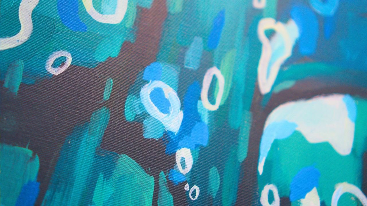
3. Blue sky and negative painting: Before we start the first step, you should know
that this painting requires a bit of courage. It will have a certain
amount of time. It won't look like anything. It will look just like
an abstract painting, but by the end of it, you're going to really
understand how to build up layers and how
to create depth, as well as colors, and, of course, the whole
entire painting. For that, you will need to start with some
blue for the sky. A little bit of yellow. And some white. With a big flat brush, it has a bit of water in it. Take about half of the
white and a bit of blue. Mix it well together. Well, let's take a bit more
blue and a bit more white. Let's blend it smoothly together to get
this surreal color, this beautiful baby blue. Such a beautiful
color. And let's establish our horizon line. Well, it is the horizon line
is going to be a bit lower, but we're going to try to
make a beautiful line. A very interesting
way of measuring is by going with another
brush, just like that. And it's a bit lower. I'm going to need to
also look from above. Okay. And now that
we've set the line, we need to set a
middle line as well. Okay, a bit too high. And let's go ahead and start making these
beautiful lines going up. Let's start on this
corner and beautifully add this color softly and
maybe break it a bit. Go on this corner just
to trick our mind to not focus too much
on the brush marks. Use the big brush so you can have beautiful fast paintings. You don't have to
use small brushes. Most beginners usually
use too small of a brush, and they end up spending hours
and hours on a painting. Let's go in the middle over here and create a bit of depth. You create depth by making
small little lines like this. Not a lot, just a few. And then making bigger
marks as you go further. And let's define a bit
of a cloud in this area. And make it like that. Maybe it comes around just over here and it loops like that. Okay. And let's actually
make it a bit bigger. I'm just focusing
a bit on the edge. Like, notice how here it's
such a beautiful edge, and then here it's too
jagged like make Jagger. And now over on this area, we need some more
interesting edges. Edges are very
important in painting. And of course, this is
not really a cloud. It's a banana, so no more
banana looking clouds. Let's continue like this and
make a beautiful splotch. Now, this will be
another cloud over here. It's a bit of a hairy cloud. So let's focus on
that edge and make it a bit lower over here and maybe add some
interesting things. The closer things are to you, the bigger the shapes. Of course, this is
not always true. And usually clouds
have this interesting, fluffy top and this flat, depending on the
clouds, of course, and this flat underside. Let's leave the area like that. You can also brush the paint a bit down
just so it creates a bit more of an interesting
and beautiful look. And you can also brush it
again just so there is a few more interesting textures there's happening on
the wonderful sky.
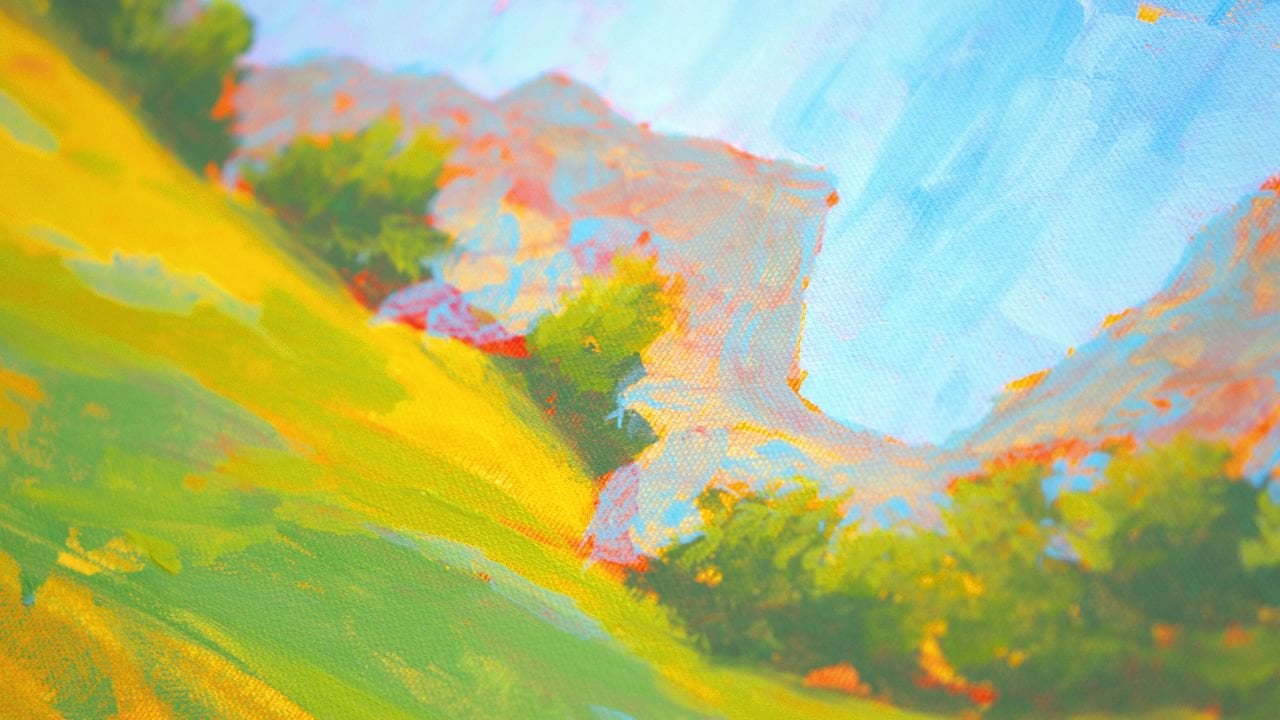
4. Simple line of mountains: Getting more blue. And let's add a bit of red just so we can create a
wonderful purple. So taking some of this red maybe too much, I
think it's enough. It's fine. Mix it well because you have a
lot of paint in the brush, so you need to be
mixing it very well. And now let's make some
mountains in the distance. Just start with a
beautiful line, purposefully lower and
leave the white band over here so you can
add the bottom of the sky later because then you can also
edit the mountains. The mountains will be
very small try to let's actually use the
smaller flat brush because whenever you want
to have more control, you can change to
a different brush. These are the shapes
of the mountains. You can make like pyramids, triangles, or you can go a bit
more crazy in a staircase. Try to vary them
and make them as interesting as possible because Mountains are not like
this all the time, like beautiful triangles. You need to make
some variations. Be careful on the edge. Try to make it as
nice as possible so you don't have to
repaint it later. Let's go with another
beautiful line from here to there and control these
mountains shapes. You can also use the
corner of the brush to get more interesting
looking mountains. And then going and
filling them in, maybe connecting
some of them and go slower because
you don't really need to go very fast
whenever you have a brush that is a bit
bigger than you need. Notice how these
three look the same. Let's break that up by making
this one a bit bigger. And more tall. Let's go like that. Maybe like this. Don't
focus on the bottom edge because you're gonna use
another color on top of that. Okay. So mountains
in the distance. And now let's paint the
bottom of the mountains a bit just to lose some of that color that you
have in the brush. Just brush it like that. Okay.
5. Purple Horizon: Now let's go a bit darker
by adding some brown. And with a small brush, let's go and take some
red and some blue, making this beautiful purple. Since you already have
this beautiful purple, you might as well just use it. This time, you're going
to cut like some shadows underneath the
wonderful mountains. You can raise them up a bit. You can do a lot of things to create some more
interesting stuff. Don't make them like
this, just a line. Try to vary the line a
bit and add some weight, some texture, not
too much texture, but just a little bit of weight. Maybe make a bigger
one over on this side. And now let's go a bit lower just to make it a
bit more interesting. And then over here, maybe these are some hills or some shadows or
something like that. Okay, and another
smaller one here. Sorry, sometimes I just end up making things without
talking, but yeah. And now you can add another
beautiful line just here, take some brown, add
it over the purple. Just to make it even
darker and add it in some areas to better
accentuate this shadow, maybe clean up
some of this edge. Let's clean up the brush and
go back to some blue to make the wonderful underside of the sky now that
it's a bit more dry.
6. Atmospheric perspective: Don't need to be dry. You need some red,
a tiny bit of red, some blue, mix in
a bit more red, and then take some white to make that color a bit
more interesting. It's going to be a bit grayer, just so it adds more
variety in the sky. It adds more color variety
because color variety is actually the secret
sauce of painting. If you put just paint from the tube or only two
colors together, it's not really that beautiful. And now with the
brush the other way, we need to focus on creating and making
these edges even better. Notice how you need to really be careful about
not going into the blue, below or above too much and go slower so you
have more control. I'm going to go like
this so you can see, and barely touching the edge, doing a centimeter or two, and then going and editing
some of those edges. You don't need to focus on making them perfect
because it's okay if they blend a bit because things that are far away
tend to have softer edges. That's another way
to create depth. I think this purple
is way too dark. We need to make it lighter. So take some white,
add some white, and then start right
where you left off. You can go back a bit. Now, it's better. I think
it needs even more white. Let's find another clean area to add more white to
this grayish purple. And you can go back inside
the shape and continuing. But this adds more color
variety because you are now creating more textures and things that are
blending together. The 23 colors you've blended
are now playing together. These are analogous colors, so they are very
friendly to each other. If they blend into each other, they are not gonna
fight over who's the boss and trying
to edit that shape. Notice how this
area is too calm. Let's add a bit
of another ridge. And over here, Because you've added
this color onto the beautiful bottom of the sky, just so we balance out
the whole composition. This is how you create
compositional balance. You need to take some
of this color and add it in the sky. So take it and just
brush it over the blue. The blue is a bit wet still. You can go like this, as well. Just blend it a
bit into the sky. Not too much, just a few
touches here and there. So here, notice how they
are a bit more vertical, just because it creates a bit more of an
interesting look. And here, maybe they
push towards the cloud. Perfect. Now, let's
make a cloud here. And as you blend the color, if the blue is still wet, it will pick up a bit
more of the color. So you can go a bit and take more color to add some of this
grayish tone over the top. Making some more marks
on the left side, and I have a bit of a white
spot over here and over here. And that is all for this step, and you don't need
to let it dry. We're just going to
go into another step.
7. Color harmony: This step, you're going to
basically use the same colors, but you will need to
clean up the brush a bit. The big brush, you do that by swirling into the water
to get the paint out, dabbing a bit, being careful not to spill some of this water
paint onto the canvas. I intentionally did that. You can do it as well,
just to have a bit of a wash and to make it easier for yourself to paint
and clean the brush. Okay. Once you do that, you are going to need to take some yellow, just on the corner. Look at how small it is. Take some yellow to make
a bit of a turquoise. You are basically
creating a bridge of colors from the sky colors to more different type
of color palette. So you first need some of this turquoise, this
yellow turquoise. You can go a bit more textured
with a big brush this time because you're just
having a bit of fun. You can also take some of
this turquoise, whiten. It basically is white and blue to add some of
this color over here. And let's add a beautiful
think of this as a line connecting and making a parallel between the sky and the ground. Let's take some of
this purple, white. If you don't have it,
it's easy to make. You just add blue, white, and a bit of red, a lot of white, actually. This just adds a bit
of color variety. Let's take some of that white
blue and add it over here. Trying to blend the colors, you should do as well
and make this line. Notice how flat
it is on the top. So let's make it a
bit more interesting. Okay? And now let's take some more blue
and some more yellow, maybe a touch more blue, just to make a beautiful
turquoise and some white to make this turquoise a bit more a tiny bit
more dark than this one. Okay? Just dabbing a bit of color in between the lines and over this to create
a bit more depth, color contrast to make them
just a bit more interesting. This is not a seaside, but we are building that bridge where maybe there is a lake or something
in the background. Let's take some more
white and add it over. Things in the distance tend
to be a bit more foggy, a bit more light. So you can accentuate that by going and adding a
bit more white Mm. Notice how it's very important to try to keep
the things that you've painted so you don't have to go over them again
or lose something. But you don't have to really
pay that much attention. Let's build some
texture over here. And on this side, just
cleaning up the brush. This all I'm doing right now, cleaning up the brush
over this area, taking some more of that purple, just to add a bit of contrast.
8. Turquoise conundrum: And as soon as you do that, you can also take some yellow, put it over here. So brown. And a touch of red. Not too much. Make this
beautiful green, earthy tone. It's going to blend
together quite well with blue that you put in the turquoise because
it's a mix between the blue, and you also have a lot
of blue in the brush. So that makes the colors
really more interesting and blending together is a
breeze. Take some water. This is going to be a very
runny type of wash. And start thinking and
covering almost all of the canvas that has
splotches of white, and it doesn't have
the turquoise blue. Take some more of
the paint, add it. Haphazardly, if it creates. The goal is to go over
the areas that don't have very thick paint and have small little white
points like this. And you can also
think about edges, like you did with the mountains. You can think about edges
on this side as well. You can make some of them soft, some of them harsh, like right over here, and making them a bit
harsher on this side, on the left side, and then
blending the other side. Going outside of the canvas, painting this beautiful corner, loose and fast, it creates a
bit more abstract painting. This layer is basically for
covering up the whole Canvas. You shouldn't cover it all. You need to change a bit
colors before you cover it all completely because you now build a little bit
more of the bridge, so you can go a bit more towards
the green, earthy tones. Let's take some red, just a tiny bit of red, and some yellow. Mix it over the paint that
you already have here. This will make it a
lot more interesting. Another beautiful green. It's creating green
because there is a lot of blue in the brush. And notice how beautiful
this sits on top of this color and also
blends with the turquoise. It brings it down a notch. Some water goes a long way to just do a bit
of a wash. And it also lubricates the
brush to be able to glide. You can go closer. So notice how big
these brush marks are. And the more you go
towards the horizon line, which is over here, you
need to go a bit smaller. If you really need it, you can use the smaller flat brush. I don't recommend it, though, because whenever you
use a smaller brush, you tend to stick around with
it for the whole painting. So do the majority of the
painting with a big brush so that you understand that the big brush can do
small things as well. And finishing up this area, there is a lot of white in here, but I don't mind it that
much. Let's blend it a bit. And just because we
have yellow so close, let's add a bit more yellow
this time just yellow to make it a lot more
green and saturated. The more you blend
over the areas, the paint becomes polluted. It takes some of the
paint off of the canvas, and then it creates that thing that we were talking
about earlier, which is color variety.
9. Slow changes: Okay. And now let's
go the opposite way, take some red and some yellow and make it
a bit more orange. Notice how immediate it is. With this color, you might
as well just stick around in the greens because they tend
to go better with the color. But if you go over the
blue, nothing happens. It just creates chalky colors. So basically, chalky colors, they have too much
cold colors in them and not enough to be a blue or a purple or
something like that. And muddy colors are too
brown, too red, actually, too too warm and not warm enough to be
distinguishing them. And as you go towards
the horizon line, you can start to edit
slowly these shapes. Notice how easy it is to just
make some lines over there, over here and just create
this beautiful greenery. Okay. Now, for the next step, you will need to let
this dry completely and have a cleaner brush, maybe the medium brush, the small flat
brush because let's actually clean it right now because you're going to
work onto the clouds. You're going to make the clouds and also with those colors, you're going to add
them over the green. The problem is not
the blue of the sky. The problem is the green
because you are going to enter with the brush onto the green. So you're going to pick
up some of that green. So that's why you
need to let it dry. We let the paintings
dry usually whenever we change to a different
color on the color wheel, a very far away color. This way you create
color contrast. And you also do it in order to really create
a lot of contrast, even if you have the same colors like harmonious
analogous colors, but you want to
create sharp edges and also a lot of contrast. So you want to jump from
a very dark color to a very light color without
them blending together, you need to wait
for them to dry. Let this painting dry. If you have a hair dryer, you can dry it very
fast in a few minutes. So I recommend just taking the hair dryer from the
cupboard or wherever you keep it and blow drying it very fast so you
can pay it faster.
10. Yellow clouds: Okay, now that you
have your brush clean, let's actually clean
it a bit more, just so it doesn't have
any blue inside of it. Even though the
water is a bit blue, it doesn't really matter. You will need to put some white paint in
an area that is dry. Like, for instance, here
next to the yellow, it's important to be close
to the yellow and have some space to play
around with the white. It's gonna be some
white, some yellow. That's too much yellow. Let's take some more white. Even though the
paint the green on the inside is not really dry, you can still pick up some
of that white because it's enough color to make it nice. So that's just about
it. That's the color. It's a very, very light yellow. And you're going to start
right over this blue. And make some beautiful shapes. This is not the finishing
color, don't worry, and add it a bit
more to the bottom, creating some edges, try to
make them not very fluffy. This is not a fluffy painting. Make them straight, but
not entirely fluffy. Clean up the brush, even though it has some
blue, that's fine. Can even go pollute. I cannot say that word. You can go add it towards
this area, as well. Let's go over this blue. Don't worry if it's
a bit transparent. You're going to fix it later. And start adding some of
this color onto the clouds, the white areas that you left. Okay. And once you do that, you can take some
more white this time focusing on the left side of the clouds on
the top left side, notice how it's much more light. But because you have
the yellow underneath, you also can blend
them very well. Now it's time to really fill
in those areas and then focus on the edges later in
the next lightest color. Okay? Let's take
some more white, blend it over the yellow. Over here. You can also add
another bridge just like that and press down to add some of that
blue on the bottom. In case you don't have the blue, you can just take some of the turquoise or blue and
add it at the bottom, just so it creates a bit of a softer edge on the
bottom side of the clouds. So it's not so harsh. Just taking some
more, just to add it right underneath the clouds. And just the touch is enough to blend those
clouds together. Now taking some
more white, very, very carefully touching
the red. With the corner. Notice how small it is. It's tiny, and I'm still going to take it away
and put it next to it so that this beautiful
pink is not too intense. Slowly add a bit more. Well, let's actually
paint with this. First, it's just a
small hue variation. Don't be afraid to
put thick paint. It makes your paintings
look more luxurious. Okay, going on the edge. And over here, on the top side, notice how this color
stands out a bit more than it's not only
because of the white. It's also because of the
tiniest amount of red. If you can notice the red, then it's not good. You shouldn't be
able to notice it. It should feel as if
it's a lighter color and going underneath and on
the left side over here, maybe adding some more
clouds on this side, just going in because they
are not really connected. The areas are this
area is a bit stunted. It hasn't grown properly. Okay, making the
white lines a bit more disappear,
taking some white. I accidentally took some blue, but that's fine, for this
area is completely fine. Adding some finer lines. Notice how they blend so well
together with the purple, small, beautiful
lines, smaller and smaller, long and beautiful. And taking some more white Okay, adding it to the left of the
clouds over on this side, and maybe on here, blending some of that
color, not too much, keep them a bit separate and adding some more runaways
around the other clouds. These are the most important
parts of the clouds. They just give them
that fluffiness because they are broken by
the wind just like I am. Wow. I'm broken by
the wind because it is cold the cold
wind of the summer. Okay, notice how this beautiful
line has been created. Let's actually accentuate
another beautiful, small one. This is just playing
with big, medium, small. You're just playing with bigger shapes and
then smaller shapes. And then even smaller shapes
just to break things, break the monotony
of the whole cloud. I'm adding another
highlight on top of this because it
was too yellow. And don't blend
everything together. Don't feel the need to
blend everything together. Let's take some
red on the corner, as always, just a touch
of red. It's too much. So we need more white, more white, and some
yellow, too much yellow. These colors need to be so
white and so beautiful. Okay. And going over the clouds
with this beautiful pink, let it get blend a
bit with the yellows. Notice how beautiful it becomes. Just adding it over. Don't worry too much
about the placement. This is just to add some
of that color variety. Okay. And after a big stretch, I'm going to do some
lines on the bottom, maybe a few dabs as well. Just a few dabs and then a line, a few more dabs and then a line, maybe that line is too big. You can go over with
a finger to blend the whole thing over the blue and over on
this side, a few lines. Now, with this pink, let's start creating on this area some beautiful
patches of color, cleaning up the brush and creating some of this
interesting reflection. Maybe it's a reflection,
maybe it's just grass or some patch of sand
or something else.
11. As above so below: Now take some yellow.
Too much yellow. Let's add some more white
in the corner over here. I touched a bit of
red. That's fine. And let's add it. Notice how it is more yellow, and it really shines. And let's add it to the
clouds over the pink a bit. And under the clouds, maybe connecting these two is a very should have broken up this cloud a bit
more, but that's fine. The more we know,
the more we learn. The more we do,
the more we learn. Taking some more paint and
focusing on this area, leaving some of
the other colors. Notice how these colors have a very beautiful life
on this pasture, because they have that brown. So it's not so distant in
terms of on the color wheel. Taking some more
yellow this time. Now it's good to have
a lot of yellow. Well, not a lot,
but as you can see, to bring back to
bring the bridge closer towards the
Let's take some water. And some more yellow. To blend in and bring the
bridge closer towards the green and just creating
a beautiful color. Notice that the yellows
usually are very transparent, so we are playing with that. But if you wanted a
very opaque yellow, you'll need to do
a few passes over. Okay. Maybe some textures
over on this side. And some of them on here. Let's take some more
yellow this time only the only yellow, there is a bit of white in the brush and create
a few patches, just slowly inching your
way towards the greens. But because yellow is
a transparent color, you don't even need to
recreate those greens. Let's also try to make some lines over the white.
Let's take some white. This time, it's important that with the yellow
that you have, blend it together, and it's important to build some texture. You've played only with
small amounts of texture. Now take more of this
color, more of the white, and just play over it
to build some texture. Just put your brush on the side and let it do
abstract shapes over, especially over the yellow, the intense yellow sides. Notice how beautiful it is. If you don't have
enough textures, take more of this white and put it over and blend it over. You don't have to
blend it, actually. So going on to the left, Okay. Now, taking just a touch
of red on the corner, maybe that's too much and making a beautiful pink with some
yellow or orange, rosy pink. This will be such
a beautiful color. Let's first add it
as a texture over this yellow and then
put it in some areas. Notice how much more warm and beautiful the painting
looks immediately after you put this
yellow pink over it. In fact, this rosy pink is so beautiful that you might as well just add
it to the clouds, creating some more cuts. Notice how these
are not blended. They are very they are
like the mountains. Like you created the
mountains and don't go to the edge of the cloud. Just focus a bit on the
middle, lower side, especially on the right,
middle, lower side. You can go a bit
higher if you want. But these are not blended, yes. So it's a beautiful color. And it's gonna dry a bit
darker as well because acrylic dries a bit dark. Okay? And underneath here, notice how much more
beautiful this color is this rosy pink that made the clouds so
much more interesting. I picked up a bit more
of the edge of the pink just because it was a bit more
interesting. Not too much. We don't want to overpower
the whole painting. And now let's clean
up the brush. The sky is done. We're
not going to touch it. If you want and you have
to change it a bit, you can go back with some white, take some white and add a
few more textures on top. You can do this exact thing. Just straight up white
and add it over. It really creates a bit of texture because they are a bit, but just on the middle one, just so it's more interesting.
12. Light and dark contrast: Okay. Once you've done that, you need to go back
to the greens. So yellow, blue, and a bit of brown because you've played
with very light colors. Now you need some darker colors, this beautiful, earthy green. And then at the end, just some very intense green
after everything has dried. Notice the shadows. Notice how it just goes nicely. And as always, if you go close to a lighter patch of color, it will create more contrast. That's the secret
sauce of contrast. Nobody will tell you
this secret diet. I'm joking, creating some
more lines just so we are focusing also on areas that are exposed that
have white canvas. We don't want the
white canvas showing. So that's an easy way to add
abstraction and composition. Let the painting dictate where
you put the actual paint. If you took some white, just like I did just now,
don't worry about it. Just go and spin the brush and just paint in other
areas. It's going to be fine. Now, taking some more
yellow and adding it over this earthy tone just so we can come closer
towards the green. Let's add some
textures. By dabbing. Notice that it's making
this mess dabbing, maybe with the corner of
the brush and then blending them with the corner of the brush a bit and
then adding some more, blending some more at the
bottom of the texture because things don't usually have textures as they
go down in the ground. They have only on top. Think of them as
beautiful grass, taking some more yellow, adding it on top, getting closer towards the colors you've put the yellows and the white of the clouds that
you've put on the bottom. This is way too intense, so let's cut it over. This color is so beautiful, and you're going to
need to use it a bit more in case
you already got it. It's just a simple green
that looks gorgeous. This will need to have some
more lines on top with a lighter color with a lighter green or some other
beautiful colors. Okay. And over on
this side a bit more, let's take a look
and see if there are some whites covering all
the whites the canvas, covering the canvas colors. Over here, there is a big one, big area, and in this
corner, maybe on the edge. Okay. Let's add a tiny bit
of white to that to finish the whole thing to get so
very close to the color. Notice how close it is. And you've built a
family of colors. Let's add a big flat color
over here and another one here and continue this line a bit more onto the right
by taking some white and blending
it into the green, doing the same over here
just to make this a bit more round it out a
bit more of a line. Let's take some yellow and place it over the white that you just placed over here just to create that same kind of interaction, getting some white over and
putting it over the yellow. And since you have
this new found color, you can go and add it with
small lines at the top. Just a few to fix
this area over here. Maybe this is a lake kind of
situation or we don't know. It's like a lake that is almost drying out and it shines
the whole sky over. Let's take a break. And let's go over the painting
once again at the end. For a few finishing
touches, it's almost there. Needs just a few more colors.
13. Color variety: That the painting is completely
dry, as you can see here, no paint has gone
out of the painting. We can focus a bit more
on some saturated colors. Notice how the areas
are very unsaturated. Plus, we still can see
some of the canvas. So we need to focus
on that as well. And the way we do that
is by taking some water, we have a clean, beautiful
brush over here, taking some of this blue, and start adding it in the
areas that have some white. It has a lot of water. So it's a watery color, just because we
don't want it to be too harsh on the
actual painting. We can do it in the distance
over the mountains over here to accentuate and build
some of that color variety. It just adds a bit more
vibrancy to the painting. This is like a beautiful swamp, just adding another
line over here, maybe over here, a bigger one. Notice how it's transparent. This builds a lot
more vibrancy and the colors are more
integrated into the painting, just because you can
go and wash over. Notice how the purple
is still showing. And if you go ahead and go over some like white over here, it's going to still show up. You can also wipe it
with your finger. That's why you need gloves. And just start focusing on some small areas that have
certain whites of the canvas, small dots of the
canvas and do a bit of a wash with this color. We're going to actually
go ahead and add another beautiful color
over this just to add more interesting variety. This will be a very green color. It's a very nice and
beautiful green. You can go over the blue
just to blend it a bit, just so it doesn't
stick out too much. Notice how this green is very, very saturated, and
it really brings up, let's add some more yellow. It really brings out the
best in the painting. Makes everything more
vibrant and beautiful. Just focusing on the areas
I've touched with the blue, just so we create that
turquoise feeling by blending it together
and making that blue a bit more soft by softening the color
and the edges of it. Okay. And let's go even more yellow and go over the areas you've painted
with the green just a bit, noticing that here there
is some white and here, maybe in the distance, just a small little line. Maybe there are some trees or another part where
the sun shines and building layers
over the top of these already beautiful colors
and some textures as well. You can add some yellow, just a thick layer of yellow. Because it's transparent,
it's way better to just grab a big gulp of paint and build some of that textures
into the painting. Remember, soften the edges on the bottom and then
texture on top.
14. Warm and cool tones: Okay. Now, let's
clean the brush. Once again, well, not really. Let's take some red and
mix in the palette is dry, so I can mix everywhere. Let's mix a beautiful orange. It still has some green
and the brush into it, so it's not a very harsh orange. That's why I didn't clean it. Start by maybe
cutting this off a bit because it was too harsh going over
here over the blue. Notice how the blue just
ended up in the background. It's not visible
that much anymore. Let's add some more
orange just over here because it created
a 90 degree angle. 90 degrees angles are very harsh and they attract
a lot of attention. So if you don't want the
attention to be there, I'm just going to switch
this way, the brush, so it creates
textures on the top. Okay. Adding some
water just so I can add that beautiful wash
over the top of things. Okay. And going ahead
and adding some more of this color around
here, adding some yellow, a lot of paste, just to break this shape down a
bit and this one, and maybe over here
just a tiny bit. Now, let's go ahead and make
some beautiful textures. For that, you will need
some yellow and some white just to have a
very light yellow. And let's create some
beautiful textures over top, especially this color
will be very visible once you put it over something
like a dark green. Notice how it's very
visible over there. Let's actually do it over here. Let's spin the brush around
because it tends to do the textures on top
and brushing it over, taking some more texture. Now that you've
brushed it to add a bit more color and maybe this angle needs
to be cut a bit. With the corner of the brush, you can start to make some
more interesting shapes. And over here in the corner, creating some texture and
some dabs just over here, brushing it over, adding
some more texture, turning the brush around,
it has some orange. Now, let's clean the brush
and go back to the blue. This time with a bit
of a thicker paint, some white and some blue, mixing it together to
create this beautiful blue. And now you can go over some
areas like this yellow, picking up some of it onto the brush and then
going over some areas around here and
maybe around here to add some of that
reflection of the sky. Remember, as you go further, you need to be a bit more
thinner on the brush marks. So try to do vertical
motions, just like that. And also right over here, you can go a bit
thicker since there is a lot of white of the
canvas around here. And let's actually do the
same over here just to show this sky as a reflection, since we decided that this
is a swampy landscape, beautiful landscape
with reflected sky on the bottom and some
greenery and some grass. Okay, playing around a bit
with some textures here, maybe add some water to
do some of those washes. Remember, the washes
end up transparent. So you should be using
them a bit sparingly. Or depending on the look
that you want to achieve, you can use them as you wish. Let's add one here. Okay. And some textures. Maybe add some yellow, make this beautiful green, just so we can add some
beautiful grassy textures. With the corner of the brush, we're just creating some dabs, just a few, and then
making a line underneath. Over the white, just a tiny bit. Remember, you don't want to cover everything with
another layer of paint. The goal is to keep some of the parts and combine
them like look over here. Like, this is an area that needs a bit of change
because it's black here, black here, black here.
Well, dark green. So if you go with this
lighter green on top, you can really make
it disappear a bit.
15. Final touches Thank you : Grab some yellow straight up yellow and add it on
top as a texture, maybe going a bit further. Also over here over
this wash of blue. And in the middle, let's add some more
yellow textures. But this time, let's use
the brush differently. Like on its side, like vertical. I know you can't see, but
just making some dabs. Notice how they are very
light and textured. Just so it creates some
texture in the distance, maybe further away as well, and then lining them up, so it creates a bit more depth. Let's do some more on top. After you go with a line, you can also go back and
add some more texture. Maybe I should press. This is a very
interesting trick. You can press into the
brush so that you have more texture onto the
actual tip of the brush. Okay. Don't go overboard. You might be tempted
to go overboard with these very high
intensity highlights. Let's take some white with this yellow that we have
in the brush and go over. That's why you don't need to really go overboard
with these highlights. Maybe that is too white. Let's add some more yellow over top because you
can all the time, you can add more, but
subtracting is harder. Let's take some more
white and add it here, just one dab and then start to consolidate another area of
these kinds of textures. And over here, and as the paint just goes
away, you can add more. And let's add another patch over here and another one
closer to the viewer. Notice how because you
pressed on the brush, you now have I took
some yellow from here. You now have this
beautiful textured brush that makes very beautiful,
very interesting shapes. And then brush it
over clean the brush just to be able to accentuate
this and blend it in a bit. Just put some water over
it and blend it in a bit, so it becomes transparent on the bottom and
opaque to the top. And certain areas just do a wash with this yellow
green that you've found. Start blending just a tiny
bit. Don't go overboard. The key here is to not really go crazy with the details
and the blending. We want that rugged feeling. Let's add another line on here
and another one over here. And let's do a wash
over this orange and maybe let's get some more of this watery green
to go over this. I'm noticing some
whites over here, so I'm going to take some blue, just blue and water. Cover them up. Just builds
a lot of color variety. Plus, it blends them in
the same on this side. Can also, if you want to
build more Mountains. You can start to add
some of this blue a bit thicker and over here, perfect. And that is it. So
you've learned in this class how to create
the sky easily with one color and then harmonize it with the bottom of the sky. You've touched the
colors over here, so you harmonize it together. You've also learned
that you have to really wait for the paint
to dry when you change from a color that is very cold to something
that is more warm. Also, when you change, if you want to have very intense contrast when it comes to the dark and light, you need to wait for
the paint to dry. It's a very important
step for painting. You've also learned how to make washes with the
brush and then let the painting decide
what abstract textures it needs because of the canvas. You've learned how to
create distance by making big clouds in the front
smaller as you go further, and you've learned
that the edges tend to be a lot softer in the background as
they go further away from you and the colors
a bit more muted. You've learned how
to make mountains and control the edge
of the mountains, both direct painting
and negative painting, which is going with the top
color and editing the shapes. You've learned about soft
edges and hard edges. When it comes to
the mountains and clouds like this is a hard edge, and this is a soft edge. Simple. Hard edges
really describe the shape and they make the
painting look very clean. But you need a mix of both to have an
interesting painting. Notice how all the textures are concentrated around here and the biggest contrast, as well. You've learned how to do
that without even thinking because this is the lightest
area and also this one. And it brings the viewer closer because it has more
detail, more texture, and you've treated
the whole painting around it like here, over here, and over here. You've treated it
as more abstract, just as you would look into the distance and
you would focus on the grass and the beautiful
foliage on the ground. And everything else would just
blend together around you. That's exactly how you create this sense of
perspective and focus, and you are using this to guide the viewer
towards this light, this texture, and this
beautiful plane of color. You've learned how to harmonize
colors together by mixing the sky color into
the beautiful ground, and this goes for everything. Landscapes, still lives,
portraits, everything. The background, the
surrounding areas, the colors from the
surrounding areas need to be found on the
object itself. The more reflective
the object is, the more it has of
that background. If it's water, it has
a lot of sky color. But also even grass, as you go in the distance, it becomes more blue. It has this hazy, white, bluish tint to it. Speaking of haze, the more
you go into the distance, the lighter the color become
and the more together, the less contrast they have, you can also do like a shadow. Like for instance, maybe
here, there is a shadow. That's why it's more dark. And also, as you go further, you understand that you can build the texture
and build the lines more finely to give this
impression of depth. And those are the things that you've learned
about painting, but you've also
learned about color. You've learned that
there are some colors called analogous colors. This is the color, let's say, blue,
and it's friends. The friends are just together
into a beautiful pizza. You can think of some friends just having a pizza,
a slice of pizza. So they are like blue, turquois and maybe green. So you can have red, orange, and a deeper red. Colors like these blend
very well together. They just like to
play with each other. They don't create any noise, any distractions, they
just blend together. But if you want to
be a bit more bold, you need to let the
painting dry and then change the color harmony
to something opposite. But you've also
understood that to get to this point
on the color wheel, this other point on the
color wheel, let's say, from blue to orange or yellow, you need to build sort
of like a bridge, an intermediary color,
something more muted. You build it, something like
the brown or the orange. And then on top of it, you can add the pinks and the yellows and colors
that are more warm. And I think that's
enough for this course. Thank you for watching. And if you are kind enough, please leave a review. It really helps me and the people who want
to watch this course. See you in the next one.
 George-Daniel Tudorache, Together we will create amazing things.