Transcripts
1. Intro: hi there, and welcome to part two of my Siri's about drawing reefs with ink. In this class, we'll take a closer look at liquid ink and how to use a brush to create great gains in your reefs are walking through the process of creating a cheat sheet, just like we did in part one of discourse. Also, sherry. Some tips to make your designs stand out and make the most out of liquid ink, so let's get started.
2. Supplies and Gradients: Let's start with the supplies in this class will only be using liquid ink and a brush. Any type of ink will do. You can use calligraphy ink if you already have some, or you can do like me and simply use in contra GIs from a regular fountain pen like these, it's better to use really thin brushes because we'll be painting small elements. We'll also need some water towards the precious at a mixing Pillette or any other sort of container. Where will be mixing Inc and Water? I used a disposable plastic plate, so I'm not sure if you can see it, but I'm pouring water in my mixing palette on the opposite side of the ink. I make sure they're not mixing just yet, and I'll show you how to create Grady ins with ink I used to seeing as I would use water colors, for example, this is the darkest shade of black I can create, and now I add some water and you can already see a slightly lighter shade disappearing in my blending bullets. I like to keep three separate mixes, one with Pure Inc one where the ink and the water are mixed and one where it's mostly water for my lightest shade. And this glass will explore different ways to play with Grady ins, which is something we couldn't really do with Ben's with flying art. So feel free to experiment to try mixing water and sank in different proportions, especially if you've never done it before. And if you don't feel comfortable using liquid ink, make sure to use thick paper like what a color paper or car stuck. Otherwise it just won't stay flat because of the amount of water and liquid ink will be using.
3. Cheat Sheet: once you feel comfortable with the liquid ink it sent to make a cheat sheet, just like we did in part one of this course. When we use Spence, it's all about creating a collection of references and ideas you have with different floral designs and different types of grading variations. You're free to reuse designs you created for the previous course and see how different they look what this new technique thank. Here, for example, opened one of my favorites literal designs, which is the one with the long, stringy leaves. I use a very light shade of black, so I've mixed a little bit of ink with a lot of water, depending on the type of ink use. The lighter shades may have a slight coloring here. Oh, my designs were slightly violet. Sometimes when I makes Incan water, I get a dark green, for example, so keep in mind and had mixing water and black ink want make great like I used to think. So now try another one of my line art designs, and this time I'll be using pure black. Another thing worth mentioning is that he really don't need a lot of ink for example, the quantity I dropped in my mixing Villette was way too much for this whole course. I recommend you start with one small drop of ink. You can then add some more at any time if you need it, and you won't be wasting it like I did here. If you haven't already practiced creating a Grady in by adding more and more water to your design, the visual resolve is really pretty, and it will look great on your reefs. Thank you, thank E. One thing I really like about brushes is that you can use them both for painting and for drawing. Try creating a line. Art elements similar to those were created in the previous course. The thinner your brush, the more delicate your designs will be. Three e e e e. This type of botanical element. It's great for giving your reef specific shape. I use it a lot. Unloved design you can try is this fern with smaller and smaller leaves. Now let's try something different. I'm going to dilutes the ink directly on the paper to create interesting results. So I start by drawing a huge black dots. And while the thing is the wet. That's very important. I'm gonna try to add some lighter shade of ink or even just water, and I'm going to form the leaves this way. It creates sort of a great and inside each leaf, and it gives a really painted Lee look to the design. I think, by the way, once your design is dry, you can odd small details. If you like, just make sure that everything is completely dry. Otherwise you'll just create the same page Italy effect as in the last define. You can also do the opposite started by drawing the outline of your design, just like we did in the course about Ben's. And once it is dry, you can color it. Finally, here is something a little bit more complex. Don't hesitate to create something really intricate and detailed if you want e e. E. Now I'm going to check if everything is dry so I can add some color to design. So here I have my Chichen that I will be using for the next exercises
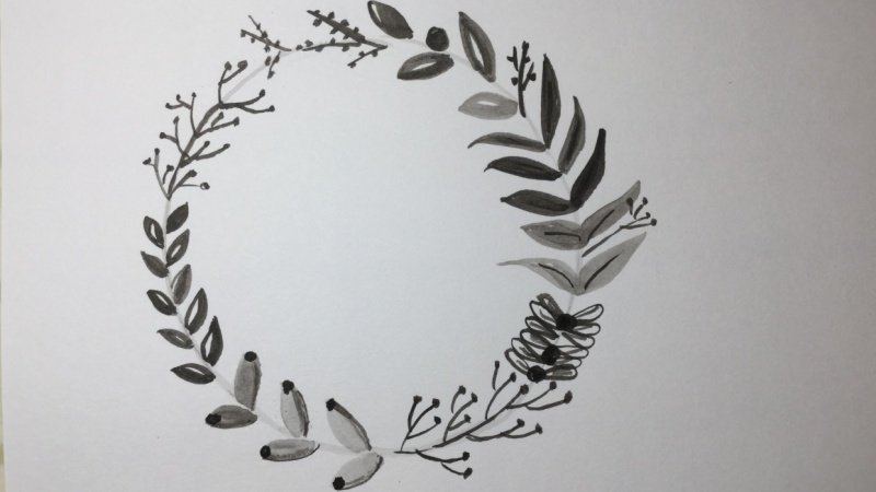
4. Simple and Complex Wreaths: The next exercise is about creating simple reefs using one or, let's say, a couple of botanical elements. What is new about this exercise? It's something we couldn't do with Ben's. We can now underwater, too well, illustration and create different kinds of visual effects. So let's start with a very simple reef. I paying some leaves, I make sure there are spread out, so I'll be able to add a few additional elements later. E e E. For this one, I want to innovate a little bit. So instead of painting a second type of leaves out a few Berries, I paint them self flee with some very diluted ink. So we've let's afford ER, And while the paint is still wet, I add a small drop of Pure Inc When mixing Inc and water directly on the paper like this. First, make sure that the wet area is isolated here, for example, the Berries are not wide touching the rest of the design. Otherwise, it would really be a mess. I let it dry for now in the second exercise are put into practice. One of the techniques I showed you in my cheat sheet. It's the opposite of the first exercise. Actually, if you can master this technique, you have really beautiful results, so I encourage you to try it out. So I start by painting a simple reef. We've pure black, but I make sure that the ink is not entirely with its between wet and dry. It will be easier to control it that way. So once I'm done, I'm going to add some water to the painting. You can experiment with the way you are. Water. You can start with the side where there's already Inc and you can kind of dragons to create a grade, and or you can add water next to the ink and kind of mixed them in the middle, depending on the quantity of water And how wet your Angus. You'll have different shades and different grains. Thank you, E e. And now let's create a more complex race with many different elements and with a soft radiant to give it a little trist. E. Keep my Cheech it handy for inspiration. And like I showed you in the previous course, I tried to switch between different shapes and now different shades to make it more interesting, - I think. - Okay ,
5. Floral Elements: and now it's time for the final exercises. Recent Nice, but that better? If you can throw in a few flowers, right, how exactly should you place them? If we're talking about one single flower that is going to stand out and grabbed the attention of the viewer, you can place it anywhere. It doesn't change anything. If I want three flowers, I'll place them inside an equilateral triangle, which separates the circle into three equal segments. For five flowers. I'll paint them inside of five pointed star. So again the circle is separated into equal segments. Why not? Do you are four flowers? That's just a matter of personal preference. To be honest, I feel like it's just prayed here to use the art number of decorative elements in the reef , especially when we're talking about the circle. You can, of course, pained an even number of flowers if you wish. And now let's have a look at two different ways to paint this flowers. First I'll try something in a more expressionist and painterly style. I place drops of ink on the reef and then, with a little bit of water, I paint a few strokes around them. which will slightly Mixed Inc and the water I Live it for now. I wanted to dry a little bit, so I take this opportunity to draw some botanical elements around the flowers. Thank you. And when the flowers are a little bit more dry, I use more water with thin brush to draw some pedals. Now let's try something more precise and realistic. E I start by painting the general shape of the flower with some diluted ink while I wait for it to dry. I banged the rest of the wreaths, adding different elements here and there and trying my best to create contrast between lighter and darker shades. E E E e. Once the flower shape is dry enough so I can paint on top of it, I simply adds the outline of the flower with a darker shade of black this'll. Style is very different from the 1st 1 but again the flower really attracts the eye. It's a great addition to any reef
6. Outro: thank you for watching Part two of Drawing Reese with ink. Inbar Tree of this class will put together everything we've learned about pens and brushes , and we'll be creating even more detailed and complex Reeves. In the meantime, breakfast, rowing, reefs with a brush experiment with different shapes and different decorative elements and, most importantly, have fun. They could look at the class project section for some exercises and inspiration. And don't forget to follow me so you won't miss my next class is happy drawing.
 Margarita Bourkova, artist | dreamer | infp