Transcripts
1. Introduction: Feeling a pen, scratch
across paper and making a mark is the most
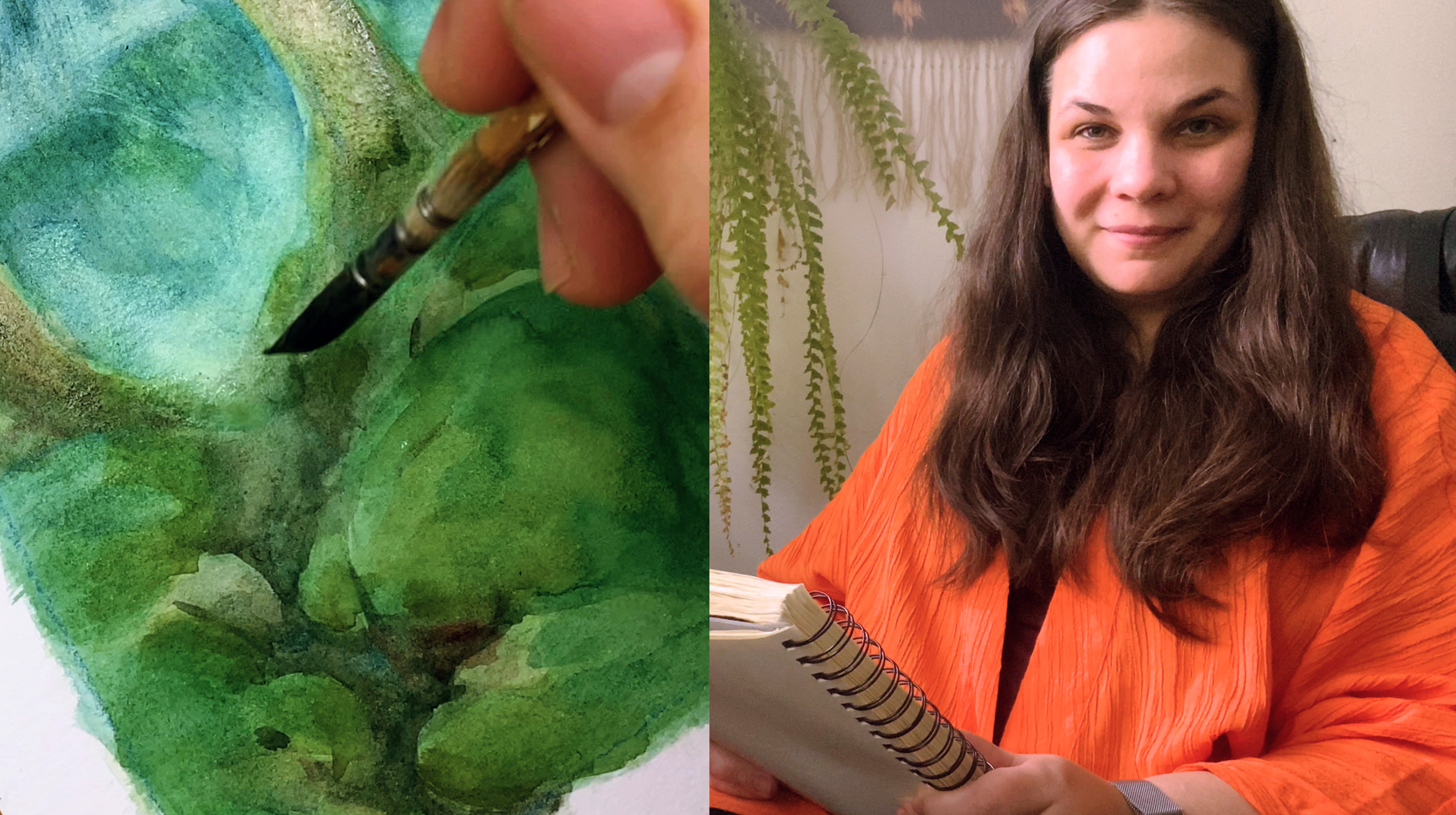
satisfying thing I do. [MUSIC] Hi, my name is Yana. I'm an artist and illustrator
based in Finland. I've worked as game artist and illustrator for many years. But after having
my second child, I really felt like I
needed a bit of change. I have a feeling so tired of working on the computer all day. I really miss the
unpredictability, miss and feedback of
traditional mediums. So, I decided to take the plant and try my hand
at drawing with ink. The dip pen has now
become my favorite tool. It's been an amazing
journey but I've been able to let go of that
need to be perfect, be way more productive, and find my personal voice. This class is an introduction to drawing with
dip pens and ink. It's aimed at a total beginner. I'll tell you everything you
need to know to get started. I went through a
lot of trial and error when I was
starting out myself. So I'm really happy. I'll be able to share
my mistakes with you. So you'll be able to avoid them. This class is great for anyone who's interested in trying
out the new medium. Once to try drawing with ink or anyone who's tried drawing
with dip pens before, but had trouble with them. I'll show you the tools
and materials you need and go over
common problems. We will talk about line weight, quality and texture, and how to build for men
value with lime. I have exercise sheets for you. You will be able to
practice pen control. As a class project,
Bill Inca sketch. Either you own, or the one
I provide for you and usher the thought process behind building up an
illustration using line. I'm really excited to
bring you this class. I had so much trouble with small things when I was
getting started with dip pens. It makes me so happy
I'll be able to make the process
easier for you guys. I aim to give you the tools and confidence you
need to succeed. I really hope you can find as much joy in drawing with
dip pens and ink as I do.
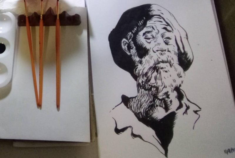
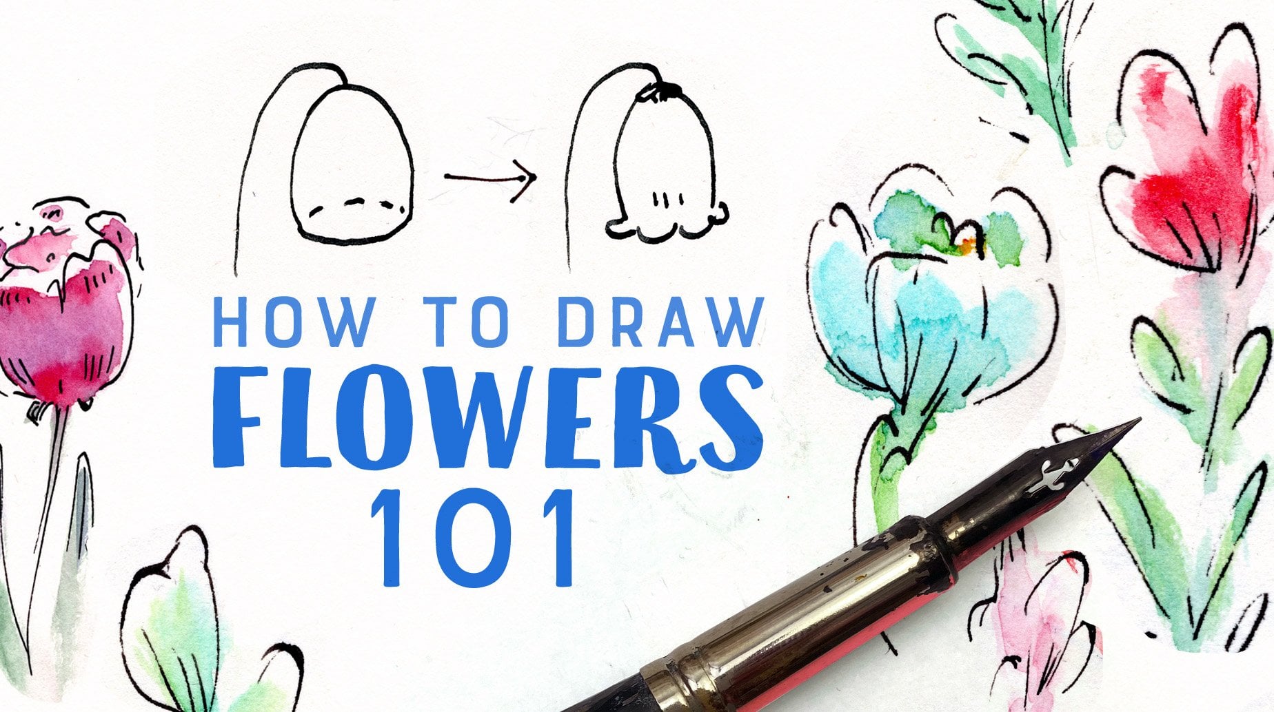
2. Class Project: Hi guys. I'm so
glad you're here. The goal of this
class is to give you all the tools you need to
get started with dip pens. As a class project, we'll first practice controlling the pen by filling
some exercise sheets, and then we'll throw a nature scene with
dip pens and ink. I chose this project because organic shapes leave a
lot of room to play with line and texture and
it's really easy to show you how to compose an image in black and
white using them. There's also a lot of room
for personal expression, as there's no need
to be too accurate, and I really like
drawing plants. You can ink my drawing
or do your own sketch. The point isn't to
replicate the way I use line but to find the way
you like to make marks. Experiment with the
pen and have fun. Let yourself make mistakes. In the next lesson, I'll
introduce you to the dip pen.
3. Introduction to Dip Pens: In this lesson, I'll
introduce you to the dip pen and its
special qualities. I'll show you the tools and
some inspirational images, so you can see what's possible
working with the pen. The dip pen has two parts. The pen holder and the nibs. To use the pen you
place a nib in the correct size pen holder
and then you dip it in ink. There are lots of
different nibs, but not all of them are
really useful for drawing. The nib you're using will make a really big difference on how drawing with
the pen feels. The softer hips are really easy to make
line variations with, but can also feel a little
bit hard to control. Is easier to get long, smooth lines out of
the harder nibs. This is a pen holder. They come in different sizes, so we're sure to use
one that fits your nib. The body can be made of
either wood or plastic. The wood ones do end up showing a lot of wear and
tear with time, but they still do hold up
for a pretty long time. Personally, I like having pen holders in lots
of different colors, so I can color-code my nibs, and then I have an easier
time finding them. To start with, you only need one pen nib and a pen holder that's
the right size for it. To use a dip pen, you need to dip it in ink. Then you control
for a little bit. When you feel is running low, you dip it in ink again. Compared to regular ink
pens or fountain pens, you're able to get a lot
more aligned variety and texture when you're
drawing with the dip pen. In brush drawings, you usually see a lot of
solid black shapes. But as it's really hard to
get those with the dip pen, the pen drawings usually rely on textural tones made with lines. It's one of the defining
characteristics of the dip pen drawing. The surfaces have beautiful
textures made up of multiple lines that
end up giving the drawing a lot of
life and movement. Unlike other ink pens, the dip pens aren't
that portable. As you need an open ink
bottle and a way to clean your nib after
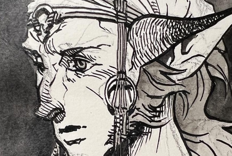
you use it for drawing. Here are some more images
I find very inspirational. I loved the different ways that different artists have
found of using the pen, bringing their own
personal touch to it. Know this whole
texture is strongly contrasted with
leaving whitespaces. How using broken line can give you a really airy
and a thrill look, or how using a bolt and low stroke can give an
image a lot of energy. I've tried all the
different inking tools, pens, and brushes, but I found that
for me the dip pen is just the most
satisfying tool, there is. I love giving a drawing, energy, and movement using line
and I find controlling the strokes with the dip
pen is just self-rewarding. I've also found that
working with ink, as it's a permanent medium, has really allowed me to let go of that need to be perfect. Accept that mistakes happen, and move on from them. I hope I was able to give you some really fun
ideas then you're so excited to get
started drawing. Remember to think about
what approaches resonate with you and don't be
afraid to experiment. There's no right or wrong
way to use the pen. In the next lesson, I'll introduce you to the
different pen nibs.
4. My Favorite Pen Nibs: In this lesson, I'll introduce
you to different tips available and give you recommendations that will
help you get started. There are so many
different kinds of nibs, but most of them are geared
towards calligraphy. When you're looking for
something to use for drawing, ideally, you want something that responds to your pen pressure. That means when you press down, it will actually split open a little bit and
make a figure-line. I find the softer
tips feel a bit harder to control especially
as you're getting started. But you can make such
fun varied lines with them and really
interesting textures. The harder tips
do feel easier to control and it is
easier to make long, smooth lines with them. The different nibs have really
different drawing feels. It can be really personal but actually feels good to
you when you're drawing. It's really good to try out different fonts and
experiment with them. Personally, I usually
like changing out my nibs just for a change of pace and
to make things interesting. Here are my favorite nibs. This is the Nikko G-Nib. It's a Japanese nib and it's pretty commonly used
when drawing manga. I find it pretty stiff
and easy to control, but you can still get some strong lines and
line variation out of it. If I was to describe
it in adjectives, I'd say it's strong
and decisive. This here is the Saji-nib. It's another Japanese nib that's pretty popular in manga, usually in a more girly style. If you see lots of fine
lines and flowing hair, that would be probably something
made with the Saji tip. It's really easy to make
controlled long lines with it. So if you're into
drawing flowing hair, these might be the tip for you. I think this is a tip I most prefer as far as for
drawing feeling goes. It just feels amazing
to draw with for me. There is one really
annoying downside though, is that it seems to
wear out really fast. After I've done one really
detailed drawing with it, I can already feel
that it isn't as accurate as it was when it
was new from the package. This is the Maru tip. It's the last Japanese
tip I'll show you. It's purely amazing
for fine lines. I couldn't do them
with any other tip. I tried a lot of fine liners, but I just can't get over the
feeling the Maru tip has. I wouldn't necessarily use
it for a full drawing. What is really amazing as far as those fine details and
fine shading goes. This here is the Blue Pumpkin. I find the name
to be really fun, but so is the nib. It's very soft so it's really easy to make line
variations with it, but I had a lot of trouble controlling it when I
was getting started. If you're in the
natural texture though, and just variation in general, it should be pretty
amazing to draw with. I don't usually make
really long lines with it. I find it is best when
you're working with shorter textual lines and looking for that line
variation in all your lines. This is the Dessin Arrow. It's another drawing tip
that's very popular. But I don't really
seem to use it as often as I use my other tips. It's pretty similar to the Saji tip and
makes a fine line. It's harder to make long
lines with it than with the Saji though as it's
such a smaller tip. It is very easy to get
line variation though, so I'm sure there is
an audience for it. I find the Japanese tips
easiest to control. But in general, the others make really interesting
textures on line. You'll find some nibs
just feel like they respond to your hand
more than others. It's really fun to try
out different ones. I know it can be a
little difficult to see the differences
these nibs have with my drawing but that
actually comes down to the fact that I now have
pretty good pen control. I can make most of them
do what I want them to do but with some of them, it's harder than with others. I usually pick the nib I use based on the drawing
I'm going to do. As mostly I'm doing fine lines I used the nibs
that are easier to control. But sometimes I just
really feel like drawing a texture and then
I'll use softer tip. You definitely don't
need to go out and buy a ton of nibs
to get started though. I recommend the G-Nib for beginners as it's
pretty easy to control, but you can still get a lot of variable effects out of it. Once you feel more
comfortable with a pen, you can venture out and try
out other different ones. In case you want to
go back and check, I have a list of all the nibs I listed in the course resources. In the next lesson, I'll go over the rest
of the materials you need including
picking the right paper.
5. Other Materials: In this lesson, I'll go over the materials you need
in addition to the pen. First off, we need ink. Anything you have
on hand will do, but make sure you take a few
things into consideration. Non-waterproof ink is easier to clean up
from your pen tip, and if you're pouring
it on your backpack, you can at least
get some of it out. Ask me how I know. If you want to use
watercolor or ink washes, you want to be using
waterproof ink. You need to be really careful with cleaning up
when you're using it though, as it will harden on your
pen tip really fast. If you happen to pour
it on your laptop, it might be a tad
harder to clean it up. You can get some of it off with the white
solvents though. Ask me how I know. I really loved working
with colored ink as well, and if that's your thing, there's plenty of
shades available. Personally, I use
waterproof ink. I always have the option to add watercolor or ink washes
on top of the drawing. Now, let's talk about
choosing your paper. The nips are actually
pretty sharp. If your paper has
a rough texture, they will cut on it. These can lead to uneven lines and unfortunate ink splatters. On the other hand, if your
paper is as smooth as glass, it can feel like it's really
hard to control the pen at all as there's nothing to
stop it from slipping around. Also, it takes
longer for the ink to dry on the smooth paper, so its a lot easier to
accidentally make a mess. Personally, I really
love drawing on mixed media papers that have
just a slight tooth to them. I felt like they gave me the best control when
I was starting out. As time has gone by, I feel like I've gained
better control of the pen on rougher and
smoother surfaces as well. Now, I prefer to work on
smooth illustration board or hot press watercolor paper if I plan on adding
a lot of water. I wouldn't really
recommend using anything that weighs less than
200 grams per meter. You can doodle on printed paper, but you will start
working your way through the paper
if you add layers, and it will warp
just from the ink. Other materials you need are a water jar and blotting paper. I prefer to dip my nip in
water right after I finish using it to prevent the waterproof ink from
drying on the nip. Then I wipe it clean
with blotting paper. It's really important to
have that paper close at hand in case you
make a spill too. The faster you can clean
it up, the better. As far as drawing supplies go, I use a small brush for
adding spot blacks if I need them as that's a lot faster to do with the brush
than with the dip pen. White ink or paint is nice for fixing mistakes and adding
highlights as needed. Personally, I recommend
the copic opaque white, but you can also use acrylic
white or white gouache. The most important thing
you need is something to keep your ink bottle
from tipping over. This is important. It took me three major spills before I constructed an ink
bottle holder for myself. I recommend you do it right now and not after
you make a mess. I can tell you from experience, it's really not fun to
clean up waterproof ink. You can make a
bottle holder pretty easily just from scrap
cardboard like mine, or you can cut a hole
in fabric and put it over your ink bottle and
target on your work surface, like the old books suggest. I have a list of the
drawing supplies I use in the resources. You can check it out, if
you want to have a look. You can get started using something that
you happen to have on hand or that's easier
for you to find locally. Remember the experiment to find out the supplies you like using, and remember to set out your cleaning supplies
before you start drawing. In the next lesson, I'll show you how to draw
with the dip pen.
6. How to Draw with the Dip Pen: In this lesson, I'll show you how to
draw with the dip pen. We'll go over how
to hold the pen, how to dip it in ink, and the correct arm movement
to get smooth strokes. Now, before we start, there's one thing we
need to do first, if your nib is new, it needs to be cleaned
off the factory code, otherwise, ink won't
flow from it properly. You can do this by
using the soap and warm water and rubbing gently, or if you're feeling quirky, you can stick it into a
potato and wait 15 minutes. Yes, this works too. Now, let's dip the pen in ink. You need to be careful not to overload your nib, otherwise, you can easily get droplets and puddles of ink everywhere
while you draw. The amount of ink that
feels right to me is about halfway to the
little hole on your nib. Wipe off the extra
drop at the end of the nib on the lip
of the bottle and test that you're getting a good smooth line before you put the pen on
the actual paper. Now, it's time to start drawing. I have practice sheets for
you to help you get started, download them from
the class resources and get your pen ready. The practice sheet
we'll be looking at for this lesson is the pen
control practice sheet. First, let's look at
how you hold the pen. When you're drawing
with a regular ink pen, you can pretty much hold
it at any angle you want and draw in any direction, with a dip pen, however, it's crucial you get
the angle right. You need to be holding
the pen like this and drawing by pulling
the pen towards you. You will never be pushing
the sharp point of the tip away from
yourself into the paper. Your arm needs to be properly supported at all times
and you need to be moving from the wrist for
smaller strokes and from your elbow to get
longer, smooth strokes. Try it out. Practice
drawing from your elbow to get
long even lines. You can't change the position of your arm while
in the middle of a stroke because the
ink needs to keep flowing at an even
pace from your nib. Otherwise, your lines will end up with uneven spots in them. If you can't do the line you want within your
range of motion, you need to execute it in
several smaller lines. This can make drawing
curved shapes especially tricky and can take
a bit of practice. The solution is to break the shapes into several
smaller lines like this. Once you get really precise with starting and
stopping your stroke, you can make the lines look
like one continuous line. If you find connecting the
lines accurately difficult, you can also leave a little
gap in-between your lines, that often looks
actually really good. I really recommend you'll
practice drawing curved lines and especially circles to
get the hang of this idea. As the right motion the
dip pen is capable of is so much more limited
than other ink pens. You need to plan
out your strokes. You need to know the
start point and end point of each of them before
you put the pen on paper. Otherwise, you won't be
able to get smooth lines. Don't try to mix strokes that aren't within
your range of motion. You get variances to your line thickness by
putting pressure on your pen. This will look
different depending on what you happen to be using. On the hole, it's good
to keep your pace even. The speed which you use
to move your pen actually affects how much ink has time to flow from the tip of
the pen to your paper. You can actually
move faster to get lighter strokes and
when you move slower, you get the thicker ones. If you want to give your stroke a nice tail that can smooth out, you can do a fast
flicking movement at the end of your stroke. Now, you might think that
this sounds a lot more involved than drawing with other ink pens, and
you'd be right. There's actually a lot
of stuff you need to take into account when you're
drawing with the dip pen. I've actually found though, that having to plan each
stroke before I put the pen on paper ends up with me making more interesting
and mindful lines. To recap, it takes a bit of adjustment to get used to
drawing with a dip pen. Fill out the practice sheet, and get comfortable
with the pen. Don't get discouraged. If it doesn't feel natural, run away, It took me a long time to get used to
drawing with a pen as well. Focus on imagining each
stroke before you draw it. In the next lesson, I'll go over some issues I had when I was learning
to use the dip pen and what was causing them.
7. Common Issues and How to Avoid Them: In this lesson, I'll go
over some things that gave me a trouble when I was
learning to use the dip pens. Really, some of these issues gave me
so much frustration, I really hope I can save
you from experiencing it. Issue number one, shaky lines. It can be so frustrating when your lines just don't do
what you want them to do. You do, of course, just get better with
practice but there are a few things you can do
to help things along. It's a lot harder to make a
smooth line if you're going too slow, so try speeding
up just a little. Double-check to see if your arm actually has good
support and make sure you're not
trying to do a stroke that's longer than your
arm position allows for. Another thing that's
never good for your line quality is
having shaky hands. Some people just have
shakier hands than others, but you should check if you're maybe having too much caffeine and
getting too little sleep. That's probably most
of us, to be honest. Issue number two, ink
drops everywhere. Now, drawing with ink
is naturally messy, but it's not exactly fun when the mess is literally
everywhere. Here are the common causes. Having too much ink in your nip. When there's too much ink, even the slightest movement or a jarring motion can
shake some droplets off. Your nip getting caught in
rough paper and jerking. Now, even if you
have the correct amount of ink in your nip, it's still ink and can be shaken loose if you make a
movement that's sudden enough. Getting suddenly caught on paper texture will
certainly do it. Avoid other sudden changes
of direction as well, otherwise, there
will be splatters. Try to keep an even pace. Issue number three, smudging. I'm sure this is a thing
everyone is familiar with. I still occasionally smudge my lines and feel really
stupid afterwards. You can try putting
a paper under your hand but I've found it just makes
the mess worse for me. The usual advice
is to start from the left and move to the
right if you're right-handed, but I've found I can't really
work on a drawing that way. I like to give
myself room to make changes to my
drawing so I usually start from the most
important part and work from foreground
to background. What I've ended up doing to
avoid smudging is to keep mental track of
all my lines that are wet and avoid touching them. Of course, it can be pretty
hard, so when I do lose track, I take a break and
let the drawing dry out. It might help to work on
several drawings at once, as then you can put one
aside and work on the other without feeling
like you're losing time. Or you can do some pen control
exercises while you wait. Issue number four, pen seems to be
leaking ink and you can't seem to get
good lines out of it. It can feel like the
pen keeps making puddles of ink
while you draw with it even when you make sure you don't have too
much ink on your nip. You can't seem to get sharp lines and when
you apply pressure, you just get a puddle of ink
and drawing feels terrible. This happens when your
nip has gone bad. They don't last forever and once they get a
little bent out of shape, it gets pretty hard
to draw with them. I noticed that Japanese nips seem to suffer from this more, that's probably why they're
sold in multi-packs. Don't worry though,
you can prolong the life of your nip and
bend it back into shape. Press the nip from both sides so that the tips just
cross each other, dip the pen in ink, and try it out. If your lines still
don't feel good, bend it some more. Eventually, though, you will
need to replace your nip. It seems like the
harder the nip is, the easier it gets
bent out of shape. To recap, drawing
with ink is messy, you can't really prevent
each spill and mistake. If you run into problems though, check back to this video
and see if you can find a way to diagnose
and fix your issue. In the next lesson,
I'll show you how to hide your mistakes
when they do happen.
8. How to Fix Mistakes: In this lesson, we'll
be fixing mistakes. Now, you might think
that eventually, when you're really good, you
will stop making mistakes. That might happen. But I certainly haven't
reached that point myself. I make mistakes all the time, so I get a lot of
practice fixing them. The first one is easy. You've made a mistake. You will feel terrible. You want to fix it right now. Let's look at the issue. Sure, it's looking pretty bad. You can see it clearly, but is it actually going to be visible once your
drawing is done? You've added all your
shading and all your color. You'd be surprised how
even bigger stuff can completely disappear when
you just add stuff on top, even if you're not trying
to actively cover it. Now, even if it is visible, once everything is complete, there's no reason
to actually use extra cover-up when
it's not needed. If you plan on covering
it with white, it's better to wait when
you can actually accurately assess how much white you are
going to need to cover it. You can't actually draw on
top of the white covering. It's a lot safer
to do that last. Otherwise, you
might find yourself in a situation where
you're changing your mind on line white or something and then you can't
actually fix it anymore. Let's move on to using white
to cover up your mistake. I'm using Copic Opaque White. But you can use white gouache or white acrylic paint as well. Now, find a fine brush and only cover up the area that
actually needs covering. Remember to check if
your cover-up needs another layer after
it's dried up. This technique works
best when the area you are trying to cover
is relatively small. If you had a big ink spill, consider some of the others. Remember, you won't
be able to draw on top of the white
once it's in. Third option, cover
it with black. Plan a new shadow or a dark part of the drawing
around your mistake. This is especially good
for bigger messes, or if you're realized you've made a really big
drawing mistake. Look at your drawing and think, could this really all be shadow? I find this to be a really
fun creative exercise too. Sometimes it completely
forces you to remake your drawing and the results can be so unexpected
and exciting. Just let go of the
expectation of what you're drawing was meant to be
and go with the flow. Number 4, pretending it was what you meant
to do all along. This is what I do
almost every time I happen to get accidental
splatters on my drawing. On this drawing, I
spilled some ink onto the trees and decided I really wanted to draw
some apples there anyway. Here, I got some ink
on the girl's hair, and thought, why not and
drew some leaf shapes there. On this one, I
splattered some on the moon and thought it
actually looked pretty cool. I just added some more. See if you can think of something that the
mistake could turn into. Don't get too hung up
on your original plan. One of something can
look accidental, so add more of the same. Even smudges can be a stylistic choice if you
really get into them. Make it look like you
meant to do it all along. Now, sometimes nothing works and the drawing
really is ruined. Then what's left
to do is scrap it, burn it in a fire,
and move along. When things just
go wrong and you try to salvage them but it
all looks terrible anyway, I suggest sleeping on it before making the
final decision. But once in a while, you would just need to scrap
something and start over. If things just keep feeling
terrible when you are drawing, it might
be time to let go. To recap. You can't
actually avoid mistakes. They happen to everyone. Try and not get too bent
out of shape when they do. If it looks like things
are ruined anyway, try and see it as an
opportunity to experiment with some creative techniques
to try and hide it. Then if it's terrible anyway, just toss it and start again. In the next lesson,
I'll show you how to build form and
value with lime.
9. Form and Value with Line: In this lesson,
I'll show you how to build form and
value with line. I think line is amazing. There are just so
many ways to use it. You have endless
possibilities of being creative and expressive
with line work. You can use it to
create movement, play with textures
and mark-making, and show your personal touch. We need to get started
with the basics though. Let's look at how to
show form with line. Here's a circle. If we draw straight
lines across it, it becomes a circle with lines. If however, we draw lines that follow a
three-dimensional form, it suddenly becomes a ball. Notice, you can
draw these lines in different directions
or add texture, but as long as you follow the form of the object
you are drawing, you will communicate each shape. You don't need to
add any kind of shading to your drawing
for this to work. The form of the object will be easy to understand
just from the line. Now, let's try building
value with line. You can't achieve
the same kind of subtlety with ink
lines as with pencils, so I find it's
good to start with a very clear idea of the different values
I'm looking to express. I'm breaking the shadow
down into the light area, the terminus, which is where
light turns into shadow, and the core shadow. The core shadow is
getting hit by bouncing environmental light from
the primary light source, so the terminus, ends up being the darkest
area of the shadow. Usually, it's enough to
nail these three areas. They give the viewer a good
sense of the lighting. Using lines that
are the same width, you can verite perceived
value by drawing the lines closer together
or further apart. For lighter parts
or for highlights, you can use breaks in the line. I like doing my shading with lines all going in
the same direction. But you can also add hatching going in different directions
to build up value. Your lines don't need to be
neat and straight either. They can describe texture as well as show light and shadow. Just remember to keep
following the form with your shading so your drawing
doesn't start feeling flat. When you're adding
large areas of dark tones in bigger
illustrations, they can sometimes just be textures or a
patchwork of lines. Just remember, you need to have a clear idea on how
you plan to build your values as you can't really change your mind in the middle
of an ink illustration. To recap, there's so much room to be really
expressive with line. There's no right
or wrong approach. Download the practice sheets
and try it out for yourself. Practice wrapping
your line around forms and building values and textures in whatever way feels interesting
and fun to you. In the next lesson, I'll show you how to plan out a drawing.
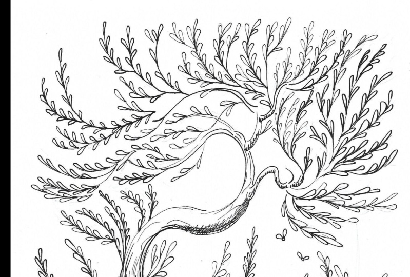
10. Planning an Ink Drawing: In this lesson, I'll show you how to plan
out your drawing. I decided I really wanted to
draw a tree for this class. I started by digging out my sketchbook and
drawing some trees. Now, I'm going to
show you the steps I go through when
I plan a drawing. The first thing you need to do is to place your
subject on a page. It's important to understand how your drawing will actually
appear on a page, so I drew some boxes
around my trees to see how the placement of the elements would
actually work out. I was pretty pleased
with the general idea, but to make sure I was getting
the impression I wanted, I made a few variations. It's important to know what
your drawing is about. In my drawing, I
decided my focus was going to be the beautiful
texture of the tree trunk. The rest of the elements
are really going to be more supporting actors
than anything else. The most crucial
thing you need to consider when you're doing
a drawing like this, in black and white, is having
clear value structure. Think of the shapes
you have and make sure they are actually
easy to read. You can't make everything
a similar gray. The goal here is
to make a drawing that's easy to
understand at a glance. The different forms and
masses need to be given a value structure that helps
to differentiate them. Think big rather than small, and group things together to create a stronger impression. The more detail you have
going on in your drawing, the more important it is to have the underlying value
structure be simple enough. Otherwise, the impact of your drawing will just
get lost in the noise. Make sure you're contrasting light forms against dark forms, and vice versa for clarity. Think of how your drawing
would look at a distance. You're trying to avoid it
appearing like a gray blob. Remember, wherever you have the most
contrast and detail, that will be the focal
point of your drawing. It's good to remember you can't actually emphasize
everything in a drawing. You need to pick your
poison and stick with it. Even though the drawing I'm
planning is from imagination, you'd go through a similar
planning process when drawing from a live model or
from a reference photo. You need to understand the basic building
blocks you're working with before you
dive into detail. To recap, make sure you have a plan before
you start drawing. It'll make the whole
process a lot smoother. Even if you're drawing
from reference, remember, there will
be no way to erase. In the next lesson, we'll be drawing our
illustration with ink.
11. Drawing Demonstration: Nature Scene: In this lesson, we'll be drawing our illustration with
dip pen and ink. Now, we're going to pull
from all the stuff we talked about before and ink
a full illustration. You'll find the drawing I'm inking in the class resource, or you can use
drawing of your own. I like doing my drawings
in colored pencil, as I like a bit of color peeking out behind
the line work. I like feel it gives
to work a bit of life. If you print out mine, you can use either the color
or the gray scale version. I'll be drawing
with the G-tip with waterproof black ink on
Fabriano mixed media paper. As you can see, my
drawing is pretty loose as I don't want to get stuck following the
lines too closely. I think focusing on
copying instead of drawing your lines results in a very
lifeless and dull drawing. I can't get myself to unstiff
if I just try to copy. I want you to use drawing
as a starting point and experiment with the way you want to draw shapes and use line. The organic subject
matter leaves a lot of room for self-expression
and experimentation. You don't have to
aim for realism, focus on being creative and
going your own way instead. I start my drawing
by first loosely outlining the tree trunk
and then going on, off to the branches since I want to define the
basic shapes first. I try to focus on getting interesting shapes and
a good silhouette. I don't accidentally want
to go too dark anywhere, so at the start of the drawing, I'm trying to stay pretty light. As I told you, I'm not really
following the drawing, I'm just trying to make
interesting looking lines. I love doing all
the organic shapes, so this is a great
illustration project for me. Like we talked about in
the common issues lesson, a lot of people try
to avoid smudging the ink by drawing
from left to right. But as that's never
really worked out for me, I'm just trying to focus
on dodging my wet lines. That can be pretty
challenging at times. Generally, I work by first defining the big
foreground shapes, and then moving towards
the background. Working this way, you
need to be really careful not to place your hand on
top of the wet ink lines. If you forget which of your lines are wet
and which are dry, it's time to take a little
break and let things dry out. You can see how I'm holding my arm very steady
and supported at all times to make sure I'm in a steady position
to draw smooth lines. My elbow never leaves the table. I know where I'll start and stop each line
before I draw them. I really want all of my lines to be interesting
and expressive, so I do whatever feels right to me in the moment
when I'm drawing. You can also see me sometimes stop and test out the stroke, I plan to draw in the air before putting the pen on paper. Remember, you can always
break a long line into several smaller strokes
if it's hard to execute the line in
one smooth motion. I can see I didn't actually draw one long outline for
the tree trunk at all. Instead, what I did was draw lots of smaller
strokes that followed the grain
of the wood and created the illusion of
one continuous line. I'm concentrating on wrapping
my lines around the form of the tree trunk just like we
practiced with the circles. I'm starting to build up the
texture of the tree bark, but I'm making sure it won't be a uniform value all
over the trunk. The texture of an
object is always most visible along the
line where light and shadow meet as different bits of the texture cuts the light and other bits catch the shadow. That makes it really
easy to see the texture. I'm making sure I concentrate my textual detail of the
tree trunk in that area. As we discussed in
the planning stage, the focal points in
a drawing always end up being the areas of biggest contrast where extreme
light meets extreme dark. Here in my drawing, the area of interest
is the tree trunk. You can see how I'm using the whole value range to
describe the texture of the bark while I'm using much more muted value scales on the other areas
of the drawing. It's also the area where I'm concentrating most
of my fine detail. I want to make sure I'm guiding the viewer through
the whole drawing, so I'm also focusing on creating
a strong sense of flow. I visualize this as an arc that spans across
the whole drawing. Here, the base of the arc is
the trunk of the tree and I use all the other forms to
support the flow it creates. Nature can be pretty
chaotic in real life. I find it interesting to give
it an underlying structure. Now that the basic shapes
have been defined, I start building up my values. It always ends up taking me by surprise how long that actually
takes with pen and ink. If you really want to
do a fast drawing, don't do a dark one. This ended up not being a fast
drawing, let me tell you. Now, you can obviously
help differentiate between things by making them lighter
or darker than each other. But another way to do
that is to give them different textures and
different amounts of detail. As the leaves here aren't
really the focal point, I've given them all pretty
uniform flat texture and basically no detail. As a rule of thumb, it's really good to avoid
things being too equal. You will get a much more
dynamic and interesting drawing when you make contrasting
areas to have tension. So either, make a
drawing that is predominantly light or dark, contrast lots of long lines
to small areas of short ones or concentrate the detail in the work in a specific
spot of the drawing, like I'm doing with
the tree trunk. I'm also leaving the
background plank white so that it has maximum contrast to my
other areas of interest. Remember to keep looking for
what your drawing needs and checking that
everything seems to be working out like
you envisioned it. If you happen to
make any mistakes, refer back to the
fixing mistakes lesson. I always somewhat end up
changing my plans while I'm drawing even if I made a lot
of thumbnails beforehand. It's just different actually
building up the values and working in the large scale than looking at a
small thumbnail. Sometimes, I end up going completely back to the
drawing board if I feel like the composition just
isn't quite working and make more studies before
returning to the drawing. I did end up having a
bit of difficulty with the bottom part of this drawing with all the leaves in it. I think I probably
should have done a more detailed study before
diving into the ink drawing. I think with a second pass, I could have given it a more
dynamic, interesting shape. Now, if you end up wanting to
have a pretty dark drawing and don't actually want to spend ages hatching those dark areas, nobody's actually forcing you. You can also mix the dip
pen work with ink washes or just plain use a brush
for larger areas of black. I could have probably
saved myself quite a bit of time with
this drawing if I just decided I actually
wanted some areas to be completely black
at the beginning. On the other hand, sometimes it's just really
hard to know that before you actually get
pretty deep into the drawing. If you do end up wanting to use a brush to add black spots, I really recommend
you do that only after doing your
initial drawing. I notice if I start adding the blacks with the
brush too soon, I can easily go
overboard with it and then the whole thing just
ends up being too dark. As you know, the one
thing that's really hard to do with ink is to erase. If you know some areas are going to be on
the darker side, you can also save
quite a bit of time by just laying out
an initial wash that isn't actually too
dark and then just continuing to build your
line work on top of that. I actually like doing
that quite a bit. I noticed I really
do like to use some line work even if I lay down that initial shadow wash, I just really like the look of textured shadows that
come from using the pen. I think it nicely simulate the effect of shadows
in real life. Everything goes a
bit mushy and detail just gets lost in the noise. So I prefer doing very
textural shadows with barely defined edges inside the shadow masses and using clear line work
in my lighter areas. I'm also using line to build distance and a sense
of space in the image. I make sure to define
the edges that are on the top of the background
shapes very clearly and let the background
shapes disappear behind them by using lighter
tone and less detail. In general, I look to use stronger lines in the
foreground and lighter, more problem lines
in the distance. I also blend things in
the larger masses and omit detail in general as
the distance increases, though that might not be as visible in this
particular drawing. Now remember, if
you start feeling anxious or impatient
during the inking process, it's time to take a break. I noticed whenever I
get that itchy feeling, I need to listen
to myself or I end up making a mistake
almost right away. The whole process
requires a lot of concentration and sometimes
it just runs out. Take a break and return after you've charged
your batteries. When I feel like my drawing is starting to near completion, I take final stock. The things I check out are; are the edges working out, are they actually clear in
what they are describing, do they make the
image easy to read, and are they tidy? Are there some edges depth
aren't supposed to be there? Do they all have a meaning? Does the value structure work? Are there some values somewhere that don't really seem to fit? Do I need to darken something since I can't
really go lighter? Are all the shapes easy to read? Sometimes, it's hard to decide if a drawing
is really complete. If that happens, I usually sleep on it and return the next day. If you feel like you
aren't quite happy with your drawing or you just can't
place your finger on it, you don't really know why, please take a break
because that's usually when you end
up adding a little bit of everything in there
and totally overworking the whole thing and really
regretting it later. To recap, there are so many things you need to keep in mind while
you are drawing, that it can feel a little
bit overwhelming at first. But don't worry, it will
get better with practice. It took me a long time
to feel like I was in control of the dip pen and
I still make mistakes. Just take a break if
you start feeling impatient and keep
a steady pace. I hope you guys had a lot
of fun drawing with me.
12. Final Thoughts: We've made it guys, I really hope you
enjoyed the class. Now you have all the
tools you need to get started drawing with
dip pens and ink. Remember, there's lots of different approaches
to doing line work. Don't be afraid of going out
and discovering your own. I really hope I've given you
the tools and courage you need to find out the way you
want to use the dip pen. It was so fun drawing
together with you guys. Remember to upload your class
project so everyone can see the results of your hard
work and while you're at it, have a look at what
everyone else is doing. It's so inspiring
to connect with people who are working on
the same thing as you are. I can't wait to see what
you guys come up with and I'll definitely be
commenting on all your projects. If you post on Instagram, remember to tag your work
so I'll be able to find it. I'd love to create more
classes in the future, so it would be wonderful to hear what you guys
thought of this one. Please leave a review, let me know what you think. Bye guys, I hope
to see you soon. [MUSIC]
 Jaana Heiska, Illustrator