Transcripts
1. Introduction: [MUSIC] Surrounding
yourself with things you love can be
such a powerful thing. I think plants just make
your home feel like a home and drawing them
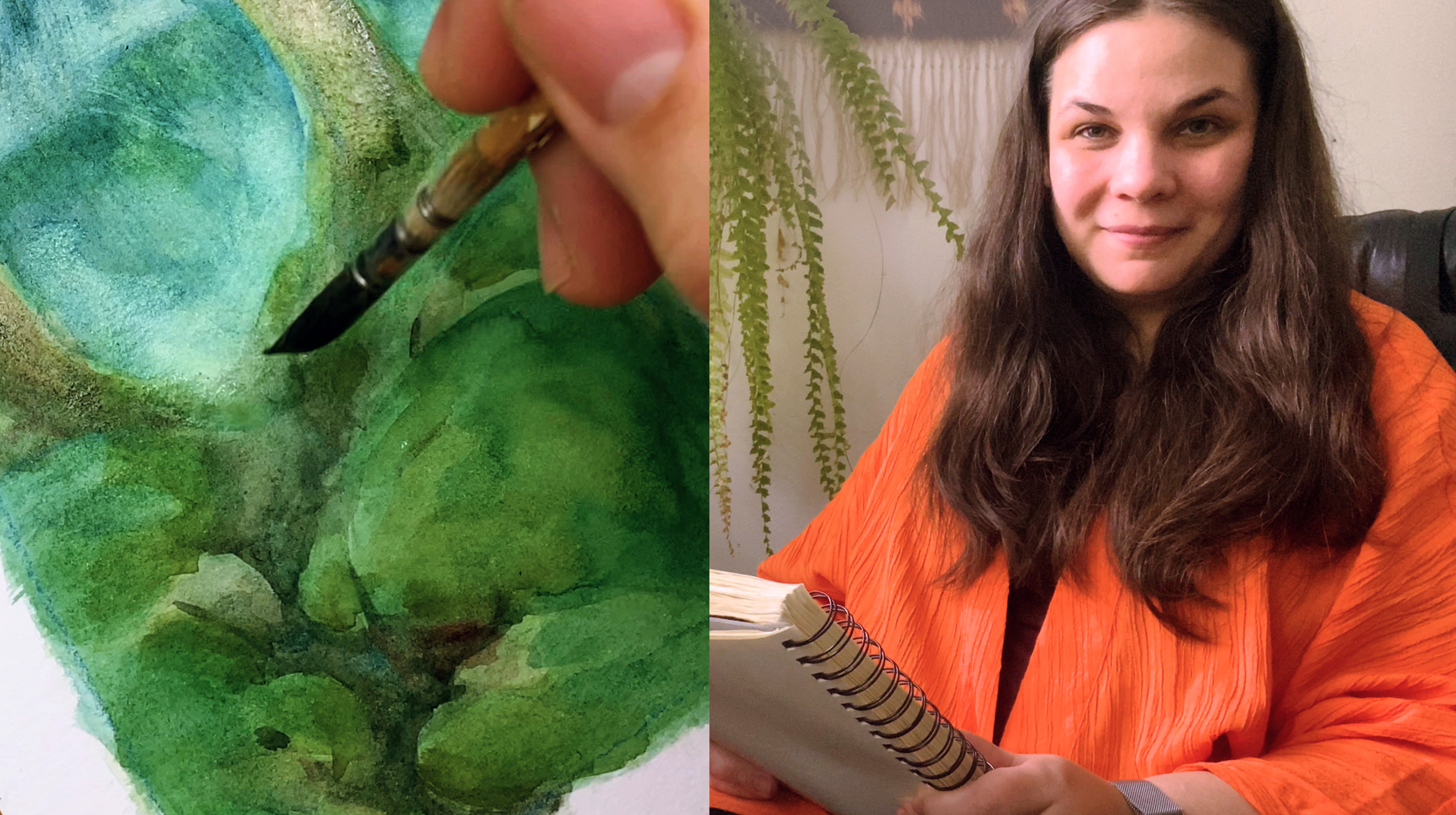
can be so rewarding. [MUSIC] Hi, my name is Yana. I'm an artist and illustrator
based in Finland. I love creating art inspired
by fairytales and folklore. Creating something that
feels like a dream and transports you
to other world's. I've worked on a wide array
of commercial projects, doing game art,
and illustration. But my personal expression has always been really
important to me. I've taken a lot of time honing that personal voice and building my own
independent body of work. You can take it over on
Instagram if you want to. Plants have always being
close to my heart. As a kid, I loved having
my own plants so much. Even back then, I just didn't understand
how someone would not want to live
surrounded by greenery. But it took me such a long time to learn how excellent
I want to draw them. I used to look up pictures of stylized plants and
wonder how that happened. I spent a lot of time analyzing those pictures and
trying to draw my own. Now, I really want to
share that process with you so you can have
an easier time. This class is a fun
introduction to lose ink and watercolor technique and
the basics of style. It's great for beginners, because all the techniques
used are really simple, you don't need to draw
realistically at all. The whole point of the class
is having fun and stylizing. I'll be covering my
approach to inking. How to use what I've made, their variety, and how
to balance detail. I'll go through all the basic watercolor techniques I'm using, and then I'm going to
show you how I apply them when I'm coloring
my final drawing. In addition, I'll be
talking about making stylistic choices and finding your own personal voice and
expression through them. This class is for anyone
who loves plants and would just like to have fun
exploring style with me. I'll share all my tips
and tricks to save you time and frustration
along the way. Being able to draw plants
with you makes me so happy. I really hope you're going to enjoy drawing and
painting with me.
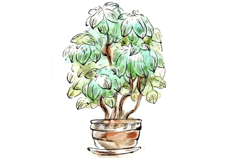
2. Class Orientation: Hi, guys. So happy
to have you here. Today, we are going
to be drawing a stylist portrait
of a house plant. I love taking the time to appreciate the objects I
have around me every day. I think it's a wonderful way of being mindful and
living in the moment. Drawing something you love is such a great
way of getting to know it better and learning
to appreciate it even more. You don't have to be an
accomplished artist to do this. The drawing can be as simple or complex as you want it to be. The key is to know
what you love about an object and emphasizing
those qualities. What you're going to
need for this class is some waterproof
ink or ink pens, some watercolor paper that's
big enough so that it won't run all over the
place, and some watercolors. I'll introduce you
to the materials I'm going to be using if you
want to look them up. But really, anything you have in hand is probably
going to be fine. We'll talk about some
different ways of stylizing, which details you leave in, which details you leave out, how you feel about the
subject you are stylizing. You really get the best
results when you lean into what feels right to
you when you're drawing. We are going to be
doing warm-up sketches and some experimentation
just to loosen up. Get to know our subject matter. Have some fun. After we are done
with the sketches, we're going to
look through them, pick the ones that feel
really good to us, choose one to make
a final drawing, then we'll ink it. I'll walk you through my
thought process and give you some tips on making
effective lines. Finally, we'll add some color with loose watercolor washes. Plant portraits are
relatively fast to do. If it goes wrong, you
can just do another one. You shouldn't be afraid
of making bad drawings. That's just part of the process. I make lots of bad drawings, I make terrible,
terrible drawings. But it doesn't matter because to actually
get to a good drawing, you have to feel
free to experiment. Sometimes it's just a
process of elimination. If you'd be going at it, you will find the stuff you like. The goal of this
class is to loosen up and find the freedom
to express yourself. You can adapt the
tools you gain here to any subject matter you want
to draw in the future. Download the class resource
and let's get started.
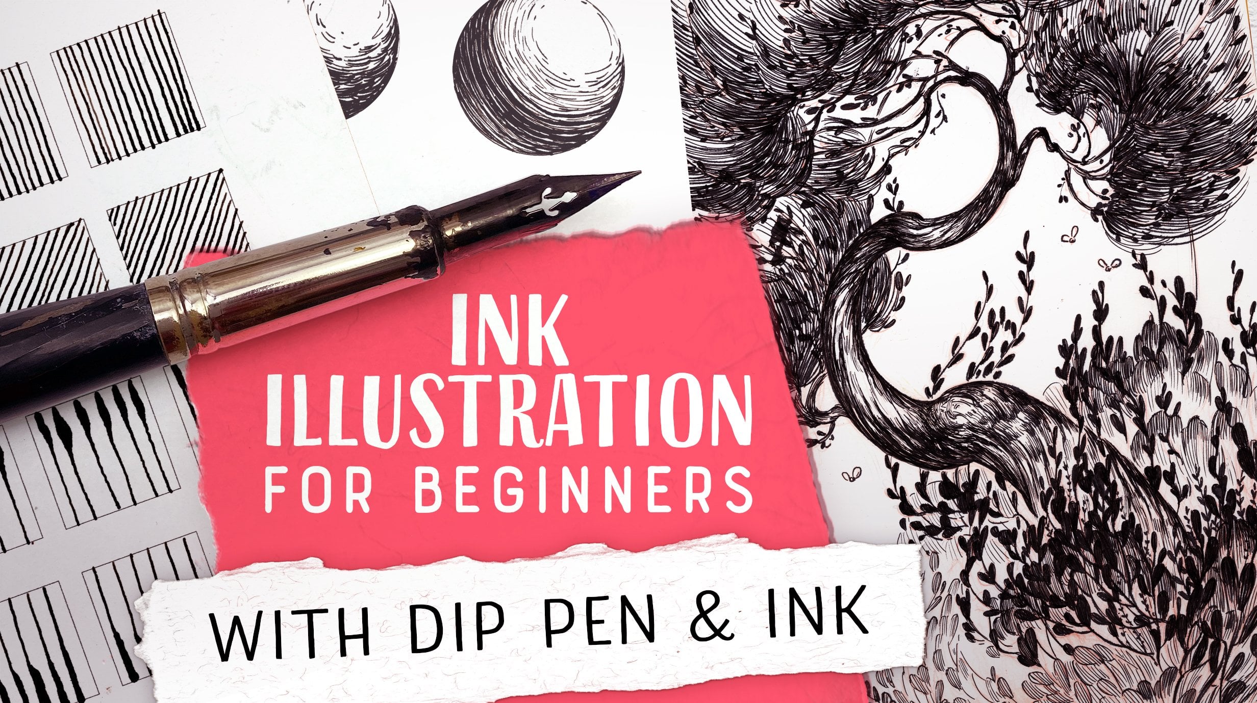
3. Materials: In this lesson, I'll cover
the materials you need and the materials I will be using while I'm
doing my drawing. First off, you're going to need a sketch book and a
pencil or colored pencil. That's what I usually use
for the final drawing. The key thing is to have
something with waterproof ink. Personally, I like
using a deep pen, but really you can use
any waterproof pen you happen to have on-hand as long as you like
working with it. Here I have some
Copic and Macron waterproof pens I've
liked using in the past. I really like using
the deep pens myself because they give me a variable line and a nice organic quality
to the drawing. The tip I chose to use for this project is called
the blue pumpkin. I thought it was perfect
for drawing plants as it's so easy to make
interesting marks with it. Really though, if you haven't
used deep pens before, it might be easier to
start with a regular pen. It takes a bit of trial and
error to learn to control the deep pen or you
can use a brush. I don't actually know how
to ink with the brush but some people do
and it looks great. In theory you can draw
on printer paper, but it certainly
won't be able to take vertical or
without warping. Here I have two kinds
of paper I usually use. This is Arches hot
press watercolor paper weighing 300 grams. But when I just want
to play around, using really nice paper can
make me really freeze up. So I end up using this Fabriano
mixed media paper a lot. If you're like me,
pick the materials, you can have fun with. Both of these papers
are really smooth, so they're really
easy to draw on. You can certainly use cold press watercolor paper
if that's your thing. But for me, I prefer
drawing on hot press, especially with the deep
pen because the nip easily catches some texture and regular pens are a
bit more forgiving. As far as watercolor goes, just use whatever
you have on hand. Personally, I'm using
[inaudible] watercolors. Guess I think
they're pretty good and it's easy to get my
hands on them over here. The key really is that you're able to mix pretty deep colors. Otherwise, you're going
to have a hard time getting fun watercolor
effects out of them. Other things you're
going to need are some watercolor brushes, some clean water, some bloating paper, because you're just going
to make a mess anyway. The point be, use whatever materials you
happen to have on hand, are easily accessible, or something you really
want to experiment with. Just make sure the
ink you're using is actually waterproof before you start making
your final drawing. Now that we've covered all the materials
you're going to need, let's talk about how
to stylize something.
4. How to Stylize: Hi, guys. The goal
of this lesson is to talk about how
to stylize anything. Let's talk about style. Obviously, it's a pretty
popular subject matter. There's tons and tons of material out there telling
you how you're going to find your own style and probably the process isn't really the same for
any two people. Just is nobody really
has an identical style. It's almost like a fingerprint. But how do you actually
choose what to draw and how to
deviate from realism? When I started out, I wanted to draw really
realistic pictures. Pictures that look exactly
like the subject matter. Not necessarily because I
just loved realism so much, I just couldn't really understand how to actually
stylize something. How do you judge
if you succeeded? You have to go and
make your own goal. How do you do that? I really loved stylized
pictures though. It just felt like they
had more feeling in them. I just had no idea how
you actually move from something realistic to
something that's just not. Obviously, since I
don't want to be stuck doing realism for
the rest of my life, I started analyzing
stylized pictures. When you stylize, you need to know what you want to express. You have to know how you feel about the thing
you're drawing. What parts of it do you
think are beautiful? Do you want the picture
to be beautiful or do you want it to be scary? What parts are scary? You want to pick those
parts of the thing you're drawing that feel important
to you and emphasize them. Bring out the qualities
you see in them, and just pick everything that emphasizes your experience
about the subject matter. If you think something is really beautiful and you want
to bring that out, you pick the beautiful parts
and you emphasize them. Another thing that's really
important is to have clarity. You can't actually emphasize
every part of something. Usually, the clearer the drawing
people are looking at is, the more emotional impact
it's going to have. Of course, right now, we're just drawing
a single plant. Unless you want to do a family
portrait, that's cool too. But still, even if you only
have one subject matter, you're going to have to
make sure all the parts of it are working towards
your one goal. To achieve clarity, there are a few key points. You're going to be leaving out stuff you feel like
is unimportant. That's not working
towards your goal. You don't need that. You want people to see
the important stuff. Part of having
really clear shapes is having a good silhouette. If you aren't able to recognize your object
just from the silhouette, if you fill everything
else with black, that's not a
successful silhouette. Really, it's all
about communication. You need to know how you feel
about the subject matter. Then you need to draw that out. Once you get that feeling
from your drawing, then you know it's a
successful drawing. Then when you genuinely
express something, you're going to find it
resonates with other people. You can't be thinking about
what other people might be feeling or thinking about your drawing when
you're drawing it, and it doesn't have
to please everyone. You're going to find
some people really get what your going for and then
some people just don't. But we're all different. If you try to make art
that pleases everyone, what you're going to end up
making is really plant art. Think about what
resonates with you. Not even necessarily when
you are looking at pictures, but things you really
love in your life. Objects you like. Things you find beautiful. Everything that really
creates a feeling in you. What are you looking at when you go out walking in nature? Which details really strike you. There are lots of
ways to stylize, even if we're all using
the same materials. You can use thick lines, you can use really bold shapes. You can do really delicate stuff with really narrow incline, you can do delicate [inaudible], you can do bold colors, you can do splashes of color, you can do so many things. Think about, what kind of
pictures resonate with you? Some styles that really
strike a chord with you. They might not work
out when you actually try to do them, but experiment. You're going to learn
the stuff by doing it. In the next lesson, you'll
learn how to stylize a plant.
5. Stylizing Plants: In this lesson, we'll
cover how I break down a plant I want to stylize
into different elements, how I choose which
elements are important, and how I use them to build up an image that is compelling. I've always really loved plants. As a kid, I used to
collect houseplants and this spready tried to
keep them alive on my really dark window sill. With varying success, I still have some of the
plants I had back then. Naturally, I really loved
drawing them as well. But pretty soon I know
this that you can't actually realistically
approach natural things. The thing about plants
is they usually have insane amounts of
detail. You can see here. I mean, you're not going to be drawing
every leaf of that. Are you? You're basically
forced to simplify. As much as you're
going to be able to draw a really
realistic teapot, you're not really able to
draw a really realistic tree, you just have to make
some choices there. Really, when you're
stylizing plants, a lot of it comes down to
managing the amount of detail you have in your picture and not getting totally
overwhelmed by it. When I start thinking
about stylizing a plan, I first look at the
general shape of it and emphasize the
qualities it has. If it's lash, make
it really lash. If it's scrawny,
make it scrawnier. The next thing you're going
to look at is the details. Which details are actually crucial to recognize
in this plant? Sometimes people
draw things that just have general leaf shapes, but here we're
drawing a plant you have and you want
to recognize it. When you know which
of those elements are the important ones, which ones tell the
story of this plant, you can basically leave
everything else out. After I've decided what
I find appealing in my subject matter and found elements I think are
keys to recognizing it, I start constructing my image. First, I work on the general
form and silhouette. I make sure the
silhouette is easily recognizable and has
interesting varied shapes. I like the elements of the
picture to follow a chain of flow instead of
placing them haphazardly. I make sure that I
add smaller details so they emphasize that feeling. After that, it's really just
about filling in the detail. I stylize the leaf shapes and add them wherever
they feel right. I'll consider line
thickness and shadows thrust to help the
image read more easily. Those elements though, I
like being a bit decorative. I like lines, so I add decorative details that fit in with the general
shape of things that don't distract from
the essential shapes so that the plant stays
recognizable and clear, but it still looks pretty. I think about what's the
one thing I really like about this plant and then
I aim to emphasize that. Just make it more apparent. It's important to stay
consistent with the stylization. If you're using only
geometric shapes somewhere, and then you're suddenly using really only organic soft
shapes somewhere else, it's going to end up
looking disjointed. You're going to need to continue the same kind of flow
through the whole picture. When drawing leaves, it's
important to stay consistent. You can see these are all
leaves of the same plant. But it's also important
to add variation. Think about people using Photoshop stamp
brushes to draw trees. Those always look
less than ideal. You can really get that
same effect on paper if you just end up repeating the same leaf shape
over and over and over. Luckily though, you
have a view model so you can easily see every
leaf is a bit different. It's really easy to
add that variation and make it look organic
and interesting. Remember, this is
about expressing your personal views of
the subject matter. Instead of trying to make
something look pretty, focus on drawing something
that communicates, you're always going
to end up with more interesting
results that way. All right. Now we're ready to start gathering inspiration.
6. Gathering Inspiration: The goal of this
lesson is to gather some inspiration
on different ways to stylize before
we start drawing. It's really nice to have some visual cues in
mind before we start drawing because sometimes you just get hit with stage fever, you have empty paper, you have no idea
what you're going to draw and you just
need to get started. I like gathering mood
boards on Pinterest because it's really
easy and visual. You don't actually
need to copy any of these images when you draw, but you might start trying
to emulate something you see here and then just go
off with something else. Here are the images I gathered before I started
drawing my plants. I was looking at different
ways of stylizing. Lots of detail, less detail, how people are using watercolor
and ink together even. As you can see, I'm drawn to do pretty decorative styles, I like pretty lines
and bright colors. Note that lots of these artists have their focus on
different things. Some are really going off on the color and some find
a line more important. That's something you can think about when you're
doing your drawing. As you can see, there are
lots of ways to stylize. I really encourage you to do your own inspiration
board so you can see what really
speaks to you. It's really nice to
have something in mind when we start drawing. That just makes the
whole process easier. In case you haven't looked
through my inspiration board, the link to my
Pinterest profile is in the resources and you can browse through
everything in there. Now we're ready to
start sketching.
7. Sketching Your Plants: The goal of this lesson is, do a small sketching, explore your plants, and the way you
want to draw them. Pick up your sketchbook, find a comfortable place where
you can see your plants, and start doing some
little sketches. Remember, they don't
have to look good, he thing is to experiment, find things you like, and just discard the rest. You're going to
use these sketches to guide the final drawing
you're going to make. To make filming easier, I've taken a few photos
of my favorite plants and set up my phone so that you can easily see what I'm drawing. I really encourage you
to draw your plants live though if you can just find
a good spot to sit in, because it's so much
easier to actually see the fine detail and understand the shape
of the plant that way. If you're having trouble using your own plant as model though, or if you just want to have
a look at my pictures, you can find them under
the class resources. When I start sketching, my first goal really is
to just loosen my hand. Usually, the first
few drawings are going to be less than
good, and at this point, I'm just expecting it, so I try to get them
out of the way and just not be too critical
about the end result. Usually, I like sketching
with a colored pencil, but since it's really hard to pick up those lines
with the camera, I've decided to do my sketches
with the inks right now. As expected, I'm not really a huge fan of
the first sketch, so I'm deciding to move on. This is a jade plant I've
grown from a cutting. My aunt lives in
America and she has this great summer place there with a beautiful
outdoor garden. We used to visit her
almost every summer, so I've brought back a
lot of cuttings from her. I think this plant doesn't really look like a jade
plant should be looking, but the shape is
really interesting, so I really wanted to draw it. I really like the small
details on the pot, and I think the leaves really remind me of
a string of pearls. I really like doing decorative
details on my work, so I thought this would
be right up my alley. As you can see, I'm not that worried about following
my reference, I'm more focusing on actually
finding details that interest me and creating something decorative
and fun with them. I really enjoy working
with the dip pen, just getting that one good
stroke is so rewarding. The tip I'm using
here is pretty soft, so I can actually get a lot of variety just from one line. It takes a bit of time to get
used to using the dip pen, but when you actually
do feel in control of it, it's so satisfying. I really like some of the
details that I came up with, but I think the general shape could really use some work, so I'm just adding a few
final touches and moving on. My next object is a coffee
bush my grand grew from seed. When she died, it
ended up with me but it hasn't really been
receiving the best of care. It just doesn't seem to
like the water here, and to be honest, I haven't been watering
it often enough, so it ended up losing quite a few leaves
since its glory days, but I still find it
really pretty and I really like the small
spindly trunks it has. I really like the leaf
shapes it has as well, I just find them really
interesting and beautiful. This sketch isn't
really turning out to have an interesting
silhouette either, but I'm finding I'm
really enjoying drawing the soft
round leaf shapes. I'm actually finding I'm
enjoying this drawing quite a lot even if the
silhouette isn't perfect, so I'm taking it a
little bit further. I'm adding some
darker shadows and describing the leaf shapes
with finer strokes. I'm also trying to see where
I actually need to add plaque details to balance the whole drawing
and the composition. When you're drawing a
mass of leaves like this, often it's really
important to first understand where the leaves
are actually growing from. You need to understand where the stem underneath is going, and then when you actually
draw the leaf shapes on top, you have to keep in mind where
they connect to the stem and draw them as a clump
outward from that point. In a way, the coffee bushes are really ideal model
because you can so easily see where the
stems actually are. They are more obstructed
in my drawing, but because the
model is so good, it's really easy
to imagine them. This is why I now start drawings with a lot of leaves
with just drawing the stems and big round shapes around the stems to see where the clumps of leaves
are going to be. For the longest time, I thought
I could really just fake it convincingly if I just
drew a bunch of leaves. I still drew them in a round
shape, but eventually, I had to admit that if you
really want to be convincing, you need to start
from the bones up. I find adding just
a few shadows can actually do a lot for the
clarity of the drawing, it just makes it so much easier to understand the
shape at a glance. Now I'm starting
the drawing with the coal pencil again because I really wanted to concentrate on getting an
interesting silhouette. This Monstera actually
belongs to my cousin. It's a cutting I've
been growing for him from an older plant and it's been waiting for
my cousin to come fetch it for about two years. I really like the
geometric shapes the Monstera leaves have, but I'm having a bit of
trouble trying to think about how I actually want
to stylize the plant. It seems like no
matter what I do, most of the picture
ends up being just these really long stems. I'm trying to use the
really common trick of placing something
behind something else to create a bit of a more interesting silhouette and to give it some
sense of space. I think it is helping
a little bit, but I'm not really feeling that this is a balanced composition. It just feels weird
to have the thin stems to be essential
part of the image. What makes it even
worse, in my opinion, is that the stems the
Monstera has are really straight and if I start
changing their shape, you can't recognize
the plant anymore. I think the trouble is, my style and this plant just don't really match
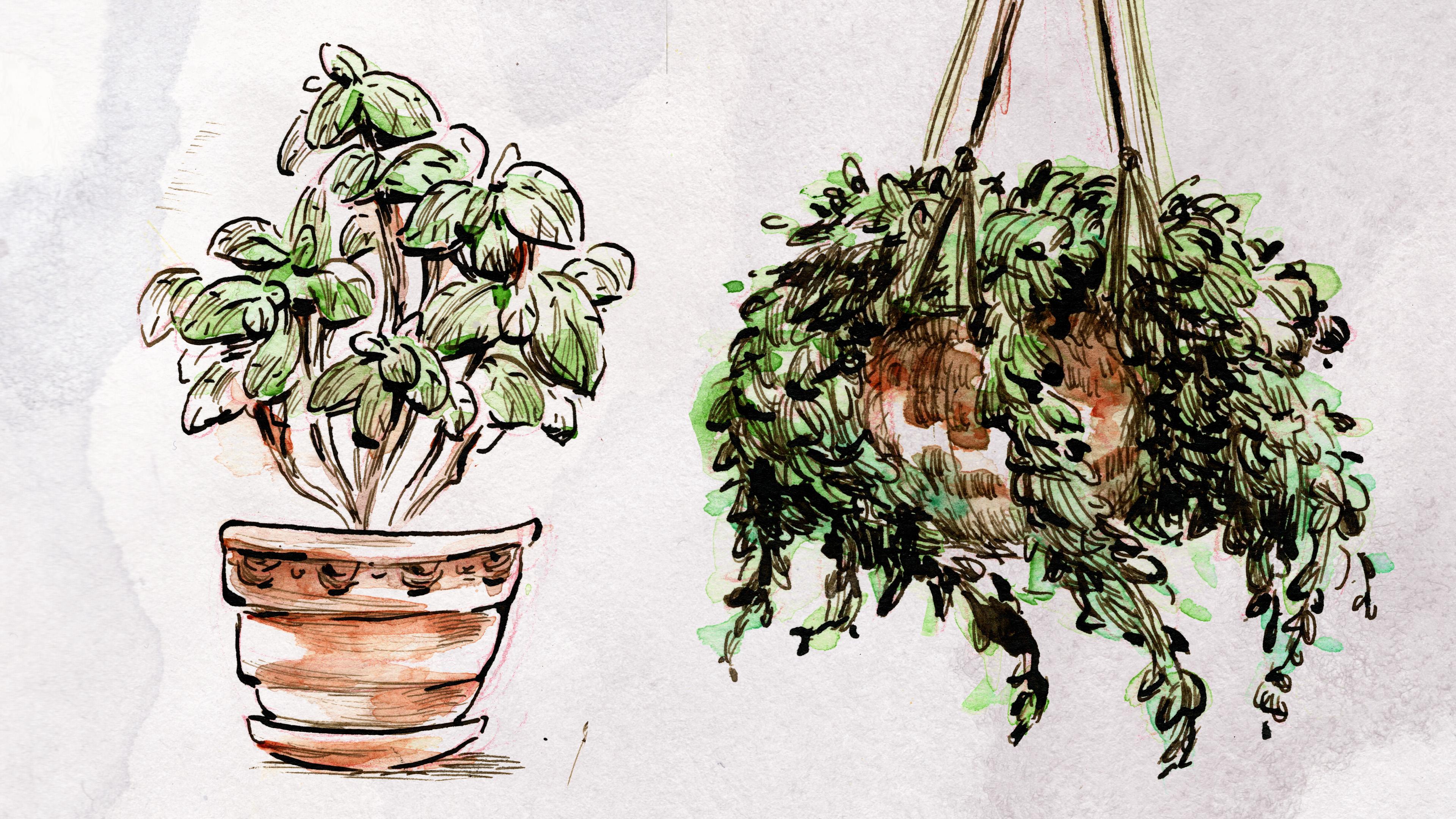
well, so moving on. This is a Peperomia that's
growing in my shelf. You can see it in the background when I'm talking to the camera. It doesn't really have
an interesting history, but I find it really beautiful. I love the way it has round leaves and they fall
down like a waterfall. I really love this pot as well, I think it has a
beautiful natural texture and the cutest little feet. I think this plant has an amazing feel
that I love the way the strands go everywhere and just end up looking
so varied and fun. I end up completely losing
track of time drawing this one as I'm enjoying drawing all the little
leaves so much. I really hope you
can find that state of mind as well when you're
doing your sketches. I just love how this plant thrives even though I don't
really care for it that well. Ever since I had kids, life's just been so busy, I completely forget
to water my plants. I'm really loving drawing the long thin shapes
for the stems here. I think they're just so beautiful when you stroke
them with the pen. I'm finalizing the
sketch by adding some shadow shapes again so that it's just easier to understand where the
leaves hung above the pot. I think I'm really starting
to feel warmed up now. It's a lot easier to
find the shapes I like and I'm just really
enjoying drawing. I'm feeling really
pleased with this sketch. Next, I'm drawing
my other Peperomia. This plant has really cute
retro plants stand and pot, and I really look
forward to drawing them. I think there's lots
of room to play with stylizing the shape
of the plant stand, though my approach here
ends up being a bit timid. I've made the classic
mistake of placing my drawing too close
to the edge of paper, and now I can't quite
fit in the whole plant. It's a little bit annoying. I'm not too miffed about
it though since I'm not really invested in my
sketches looking good. I'm just using them to
run around the ideas in my head and seeing what I
actually find compelling. So even if the very top of the plant is
being cut off here, I'm not really feeling like it's interfering with my goal. I think the mass of leaves
the Peperomia has is so cute, it reminds me of a clown week, especially as I can imagine
the movie color of leaves. I just love how random they are. It feels really fun to play
with the shapes they make. I'm also really liking
the middle part. I just enjoy drawing middle reflections
with my pen so much. I think this sketch has the potential to be turned
into a fun drawing. Now that my page is full, I'm assessing where I am. I think I'm warmed up and I really enjoy some
of the sketches, but I feel I need further work before I'm ready to move on. This is usually how
my process works. I look at my first drawings and I see that I
just need to take things a bit further to
make a stronger statement. Decide which elements I really want to
exaggerate and commit. After looking over things, I decide to have another
go at the coffee bush. I think it has balanced
shapes and it would be easy to make it look
good on a page on tone. I feel like I'd
enjoy playing with the leaves and the
stem shapes a lot. I just love how large it feels. This time, I really focus on getting an interesting
silhouette and flow to the drawing. To make things look interesting, I try to avoid even things. Here, I have more stems
at right than left, and more leaves at the
bottom than at top. The spacing and direction
of leaves has variety. Perfectly balanced things
can look beautiful, but they often feel
static and unnatural too. As a rule of thumb, try to avoid things
being halfway too or half as big
as something else. Think in thirds instead. Make something 2/3 as big as
another thing or 1/3 as big. Just like it feels super
boring when you take a landscape picture and place the horizon
right in the middle, you want to avoid
things being cut off at halfway points of
anything while drawing. For some reason,
it seems like we subconsciously try to do this, so it's something you need to actively fight and look out for. I'm feeling good
about this drawing. I think I have a clear vision
of the elements that are important to me and I'm ready to move on to the final drawing. Remember, the purpose of
sketching is to stay loose, get warmed up, experiment, find things you like, and build on those things. You don't have to go
into lots of detail. Actually, it's
better if you don't. Now we're ready to start
doing the final drawing.
8. Final Drawing in Pencil: The goal of this lesson is
to pick your favorites from the sketches and start building on that to do
your final drawing. After looking
through my drawings, I ended up choosing the
one with the coffee bush. I thought it had a
really pretty shape and I really liked that
it had a lot of leaves. I really liked the round
shapes the leaves had as well, and I thought it would be
so fun to emphasize that. I like doing drawings
with a lot of details. So I thought having a
lot of leaves would really give me room to
play with that as well. I tried my best
with the editing, but I know this
footage isn't really easy to see as the
pencil is so light. But try to bear with me and I'll walk you through
the drawing process. First of all, I'm actually
a really messy drawer, so I've developed a process that works for me
to combat that. I start out with a
pencil and I sketch out all the big shapes that
I feel are needed. You can see me
drawing round circles where I just want the big
leaf shapes to be so I can test out if they actually
feel good where they are and to make sure the whole plant has an
interesting silhouette. I'm also trying to find the flow that just goes through
the entire plant. I usually really like building my drawings around an arc shape. Here, the arc is kind of going from right in the middle
to left on the top. I think it just gives a really interesting flow and
shape to the whole drawing. I usually erase a lot at
this point just to make sure all the shapes
are actually where I want them to be and the
whole thing works out. I know it isn't the
prettiest process, but it works for me, so I've stopped feeling
guilty about it. Not everything you
do can look pretty. After I've established
the general shape of the thing and I know where all the masses are going to be, I start drawing the
individual leaves. Still, with the leaves, I'm trying to make sure I actually follow the general flow I've set up with the big
shapes to make sure that no leaf actually sticks out at a random direction that interrupts the
filling of the flow. I know with the real plant, the leaves can actually be
sticking pretty much anywhere. But in my drawing, I want everything to flow beautifully because
that's really what I see in the plant. After I'm pretty happy
with my first sketch, I actually pretty much erase it. I'm just rolling around
with my kneaded eraser. It might look like I'm
erasing the whole sketch, but I'm actually just leaving a light outline that I can go back on with
my colored pencil. Now, I really like doing the
whole thing again with a colored pencil, because now that I know the
general shape I want, I can actually make sure every line is an
interesting shape. I notice I really do end up
changing stuff at this point. Just small changes of
making interesting angles, turns, just small adjustments
to the whole silhouette. I've found it's a really
important step for me to actually end up with a
drawing that I'm happy with. I really like the colored pencil showing underneath my inks. I don't really like seeing pencils under my inks,
so if I do a pencil, I need to completely
erase it afterwards. But when using a colored pencil, I just really like
that it gives you that little bit of
interesting color underneath. It just adds a bit of life that I really
enjoy in my drawings. Sometimes I go back on top with colored pencil as well and
just enhance the effect. My aim here is to
really give each line an interesting shape to
make a strong statement. No fuzzy lines or
uncertain marks. Still, I'm not actually
going to try to replicate these lines when I start going over
them with ink, they just act as a guideline. I might actually change
my mind at the next step. I'm also not really adding
any fine detail, because I just find that I like improvising that bit
with the ink pen. The tools you can see me
using are acrylic pencil with a pencil holder that lets me use even a small stub
of pencil effectively, a colored pencil for
the final lines, and a kneaded eraser. That soft type of eraser
that you can easily reshape, that's really kind on your paper and won't
tear it easily. I'm feeling a bit dissatisfied with the shape of the pot here, so I end up erasing it and
trying to fine-tune a bit. After I'm happy with the shape of things and
how everything is looking, I just go over everything
and lighten it a bit so that the colored pencil lines won't be totally overpowering. You can't actually fully
erase the colored pencil, so that's why I never start my drawing with a
colored pencil. Instead, I use graphite
because it's easy to erase. To summarize, your
drawing doesn't actually have to be perfect
at this stage. You just need to have
the general shape down and know where you're
going to be adding detail. Now we're ready to
move on to inking.
9. Inking: In this lesson, we'll
cover the inking process. I'll be drawing with deep pen
and waterproof sepia ink. But you can also
use waterproof pen, or ink with brush. I'm pretty happy with
my final drawing, but I'm only using it as a loose guideline
when I'm inking. As you might remember
from my drawing video, I avoided making the
final drawing feel completely finished before
moving on this stage. So I wouldn't feel compelled
to follow it too closely. I find the inks end up feeling really
stiff and lifeless, if you try to follow your
drawing line by line. The first thing to remember
when you start inking, is that lines will smudge, if you rub over them. There's lots of advice out
there that suggests you ink your drawing from left
to right to avoid this, but it hasn't really
worked out for me. I find the most
important thing is to start with the
shapes that are on top. It's the only way that you
can actually make sure the bottom shapes connect in a beautiful and controlled way. You can see me starting with the leaves that are
right on top and front, and then continuing to draw the leaves that connect
to them from underneath. For this to work though, you really need to be aware of which of your lines are wet. To avoid smudging them, I end up rotating the paper, or letting the
lines dry for a bit anytime I need to reach
something across them. How long the drying takes
depends on your paper, and how thin or thick
your lines are. So you need to experiment with your materials to find out the exact time you need to wait. You can see me move around the wet ink lines
while I'm drawing. You can also
experiment with using a paper under your
drawing hand if you want. When I tried it, the paper just ended up smudging
the lines anyway. You might have better luck depending on your
materials, though. I feel like this is a
fairly simple drawing. I really wanted
to concentrate on my lines being expressive
and interesting, that's why I picked a
soft tip for my deep pen, and concentrate on varying
the pressure while drawing. This tip isn't necessarily great for making
long smooth lines. But I find I can make really
interesting marks with it. As this is the final step
in the drawing process, and I'm pretty confident in my general silhouette and flow, my main focus is on making each individual shape
and line interesting. One of the things I
really like playing with, is not having a closed
line around the shape. Since the line is marking
the edge of the shape, I think of this as
losing an edge. I feel like doing it just gives a drawing more room to breathe, and makes it feel lighter. It can also help the drawing feel more three dimensional, when you lose an edge in a place where that edge would
be blurry anyway, like in deep shadow, or around bright light. I like leaving a little
gap in the line when a leaf is going behind on
the leaf because of this. Connecting the lines of the leaf below to
the leaf above, would visually connect them. But leaving that
little gap helps clarify which of them
is actually on top. If I was painting in oils, I would be plugging those edges to achieve
the same effect. I find when you are
drawing a mass of leaves, the tips usually have
a very clear edge, and as the bottoms of the leaves disappear behind other leaves, those edges can be really blurry because they often
get lost in shadows. So as an easy shortcut to making something feel
like a lot of leaves, I sometimes end up
just drawing the tips, but leaving out a lot
of the other detail. The key to getting
good line quality is visualizing the start and end point of each of your lines. Then, it's easy to make the
line in one decisive stroke. You can see, I'm sometimes
stopping and testing out the motion before
actually drawing a line. It's an easy way to
make sure you have a clear idea of what you plan to do before putting
the pen on paper. To make a nice line, you need to be able to execute
it in one smooth motion. If a line is too long or
complicated for that, you can break it into
several segments and execute each of those
with one clean movement. If you aren't sure
you are able to continue a line from the
exact spot you stopped, you can usually just leave a break in the line
between the segments. Since we'll be using
watercolor on top, one thing to remember is that it will somewhat
obliterate the lines. So if you do the whole drawing
with really thin lines, after you add color, you might realize
the lines aren't quite as visible as you
hoped they would be. Any really fine shading will
also practically disappear. If you really want to add
finer detail like that, I suggest you do it
after adding color, to avoid wasting a
lot of time doing work nobody will
actually be able to see. I've learned to overemphasize everything just a little bit more than I would if this drawing would be
finished with ink. For line work to
appear interesting, it's important to use a
variety of line weights. That means, having some lines be thicker and some lines
be thinner than others. Even if you don't use line weight to describe
bright and shadow, having a variety
of lines creates visual interest and helps you
balance your composition. You can also use line weight
to establish hierarchy and clarity of shapes so that your
picture is easier to read. As you can see, I have three major
clumps of leaves here. I don't think their shape is as easy to understand as I'd like, so I'm going to emphasize the edge of each clump
by using a heavier line. Likewise, I'm using
darker lines to describe the stems so it's easy to visually separate
them from the leaves. As the pot is a very
heavy solid object, I'm giving it a very
solid outline as well. The shadow under the
pot is more blurry, so I'm happy to use a more
broken light line there. I'm also using thinner
and more broken lines for the leaves in the back, as I want those to
appear to be more out of focus and to blur
into background. This really helps to give the
picture a sense of depth. If you think your drawing isn't leaning as clearly
as you'd like, think of the big shapes
it breaks down to, and emphasize the
edges of those shapes. Give things that
are in the front more emphasis than
things in the back. Another thing that can really help your lines read better, is adding just a
few spots of black. Since we'll be working
with watercolor on top, you don't want to add
any large black shadows, but just emphasizing
the corners of things, or where two lines connect
with a touch of black, can really add a
lot of interest. I'm feeling like the lines of my pot are a tad boring, so you can see me
thickening the lines on the corners and adding just a touch of black
where two lines meet. Another thing to pay attention to when
you're using line, is the light and shadow. As you can see, I'm also leaving gaps in the lines in
the middle of leaves. Those lines follow
the logic of how I imagine the leaf is
being hit by light. The lightest parts
get gaps in the line. It's also really
important to follow the shape of the leaf with the lines in the
middle of the leaf. Not doing so, can completely
flatten the leaf. You don't need to do this. But I love adding a bit of
shading to my drawings. I just really love
the way it creates a textured surface and
helps describe the formats. When you draw your shading, it's really important to follow the shape of the
object you're shading. Sometimes even just a couple of lines following along that form, can really help
clarify that shape. There's lots of room for personal expression
here, though. I like doing long lines
following along the form, but you can also go across form, use short lines, or even just interesting
marks as long as the general shape of your marks is following
along the form. There's lots of ways that texture with pine marks as well. If that's something
that sounds fun to you, you should definitely
give it a go. Remember, you don't
necessarily need to copy the way I use
line or do my drawing. There are certainly lots
of different ways to do a line work that can
all work beautifully. Just think about the
points I've gone through and consider how you'd like
your line work to appear. If you'd like to try
different things, you can just scan your drawing, print out a few copies
on thicker paper, and have fun trying
out different styles. Just remember to use a
watercolor ceiling spray on top of your printed line work
so when you add watercolor, it won't spread the ink. I definitely didn't magically find out how I was
going to use line. I went through a lot
of trial and error, and I still make mistakes and redo things when I'm
not happy with them. But it's been a hugely
rewarding process for me. I really hope you can find the same enjoyment in
line work as I do. The main thing to remember, is let your inks dry properly before you
start adding watercolor, and if you made some mistakes you really want to cover up, do that after the color. Now, we're ready to add color.
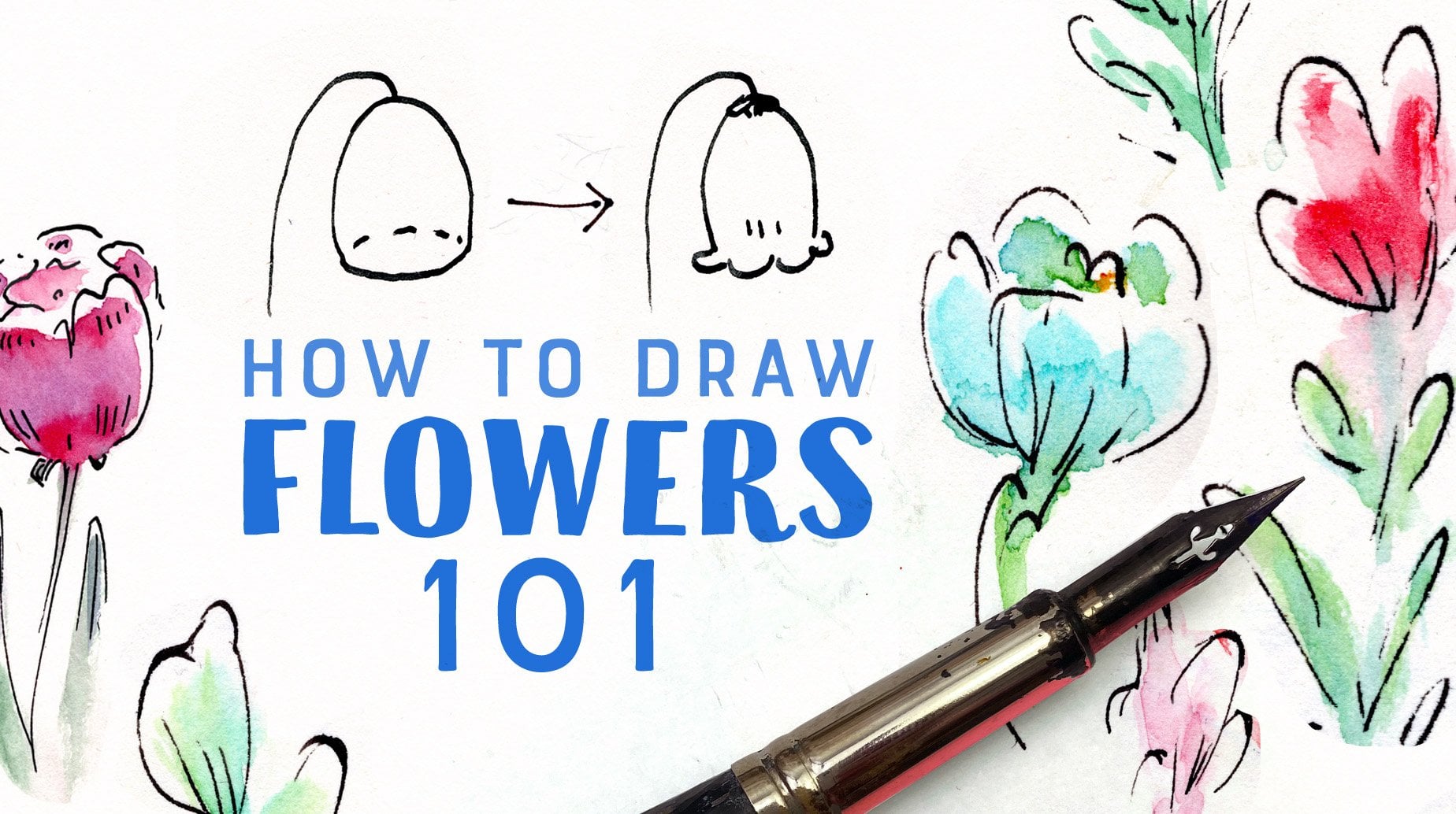
10. Basic Watercolor Techniques: In this lesson, I'll give you a brief introduction to
basic watercolor techniques. First, to prepare your
watercolors if they're in a pan, drop a little bit of water on them that'll help to soften them up and it'll make it easier to get the
pigment out of them. Just let it sit for a little bit before
you start painting. Now, I'm going to demonstrate the basic techniques I
use while I'm painting. First, let's try blending. Paint down a strip of color, then clean your brush, squeeze out extra water, but don't let your brush
get completely dry. Now, with a clean brush, just gently smooth out the
color you laid down earlier. If you've got the
amount of water right, you should have a completely
smooth transition. This can take a little
bit of practice. Another technique I really like using is called charging in. For this one, you will
first lay down one color. Usually, I wouldn't be using
anything too saturated. Then you clean your brush
and pick up another color, then you just drop in paint in the color
you already painted. You'll get really
fun and beautiful watercolor effects with this when you are creating
with using it. Now, as long as your
wash is still wet is also really easy
to remove color. You can do this
with a clean brush that's been squeezed
dry of water, or with a paper towel. You can never quite
return to white, but you can still
remove a lot of color. Now, I'm going to do a simple demonstration of the watercolor process
I usually use. First, I lay down a simple
light wash. For this wash, I make sure I'm adding the
lightest parts of my painting, but I'm still going to add some variation and color
into it wet on wet. I think the key to making
your watercolor look fun and loose is really just being very free with dropping in colors and using
big brush strokes. The most important thing to remember is that you
can never go lighter, so you need to be
really careful to leave the areas you want to stay
light, actually light. Once my first layer is dry, I'll do a shadow layer. For this one, the key
is you're actually being visibly darker
than your first layer. Otherwise, it's just going
to look a little bit muddy. I make sure to blend
some of the edges and not make it uniformly dark. I'm not really too concerned
about being accurate, because I'm planning on drawing with inks
on top of this, so I can really leave all of
the details to the ink line. After my shadow was done, I usually go on and
add a little bit of detail where I feel
like it's needed. Usually, though, it's
a lot better to make a strong statement in a few washes than to
keep adding on things. For the actual illustration, I'm going to work in
reverse order where I actually do the inks
first and watercolors next. But really, you
can go in whatever order feels most natural to you. As you can see, these are
really basic techniques. You can really adapt them
to any way of painting. It's a good idea to
practice these techniques a bit if you aren't familiar
with them already. It can really take a little
bit of trial and error to get the amount of water and
paint in your brush right. If you have too much water, especially when
working wet on wet, it's just going to
bleed everywhere and you can't control it at all. Now, we're ready to add
color to our drawing.
11. Adding Color: In this lesson, I'll
be talking about adding some color to the
finished ink drawing. With watercolor,
the first thing you need to do is to prepare well. As you can see, I've actually premixed all the
colors I'm planning to use on the first wash and now I'm ready to start painting. There's really no need to be
realistic about the colors. As you can see, I'm not really planning
on being either. But I'd taken some
inspiration from my model. I've looked at it
and I've seen that the highlighted parts seem a lot more blue than
the shadow parts, so I've mixed some
bluish colors for the highlights and some more yellowish
greens for the shadows. With watercolor, it's
really important you do all of this thinking before
you actually start painting. Because when you are planning
on working wet on wet, like I am with loose watercolor, you can't change your mind in
the middle of the wash. You need to keep working really
fast before it dries. As in this case, my wash area is really quite large as it
covers all the leaves. I'm really focusing on
getting all my colors down before the
brush starts drying. After I've picked my colors, I plan out what I'm
actually going to do. I know I'm going to use the bluish colors for the
leaves that are valid and the more greenish
colors for the leaves that are behind and in shadow. The other thing I really need to know is where I'm actually going to
leave the paper white. I like using lots of paper white in my
watercolor paintings. I just think it makes them
feel really light and airy. I really like my watercolors
to be lived in general because I don't really want the color competing
with my land work. It's really easy to
accidentally go too dark, so I'm really focusing on
my first wash being light. As long as the wash is wet, you can actually
modify it a lot. I do my initial layer
with one color, but you can see me dropping in more colors and adding
deeper shadows as well. I really think the
best part about watercolor is how beautifully the colors will blend together. You just can't achieve
that with any other media. You could color our drawing
by just using a few colors. One for shadows,
one for highlights. But since I really love those
watercolor transitions, I want to take full
advantage of them. That's why I have so
many colors mixed up, so that in each leaf and
wash I can add variations. As long as your
wash is still wet, you can also easily
remove color. You can see me removing
color with a brush. You just need to
clean your brush, squeeze out any extra
water that it has, and then just use it to pick
up the paint you don't want. If you had a bigger mistake, you can also use a paper towel to dip out
a lot of extra color. Sometimes I even just use my fingers just to reduce
a color a little bit. Now as long as
your paint is wet, you can also pretty easily
modify the edges of your wash. If you take a clean
brush with water in it, you can easily smooth
out a hard edge. Just make sure your brush
doesn't have too much water. Otherwise, it gets
really hard to control. The whole thing is really
a bit of a race to finish. That's why it's so important, you've done all your
prep work beforehand. Personally, I really love
how freeing that feels. You just have no time
to chart to yourself. After the wash is done, you can always take a
look at it and think about what you might do
differently next time. I really like the
structure of having a clear planning stage and
a clear execution stage. Now, after I'm done
with the leaf wash, I really need to let it dry. So I move on to
painting the pot. The actual pot is
naturally really orange. But since I really like
that light feeling, I want to leave
parts of it white. I plan out, which part
are going to be white, and then I start adding color. As with the leaves, I'm actually using several different colors just to take advantage of the really beautiful
watercolor effects. I think I went a
bit too dark here, so I just took out some of the
extra color with my brush. I'm using the deepest colors in places where the actual
pot has shadows. But I'm not too worried about looking
realistic in general. Then I just add a light
wash on the shadow. I'm really worried
about going too dark, so I actually go back there
too and take out some extra. So far I've been
using a flat brush. I just really like doing
the bigger washes with it as I feel it gives me
really nice solid shapes. I think the flat shape really encourages you to use blocks. That just seems to be something that's easy for me
to think about. For the details though, you can see me switching
to a smaller round brush. Lately. I've been really
liking using Chinese brushes. Now that my first wash
on the leaves is dry, I can start adding shadows. I'm making sure I'm getting the whole area I'm
planning on working on wet first and then I start
adding more color into it. Again, I'm working with several different colors
I have pre-mixed so that I can work
quickly and still get those nice
variations in color. Though, this is the shadow area, I'm actually not going too
dark with it since I really want to preserve that nice
light and airy feeling. I make sure to smooth out
some of the other edges with my wet clean brush since I
really like that blurred look. I add some deeper shadows under the top leaves to
enhance their shape. If you wanted the more clear, three-dimensional
effect, you could really use one big shadow shape. I think those look really beautiful with
watercolors as well. I just really liked how
my leaves here felt like a blurry mass so we ended
up not doing that here. I think my line weight is strong enough that you can
really get a sense of the shape even if I'm not
using really clear shadows. I also want to add a bit more
shape to the top leaves, so I'm doing another
pass on them as well. I found I really like to
enhance the places where the form turns where the
deepest shadow usually lies. Even if you're not actually drawing out the whole shadow, if you're just describing the
place where the form turns, you can really get a sense of the three-dimensional shape. I'm also using
just smaller spots of deeper color in places where they would be deepest shadows between the leaves and
behind the leaves. One important thing
to remember is that watercolor
always dries lighter. If the color is looking just right to you
on your painting, it's going to be to
light when it dries. It's really easy to just
keep adding detail and shading and suddenly notice
you went just a bit too far. Then your colors end up
too dark and muddy and you actually lose that
nice clear statement you made at first. Usually, you get the best results when
you try to work with as few layers as possible and plan them
carefully beforehand. I think my shadow layer here could have
used more planning. As you can see, the
whole painting process was actually pretty quick. Certainly, it was a lot quicker than making
the ink drawing. It took us a whole lot of
work to get at this point, but it was really fun to
mess around with color. If you're worried you're
going to ruin your carefully made drawing with the
painting process, I really encourage you to
scan it before starting. Then you can print it out
as many times as you like and have fun trying out different things with
the watercolors. Just make sure you're using a watercolor sealant
spray on top of the printed image so that your inks won't spread
when you paint over them. To wake up, prepare well, and then just have
fun with the colors. Going right guys. Now we're
done with the painting. I really hope you have a
lot of fun drawing with me.
12. Final Thoughts: Congrats guys, you made it. We talked about style and emphasizing the bits
that interest you while you're drawing and paying attention to the mood
you're trying to create. Then we explored
our ideas through sketching before making a
final drawing with ink. I shared the thought process behind the choices
I made while I was drawing and gave
you some tips on doing expressive and
engaging landmark. Then we looked at some
basic watercolor techniques and had fun adding some little
colors to our ink drawing. I really hope you're
going to take this process and explore
your own style further. You can use the
techniques you've just learned to illustrate
any subject matter. I'm so glad you joined
me for this class. I hope you had lots of fun and good to know
your plans in your way. Now I really hope
you're going to take the process we talked
about and use it to stylize other things and
explore your own style. Remember to upload
your class project. I can't wait to see what
you guys come up with. If you're going to
post on Instagram, please tag your work so
I'm going to find it. I'd love to be able to read some more Skillshare classes in future so please give me
feedback, write your view. I love to hear what
you guys thought. Bye.
 Jaana Heiska, Illustrator