Transcripts
1. Introduction: [MUSIC] Do you want to
learn more about drawing volume and shading
using a fun project? Then this class is for you. We will be illustrating a fresh tropical
fruit cocktail while learning about volume
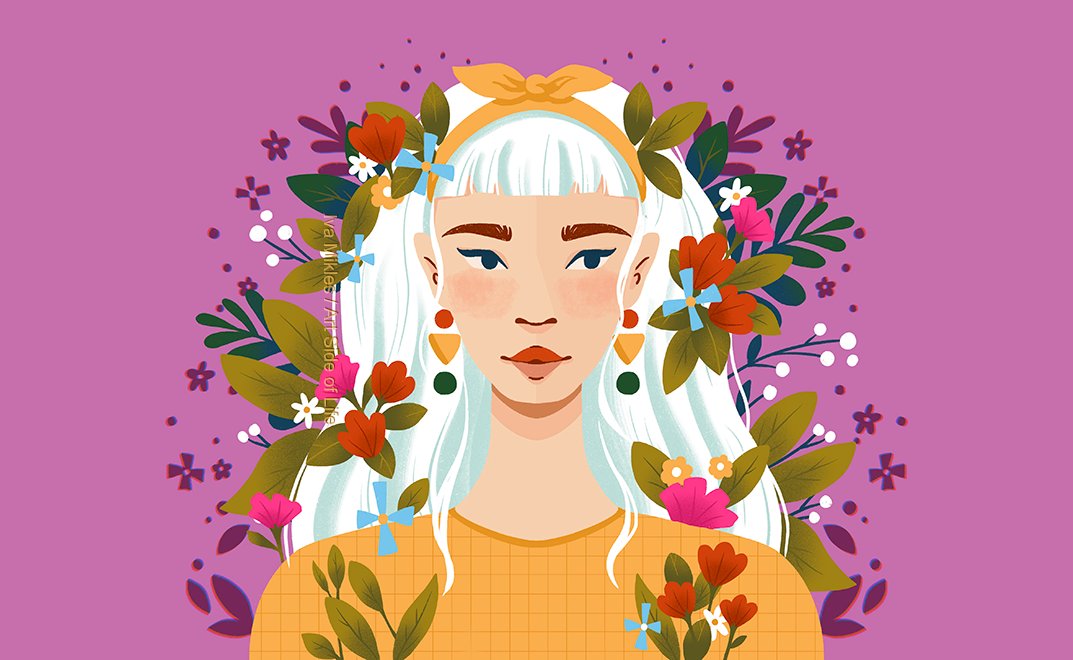
and how to shade. Hi, I'm Iva Mikles an illustrator and designer
based in Central Europe. A decade ago I decided to build my creative
career and since then, I built my business online, working with awesome clients
on amazing projects, which allows me to explore
the world and get to know people, cultures,
and locations. I believe that we are all creative in infinite
numbers of ways so I have made it my mission to teach you
everything I know, to contribute in a
small way to waking up your creative genius so you are able to pick
up a new hobby, express yourself artistically, and if you take the leap, make it your lifestyle so you can spend more time
doing what you love. In this class, you will learn
the five volumes method, to practice in a fun and
easy way how to shade, and create the
illusion of volume in your illustrations so you get inspired to create your
own unique illustrations with variety of subjects. I will be using Procreate, but feel free to use other digital
drawing software or traditional medium
for this class. Basic Procreate knowledge
is helpful but not necessary for this class as
I will guide you through it. Without further ado, let's start and see you in the class.
2. Volume: Let's first talk
about the basics. What does it mean to draw volume and what is the five
volumes method? In simple technical terms, drawing volume means to
represent the size or a scale of an object in the
space the object occupies. In other words, volume is the representation of
a mass in an artwork. Think of it as the three-dimensional
form of an object. How do we apply it in art, especially on
two-dimensional surface? You may have guessed
it. With shading. We as artists, create the
illusion of volume in the illustrations to give the art a three-dimensional effect. Especially if you want to create a more realistic but
still stylized look and not only the flat shapes. Shading will help you to draw a three-dimensional
object and make them appear that way on
two-dimensional surface. This practice will
also help you draw different scales of the object and objects in perspective. Creating volume is usually
done by applying tone or different shades of light
and dark onto your object. The object can be
simple as a ball with shades of light and dark
in black and white, or with shades of light and dark colors like
a blueberry or pomegranate, if you imagine that. The shades of light and dark
are also called values. When you are just
starting to draw and you are new to
shading and volume, it is good to start practicing shading on simple
geometric shapes. It helps when you think of
them already as volumes, not only as shapes. I will be using both words
equally throughout the class. Let's now talk about the
five volumes method. I think it's quite a fun and simple way to learn to
draw volume because it teaches you to draw volume using the five basic shapes: a cube, a sphere, a cylinder, a pyramid, and a cone. This method is well-known in the art industry and it's
considered an effective approach to drawing and
painting because you can use these shapes or combinations of them to draw anything
you imagine. Well, of course we need to
practice as much as possible so it gets easy and we don't
even have to think about it. Basically, like with any new
subject we are learning. Let's do that, and
in the next lessons, we will be practicing drawing volume with
all the five shapes, starting with a cube. See you in the next video.
3. Shading a Cube: [MUSIC] In this lesson, we'll practice shading a cube. First, I will sketch a square here on the right
side for reference. A cube is the best shape to start with shading
because it has six equal sides or
planes with sharp edges. Let's start illustrating
the cube in space. To draw a cube in space, I usually start with
the bottom part and imaging a floor where I
will be placing the cube. To make the lines
perfectly straight, hold the pencil on the
screen after making a stroke and wait for Procreate to help you
straighten the lines. To imaging a 3D look, make the lines which are in
the back in lighter value. Then copy or redraw the bottom
part to create the top. It should be the same
size in this angle. [MUSIC] To make the
cube symmetrical, make the lines parallel to each other and in the same length. [MUSIC] To make a
copy of the cube, you can just
duplicate the layer. Here, we can imagine the light coming
from the top right. When shading the
simple stylized cube, I usually use three
color values. Each of the planes will be affected by light
in a different way. We will use the
lightest value for the plane where the
light hits the cube. Test out different
brushes to find your favorite brush for
sketching and shading. Here, I'm using the same ink brush for
sketching and shading. Then we will continue adding darker values to the planes
further from the light. The darkest tone will be also on the furthest plane of the cube relative to
the light source. In our case, left
side of the cube. [MUSIC] Because in our case the light is on the right, the shadow cast from our cube will be on the
left from the object. The cube is solid in this case, not transparent
like a cube of ice, for example, so the light
doesn't go through it. [MUSIC] With these few simple steps, you have created a cube. To practice more, try to
spend few minutes moving the light source around and
shading the cube differently. For example, move
the light source to the left side and add the lightest values
on the left and darkest on the right and so on. After you are finished
practicing shading the cube, let's move on to the next
lesson where we will use the shape of a sphere or
in other words, a bowl. See you in the next video.
4. Shading a Sphere: In this lesson, we'll
practice shading a sphere, commonly known as a ball. As you already know, the ball is based
on a circle shape, so let me sketch it on a
side as a reference again. To draw a perfect or
geometrical circle, tap and hold on the screen with your other
hand while drawing. Now, imagine the light source
in the top right again. The lightest area on the ball will be on the top
right as well, closest to the light source. To create simple
shading on the ball, you can draw radial
ellipses like this, going from smaller to bigger
to make an illusion of volume using different
values from light to dark. Light and shadow on the ball have interesting
highlights which are little bit different
from the cube because of the curved
round surface. We will be combining flat
and round surfaces later on, so try to notice and
remember these differences. I will color in the ellipsis
so you can see what I mean and what I'm thinking about when coloring ball-like objects. As you can see, I will color in these ellipses with light, mid, and darker value tones to mark the main values
I want to use. [MUSIC] I'm again moving the shadow slightly to the left because
the light source is on the top right in our case and not directly above the ball. As you can see, I'm using a mid-tone value for the shadow, not the darkest value here, because the light
bounces around and makes the shadows slightly lighter than it is right under the ball. As you can imagine, there is less light directly
under the ball, so it will be darker there. That's why I'm using
slightly darker values here. This is also called
contact shadow. Now, I will copy the ball
and use the smudge tool to quickly blend the
values to create the illusion of a
smooth surface. If you want, you can also use your favorite texture brush to blend these areas if you prefer. When I use a texture brush to get the right color to blend, I'm using the color
picker in-between the lighter and darker value to have a smoother transition. [MUSIC] Tada, you created a bowl,
that was quite quick. We will use the same
principles when shading with colors
for our project too. To practice more, spend a few minutes moving the
light source around again. After you are finished, let's move on to the next
lesson where we will use the shape of a
cone and a pyramid. See you in the next video.
5. Shading a Cone & Pyramid: [MUSIC] In this lesson, we will practice with the
next shape, which is a cone. I will focus on the cone
because the pyramid is very similar to shading a
cube using sharp edges, but I will show you both. As with the other shapes, I'm starting with the basic
two dimensional shape, in this case a triangle. To draw a cone easily, you can start by drawing a
vertical line in the middle, which represents the
height of the cone. Then draw a horizontal
line on the bottom, which represents the
width of the base. Then draw an ellipse, and then connect the
edges of the ellipse with the top on the vertical
line which you drew first. The lines we use to construct
the shape will not be visible when we look at the
cone from our point of view. I can make the
lines there lighter or get rid of them
not to confuse us. I will copy the cone
so I can show you what I'm thinking about when
shading the cone shape. [MUSIC] I will imagine the light source
from our point of view and remove
the sketch lines. If the light is where we are, I mean from our point of view, then the shadows and
the darkest areas of the cone shape will be on
both sides of the cone. I'm starting with the
lightest value in the middle, and then I will add
darker values on both sides towards the edges
from the lightest value. [MUSIC] Then I will add the darkest areas on
the edges of the cone. To keep the symmetry, they should be of
a similar width. [MUSIC] Then I will copy this cone with values so we can see the difference
after smoothing out the surface and creating smoother transitions
like we did on the ball. I'm using this match tool again. [MUSIC] As with the
cube and the ball, practice some more and spend few minutes moving the
light source around. You can for example, imagine a light source
on one of the sides, let's say right, then you would just
go from light to dark value from right to left. You will see that on
one of the examples in color in our cocktail
illustration later on. Now let's quickly compare the
shading with the pyramid, which similar to a
cube has flat sides. [MUSIC] When the object has flat sides, you will see hard, also called sharp edges, compared to the smooth edge and value transitions on
the round shapes. [MUSIC] Try to spend few minutes practicing
shading the pyramid as well, placing the light source
in different angles. After you are finished, let's move on to the next
lesson where we will use the last of the five
shapes, [MUSIC] the ceiling. Commonly known as
a can or a tube. See you in the next video.
6. Shading a Cylinder: [MUSIC] In this lesson, we'll practice with
the next shape, which is a cylinder shape, commonly known as
a can or a tube. I will sketch a
circle on the side because a cylinder is a
three-dimensional shape consisting of the two
parallel round bases joined back curved surface, which you can imagine
as a rectangle. Practicing this shape
is useful, for example, when you want to draw
tree trunks, coffee mugs, glasses, tube shaped
sofa pillows, pillar candles, flower pots, and many other shapes. When creating this
type of shape, to keep the geometry
and perspective right, you want to make the
curve on the top and the bottom similar and
then the sides should be parallel if you want
to have the tube with the same width on
top and the bottom. We see these tube under an angle so the
perspective applies here. Imagine we are looking
from the top down. Here for our light source, I will imagine an overcast day. The sun behind the cloud. There are no strong shadows and because the light is on top, we will see the lightest value first on the top of the tube. Then I will add
values from light to dark starting in the
middle of the tube, going darker outwards to the
edges of the tube sides. [MUSIC] The darker value
stripes on the sides of this lightest value should have the same width within
the same value. Then, of course, I can add the darkest values on the edges. [MUSIC] Afterwards, I copy
the tube again and blend the values as
in the previous lessons. [MUSIC] When blending, I am
focused on keeping the values in the same width
as I mentioned before. We don't change the
symmetry of the shape. Awesome. You've created a tube. Now, spend few minutes
to practice more and apply the light source
from different positions. After you are finished, let's move on to the next lesson where you will learn to use the visual aid of
a surface grid to describe the volume
of the object. See you in the next video.
7. Using Surface Grid: [MUSIC] In this lesson, we will look at
the surface grid, which you can use as
a visual guide to describe the volume
of the object. You can imagine the
surface grid as a fishing net spread
over the object. It will help you add shadows on different shapes and
add different angles. Seeing the big surfaces
with this type of grid will help you imagine
the perspective too. When you draw straight
lines for a grid, you're suggesting that
the surface is flat. When you draw curved lines, you are suggesting that
the surface is curved. [MUSIC] Now, I will sketch a variety of objects and when
drawing the grid, I am following the outer
edges of these shapes. [MUSIC] For example, the cone
has straight lines going down following the
sides of the cone. In the curved lines following the bottom curve of
the cone base ellipse. [MUSIC] The surface grid can
also help you describe a perspective when
drawing objects in space, as you can see in this
example of a square. First, we can see it in
a frontal view using horizontal and vertical
straight lines like a grid. Afterwards, using angled
lines going into a distance, we use the grid to
describe perspective. [MUSIC] How can you use this
in your illustrations? Like this square
can, for example, be a picnic blanket
and the grid can help you create the checkered pattern for these picnic blanket. Now let's move to the next
lesson where you will learn how to use the surface
grid for shading. See you in the next video. [MUSIC]
8. Light Source: [MUSIC] In this lesson, we will use a surface grid, to grid the volume for our objects depending
on the light source. In this lesson, we will look at another light source
angle while keeping the previous example with the light source in
the top right corner, so we can see the
difference easily. Let us use the
surface grid to help us figure out the
shading and volume. To draw the surface
grid on the ball, the vertical lines meet at
the top and at the bottom. If you are looking at
the ball and there is light angle from the top, the horizontal lines
are curved downwards. [MUSIC] The direct light will
be on top of the ball. [MUSIC] Then I will add the halftone value, and as before, the darkest
gray value as well at the end. To use the help of the
grid, you create it. You can keep it on a separate layer and
reduce the opacity. [MUSIC] If you draw traditionally, I like to keep the sketch with the reference grid
nearby for a reference. Afterwards, you can
smoothen the edges of the value transitions
with the smudge tool. We are using a stylized
simplified version of the light on the ball
instead of a hyperrealism. If we want to create hyper-realistic light
and shadow on this ball, we will need more shading and details which are out of
the scope for this class. Just to quickly mention them, we would have direct central
light, highlight, halftone, terminator, core shadow,
occlusion shadow, cast shadow and the
reflected light. Quite a mouthful, isn't it? [LAUGHTER] But if
you are interested, you can of course, practice the hyperrealism
as well later on. [MUSIC] Going back
to our example here, too quickly practice different
light source angles, you can also draw
the ball smaller. When I want to practice
something quickly, and I don't want to be
distracted by making things perfect or with
too many details, I sketch small objects. You can test it out and see if you'll like
this practice too. [MUSIC] Another thing I want to
show you is an example of when you have two
objects next to each other. First, you can shade
them as we did before, and then you would
add the shadow between if they are
close together. In this case, we have the
light in the top right, so the ball on the right is casting a shadow on
the ball on the left. To make the shadow
more realistic, you can draw the shadow from
lighter values on the top, to darker values
closer to the ground, where less light
gets to the area. For the observation practice, try to see and
notice the shadows on the round object
in the real life too. Maybe oranges on the tree, limes or apples on the table with the light from the window while you are having breakfast. [MUSIC] Now let's move to
the next lesson, where we will practice combining the shapes using flat
and curved surfaces, in order to prepare
for our project, by tropical fruit
cocktail illustration. See you in the next video. [MUSIC]
9. Combining the Shapes: [MUSIC] In this lesson, we will be combining shapes. We'll use flat and
curved surfaces to practice various
volumes and shapes. Let's start with
the half sphere. Imagine a half of a round shape, it can be half of a
mango for example. Here, I will draw
an oval first for this half of the round shape and already imagining
some fruit. We are looking at it under
an angle from the top. After drawing an oval
for the top flat part of this fruit I will add the curved bottom to add
the part with some volume. As I mentioned before
the flat surface is suggested by the straight
lines on the surface grid, and the volume on the
bottom part is suggested by the curved lines which meet at one point on
the surface grid. When you're shading the
top part try to use similar value tones as the
difference in light on the flat surface
is usually not too strong and sometimes
barely noticeable. To shade these halves' sphere
with value tones you can follow the surface grid as we did before with
the other objects. I'm imagining the light
on the top-right again. Here filling the bottom
part from dark value to light value using the
eyedropper tool to blend, and you can use the smudge tool or brush to blend
the transitions. When shading the bottom
part try to follow the curved grid lines to create the transitions
in values. [MUSIC] Now let's move
on to the next shape. Here, I'm creating a pear
shape as you can see. To create volume I'm imagining two spheres
merged together. To help me imagine
this shape I'm thinking in the simple shapes, so what can I use here? I can use two spheres. To create the volume
I'm imagining two spheres merged together
smaller on the top, and the bigger on the bottom. If we compare the
lines on the grid in the middle section the
surface grid lines are less curved, and on the bottom part, the surface grid lines are more curved to suggest the
bigger volume there. Next, I'm sketching
a half ellipse with a curved bottom part and I'm imagining a slice of
an apple or a lemon. As before the half ellipse
side we see here is flat with straight
vertical lines meeting in one point and the
horizontal lines are angled following the shape of the curve on the edges
of the apple slice. [MUSIC] Then we have a slice of a melon example which is based on the
triangle as you can see. Here I'm following a
similar surface grid to suggest a flat surface
and a curved bottom. Vertical lines are
straight and they are following the angle
to meet at one point. The horizontal lines are curved following the outer edge of
the bottom of the melon. You can also try to draw
more similar shapes one with a flat surface and then with the curved lines
suggesting more volume. [MUSIC] Now try to spend 10-15 minutes
practicing with as many shapes as you can imagine for your fruit cocktail. You can spend more time
if you want, of course. Then while practicing add
surface grid lines suggesting volume with the curved lines and flat surfaces with straight
lines on the grid. Always try to
notice the edges of the shape to help you create the curved lines on
the surface grid. [MUSIC] Also, try drawing the same shape for example
the teardrop shape with curved lines on the
grid as well as straight lines to
suggest a flat surface. Then the flat surface can
become a fruit sliced in half, and the curved surface with a teardrop shape can become
a fruit in one piece, maybe a fresh fig. Now, let's move on to
the next lesson where we will practice more
and start using color. See you in the next video. [MUSIC]
10. Sphere Shape Fruits: [MUSIC] In this lesson, we will practice
shading in color using the fruits and
starting with a bowl shape. Please feel free to select your favorite fruit
or follow along. Now, let's draw a sphere as a reference here
in the corner. [MUSIC] I'm choosing blueberries for this shape because they are one of my favorite fruits. I love them for breakfast. [MUSIC] I'm adding blue color as a base, and then I will add
one lighter value of the blue and one
darker blue value. I will shade it in the
same way as we did before using shades
of black and white. [MUSIC] That we have blueberry with
volume and quite quickly, and because you wouldn't
usually eat just one blueberry, you can copy and paste
it more times here. I'm also rotating them
for the visual interest. You may be thinking, what
about the light source. Here, I'm not using
one light source for all of them as a
group of blueberries, because I'm just
copying them and moving them around for
more visual interest. If you want more realistic group of blueberries
placed on a table, for example, keep the highlights and the light
source on one side. [MUSIC] Now let's draw another fruit. I'm taking a circle
as a base and I will imagine a fruit
sliced in half. In this case, we will only
see it from the sliced edge, so I'm drawing a flat surface. No volume here in this angle. [MUSIC] I can add the color on the
outer edge for the peel of the fruit before adding
the seeds in the middle. [MUSIC] Can you already guess
the fruit I am drawing? [MUSIC] If you said dragon
fruit, you are right. So tasty and cool-looking with these colors and the seeds. Then we can just copy
the round shape and make another fruit sliced in
half under the same angle. I will add few details and then you can guess
again, what it is. [MUSIC] Can you tell what fruit it is? [MUSIC] First I was going
for a pomegranate, but because I made the
darker purple too dark, it looks more like
a patient fruit, so let's copy it
one more time and make an actual pomegranate
with the lighter colors. [MUSIC] Compared to the patient fruit, the pomegranate has white peel separating the seeds inside too, so there's slight
differences here, but the overall shape stays
the same in our example here. To finish the shape and to
look like a pomegranate, we just need to add
the top part with a small crown so it's
more recognizable. [MUSIC] Now we have a few
bowl-shaped fruits, one with volume,
the blueberries, and the other slides in
half with the flat surface, the dragon fruit, passion fruit, and
the pomegranate. If you want to make the
full pomegranate quickly with volume and not
sliced in half, just take one of the
blueberries and change the mid tone from blue to
purple-pink pomegranate color. I'm just dragging and dropping the color on top of the surface. [MUSIC] To add more details, you can add few marks
on the surface, and then the recognizable
pomegranate crown on top. Tada, you have a
full pomegranate, very quickly from the other
shape you already created. [MUSIC] Which ball fruit did you
choose for this exercise? I am very curious and
I can't wait to see your take on this fruit
cocktail illustration. In the next lesson, we will practice with an oval
and the teardrop shapes. See you in the next video. [MUSIC]
11. Oval & Teardrop Shape Fruits: [MUSIC] In this lesson, we'll practice shading in color with the oval shape and
tear drop shape fruits. Feel free to select your favorite fruit or follow
along with my selection. Let's make the oval shape and add the bottom part with volume. So we have a reference
here in the corner. As you can see from the surface grid shape
on the one side, it's flat and the
bottom part has volume. You can, for example, take kiwi sliced from
the longer side. Or it can be also mango or other fruit in this
shape you can imagine. You can also draw the top flat part with
slide self shading. The difference in values
should be quiet small. [MUSIC] The bottom part, with more volume,
we'll have stronger, more distinctive
differences in values. [MUSIC] After adding some details, can you already
guess which fruit I chose for this
shape and volume? Yes, it's papaya, if
you guessed that, I chose this fruit for its interesting colors
and contrasting seeds. [MUSIC] For the next example, I think of a tear drop shape, or in other words, the two spheres that
merge together. As we practice before, this sounds a lot like a pear. So let's make a
pear out of that. [MUSIC] Following the curved lines
on the surface grid, I'm shading this pear shape with lighter values and
darker values. As a result, the shading is curved like this
surface grid lines, from yellowish green
to dark green. For this shading,
you can test out brushes from the drawing
brush folder for example. I quite like the Oberon brush
for shading this shape. [MUSIC] We have a pear with volume. Now I will change the brush from bigger
tip size brush with texture to smaller tip
size brush to add details. Then you can add few
spots in yellow or pink as pear sometimes have
more colors on the peel. To add little details
on the pear surface, I'm selecting lighter
value in the lighter area. I'm still following
the grid and placing these few spots along
the grid lines, imagining the volume
and his last details, you can add the stem, and the darker detail
on the bottom. [MUSIC] Now let's move on to
the next lesson to practice more
shapes and volumes. See you in the next video. [MUSIC]
12. Triangle Shape Fruits: [MUSIC] In this lesson, we will practice with
triangle shapes and half-oval shapes as a slice of fruit in your
tropical fruit cocktail. Feel free to select your favorite fruit or follow
along with my example. For this first example
in this lesson, I'm starting with
a triangle shape, rounded at the bottom, as I'm planning to make, I think you already know, yes, a watermelon slice. Rounded bottom because of the overall round
shape of this fruit. The surface grid
will also help me with placing the seeds
along the lines. [MUSIC] To use the help of the grid, you create it, you can keep it on a separate layer above, and set it to multiply
and reduce the opacity. If you draw traditionally, I like to keep the sketch with the reference grid
nearby for a reference. Then I'm adding more color, green for the outer
skin of the watermelon, and shade it based
on the surface grid. From the darker green values on the left and the lighter
green values on the right. [MUSIC] Because the light
source is on the right, the right side plane of the watermelon should
be even lighter. We can see the difference
in values when we cross from one plane or
in other words, side of the watermelon
slice to the other. In the green area at the bottom, as well as on the
pink-orange area. Notice that everything is
lighter on the right side. [MUSIC] When I'm happy with the shading, I'm placing the seeds along
the curved lines of the grid. [MUSIC] I'm making some of the seeds lighter for more visual interest as they have various colors
in real life, but you can keep them
all dark if you prefer. [MUSIC] Next, let's make slice of
another fruit using half oval. Here, you have many options
for these fruit shapes. [MUSIC] Now, let's draw the slice
under a slight angle. We can see bit of a bottom
part with the volume 2. We will be also adding
a skin for this fruit. [MUSIC] We will have the skin of the fruit at the bottom, [MUSIC] as well as with
the other shapes, and following the
grid and making the bottom part with volume
with stronger shading. Imagine again that it is darker
where we have less light. It's up to you to decide where you place
your light source. You can imagine it left or
right or somewhere else. Here, I have the light
source in the top-left. [MUSIC] For the middle part, I'm adding the details
based on these fruit seeds. The seeds have radial
placement from the center because they
usually grow from the middle. On the edges of this fruit, close to the peel, you can see lighter color. I think you can already guess what this
colorful fruit is. Yeah, it's a slice
of a fresh fig. Now let's move on to the next lesson where
we practice more. [MUSIC] See you in
the next video.
13. Rounded Cone Shape Fruits & Leaves: [MUSIC] In this lesson, we will practice more
with cone-shape and some leaves to add to your
tropical fruit cocktail. I'm cheating here a bit
because it's not a fruit, but rather a vegetable. But let me know in the comments, if you know any fruit
in the cone-shape. Can you already guess which
vegetable I will be using? Yeah, I'm using a reference based on a cone-shape and this time it's upside down cone with the rounded
top, as you can see. Yes, it will be a carrot. If you don't want to
draw a vegetable, maybe you can choose fruit ice cream cone
instead of a carrot. When creating the
grid for this shape, we will have the vertical lines spread more on the
top where there is more volume and
they are meeting at the bottom where the
carrot is more narrow. On the top of the carrot we have the curved horizontal
lines to suggest the volume because
we are looking at the carrot under a slight
angle from the top. I will copy the sketch
with the grid layer, set it to multiply with reduced opacity and either
color on the layer below. To add color, choose the
placement of the light source. I chose to have it on the
top right in this case. I will add the shadow
on the carrot on the left side following
the surface grid. Also because the carrots have interesting detail in form
of dents on the surface. I can add these with help of the curved
horizontal lines of the surface grid and to see how these details will look on
top of the orange color, I'm reducing the grid
layer opacity now. To draw easily within the shape, I'm using a layer clipping mask. Darker in the shadow
areas of the carrot and lighter on the right side
in the lighter area. To make the carrot
dense more realistic, you can erase a little bit
of the edge of the carrot. Then to add more fun shapes and more color to our fruit and
veggie cocktail illustration, we can create some leaves also with the help
of a surface grid. One of the leaves will be flat and another one
with the bent side. For simplicity, I am not shading the leaves to match and I'm just making the bent side
darker and I'm adding a slight value transitions
on the flat surface. Of course, you can
experiment with additional textures on the
leaves and the fruits. To test how bigger
texture brush is on the object use
layer alpha lock or draw on a layer above
with a clipping mask. Afterwards I'm adding
a few lines to suggest the middle of the leaves detail
for more visual interest. I think I quite like the color balance and
shape variety here. I think the leaves make
everything look even more fresh in our illustration
and if you like, add more leaves around for even more freshness and
summer look and feel. When creating your fruit and veggie illustration
for the project, try to practice and
use as many shapes as possible to have
a visual variety in your illustration
and of course fun as well with the colors of different fruits and vegetables. I'm super excited to see your
projects with the fruit and veggie cocktail
illustration using shading, volume, your favorite colors, your favorite textures and
maybe some fun details. Don't forget to upload your illustrations in
the project section.
14. How did it go?: [MUSIC] How did it go? I hope you had a lot of fun creating your own
tropical fruit cocktail. If you want to expand on the knowledge you
learned in this class, you can watch my other
classes, for example, about composition,
perspective, and colors. Just visit my teacher's
profile to find them. Don't forget to share
your class project in the project section
and I can't wait to see all of your
awesome artworks. If you would like
me to also share your illustrations on Instagram, please tag me when
posting so I can help you and your art to be
discovered by more people. If you have friends or family members who would like
to learn to draw volume, please share this
class with them. If you like the class, please leave a review
because first of all, I learn a lot from your
constructive feedback, and second, you will also help
other students to discover the class and you may contribute to their
artistic journey too. If you have any questions
or suggestions, please leave a comment in the discussion section because
I would love to help out. Thank you so much again for watching and see you
in my next class.
 Iva Mikles, Illustrator | Top Teacher | Art Side of Life