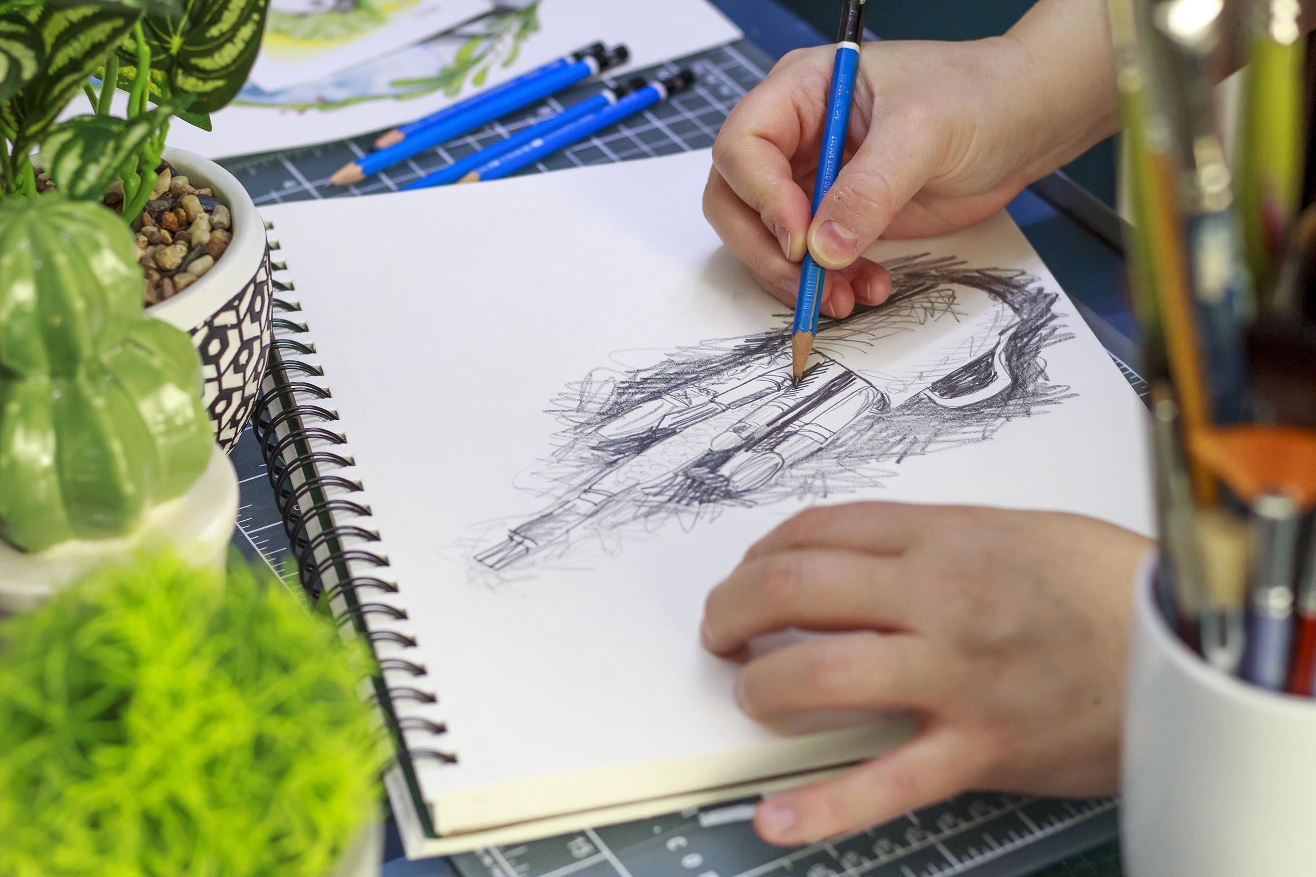
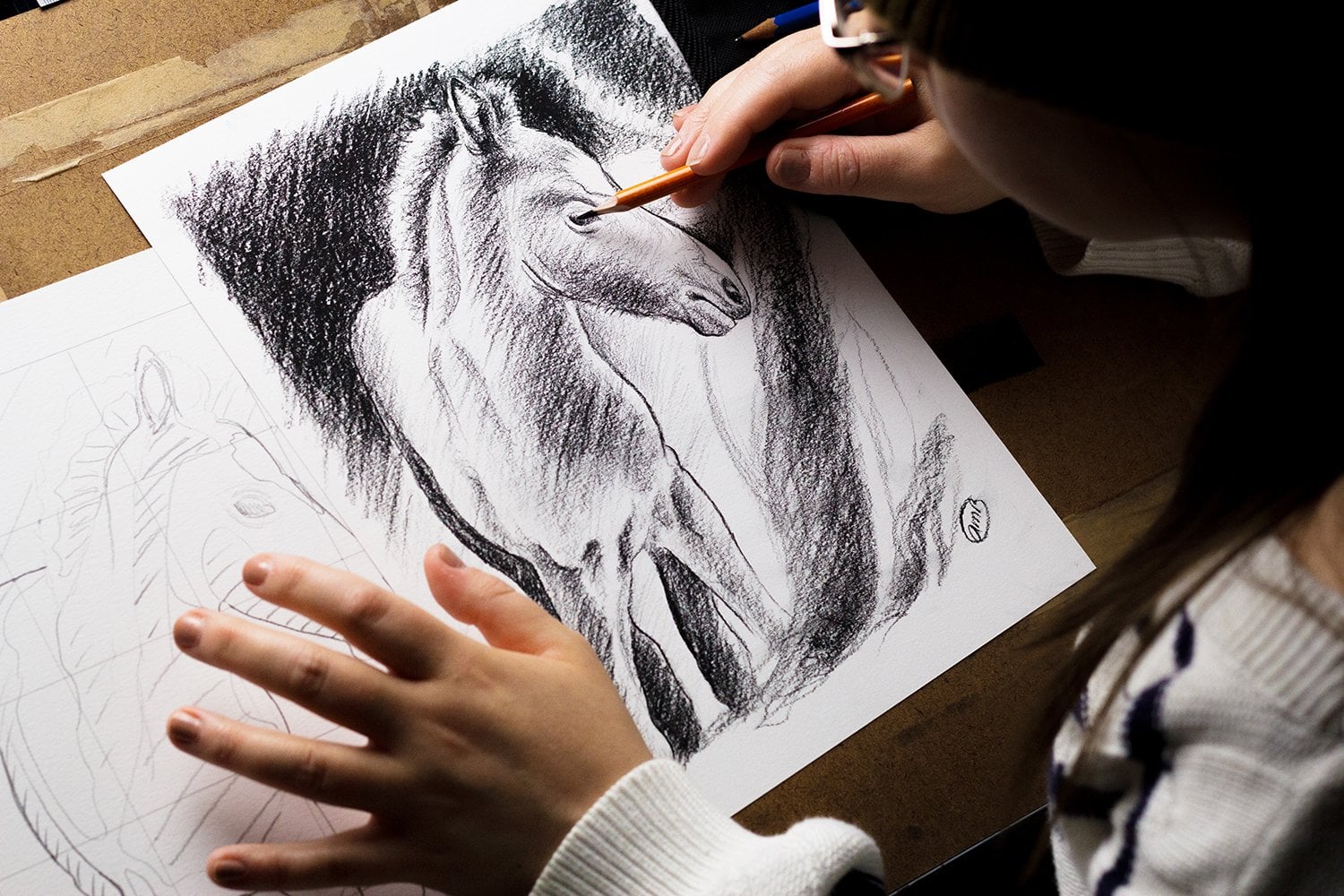
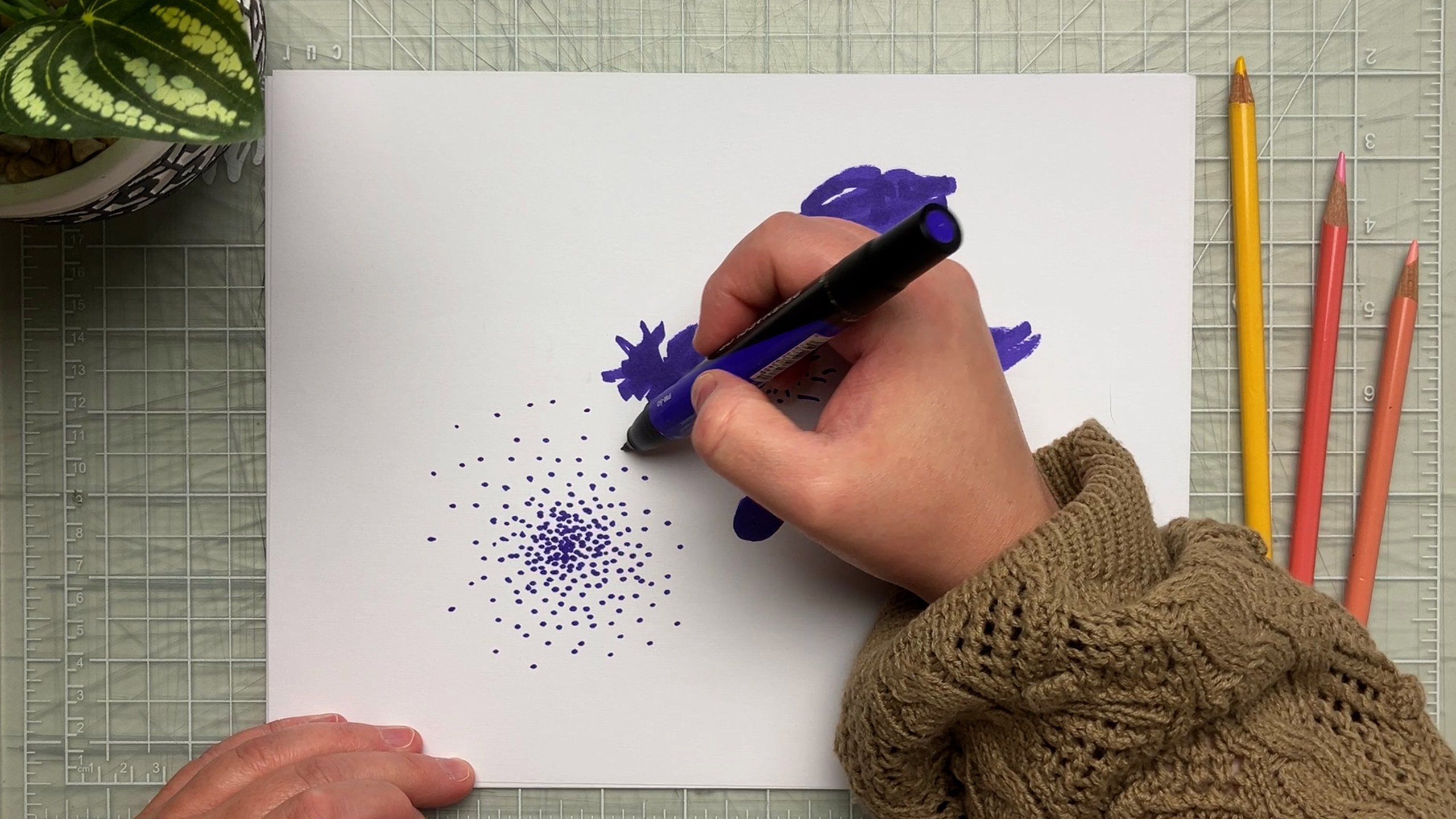
Transcripts
1. Introduction: When we think about line, we usually think about outline, but this is only the beginning. So much information can be conveyed
in a simple line. Line can express form and depth through value and shading. It can suggest different types
of materials with texture. It can even add movement
and dynamism to your work. Line is very versatile and it can have many
roles in a drawing. Hi, I'm [inaudible]
a graphic designer, an artist, and an illustrator living in the beautiful
province of Quebec. I've worked in the
creative field for a little over 10 years, but I originally fell in love with drawing at a
very young age. I still get excited
when buying pencils, and I'd rather spend an
evening drawing than partying. I consider myself a
lifelong learner. In all of my years
as a visual artist, I've jumped from
drawing to painting, to photography, to
graphic design. But much like I
ran into a magnet, I always do come back to
my first love; drawing. Many of us see
sketching and drawing as the first step to
something greater. I, on the other hand, have always been fascinated by drawing as an art in itself. I can look for hours into
the great masters sketches, analyzing and
observing. But why? Because drawing, while
still simple as a medium, is so much more complex
than it appears. This class is all about
harnessing the power of line work in order to
draw more expressively. That is to say, not necessarily drawing exactly what
is in front of you, but how to add depth, emotion, and texture through the
intentional use of line. This class is perfect
for beginners or anyone who came to level
up their line game. Together we're going to work on a sketchbook and play
with various exercises. Through these
exercises, you will learn how to use
line to add value, shading, texture, movement,
and mood to your drawings. You'll gain confidence
in your line work, improve your drawing
skills along the way, and take steps
towards developing your very own graphic language. At the end of this class, not only will you have a pretty cool sketchbook
to show around, you will also be able
to translate what you see in the expressive
way that is your own. Hopefully, you will
have jumped out of your comfort zone
and try new ways to draw exploring all kinds of lines while giving your
drawing a renewed strength. Drawing expressively is in fact, drawing your own
version of the world. If you're ready, grab
a sketchbook and your graphite pencils
and we'll embark on your own journey to
become more expressive.
2. Class Project: All right, let's take a look at
the class project, which is very simple. Through this class, we are
going to be working on a sketchbook containing
all of your exercises. Plus at the end, a bit of a putting-it-all-together
challenge. After a brief introduction
concerning line, we are going to start
with a line brainstorm. Next, we'll differentiate
outline and contour. Once this is done, we'll explore a line
through volume, shading, texture,
movement, and mood. Lastly, we are going to put it all together with a challenge. All you need for this class
are a few household items, a sketchbook or loose sheets,
and graphite pencils. I strongly suggest that you use soft graphite pencils
such as 5 or 6B, so you can get darker
tones if you want to. Note that I do
recommend that you do more than is suggested
in the class. Why? First, because
it's a lot of fun. You'll see how liberating the exercises are
when we get there. But mostly because drawing, like everything in
life, takes time. The more you do, the more
you'll get out of it. If you're ready, grab your sketchbook and
we'll start with line. See you in the next lesson.
3. What Is A Line? On Line Quality!: I think we all
know what line is. But line as an artistic element has
specific characteristics. Let's look at a few
pointers to see line from an artist's
perspective. Line is one of the
seven elements of art, along with shape, form, volume, space,
texture, and color. You can think of line
as a moving dot. What I mean is when you touch your pencil to
a piece of paper, if you lift it right away, there will be a dot. If instead of lifting
the pencil right away, you decide to move
it along the paper. Now you have a line. I guess we could
say that line is the most basic visual element. But at the same time, line can be a lot. Lines can be organic
or geometric. Their most obvious use is
the outline of a subject. But line in itself can
be a little boring, and since this class is about
developing expressivity, let's introduce line quality. What I mean is what
characterizes lines. When speaking about
line quality, we usually mean line weight
or the thickness of a line. But lines can be more than that. They can be controlled, they can be forceful, they can be fluid, and so on. Quality gives a descriptive
aspect and according to it, lines can express, form a try dimensionality,
light, depth, texture. It can guide viewers eyes, and this is why I said
that line can be a lot. To draw more expressively. Keeping line quality
in mind is essential. As you can see, line is a powerful tool. This class is about
learning to harness this power and start your journey into drawing
more expressively. Follow along in the
exercises as we discover ways to use
line for expression. The next lesson is going
to be about activating our brains and our pencils with a line brainstorm.
See you there.
4. Brainstorming Lines: [MUSIC] Let's loosen up a bit with a fun and
stress-free exercise. In this lesson, we are going
to brainstorm all lines. Grab your sketchpad or
your paper and a pencil, I'll throw some
objectives at you and your job is to draw a line you think matches the objectives. Ready? Let's go. Smooth, random, curly, and angled. I would love to see
what you came up with so if you feel up to it, please upload your lines
in the projects gallery. Note that everybody's lines
are bound to look different, this is normal and way more interesting than
everybody being the same. Now that I've put
you on the spot, let's have a more in
depth brainstorm. Please take a few
moments to name and draw all of the lines
that you can think of. I invite you to pause here and then I will share
my own brainstorm. [MUSIC] As promised, here's my own brainstorm of many lines that could
be used in drawing. The first one I
came up with this repetitive and I have these
little sketches next to them. Then there is
steady, continuous. There's no real drawing next
to it so let's go for it. This is when you don't
ever break your line. Random, it could be continuous or not when
you are going random. Smooth, let's go for
curvy and controlled. Jagged, curvy. There are many kinds of curvy. Angled, orderly. Here we are. There's hatching and
crosshatching, the classics. You could go for
pale, very pale. You could also go
for bold and strong. The movement of your hand also
makes for some objectives. Could go with varying
pressure. It's this one here. We don't see it much
but bolder and paler in the same line, you vary. Curvy and wavy, weird, which is the same as
random when you think about it and curly. Once again, I invite you to share your brainstorm
in the project gallery. This will be quite interesting. In the next lesson
we are going to have fun with contour drawing. See you there. [MUSIC]
5. Drawing Objects: Outline vs. Contour : Earlier, I mentioned that the most obvious use of lines
is to outline subjects. This is where we are going
to start our journey. But we won't stop there, because outlines, well, obvious are not
as interesting as contours which are even more relevant to drawing
more expressively. An outline is the outer shape
of an object or figure, or the limits of this object
or figure if you like. It does not model form, meaning it is not
three-dimensional, only two-dimensional, and it's not very
expressive in itself. Now that we understand
what outline is, let's take a look at contours. The main difference
is that contour does give a sense of
tridimensionality, but there is more to it when
we speak of contour drawing. In terms of art practice, contour drawing is a very basic and useful
drawing exercise. It was popularized by Kimon
Nicolaides in his 1941 book, The Natural Way to Draw. There are many variations including Dr. Betty
Edwards' version. Contour drawing looks at the whole without too much detail. It is mostly done without
looking at your drawing, but you can pick a little
depending on the variation. It is a great way to improve
hand/eye coordination. In this lesson, we will remix Nicolaides' version
of contour drawing. It will help you figure
out the difference between outline and contour, and it will be the
starting point on which we will
build our sketchbook. Nicolaides says that in
order to draw contour, you must focus on the point on your subject and you start
drawing only when you are convinced that your
pencil is resting on that point while in fact you're drawing on your paper and
looking at your subject. Our remixed version
will be different. We're going to outline
objects that are laying flat on the paper and then we're
going to add contour. I will show you what I mean and then you can go on your own. Choose 5-10 small objects
from your everyday life. Try to choose objects that
don't look anything alike, some with strained lines
and others more complex. Start with one simple object and lay it flat in
your sketchbook. With your pencil, draw the outline of your object. Great. Now, we know
what outline is. Move your object a little to
the side of your drawing. Now, we complete the contours. Contours will go
inside the object; they give a sense of
tridimensionality. They can be stickers, outlines of different
shapes, and so on. Do this with all objects. Later on, once we have explored ways to make your
lines more expressive, we'll draw live objects instead
of outlining them flat. [MUSIC] I know this will seem odd, but we will end
this exercise here. I promise we'll come
back to it later. In the next lesson,
we are going to explore line as value. See you there. [MUSIC]
6. Line As Value: [MUSIC] In this lesson, we're going to use
line as value. In other words, how to create
value using lines only, with the goal of drawing
more expressively. But first things
first, what is value? Value is one of the seven
basic elements of art, along with line, shape, form, space, texture, and color. Value basically
conveys the lightness or darkness of a color. In drawing or painting, we use value to create
the illusion of light. To know how important that is, you have to understand
that to see is to decode the light
in our surroundings. If there is no light, there is no seeing. If there is no
illusion of light, well, there's nothing to see
in your painting or drawing. Value also creates contrast according to the range
of tonal values used. To achieve low contrast, we use a higher range of tonal values with less
difference between them. To achieve high contrast, we use fewer tonal
values between hues with bigger
steps between them. To understand this better and to develop ways of using
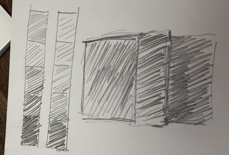
lines as value, we are going to work on our own value scales
using lines only. However, at this point, you must be asking yourself, how am I ever going
to achieve this? I have to tell you
it's quite simple. I'm going to teach you two techniques to
use line as value. First, you can create different values using the
space between the lines. For darker values,
your lines have to be closer together with less
paper showing through. On the contrary,
for lighter values, your lines need to
be drawn further apart with more paper visible. The second way of achieving different values
is using pressure. When applying more pressure, you get darker value, and you guessed it. When applying less pressure, you get lighter values. You can also combine
the two techniques. Let's take a look at a few
reference images to see this. In this image of
surgical instruments, there is a good example
of how value can be created with the
space between the lines. Here and here. You can see that the lines
are drawn closer together and the drawing seems to be darker
than in this part here, where the lines are
further together. Also, a great example of this is this very graphic
drawing of a building. This is a clear example
of how lines drawn closer together give a darker
value to your drawing. In fact, this whole drawing uses only that principle
to create value. In this drawing of
Mary sister of Martha, you can see that
even though lines have pretty much the same
space in-between them, pressure is used to
get darker tones, especially in the ear
and the hair sections. The same happens in this
scary drawing of two beasts, where we clearly see that
the pressure was used in the eyes and mouth areas
to get darker values. Now we get to the fun part. Let's do our value scales. I'll show you how
I do mine and then you can go ahead
and do your own. To start our two value skills, we will first draw a
template for the skills. I'll show you how I do it. But you can do the
size that you wish. It doesn't really matter. I like to work
with five squares. Here's what it's
going to look like. [MUSIC] Now we can set the ruler aside. The principle of the value
scale is that it's going to go from darkest to lightest, or the other way around. Whether you go
from light to dark or dark to light
does not matter. But you have to choose one
of those two so you can see how to go from
one to another. I'm going to go
from dark to light. In the first one,
I'm going to do space between the lines, and in the second one, I'm going to do pressure. What I like to do
when I'm working on scales is I'm going
to do the darkest, and then the lightest. Then I'm going to work
my way in-between. Let's start with this
space between the lines. Let's do the darkest one. I forgot to mention that I'm
working with a 5B pencil. It's quite soft so I
can have dark values, but this one just broke. I'm going to take another one. [NOISE] Here we go, a 5B. This is not ideal. I should've kept the same
pencil, but we'll make do. For the lighter one, I'm going to leave a lot of space between my
lines. Here we go. We can already see
the difference and I'm going to work
my way in-between. I'll start with the center and then I'll do the last ones. [MUSIC] There you go. It's not perfect,
but you can see that the closer the lines are, the darker the value, and the further apart they are, the lighter the value. I'm going to do the same
but with pressure now. Let's start with the darkest. I'm going to apply
a lot of pressure. [MUSIC] There we go. Simple as that. Now you know
how with using only lines, you can go from
darkest to lightest. I invite you to share your process in the
project gallery. I would love to see
your value scales. In the next lesson
we are going to explore line as shading. See you there. [MUSIC]
7. Line As Shading: Now that we have learned
how to use a line as value, let's dig into line as shading. What is shading really? Shading is the act of adding value to create the
illusion of form, space, and light in a drawing. Shading is also exercising control over the value produced, meaning that it is the
technical side of things. It is also physically
communicating the light source with a range of
values. To sum it up. While value is the amount of black and white there
as in a drawing. Shading is the act of
putting it down to paper. There are many, many
shading techniques. But since this class is
about line and expression, we will be more focused. To explore shading the line we are going to
draw two objects. One more curvy,
more streamlined, and the other one
with flat sides. It would help you to have a
contrasted lighting setup. Note that for this step, you can find reference images in the resources if you don't want to start from scratch and just want to try
the shading part. However, I strongly
encourage you to try and draw the
objects from observation. But how does one
shade with lines only you must be
asking yourself? Let's take a look. You're shading
technique will probably depend on the texture
of the object. But let's not get
ahead of ourselves since we are covering
this in the next lesson. The first shading
technique we'll explore is frequency of line. The second technique
we'll explore for shading is with
pressure only. Haven't we heard this before? Yes, we have.
Remember that shading is the physical aspect
of applying value. Some concepts will cross both. Lastly, we'll use both frequency and pressure combined
with random lines. Let's dive into the exercise. But first I will give
myself some parameters. My first object will be
flat-sided and irregular. [NOISE] I'll be using
this, a simple box. My second object will be
curvy, but still regular. To make things
easier for myself. I'm ready to draw my
objects and shade them. Here's a shot of what I see. You can look at my setup. Look at the difference
between the sides. They are quite clearly
different in terms of lighting. Let's start crosshatching. Remember that we
are interested in expressivity and not
as much in realism. It doesn't really matter if your object is not as
realistic as you would like. I could even add this
little bit of color here. As you can see with
simple frequency of line, I can get the
shading that I want. It's quite rough and that's
what we want for now. Now for the curvy object, I will have to work
in a more fluid way, meaning that there
is no definition between the different values, contrary to the flat object. This is why we will be using pressure instead of
frequency of line. It will be easier
to go from dark to light in a more organic way. Let's start with a
simple contours. [MUSIC] As you can see, I've been playing with
pressure for this one, adding more in these
areas here and there. Then trying to go
smoothly from dark to light, adding less pressure. It's still pretty
rough as a drawing. I kept it very simple, but we can already see
how expressive it is. [MUSIC] Now for the third one, I'll be using the
curvy object again. But with random lines. I could go on forever with this. I could add more detail, but I really don't have to. I think we get this
sense of how it works. Now it's your turn
to go and have fun. [MUSIC] Feel free to share your drawings in
the project gallery. I would love to see
what you're working on. In the next lesson, we are going to explore line
as texture. See you there.
8. Line As Texture: Now that we have explored
line as shading, we are going to look
at line as texture. Texture has a place amongst
the seven elements of art. In drawing we use
visual texture, which is the illusion
of physical texture. We will be creating a
2D illusion of the way an object or a surface
must feel to the touch. There are many, many adjectives
to describe texture. The most obvious being smooth
and rough in my opinion. Texture is created with the
use of value and shading. Once again, we are
going to go back to our flat objects and
add texture to them. I will be adding texture
directly to the objects, but if you're in the original and you want to try
something else, go ahead, that's great. First, since we are interested
in drawing expressively in this class and not about
representing reality closely, let's implied texture
by inventing it. What I mean is the texture you decide
to represent will be invented and it doesn't have to be a perfect
representation of reality. Remember shading with pressure and frequency of line earlier. This will come in handy. Going back to the flat objects, we are going to add texture. Choose one of your objects
and imply a rough texture. For your second object, create a smooth texture. As you can see for the rough
texture I've been using more frequency of line and
for the smooth texture, I've used more pressure
than anything else. I won't go into more
detail than that since I'd like you to come
up with these yourself. Now it's your turn. Please share your work in the Project Gallery. It would be fun to see
what you're working on. In the next lesson, we are going to explore
line as movement. See you there.
9. Line As Movement: [MUSIC] The next lessons will be more on the
abstract side of things. This means that there is
no right or wrong answer, as it usually is an art. In the next minutes, we'll explore line as movement. There are many ways to
implement movement in artworks. But once again, for this class, we will be more focused. We'll be focusing on creating
the impression of action, and then also on what makes your eyes move
through a drawing. These are some of the
elements that will help us become more expressive
in our drawings. But tell me this, how can we create some movement
with lines only? It will help us to think
of line as a moving that implies the
artist's hands movement. Its starting and ending points can give direction
to the movement. Think of 90 degrees angles as stable and diagonal
lines as dynamic. Generally, curves
imply movement. Also you can create
rhythm with a motif. Irregular motif will give an impression of stability while an irregular motif will give the impression of
being more dynamic. I'll try three kinds of movements and work
with my flat objects. You can try these parameters yourself or you can
try something else. First. I'll try and
get the impression of a circular motion
in the background. Then I'll go first, simulating random nervous
movement, and last, I'll try and give an
impression of stability, so no impression of
movement or less movement. The first one is going to
be giving an impression of a circular motion
in the background. Now, this is a fun one. There is no right or wrong, but it's intuitive what you have to do to get some movement in. I think that having your lines
crossover from each other gives even more of
an impression of movement compared to say, if you had a line start and end, and then just
starting another one. If you have them crossover, you have even more
movement because it gives them a direction. I'm quite satisfied of this one. Let's go to the second one. We will try to simulate
random nervous movement. See how when your
lines are so energetic and don't have an
overall direction, your eye doesn't really
know where to rest. It gives this nervous,
erratic feeling. I really like this. There is no resting. Lastly, we will try to give
an impression of stability. Keep in mind that 90
degrees angles are stable. I haven't really
thought this through, but by giving more value here, it also gives the object
something to rest on. It gives even more
stability to the drawing. It was done really fast, but I like the effort [MUSIC]. Feel free to share in
the project gallery. I would love to
see your drawings, especially if you did something
different than I did. I would love to see that. In the next lesson, we're going to use lines to create a certain
mood in our drawing. See you there. [MUSIC]
10. Line As Mood: [MUSIC] The next concept of this class is
exploring line as mood. What is mood? The mood of an art piece is the overall feeling you
get when you look at it. It can be many things. It can be calm, nervous,
dramatic, positive, luminous, epic, peaceful,
stable, and so on. Many elements can alter
the mood of an art piece, color, lighting
contrasts et cetera. Since we're drawing with
graphite in this class, we'll have to be more focused. In drawing, the mood
will be controlled by all of the previous elements
we've been working with, value, shading,
texture, and movement. Surprise. They will all come together to
create a certain mood. But how does that work
when working with line? For example, tranquility. You can use a wide range of values to have less contrast, soft shading, so
with pressure only. You can use smooth
textures and stable lines. All these elements together, will create a mood
of tranquility. For more drama, you may
use contrasted values, you may also use hard shading, or frequency of line,
rough textures, nervous, dramatic movement, so you get the idea. Everything comes together to create the mood of the piece. The last exercise is starting
to put everything together. Starting from two of
our flat objects, let's work on two
different moods. The first one would be
tranquil or peaceful, and the second one,
nervous or dramatic. Starting from the
contour drawing, you already have to
make decisions about line quality to get
a certain mood. These decisions will also influence all of
the other elements, value, texture,
shading and movement. Let me show you how I do it, and then you can try it out. I did not think about this
when I was drawing it, but now that I see it, I can already decide
that this is going to be more tranquil and this is
going to be more nervous, because see the lines, how
they are a bit erratic, and they are darker, and a bit more awkward, and these are smoother, and with more curves, and they're more fluids. This is why I chose
one and the other. The contour drawing will
already set the tone, and then you add the
rest of the elements, value shading,
texture, and movement. [MUSIC] Now let's go for the
nervous and dramatic mood. [MUSIC] The only thing I don't really like is that
there is no real definition between the negative spaces and the object
itself in this one, but I really like how the nervous and dramatic
mood is seen through. This could be reworked,
we are learning, this is experimentation, so overall, I'm quite
happy about this. It's a great sketch
book overall, and now it's your turn to try. [MUSIC] In the next lesson, let's put everything together
and draw live objects. [MUSIC]
11. Live Drawing: Use Those Lines!: The work you've done will come together
all by itself in the end. But let's push this a bit
further with a challenge. Choose a model and make
a few contour drawings. Take your time, there's no rush. If you are completely
either lost, I invite you to use the
flat objects technique. But I really encourage
you to start from scratch and get out
of your comfort zone. Remember, we're not focusing on realism, but on expression. When you have loosened up a bit from your contour drawings, go for the big one. Start with the contour, but take your time
to decide what the mood of the drawing will be. This should help you decide
what kinds of lines you will use to add a
certain range of values, the way you will shade, the kind of texture, and if you wish to
depict movement or not. Think of the negative
spaces around your object. The way you activate
them or not, will affect the overall mood and the expressivity
of your drawing. When you're satisfied, do share your drawings in the projects gallery along
with the whole process. I strongly encourage you to
do many drawings in the end. The more you practice, the easier it will get, let loose, and use
lines for expression. Up next, a conclusion. See you there.
12. Conclusion: I hope you enjoyed working on your
lines as much as I did and that you picked up
a few tricks along the way. To come back to these
exercises whenever you feel stuck or
lack inspiration, or even if you're just bored, the more you do, the more you
get out of your drawings. I strongly suggest that you make this sketchbook a part of
your regular practice. Please don't hesitate to
ask any question about this class or the exercises
that we did together. I will of course answer to
the best of my ability, and it would be my pleasure
to connect with you all. Thanks again for
taking the time to watch this class and I
will see you very soon. Bye.
 Amélie-Maude Bergeron, Graphic designer | Artist | Illustrator