Transcripts
1. Introduction: Hi, I'm Emily from New Zealand and today we're going
to draw a fir tree. Actually, we're going
to draw two trees, or at least two versions
of the one tree. In the first drawing,
we'll look at simple branch shapes and how to draw foreshortened branches. Now, this drawing will be more illustrative than realistic, and it will have a simple style. It can be used as a base for Christmas tree
illustrations, or you can use it as a warm up for the second tree drawing. For the second drawing, we'll sketch a realistic looking tree. We're going to take a different
approach and focus on texture and value to
build a three D illusion. If you are interested
in drawing trees, both parts of this lesson
will be useful to you. The first part of the
class will help you to understand the
form of the tree. And then the second part will
show you how to approach drawing it using an
artist's way of looking. But you can also choose to do just the simple project or
just the realistic project, depending on what
you want to achieve. Grab your pencils and
let's get started.
2. Experimentation: How To Draw Foreshortened Branches: Materials are really
simple For this class, we just want our three standard pencils that
we normally use, a middle and a dark pencil. For the light pencil,
a two H or an HB. For the middle pencil, A two B. Then for the dark pencil, a four or six. Nice soft dark pencil. Then you also want a
party eraser as well. We're going to get
straight into it. Now we're going to do two versions of this
one tree up here. The first one is going to be
more like a diagram or a way of understanding the
form of that tree. And then the second one, we'll approach it in
a slightly different way and look at it more with, I guess, an artist's eye. So the first one might look a bit more like an illustration, and this would be a good
one to do if you're wanting to draw Christmas
trees for any reason. For your own illustrations, or cards or gifts or whatever. And then the second one will
be a bit more realistic. I'm going to divide
my page in half. And this is just so
that I have a area to practice some
things on and then an area to do our first
version of this tree. So what I want you to do when
you look at this tree is to try to think about its three dimensional form when you first look at
something like this. Or if you're new to drawing,
then you might look at that and draw something
that's sort of black. At the very simplest, it
might be something like this. Just because that's what
we know is a symbol for one of these pine
trees or these fir trees. Or it might be
something like this. If you're looking
at it, noticing that they're curving
up on either side, both of these are
two dimensional representations of that tree. What we want to add in is the three dimensional
branches or the ones that are coming
towards us and away from us. If you think about looking down on that tree
from the very top, you have the trunk if this
is a bird's eye view. And then right at the
top of that trunk you'll have some small
branches coming out. Maybe there'll be four or five. And then underneath that row or that ring of branches
getting lower down the tree, you'll have one, maybe some. They're going to be
a little bit longer. And as you come further down, you're going to
have the branches wrap all the way
around the tree. I mean, we know
that, but sometimes when we look at a drawing like this or a photograph like this, we're not really
thinking about that. That's what I want
you to think about. As they go further
down the trunk, they're going to get
longer and longer. Those are the older branches
we need to figure out, how do we draw these
ones that are coming towards us when something
is pointing towards us. When it's pointing
out to the side, it is obviously quite long. You can see the full length
of it as it starts to come in towards that length,
from your viewpoint, is actually if you were to draw a straight line
from here to here, that's shorter than
from here to here, just because of the perspective. Then as it starts to come
further towards you, imagine this is a branch that is almost pointing directly at you. You can see from from here to here is much
shorter than it was before. Then as it comes directly
facing directly towards you, all you can see is just the
end of it is very short. But what you might see is maybe some secondary branches or some needles coming off it
on either side as well. Think about that concept of it getting longer as you see
the full length of it or the side of it and then
it becoming shorter as you look directly
down the length of it. That's what we're
going to try and translate into our drawing. What that means is
if we're looking at these individual branches and have to go at drawing
these with me. Now if we're going
out to the left, out to the right, we're going to see the full length of them. This is like the actual branch
itself, the wooden part. And then you can see
they curve down like this on either side when
we include the needles. But the needles are in bunches or a broken
broken edge there. If we want to show that
there in bunches and it's not a hard shape
like this one here, then we can use broken lines. We can have broken lines
between the bunches, but even the bunches themselves could be just broken
a little bit as well. And that's going
to give a bit more of a natural feel to it. So these are the ones coming to each side look a little bit like angels
wings at the moment. But just have a look at those on your page now
that you've drawn. And then also have a look
back at that photo and see if you can find similarities. You can pick out what
you've drawn here. One on the left hand
side looks like that, one on the right hand
side looks like that. And then we want to look at these ones that
are in the middle. These ones that are
coming towards us. Looking at the photo,
here's one here. It's not pointing
directly towards us. This would be the branch. And then you can see the leaves or the
needles on either side. There's a difference between
that 1.1 of these ones that stick straight
out like this. You can see the
difference in the length. There's one here as well, which is pointing
upwards a little bit, but you can see how short it is. Have a look right at the top
here. There's a couple here. These are all ones that
are sticking directly out in front and
pointing towards us. Maybe closer down to the bottom. This might be one here, sometimes a little
bit hard to see. This is one that's pointing
towards us but also downwards a little bit
and then they have the needles on either side. Here's another one which is at a three quarter we've got the branch and then we
can put the needles in. And we're going to not
draw this exact tree, but we're just using these as
examples or as a reference. If we want to draw one that is pointing slightly
three quarters, we're going to have the branch. Then we're going to
have some needles. And usually start off
with like a point. And then bring in some
other needles here. If we want to draw one that
is coming closer towards us, right directly towards us, it might just be a
short stem like that. And then we're going
to have the point which is also pointing towards us very short
but quite wide. And then the needles are
going to go more outwards. I draw that one again down here, a bit of a point on it. And then the needles going
outwards to either side. We want to keep it short. We don't want to keep
going further up. Because remember when
it's pointing towards us, it is, it's very short. Maybe we can see a little bit of the length because it's
pointing downwards. That's what that
length is there. If we wanted to make it look like it was pointing upwards, then we're going to
do the line again. This one went down, so I'll
go up and we're going to have the point and then we're
going to be able to see some of those
needles on either side. And then the trunk
would be here. We've also got ones
going to the back, which we wouldn't
really be able to see. If you look at the photograph, maybe you can see a few
sneaking through in the gaps, but we don't need to worry
about those too much. Those are things that we're
going to add in in a moment. We're going to practice drawing these branches in a
tree form over here. But just have another quick go, maybe think about doing
a whole level of trees. There's a trunk, the
ones here going to the side. I'm just
going to do that again. I realized that I didn't
have it on the screen. There's still another
one here is doing one level. Here's the trunk. We're going have a branch
coming out to each side. These branches
actually might have a little bit of
thickness to them. And then we're going to
draw one coming towards us, might do it slightly
to this side. This time we're going to add on our needles just
with broken lines. You make them a little
bit irregular as well, so they're not all the same. Then this one here, we're
going to have a bit of a point like a sea gull
or a bird in the sky, and then some wide needles reaching outwards on
either side of that trunk.
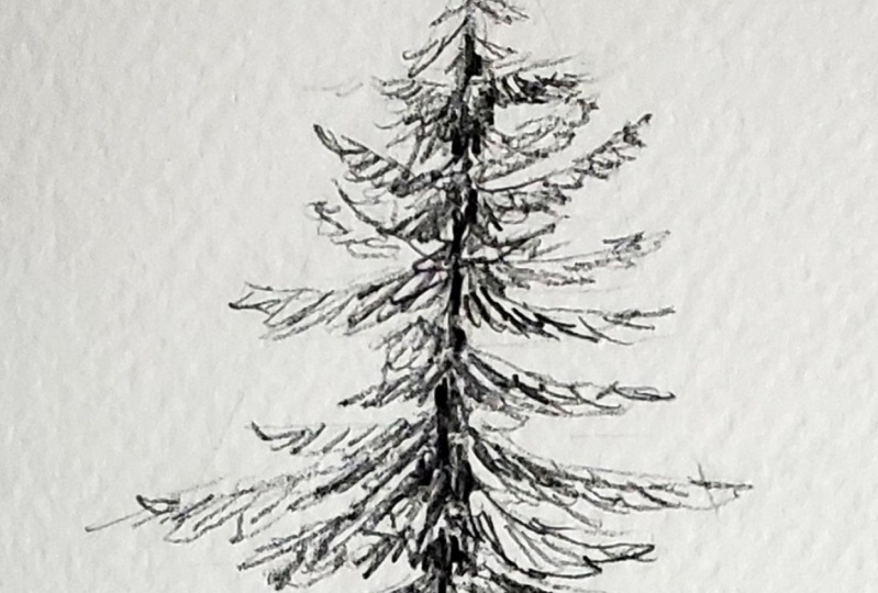
3. Simple Tree: Drawing The Outlines: Before we start drawing the
branches for this tree, let's have a look at the
overall shape of the tree. This is always a
good place to start. Here's our trunk, then
if we think about the bulk of the leaves and maybe not going right up
to these points here, but the bulk of the tree forms a really long
triangle shape. Sometimes if you're
looking at other trees, they might be more
rounded like this, even if they're
pines or fir trees. Or there might be ones
that are maybe a little bit skinnier as well like this. We want to think about
that overall shape first before we start
putting in branches. This is also going to help us decide how big the
tree is going to be. So I'm going to put
a little point at the point at the bottom. Put in my trunk. Just
using a HB pencil here. Then we can start thinking
about putting in some levels. You can see those youngest
ones right at the top. They're very short,
quite close together. Like I said, we're
not doing this exactly the same as this tree. As a reference point down here, these ones are going
to come quite far out. Think about our
shape of the tree. Maybe put that in first. Then we can think about how
wide these branches here. You can see on the side here, these ones, they're quite wide and these ones up
here are very skinny. We put in some wider
levels at the bottom. Then as we get further up, they're going to get skinnier. Skinnier to all those
really young shoots right at the top of the tree. I've drawn this really lightly, you don't want to do
this dark because obviously then
you're going to have blinds and things
breaking up your drawing. Start at the top and just work our way down at the very top. I'm just going to
put a few lines, we can't really even see the branches on those
first few levels, It's just a few flicks
outwards to either side, one or two coming
towards us as well. Then we get down to maybe
this one, this one here. Then we're going to have
one coming out to the side, one coming out to
the other side, one coming quite
close towards us. A few little flicks
on either side. Here we can have a
little bit more detail. Try not to be too
perfect with these. They don't have to be
exactly the same shape or exactly the same size. It's actually better
if they're just flicked in there so that they feel a little
bit more natural. Might have gone a
little bit too far out. With those ones,
we've got to remember that the shape of our tree. You don't need to stick exactly
to these levels either. Maybe lost a bit of
room on that next one. So I could just join
these two together. Again, putting my branches. You could even go all
the way down if you want to put the branches in that way, we might be able to stay in control of the
size of our tree. And you'll see that I'm changing the direction that these
ones coming towards us go. We're really just thinking
about having four branches, if you imagine the
branches going around the tree on each
level we have 1234, but they're not all
going to be pointing exactly the same direction
as we come down here. Make them a little bit bigger, maybe have some going further to the side so we can see a
little bit more of that trunk. Now as you come closer
to our eye level, you're going to be able to
see more of the length of the branch or more of the top of that branch that's
coming towards us. Technically, as
we go further up, we're looking upwards
at the branches. When this is above
your eye level, you can see more of
the bottom of it. And when it comes down
below the eye level, you can see more
of the top of it. Don't worry too much about being able to see
the bottom of it, but we can definitely make sure that as we come
further down the tree, we're looking down on
those branches here. That's why I've made it
a little bit longer. Okay, so let's go through
and add in these branches. Now remember, this one
is more of a diagram. It's not a realistic tree, but hopefully this will help you to get your head around
what's happening with those branches and how you can show them as being
foreshortened. We're going to add a little
bit more detail to this soon, so it'll feel a
little bit more three dimensional as she,
as we go through. You could add a little bit of thickness to those branches, especially the ones
that are getting bigger and closer to us. Remember these ones
that are coming towards us or more towards us than the ones that are
sticking straight out. They're going to be wider as well because we're going to be able to see the width of the needle sticking
out from either side. You can have these
needles pointy, or maybe you can have
them all rounded depending on what sort of
look you're going for. So they can be rounded like this or they can be
more pointy like this. I'm going to keep mind pointy. Remember to keep the
lines a little bit broken even within
each set of needles. You can have broken
lines if you want to.
4. Simple Tree: Adding Shading: Now we've got a nice simple
illustration of a fir tree. We need to get rid of
all my light lines. We've looked at the shape, There's a couple of
other things we need to bring into this texture, and there's also a light source. Both of those things
are going to help give this tree a bit more
form the texture. If we come back to these
practice branches here, we can just use a
flicking line to add in some more detail here
to these needles, maybe a few coming down
from the branch as well, these ones that are
pointing towards us, they're going to move in towards that center stalker branch. Follow the points of the bunches of needles
that you put there. These ones here,
following these points. Nice flicking motion with your pencil so that
you get something that is flowing and not
a hard line like this, has a bit of a flick
on the end of it. That's how we're going
to add our texture. Then we also need to add
a light source as well. These branches that
are close in towards the trunk are going to have more shadow cast on them
from the branches above. Imagine this is the same tree. This branch here
is going to have some shadow cast on it
from that branch above it. So we can add in a
little bit of shading. Doesn't have to follow the same direction as
your pine needles, but you can make it follow the same direction
if you want to. Then the trunk itself is going
to have some, some shadow. It's dark colored, but
it's also going to have some shadow and
also some texture. We do that all in one
go, make it quite dark, and use some scattered lines or a linear pattern to
create a feeling of a trunk. Then we'll go in
with a two B pencil and really darken up some
of these shadow areas. Enhance some of the branches
a little bit as well. Maybe put a little
bit more detail. You can make them as
dense as you want to. We can actually put in a few more branches out the back here. I'm just going to go through and identify where I
want my trunk to show. If you don't want it
to show, that's okay. You can just make your
branches a lot bushier. Then maybe put in just
a few little fillers. I'll do one here. It's
coming out the back. We're not going to be able
to see the full length of it because it's
pointing away from us. It's like this one is
pointing more towards us. This one is pointing
away from us. It's going to be foreshortened, put a few little bunches
of needles on there. It can almost just be a line
and a couple of scribbles. It just fills in a bit of space. We might actually do the shadow first just because it's going to help keep
things in order. We're going to be able
to see a little bit more clearly where
everything is. If you've lost any
of your branches, you're not quite sure
where you are, I'm getting a little bit lost here. Then you could just put in
a few more defining lines to help you find them again. Then I'm going to work my way
up, starting at the bottom. So this is all going
to be in shadow here because of the branch above it and all the
branches above it. The trunk, it's going to be
quite dark and in shadow, I want to leave the leaves at these needles at the
end. Nice and light. Let's put the trunk in here. Texture and shadow right
up underneath that branch. Underneath each one
of these levels, there's going to be a
little bit of shadow on the needles beneath it
or the branches beneath it. It's a bit more trunk in there. Trunks going to be darker. There's not going to be
too much shadow at the top because there's
going to be a lot of light reaching that top area. It's given us a
little bit of depth. Maybe need just a bit more on these branches
sticking out as well. A bit more shading. Not right to the end but just a little bit. The bits will be underneath
the branches above them. A little bit of smudge
if you want to with a tissue or even just
with your finger. Then we can go through and
add in some more texture.
5. Simple Tree: Texture: I'm going to move to
my two beat pencil. Now I'm going to start at the top and I'm going
to work my way down. You could look at
the photograph as well when I was talking
about a light source before. It can be a directional light
source in this photograph. The lights just hitting the whole thing get
shadow underneath. And shadow maybe in the back. But you don't really get shadow on one side or light
just on one side. That's what it could be if
you're doing more of these, you can keep all of
this side really light and then have all of
these ones in shadow here. And then have a cast shadow
on the ground as well. But I'm going to
treat it more as just a fairly fully lit tree. It's lit from the front end, from above, and
that means up here, there's not going
to be much shadow. But we could look
at the photo and just see where there's
a few little bits of dark and add in our texture as well if
you're getting lost. A good way to bring
back a little bit of control is to put in those branches with
your darker pencil. Maybe they look at
the photo again. Maybe some of those
branches can even go out past where the needles are. Work your way down, putting in the branches, adding
in the texture, and also if you feel like
it needs it adding in a little bit more shading anywhere that's
close to the trunk. I'm just using a regular pencil, but you could use a
mechanical pencil here if you wanted it to be really fine. I've kept mine quite loose, but if you were wanting to
do something that's more like a traditional
Christmas tree, then each one of
these branches could be a very defined shape, more like this one here. Maybe even join together and you just follow the same principle as
what we've done. You'd have the ones coming
to the front as well, and they'd also be more defined. Remember these ones lower down, we can see a little bit
more of the tops of them. Maybe you can even
see a little bit the needles going
out the other side. And then it is put in a
little bit more detail for these ones
going up the back. We don't want those to be too detailed because they
are just just fillers. Finally, we can go through and add in some even darker shading. Thinking about
your light source, is it all just coming
from the top or is it coming a little
bit from one side? In which case you could darken
up on the opposite side a little bit more filler space. And their mind feels
a little bit too sparse, especially down here. I think it needs
another couple of branches sticking out the back. You can bulk it up as
much as you want to. This is just a quick diagram
or illustration of a tree. Like I said, if you wanted to, you could do one that is even more simple, closer to this one. Let's very quickly do something like that here, just
so I can show you. We're just going to
put the branches out each side exactly the
same way that we did, making sure they get
better as you go down. And then remember these ones in the front are going
to be quite wide, then these ones here
are going to be long. If you did one more like this, then you could also go through and add in your decorations. If you want to make
it a Christmas tree, put a star on the top, maybe some baubles and
things and some decorations. These drawings like this look quite nice in ink pen as well. Then you could add just a
little bit of texture with your ink pen to show some of the needles and some of the shadow on the trunk and
that sort of thing.
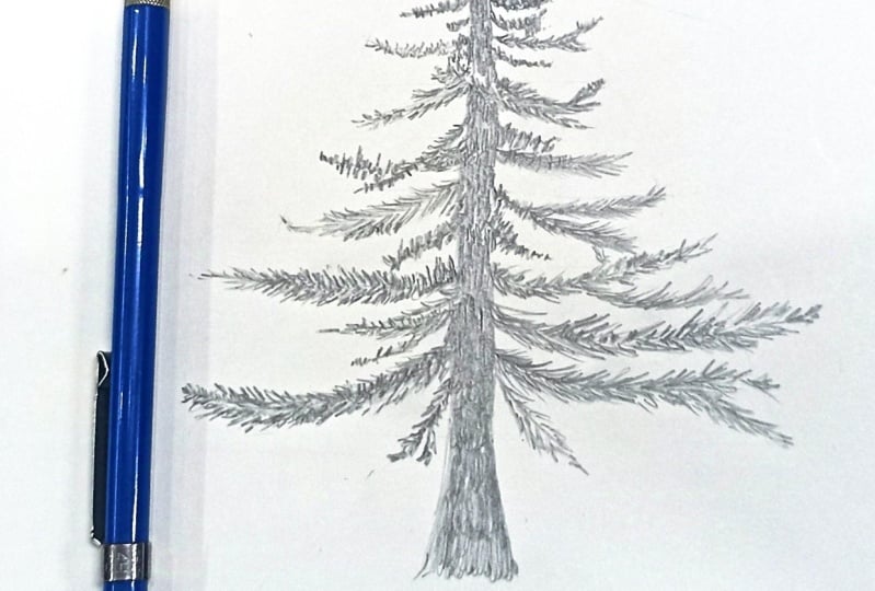
6. Realistic Tree: Main Shapes: For this one, we're going to
do a more realistic version, and we're going to spend a
little bit more time on it. And I'm going to start
with an HB pencil. It's quite a light one, though. This time I'll start my drawing quite light so you
may not be able to see the whole thing. We're going to have to change
our viewpoint a little bit, or way of looking at the
drawing is going to be the top, is going to be the bottom. Don't make it too big, make sure it's manageable. You're not going to be
spending all day doing it. And then I'm going to
put in my center line. Then I'm going to get an idea of the shape of it. Apologies. If this is very light, I'm looking more closely at
the photograph this time. I'll do that. Just a little
bit darker so you can see it. But keep yours as
light as you can. This time we have
an understanding that there are branches
coming towards us. Hopefully that'll help us see their shape a
little bit better. But we're also going to be
looking more at shapes of light and dark areas where there's maybe a lot
of needles altogether. But we're going to clump
them together as one shape. For example, this area here, it doesn't exactly
look like a branch. It's more like a shape
of the same value, it's very dense
in there as well. Then we could also look at some of the branches that
we've already looked at, but we're going to see them
as shapes of light and dark. Half of that is
light and is dark. If you look closely,
that one's quite light. We could also just look for
dark shapes themselves. This shape under
here, it's very dark. There's also this shape got a little bit of light
shining through it, but these parts that
are just dark green. But we're going to see
those as individual shapes. A little bit like
negative spaces as well. Actually we could look at
the sky as negative spaces. See if you can change
your way of looking. Now to be more about observation of light
and dark and of shape, what I'm going to do is I'm, I'm going to start
at the bottom this time and I'm going to put
in some of those shapes, it might help us think about where's halfway
up your tree? Halfway up the photograph. If this is the bottom
here and this is the top halfway is
probably about here. That could give you a place to start just putting in something. I'm just going to
put in that shape there, quite light shape. Then there's another
branch that sticks out from beneath it. These are just guidelines. That's why I'm keeping
it really light. But I'll zoom in a little bit so you can see
what I'm doing. Then down the bottom here,
we've got our trunk. But we've got this
shape like this, just coming over the center
line of the trunk there. Let's look for the
general shape and keep it loose and wobbly. I'm looking for this shape
now, something like that. The thing about trees is
there's no way you can draw every single needle
on every single leaf. Every single branch
is pretty tricky. We just take a guess. We'll not take a guess, but
we take a look at our subject is draw something that is similar or that's an idea
of it or an illusion of it. Now I'm putting in another one, another shape that I can see, which is a shape here. Between that shape
and this shape, there's another branch that
comes through under here. It comes quite far out. Then there's a bunch in here. Jigsaw, puzzling
things together. Now there's a halfway point. If we go up past halfway, we can see some more
defined branches. I just working my way up trying to keep
track of where I'm at, but if it goes a little bit
astray, it doesn't matter. You're just going
to grab hold of something that you can see in that tree and you're
going to draw that, draw those shapes is working my way up. Might need to go a
little bit taller. I'm running out of
room to put in, those last few might just
make up that top part. Actually, I know that is
a bit difficult to see. Can we darken this
up a little bit, then I'm going to go
down the other side and I'm going to try and match to what I've got
on the right hand side, what's in line with
that shape there. And it has a little
one coming out of it. This shape, that little
branch coming down there. Then underneath that there's this big shape looking at the negative space
between these two. That's the area of blue sky. And just getting a
general idea of it, you can see the trunk
in between these two. And a lot of stuff, little patchy bits
happening in here. From here, what
I'm going to do is I'm going to look
for those areas of blue sky and see if I can fit those in
with what I've drawn. Maybe just edit a little
bit of what I've drawn. So keep track of your halfway
point. That will help. A lot of blue sky in there on the other side
looking for blue sky, We should have a bit
more of a gap down here between this
one and this one. I see that mountain showing
through the back there. We're not going to be drawing
the mountain or anything but just looking at the negative spaces as I
come up along this side. There's a lot of videos and things out there
that will show you how to draw trees. But usually they skip past
the ones I've seen the skip past the actual
drawing of the tree or they'll fast forward it
and you left wondering, well, how did they
actually do that? Well, this is how they do it, but some of it is also
having done trees before. You know what marks to
make with your pencil. You could actually, instead of doing all of this drafting, you could just start at the
top, work your way down, and you'll just be
drawing texture as you go and filling
in those light, in those dark parts. That's what we're
going to do next. But I just wanted you to
have a little bit of a, a bit of structure here. Go through and put in the trunk where you
can see the trunk. There's one more branch that
comes up underneath here. It's kind of a
scraggly looking one.
7. Realistic Tree: Shading With Texture: Now we need to come
up with some texture. The texture that we used
before was lines like this. This time we can use
something that is a bit more of a scribble. Then maybe as we get
out towards the ends of the branches or
anywhere where you can see it might be a branch, you have a bit of scribble, but you can see a
few needly parts, maybe then you have a
few lines and things, but this is where I
was talking about. Once you've drawn some trees before and you understand how to create the illusion,
you just do it. You're looking as you
go and you're making the marks that you want that are going to represent
what you can see there. But it is more about scribble
and about shading as well. This is probably a little
bit too dark because some of these areas on a branch are
going to be light as well. So you might have some
light scribble and then some dark
scribble to build up parts underneath it as well.
Let's start at the top. Zoom in a little
bit on the photo. Try and stick to what you've got laid out on your drawing. It's probably better to stick with what you've got
in your drawing, then change it to
match the photo. I know that goes
against everything I normally talk about
in these videos. We don't want to get
too confused and we want it to look natural as well. I'm just looking for
those dark parts, finding some texture
that I can use to create those very pointy ones
right at the top. Broken line is always good, it's a little bit broken there. Then I'm going to anchor myself with some of these branches
that I've already mapped out. Let me just figure
out where I'm at. Here's my halfway point, that's the ones above that. This is that one that's got
that dark part underneath. Might just put that in now and edit the shape a little bit. I'm looking at this one, looking for the dark shape, shading that in was
a bit of scribble. Then I can shade in the light
part too, but much lighter. Then I can also
show a little bit of those light parts coming into the dark part by just creating some shapes
around the edges of them. Put that one in as a placeholder
so I know where I'm at. Then I can maybe work my way up whatever
works for you, really. Now I'm looking even closer
at the shapes that I can see. I'm working on this one
just above that one there. We want to bring in the branches that are interesting and that we can see the most that we
can gather something from. Mostly just putting
in the dark parts. Working my way
along that branch, looking for the dark
parts that I can see, comes out to a bit of a point. Think there might be two
branches joined together. Just going to treat
it as one and then putting in a little
bit of the light as well because it's not white. So we don't want to
leave it completely white unless there's a
very, very bright area. I might work my way over
to the other side here. Again, looking at
light and dark, I'm working on this one
now I've done this one, come across doing this one here. There's one just beneath
it as well that I can put in scribble, starting with light
or with dark, whatever works best for you. You might find it
easier to put in the general shape
lightly like this, and then come in with
the darker shape, a point on the end. This one here actually goes
out further than this one. I've got to bring that
shape out a bit more. It's got a few pointy bits on the end using the fine
point of my brush, very fine point of my pencil
to put those in so you get that contrast
between the softness of this texture and the
sharpness of those branches. Then we're going to put
in my darker shapes. Just like in our diagram,
you'll notice that there's some shadow up to the trunk. And also underneath at
the bottom of the leaves. The top of each branch might
be lit up a little bit more, except when you get
close to the trunk here, we're going to try and
have three values. This one that I'm
doing right now, We've got this dark
part just here, we've got a light part here, Then we've got
some middle parts. I'm just working my way
along that branch with my eye and increasing the pressure when I need
to for the dark parts. Then maybe lightning up a
little bit for the middle and keeping the lightest
parts really light, work my way up to
the other side, putting in the dark
parts where I see them. This one here, it's got some quite defined bunches or sub branches coming
off this main one here. Shade those in as shapes and then put in a
little bit of the dark. Then I'm getting up
to this part here where I got a little bit
lost or a little bit lazy. I think I'm just going to fill it in with what I
can see in that next level, an approximation
of what I can see. Then we can see a
little bit of the trunk there switching to
a three B pencil. It's mostly because
it's a bit sharper and the more you look, the
more you're going to see. You might start to see a few of these have
got some branches that might be moving in
behind them or through them. Now the tricky thing is to stay focused on where
we're at, not get too lost. It's a bit of trunk in here and it's got some light on it. A little bit of shadow and a
little bit of light as well. I've gone back to
my placeholder now, can start working my way
down towards halfway. I will speed some of this up in a moment, but
just to go over, what we're doing are either shading in the light
or the dark parts first, whatever makes
more sense to you. And some of those, it
depends on the branch. This one I did the light shape first just with some
circular scribble, a little bit of a
point on the end. Some of those very fine needles look like fingers reaching out. Then once you've done
that, putting in the dark, you're looking for
shapes of dark, then just working your way down, it is like a jigsaw puzzle. You start to fit things
together, something doesn't fit, just skip over it, move
on to another branch. It's all about
creating an illusion. Using what you can see in that
photograph as almost like, as inspiration or
as a reference. But you can change it a
little bit if you want to, as long as you're using
the same patterns, that you can see
the same textures and some of the same shapes. The part that I'm working
on, on this side here, you see there's a
few little bits of blue shining through
this branch in here as I go through and
put in these dark parts. In these dark shapes
that I can see. I'm just making sure I leave
just a little bit of light. That bit of light and
that bit of light. Then this is looking promising because it looks like
I've met up with the correct branch sagging
one, it's all quite light. And then I'm right next to that bit of the trunk
there that is quite clear. You can see it now. I can't really see
much texture on there. I'm actually just
going to shade it in. There's a couple of little
bits of light will probably leave it reflects
a light in there. I'll just do this one
and then I'll move to the opposite side and we'll work our way down there and speed
up the video a little bit, then locking in the shape, little bits that are falling down out of that shape as well. Even though we put
in some basic shapes before and now we're adding
some more detail as well. And then putting the dark, there might be some
middles there as well. It's not always just dark. I might be making this one just a little bit
too dark actually. There's this one that's
shooting off out over here too. These ones that come further
out are a bit more scraggly, bit more light
showing through them. You can see that takes a
bit of patience, right? I'm going to move
to the other side. Have patience and keep
working your way down. Do try to be really aware
of the light in the dark. In this one. I said that
first one that we did, we're thinking more
about the shapes and the branches
coming towards us. If we're thinking just about shapes of light and dark now, we're going to get that sense that branches are
coming towards us, especially down
here where they're covering the trunk or
here where we've got that shadow showing that the branches coming towards
us and then curving upwards. It's about making
a shift in the way that you think or the way you observe what you can see
using your artist's eye. Rather than just what you know about branches and pine trees. We don't want to draw a symbol or something that we
think it looks like. We want to use your artists
eye and notice these shapes, and particularly shapes of light and dark. O
8. Realistic Tree: Tips For Contrast And Line Quality: I've got to my halfway point. Now, just a couple of things that I want to
bring your attention to. This is just about bringing in a little contrast between our soft marks and
our sharp marks. We've got lots of soft marks
with the soft shading. But some of these branches, if you look out towards
the end of them, you can see a bit more detail. And you might use more of
the point of your pencil there to create an
idea of more detail. The sharp pencil
mark that we use, it's almost like it creates an illusion of sharper detail. You can put on some
sharper parts here. If you can see some
lines that look a little bit like needles, there may be a few
lines as well. I could see a few on
these ones up here. You don't want to be too linear, but just to add that little
bit of extra detail, a few tufts coming out
the other side as well. Then also really close
to the trunk here, you can see quite a bit
of sharp detail as well. Let's make sure I'm
not getting lost here, but just especially over here
on this side of the trunk. In here there's some
quite sharp detail in there that maybe branches, very small branches and needles
and things hanging down. And they are very dark
against the light. These parts you want to
put in quite carefully, they don't have to be exactly
the same shape necessarily, but they should be
nice and sharp. Maybe try and get an
approximation of the same shape, so there's a bigger one, there's some bits that cross
over each other in here, the hardest thing is getting
them to look natural. And sometimes if you
try too hard and you try to draw exactly
what you see, you end up drawing
something that is a bit too straight edged, a bit too geometrical geometric. I find it easier to just give a little bit of a
wobble to my pencil every now and again get something that is irregular
and that maybe I don't control quite as well as I do for some
other sorts of drawings. But like I said, it comes
with experience as well as knowing how to move your
pencil to get certain marks. I think I definitely
have got something a little bit and miss here
because I've got this one, then I think I may
be missing a branch. And here I think what I've
done is I've put in this here when I should have had it down closer to this midway point. Apologies about that. Should be underneath
this branch here, but like I said, it's just an
approximation of it. I just got myself a little
bit lost when I came up here. But I'm just going to
use what I can see in the other ones above it
and add in some branches, sharper branches again against the light coming through
in the background there. Then also trunk, we want
to get the value right. Mine is probably not
quite dark enough. If I look at the branches on
either side of the trunk, I want them to
appear quite light. Especially the parts
that have the light hitting them really
need to darken this up. That part that comes out
above our center line there, you can see how dark it is. Almost black really
then straightway. That's given everything else a little bit more form
because it's made these appear lighter as if light is hitting those branches.
9. Realistic Tree: Starting The Lower Half: Right. I'm going to carry
on below the halfway point. Now this is where things
get a little bit bulkier. We can see some of the trunk
there and it's much lighter. Keep that in mind. When you put in the shading for that trunk, it should be very light. If you squint,
you'll see how much lighter it is than the
part above halfway. I might just put that in now
just to get my value right. Some of these branches
are probably going to be going over the trunk
just a little bit, but most of these ones
are a lot bulkier and you could even draw or
shade in the bulk of it. First, I'm looking at this one just below halfway
on the left hand side. We don't want it to get
too regular shapes, but just to get some
value in there. Then go through and look
at like the sub shapes. What can you see within
that bigger shape there? Here's the bigger shape. It's got that little
bit coming off it, That's what I've shaded in here. Here's a little
part coming off it. Then within the sub shapes, there's this dark part would
be easiest to look for. The dark parts I think. Dark part here, dark
part through here. We've already got a
base layer of shading that's going to represent
our light part. We need a little bit more
texture in that light part, but we also need to put in those sub shapes,
those darker parts. I'm going to go ahead
and do that now. Just working my way
in my eye across it, looking for the dark parts, trying to see clumps. You could even draw
those shapes out, those clumps out if you want to. If that makes it easier, then shading in
the darker parts, then if you wanted to, you could go through and find the sub shapes within
each one of these sub shapes. For me, it's getting a
little bit too detailed. Takes a bit too long
for me to be honest, let the eye do that work. Maybe just put a few
little scribbles and things and to create
a bit more detail, just make sure you're keeping the light where it should be. We've got a bit of dark, should be the dark and there comes down a little bit further
to meet this branch here. We can use that dark to create the border for the light in
front of it as well. I got that main shape, but I'm also finding
a few more shapes off shooting from that as well. Very much just about observation
where your eye goes. That's what you
draw, what you see. But you're always thinking
in terms of light and dark and shape. Not even really lines, just shapes of light and dark. There's this part that
comes down and out and maybe we can vary our line
quality a little bit. Have some sharper
marks out there where there's a bit more detail that
you can see more clearly. Just going to add a little bit more light to this one here. It's felt like it was
getting a bit dark. Keep working your way down. You may be finding that there's a particular
style coming through. You can see my style
coming through. I think that's quite strong. It's more of a
scratchy feel to it. Yours might be more soft, and the marks might be a little bit
rounder than mine are. There's no right or wrong way to do it that just
comes down to style. These bigger ones,
I'd suggest shading in the bulk of the shape first. Don't just shade in what
you've drawn already, but all the outlines that
you've drawn already. But look again at the shape. As I draw this one
in, I'm seeing that there's a few
little bits that come out side the shape at the top before it starts
to curve up a little bit. Looking how it joins in with this other shape here,
just underneath it. All the little offshoots and things shading, all of those in. It's almost like you're
drawing the silhouette of it and shading and then go through and add
in the dark values and the subshapes as well.
10. Realistic Tree: Integrating Light & Dark Values: How are you going? Hopefully
you're sticking with it. It's very easy to get
lost in what you're doing and I think that sometimes
it can be a bad thing, but generally
that's a good thing if you're feeling like
this is almost like a meditative process and you are just drawing and
looking and drawing, that's really what drawing
is about and it means you're tapping into those
observational skills. And seeing like an artist's
the light in the dark without thinking about it's a tree or it's a branch,
you're just observing. Just got a little bit
here to show you. You can see I've blocked in
the lights and the darks, but they're a little bit
too stark or separate, so we need to integrate
those a little bit. I'm looking at
this section here. Hopefully you can see that. See What I've done is this part here I've blocked in the dark. There's this dark shadow
coming from this one above it. Dark comes out a little bit. There's a bit of a dark
shape that comes down here. Then there's this
dark shape that winds its way down and starts
to jump back in again, I've put in all
those dark shapes, but you can see it just
looks a bit separated it two dimensional rather
than three dimensional. That's when we need to look
for those in between values. There's a little bit of
a middle value in here. It's a way to integrate
the light in the dark. Maybe there's a few sub shapes in here that are
not quite as dark, but a bit of shading. If you find that
yours is looking a little bit like this to light and dark,
too much contrast, then it'll be a matter
of going through and focusing in even more and finding those smaller
details of mid values. Then maybe even just putting a little bit of texture
in there as well. Especially as we come into these bigger areas,
there's a lot more room. We don't want to
just leave it blank. We might have to add in
something that presents the shapes that we
can see there or the leaves and textures that
we can see in there. That might be through
marks that you put over top or it might be
going back into your dark. I'm going into the
dark area here just looking at it again and it's got sharp edges where
it's got soft edges moving into the light area
above that dark part, it starts to give it a
little bit more depth. Then also, don't forget about our sharper lines
that we can have. They can be very fine lines, quite fine detail as well, to show these branches
that is sticking out and do have very
fine points on them. Hopefully this has given you enough to keep
working on your own. It is a long process when you're trying to
draw something that has a lot of detail and you want to make it fairly realistic. You can choose how much
detail you put in there. You could keep everything soft. Like this part here, you can see it just below
the halfway point there. There is more detail in that, in the photograph, but
I've kept it quite loose. We do need to bring some
detail in somewhere. Otherwise it's just going to
look a little bit blurry. We have a look at
that trunk in there, needs to be a little bit
wider because obviously the trunk at the
bottom is a bit wider. The tree gets narrower as
you go further up the trunk. I'm just going to bring
that out just a little bit. It's up to you how detailed
you get with that trunk. You can see it's got some
shadows cast across it, some branches and
things that are casting shadows over it. But there is a lot
of light coming through in that bottom
part of the trunk. Make sure you keep a
bit of that light. One side of it is darker,
the side on the left. And there is a bit more
shadow down the bottom there. Just something to
think about with that trunk paying attention
to where it's light and where it's dark and some of the shadows that
might be going across it, that was a shadow there. A bit too much of
a linear shadow. So I'm just going to shade
across it, make it softer. You might have noticed every now and again I've
been giving things a little bit of a blur if they feel a little bit too harsh. Don't usually use my finger, but it's such a
small amount here. Just using my finger to do it, You could always get
something like this anywhere where feel like there's a bit too much detail
or too much contrast. Just adding a little
bit of smudging. But you've got to be careful
with these things because people will just obliterate all of that lovely hard
work that they've done. I just do it at the end. If you look at it
and you go, oh, there's something
not right there, Maybe here, this is quite light. Where is that in the photograph? There is a bit of light
shining through there. So I could either bring
back a bit of light, this is just under
the halfway point. Can then bring in
some more detail over the top to show that as light and the other
side is a bit more dark. Or if you want to make it
appear like this is part of the tree that's coming
forward towards us and it is overlapping the trunk. Then maybe you do just
smudge it out a little bit. You can also see
when you smudge that things get darker as well. That's something to
just be careful of. You don't want darks
in your light areas.
11. Realistic Tree: Larger Branches: Okay, I'm going to move down into these bigger parts here. I did a little bit of that one. Let's do a little bit of this one on the side
and this one here, then I'll work my way down. But I'll probably leave the, the rest for you
to do on your own. One more time going
through that process. If you've lost a
bit of your shape, like I've maybe adjusted
things as I've come down, then you could just lightly go through and draw
it back in again. I'm just using my
three B pencil here, but I'm using it lightly
just to map in that shape, especially mapping in
the dark parts as well. Just put that in there
as a placeholder. And then there's a
bit of sky there. I'm going to put that in
as a placeholder too, so I can try and keep it
then dark underneath that. Now that I've put that in there, I can use it to frame
the lighter area. I'm looking at the
way that that dark moves up into the light
part, the shape of it. Then I can shade in
all of the light. It'd be good to use small
circles here because it's what it feels like. It's got that rounded look rather than being looking
like a straight needles. It is made up of
straight needles, but they're clumped together and you get these
little bubbly parts. A bit of light in
here as well as we get close to the trunk. Probably put this a little bit too close to the
trunk, but it's okay. I'm just going to work
with what I've done. Put in a few little dark parts against the light in there. And then I'm coming
down the other side of this dark parts some light. Let's see some light
in there as well. Even if you can't keep track of what I'm doing
and it's not exact and never are exact when
I'm drawing trees like this because I don't
have the patience. I don't know if you
do, but even if you're not keeping up exactly
with what I'm doing, hopefully you can
The same techniques that I'm using to apply
to your own drawing. Now I'm going through that
shape that I've blocked in light and I'm putting
in some mid values and looking for any sub shapes. Sometimes even just adding a bit of random texture where I feel like it might be a
little bit too flat. Then making sure you
put in bit stick out, checking the value of those two. The ones on the other
side are quite dark, but this one here that
sticks out is actually about the same value is the rest of the tree or the rest
of this part of the tree. Then we've got these
ones coming out here. I'm just going to map
that in a little bit. I know where I'm at.
Little one up there. This one's got some sub branches that are hanging down
off it on either side looking for the
light in the dark. As I do this, I'm looking
for the light in the dark. But I'm also flicking my eye
back to that part that I put in so that I can gauge when
I'm getting close to it, whether I'm going
too far or not. Because we're not
thinking in terms of proportion so
much for this one. We're not measuring proportion, We're just using our
eye to move back and forward across our drawing
and across the photograph. That's not always that accurate. Every now and again,
you've just got to make sure that you're in the right place in relation to something that you've already got
in your drawing. I've definitely got
some parts of mine that don't quite match
up with the tree, but I'm not worrying
about those. I'm just going to
put in this part here looking for that
dark part on the trunk. Then we've got this part
that comes in front, which is important because we don't have a lot of
other ones that are coming in front of the trunk. This is one of the branches that is going to
help make it look like the branches are
coming towards us as well as going to either side. Some of these especially
ones that are further back, you can just leave fuzzy, especially if you are going to bring some
detail in somewhere else. I could have this part in the foreground here with
quite a bit of detail. Really go in and be careful
about what I'm doing. I feel like I need glasses to be able to see some of
this detail right now. Actually, definitely
take a break. If your eyes are getting tired, I might tend to get a
little bit blurry when I'm looking the way that
an artist looks. I'm going to bring in a pencil that's a little bit
sharper, a four. But just to get a little
bit more detail in here, looking at some of
those sub shapes, maybe even putting in a
little bit of a pattern like a dotting pattern
or stroke pattern. You can see when I put in
that a little bit of pattern there gives it contrast
to everything else. This part is different to
this part, which was softer. You can help eye to certain part of the
drawing that way as well. But it's also just nice to
bring some contrast into it. It means that the eye has
something to look at. It's interesting, even though we don't really think about
it being interesting. It makes for a more
interesting drawing, more interesting
viewing experience than if everything
is exactly the same. The eye has different patterns and points to move between. I'm definitely getting
lost down here. I'm not quite sure where I'm
at, which branch I'm doing. I'm looking at one
of the branches. But if it's the right branch. But getting to that point
in the drawing now, I'm definitely going to put
this little dark part back here because it's hidden
a bit by the shrub. But just to help frame that
one that's in front of it a little bit more it, if it is hidden by the shrub, we might just have to
make up a little bit on the end of some of these
that we can't see so well. There is this lovely
one over here that is drooping, which
I really like. I definitely want
to put that one in. Just put a few markers in here where these other
bits are going to go. Then I'm going to
finish, afterwards, I'm going to put in
this droopy saggy one. This one has got a little
bit more of a linear mark, it feels like it's hanging down. This is put in the shading
and then showing the shapes. Then we can put in
some of that texture that's a little bit more droopy, but there's some parts
flicking out the top of it as well and overhanging
from the one above it, This line shouldn't be perfect. It a little bit wobbly because it's needles and things that are showing up
from the other side. This is very dark, this one as well because it's in shadow. Anywhere that is in shadow, it's nice to soften
it off a little bit because you want it to feel deeper and a
bit denser as well. You've got lots of
patterns and things in there it can bring it to
the front a little bit. I'm going to bring
some of these bits hanging a bit further down here. There's a little bit
more of the trunk that you can see right at
the bottom there. I'm not quite sure how
tall this tree is. Maybe it keeps going down. You could finish it
off if you want to. You could make it look
like a standard A trunks. Remember there'll be
shadow right underneath branch that's at the bottom
of the tree and the en, as you come out towards
where the roots would be, it's going to be a
little bit lighter.
12. Realistic Tree: Evaluation: It's coming together.
Now I've got just a little bit
to finish in here. All I'd say to you now is that you've got to a point where you feel
like it's almost finished. Is to look at your drawing
and look at the photograph. We do this in a lit of classes and just see what
you can observe. See if there's any
major differences, especially between
light and dark. Or if there's
anything that stands out to you in the
photograph that you feel like maybe isn't in your drawing, then put that in. One thing that stands out to me is this dark patch over here. Could be dark stronger. I think I soften
the blending stump, but I can definitely put that in again and maybe just
look a little bit more at the shape of it because it's something that's
significant in the photograph. Maybe a few more of these
shapes of sky showing through. There's probably a few
more dark shapes like that that I'd go through and
put in This one up here. What else stands
out This one here? I've got it draws your
attention quite a bit. I think maybe I've
done a little bit too big and I've got a lot
of texture in there too. I could maybe get rid of
a little bit of it there. Push it to the
back a little bit. It might feel like
it's moving out away from us a
little bit further. I'm missing a few little
ones in here as well. Anywhere where you've
got some gaps as well, you might just fill them in. Taking an example from one of the leaves or one of the
branches on the tree. Use it as an example
and just fill it in. It doesn't matter if it's not
in exactly the same place. It's going to give you enough
information to be able to represent a similar branch in the place that
you want it to go. If you've got any
big gaps of sky, there's quite a big gap in here. And I can see, I
think this is where I accidentally did
this part above it. But I could choose another area of the tree and put it in, or I could just give
an idea of there being some branches or something
in there as well. Remember to balance off your tree trunk in
terms of value. Make sure you've got
it the right value compared to the leaves
and things around it. So it should be dark,
quite dark in here. And you can use it to
help frame some of those lighter areas
too, where it overlaps. Then as we come down here, it's dark on one side, it's got those shadows
coming across it. But generally, it's quite light. When you're looking
back and forth between your photo
and your drawing, You can also look at the
negative spaces that might help Sometimes If I look at
this space in here, the shape is pretty good. But by looking at that
space in the photograph, I can see that there's
some more parts that come down from
this branch here. It's got a little bit
more shape to it. Trying to see it more as a silhouette can
help you to then figure out where you
might need to add maybe a little bit more
detail to something. Then also remember
to think about contrast in terms of your marks. Have you got sharp
marks and soft marks? Have you got them
in the right place? Anywhere where there's
some fine branches, you could have some
quite sharp marks. And then anywhere where there's big bunches of
needles, altogether, it might be quite soft, even though we know that
they're not soft in real life. But just to give the eye
a bit of a break and to move the eye between
the different contrasting areas of texture, I hope this has been
useful for you. It's quite a long process, it can get a bit
boring. To be honest. People are really into this work where you're meditatively going through every part of that tree and mapping
everything out. But what I do hope that
you've taken from it is how to create a texture that gives the illusion of
needles and also how you can use that light and
dark to create form. Remember when we
did our other one, we talked about three things. We talked about shape, we talked about texture
and light source. And we've approached this one from a different
way of thinking, but it's the same thing. We've got texture,
we've got shape. The shapes are way
more detailed. We're looking at the shapes or the sub shapes of each of the branches and
the clumps of leaves, as well as a general shape. And then we've got
light source and again, more detailed with
our light source, we're not just thinking about it's coming from one direction. Everything on the other
side will be dark. We're looking at each one of
these clumps and thinking about light and dark and
shapes of light and dark. And that's essentially
giving us that sense of a light source coming towards the tree and maybe
from slightly above. So you can have these shadow
areas underneath this. One's just in time
for Christmas. I hope you have a lovely
holiday and maybe you can draw a few Christmas trees
while you're relaxing. Thanks for joining me and
I'll see you in the next one.
 Emily Armstrong, The Pencil Room Online