Transcripts
1. Introduction: Possible to create some
absolutely beautiful drawings of animals with colored pencils, but it can feel
very overwhelming. I'm going to show you
today that actually, if you follow a
series of key steps, it's maybe not as
complicated as you'd think. My name's Jemma Chambers, and I've been making online
art tutorials since 2020. I've helped tens of thousands of people improve their art. Today I want to take a
really in depth look at how to draw some
stunning portraits of dogs. I'll show you all of the
materials that you'll need, as well as some of
the key techniques. I'll then talk you
through the process that I always use for drawing fare. We can then apply
that process to drawing this dog.
Let's get started.
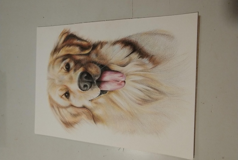
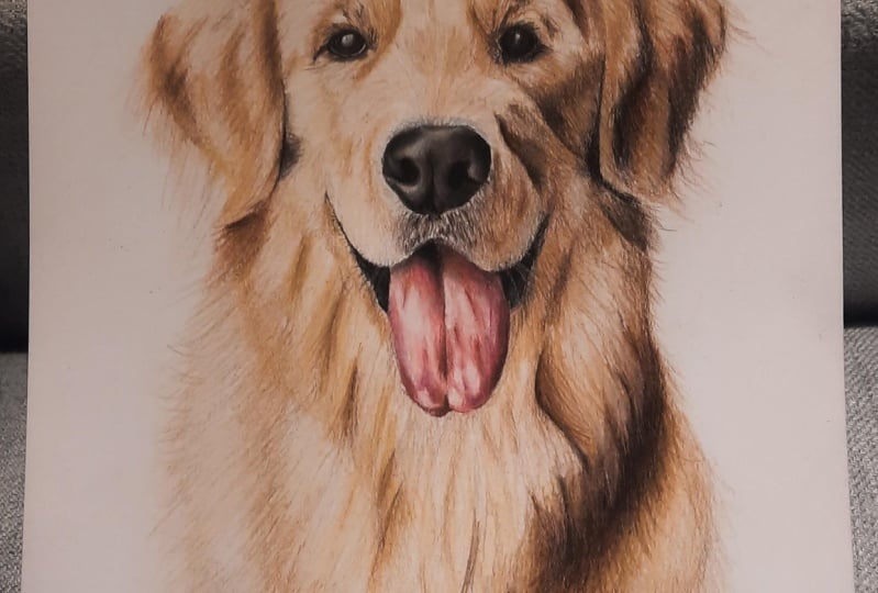
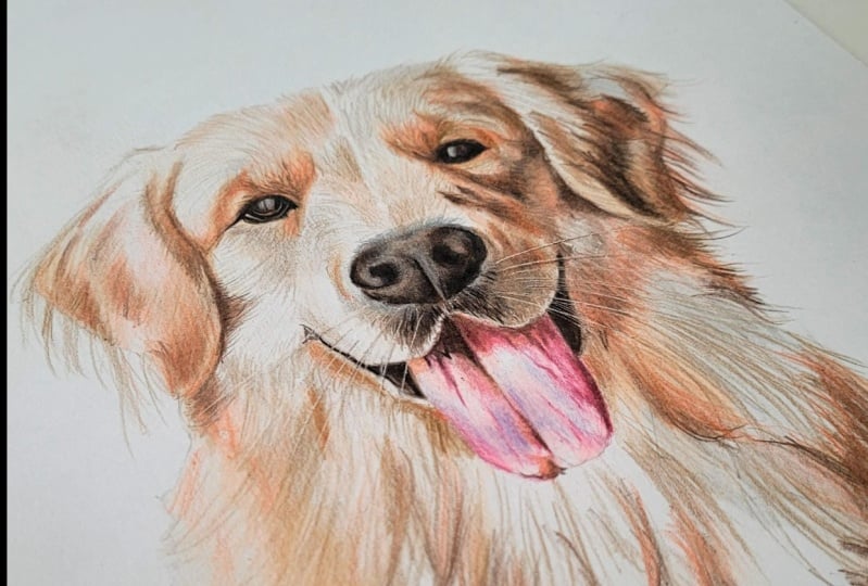
2. Class Project - Drawing a Labrador: The class project, we
will be drawing this dog. Now, I've chosen this
dog for a few reasons, and actually the main reason
is the color of the fur. I think golden fur is generally thought of as
very tricky to draw. So I thought it'd be a
really helpful one to show. Now, I will show you everything that you need to know to draw this dog and also
how you can apply it to other drawings
of other dogs. But if you want to use
exactly the same colors that I'm using for this dog, I have included that in
the class resources. Also included some sketch outlines in the class resources. I will show you how to
make your own sketch, but if you want to use
mine, that's where that is. Finally, when you've
finished your drawing, please do upload it to
the class projects. I would love to see
what you've done. Now, let's look at the
materials that you'll need.
3. Materials You'll Need for Drawing with Coloured Pencils: Let's think about
the materials that you'll need to draw this dog. And the most obvious material
is a set of pencils. Now, I am going to be
drawing this dog with the set of 72 prisma color. These are professional
colored pencils, but you don't need to use
exactly the same set as me. Any decent sized set of
pencils will be fine. I would say you want
at least a set of 36. You don't need to have
professional colored pencils, something like
crayola will be fine. Now, what is probably more important than the
pencils is the paper. You want to be drawing on
the right kind of paper. Every drawing that I create, I always use bristol
board paper. This is really nice, smooth and thick paper. The key to all colored
pencil drawings is to build up the color gradually to build it up in a
series of layers. And this paper allows
me to do that. You don't want to be drawing on something like sketch paper or printer paper because
it's just not able to take all of
those layers of pencil. Next up, you will need
a pencil sharpener. Now, I use this hand
crank pencil sharpener. I particularly like that
I can change the blade. But you don't need
something as fancy as this. Anything that creates a really nice and sharp
point will be fine. Next up, if you are
creating your own sketch, you will need a pencil
ruler and an eraser. And the next item is
an optional item. This is a craft knife. Say this is optional. This is
what we're going to use to add in the whiskers at the
very end of the drawing. But you certainly can create a stunning drawing of a dog without it if
you don't have one. The next item you'll need isn't actually something you can buy. It's something you're
going to need to make. This is a set of swatches. Now, for every set of
pencils that I own, I always watch out
all of my colors. I go from as light
as each color can go to as dark as each color can
go, and then I label it. And that shows me
what each color actually looks
like on the paper, rather than relying on the barrel or the
lead of the pencil, which don't tend to
be very accurate. This is quite a time
consuming process, but honestly, it
is so important. I heavily rely on swatches
for all of my drawings. It's not something you will need to do frequently, though. The set of swatches that I
have are at least 5-years-old. And the final thing
you'll need is some way of looking at
the reference photo. Every drawing I create
is from a reference. I find that is the best way
to create realistic drawings. Now, I like to look at
reference photos on my iPad. I particularly like that I can zoom in to see all
of the details. But you don't need to
do this. You could always print out the
reference photo. You will need a set
of colored pencils, the right kind of paper,
a pencil sharpener. If you're creating
your own sketch, you'll need a pencil
ruler and an eraser. You could also use
a craft knife. You'll need a set
of color swatches and some way of looking
at the reference photo. Next up, let's look at some of the key techniques
that you need to know.
4. The Key Techniques: Let's have a look at some
of the key techniques that you will need
to draw this dock. And the most important thing
to understand is layering. As I mentioned earlier, layering is the key
most fundamental part of drawing with colored pencils. This is where you
gradually build up the pencils in a series
of light layers, rather than just pressing really hard and
blocking in a color. Enables you to mix
colors together and generally creates a much
nicer, softer look. And you'll notice when we're building up the
colors of the dog, we are always working
in light layers. Now, in order to build
up these light layers, the most important
thing that I do is hold the pencil further back
than you might imagine. If I hold the pencil back here, it literally stops me from
being able to press too hard. Notice that I particularly am doing this for the
lighter layers where I don't need to be as accurate with where
the pencils going. As I move on to later
in the drawing, I do hold the pencil closer
to the tip while still pressing lightly just because I have a bit more control
over where it's going. Now, as well as
creating light layers, another thing that I
particularly want to do is put down the pencil in
generally two different ways. I either want to
put down the pencil really nice and smoothly, or I want to create the kind
of flicking motions of fair. So to put the pencil down
as smoothly as possible, what I do is work in circular motions rather than just scribbling back and forth. Working in circles or
oval motions, again, the pencil just goes down in a much smoother, more
consistent way. You'll hear me talk about
circular motions a lot, and this is what I mean. I also will talk about
flicking motions. So this is creating
that fair texture. It's where I'm very gently flicking the pencil
against the paper, just gently brushing a
really sharp pencil, and it creates these really fix. It is well
worth practicing, specifically getting this
as soft as possible. Now, the last technique
that you particularly want to focus on is using
the craft knife. As I said, this is
an optional step. Now, what I like to do
with the craft knife is use it to add
in the whiskers. Once I've built up my
series of light layers, I then can use the craft
knife to scrape away the top few layers of pencil to reveal the generally
lighter color underneath. So you can create some really thin light lines by scraping
away those top layers. Now, it is so important to
do this really lightly. If you press firmly
with the craft knife, then you will end up
damaging the paper. And again, I so strongly recommend practicing
this before doing it on your finished drawing
because you don't want to get to the
end of the drawing and end up ripping the paper or somehow
damaging the drawing. So those are the main techniques
that you need to know. Let's now talk specifically
about building up there.
5. The Technique for Drawing Fur: Now whenever I'm drawing fur, whether it's on a dog
or any other animal, I always use the same technique. This I find really good for creating some lovely soft fur. So let me talk you through
that process, and then, hopefully, when we draw the dog, it'll all make a lot more sense. So I'm going to explain this by talking you through
drawing this little mouse. Now, we do actually have a full skill share about this mouse. So if you want to cover fur
texture in a lot more detail, I will link that in
the class description. First thing that I always
do with fur texture is actually start with
some smooth base layers. I don't start off by building
up any sort of fur texture. So what I want to do is look at the underlying
colors of the fur, and I like to start with the
lightest color in each area. Now, when we're drawing
the dog, I will talk you through the lightest colors
I can see in each area. But on this mouse, for example, there's a mixture of gray brown, and even some pink. Sometimes it's easiest to
see these underlying colors by looking at the
reference photo and maybe kind of squinting. It helps you look past
that fur texture. I always build up
those base layers with circular motions to try and get it nice and smooth and as always and working
really lightly. After I've built up
those base layers, generally going from
the lighter colors to the darker colors, and I have a slightly
funny looking animal. But the main shapes are there. I can then start thinking about adding in the fur texture. And I pretty much work through
the exact same colors, but this time using
those flicking motions, particularly looking at
the direction of the fur, it doesn't necessarily go in the direction you would expect. So particularly want to focus
on the length of the fur. There'll be different
length of fur on the face, for example, in comparison to the back of the
mouse, in this case. And I also want to look at
the density of the fur. So in some areas, the
fur might be quite thin, so I need to add
flicking motions, not quite as close together. But if there's a really
dense area of fur, I will need to add a lot of
flicks one on top of another. So built up all of
the fur texture. Now what I'm left with is an animal that looks
a bit scratchy. And I can go back over
all of that fur texture once again with
circular motions with those same colors to
smooth everything out, and this will make it
look a lot softer. I can also use this
as an opportunity to brighten anything up, maybe adjust the colors if
it's not looking quite right. So that is the process that
I always use for all fur. Let's talk about
reference photos because this is more important
than you might expect.
6. Selecting a Reference Photo: Selecting the right reference photo for your drawing is one of the most important
things to get right. You could have all of
the perfect techniques. You could be an amazing artist. But if you're working from
a bad reference photo, it's never going to look good. So there's a few main things that I'm looking
for in a reference. The number one most
important thing is that I want to have a
good amount of detail. It's always tricky, particularly when you're
drawing an animal if you're drawing from
a reference where it's blurry or you
just can't see. It's not going to create a lovely detailed drawing if
you can't see that detail. Want to be reasonably
close to the dog. So you can see all
of that fur texture. Next up, another
really important part of the reference photo
is the contrast. If you have either
poorly lit reference photo or it's in bright
sunlight, it's all one color. Again, it's not going to
create an amazing drawing. What you want is some
really nice light colors, a good amount of mid tones, and some really dark darks. If you're taking your
own reference photo, what I usually recommend is getting your dog to
sit by the window. That generally creates
some really nice light. Now, another thing
to think about is the kind of height
of your drawing. I always like drawings
of dogs at eye level. I think it always
looks a bit odd if you're looking down at the dog. So if you're taking your
own photo of your own dog, do get down to their level. You'll see that on the
reference photo that we're going to use for the
drawing on this course, it is at eye level, it has some brilliant contrast, and it's all really detailed. The only part of
this reference photo that actually I don't like is that you can see
part of the back of the dog. You can see the dog's back and the dog's tail
in the reference. So we're just going
to edit that out. I'm going to not
draw that section, and it's going to create
a much better drawing. So that's the most
important things that I'm thinking about when
selecting a reference photo. Let's create our sketch.
7. Create the Sketch Outlines: Now before we can
think about adding any color onto the drawing, we first need to create
our sketch outlines. We want to have a
really rough templa of the key shapes of the dog. So, I like to do this with something called
the grid method. This is where you draw a
grid on your drawing paper, and put a grid on
your reference photo, and you just draw what's
in each individual square. Often when you're
drawing sketch outlines, it's very tempting to
try and draw a dog. So you make various assumptions about which shapes
need to go where, and it ends up not
being very accurate. If you're just drawing what's
in each individual square, it stops you from thinking about drawing a dog and you're just
drawing a series of shapes. You're just drawing what
you can actually see. So let me show you what I
mean a little bit better. We'll draw a few of the
squares from this sketch. So let's start on
the left hand side and work our way
towards the right. I want to start on
this square here. The easiest thing that I
have found is to look at where the lines are
passing through the grid. So, for example, we
only really need to draw this line along here. So this line here is crossing the grid line maybe about a quarter of the
way from the right, and this line here is
crossing about a quarter so let's mark those points on our sketch at the
top and at the bottom. And then all I need to do is
join these points together. And that is already
the first square done. Now, the next square
is much easier. There's only a tiny
bit of the dog. But then this square it, so I've already got
this mark at the top, and then it kind
of curves around a little bit and crosses a
bit to the left of halfway. Now notice that I'm
not worrying about drawing in any of
these fine strands. I want to be generally looking
for the edge of the ear. Want to get the basic
shape marked in rather than getting all of
those details marked in. So I just want to get the
general outline of the ears. And as I say, I like to work reasonably methodically
as I go around it, just working one square at a time from the
left to the right. I can draw in this
line along here. This is reasonably
simple because it's just a line going upwards. And once I've drawn in
the general ear shape, I want to start thinking
about marking in the face. I think that this can feel
quite tricky, and once again, you'll see I've marked out
the edge points of the eye, and then I'm just joining them together in that eye shape. Now, if you're
finding it tricky, drawing out the detail
of the eye here, you could put a
smaller grid on here. If it's too tricky, working with the reasonably
large grid squares. So you could always
do a smaller grid on just the eyes, nose and. So I've drawn in
all of the squares, what I can then do is
erase the grid lines. Now, the sketch that I've
got here is quite heavy. They're quite dark lines. In actuality, you
want this to be as light as you can
possibly make it. I've done mine darker, so you
can see it on the camera. And it means that when you
erase those grid lines, you will actually be
able to erase them. Mine are very much
still showing. So what you should now have
is a very light drawing, a very light outline of a dog. The last thing I want to
do before starting adding any color is take a really good look at the
reference photo.
8. Studying the Reference Photo: Like to do before
every drawing is take a really good look
at the reference photo. I'm looking for all of the key colors and shapes and things I
want to bear in mind. So let's take a minute
to do that now, and you'll see a little
bit better what I mean. So let's take a look at the most obvious things I'm noticing in this
reference photo. And probably the most striking, the most important part of this drawing of this reference
photo is the color of fur. So let's look at some of the actual colors
that we can see here. This dog has kind of golden fur, which is made up of
a number of colors. There are the lighter
areas like a long hair. This, I would say is like a very kind of yellow. There's some
darker areas in the fur like these folds around
here, these darker spots. These are all quite
a more earthy, darker kind of yellowy tone. And on this side of the face, which is more in shadow, it gets really quite dark. Around here, this is
really quite dark brown with some of a
similar color to here, but a little bit darker. You can also see all
of these dark patches all along the side of the face, all down here, which
you can generally see down this right hand
side of the body. Some areas like the fur around
here on this darker spot, it's not dissimilar
to the color here, but it does look a
little bit different. It looks like it's
got an ever so slight hinky tone,
particularly around here. So we're going to
need to build up quite a number of
colors within the fur. Something that always
needs thinking about is the length of the fur, the kind of buildup of the fur. Particularly thinking about
the length right now. There are loads of different lengths of
fur within this dog. There's some shorter
fur around here. This is some very,
very short fur and around the muzzle generally. It gets a little bit longer
around the top of the head and then much longer around
on the body around here. And there's some
very long hairs on the top part of the
ears all along here. But then it's much shorter
at the bottom of the ears. So we're really
going to have to pay attention to the
length of this fur. And generally, how are we
going to be building this thinking about other
areas of the dog. So not the fur I'm thinking particularly about the
eyes, nose and mouth. The eyes, I would say, are generally pretty simple. This eye on the left has a lot more detail than
this one on the right. This really just looks
like a very dark patch. You can't really
see any details, except for that
little light glint. This eye has a little
bit more detail. You can see some of the
brown iris around here, but still not a
huge amount here. On the nose, there's some colors that I wouldn't necessarily have imagined there's some gray like around here
and around the top. Tongue has, again, more detail to it than
I would imagine. It's got a lot of lines
and dips down the tongue, and it's generally
again more shadowed on the right hand side
and lighter on the left. So those are the key things
that I'm noticing about the reference photo to begin
with. Let's start drawing.
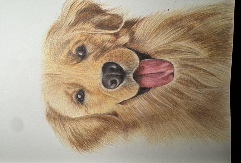
9. Map in the Dogs Face: As I always do, I want
to start off here by drawing the eyes,
nose and mouth. I want to map in
these key areas, although we're not
going to worry about adding every tiny
piece of detail. So I'm starting on the eyes here and I'm going to start by drawing in the light sections with a very light cool gray. So looking at the eyes, they've both got
these light patches. The light patches on the eye and the light patch
around the bottom. The closest match, I would
say, is a cool gray, a lighter cool gray sort of generally over
the whole area, and then a slightly
darker cold gray to add in both this line here, and it's a little bit
darker around the edge. You can see it kind of has a
slight gradient around here. So let's start off by putting in my lightest cool
gray in my set. And I'm just blocking in that light patch on the left
eye and then also marking in where that light
strip underneath that light band that
light bond needs to go. And let's also just put in the light patch on the right eye as well.
There's not as much to do. Can move straight on to a slightly darker
cool gray to draw in both that line that I mentioned and add a little bit of shading around the edge. So as always, the most
important thing that you want to be doing here is
not pressing too hard. I want to be pressing
really nice and lightly, so I'm able to build up
a lot of the pencil. We're not going into huge amounts of detail
right at this second. I'm not going to
complete the eyes. But I certainly want to
get things mapped out. I want to be able to build more up over the top
of this as I go. Let's now map in
the brown areas, and I'm particularly
looking at on the left hand eye,
the iris area. So you can see the dog's iris. It's not massively obvious. Most of the eye is just
a very dark brown, but you can see this
lighter band around here and a little bit of
something here, as well. Use this reddish brown to just lightly map in these areas. You'll see me working in circular motions here to try and get it down nice and smooth. And again, I'm not
pressing very hard at all. I do want to build up
some of the pencil here, but I don't want to be
pressing full force. As I say, I need to
be able to build up a lot more pencil over the top of here as we work
through the drawing, not just even in this section, but generally for
the whole drawing. Let's add some of this on
the other side as well. Just a little bit into
the middle of the eye. And then I'm also
going to put some of this brown around the
outside of the eye. You'll see that there
is this kind of reddish brown around the edge, all around here, and you can particularly see it
around here as well. So let's just put a
little bit of this down. We're going to add to it a lot more in the next few sections. But for now I want to build
up a lot of this color, which is just going to help the edge look a little
bit more realistic. I think it's going to
help me get my bearings a bit better on what needs to
go where within the drawing. Actually going to before moving
on to the darkest colors, add a little bit of
this very light cream, again, all around the
outside edge of the eye. Generally speaking, I
would say that this is the undertone of
most of the fur, and I think it's going
to make my life a lot easier if I put just
a small amount around the edge now and I'll
be able to blend the eye a bit better into its
surrounding fur later on. So let's do the same
on the other eye. Again, notice that I'm not pressing hard and I'm working in circular motions to try and get this down as smooth as possible. Now that I've put something down around the edge of the eye, let's start mapping in
these darkest areas, which is actually
most of the eye. So for this, I'm using the darkest brown that
I have in my set. This is the dark umber pencil. And I'm going to start
off by going around the edge of that
very light patch. I don't want to get any of this dark brown on
that light area. I want to have a really
nice and crisp edge to it. Also draw an edge to the light patches around
the bottom of the eye. So I want to be
drawing around here, and then around the bottom, you can see that it's
a little bit darker around the top and bottom edge, sort of around the
outside edge of the iris. So if I can map in
this whole section, then once I've carefully drawn around the edge and as
I say, got my bearings, I can then add a little bit of the shading the
actual iris area, although I want
that reddish brown, it's looking too
light at the moment. It's again, nice and lightly. I don't need to be
pressing too hard. Just build up some of this
dark brown around the edge. Remember that if you want
to make an area darker, go over it more times rather
than pressing really hard. Now, that's already kind
of resembling an eye. Let's go around the bottom of
that light strip, as well. Just really carefully marking this in really carefully
looking at the reference photo. I'm noticing that it's not a solid strip of
light under the eye. It has a patch in the
middle that's much darker. I'm also just going
to generally draw the shape around the
edge of the eye. So looking at the general
shape of the dark patch, there's this area in the
outside corner of the eye, and it's generally just
dark all the way around here with a bit of a
zig zag in the corner. Now, in actuality, when
you look at the eye, there's a lot of fur texture
around the edge here. I'm not worrying about the
fur texture at this point. I just want to be getting
these key shapes mapped out, and then I can add to it and adjust it as we work through
once we've built up the Draw in that darker section on the corner of the eye here. And then let's put something
down for the other eye. And the other eye
actually in many ways, is much easier because you
can't really see any detail. I need to go around
that light patch. And then then really
just drawing in the outside shape of the eye. So looking at the whole
shape of this dark patch, which goes all the
way around like this. Again, I'm not
worrying about any of the areas with fair texture. We can add that in
in a little while, but now I just want
to be mapping out the outside of the shape which will need to
be really dark. Go around this central
slightly lighter section. Use circular motions to shade
in the whole of the eye. I think it looks a little bit peculiar right now,
but that's okay. It will build up a bit later on, but at least we've got something
down for both the eyes. So let's now get something
down for the nose. For this point in the drawing, I'm going to keep the
nose reasonably simple. I'm looking for the lightest
areas within the nose, and I'm going to stick to
this light gray color here. I'll put this light
gray on this area here around the top where it's generally
gray around here. I would say this is probably
a slightly different gray, but I'm going to add that in
once I've drawn in a lot of the fur because so much
of it is coming into the so there's this little
patch of the gray, a similar gray to this here. So let's use the closest match
that I have to that gray. This is the 20% French gray, my lightest French gray. I'm only going to put this
color anywhere where I can see some of these
lighter patches of gray. Say, for example, under
the nostril around the top of the nose and that patch I mentioned
a second ago. Again, in terms of
putting this down, notice that I'm working in circular motions to try and
get this nice and smooth. And that I'm not pressing hard. I am pressing nice and
lightly and going over the areas multiple times
to build up the pencil. It doesn't need to be perfect. Once again, we're just trying to roughly map out what's here. So once I'm happy
that I've got all of these gray areas marked in. Let's once again use that very dark brown to
map in the key shapes. So I'm going to start off by mapping in the shape
of the nostril. And I'm generally going to work from the left to the right. You can see a very
prominent shape of the nostril on the left here, and it even goes around
and up into this corner. This is all very dark as well. There's also a very
prominent line down the center and along here. There's also this,
not as dark as here, but this area here needs a decent amount of
shading filling in. It's not as light
here as it is here. And although we
can see the shape of the nostril on
the right hand side, it's generally much
darker on this side. So I need to build up a lot of pencil all around here as well, as well as on that nostral area. Is really all there is to it
to this nose at this point. You can see that I have built up the nostral area on the left. I've also put that line down the center and added a lot of shading down
the bottom here, just gradually building it up. And then I'm going around the
edge of the nose to build up that nose shape before going back and making
this nostril a bit darker. So I'm just keeping on going over the same areas
over and over again until I'm happy
that what I've got is reasonably well
matching the reference. So this area is coming off the nostril where I mentioned,
it is very dark as well. I can go around the
top and add in some of these more mid tone areas still building it up with
these circular motions. And then let's map
in the nostral shape on the right hand side. And again, I find it easiest
to put something down, and then we can just keep
going over the area multiple times until it's building up to look a little bit closer
to what I've got here. So I'm just keeping
on going over it. Again, not worrying
that the gray areas, I think, could have
a lot added to them. I also think the darker areas still aren't looking
quite dark enough, but I think that this
is enough at this point that I can draw in the fur and then come back to this nose. It is resembling a dog's nose. So once I'm happy with the nose, let's move on to the mouth. And before we get
started with any of the tongue or
the darker colors, I'm actually going
to put a covering of the cream pencil over all of the darker
sections of the mouth. Because we've got some
fur in that we've got some whiskers that
are crossing this area, I just want to put down a
base of the very light cream, the kind of color
I can see here. And that will make my life much easier a little bit later. Just doing this with
secular motions, not pressing very hard once again and building up
a decent amount of the pencil before
we can then start focusing on the mouth
and the tongue. So I'm going to begin by
focusing on the tongue. So I'm going to begin by
focusing on the tongue, and I'm starting off with the lightest color I can
see within the tongue. So the lightest color
is a very light pink, and I've picked the closest pink that I can see in
my color swatch. I'm literally just
going to put a nice, even color of this all over
the tongue area once again. I can go all the way up to
the very top of the tongue, even though the top of the
tongue is very dark brown. I'm still going to put some
of this pink down there. Again, it's just going to
make my life a lot easier. So once again, working nice and lightly working in
circular motions, you'll see that I'm holding
the pencil quite far back, which will stop me from being
able to press too hard. Once I've got a really nice and smooth covering on the tongue, I have now something that
I can be working on. Let's use this same pencil, but now I'm going to use it, holding it closer to the tip. I am still pressing lightly, but maybe a little bit
harder than I have been, so I can start mapping
out all of the shapes. Starting off by mapping in that line of the tongue
down the middle, and then I want to be
adding some shading, particularly to the left
hand side of this line so that it fades a little bit
better into the tongue. I'm also going to go through and draw all of the other
lines on the tongue. So there's this line
down the center, and then there's all of these
lines making up the tongue. Some of them are
really quite dark, particularly around here
and these ones along here. And some of them
are really quite like this line and this line. I want to start out by getting these key shapes marked in
with this light pencil. And then as we work our way
towards the darker pencils, it'll be a bit easier to
see what needs to go where. So around the end
of the tongue here, there is a darker patch.
I'm going to map that I'm literally just
going to draw in the shapes that
are on the tongue. I would say that it looks a little bit peculiar,
and that's okay. We're literally just
drawing what we see on this tongue and not worrying
if it looks a bit odd. So those are kind
of the key areas on the tongue that I want
to get drawn in for now. What I now want
to do is look for the next darkest color
within the tongue. I would say the next
darkest color is actually probably
this Tuscan red. This is a slightly
more purply color than maybe you would expect, but I can see a hint
of this purple. It does seem to be
the closest match that I have in my
set of pencils. I'm literally going to go
over nice and lightly, all of the lines
I've already made anywhere where I can see
a hint of this color. So particularly generally down the right hand side
of the tongue, it is much darker,
as I've mentioned. Also need to go over a lot
of the lines on the tongue. So down the center
line, for example, and just generally all of the lines that aren't
extremely light. And it looks quite different
to the very light pink, but it will not look as dark when we start adding
in the darkest values. So let's also use
this color to start mapping in where the shadow
is going to go at the top. You can see we've
got this dark kind of triangular shape at the top, and also it very dark all
around the edge here. This area here, though, isn't as dark as this area here. This is more of a kind
of brownie color. As this is more a very dark brown with a hint of purple, particularly
around the edge. So let's roughly mark
in those shapes. Just again, this is
all part of me getting my bearings before we start going in with some
really dark colors. And then I'm just going
to see any other areas where I want to add some
of this color for now. I am going to come back to
this color a bit later. So I don't need to worry if I feel like I need to
add some more later. Let's move on to
a slightly darker or maybe it's the
same kind of color, but a slightly different tone. This is the sienna brown. This is that kind
of reddish brown. Again, I can see a
little hint bit, particularly in this area here. As I mentioned, it's not
as dark as on the left, and it has more of
a brownie tone. So let's build up some of
this color along here, as well as down the
center of the tongue, just anywhere that looks
more brown than purple. And then I can move on
to that darkest color, once again, the dark umber that we've used a lot
at the beginning. Fill in those darkest areas at the top of the tongue
and generally make all around where the sort of lip of the dog is
meeting the tongue, make all of that area
look a lot more shadowed. So now I'm happy
with the tongue. Let's start filling in some of the darker areas around
the edge of the mouth. So I'm going to block in the outline of the
general shape here, just nicely going
over my sketch, and then I can once again use circular motions to map this in. So I'm starting off by blocking
in this whole section, going all the way up to the
edge of the lip along here. I just want to roughly
mark this in as well. You'll notice that
it's a little bit lighter around the
edge around here, and then it's generally darker towards the
middle and top. I'm going to make that
middle and top area a bit darker but leave the bottom
area a tiny bit lighter. Again, we're going to build
on this a bit more later. Let's do the same on
the right hand side, to go over the
lines of my sketch, going over the outline
to start with, and then I can use
circular motions to start shading in this color
and blocking in the area. Again, I would say it's
darker all around here. You can kind of see
this dark patch. But we also need to
fill in around the edge a little bit lighter
like this area here. So I can lightly fill
in that edge area, but I want to be going
over the area more times towards the darker center. Now I'm happy with the
edges of the dog's mouth. I'm just going to add
a little bit more of this darker color along
the edge of the tongue. It's not looking quite
dark enough right now. There's a very deep
shadow along the edge. Before we move on to
start drawing the fur, let's just go back over the tongue few more times with the same colors
we've already used. It's all looking a
little bit pale now, particularly now that we
put in these darker colors. It makes the pinks
look too light. So in exactly the
same way as before, let's use these same colors. So going over the area
with the Sienna brown, generally building up a little
bit more of this color. And I'm going to do the
same with the tuscan red, particularly along
this right hand side. And again, you can see
it's not looking perfect, but it is resembling a tongue, and that's all we're really
trying to do at this point is get the key shapes and
the key colors marked in. And then we'll be
able to build upon it much more later when we have
more of the drawing filled. Let's do the same
with the light pink that we used at the very
beginning of the tongue. Just build up a little
bit more of the color. And then, as I say, by
the end of this section, you should have a dog's face, which looks accurate, even if the colors aren't
looking amazing. It's not looking super
detailed at this.
10. Build up the Base Layers of the Fur: Want to do now is start
filling in all of the base, underlying colors in the fur. So this is a sort of slightly
time consuming process, but I do think it's
reasonably simple. So what we want to do
is start off by putting down the lightest
color within the fur. So the lightest color
is this color here, I would say, this kind of very now, comparing the reference
photo to my color swatches, the closest color that I
have to that is the cream. So all I'm going to do is
put this cream everywhere, a nice solid, smooth color
over the whole of the dog. Now, there's a few
things that I'm particularly thinking
here whilst doing this. Firstly, I do want to
be putting this down as lightly as I possibly can. I don't want to
be pressing hard. So to help me with that, what I'm doing is
holding the pencil further back than
you might think. For this pencil, this is
quite a short pencil. I've put a pencil
extender on here. They're really, really handy for when the pencil
starts getting smaller. It makes it much
more comfortable. I also want to get this down as smooth as possible
because we're not worrying about building up any of the fur texture
at this point. I just want to put down
a really smooth color. So to help me with
this, I'm working in circular motions rather than
scribbling back and forth. The pencil just goes down
in a far more consistent also making sure that my
pencil is nice and sharp. Again, the pencil
just goes down in a much more consistent
way if it is sharp. And this is literally all
I'm doing to start with. Now, it's hard to see. You can still see the very
light lines of my sketch, and so I am literally
staying within those lines. Now, the only thing
to kind of bear in mind is that I don't want
to go over the edge. Where, in some areas, we've got some quite fluffy fur. I don't want to be putting down a base there on this area. I think that will look better if I use flicking motions
for this area. So I'm only doing the base
coat up until this line, this solid line around
the edge of the ear. And the same here, I'm just
going solidly around here. Because we're dealing
with a light color and I'm pressing lightly, it is quite hard to see
what I'm doing here. But as I say, I am
literally just putting a solid color of this yellow
over the whole of the dog. So once I have something
down everywhere, what I then want to
do is gradually start working from the lighter colors towards the darker colors, filling in all of the
underlying colors of the fur. As I say, at no point in this section are we at all
worrying about fur texture? Let's take a look at
the reference photo and look for the next darkest color. So I would say that
the next darkest color is this kind of
color around here, this quite light
earthy yellow color. So the closest color
that I have to this in my set is the sand color. And I'm going to use
this to map out all of the areas that are either
the sand color or darker. So let's take a look
around the eye, for example, and I'll really show you what I'm seeing here. So you can see this
very prominent line coming down and along here. And then all of this area to the left of that line is
this kind of sandy color. There's a patch up here. There's also this
patch that's coming up and around around
and down here. And I need to mark in
all of these shapes. I also want to mark in
on the sort of cheek. There's this kind of
triangular patch. But I won't need to build up as much of the pencil here as I do here because this is
a much lighter color than in exactly the same
way as before, I don't want to be
pressing hard here. I want to be once again, holding the pencil
quite far back, which will stop me from being
able to press too hard. And I am literally
just looking at my reference photo constantly to try and as much as I
can emulate the shapes. So let's take a look at the ear. And actually, on this
ear on the left, there is really a
lot of this color. Quite a thick band
coming down here, and it goes up in that direction and up
in this direction. It comes all the way round here. There's a little light patch
here that we want to avoid. And then there's a patch here, this kind of
triangular shape here, and a little patch here. And as I say, I just
want to try and mark in these shapes as closely as I can to what I see in
the reference photo. You don't expect it to look
amazing at this point. It will start coming together actually by the end
of this section. But certainly, at this
point where we've only got two colors
right now in the fur, you expect it to look a little bit odd and a little bit patchy. Okay. So let's keep
working through here. And I generally try and work in a reasonably methodical way. I like to work at the top of the drawing and gradually
work my way down. So let's look at this eye
on the right hand side. And here again,
we've got some quite interesting detail
above the eye. There's this line
coming along here, and then this shape around here. A lot of the detail is a darker color than
this yellowy tone. But I'm just going
to fill in this whole patch with the sand. I also want to bring
the color around here. There's a lighter patch
here, but it's darker here. There's also a lighter patch underneath, and it's darker all Here. I'm also looking at this darker patch above the eye. There's kind of this
lighter patch here, and then it's darker again, and it's dark up here in a bit of a strip and up
here in a bit of a strip. So we literally
just need to learn to see what's within the fur, even though in many ways, I feel a lot of it doesn't
necessarily make sense. You wouldn't think
that there are all of these darker patches
within the fur. But the rule is always, if you can see it,
you should draw. Have a bit more of a
look, but I'm going to work through this
a bit faster now. So I'm looking at a lot of
the bottom of the face. There's this strip around here, and all of these patches
on the right hand side, there's actually quite
a prominent line around here that I'm going to
mark in at this point. And there's a few
patches up here, and then it's generally
darker around here. So along here,
you'll see that it is much darker than here, for example, but because
we're putting the sand everywhere that is
that color or darker. We do need to fill
in all around here. I'm also looking at the
sand color along here, down here, down here. Even on the ear to the right, there's some really interesting
and prominent shapes like this line along here
and the lines around here. You can see that this is slowly really starting to
build up to look, admittedly way too light, but it is generally marking
in the shapes of the dog. Now, I particularly like
working from the lighter colors towards the darker colors
because it does mean that if something's not
looking quite right, it gives me the opportunity
to correct it to make changes before we go
on to much darker colors. As I'm happy with
the sand color, I once again want to look
at the reference photo, and I want to look for
the next darkest color. And I'll compare that
to my color swatches. So the next darkest color, I would say is this kind
of color around here. It's very similar to
the sand, but darker. It's got more of a
brown tone to it. So let's move on now to
the light umber pencil. This is a very,
very light brown. It is the closest color to that tone that
I have in my set. And I once again want to be looking at the same shapes and going over any that need to
be this color or darker. This is now ten times easier
because they've already marked in a lot of these dark patches
with the last pencil. And you can see that bit by bit, it is already starting to come together and look
a little bit like a dog. So this area here is a
really good example of something you want
to be thinking about and bearing in mind. As I mentioned a second ago, there's this area in the middle of this kind of
triangle outline, which is more of a sand color, I would say, whereas
the outline is darker. I can draw in the
outline and then do a little bit of shading in the middle, but not as much. I want to be focusing more with this pencil on the outline. There's also fill in some of the maybe lighter patches that if I press really
lightly with this pencil, I feel is a reasonably
good match. Areas like here, there's
some really light shading. It's not as light
in color as here, for example, but it's nowhere
near as dark as here. So if I draw in areas like this bit kind of round here as well. Just really lightly
with that light umber. It's adding a nice amount of
kind of shaping to the face, but it's not too much. You can see how lightly I'm
pressing and I'm putting down this color just to add in some of that subtle shading. So I'm going to, as I say, work through this reasonably
quickly because it is so similar to what we did
with the sand pencil, but we're just going
over it darker. Only the darker area. Do think this is just
such a nice way to get your bearings before we even
think about any fur texture. The whole process now is
going to be ten times easier because we've got all of the key shapes mapped out
at this really early stage. And this is why I really
like doing the eyes, nose and mouth
first because I do think it would look really
peculiar if we didn't. I just think it makes the whole
process nicer and easier. So from here, let's
once again look for the next darkest color that
is in the reference photo. I'm looking around kind
of here, around here. This area is still
not dark enough, and it kind of needs more
of a red tone to it. So let's use the sienna brown, that's that reddish
brown that we used on the eye and on the
tongue earlier to once again make some of the
areas that need to be a bit darker and a bit redder
stand out a little bit more. And you'll notice that
every single time, as we get lighter
with the colors, I have to do a lot less shading because we're gradually working our way towards the
darker pencils, there's just not as
much that we need to do in comparison to the
really light colors. You'll see that I'm still
working in circular motions, just like we did
before to nicely and smoothly build
up this base layer. And I'm still pressing
nice and lightly. At no point do we want
to be pressing firmly. And then the last thing that
we're going to be doing in this chapter is filling in the darkest color that I
can see within the drawing. So actually, the darkest color
I'm going to use is also the darkest color that I use for the eyes,
nose and mouth. This is that very dark
brown, the dark umber. And there's not a huge amount of places that I need to
be using this at all. Most part, it is down the
side of the ear here with this shadow with this triangular
section at the bottom, around this ear here as well. And actually, in a lot of
the shading in the ear, there's a lot of
this dark brown. Also, generally on
this side of the face. So all of the shapes
here have now been mapped out very clearly. I want to go back over these sections around
the corner of the eye. There's a line along here, and that needs shading
all along here, needs shading, all
down here as well. And I do want to mark in
this section under the nose. So I want to make
sure that I'm leaving this very light edge
and just shading above, but I'm still not worrying about any fur texture for this area. I'm literally just going
to block that area in. So let's once again build this
up with circular motions. I don't want to make some
really solid blocks of color. We will later on need to
build up more of the pencil, so it is a darker
color, I imagine. But all we want to do
is put a little bit of extra undertone here for now. So in the next
section, we can put fur texture over here and
it is possible to see. Work over all of
those darker sections that I mentioned still with
those circular motions. I am holding the pencil
closer to the tip now. I am still pressing
nice and lightly, but I do need to be a
bit more accurate about where the pencils going because this is such a dark pencil. So I'm holding it
closer to the tip to have a little bit
more control over it. So let's just tweak a few
areas down the bottom, and then before we move
on to the next section, I'm going to have one final look at if there's any other
colors I want to add. Just build up a bit more
of this pencil here and then let's have a look
at the reference photo. I'm once again, particularly
looking at this area here, and I just feel like
with the base layers, there's a color that's missing here that I don't
currently have. Looking at and comparing the drawing to the
reference photo, I feel like there should be a little bit of
a pink tone here. So I'm actually going to
add in some of the peach, not a huge amount,
but I'm going to put a light covering of this. This is kind of a pink color, but not a really bright and vibrant pink like we used on the actually, just adding
a light covering of this in quite
a lot of places, but not in the very,
very light places, particularly down the left
hand side of the face. It's just making the
whole thing look softer, warmer and giving some really
nice and light shadows. Now, we will build
upon this more towards the end once we built
up all of the fur texture. I really think it's
making a huge difference, and it's just giving us
an extra something to work with when we do start
building up the fur. The end of this section,
you should have actually quite a clear dog. It's all very pale. It has no fair texture and
not a huge amount of detail. It looks quite washed out. But we have a really good
base that we're going to be able to build all of the fair texture on and then
brighten everything up. But that is it for this section.
11. Build up the Fur Texture: At this point, I want to start adding in
some fur texture, and I'm going to use quite
a few colors to do this. Now, unlike how I would
usually go about this. I'm actually not starting with the lightest color I'm going to use for these fair flicks. I'm going to use
more like midtone. So this is the
light umber pencil, and I'm going to work
my way around the dog, filling in any area with
this kind of color. The reason I'm starting
with this color is I think it's going to
be better to start with a color that's a bit
more obvious rather than starting with the pink that's going to
be so very light. I can start with this brown
in a lot of the places, and then I can add the pink
to add in the further detail. Now, in terms of how I'm
putting the pencil down, I want to be making very small flicks in the
direction of the fur. So let's take a minute to
have a look at the fur. Think once you get used to it, it becomes quite simple to
see what needs to go where. So the fur along here is traveling in this
direction down the bottom, kind of almost down
into the left. It's traveling more this way here and then this way up here. Similar on the ear, it's traveling downwards at the bottom and more
this direction. But there are some little
waves in the ear here, so I can add some flicks in a slightly more wavy direction. You also wants to
be adding flicks, much smaller flicks here
because the furs much shorter in upward
direction here. Whereas, we need to go around
the top of the eye here, and then it starts coming
in this direction. And you can see on
areas like this, you can really see that
light umber. The same here. Although this area
is very light, there is a very slight amount
of that light umber here. So I'm adding flicking motions along the top of
the eye up here. And I'm gradually
working as I usually would generally from the
top towards the bottom. So you can see me here just gently flicking back and
forth with the pencil. The fur in this
area is very short, so I really don't need to
be adding long flicks. I need to be adding
nice and short flick. This is a reasonably
time consuming process, but I wouldn't say
it's too tricky. The most important thing
throughout all of it is that you have a really
nice and sharp pencil. It's really important to
frequently sharpen the pencil. If you end up with
a blunt pencil, it's going to make much less delicate and some
really thick marks. Let's look at some of the
other directions on the fur. You can see the fur curving
around in this direction. I do want to add some gentle
flicks along the top. Note that this isn't a
perfectly straight line, and I want to add
flicks going in the direction of the first
strands along the top, so this first strand needs
to be coming this way, this one round to this way. These areas can go
straight up before I can start moving my way
around onto this ear, for example, when again, there's a lot of
this light umber in this area with the fur
going in this direction. Even though on an
area like this, the fur is much, much darker. I'm still going to build
up with that light umber, then we can build other
colors over the top of it. So as I say, this is
reasonably time consuming, but I don't think it's too
tricky because we've spent so long building up all of
those underlying colors, it's quite simple to see
which fur belongs in which area because we've
already mapped out a lot of the key
colors previously. It's really just a case of being extremely patient and just gradually working
your way through, pressing really lightly
with the pencil. Let's work along this side here, and I'm going through
this reasonably quickly because it is really nice and simple in comparison to how
tricky maybe it looks. Now, it's worth bearing
in mind that even when building up all
of this fur texture, I do think it looks a little bit washed out still.
But that's fine. We're not worrying about building up any vibrancy
of color at this point. I just want to get
some texture in here, and we can always
add to it as we. I've gone over the whole
area with this light umber, what I now want to do is make flicking motions with
some other colors. But actually, the light umber
was the most intensive. It was the color that
needed the most adding. So let's move on now
to the peach pencil. This is the pencil that we used at the end of
the last section. And I once again want to be building up some
flicks with this. This time, I really
only need to be putting this peach on some
of the lighter areas. So you can see I need
to be building up on some of the wispy
parts around the ears. So around here, I'm
going to do this with the peach pencil just to help it flow reasonably well
with the rest of the ear. In actuality, we'll probably add some yellow a little bit later. It's tricky with
this because we're drawing our dog on
a white background, but this dog is on the
dark blue background. So all of these pieces
of hair are standing out a lot more than
on my drawing. When you look at areas
like this light area here, you can see all of
that fur texture. There is this yellow or very
light yellow undertone, but there's all of these
more pinky sections on top. I think that's the
closest match for the texture I can
see in this area. Let's add flicking motions once again around these
light areas at the top, and I can also use
the pink to mark in these fluffy
areas on the ears. In actuality, these
heads here, I would say, are quite a lot darker
than this pink. But if I can get them mapped in where they're
going to go now, I think it's going to
make my life a lot easier as I work towards
the darker colors. I need to add a reasonable
amount of this pink, particularly in the bottom left where there is just
so much light there. And then once I've
added flicking motions on all of
the lighter areas, I'm going to keep working
my way through the colors, and we're very much using
the same colors that we used before when we were
filling in the base layers. So this is the sienna brown, that kind of reddish brown. And I'm mostly wanting
to add this color, particularly around
the top of the eyes. You can see that reddish
brown all around here with some really quite
prominent hair strokes, as well as there's
a lot of it around here and around here,
for example, as well. Let's do exactly the
same process again, building up this new color. And as I say, all
we're trying to do here is add in some texture. I don't expect the dog to be looking as rich as
it will in the end. That will come a bit later on. All I'm wanting to do is add
in some sort of texture. We need to be adding
more towards the top, particularly on the
right hand side of the face where it has
all of those shadows. And we'll be able to
put colored pencil over the top of this and
tweak all of this later. But I really just want to get something down in
terms of texture. Now as I move on to some of the darker
colors, once again, just like with the base layers, I'm finding that I don't need to build up as much of the color. So I haven't spent anywhere
near as long doing the Sienna brown as I did
with the light umber. So let's move on now
to the darkest pencil. This is the dark umber. Again, there's not a huge amount of areas that I
need to put this, along the edge along here, and I need to add quite
a lot around the eye. So again, looking at
the reference photo, look at all of these little
dark hairs around here. These are almost like dots. They're so short.
And then there's some really small
flicks going upwards. There's also some really small flicks around the top of the here and around the bottom of the eye going in this direction. Again, really small hairs. And then the same on this eye. All of these dark hairs, very short dark hairs going
in this direction here, starting to curve round, and then we're going
around the top of the eye, all around here
and all down here. I'm also really looking at
this area under the nose. Again, look at all of these
really prominent hairs directly under h. Even in areas like this where
it is a lot lighter, you still can see all
of these hair marks. Going around the
eye here, again, with my nice and sharp pencil adding in these
flicking motions. And then I can really
build up a lot of the fur on the cheek area here. Which this area is
looking a little bit scratchy when I add in
these flicking motions, but it will come together
towards the end. I then going to focus a bit of attention onto the ear here, which, as I've said a few times, is just a very, very dark color. So adding flicking motions, even coming down off of
the ear, although the going to call them flyaway hairs on the other side
are very light. They are much darker on
this side on the right. So same here, I
really want to add some nice flicks of this color coming out of the fur before
focusing on this area here. So once again, really looking at the length of the
fur and the direction, a lot of the hairs around this area are really,
very prominent. I'm not trying to match them exactly to what I can see
on the reference photo. But what I do want to do is try and build up
the same direction, length, and density
of the color. So where it's a bit
sparse around the edge, I don't want to add
too many flicks, but I need to add more
towards the middle e. Let's add some under the mouth as well, as
well as on the body. And you can see that towards
the end of this chapter, it's not looking
perfect by any means. But in comparison to
the last section, it does have a decent
amount of texture built up. Certainly, we're going
to be able to build upon this a lot more in
the next chapter. It's really given us
something to work with. Not to say that we're
not going to be adding more flicking motions
in the next chapter, just that we have
something to work with. The last color that
I'm going to use, and I'm not adding
in a huge amount of this color is the black, in a few key areas. So on the around
here, for example, just a few flicks in and
amongst all of that dark umber. We'll be using the black a
lot more in the next chapter. And anywhere else
where I can see a little bit of black
texture would benefit, so particularly around the eye. So as I say, by the
end of this section, you should have a
dog that still does look like a dog with a
decent amount of texture, but maybe it's not
looking colorful enough. It hasn't got enough
intensity of color. But we can build upon
that in the next chapter.
12. Adjusting the Colour of the Fur: Now that we've got all of
the fair texture marked in, let's brighten this up and really adjust
all of the colors. So I'm going to start off by focusing on the eyes,
nose and mouth. And you'll notice that the
eyes look way too light. They haven't got
any pop to them. So I'm going to start off here
by using the black pencil, and I'm going to go over it
in exactly the same way as I did with the dark brown
right at the very beginning. So I'm going around the
edge of this section, so around the
outline of the iris, making that much, much darker. Then I can start
adjusting and adding to any other area that
needs making darker. So generally around
the outside edge going around the
top and the bottom. I want to make sure that I leave that very thin line around here, that white line, and just gently add a little
bit more shading. I'm not applying loads
of pressure here. I'm applying maybe at most a medium pressure
just to build up a decent amount of the pencil here so that
it does look much darker. Was fine with black.
I do need to add some to the drawing
so that the eyes, for example, do
look dark enough. But I don't want to
add a huge amount because I think it
can look a bit harsh, particularly if you put
too much on the fur. So let's just add a tiny bit of shading around the edge of this gray patch and also add that line that's going
down the gray patch. It's got a little bit kind of lost after all the colors
we've built up around it. And then let's do the
same on the other eye. So again, going over the
area with the dark brown. So particularly going
around the edge, outlining that light patch. Once I've gone around the
edge of that central part, the central area here is
now looking way too light. So let's just add a
very light covering of the black to
this area as well, still making sure to
avoid the light patch, and that's looking much better. So I add a few little flicks
around the edge of the eye, just like I did before, because the eye on the right
hand side doesn't have as clear edges as
the eye on the left. On, I'm happy with
the black that I've added onto the eye, let's move on to the nose. Again, I just want
to go over all of these darkest areas
with the black. So going over the nostril here, applying that medium pressure, I literally just want
to block in this area, make it a nice solid black. And then I want to
apply the black, any other area that needs
to be particularly dark. So down this central line and particularly to the left of this central line
down the bottom, it's just all very
dark down here. Also need to make sure that I'm blocking in the
nostril on the right, and generally all around
this outside edge, it is really very dark. The only area that I
particularly want to leave is that light gray
spot just below here. So we built up all
of these areas previously with that
very dark brown. I just think it's not
looking quite right, and it needs to be a
much darker color, a darker color mixed with
some gray in some areas. Now, it's worth mentioning
about the dog's nose. Most of the time, when you
really look at a dog's nose, it's got quite a lot
of texture to it. Not worrying about building
up any of that texture, specifically because it would be such a small amount of detail, sort of such fine detail
that you wouldn't really be able to even see it from a
normal viewing distance. This isn't a massive drawing. So adding really fine
detail on the nose is really not going
to be any reason to add that in.
There'd be no benefit. Let's add some of the black on this area
underneath the nose, particularly towards the center, it's really very dark. And then whilst I've
got the black out, I'm also going to add this
to any other areas that I think would particularly benefit from being made darker. So you'll notice
that now because we've built up all
of that fur texture, I want to adjust the
color of the fur. I don't need to work in
a fur texture method. I don't need to add
flicking motions. I can be working in
circular motions just to put a covering of
this color over the top. I'm going to add a few
patches along here. When you look at these patches on the cheek, they're so dark. All along here is just so dark. That I don't need to add a
huge amount of the black. It's not all solidly black, but I do want to put more
colors over the top of this black so that it will make the brown darker, for example. So I can add a small
amount of that. I need to add some
onto this area where the ear is meeting the face and generally make the
ear a bit darker. This ear on the right hand
side is a very dark ear. So I already think the face
is looking much, much better. I said, once I've filled
in the black areas, I think that the fur looks
a lot more washed out, so we can build upon that as
we go through this section. So let's also use the black to go over the brown
on the mouth here, once again, using
that medium pressure. And I maybe just want to ever so slightly tweak the shape, particularly up and into
that top left corner. I'm going to add some flicking
motions up from the mouth into that fur so it's not
such a crisp line along here. And then, as I
say, just slightly adjust the shape of the mouth. Including adding a
reasonable amount of the black in the corner. Before moving on to the right
hand side of the mouth, let's just add some
extra black shading on the top of the tongue here where it does need
to be really dark. But I need to add more shading onto the left hand
side than the right. As I've mentioned before, the right hand side
of the mouth on the tongue is much lighter. So let's go over this
side of the mouth here, and it's really just a case of going over what
we've already got, maybe slightly tweaking the
shapes if I think it needs. Once again going to add
a little bit of flicking motions going up into the fur. So now let's keep
looking at the eyes. I'm going to use my
darkest cool gray to just tweak the shading on
these light patches. So although the patches
are very light, it is kind of a gradient from the edge of the gray patch in, and I don't think that it's looking dark enough around
the edge at this point. So just a tiny bit of
this very dark gray, and then I'm also going to use
the dark gray on the nose. So as I mentioned before, the nose isn't just black. Some gray areas you
can see along here, gray along the top, some lighter gray areas
like here and here, and then some more
mid tone like here. And I would say the gray around here is really quite dark. So I can use this dark
gray to just tone down some of those areas that I
do think need to be darker. And we're going to
work through the grays to adjust the
colors on the nose. So going around the
edge of this patch, I want to make it a little bit darker and tidier
around the edge, but I do want to use a lighter
gray on this light patch. Let's also add a really
light covering at the top, but we will be adding
some extra gray into this area with
a lighter gray. Whilst I'm here, I'm
also going to add some flicks around
the top of the nose. Again, you'll see where
the nose meets the fur. All around this top section, there is some cool gray fur. It doesn't just go from
a really sharp line of the nose here straight into the fur like it does
around the edge. So notice that the fur isn't all pointing
up, for example. It's pointing up in the middle, but it's generally kind of
pointing round to the side and getting shorter around
here until it disappears. Same on the other
side, it's going in this direction and then
disappearing around here. So that's what I need
to be building up just nice and lightly with
this darker gray, adding flicking motions,
following the direction of that fur and generally
building up this texture. Move on now to a
slightly lighter gray. This is my 50% cool gray, and I want to be
putting this on all of the areas either
that need smoothing out where I think the darker
gray needs smoothing or any area that is
more like a mid tone. So I can go over this area of the nose on the
right hand side, and that's looking
much more solid. I can also go over the
edge of this lighter area just to kind of
help it smooth out into its surroundings
a bit better. Also just going to
add a little bit of shading onto the
top of the nose, just to smooth out those
hairs at the top there. Let's move on now to the lightest cool gray
having my set, just to put over the
light spots on the eyes, smooth that out, and
also the light spots that are left on the nose. So we should have a pretty nice and smooth
looking nose at this. I'm generally happy with
the nose and mouth for now, Let's start focusing on the fur. And I'm going to start off with the very dark brown that I've used a lot
throughout this drawing. What I want to do is
follow the fur technique, and I now want to
smooth out that fur. So we've spent a
long time building up all of the flicking motions. It's now looking a
little bit scratchy, so I can go over the
whole thing again, making any area darker to start with with this
pencil that needs it. So you can see I'm going over any area that needs
to be a bit darker. So for example, a lot of areas on the right
hand side of the face, that's all looking very scratchy and maybe not dark enough, so I can also make areas much darker by going
over with this. Now, at this point, I'm
really not pressing hard. I want to be using circular motions and
pressing nice and lightly, and maybe going
over an area more times if I think I need
to build up more color. But I don't want to do
anything too fast right now. Or I could end up taking
it a little bit too far. Let's go over the fur on the ear using all of
these circular motions. You can see that the fur texture is still showing through. It's just a bit softer. Actually, I would
say that this is a reasonably quick process. I am going to be going over all of the dog with a
number of different colors. But each color, it tends to
be quite a quick process. I'm just really looking
at the reference photo, looking at the drawing, and working through it
reasonably fast. Now, let's also just use this brown to tidy
up the tongue. So going over that
black area again to tone it down and
smooth out the edges, also going to tidy up down the edge of the tongue
and all along the top. I'm always looking for the most obvious
thing that's missing. So I'm particularly noticing that around the
bottom of the nose, this is all looking
too white, too bright. So I want to tone down
around the edge of the nose with the 50% gall gray. And then I can move
on and start adding some extra shading
with the light umber. So this is one of
the key colors, I would say, for
drawing this color Can use it to add
some extra flicks around the more wispy parts on the edge of the dog's ears, but also builds up a
lot more of the color. This is a really good mid tone
for slightly smoothing out that very dark
color and also just adjusting the color so it all looks a bit more consistent. I can add some very
light shading towards the center around here where
I can see a little hint. I'd say that I'm
constantly looking at the reference photo
and thinking about the most obvious
color that's missing. And for every color I add, it makes a new obvious color shine through. So I can add in all of this. Brown really add in
some extra shading with this nice and light brown, going over all of these
very dark brown patches on the right hand side. And you can see how hugely that's adjusting the whole area, just going over here
with circular motions in a very similar way to what we did when we were adding in all
of the base layers, constantly building it up. I would say I'm using more of
a medium pressure here just to try and get the color to
look as solid as I would also just going to work my way around using it around the edge of the
mouth, for example. Just anywhere where I can
see some of this color on the reference photo
and I don't currently have it or enough of
it on the drawing. And then that shows me that we need to add in some
more gray in the first. So particularly in
this patch here, I'm going to use the
50% cut gray again to just build up a little
bit of this cooler tone. As always, I can see it
in the reference photo, so I'm going to draw
it into the dog. I can also see a lot of gray in this bottom
right hand corner, so I'm really going to
build up a lot here. You'll notice that towards
the bottom of the dog, I haven't added in anywhere
near as much fur texture. It's generally just gets much smoother as it
gets down the bottom. It gets a little
bit out of focus. So I haven't got as much
fur texture to begin with. I am going to add a few flicks around the outside, though. I think that that would really help soften the dog slightly. At this point, I
want to think about the most obvious color
that is now missing. I'm now going to go through and add back in some of
that sand color. This is this earthy
kind of yellow. Again, I don't need to
be adding a huge amount, but it's just going to
brighten it up on a few areas. I would say that some of
these more vibrant patches, particularly around the
eyes and on the ears, just don't look bright enough. All of that sand that I added in when we were
doing the base layers, I would say has been lost. Then that completely again, changes the color of the
dog's fur and will help me see the next most obvious
color that's missing. And we're just going
to keep doing this. Keep adding in more
colors into the fur until I feel like the drawing
is matching the reference. So I'm going to add
in some more gray, that same gray that we used on the dog's cheek around here. This is probably the
most prominent color in the fur that I haven't
really added in at this. See all around here, there's a very cool gray that we don't really have
in other areas of the fur. It's really only in
the shadowed area. You can see a lot of it
around here, this cool gray. So I'm going back to that
gray to really build up a lot more on this right
hand side of the face. And still going over this
area down the bottom. I did add some in a second ago, but I think it needs more. It needs smoothing out a
little bit more, as well. It looks quite
scratchy down here. At this point, I would
say that the midtones are really starting to stand out
as not being obvious enough. Now, in the base tones and
in the vertexu section, we used pink and earthy pink. I'm going to go
back to that pink. This is the peach pencil
to once again just block in a lot of
these mid tones and help smooth things out. I really only want
the lightest areas, particularly the left hand cheek to look really brightly colored, really light, and a lot
of it is at the moment. So I can go over all of these
mid tone patches around the around here, this area isn't anywhere near as light
as here, for example. So we need to be adding
some shading along here. This line isn't as prominent as I think it
is on the reference. There's a subtle line down here, and all of this is really quite dark when you
actually look at it, as well as all around the
side of the dog's cheek. Particularly focusing on using these circular motions and
smoothing out these areas, making them a little bit darker. This is a great example of
where you can still see that fur texture and building
up all of this pencil. But it still does look
very on the dog's face. So I'm working in kind of a clockwise way around
the dog's face, I quite like to
work methodically. I think the fair is
looking much better. The most obvious
difference between the drawing and reference
photo to me now is the tongue. The tongue just is
looking way too pale. So it's actually not a huge amount that I need to do here. I'm going to use
that tusk in red. It's kind of that
reddy purple to make particularly the right hand
side look much, much darker. To the right hand side and
also along the top up here. Then when I really
look at the tongue, one of the most obvious
things that I think stands out is the
colors within here. So when you look at
the color on here and all down this central area
on the reference photo, it looks a lot more purple
than on my drawing. So I'm just going to use
quite a light purple to fill in all along here. Just add a little bit of light shading
anywhere where I can see some of the purple or
more of a purply pink. And then I can use
that bright pink that I used on the
tongue earlier to go back over this purple to
maybe slightly tone it down, but I still want to get that purple tone really
going through. And that tongue is looking
much, much better now. Let's carry on working
through the fur, and I'm now wanting to build up some more of
that reddish brown. You'll notice that really,
most of these colors are colors that we have used a
lot up until this point. So going over all of the ears, this all needs to be made
more of a reddish tone. I'm really wanting to build up more shadows on the
right hand side. I'm going to adjust the
lighter areas once again. So I'm going to use
a beige pencil here. This is a very light
kind of yellowy pink, just to add a little
bit more vibrancy into the color of fur. Particularly down
this bottom area, the chest of the dog is looking too light at the
moment, I would say. I'm going to keep flitting
through these colours. So using a darker cool gray at this point before moving on to a lighter cool gray
to make some again, these mid tone patches, particularly on the head, just make them a little bit darker. I feel like the
main color that is missing is still a
gray and, in fact, maybe not just a cool gray, but also this French
gray seems to be a really good match
for some of the patches, particularly on the
top of the head. And it's just giving
it a lot more interest into the fur and just toning down those
lighter areas so they're not as light so that
the really light areas, particularly on the left of the face are standing out a bit. Going to focus a bit more on the right hand side
of the phrase, making these shadows stand out a bit more once again
with that dark umber, you can see how we just
keep needing to go back to those same colors so that the fur can be built
up to the right level. It'd be really hard to
do it all in one go. It's much easier if you keep coming back to it and
building it up gradually. And then I can go
over the top of that once again like we
did before with the light umber to smooth out
all those darker areas and kind of tone
them down a little bit so they don't look as harsh, particularly around the edges. Just use this same pencil, this light brown to add a little bit of fur
texture down the bottom around here and a little bit of extra shading with the
cool gray up the top. But then that is pretty
much it for the fur. I'm pretty happy now with
the overall look of the dog. Now, at this point, you could say that the drawing
is finished. The last thing I'm going
to do, which is very much an optional step is
add in some whiskers. This dog has some very
prominent whiskers on its face, not loads of them. So I can think about adding
those in at this point.
13. Add in the Whiskers: Now the final step to drawing this dog is adding
in the whiskers. This is very much
an optional extra, and all I'm going to do to add these in is use the craft knife. So I'm looking carefully
at my reference photo, seeing where all of the
whiskers are passing, particularly the dark
area of the mouth, and I'm just very gently
scraping away the top layers of the pencil to reveal the very light color that we added right at
the very beginning, so that was the cream. You see, I'm not
pressing hard at all. I'm just very lightly
lifting some of the pencil, just going back and forth
over this dark area. So let's do the same to the
other side of the mouth, just working out where the
whiskers need to go and then very lightly scraping
back some of the pencil. I don't need to scrape it back until it's a
really light color. I just need to scrape
back the top few layers. You can see it is lighter, it's not hugely light. And that will be
just about enough to enable me to put more pencil
over the top of this, a lighter pencil, which I'll
add to draw in the whiskers. So all we're doing to start
with is very, very gently. I can't stress enough how lightly I am pressing
with this craft knife. You don't want to press hard or there is a real risk that
you'll damage the paper. Certainly practice
this before you do it. So now all of the whiskers
have been marked in. I know where they need to go. I'm going to take a nice
and sharp white pencil to go over them and just help
them stand out a little bit. Slightly going back and
forth over each whisker. They're looking much
better already. In fact, I think that
they're even more obvious on this right hand side. I'm just going back and
forth along the lines. And you could just add in the
white and leave it there. They are looking like nice
and prominent whiskers. What I'm going to do is
actually add a little bit of episode slight shadow
underneath them, as well. So I'm going to take
that dark umber, that very dark brown. Just put a really, really
light, thin line underneath. And I think it helps
them look a little bit more three D. It helps
define them a bit better. In some cases, you can use it to maybe tidy up
the line a little bit if it's looking a little
bit too wide in some areas. But you can see that
that whisker there is just tidied up really nicely. They look much more crisp. And that is really all there is to adding in the whiskers. In fact, that is the
end of the drawing.
14. Summary: Alright, and that is
the end of this course. I hope that you've enjoyed it. So what you need to do is make sure that you have
the right materials, specifically the
right kind of paper. You then want to make
sure that you've got the right reference photo
with a good amount of detail, a good amount of contrast. And it's taken from eye level. And you can now think about
creating your sketch. Which you want to
make sure you do with really nice
and light lines. From here, we can take a minute to look at the reference photo, really look for
those key colors and shapes before working
through the fair process. So I generally like to start
off by drawing the face. Then I can start off building those base
layers of the fur, looking at all of the
underlying colors. I can then build up
the fur texture, particularly looking
at the direction of the fur and the
length of the fur, and then I can
adjust the colors, smooth everything out by putting more nice and smooth
layers over the top. Now, if you've enjoyed this
course, please do review it. And please do remember to upload your drawings
into the class projects. Happy drawing guys, and I'll
see you in the next course.