Transcripts
1. Introduction: Possible to make
some absolutely, stunningly detailed drawings
with colored pencils. But a lot of people aren't
sure where to start. I want to show you today
that if you break it down into sections and work
one step at a time, it's actually
reasonably simple to build up some really
interesting texture. Name is Jemma Chambers,
and I've been making online art tutorials since 2020. I've helped tens of thousands of people improve their art. And today, I want to focus on
something really specific. Let's think about building up some texture with
colored pencils. And I particularly want
to focus on this avocado. Now, I've designed this course specifically with
beginners in mind, so I will talk you
through everything you need to know to
create this drawing. We can start off by talking through the materials
that you'll need. And then let's have
a really good look at the reference photo, really see what that texture
actually looks like. And then we can start working through the process
one step at a time. So, let's get started.
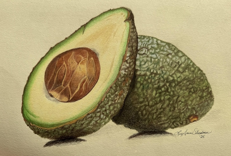
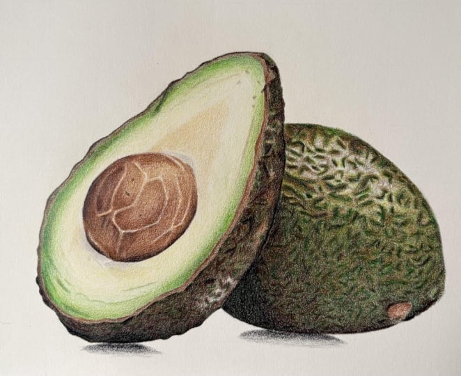
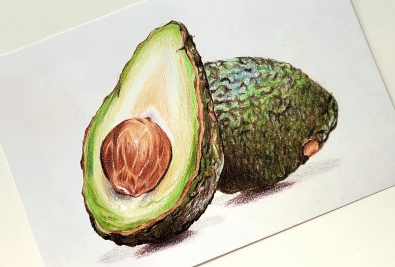
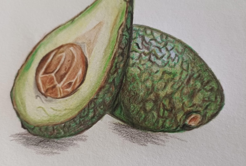
2. Class Project - Drawing an Avocado: For the class
projects, we will be drawing these two avocados. And I've picked this
reference photo for a couple of reasons. First up, it has
amazing contrast. We've got some really
nice light areas and some really dark ducks. So it's already set to create a really nice
finish drawing. It also has a really nice amount of particularly greens
in the reference photo. We're going to need to
work out how to build up and mix all of these
different colors. Now, if you want to use exactly the same colors that I am, I have included a full list
in the class resources, as well as covering all of
the materials I'll be using. Now, as we work through
the course here, I will show you how to create everything you'll need to
know including the sketch. If you don't want to
create your own sketch, I have included my sketch
again in the class resources. When you finish your drawing, please do upload it to
the class projects. I would love to see
what you've done. So let's take a minute to talk about all of the materials
that you'll need.
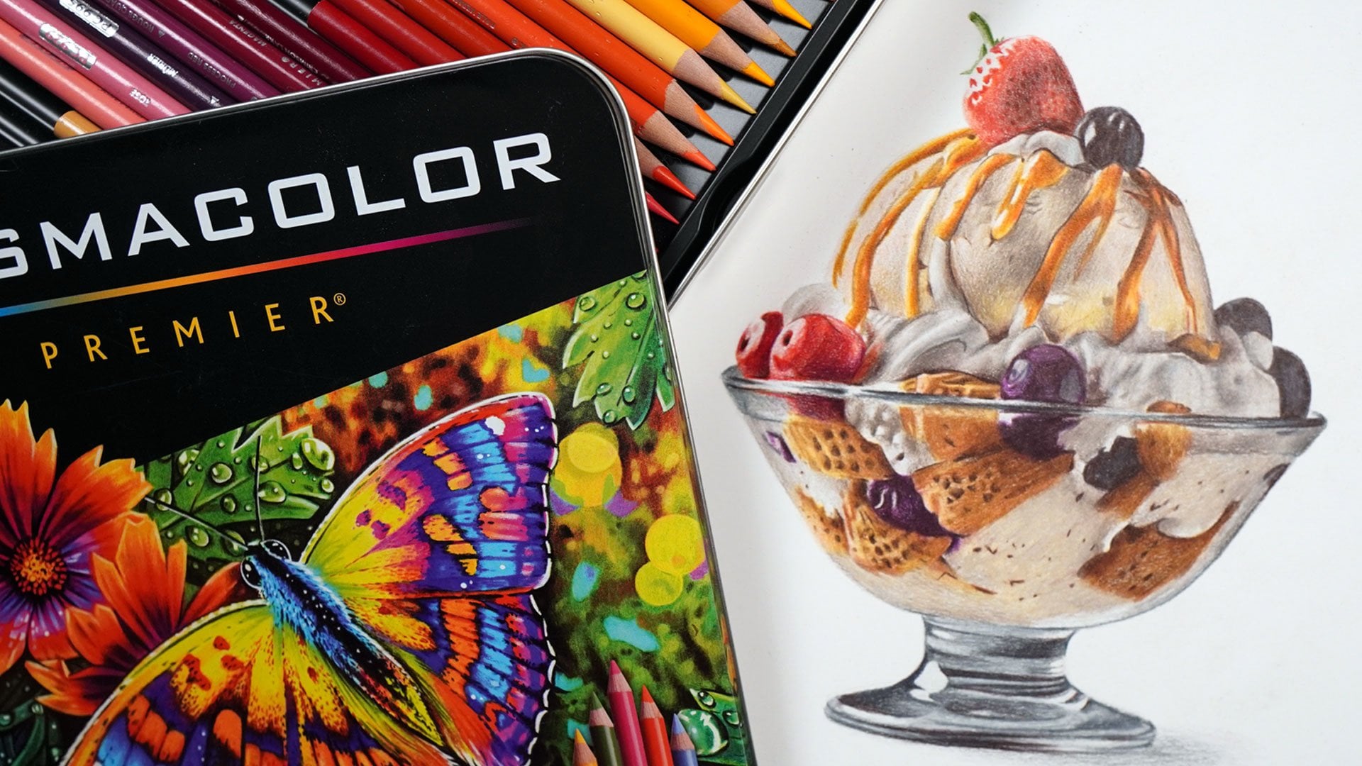
3. Materials You'll Need for Drawing with Coloured Pencils: Talk about all of the materials you will need to
complete this course. And first up, the
most obvious one is a set of colored pencils. Now, I am drawing this with
polychroms colored pencils. I'm using this set of 60. These are a professional
set of colored pencils, I find them very
nice to work with. But you don't need to use
these exact colored pencils. You could use a much cheaper
set, for example, Crayola. Next up, you will
need some paper. And in actuality, I think that the paper is more important
than the pencils. I always like to draw on
a smooth bristol board. Bristol board is a
very thick paper, and it means that
it's possible for me to build up a lot of
layers of the pencil, and that is going
to be absolutely key for building
up this drawing. I'm using the
Strathmore 400 series. It's a really nice,
smooth bristol board. Su, you will need some way
of sharpening your pencils. Now, I have a hand
crank pencil sharpener. This I particularly like
because I can change the blade. So I don't have to
throw the whole thing away when the blade gets blunt. You don't need something
as fancy as this, though, you can just use any
basic pencil sharpener, as long as it creates a really nice sharp point
on your pencils. If you do want to
make your own sketch, you will need a graphite
pencil ruler and an eraser, and we'll talk a little bit
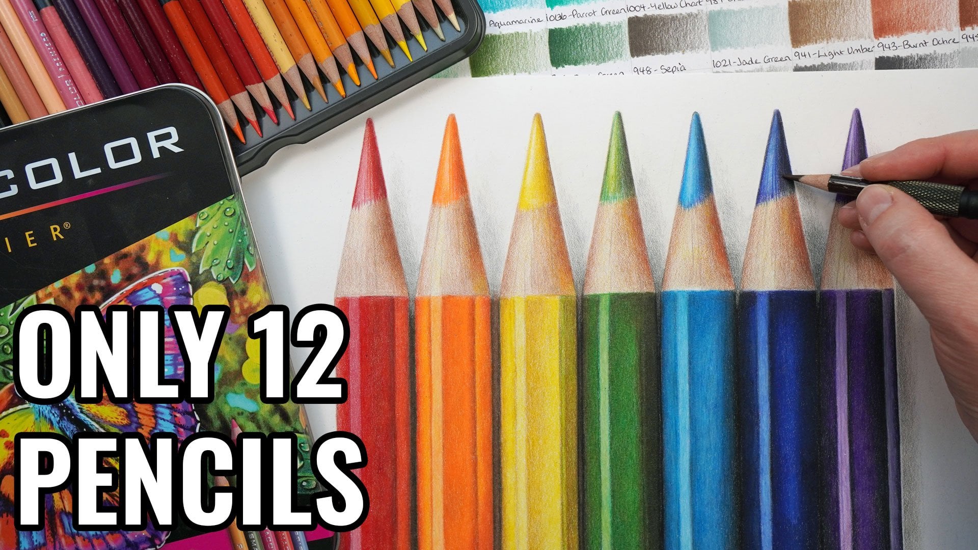
more about that later on. From here, the next
material you'll need is actually something you're
going to need to make. This is a set of color swatches. This is where you draw out every single color in your set, going from as light
as you can go to as dark as you can go
and then labeling it. And what that shows you is what the pencil actually
looks like on the paper, rather than relying on the lead or the
barrel of the pencil, which don't tend to
be very accurate. Now, these are so important for every bit of
drawing that I do. I really rely on them to compared to my reference photo, really see which color
is the best match. Deep bear in mind, this
isn't something that you will need to do multiple times. The set swatches that I've
got are at least 5-years-old, so it's really not
something that we'll need redoing frequently. Now, the final thing
that you'll need is some way to look at
the reference photo. Because I draw realistic items, I always work from
a reference photo. I find that is the best way to make a drawing look as
realistic as possible. So I need some way of looking
at that reference photo. I do this on my iPad. I particularly like the Con zoom in to see all
of the details. But you could print out
the reference photo. For example, you just need some way of looking
at the reference. So you will need a set
of colored pencils, the right kind of paper,
a pencil sharpener. If you're creating
your own sketch, you'll need a pencil
ruler and eraser. You'll need to make
a set of swatches, and you'll need some way of looking at the
reference photo. So next up, let's talk about
creating the sketch outline.
4. Sketching the Outlines: Before we can think
about putting some color down on the paper. What I first want
to do is create some really nice and
light sketch outlines. I want to give
myself a little bit of a guide that I'm working to. So I like to do this with something called
the grid method. This is where you draw a grid on your reference photo and a
grid on your drawing paper, and then you just go through
one square at a time drawing what you can see in
each individual squares. This is so important so that you get your proportions right. And it really helps
you to see what's actually there rather than
what maybe you think is there. So you get a more accurate shape do go into this in
a lot more detail in my colored pencil
beginners guide, so I will link that in
the class description. Once I've drawn everything
in each individual square, I then use an eraser
to remove that grid. Now, the absolute most
important part of this is that you do want it
to be as light as possible. We want to get a really
accurate sketch, but I don't want to be able to see it too prominently
at the end. In fact, you can see
how faint this is. But don't forget if
you don't want to draw your own sketch outlines, I have included my own
in the class resources. Before we go any
further, let's take a minute to look at
the reference photo.
5. Studying the Reference Photo: I mentioned when we were
looking at the materials. For every drawing I create, I'm always working from
a reference photo. Now, what I like to do before actually starting the drawing, starting adding the color, is to take a minute to
have a really good look at that reference photo. Really see the key
elements that are here. So let's take a minute
to do that now. So first off, let's
look at the stone here. And this isn't as perfectly smooth as I would
imagine it would be. First up, I'm noticing
that it is much darker on the left hand
side, lighter on the right. Clearly, the light is
coming from this way. So in the lighter areas, it's a kind of
light browny color. And then in the dark areas, it's really quite a deep brown. I'm also particularly
noticing on the stone that it's got
all of these lines. So it's not perfectly smooth. It's got these lighter lines
running kind of randomly, I guess, through the stone. So I'm going to want
to mark those in and then draw in
the texture around They've got a little light
patch at the bottom here and then a dark
end to the stone. Those are the main
details on the stone. Looking at the avocado itself. The innards of the avocado is a number of different colors, so it's generally reasonably, probably lightest around
this kind of area. It's a little bit
darker on this section, the more inside section. Then it gets to be a
much darker or more vibrant green as it gets towards
the skin of the avocado. I want to create quite a
nice smooth gradient going from this color here to a little bit lighter and then
much darker around the edge. Then probably the
trickiest part of this drawing is going to
be drawing in the skin. Now, the skin is
very, very textured. It's a very bumpy skin, but there are more colors in
here than you might expect. Looking at the lighter
patches on the skin here, all of these really light areas, they look to me to be
quite a light blue, particularly in this top area here and then it gets to be on the lighter areas
quite a vibrant green, a pretty similar green here
to the green around here. And then the darker areas are sorted into kind of patches. It's all very patchy to
create that texture. So there's all these
lumps on the skin. I'd say that the
lumps are bigger, or they appear to be
bigger around here, and they get smaller
around the bottom and also around the skin on
this avocado here. Other thing to bear
in mind on this skin, particularly on this section of avocado is that around the edge, it's not green like on the
flesh or a darker green, I guess this is here. This is much more of a brown. It's a very similar color to the underlying
color on the stone, and there's brown all around
the edge all around here. But there's also
the odd patch along here and a little bit
the same brown here. Those are the main
things that I'm thinking to start with
when drawing this avocado. Let's start adding in the lightest colors and building up marking in some
of that texture.
6. Building up the Lightest Layers: I want to start
here by filling in the absolute lightest color, and the absolute
lightest color on one section may be different from the lightest
section on another. I'm going to start
off by looking for the lightest color on the stone. I would say the
lightest color is in these lines on the stone, so around here, for example. This is a pretty light
yellow, the same here. There's some other
colors in here as well, but on the most part, I would say that this
looks like a light yellow. What I want to do is take the lightest yellow from my set, so this is the cream pencil and lightly put it down over
the whole of the stone. Now, as usual, there's a few things that I
want to be doing here. First up, I want to be pressing
really nice and lightly. I'm going to want to build a lot of layers up over this stone. So if I press nice and lightly, that will enable me to
build up a lot more pencil. In order to help me doing this, notice that I'm
holding the pencil further back than
you might expect, I'm not holding it
really close to the tip, and that stops me from being
able to press too hard. Not only putting this
yellow on the stone itself. But I'm also going
to put it anywhere else where I can see
some yellow son, particularly looking at
this kind of triangle here and a little
bit around here. So let's lightly build up
some more of the yellow in these places and just kind of
fade out towards the edge. Now, I'm also working here in circular
motions rather than scribbling back and
forth because I want to make this really
nice and smooth. Generally speaking,
the kind of flesh and the stone of the
avocado is very smooth. So I want to try and build
up pencil in that way. We're going to do is work
from the lighter colors, and just focus on putting
something down in each area. So I want to put
something down on the bulk of the flesh here. Now, obviously, I can see
quite a lot of yellow. We've built up some
of the yellow here, but all around the edge, this is made up of
a lot more green. As I mentioned when we were
looking at the reference pot, the green is kind of fading
from a very light green here to a much brighter and more vibrant green towards the edge I want to be looking at my
color swatches and looking for the closest green to the color
I can see on the avocado. I would say that
the closest green is this earth green yellowish. This is quite a earthy green, I think, quite a
natural looking green. I would say that it looks closer to a lighter
color. I want to be same as before, but
pressing really lightly, I don't want to build
up a huge amount of this pencil
because I don't think that that will be
an accurate match to the reference photo. And what I want to do is very
similar to with the yellow. I want to work my way
around the stone. I don't see any of the
green on the stone, work around the edge here, and just build up
some of the green fading it into that
yellow section. I say, I don't want
to press hard here, I want to be pressing
really nice and lightly. And this is really nicely demonstrating how I am holding
the pencil further back. So this particular pencil
is quite short pencil. So I'm using a pencil extender here to help me hold
it further back. And then I can just work my way along here really nicely fading that green into the yellow so that we've got
a nice gradient. All I'm trying to do is put something down that we can
then start building off of. And that's pretty much what I'm doing for the whole of
this first chapter. I want to be building up
some pencil, and then we can everything after
it. Remember that by the end of this
first chapter, you want to have something
down on the paper everywhere, but you don't expect it
to look good necessarily. So you can see me working around the edge where the avocado
is meeting the skin, and then just
lightly fading this into the sort of
middle of the avocado. I'm going around the
stone here so that I'm not risking going
over that stone. I don't want to put
green on the stone. And as before, I'm
once again working in secular motions to try and make this as smooth as possible. As I say, we will be building up a lot more pencil on here, but the smoother I can
get it to start with the easier that
that's going to be. But you don't expect to get it absolutely perfectly
smooth at this time. So you can see that it is slightly resembling the
middle of an avocado. L et's look for the lightest
color on the skin here. And again, as I
mentioned when we were looking at the reference
photo a second ago, the lightest color I can see in this section is this kind
of color here and here, it looks to me like
a very light blue. So I'm going to take the light ultramarine pencil
and once again, put down a very nice
and light layer anywhere where I can see
a hint of this blue. So, there's really just a patch on the skin that is more blue, and then it turns to green
a little bit lower down. So let's build up the
blue. And although may look a little bit
peculiar at the moment, you may not feel like you should be able to see
blue in the skin. If we can see it,
we will draw it. Let's once again, build up a nice and smooth
layer, nice, light, smooth layer by holding the pencil quite far back and working in
those circular motion. Now, something else that's
going to make this go down in a much smoother and
more consistent way is having a nice and
sharp pencil here. It makes a massive difference. So make sure you're
frequently sharpening your pencil so that you're always working with a
nice and sharp point. Just put the blue anywhere else where I can see a
little hint of blue, a little bit just around here. It's still on the
skin of the avocado, the other piece of avocado, and it's roughly at
the same height. So the light is obviously
reflecting in a similar way. I I'm happy that
I've built up all of the areas where I can
see some of the blue. I want to be looking at the lighter areas towards
the bottom of the skin. Again, as I mentioned when we were looking at the
reference photo, if you look at the light
patches down here, this is a much lighter green, a very similar green, I would say to the
general green on here. You can see some of that
green around here as well, kind of bluey green here. Go back to that
same earthy green that we were using a second ago and just lightly build up some of this on
the skin itself. Again, we just want to be
working with something here. We want to be putting down something that we
can then build upon, and I'm really focusing on those lightest colors right now. So I can focus on
the lighter areas of the skin on the
avocado on the left. I pretty much want to
go over the whole of the remaining skin on
the right hand side. I do want to go around that. I mentioned that there's
this more brownish patch. On the avocado. I want
to work around that. But beyond that, I just want to block in this whole section. So now, I'm generally happy
that I've put this green anywhere where the lighter
color is poking through. Let's think about the next color that I want to be adding in. And I want to be
particularly focusing on the color around the
edge of the avocado. So, again, as I've said before, we can see this light brown
color all around the edge. So let's use the raw umber
pencil to fill that in. Still, I'm working
nice and lightly here. I don't want to
be pressing hard. This isn't the time
to be building up all of the darkest values. We're just trying
to get our bearings right now and kind of
map everything in. And so I'm working the whole way around the edge of the avocado. I think it looks a little
bit odd at this point, but once we start building
in all of the texture, it will start fitting in and looking kind of
a bit less obvious. So I'm really looking
at the reference photo, looking at each section here. I want to be working out how wide. The brown needs to be if I need to make a really
thin strip of it or if it needs to blend a bit better into where I will build up the
texture with the darker green. And really looking
at the shapes here, so it's not perfectly
smooth around the edge. There's various lumps and bumps and I want to try
and get them mapped in. Now, I do think that
this is made a lot easier because I
had already marked in a lot of these kind of wiggly outside lines
from the sketch. So I got that as a little
bit of a template. Also fill in the same
color onto the stone. On the most part, I want to
just block in the stone. But as I mentioned,
there's all of these lighter lines
on the stone. I do want to mark those in. I haven't marked these in on
my sketch, but that's okay. I don't think that
they need to be absolutely in the perfect place. As long as I get the
general shape right, I think that will be fine. Once again, what I
can do is mark in where the line on the
stone is going to go. Mark in that I've got a line that I think
is going up here. Then I can shade
from that point. So shade up to the
line on the left. Then I can start
thinking about marking in the next line,
the next section, just really looking at the shapes that I can see
on the reference photo, I'm trying to get it as
accurate as possible. I want to go around both lines, both edges of the line so that I can keep that middle
bit nice and light. And then I can shade in with circular motions to
block in this area. Obviously, a lot of detail on the stone that I'm not
worrying about right now. I just want to get this
lightest color marked in. I'm not worrying that some parts of this line look a little bit. It doesn't look very
realistic, for the most part, because it's not very
consistent in its thickness. But we can tweak that
all a little bit later. As I say, I just want to get
something down on the paper. And then we can
start tweaking this and really improving
it from here. So once I'm happy that I've
marked in all those sections, I can use circular motions to
mark in these inner areas. Absolutely cannot
stress enough that beyond trying to get this
down as smooth as possible. That's all I really need to do. I don't need to worry about
any of the detail and I don't expect it to look
amazingly like a stone. The thing that's
going to bring this together is as we work towards the darker colors adding in all of those higher
levels of contrast. Let's look for any other areas that have a little
bit of this brown, particularly looking at these brown little flex along here. So we can just lightly map
in where they need to go. Then I can move on to the darkest color I'm going
to use in this chapter. Let's not forget this
little area here, which is this area. And then I can move
on to a green that I intend to use with that
earth green yellowish. This is I kind of think of it as a darker version
of that same green. And I'm going to
use this to mark in any areas that
are dark green. So all around the outside
of the skin of the avocado. In some areas, it is much
darker than this color, but for now, I just want to get the shapes mapped
in with this color. So let's start off by going
around the edge here. You can see that there
is a thin dark line all along the edge. But it's not all the same
consistent thickness of line, and it's not a nice
and smooth line. It's very, very bumpy. It's generally got
some larger bumps around here, for example, there's a lot more
of the dark green in this section where there's
a little line coming down. And it's generally quite nice
and a little bit blurry. It's slightly fading in, so I don't need to make a really sharp crisp
line, but I do, on the most part,
want to mark in this kind of wobbliness.
I'm going to call it Once again, this is made a lot easier because I have mapped in on the most part
this wobbly line very clearly from my sketch. On the most part, I'm really
just following that sketch. Now what I want to do is start
thinking about marking in all of the details on
the skin of the Avocado. Let's start off by focusing
on the avocado on the left. I think that's a little bit easier just because
there's less skin. And then we can focus on
the one on the right. Let's have a look at
what's actually here. As I say, this is kind
of a bubbly apache skin. There's quite a firm line
that's as wobbly, I would say, is this side, going
all down here, and it's generally darker on this piece of
fruit, is it fruit? Than on this piece.
And where I'm looking at the skin a
little bit closer up, what I want to be doing is
looking at the darker areas. So there's the odd light patch. I want to be working around
those light patches, so shading around them. You can see that it's a
bit darker going up here, a bit darker going up here
along here, around here. Basically need to work my way down trying to fill
in that patchiness. So I'm working around
where I think there's a light spot and basically
shading from that point. Now, a few things to
bear in mind here. First off, I'm not
trying to get it absolutely perfectly the
same as the reference photo. I don't know that that would be possible. It would
take a very long time. Do want to do is look at the general shapes on
the reference photo and try and follow that same
kind of series of shapes. So this is very patchy, and all of those patches
are pretty close together, so I want to be trying
to create that. And I would say that
all of the patches start getting smaller as
we work our way down. They're generally a little
bit bigger towards the top, and that's even more obvious
on the other avocado. So we want to be really
focusing on getting the edge of the avocado here as accurate as possible in that is
not a really smooth edge, and it does kind of go into that brown
section a little bit. Now, in terms of how I'm putting the pencil
down on the paper, even though I'm filling in
a small patchy section, I am still working
in circular motions. So you can see that
I am going over these areas little bit by little bit in these
tiny circles. To try and make at least the
darker areas quite smooth. Now, I do think that this
looks very peculiar. It looks very patchy and not necessarily in a good way. But Once we've put something down on the texture,
we can tweak it, maybe with some
darker colors as we go and build up some
of the lighter colors, so the contrast isn't
quite as prominent, and I think it will
all come together. Now, as we go down
to the bottom, the skin at the bottom here, it's in a bit more shadow, so it starts getting
much, much darker. In fact, down the bottom here, I want to focus less on building up all of
that patchiness and more on getting
the edge of the fruit, looking a bit more correct. It's very wobbly, as I say. Building it up in such a way that when we move onto
the darker colors, we can really feel a bit more confident that it's
mapped out accurately. Let's now do exactly the same for the avocado on
the right hand side, and this is very, very similar. There, if anything, are some easier patches because
they tend to be a bit bigger. Let's go through this
a little bit faster. Am looking at all of the shapes
that are made up in here. So, for example, there's
this kind of swirl here. I want to be adding
that in adding in this kind of shape
here, this shape. I don't need to get
all of these shapes in exactly the perfect place. But because I want
the texture on the avocado to look kind
of so naturally random. I always think it's
hard to be that random. So I can follow
the shapes that I can see within the avocado, and that will hopefully make
this look more realistic, even if, as I say, I'm not getting it perfect. As I work down, I do find
because we're getting two slightly darker areas of skin, it's very
light at the top. The dark green patches need to be reasonably small at the top. As we work down here,
the darker areas do get a little bit larger. So you can see that
this dark patch here, for example, is thicker
than this dark patch here. So I just need to
be building up more of the green as I
work my way down. As I get to the bottom, particularly in this
bottom left hand corner, it's a really, really
deep shadow like on the bottom of the
avocado on the left. Pretty much getting
the outside edge of the avocado right here and then just shading
in this whole area. Now, the number one thing
that I want to stress to you about this is
to take your time, build up the texture
as best you can, but don't worry about it
looking weird and patchy. Don't worry about
getting it perfect. So much of this is going
to be built up upon. We're going to
build up some more darker areas, as I mentioned, really get those
darker values to pop, and we'll also be building up
some of the lighter areas, making it look a little
bit more natural. It doesn't look
very natural with how patchy it is at the moment. But this is always
where we need to start. This is how we need to start
building up that texture. So by the end of
this first chapter, what you should have is
two avocados drawn out, but they're not looking
very realistic. They look a little bit odd. There's no contrast
really to them at all. But we do have a really good
solid template that we can start thinking about building
on in the next section. But it for this first chapter.
7. Adding in the Darkest Layers: This chapter, let's focus on getting those darkest
values, right? So I want to carry on working
from these lightest colors, and I'm going to focus to
begin with on the stone here. So, let's start
off by going back to the color that I was
using before on the stone. This is the raw umber. I just want to be building up a little bit more
of the shading. Let's take a minute to have a look at the stone
a bit better. Right now we just have a very
rough template drawn out. But I want to look at this
with a little bit more detail. You can see that although there's all of these
light lines in here, they're not all the
same color throughout. In fact, the lines that I've got are way too light at the moment. I'm also noticing that there is a kind of light circle here, and then it's darker
all around this circle. There are some areas that
are really very dark like around the edge
here and along here, as well as this line along here. But to start with,
I want to begin kind of refining around this
lighter patch in the middle. Let's use the same
color as before. I'm not pressing firmly. I'm just going over
these same areas. But just wanting to build
up a little bit more color in any area that
will be much darker. As I always say, this is part
of me getting my bearings, I can start tidying up around the edges of those
very light lines, and generally mark in where I think these darker
areas are going to go. You can see that I'm just
going over the areas a number of times and that's gradually building up a
slightly deeper color. You can start to see the
general lighter shape in the middle
starting to build up. In actuality, I don't
think it will be until the next chapter that this
really gets a lot clearer. I'm happy that I built up
a lot more of this color, a lot more of the shading on
most places of the stone, so avoiding that lighter
circle towards the top, but also tidying
up around some of the lines here,
those lighter lines. I'm going to move on to
a slightly darker brown. This is the burnt sienna. I want to be putting
this anywhere that has a slightly reddish brown tone. You can see that reddish brown
particularly around here, but you can see it prominently in this section here as well. In a around the bottom, in a lot of the darker areas, they have this reddish
brown tone to them. Let's build up this color, and this is made so much
easier because I can use the light lines as a
bit of a kind of guide. It's helping me get my
bearings on the stone here. But you'll notice that I'm
still not pressing hard. I just want to build up
more of the color nice and lightly so that I can carry on building through to
the darker colors. Let's go all along the
bottom here as well. Filling in there's some shapes that I don't currently have marked in some sort of
tear drop shapes, I guess. I do think it's looking a little bit peculiar,
but that's okay. I think the whole thing will
pretty much end up looking a little bit peculiar
until we get to the end. Once I'm happy that I built up some of this reddish brown, I can move on to yet
another darker color. It's just add a little
bit around the top. You'll see that I'm
not putting any of this color on where
that lighter patches. Before we move on,
let's just add there's a few spots
on the stone. You can see all of these quite
subtle spots along here. Really think it will show
if we don't add those in. So let's just mark in trying to get them in
roughly the right place. And then I'm moving on
to the walnut brown. This is the darkest
brown I have in my set, and I only want to put this
on those darkest areas. So again, that's particularly
generally around the edge of the stone and also
close to the light lines, as well as this very dark
line all along here. I really want to be
building this up. Now I've built up all
of these darker colors, I think it's really making the light lines look too light. As I pointed out, in reality, I don't think that they are all the same color throughout. So let's go back
to the raw umber and maybe tidy up some of the lines in some
areas if they need to be a little bit
kind of skinnier, but also go over them. So you can see that I can
still see these lines, but they're just a
lot more toned down. And I pretty much want to do
this on all of the lines, except for maybe the odd area, particularly again around
that lighter patch, where I do want them to generally
be quite a bit lighter. I think that there's
still more that I will need to add to the stone, but we can come back to
that in the next chapter. For now I'm happy that I've got these darkest values nice
and clearly marked in. Let's go back to
the walnut brown, and what I want to
do is really focus on adding this in to all
of the darker areas. Just like before,
I'm going to work through this in quite
a systematic way. Let's start off by
going around the edge, and I pretty much
want to put this everywhere where I put
that darker green. Generally around the edge, it is all very dark. There is the odd patch
that's much lighter. But on the most part,
I need to build up quite a lot of this brown
all around the edge. I then want to start
working my way over the darker patches on
all of the spotty skin. Now this is very, very similar to what we were doing a second
ago with the dark green. Maybe I'm being a little
bit less thorough, and I'm only putting it
on the darkest areas. That said, I would
say that it is going in most places still. So you can see I
am literally going over the top of where
I added that green. The green has been really good for mapping out what
needs to go where. And now I can see
that a bit clearer. It's a bit easier for me to fill in the rest of the brown. It is worth having a
good look at the skin. You'll see that, as
I say, some areas are darker than others. So for example, you can
see a really clear line around the edge between
the two avocados. And it's really very dark
here and all along here, as well as all along here. So I really want to be
building up a lot of the darker brown in these areas. I do want to build up this
dark brown in other areas, as well, but maybe not
to the same extent. You can see that it's really
building up that texture, making it look a lot richer. It will mean that we
can really go over this area and add a lot more
color in the next section, make it look a lot more vibrant. I want to really be
going over this area down the bottom in quite
a detailed manner. As I said down the bottom, it has got quite a
prominent shadow, and it's also got quite
a prominent shadow generally where the two avocados
are next to each other. Focus on this avocado
on the right hand side, and I don't need to go over all of these areas at the top. Here, particularly, because
this area is so light, you'll see that a lot of
these darker areas are, I would say, a darker color. You can see the green,
particularly around here. It doesn't so much to
look like a darker brown, but this area does look
like a darker brown. I want to go over
here, go over here, and there's a lot that I
need to be adding down here, but I don't need to necessarily fill in a huge
amount at the top. So I really want to be filling up this area down the bottom using those circular motions to make that shadow stand out. You see I've added
a little bit of the texture added
in a little bit of this brown towards the top, but not as much as I
say, of that green. So I add a little bit
into this area here, but I don't, again think it needs a huge amount
in this area. It looks more green to me. That said, once we've built
up a lot more of the color, it might be that we need to
add more in a bit later. Whilst I've got this brown, I'm just going to fill in there some little subtle
shadows just underneath. I have marked them
in on my sketch, but I haven't currently actually
filled in these shadows. So let's map these in. I once again want to go over the absolute darkest areas
with the black pencil. There's really not too much
that needs doing here. Generally speaking is once again towards the
bottom of each of the avocados and
generally speaking where those two avocados are
sitting next to each other. All along this line here. Although this looks quite
harsh, I would say, for now, it will look
much much better. Once it's got all
of the other colors built up on top of it, it will really help
to tone it down. So it's build up along
the bottom here, and I'm also going to go over this shadow just
nice and lightly. Also going to go over some of the darkest areas
on the stone like around this edge here and a
little bit towards the top. Then there's just
the odd area on this avocado on the
left hand side, on the right hand
side, once again, really focusing on
filling in the bottom. So essentially, what we have at the end of this chapter
is, I would say, a set of avocados that do look pretty good
on the contrast, and the proportions
are about right, but it's looking nowhere
near vibrant enough, and it's not looking right because it's not vibrant enough. In the next section, we can use this really thorough
template now that we've got to build up all of that vibrancy and really
brighten everything up. But by the end of this chapter, it should look
something like this.
8. Brighten up the Colours: Now that we've got all of the
lights and darks marked in, let's think about
brightening this up. I want to start off
by brightening up the fleshy section
of the avocado. I want to add in
this green section around the edge, this green rim. Now, you can see
that we did add this in really lightly before. What I want to do is make it a lot brighter, much more refined. Although we've got all of these basic shapes marked
in really lightly, we now want to be
really adding in the vibrancy and
tweaking the colors. I'm using the same color
that I used before. This is that earth
green yellowish, and I want to be working
around the outside really looking at all of the
shapes that are here. So you'll see that it's not
all one very smooth color. There are some much
darker patches like here. There's a few darker
patches along here. This line here is pretty dark. It's got some dark
green around it. It's much lighter around here, so I don't need to
build up as much around this section and then gets
darker again around here, and there's all of these lines along this area at the bottom. There's a line here as well, a darker patch here. I want to do is work
around the edge, building up this green and
marking in those patches. Now, my goal here is
to go for the green that is the closest
match in my set. Although I think
that this green is the closest match to the
green around the edge. I do think that in the reference photo is a little bit brighter, which is fine we can adjust
that in a little while. But this is the closest green, I think, so I can start
off by building this up. Once I'm happy that I've put some sort of green
around the edge, let's look for any other
main colors that are missing on this section on
the flesh of the Barricado. Looking at the color under here. There is a shadow
under the stone. What this really is
is quite a cold gray. It's not necessarily
a color that you would think is in the avocado. But all along here is cold
gray all around here. So I've got two cold
grays in my set. I'm going to use the
slightly darker one. I just want to fill
in this section. This is going to help
make the stone look like it's in a hole in the avocado. It's also going to give it
a little bit of shadow, which is going to help it
look a bit more realistic. Have added a small amount
of this gray shadow. I once again want
to be looking at any other main colors that are in this
section of the avocado. So I'm very much working around this one
section at a time. I find that is the easiest way to work kind of work
quite methodical. So starting off with the
flesh of the avocado, we can think about the skin separately and the
stone separately. So I'm particularly looking at this triangle here,
this color here. This has a kind of
orange brown tone to it? Not dissimilar to the
orange brown tone that I think is in the stone. So let's just very lightly
take the raw umber pencil. That is the main
underlying color in the stone and just lightly
mark in that triangle. Now, I don't want to add a
huge amount of this color, as I say, it is just
a hint of this. So I can help myself with this in the same way
that we have done up until now by working
nice and lightly, holding the pencil a
little bit further back. I do you want to
be quite accurate with where it's going, though. So I do you have to hold it closer to the tip than
I would otherwise, just because I really want
to control where it's going. Also want to be working
in circular motions. Now, there's a few lines around the edge as well
that are a similar color, so let's add those in. Then I'm going to
use a pretty bright green to try and brighten
up around the edge. As I said, I don't think that the earth green yellowish is a hugely perfect match
for the reference photo, I think it is a
little bit brighter. I'm looking at my
color swatches, the color that I think is the closest to the
color that I'm missing. It just needs a little bit of this much brighter green added. So I can lightly go over the top of what
we've already got. And it is just making
the whole thing look nice and bright. Once again, let's have another look at this green section, see what else I
think is missing. I'm particularly looking at this section here, for example. This is really
quite a dark green, as I've already
mentioned a second ago, and there are a few areas
of very dark green. And what we've got
at the moment, I don't think is dark enough. So I'm going to use
this darker green. As I said earlier, we
have used it before. I used it on the skin. I tend to match this green up quite frequently with
the earth green yellowish. I find that they are similar, but this is kind of
the darker version. Can work around the edge adding
in this extra dark color. I'm also whilst I've
got this color out, going to use it to really
make the skin much darker. The skin has a lot of
detail marked in on it. We've got all of that
texture marked in, but it's just looking way too
light and way too patchy. So I'm going to lightly go
over this whole skin section. Avoiding anywhere that
has that light blue tone. There's some areas with
the light blue patches. I want to avoid that. Just as I say, whilst
I've got this pencil, go over the skin on both areas. No pressing family here and working nice and
lightly working in those circular motions and just building this up
a little bit more, going over a lot of the squiggly marks that
I marked in here before, particularly if
it's an area that will need to be a little
bit lighter because it's got either
blue or there was some area on the skin
that had a light green. I don't really want to
add too much higher up, as I say, there is all
of this blue up here. I said, I think that this
area to the top with the light blue patches of light is looking too
light at the moment. So we will in a second add
in some more light blue. Let's just carry on around
the edge of the avocado here. Fill in all of these darker
areas that I mentioned. And then I can switch to
that light blue and just make this area a little
bit more vibrant. I am going about this in the
same way that I did before. Nice and lightly working
in circular motion so I don't want a really
heavy blue color. Take a minute now to
focus on the stone. I think the stone is
looking way too light. Let's go back to
that walnut brown. I'm not going to use any colors beyond what I've already used, I don't think on the stone. I think it just needs more. This is very similar
to what I was doing before filling in all of
those shadowed areas, avoiding that patch of light in the center
towards the top can also slightly refine some of those light vein lines
running through here. Just making them look
a little bit tidier, maybe making them
a bit darker in some areas like around
here, for example. On the most part, I'm very much doing what
I've already done. As I say, just making
it a little bit more. So let's think about
any other areas where I need to add in some of
this worn up brown. So let's go over a few of those darker patches around the edge. And let's also add
some light shading over some of the darker areas
of the skin of the avocado. So right now on the most part, the dark patches of the
avocado are that dark green. Actually don't think that the
dark green is dark enough, so I can add some
brown over the top. I can always add some more
green over the top of that if I want it to look
a little bit more green. But what I'm really going for is a darker version of
what I already have. Let's go over the bottom of this avocado on
this side as well. Really going back over all of those patches that I've
already marked in, I think that they
have got a little bit lost where I put that
darker green over. Actually, I want to build up some more dark colors down
the bottom down here, so I do need them to look a
little bit more prominent. But this is a lot simpler than before because I
am literally just going over all of those shapes that I've
already marked in. So I'm working
reasonably quickly. It looks a little bit kind
of scribbly at the moment. I can tidy that up by
going back over it, adding an extra
layer of shading. As they say, really
want the skins of the avocados to
look nice and deep. Take my time going over some of the darker patches
towards the top as well. Just tidying this up, really looking at the shapes
in the reference photo and trying to make these look
a reasonably close match. Then I can go back to
that darker green. Actually start applying a little bit more pressure
at this point because I do want to make the skin
a little bit smoother. Maybe go over some of the darker patches towards the top up here to blend it a bit better
into the blue section. And I can add some extra shading down the bottom down here. Again, I want to make
this bottom section look like a very dark green. I don't want it to look quite as patchy as it's looking
at the moment. So now I'm happy with
the darker values. Let's use that lighter
green the earth green yellowish to just smooth out a lot of this
bottom section. As I said, I don't want
it to look patchy, and I think it is at
the moment. But as we particularly towards the middle of the skin of
this avocado here. It does get quite a
lot lighter before it gradually blends into
the lighter section. So let's just try
and make a nice, smooth transition between
the darker bottom section and the much lighter
blue top section here. So I can just go over particularly going over
some of those dark patches, and let's do the same
on the other side. And then I think this
is looking much, much, much more vibrant. I'm generally happy with how
it's looking at this point. I think that's a good point
to stop this chapter, and in the next chapter, we can add in those
absolutely final details and really tweak
anything that's left. And let's just add
in a tiny bit of blue up here to brighten
this up one more time, as well as along here. Just the same area that we've
added in blue in the past, all of these spots along here. And then that is it
for this chapter.
9. Adding in the Final Details: Finish off this
drawing by tweaking the final colors and adding
in the final details. And I'm going to
keep working through this one section at a
time like we did in the last chapter to work out what the most obvious
color is that's missing. And right now, the
most obvious thing that I think is missing is that the flesh of the avocado is not looking yellow
enough, I guess. When I compare my drawing to the reference
photo, particularly, haven't really got any yellow, except for the underlying
cream on this section, and look how yellow in some
areas it really looks. It's kind of a yellowy green, but more on the yellow side. So the closest color
that I have to this is quite a bright yellow. I'm just going to go over
particularly around the edges, but I will also add some
towards the middle. I'm focusing around the
edges to begin with. Working in circular motions and building up
some of this color. Can see that that's not
really making it look yellow, but it is making it
look more vibrant. It's just tweaking
it so it's a little bit more accurate to
that reference photo. So I want to be working in
circular motions here as usual pressing
reasonably lightly. I'm not pressing firmly. It doesn't take a lot to get
some of this color built up, I just want to make it look
as smooth as possible. Let's just add a little bit more particularly around
the edge where I think that it just needs more of the brightness building up
and really comparing my drawing to the reference
photo to work out where I need to be adding
in more of this yellow. L et's focus on
the brownish color around the outside of the skin. So this brown line that's
going around here. Right now, I think it's
looking way too pale, so I want to build up a
couple of colors along here. So I'm starting off
with the burnt sienna. I don't need to put
this everywhere, anywhere where I can
see a slight hint of this reddish brown, which actually
generally speaking is in the darker patches. It's a lot of areas
where it actually already built up a
reasonable amount of color, but I just want it to be
a little bit brighter. So you can see I'm working
my way around here, just nice and lightly, and it's already
looking much richer. Et's add a little bit around
the edge around here. There's just a subtly
darker section here. It kind of fades
into that green a little bit more than what
I've got at the moment. And then let's tidy this up add a little bit
more color by using that raw umber to just blend in some of
the lighter areas. I think it's helping blend this darker brown area a little bit better
into the green. So I think that's looking
much much better. Before I move on from this
area around the outside, I am going to go
back to that cream. This is that very light yellow, and just use this to smooth out the lightest areas on
this brown section again. Basically anywhere where I
haven't put that burnt sienna. I want to use the cream. You can see it's quite subtle, but it is smoothing
out what's here, but also lightening
it up a little bit. So now, I'm happy with
this line around the edge. Let's think about
the next section that I think needs
some tweaking. And let's just take a minute to brighten up this area here. I'm using the same colors
that I used before starting off with
the burn sienna. Just mostly around the edge. Then using that raw umber to just brighten this
area in the middle. And then I can smooth
that out with that cream. I'm going to focus on the stone. So I'm very much doing the same again as
we've done before. I still just think that the dark areas aren't looking quite dark
or smooth enough. And the light areas, I want to work around that so that it stands
out a bit better. I also think that those lines are looking still a
bit too prominent. So let's go back
to that B Ciena. And I'm going over all of these darker areas in exactly the same way
that I have done before, but avoiding that circular
patch towards the top, that needs to be much lighter. Can be going around here,
building up some of the color, but also tweaking maybe
slightly the shape of the stone or in some
areas tweaking the lines, making them maybe a bit thinner. Once I'm happy that I've got all of these darkest parts in. Let's build up some
of the raw umber to even further tweak these lighter lines and just generally build up that
underlying color a bit better. I think that this is looking much closer to the
reference photo. It's probably one of the
trickiest areas in the drawing. Particularly because
of these veins, they're just very hard to
get looking realistic, and the key is to be
building up actually probably more of the raw umber on them than you might expect. Then let's build up some of the worn up brown on
the darkest areas and really just
tweaking things the same as I've been
doing up until now. Build up a little bit more
of this triangle here. It's again, not
looking dark enough. We already had some of the
raw umber in this area, but I want to build
up a bit more. Then I'm also going
to go back to the cool gray that I used
in the last chapter. I can see some of it up here. I want to build up that
a little bit further. Just anywhere where I can see
a little hint of this gray, which is generally
towards the top of that raw umber triangle. In quite a few areas
around the edge actually. I'm also going to
build up more of the gray on this darker
patch down here. Add a little bit more
of the raw umber. Again, I can see a
little hint here. And I find that as I add in maybe some of the gray
like I did just now, it makes areas like this a
little bit more obvious. And I start to notice
some of the extra colors, and I do think it's
things like this that really make this look
much more realistic. So I once again,
work around the edge brighten up around
here one more time. And I'm going back to that
earth green yellowish. As I've said a few times, I
think it is the color that is closest to what we have
around the edge here. It's the same as I
was doing before. We're just doing more of it. I just want to be building
up more of this color. Add a little bit of a dark
green around here. This patch. There is a blue patch here, but it's too light what
we've got at the moment. And then I can use this
darker green to once again go over these darker sections
that I've talked about a lot. So you can see how
we're going over the same areas multiple times with the same
colors actually. But we want to keep going, keep building up the color until it does match
the reference photo. It doesn't need to
be a perfect match as I've said a number of times, but we do want the colors to be as vibrant as in the
reference photo. Gating into the final tweaks. Now, I just want to add a little bit more of the worn
up brown down here. The shadows not looking
prominent enough. Then I'm mostly happy with
the avocados themselves. I'm just going to take a
minute to focus on the shadow. So using that warn brown to just add a bit more
onto the shadow here. It looks a little bit
too kind of patchy. I'm not changing the shape
or anything in this area. I'm literally going over it and building up
more of that color. Whilst I'm tweaking the shadows, I am also going to use
that same cold gray that I used before on the Avocado itself to just add more shadow. Looking at the shadow, there's
the very dark shadow down the bottom that I've already
marked in on both of these. It actually extends down
further with a cool gray, I would say, and there's also a cool gray shadow
here, here, here. Here. So let's use the darker
cool gray to add that in, so I'm just going to
extend the shadow that we've already added
in down a bit more. And I think that that looks like a much more realistic
kind of gradient here. It smooths it out
much, much better. And then I'm also going
to add in just very lightly the shadow that I
mentioned the other shadow. So I'm not going to build up a huge amount of the color here. I want it to be
reasonably subtle. The main bit that I want people to be looking at is
obviously the avocado. But I don't want to
put nothing here. I think adding a little shadow does make a big difference. You use circular motions to
lightly build this up again, just going over the area
multiple times to build up the colors until
it's at the point that I want. Then that is it.
10. Summary: That is the end of the course. So the first thing I always
do when starting any drawing is to put down some really
nice and light sketch lines. Once I've got my
sketch all marked out, I can then take a minute to really have a good look
at the reference photo, looking at all of the
most obvious elements that I want to be
bearing in mind as I work my way
through the drawing. Here, I want to
start building up some really nice and light
base layers really smoothly. I'm not worrying about the
texture to begin with. Once I've got those
initial lightest colors in each area marked out, I can then start mapping
in the key shapes. I don't need to
get this perfectly matching the reference photo, but I do want to very much use the reference
photo as inspiration. Once I'm happy, I've
mapped out all the shapes, I can then start working my way up towards
the darker colors, really marking those shapes
in a bit more prominently. I can go back over
the whole drawing adjust the colors and
brighten everything up. Now, I hope that you've
enjoyed this course. If you do, please do review it, and don't forget to upload your finished drawings
into the class projects. Happy drawing guys, and I'll
see you in the next course.
 Gemma Chambers, Pencil Artist