Transcripts
1. Introduction: It is possible to create some absolutely beautiful
drawings with colored pencils. And actually, you don't need
a massive set to do this. In fact, if you're new to
drawing with colored pencils, it can feel overwhelming
having loads of choice. I'm going to show you today everything you need to know to create a beautiful drawing
with just a set of 12 pencils. Oh. My name's Gemma Chambers, and I've been making online
art tutorials since 2020. I've helped tens of thousands of people on my YouTube
channel improve their art. But today, I particularly
want to focus on a beginner friendly
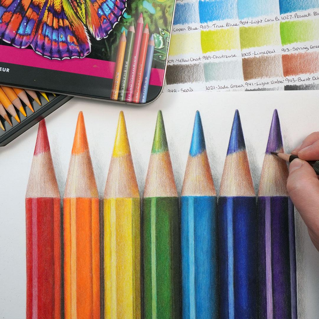
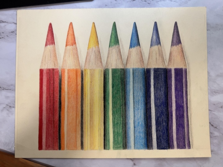
colored pencil drawing. I want to show you how to draw this really fun drawing
of colored pencils. Now, the goal of this
class is to show you everything you need to know
to draw with colored pencils. I will go through all of the
materials that you'll need, as well as all the
key basic techniques I use in every single drawing. Then show you the process
that I always use starting off by creating
the sketch outlines, studying the reference photo, and creating this drawing with only 12 pencils.
Let's get started.
2. The Class Project - Drawing the Coloured Pencils: Now for the class project, we will be drawing this
colorful pencil drawing. And I've picked this
for a few reasons. Firstly, although it looks
reasonably complicated, it's actually going to be
amazing for practicing one of the main skills that are needed for drawing
with colored pencils, which is particularly
putting down the pencil really
lightly and smoothly. It's also not as complicated
as it might look initially. It's on the most part,
a lot of blocks of color that we just need to mix together and put
in the right place. And, of course, this
is the class project because it's just a
really fun drawing. It's so lovely and vibrant. I will show you
everything that you need to know to
create this drawing, including how to
make this sketch. If you don't want to
create your own sketch, you can always work from mine. I've included it in
the class resources. Let's start off by talking about the materials
that you'll need.
3. The Materials You'll Need to Draw with Coloured Pencils: Now let's talk about the
main materials that you'll need to draw not only
these colored pencils, but anything with
colored pencils. And the most obvious
material that you'll need to start with is a set
of colored pencils. Now, for all the
drawings that I create, I tend to draw with either polychroms
colored pencils or prisma color colored pencils. These are both professional
colored pencils. But you don't need to draw
with these exact pencils. In fact, you can create some absolutely
beautiful drawings with something like ola. For this drawing that
we'll be doing today, I'm drawing with
prisma color pencils and only pencils from
their set of 12. Now the next material that
you'll need is some paper. But you want to make sure you have the right kind of paper. Now, for every colored pencil
drawing that I create, I use a technique
called layering. Now, we'll cover this
more in a second. But essentially, what that is is where I build up the pencil gradually in a series
of light layers rather than just pressing
really hard with the pencil. In order to build up
all of these layers, I need to have the kind of paper that's able to take
all that pencil. Don't want to draw
on something like printer paper or sketch paper. I like drawing on something
called Bristol board paper. It's a very smooth paper
that's also thick like a card, and that is able to take the amount of pencil I
need to be putting down. Now, you'll also need
a pencil sharpener. I have a hand crank
pencil sharpener. I particularly like that I can change the blade
when it gets blunt. But you don't need a particularly
fancy pencil sharpener. As long as it creates
a really sharp point on all of the pencils,
that's all you need. If you're creating
your own sketch, you will also need a ruler, a graphite pencil,
and an eraser. From there, the next
thing you'll need is a set of color swatches. Now, this isn't
something you can buy. This is something
you'll need to make. So for every set of
pencils that I own, I create a set of swatches. This is where I take each color, and I go from as light as
I can to as dark as I can, and then I label it. And I do this on the kind of paper that I'm going
to be drawing on, so on a Bristol board paper. What this shows me is what the pencil actually
looks like on the paper, rather than me trying to rely on the lead or on the
barrel of the pencil, which don't tend to
be very accurate. And these swatches are the whole key to how
I select my colors. I'm always comparing
my drawing to these watches to work out
which color I need to add, and it really helps me to see the actual colors
that are available. This is always important for every set of
colored pencils I own, but maybe even more so for a smaller set like a set of 12. Now, it is quite time consuming
making these swatches, but it's not something that
needs to be done regularly. The set of swatches that I
own is at least 5-years-old, and it doesn't need to be
extremely tidy, either. You just need to see
what those colors are. Now, the last material
that you'll need is some way of looking
at a reference photo. So for every drawing
that I create, I always work from a reference. I find this is the best way
to create really lovely, detailed, realistic
looking drawings. I like looking at my
reference photos on my iPad. I particularly like that I can zoom in to see all
of the details. But you don't need
to have an iPad. You can always print out
your reference photo. So those are the
core materials that you'll need for every
colored pencil drawing. Let's take a minute
to think about the key core techniques.
4. The Core Techniques: Talk now about the core
techniques that you need to know. I mentioned earlier
when we were looking at the materials about
something called layering. This is where the colored pencil is built up in a series of light layers rather than just pressing really hard
with the pencil. Now, in order to build
up the pencil lightly, there's a few things
that I'm doing. First off, most importantly, I'm holding the pencil much further back than
you might expect. Generally speaking, I hold the pencil about halfway
down the barrel, and this literally stops me from being able
to press too hard. Not able to control as precisely where the pencil is going in comparison to if I was
holding it closer to the tip. I also find holding the
pencil further back is generally much gentler and
less tiring on my hand. Now, I also always want to be working with a
really sharp pencil. The pencil is going to be
much easier to control and go down so much more consistently
if the pencil is sharp. So I'm always
frequently sharpening my pencils throughout
the drawing process. This leads me nicely into the general pencil
motions that I use. So, generally speaking,
and this very much applies with this
pencil drawing. I want the pencil to go down
as smoothly as possible. I don't want to have really
scratchy, scribbly texture, particularly on things like these pencils where they're supposed to look super smooth. So in order for me to get down the pencil as
smoothly as possible, what I do is work of circular or oval motions rather than just
scribbling back and forth. So if I work in large
circular motions, the pencil goes down again, much smoother and more consistently than
it otherwise would. And using that in combination with pressing
lightly and working with a sharp pencil is what's
going to gradually build up that really
smooth series of colors. This is such an important
and fundamental point. I so strongly recommend practicing this before
moving on to the drawing. Just practicing, putting
down a solid block of color, pressing lightly
with a sharp pencil, holding the pencil further back. Because if the drawing
looks scribbly, it's going to be quite
hard to correct. When I'm building up pencil
with these light layers, as I add more and more
pencil into an area, it gradually builds
up in its vibrancy. When I get to a certain point, I find that the
pencil looks vibrant, but also has,
generally speaking, a lot of white spots of the
paper still showing through. For something like
these smooth pencils, what I then need to do is one final technique
called burnishing. This is where right
at the very end, I press much firmer with the pencil to blend all
of the colors together. Means my drawing
will finish with a really lovely smooth color, where they're all nicely
blocked together. And you'll see me doing that towards the end of this drawing. So those are the
main core techniques that I use in every single
one of my drawings. Next up, let's take a minute to talk about the reference photo.
5. The Reference Photo: Mentioned a bit
earlier in the class that for every drawing I create, I always work from
a reference photo. I find that is the
best way to get a truly detailed and
realistic looking drawing. But it is so important to select the right
reference photo. A drawing from the
wrong reference photo is never going to look amazing. So let's take a minute
to talk through the main things that I'm
looking for in a reference. And the number one most
important thing is contrast. In fact, this is the
main thing that I'm focusing on in every
single drawing. My reference photo, I want
to have a really good amount of light colors and dark
colors as well as midtones. By having a good range, that's what's going
to make this drawing look really interesting. Creating a drawing from
a reference photo like this is never going to look as good as a reference
photo like this. Now, I also always want
to be working from a reference photo with a
really good amount of detail. I'm not going to be able to add in all of the detail that I need to if I can't see it if the reference photo is
blurry, for example. I need to have a really
clean picture to be working. Finally, I am always
thinking about the angles of the objects
in my reference photos. Now, this is different
for every subject. Generally speaking, I find if something's at a bit
of a funny angle, it generally doesn't translate
that well into drawings. So you'll usually see me
creating drawings from items that are either head on or
maybe looking straight down. But generally speaking,
they're looking straight on, and that's the same if
it's an animal, a person, or an object like
a flower or food. Now, I can't stress
enough how important it is to be taking your time to
find the right reference. Honestly will make a
massive difference between a really good drawing
and a not as good drawing. So let's now think about
creating this sketch outline.
6. Creating the Sketch Outlines: Let's create the sketch outlines for these colored pencils. Before I can think about putting any colored pencil
down on the paper, I want to take my
time to map out the proportions of everything
I'm going to draw. I want to have a good template of what's going to go where. And to create my
sketch outlines, I generally use something
called the grid method. Is where I draw a grid on my drawing paper and a grid
on my reference photo, and I only draw what's in
each individual square. So this stops me from making assumptions about the
shapes that are here. So if I'm drawing an
apple, for example, you assume that an apple
is just a round ball. But it's actually a much more interesting
shape than that, and it forces me to look at the shapes and the
outlines that are actually. With these pencils,
the sketch outline is a little bit
more interesting, particularly because
the lines of the pencils need to be
so perfectly straight. Usually, I would just sketch my lines looking at
those grid lines. But for the purposes
of these pencils, what I want to do is
still use my grid lines, still work out where each line at the edge of
the pencil needs to be, but then draw that line much clearer and more
neatly with a ruler. I want to have each
and every line of these pencils marked in for
my sketch with the ruler. I'm not going to
use the ruler on the actual drawing when we start using the
colored pencils, but I do want to have really
clear lines on my sketch, really straight lines,
or I think it's just going to end up looking a little bit wonky and a little bit. I've drawn in my whole sketch nice and clearly with my ruler. What I can then do is use my eraser to erase
those grid lines, and I'm left with just
my sketch outlines. Now, the most important thing of creating your sketch
beyond taking your time to make sure that
everything is mapped out correctly is to be
pressing really lightly. Now, for my drawing here, I've pressed quite hard simply so you can see
it on the camera. But if you look at the
start of my drawing, look at how light my
sketch lines need to be. And having much
lighter lines will make the grid much easier
to erase, as well. So now I have my sketch. I want to take a minute to really have a good look
at the reference photo.
7. Talk Throught the Reference Photo: Before we get started
with the drawing, let's take a minute to have a look at the reference photo. I want to have a
really good look at the main colors and shapes that I'm going to need
to bear in mind here. So let's do that now, and hopefully you'll see
a bit better what I mean. So let's start off by looking at the barrels of the pencils. Actually, these pencils
don't look too complicated. Generally speaking,
every single pencil has a light shine on
the left hand side. There's two solid
blocks of color here, and generally
speaking, they're all a little bit darker on
the right hand side. Noticing that the darker area on this red pencil on
the right hand side actually is a little bit
more orange than the rest of the pencil because
of the reflection from this orange pencil. Also noticing that
the left hand side of this orange pencil
has a little bit of red from the reflection
from this side. The same here,
there's a little bit of orange down this side, and it's a little bit
more yellow here, and you can see some green
down here and blue down here where each pencil is reflecting from
the one next to it. So we'll need to be
adding in areas like this darker green along here to make these pencils
look more realistic. Looking at the areas at the top, this is probably the
more complicated part. There is a little
bit of texture here. We don't have any texture
on this bottom half. It's going to be a
case of building the pencil up as smoothly
as possible down here. Here, we do need to
add a little bit of texture on the wood and
on the pencil lead. But looking at each of these
leads, generally speaking, it's got a light shine going down the middle left hand side, and it's darker on the right. And there's also
some darker lines striping through here and
on the wood, as well. On the wood casing here, again, you can see reflections
on the right hand side. So you can see that this
is a little bit orange. This is a little bit yellow, and we're going to
need to add in some of these reflection colors. And once again, generally, it's darker on the
right hand side and lighter on the left. Finally, I'm noting the shadows. Look how dark the shadow is in between the pencils and the
same around here as well. There's quite deep shadows in between the leads up the top. But the shadows aren't
very harsh lines. It's all pretty subtle,
so we'll need to build that up really
nice and lightly. So all in all, I think it's not too complicated of
a reference photo. Those are the main
things that I'm noticing initially.
Let's start drawing.
8. Build up the Base Layers: Now I want to start this
drawing by looking for the lightest color that I
can see on each pencil. So I'm going to
generally start on the left hand side and work my way gradually
towards the right. So I'm starting here
with the red pencil. I want to select the
closest color that I have to the lightest
area on this pencil. So I would say that the lightest
area here is light red. I actually only have
one red in my set, so this is the red
I'll be using. And what I want to
do is solidly block this color in really nice and
lightly on the lead here. Trying to make it as
smooth as possible, and we'll talk more
about that in a second. Once I've got a solid block of color over the
whole lead area, I'm then going to want to build a slightly darker red down
this left hand side here. I want to leave this strip here, but I also want to
build some more red on this right hand half. In order to make an area darker, I don't want to be
pressing harder. What I want to do is go
over the area more times, and that will gradually
build up a richer color. So you can see I'm
just going over that left hand side and
this right half here and just building up the pencil still lightly is
making a richer red. The goal at this point isn't to make something that's
perfectly vibrant. I'm not trying to make the
finished drawing here. I am literally just trying to
map out what's going where, and I'm trying to
get my bearings on where everything's
going to be. I'm happy with that
lead up the top. I then want to start building up this color on the bottom
half of the pencil. So as I mentioned when we were looking at the
reference photo, the pencil is kind of split
into a series of strips. There's a sort of
midtone strip here, a large rectangle here. There's a very light
strip going down here. Then we've got another
midtone rectangle here. There's a darker line
going along here, and then it's a little
bit lighter and more orange in this strip
coming down here. At this point, I'm not worrying about marking in
the darker strip, and I'm also not going to worry about marking in
the orange either. I'm just going to focus
on getting these shapes clearly marked in
with the red pencil. Now, I generally
find it easiest to work my way carefully
around the outline first, so I have a really clear
line that I'm shading to. And you can see
me literally just going along those sketch lines. This is where marking
out the sketch really clearly is going to make
life so much easier. And then once I've done
that, I can be blocking in this color along that
strip. It's important here. Again, to be pressing lightly. I don't want to
be pressing hard. To be working with a
really sharp pencil, the pencil is going
to go down so much more consistently
if it is sharp. And generally
speaking, I want to be working in circular motion. So I want to try and get this
down as smoothly as I can. Well, you can see I'm
kind of working in longer oval motions here
because it's such a thin strip. I am going to build
up a little bit more of the pencil down
the right hand side, just so it's really clear
where this rectangle, this strip is ending. Then let's start marking in
the next darker section. So once again with a
really sharp pencil, it is so important to sharpen
your pencil regularly. You can see that I'm going
along that sketch line, trying to make sure it stays
as straight as possible. When I created my
sketch, I used a ruler. I'm not using a ruler here. So I just want to
take my time making sure that I'm carefully
going over that line. Once I've marked in the
edge of this section, I can then start working in secular motions to block
this section in two. Now, it's important
to note here that I am holding the pencil
pretty far back. I'm holding the pencil about
halfway down the barrel. This just really helps me to be pressing nice and lightly, and I find it works
really well on slightly larger
sections like this. Where I don't need to be extremely accurate about
where the pencil is going. I'm just trying to solidly
block in this color. So, honestly, the most
important things in really this whole drawing is
to be pressing lightly, building up the pencil as smoothly as possible using
these circular motions, and to be working with
a really sharp pencil. Beyond that, it is certainly
for this first chapter, going to be a case
of just blocking in each of these shapes
using those sketch lines, we're just going to
block in a series of rectangles and then we'll be able to build on that as we go. So once I'm happy
with this rectangle, I'm happy that
I've got the color marked in pretty smoothly. Let's also add a
slightly firmer line down the left hand side here. I'm going to and then
I'm going to really, really lightly block in some of this red down
this strip here. This strip is pretty
much a very light pink because of the
reflection of the light, but I don't have
a pink in my set, so I just want to be blocking
in this red really lightly. You can see I've barely put
any of the pencil down. Now fill in this section
on the right hand side, once again going
around the edge and marking in a nice
and crisp line. And then really lightly, again, filling in some of
the pencil down here. And that is the
first pencil marked in with that main first color. Let's move on to
the next pencil, and now we need to be
filling in an orange. So this is going to be the exact same process just
with a different color. Again, I want to be looking
for the closest color I have to the lightest section
within this pencil. The pencil is an orange and the lightest color is
a pretty light orange. This kind of orange here or
this kind of orange here. Once again, I only have
one orange in my set, so I'm going to be
using that orange. And I'm starting off by just
blocking in this pencil in this top section up just
like we did for the red. And once I've got a really
nice and smooth color up here, I once again want to be building up more of the pencil
down that left hand side, so just going over
the area more times to build up a darker color
down this left hand side, and we're also going to put
it down the whole right half. And then I can start focusing on the bottom barrel of the pencil. I'm going to go through this
a bit faster now because every single pencil is going
to be exactly the same. I want to be filling in around the edge of each
of the rectangles. I can see on the pencil here. Remember to be working with
a really sharp pencil. And once I've drawn
in that outline, I can then start shading
in with this color. Now, you'll see
that I am holding the pencil closer
to the tip here. I'm not holding it as far back, and that's because we're
filling in a smaller, rectangle, a thinner strip. I need to be pretty accurate about where the pencils going. But I am still pressing lightly. That is so important. Start filling in the edge of the next section and then
shading that in as well. And this is where it
is so important to practice building up
the pencil lightly and smoothly with
the sharp pencil because that is really
the bulk of this drawing. We obviously will
be mixing together some colors a little bit
later and building colors up. But on the most part, if we don't get the pencil
down really smoothly, it's not going to look
like a nice smooth pencil. Build up the pencil a little bit darker around that
lighter strip and then build up a very small amount of the pencil down this
light strip here. So you can see I'm just putting a tiny bit of the pencil along here to add a very
light layer of color. And then let's fill
in the line down the right hand side of
this orange pencil, maybe build up a
little bit more color down this edge here as well. And then I want to
lightly build up some of the pencil along
this section. Now I'm generally happy
with this next color. Let's move on to
the yellow pencil. You'll see that there is
only one yellow in the set. So I'm going to once again, block in this very bright yellow over the lead of
the pencil up here, and then in each of the sections down the
bottom of the pencil here. I always think of
this first section. When I start putting colors down on a colored
pencil drawing, my first step is always getting a bearing on
what is going where. I want to get the
shapes marked in on all of the main sections. I want to get the main
colors marked in, and then it gives
me something a bit clearer that I can
be building off is sort of where I go
from working off of my sketch on to working
off of some colors. So you can see that
with a lighter pencil, it is generally easier to get the color down
nice and smoothly. It's easier to block
it in in a softer way. Well, certainly, it doesn't show any imperfections, as well. Fill in this right hand side. And then as we move on
to the green pencil, we're going to start using
a few different colors. Now, I actually have
two different greens in my set of 12. I have a lighter, slightly more yellow green, and then I also have a
darker, richer green. So I'm going to start here
using the lighter green. This is the apple green. And I'm once again going to solidly block this
color in on the lead. So on this green pencil, you can see that there is this lighter green along
here and on this strip. And then there's a much darker richer green on the
rest of the pencil. I think that the lighter green matches the apple
green very nicely, and the darker green matches
my other green better. So I'm going to start
off by blocking in the lighter green on the lead at the top here and blocking in this lighter green down
this light strip here. So doing this in exactly the
same way as I did before. Once I'm happy that I've got the lighter green
areas marked in, what I can then do is switch
to the other green and mark in the other strips in the
same way I would normally. So marking in the edges, making these nice and
clear crisp lines going over my sketch lines, and then shading that in, and I'll be able to do the same on the rest of the pencil. Do think at this point, the greens look very,
very different. They don't look like they're
going together very well. They look a little bit
peculiar, but that's okay. All I'm trying to do is get the closest match to the
lightest color in each area. I do think the closest match to the light green strip in the
middle is the apple green, and I do think that
the closest color to the lightest area
here is this green. They look very different,
but that's okay. We will be able to correct that and adjust
that a bit later. So let's move on to
the next pencil there are two different blue
pencils in this drawing. There is a lighter blue pencil
and a darker blue pencil. I do also actually have two different blues
in my set of 12. I'm starting off here
with the lighter blue. This is the closest match to this lighter blue
pencil in the drawing. Once again, blocking
in the pencil on this section and then going
over the area more times on that left hand side and on the right hand half of the lead up then I can once again block in all of the strips
down the bottom. Going over the
lightest rectangle and then we'll also go over
the darker ones as well. It doesn't actually
matter what order you fill the strips in
down here as long as it's marked in really
lightly and you end up matching each of the strips to what can be seen in
the reference photo. Now, do you remember
throughout this that the most important part is to keep sharpening your pencil? It makes such a
massive difference, trying to put down the
pencil smoothly with a sharp pencil versus
a blunt pencil. It can be tempting to let it go a bit more blunt,
but honestly, I don't think it ends up looking anywhere near as good
if you let it do that. I don't think it's worth it. Now, on this pencil,
there's actually not really a darker strip
on the right hand side. You can see it's generally
quite smooth gradient. There's a little bit of a
darker line down this edge. But I'm going to block in the whole area with
that lighter blue, and we can add in that darker
area a little bit later. Let's continue to use
this same blue on the lighter areas
on the next pencil. So just like with the green, I think that the
lighter sections are more of this light blue
here, like along here. This is a very similar. It's not the same, but it's
a similar blue to here, and it's lighter on this strip, again, similar but
not the same to here. And then it's much darker on the other areas surrounding it. So let's fill in those lighter
areas with the light blue, and then I'm going to go
over those darker sections with the dark blue. So you can see I've gone over the left hand right side
of the lead at the top. Now I'm filling in this strip
down the left hand side, and then I can start filling in the large strip on the right. Now, really, reasonably quickly, we're ending up with what
looks like a set of pencils. They're obviously not
looking super realistic, but they are looking pretty clear on what is
going to go where. Let's keep blocking in this
pencil all along here. Finally, let's move on
to the purple pencil. So for this, I'm using the only purple pencil
that I have in my set, filling in that top section
once again and then blocking in the areas
down the side once more. So you can see we have followed exactly the same process
for every single pencil, and we now have something
down for almost every area. Now, what I do want to do
from here is start adding some sort of color onto the
wooden barrel at the top. Right now, I've got no
pencil in this section, and I do want to get something
down that we can then be building looking at the color on this section at the
top on each of them, generally speaking, I
would say that this is a very light brown, like a sort of
yellowy, orangy brown. Now, I don't have a color
that perfectly matches this. Again, what I want to
be doing is looking for the closest color that
I have to this color. Now, the closest
color I would say is actually the
Sienna brown pencil. Now, I always think of this
as a kind of reddish brown. Don't think that it is the perfect match
for this section. I think a lot of the color
will need to be adjusted, but I do think that it is the closest that I have right now, particularly if I press really,
really lightly with it. This is the key. As light as I've been pressing on
the rest of the drawing, I need to be doing this
area even lighter. Can see that I have filled in the lines on either
side of the pencil, and now I am extremely
lightly adding in this color over the rest
of the wood casing here. Just the tiniest bit of pencil. Now I will need to add a
little bit more of this color, particularly on the
right hand side, because as I mentioned earlier when we were looking
at the reference photo, there is a little bit
of a shadow there. And I do want to be subtly
building up that shadow. But I am not pressing hard. It is so important to
be pressing light. That's what I want to be doing
for each of these pencils. Let's do the same
for the next pencil going over the sketch lines
that I've marked in here, going up each side really
nice and carefully before, again, so lightly
shading this pencil in. Now, you'll see that here I am once again holding
the pencil far back. It stops me from being
able to press too hard. But even holding the
pencil back here, I'm still consciously pressing
really lightly because I need to be building up such a tiny amount of the pencil. Let's do the same
the whole way over. Building up a very light
amount of the pencil, still working in those
circular motions to try and make it as
smooth as possible. I am building up
more of the color on the right hand side where there is that slightly darker shadow. But I'm just going
over the area more times rather than pressing
harder to fill in that shadow. And remember that we will
be putting other colors over the top of this to tweak the area and generally make these areas of wood look more accurate to the
reference photo. There are so many colors
we can build over the top of this to make
it a closer match. By the time that I've gone
over all of these sections, what I now have is some
reasonably clear pencils. They're obviously not looking particularly realistic
at this point. They look pretty
basic in their color. But I do have every section
of the drawing marked out. I very clearly know
what's going where. And I also have the most
obvious lightest color marked in in each area, and we're just
going to be able to gradually build up that pencil, build up the color to refine the shapes and
colors on these pencils. Let's just go over
some of the shadows along the right hand
side here a little bit. And then that is the end
of this first section.
9. Add in the Contrast: Now that we have the main
key shapes marked in, let's try and refine this
a little bit better. So what I'm going to do is
generally carry on working from the lighter colors in each section towards
the darker colors. And I want to gradually try and further refine any shapes, but also make sure that I've got all of the main contrast marked. So let's start with
a lighter color. I'm going to start here
with the orange pencil. So down the side of
this red pencil, there is a very light red on the right hand side that I
think actually should be a little bit more
orange because of the reflection from the
orange pencil next door. So let's add a light little
area of this orange. And you can see that's
really brightened this up by just adding a
very light layer. Also going to add a
little bit more of this orange pencil down
the right hand side here. I don't think that
the right side of this pencil is looking
quite dark enough, particularly around the edge. So let's just lightly
go over this, build up a little
bit more color. And then we can
see anywhere else where we need to be
adding the orange pencil. So you'll notice I'm just doing the odd little tweaks for now, I'm just looking for
any differences as I'm working from
the lighter colors towards the darker colors. Let's add a really
thin orange line down the side of this
yellow pencil now. You can see this subtle
orange line coming down here, and it kind of slightly
fades into the yellow. Let's just add that in
down the side here. Now, again, it is so important to be doing this
with a sharp pencil. It'll be much easier to make the line nice and clear
down the side here. You can see I'm going
over the line that I've already marked in
with the yellow pencil, adding in that sharper
line and then slightly fading it into the rest of
the yellow pencil here. So it's not too much
of a firm edge. And then let's move on to
the bright yellow pencil. So still looking at the right hand side
of the pencils here. On this orange pencil, it has a little bit of a reflection from the
yellow next door. You can see this
strip just looks a little bit more yellow.
It's not a yellow strip. It is definitely
orange, but it has a bit more of a hint
of this yellow one. Let's just add a small amount of this yellow over the
top of that orange. And you can see it's
subtly changing the color. It's mixing this yellow with
the orange we've already got and just slightly
adding that in. And actually, I'm also going to add a little bit of this yellow down the left hand side
of the green pencil, as well, where I also think it needs to be
a hint more yellow. You can see how a tiny amount of pencil massively changes the
green that we have here. It suddenly looks
much more yellow, and I'm really just putting
a small amount down. It's gradually worked
towards the darker colors. The good thing here
is that there aren't a huge amount of
colors in the set. So if I want to go a
little bit darker, the next color really that I
can do is the Sienna brown. Now, this is the brown
pencil that I used to add in the wood casing for the
pencils in the last section. I'm going to use
this pencil again to add a little bit of shadow into, particularly the red
and the orange pencil. So I mentioned before
that I always think Sienna brown is a kind
of reddish brown. It's almost like
a very dark red, and I'm going to be using
it basically like that. I want to be starting
off going over the areas over the top of the pencil here that
I already marked in. So as I've mentioned throughout, the left hand side has
a thin line that's darker and the right hand side of the lead here is
also much darker. I want to go over what
I've already marked in with the red pencil
with this brown. And it's just generally increasing the contrast
up the top here, making it that
little bit darker. Not worrying at this point about any of the texture that
I can see on the lead. It's got a series of
lines going down it. We can add those in later. So I want to think
about where else I can see some of this color
on this red pencil. I'm now looking at this
dark red or kind of dark red brown line
coming down here. Really have this line
marked in at the moment. I have where this section is ending and the
more orange section to the right is starting, but we don't have this
nice and dark line. So with a really sharp pencil, I'm starting off just
following that line going down so that it's
nice and clear and crisp. And then I'm going to add a
little bit of shading just fading out this line a little bit into the
area to the left. Can see I am working in some small little
circular motions and just lightly fading this line out from that crisp
line I've added in. So I'm adding extra
circular motions, extra shading close to the line, and then I'm fading it out as it gets over towards the left. And it's giving this section
a lot more definition. And I'm just working
my way down the line, building up some of this pencil along
here until I think it matches a bit better what the line looks like in
the reference photo. Once I'm happy with this line, I've gone through made it a little bit darker if
I think it needs it. Let's think about anywhere
else on this pencil where maybe a little bit extra
of this color would help. I'm also going to use
this color to just add a slightly crisper line
down the left hand side. It's just looking a
little bit fuzzy, and I think a little bit of definition along here
wouldn't be a bad thing. I can see in the reference
photo there does appear to be a slightly
darker line along here. So I'm just going to add
this along the line here, and that already
looks much tidier. Want to do very similar
to the next section. So still with this same pencil, I'm once again going
over the darker areas on the orange because
this is a reddish brown, I can add this pencil
to both the red and the orange to make these
areas a bit darker. So build up some of the color lightly over the
top of the orange. And if when I've added this, I think it's looking
too red, for example, I can always go back over it with the orange
and that will adjust this color to make it
more orange Sienna brown. So we can always mix
the colors together. Let's once again go over
this line along here. There's a very similar line on this orange pencil to
what's on the red pencil. So I want to be doing this
in exactly the same way. So already, I feel like these first two pencils
are looking much better. They're looking more refined. The colors are looking
a little bit darker. We will still need to
add darker colors, particularly around the
shadows of the pencils, but we'll get to that
a little bit later. Let's now move on to
the yellow pencil. Now, the shadow on
the yellow pencil is a different color to the shadow on the
orange and the red. It's a much more subtle
kind of shade, I would. Almost just subtly darker brown. It's almost a very dark, browny yellow along here. Now, I don't have a brownish
yellow in this set, but I do have a
dark brown pencil. So what I want to do with the dark brown
pencil is extremely lightly build up a little bit of this color in those areas that
need to be more shadowed. And again, we can always
put yellow over the top of it to make it more of
a yellowish brown. So you can see how lightly I'm pressing here to build up
this really subtle shadow. You'll notice on
this pencil this is quite a small pencil
because I want to hold the pencil still quite far back like we did
in the first section. I can't do that with the
size of pencil this is, so I'm using something here
called a pencil extender. This is a plastic tube that
you screw onto the end of your pencil and makes it easier to hold as it gets to
this sort of length. So it means you can use
your pencils for longer. I so strongly recommend having pencil extenders
if you don't already. They make using small
pencils like this more comfortable and generally means that you can use
them for longer. In situations like this, it means I can still hold
pencil further back, even though it is
such a small pencil. You see, I'm not
building up loads of this color along the
lead of the pencil here. I'm just adding
really a little bit, and you can see how lightly
I've built that up. Let's also use this
same pencil to build up some of the color over the right hand side of
this yellow pencil. The shadowed area here is definitely a reflection
of the green, but it's not just a
green, I wouldn't say. It's more like a kind of
yellowy, brownie green. So let's use this same
brown pencil to lightly add a small amount of
this color down the right hand side
of this pencil. Later we'll be able to
put green over the top and generally make this
shadow make a bit more sense. So just like I did in the
last section, you will see, I am going down both
sides of this strip, going over the yellow that
I've already marked in. So it's pretty easy to see
where the line needs to go. And then once I've
marked that line in, I can then once again
work lightly and in circular motions to build up this color all along
the right hand side. But it's important
to note I'm not adding a huge amount
of this color. We will need to add green and possibly yellow over
the top of this. So I don't want to be
building up tons of it, and then it all gets
really washed out later. The first few pencils
now look like they've got a lot more depth to them. There's obviously a lot more color we will need to build up. But I think it is much clearer
what is going to go where. So let's keep going on. Let's keep adding
some of this color to any other pencil that I think needs to be made a
little bit darker. So you can again, see that
I've used this dark brown over the tip of
this green pencil. Also going to add strip down the right hand
side here with the brown. You can see this kind of dark green brown
line all down here. To start with, let's mark this line in with the
dark brown pencil, and I can always add
green over the top to make it more on the
green side of things. So I'm marking the
line down here. I don't have a line on my sketch for where
this needs to go. So I'm just trying to get
a nice and consistent line going down the pencil here. Once again going to
shade my way down, just making this area
a little bit darker. What's good about using the
brown to make an area a bit darker rather than the black is that I don't find
it looks as harsh. When we put the green
over the top of it, it will look less harsh than if I did the same but
with the black pencil. So let's keep using
this same pencil. But I now want to
start focusing on some of the shadows that are
between the pencils. So let's take a minute
to have a look at what's I'm noting that in between
each of the pencils, it is very dark in shadow. Obviously, the general
background is pretty much white, but it's very dark
in between here. And actually, I feel
like it's lighter on this left hand side
and darker on the right. So here, this line
down the middle here is more of a dark brown. It's dark brown and a
pretty solid block, dark brown down here. And then it is at the top, but nowhere near as dark on the shadow from the
tip of the pencil. But you can see it
is a little bit darker in particularly
dark brown, and it's generally darker
up this left hand side. The same here, this
is also dark brown, maybe a little bit lighter
than here, I would say. And you can again see
between every pencil, there is this subtle
shadow up the top, but not as prominent
as down here. As we get towards these lines, particularly these last three, this is much more black
rather than brown. This is still brown, but this
looks like it's more turned into black on the line
separating these pencil. What I'm going to do,
I'm going to start off focusing with
the brown pencil, and we will gradually
move to the black. I'm once again going down
each side of the pencil here. I want to mark in where
that darker shadow, where the gap is. And then once I've
marked in the line, I can then lightly shade
between those two lines. So very similar to what we were doing for all of
the last section. I want to be gradually building this color up or as we
get to the top here, I really need to fade it out. So it's pretty dark
between the pencils, but it very quickly fades out. So up here, I am pressing
really, really lightly, trying to make sure that
the lines along the edge are as smooth and
soft as possible. So you can see me building
up a really light layer of the pencil coming up
out of this section. I'll come back to that
area in a minute. Let's continue going down here, marking in the lines
on either side. Once again, don't
forget that you need the pencil to be
really sharp for this. It's not going to be possible to control where the pencil is going correctly if it isn't
a really sharp pencil. Then I can once again
shade that area. Let's go back to this
area at the top. So again, so lightly. I want to be building up my pencil here
just a little bit. I don't need to be adding
a huge amount of shadow. It's really quite a
subtle shadow up the top. I just want to be
building a little bit mostly over towards
that red pencil. This is the shadow
for the red pencil, not the orange pencil, so it needs to be a little bit more over to that red side. I also really want to make
sure that the edges of my shadow fade out
really softly. I don't want any harsh
lines here whatsoever. As I'm generally happy
with this area up the top, I think that it's all
looking nice and consistent. I can move on to
the next section, and I'm basically going to do this same process
between each of the pencils before
we then move on to the darker pencil, the black. So again, you can
see me filling in the color between
those two pencils, but also very subtly fading
it out as we get up the top, but also adding
some subtle shading closer to the orange pencil. Adding some really nice and
soft shading up the top here. Look at how subtle that is. And actually, I'm not
necessarily going all the way over to the
barrel of the pencil. There is a little bit of a gap. There is a very subtle lighter
line along the edge here. But I'm just subtly
leaving that in. Find that sometimes when you
build up color in one area, it makes more obvious in another area, something
you need to change. So actually, I'm going to
smooth out the edge of this first shadow here
a little bit better, make that a little
bit softer before carrying on down
this middle here. And then we'll do the
same for the next pencil. So it's very much the
same process again. It's a very similar
process to what we did in that first section when we were marking in the main
original shapes. And it's very much a case of
blocking in the color really nice and lightly and just gradually building this already, I think that's making the
pencils look much better. They look better than they
did without this nice shadow. Now, I particularly want to be tweaking all of these
areas towards the top. I will be adding black in the sections separating the pencils as
we get towards the right, but along the top, it always
needs to be very light, and I always want to add these shadows with the brown pencil rather
than the black. Let's just go along
all of the tops here, rather than filling in all the way down
between the pencils. Let's just subtly add that
same shadow along the top. I'm also going to add a shadow
down the right hand side, down the side of
the purple pencil. I feel like the shadow down
this right hand side is a much softer shadow than between some of
the darker pencils. So I'm going to add a really
light and subtle line down this right hand side. And then I want to make
sure that I fade it out as much as I have along
the tops of the pencil. I think probably the shadows here could be tweaked
a little bit better. I think I probably will
add more shading to them. But for now, I just want to be getting a
good idea of what's going where and really trying to make the picture
a bit clearer. It's going to be much easier
for me to see what needs adding where when the picture is already drawn out
reasonably well. Let's add this line down
the right hand side, and then I want to subtly
shade this in as well. So you'll see it's
all the same process. I'm just building up all of
the areas in the same way. That's kind of what
makes it easier being a group of pencils. Generally speaking, we
do need to build it all up in the same way
around these pencils. So once I'm happy with the
shadow on the right hand side, let's move on to
the black pencil, and I want to be adding
this in anywhere that I think needs to be much darker. Let's start at the left and
work towards the right. So starting between the
red and the orange pencil, I am going to add some
black along here. It's not as jet black as on the right hand
side of the drawing, but I do think that brown needs to be made a
little bit darker. So if I add this black in here over the top of the
brown I've already added, but fading it out
towards the top. I then want to tone
that color down, I can go over it again with
the dark brown pencil, and I'll end up with an extremely dark brown
rather than a black. Between these two pencils, I feel like I don't need
to add as much black here. This gap is generally
much lighter and more of a kind of orangy brown
rather than a black. But I do feel like on either
side of the gap here, it is much darker. Just use the black
pencil to fill in those lines either
side of this section. And then I'll slightly
fade them into the brown, but I'm going to leave
them reasonably crisp. And then once I'm
happy with that, I can once again move
on to the next section. And this next area, I can again, use the pencil to fill
in lines either side. And I'm generally only
going to start shading in between these lines a couple of centimeters
down from the top. I don't want to go all the way
to the top because I think that very top section here is more of a dark brown
rather than a black. Just fade that black area out, and then I want to shade
the black lower down. And this is already making those pencils stand
out a bit better. They obviously need to be made much brighter and
much more vibrant, but this is really
just me trying to get a good idea of where all of
the contrast needs to go. Let's add a subtle
amount of black. Just to the top of
this green pencil. It needs to be darker up here. We need a darker shadow, and I don't think the brown
was doing quite enough. So I'll add a light amount
of the black pencil, which, again, I will add
green over the top of this to make it more
like a very dark green. And then I'm going
to keep working along between the pencil. So here I'm just
blocking the blacken. I don't have any brown
in these last few gaps. This does need to be
really nice and jet black. I'm also going to add
a slightly darker line on the right hand side
of the green pencil. Like the pencils get so much darker on the right hand side. They're very bright on the left with the red,
orange and yellow. And as we get towards the green, the blues and the purples, the shadows between the gaps
between the pencils and here and the edge of the
pencils just gets much darker. So we're going to need to
add a lot more of the black here than we would on
that left hand side. Just go around the
tops of the pencils, make this a little bit crisper. I can see these subtle
lines along the top, and then I'm going to keep
working my way along. Once again, I don't want to
go all the way to the top with this very dark black line. I want to fade it out a
little bit towards the top. But from there, I am just
solidly blocking in this color. And you'll also
see I've drawn in a line to the right hand side of that lighter blue
pencil where I will be adding some of this extra
shading to there, as well. It's important to note
on this right hand side and even more so here
how dark this is. Look how much the shadows
on the right hand sides of the pencils blends into the
gap between the pencils. So I need to blend those colors together a
little bit right now, and we'll be doing a lot more of this in the next section. Let's add to some of the shadows along the
top up here as well, very much going over
what I've already done. And then I can once again do
exactly the same as I did a second ago going down the
gap between the pencils. I want to be building
up a lot of shadow to the right hand side of this darker blue pencil here as well. And that looks so much better than it did
a short while ago. Just having this extra
contrast added in makes it so much clearer what else needs to
happen to the drawing. It makes the colorful areas of the pencils look much more faded and muted, which
isn't a bad thing. It makes it very clear where
we need to go from here. Do the same finally
on the purple pencil, I want to be really defining
this darker shadow along here where we don't really have this section marked in
properly up until now. And then I'm also going
to add in a little bit of a line down the right
hand side here, too. So by the end of
this second section, you should have all of the pencils very
clearly marked out. It's very easy now to
see what's going where, and really all we need to do is refine all of the
colors and the shapes. Now, the final thing
I'm going to do with the dark brown
pencil again, is just tidy up down this
right hand side where I think there's just a bit too
much of a light line down. That is it for this section.
10. Fill in the First 2 Pencils: At this point, I've
got the main colors and the contrast marked in. I now want to focus on
brightening up the pencils, making them look a
lot more vibrant. So I think the easiest
way to do this is to work once again
one pencil at a time. I'm going to start off here by focusing on the red pencil, and then when I'm
genuinely happy with this, we can move on to
the other pencil. Want to be constantly
thinking about the most obvious color
that needs to be added. The main thing that
needs brightening. So I'm going to start in
a reasonably obvious way. I'm starting off by
focusing on the red areas. So I do already have
this red pencil marked in on a lot of this red pencil. But it's very, very
light at the moment. And when I look at
the reference photo, it needs to be
much more vibrant. So I'm going to start off
going down this strip on the left hand side with
the only red that's in my you'll see
that I am once again building up more of this
pencil nice and lightly. Now, once again,
you'll see that I'm holding the pencil
quite far back. I'm not holding it
really close to the tip, and that is to help me
press reasonably lightly. I'm not pressing as lightly
as I did in the last chapter, but I am still generally
pressing lightly. You can see that I'm
once again working in some little circular motions
working my way along here. It's very much the same process that I've already been using. I'm just building up
more of the color. Throughout this section,
it's very much going to be a case of building up
some of the color. And then that is
going to help to make the next color that needs
adding more obvious. So I'm really working through this just one color at a time, and then we can see where
we need to go from there. So once I've marked in that
whole strip all the way down, I want to build up a little
bit more of the bright red just on the right hand edge
of this strip along here. So you can see this
slightly brighter red line going all the way
down this side, just this nice and thin line. I want to be adding that in along here with a nice
and sharp pencil. You see, I'm just taking
my time going down here. I want to try and keep the line as straight
as I possibly can. And this has helped because
I have already marked this line in very lightly
with the previous pencil. Once I've marked that line in, let's once again do
exactly the same on this large strip
in the middle here. So I want to be building up
a lot more of the color. I want to have a
much brighter red on this large strip
towards the middle. And I'm still holding
the pencil reasonably far back working in
little circular motions. And very importantly, I'm
working with a sharp pencil. So exactly the same
process as I used before. This whole section of the
drawing here is reasonably time consuming because there is so much color that
needs to be marked in. Really, a large amount of this reasonably large paper
needs blocking in with color, and it is a time
consuming process. Now, for this chapter, I would say it's
reasonably simple, but you will notice that it
is quite time consuming. There is so much pencil
that needs blocking in like this that is just
a case that you've got to take your time and
gradually build it up. Notice as I'm doing this
here that I'm holding the pencil a little
bit closer to the tip. I'm not holding it
really far back. I'm also not holding it
really close to the end. That's where I need to have
a little bit more control over where the pencil is going. So you'll see that I held it closer to the tip
where I needed to mark in exactly
where the pencils going down the side
of that light strip. And then I'm holding the
pencil a bit further back now where I want to just
be blocking in the color. I can't stress enough how important it is to take
your time over this. Look how smooth we need to
be building up the color. Actually, the pencils
in the reference photo are perfectly smooth,
solid blocks of color. We're not going to be able
to get it perfectly smooth, but I do want to make it
as close as possible. I want to make it as smooth as I can with the
colored pencils. Just add a little
bit of the pencil also on this light strip here. So we already put a
very light amount of pencil down on this strip. I think it's not bright enough. We need it to be a darker
color here, a darker pink. So you'll see that I'm back to pressing extremely lightly. Just building up
a little bit more of this color along
here so that it doesn't look as white in comparison to the rest of
the pencil I've built. I also wants to be
filling in some of this color on the right
hand side as well. Now, the color along here, I feel is quite a
different color to this color and this color. This strip along here looks
more like it's got a hint of orange to it than the rest of the red pencil because
of a reflection, I think, from this pencil. Still want to be building
up some of this red, but you'll see that I'm using a much lighter amount
of pencil here. I don't want to be building
up as bright of a red. It's a little bit darker than the light strip that we
added in a second ago, but it is much lighter than
the rest of the pencil. And that's because in a short while we need to put some orange over the top of this
as well to make it more like a red orange. Before I move on
from using the red, I want to be building up more of this red color around the tip
of the pencil here as well. So I want to be
building up some of the red just a little bit
on the left hand side, and then a reasonable
amount on the right, just like we added in before
towards the very beginning. But I want it to be
a brighter red now. I want to add in that
same color, but more. And already, I think
this red pencil is looking so much more vibrant. It looks much better than it
did just a short while ago. Now switch on to
the orange pencil. And just like I mentioned, I want to be putting a light
layer of this color over the top of that light layer
of red I added a second ago. And you can see how putting
this orange over the top of the red is making a massive
difference to the color here. It looks like a vastly
different color, I think, to the rest
of the red pencil. It looks more like an orange red rather than just a bright red. So from here, I want
to be thinking about any colors now that
I've added in before, but maybe are looking a
little bit too muted now. So let's move on to
the dark brown pencil, and I'm going to be going
back over this line here, adding a crisp line
the whole way down, and then I want to be fading it a little bit into the red
section to the left of here. So I'm starting off with
a really sharp pencil, making this line a
lot more defined. And then I'm just
going to fade it out a little bit into that
red section on the left. I feel like I can not only see
the brown line along here, but I can also see a slightly
more faint brown kind of shadow going down the
middle of this section. It's quite subtle. I
feel like I can see it, so I'm just very
lightly going to add in a little bit of the brown on the middle of
this section here. And then I'm also going to
use this same brown to just slightly smooth out the edge
of this pencil along here. It's actually not
the very crisp line I feel I have at the moment. I want it to be slightly faded out into the
rest of the pencil. I'm going to add a
little bit of the brown over the left hand
side here as well. Just along the edge
of this pencil, I feel like it's got a very subtle but quite
crisp brown line. And I just want to
add that along here. And now, comparing my drawing
to my reference photo, I once again want to think about the main color
that's missing. And actually, now
that I've added in this orange onto the right
hand side of the pencil, I think it shows that
the whole pencil needs to be a little
bit more orange. The red that I have in my set is kind of it's quite
a deep rich red, and I think the red pencil
is more of orange toned red. So I'm going to use
the orange pencil to just lightly go over
all of the red now. You can see that it's changing
that color to be more of a bright red rather than that richer red
we've been using. You'll notice that
this is creating a different kind of orange
red to the orange red we have on the right
hand side of the pencil because there's more red
already on the paper. So when we add the
orange over the top, it's making a different color, and it's making more like
a bright red rather than, as I say, that richer red. Same for this whole
strip in the middle. And here, it's much
easier to see what a different color this is making to that
right hand strip. It's just making the whole thing look so much more vibrant. And as I say, I think it
is making it look more like a bright red rather
than the color it was. So you can see how just mixing a couple of colors together, building up these light
layers can really change what we've got on the paper quite drastically, I would say. Going to add some
more of this orange down the right
hand side as well. Make that a little bit
brighter along here, too. Let's just add
some of the orange over the tip of the pencil here. I want to change this
red color here as well. And then I'm going to switch
back to the dark red pencil, the red we've used. To just tweak the edge of
this light strip along here, I think it's looking too big. It's not looking quite right. Also add some more of this color over this
light strip. Once again. For every color that I add in, I think it makes the next area more obvious where
we need to add more. So I think this strip
was just still looking too light in comparison to
the rest of the pencil. So now I'm generally happy with that red on the left hand side. I want to go through
the same process of brightening up the
rest of the pencil. Let's go through these a
little bit faster now. I'm starting off with
this orange pencil, and the most obvious
color that I need to be adding here is more orange. So I'm just going to start off down this strip on
the left hand side, going over the orange in the same way that I
did with the red. So I'm building up very
nice and lightly and using circular motions more of this color so that it
looks more vibrant. So you'll see here I'm using something called a
pencil extender. This is so I can hold
the pencil further back, even though it's a
reasonably small pencil. You'll also see I used this
on the dark brown pencil. I've used it on various
pencils in this drawing. So just going to use
this pencil to tidy up along the line on the edge here and add in that darker line just like
I did on the red pencil. So just a nice crisp line along the left with a nice
and sharp pencil, and that's going to
tidy this line up here. Before I'm also going to
build up more orange along this central strip along here cause that is a
reasonably similar color, I would say to the
strip on the left. I would say this color is reasonably similar to this color and this
color, actually. This is maybe a
little bit lighter, and obviously this
strip is the lightest. Build up all of this
color down this section. And it is so important to
take your time while doing this so that the color
is nice and soft. We don't want to have it
looking very scribbly, and I still am going
to need to add a lot more color over the top of here so I don't want
to be pressing hard. Let's also add this
orange down all of the right hand
side here as well. And I want to be building
up some of the color over the darker areas on the
tip of the pencil up here, but it's all exactly the same as we've been
doing already. So going up this left hand side, and I'm going to
add a little bit particularly around
the bottom here. I want to switch
to the next pencil that I think needs adding. So along this left
hand side here, what I'm going to do is use the red pencil just along
that left hand edge. And then I want it to fade a little bit into the
orange section next to it. So you can see this line
of red going along here, which is a reflection
from the red pencil, and then it gets much, much
lighter as it gets over here. Let's add this line all
down this left hand side. You can see it's
reasonably subtle. And then I also
want to think about any other area where I can
see some of this red tone, where I want the
orange to be a bit more on the red side of things. So I'm particularly
noticing the red that I can see towards the
bottom around here. It also looks a little bit more red going up this dark line, and I can see a little tiny bit of red around the
top around here. Let's add some of that
red up, that dark line, and a little bit in
this patch here, but do not how far
back I'm holding the pencil and how lightly
I'm building this up. I don't want it to look red. I want it to look just like a
more red version of orange. The same on the tip up here. I just need to be building a little bit of this
color along here. And then I'm going to switch
back to that orange pencil to think about any area that I think needs
to be brighter. So I want to once again
tone down this light strip. It's looking way too
light at the moment. So let's make it a
slightly darker orange. Now I want to switch
on to a yellow pencil. So as I mentioned, on the right hand side of
this strip down here, it looks more yellow. It's red to the left, but more yellow to the right. So you can see this
is almost like a orangey yellow all along here. And it looks a little
bit more yellow toned in a lot of areas on this
right hand side as well. All I want to do is take
that bright yellow pencil and just brighten up the orange, make it more like
a yellow orange on pretty much the whole pencil. So you can see
what a quite large difference it's making adding
a tiny bit of this yellow. It is keeping that orange. It still looks like
an orange pencil. It just looks like more
of a yellow orange. And it generally, I would say, looks like a more interesting
color than it did before. So let's go all down this
right hand side, as well. And then, as I always say,
for every color that I add, I think it makes the next color that's missing
look more obvious. Let's add a little bit of this yellow over
the lead up here, particularly around
those lighter areas towards the middle. And then I'm actually
going to switch to the Sienna Brown pencil and go over some areas of the red pencil to begin
with, with this color. So I've mentioned before, I always think of Sienna Brown as a kind of reddish brown. There are some areas on
the red pencil where I just think it needs a
slightly almost darker red. So particularly this dark
line that's going up the pencil just looks very abrupt in comparison to
the rest of the pencil, and it's really showing, I think, now that I've
added in the orange pencil. I'm just going to
use this pencil to build up some of this red and generally smooth out that very dark
line along here. Once again, you'll
notice that it isn't making the
red not look red, it's just making it darker. Going to use it to go along
the side a little bit here, and then generally smooth out this very sharp line along
the top here as well. So let's just add a little
bit of this color along the lead on the shadowed
right hand side, as well. And then I'm also going
to use a little bit of this color on some
areas of the orange. So I'm starting off going over that red line that
I've added along here. I'm also going to use
this pencil to just add a little bit of extra shape around the right hand side, too. So on this right hand side, I can once again see
a similar line going down here that just needs
to be a little bit darker. I want to smooth out along here. I'm also going to use
this pencil to make this dark line on the orange pencil a little bit darker and
a little bit richer. So let's start off by making the line look
clearer and cleaner. And then I'm going to add
some extra shading on this side along here to again make this a
little bit darker. So it's interesting
with this pencil that adding this over the
top of the orange, once again, I don't
think is making the orange look not orange. I think it just makes
it look darker. So I'm going to put
this pencil all along this right hand side
of that light strip. See how there's just
a slight shadow of a darker color
going down this side. And I want to be adding that in, but I am fading it out
into the orange section, this large orange section
because I don't want to have a whole load of really
sharp and abrupt lines. So let's fade this
out along here. And then I'm just going to
add a little bit of light shading onto this large strip. So again, just smooth
this all out and generally make the
area a bit darker. See, we're just building a few colors on top of each other. The most important
thing on all of these pencils is that we
get the contrast right. If the contrast is right, then the rest of it is
going to look right. It doesn't matter as
much as you might expect about getting the
color looking perfect. Getting those lights
starks and mid tones in the right place is the
most important thing. And if we get that
looking right, then the whole drawing will look right and it will look good. Generally happy with
these darker areas. I feel like the whole pencil
has a lot more shape now. I'm just going to
add a little bit of this color on this
right hand strip, just fading it out a bit
from the right hand side in. And now I'm once
again going to go back to that yellow pencil to make the orange look a
little bit more yellow orange. So going down this
whole strip towards the middle I'm going to add a little bit of the yellow
on that light strip, too, just to make that a little
bit more yellow as well. And then I'm once
again going back to the orange pencil to build up more of this color
down the middle. So you can see, it's very
much a case that we go through the same colors
over and over again. Once I've added a little
bit more of one color, it becomes apparent
that maybe I need to add more of a color
I've already added. So I'm just lightly
adding in more of this color over this whole
right hand side of the pencil. Then actually, before I move on, I'm going to go back to the red, add more of the red down the bottom here
where I mentioned, it does look more of a red tone and add a little bit more along, particularly the top
right hand side.
11. Fill in the Darker Colours and the Yellow Pencil: I think both these pencils
are generally looking good. What's making it a bit harder
to tell what we need to add is that the dark line between them isn't
looking dark enough. So I had already filled
in this line between these pencils with
both the dark brown and the black pencil. I want to be adding in more
of this dark brown pencil. I see that I am now applying a much firmer pressure because I can see that this
strip is so dark, I'm not going to need to add loads of other colors
over the top of it. I do want to build up a decent amount of the
pencil in this strip, so I am pressing a bit harder. I am not pressing
full force, though. I just want to be blocking
in more of this color, and it makes it easier to
see what needs adding, if anything, onto the pencil. Let's use this same dark
brown to just refine the shadows between the orange
and yellow pencil, too. And the shadow here
is different to the one between the
red and orange. So this is a much, much lighter shadow than here, but there are very dark lines down either side of
the pencils, really. And then it's lighter
and more kind of reddish brown
towards the middle. So let's use this dark
brown pencil to add that nice and crisp
line up the side of the orange and up the side of
the yellow pencil, as well. Don't forget to have a really nice and sharp pencil for this. It will be so much easier. And then I once again want
to slightly smooth that line out so that it's not a really harsh looking
line on the edge, and we'll add another color to darken this in a short while. So I also want to be adding this line up the
right hand side too, and that looks a much
darker shadow with that lighter section
towards the middle that we'll be able to use to
add a different color. Going to add the sienna brown along the center of
these two colors, just going along
that middle section to make it a bit darker, but I don't want it as dark as the dark brown would make it. I want it to be a slightly
lighter brown along here, although obviously darker
than it is at the moment. So that's looking much better, and it's made the red and the orange pencils
also look much better. Let's now use this
same pencil to add in some of the darker
shadowed areas on the yellow. So if we look at
the yellow pencil, it's not all really
bright and light yellow. We look at the top
on the lead here, you can see that
it is this kind of reddy brown orange along here, but it's quite a dark shadow. And actually, if we look at the rest of the yellow pencil, I would say it's
similar in many places. It's generally darker down the left hand side
of this strip, and then a lighter
yellow down the right. It's obviously a pretty dark and slightly green
color along here. And it's quite a bit darker
on the left hand side and orange from the reflection of the orange going
all around here, and there's also a
slightly darker line going down the left hand side
of this light strip. I'm going to do is use this sienna Brown pencil to add in a lot of those shadows, and then we can
tweak the color of those shadows with
the yellow pencil, for example, to make it a closer match to what
I'm seeing here. So I'm generally happy
with the shading I've added on the right
hand side of the lead. Let's just add a very
thin line on the left, as well, and slightly fade that into the rest
of the pencil. I'm going to start filling
in some of this color on the left hand side
here of this strip. So focusing one strip at a time because I think that's the easiest way
to approach this. I'm just adding a really
light amount of shading, but also drawing in a nice crisp line on the right
hand side of this section. So it's drawing that
line going all the way from the bottom up the
pencil along here. And let's just add some really
light shading along here, focusing more on adding
shading on the left hand side, where it does need to
be a little bit darker. As I mentioned, it's a little
bit more orange toned, but we can add that
in in a short while. For now, I just
want to be getting the lights and darks
in the right place really and getting a
little bit more depth into this yellow pencil. Right now, the yellow
pencil very much just looks like
it's just yellow, but I don't think that's
particularly accurate. I think it's got a lot
more other shading here in comparison to what
I have at the moment. So let's add some of
this brown also in this next larger section
making sure that I fade it out as it gets
towards the right hand side. So you can see me
once again drawing a nice crisp line along the
edge of that light strip. So I'll go all the way
along here because it's quite hard to see
really at the moment, where that light
strip needs to end. And then I'm just going
to fade that out. So I want to have a bit
of a gradient going from that line gradually towards the right hand side
of this strip, but I want it to fade to
bright yellow as we get. Don't think that this is making the pencil stop looking yellow. I think it still
does look yellow. It just looks like a yellow with a bit more shading, a
bit more depth to it. So we're wanting
this sienna brown to become a dark yellow, I guess. But it's important
to remember that we can change the color of this brown by adding other
colors over the top of it. So for now, let's use it to get the contrast looking right, and then we can tweak
the color as we go. Let's also add a thick line going down this right
hand side as well. We will want this to
be a bit more green, but we're going to start off by just making it a bit darker. Also noticing that there's a lighter line going through here, so we need to have a darker
line and then leave a gap and then another darker
strip down here. So you can see I'm leaving that lighter line in here that will need to be quite
a bright yellow. So let's work all down
this right hand side. And then once I'm
happy with that, I want to make this
strip more of a green. So as I mentioned, it
is kind of dark green, a reflection from that green on the right hand
side, I would say. So I'm using my lighter green
out of the two greens in my set to just brighten
up along this strip. Just that color on its
own is really changing the look of that dark shadowed
area down this right side. I think that's looking
much, much better. So at this point, I once again want to be comparing
my drawing to my reference photo
and thinking about the most obvious color
that is now missing. I now think we need
to add yellow. Going to go back to that
very bright yellow, the only yellow in this set. And I'm going to add a lot of the yellow over the
top of the pencil. So I'm going to go over all of the sienna brown
that I've added in. So starting off with the lead of the pencil along
here and look at how much it seems to change the color, the
general colors here. I suddenly looks so much
more vibrant for just adding a reasonably small and
light amount of the yellow. And those shadows look a lot more they kind of make
more sense, I would say. They look more like a dark yellow rather than a
kind of reddish brown. Also use this yellow to go over all of the other
main yellow areas. So I'm using it again, with a sharp pencil
with circular motions, pressing lightly going all the way down this left hand side. And honestly, a little bit, I do think goes a long way. Let's also go over this
middle strip along here. And I feel like it does
change the color of the sienna brown
and just makes it look a lot more kind
of polished, I guess. So I'm working in
these secular motions to block in this
color all down this larger I'm also
going to use it to go over the green strip
on the right hand side. So again, I don't think it stops the area from being green. I think it just makes it be more of a kind of yellow green. Let's now switch back to the
dark brown and once again, block in this shadowed area between the yellow pencil
and the green pencil, just slightly fading out
the edge so that it's not a super sharp and crisp line
just like I did before. Also going to use
this pencil to make any other area that I think should be a
little bit darker, that a little bit darker. Particularly along
this shadowed area on the right hand
side of the pencil, I think I just want this
to be a little bit darker. So I'm working my whole way up this right side
of the pencil. I'm also going to
add a little bit of this color just along
the top up here. You can see how lightly
I'm building this. Just a little bit down this right hand side
to make it a tiny bit darker and down
this side here as well. So let's once again, think
about what needs adding to make this a closer
match to the reference. And I'm particularly looking at this lighter strip
now going along here. I think it just like
the other two strips, now looks too light. So let's build this up
with the yellow pencil, add a little bit of
this color along here. And then I'm just going to use a little bit of that dark brown to make the right hand side
of the lead a bit darker. It's got quite a dark
shadow along here that I don't currently I think it makes sense to leave it at the end of this yellow pencil for now and in the next section, we can cover the
other four pencils. I want to try and keep this in reasonably manageable chunks. So by the end of this section, you should have a much brighter, more vibrant couple of pencils, and we can add to the
other four in a second.
12. Brighten up the Next Pencils: Let's brighten up the
other four pencils now. I'm going to start off by thinking about the green pencil. So I want to be beginning
by just slightly improving the general contrast
and shading on the pencil. So I'm starting off here by
using the dark brown pencil. And I'm just like I did before, adding a slight darker shadow on the right hand side along. Feel like the line is looking
too crisp at the moment, and I just want to
soften it a little bit. So I'm going to build
up some of this brown, and then we'll be
able to add a green over the top of this
in a short while, which will end up making this look more like a dark
green rather than a brown. So let's now think about making the green a bit darker
and a bit more vibrant. So I'm going to
start off with the darker green from my set. And I'm going to
use this to go over those darker areas
around the lead. So putting a thin line down the left hand side and building up a lot more of this green on the right
where it is more shadow. I think on the most
part, this green is probably closer
to the darker green. I still think that the light green strip along here and some of the light green here is more like the lighter
green in my set, but generally speaking,
I think it is more of the grass green
kind of color. I use this green
as my main pencil, and we can always add tweaks of that lighter green, as well. Building up a good amount of this pencil down the
right hand side. Once again, holding the
pencil quite far back, making sure that I'm pressing
really nice and lightly. I want to make
sure that it fades out towards that
lighter section. Also add some around the
bottom of this lead area, and again, get it to fade out
as it goes up the pencil. Then I'm going to use
this same green to make all of the green
sections more vibrant. So we're working through this in exactly the same way as I
did on the previous pencils, starting off by blocking in the whole of this section
on the right hand side. So I'm going over that brown. I want to go all down
this side along here. And you can see,
again, I'm using circular motions
pressing lightly, just gradually building
up some of this color. I do think the color
isn't a perfect match. I think it is going to need to be made quite a lot darker, but I just want a color that's a bit of a
closer starting. Now I think all of
the green is looking way too light and I need
it to look a bit darker. I always think when I'm trying
to brighten up an area, particularly when I have
a smaller set of pencils, I always want to
be thinking about the closest color
that's missing. So right now, I think the
green that I'm using here, although it's not
a perfect match for the green of this pencil, it is the closest color
that I have to this green. Therefore, I'll add it in and I can add other colors
over the top. It's blocking all the
way down here as well, going right up to that
nice crisp line I marked down the right hand
side of the light strip, and I'm also going to
use this pencil to go over this darker
strip on the right here. And you can see that's
slightly turning this area into a dark green rather
than I'm not sure. Was it the black
pencil that I used to mark that Remember, as always, the most important
thing when building up the pencil is to work
with a sharp pencil. It's going to go
down much nicer more easily and more consistently
if it is sharp, and I am taking my pencil away
frequently to sharpen it. You'll find that
some pencils do need sharpening more
frequently than others. These are prisma color pencils, and I do feel they
need sharpening more often than something
like polychromos. Once I've blocked in the
whole of that section, let's just use this same
pencil to once again make the light strip along
here a little bit darker. And this is helping
make this area look a more consistent color because it's the same green as
the rest of the pencil. It's hopefully going to
fit in a bit better. So now I'm generally
happy with that green, but I think the green
just looks it's kind of too light
and too vibrant. It needs toning down a little what I'm going to do
here is use the black pencil, and I'm using it
so very lightly. I want to add a
really light layer of the black over the whole of the green sections to tone it down so that it looks
more like a dark green. So again, you can see how lightly I'm building
up this pencil. I don't need to be adding
a huge amount at all, and I do want to be
adding it really lightly. I obviously want this pencil
to look like a green pencil. And if I press really hard with the black and blocked
in the whole area, it's not going to look green. I'll mark this black
pencil all down here, and you can see how already it is changing the color
of the pencil to be more of a toned
down, darker green. Let's also use this
same pencil to just make the shadow here
a little bit darker. Generally speaking, I feel like the shadows on the
left hand side, between the red and
orange pencil and the orange and yellow
are a lot lighter. They get much darker
shadows as we get towards the right hand side between
these right hand pencils. I want to just be
building up a bit more of this darker black here, but also making sure that I am fading that out a little
bit into the green section. So you can see I'm removing
any sharp line along here and just fading that out so that it's not a
really sharp line. Let's do the same along this shadow on the
right hand side of the green pencil as well. So I just want this to be a much crisper shadow along here. You see me tidying up that line, trying to make it as straight as possible next to the
blue pencil, as well. And then I'm also going
to add some of the black on the shadow on the
right hand side here. So I think the shadow
isn't looking dark enough. Now that I've made the rest
of the green a bit darker, it's just not looking
enough along here, so I'm going to lightly
add more of the black, but I am making it
a darker shading area than on the left hand side of the pencil that I
added a second ago. I want to build up more
of the black along. I'm doing by going over more times rather than
pressing harder. I just want to be building up still a light
coverage of the pencil, but going over it more
times to make it darker. And I want to be building up that kind of separate
line along here as well, just like we did on
the yellow pencil. You can see there's quite
a subtle extra line, and then there's a
lighter line in here. Also add a very light
amount of this pencil, particularly along the edge
of that lighter strip, but generally making this
whole middle section a little bit darker,
too, just like I did. On the left hand
side of the pencil. Again, you can see me building
a really light amount of the pencil over here to just
make it a little bit darker. And then once I'm
happy with that, I can then move on
to the next So I now want to slightly change
the color of the green. I think, particularly
down this left side, it's not looking yellow enough. I want it to be more
of a yellowy green. So just adding a tiny amount of this yellow over the
top of the green is tweaking that
color so that it is a completely
different kind of green. Do the same for this strip
down the middle, as well. You can also see it slowly starting to blend together some of the colors
I've got here. So I'm not actually trying to
blend the colors here yet, but you can see it's starting to mix them together
quite nicely, and it's just looking
a much closer green to the green on
the reference photo. I feel like the green of the grass green is more
of a slightly blue green. It's almost quite I think it
is a cartoony kind of green, and that's not what I'm
looking for for this pencil. Add a little bit on the
light shine up here as well, this light strip,
and a tiny bit onto the lighter areas of the
lead up here as well. So let's now switch back
to the grass green, and I'm going to add
more of this color over the top of that black I added
down the right hand side. So again, adding this green over the top of the black is going to turn that black into more of a dark green rather
than just a black. So you can see it is
making the area darker, but it's also matching
the pencil much better. Actually, I'm going to add
a little bit of this green over the other green
section as well. Before moving back on
to the dark brown, where I want to start adding
in some more darker colors. So actually, with this
green because we're moving towards darker
pencils in the set, the green, the blues
and the purple. Generally speaking, I need to focus more on brightening up but also contrast rather than just getting really nice
and vibrant colors. So I'm going to add the
brown over the top of this dark section down the
right hand side as well. This will once again help
tone down that black. I want the darkness
of the black, but I always think black
looks quite harsh, and I think it will look
better if it's more of a brown that we could again
add green over the top of. I'm also going to tone down that lighter line
between the sections. I think it's a bit too
much at the moment. I'm also going to add
some of the brown to the top up here to just make
that a little bit darker. I do feel putting this
color over the top of the green is even more so making it look
like a dark green. This color the whole
way down this section, particularly focusing
on adding more of it on the left hand
side of this strip. So it's darker on the left, and then it kind of fades out. And this is similar
to what I did on the other three pencils. Generally speaking, the shading is pretty much the same
on all of the pencils, just that the colors
are different. So, generally speaking, there's a lighter strip down the right
hand side of this strip, and it's darker on the left. Just building up the color
going over the area bit by bit until I'm happy
that it looks dark enough. Then I can do exactly
the same down the left hand side of the pencil along here
to fade that out, and it will help
the pencil look a little bit more rounded. Now, at this point,
I'm generally happy with the green pencil. I think it's looking much
brighter and bolder. Let's work a bit faster through
the other three pencils. Once again, start off by making the darker areas
look a bit brighter. So there's two blue
pencils in my set. There is the true blue, which is the lighter blue, and then there's this blue, which is the violet blue. Now, it says it's a violet blue. It is a little bit more on
the purple side of blue, but I don't think
it's really purple. I think more than anything, it is a dark blue. So I'm using this
dark blue to make the darker blue areas a little
bit darker on this pencil. So starting off at the
top on the lead here, filling in exactly the
same areas as normal, making the right hand side
darker, sort of half. And then the left hand side is just a reasonably thin
dark line on that left. And then I also want to be using this same pencil to
block in all the way down the right hand side of the pencil where it is
that darker shadow, just like we have on
the other four pencils. I'm still nice and
lightly still working in circular motions and just
making sure that I can nicely fade out the
area where needed. So along here, I'm fading out the pencil going along
that left hand side, making it a little bit
darker along there, and then fading into that
light blue we've already got. I say, I do think that this blue is slightly on the purple side. So we can always add the
light blue over the top of this to remove some of that purple or to cover
up some of that purple. But for now, I just want to be trying to get the
contrast looking a little bit better
and gradually brightening up the colors. So also add lines either side of that light strip
on the blue down here. Still, you'll see with a nice
and sharp pencil so that I can be really accurate
about where this is going. I'm also going to add
a light amount of shading over this whole strip, this large strip here. Once again, blocking
in the area. I'm trying to make the
whole area that little bit darker so I can add some of the lighter
blue over the top. So you can see that my putting this color over the top
of all of the blue has generally made it a little bit darker and maybe
slightly the wrong blue, but when we add the lighter
blue over the top of this, it will be a darker version
of that light blue, which I think will
closer match the pencil. So let's now switch back
to that light blue. This is the true blue. And I want to put this over everywhere where I put
that darker blue pencil, but also any lighter areas that I think need making
a brighter blue, as well. So let's lightly go over this whole strip down
the left hand side. I've mentioned a
number of times, but honestly, pencil
extenders are so good. Look at how small my
blue pencil is here, and I'm still able to use it still perfectly
comfortable to hold. They get you so much more
life out of your pencils. I do highly recommend
pencil extenders. Let's lightly build
this color all down this left hand strip here. And you can see that putting
this color over the top of that other blue is making this blue just that
little bit darker. Although it's still
nice and vibrant, I don't feel like it's taken the overall color
of the blue away. Let's do the same down this
central section here as well. Always working in
circular motions, always building up
the pencil lightly. I think this whole drawing is reasonably time
consuming just because we're
spending so much time building up the pencil lightly, and there's such a large area of pencil that doesn't
need building. You look at the size
of the sheet of paper and how much
pencil is on it, you can really see then we need to build up a lot of this color. So once I'm happy that I've
built up this color over the whole of the right hand side to the right of
that light strip, just like I did with
the previous pencils, I want to add more of this color down that light strip, as well. It's looking too
light at the moment. So let's very lightly build up some of this color
along I'm going to work back up adding that
thin bright line to the left hand side
of that light strip, again, in the same way
that I have done before. Pretty much all of these pencils are laid out in the
same way generally. Just some of them they're just different colors to each
other, and that's already. Some of them are a
bit darker as well. Let's add all of this
color along here, brightening this up a little bit further because actually, I think it's not looking quite
bright or vibrant enough, and I'm going to do the same
on the right hand side here. So building up more
of this pencil once again down this
right hand side, making it look much
brighter and more vibrant. And then I'm going to switch to the black pencil to try
and improve the contrast. I want to make the shadowed line between the pencils just fade
out a little bit better. I think it is quite
a deep shadow really now down this
left hand side. But I do want to fade
it out very quickly. I don't want a large thick
dark strip down here. I want to fade it out into this light strip all along here. And then let's also
build some of this color up on the right hand
side along here, making this whole strip down
here that little bit darker. Do want to make sure that
I am fading a little bit better into the area next to
it than what I had before. It was quite an abrupt
line down here. I actually want this one
to be a little bit softer. As the pencils go towards
the right hand side, I do feel like all of the shadows and everything
gets much darker. So we need to make the shadows
generally darker as well, but I do want them to
fade out a bit better. So let's go along this line up I want to make this
shadow a little bit darker. And then I'm going to smooth
out that dark shadow, just like I have done before. I want to fade it so there's not a really abrupt line down
the edge of the blue. And I'm just going
over the area a few times and tweaking it whilst making sure that
that right hand side is really nice and dark. But also blends nicely into
the rest of the pencil. Also use the same
pencil to just make the rest of the blue
a little bit darker. Again, adding a small amount of this black pencil over the top of the blue I've
already got here isn't making the whole thing
really deep black, but it is just making it
a small amount darker. And you can see just going over these areas a number of times, I think it's still keeping
that lighter blue color, but as I say, it's just making the whole thing that
little bit darker. Make it a little bit
darker along the edge of this pencil lead up here. So a nice dark line which is then faded into the
rest of the lead. So you can see me just
lightly fading out that line, so it's not a really
sharp and abrupt line. And then let's start working
on this darker blue pencil. So again, I want to be
using this same pencil, this black pencil to
just smooth out and add a slightly darker
amount of shading on the right hand side of that tip. And then once I'm happy that this whole left hand side
is looking nice and smooth, but also darker than
what it has been, particularly with that
dark shadow on the left, smooths out a little bit. And you can see I am just going over the same area
over and over again with this same black pencil to try and make sure
that it is smoothed out, but also it's got that
nice gradient coming from the left hand side and just slightly going over towards
that lighter strip. Want to be thinking
about before I move on, if there's any
other area where I need to be adding
some of this black. And actually, I'm
going to go back to the other blue pencil. So now that I'm adding in all these other areas of
black, obviously, I added the light black on the right hand side
of this pencil. I hadn't gone over
this strip along here, but when I take a
second to look at it, I just think it's looking too light in comparison to
the rest of the pencil, so I am going to add a little bit of the
pencil along here. You can see so very lightly to just make it that bit darker. Before I can then start
building up some of the same pencil on the right hand side of
the darker blue pencil. It's okay switching between
pencils, if necessary. Generally speaking, I'm trying to work here from the
left to the right, but that doesn't mean
that it always works out exactly perfectly like
that, and that's okay. If I see something where I definitely need to build
up more pencil there, for example, I will
go back and do that. So once again, I
want to be building up a lot of this black on the particularly right hand
side of the pencil here. We've once again got that
very nice and deep shadow that I really want
to be building on. You can see once again I'm working nice and
lightly and going over the area more times in order to build up
that darker color. Going to mean that
we're going to be able to build up more colors
over the top of this, tweak this color to
make it more like a dark blue as we build
the rest of the colors. So now that the pencil is
generally looking darker, let's once again
do what I normally would building up more of this black pencil towards the left hand side of
this darker section. Creating much nicer and crisper lines down the
edge of that light strip. You can see I'm
going in here with my very nice and sharp pencil. This is all exactly the
same as I've already done. Then I'm going to build
up more color again, down the shadowed
area down the right. Actually, for a lot of
particularly this pencil, I've only used the black so far. I just need to be trying to
get that contrast right and more obvious before I start brightening it up with
the brighter colors. What's tricky, as I say about these pencils on
the right hand side, is they are just
much darker than the brighter pencils on the left, the red,
orange and yellow. And so I'm happy with that
shadow on the right hand side. I'm actually going to add
a bit more of the black to the shadow on the
right hand side of the lighter blue
pencil, as well. And down the left hand side of this larger strip
here, as well, building a bit more of the
color so that it matches the general shading of this pencil to that reference
photo a bit better. And then from here, I can
think about other colors that I need to be adding to
that darker blue pencil. So I spent a long time building
up the black so much so that you can't
massively see any of the blue on that darker
blue pencil anymore. So let's use the darker blue
in my set the violet blue, and I'm going to very
lightly build some of this color over the top
of all of that black. So still with that really
nice and sharp pencil, and you can see how nicely
it's blending with that black. It's just making this pencil look like a very
dark and rich blue. And because this pencil,
as I've mentioned, is a little bit more
on the purple side, because it's that bit darker, you can't really see that
purple as much, which is good. I don't really want the
purple to be showing through. Build up some of this pencil over any of the darker areas up the top up here and very lightly on that lighter area
towards the middle. And then let's start building up this pencil lightly again on the right hand side
of this pencil to the right hand side
of that light strip. Honestly, I cannot stress enough for the whole
of this drawing how important it is to have a really sharp pencil
to be working with. It is so, very, very important. It's just going to go
down, so much easier, smoother and more
consistently if it's going to adds a
little bit of this color, particularly to the top of this light strip
in the middle here. And then I'm going to
carry on building up this color down this
right hand side. And you can see that I keep
going back to some areas. If I think an area maybe
looks a little bit lighter, I will focus just on that lighter area to try and make this as
smooth as possible. Any areas that look a little
bit patchy will sort of come out at the end when we start pressing a
little bit firmer. And if I just keep
building up the pencil, it will start looking
less patchy gradually. I think the patchiness
shows more with a darker pencil like this than it would with
the yellow, for example. Let's keep building
up a little bit more of this color down
the lighter strip. Again, where I want it to
be that little bit darker. It's still looking too light. And now I don't think the blue that's along here is really matching the blue of the rest of the pencil as nicely
as I would like. And then let's do the same thing to the last pencil,
the purple pencil. So I'm using the
violet pencil here. This is the only
purple in my set. And I'm once again using
this to go over that thin, dark line on the left hand
side of the leg and filling in all down the right
hand strip all down. Also want to do the same on
the bottom of the pencil, so I'm going over
this whole strip to the right along here. So I just want to solidly block in this strip down
the left hand side, and then I'll do
exactly the same for this section in the middle. So this pencil on
the right hand side, this purple pencil is
the only one that's different with that dark shadow
down the right hand side. Because this is the end pencil, it doesn't have that
really deep shadow. Down here, you'll see it's kind of a grayish purple color. And it's generally, I
would say, lighter. It's not as light as this strip, but it is much lighter
here than it is on the rest of the
pencil on both of these other So although I will need to be building up some
of this purple pencil, I won't need to be
doing it as much. So once I've blocked in
this color all the way over what I already had
here on this purple pencil, let's once again tone down
this light strip here. And actually, I want to not only lightly build up some of the
pencil along this strip, but I also want to be adding this darker line down
the middle here. So you can see me adding
that line down here. Then also just adding a
little bit of extra shading. Just to tone this down. Now, let's also add some of this purple to the
right hand side. As I say, I don't
need the same amount as I did on the other pencils. I'm generally building up a decent amount of the purple on the very right hand side, and then fading it out towards that darker line for
the central strip. So you can see me adding that purple line
along the edge and then fading it towards the
left hand side of this strip. I want to start
thinking about making the contrast on this purple
pencil a bit better. So I'm once again going
back to the black pencil, and I'm going to go
over this darker shadowed line all down here, make it not only darker, but also a nicer
and crisper line, which then can be faded into
the rest of the purple. You can see me building up a
good amount of the pencil by that line and then just
fading it towards the left. Once I'm happy with that line on the right hand
side down here, let's also use this
same black pencil to just tone down some areas, any other area where I think it needs to
be a darker purple. Now, remember, I can
build up some of the black and then add
the purple over the top, and it will end up looking like a dark purple rather than
a black like we have here. So let's add some of this
color going all the way down, particularly making
the line around the edge of that lighter strip
a little bit more crisp. And I want to build up some of this color down that
left hand side. It's exactly the same as
we've been doing before, really lightly
building this color. I'm also going to add a tiny bit down this right hand side, too. Although I will be making
this area lighter. I still needs to have a hint of black because it is
more of a gray purple, and so I will need the black
in order to make that gray. I'm just going to tidy
up the top along here. And then the last color
I'm going to use in this section is just
the red pencil. So the purple, I think is
generally a good purple, but maybe it would
be good if it was a little bit on the red side. So I'm using my red pencil to very lightly go
over the purple. Just make it more of a kind of pinky purple rather
than at the moment, I think it is just
a standard purple, but I do want it to be a little bit more on that pink side. So let's just add a light amount of this color all down here. And then at this point,
I am happy that all of my pencils are looking much brighter and much more vibrant. From here, we can think
about adding in some details and also adding in all of
the finishing touches. Now I'm going to add a little
bit up the top up here, as well over this purple. And that is it for this section.
13. Add in the Details: Let's focus on brightening
up the wood casing at the top of the pencils and generally adding in
some of the details. So right now, we only have a small amount of sienna brown, I believe, on the pencil casing, and it's looking
very washed out. Now I've brightened up the
rest of the pencil barrels. So what I want to do is brighten this up and gradually mix
together some colors. So I'm actually going
to start off with the same Sienna Brown pencil
that I've already used. I think this is the
closest match that I have to the
pencil casing here, this wood area, although I don't think it's
a perfect match. So I am once again
going to look at all of the light and dark
areas that I can see within this area of casing. And I just want to try and get those light and dark
areas marked in. So let's take a look at
what I can see here. Now, I'm noticing that on
each of these pencils, they all have a shadow
on this right hand side. Generally speaking, it's a reasonably consistent
color, I would say, except for this
area on the right, which is significantly darker to about this sort of point. It's generally lighter
on the left hand side, although there is a little
bit of a darker kind of almost outline. And
then the same here. There are other
colors in here as well, but generally speaking, it is darker on the right
and lighter on the left. So you can see that
I am building up this pencil much more on
that right hand side, trying to mark in roughly where I think that
darker area will be. But then also adding
some light coverage on the rest of the
barrel of the pencil. So right now, we haven't got a huge amount of much on here. I want to have some sort of color over the
whole of the barrel. I just want to have a little bit more on that right hand side. To fill the pencil in
really nice and lightly, I'm going about this in exactly the same way that
we already have done. And once again, holding
the pencil quite far back. You can see me holding it
about halfway down the barrel. And I am working in
secular motions, pressing lightly, and working
with a really sharp pencil. And already, I think
this does look better. I've got something a bit stronger over the whole
of the wood casing, and then I'm just
going to go back over this area on the right
hand side to build this up a little bit
more so that I've got a slightly darker
shadow along here. Once I'm happy with
that first red pencil, I want to be doing exactly the same for the rest
of the pencils. So I want to be lightly building up some of this color over the
whole of the wood section, particularly focusing
on building up more of the color on the right hand side where there is that
darker shadow. And just generally making
sure that I've got a nice and light amount of the
pencil towards the middle. I can't stress enough how I know that this isn't quite
the right color, but because I'm working
so very lightly, it's not as far
away as you might expect from first filling
this in with this pencil, and we'll be able
to put other colors over the top of this to mix this to make it a closer color to
the wood barrel in the end. Working my way along
one at a time, I don't expect them to all
look exactly the same, because actually, when I
look at the reference photo, they're not exactly the same. Some of the shadows are maybe slightly larger than others. Maybe the shadows aren't
exactly in the same place. It's all pretty similar, though, and I can always tweak the shapes of these shadows
a bit later if I need to. But on the most
part, I just want to be getting some sort of color over the whole
of these barrels just 'cause it didn't really look like we had anything there. I've gone over every
single one of these, I've got all of the shapes
much more clearly marked out, and I've got something
down for that woodcasing. What I want to do
here is think about the next most obvious
color that I need to add, what I need to change about what I've got
here at the moment. So I'm once again looking at particularly this
shadowed area and noticing that this isn't
just a plain shadow. It actually looks
pretty bright orange. And it's not just
on this red one. Every single shadow along
here have this kind of bright orange glare to
them that I want to be adding in really strongly
down this right hand side. So I'm taking the
orange pencil that I used earlier for
the orange pencil, and I'm putting a
light amount of this over the shadow on
the right hand side. Now, it really doesn't take much to massively change
the color that's here, and it's better, I would say, to add a little bit too little than go really hard
and add way too much. I'm adding a light
amount of this, particularly down
that right hand side, but any other area also that I can see a little
hint of orange. And then I can move on
to the next pencil. So on this pencil, I can see
a little bit of this color, both not only down the
right hand shadow side, but a little bit down this
left hand side, as well. And then I can think about
moving on to the next pencil. Just going to work along
here one at a time, filling in the orange
in that shadowed area, and I think adding this
in is going to make it easier to see the next
color that needs adding. I think just a little bit of this orange has really changed the color of the
wood or certainly what I would perceive the
color of the wood to be, so it makes it easier to see where I need
to go from here. So once I'm happy with the orange on all
of these casings, I once again want to think about the next color
that needs adding. So I now think that the wood areas at the top aren't looking quite
yellow enough. Now, I don't want to be adding a really bright layer of yellow, but it just needs an ever
so slight yellowish tone to it that it doesn't
currently have. So I only have one
yellow in my set. I'm going to use it really, really lightly over each
of these one at a time. And I think actually
reasonably quickly, I've ended up with a
wood casing that isn't looking far at all away from the color on
the reference photo. Think just mixing together
these couple of colors, the yellow with the orange
and that Sienna brown, it looks pretty good to
the color of the wood. Now on this yellow pencil, I'm adding more yellow
on the right hand side, because I do feel
like the shadow, which I mentioned was quite orange looks a bit
more prominent here, more on the yellow
side of things. And then I'm just going to keep working over these
one at a time. So you can see all
of the colors mixing together and forming this
much nicer wood color. So I've added all
of this yellow in, I can once again
compare my drawing to the reference photo and think about the next color
that needs to be added. So I'm now moving on
to the red pencil, and I'm focusing on
adding to the shadow on the right hand side and
making it again brighter. I feel like now I've added in
all of those other colors, it's more of a red that
needs adding down this side. Added the orange and the yellow, but I think it needs to be
more of a reddish orange. Certainly, on some of these, some of the shadowed areas are a lot more red than others. I'm particularly thinking
about the red pencil. So it particularly
looks red around here. But actually, I think most
of these other pencils do. It's just the orange
that has a bit more orange and a
little bit less red. This is looking so much better. Let's think about adding a
small amount of detail now, and I want to go through
these pencils one at a time. So at the top of the pencil, where the lead is meeting
that wooden casing, it isn't the
perfectly smooth line that I've got added in
here at the moment. It's actually much
more of a zig zag. You can see all of the zigzag
lines along the top here, and they're different on
each of these pencils. Some of them have more
prominent zig zags like here, and some of them are
a bit more subtle. Also not all going in
exactly the same direction. These are slightly more curved, these two in terms of the
line for the zig zag, whereas the orange one is a bit more straight across,
I guess, a little bit. So I'm looking at that
reference photo and trying to add in these lines with the
most appropriate colors. So for the red pencil, this is the red pencil. And that can start to add in some of those little details. There's actually not
a huge amount of detail on these pencils. It's really only these lines around the top of the pencil, as well as some of the details we'll add in a second
on the wood casing. Here I'm using the orange
pencil and once again, adding all of these
little lines in before doing the same
with the yellow pencil. The yellow pencil, I'm being
a little bit more rough and ready because you can't really
see it with this yellow. I'm just adding some general
shading and blending. And then I can go back to adding those details with the
darker green pencil. So you can see I'm
almost brushing my pencil against
the paper here to create some light
little lines just to give an idea of that
texture that we can see. Then once I'm happy
with the green, I'm going to move
on to the blue, but this is the darker blue, and I'm going to do the same
for both of the blue pencil. I'm particularly looking at the direction of these little
lines that are coming down. They're not all
going straight down. On this right hand side, here, they're going a little
bit more to the right. Whereas they go a bit more to the left on the left hand side. Let's also add some little
lines on this pencil here, and I am looking
at the reference photo as I'm doing this. They're all a little
bit different, and it's going to look a
lot more realistic if I can make them similar to
that reference photo, if I can make them look sort
of matched in the same way. Let's just add a
little bit of shading on this lead up here
whilst I'm here. And I'm going to add a few of the lines I can see
on this lead as well. As well as all of the lines
coming down from the lead, you can also see they all have these subtle lines where
they're not perfectly smooth. They all have these
lines coming down. Some more prominent lines like this one through the
middle of the orange, and some that are a
little bit more subtle, like, around the edge here. So let's just start adding
some of those lines subtly in with the pencil that matches
the lead on the drawing. So this is the violet blue. Let's move on to the violet
pencil on the left hand side. So once again, adding those lines coming
down from the lead, and I'm going to add
some subtle lines going up the lead as well. Just add a little
bit of that texture. It looks very prominent
at the moment, but it will look a bit
more toned down as we go. Now, that isn't the only texture that I need to be
adding along here. Look at all of these lines
on the wood, as well. All of these barrels
have these wooden lines. So I want to add those lines in, and I'm using the dark
brown pencil to do what I'm doing is just very lightly brushing my pencil
against the paper, so going back and forth
with the pencil to create a really nice and soft line that is sort of hinting at
that texture of the wood. I don't want to make
a really hard line because they're not really hard lines in the reference photo. I want them to look
nice and subtle. And in fact, we'll probably tone these down a
little bit later. Now, every line on each one of these barrels is a
little bit different, and I am trying to copy
where the lines are on the reference photo because I don't want them to
all look identical. And I think they will
be if I just try and do them off my back. Let's just build up a little
bit of the shading on the right hand side of the
pencil along here as well. And then I want to do the
exact same on the next pencil. So looking at where
specifically the lines are on this pencil on
the reference photo, always working with a
really sharp pencil that is so important. It's always important, but it's particularly important when
doing these little lines, or they're going to end up just making really thick marks. I'm not trying to add in absolutely every
single line because I think that end up
looking quite cluttered. There's a lot of lines on here. I'm just adding the main ones, and then I'm adding
some circular motions along here to just add
some extra shading, make the right hand side of
these pencils a bit darker. I'm going to be doing
that on every single one of these pencils at
the top here as well. I always starting off adding in those lines that I can see
from that reference photo, just lightly brushing
back and forth with my pencil to build up a
small amount of that line, and then working in
circular motions to build up a small amount of that brown on the
right hand side. Along here. Now, there
are occasions where I add a little bit of shading on
the left hand side as well, if I think it just needs to be a little bit darker
on that left. And then I can go back to adding the shading on the
right, along here. And these pencils are
looking so much better. They're looking so
much more detailed. So what I'm now going to do
is just briefly focus on the shadows around the
top of the pencils. So we did add these shadows
in quite a while ago, but because so much other color has been built up around here, they're looking a
little bit kind of washed out and a
little bit muted. So I'm going to take
my black pencil now, and I'm working in circular
motions to once again build up the pencil a bit more in the same way
that I did before. Just like that, and
then I can move on to the next pencil. So it's already marked in
where this needs to go. I just need a bit
more of the shadow. I do want it to be
nice and subtle. I don't want it to be too harsh, but equally, I want there to be more there than I
have at the moment. Just work along
these one at a time, building up that shading, building up that shadow, really focusing on
pressing lightly. It's so important that
I get the shadow to fade out into pretty
much nothing. I don't want to have a really
clear edge to this shadow. I'm just going to
go back and add to a few of these where
I think actually they should be a little
bit darker than what I have got at the moment. I think it becomes easier. Once you build up a few, it becomes a bit easier to see if you do need to add more. You can always go
back if you need. Just smoothing out this
shadow along here. It's looking a
little bit patchy. And then I'll work along
this right side here. And for this shadow, here I want to work not only
around this top section, but I need to work the whole way down the right side
of the pencil. So I'm building up
the shadow all down this right side to make
it that bit darker. It's just looking too
light at the moment. So now that's
looking much better, let's add one more tweak onto
the tops of the pencils, and then I'm generally happy
with the detail for now. So I'm actually going to go
back to the sienna brown and go over the same areas
that I did at the beginning. So because the brown
that I added for the lines on the wood
are looking quite dark. They look a little bit too much, and I kind of want
to tone them down. And I also want to
make the wood just that little bit more
of a brown color. So I'm going back to
the sienna brown, building up over the lines that I added in a
short while ago. This is generally
just toning things down and smoothing
them out a little bit. So by the end of this chapter, what you should have is a set of seven pencils that are looking pretty accurate,
pretty realistic. They look a little
bit patchy and probably still not
quite bright enough, but we can fix that
in the final chapter. But that is it for this section.
14. Smooth Out the Colours: Now that I've added in all of those details towards the top, let's brighten everything up
and finish everything off. So I'm going to work
through this in exactly the same way
as I have before, once again, starting working through one pencil at a time. So I'm beginning by
focusing on the red pencil, and I'm starting off by adding those few details on
the lead at the top, as well as adding this extra brightness of
shading to the right. As I mentioned, on the
leads towards the top, there are some lines up here. There are all of
these little lines adding detail on the lead. I didn't actually have that marked in from the last chapter, so I want to do that
now and also use some slightly firmer shading on the right hand side
of the pencil lead here to just brighten this up. So this is very much the same
as I've already been doing. What I am doing now is starting to use that
firmer pressure because I'm coming
to the end and I really just want everything
to be nice and bright. I'm not using really
high pressure, but I am using a firmer pressure than I have previously to start blending all the
colors that I've built up here together and
smoothing everything out. So I want to be doing the same down on the barrel of the pencil you'll see that I am holding the pencil much closer to the
tip than I had previously. I'm not holding it
really close to the tip, because if I hold it
really close to the tip, there's a chance that I will
apply too firm a pressure, but I do want to be applying much firmer pressure than
I already have been. And you can see that it's
just blocking in the color in a much better and
more consistent way. But beyond applying some
slightly firmer pressure, that's literally all I'm doing differently here to
what I've already done. I by the end of this
chapter to have some really lovely
and bright pencils that are nice and smooth. And it'll be a bit easier to
see this as we get towards the darker pencils because
it will be more obvious, I think, what I'm doing here. It'll be easier to see
the firmer pressure that I'm using on
those darker pencils. So let's do the same on this
other red section here. I'm using that slightly
firmer pressure the whole way along here, marking in the edge
of that light line. So I can mark in the
edge of that line and then shade over from that point. Say that this is a
medium pressure, a medium pressure but still
working in circular motion, still working with
a sharp pencil to block in that
color more brightly. And already, I think it's making a massive difference to this
pencil on the end here. So I am actually also
going to go over the dark line along
the edge here. Look how going over
that dark line with slightly firmer pressure with this red pencil is making that
line look like a dark red. Instead of the brown
that we added in before, it just makes a lot more sense with the rest of the pencil. Also build up a little
bit more shading, but light shading here
like we did before down this light strip because I still think it's not dark enough. I don't want it to be as dark
as the rest of the pencil, but it does need to be darker than what we have at the moment. And then I'm just going to
add a tiny bit of the red to this more orange toned
area down the right side. Now I want to smooth out and blend some of the lighter areas. And I don't have
many light pencils really at all in my set. One of the few light pencils
I have is this white pencil. So I'm going to use this to use that medium pressure to
smooth out the lighter areas. So you can see if you use a
white pencil over the top of some reasonably light pencil like we have on
this light strip, it almost blends the
colors together, and we're left with this kind of pink color that you
can see I'm doing here. It is actually getting
darker, I would say, than what I had here originally, or it certainly comes
across as darker. You can very clearly
see where I've put the white pencil and where I haven't it's just
smoothing this out. If I don't use this, it all looks very grainy, I would say. And then for this area
on the right hand side, I'm applying my medium pressure with the orange pencil now. So it's still mixing together the orange with the red
that I've already got here to make that kind of orangy red that I'm
wanting to end up with. But most importantly,
we're ending up with a much smoother area that looks more consistent
to the rest of the pencil. Throughout all of this,
the whole goal of this section is to try and
smooth out the pencil. I don't expect it to
be perfectly smooth, like if it was printed, but I do want it to be smoother
than it is at the moment. So let's keep using
this orange pencil, and I'm now doing
exactly the same as I did on the red
to this orange. So I'm once again adding those
lines going up the lead, and I'm adding some
medium pressure to my shading on this darker
area on the right hand side, and adding a little bit of extra shading now on the lighter area because
I think maybe it's looking a little bit too light in comparison to some
of the other areas on I'm not going over this full force at this point
or anything close to that. Now let's use this same pencil to start smoothing out some of the darker areas or darker or mid tone areas of the orange. So going along the
left hand side of this strip, particularly, and over that crisp
line to the right, but I'm kind of fading out
in that middle right area. And then I also want to use
medium pressure to block in the whole orange down
this central section. Can't stress enough that I'm
not pressing full force. I am pressing much firmer
than I previously have, but I'm using, as I say, more like a medium pressure. If I press really hard, all that's going to happen
is I'm going to end up with not only quite
a scratchy pencil, which is the opposite
of what I want, but also I will probably
end up breaking the lead. Doing this, however, using this medium pressure will
mean you'll need to sharpen your pencils more often than before because it will
wear down a lot faster. It is worth it to get
that nice smooth, finished looking pencil. Let's also use this orange down the right hand
side along here, but I am once again
focusing more on building up the orange on
the right hand side of this section and kind of
fading it out a little bit as it gets towards that dark
line a bit to the left. So you can see I'm focusing
particularly on building up the orange on that
right hand side along. So I'm happy with the general
orange that I've built up. Let's once again switch
onto the white pencil to blend and smooth out all
of these lighter areas. So a little bit on
the lead at the top, and then I want to
focus on smoothing out this light patch going
down the middle here. And again, you can see me using the medium pressure
to smooth this out. So exactly the same
as I did on the. I'm going to use the
yellow pencil to just brighten up
this little line to the left of that
very light patch and generally smooth
out that area. As I mentioned, I do
think a few of the areas on the orange pencil will have a little bit more of a
yellow tone to them. So I can use that
medium pressure with this yellow to smooth
out those areas. And quite quickly, I think,
the red and orange pencil are looking quite
nice and smooth. Let's do the same for
the yellow, once again, going over the darker
areas first with the heavier pressure or the
medium pressure, I would. Then I can start going
over the areas on the body of the pencil here
so you can see I've gone down the left hand side, and I'm going down the
stripe towards the middle here using that median pressure once again to try
and smooth this out, it's making the pencil look much brighter and more vibrant. It looks much more like
the reference photo. Also use the lighter
green pencil here to just slightly adjust the color
on this right hand side. I've mentioned a number of
times that the shadow down here is kind of
light green color. And I think some of that greens got a little
bit lost with some of the browns that we built up over the top of this section. So I'm going back to
using this light green, but I'm using more of a light
and medium pressure here. I'm not pressing
as hard as I have been with the other
pencils at this point. Just cause I want to add
a hint of this green, I am adjusting the color a
little bit as I go here, and then I can use the
yellow over the top with that medium pressure
to smooth this out. And that's turning
the green into a more yellowy
green that I think is matching the
pencil much better. Let's keep going and move
on to the green pencil now, and I'm actually using
the lighter green here to start adding in some of
the lines on the lead. I think that this
is a closer match to the green on the pencil. I think the green pencil is kind of a mixture between the two greens that
I've got in my set. I don't think either
of them are perfect. I'm going to use the
lighter green of the two to use the medium pressure
and smooth out the colors. I think if I try and do
this with the darker green, it's just going to end up flattening a lot of the
colors that I've got, and it won't look quite right. So I'll use the medium
pressure going all down this left hand side
down here with those circular motions
to smooth this out. And then I'll do the same
down both the middle and that much darker
right hand side, as well. And it's not really changing
the color of the green. It's just making it a
little bit more vibrant and most importantly,
is smoothing it out. Going to add a little bit of this green along
this light section. And then once again, go back to the white pencil to smooth
out this lighter area. So using the medium
pressure along here to smooth this out and to
generally make a nice light, smooth green line along here. I'm just going to keep
building this up a little bit, smoothing this out with
that lighter green pencil. An areas that just look a
little bit too textured. The goal here is to create as smooth a pencil as possible. As I say, I won't be
able to get it perfect, but I do want it to be
as smooth as I can. So I'm just going
over any area with this medium pressure that I
think looks a bit scratch. Move on now to the next pencil, and I'm using the lighter blue here to go over all
of this pencil, again, smooth everything out. There is really no more
to this than me using this medium to firm pressure and trying to create as smooth
pencil as possible. Now, I am going to
add a little bit of extra shading onto the
top of this light section and then get back to using the medium pressure on
the rest of the pencil. Can see how nicely this is blending together all of the colors that I've
built up along here. Now, there is the odd area on this pencil that I am
using lighter pressure. I'm switching to lighter
pressure with this pencil. So towards the middle
of this pencil and by the left hand side
of the lighter area, there are the odd
sections where I think I don't want it to be
this dark of a color. Although this is the lighter blue out of the two
blues in the set, I don't think it's
necessarily a light blue. If I just solidly block this in over the whole
of the blue pencil, I think it might
be a bit too much. You can see I'm
filling it in along this line by the edge
of that light strip, and then I'm fading it out a little bit as we get
towards the right, and then just adding
some very light coverage along this area just
before that black, darker area of shading. I can switch back to the white pencil and start blending out some of
these lighter areas. So starting off by going over this light line towards
the middle and look how much the color is changing
and how much it's brightening from adding
this white on here. It's making the whole thing
look so much more vibrant. And if I had have put tons of
the blue pencil down here, it probably would have
been a bit too much. Mixing a little bit with that lighter pencil I
think is looking good. Let's also just
smooth out some of these areas that I want to
be a little bit lighter. So just along the edge of
this lighter strip here, you can see it
looks very grainy. And as I mentioned, I
think it would be too much to try and blend it
with that blue pencil. I think blending with
the white on some of these lighter areas feels
a lot more appropriate. It feels less harsh somehow. Going all along here, and it also wants to go
over this lighter area which is between the blue
and that black shadow. So I'm using that
medium pressure all along this sort
of central section. And it's really
nicely smoothing out, I think, the edges of that blue. Let's now use the
lighter blue to just smooth the black area, the shadowed area along
here and blend it into that lighter area I
just blended with the white. So I'm just applying that medium pressure along this edge here, smoothing it into the area
I blended with the white. I'm also able to
use this to go over any area that I think should
be a little bit darker. So although this area, I didn't want to use
this pencil full force, I do think it should be a little bit darker than what
it is at the moment. And then let's do the
same to the blue pencil. So this is the darker blue, and I'm using this to smooth out some of the areas at
the top and really brighten these up
as well as going over some of those line
details on the lead, and I'm using that
medium pressure over the whole of
the pencil here. You can see where I'm going over areas where I built up all of the black before because I've
still got this blue color, but it just looks like a much darker version of this blue. Once again, leaving
a lighter area down the center of the pencil. You can see I'm using
that medium pressure either side of this strip, but I'm just easing up
towards the middle. And that's because
I will blend with the lighter pencil
along here as well. Let's just tidy up
along the top and add a little bit of
extra along here. Generally, the light strips are a little bit darker
along the top, I've noticed, and then they
lighten as they get lower. You see me working the
whole way along here, leaving that lighter line
towards the middle and then shading over the darker
shadow on the right hand side with that medium pressure
before easing up towards the middle so that
it nicely fades out here. And then once I'm happy
with that shading, I can then once again switch to the white pencil to blend this whole area
down the middle. So, again, it's amazing
to me how much brighter and how much the color changes along here when I
add white to it. It looks so much more vibrant. But it does match
the reference photo, I would say a lot better. So you can see me here
using that medium pressure. And then I'm just going
to go over any of the lighter areas on the
rest of the pencil here. So I want to go over
this area in the middle using the medium pressure
in this section. And that is making
this whole area look really quite
bright and vibrant. What I can do is smooth it out a little bit with the white
pencil and then go back over it with the blue to finish smoothing
this out and also just tone down the area a little bit so it
isn't quite as light. So I think that is
looking so much better. It looks like a much more
solid looking pencil. Do the same now with
the purple pencil. This is the violet pencil. And in comparison to the
rest of the pencils, this area at the top is
looking so much lighter. So let's go over
the right hand side like I did before and the left. And then I can start using
that medium pressure down the side of
the pencil here. So down the whole
of this left hand. The central strip here, using that medium to firm
pressure to block this in, and it's looking so much
better, so much more vibrant. I do think all of the
darker areas that we spent so much time building
up are still showing through. It would certainly show
if they weren't there. So let's add a little bit
of extra shading down the light section and down this section on the
right hand side, but particularly closer
to that right hand side. You can see where because
I've got less purple here and more of
the black pencil, you can see how it's
closer to that kind of purply gray that I
mentioned much earlier on. I can see on this
right hand strip. Then let's use the
white pencil to smooth out this
light strip here. Going all up this central
section, smoothing this out, and I'll do the same down this right hand
side here as well. So that is the vast majority
of the drawing done. Let's add in the
absolute final details. So I'm going to look at
anything that I think isn't looking quite right
and just tweak it. So I'm starting off here
with the black pencil, just refining down
this right hand side of the pencil here. Really tidying up that line. And I'm going to do the same on this line here
because the pencils, particularly on the
right hand side of the drawing are so dark. I think I actually
want the black to be a little bit maybe stronger than what
it is at the moment. So I'm just fading out
this black along this edge here and just smoothing
out the line so that it fades a bit better
into the purple, but it looks a bit darker
whilst it's doing. Also going to tidy up along the edge of the
light section here, make the black line here
a lot more prominent, too, and do the same
on the left hand side. You can see how adding a
little bit of the black is just completely changing
the shading of this pencil. I think it looks so much
better, that bit darker, and it is matching what I can see on that reference
so much better. Do the same on this blue pencil. I want to make the shadow down the right hand side look
so much darker and richer. And this will also
help remove any of the slight patchiness that
I can see down this side. I want where possible to make all of those light
patches disappear. So I'm tidying up all down here, going over this area
a little bit more. In some areas, I do need to
press reasonably firmly. If there's a patch that's just kind of not
looking quite right, and it's not looking
quite dark enough, I will press a
little bit firmer. I'm also going to this
left hand side of this patch darker where I put all of that dark
blue not long ago. And I'll go down this
left hand side, as well. So I think it's just tidying
it all up that little bit. I won't need to add
anywhere near as much black as we get towards
the left hand side, because most of the darker
colors are all on this right, particularly these two
right hand pencils, it all gets a lot lighter and
brighter towards the left. Start building up
some of this color on the right hand side of
this lighter blue pencil. But I don't need to
add a huge amount. I just want to add a
little bit along here, and then I'm going to switch to a slightly lighter pencil. So this is the dark
brown pencil instead, and I am once again
going to make this shadow on the
right hand side of the green a bit darker. I think it's looking
not quite dark enough, and it all looks a little bit
too patchy for my liking. So I'm going over it with
this dark brown pencil. It's again not taking away all of the green
that I've got here. It's just making this darker. So let's build this up
and smooth it out a little bit towards the
left of the green here. Then let's do the same on the left hand side
of the green hip. I don't need to do as much. As I've mentioned a few times, the most important thing with this drawing is that we
get the contrast right. I want to get all of the lights darks and mid
tones accurately marked in, and then it doesn't matter if the rest of it isn't perfect. So I'm just toning down some of the lighter areas along here. And then I'm going
to start using this same brown pencil to make the shadows on the
right hand side of the barrels
here a bit darker. Sometimes I think
it helps to take a minute to step back
and really think about what the difference is between your drawing
and reference photo. And I strongly feel
the shadows along here are not looking
dark enough. So I'm working along
all of the pencils, making these shadows,
that little bit darker, that little bit richer. And then, actually,
I'm going to tweak a few colors on these
barrels at the top, because I think we
could make them a little bit closer to
that reference photo. So I built up all of
the color along here. I'm a bit happier with the
kind of level of the shadows. I think the shadows
are looking dark enough in comparison to
the reference photo. I'm going to smooth out
those shadows a little bit and just blend them
with the rest of the wood. So I'm using here the
Sienna Brown pencil, and I'm using it all along this right hand side
to just smooth out that dark shadow and make it match and change the color
of it to this sienna brown. And generally making a lot of this barrel a little bit darker, particularly towards the bottom. Do the same on the next pencil. So I want to go over
anywhere where I put that dark brown pencil to turn it into more of
this sienna brown, but also generally over, particularly the right
side of the barrel here. And I think that's
looking so much better. It looks like it's matching the bottom of the
pencil so much better. Just keep working
along the line. I don't want to work on
these one pencil at a time. I think it's better to
work on them all the same. If I do to one pencil or
what I do to the rest, it means that hopefully they're all going to look
pretty consistent. Which is the most
important thing. I want them to all look
consistent because that's how they look in the reference
photo, particularly. I've made it over to the
pencils on the right, I once again want to look at
my drawing and compare it to my reference photo
and think about the most obvious color that
I think I'm missing now. So I mentioned
before that a lot of the shadows here had a
very strong orange tone. I did add this in before, but I think it's all
got a little bit lost by all of the other colors
that have been built up. So I'm going back to
the orange pencil, and I'm going to use this to not only smooth out that dark
shadow on the right hand side, but also generally
brighten this up. So I'm working along
all of these pencils, brightening up one at a time, adding in some of this orange. And then I'm going
to use the yellow on just a couple of these. So, particularly on the bottoms of the orange and the
yellow pencil here, I've mentioned before, just have a much more yellow tone to them. So let's add some of this
bright yellow over the top, and you can see this
yellow mixing with all of the other colors that are
do the same on the green, and it's just making that orange a slightly more yellow orange. I couldn't really see any of this bright yellow
on the red pencil, so I've avoided that, but I am working my way along some
of these other colors. I'm going back to
the purple pencil, and I'm trying to
go over some of the white spots that I can
particularly see here. So I'm just using more medium pressure to smooth this out a
little bit more, adding in these final tweaks. Where I've added the
black back over here, I can now add more purple without that black getting lost. I feel like that purple is
now looking much smoother. You can keep going
until you think yours is looking smooth enough. I'm going to do exactly the
same with the green pencil. I think the green is just
looking a little bit grainy and I want to smooth
this out a little bit more. I'll go all along this section
on the right hand side, as well as the
left on the green. And then that is the
end of the drawing.
15. Summary: And that is the end
of the drawing. I do hope that you
found this helpful, and hopefully colored
pencils are a little bit less of a mystery
than they used to be, especially if you want to draw with a smaller set of pencils. Now, I do hope that you
enjoyed this class. If you did, please
leave a review. And don't forget to upload your drawing into
the class projects. I would love to see
what you've done. Happy drawing, guys, and I'll
see you in the next one.
 Gemma Chambers, Pencil Artist