Transcripts
1. Welcome to Class: Tiny coal moments are exactly
what they sound like. Small drawings that capture
parts of everyday life. These projects are perfect for when you're feeling
creatively stuck, wanting to try something new or ready for short
drawing session. Hi, everyone. I'm Yifat Fishman. Here on Skillshare, I offer classes for beginner artists as well as intermediate level
courses for illustrators. Welcome to Tiny count moments. This is a draw with me kind
of class where you and I illustrate three fun
art prompts together. As a professional artist, I often work on large complex illustrations
for my clients. But sometimes you just want to draw something light and joyful. And that is exactly what
this class is all about. So in class, we create colorful set of mini
everyday moments. And what makes them a series, a tight shared color palette, and a consistent drawing style. Two skills, I'll guide
you through step by step. These 20 minutes
drawing sessions are great for
brushing off skills, building confidence, and bringing more color into
your creative practice. So grab your pencils
and let's get started.
2. What Are Tiny Calm Moments?: The idea behind this class is to show you how to
find inspiration in small everyday things
and how to turn those simple subjects into charming stylish
illustrations. You'll see how much
creativity you can unlock with just
a simple sketch, thoughtful color choices, and the easy techniques I'll
share with you today. We are keeping everything
smaller and more manageable. Each illustration will be around five to 7 "
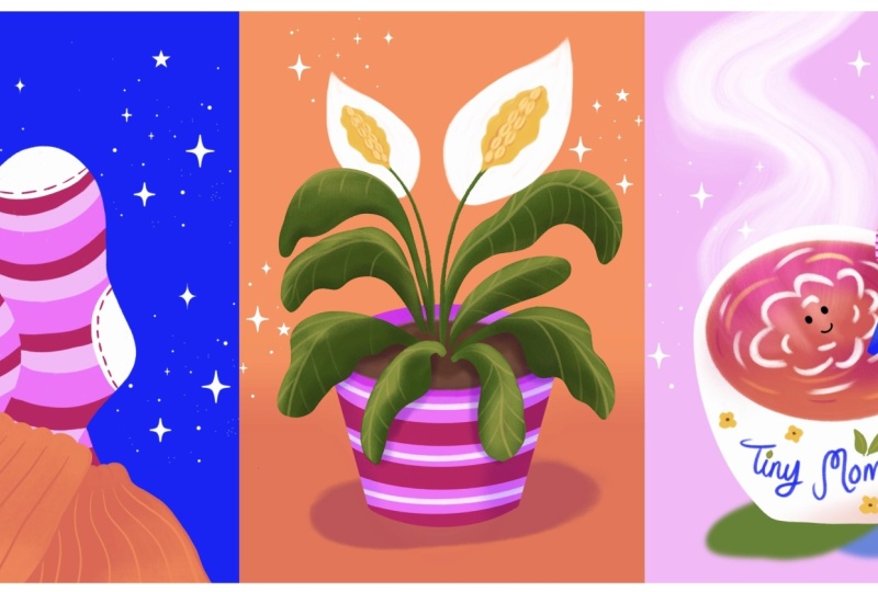
for your project, you'll create a mini series
of three cozy illustrations, a pair of feet in
colorful socks, a warm cup of coffee or
tea, and a house plant. You're welcome to draw all three prompts or pick
one that inspires you most, and feel free to draw any
other ideas you might have. These are just meant to
help get you started. Please don't forget to
share your artwork. I truly love seeing
your illustrations, so upload your projects to the class gallery
for everyone to enjoy. Follow along in Procreate, another app of your choice
or your sketchbook. Anything that feels most
comfortable for you today.
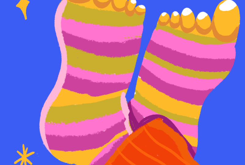
3. Socks: Setup and Sketch : Today we're going to work
with very small canvases that will allow us to have fun without the stress of getting
into too much detail. The canvas that we're
working with is five inch over seven inch and you can create
it right here. Add a new canvas, let’s
work in inches, and we're going to do five by
7 " resolution can be 300. So I'm going to use sketch reference
to create my images. And the first one
that I want us to start with is drawing
these colorful fun feet. And what I would like
to show you is a way to use shape in order
to create feet. Feet needs to be right because if we get the feet
wrong, it's very visible. This is just something
that we see every day. We can create an awkward plant, but we cannot just
do awkward feet. So let's start with a very basic shape, and
we'll take it from there. Because if you
think of the feet, they do have a little
trapezoid, right? The heel is narrow and
the toes are wider. So if we start with
the basic shape, we can then imagine that
there is a big toe over here and four smaller ones
over here, right? And just like that, we have
the shape of the feet, but we do have the curves
that we want to add. We have a curve here, another
curve that goes like this, and let's make it simple. We'll do a curve here,
then we have the heel. Then we can remove the rest
of our geometrical shape. And what we're left
is with a foot. So let's use that as our guiding layer for
this illustration. And now that you know
how to draw a foot, we're going to create an
illustration based on it. And here I want us to use the assets that we
have for the class. Let's bring them on
as a reference layer. I'll grab it as an image there. So this color
palette is available for you in the class resources, go ahead and download
it and use it. My background layer color is basically based off of
this background layer. It's a very light gray. So if I use white over it,
it's easier to see it. Let's go ahead and create a new color palette with the colors that we
have over here. I'll start with the bottom. These are my main
background colors. And now I'm going to
go with the greens. I like to put the light
colors at the very top. And just like so,
I'm sampling and tapping to create
my color palette. Let's do this one over
here, this one over here. So now that I have
my color palette, let's go ahead and
change the background to blue because I want to use the
white to create my shapes, and so the background
needs to be darker. Let's go ahead back to our
layer and draw our feet. So basically what I'm doing
is tracing tracing the shape. And, you know, I really want
to have this little pinky, maybe give it a
little character. There. And next thing
that we want to do is color in the shape. And for that matter, I would switch over
to my pastel brush. Part of this process is
really doing things manually, taking the time to enjoy
the coloring process. And really, really have fun. I really love coloring
in manually, everything. It helps me connect
with the image. It helps me get
into the mood of, you know, being in a
creative moment right there. Great. So much fun. All right. So now, you know, we can actually keep on going with the same brush.
I'm using the pastel. But if I scale it down, I can draw the
rest of the shape. So first the feet
have this curve. I want to connect this food
to the rest of the leg. And then let's imagine pens maybe the pens are not,
you know, boring straight. Maybe they have this
fun little detail. What we do here is
blocking the shape. And that will give
us later a lot of creative freedom because the
shapes are already defined. All we can do later is
color them in and really let loose with the colors
and all the fun details. And this is also the professional
way of illustration. When we illustrate
professionally, we create the shapes. We make sure they are
nice and refined, and then we will go ahead and bring in
all the nice colors. So take this moment to
evaluate your shapes of the leg and see if it's good,
if it's working for you, or if you feel like there's
any changes that you want to make before we move
on to our next phase, which is coloring it.
4. Socks: Coloring and Texturing: I think this leg is really nice, but we do have another one, so we are just going to go
ahead and duplicate the shape. I'll use this one
as the bottom leg, but I'm going to change
the opacity a little bit just so that I'll be able to see a difference between
the two legs. And so since I want to create illustration where
the feeds are crossed, I'll need to flip
this bottom leg. So let's go ahead and use the
transform tool and flip it. Right. And when we put our
legs one on top of the other, they're not like so. But this arrangement, we do need to bring them
closer together and move things a little bit so that the legs will look natural. You might want to
use a distort here. And now I'm going to imagine
where this part goes. Just like so, we have two
fits one under the other. So this one is cut, but we don't mind the cup
because we don't see it. I'm going to go ahead
and bump the opacity up, and I'm going to hide
this layer for now. Let's go back to our top layer. And what we want to do here is start adding all the
fun colors to the food. So I'm going to
lock it in alpha o. Here we can sample colors from our color palette or go over to the color palette that we set directly into this project
and start picking our colors. I think it will be really
fun to create stripes over the food because
with the stripes, we will be able to show
the shape that is curved. So let's scale up the branch and start adding our stripes. Since we're working in Alphalo, we can very freely add the stripes and
they'll stay within the shape that we
determined for the feet. So, where would you
put your colors? What colors would you pick
for your illustration? I like to use strong colors.
I think they're really fun. O maybe we want to
add some orange. I like the orange details. Maybe we can use the orange to add some definition
to the toes. I'm getting fancy here. Maybe we want to
use the light pink to add some light over
this side of the food. Et's try to be more
intentional with our coloring. All right. Finally,
let's do the pens. I'm gonna color this one. And to add some definition. Let's just bring in some
light colors as well. Very simple. Now let's
do the other food. Once again, we'll lock
it up in Alpha lock. And since we have our color
scheme going already, let's just try to mimic the same pattern that we
created with this new sock. We want to create a difference between the top leg
and the bottom leg. Think a good way to
go with this is to give the other pens
a lighter color. Let's add some stripes. We can actually sample
from the top layer. Now when we draw the stripes, you want to make sure
that you don't have the same stripe going
right under the top strip, so that there will
be a difference between the top leg
and the bottom leg. So I make sure to pick
colors that are different. So here we have the
pinks overlapping. So I might want to just
use a different color here just to break this
pattern a little bit. Like so. Fun part is that we although we're
drawing the same socks, we don't really need to be
accurate with the pattern. We can definitely change it up a bit and be more dynamic
with the stripes. I think it makes
it much more fun. There. Finally, let's do toes. And here we have the
feet overlapping. So here we can create some difference with
variations in the color. So to create the shading, I'm just going to
create a darker area with a darker color. In this case, the dark orange works very well to
create the difference. Now, this area where we have overlapping has to
have some shading over it. So let's pick our darker tone. There. Very simple. Another fun thing
that we can do is add some highlights in
the lighter color. Maybe we'll add some
highlights here as well. I just makes everything
more bright and shining. And everything immediately pops. Let's get some highlights
over the pens, as well. Nice. All right. We're almost done, but
let's finish it up with, um with some fun, other details. So let's go back to our
Let's pick this brush. This is a liner brush. I'm just going to add
some fun little stars and shiny elements just to make this illustration a
little bit more festive. We can style our shape
a little bit. Like so. And if you want to really nitpick and have some
more fun with your art, you can just go and add lots of fun little details just to
bring everything to life. Let's add some
patterns to the pens. And what I like about
these stripes is that they help the pants look
like they have some added style and some more movement rather than
having those flat shapes.
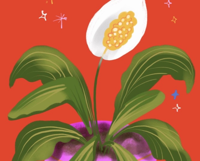
5. Plant: Drawing with Symmetry: So now that we have our
first illustration, let's move on to our
second exercise. I'm just going to
duplicate my canvas. And well, I think we're going
to go next with our plant. And so let's group all the feet layered
together and hide it. Now, the plant illustration
has a different background. So I'm going to go
ahead and change it. It's very inspiring to
start our work with a bold color rather than
work with a very muted one. So I'm going to go ahead and
pick the pencil brush again. And for this exercise, we are going to draw a plant. The fun thing about this plant, it's a peace lily and it has
a very beautiful flower. So to match this illustration
with our sock illustration, we're going to use
stripe pattern on the plant pot and then just have fun with organic
shapes of the greens. So let's get started. So first thing first, I think we want to start with an oval. For the pot, and I want to
make it rather wide oval. So I'm just going to
reposition this about, let's say, third way down because we want to leave
some room for the plant. And then we can
actually go ahead and use the drawing
guides as a symmetry. There. Now we have a perfectly
symmetrical flower pot. And we can plan our
stripes as well. This can also help us plan
our plant to some degree. Maybe we'll have a big leaf over here and another leaf over here. Okay. And we don't
want to be too precise and too accurate because we don't really
want to be boring. So too much symmetry can tend to create less of an
interesting design. So we do want to break
the symmetry somehow. Maybe I'll add a leaf over here and a smaller
leaf over there. And then my flower is
going to be an oval. Like so. All right. We have our general plan, and this is going to
be our sketch layer. Let's go ahead and
color this now. I've already created a
rough idea of my colors. You can go ahead and follow
my color palette for this illustration
or use your own. I am going to pick
my pastel brush, first thing will be to
color the flower pot. The color scheme here
is red and green, which are opposite colors
on the color wheel, they are complimentary colors. And then pinks and red are
very good color combination. That's a protein for you. If you want to create a
harmonious color palette, when using strong pinks, just pair them up
with beautiful red and you have a good
color plain right there. So my first step will be to color in the flower pot and then have fun
with the leaves. Now, the color the flower pot is going to be
geometrical in shape, and so this will anchor the
organic shape of the plant. I'm going to go ahead and lock this layer in an alpha log, and I'll give it some dimension. Actually, let's bring
this up and lock it. So I'll have some guiding. So I was looking for
this line over here. I think for the soil, we may want to be very loose. So what I did is, I
scaled up my brush. This is a texture brush. It's a pastel. But
you know what? I want to show you that we can do the same thing
working with the pencil, and you can use the
six B pencil in procreate to do the same thing. The pencil brushes have
a wonderful texture. And if you scale up the
brush all the way up, it will give you this grainy, noisy texture that is
just fun and really great for drawing the
soil for the plant. My next step will be to create some separation between the top of the planter and the
bottom of the planter. So I want to introduce
a line here. I find this really distracting.
So let's remove it. So what I did here,
I created an ark, and I let Procreate help me
with placing the ark there. And next up, let's move back to the pastel brush and add the beautiful stripes
over the planter. So we start with pink, and then we'll have a red one
and pick one and a red one. I actually planted it out right. Ooh. This is way too big. This is so satisfying. All right. Let's remove it
and see what we have here. You know, I think our planter
could use some definition. So I'm going to go ahead and
pick a wide and soft brush. I'll use this one. And I think I'm going
to keep the red and et's add a new layer and we'll
set it in a clipping mask and change the color
blending mode to multiply. And I feel that the
red is not working. I'm going to use the same color that I've used for
the flower pot. And with a white brush, just add a little bit of
definition to my pot. Like so. There you go. And we can actually group
these layers together. Go ahead and add a new
layer to create the leaves. Let's go back to
the pencil brush, and I am going to
pick my dark green. Let's draw some fun
shapes for the leaves. Now, leaves are organic shapes. They are very forgiving. The only thing that we want to pay attention here that we
want to layer our leaves. Some are going to be in
front of the others, so we will probably draw the leaves on two
separate layers. I'm going to start with
the ones on top and then we'll go back to
the ones at the bottom. So I had a rough
shape for the leaf, but I didn't trace it exactly. Credit some variation
in my line. And in that sense, though I drew the plants
using the symmetry tool, I can now change up the shapes when I'm
drawing on top of it. So I'm using the sketch
as my guideline, but I do change it up a bit.
6. Plant: Painting Leaves and Shading: Let's lock this layer and go to Let's go with a soft love.
Let's go with this one. This is a very soft brush, and I'm going to pick
a lighter color. Let's give the leaves
some fun dimension. So basically for the leaves, we draw the shape, and then we add some dimension and definition with
a finer brush. And I think that
we might want to get a slightly
darker color here. So it's a variation on
the green that we have. Introducing a darker shape immediately adds
dimension to our work. Like so. Let's check out the sketch layer for a bit and see what we
are working on so far. I love it. So now we want to create the bottom
layer of our leaves. And you know what?
I think we are going to continue working
with a darker green. I feel terrible for not including it in
your color palette, but what I did was
I simply picked up a darker shade for my
original green that was here. So you can do this yourself. That you can. Again, I'm following the ideas
that I have in my sketch, but I'm playing with them. It's much more interesting
to play around with the shape rather than
copy it exactly. Have fun with your leaves, play with the shapes.
There you go. I think the plant is gonna
look much more fun this way. Plus, the peace lily really
has these droopy leaves. So let's do this leave now. I'm carried in. And,
you know, in fact, I am using the pencil brush for all that because the
pencil brush is just one of the most diverse
brush in your toolbox. Bear that in mind. Um,
let's do this one. Up next. Let's give
it some dimension and fun textures just the same way as we did
with our top layer. I'm gonna go with the dusty
and pick my lighter green. Now in the same way as
we did with the socks, we want to make
sure that the light colors don't overlap with the top leaves so that we oops, I did not lock my layer so that we can see the
difference between the leaves. Now, as the light
falls from above, we will make sure that the light areas are at
the top part of the leaf. And over here, this leaf
is shadowing this one, so the lighter part is going
to actually be this one. Switching back to the pencil, let's add some definition. What would you like
to see on your plant? Maybe you have another
favorite plant in your house that you
would like to draw.
7. Plant: Adding Flower and Personality: Well, guys, our last element is going to be the top
of the peace lily. Let's grab a new layer. And first I want to do the stem. And the next thing that we're
going to do is the flower. There's this beautiful
elliptical shape. Kind of like a tear drop. So we want to make sure that we find this shape
on the canvas. I'm thinking that
I might want to add some shadows
under the leaves, but let's focus on the flower. I think the pencil brush is gonna work well with a flower. But let's give it a little bit of
dimension, just a smidge. I'm very tempted to do that. Very tempted. Let's
see how it works. Yeah, I love it. Of course, I did not lock it. I did lock it, but I'm
drawing on a new layer. Okay. I'm just going
to merge down. Perfect. Nice. Okay. And now we're going to do
this beautiful flower. So I think orange and yellow
will work great here, but I want to introduce
the yellow more. So let's start with the yellow. It's just a brighter color, and it's more contrasting with this bright red that
we have at the background. Oops. We got to switch our
brush back to the pencil, maybe give it a little
bit of definition. There. Let's remove the sketch. It's really distracting. I love it now. I think we need to add some definition
to our peace lily. Now, we'll go back
to the orange. See what happened
there? I don't want my lines to intersect. Trying to create this rather
stylized shape over here. Lovely. We can also try to
introduce some highlights. Let's try it and be
very careful about it. So I pick the white
because I'm trying to keep a cohesive
color palette. And I'm just going to
add some highlights. Let's check it. Let's
see if we're loving it. What do you think? I like it. I think we're going to keep it. Well, I'm going to
keep it anyways. All right. Last thing, let's give our
leaves some shading. Just gonna pop in a new layer
here and grab a soft brush. Let's do the dusty, and
let's be fancy and grab multiple introducing the shading immediately makes everything pop because it immediately
creates a sense of depth. This is our simple and
fun plant illustration. If you want to give
it some more work, we can always add some more
definition to the shading, maybe give our plant
a little shadow. Every shadow that we add to our work immediately
create contrast and separation between
the background and the main elements and
brings everything to life. I think this one is pretty done. Let's move on to our final
drawing for this session. I'll see you in the next lesson.
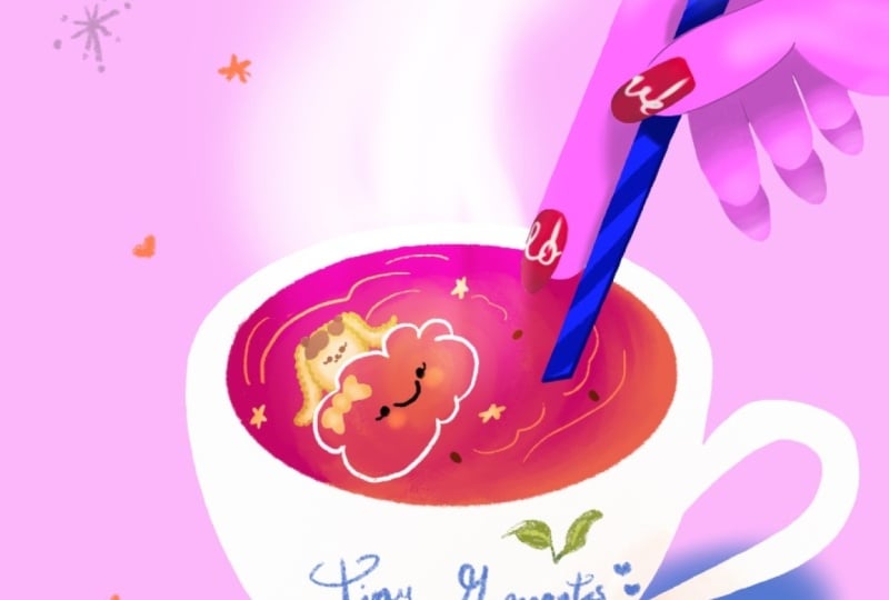
8. Coffee Cup: Planning and Shape Blocking: The coffee mug. First off, let's change the
background to this one. Now the reason I'm using these different colors for the background is because
we are creating a set, a good combination
of three colors that works well together. And throughout this
set of illustration, we're using the
same color palette so that everything
is matching up, and it creates a cohesive set
of illustration when we're keeping our colors using
the same color palette. So I have some fun ideas
that I want to try with you for this illustration. I want to do something
fancy with the vapor that comes out of the coffee
or it could be a tea. I'm going to do coffee,
and I want to do some fun writing on
this coffee cup. So let's start with the
foundation, our basic shapes. First, let's do an oval. Oh, this is a very
thick brush. Okay. So this is the
center of the page. I don't want my coffee cup to be exactly in the center
because I want to leave room for all the fun elements that are happening
here above it. But my ellipse is very narrow, and I can see that in my
sketch I created something is more closer to a circle, and I believe my intention
was to leave room for illustrating
the coffee inside. So using the free form, I can stretch hoops, can stretch my form. And I am going to bring
back the drawing guides. Now, let's think a little
bit about the composition. I think I left a
lot of room here. This is too much for
what I am planning, since we don't care about
resizing at the moment, because when we resize, we actually add pixels
that are not there. But since we're sketching, we can definitely make all the changes that we
want to be very free here. This is our sketch layer. This is our planning layer
and it's very forgiving. So definitely feel free to size up if you need to do that. I think it looks great. Let's
make it a little narrow at the bottom. Okay. So since we're viewing
it from the top, we'll see more of the top of the handle rather than
the bottom, right? So what I'm trying
to do here is not create a parallel line, but make sure it's a
bit narrow down there. So this is the cup, and we want to have a
hand steering the cup, and I did something like so. Right. And now let's
look at the hand. To draw the hand, you
can actually take a photo of your
hand and trace it. I'm just going to
pose. And since it's a stylized and
simplified illustration, remember that we're working on a stress free
sketching over here. We can just be more
forgiving and, you know, allow ourselves to
plan our shapes more freely. I want to create some fun
shape in my coffee mug. And I want to write
something here, but we'll do it together later. And I definitely want us to do. The steam, not vapor, steam that comes out of the
c. Let's move to color. I am really done with sketching. The fun thing about sketching is it gives you the structure, but you do want to go and
move ahead to your drawing. Sketching is a great guideline, but just move ahead to color, and that allows
us to stay loose. We're kind of
eyeballing the shape. We don't really need to be very precise and not being very precise will help
this illustration. Look more whimsical and fun. I've gone ahead and
drawn the coffee mug. What I want to do now is add
a little bit of definition. I'm wondering if I want to do
it in orange or blue maybe. Let's see. Yeah,
orange is better. Let's walk with the orange. I'm going to add a little bit of definition at the bottom of the cap and here,
let me show you. We're creating a nice definition
to the little handle.
9. Coffee Cup: Drawing A Hand: And finally, we're going
to create the coffee. I'm actually keeping the
orange for the coffee, and looking back at my
little plan over here, I can see that I
made it in dark red. We can always add
red afterwards. Let's see if we
can work with red. Let's see why your teacher
has planned out red coffee. Hm. You know what? I think we can use the red
to add more definition. So I'm in a new layer.
I like this over here. I like what this brush is doing. I love the texture over here. So let's try to
add more of this. You know what? And we
can even move over to this little tool over here, which is very handy. And make this little more
smooth and blurry. Like so. Let's move on to
our next element, and that would be the hint. And for the hind, we
want to be more precise. So I'm coloring the hand
basically following the sketch. This is just going to be the
color block for the hind. And once it's done,
let's add a new layer. We can make it in a
clipping mask and find a darker color and a softer
brush to add some definition. So for now, I'm not using any
lines to define the hand, just the shading
in a darker color. And we can play with
the shading layer since it's in a clipping mask and erase some just to add some fun details to the finger. Let's check it out
without the sketch now. Yeah, I like it. But let's add some
more details now. The the brush that
steering the cup. You can draw a
spoon if you like. I think this one is a brush, and I want to use the blue. Again, using the same
cohesive color palette that I use throughout
this series, starting with the tip of the brush and then
the lower part. Now let's add some definition to the brush with
a darker color. The simplest and quicker
way to do it is just using the alpha log to
lock the shape that we've created and then just
brush over it with a darker color to define the areas where the fingers
are holding the brush. I love how adding a
little shading in the right places help really define the shapes
and bring them to life. So I've got some shading under the fingers and where
the brush meets the coffee and along the edges to help create
that rounded shape. Okay. And now let's go
back to the finger, and I feel that brown works
great here just as a liner. We don't need to really
outline the hand, find where lines are
really, really necessary. And if I uncheck the sketch, you can really see where
I need those lines. And finally, I want to
add some highlights, and I'm using my white
brush to add highlights to the tips of the fingers and a little bit over
the back of the hand, just to bring it to life and make the shape more
defined and lively.
10. Coffee Cup: Loose Calligraphy and Finishing Details: And now let's add
some whimsical and playful elements to
our illustration. I'm going to draw a smiley
cloud on my coffee. You know, when you go
to a coffee shop and order a cup of flat, usually the barista would
draw heart in the foam. So we're going to do a cloud. And then I want to add
some definition to the coffee and break down the uniform red color with some other
definition in detail. Next, I want to
draw the steam that comes out of the
cup, and for that, we'll use one of the softer brushes and generally draw the
shape of the steam. And then we can blur the edges of the steam using
the smudge tool again. And that helps the
steam integrate better with the background
and the coffee. And the next thing I want to
show you is a fun technique. We're going to use a new tool
that would be the liquefy. And with the liquefy, we're going to play with the
steam and kind of push it a little bit and give it
a more defined shape. Alright, last thing,
let's try to find a good blending
mode for the steam. And I think the overlay
gives me the best one. It helps the steam blend
nicely with the coffee, creating this very
beautiful pink, and it also blends better
with background as well. And finally, we're going to add some character and style to the coffee cup with free
style hand lettering. This is something that
I really like doing. I'm grabbing the
pencil and drawing this whimsical text
over the coffee mug. I'm going to write tiny moments. That's the name of the class, and it also helps create
this atmosphere for this illustration that's showing a coffee cup being steered
and the steam coming out. And I feel that the blue
writing really helps style this illustration nicely. Alright, and we can adjust our hand lettering
using the transform and adjustment and
select elements of the writing that we
want to reposition. And finally, we can style more of our hand lettering
with just adding some whimsical details like
maybe some flowers or leaves. It could be just a couple of simple leaves like the
ones that I'm drawing here to design the written
message on our coffee cup. And we're almost done. The final things
that I want to do is create some more
definition and add shading. I'm going to use two
colors to create my shadings just because
I like the added colors. We have a lot of pink
in this illustration. And again, the same
way as we did before, the shading helps bring
everything forward, helps this illustration pop and adds dimension
to the illustration. So I'm going to finish things
up with my handy pencil. I'm just going to draw some fun elements
in the background, just to bring some more
character into this scene.
11. Final Thoughts: Thank you so much for
joining me in this class. I really enjoyed
walking you through the process of creating
tiny illustrations, and I hope you enjoyed the creativity you put
into them as well. In this class, you learn
how much personality and charm you can pack into
any tiny illustration. And my hope is that this class gave you confidence to keep drawing small moments whenever you need a spark of inspiration. These tiny projects are
proof that you don't need big ideas or
complicated subjects to create something beautiful. I'd love to see what you made, whether it's one illustration
or the full mini series. So please share your work
in the class gallery. If you enjoyed the class, I'd really appreciate
if you left a review. It gives me an insight
into what worked for you, and it helps other students
discover the class. So thank you for spending this
creative session with me. I can't wait to see your
everyday tiny moments. I'll see you in the next
class. Bye for now.
 Yifat Fishman, Artist & Illustrator