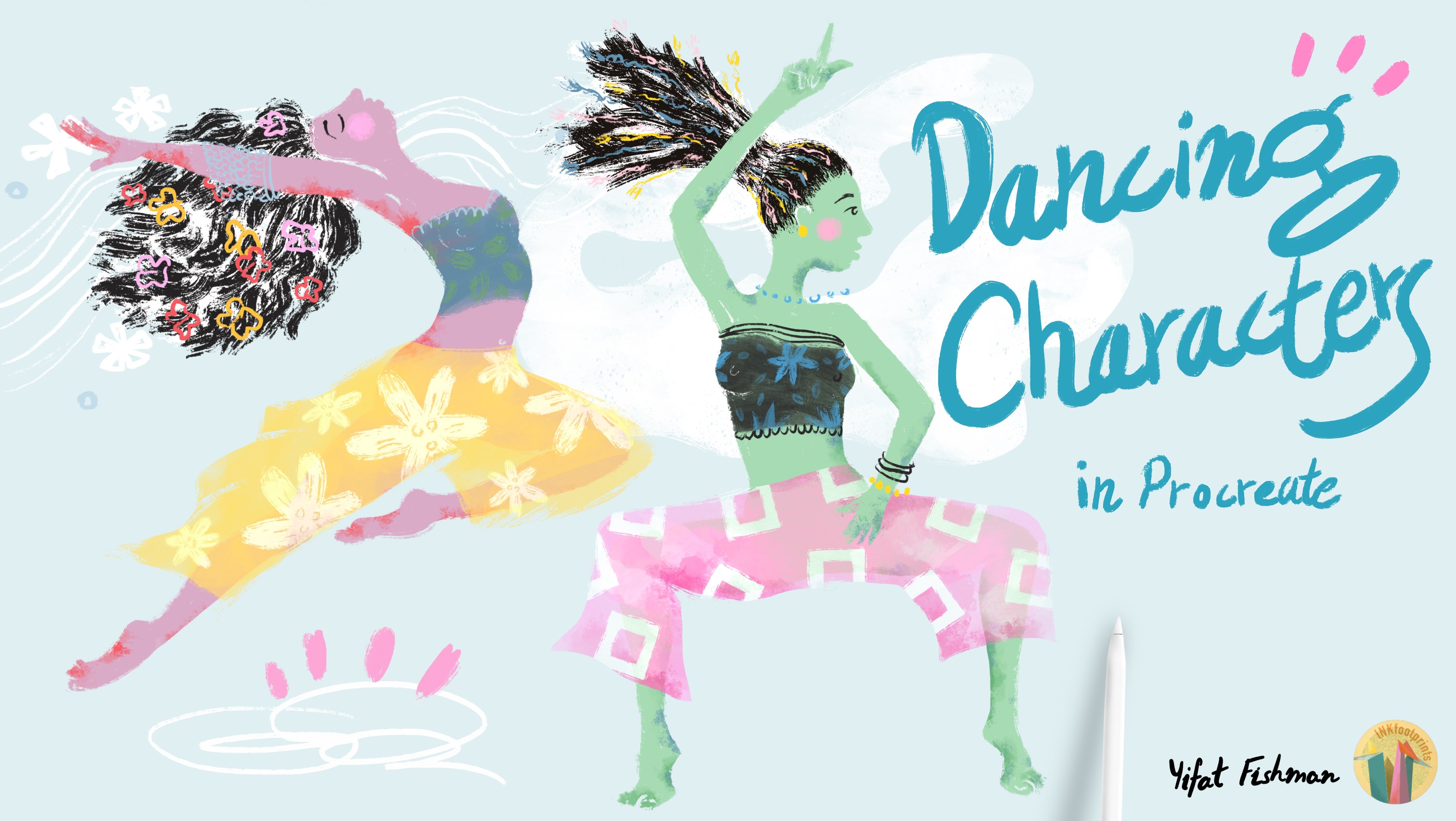
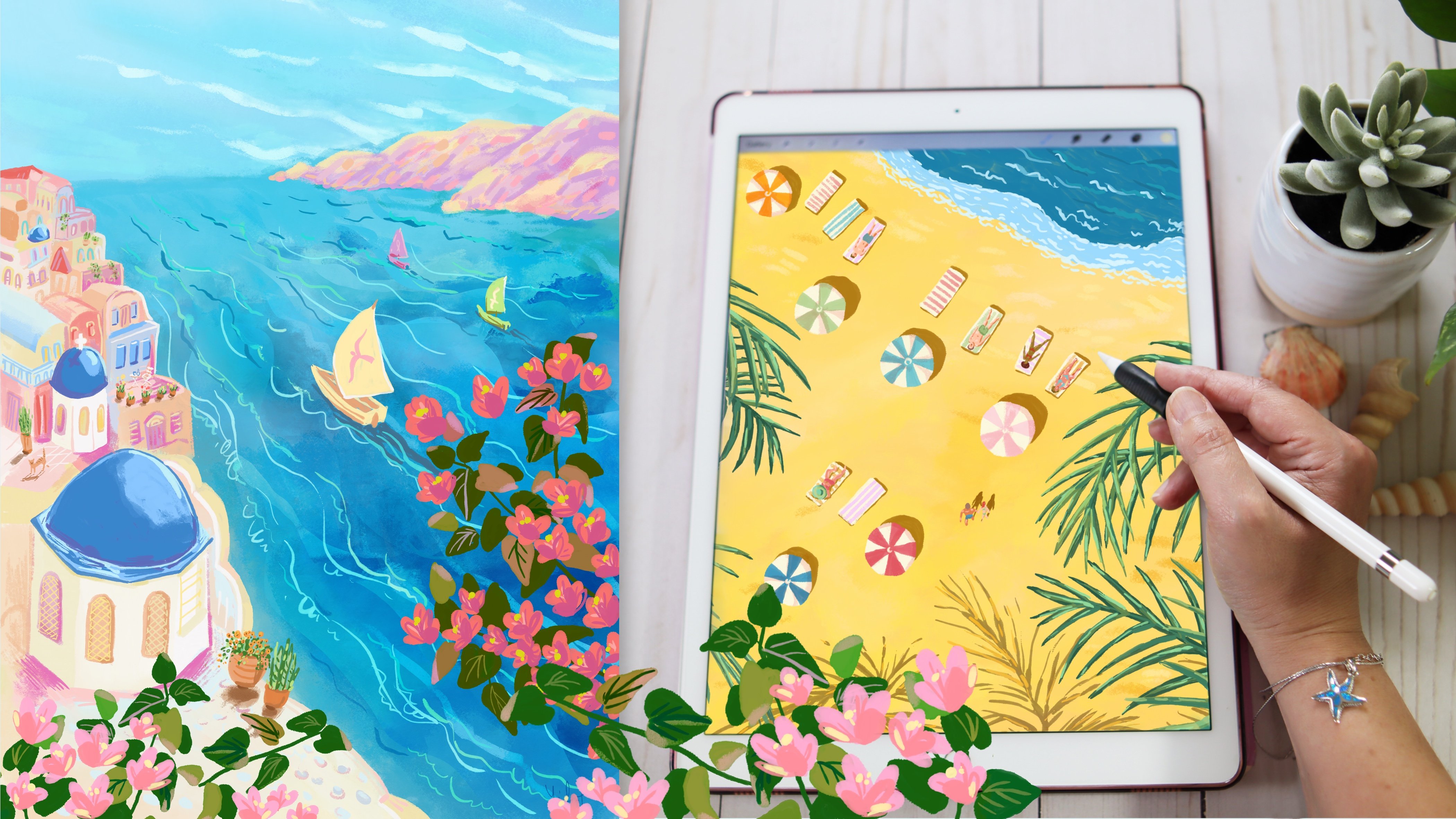
Transcripts
1. Welcome to Class!: Botanical illustration
is such a great way for us creatives to
connect with nature. Finding ways to infuse your drawings with
plants is so satisfying. I love to incorporate
plants in my illustrations. And the ones around my house
often inspire my work. In fact, I have a plant buddy sitting right next
to me on my desk. But when you think of
botanical illustration, you want to start small, especially if you're
just a beginner. Because getting better at
drawing takes practice. Hi, I'm Yifat North Texas based
artist and illustrator. I went to school for
industrial design, but ended up following my
passion for illustration while raising kids and
moving between countries. It's not always easy
to do what you love while you have life
going on all around you. And I get it. And this is what this whole
class series is all about. This class is the
first in a series of short and sweet
illustration classes, each with a focus on a project that teaches
you a set of skills. In this illustration
class series, we create bite-sized
projects to help you flex those artsy muscles and learn to draw on the
iPad in Procreate. Throughout this class,
we'll be drawing a fun planter with succulents. You will learn to sketch your composition with a
few drawing guidelines. Pick the right brushes from the
Procreate brush selection. Choose colors for your palette. Draw shading, highlights,
apply textures and masks. Whether you're a complete
beginner or have some experience
drawing in Procreate Sometimes you have limited
time for creating and growing. Join me in class and
let's start drawing.
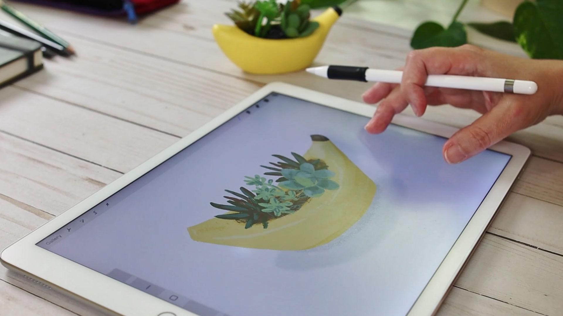
2. The Project: Welcome to my studio. I'm so happy that you're
here. In this class we're going to create
an illustration project around a house plant. Try
to find something funky, something unusual,
interesting or funny, and stick a plant
in it and draw. You can also research and
find photos of fun planters and join them with images of plants that
you want to draw. For this class,
we're going to use the iPad for sketching. I sometimes start my
illustrations on a sketchbook and then take a photo and
move it into the canvas in Procreate. You're welcome to do
that if you like. And if this is part
of your process. I'm going to be starting
everything in Procreate. So without further ado,
let's start drawing.
3. Sketch: Let me show you how
I set up my canvas. I usually make sure
that it's print-ready in case I created
a really nice project. Sometimes we think
we're just going to warm up and do something. But it ends up really nice. And we might want to send it out for print and
frame it on our walls. So it's a good idea to
work in high resolution. Mine will be 300 DPI, That's good enough and it will not chew up all
your layer space. My canvas settings are 10 " over 10 " or if you set
it up as pixel size, it will be 3,000
width and height. And the DPI, like I said, is 300, which is
great for printing. A higher resolution will show
better on your brushwork. In lower resolution, the
brushes just don't look so nice on your digital
canvas as you draw. So if you get that feeling
that you're not happy, it just might be
that you need to bump up your resolution. Okay enough said about that. So what I want to do now
is give you a few pointers on how to sketch
from observation. I think this is really an
essential part of the process. And this is something that sometimes gets
people frustrated. They want to get
better at drawing. So I want to include
that in this class. So here are a few guidelines for drawing from observation. Just like we'll do
in a sketchbook. We're going to use a pencil
for creating this sketch. I love the six B
pencil in Procreate. It's really soft and mimics
a real pencil really nicely. The other benefit
of sketching in Procreate is that you can
easily change things, transform them, move
them around the canvas, and you have a lot of
flexibility when you do that. So what we want to do
at the beginning is get the rough shape in.
I'm drawing a banana shape, which is kinda funky. I want to do it in very
gentle lines just to roughly get the shape of
the planter on my canvas. And then when I'm more sure
about my line drawing, then I'll press more on the Apple pencil to
draw stronger lines. In the same way. We'll do that in our
paper sketchbook. We'll pick an H pencil, which is very gentle, and use that one for
the initial sketching. And then we'll pick
a darker pencil like a two B or six B pencil, go over the shape and draw stronger lines that
we can actually see. So we're doing the same thing when we're illustrating
on the iPad. And we are looking
for the shape. Fun thing about illustration. We don't have to be precise. Sometimes making all
these wonky mistakes, creating this
slightly off shapes is just what gives our
illustration character. So if you get that,
work with it, we don't really need
to be picture perfect. Illustration is all about
interpretation of what you see. If we wanted to do
something precise, we'll just take
our phone and snap an image and that's
it. We're done. So give yourself room
to explore and be creative with the shapes that
you create on your canvas. Alright, and lastly, we want to make sure that we draw in all the various plants that
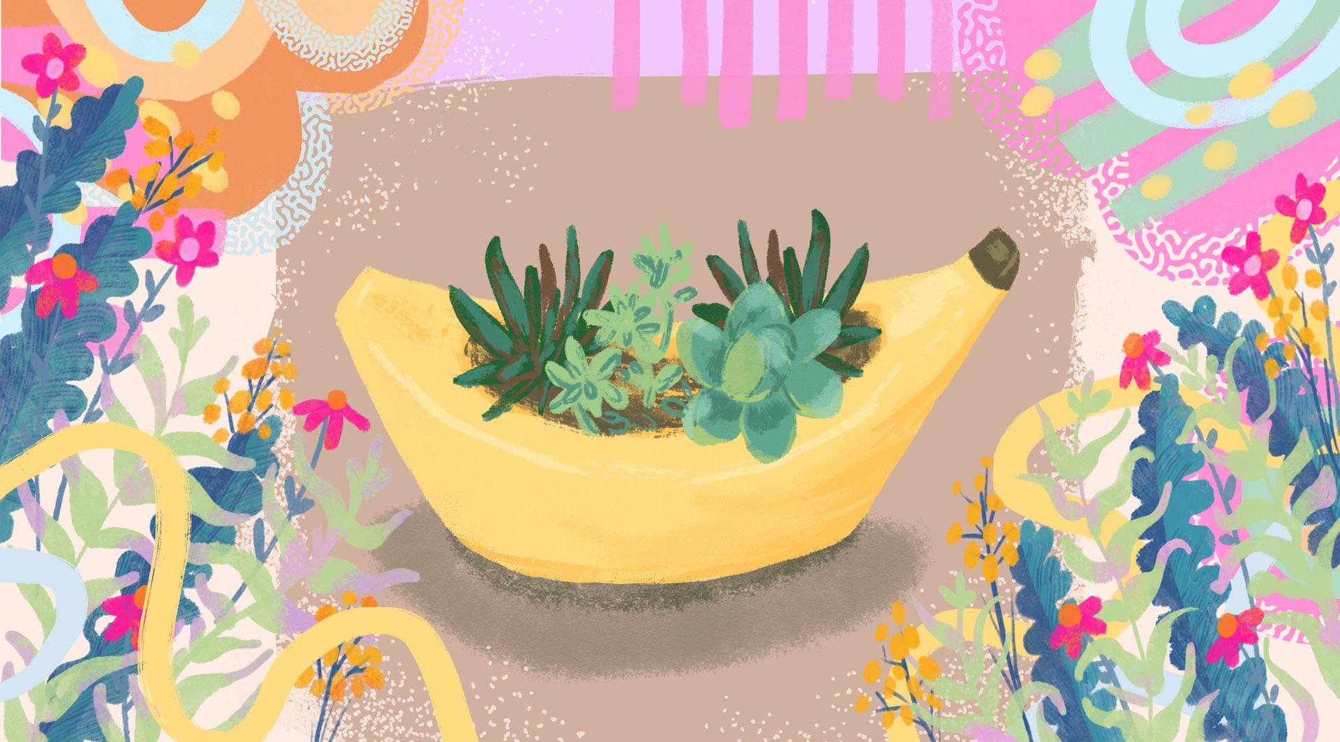
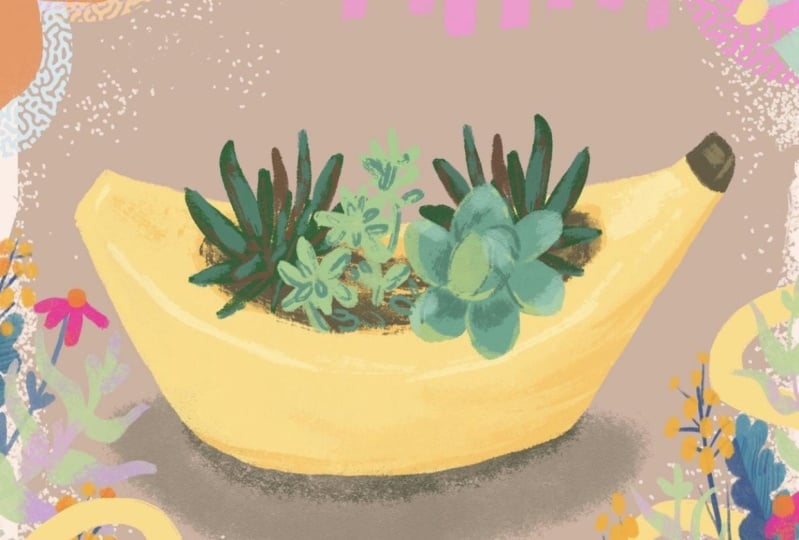
we intend on illustrating. What I like about the
planter that I'm drawing is that it has three different
types of plants in it. So that gives me quite
a variety to work with.
4. Color: For me, color is the main
driver of my illustration work. It gets me going. Color makes me happy. I sometimes
dream about colors. So I want to get to that stage of the
work pretty quickly. I believe some of
the reasons behind our creative choices
are simply love. We're drawn to creating
stuff that we enjoy. For me, yellow is
my happy place, so I tend to work with
that color often. I believe that's one
of the reasons for choosing this banana
planter for this project. Alright, so without further ado, let's head over
to our brush menu and pick our first
coloring brush. I'm going to use Oberon
for this exercise. And the best way to get
to know our brush is to play with it a little bit
on the side of your canvas. Check it out so
that you'll get to know your brush and get
used to draw with it. I already set up my brush size just the
way that I like it. And I want to show
you how to do that. So you have this display to show you the
size of the brush. And at the top right corner, if you press on the
plus sign, Procreate is going to remember that setup. Those settings change
between brushes so you can set up brush size for each brush that you like
working with and Procreate will remember your settings and
that's really, really handy. So we're going to add a
new layer and set it up as our color layer
and start working over our sketch to
color in the shape. We're not going to drop in color because that would create
really weird texture. We're just going to color it in the old traditional
way of painting in all the brushstrokes. This is a fun way of doing it, but it's also a way
of making sure that you get all the texture
of the brush in. There is a way of
tracing the shape and picking a color and
dragging it into that shape. I would suggest just painting it in the old-fashioned way
with lots of patients. It's just really fun and it will also give you
better textures. The next thing that we
want to do is to drag the sketch layer above
our color layer. So that will have a guide
that we can see and make sure to remember to
lock your sketch layer so that it will be
unavailable for drawing. We just want it to guide us. We don't want to accidentally
paint on that layer. And what I want to do now is to quickly apply a mask over
my color layer. I'm going to use Alpha
Lock by swiping, right with two fingers on a layer and creating the alpha lock mask, you will see it as the checkered background
around your colored shape. You can also work with a
clipping mask if you like. I tend to work with alpha lock
because it's just quicker. And now what we
want to do next is to pick a darker color. If you work with yellow, a darker color for
yellow would be to go more into the
oranges rather than to scroll down on your
color wheel and pick a darker color that will just
give you a very muddy hue. And with yellows that
are very happy colors, we want to keep them saturated. So picking from an orange color as your shading is
the better way to go. We can go over and
pick another brush and that would be the Blackburn, which is also one
of my favorite. It draws pretty much like a real brush on the
digital canvas. It's even less transparent
than the Oberon. So without changing the color, if we use the
Blackburn for shading, will get an extra layer of color over the shadings
that we've already created. So what we have here
is an added color and a slightly
different texture. And that's pretty much it. All we need to do to finish
this part is start adding darker colors at the inner
part of our plant container. All right, and up next
we're going to add more details and more
textures to our illustration. I'll see you in the next lesson.
5. Contrast: So here we are. I really like what we have
on the canvas so far, and we only used two colors
to create our shape. Now it's time to add
more definition to our planter with highlights and a little bit more details. Alright, so looking
back at my sketch, I have a line that defines the shape of the
top of the planter. Now that one should actually
be drawn in lighter colors, the light will reflect off
of the rim of the banana, the upper part of the planter. It will be the one closer
to the light source and reflecting off
of the light source. So we will paint that line
with our lighter colors. In this case, it will
be a light yellow. Now we don't want to
draw in an outline. We just want to paint in a few areas along that line
to create that effect. The next thing that you
want to do is to bring in more details and
create more contrast. Sometimes it's difficult to make that jump into stronger colors. But don't be afraid to
do that because that will bring your work into life. Contrast is an essential
part of drawing. So if all the colors
are very, very subtle, nothing will pop up and
engage with your audience. So a contrast will be adding darker details or adding lighter details
in a darker shade. In this particular image, the banana planter
has a fun dark tip and also the soil is darker. And those are the
opportunities for creating that contrast and adding some interesting
details to the planter. So what I'm doing here is I'm trying different approaches. And I'm using the two brushes that I chose for this project. And seeing what works. If one of the brushes
is too light, I might want to add
more details in the other brush that is
stronger and more textured. And we want to make sure
that we create lighting and shading with all the details that we create on the canvas. In the next lesson, we'll start drawing in our plants and add
them to our planter. I'll see you in the next lesson.
6. Drawing Plants: So we've created our foundation. We know the brushes that
we're using for this project. We know the colors
that we picked. And now it's time to add more details and
draw in our plants. We'll make sure that we
check our sketch layer. So that will have a guide. And we're going to
add a new layer in between our plant layer and the sketch and pick a
nice color for our plant. Using the same brushes
throughout an illustration. Create a very tight
and consistent look. So be sure to use
the same brushes that you've chosen throughout
and illustration work. So I'm going to test
out my brush and see if the size is
working for me. I don't want to work with
too large of a brush. I want to be able to have
control over my work. And at the same time, I don't want it to be
too small because I want my work to be more quick. So just got to find the
right brush size and then trace my sketch and create
the shape of my plant. The next thing
that we want to do is start adding definition to the shape of our plant
with highlights and shading. We're going to pick a lighter
color for highlights, changing the hue a little bit. You can use slightly
warmer color or slightly cooler color
for your highlights. Once again, we will work with the mask over our layer to add that definition,
and test our color. So the only way to
know if the color is right for you is to test it out first and see if the main color works with the
highlights that you picked. And if not, we're just
gonna go ahead and tweak our color until
they just feel right. Picking the color
is a process. And the way to know
if they work or don't work is if you like them. If you love them, if they
work for you, great. Go on and move on to the next step which
is drawing them in. Important thing is
not to get stuck. We can always go and adjust our colors later
on in the process. So what I want to
do now is draw in the shape and make sure all the details
are showing through. I can use my two
brushes to do that. I might want to change between them to get some
of the lines in. And some of the more
softer brush works in. The softer brush,
which is Oberon, works better for drawing in
the petals of the succulent. And I'm bringing in
more details with a Blackburn brush.
Alright and now I want to add some shading, shading and highlights play
together to define a shape. So we're going to
use our shading at the very base of the leaves. And the highlights are
gonna be at the top. A fun detail that
we can add in a plant is use highlights
in a muted color, like a very light aqua blue, that will create a
really fun effect when we draw in plants.
7. Creating Plant Variety: In this lesson, we're
going to add more plants. And I want to show you a new technique for
drawing your plans. So once again, we're going
to add a new layer to the canvas and pick a fresh new color for
our second plant. So what I want to
do now is paint in just the shape of the plant. What I like about
this plant is it has all these smaller shapes that create the entire plant and they repeat themselves
with variations. I think that helps create
a really playful shape. The next thing that we want
to do is pick a darker color. I'm going to use the color that was the last on my canvas. So I'm picking the darker color that I used for the shading of the first plant and with the same brush doodle
in the details. This is a really quick way
that creates a very fresh look. So what we're
choosing to draw here is just highlight
some of the details. We don't really need to go
over each and every leaf, get closer and get
all the details in. To get that fresh
and quick look, we'd pick some of the shapes and highlight them with
a darker stroke. Alright, and now
let's add a new layer and create our third plant. I want to go back
to my Oberon brush for that one and draw in all the basic shapes
first before I start adding in the
shading in a darker color. So the main technique
that I'm using here is drawing the basic shape, adding shading and
adding in highlights. The first step is
creating the shape. The second step is
adding definition. To create interest in the illustration, we sometimes create a lot of definition with more details. And sometimes we
want to bring in just a little amount of details to create that contrast between the light and the dark
and define the shape. This technique creates a very fresh and
interesting illustration even on a smaller scale. Two of my plants have shading
and highlights and texture. And one of the plants is only the basic shape with doodles of the details
drawn on top of this. And this variation
in the style creates a lot of visual interest
in the illustration. Important thing
to remember is to pick up the color directly
from your canvas. Since we've already established
our palette by now, the colors are all there on the digital canvas
and we want to keep everything tight
and nicely stylized by sticking to that
same color palette. Let's take a closer look
at the art process. I'm going to add a new layer
above my plant and use that layer to add dimension to this plant with new colors. I think it's going to be
much more interesting to step away from the greens and add a warmer color that
will tie in to the planter. And so I'm picking
shade of brown to add dimension
to my third plant. Last thing that I want
to do is add a pop of color and bring this plan to live with some highlights. And up next, we'll be adding some finishing touches to
this cute illustration. I'll see you in the next lesson.
8. Tips, Adjustments & Touchups: In this lesson, I
want to show you some fun pro
technique that will help you streamline
your workflow and tweak and adjust
your illustration work. So the first thing that
I want to do is merge my texture layer with the
color layer, like so. And then I'm going to duplicate that plant and hit the
transform tool and change it. So I've hit the transform
tool and now I'm going to flip the shape horizontally. And that creates a
very fast variation. I'm going to drag
and place the shape in its designated place,
shift it a little bit or use the distort option to create variation
to the shape. I want my plants
to look similar, but slightly different so that it will create the
appearance that I have two different plants from the same family growing in my little
banana-shaped planter. The next thing that we
want to do is create a slight variation
to the colors. So let's head over to the, adjusting the colors and create a slight color variation
for our second plant. So here we can change
the hue, the saturation, but just changing the
brightness a little bit already creates a very nice
variation for this planter. And it makes sense
that it will be darker since it's behind my main plant. So like I said before, we have the flexibility
of changing the colors and work with
what we have on the canvas. In this case, I really like the variation that I created
for the second plant. So I'm going to go back to my first plant and change
this one as well, and then go back to my second
plant and make sure that it's still different
than the first one. So we kind of go back and forth between what we've
created so far and create slight adjustments
and variations as we work. Now it's a good idea
to take a few moments to assess your work
and see if you want to make more changes to the other plants that you've
drawn in on your canvas. The last thing that
I want to show you is that we can create
duplications with other plants and really fill up our planter with many
plants if we like. Let's give it a try
and see if that works. So I'm just testing it out. I want to duplicate
my first plant and place it somewhere else on the canvas and see
if it works for me. And it's nice, but I'm
not really loving it. So I don't think I'm going
to keep this variation, just going to delete this layer. So I think the composition
was just too crowded and I'm not going to
work with a plant. let's move on and I want
to show you how to finish your illustration with shading
for the entire planter. I'm going to add
a new layer and make sure it's underneath
all the other layers. I'm picking a color
that is similar to the one that is
already on the canvas. I think that working with
cool gray really work with the color palette that
I have set up for my canvas. I'm going to play with my
Oberon brush and lower the opacity and scale up the
brush to create the shading. And with that, my friend,
my illustration is done. I can't wait to see
what you'll create.
9. Final Thoughts: Thanks for joining
me in this class and congratulation for
following through. I think we kept it
sweet and short. And I hope you really enjoyed the illustration
process on the iPad in Procreate. I'm looking forward to seeing what
you create in class. Whether it's just a sketch
or some rough colors, or if you've finished
all the project. Anything that you managed to do in this short amount of time, post it in class, and share it with the rest
of the students community. Please post a short
review at the end of class and let me
know how you did, what helped you
throughout the class. And if you have any suggestions or things
that you wish to learn, so that I'll be able to incorporate that in
my next classes. I sometimes share projects from my classes in my
Instagram account. Do follow me there to
see what I'm up to and what classes
I'm planning for you. I'll be sharing that in
my Instagram as well. And follow me here on
Skillshare to get notified when my next class
is ready for you. So thank you for joining
me today and I'm looking forward to seeing
you in my next class. Bye for now.
 Yifat Fishman, Artist & Illustrator