Transcripts
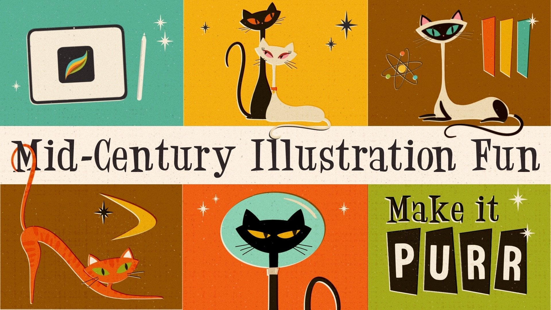
1. Intro: Mid-century modern is a significant American
design movement that was popular from
roughly 1945-1969. It was visible in areas such as interior architecture
and urban development, but also in product and graphic design as
well as illustration. The latter is what I'm
really obsessed with. I like the simple shapes, the limited colors, and also the fun that comes
from these illustrations. Especially screen printed ones are super intriguing to me. Hi, my name is
[inaudible] Schneider. I'm a designer, illustrator and teacher based in Germany,
and in this class, I'm going to teach you all
you need to know to draw this wonderful
mid-century screen printing style
illustration impropriate. All you need is your iPad
and your Apple pencil. First, we are going to hear
some interesting facts about the screen printing
technique itself. After we've learned
everything about the resources that
come with the class, we start the brainstorming
process to find out what to include
in our illustration. We sketch out together
and arrange the items on our canvas and decide which
colors we want to use. Finally, we draw our shapes, refine the lines, and then I introduce
you to the techniques that help you create this
unique screen printing look. If you are as obsessed as I am with everything
mid-century, then this class is for you. Let's get started.
2. Classproject: As class project, I
want you to upload the illustration we've made
together during the class. For that you just go in class to the Projects
and Resources tab. Hit the "Create Project" button, name and describe your project and then you upload the image. The only thing you need
to make sure is when you save your artwork
in Procreate, that you save it as a
JPEG and not as a PNG. A PNG is usually too big to
be uploaded to Skillshare. Then you hit the
"Publish" button. I'm always super excited to
see my students artwork, and I know others feel
inspired by them too. In my next video, I'm going to show you the
resources that come with a class and how you
download and install them. See you in the next video.
3. Downloading And Installing: This class comes with quite some resources
which you can find on the skillshare.com website in the
Projects and Resources tab. First of all, you will find my links to the mood
boards in here, here's the link to the
screen printing style, and here's the one to the mid-century illustration
style mood board. On the right side, you can find the resources
I've created for you. Here you find my brush set, the swatches, and the font. They're super easy to download. You would just hit one of them and you allow the download. Here you can see as soon as that little
arrow is bouncing, the download is complete. You would just hit
it and then you find the file in your
downloads sections. You would hit it and it would be imported into Procreate,
super simple. Just notice that new
added brush sets are always added to the top
of your brush list. It's opposite to the swatches. I can show you now. Let's just go back. If we download the swatches, and they're also appearing
in the download section. We hit Swatches and as
soon as they are imported, you can find them in
the Color section here, but you need to scroll all
the way down to the bottom. This is where the new
swatches are being added. Here you can see
mid-century screen print, and here you can see the
colors I've used in class. The font is also super easy. Let's go back. Let's
download the font. Yes, we want. Arrow's bouncing
and we just hit it. It's imported right away. If you add text now, you can find it in your, that's a text, let's add a color, here you can find it. 50 sprint, that's
the font we've used. You can just go ahead
and start typing. Please feel free to use all those resources
for other projects. If you do, why
don't you show them on social media and to tech me? You can see my Instagram
account name and Facebook account name at
the very end of the class. In our next video, we're
going to talk about the screen printing
technique and what characteristics we want to depict in our illustration. See you in the next video.
4. What Is Screen Printing?: Let's quickly go over what
the screen printing means. I'm going to be
showing you here at this wonderful Instagram account by little friends
of printmaking. If you don't know
these guys yet, you should definitely
check them out. They produce great content, wonderful artwork all made with screen printing technique. You can see here she's
right now applying ink on a mesh and it's going to use the spatula to
push the ink through. Here we see, and
then she repeats the same process with all the other colors
that are needed. The meshes prepared
that some areas are pervious for the ink
and some areas are not, so if you don't know them yet, please go check them out
they have wonderful artwork. We recap one more time. In screen printing technique, there's a sheet of paper
being placed under a mesh. The mesh was pre-treated that
according to the design, some areas are impermeable
and others are not. The ink is then applied to the mesh and printed
onto the paper using a rubber spatula and
after the ink has dried, the process is repeated with each of the
remaining colors. Since this process is
usually done manually, there is of course, room
for errors or misprints. However, for me there's no mistakes but
more the opposite. These imperfections
are what I really want to achieve and
procreate to create that true handmade and unique look far from being
too digital or clean. I'll show you what
I mean by that on my Pinterest mood boards. You can find the link
to my mood boards in the resources tab if you
would like to check them out. We're in my screen printing
style mood part now and the first thing we see
is in each of the examples, there were not many
colors being used. This is clear now, we know now for
each color you need a printing process so of course, people were limiting
the amount of color. Something else we see
is especially here. The colors here are shifted so that means
the purple has moved into the green area and initially it
probably wasn't wanted, so in a screen printing process, you might call this a misprint. But for me, this looks
supernatural and also random. I like that on this side, the color interacts
with the color below, but also creates this white
outline now so it's easier to depict the shape and I really like how the colors
interact with one another. We also see that the artist where focusing
on main shapes, they didn't draw
too many details they just stayed with the basic to just deliver the main message that the viewer can
understand what he sees. What we also see here is that not all the areas have gotten the same amount of ink so there might not have been
enough ink on the mesh or the mesh didn't
work properly. This is also a
supernatural looking to me and I really want to take this
into my art in Procreate. Let's move to another
mood board off mine to the mid-century style. You can also find the link in my resources tab and I would like to show
you something else. Here's a great example
that the paper itself has also marks. We see those little black dots everywhere in the paper that
means the paper they've used wasn't completely white and this also creates a
very natural feel. One last thing here, we can see that's gorgeous. I like the stain here. We see a stain, we see spots, we see yellowed
areas in the paper, and that also seems
to be very old so it adds to our mid-century drawing. One last thing I really
want to add to my art is the paper texture itself. We can see there's
some bumps there, some areas that are highlighted, some areas that have
a little shadow. This is from the
paper texture itself. This is something I also
want to have in my artwork. Those are the five areas I
really want to focus on. Let's recap. The amount
of color. Not too many. The colors are shifted to
get a white outline things, but also some interaction
with the colors below. We want to focus
on simple shapes. We want to make sure that
not all the areas have the same amount of
ink and we want to add some texture in the
paper itself and some marks or stains or spots to just create this unique
handmade feel. This is enough information about the screen printing style. We know now how we want
to depict it in our art, that it looks
natural and unique. Without further
ado, let's move on to finding some inspiration
and our sketch. See you in the next video.
5. The Brushes: Before we really dive into
brainstorming and sketching, I would like to introduce you to the brushes and the font
that come with the class. Just to give you
a little overview what we have and
how they work best. First, we have this
sketch in our brush set. It's what the name tells you. It's just basically a pencil. You can draw sketchy lines which have a little rough edge. It's pressure sensitive. The harder you press, the more opaque brush
is going to draw. It comes without streamline and it works great
for sketching, but also for decoration
lines in the final drawing. Sometimes you see that in mid-century illustration
style that some of the drawings have lines to
just add some more details. This is really well for it. You can make it
bigger or smaller. This is what I really
like to sketch with. [NOISE] Our next
brush is nice liner, which is one of my
favorite brushes. It is for inking purposes. It really draws super nice smooth lines
with smooth edges. It feels without texture. In this illustration style, I'm mostly using it as an
eraser because it's really nice to depict nice
shapes, nice outline. You will see what I mean by
that later on in the class. Brush number 3 is the
nice liner tapered. It's basically the same
brush as the one before. It just is more pressure
sensitive and has tapered ends. That means if you
don't press hard, the line is thin. If you press harder, the line gets thick. I also use it a lot for erasing to just be able to
erase pointy lines. Brush number 4 is
our screen printer. This is the one that enables us to draw in this
mid-century style. I show you what I mean by that. If you choose it, and you draw over the canvas
there's always going to be areas that are really filled
with ink and some are not. This just looks like this. Not enough ink on the mesh
feel. I really love it. If it doesn't fit
enough space for you, then you just lift up
your pencil and draw over some areas again to
fill it with more ink. You go with whatever
you like best. Let me show you once more. If you draw over
the whole canvas without lifting up the pencil, then you create
areas with less ink, but if it's not filled
enough for you, you just lift up your pencil and go over some
areas once more. You decide what you like best. The fifth drawing brush I've added is this stipply shader, which I might not
be using in class, but for mid-century style, it is a must-have. That's why I added it. With this stipply shader
you can just add shading, of course like darker spots and a lighter spots or
some subtle texture. I'll show you what I mean. I've just added a layer
and turn it into multiply. Then I've chosen
my stipply shader and I draw over it once more. You can just see what it does. It adds stipples to
create maybe some shade, but also you can use it
to draw some highlights. Just in the opposite direction. Let's go pick a lighter color. Like here you could
also add some light. I really liked the brush. It acts super nicely and it
creates a subtle texture. It's just for this screen
printing style I want to keep my illustrations as plain as possible to not have them
look too realistically. Let's move on to the
next brush group, which are the paper
mark brushes. We have five of them. They just basically add
marks onto the paper. In the paper making
process in the factory, the pulp they use to
mill sometimes it's not bleached completely
and sometimes they also added recycled paper in it. That means there's going to be some darker spots in the paper. This is why I created
those brushes. I show you how they work best. I would always add two layers and turn
them into multiply. We have one and two and
both are set to multiply. On the first layer, I will draw with a light color. Let's use this yellow. We can't really see a lot yet. Although here you
see already some of these stipples they appear just subtle and that's
exactly what we want. Then I add another layer
with a darker color. Let's say we choose black here. Now it's really visible. You see all those marks, those fibers here
in the paper pulp. We can play with the opacity, turn it down a little bit. Then it looks supernatural
like recycled paper. We have five different ones. Let me show you quickly. Let's turn off the
background layer. Let's add another layer. I'm just going to show
you the blank sheet. It adds water marks. As if somebody would have
split water and the paper or maybe coffee and that
created this blush on it. We have stipply draws
stipples, as it says. We have spotty, which
draws subtle tiny spots, and we have splashy
with bigger splashes. Here we go. Again they
work best if we add two layers set to multiply
on top of everything else. Then we draw with a light shade, and we draw on this second
layer with a darker shade. That creates a very natural
looking in-depth look. The last brush group is
the paper texture group. We have five different
paper texture. This texture appears
in the milling process when the paper pulp is being pressed through
different rollers. The rollers at this
pattern onto the paper. This is what we want
to add as well. I have five different ones. They also work the best. At the end of the
final illustration, if we add again two
more layers on top, also set to multiply. One layer is going to be
drawn with a light color and the second layer
with a darker color. That just adds so much reality that it looks like real paper. Let me show you the
different patterns I have. We have the watercolor texture, which looks like this. We have acrylic texture, which looks like this. We have, let's see, pastel paper texture,
which looks like this. We have the woven texture, which is actually more of
a canvas than of a paper, but still, I really
like how it looks. We have the rough
texture. Here we go. Let me show you how it looks
when everything is there. We have the background color, we have the paper marks. Now I'm going to add two
more layers set to multiply. First I'm going to add, let's go with the pastel paper. I would add one layer
with a light color. We can't really see
it yet because it's super subtle about that's
exactly what we want. One layer with a darker color. Let's choose black
again. Here we go. The white areas, you
can see it really well, but also you can
see it in the blue. Now, this looks like paper. It's just a little bit
too dark for my taste. I would turn the opacity
down a little bit, on the black one and
also on the yellow one. Now to me, it just looks super gorgeous
like a real paper. With a class there's also
the font '50s print. When you downloaded it. then it appears in your
procreate when we add text. We took on those
two letters here. Here we can find all the
fonts that are installed. Here we see '50s print. Let me turn the
size a bit bigger. Then you see that it also has this screen printed look here. With some areas without ink, some areas that
are really opaque. Let's just turn it into a
white color. Here we go. This font also comes
with a private license. That means you are allowed to use it for private purposes. However, the private version doesn't have any
punctuation or symbols. If you're interested
in the full version, you can check out my
Creative Market shop. there you can find the
full version and you can also get a professional
or commercial license. That's all about the resources
that come with the class. Let's now dive really
into finding inspiration, what to include in
our illustrations, and get started with our sketch. See you in the next video.
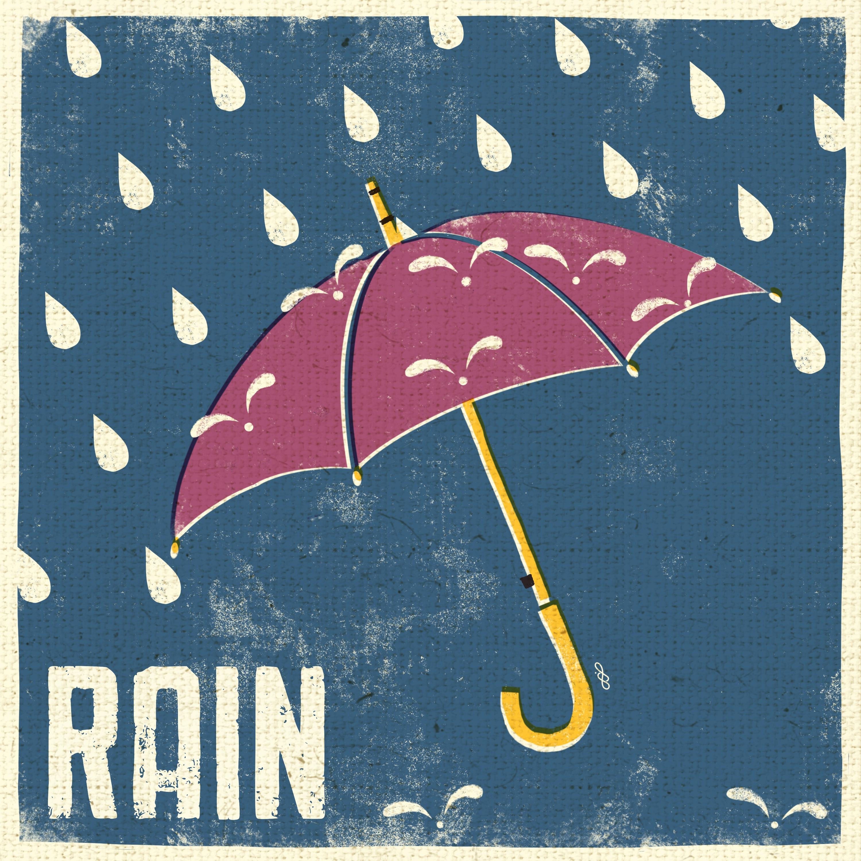
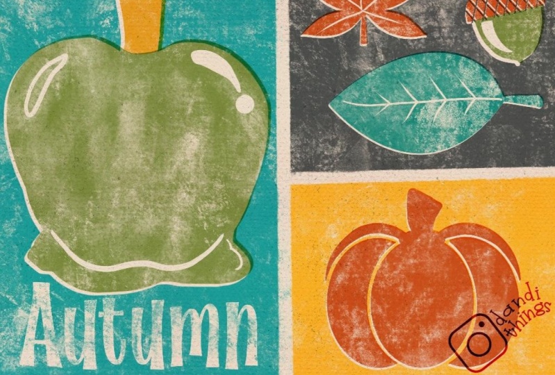
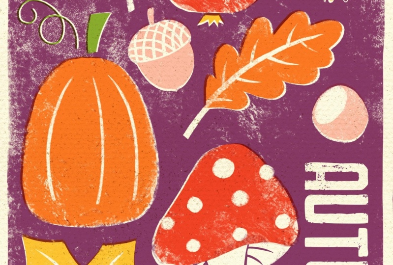
6. Brainstorming And Sketch: In this class, I
would like to create a little fall or
autumn illustration. Let's brainstorm first and think about what items
belong to autumn. What items do we typically
see in fall out there, and just make some notes
about what we would like to have in
our illustration. I went to Google and
typed fall items. I want to show Google pictures. Here we see of a variety of items you normally see in fall. Let's say, of course, pumpkins, colorful leaves, mushrooms,
acorns, and nuts. We see wellies, we see warm clothes,
an umbrella. What else do we see? We see typical fall
animals like a squirrel. We also see pine cones, different shapes of leaves, different shapes of pumpkins, warm socks, clouds,
and rain drops. Maybe a hot beverage, apples. I guess we get quite of an idea. Let's get started
with our sketch. Let's move over to Procreate
and open a new Canvas. I would like to use
the screen size, which is 2732 and 2048 pixel. I just don't like
this color profile, that's why I recently made a new one with
the same dimensions, which is here just
with RGB colors. This one, I open. I would also like to have it in portrait mode in the end, so let's turn it around. Let's add some text now where we can write
down what we would like to have in
our illustration. We write it down in our artwork that we
have it on hand all the time and can just quickly
go back and forth to check in case we can't remember. What do we want to
have in our picture? Let's see. For sure, I want to have a pumpkin or two. I would like to have some
leaves and nuts and acorns. Then I also would like to have mushrooms in it and maybe some fruits as Fall is the season for a lot of fruits like apples or pears or plums. I guess that's
already quite a lot. Let's say that's enough. Let's grab our pencil and
get started with our sketch. We open our layers panel and we make the text
invisible for now. Then we make sure that we're
on the sketcher brush. This sketcher brush is like a pencil and I love to
use it for sketching. In my illustration I always
like to include some text, so I would want to write autumn here in this bottom corner. I keep this area clear
already that I don't put my items too
close to the text. What is one of my big items? That's for sure the pumpkin. I want to have it visible, but not completely that
it jumps into your eyes. Maybe I'll draw it in here. Again, let's stick
with simple shapes. We just have this shape. It's going to have a stem up
here and maybe some spiral, however you want to call it. This is something that grows. When the pumpkin
grows on the plant, sometimes we see those
little spirals and it's supposed to have some
lines from top to bottom. What's another big item we want to have in
our illustration? Probably a mushroom. I love those red and
white mushrooms. I think I'm going to
place it down here. But I want to have
it a little curved that we also see the under, what's inside of the mushroom. Those little lines here, and this one is going
to have some dots. As Bob Ross would say, let's give him a friend, so here's this small one, just coming out of
the ground maybe. Here, the stem is still small. The top part didn't
open fully yet, and the dots are a
little bit smaller. I guess in this area here, I would like to have a leaf, maybe a maple leaf or something. Let's see. We have this shape. Here's a little pointy area. We have this here, pointy here. Great, that fits very well. Another big item that I
would like to have is, let's say an apple. This is going to be
here in the middle. Maybe a little further down. Maybe that's too big. Let's make it a bit smaller. The apple also has a stem and a leaf and maybe this
little thing on the bottom. Maybe here's some space
for another leaf. Let's say we draw
an oak leaf here. Something like that. Later on when we
block all the color, we can refine these lines. Maybe some lines
in this direction. I think here I want
to have another leaf, a round one, maybe from
a birch or something. Just simple shapes, not
too close to the apple. I guess here I want to
have some more mushrooms as I just like their shape,
they're super interesting. Maybe let's have some small ones with those tiny little caps. Again here let's
give him a friend. Here we go. Maybe we can make
the apple a little bit smaller like that. Then I have some space
here to draw an acorn. I really love acorns. They have this cap
and the fruit inside. I like to give the cap, I don't know how it's
called in English. You see what I mean those
lines that are crisscross. We have an acorn here, and maybe here's another
space for a little hazelnut. I think this looks really
fantastic already. In our next video, we're going to look
for the colors we want to use. See you there.
7. The Colours: Welcome back. Let's now think about the colors
we want to use. What I'm going to be using in my illustration that's for sure, a bottom layer
which I'm going to be dying yellowish white. It's just to depict that the paper that it
was printed on, it's already a
little bit yellow. It shows the age of the paper. This is going to be
my bottom layer. On top, I'm going to be putting the background layer
in another color, which actually I
can't decide on yet, but what I wanted to think about is the colors of
the items itself. I want to make sure that we
don't use too many colors, maybe three or four, plus the background color plus the white here we
have underneath. Let's see what colors we need. I usually like to make a rough little sketch
with whatever brush. Maybe let's use the
nice liner for now. Let's make another
layer on top of our background layer. Let's see. I really want to have
some red for the Apple. The apple is definitely
going to be red and my mushroom here, I think. Here, the small one as well. I guess I also would like to use orange as I think
the main fall color. In my opinion, a pumpkin has to be orange, so let's make the
pumpkin orange. Also maybe the leaf here. I think the stem of the mushroom is going to
be this yellowish white. Maybe I make all the leaves in orange because we don't want
to have too many colors. Maybe let's see. I also want to add some yellow
or this nice pink shade. That's the color palette
you find in the resources. Maybe let's go away a little
bit from too natural colors. Why don't we use this here? This is a great pink tone
and also for the mushrooms. No, I don't like this. I think I want to add some more colors than
just three or four. I think I want to go in with some more colors so let's see. I want to introduce, I guess, whoops, that's not
what I wanted. Let's delete this swatch here. I think I really want
to introduce yellow. Let's make it more colorful. We are the artist and we can decide what's going to be in our artwork. That's how it is. I want to have the
mushrooms in yellow. What about here, the stems? I will even introduce
some green here. This is what I want
to have green and maybe even the leaves here. Then I guess I would keep
our nuts and acorns. Maybe let's see how it
looks when we use brown. Here the center part and
here maybe the head is going to be white and we just
draw the lines in brown. But that looks to natural to me, I might go with a
different color. How about my beloved pink shape? I think I like that much better. The central part here of the
hazelnuts is going to be white and maybe also here, the little acorn hat. I would just draw those lines. Yes, I guess I like that better. What about the bottom
part of the Apple? I probably want to
have it in yellow. This is a very nice
colorful illustration. Maybe we can already
decide on how our background is
supposed to look like. Let's create another
layer underneath. How do we like it in purple? Not too bad. How about blue? I really like the blue. I really like that too. But blue is not so
super fall-ish. What about brown? Brown is also nice. I guess I might be going
with a purple shade. Let's go with that first and
see later on how we like it. Now we have our
rough color idea. It might be changing
throughout the process, but that's for now what
I want to go with. In our next video, we're going to use the
right brush to really draw our shapes and refine
them. See you there.
8. Background And Text: Let's start with our
background first. We want to turn all the layers
with colors off so far. What's left right now is just basically our color
of the paper. This is our sheet of paper
we want to print on. We're going to create
another layer, we are going to draw with
our screen printer brush. Then we scale it up a bit and start drawing on
our piece of paper. We don't need to go up
all into the edges, we just want to fill
the paper roughly. I really like that
there's this empty spot, that here's some areas with
just less ink here and there. This just looks like a misprint, but it also looks super
natural and less digital, and this is exactly what I want. Now I would like to
delete some of the edges, let's just make them a
little bit straight. Here we go. Not too straight though that
it's going to lose its hand printed style. Roughly is okay. Here we go. I think this way around. The next thing I wanted
to fill in is the text to show me how much space
is left for my sketch. Let's add text. You remember, you downloaded my font
and installed it. It should be there. See, this is already the font you got from
me, fifties print. In my Procreate, it would start with this font. Then you would just go here
and find the right font. Here we have fifties print. I think I want to have
it a little bit bigger. Yeah, something like that. We can work with the kerning, we can make it closer together
or even further apart, that's just for your liking. I think I want to go with that. Then we want to type. I would like to have
the word autumn. Okey-dokey. I want to rotate it by 90 degrees and put it in
my bottom corner here. Let's just quickly
open the sketch to see how much space we have. I guess that's okay. We'll leave that size. Later on, I'm going to
show you a little trick. We will cheat actually a little bit to make it look
even more like a screen print by cutting out anything that's on
top of the purple layer. We're going to cut out the text, we're going to cut
out each color area to depict even more of
the screen print effect. But for now, let's go with that. Background and text is there. In our next video, we are going to draw the rest of our shapes and refine them
as well. See you there.
9. Inking And Refining: We prepared our background
color and our text, and if you think it
looks too blobby, too many white marks, then feel free to go with your liking and add
even another layer with a purple color or just
draw over it once more. I like it for now and
we'll see how it's going to look like when all
the other colors are there. Let's start with
our next shapes. I wanted to open the sketch
and to look at the colors. We need a layer
for the color red. We need a layer of orange, yellow, green, and pink. Then I'm going to add another
layer with a yellowish white to just draw the dots, the stems of the mushrooms, the veins of the leaves. Sorry, let's go back. The veins of the leaves and some little marks
here and there. This is going to be in white
again that it looks like in the end as if there wouldn't
have been any color at all. For now, let's start
say with the red color. We turn off the color
sketch and we open another layer and we
go to the color red. I'm going to turn down the
size of my brush a little bit. Then let's just go and draw the apple just like this and refine the lines
right away by erasing. I want to refine my lines a little bit and I just
erase the outline. I'm not going to be too tidy, just a little bit. I want to keep the
hand-drawn feel. Let's turn off the sketch. Yeah, that definitely
looks like an apple. Sketch on and move
down to our mushroom. The bottom side of the mushroom, I want it to be in our yellowish white as
well as the stem. Whoopsy, I'm on the eraser. I just want to have
the cap in red. Obviously it's red down here. Here again, we can refine
the lines a little bit. You just go with
what do you like. If you like a different
shape of the mushroom, please go ahead and do that. If you like different colors, please always go
with your taste, go with what you wish, go with what you like. It's your art and you're the artist and you're going
to make all those decisions. If it feels right for you, then that's what you
need to go with. Okey-dokey. I like it. Let's turn off the
sketch quickly and see. Yeah, that looks like
mushroom caps for sure. Onto the next layer. Let's go with orange. Orange, these two items
are supposed to be orange. The leaf and the pumpkin, turn it off, get some orange. Also refine the lines. Sometimes I'm facing a problem with corners with
really sharp edges, so that's why I created
this tapered nice liner. Because I really don't like
these round edges here, these round corners, so I'm going to draw over with a screen printer once more. Then I'm going to
refine the outlines with a tapered to get it
a little bit pointier. Sometimes it's also
enough for me to just draw over once more, but sometimes even that
doesn't look really nice so we just need something
that is really pointy. Here is your oak leaf. Wonderful. As you see, I didn't draw the veins because I want the
veins later on to be white as if there wouldn't have been printed any
ink for the veins. That's just my additional color. We're going to work
with negative space; that's how it's called, with the white
color of the paper. This is how we're going to
draw the veins later on. That was our orange layer, let's move on to the next color. Let's choose yellow now. Sketch on, add another layer, color sketch off, pick yellow, pick the screen
printer brush and let's go. We're going to Refine the line soon with an eraser. Yes, the leaf was also yellow. I just think I need to move my sketch over a little bit
here at least the leaf, because it goes over the purple background
color which I don't like. I'm just going to select it and shift it over
here. Very good. Go back to my yellow layer
and start drawing the leaf. If you wonder why always this tiny little window appears, it's because I put
on my Apple pencil. I gave it the function
if I double-tap, I get the copy and paste menu. However, the Apple
pencil is super sensitive and sometimes if I
just move my fingers around, it would just appear. I just don't notice it so often anymore. You
get used to it. It's really handy when
you really need to copy and paste all the time. Let's continue with
our yellow leaf here. Let's refine the outlines. As you can see, I left some in-between
space here, between the cap and the stem. This is just to depict
the outline of the cap of this yellow mushrooms
and also here to see that this stem is in front
and this stem is behind. Just to create a little
dry dimensional feel. Our yellow layer
is done as well, let's move on to our next color. Let's choose green now
and turn on our sketch. Maybe I even want to do
it differently to have the stem of the apple here
in either pink or white. I guess I'm going to go
with a pink later on. Let's go and make
another layer for green. We'll see if that works with this brush or if we should use maybe our pencil brush because it also has
some areas where it doesn't paint really
every single pixel and it also has a
little fringy edge. I think I don't like
that because if I start refining the line here, it would probably be visible where the lines
don't really meet. I'm going to delete
that area again, and just use my sketcher to draw it because then I
won't have to erase anything. We're all green and we
just draw it like that. Now let's refine the
rest of the areas. Let's move on to the next color. I guess green is done. I just see a little area that I don't really
like here in my yellow and I guess I want
to draw over it once more. I think what I don't
like is that we can see, is the drawing lines because
my brush was set to small. I want to use my screen printer again and I want to
go over it once more, just to get rid of
those drawing lines. I guess it's much
better like this. We also need to refine
the lines once more, but again, you don't need to be too perfectionistic about it. It's just sometimes
those little mistakes maybe if you want
to call it that. They create an even better look, so just go with
whatever you like, be as loose as you want. Again, you're the artist, what you decide is
going to be okay. I really like that
sometimes you don't feel the color until
the very edge, but my brain still tells me, where's the outside and where's the outline and where the
items starts and ends. I really like that. I'm more happy with
the yellow leaf now. We still need the pink layer. Let's add another layer and
let's open our sketch again. I see I want to move
over from my sketch, I want to move the hazelnut. Let's select it and shift
it over a little bit, maybe in this direction, and the rest is okay. The stem, the acorn, and the hazelnut are going
to be in our pink color. My acorn has gotten a little
bit wider in our sketch, so let's see if we
like that or if we want to decrease the
size a little bit more. Erase the lines. I guess what would make
it a little bit easier is if the cap of the acorn would
be on a different layer. Let's select it. Here you see my little trick. Cut and paste. Now we have it on
a separate layer, and now we can erase
without damaging the other areas in pink. Let's turn on our sketch. Let's just say we want to
erase, here and there. Let me just make my sketch a
little bit more translucent. Then I'm just going to erase
those checkered lines. Just pretend that
there's a curve. Here we go. Turn off the sketch. Yes, I really like that. No, actually, I don't. I think here in the middle
there's a weird area, so I guess I need to change
the angle a little bit. Now I'm happy with it, and we need to refine
our other lines. But we can put down this layer and add it to the
layer below again. Merge down and we have all the pink colors
again in one layer. Turn on the sketch. We just need to make sure that we erase everything we don't want
to have on the picture. Because later on when
we do our little cheat, it would impact the purple
layer below as well. The last layer is going to be our white layer.
Let's add a new one. Go to our yellowish white, and we need the small size of our screen printer
brush is the best. Now we want to draw the veins. I guess, I want to fill
the cap with white. I want to fill this area
here from our hazelnut. Of course, the veins again
some lines maybe here in the pumpkin and the spots
and stem of the mushroom. Actually, I changed my mind. I think I want to add two
layers for the white color. One that's going to be on the bottom and one that's
going to be on top. What would make it super
difficult right now is, to erase exactly the same
line as the red cap. Sometimes there
would be some edges, I would draw some wonky lines and they wouldn't
meet up perfectly. But we can help us
with a little trick. We're just going to
select the red layer. Select, and then we're
going to move on to the white layer and we
erase by just doing this, this swiping motion with
three fingers back and forth, and now you can
see where the red was it has delete everything
on the white layer. Let's just turn off
the red and you can see there's the perfect
line from the red cap. Yes, there are some leftovers. But that's just
because there wasn't any pixel field here due
to our special brush. We can delete that though
without damaging the light. That was colored.
I want to delete. Here we go. We just delete what we don't
want to be there. Here we can do the same. We can erase everything that's
pink on our white layer. That helps us with not
erasing too much or too less. Because later on without cheat, we're going to turn
every colored layer, we will turn into multiply, and so all the colors that
are on top of each other, they're going to
interact with one another and we're
going to see that. We want just certain area to
interact with one another. We do the same trick. We select everything on
pink, and then we say, we go back to our white
layer and we erase. Let's turn pink off. You see, there's just left
what we want to be left. Perfect. Now let's just
erase the outline. Let's turn on our
red layer and add another layer on top to do
all those tiny little marks. Our overall illustration
is finished for now, and I really like how it looks. In our next step though, we are going to be doing some more refining and
some more cheating. We add a little bit, take off a little bit, to just have it look even
more like a screen print. See you in the next lesson.
10. Cut Out Cheat: Now let's turn our
beautiful illustration in a real screen print style. By that we are going to
be cheating a little bit. First of all, let's get rid of all the layers we
don't need anymore. Let's say I don't need
the text layer here. I don't need this sketch, but I'm going to
leave my sketch, but I don't need
the color rough. I don't need the
purple background. I don't need this empty layer. From layer 15 down to layer 3, that's all the layers
we want to keep. We're going to
turn them all into Multiply blend mode now. You see there
happens quite a lot. That's why we need
to do the next step, which I call cheating, there's happening so
much because the colors they just interact
with what's beneath. They interact with each other. In some areas of our
illustration we want that, in some areas we do not want it. What do we have to do
is now we have to erase the part that has been drawn
with the colors underneath. I show you. Let's start with our
text layer, Autumn. I should mention that first. We start to erase now and
this is not reversible. We need to be sure
that every item is where we want it to
be on our illustration. Because there won't be
any further changings possible anymore. If we cut out now, it's going to be cut out. If we have a mistake and we
want to change something, that would cause a lot of
trouble and a lot of effort. We're going to be sure
that everything is where it belongs to and
where we want it to be, to be able to have
the cutouts now. Let's go ahead. I'm pretty sure that my text is
going to stay there, so I'm going to select it and
then I'm going to remove it from the layer below by just
doing this swiping motion. I can turn off that text layer. You see it's turned off and it still shows a white area here. That's the magic. Let's do the same with
the white layer here, then you know what I mean. We select it and we
erase it in the purple. Now we can see the
white comes back. It's because we just see
the bottom color through. Let's move on and
go ahead and do it with all the layers we have. Let's select them and delete it from any other layer below
which is interacting with. It interacts with
purple and let's erase. We want to select and we want to delete and then the
initial color comes back. Let's select and let's erase. You see, there's more holes coming into our purple
background color. That's exactly what we want. Let's choose green, select. Go back to the purple
layer and erase here. Let's go to pink, select, go to purple and erase. The last layer, let's choose the white one. The white one, because it
interacts not only with purple, but also with all the layers, we need to erase it
through all the layers. That just means we
need to select it multiple times and
then erase it there. Let's start with a pink area, erase here. Select again. Go to the green layer, erase. Select it again because you see the stem hasn't fully
arrived of course, because it's still
not visible it reaches into purple and we need to delete it in purple as well. You're going to see
soon. Wait a second. Let's undo double finger tap. We forgot to select. Let's select the white layer, go to yellow and erase again. Here we go. Now we see all the areas we want to
have in our illustrations. Now we can do some
refinishing touches because for my taste, there's too much purple left, so I'm going to go ahead and erase some more areas where I think there's too
much color left, too much paint left. I'm just going to go
through all the areas here. That's what I've deleted
in the purple layer, maybe some more here. I did that for a particular
reason of course, back then, the ink
was quite expensive. They only used ink
where it really was necessary and of course, the colors on top of
each other interact with each other because they
weren't fully opaque. That's why they could only
print a certain color on a certain area where
it just belonged to. That's why we had to erase some of the purple
here right now because technically there wouldn't
have been any purple at all because
this area wouldn't have been printed with purple. Because it's not supposed
to interact with orange, so they would have left out this space right
away with a mesh. That's what we're going to do. But the rest looks
super amazing here. Maybe we want to go through all the color layers and think about if we want to erase some more color that's left out. Let's go through all the
layers now and see if there's any more color
we want to erase. That looks amazing. Now let's just do this
last finishing touch, which is shifting our layers
completely a little bit, to just have some areas of the color interact with others. I'm going to show
you how we do that. For example we don't need
wide layers any longer. We can just go ahead
and delete them. Because what we have white
now is the bottom layer, that's what we need. We have that already
and technically we also don't need our font layer. We just need the colors and
we can go ahead and shift them a little bit and
you'll see what I mean now. This is what I really love. I love that the red interacts a little bit
with the purple here, but also creates this
nice white outline. Which also defines the
shape a little bit more. It looks like it was a
little bit of a misprint because the paper below the mesh wasn't in
the complete correct, 100 percent correct position. But still, it looks amazing for me as it looks like handmade. It doesn't look like digital. It just looks natural. Let's go ahead and
move each layer for just a tiny little
tad to whatever side. You just decide what
makes sense for you. I really like that
especially with this little spiral
here we drew here. Let's just shift the pink
area a little bit more. Here we go, and I really like that now. In our next video we just add some more texture to
our illustration to just get the feel of
this is a real piece of paper and somebody
really printed ink on it. Let's move on to the next video.
11. Finishing Touches: In this video, we want to add some paper texture and maybe
even some paper marks. I want to add four
more layers now, and all those four layers
need to be set to multiply. Let's start with Layer number 1, turn it to multiply. That's just repeat this layer, duplicate this
layer three times. We have four layers in total, which are all set to multiply. I want to get started with
my paper marks first, those tiny little
dots and spots. I would always use two
different colors to just create some depth in the paper and I'll show
you how that works. I would go ahead and
use a light color like yellow or pink. Let's say we want to
use this deeply brush. I will just draw over
the entire paper , it's quite subtle. But if you look here,
those tuples here, everywhere, they were
created now with this brush. We move on to the next layer
and also use a dark color. Could be blue, could be
brown, could be black. I'm going to go with black now. By using the same brush, I'm going to draw over again. You see right now, it's
not subtle at all. But you can see this
tuples pretty well. What I would do now
is I would just turn the opacity down
until I like it. Let's go with 25-30%. Which layer am I now? That's the right one. It can be turned down
a little bit more. This I really think
this looks gorgeous. It's just the paper. It has some marks. It's maybe recycled paper. That really looks gorgeous, but now I still want to
add some more texture. Let's move on to Layer 3. We added, and I'm going
to choose yellow again, and now I'm going to go ahead and pick one of those colors. Let's say I want to go
with a pastel brush. I'm going to draw over it again. Since we set the
layer to multiply, it would interact with all the colors that
are underneath. You might not be able to
see it very well right now. You can see it here
in the white area. You see those marks here. These are there and they
seem to be the shade and the highlights
from a textured paper. If you zoom out, you
can see really well. But this is just
with a yellow color. I would also like to
add a darker color. Let's go ahead and use
black maybe and draw over, and now we can see
it really well here. The marks of the paper those little dimples and
really looks gorgeous, although this is way too strong. I'm going to go ahead and turn the opacity down
a little bit more. You just go with your liking, you just go what you like best. I really like this illustration. This looks gorgeous to me. You of course, please
always go with your gut. Go with what's your taste is. Go with what you like. You choose the colors you like. You're welcome to choose mine, but you're welcome also
to find your own colors. You go with the opacity of the colors as
much as you like. You just make all
those decisions that it makes sense for you. That's the most important part. What I would do in the end, I would always sign with
my little mark here. I would always sign
my illustrations. I would go and get the
white color and choose like a little spot where
it's visible but subtle. I would just stamp
my sign over there. I'm going to put it here
right next to the stem, but I want to do the
underneath. Let's go. I would just stamp it
here right next to it, and now I signed
my illustration. Everybody can see
that it's from you, although it doesn't
jump into your eyes. I think a signature on your
painting is always important. Let's move on to
our last video with the final thoughts.
See you there.
12. Final Thoughts: Congratulations, you
made it this far. Thank you so much
for taking my class. I hope you had as much
fun as I did by now. You've learned a lot about
the screen printing technique and what characteristics you need to follow to
mimic this look. In procreate, we talked
about focusing on simple shapes and sticking
to a limited color palette. We need random areas
lacking ink for more authenticity and colors interacting with one another
by shifting it overlapping. And lastly adding
the paper marks and paper texture to create
this realistic look. Please don't forget to
share your project with us. I am so curious to
see your version. And others might get
inspired by your art too. If you've enjoyed my class and the resources
that came with it, please consider
to leave a review as it helps us
artists a long way. You might also want to follow me on social media and sign up for my newsletter to
stay up to date with the art world and what I
am currently working on. If you share your
work on social media, please always tag me so that I am able to
see your work too. Every time I see
what my students make out of the content
they've learned in my classes, I get really excited
and feel so rewarded. You can also subscribe to my Youtube channel where I share free tutorials regularly. Now, thanks again
for staying with me. Happy creating and we see each
other in my next class by.
 Jutta Schneider, Artist | Educator