Transcripts
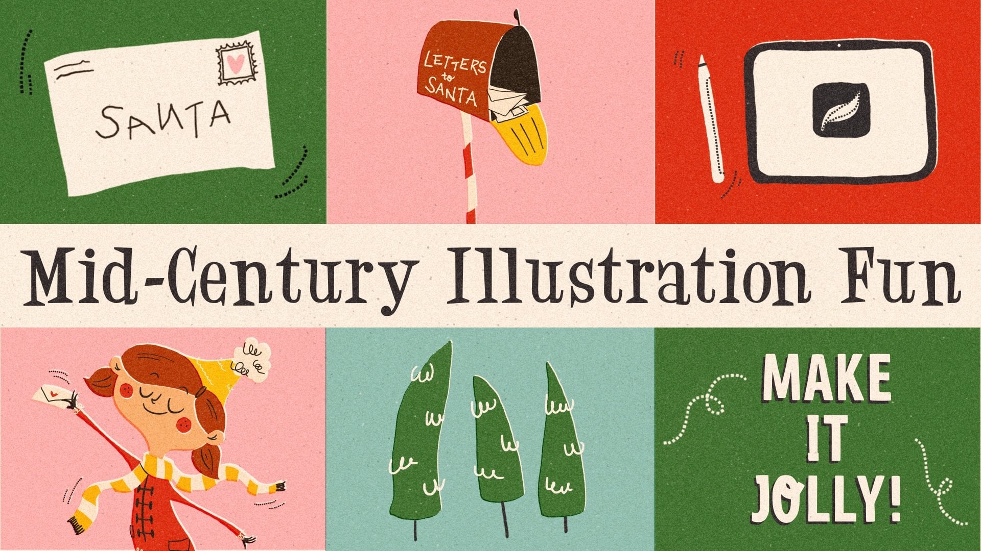
1. Intro: Hi everyone. I'm
[inaudible] a teacher, illustrator, and designer
based in Germany. In this class, I'm going
to introduce you to the iconic retro art
style in procreate. I call this art style iconic
because we are going to use the same rules for drawing our items that apply
also to a good icon. But to all my texture loving
fellow artists out there, don't be sad, we're
also going to include a lot of juicy
texture and shading as well. If you celebrate
Christmas and are ready to get into the mood, we are drawing a holiday related illustration but of course, this technique can be used
with any topic you like. We start the class by learning about the significant
characteristics of this style and how to find inspiration about what to
include in our illustration. Then I am going to show you two different
techniques of drawing. In Technique 1, we're
staying clean and almost vector light and
moving onto Technique 2, we are going to add a lot of texture and shading
to our image. Each taste is going
to be covered. By watching this class, you will get all the resources I carefully created for you. My procreate brush set
with 16 sketching, inking, and texture brushes and 16
holiday related brush steps. In a bonus video, I am even showing you how to
make your own brush chain in procreate so it's worth it
watching until the very end. You will also get
my font or rounder, my favorite winter swatches
and also the links to my Pinterest Moodboards about both the illustration style, iconic retro, and also about
Christmas illustrations. By the way, the illustrations
you are going to create, I'm making great Christmas cards in case you're still looking for something unique and handmade to present to your beloved ones. Let's get into it. Grab your iPad and
your Apple pencil, I will see you in class.
2. Class Project: In this class, we
are going to draw two different illustration
styles together. One's the clean and
flat vector like one and the other one is the texturized and
three-dimensional one. I want you to upload both of
them to the project gallery. You can do that easily on
the skillshare.com website in the Projects
and Resources tab by hitting the Create
Project button, please make sure you
upload your project. You inspire your fellow students and you make this
teacher here very happy. Can't wait to see what
you come up with. [MUSIC]
3. Downloading And Installing: [MUSIC] This class comes
with a lot of resources. Not only can you find the
links to my Christmas and iconic retro-related
mood boards here in the Projects
and Resources tab, but the class comes
also with three files which you can find here
in the Resources tab on the skillshare.com website. First of all, you
will find my font, which is called Allrounder. You will just install it into your Procreate font
list by tapping it. Then it's going to ask you, do you want to download
it? You say yes. As soon as this tiny
little arrow has bounced, the download is finished, you just tap the arrow
and tap the text name and it's going to be
add to your font list. Let's go back. We find also the
iconic retro swatches, which you can download
in the same way. As soon as the arrow
bounces, it's done. You can tap it. It's unpacking and
imported into Procreate. You can only find it now. When you go to your color panel, you need to scroll all the
way down to the bottom until you find your
new imported swatches. Let's go back again and check how we can upload
our retro brush set. You also tap it and
allow the download. As soon as the arrow
bounces, it's downloaded. You hit it to unpack
the zip file. You tap the brush set and it's going to be imported
into your Procreate. But to completely mess up
with us, that new brush set is going to be add on top
of your brush library. You will find it always
at the very top. Keep that in mind. The color palettes are
added at the very bottom, and the brushes are added at the very top in your library. Now you know how you can
install all your resources and I hope you will have
a lot of fun using them. Now let's move on
to the next video where we're going to
talk about the art style in which we're going to
draw our illustrations. See See there. [MUSIC]
4. Getting Into The Art Style: [MUSIC] In this lesson, we
are going to talk about the art style which I
called iconic retro. You find plenty of examples
about this art style on Behance and Dribbble and
of course, on Pinterest. I even created a Pinterest
mood board myself. The link to it you can find in the Projects and Resources
tab on Skillshare. Feel free to check that out. But I want to explain a few
general characteristics and I can show them
in my example here. I called it iconic simply
because we want to combine various icon-like
illustrations in one piece. By icon-like, I mean, it is geometric, it can be super bold, it is minimalistic and reduced
to the basic information, it is easily readable, and it sticks to a
limited color palette. This is definitely something we need to show in
our illustration. I added the attribute retro
because some of the items, or even the overall appearance
of our illustration, might show some features of illustrations from the
middle of last century, which I'm still in love with, such as the type or the
shape of some items that might not exist in
that way nowadays anymore. Maybe the color combination, the screen printed look
or texture shading that gives the whole illustration
an overall retro feel. Let me show you in
this illustration, which is exactly
the same as this, with just some more features. I added shading,
I added texture. As a texture, I want to make sure that I use some yellowish white
in the background to just show the paper
is yellowed over time. I want to also include some
stipples and paper marks and I made some gorgeous
brushes for them. I also want to include
some paper texture, a little bit of a
screen printed feel, and also the shading. I use a certain stipple shader, which you see very often in
mid-century illustrations. I'm showing you the two ways
of illustration in this style because I simply couldn't
decide for just one of them. I like both the very clean
and almost vector-like look. But I also like to really
dive into shading and texture and making it more 3D looking
even though it's super flat. Let's recap one more time. We called it iconic because we want to stay
geometric and bold. Minimalistic, we want to
reduce to basic information but still be easily readable. We want to stick to a
limited color palette. We called it retro, because the type and the
shape of some items, the color combination maybe, that screen printed look, and the overall texture
and shading technique. Now let's move on
to the next video where we want to brainstorm and find the items we want to
include in our illustration. See you in the next
video. [MUSIC]
5. Finding Inspiration: Hi and welcome back
in this video, we want to brainstorm
to find the items which we want to include
in our illustration. I moved over to my
Pinterest board, which is called
Christmas illustration. You find the link to this mood board in
the Resources tab. So what I am going to do is I'm going to look at all
those illustrations to just find certain items that
are typically in winter or holidays related
illustration. So here we see snowflakes, we see ornaments of any kind, and that's also a good
example of what I meant in my last lesson
about the art style. Those ornaments you don't
really find nowadays. They are typically
mid-century modern, they are from last century. But still we look at them and we just feel happy because
they just look so gorgeous. The shape and the type and the overall appearance
is just amazing. So we might include some of these old fashioned ornaments. What else do we see? We see Santas, we
see Christmas trees. We see people carrying
presents in general. We see stars, birds, food items, very nice. We see plants and foliage. We see reindeers, we see warm clothes like
here, scarves and sweaters. Candy, of course very important. Again, plants and foliage. We see snow. We see stockings and Reese, and also caps and hats
and mittens maybe even. I think we got an idea already. If you look for inspiration, Pinterest is always a
very nice resource. But also remember, we don't want to copy
what we see there. We want to just get
some inspiration, some ideas, and then turn them
into our own illustration. Let's move over to procreate
and open a new canvas. For this illustration,
I would like to use a canvas with the measurement
of four by three. It could be 4,000
by 3,000 pixels. But also, if you don't
have a very strong iPad, you might want to go with
the 2,000 by 1,500 pixel, just to give you enough
layers to work with. I'm going to go with
4,000 by 3,000 pixels. If you don't have a
canvas like that yet, it's simple to make it yourself. You just hit the little
"Plus" and then you just type in the measurement
you want to have, let's say 4,000 by 3,000, and you can see I want
to stick with a DPI 300, and that gives me 51 layers. But if you want to go
with something smaller, it will give you more layers. Let's see if I use
2,000 by 1,500, and that would give me 219
layers, which is plenty. Feel free to go with any size. You could also go with
a square or whatever. That's also something I really want to mention in this class. Feel free to follow in
whatever I am doing, but also make it your own and include what you
want to have in it. Then we hit "Create". But I don't want to
create this canvas because I already have mine. Let's cancel that, and I'm going to open my
rectangle four by three canvas. Here we go. First of all, I'm going to go over my brushes in the
next video in detail. For now, let's just move
over to the sketcher and start writing
down what we saw, and we want to include
in our illustration. We saw a lot of different
kinds of stars, we saw snowflakes, we saw
ornaments of any kind. I think I also want to go with some warm clothes,
maybe a sweater. Let's go with this sweater. I want to include a reindeer. Maybe a stalking, and since I have super
cool hand stands, I also want to
include some hand, maybe a hand-holding
something; we'll see. A Christmas tree, and I think that's
quite a lot already. Let's also think about
something we want to write onto our Christmas card or
Christmas illustration; maybe some typical
phrases you see on a holiday related cards
such as **, **, **. Maybe let it snow. Maybe happy holidays
or 'tis the season. Maybe also season's greetings. Of course Merry Christmas. We've found a lot of items now we could include in
our illustrations. We also found some sayings
where we can choose off, that makes it easier later on when we want to start to sketch. But in our next video, we're going to talk about the resources that
came with the class, the brushes and the font, and how to use them,
so I'll see you there.
6. The Resources: We're still in Procreate and we're still in our
Canvas we just made, I just want to make this
layer invisible and add a new one to show you
how the brushes work. If you followed my instructions, You will find your brush set, which is called JuHeSch
Iconic Retro and in this set, I included, let's say, four different types of brushes. The first six brushes are
drawing and inking brushes. We started already
with our sketcher, which works like a pencil. It doesn't have streamline
and it's really nice. It reacts really nice if
you want to draw lines and sketch out something. The next three are
my Niceliners. We have this one. It is just drawing smooth line with a little
bit of streamline. We have the Niceliner Mono, which doesn't have any taper at its ends and we have
the Niceliner Tapered, as you can see with
pointy ends like here, it's pressure sensitive. The next brush is the
Irregular Filler, which we are going to use
for the screen printed look and if you're interested in the screen printing
technique itself, I have another class
here on Skillshare. It's called Mid-century
Screen Printing Style. You will find a lot
of brushes there too. Let's go back to the
Irregular Filler. I can show you how it draws. It will just basically leave
some areas out without ink. You can go over, of course, and close as much
gaps as you want and this just gives
a natural texture, and a random one
that doesn't look so super vectorized or digital and sometimes I'm
in the mood for more digital and vectorized look and sometimes I'm more in the
mood for this screen print and loose and textured look. That's why I'm going to show you two different ways of
drawing this illustration. The last brush in this category
is this Stipply Shader, something you see quite often in mid-century illustration or
retro style illustration. It's the shading with
tiny little dots that are randomly spread. You can use it for a shade or you can use it
for a highlight. Both of it works really well. The next category
are the Paper Marks. Let's turn this layer
off and let me create a new layer and go over to plug. The Paper Marks they just leave some tiny little random
dots on the paper and it just looks like the
paper wasn't completely white. While using those brushes, we will play with the opacity
and also the blend mode. I show you now how
they work best and let's just empty
this layer once more and let's just delete
everything we see and give it back it's opacity, it's there, and give it a color. Let's say we want to use
this teal color here. Now I'm adding a new layer which I'm going to be setting
into multiply mode here and then I usually
use a light color. Let's see, let's
move on to yellow. Let's use the Paper
Marks Luscious and just draw over
the whole canvas. We don't see much yet, just some random stipples but if we create another layer which is also set to Multiply, and we give it a darker color. Let's say we use the black tone and then we can play
with the opacity because they're very visible now and we want to a subtle
texture and you can see now they blend into the background and it's especially
nice when you have different colors
in the background, the little dots and stipples, they might react with
the colors below. That's why we want to
set them on Multiply and it creates just a very nice
depth in our illustration. The next brush category, are the Paper Texture
brushers and they are, even though it almost
sounds the same, they will add some texture
into the paper itself, like the way the paper was pressed by the rollers in
the paper making process. This is something we can also
depict in our illustration and I want to do the same. I want to create a layer, a new layer and
set it to Multiply and then I'm going to
duplicate the layer. Again let's move to a light
color, for example yellow. Let's say we use
Paper Texture Posh and then we just draw
over the whole canvas and with a yellow color alone, we already see a little bit but if we complete the process
by going to the next layer using the same brush
just with a darker color and then we have a pressed
texture into the paper and again also here we can play with the opacity
of the layers. We can make it as
subtle as we want. To just give a little hint
of this is real paper where the artists painted on. Those are the paper marks
and paper texture brushes. The last brush category
are my wonderful stems, which I all created myself. You can see there's
a lot of them. We have ornaments,
different styles. We have holly, we have bells and they
work super simple. You just choose one, you tap and it's there and then later on
you can finish it, you can add more details, you can add more
texture and what not. You will see all your
possibilities with those stamp brushes
later on in class. I wanted to show
you one last thing. That's my dot String. It's super cool. You can just use it
and draw a line. Place them close together
or further apart. They're super nice
for decorating. In a bonus video
which I'm going to be showing you at the very
end of this class, I'm going to show
you how you can make your own little string
brush just with some Scandinavian stars in it so stay tuned until
the very end. That was a lot of information
about those brushes. I just quickly meant to show you the font as well,
which I included. You can find it if you
go to the wrench icon and you say add text and then if you hit
those two A's here, you will get to the screen
where you can choose the font. The font is called alrounder, you might find it in the very top of your
list and here we go, you just tap the name alrounder. You can play with the size. You can play with the kerning. You can play with opacity, of course but this
is enough for now. Let's just quickly
write Christmas that you see how this
one works and looks. let's just place it down here. It's a very rounded,
very clean font. That's enough information about all the resources I've
implemented for you. Let's move on to
the next video now and get finally started
with our sketch. See you there.
7. Sketch and Color Rough: In this video, we're going to sketch
out an illustration. That means we're going to define where which item belongs
to in our Canvas and we are also going
to set the colors we would like to use. For that, we need a little
bit help of Procreate, which offers us a great tool. We are going to use
the drawing guide, which you'll find
under the wrench icon under drawing guide. If you toggle it on, you get a grid in any size. This right now is way
too small for my needs, because as you might remember, we are going to
divide our Canvas in a few different
rectangles or squares. In each rectangle or square, there's going to be
one of our items, so we need something that
helps us dividing our Canvas. My Canvas size is
4,000 by 3,000 pixels and I think I would like to go with maybe eight
different boxes. I'll show you what
I mean by that. We need to do a
little bit of a math. Right now our grid
size is 126 pixel, and I think I want
to go with 500 pixel and that gives us 1, 2,
3, 4, 5, 6, 7, 8 boxes to the longer side and six
boxes to the shorter side. I think that's perfect. That's exactly what I need. Now, it's time to think about
which items to include. Let's go through our
list one more time. Stars, snowflakes,
ornaments, a sweater, a reindeer, a stocking, a hand, and a Christmas tree, and a box for the
saying of our cart or of our illustration. Let's toggle off
our list for now. Now let's think about
I like to have squares and rectangles and I
also like to include different sizes and
different orientation. Let's see. Why don't we start with, whoops, let's go to the
sketcher pencil first. Here we go. Why don't we start
with this corner here and turn that into square, let's just put the
reindeer in here. Rough sketch is
perfectly fine for now. We don't need to go into detail. As for some items, I'm offering a stamp and for some other items
we can draw later on. For now it's just to find which areas should
be filled with what. I would like my text
maybe in this box here, maybe let's go with season's
greetings for now maybe. I also like when some boxes are not all on the same
axis as the other boxes, why don't we have a bigger
square here and maybe also on top of it so that
gives us two big boxes, and then why don't we just
draw another line here and another line there. I think this is a very nice
distribution of boxes. For example, we could
put our sweater in here, like this maybe just
roughly is perfectly fine. Of course, our sweater
should have some decoration. I want it to be
like a Norwegian, Scandinavian pattern
with a star here. Those typical knitted sweaters. Maybe with also some
lines here and there, or maybe here, there. I think that's already nice. The longer box is definitely fine for our Christmas
tree, maybe. Maybe like this. Then I wanted to have a hand, one of my hand stems has a
hand that holds something and I guess I want to include
that here maybe like this. Those are the fingers
holding something that's a pointy and thumb, they're holding something and what if they would
hold a stocking maybe? Maybe like this, a heel and also maybe some
snowflakes on it. Maybe some dots as well, just some decoration that
it doesn't look so boring. Here's the hand. I want my hand to have
a little bracelet here. What else does our list say? Let's toggle it on stars. A star is going to
be on the sweater, snowflakes could be
on the stocking, but also maybe in the
background somewhere. Ornaments should definitely
be on the Christmas tree. We have a sweater, a reindeer, a stocking, hand, Christmas tree but
I guess I know. I also like to turn a whole
bucks into something. For example in my
other illustration, you might just see
the rectangle. There was a rectangle,
which was the candle itself and we could also turn this
rectangle into something. Why don't we just add
some stripes here? Then, boom, some are
red, some are white, and then it is part
of a candy cane. I guess it's nice. Some ornaments here
on our Christmas tree and maybe some stars
or snowflakes. Maybe some snowflakes
could be with or without, maybe smaller ones that
have this arrow at the end and maybe bigger ones or smaller ones that don't
and bigger ones that do. We'll see later on as our
illustration moves forward. I guess that's a very
nice sketch already. I want to move
over to my colors, the colors I want to include and I want to add a new layer, put it underneath my sketch
and I guess I will give that layer already my yellowish
white background color. As I said in the previous video, that I want my paper to look
a little bit yellowed by age and for my color rough, I'm going to add another layer. Since we want to go
very minimalistic, we are not too free with
our color choices to just make sure that our viewer
understand what they see. If we would draw a blue and
purple striped candy cane, I don't think the
viewer would understand what he sees but if we
draw our candy cane, let's move over to
the nice liner mono. If we draw it right away with red and white strips or stripes, I guess it's clear that this is supposed
to be a candy cane, and this is what I want
to go with for sure. Then we have our reindeer
and for our reindeer, I guess I want to use this
light brownish, beige tone. I guess I will use the same
tone for my hand as well. Please forgive me that my
sketch is super rough, but I guess you get the idea. For sure, we also need green
for our Christmas tree. Let's go with green first here. Then we can decide which
backgrounds we want to include. I guess I want to choose not more than four colors
plus black and white. I think that's plenty
already so let's see. I think the antlers, I want to have in black, also the eyes and the stem
of the Christmas tree. I think I want the sweater and
the bracelet here to be red and the sweater here too. In case you wonder
why this copy and paste window appears
from time to time, I just gave my Apple pencil the function
that when I double-tap, this menu opens because sometimes it's super
easy and quick for me to copy and paste items
I will show you later on. But the Apple pencil is
also super sensitive, so sometimes if I just
twist it or turn it around, it would just appear. I guess I need more green
in my illustration. Why don't we use
it as a background for our reindeer here. We could also give the
reindeer a little red nose. Cute one. It looks like Rudolph
and maybe our stocking. I think that's nice. But let's see, how many
colors do we have? One, two, three
yellow and black. I think we can introduce
another color. What if we go with
light blue maybe? I don't like that. How about light green? What if we use light green here? Oh, yes, I really like that. Maybe also here behind our hand. Remember, this is just
a rough color sketch. In case we come across, we don't like it later
on in our illustration, there's no problem in
changing to another color. That's no problem at all and you should go with the
colors you like anyway. You don't need to use mine, you are welcome to, but you're also welcome to use the colors that you really like. I guess we need some more red. How about our ornaments
are going to be red and maybe the background
from our stocking here. What if we use some more
beige here for the background and maybe this box
just stays wide and I use colors for the text. What about we write
seasons in red and maybe greetings in green, but the dark green due
to the contrast, maybe. Some decoration here
on the sweater, for example, I think
that should be white. Strips, stripes
and here as well, the snowflakes or stars and
the dots and here as well. By the way, I don't
know if you know, but sometimes people
want to draw a snowflake and they draw it
with eight lines. That's not a snowflake. A snowflake only
has three lines, a snowflake is always
six-pointed, never eight pointed. This is a star, but this is a snowflake. I think this is a very
nice color distribution. We have the colors
spread out evenly. That's not one corner where
one color is really dominant and I guess this is a
good starting point. Let's move to our next video where I'm going to introduce
you with Technique 1. I will see you there.
8. Technique 1: Background: Let's dive in into Technique 1. We want to start with
the background first, like those little boxes here. Let me just toggle off first the color layer and
add a new layer. I want to start with a
dark green box here, up there in this corner. What I'm going to
do is I'm going to use the Selection Tool here, not in Freehand mode, but in Rectangular mode. That's very handy. I would just pull and try
to get exactly to the grid. Now this corner
is selected and I can color-drop the green
color in this corner here. You might wonder why we
have this yellow dot here, I guess it's in
our sketch layer. Yeah, this is where it is. Oh, and since I turned
off the sketch, I see that I didn't meet
the grid here completely. Let's fix that. I think I went a little bit
over the line down here, but I need to make sure
that I toggle on Freeform. If I have Uniform toggled on, then the whole square will
always change its total shape. The dimension is
going to stay the same and this is
not what I want. I just want to shorten
this side here. Yes, and now it's
up to the grid. It's important that
all the boxes later on meat in the same axes. Let's continue to the next box. The box is going
to be light green, which is a square up here in this top right corner and a rectangle in the
bottom left corner. I don't think I'm going to use a red box here where we want
to depict the candy cane. I guess I just want
to draw some stripes. Let's make another layer
and choose light green. Go to the Selection Tool and drag a rectangle
here in this corner. Color drop, and toggle off and on again to start over here, and color drop in here. That are the green boxes. We need a light brown box here. I think up until this line here, let's make another layer and
choose the light brown here. Select. Now we need to make sure
that we meet all the lines exactly and color drop. Let's check how it looks. Here's a wide line. Let's make sure we drag
it over a little bit. Yeah, that's better. I guess, to this side as well. One little pixel, I guess. Yes. The last corner
is going to be red, if I remember correctly, yes. Let's add another layer and
go to the Selection Tool. Try to go into the corner
and color drop with red. Turnover and let's
see if all the, this line doesn't match. You see there's a tiny
little white line. Let's go to the arrow. Now that's our background done. That's lovely already. I think the colors are
really nice distributed. Now we can move on to the
next part where we're going to add our items
into our boxes here. See you in the next video.
9. Technique 1: Items And Text, Part 1: Now we can start
to fill our boxes. Let's start with a reindeer. Let's add another layer, choose the light brown and then we finally get
to use wonderful brushes here, wonderful stamp brushes. Here we have the one
that's called Reindeer. We need to try a little
bit with the right size. That's too small. Still too small. Maybe a tiny tad bigger. Maybe a tiny tad more, wasn't the middle,
can still drag it. Sometimes it's easier when
we turn off snapping. Then we are able to move it without him being
moved to some place where we don't want to have it. Let's turn off the sketch. That looks lovely. I want the antlers in
black and the eyes too. I guess I also want
to give my little reindeer a lovely red nose. I am going to add a layer
below our reindeer itself. I'm going to choose the red
color and my Niceliner Mono. Then I'm just going to draw
a tiny little circle behind and our Rudolph has a
wonderful red nose. Next I want to draw
the antlers in black and that I don't
draw over the lines. I want to make sure that I
either use a clipping mask, or I use the selection tool. I'm deciding for the
latter because later on I might use all the layers
that are here already and give it a little bit
of shading even on top. My shading layers, are
usually on multiply mode and that might not work when the layers below
are on clipping mask. It's easier if each
layer behaves on its own and I can drag and drop them
wherever I need them to be. That's not possible when
they're clipping masks. It's a little bit
difficult to explain. You might see later
on what I mean, for now you just follow me
and see how I'm doing it. I'm going to select
my reindeer layer. Just select it. Then I'm going to
add another layer and I toggle my color to black. Now I can only draw
where the reindeer is. I am going to draw
over the antlers. Now, I guess I want
to add the eyes. I think I want to use another
help from Procreate now. Instead of using the grid now, I'm going to my drawing guide, Edit drawing guide and I'm going to toggle
on the Symmetry tool. Grabbing this blue
dot in the middle, I can move the line here where the symmetry
is going to happen. I try to find the middle
of my reindeer head. Let's see. Let's hit "Done". What I also did is, under the Wrench tool, you find the preferences
and the gesture controls here and copy and paste here you see Apple pencil double-tap. That's why I have this
little window appearing here every now and then. But I also wanted to show
you the assisted drawing. I set the function to
this square button here, and by tapping this button, I will turn on my
drawing assist. That's also very handy. I'm going to tap this
button and then you see drawing assist on
or drawing assist off. For now I want to use the drawing assist
for my little eyes and I am going to
draw them here. I think they're perfectly
well in the middle. This looks like a
very cute reindeer. Something I wanted to mention, when you're drawing eyes, like here for the reindeer, it's always helpful to know that the lower the
eyes are in the face, the cuter the face
is going to be. Let's undo. I could
draw the eyes up here. It would still be nice. However, if I draw
them down here, it looks super cute. It's just because the
lower the eyes are, the closer the eyes to the nose, the more babyish looks the face because
babies usually have a very big forehead in comparison to the
rest of their face. If you want to draw cute faces, keep the facial
attributes like eyes, nose, and mouth, keep
it as low as possible. Then the faces will
appear very cute. But now my eyes aren't
perfectly round, so I try again. Here we go. What I want to do is
now group the layers that belong to our cute Rudolph. Let's turn them into a
group and name it Rudolph. I'm going to move on
to my candy cane now. Let's add another layer. I guess I want to go back to my drawing guide with a grid, so edit drawing guide, go back to 2D grid and it still has the dimension
we set in the beginning. Since I want to follow
those diagonal lines here, I'm wondering if I want
to be red or white, I guess I want it
to be red here. I think I'm going to work with
the Selection tool again, just to get really
straight lines. Let's go by freehand
again this time. I want to start here
in this grid corner, move down to this grid corner, over to this grid corner, and then over to
this grid corner and now we close the shape, and then I can just
fill it with ink. Now let's see if we
met all the angles. No, we did not. However, that doesn't matter. We can just free form. Yes, we can just move
it a little bit. Let's go ahead, we're
still on this red layer. We could just copy the layer, but I guess I just want to go again with my Selection tool. Next dot here. You see now I
double-tap my pencil. I duplicate it. It was spilled in a new layer. We can just flip horizontal,
and flip vertical, and move it to the
bottom corner here. Here we go. Merge down that we have all
the strips in one layer, and here we are. The candy cane is done. That was super simple, I guess. Let's see what we wanted to
have in the top right corner. We wanted to have the hand
that's holding something. Let's make another layer and go to our stamp brushes and find the hand that's
holding something. I think that's this one. Then we want to go
with the beige color. Move it over. I like this hand now. It's just possible that we might draw our stocking in
a different angle. Like more this angle. We will see when we get there. Let's now just finish our hand. Toggle off the sketch. I want to give my hand
a red bead bracelet. I want to add another layer. Now I'm going to
pick the dot string, and the dot string
works super easy. Let's just see how big our
beads are going to be. We just draw a line, let it snap to straight. Then we just draw
upwards with our pencil to get the beads
closer together. Then we can move everything. I think we can even
delete one of the beads. Let's see 1, 2, 3, 4, 5, 6. Let's do it again
with just six beads, so draw 1, 2, 3, 4, 5, 6, snap, push them together, and then we're just going
to move the bracelet down. That is just on her wrist. I'm not super happy with the
contrast here to be honest. I think the contrast
is not high enough, but I'm going to leave
it like that for now. Later on with our
second technique where we give the shading, I think then it
looks way better. It might also look better when we turn off
the drawing guide. There's something
about those grids, that really distract my eyes
and once I turn it off, relief now I see the whole
beauty of the illustration. I don't know how
you feel about it. Again, drawing guide, on. Our hand is done. Now we need a little string
going down for our stocking. Let's just turn these
two layers into a group and name the group, hand. We should also name our layer, candy cane here.
10. Technique 1: Items And Text, Part 2: [MUSIC] Let's move
on to the next box. We named our layers and going to add a new one
for our stocking. I think I wanted to
look at the sketch. Since this string is
going to be here each, this needs to be the highest
point of the stocking. I guess it's going to hang down with a tool like
downwards. Let's see. Maybe I'm going to adjust
my sketch a little bit, go to the selection
tool and select, just the stocking and turn
it the other way around. Maybe we need some free-form changes or even
distortion like this. Yes, I guess this is the angle that will
look a little better, maybe not as much. What this way. I'm not super happy
right now with the shape of this stocking. You know what? That
is fine absolutely. Let's toggle off the sketch. Let's add another layer. Go to black, go to our sketcher. Just sketch it once more. [MUSIC] Maybe we
can move the hand a a little bit to the side. Let's go to the hand layer. Maybe like this is
enough already. Now we can also move our stocking and then both
of it match much better. Okey-dokey. I think
that's all right. Let's go with this
sketch and let's start with our next layer. What did we decide on? We decided the stocking
itself is going to be green and it's going to have wide decoration of
parts fur and stuff. Let's see. We want to
draw a nice rectangle, but we need to change our brush. We want to go back to the nice liner mono
and then draw nicely. Maybe we going to start with
a rectangle with corners. Edit shape, go to rectangle, and fill it with colors, and then
we can delete the corners, which is sometimes easier. Then draw rounded
corners right away. Turn down the opacity of my sketch layer just to
make sure that I don't have any little ragged
edges, which I don't like. For this ad Stein,
I find it super important that we really
have clean edges, and clean lines, that really
looks like vectorized. [MUSIC] Wonderful. Our stocking below is green
so let's add a layer below. Move over to dark green. Great and now I can
select the green layer. I want to select it and then I go back to
the white layer, change the color to white. Now I can draw the
heel without drawing over the area where
the stocking is. I don't need to pay
attention about the lines. I think this stocking is supposed to have some
dotted lines and some tiny little stars and maybe let's see what did
we decide in our sketch. Which is we just went
with eight-pointed stars. Let's go with that here too. I just want to add
a new layer and I don t think we need
the selection for now. Let's just go and
choose our mono line. We want to draw an
eight-pointed star now as the decoration for
our stocking here. I show you an easy way
how we can do that. We just draw a straight line. We let it snap into
straight and we tap with one finger
onto our canvas. Then the line is going to
be absolutely straight. We then want to
even out the edges. It also should be straight. Now we can duplicate this layer. Duplicate and rotate
by 45 degrees. Turn it off, turn it on again. We duplicate once more
and rotate. Turn it off. We duplicate again and rotate and now we have
our eight-pointed star. It's a very simplified
one of course. However, this is what I like
for this drawing style. I think it's just a
little bit too big. Let's make it a bit smaller and turn it into
the right angle. Then let's duplicate it and
let's move it to this side. Let's duplicate it once more and move it
to the other side. Now we have this problem that the ends are peeking
over our stocking. Maybe I should turn off
the sketch that you see it better and this
is what we don't want, but we can also use some
procreate help with that. But what I'm going to do is
first I'm going to merge down all the stars here
in one layer now. Then I'm going to
select my stocking like the green layer selected and
then I'm going to invert it. Now, everything is selected, but what is green. Now I go to my star layer
and start to erase. Now as you can see, everything that was not on the green layer has
been erased now. This is very handy. Now I think I want to add another dotted line here
on top and on the bottom, just to add some more
decoration [MUSIC] I'm doing the same trick again. I select the green layer, "Select" I invert my selection, go back to the white layer
with the decoration, and erase it by just swiping with three fingers
quickly back-and-forth, and that deletes everything
that's not on the green area. I think our stocking
looks wonderful. Let's just merge those layers together to just save on layers, and we're going to group
those two layers again, hence the name them Stocking. However, we also need to
add this little string, I guess I'm going to
do that in black. Let's add a new layer. Then I'm going to move it
below the white layer. Let's turn off the
Drawing Guide to see its full beauty. Very nice. Drawing Guide on again, and move on to our next item, which is going to be
a Christmas tree. Then we just draw some dots
here onto our Christmas tree. Maybe it's also easier when
we have a symmetry tool. Let's go back to
our Drawing Guide. Edit Drawing Guide, Symmetry, and move our symmetry line
over the middle of our tree. Now, I want our
Christmas tree to have a black stem so we do our
same trick as previously. We select the green layer, we add another layer, choose black, and just
draw over the stem. That's done. The next
thing I want to do is I want to add
some snowflakes. I guess this time
I want, let's see. I want them for sure
on a new layer, and I need thin lines, I guess. Go to my white. Let's start with
a straight line. We draw straight line. We straighten the end. Maybe we add a little V-shape, but I think I need
to use a new layer. Let's add a new layer for now, and let's toggle on the
drawing guide. Here we go. Then, we just draw this
tiny little V-shape, maybe little bit
straighter like this. Straighten the ends, and now we copy that, and we move it over
here to our snowflakes. Tripe here. We
paste it once more. We flip vertical, and we bring it at the end. Now, we have a great shape here. Let's merge all those
layers together. Then, I'm going to copy this
whole shape. Here we go. Copy and Paste. Now, we want to make sure that our snowflakes is
six-pointed one, not an eight-pointed one. That means we need
to rotate it not by 45 degrees but by 60 degrees. That's super easy
when we just tap the green button up there
and then type in 60, and boom, here we
have the rotation. We do it one more time. Let's just paste once more, and this time we rotate
it by minus 60 degree. Then, we'll rotate in
the other direction. Here we go, we have
a perfect snowflake. Yes, I like it. Let's merge all those
three layers together. I use my wonderful copy
function again. Let's copy. [MUSIC] First, merge our the layers, and group them together, and name the group Tree. Then check in our sketch. Yes. What we want to
do now is we want to have a sweater down here. Let's add another layer. What color did we decide on? Red. We said it's
supposed to be red. Find find the red color. Go to the brushes, and find the shirt stamp. Let's see. Here we go. [MUSIC] Now, let's add the decoration items. Let me use, we select our
red layer with a shirt. Add a new one. Go over to white, choose our mono
line brush again, and start over painting here, the cuffs of the
sleeves, for example. [MUSIC] I think I want to toggle on the
symmetry tool again. Edit drawing guide,
here symmetry. Let's put it in the
middle of our sweater. Done. We're going to
see if it's the middle. Maybe. Don't forget to
select the sweater. Back to our white layer. [MUSIC] I think we're not
absolutely in the middle. However, it doesn't
seem to be a big deal. Let's just check.
We can just erase the white parts that
go into the sweater. What did we decide
in our sketch? Yes, I think we want
to have a star, a big one, a big Scandinavian star in the
middle of our shirt. That's super helpful if we use
the symmetry tool as well. Let's see what we need. Let's turn off the sketch. It's irritating. Of course, we need the mono-line brush. Let's draw a straight line here and a little longer
one next to it here. Let the ends meet here and there and maybe a little
longer. Maybe here too. You will see why. Then we're going to color drop. Here we go. For now it looks a bit odd, but we're going to erase
away what we don't need. Awesome. We can toggle
off the drawing guide. What we're going to do is we
need the selection tool now. Let's just select this area here and duplicate it and
rotate by 90 degree. I think it's too big. Let's go back. Let's undo. Let's select once
more. There we go. Then we need the free-form tool. Then we make this a little bit. Now, select once more, duplicate, rotate 90 degrees. I guess that's how
I like it now. I just want to make sure that we don't have this cross
here in the middle. I want to delete those lines. First I merge down and then
I use my eraser. Let's see. [MUSIC] Now we're going to draw lines. I want to use the same
pattern as we did here. Again, let's select
the red shirt. This shirt is done. It looks super cool. This is a shirt I want
to have for Christmas. The last item that is missing in our illustration in
technique one is the fund, which we are going
to add right now. We go to the wrench icon. We say add, add text. We tried out the font already so the font is already chosen. I think I want to
start with red first. Let's go to our text. I think we needed bigger anyway. Let's start. Seasons.
See how big it is. Does it fit in here? It fits exactly. Then let's duplicate this layer. I just see that we didn't
group our shirt layer. Let's do that
in-between quickly. Let's group. Let's name it. Sweater. Now let's
go back to our text. That's this one. But we need to adjust the
text. It's super easy. We just hit edit text, we mark it and we write down. But I want it to be green. Let's mark it by
tapping three times. Turn it to green. Now we see it's a
little bit too big now. I think I want this font to be the same width as this
word seasons. Here we go. Now we can just move both
of them in the middle. Our first style
illustration is done. Let's turn off the drawing
guide. Here we go. That the line vanishes. Amazing. I'm really pleased
with this illustrations. This flat vector style
is super amazing to me. It's so clean and tidy and
everything has an order. I really like it. However, I also like
a lot of texture. In our next video, we start to re-color or add a little bit of texture
and a little bit of shading. I see you in the next video. [MUSIC]
11. Technique 2: Recoloring: [MUSIC] For our second
technique we are going to recolor and add some
shading and texture. But first, we are going
to duplicate our canvas. We select it, select this one
and duplicate it. Now we have it two times. It's for two reasons. First of all we don't have so many layers and we also
don't want to destroy the original so we keep the original as it is and
work on the duplicate. The first step, what we
are going to do is we're going to recolor and I show you. Let's start on the bottom. Let's start with
the dark green box here around a reindeer. Now that the colors
aren't filled equally, I want them now to
show some texture. Let's select layer and
add another layer on top. I want to just toggle this off that it's invisible for now. You can see better what I mean. Go back to our dark green color. The colors will
still stay the same. However, I'm not going to
use color drop anymore now. I'm going to use the
irregular filler now. When that draws, it just
leaves some areas without ink, and that's exactly what I want. You can see there's
no ink in all of the corners and that's exactly what I want
it to look like. Now actually we can even delete layers we don't
need any longer. We don't need the clean one so I'm just going
to go and delete it and move on to the layer
with the light green. I'm going to select the layer, add a new layer on top, change my color to light
green and maybe I toggle the light green area off and I just draw over
the other parts. I really like that there's just some random spots without ink and it just looks a
little bit screen printed. Again, I explain more how the screen printing
process works in my other Skillshare class. The light green layer
looks fantastic. If you want more or less
increased spots in your layers, you just go over once more for more filling and you just draw
roughly for less filling. That's just the simple
way of doing it. I can delete my
light green layer, move on to my light brown one, select it and add a new layer. The last one I guess
is the red one. I'm going to delete this one just in case I'm
running out of layers. Here we go, toggle off, go to red. Very nice. The background is
done, is recolored. Now we basically
go layer by layer. We select it, toggle off its visibility. We add another layer and we draw over with
the refilling tool. I'm going to speed up the video while I'm showing you that. I just wanted to mention
when you know in the beginning of
your drawing process that you want to go with
the second technique, you don't need to start with
Technique 1 necessarily. It's super easy to select some areas especially
with the stems, and just draw over again. However, when you
draw the background, for example and you
select your square, you could just instead
of color drop, you could just fill it
with a filler brush. That's a simple way
of saving some steps. Let's move on now. I'm going to go layer
by layer and recolor. [MUSIC] Sometimes
we see that some of the color from the background
is shining through. If you don't want that, you just go ahead and you delete these areas in the layer below. That's no problem at all. Here I have the same problem. I have some green
sneaking through my little reindeer head and
I don't like that really so I'm going to go and delete everything I don't like
off the green layer. I show you. I just use the
original layer, select it, and I go to the
green layer and do the three-finger swipe
and boom, it's deleted. Then here I see I have a little bit off the
red color from the nose sneaking through
and I also don't want that so I'm
going to do the same. I select the reindeer, I go to the red layer and I'm just going to
delete it. Here we go. Now I can delete
my original stamp, reindeer and move on. The first corner is finished, and now I'm going to
move over through the whole illustration area by area and recolor and fill
with my filler brush. [MUSIC] When we have a layer with white elements, I'm usually not
deleting it right away. I'm just deleting
it from the layers below and I'm also not
going to redraw it. I'm just going to
delete the layers below that interact
with a white, but I still leave
the layer here to be able to add some texture
and shading later on. Here we are. We deleted
everything we don't need. We cut out everything
what we don't need and we recolored
everything. Right now we can already
see the difference. There are some areas where
no ink is gotten printed and it overall looks a
little bit less clean, a little bit less tidy but that's also exactly
what I want right now. In the next video,
we are going to move on and add some shading.
See you there. [MUSIC]
12. Technique 2: Shading: [MUSIC] Here we are with the
shading video in case you wonder why I didn't
re-color the text. I just think if we add
some jagged text lines, it wouldn't be that
readable anymore. I just decided to leave
that as clean as possible right now but for the rest, it really looks nice with
the missing ink areas. Now we're going to move
on and add some shading. Let's start with our
little reindeer here, let's find the layer. Here we go, now we could either work with clipping mask, and most of the time
it works all right. Let's add a clipping
mask, add a layer, tap the layer, hit clipping
mask and what that does, it just adds a layer on top
where you can only draw on the area where is already some
pixels in the layer below, in the layer where
it's clipped to. Here we go. We have the red
nose and right now I can only draw in this red area so I won't damage anything
else in our illustration. What I usually do
when I add shading, I would just use the same color but set
the layer to multiply. That means the red
color interacts with the red from below and that already is a little bit of a darker tone and
that's all I need. But what I still want is
that my colors are still vivid and sometimes
if you just use a darker tone or even
black for shading. That makes the colors
a little bit dull, a little bit boring and a little bit toned down and
I don't really like that. I'm going to use the same
colors as we have in our palette already through
to the Blend Mode multiply, it interacts with everything
what it's clipped to. I changed my brush already
to this deeply shader, let's just pretend
the light source is up here so the bottom of the nose would be a little
bit darker and that's all we need, that's
basically it. Maybe we would add
another layer, turn it into a clipping mask
and just add some highlight. That's a nice round
and here we go, a little light source
makes a little shine here, and down there we
have the shade. Maybe we play a little bit
with opacity that it doesn't, that's not too visible. Awesome. Now the same to
the head of my reindeer, I will add a layer, turn it into a
multiply mode and add some shade and add another
layer for the highlights. [MUSIC] All the black layers, I would always use only a
white layer with highlights, and our reindeer is done and it looks super cute and
three-dimensional. Now we're going to move on
to the candy cane and I think this is a lane candy
cane and it's round. That means this area
here needs a shade and this area here needs a
little bit of a wider shade. Then there's one line that needs a little
bit of a highlight. Let's see how we do that, since we only have
the red stripes and the white areas are
the background color, we will create two different
layers of shading. Let's start with the red
area, clipping mask, multiply, go to red, craze the brush size a
little bit and then re-draw. Just a tiny subtle
but I think we can even increase the
size a little bit, here we go, just a little bit and a little bit on the other
side on the bottom. The harder you press, the more you go over it, the darker it gets, let's add another layer, turn it into a clipping
mask and choose white. Now we just add this one
white highlighted line, clip it darker in the middle, fading out towards the outside. Then I will just place a
little bit with the opacity, just very subtle
little highlight and now let's add another
layer below the red. We can just go to black and add our shading here and areas we
don't want to be in color, which we can delete in a sec. Here we go, let's just
delete what we don't need, done and I think it's a
bit too dark for now. I'm going to turn
down the opacity as well and now it looks rounded. Awesome. Let's move on to our hand and I still think
I don't know how about you? I'm still not super happy
with the contrast here. I think the contrast
is not strong enough, I would probably play
with the green color in the background but
let's see how it looks for now if we
create some shading. Let's add another layer
on top of the hand, turn it into a clipping mask, set the layer to multiply, and start with our shader brush. Let's move over to our
light brown color, turn the layer to multiply. [MUSIC] In case we add some shade
where we don't want it to be, we just go ahead and delete it. [MUSIC] I guess what we could do maybe is
we could try to fix our contrast problem since we only have these two
area in light green. We could just go ahead and play with a use saturation
and brightness, I'm going to show
you what I mean. I selected the layer and
then I just move over to the magic wand button and go to use
saturation brightness. Then I'm just going to play and make it a little
bit lighter and already the hand pops much
better even though I just go three percent
towards the white area. I think that's much better. Awesome. I think
we're going to go ahead and do that in the
other illustration as well, just to have a
little bit more of contrast in that area here. But now let's move on
with our shading in here. [MUSIC] To draw my shade
on the white area, in this case, I can just
use my selection tool. I would just select
this layer and add another layer and
then I will draw automatically only where
the white color is. That means I don't want to
erase anything later on. If you're sure that your
layers look exactly as you want them to do and you don't think you are going to
make any more changes. Then feel free to just
merge your layers. Another technique could also be, instead of adding
a clipping mask, you would just
Alpha lock a layer. However, that doesn't support
the multiply technique, so for me, it's always better if I work
with clipping mask first, and then when I'm
running out of layers, I will just merge to
gather the layers. [MUSIC] That is our shading and
it's gotten fantastic, I really like it now, I'm not going to
touch the font again. This is just good the way it is. One last step that's
left is we need to add the paper markers and the paper texture and we're going to do that
in the next video. See you there. [MUSIC]
13. Technique 2: Texture: [MUSIC] Here we go
for our final step, which is adding the paper
marks and the paper texture. We want to add four more layers, and we just want to
make sure that we still have enough
space for that. I think we can delete the layer with our text, with our list. I think we can delete
the layer with the color wrap and the
sketch and this one as well, and now we're going to
add four more layers. We add one. We set
it to "Multiply", and then we duplicate this
layer three more times. 1, 2, 3, 4. We are going to start
with the paper marks, those little dots and
stipples that show that the paper we refused to draw on wasn't
completely bleached. Let's say, we're
going to go with paper marks luscious or sparse. Let's go with sparse. As I said previously, we're going to add two different color layers
with the paper marks, one with a light color, and I like to go with yellow. Let's just draw over
the whole canvas. We can't really see
much right now. Just if I zoom in, we can see those tiny
spots here and there, but they're going to
be really visible once we added a layer
in black color. If we do it with two
different colors, it just adds more depth when
we play with the opacity. You're going to see that soon. Now it's really visible,
all those tiny, little spots and marks, and we can play again with
the opacity of our layers. Let's turn it down a little bit. Now we just have some subtle-appearing
tiny, little marks. You don't really see it if you don't pay attention to it, but they really add to
the whole appearance. Now let's move on, and choose, again,
a yellow color. Now we're going
to use a texture. Let's go with texture posh. Again, we draw over
the whole canvas. We don't really see
a lot of changes. Just when we zoom in, we see all those
light and dark areas. What the yellow also does is it makes the colors
even more vivid. The color really
gets some warmth, so let's go and use our black color and add the black color
onto the last layer. Now, of course, it turns really gray and doesn't
look nice at all, so we turn down
the opacity again; just subtle, just a little bit, just until a degree
where we really like it. Now as you can see, now it really looks like
maybe watercolor paper. What we need to do when
we share it right now? Of course, we need to sign it. For that, I do have my own little stamp
I made eventually. It's that little sign here. I guess I want to add my
signature stamp right here, in black, next to the
stem of the tree. Now we have our
finished illustration. I really like it. I hope, so do you. You did a great job following along through all those steps, and I hope you can make a
lot out of this technique, and use it for whatever
else themed illustrations. There's just one last little
thing I wanted to show you, and I'm going to do
that in the next video. It's how you can make your own stamp chain.
See you there. [MUSIC]
14. Bonus Video: Brush Chain: As promised, I wanted to
show you one last thing. I wanted to show you how you can make your own stamp chain, which is super simple
here in Procreate, we want to make a
Norwegian star. What we need to do first
is draw the shape. For this, we're going to open a new Canvas which
has to be square. I'm going to go with
2,000 by 2,000 pixel. But the size doesn't
really matter too much. For this technique, we need to turn on our
drawing guide again. We want to have the
quadrant symmetry for now. I toggled on drawing guide, and I'm going to edit
my drawing guide, switch over to symmetry and
choose quadrant symmetry. Here we go. That makes sure that
my angle of my lines is the same on the top as
well as on the bottom. I'm going to go with
a nice line, a mono. I'm going to draw
this V-shape here. But I don't like the angle yet. I'm going to go a
bit more straight. Then we're going to draw
this long line down, where they meet we
tap the Canvas. Then we make sure
we are perfectly straight and we fill our shape. Now, we just don't have pointy
edges which I don't like. I'm going to erase and make sure that
we get pointy lines. What is super important
when you make your own stamps is that you go with the blackest
possible plaque. Let's make sure we have that. Sometimes if you go with
the color wheel and you just tap down with there
where it snaps to black. It doesn't snap to a
perfect black always. We can make sure that we are
with the blackest black, where we go over to
the value panel. Here we have with the RGB, we always have to
have zero everywhere. We can toggle those
notes back and forth. However, we need to
have them here at the very left end to make sure that we have the zero here. Otherwise, if we go
more grayish the color we pick later on
where we use our stem won't have the 100
percent opacity. It can only be opaque when we've used for
our stamp shape, when we use the blackest
possible black. Keep that in mind when
you draw your stamps. We have this shape now and
all we need to do is we duplicate the layer and
rotate it by 90 degree. Here we have our Norwegian star. What you could do, you could go with it
as it is right now. But I like to erase
the lines in between here that my style was made
out of eight diamonds. I'm going to show
you how that looks. Let's see. Let's increase the brush
size a little bit. Let's merge our layers. Now we have our star and
we can start erasing. I want to erase
here in the middle. Make sure that we
just have one line. Maybe I turn off the
Drawing Assist first. Our Norwegian star is finished. What we need to do now, is we need to copy and we not only need to
copy the black shape, we also need to copy
the white background. We could just make a PNG, save it in our color palette
and then upload it later on. But it also works super simple if we again go with our
copy and paste menu, and then we hit the
"Copy all" button. That copies everything,
what's visible. Just not the drawing guide. We hit "Copy all". Let's turn off the
Drawing Guide. Now it's up to us to
make a new brush. It's super simple. We open our brush studio. We're still in our brush set. We say, add a new brush. The stroke path spacing, that's what the miracle does. We're going to go to that later. Right now we want to
add a new shape source. Let's hit "Edit" shape. Let's go back once more. We're here at shape. We hit "Edit" and we
say import and paste. Now, our Norwegian
star has been pasted. However, we need the
colors inverted. Everything, what is black
now is supposed to be white. It's super simple to do here. All we need to do
is just tap with two fingers and the
colors are inverted. We have our white, Scandinavian or Norwegian star. We can just hit "Done" now. As you can see,
it already works. It is this star. We just need to do
some more adjustments. Let's go back to the stroke path and increase the spacing. Now, this is how
the magic happens. Here we go. Let's go with 65 percent. Now stabilization, we can go
with a lot of streamline. It's just up to you
what you want to do. We don't need any taper. We have our shape. We don't need any grain. The rendering could be
with intense blending. We don't need any wet mix. We don't need to do
any changes here. Also not here. With the Apple pencil what we want to toggle
off is the opacity. When we press down, we want it to be
opaque all the time. The properties are
alright, I guess. Maybe the maximum size
can be a bit bigger. We want to be able to
make really big stars, but also very small ones. Let's see how that works. Materials, we don't want
to do anything about this. Then we just name it. For now let's name it
Scandinavian Star Chain. Hit "Return." Then we insert our name. We say it's made by JuHeSch. Of course, you will
add your own name and you sign it here. If you're going to
upload a photo here, there can't be any
changes done any longer. If somebody would just copy your brush and try to adjust it, he wouldn't be able to make any changes
here with the photo, which is really good. That prevents somebody
else from just copying and stealing basically
your brushes. Make sure you always
add a photo here. I'm not going to
do that right now. I'm going to do that later. I just hit "Done" for now. Here we have our
Scandinavian star chain. Let's try it out. Let's toggle off this layer, go with another layer, and use a color. Here we go, although
this is much too big, so let's go a little
bit down in the size. Here we have our
beautiful star chain. You can play around that
you like the spacing. You could increase the spacing. You just tap the
brush once more. Go to I think it
was with the shape. No, it was not with the shape. It was with the stroke path. You just increase or
decrease whatever you like. Here, you can make
your adjustments done. Then you have your
wonderful chain. What else you could do
is you could choose whatever item and
turn it into a chain and that helps you by creating super cute
decoration lines. I hope you play around with that and I really hope you
find that useful. I'm thanking you once
more for taking my class. See you in the last video.
15. Final Thoughts: Here we are at the end of
this class. Way to go. Thank you so much
for taking my class, By now, you've learned a lot about the iconic retro art style and what rules you should follow to depict it in Procreate, such as staying
geometric and bold, minimalistic, but also making
sure it is easily readable, and of course,
limiting your colors. To add the retro field, you choose certain
types and shapes of the items you include. You choose a typical
color combination. And you might even add
a screen printed look with texture and shading. Don't forget to upload
your class projects in the project section to show off your creativity. I can't wait to see what
you guys came up with and how you
interpreted the style. If you like my class
and my resources, please consider
leaving a review. You might also want to
follow me here on Skillshare to get a notification whenever
I upload a new class. I also share
tutorials on YouTube. It might be worth it to subscribe
to my channel there too. If you post your art
on social media, please always tag me so I
can see your creations. It is super encouraging
and exciting to see what my students make
out of the content they've learned in my classes. Thank you once more
for staying with me. Happy creating. We'll see each other
in my next class
 Jutta Schneider, Artist | Educator