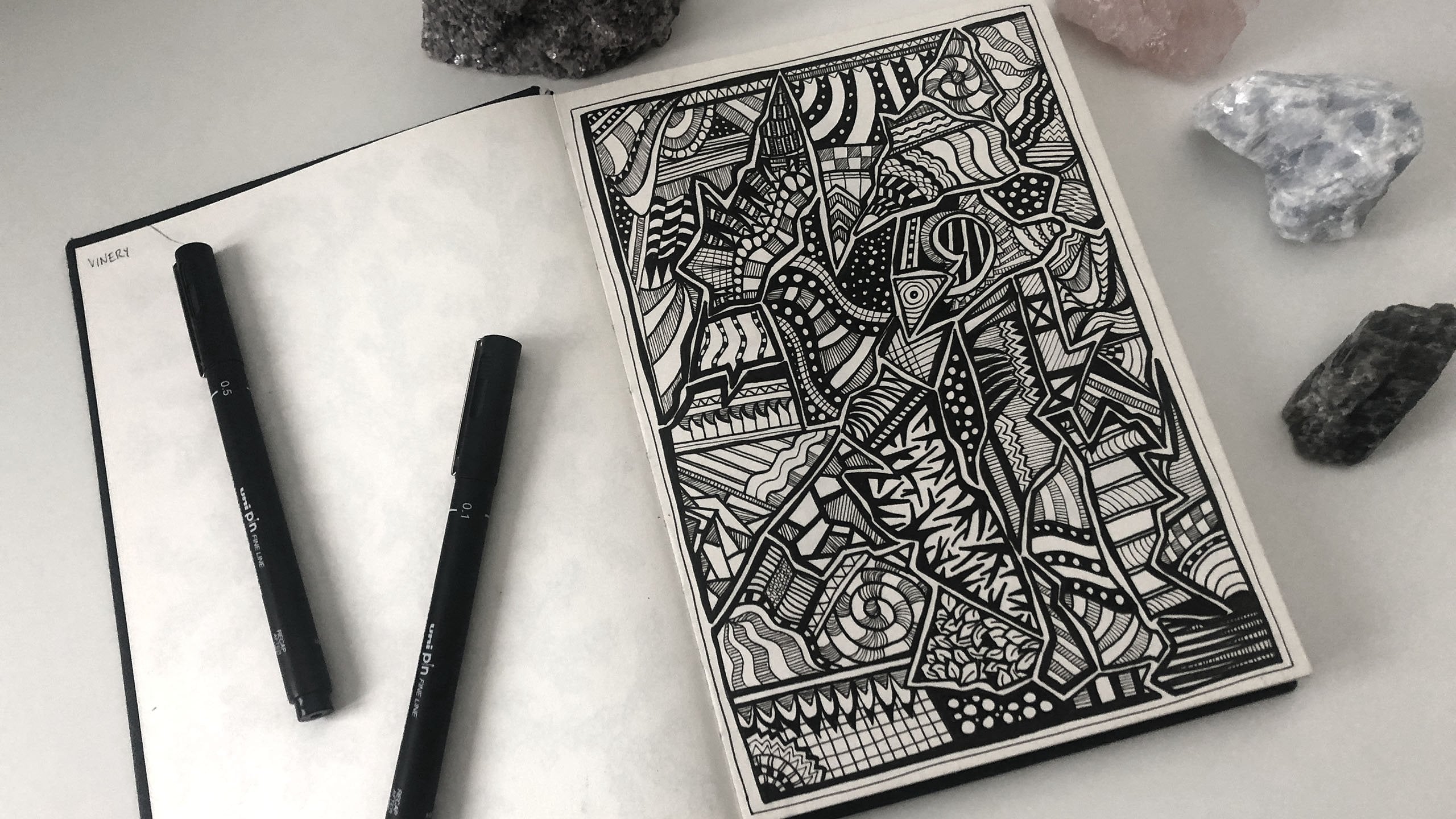
Transcripts
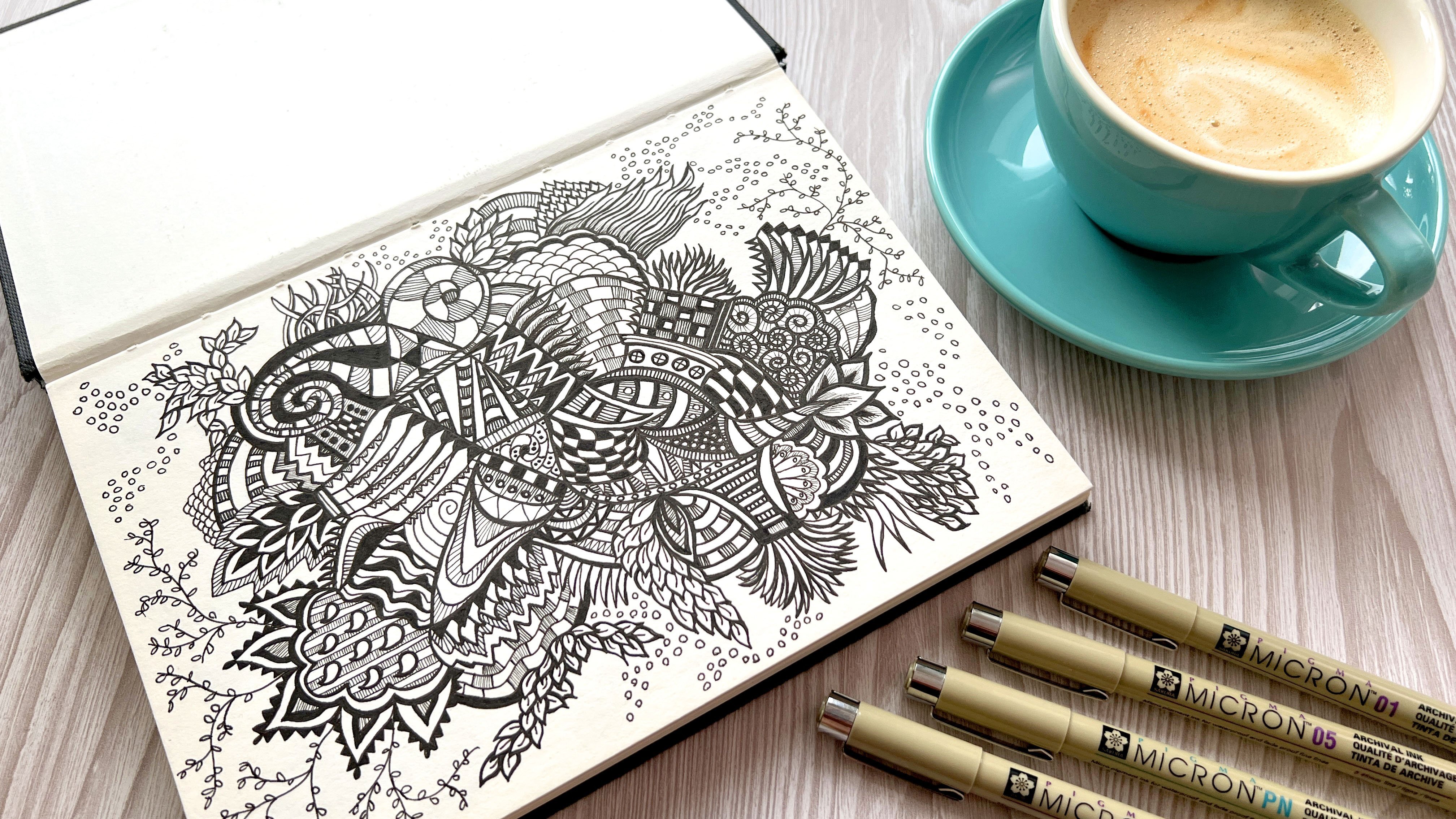
1. Introduction: Hi, I'm Hattie Linton and I'm an artist and illustrator
based in England. In this class, I'm going to
be showing you how to create a beautiful and unique God inspired illustration
in procreate. I myself studied art at school, and I didn't really do a whole
lot with it once I left. And it was only in
my mid '20s when I decided to start picking up
the pens and paints again. And I started teaching
myself ink illustration. From there, I got my first
ipad and a copy of Procreate. And I started teaching
myself how to draw digitally and transfer my ink illustration
skills into digital, which has been such an
interesting journey for me fast forward to now. And I'm actually selling
my illustrations both ink and digital as commissions and also as surface
pattern designs on print, on demand sites such as Red
Bubble and Society six. These designs are now sold
all over the world and I have so much fun
creating them and uploading them For this class, I'm going to be teaching
you all the steps to go through from selecting
your unique color palette, creating your background
and painting it, manipulating it using tools
like liquefy and hue. And then finally, exporting and choosing the best settings to
export your design so that you two can upload your
design onto products and create gorgeous gifts and homewares on print,
on demand sites. I cannot wait to see
what you create. With this, I love seeing
everything my students create. So don't forget to upload your class to the
project gallery. If this is the kind of class that you really enjoy seeing, please consider giving my
teacher profile a follow. And you'll be the first to
hear it whenever there's a new class or a giveaway
launched on the website. Before we dive in with drawing, let's first up talk
about your project.
2. The Class Project: Before we dive into drawing, let's talk about your class
project for this class. By the end of this class,
we will have covered loads of different tips and
techniques in procreate. And you will have
created a gorgeous and completely unique geode
inspired pattern illustration. Everything that we're going
to cover in this class, from the color palette
to the way that we design the background and manipulate it and
add our details, is going to mean that
your God pattern is going to be
completely unique to you and different from mine and different from everyone
else in the class. Which for me as a teacher, is such an exciting
thing to see. And it means I can't wait
to see how you interpret this class and create your
geod inspired illustration. So at the end of this class,
we're going to be exporting our designs out of
the procreate app and uploading them as J pegs into the projects and resources
tab in this class. Once your class project is
in the project gallery, I'll be able to
see it and I just cannot wait to see
what you have drawn. Okay, now that that's covered, let's dive in with
our first lesson. We're going to start navigating procreate and setting up
our canvas for drawing.
3. Setting up Your Canvas and Quick Procreate Tour: Okay, let's dive into procreate and start setting up our
canvas so we can get drawing. You're going to need to open up the procreate app for those of you that are
brand new to procreate, This first view that you see here is called
your gallery view. This is where everything that you've ever created appears. This is my gallery view. At the moment, I like to organize all of my
designs into stacks. It keeps things
nice and organized. If you're anything like
me and you start drawing, and then you have to
go at something else, and then you learn
a new technique and you go and try that out. And you end up with this mess
of a gallery that's just full of loads of different
things because it's all stored in different orders. One thing that I would
recommend to anybody using procreate
for the first time or if you're a long time user. I have a stack that I
call my junk drawer, which is where I like to keep all my odd sketches that don't really fit with any
particular project yet. Or if I'm trying something out for the first
time or I don't really know where it's going
or something like that, it's quite handy to just have a stack that I can keep
it in and then it's not filling up my gallery
page because I like to keep everything quite
neat and organized in here. That's one tip that I
definitely recommend to anyone using procreate, that's my procreate gallery. We're going to be
creating a new canvas now for geo design, we're going to want to tap on the little plus icon
in the top right here. Then these are our canvas sizes. We're actually going
to be creating a new custom canvas size if we tap on this little
dark icon here. We then get these canvas
settings to choose from. There's quite a few
things in the left here that we don't need
to worry too much about, like the color profile and
the time lapse setting. This is if you're
taking a time lapse of your design as
you're drawing it, you've got some little
canvas properties here. We don't really need
to worry about these, it's mostly the dimensions
we need to worry about. What we are going to do
is we're going to set the width as 7,000 And you want to make
sure that pixels is selected here because you've got a few different
options here, millimeters, centimeters,
inches, and pixels. Generally speaking,
in digital art, everything's measured in pixels. If you're having things printed, you might work in inches or centimeters, depending
on your printer. If you were doing, say,
a magazine illustration. But for the most part you're going to be
working in pixels, then it's exactly the same. For the height, we want
to be 7,000 pixels. The reason why I've
chosen 7,000 by 7,000 this is a big canvas. But what this means is you're
going to have so much to work with that when you upload your design onto sites
like Red Bubble, you then have an awful lot
of choice about the types of products you can
add your design to and you're not going
to be limited in any way. I find that this is
extremely useful for that. This setting here,
maximum layers, is actually something
that procreate spits out itself based on the size that
you sletched to the top. This is because procreate
has a limit to the amount of layers that you can have
in any given document. And this is fine. This is saying that at 7,000 by 7,000 you can only
have 34 layers. That's fine, because
for this project, we're only really going to be
using about three or four. That's all we need to
worry about there. We're just going to hit Create, That's going to pull us
into our canvas view here. Now we can start
setting up our canvas. And I'm just going to give a really quick
procreate workspace to just for those of you that are a little new to procreate. If you're already really
familiar with procreate, feel free to skip on to
the next lesson where we'll start creating
our color palette. First things first,
we're going to go through the menus along the top. And the little tool we've got down the left
hand side here. Then I'm just going to
share with you some of my personal preferences for setting up before
I start drawing. First up, you've got
this gallery link. This will take you back
to your gallery view. We'll just jump back
into the design itself. Then we've got our Actions menu. You've got Ad, which
is where you can insert anything from a photo, from your camera roll, or a
file from your online files. If you want to put some
text into your design, this is where you
would come to do this. You can also use this to copy your entire canvas and
paste it somewhere else, which can be quite handy
for some larger projects. Then you've got your
canvas settings. This is where you can
resize your canvas. You can add drawing guides. There's some assistants here. If you're doing animation, you can flip your canvas round. And then there's some
canvas information settings at the bottom here, which you will notice is very similar to the
settings that we used at the beginning of
the canvas setup. You have your share
menu. This is where you pick your settings for
exporting your design. We will cover this
in a lot more detail in our class later on, exporting designs
out of procreate. Next up we have the
video settings. This is if you're going
to do a time lapse video, which we're not really going
to cover in this class, But if this is
something you would be interested in
learning more about, please let me know and
I'd be happy to do a quick little lesson on creating time
lapses of your art. Then we have your
personal preferences. This is the part of the Actions menu that's
actually about how your procreate is
set up for you. You might notice that the interface on my procreate is a little different to yours. This is just because I've got this light interface setting
turned on by default. Procreate comes
with a dark theme. I just prefer working
in a light theme. It's just a personal preference. There's also an
option to switch on the right hand
interface which moves your size and opacity side
bar to the right hand side. I am right handed, but I actually prefer having
it to the left here. Because it means that when I'm going across the canvas here, I'm not likely to nudge it. We've then got a few options
around your brush cursor. I'd recommend leaving
these in default, but feel free to have a play around as you get used to it. Next we've got the
Adjustments menu. This is adjustments for manipulating your design and just tweaking and
changing a bit. We are going to cover a couple
of these in this class. We're mostly going to be
looking at the color options at the top here and the
liquefied tool at the bottom. But there's loads
of really great creative effects in this list. And I'd recommend at any point having a play with them
to see what they do. We've then got a couple of
tools here around selecting, you can select a portion of your design and then you
can start manipulating it. Then this is your
automatic select tool, which say you had actually drawn something on your canvas. It'll then select
it automatically, and this is where
you can resize it, you can flip it, you can
make it fit the canvas, You can distort it,
you can warp it. There's all sorts you
can do with this, but this isn't really
anything that we're going to be covering
much in this class. That's fine over on
the right hand side. Then we've got the brush tool, when you select this list then opens up your brush library. You've got your most
recent brushes at the top, and then you've got all these different
categories of brushes. So we've got sketching
and inking and drawing, These are all here by default. Within procreate, I will be selecting brushes
that are built in by default rather than
using custom brushes, although you can install
custom brushes to procreate, and that's a great way to just add more functionality
to your app. Then we have a smudge tool, which is just a tool that helps you smudge
in your designs. This is quite handy for
some more artistic styles, but we're not really going
to need this for today. You've then got your razor tool, which if you select it again, you get the same brush
library that you did in your brush tool. You can actually select
different erasers based on the erasing that you want
to do within your drawing. That's quite a handy
thing to know. Then you've got
your layers tool. You can actually
select different layers and you can actually create layers on
top of each other so you can actually
build up your design. And then if you needed to, you can change the order
in which those layers appear so that which one
becomes on top of the other. And you can move them around
independent of each other. So you can see this
back piece is moving, but this one staying the same. Then you can move
them back again. You can rename your layers. Being able to manage your layers is a really
important tool within procreate because it
helps you just keep control of what you're
working on in your design. And you know exactly where
everything lives and it makes it a lot easier for maintaining your design in the future. Last but not least, we
have the color picker. We have several different
color tools at our disposal, and they're listed
here along the bottom, you've got the disc tool, this allows you to pick your
color value around the edge. Then on the disc inside, you've got brightness and saturation that helps you
to pick a color this way. You've then got
the classic view, which is where you can change the color in the first line. You've got your saturation in the second line slider and you've got the third
is your brightness. That's another way
to choose colors. You can also just
move the cursor around the square at the top. You've then got harmony, which is quite good for creating
colors that go together. This is set up as complementary, but you can have an analogous. You've got triadic,
there's all sorts. If you've got one color in particular that you want
to be drawing with, it will then give you the
values that go alongside. If you're familiar
with color theory, this is going to
make a lot of sense. But if you don't
worry because in this class we're
actually going to be creating our
own color palette. We've then got values. This is really helpful if you wanted to pick a specific color. And you already know say, the RGB color value or
the hex value for this. Again, we're not really
going to need this, but this is quite a good way to fine tune your color
selections if you needed to. Last but not least, we've
got palettes and this is where we'll be working
predominantly procreate. Does come with some
palettes pre included, but we're actually
going to be creating our own color palette
in the next lesson. Lastly, we've got this tool
on the left hand side. This is our size
and opacity tool. When we're selecting our
brush and our color, we've got different choices here for selecting how
big the brushes. Then similarly, how
opaque the brushes. If we selected something
really huge here, this would be a really big, we've got the opacity at full. That would be the largest
size there for that one. If we bring the size right
down and the opacity, we end up with quite
a different effect. This is quite good for
building up as well. A lot of these brushes
and tools actually have their own settings built
within them in the library. If you selected a brush and
then selected it again, you actually get
the brush studio. And this is where you can play around with the actual
properties of the brush. If you're brand, brand
used, procreate, I would recommend you don't mess around with these
settings too much. You can reset them if you end up changing everything
and deciding that you want to put it back to
the way that it was, you absolutely Can you do this by going into about
this brush and then just reset all settings. But for now, I'd recommend
just leaving the brush studio. That's our quick guide to the layout of the
procreate workspace. I'm just going to delete our layers here and
clear these out. And then we will be moving
into the next lesson, which is going to be creating
our unique color palette.
4. Creating your Unique Colour Palette: Okay, great. So now we are
ready to start creating our unique color palette
for this design. I've actually got a few
crystals here because I'm quite a big fan of rocks
and minerals and godes. Anyway, I've actually got some great examples I
wanted to share with you guys about what makes a god, and about the color
palettes we can use. First off the bat, I'm not going to say
that these have to be accurate drawings and
accurate color palettes, but I think it's quite
interesting to see how gods are actually formed in
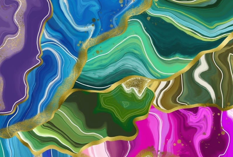
creating our design. This is a slice of Agate
that I've had for years. I just love all the
different blue shades in it. I think it's
absolutely stunning. All these lighter bits
in the center here, and then these rings
going around the edge, all these different
shades of blue. And this almost dark gray, browny blue here
along this edge. I think it's absolutely lovely. Then I've actually
got another piece. This is just a tiny piece
of a slice of Malachite, but this has the
exact same rings as a God. I just love that. Even though this is just green, we've got all these
different shades of green, including going all the way in the center to almost black, dark, dark green, and then these lighter
ones on the edge. But it isn't as
simple as a gradient. It builds and there's all these different rings and elements and it's
just so very pretty. I've got some other
pieces here as well. This one is almost transparent. It's got all these
cracked effects inside, which is just so
pretty to look at. But again, it's all these
different shades of green. I've got this piece
of carnelian, which is just, there's a
creamy color along this edge. But then these different shades of orange running through. There's so many
different things, there's so many
different crystals and different colors
and color palettes. This one is just a very
pretty pastor one, but again, with all these different
lines running through them, we're going to be drawing
on inspiration from quite a few of these in
creating our design. Lastly, I just want to
share this fluoride tower. I find these
absolutely stunning. The range of colors
that you can get. This is actually called a
piece of rainbow fluoride. The sheer amount
of colors that you can get in these
is just stunning. We've got these very pale pastals through
the cracks here, and then we've got
greens, yellow. There's purple at the top.
There's some orange here. That's absolutely gorgeous.
That's a great example of a crystal where we've got multiple colors all
coming together to create one beautiful mineral. To that end, we're going to start creating
our color palette. But we're not going to
be following nature, we're going to be creating
whatever we like. I'm actually going to
be creating a blue, pink and purple color palette for creating our jeered pattern. The way we're going to do this
is we're going to open up the color tool and we're going to navigate down to
where it says here, palettes. You will notice that there's a few things set up here
as well as the wheel. We've actually got a
history of past colors, and then we've actually
got a palette here, which is the default palette. This black and white one is
actually a custom palette that I made a while ago that I was using for a
particular project. We're going to be creating
another palette and then making that our default palette. Tap on palettes. Then we have a selection
of palettes here. We're then going to tap on plus, which is to create
a new palette. And we're just going to
create a new palette. So we're creating it from
blank at the moment. This is now an empty palette with absolutely
zero colors in it. What we want to do is we are making sure that this
is our default palette. If you tap on any of
these three menu, you'll actually see Set
As Default as An Option. And you will have
this little blue tick to show that it is your default. If I was to select this
one as the default, it would now have the
little blue tick. This one is going
to be our default. I'm actually just
going to rename this, I'm going to call this Geodes, and this is going to
become our Geodes palette. I'm just going to select Enter
Now that it's our default. When we go back
to our disc view, we can also use classic view. It's entirely up to you,
but I like using disc view. You can now see that God is our palette at
the bottom here. Now we're going to start
creating our individual colors. For our palette, I want to stick in this lower half of the
color wheel for my colors. I wouldn't want to get
much brighter, I think, than this blue then pink wise, quite like a pinky purple. But I don't want to go
all the way to magenta. We're just going to
have a little look, look through these
different options here. I'm going to start
out what we want is a selection of
colors that we can use. If we look back at our God, we want some main
colors, darker colors. And then we're going to want
lighter colors to create these rings as we go
through our design. What I want to do is
I want to focus right now on what my three main
colors are going to be. I'm going to look at making
a blue, a purple and a pink. I'm thinking this a blue
here is quite a nice blue. I don't want it to go
to light because we do need lighter shades later. I'm just going to select
that in my first block here, you can see that's now
added the block in. Say you pick a color by accident and you didn't mean
to add that in. If you wanted to remove it, all you have to do
is press and hold. And then you will get an
option to delete your Swatch. And then you can just
delete it like that. I'll just go back
to my blue here. If you tap a swatch
you've already created, it will then reset the
color wheel to that color, which is how we're
creating this palette. I'm quite happy with
that as my blue, I then want something
a bit purply. We just have a
little look sticking around this darker area. I think a bluey purple, but maybe more into
the purples here. I think that will
be my purple color. Great. You can
actually see by them going next to each
other what they're going to look like on the page. Then moving around again, I want to a pinky purple. I think that looks pretty great. And I'm going to add that in as my third color at the moment. Those are my background colors. Then what I want to do
for each of these is create varying shades of
light to go along with it. We're just going to go up, which is increasing
the saturation, but also round a bit to the left to add a
little lightness. We're not going to go
all the way to the top, but we're just going
to go up a little bit. I'm going to add
that blue in there. Then we're going to go round
again and add that blue in. And then I'm going to create one that's not quite all
the way to white, which is at this 45
degree angle here, but just enough into the blue that we've
got a light blue. We're basically having four
shades for each color. Then I'll move on to my
purple and I'll do the same. We'll go up, then
we'll go round a bit, and then round a
little bit further. Those are my four purples. The same for my pink. We'll go up, we'll go
almost all the way around. Then we have our selection
of colors there. Just because we're
selecting these now, doesn't mean that we can't use other colors later if
we decide we want to. But it's really great
to have a basis for where we're going to
start with these designs. It just makes it
easier than making it up on the fly as we go along. Lastly, one little tip that I like to do in
all my drawings because it just makes it easier if
you just tap in that corner, you can get a pure white and we're just
going to add white. And then I'm just going
to pick a middlely gray and then a black all
the way at the bottom here. If you double tap at the bottom, you'll get a perfect
black as well. I didn't quite do that.
Right. I'm just going to delete that double click, and then that's
our perfect black. So I've got a white,
gray and a black. You can add more to
this if you want to. That's entirely up to you. But this is going to be my
gods palette for our drawing. Now that we have our palette, we can get started
in our next lesson, which is painting
our background.
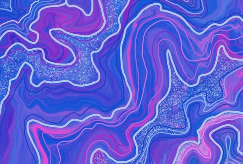
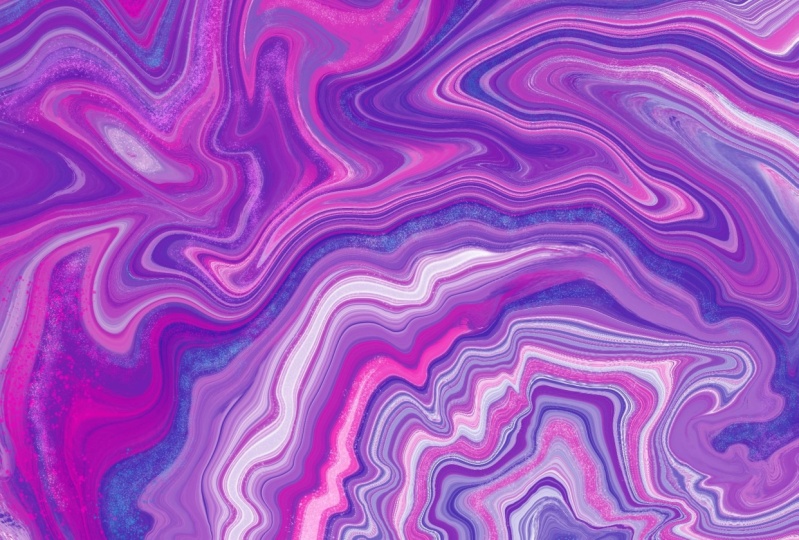
5. Painting the Background: Okay, great. So you'll
be happy to know that we are now going
to start painting. The first thing that I like to do before I start any drawing, and I'd recommend
you to do the same, especially for this one, is I'm actually
just going to pinch slightly and just pour my canvas in a bit so that it's got the work space
background around it. I just personally
find this easier, especially when I'm
working right up against the edge edge of the
canvas, which we will be. It's just so much easier
to go across rather than having to navigate it when the canvas is at full size. I'm just going to undo that. We're going to start
painting our background. What we want to do
is in our color, we're going to pick our
first color from the three. It doesn't matter which one
you want to start with, I'm just going to start
with my darkest blue. You definitely
want to start with your darkest colors first. That's important
for our background. The lighter colors are going
to be for our details. Later, we're going to go
into the brush library. We're going from the
painting section because you've got all these
different categories here. We're going to scroll down and we're going to select oil paint. The reason why
we're picking this brush is that it actually creates this very
nice streaky effect. This is going to help
us later when we're creating our lines and patterns, when we start manipulating
our background. You're going to want
your brush size to be at 100% and you're going
to want your capacity to be at 100% We're
just going to start creating bits of color
all over the page. And we're going to switch
between our three main colors with quite a lot variety. One thing you don't want
to do just to be clear, is you don't want to be
using your brush so much that you're creating these
very solid blocks of color. We're actually looking for these streaks because
this is going to help us create some really
interesting texture later on. I'm just going to undo that. We're going to want to layer up our colors and mix them
in as much as possible. So a bit of blue over there, add some more purple pink. And we're just slowly
filling up our canvas. Sometimes when you
go over these, because this is meant to
be replicating oil paint, you will find that your colors
start to blend together. And that's absolutely fine
because we're looking for this cohesion between your colors, we
start filling it in. Now at this point, you
might start to notice that there's a lot of white missing from the background
of your canvas. That's fine. That's why we've got this white
selection over here. You can start to just
pull in just a couple of little streaks just to add
a little bit of white. Then just go over again with some color just to
blend that in again. I'm definitely a bit pink
and purple heavy here. I'm going to add a
little more blue. You might notice as well that I'm doing all of this
in one direction. I'm going diagonally here.
There is a reason for that. I just think it's going to make the lines that we're looking for when we're looking
at these crystals, when we're looking for
these lines together. This is going to help us
create that in our painting. I'd recommend just picking a
direction and going with it. I'm just going to
add a tiny bit more pink because in my mind, you can never have
too much pink. I'm actually going
to reduce the size. So we can start to add in some smaller little
streaks here as well. Then a little more blue
just in this corner here. I think I'll just add in
one more white up there. And I am absolutely
guilty of this. In a lot of my work,
there is definitely a possibility of overworking
the canvas In this instance, what you want to do is
make sure that you're not just going over and
over and just repeating, and repeating and
repeating yourself. I'm definitely guilty of that. Just keep taking a
pause, stepping back, looking at what
you've got, trying to decide if it's
balanced enough. Yet once you think you're
happy with your design, you can stop drawing, which I'm struggling to do. We're going to stop
right there and we're going to move on to
the next lesson. Be cause this is now our
background painted complete. What we're going to do in
the next lesson is we're going to look at
the Liquefy tool. And we're going
to actually start manipulating this to make it look like a proper
geoed pattern.
6. The Liquify Tool: Fantastic, so far we've
got our color palette and we've painted our background
using the oil paint brush. Now we're going to
manipulate this to make it look more like a geode. The way we're going
to do that is within the adjustments menu. We're going to go down
to the Liquefied tool and then we've got all these options along the bottom here. There's quite a few that
we're going to use in this. This is where it
can take a lot of your own personal creativity to create your
particular pattern. But I'm just going to
go through what I would use to work on this myself. We've got a few options here. What push does? It literally
pushes your design along. You can actually create
interesting ridges and bumps within your pattern. There's twirl, which I would recommend reducing the
distortion probably to around about 40% What
twirl does is it actually just moves
your patterns around. If you were to
press and hold it, you can see it's literally
twirling your design up. Obviously, we don't want that if you do find yourself
using a tool too much. There's a great tool at the
end here called reconstruct. If you just reconstruct over the area where
you've made a mistake, it will actually pull it
back to where it was before. If I actually Bush reconstruct
all over my painting here, it will put everything back to the way it was at the beginning. But this is a really handy tool to just fine tune some areas where maybe
you've just pushed a little too far or
you just want to bring it back a bit by pushing
it the other way, you then just make it worse. That was where we got
to, we've got some, a little bit of
twirl going on you to lightly tap and a little bit of a
jiggle. A little jiggle. Then you can see if we just
pick up our geode again, you can see already how
we're starting to create the same patterns and
these lines and things, they're already
starting to come in. And you can see where the
white we added or left behind. If you were good enough to only add so much color
that you had some of the background left is actually coming through
really, really well. 12 right and 12 left. Obviously it's the
exact same tool, it's just, it's going in
a different direction. I'd recommend picking one. Because if you 12
everything and then you select 12 left and you
start going over again, you end up getting these
really wibbly lines, which can be good, but it often ends up meaning you
get these points. If I just zoom in here, instead of getting a nice wavy, you've actually got things
that are doubling back on themselves in small parts. It can look good, it can end up just looking really
messy and confusing. I'm actually just going to use reconstruct to just go over
that bit a little bit more. Then we'll just bring
the 12 right back in because I'm picking 12
right for my 12 tool. We've then got pinch, this is where you might see an area like maybe this big
block of pink here. You think that's a bit much,
you can actually pinch it. What it does is it just
pulls in, obviously. You have to bear in mind that to pinch it is actually pinching the other colors and pulling
them in with it just by, you can then just reduce
some of these areas. Then by the same token, you've got the expantle which actually expands
some of these. I might want to increase
that light blue down there. Maybe this little area
is very interesting. Basically, it almost zooms in on that particular area
and you can really fine tune which bits you
like the look of. I'm quite happy with
this as a design. I might just push some of this pink in because
that's quite a cool color. We haven't got too much of that, but I'm really happy with
how this has come out. We've got some really
interesting lines here in these variations is
what we're looking for to add to our geodesign. Up next, I'm going to quickly talk you through
some color tools. This is more just if you're not too happy
with your color palette at this moment rather than having to go all the way back to beginning and picking
another color palette and then
drawing it all again. I'm just going to show
you how to fine tune what you've already got using the
color tools in procreate.
7. Using the Colour Tools: Okay, so now that we have
painted our background and manipulated it using
the liquefy tool, I'm now just going to show you a couple of color tools that
are quite handy with in procreate if you wanted to just fine tune your
color pate a little bit. If you go into the adjustments
menu in the top left here, you can then find
some color options in the first block
of adjustments. Firstly, we'll just look at hue saturation and brightness. The way that these sliders
work is very similar to the color sliders that you
get in the color tool. You've got your
hue which changes the main color profile
of your design, 50% being the color
that you started with, If you're just playing
around with it, you've then got saturation, which is about how
vivid your colors are, how brightly colored they are. Obviously, if you go all
the way to the top end, your colors become almost neon, and in some cases can end up
being quite a bit garish. If you go all the
way to the bottom, you end up with a
gray scale design, which can look quite cool, but that's not really what
we're going for here. Then we've got brightness, which is about how much light
and dark is in your design. Obviously, you can pull it
up and it adds more white to the design until you get to the very end and it's
completely white. Or you can go the other way
and go all the way to black. Obviously, some of your lighter
colors are still shining through because you can't turn everything
completely black. That wouldn't be
the point of that. Anyway, I'm quite happy with the color palette
that I've got, but if you wanted to tweak
yours for any reason, these would be the tools
that you could use that for. Another tool within
the adjustments for the color changing
is color balance. This basically analyzes your color profile
within your design. It splits everything
into either cyan or red, magenta or green,
and yellow or blue. And what it does is
it actually looks for these shades
within your design. And you can then manipulate them on a more specific basis. If I were to up this slider, for example, on the can
end, you can actually see, if you look up
here in my design, you can actually see some of the blues
becoming more vivid. And if I was to take this slider all the
way to the red end, those same areas are actually
becoming red in color. It's not manipulating
the whole image. The way that the hue slider was, it's only targeting
certain color values in how these are changing. I'll just slip that one
back to the middle then. Same for the magenta and green. Obviously the majority of my picture is varying
shades of pink. It's obviously picking up
an awful lot of magenta. If I go all the way to the end, it's changing all
those pinks and purples into this very,
very bright magenta. If I was to take this all the
way back to the other end, you've then got these dark
greens coming through, which is quite an
eerie erie style. But like I said before, I'm quite happy with the
way that this is set up. I'm not going to
change anything. There's no number
values for these, which makes it quite hard to see if you've actually
made a change, especially if you
didn't want to. What I'm going to do
is I'm going to leave the menu and I'm just
going to hit Undo. It just means that if there were any slight changes that I
couldn't really perceive, they've now been undone. Next, in the adjustments
menu, we have curves. Curves is an interesting
one funny story when I was studying
graphic design at school, which is a story of itself because my school
didn't actually offer graphic
design as a module. I was just teaching myself, which is a bit of a
story of my life. I had no understanding
how these curves worked. But I love playing with
them because they would create such interesting
and weird effects. I'll be honest to this day, I'm still not completely
sure what curves actually do except really
psychedelic effects. In your drawings,
I used to just sit at the Mac computers
in my school's art lab and I would scan in my paintings and then I would just play around with
these for hours. Yeah, that was that. But there's all sorts of
playing around with this. I wouldn't recommend
doing anything for this particular project, But
that's entirely up to you. If you want to create a completely psychedelic
geode pattern, go right for it, I'm not
stopping you. Same as before. I'm just going to
undo to take it back to my color
palette of choice. Finally, in the color choices, we've then got gradient map. What this is showing is
it can actually apply a gradient library to your design By selecting
these filters, it's like the filters you
can get in Instagram. You can just select a filter for your design and it will just
apply it to your pattern. They're very cool, but
this isn't what I'm looking for for this
particular project. But if you wanted to, you can absolutely play around
with these gradient maps. Again, I'm just
going to hit undo. I'm really happy with how my background design
currently is. I really hope by this point
in the class you are too. In the next lesson, we're actually going
to start adding in our details and creating all these gorgeous
specific lines in our design for our
geode illustration.
8. Using an Alternative Colour Palette: So far we have painted
our background. We have played around with the liquefied tool in
loads of different ways, and created this really
interesting pattern. We have had a little play
around with the color tools. Whether you've chosen
to change the colors or not is entirely up to you. But what I will say, if you've drastically
changed the colors, what you will now find as
we add in our details, is that your color palette
doesn't match anymore. So what I would recommend doing, I'm just going to quickly show an example if this
has happened to you. Let's say I decided
that I wanted to do this greeny style instead. Let's say that's now my design. Obviously all of my details in my color palette still
blue and pink and purple. Which it's an
interesting effect, but it's not really the effect that we're
looking for for this. What you're going to want
to do is you can do it in the same palette
because we've got quite a few spaces
still open here. You don't need to
make a new pallet, but what you're going
to want to do is select the little square in
the center of this here. And what that's going to do is it's actually going to create a there we go. It's actually going to create a little color picker as
you move this around, I don't know if you can
see the top of the dial. What you've got
is at the bottom, you previous color selected. And at the top is the color
that you are now looking at. As we move it across,
you can actually see the top half of the
circle changing color. That is how we are going to
start selecting our colors. This is going to be
a bit more fiddly, but it's entirely up to you what I would recommend
doing if this was now mine. I would then start selecting, I would find the darker color. So I'd go, well,
that's a dark green. I would add this in
as one of the colors, and then I would start again, and the next dark color
is probably this teal. I'd add that in as a color. Then again, I would look around and I think the other
third dark color, it's probably going to be
this yellowy green here. That's probably the
best way to look at it. Then from here, you can either look for the lighter
colors in the panel. What I'd recommend doing is that same exercise we
did at the beginning. We are basically
going a little bit lighter towards the white and then towards
the white again. You're then building up your
new color palette to match what you've changed in the
background here again, you're then selecting
your middle color. We'll go up a little bit and
then we'll go round again. Then we'll go round to
the almost white version. Then for the darkest green, up again again, and
then almost white. What you've now got is
a color palette that works in the exact same way as your original color palette, but it now matches what you've
changed your design to. If that's what you've done,
that's how you're now going to get your
particular color palette. I'm going to switch mine back to my pink and purple because I
was quite happy with that. I've just pressed undo
until I get back to here. But you will notice
I've still got the greens in my color palette. Because I'm not undoing the changes I'm making
to my palettes. I'm just undoing the changes
I'm making to my canvas.
9. Drawing the Lines: Okay, great. So now what we're going to do is
we're going to start adding in our details by
going into our color wheel. We're going to want
to make sure that we've got that white selected, that we at the very beginning. Then within our brush library, we want to be in the
calligraphy section and we want to select mono line. This is going to
be our key brush for creating our effects. One thing I love about
this monoline brush, I use this in almost all
of my illustrations. It just fits with
my personal style. It doesn't matter what
angle you have your pencil, it doesn't matter how light you touch it
with the pressure or how hard or how much
you use it like this. The lines are always
incredibly smooth and they're all completely the
same weight, hence mono line. This is by far one of my
favorite brushes in the app. It just suits my style of illustration
really, really well. What we're going to do
here is we've already got it looking quite a bit like a geode and I think
it's gorgeous. But what I'd like to do
is add these details that give it more of
that illustration Kick. What we're going to do is
we're actually going to identify areas of
this that we can section off as segments and those are going
to become where we put our other color lines and really get in on
this detail here. First things first,
you're going to tap on layers and you're going
to create a new layer. Because what we don't want
to do is draw directly onto this background image because we're going to use
it again later. We don't want to mess up anything that we might want
to reuse in the future. It also just protects us. If we make a big mess
of this new layer, it doesn't matter
because we can just slide across and delete it and start again on our new layer, making sure that the
new layer is selected. We're then going to start to identify segments
of our drawing. First up, I can see there's a great little
shape appearing here. I'm just going to draw on that. I'll tell you what, I'm actually going to
undo that and just do that again and just show
you where I was starting. If I start off the canvas here, this is what I was
talking about earlier when I said I'd like to pinch the canvas and just
make it so that I've got this nice
space around it. If you start with
your pen or pencil rather off the canvas
and then bring it on, draw the shape you want and
then draw it off again. You then create these
very clean lines at the edge of your drawings. It just makes things so
much simpler moving forward because you've got
all these really nice clean edges all the way around. That's just my
personal preference. But what we're
doing here is we're identifying shapes
in our pattern. Where we're basically
deciding within these agates, where these lines
are going to go. Then we're going to start
adding further details. When we get down to
these different shades, like we do in this Malachite
piece here, we can actually, we're actually
identifying already where this fits within
our background. I'm just going to
quickly identify a couple more shapes
that I can see here. Looking on this corner, there's another great
one right there. I'm actually going
to draw a really big one, corner to corner. The good thing about this is
you don't have to be exact. We're not looking for, need to line up completely with
what's already on the canvas. We're just looking for
something to follow the organic nature
of it on this side. I'm actually going
to come up here and then close that one off there. This shape here in
the middle is great. And I'm actually
going to draw around and then bring it back in on itself and make a bit
of a loopy one there. That's really cool. I just
want to create a couple more. We'll do a little line in here, actually would be good to
make this like a vein. What we're going to do
is we're going to add some crystal effects later. I think having this
section here as being a bit more crystallized
would be really cool. And I'm going to show you how we're going
to do that later. I think that looks pretty good. We can always add more
white lines in later, but it's good at the
beginning to just identify where our core areas
are going to be. In fact, if that's
going to be a vein, I'm just going to draw
in another one here. Actually, maybe we'll just
do one more along here. We'll just go up and
then down again. Those are our white lines. And now we're going
to start adding in our more precise detailed
lines using our color palette. Now that these are all set up, we're going to create
another layer again. And this is going to
be where we start storing our lighter color lines. At this point, we've
got three layers and they're labeled
quite generically. I think it's worth
us to start labeling these so that we can start doing a bit of layer management. For layer two, we're just
going to select rename, and I'm just going to call
this one background layer two. We're going to rename this,
and I'm going to call this white lines then
for layer three. We're going to
rename it. And I'm going to call this Details. We're going to want
to make sure that our details layer is now
selected because we're going to do whole new details here
within our color palette. We're going to select one
of our lighter colors. I'm going to just start with
our second column here. I'm just going to
go for this blue. I'm just going to find an area where I'm going to start
drawing the blue in. I'm going to start
in the middle here. Actually, I want my
size to be smaller. I don't want everything to
be the same width as this. Because the point of
these lines here is that these are our
core section lines. We want them to be at least
a little bit smaller. I'm going to bring this down
to about 75 or 80% roughly. We're just going to follow
the shape on the inside. And we're going to start just drawing around the edge there. Then we're going to do
it again. Then we're going to go into our color
palette and I'm going to go a bit lighter again and maybe even a little
bit thinner again, around 50% We're going to
start drawing another line in. Finally, we're going to
do another one again. Now at this point, if I was to draw all the way down
here and then back again, what we end up doing is creating
this very thick segment. And this isn't what
we're going for at all. We want to keep our lines nice
and neat, nice and clean. I'm just going to
do that. What we're actually going to do
here as I come down, if I start at the top here, as I come down,
I'm just going to reach a point where I know
I can turn around safely. Same for this point here, and then all the way
around to the edge. We're not looking for everything to be completely uniform, but we are looking for it to
start to double up in size, where we're doubling
back on ourselves. What you can see starting
to happen here now, is we're actually creating
these really cool GOD effects. The lines, the same
varying shades coming in, and now appearing on our drawing to follow this particular agate. As an example, I'm
actually now going to add a darker
line on the inside. I have a couple of options here. I can select my darkest
blue, but if I do, then there's a good
chance that it's not actually going
to show up as well, because this is obviously
in the background. What I actually want is a blue that's even darker than that. I have a couple of options here. I can either select the blue I want and actually
bring the color wheel down and find that darker blue and add that to my palette. That's one option. The other thing that
I can do is I can actually start adding
in gray and black, which I have been
using in quite a few of my geode patterns. For this example, I quite
like that darker blue, so I'm going to use that
for my inside again. I'm just going to
start at the top here. I'm going to come all
the way down again. I'm just skipping
that corner because I'm not going to be able to
go in and come out again. Then we go to the top. This is quite a dark
central piece of the geode. I'm actually just going to do a second line in the same color. Here we go, We're going to finish it off
with a lighter one. Again, I'm going to
pick the lightest blue. And we're just going
to do one little one here and up to there. Then we have our first
segment of our geode. By sticking within
our color palette, we've created this really
nice gradient going from the white through the darker
blues to the lighter blue, and then the darkest blue, and
then the light blue again. It's created quite a
nice interesting effect. We can now add this all over. I'm going to add
the same up here, and I'm going to use
purple for this one. We've got our
darkest purple here. I'm actually going to
start going the other way. I'm going to start
with the lightest one. We're going to push this up to. I'm going to do about 80%
I'm going to draw again, starting off the canvas, I'm going to draw
a couple of lines, one tip with this
particular brush. The quicker you move your pen, the smoother the line
actually becomes. If you're drawing and
you're being super, super nervous and you're
jittering around, you'll actually create
that jittery thing. But the great thing
about this pen is because it's got this
streamline effect, it actually creates a very
smooth line every single time. I recommend just taking
a bit of confidence and actually just going
for it with your lines. Because they don't
need to be exact, they don't need to be precise. We're going to undo those. I've done some of
the lighter purple. We're going to go
for the mid purple. And I'm just going to
decrease the size again. That's our mid purple. And then we'll go to
our second mid purple. This one. There we go. You can see already these
purples are starting to get lost with the purple
background, but that's okay. And then I'm going to do
the same thing again. I'm going to come down and
create a nice dark purple. And we're going to
add that in there. I'm going to add dark
purple and dark purple. Then finally I'll finish
it off with another white. Actually I'm going to
go even thinner again, maybe 30% And I'm going to add some little
white lines in here. We've done another one up here, and then we can do the same for these other areas
off the corners. I'm now going to go away
and fill in this section, and this section up here. And then I will
come back and show you what I'm going to
do with the rest of it.
10. Adding Crystals: Okay, I have just been working through
these other segments. I'm just going to
quickly talk you through what little
additions I've been making down in this
corner section here. We had just one big area, but what I've actually done
is it's been split in half. As you've reached
that point where not all the lines can go
all the way to the edge. We've now got these very
interesting closed off loops. This has actually been separated twice over in this
particular corner. This one's got a nice mix of the pinks and the
purples in my palette. I did also add in a
darker pink to go with the darker blue and
the darker purple that I'd already made
up in this corner. I just added some nice thin, light pink and light blue
colors lines for those. One thing we don't
want to do is we don't want to fill every
segment of this with those lines because the picture will become far too messy. It'll become far too busy. And we want to keep it a
little more interesting. That being said, we're
definitely not finished. We definitely want to be adding some more details in here. As I'm looking at this here, I can see we already
identified that we're going to do a vein of
crystals along here. I think it's worth actually
doing another one down here. So what I'm going to do is I'm going to switch back
to my white lines layer. This is one of the
things that I love about digital illustration
is you've got so much freedom and
so much creativity and you can just decide, oh, I'm actually going to
add another piece in here. And because you've got
layers management going on, because you can alter your color palette and
the direction so easily, it's, it's just a very freeing
exercise to be able to say, actually I'm going to go in a slightly different direction. I'm changing my mind,
which for me at least, it's much harder to
do that when you're working in paints or
something more physical. I've got my white line selected. We're going to make sure that
our brush sizes back up at 100% and we're going to just turn this
into a vein as well. We've already got a white
line going on here, but I'm just going to stay
on the left hand side of it. And we're just going to draw
another line along here. We've got a vein running through here which
we're going to make sparkly. Basically, we're
going to make it so it looks like it's crystals, it's the insides of the Agate. Then we're just going to add some other darker
details to some of these other lines
just to give it a little more contrast.
We're basically done. We'll start off with
the crystal style. What we're actually
going to do here, and this is just to
protect ourselves, is we're going to make
another layer again. We're actually going to
rename this one crystals. And we're actually
going to move it. So what we want to
do, you tap and hold, and we're just going to
drag it under white lines. Because what we're going
to do is we're going to create quite a
messy effect here. And we don't want to have to be cleaning up after ourselves. And I'll show you what I
mean by that in a second. We're going to go into
our brush library, and we're going to
go to spray paints, and we're going
to select Flicks. If we have a little play
in the brush studio, what you'll actually
see is that this gives us quite a nice
little build up. And you've got
very tiny parts of the flicks and you've
got bigger ones, and these can build up using the different colors in our
color palette and white, and this is going to create
quite a nice sparkle effect in our geodesign. That's the brush we want. We are on our crystals line
and we're going to zoom in. We're going to check
the size of our brush. We want this one
to be quite small because this can be
quite a big brush. If I zoom out again,
I'll just show you this. That's how big the brush can be. We definitely don't
want it because we're focusing on
these areas down here. We're going to start off
with one of our colors. This vein is pink,
so I'm going to stick within my pink colors. I'm going to start
with this middle pink. The second lightest one. We're going to go to 'da
about a size 17% thereabouts. We're just very carefully you see the brush
moves on its own. I'm just going to follow
the line of the vein. Come back here, you can see the brush is actually
going over the edge. That's fine because that's
fairly easy to clean up. But what I was
talking about before when I said cleaning up was if I was to move this crystals
back over the white lines, what you've then got,
you would then have to clean up all
along here as well. You'd have to clean up,
make sure that all of your white lines were
really pristine again, by placing the crystals layer under your white lines layer. You'd then only
have to deal with the little splashes
that get over the edge. Just going to go
back to our Azor and we're going to clean
up all along this edge. But I would recommend doing
this step at the very end. We're going to make
our mess. And then we're going to clean
it up and we're going to have a beautiful
sparkly crystal section. Back to our brush. We're just going to follow this around. Try not to press too
hard like I just did because then the
flicks go everywhere. I'm actually just going to
make it a little bit smaller. I'm just going to undo that. We're just follow around. Bear in mind if you make
your brush smaller, you're actually making
the flex smaller. I actually don't
like how that looks. This is the other thing
about digital art. There's so much experimentation. We're just going to
carefully through here. There we go. That's our first
layer of the flex done. We're then going to go
to our lighter pink and we're just going to
take another pass over it. And what you can
see start to happen here is it's creating
a glittery effect. I'm just going to go
in a bit further and we're going to now
add the white. This is really going
to make it pop. I'm just going to make the
brush a little bit smaller. We're just going to
quickly skim over it. Particularly on these edges here where it's still a bit of a darker pink there. We have our glittery
line of crystals. At the moment, it
looks really messy because we're all
along this edge here, it loses the effect. I'm just going to select
from the brush library. Maybe the streaks one and just increase the size a bit.
I'm just going to go in. The great thing with
this is because you're only deleting off this layer, You can go right up and
over the white line. It just cleans it
all up for you. All the way over. I'm back
down again. There we have it. We've now got a nice
light crystal vein going running through
the top here. I'm going to do the
same down this side. This one's got more of
a purple tone to it. I want to make sure
that the colors I'm picking from a purple, you don't have to,
you can totally do a contrast with
another color. But I like the background and the color of the
sparkles to match. Again, I'm going to start from the second lightest
color, my brush. It's already remembered that
I was on flakes before. It's remembered my
brush size as well, but we were using the smaller
flakes for the white ones. I'm just going to
up this slightly to about 17 again and we're just going to run this
through the vein, then again, then I'm going
to get the lighter purple. We're just going to run
this through again. See it's starting to
pick up that pattern. Then lastly, same as
before, the white. I'm going to make it
a little bit smaller, around about 10% ten or 11. And we're just going to run
this through just to get those darker areas
and really lift them up the same as before
with the eraser. And the erasers
remembered what it was I wanted to take before just going to zoom in and
have a little clean up. I went a bit too far. Just undo, there we go, there we go, nice and clean
the same on the other side. By managing our layers, we have made this
job so easy for us. Because if you can imagine, if this had all
been in one layer and we drew on our lines, then we were adding our flex. We couldn't erase them because we would erase
everything else with it. This is where layer management in your illustrations becomes so important because
you're just able to have so much more control over what it is that
you're creating. I highly recommend
even if you think you're making a really
simple illustration, even if you're just going
for something really basic, just do layer management anyway. It just makes your
life so much easier, you can find things better. Yeah, it's one of my
top top tips there. We have a nice vein of purple
crystals running through. We're almost there. It's really starting
to take shape. But I do just want
to start adding a bit more because as I'm
looking at this now, I'm very aware that
obviously this area is very light and this
area is very light. And then we've got some
quite empty open gaps here. I just want to add a
little more detail just to balance out the piece and then
we can start talking about saving it
and exporting it.
11. The Final Details: We're going to start off, I'm going to start with one
of my darker colors. We'll start with
the darker purple. Obviously, we don't want
to be on flakes anymore. We want to go back
to calligraphy and then back to mono line. I'm on around about 70% I'm actually going
to follow this line through and just give
it a bit of weight. There we go again,
same as before. We're not looking for
absolute precision here, We're just looking to create something that looks
nice and flowy, and organic because you've already got a lot of
very detailed patterns going on in your background. To add something that
was too precise, I think would do
your illustration a disservice because
we're looking for uniqueness for things
that are different. We don't want our illustrations and our art to all be the same. We want things to
reflect ourselves. That's why I love
doing these kind of illustrations by creating our
own individual palette and our own style of drawing and all the
different ways we can manipulate the background and change the colors and
all of that stuff. It just means that we've created something that
no one else has created. Even if all of you following my class all followed
these steps, you would all come up with
completely different designs. And that's what I love about
this kind of exercise. It just gives everyone complete, total creativity and freedom. There we go. What
I've done here, I've added two lines, either side of the white line. They're not too heavy. It just adds a little more
depth into that. I'm just going to do the same over on the edge of this vein. I'm just going to increase
the size a little bit. Yeah, I'll keep the purple color because this was
our purple vein. I'm just go around the edge. Just follow this along.
Same on this side. Then finally up here I'm
just going to do the same again but with my darkest pink. Just select that color, it adds a little extra perfect. I'm really happy with
how this is turning out. Feel free at this point to add any other
details that you like. You could even go back to
your white lines layer. I could even go back here, whack the size back
up to 100% and decide to add in another
block right here. If there's nothing stopping you from just keep
adding to this. I would just say be
careful not to overdo it. Now that I've added that
there, I quite like it. I'm just going to clean this. I've managed to I should have selected the same
brush type, but it's okay. We're just going to
go over it here. I'm just going to connect
that back up quickly. I think we'll make this
one another blue one. I quite like the blue ones. I've got my darkest blue. And we'll start with that,
we'll add that to the inside. And then we've got our mid blue. We just about manage that. There we go. And
then we'll go to our lightest blue.
The lighter blue? Not the lightest, but I'm
going to make it a bit thinner and maybe a lest blue in the
center. There we go. Feel free to play around
with these yourself. Add in your own segments. You can combine colors. I've got some
segments here which are a mix of purple and pink. I've got some that
are pink and blue. You can really just
have a play around and just see what you like about it all and then just keep building on it until
you're completely happy. I think I'm done with this one
and we're going to move on to the next lesson
in this class, which is exporting
your design so you can put it up on
sites like Red bag.
12. Exporting Your Design: Here we are. We have
our finished Geod inspired illustration. I really hope you enjoyed
creating that as much as I did. I find so much fun
making these patterns and it's just interesting to find different ways
to create it every time. What we're going to do in this lesson is we're
actually going to export it so that we can
upload it somewhere. Hopefully you'll be
happy to share this as your class project on
the skill share class. That would be so great to see. I'm just going to show you
quickly how to do that. As you might remember
from our previous lesson, up in the top left, you've got the
little wrench symbol and that is our actions menu. And then you have a
little share icon here. And then these are all
the different ways that we can share this image. The bottom half is where you can share
a particular layer. This isn't really helpful to us. We want to share the
whole image and we don't want to
consolidate our layers. We're actually looking at the share image section
at the top here, just to talk you through
them really quickly. There's a few different
options here. The first one is sharing the
image as a procreate file. This is only really
handy if you want to send this to someone else
who also has procreate. And you want them to
be able to open it in their procreate app with
all of the layers intact, so that they can start adding to it or changing it or whatever. You've then got PSD, which is the Adobe Photoshop file format. Same thing if you wanted
to open this up in Photoshop but and you wanted
to keep those layers intact, that's the format you would use. You could export it as a PDF. Then you've got three image
formats at the bottom here. Jpeg, PNG, and Tiff. Generally speaking, the
one that you're going to want to go with here is Jpeg. Not too large of a file size. If you were to elect PNG, technically you can
upload that to sites, but it's a much
larger file size. Png is really best used for images where you have
a transparent background, which obviously
this one doesn't. We have used the
entire canvas here. We are going to be
exporting this as a Jpeg. We've actually got quite
a few options here. We can send it to somebody. We can add it to our itunes. I actually don't
know what that does. We can save the image
just to our camera role. We can send it to our printer. If we have a wireless
printer save to our files, if you Apple icloud drive,
that's what that is. Then if you've got other
apps installed on your ipad, you can actually save
direct to some format. So for example, I've got
Wordpress installed on my ipad. And I can save it
directly as a draft, as a draft post for a
Wordpress blog article. Save it to Pinterest. All
these different options. I'm just going to save
it to my camera role because then I know
where it is and I can just go and grab it when I want to add it as my project. But I'm just going to show you a couple of different ways. I'm going to save image to
my camera first successful, then I'm also going to stick
it up on my icloud drive because I like to keep a back up of all of my finished designs. Just worst case scenario, if something were to
happen, I have them all ready to go there as well. I'm just going to
scroll down and I'm going to save it to
my files as well. Here it gives me different options of where I want to save. And I've got a little designs
folder and procreate. See I've got 219 items in here already and I'm just going
to save it in there. Export successful.
And that's it, you've exported your design. So now when you go to
your red bubble site, or if you wanted to upload this as your class
project on skill share, you now know where
it's saved and you can just go and upload
it straight away.
13. It's Project Time: Now it's time for
your class project, taking what we've exported
in the previous lesson. You're now going to upload it to the project gallery
for this class, which you can do
straight from your ipad. Simply navigate to my class
in the browser of your ipad and then tap on the Projects and resources tab at the
bottom of the page. Then submit project.
And from there, you can upload your design and add it to the
gallery instantly. Alternatively, if you
prefer, you can of course, move your design onto your computer and add it
to the gallery from there. Instead, I cannot wait to see what you have
drawn and thank you so much for
taking this class.
14. Final Thoughts: Well done and thank you so
much for taking my class. Congratulations for making
it all the way through to the end and submitting
your class project. I had so much fun putting this class together and
I really hope you had just as much enjoyment
taking the class and creating your Ed
inspired illustration. Over the course of this
class, we have covered everything from creating
your color palette, adding in the details
and manipulating the background right
the way through to exporting your
design and adding it onto sites like Red
Bubble and society. Six, if you enjoyed this class, I would really appreciate
a review from you guys. Please consider following
my teacher profile and leaving a review If there's any content or techniques or anything
that you would love to see in a
class in the future, please let me know by either
sending me a message on social media or leaving a comment in the discussions
tab of this class. Thank you again and
have a wonderful day.
 Hattie Linton, Digital Artist and Ink Illustrator