Transcripts
1. Introduction: Hi there. My name is Hattie Linton and I'm a digital artist and Ink
illustrator based in England. I studied is at school, but it's only been in
the last ten or so years that I've been really
getting into my Art again. And I've been spending the last few years working
as a professional artist, both taking on custom pieces and commissions for people
all over the country, as well as selling
my Art on sites such as Redbubble
and societies sex. I really loved
drawing and I draw in lots of different
kinds of medium. But my absolute favorite
to draw with has always been working with inks. I understand that
for some people, inks can be quite an
intimidating subject, and that's why I'm
so passionate about teaching inks here
on Skillshare. There's something
about the permanent of ink that I
actually find more of a challenge rather than
something to be afraid of. And I would love
to help you get to that same place if you're
feeling the same way. Over the course of this class, we're going to be
looking at different ink shading techniques to add a little extra
depth and light and dark and shadow to
ink illustrations. We're gonna be looking
at techniques such as hatching and stippling, as well as contouring around shapes and some
more creative and interesting and Techniques
such as scribbling and one of my all-time
favorites, tiling and Weaving. Whether you've been picking up pens in the past before
and you're just looking to try something new or you're brand new to Ink Illustration. I welcome all of
you to my class. I really hope you enjoy it. Each class is going to be
structured where we talk about the ink technique that we're
going to be looking at. I will be demonstrating
it and I'm going to be encouraging you to keep a sketchbook with all
of your illustrations and oil your Ink Techniques with
one technique per page. That way, by the
end of this class, you're going to have a sketchbook
that's going to act as a reference for all of
your future illustrations. I personally use
this all the time. I have sketchbooks
that are just full of techniques or they've
gotten them is pages of different marks and
mark making and testing out different pens and
some sketchbooks just don't have any actual
illustrations in them at all. At the end of this
class, I'm going to be inviting you to post
a project which is gonna be either an illustration featuring one or more of the
techniques in this class, or just a photo of the page from your new
reference sketchbook. I really hope you
enjoy taking my class. If you follow my profile
here on Skillshare, you'll be among the
first to hear about any new classes and giveaways that I do
here on Skillshare. And I look forward to
seeing you in this class. Let's die then
2. The Class Project: Before we dive into the
actual lessons of this class, I just wanted to talk about what the class project
is going to be. I'm going to be
encouraging you through every lesson this class
to Follow along with me and put all of your new Ink Techniques
into sketchbook, ideally with one page
dedicated to each technique. By the end of the
class, you're going to have a sketchbook full of all these different
reference techniques that you can refer back to it anytime when you're
creating ink illustrations. The end of the class, I'm
going to invite you to either sharing
illustration that you have drawn using these
new techniques, or take a photo of one of the pages from
your new sketchbook. Upload that as a
project to the gallery. I love to see the work that my students create and I really encourage you to
post the project along with everyone else. I can't wait to see
what you create. Let's dive into
the first lesson, looking at paper materials
3. What You Need to Get Started: In this first lesson, we're
going to be talking about what you need to get
started in this class. So the materials
needed to follow along is actually
not too long at all. And if you need to just check in the downloadable
resources section of this class where I've
got a whole little guide to the different materials I'm going to cover
in this lesson. So first up, what we
need is a sketchbook. So this is the sketchbook that I use for these kinds of
practices all the time. It is an A5 spiral bound hardback sketchbook
by see white. The GSM on this
sketchbook is 150, which means that it is very thick without being too
thick like cardboard. And it means it's great
for working with inks. A lot of ink work that
I do also includes bottled ink and
color marker pens. So you could probably get away with something a
little ice than this. If you couldn't
find one for 150, maybe 100100-20 would work well for Fine Liner
work as well. But I really love this brand. Their sketchbooks are not
too expensive at all. They're really good quality. And I've got rather
more than I'd care to admit in my collection. So that's what I'd recommend. If you don't have a sketchbook or you'd rather just
work off paper. The main thing that
I can recommend is looking at that GSM. So just make sure that the
paper is thick enough so that when you put ink to paper, it's not gonna bleed through. The other thing that I would recommend when looking
for sketchbooks, for creating references
is the size of the book. So this is an A5 sketchbook. It's the most common size
that I use all the time. I've a couple that are A6, which is about half
the size of this, and I have a few
that are a four. Personally, I find when I'm practicing techniques
and references, A6 is too small, I can't get enough on the
page and I have to use several pages per
technique, which is fine. But I like having one
technique on a page. And then I find that a for, even for me is actually
quite intimidating. If you'd like to challenge. Absolutely. Get an
a for sketchbook. And I would love
to see pictures in the project gallery of people using A4 pages and
just filling them with these techniques
because I think that'll be really, really special. But especially if
you're starting out, I don't want you to feel
overwhelmed by the blank page, which definitely
happened to me when I was starting as an artist. So absolutely A5 for the recommendation and
150 GSM or thereabouts, 100 plus for the
weight of the paper. Now that we've
talked about paper, I wanted to talk about pens. So all you really need to
get started in this class is a simple set of different
sized fine liner pens, preferably in a black ink. But there are some other pens
that we're gonna be talking about in a little
minute as well. So the to Penn brands that
I personally recommend, but there are loads of
great pen brands out there are Staedtler
pigment liners, which I use really regularly. There are very versatile pen and quite possibly
my favorite pen, which is microns
securer Pigma pens. These are beautiful
to work with. They are a little more
expensive than the settlers. The settlers are great. I use these all the
time for my drawings. I did try a micron
once and I loved it. So I do have a fairly good
collection of these as well. I'd say to get started
if you're just looking to get a few
pens to follow along, you probably need maybe
for different nib sizes to get a full range
of the effects that we're trying to convey. But me personally, I collect stationary and
pens and Art Materials. And I have more pens than I'm ever going
to admit on camera. So I'd say to start off with
maybe begin with a 0.1, 0.3, 0.5, and a 0.8 as a minimum,
then you've got a very, very thin nib for the very, very tiny detail work. And then the 0.8 is quite thick. It's not the thickest
size pen you can get, but it's a really good size
pen for illustrating with. It's completely optional, but along with
blacking fine liners, we are also going to be experimenting a little
bit with color. So I will recommend
one brand for this. There are, again, there were
loads of brands out there. But personally, I love
it Staedtler again, these are Staedtler,
try plus fine liners. You can get these everywhere, at least over here in England. You can there in stationery
shops and all sorts. And you can get them
in so many colors. They're really versatile. They last for ages, and I just love
drawing with them. They're really FUN, they're
really great shades. And importantly,
actually, one thing I do find with color pens is
sometimes when you use them, the cap doesn't always
match the ink inside. It's always a little bit off. Generally speaking, I find these are actually
very color accurate. So that's always
really nice as well when you're illustrating
not to get a surprise. Blue when you think
drawing with a green. So that's my recommendation
for fine liner color pens. If you did want to do some experimenting with marker pens, I'm not going to stop you. I'm not gonna be
using mock-up pens much in this class anyway. But as a recommendation, there are two brands that I
love for color marker pens. One is Winsor and
Newton pro markers, which is probably the, the
brand that I use the most. The other pens that I
have, which I love, our Copic Ciao markers, which are really, really
nice to work, work with, particularly for
bigger illustrations. As I mentioned before,
there is a guide in the downloadable resources
section of this class, which contains my
pen recommendations, my paper recommendations, my
sketchbook recommendations, and a handy guide
to different people weights so that you know what to look for when you're
buying your sketchbook. I hope this has been
really helpful. And now we can finally dive into the first drawing lesson
in this class, hatching
4. Hatching: Our first ink shading technique, we're going to be
looking at hatching. Hatching from the French
word how shirt is a Shading Technique made of closely spaced parallel lines. So they literally go up
and down to each other, or diagonally, or side-to-side
anywhere on the page. But they're closely spaced, parallel to each other so
they don't cross over. That's cross hatching,
which will be covering in the next lesson. So what we're going
to be doing in our reference sketchbook
is we're going to be writing hatching at the top. Then we're going to
just start filling the page with these
hatching shades. So the idea is that you're going to practice this technique of drawing these lines evenly
spaced, closely together. So you've got absolute
control over the pen so that every line you draw is the
exact same distance apart. If you would prefer, you can always draw a grid. I quite like going completely
free hand on the page. You can also experiment by trying out different
sizes of pens. So these marks were
made with a nought 0.5. This is now a nought 0.2. So this is quite a bit thinner. And you can see the lines, the ink lines are
quite a lot thinner. You can also have a go at
keeping them parallel, but then maybe changing
the direction of them as they follow
around a shape. Obviously they're
not parallel at one end when you are turning it. And you can make the
lines shorter as well. So this is one way to
use hatching to fill in certain spaces rather than
just loads of squares. Another technique is actually
creating the element of shadow and dark
using the same area. So you can start by drawing the lines very
closely spaced together. Then as you move
away from that area, the space gets a
little bigger and bigger until the lines
are quite far apart. I've also picked
out some of my try plus colour fine
liners to have a go. So sometimes it's
quite FUN as well to experiment these
techniques using color. You can also mix in
different colors together. I find that when I
want to do that, the easiest thing is
actually to start out with one color and then add the other color
to it rather than continually alternating
between pens. You can also experiment by trying out a different pen size. So this is actually one of
my larger fine liner pens. This is a one-point to pen. And as you'll see
when I draw with it, the line is very thick compared
to any of my other pens. So sometimes it's
quite FUN when you're practicing to try and get these very thick lines as close as possible without
them touching. Because then you're creating
really interesting shades in your illustrations
without the effect of seemingly coloring
in something. And take your time while
you're practicing. It took me years to gain
absolute control over the pen. Another thing you
can consider is the speed at which you're
applying the ink to the page. So if you're drawing very, very slowly and deliberately, which is absolutely fine. But particularly while
you're practicing, you will probably notice
that the ink goes on quite a bit thicker and darker compared to with the
exact same pattern doing quick strokes because the ink has less time to
collect on the page. So that's another really
interesting way to experiment with your
ink application. And as you practice and you get more control over the pattern, this will become easier so that we have it
that is hatching. In the next video, we are going to be looking at a very similar technique
called cross Hatching
5. Cross Hatching: Our second technique,
we're going to be looking at cross hatching. So following on from hatching, crosshatching involves
drawing parallel lines, but they cross over each other
to create a hatch defects. So we're basically creating
two sets of Hatching, one on top of the other to
create a hatched effect. Again, I'm just
going to start by writing cross Hatching
at the top of my page. The cross Hatching
effects can achieve very, very results depending
on how you cross your hatch marks and in what direction and
with what pressure. And that's what we're
going to be experimenting and practicing with on the page. Now, generally speaking, cross Hatching implies
that the lines you draw. So this is us just
hatching some lines. The cross of the
hatching of the Lines implies that they should
be perpendicular. So you're creating this
almost checkerboard effect. This doesn't have
to be the case. You can create cross hatching where maybe you're just going at an angle across
or even just very, very close together so that it's almost
barely discernible. The difference in the
angle for the Hatching, the point of the cross
hatching is that they, they intersect somewhere. It doesn't have to
be perfectly square, like this first
example on the left. I encourage you to be as
creative as you like. And there's loads of
different ways that we can be creative
using crosshatching. So one is that obviously
same as before. We can try it with, try
with different size pens. So if I try with
a nought 0.1 pen, which is very thin, obviously
the cross hatching effect, we've got these very thin
lines to begin with. When they crossover. It's still very, very light if we do the same thing
with very thick pen. So again, this is my 1.2
huge pen from Staedtler. So that's obviously one way that you can do
things differently. You can also combine
the two pens together to create interesting effects. So if we had one set
of Hatching is going in one direction with
the very thin pen. And then we had
another set of hatches going in an opposite direction, but with a thick pen. It's an interesting way to
combine the effects together. Similarly, you can
do this with color. And I actually loved
doing this with, with color because if
you take something like I've got this light
and middling pink pen here. If I just do a hatch
effect, that looks fine. And if I do the
same thing with a slightly darker,
more purpley pen. But if I combine the
two of them together, so if I do one set of hatches in the purple going
in one direction. And then I take
the pink pen and I go in the opposite direction. You're actually creating. There is a third color
in the middle from the optical illusion of these
two pens come combined. So you're actually
able to create really interesting
effects using color by Hatching them together rather than sticking to one color each. Another way to experiment
with cross hatching is by changing the size of the
space between the hatches. So if we were to draw hatches of this size
and then cross them, That's one way to do it. Obviously, if you do hatches
much closer together, you'll create a
much darker effect. And unsurprisingly,
very far apart hatches create a
very wide effect. But you can also then
mix these together. So we could have very
tightly spaced lines going in one direction. But then maybe, maybe
we don't want it to be as dark as this. We then only do a few going
in the other direction. So there's lots of, there's lots of
different ways for you to mix up your pens. And I really
encourage you to have a practice now at creating different effects and
just seeing what it is that you can do with,
with your inks. Looking at different angles, different nib sizes, combining
the nib sizes together, combining the colors together. In fact, another color, one that I didn't touch on
before is you can actually alternate the colors
within the same grid. So if I were to start with this lighter pink and just do them with a
little gap in-between. And then same going
in this direction. We can then do is you can
layer on top another color. So we could then actually
put these in-between. There's no wrong or
right way to use inks. In my opinion, I
find that it's all about creativity and what effect you want to make on the page, and how you go about doing that. So up next we're going
to be looking at a technique similar to both
of these called random Lines
6. Random Lines: For our third ink
shading technique, we're going to be looking
at a technique that I referred to as random Lines. So random Lines is a very loose application of randomly placed
Lines on the page. It serves like hatching
and crosshatching, but it's much less precise. So again, I'm just going to
start by naming the page. And we're going to start
by creating these lines. But I want you to remember
this isn't hatching, this isn't cross hatching. This is much more freeing. Again, I'm starting with a
0.5 pen and we're just going to start creating lines
like this in a row. This is a much more
freeing technique. And for some people
they actually liked the structure of hatching
and crosshatching. Because obviously with Hatching, you've got that very deliberate
lines straight down. But there's actually
something that's really FUN about just going
over all of it. Like, yeah, we're doing this. And it's just lines and lines. And you can still, you can still create hatches like this. But I encourage you to keep
it really, really messy. So as you can see from
my two examples here, these are both
with the same pen. There's not a lot of
variation going on. So I'm just going to show
you what happens when you try this with other pens. So we'll do this
again, but with a 0.1. So as we're creating
our messy lines, even though I'm putting
them pretty much as closely spaced together
as I was with the 05. This is still coming
out much, much lighter. And it's literally just because
of the size of the nib. So just a really hammer
this point home. I'm gonna do it again with my, my monster fine liner, my 1.2. So again, messy
lines, random Lines. There we go. So we've got application
in the exact same way. You can see actually, I mean, I was doing this very friendly. I wasn't really thinking
about the marks I was making. But you can see a
lot of my lines are actually still going straight down in this
Hatching application and that's absolutely fine. There's no, there's
no rule for how this technique should
work is just meant to be more messy and relaxed and more freeing than doing
something in, in hatching. So we can also, we can
also alter how this works by creating more space
between our random Lines. So if I go back to my 0.5, so we can compare with
this style over here. If I start creating the lines. But I leave more gap between
one doing it's the same pen, but there's now more,
more light in it. Similarly, if I do the
same thing by try and keep the random Lines
very close together, we're going to end up with
a much darker Technique. All using the same pen. And feel, feel free to go
over gaps where you feel like I haven't quite got
that the way that I want to. You don't have to do it
all in a straight line. So both of these
three demonstrations have been done using
the exact same pattern, but the way that we've
applied it has created the same effect almost that we got by using
a thinner pen, a thicker pen, and
R nought 0.5 pen. We can also use random
Lines with our color pens. So again, if I start with
this middle E pink that we used in the cross
Hatching demonstration. I can just create
some random Lines. And then same with our purple. I'll just do this again as well. One thing that I am noticing
as I'm doing this in this demonstration is that
a lot of what I start with, because my name is Hattie, I'm actually doing this, which is really funny. So I'm actually accidentally sneaking my signature almost
into my random Lines. So I'd actually love to see other people's
version of random Lines to see a you accidentally sneaking your signature
into it, or is it just me? So we've got several
different ones here. If we start again, if I do the light one,
that I've done it again. If I do the light one. But then we layer the
purple over the top. We can then create
similar to how we did with the hatching and
the cross hatching. We can then create actually this blending of the two colors together to make a
more unusual color. That is the random
Lines Technique. In a nutshell. I hope you enjoyed playing
with that as much as I did. I would love to
hear what sorts of shapes you are noticing
in your random Lines. The more I'm looking at it now I can definitely see little h's appearing in all
of my demonstrations. So yes, that was completely unknown to me
until this point in time. So I'd love to see your
random Lines page. So if you want you to post
this one is your Project that would be really exciting for me. But in the meantime,
we're going to move on to our next lesson,
which is contouring
7. Contouring: Okay, so here we aren't
for our Contouring lesson. Contouring is very similar to
hatching and crosshatching, with the difference
being that instead of your straight parallel lines, we're actually going to be
curving the lines to follow the contour of whatever shape or effect it is that
we are trying to draw. So I'm going to start as
I have with every page. I'm just gonna put
Contouring at the top. And we're going to start by
creating our parallel lines. But instead of drawing
them in straight lines, we're actually going
to be curving them. So this takes a lot of practice and don't worry if it's quite
difficult at the beginning, but following that same
shape without your lines crossing over or
changing too much shape. It does take an awful
lot of practice. I can see here even that the curve I've got going
at the very top here is just a little bit deeper than the shallower one going
on at the bottom. But we can also follow shapes and then change
the gap at one end. To create very interesting,
interesting effects. We're not gonna be layering these on top of
each other because that's actually a technique
called cross Contouring, which is gonna be
the next video. Bye, I'm going to show
you some ways to make Contouring a little bit varied. So one technique you
can do if you want to practice contouring is I'm doing this with a very thin
pen just because I'm drawing a shape is you can actually
just draw a circle. That one is more like an oval, but it doesn't really matter. But you can practice following the contouring of the circle. You can just practice
going around the edge of the circle to create
your Contouring Lines. And you can even do this with a more abstract
meandering shape. So we could actually
just practice going around the contours. So another way to play with contouring is
we can actually, these are called flowing lines and you can actually
have broken lines, which can create a really
interesting effect. So if I take my
nought 0.5 again, this was our flowing contour. You can actually follow contour, but you break the lineup. So you're actually
in this example, the brakes are lining
up with each other. You're still creating
that rounded effect because the I is
telling you that these are, these are single lines, they're just broken up with. We're still creating
that contour defect around the shape. Even more so if we
create some shapes here, just make this route
bit more roundy. But if we actually sort of layer them almost
like brickwork, where one line intersects with the middle of
the line above. This can also create
interesting contour defects. And then this third line within line up with
the first line, and so on and so forth. So again, this is just, this is just another
example of just being creative with what
it is your drawing. So you can see even
though this is broken up and then not in
line with each other, we can still get that effect or something flowing through
the illustration. So same as, same as ever. You can practice
contouring with very, very thin pens all the way up to our
very, very thick pens. I recommend even if even if
you feel like yeah, I get it. I know what a thin line looks
like versus a thick line. I still recommend you to practice with all of them on
each technique page because the point of this
sketchbook is we are creating a reference
for every style, for every Shading Technique. So even though, yes, it's obvious that
a thin pen is now going to make a lighter
technique than a thick pen. It's still great to
have it right there on that particular page to
then see the difference. We can also alternate
between our pens. So if I take two that are
fairly differently spaced, so we've got different sizes. I've got a zero point,
4.0, 0.8 right here. So I could do some contour lines with
leaving a bit of a gap. Then with my thicker pen, I can then go in-between. Sort of filling the gap. Just to create a whole
different kind of effect. I recommend just having
a play with contouring. You can also practice with
color pens as well to see what sorts of colour techniques
you can, You can use. We can also increase the
spaces of our contours. So having very wide
contours and then having contours that are
very, very close together. And just seeing the
difference in our pages. So up next we're
going to be looking at this technique again, but crossing them
over, which is, as you'd probably expect,
called cross Contouring.
8. Cross Contouring: Now we're going to take a
look at cross Contouring. Cross Contouring
is to contouring, what cross hatching
is to hatching. So we're gonna be looking at
the exact same technique we did in the previous lesson
with the Contouring Lines. Except this time we're
going to layer them up. And I'm going to show you some different
techniques to create different effects for
cross Contouring. Same as ever
reference sketchbook. We're going to write a
little title in the top. Cross Contouring. We're going to get started. So for cross Contouring,
obviously as contouring, we did some lines
following a flowy shape. But for this one,
what we want to do is we actually want to then go over in a perpendicular
or angled way to create a hatched effects, but we're still
following a contour. So there's a number of
different ways we can do this. You can do it like a hatch where it's just a straight line. But following the
flow of the contour. You can also, if you've
got a contour shape, you can also cross contour it by following a similar shape
in the other direction. So if I add some
additional shapes here, if this then went the other way, we could actually
create another shape. Crossing over. This method in particular
is one that I use in my abstract ink
illustrations all the time. In fact, one of my
favourite things do it this is to create
this kind of shape. And then I actually
fill in shading in the alternate squares
like a checkerboard. It's just one of my
favorite patterns to draw. But there's even more ways
that we can play with this. So this has all been
done with my 05 pen. If we have a look
at thinner pens, obviously we can see the
difference in the effect. So I'm just going
to do this again. A few lines going as a contour and then
as straight lines. And then we'll do another
little square one down here. For all of these examples, I am following the rule
of keeping them evenly spaced because we want to look at different
spaces later on as well. So same as we have with our
previous videos and lessons, you can change the space of the contours to create
different effects. So if I go back to
my 05 for a second, if I create shape like this, then some lines close together. But then we start to increase
the space between them. And in fact up here I'm
gonna put some that are even closer together at the top. And then we'll really
close together. Can then create this effect where it's actually coming out. And then similarly, we can
cut a cross with a contour, but doing the exact same thing. So we can start one end. There, someone just kinda
go round for this one. Then. You can do it this
way where it's very close at one
end and then you're slowly getting this gap here
is what is getting wider. This side is still being
very close together. Then as it comes to the end. And that creates a very
interesting effect. So it's do it again, make the gap even bigger. And then do it again and
make the gap even bigger. Then you can see
that the squares at this end remain very
small and narrow. But then as they go
along, the width changes. So that's an interesting way to, to combine them together. We can also similar to
the Contouring class, we can also draw
a circle and then actually practice
contouring around it like it's a sphere. So for this, you can
actually I this. And it then creates the
illusion of a sphere. Same as ever. We can experiment with
different color pens. So again, I'll just do
a little wavy in pink. We can do the exact
same techniques, but in colour to
see the difference. So that's a contour with, with Hatching over the top. We do it again with
some roundy shapes. Then we can even, we can
even share this space here by doing a bit of
color experimentation. So this end, I'm going to add some additional hatches
in, in the purple. Then if we slowly start to increase the space
of the purples, we can create a sort
of a gradient effect. So you've got the much
darker color at this end, and you could even put in
even more additional ones at this end. Like so. So that in a nutshell
is cross Contouring. So we've got
different size pens, you've got different sizes, shapes and distances
between the lines. We've looked at
colours and we've, we've looked at applying
it to actual shapes. So up next we're
going to use one of my other favorite
techniques called stippling
9. Stippling: For our sixth ink
shading technique, we're going to be
looking at stippling. So stippling is actually one of my favorite ways to add
shades to a drawing. It's definitely a little more time-consuming than other
shading techniques, but I find it really
relaxing to do. And it can create
some really lovely, much more subtle
effects in ink compared to some of the harder drawings. So stippling is a drawing
technique in which areas of light and shadow are created using
nothing but dots. So I've already added the
title to our page here. I'm just going to start creating some evenly spaced
dots in a circle. One tip for trying this out, if you're following along is I'm actually just going round in a spiral shape that helps me to maintain the
space between the dots. It doesn't matter if
they're not completely even because things happen, it's never gonna be
an exact science. But we can say here that for
all intents and purposes, these, these dots are
evenly spaced together. Now using the same 05 pen, I'm going to actually do
a similar amount of dots, but I'm going to have them
much more closely spaced. And what you will see here
from having them more closely spaced together is that
using the same ink, the same pen, we can create a
much darker shading effect. Then if we go smaller again, again with the same pen, this time really tightly
packed together. One tip, when you are going really quite tightly
packed together, it does reach a point where actually if the dots
touch each other, That's just adding
to the effect. So don't stress out too much about having them actually
start to overlap. Because then when you get even closer and closer and
closer and closer, eventually what happens
is they're getting so close that inevitably
they do touch. And it's just so long as
you're being very controlled with how little space you're putting around
rather than how much. That's how you then
create your effect. You can see here, we've, we've created three very, for very different shades using the same pen just by increasing the space
between our dots. So one technique that I love to practice is to actually
starting in the middle, you start with those very, very tightly,
closely spaced dots. And then if that's
the very center, then as we work
out from the edge, we slowly start to increase
the gap in our dots. And then remember you
can always add more dots in later if you feel
like you need to. And then on the next layer we get a little
bit further apart, and then a bit further
apart again until eventually you've
created this sort of gradient effect in a spiral all around that
central darker dot. So that's a great
technique to practice. And you can do this. It
doesn't have to just be from a central point out. You can practice this in
like blocks or Lines. So here I've got more of
a sort of a Squarespace. Then if we add more closely
packed dots at one end. So they're really tightly
packed in together there. Then we start increasing the
distance at the other end. You can see we then creating this lovely subtle
gradient effect on, with stippling, you can
get really quite far out. But still maintain this. If you imagine this was
something where we were trying to invoke a trail. Even though this,
this, at this point, this is one dot on its own with about a half a centimeter
before the next dart. You can see it's still
part of that pattern. So it really, it really can create some very
interesting effects. Another tip when stippling, if you're not sure exactly
how much space to leave, is to actually start with one end and another end and then slowly bring them in together. What I mean by this is let's imagine we're gonna do
this in a square shape. So I'm just going to start by putting in my four
corners of the square. So this is just my
incredibly rough guide. You can do this with a pencil
as well if you'd rather. I love working just in ink, but that's just me. Then what I'm going
to do is I'm going to create a gradient
starting at one end here and then
branching out so that this side of the square
is much, much lighter. So I'm almost, I'm not drawing a line because
everything has to be in dots. These dots are so closely packed together that it's creating
the illusion of a line. It's very, very tightly packed. There's very little
white going on on that line to the
left of the square. I'm just straightening
out because there we go. Then if we think about it, we want to get to this side, which is gonna be very, very
light and sparsely spaced. So I'm just going to, there, we've got the illusion here
of the edge of a square. We can start just filling
in this square area. Then we can slowly all over. Just start adding dots. But we're gonna be favoring the left-hand side
of the square. So as we're filling in these
dots and bearing in mind so far for all of
these practices were still using
the exact same pen. This is the 05 pen. And as we go, we're still putting in the ahd dot
on the right-hand side. But we are really
focusing on adding more and more dots to the left. We keep going, we keep going. We take a second stop. We can see that we're starting to create this gradient effect. Now, my left hand Line is
still very, very dark here. So I really need
to start thinking about how to blend that out. So I'm going to start by going
in and up and down motion. So in a similar
way to how we were increasing our dots
going around the circle. In this exercise,
I'm just adding dots going up the square and down the square and just increasing the space as we go and then back
to the beginning. And then doing it again. Then we have it That's
pretty well blended in. And what we've got here is
we have the illusion of a square without having
drawn any Lines. And it's just been
created using dots. You can see this is a really versatile Ink
Shading Technique, and that's one of the reasons
why absolutely love it. It doesn't have to be
done using tiny dots. You could do stippling
with much bigger dots. Here it comes again, the one-point to Penn. We can actually draw stippling
effects using big dots. You can still get
the same effects. Obviously it's on a
much larger scale. I'm not going to pretend
that I could create this size of an effect
using this size pen. But we can still create
stippling with bigger pens. What's interesting about that is if you're creating something, say you've done an
illustration and it's an A3 Illustration, and you want to create shade. You're not going to want
to do the whole thing using a tiny, tiny pen. I mean, maybe you are no
judgment in that at all. But you might find
that some areas of your shading actually
benefit from a larger pen. Because you're gonna get
a very similar effect from using a bigger pen. That's another thing I
recommend when you're doing stippling is to
just take a break, look at what you've got and
then go in and add some more. Because it's so easy to just, it's such a calming,
repetitive motion, just stamping the dots on
over and over again that you can almost forget what
it is that you're trying to achieve
with your effect. So every now and again,
just taking a break, seeing where it's uneven or
it's not quite doing what is meant to then just
having another go. So we can also mix
up the pen sizes. So if I take two that
are quite far apart, so for these Micron pens, I've got a one and an eight. So these are very
different sizes. We can actually
create a combination of these two effects. So I'm going to start
with the eight. And again, I'm
just going to make a little closely packed
circle in the middle and then start to do a loose
around the edge there. So obviously this is
not a finished effect. But if I then take
out my one pen, we can start to fill in much
smaller dots around it. This creates a very interesting textured,
more varied effect. Because what we've got
here now is we've got our bigger dots in the center
and we can keep adding, we can keep alternating
between the two. So if I add some more in here, then I switched back to my one. But again, I'm trying to make this same closely packed style. So I'm just adding in, adding in over and over. With these marks. You can see we're now starting
to get a similar effect. But by adding these, these tiny dots alongside the bigger dots, you can actually create quite an interesting, more
dabbled effect. So another thing that
we can look at as we have with our previous examples
is stippling in colour. So again, I'm going to use these two pink and purple pens. And we can have a practice out
what stippling looks like. We've got very closely
packed in pink. Then we can do slightly
further apart in pink. Then I was super tight in pink. Similarly, we can then look at what the same effect
is in another color. So I'll just go the other way. We've got wider pack, then our medium pack and then are very,
very tightly packed. But then we can also stipple
with these colors together. So these are obviously
the purple colors, a little darker naturally
than the pink color anyway. So in the same effect
that we did here, where we have a mixture of the thicker pen and the
thinner pen together, we can create something
similar using two colors. So we can stipple very close
together in the center with the purple and then start to add around the edge just very
loosely to begin with. Then we can add the pink in. The pink does here. If I just do it in
the center for now, you can't really differentiate between the pink dots
and the purple dots. So by adding them very carefully
and very deliberately, we can actually create a color gradient effect where they blend
together really well. So they obviously still have dots that are out on their own. And we can always
come back in and add more purple dots to the center. But we're actually
creating this illusion of a third color where we've
got the dark purple. We've got the, the light pink. And then we've got
this lovely blended pinky purple in the middle. There we have it several
different exercises for practicing stippling. I encourage you to
really have a play with the different size of
the pens and particularly these exercises where
we were creating shape using our
stippling Techniques. For our next ink
shading technique, we're gonna be
looking at Scribbling
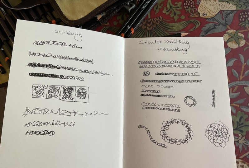
10. Scribbling: So at this point in the class, we're about halfway
through our lessons. And up till now
we've been covering different variations
of hatching, crosshatching, contouring,
and stippling. And what I'm going to be
sharing with you now is a few more creative and
different ink shading techniques that I've personally used and
developed over my career. So scribbling is very similar to our random Lines exercise
from earlier in the class. But it's not just about creating random Lines
in a certain shape. This is more, this is
even more freeing, I would say, than
the random Lines. So when we did random Lines, we were creating
single Lines and just making them crossover
in different ways. In this Scribbling is
just trying to create that continuous flow as we draw. So same as ever. I'm starting with 05 pen
and we're just going to scribble a lot of Lines and then layer
these up over each other. So you can see there's
a lot more freedom and organic movement
within this compared to our random Lines technique. There are definitely different
variants of Scribbling, which I'm gonna be covering
in the next few lessons. But this is what
I referred to in my mind is sort of
generic scribbling. So we've got here, same as we did with
the random Lines. This is a fairly flat thing. We can actually create
gradients again with this. So sticking with our 05 pen, if I do the Scribbling
all the way across. But then I focus on
one end and maybe stop halfway and then add again and go maybe a
quarter of the way. And then slowly, just, eventually, I'm only
scribbling at the very end. What we've created really
easily is this gradient effect. So we've started by
drawing all the way out and then stopping about three-quarters and
then stopping about half. And we're just layering,
just adding up, adding up until at this end, we're only adding at this end. And it creates a much darker. And compared to our flatter
version where for this, when we were just going
over and over and over, same as before, we can experiment with
different pen sizes. So taking out my 1.2, we can do the same thing again. So we're just Scribbling. And that's a very flat version, which we can then just
add two if we want to. If we add one so far each time until
we're only at the end, we've, we've created
a similar effect. It's just, it's just
with a thicker pen. We can do this with
colour as well. So again, I just go all
the way along Scribbling. That's our, that's
our flat version. But I can do the
same thing again. We go all the way to the end. And then I start at
the beginning again. And this time I'm only going to go up to about three-quarters. And then I start again
and I only go up to about half. Again. I go to a quarter until eventually we're only adding to one end and we've created
a gradient again. You can also experiment with the space between
your scribbles. So if I go back to my 05 pen, I'm just gonna do this
one a little slower, just, just, just to demonstrate. So if I'm scribbling, I'm just making random
shapes, like so. But this time if I make the
gaps much further apart, and then one where they're
much closer together. Still scribbling
with our 05 Penn. We've created three
very different shades. Depending on how much space
there is between these lines. That's scribbling. In a nutshell, it's a very simple, very
freeing technique. I really encourage you to play around with different
versions of this. And we're going to
be looking now at three different
kinds of Scribbling, as well as this more
generic Scribbling, which are circular Scribbling, scribbling with Words and
single Line Scribbling. So first up we're going to
look at circular Scribbling
11. Circular Scribbling: Okay, so I hope you're enjoying scribbling in your sketchbooks. Because now we're going to be looking at circular Scribbling. So circular Scribbling
actually has its own name, which I only
discovered recently, which is called scumbling. I've never used the
name scumbling before. But you might see this
in other techniques. And the purpose of
circular Scribbling is to literally create circles
or semi-circles, and that is the only kind
of Scribbling you do. So as ever, we're going to start our demonstration
with a 05. And the way that circular Scribbling works is
you're just doing, It's almost like, like
drawing little c's. You're just drawing little c's to create shade and texture. So same as we did before
with the generic Scribbling. We can do the same effect again, where we're doing our seas. And you can change the
angle of the seas as well. It doesn't have to
be that you're just, you're just drawing, you're just writing the
letter C. You can change the direction of the Maven so you can have C is
going this way, C is going this way. Use even an upwards
ones and you can create almost floral scumbling,
circular Scribbling techniques. So if we just keep adding seas, and then if we same
as we did before, if we go back to
the beginning and we just add and go most
of the way across. And then again back
to the beginning. And then halfway. And then a quarter of the way. Then we've created our
gradient effect again. Let's take a look at what this looks like with a thicker pen, using my 08 pen, I'm now going to be looking
at these much thicker lines. So using just sees. We can see that this is, this isn't really
the same technique as we have above hair at all, because all we've
really done is just written the letter C
over and over again. So if I chuck in some, going in other
directions as well. Already straightaway, we
can see that this has created a much more
interesting effect. Then do the same again
with a little bit further. And further. Again, the point of these
gradients is end to end. I just want end where
it's almost black. You're not, you don't want
to end up where this is completely black with
no white at all. You can see this very
tiny bits of white here. Because as soon as you
add something that's completely black at one end, if I just color
this in completely black, you end up doing is, you end up losing some
of that gradient effect. It can look good in
some illustrations, but I think particularly
when you're trying to add this sort of texture shading, you want to have as little
solid black as possible. So we can do circular Scribbling with colours as well,
same as before. I'm gonna pick two different
colors this time just to mix it up a bet and to show
a little more different. So we've got a really
light purple here, which is more of a sort
of a lavender color. And then our purple
from, from before. So using a very light color, we're just making the
seas and the backwards Cs and the use and the ends. Just to create our
circular Scribbling. Then same again with
our purple color. One thing you want to avoid with this technique is you want, You don't want to be
just drawing circles. It's very, there is a technique coming up later in this
class called looping, which is all about
drawing circles, but what You don't
want to be doing for, so circular Scribbling
is just doing this. Because this is not the
same effect at all. You want these gaps
between your shapes. So this, for this one, Your pen isn't coming
off of the page. For the seat, for the circular
Scribbling your pen is, we want to be avoiding
this style of technique at all costs. We can also see what
happens when we change the size
of our scribbles. So everything I've drawn
up till this point, all the seeds have
been roughly the same. So if we have a
go at seeing what bigger circular
scribbles look like. So create some really
big ones here. So we'll do this in more of
a shape rather than a line. So you definitely
want to be sort of, this is in some way similar
to our hatching technique. If we end up just drawing the same shape over and
over in a direction, we're not getting that same
circular Scribbling effect. So you want to make
sure that some of your scribbles are
crossing over. That's what creates
this Scribbling effect. And of course, the
other thing to say, which may seem obvious, but just, just make it clear. There should not be a
straight line anywhere on this page other than maybe
in your writing at the top. Every single Line created using circular Scribbling
should be a round shape, whether it's a really big
one or really tiny one, there shouldn't be a single
straight line on here. So we can definitely
combine bigger shapes and smaller shapes to
create certain effects. Similar to our
stippling technique, we can actually find ways to
create gradients using this. My practices are starting to
overlap, but that's okay. This is just a
reference sketchbook. And sometimes it can actually be quite interesting to see how different effects
interweave with each other. I'm going to add some more to the middle there because it's starting to lose some
of its definition. So you can see here we've
been able to create a gradient effect by very tight circular scribbles
in the middle here. And then slowly as they
come out and we can, even, if we just focus on
this edge of the page here, we can even add a little
more then more gaps. So that's circular Scribbling. Up. Next, we're actually going to be playing around with one of my
favorite ways to scribble, but it's very unusual, which is scribbling with Words
12. Scribbling with Words: This is one of my favourite
ink shading techniques because it's so unusual. I've always really
enjoyed the act of writing and writing words, and I always wanted to
write a book when I was younger and maybe I'll
get to do that one day. But for now, I do enjoy putting
words into my drawings. So the idea behind scribbling
with Words, it's a bit, it's really a version of writing rather than
scribbling with Words, but it definitely fits
into this freeing Technique more so than with
other shading techniques. The idea is literally
that we will be writing and using words and letters to create
our light and shade. So I'm going to start
with my 05 pen as ever. And I'm just going to
start with the word hello. So you don't have to writing in cursive if you don't want to, You can do it with
separate letters. The effects still
stays, stays the same. In fact, you can
even mix them up. But the idea is that as we layer the words on
top of each other, we then actually almost hiding
a message within our Art. So we can see creating
a gradient hair. If I go way out for this one, so only the 0 and
the ** overlapping, then we just keep,
keep writing hello. Hello. Hello. Over
and over again. Can actually create some
interesting shading effects. So you can see it's much
darker in the middle here and I'm just gonna keep adding to it because I just wanted
to be a little bit. I'm just checking a few. He's just to really let me go. So we've created
this gradient effect here using just the word Hello. We can do the same with
individual letters. So we almost saw it actually during our random words lesson. When I noticed that I was
actually accidentally putting my first letter of my name age into my scribbles so we can
do the same thing again. And in fact, I'm actually
going to do exactly that. So I'm going to do this
again with the 05. I'm just going to do
my first letter H. You can follow along with maybe the first
letter of your name. I'd love to see different
examples of these. It'd be really interesting to see how everyone
interprets this. But if I just do an H, I just do a series of h's, maybe in a shape. Let's try and make that
radial gradient effect that we have before. So I'm actually going to have some going in different
directions as well, because we don't
want everything to be in a straight line. This is quite amusing
because it is taking an awful lot of my focus
and attention not to, not to put an L at the end
of each of these strokes. Just an H, just an H. Here we go. Do some further out ones
as well. So there we go. We've now managed to create a gradient effect using just Hs. And in fact, I'm still not
too happy with the center. I want it to be even darker. So H, H, H. So there's loads of
different ways that you can experiment
with this just, just as we have before. So you can do it with the, with the thinner, thinner pens. So if I just keep, keep
going with the word hello. And then again with
a thicker pen. Say, one thing,
things be aware of. Here. I've just created the
word hello in the same space. Obviously we are trying to
create this more varied shape. So unless the thing that you're coloring is shaped like a hello, you are going to want
to fill in other gaps. If, if, say, say this is actually just the space
I'm trying to fill in. So hello, one really
fits in once. That's fine. Just try and, try and fit parts
of the wording elsewhere. So here I'm just
going to put an H, which put a few Hs in. And then all LO L, L 0. Then we still get our scribble. So we can still layer up
letters and shapes as well. And one interesting way to
do this is actually to have a different letter
for each color. So let's say I'm
doing something on. I want to have both of my initials and I want
to have H and L N. I'm just going to start by
chucking it a load of Hs. And then in fact, I'm not going to use
L. I'm going to use a more rounded letter
because I've got some very sharp shapes
happening here with the Hs. So let's do the
letter P instead. So we then got some
varied shape happening. There we go. So that is just a
few examples of scribbling with
Words and letters. Again, as I said, you can
do this with numbers, you can do this with
punctuation marks. It's really, it's just another way of just
being a little more creative with how it is that we're applying
ink to the page. So up next we're going to do something which is
very different, which is single Line Scribbling
13. Single Line Scribbling: Okay, So for this technique, we're going to be looking
at single Line Scribbling. Single Line Scribbling is, it's more of a challenge really than an actual
technique of itself. But it is a great
way to practice your pen skills and control over the pan and
how you create Technique, create textures and ink
shading techniques. So I'm just adding the
title as we have been throughout the class,
single Line Scribbling. And we're going to start by
just drawing a single Line. But this isn't gonna be just a straight line
across the page. We're going to scribble without
our pen leaving the page. We're going to see
how much we can do without our pen
leaving the page. I'm just going to
do a very simple, this is where my 05 pen again. I'm just gonna do a very
simple scribble scribble. And it can be sharp lines and corners and more wavy things. And we're just going to create a single block without a pen. Leaving. That is a single
Line Scribbling. So like I said, this isn't, this is
more of a challenge. This is more for you to help
practice your penmanship. Because what we're going to do is we're going to be creating shapes such as
squares and things. And we're going to shade
them in a gradient without our pen
leaving the page. So I'm going to start with, I'm going to picture a
square shape over here. And I'm just going to start scribbling all over to roughly
create my square shape. So there we go. Now we'll see there's
not a whole lot of shading going on in that. What I'm going to try
for my next square, starting at one end is, this end is going to be heavier. And then I'm still, my pen is not leaving the page. But by using spacing, I'm going to actually give the illusion that this
side of the square, just going to make it
a little bit deeper. Actually, there we go. This side of the square
is darker and it's slowly heading out over
to the other side. So lots of scribbles pen
not leaving the page. Now we have it. So it's still not great. So I'm gonna just going to
practice one more time. This time what I'm going to do is I'm going to really think
about how I'm applying this. So if we think about it, this has to be the lightest, this has to have
the biggest gaps. So we need to do this side in
as little ink as possible. And then this I gets the most. And then we've got to be super mindful of what
goes in the middle. So let's just try this again. Scribbling away. That's one side. Now, let's get this side over and done
with so we won't bake gaps. There we go. And now we're back safely in the area where we
can add lots of ink. This section here, I'm not
taking my pen off the page. This section here
is our Safe Zone. So again, without the
pen leaving the page, just put little more in
the middle, not too much, and then back to the safe zone because we can add
loads of ink here. Then how's it looking? I think maybe just
one line here, back to the safe
zone. Key in the ink. Keep the scribbling. And then we're just going to go crazy at the very end
because that's how dark is. So we can see we've
actually created quite an effective gradient
here several times over. And this, this was
just our practice where that's the idea behind
single Line Scribbling. There's lots of
different ways that you can really manipulate the ink. Obviously, the idea behind single Line Scribbling is
that we're not going to be changing our pens
throughout our drawing. But we could then layer some single lines on top
of each, each other. So I'm going to start with
my very, very thin pen. So this is my 01 pen. Rather than a square.
I'm actually going to do a circle this, this time. So I'm just going to draw
the shape of the circle. I'm being deliberately
wobbly with this because I'm trying to get
this sort of Scribble Effect. And then as we go in, it's almost like a spiral. Rarely. But me go. Then I'm just going to come out, Follow the spiral
roughly in the same way. And then I'm just
going to do one, just one on its own
ran the very edge. That's one single Line. And then I'm just gonna go up a little bit back to my five. I'm going to start
in the middle this, this time and just keep adding to the
Scribbling the middle. And then slowly, slowly
around the edge, just gonna be adding more. And again, think of that
center as a safe zone. And then go out and just
do a little bit more. There we go. But we
don't wanna do too much because we're trying
to make a gradient here. So we've actually got
some whitespace here. We keep adding to it. We keep going round it. Back to the safe zone. And almost the dark you
make that center zone, the easier it is to have everything else around it
would be a little bit lighter. So here we go. And then maybe just one more. And I'm actually now
applying the pen very lightly because I just, I just want to create the
illusion that there's more space and It's
much, much lighter. There we go. So technically that was
with two separate pens, but that is a single Line Scribbling where
the center is much, much darker going out. So bearing in mind
with our mark-making, obviously remembering that using the same pen we can create very thin lines and more normal Lines and
very, very thick lines. So depending on the pressure that we're using with the pen, that can also help us with our single Line
Scribbling Techniques. Up next we're going to be
looking at jagged Marks
14. Jagged Marks: Okay, We have now covered ten different ink
shading techniques and we're now going to have
a look at jagged marks. So jagged Marks is basically these pointy patterns
that I love to put into my abstract ink illustrations. And there what I can only really describe as being
like monster teeth. So we just add the
title to our page here. And the idea of a jagged mark is literally a pointy squiggle. So we can have
variations of these. By making the points higher up. We can have them be
really, really tiny. We can have them be
in layers together. Like so. We can actually lay them up. We can cross them
over from each other. There's lots of different
ways that we can use use jagged marks. So I'm going to start by just creating a few jagged marks
together as a reference. So again, I'm doing
this with my 05 pen. We can take a look at what this looks like with a thinner pen. I've got my zero to here. And then we'll look at are
much bigger pen again. You can see the difference
here in our pen sizes. Now, if we wanted to create a gradient using jagged Marks, There's a number of different
ways that we could do this. So we could start by just Drawing are jagged
marks like this. Then we can layer them up
the way that we did with our Scribbling going
in opposite direction. We can then go about
three-quarters of the way. And then again,
about half the way. The trick here is to try and make sure that you're
going into these gaps here. So you can see here
we've actually got quite a nice sort of a
lattice effect happening, but here we have
a couple of gaps. So we're actually losing
the gradient effect. So just on the next one, I'm just gonna be really
slow and deliberate and just make sure I get into
those gaps. There we go. And then little bit more
and a little bit more. But there are other ways to create some light and
shade with these. We can have very, very tall
jagged marks, but very, very narrow by this, almost like a heart monitor. And we can have
them where there's actually a gap between
them a little more. So you can have them
be much wider in gap if you layer them like so. We can do this and then actually change the
space between them. So they get closer
and closer together. One up here, which
is quite a bit further apart. There we go. We can also think about the
speed that we using our pen. So if I was to draw
the jagged marks very, very slowly and deliberately, like say, if I just
do about for that, That's a very, very
strong deliberate line. Again, I'm still
using the 05 PEN. But if I was to do this now very quickly with the
exact same pattern, we get a much thinner line. So you can actually then create
very interesting sort of middle ground effects with the same pen bearing in mind
that you've still got to be precise with your points using applying different
levels of pressure as well. So if I really slow down
on this bottom one, I'm worried apply the
pressure through the nib. Not so much that you want to
damage the nib obviously, but you can then create interesting gradient
effects like that. So that is our jagged Marks
Ink Shading Technique. Up next we're going
to be looking at a similar effect using
circles called looping
15. Looping: For our penultimate
ink shading technique, we're going to be
looking at looping. Also known as circling. Looping, is a shading
technique that uses small circles to create
darker areas on a drawing. And it's done by
placing a series of small circles close
together on the page. So looping is basically a more intentional version of what we did in
circular Scribbling. It might seem very similar, but instead of those
bag loose freeing, see shapes and backwards, Cs and all, all of that. We're actually going
to be creating very deliberate circles
and then layering them up and building
light and shade using that same as ever. I'm starting with my 05 pen and I'm just going to start
creating circles on the page. So they don't have to
be perfect circles. But I'm actually just
going to put them fairly close together in
this sort of size. And you could almost liken
this to our stippling effect. It's just instead of a dot
with drawing a circle. So looking at
different versions, if we then made the
circle smaller, but still close together so the circles aren't actually
touching each other. There is actually a
little gap between them which they can touch. But that's, that's gonna be
a different style again, if we make them even smaller, we can then really start to see, because what this is
doing is it's reducing the amount of white
inside your pattern. The more ink, the more black
you have in your pattern, the darker it's going
to look overall. Then we could even
get one that's so, so small that they
actually do have to touch. There's no white in-between
them whatsoever. We just lay them up like so. So there we haven't using the same pattern and we could even do it with even
bigger circles, have here an even bigger gaps. Because the gaps don't have
to be the same between them. Using the same pattern. We've actually created five very different
shading variations. And to be honest, this, this technique is
called looping, but you don't have to just
do this with circles. You could be doing
this with squares, triangles, any shape
that comes to mind. But circles, circles is
quite good for uniformity, at least in the illustrations
that I enjoy drawing. So the other thing that
we can do is we can actually look at
the pen size again. If I take my 01 pen, we do similar thing again. So I'm gonna go for a middling. So circle. We can see that this has
actually created the same, the same shading as our
larger circles have, but the size of the circles
is actually the same as what we did over here
with our middle pen. So it just goes to show that by changing the size
of your nib on your pen, you can create a much
more varied range of shading styles. If we go super small, like we did before, then one where they're
actually touching. Same thing can be
said again for the, for those larger pens. So we can do our bigger circles. Of course, with
these larger pens, you are then limited
as to how close and house more you
can get your dots. But we can absolutely try. So we'll go smaller
circles again with less of a gap between them. And then smaller circles again. One thing to really try is to remember that
you're not making a dot. So you do still want
these very tiny gaps in the middle of your circles. Because otherwise if
you're doing dots, you might as well just
be doing stippling. I'm going to really see
just how small I can get these circles without
filling them in. Boy, is difficult, but
you can imagine now, even with this very thick pen, we are able to create
such a variety and shades between them. Could make some for some very, very interesting illustrations. So another thing we can do
is we can actually layer these illustrations one
on top of the other. So I'm going to use a
to pen for this one. If I just go for a what I'm afraid who is a
medium-size circle? I'm just going to create
a bit of a bar of these Remember these circles do
not have to be precise. So there's actually
a few here where I'm drawing them in the coming out a bit overly or I'm not quite closing the circle
at the other end. That's absolutely fine. So we've got that going along. And then same as we did with our scribbling exercises and
our random Lines exercises. We can actually go back to
the beginning and just start layering the same size
circle over the top. I'm going to stop about
three-quarters of the way. So there we go. Then again back to the
beginning, more circles. It's about halfway. And then we'll do the same again to
maybe a quarter of the way. And then back to the beginning
for maybe an eighth. And then really adding it on, really piling it on some more circles at
the very beginning. And then we have our
nice gradient effect. Again. There's loads of other ways you can experiment
with this technique. We could do layering, but where you're
actually layering on different pen sizes. If I do another
little shape here, we can actually
take a thicker pen. So this is a two. If I take an eight, something that's very
different and we can actually layer the same size
circle over it, but just, just at one end. And straight away with starting
to see a gradient happen. And then in the middle, if I use a five, again the same size, circles. Lo and behold, little more
to the beginning as well. There's another gradient effect. So looking at colour, because we haven't done a
little colour experiment and in awhile we can do the
exact same effect. So I'm going to start
with this pink again. If we just do some
circles here we go, then we can add purple
end to one end. And just thinking about
the spacing of them. Then increase the spacing and then a little
bit at that end, then have some more
at the beginning. That goes another
colorful gradient effect. So looping, looping is quite a fine way to combine
the skills found in stippling and in circular Scribbling to create
more effects. For our final ink
shading technique, we're going to be
looking at something called tiling and weaving
16. Tiling and Weaving: Okay, For our last ink
shading technique, we're going to be looking
at something called a tiling and weaving. So tiling and Weaving
is great fund draw. I really enjoy this. And again, this is another
technique that I'm often using in my abstract
ink illustrations. So tiling and
Weaving is basically taking Hatching style marks. So those closely
spaced parallel lines, but then repeating them
in another direction to create an interesting effect. We're going to start by just reminding ourselves
what hatching is. Using my five pen. I'm just going to draw some small closest
space marks like so. Now in a different direction. I'm then going to do the
same closest space marks at marks like so. Then we'll add form or going
in the initial direction. As you can see, this is creating a tiling
or a Weaving style effect. You want to make sure
that on each side of your marks Your then alternating in the
opposite direction. And I'm just going to continue this on to the end of this line. So in this example, I've actually had them not deliberately not
touching each other. You can have them
touching each other. So we could do for Marks and then off the edge of
this side of the form marks, we can then have our next
for marks coming off. Then we can do it again, 234. And then when we go underneath Your then connecting them again. And then same on this side. This has to take a lot of
precision because you're basically making sure that every line lines up
with every other line. So it's a great one to practice. And then if you're at
the end of your pattern, the easiest thing is to
basically just round it off. Like so. So even more so here you can actually see that
Weaving effects. You can almost imagine that
this line here is going under these two incoming
out on the other side. But from a shading perspective, there's a lot of things
we can do here to add a little more light and dark. So first up, easiest
one is gonna be about changing the
space between the lines. So if we keep with this space between
the sections for now, we can actually
make these wider. Then we can do ones that
are much closer together. So that's one way to use tiling
and weaving for Shading. Another is to change the size of the pens to taking a 01 pen. We can actually do
the same style. But we can get even smaller
than, even closer together. Because we've gotten
much smaller nib size, we can actually create
a much tighter effect. Then even tighter still. So I'm getting really small, I'm really tight
with my Lines now. So there's still a
gap between them. I'm creating incredibly
tight weaving patterns here. So then we go across and
down and across and down. A FUN way to play
with Weaving is to play with the
color of your pens. So if I take my pink pen and I do all of my downstrokes
with my pink. Then I can do my across
strikes with a, another color. So another thing I've
done here is I've actually used for downstrokes, but I've used six
across strokes. So that's another example where
we can actually influence the shading because this is a darker pen and we've
got more shades. There's actually a
greater contrast between the two
compared to normal. So we can use that
concept to actually have different shades going
on in a weaving pattern. So say we want to create
a gradient using Weaving. I'm going to use my
zero to pen for this. I'm going to start out
by just creating for And then four. Then four. Then for what we wanna do here is we actually want this to be our lighter end of the gradient. We want this to be a darker
end of the gradients. So at the moment It's very flat. We've got 4.4. So what we want to do
is we actually want to have a little bit more
shading happening here. And then a little bit more
again in this section, and then a little bit more
again in this section. So there's a number of
different ways we can do this. So we can actually just
simply add more lines. So we've got four
happening here. If we increase this and just add a few more
going in this way. And then on this one, we actually had two in each gap. Then in this one we
add three in each gap. That's a way to create
variations in light and dark. What's difficult in this example is we do still have
these gaps in-between, so we're losing that effect. So let's try the
same thing again. But this time we're
going to close the gap like we did with our
Weaving passing over here. So same, same pen. The zero to I'm going to
start with four going down. But then my foregoing
across are going to come out from my fourth downstroke. And then same again, 1234. Then finally, same again 1234. So you've always got
three downstrokes. And then what looks like a flag, and then two downstrokes, and then what looks like an E with an extra line
in the middle. So it looks very
strange at this point. This doesn't even look flat like the one above
days because we've got this illusion here on the sides where we've actually got more
Ink and less space. So it actually looks,
looks like it's going lighter and then darker and
then lighter and then darker. But we are going,
going to fix this. So same as above. For our cross strokes
on the right-hand side, we're not going to
add any more Ink by, I'm going to add one stroke
in-between these here. So we'll just write
down the middle, add one stroke between
each of those. Now for this one same as
above, we're going to add to, so I'm just going to add two strokes in here and
two strokes in here, and two strokes in here. Now bear in mind if
you're following along, you did this by I. So it's never going to
be exact and perfect. So don't don't worry if like me, some of the lines are
really close together. The point is we are
creating an effect. It's almost an illusion. Then at this side,
same as above, we're going to add three
lines in-between each gap. So 123-12-3123. Then just to really
round it off, I'm actually just going
to add the lines at the top and the bottom. So we've got it in
a straight thing. So that's a much smoother
looking gradient than we have up here. But you're probably thinking
it's still not ideal. So we're just going
to try another go. This time. I'm actually going to
be using tiling and weaving, but with crosshatching. So, so far all of
these examples, inversions of hatching is
just a single Line going in one direction and then single lines going in
another direction. So we're now going to Thailand. We've But with cross hatching. So let's do this again. So we're going to,
I'm gonna keep this effect where
everything is tied together because I think
straightway we can see the gradient effect
is a lot smoother. So we've got 1234, 1234, 1234, 1234. So I've got a bit excited that this line has gone a bit
longer. That doesn't matter. We can always, we
can always just extend the other so
that they match. Before we start, I'm
actually just going to line up these other
lines as well anyway, just so that they
were all along. Another thing you can
do if you wanted, you could actually just draw the rectangle at the beginning. But anyway, so same
effect we're gonna, we're not gonna be adding
anything to this one. We're gonna be
adding one line to this one to lysis want
a three-line system. So we're just going
to start with that. One line in this section, two lines in this section, two, and then three lines in
this section, 123-12-3123. Now we're going to
do the same again, but we're gonna make it a hatch. So we didn't add
anything to this, but this isn't hatch still, this is still this isn't crosshatch, this
is still hatched. So we are going to add
one here just so that we get that hatch effect 34. Now on this one, we added two. We added one of
those already one, so we're adding two. So we're just gonna
go across 12121212. This one was we added two. So we're going to make
it 312, 312-312-3123 Then finally you can
see what's coming here. This was, we added three,
there was already one there, so we're actually
going to be going four cross four times. So nice and thin. Want 2, 3, 4, 1 2 3 4, 1, 2, 3 4, 1, 2, 3 4. Then we have three different tiling and
weaving techniques to create gradients. So you can play
around with all of these, including the colours. You can hatch up the colors if we did another one of these, for example, where we actually drew the rectangle
to begin with. Like so you could
then split it up into your Weaving sections and then have a practice at drawing
in each of your weavings. So, for example, here, if we were to redo this one, this would be three
down and three across. And then this one would be
six down and six across. And then this one would be
nine down, nine across. Then this one would be
12 down and 12 across. And 12 across. Then we have it. So there's lots of opportunity
with tiling and weaving. A lot of these so far have been very square in their nature. Another way to do
tiling and Weaving is to actually have things
on more of an angle. So if you remember back
in cross hatching, I said that traditionally
cross hatching is just like this, where the lines are
perpendicular to each other. Same thing with Weaving. We don't have to do it per, perpendicular to each other. So if I just carry on
with my zero to pen here, we can have Lines
coming down like this. Instead of going across, we could actually have, I'm
going more on an angle. So we can actually do
it like, like this. So bearing in mind the
shape that you're creating. Then back to several
on the other side. And we don't even have to
keep it going like this. You could actually mix and match these in completely different
directions across the board. So we could start with some coming down and then we'll do a little diagonal here. And then we go diagonal
in another direction. And then we go back to up. And then across. Then on this side we could
do a really steep diagonal. And then using your
hatching techniques. And now obviously you're cross hatching techniques as well. You could even add
to this to then create more license shades
within the shape itself. So you can then choose
on this very dark one. We're just going to add
a few hatches in here. And then maybe a
few going this way. But then only a
couple on this one, maybe one on this one. Then we can start to create more shades and difference
throughout our drawings. So that is our tiling and
Weaving Ink Shading Technique. We've now been through all
13 different techniques. And you can move on to
uploading your class project
17. Your Project: Then we have it 13 ink
shading techniques that I really hope you
enjoyed learning about. I'm hoping by now your
sketchbook has got 13 pages filled with
these Ink Techniques. And I really hope you
enjoyed taking this class. I would love to see what you've created in the project
gallery of this class. So I'm going to invite you
now to do one of two things. I'd love to see either an
illustration that you have created using one or more
of these techniques, or if you'd rather, I'd love to see the page of
your reference sketchbook that contains your
favourite technique that you learned on this class. Me personally, my
favourite technique or out of all of these, is the tiling and Weaving. There's something that
really appeals to me about how all the shapes fit
together on the page. And I love doing it in
different colors as well. So check out the project
gallery because I'm going to post that page from my
sketchbook as well.
18. Final Thoughts: Congratulations you
completed this class. I'm so happy that you came
along on this journey with me. I really hope that you took
something away from this. Over the course of this class, we've covered 13 different
ink shading techniques. And I have just enjoyed so
much teaching them to you. And I really hope you've got
something out of it as well. If you enjoyed this class, please consider posting a review because every review
helps me to create more content for
you guys here on Skillshare, if you like, also Follow my Skillshare
teacher profile because you will
then be notified anytime I do a giveaway or release a new class
to the platform. Meantime, if you've
got any questions on Ink Techniques or illustration
or anything at all, please feel free to leave a comment in the
Discussions tab. I read every message, I get every project
that's posted, and I will get back to
you as soon as I can. Thanks again for
taking this class. Have a wonderful day.
 Hattie Linton, Digital Artist and Ink Illustrator