Transcripts
1. Intro: Have you ever wanted
to draw and shade with ink pens but don't really
know where to start? Do you find it challenging to create gradients
without blending? Or you don't use ink pens because of the fear of
not being able to erase? That's where most of us start. Ink is considered to be
a challenge in medium, but it doesn't have to be. In this class, we'll go through further most popular shading
techniques with ink pens. I'll begin by showing you
the available materials, as well as ways to achieve better results
with just one pen. Then we'll practice hatching,
crosshatching, stippling, and scribbling by filling
in this worksheet, which I'll be sharing with you. For seashell drawings, we'll start with the
basics of sketching. The importance of
line weight plus a trick to help you
identify values easily. We'll put in all of the
shading techniques to a test. Because I understand
that sometimes use one to erase
those inky mistakes, I'll share that
trick with you too. Hi, my name is Maria Fe, and I'm a teacher and
traditional artist. I have over a decade of
experience in art and today I'm excited to bring you my
first-ever traditional class. But fear not my dear students because this one is for you too. These shading techniques
do apply to both. Plus, I've included a brush set that mimics the pens we'll be using as well as some
detail-only segments. For the durational materials, you'll need a pencil, paper, and some inking pens. I'll be using one with
a thick and thin tip, as well as another that
varies with pressure. For fixing mistakes, you'll
need a white gel pen, a knife blade, and
wood sanding paper. If you're working digitally, you'll need an iPad
and Apple Pencil, and a Procreate app, as well as the brush
shade which you can find in the resources. For your [inaudible]
you'll create an inking illustration using one of the shading techniques. You can choose to
draw along with me because I'll be providing
my reference images, or choose a topic of your own. This class is suitable
for all skill levels, so with that being said, are you ready to start inking?
2. Class Project: For your class project, I invite you to create
a drawing using either ink pens or
the detail brush set. You can also share your
worksheet if you complete it, or if you made one of the seashell drawings,
share that too. What's important is to apply
the principles learned in class and use one or all of the shading
techniques: Hatching, cross-hatching,
stippling or scribbling. If you're feeling adventurous, you can even combine them. I will love to see
your drawings, so please share them below. Remember that this way, you'll also get a
personalized feedback. Can't wait to see
your creations.
3. Tools : Let's take a look at the materials we're
going to be using. For starters, I already have this sketchbook by
the brand Hahnemuhle, but you can use any
other one you have. I also have these Sakura
Pigma Micron pens in various sizes. These are the ones I
like to use the most. Then we have all of
these other pens. You don't need to have these, but I'm searching them in case you want to try other options. One thing you will need though, is a pencil and some rubber. I have these near the
one by Faber Castell. For fixing inking mistakes, you'll need three things. First, I have this knife
blade that came in a set, and it's pretty easy to
use because of the handle. Then I have this white gel
pen by the brand Sakura, unless I have this piece
of wood sanding paper, the number of the grid is 220. By the way, I will be listing all the brooks mentioned
in the description box. For my digital students, you're going to need an iPad, an Apple Pencil, and the Procreate app. As for the brush set, you'll find it in the
Project and Resources tab.
4. Swatching: I'm going to start by swatching the pens so you can see
which one you want to use, whether in this class
or in your next grade. Let's start off with the
Sakura Pigma Micron pens. As you can see, I have
them in three sizes. This OO3 is super fine, while the O8, creates
thicker lines. The last one has a
plastic nib that varies in size according
to the pressure applied. To start off, I'm going
to be using Number 8. Notice how I'm holding the pen. If I tilt my wrist, I will get a finer line, while if I hold the pen upright, I'll get a thicker line. I'll talk more about this in the next segment of the class. I'm going to number my swatches. For the next one, we have the OO3. You'll see how with this one, you can get the super fine line. It is perfect for details. For these swatches,
I'm starting with a very light pressure while
slowly increasing it. Then we have the micron, PN, or plastic nib. Let's take a closer
look at the nib. See how if I apply
more pressure, I can get a thicker
stroke or a lighter one. I really like how
versatile this one is. Then we have the Prismacolor
brush tip marker. I use this one to fill in
darker areas more quickly. Then we have the Pentel Stylo. This one also varies in size as it also has a plastic nib, but it really isn't
that noticeable. Then comes a favorite of mine. It's the Pentel
pocket brush pen. This one has a
refillable cartridge that contains
water-resistant ink. The various lines this one can create makes it perfect
when on the goal. It looks very expressive.
That's for sure. Then we have the Pentel
pigment ink brush, which is very similar to
the Pentel pocket brush. I think the only difference
is that this one has a bigger brush and it also
holds a lot more ink, but that's about it. Then we have a classic the
pilot G1 in the size 0.5. This one is used to
regular gel roller ball that allows you to get
even flowy strokes. Then we have a ballpoint
pen by Faber castell. As opposed to the gel pen, we use straight out. The ink on this one
is not as runny. It feels a bit drier. For those using Procreate, I've included three of my personal liners for
my pointism brush set. These all have different
properties that mimic the traditional
pens we will be using. First, we have the
perfect liner controlled. This one is a liner
that will slightly thicken when pressing harder
with the apple pencil. It gives out a really
beautiful line. If you use it for brushstrokes, you can see the finer
point this one has. As well as the
realization that allows a precise but expressive result. Then we have the perfect
liner, no stretch, which as you can probably guess, the line won't change when
applying more pressure. This one is for everyone, then it's an even and precise
line weight all around. Finally, we have the perfect
liner in round which is like the mono line
1 but if tweak destabilization to one
that works best for me. I would say these last two
compare more to micron pens, while the first one looks more like the pentel pocket brush. That's it. Let's dive into
straw variations now.
5. Stroke variations: Let's now talk about
stroke variations. This is a very important step
that is often overlooked. Let's start with a gel
pen, the Pilot G1. If you need to create
a super even line, you're going to want to maintain an upright position like so. Let's try it out. As you can see, we've managed to get
an even line weight. To create a finer line, hold the pen at a lower angle. It looks like there is
not much of a difference, so let's try an
even lower angle. Even though that ended
up looking a bit rugged, we can use that effect to create various textures
on our drawings. Well, this principle applies to almost all of the other pens. Let's try it out with
a ballpoint pen. It looks like this one
is running low on ink, but we can use that
to our advantage. For example, use very
light pressure to create a low-opacity thin line, or build it up by
going over and over. These are also great to start
sketching and for shading. That's why I like to
keep my dry pens around. It's easy to confuse
them with the others, so in order to quickly
identify them, I just stick some
tape on the handle. See how they work great for shading and adding
darker values. Now, let's try it out
with the Micron 08. Let's try the upright position
and the one at an angle. Tilt it even more,
and get a finer line. It all comes down to
how you hold your pen, upright or at an angle. The lower the angle,
the finer the line. Go ahead, and put this
trick to the test. There's another thing
I want to teach you. When drawing smaller details, you're going to want to keep the movement limited
to your wrist. Don't move your
whole arm around. That is best for when you're
drawing bigger objects. For example, I'm going
to draw a teardrop. This one is pretty small, so notice how all of the
movement is just on the wrist. The same goes if
I add some lines, so keep this in
mind when drawing. Now for the digital students. When it comes to
drawing at an angle, at least with these brushes, there won't be a difference. The variation will come through
the pressure sensitivity, and that only applies to the
perfect liner controlled. However, you can adjust the opacity here to
create that variation, or here to change its size. As for the arm
movement when drawing, the same is true for
smaller and bigger details. Let's now learn some
shading techniques.
6. Shading Techniques: For those on Procreate, I want to show you a quick way of filling in these worksheet. Once you've imported this file from the Project
and Resources tab, click on the Layers. You'll see that
everything is labeled. For example, let's
select Hatching. Click on the Selection Tool on the top left corner and make
sure it is set to automatic. Then just click on the
square you want to shade and on the pencil icon. Rotate your canvas
if you need to. Now, you can start hatching
without going over the lines. The same goes for the shapes. Those are in the practice layer. Select it and then head
over to the Selection tool. Then you select your shape. One thing I forgot to mention is to adjust your threshold. When selecting your shape, slide the Apple Pencil to the
right at around 99 percent. This is to ensure all areas within the
shape are filled in. Now select your brush. If you don't want to make any permanent changes
to the shapes, make sure to add a
new layer and draw there. That's about it. Let's now begin
with the shading. I've come up with this
worksheet that includes four of the most popular shading
techniques with ink pens, hatching, cross-hatching,
stippling, and scribbling. For this exercise, I encourage
you to follow along. Practice will make a difference when shading your illustrations. You can find this file in the
Project and Resources tab. Print it out or fill
it in digitally, whatever works best for you. For this first exercise, we're going to make a
gradient that we'll gradually darken using
the same pattern. This is called a value scale, and it's a great tool to
practice light to dark values. Let's begin with hatching. Hatching is an artistic
technique used to create tonal or shading
effects by drawing closely spaced parallel
lines just like this. I'm going to leave the
first square blank to represent the lightest value. Let's start with
the parallel lines. By the way, that micron
pen I'm using is the finest one I
have, Number 003. When doing this one, try to keep the same
distance between lines. If you screw up, don't worry because that's
what practice is for. Zooming in so you can
take a closer look. Let's continue filling
in our squares. I'm going to fill in all
the ones on this row first just to show you the
pattern for each technique. Crosshatching is basically
the same as hatching, but with an outline that
crosses that other line. Let's start with the
same pattern as before. This is when it's time
to decide the angle of the line that will
cross our hatching. I'm sticking to an
horizontal line, but feel free to
modify it if you want. Instead of squares, you could go for
[inaudible], for example. That's entirely up to you. My lines aren't super
straight because of the position I'm
in for filming, so sorry about that. In reality, I would
have tilted this paper so that my hand faces the same
direction of these lines. This really helps
with your position. Stippling is basically used shading with the use
of scattered dots. This technique is also
called pointillism. Scribbling is a
technique of using, well, random scribbles like so. It's a really fun one that can help you create more carelessly. These ones are great
for beginners. Now let's jump to the next row. We are now continuing with
the same parallel pattern, but leaving a tighter
space in-between lines. I'm just going to move my arm in the direction of the
lines for a better hold. I have to say, I'm not really happy
with the results. This pen is just too thin, but that's all right because we can go from thinner to wider, but not the other way around. Keep that in mind. I'm going to go over
this with a Micron pen. Try to avoid joining the lines. Now, that's a better outcome. For the cross-hatching, I want to show you that we can have the same width
on the pattern, but because we already
have a wider pen, that difference is enough
to achieve a darker value. The same goes for the
stippling and the scribbling. Now that we have a more
general look on these squares, I want you to squint
your eyes a little bit. Do you see what's wrong? The stippling pattern looks too light as opposed to
their counterparts. Let's fix that. I'm going to grab a wider pen, 08, and just add some more dots. Now that looks a bit better. The same principle apply to
the rest of these gradients. What's important is to make
your strokes consistent. All of your lines don't
have to be perfect, but keep in mind the
overall look on them. Try to keep the same
spacing in-between them, the same size, weight, and direction. That's the key. Don't rush. Take your time and just practice and
practice those lines. Keep a steady and
controlled paste. Using these principles,
I'm just going to keep on filling in the
rest of the squares. For this one, I'm
using Number 08. I'm not worried if
some of these overlap. Once again, see your
values from afar. This really helps for
an overall perception. Add changes as you see fit. Now for the last squares, we can be a bit careless. Overlapping lines will create darker hues and that's
exactly what we need. Notice I've moved my
seat to the direction of my lines just to make
this a bit easier. The same goes for the next one. As you can tell, stippling is the most time-consuming one, but I really love the
possibilities of this one. Since the dots are so small, you can really be precise and
achieve realistic results, if that's your thing. Again, look from afar
and see what needs to be changed and modify as you go. Looks like that's it.
7. Combining techniques: Now, we've seen how to
create our gradients. I'm going to show you about combining styles in
these rectangles. I'll be going from
light to dark. We're going to start off with
a variation of hatching. I'll use the pen in Number 003. What I'm doing now is creating super small lines in
sections. Like so. Fill in the first
part and then change pens to one with a
bigger line weight. Start with a wider
separation in-between lines and slowly decrease it. Overlap lines where
the darker areas are. Rotate the angle of your
hand if you need to. As always, I like to take a step back and watch my
drawing from far away. I'll be adding some more lighter
values with the O3 pen. One thing to keep
in mind is that our object sometimes
determines our shading. For example, these small
hatching might work best for spiky or
even furry object. That's it for this one. In the next rectangle, we're going to
combine two styles. Cross-hatching and stippling. Follow along or use a
combination of your own. I'm using the PN pen. Notice how I'm keeping
a lighter pressure at the start and pressing
harder at the end. As for the cross-hatching, increase the separation
of your lines as you approach
the lightest area. Keep a lighter
pressure on these. Now, let's complete the lighter
lines with some stippling. This really helps with
a smoother gradient. I'm just going to keep these same principles
for the rest. Now, I'm changing my pen to a thicker one for
the darker areas. I'll just switch in-between
styles as needed. That's it. Let's continue with the shapes.
8. Shading Shapes: Now we're going to start
shading our shapes. Grab your pencil for this one. For the sphere, we first have to determine where our
light source will be. Let's say it comes through here. In that case, this will
be our lightest point, while this will be the darkest. Let's mark those areas and separate our sphere into three. This will be the lightest, the medium, and
the darker areas. Let's get to the shading now. I will be using the PN pen. To shade this one, we're going to follow
the lines of our shape. Start by pressing
very lightly and slowly build more
pressure at the bottom. The lines we made help me determine where to press harder. If you notice, I'm increasing pressure when reaching
the second line. Continue filling in
the lines like so. You can leave it like
that or if you want, take it to the next level by adding some cross
hatching through here. We're going to start with
the darkest area, the base. Then slowly increase
the separation between our lines when
reaching the lightest area. Remember to follow the
shape of our object. Now press lighter
for a thinner line. You can even add
some variations and leave incomplete lines, like so. Since this looks
a bit incomplete, we can add some more
smaller lines in-between. If you want to be extra, you can even extend some lines
with the addition of dots. Now, view your sphere
from a far and identify the values
that are too light. Add some some lines
there to darken it. You can even add some other
lines that are more free. I'm happy with that result. Now, let's shade our cone. The direction of the light
will come from the same spot, meaning the darker
areas will be here. Take your pencil
and mark that down, following the shape
and its curves. This is the curve
I'm talking about. This will be our darker area, our middle one,
and our lightest. Let's start with the hatching. Remember to follow the
curves of your object. Change the length
of your lines to create an interesting variation. Now, at the cross hatching, don't forget about
the line weight. Since these are approaching
the lightest value, I'm going to avoid
going through there. You can even increase the
line weight of the base so that it looks more
3D, like a shadow. Add some more lines with
a bigger line weight. Take your time with these ones. Up next, we have a cube. The same goes for this one. To make it look
three-dimensional, we're going to keep our
light source in mind. This time the light will come
from the top right corner. If the lightest area is there, this one will have the
darkest value, like this one. For this part, we will
have a lighter value, like something
in-between these two. Because if light
comes through here, then this part won't
be illuminated, while some of the light
will bounce to this side. Hopefully that makes sense. Let's begin with
our medium shade. As always, follow the shape of your object and now
for the darkest part. Obviously, this is sped up, but in reality, I'm
going slow and steady. It's starting to look more 3D. I think this part
lacks some more lines, so I'm going to add more. I'm barely pressing
my pen and making sure I don't touch
the existing lines. Looks better. Now
for the last shape, let's make it more challenging. I'm going to keep
the middle part light and the shadows will
come through their borders. Let me explain a bit better. This shape will be
the lightest area, while the light will slowly fade away when
reaching the borders. We can start by adding lines
that fade at the center, coming from all directions. Take your time to
make these lines. Then maybe we can add some
lines surrounding the shape, leaving a wider space when
approaching the middle. Leave it like so or combine more techniques, like
stippling maybe. As you can tell, this helps create
a better gradient. It's speeding things up
because as I told you, stippling takes
time and patience. But doesn't this
effect look cool? That's it. If you want to erase
the pencil marks, wait for the drawing
to fully dry, then you can safely use
the kneaded eraser. Now, let's begin drawing.
9. Sketch: Now we have our
background knowledge. Let's finally dive
into sketching. Go ahead and grab your
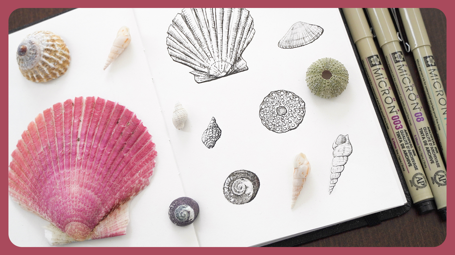
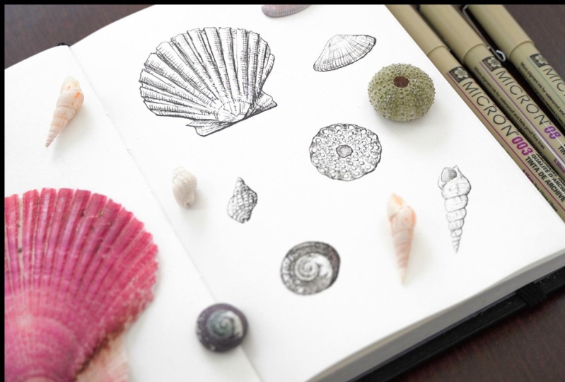
pencil for this one. I have some seashells
right here. This is what we are
going to be drawing. I'm going to share
pictures of these. You can find them in the resources just in case
you want to draw along, which I highly suggest. I'm going to place
them to the side. Be right back. Now that the
seashells have been placed, we can start now. I'm going to begin
with this one. For sketching, you want to find your metric shapes
in your objects. For example here we have some straight angles that
resemble an inverted triangle. We can start with that. It will be something
like this and then there's a
semicircle right here. Let's add that too. For this section, we can see a very straight line. Let's draw that. See how this way
of seeing really helps when translating your
object into a drawing? From here, we can start
adjusting details. Add these shapes which
are more organic. If you take a look
at this point, you can see that it
connects to the triangle, so go ahead and add that. Then we have this little curve. Now that we have
our basic shape, we can do some fixing. I see this angle is a bit wider, so I'm just going
to lower my line on both sides and add
these curvature. Blending it with a semicircle. We can then use our
[inaudible] eraser and clean things up so that we
don't get confused. That's our basic shape. Using that same principles, go ahead and sketch the
rest of the seashells. I think I'll go with this one. This is basically a cone. Start with that and
then add the details. Now I'm going to draw this one which resembles a circle. Add the spiral and that's it. Now let's make another
circle to draw this one and slowly
redefine your shapes. Then maybe, let's add this one. Notice a triangle once again on the curve at
the bottom and the top. You could also add some other directions of
the curve if you like. Now let's go with this shell, which we can also
start with a triangle. We can even add some
of the texture lines. I'm going to go back to our first seashell
and add some more details. Maybe this curve right here and some of
these other lines, this one being the
most prominent. We can summarize the number of lines really
but it has to be super exact. That's the beauty of
drawing organic subjects. Now, with our near the eraser, we're going to
form a little cone and use that point to
clean some things up. This is why I love
using this rubber. Doesn't leave any crumbs
and it's malleable.
10. Seeing values: This is a trick I want to share for the
beginners out there. It will help us quickly
look at values. Grab your phone and
open the camera app. Take a picture of the
object you want to draw. Then let's click our picture. Now click on edit. Slide through the icons until
you see the saturation one. Go ahead and reduce
it to the minimum. We can see the before and
after by tapping on our image. When you're happy with the
results, click on done. You can identify
values with ease. If you want to draw one of the reference images
I've included, just download them and
complete the saturation step. Let's get over to inking.
11. Inking: Cross Hatching: It's finally time to ink. Are you excited? We're going to begin
lining our shell. Let's start with this one. I'll be using the micron
pen in number 003. Let's begin with
the lightest area. As you can tell, because
of the highlights, light is coming through here, so let's start drawing
the lightest area. Now for the base, which light isn't hitting, I'm going to use the PN pen. For your strokes, you can make tiny ones
and eventually join them. Always use your
line in one swipe. I like to use both
methods, really. As you can see, I've only used two pens and we can already sense some diff. This is because of
the line weight. Our wider line will
symbolize shadows, while our finer line, like the one in here, will mean it's
being hit by light. This is super important
to keep in mind. Let's continue with our drawing. Grab number 003. We can start adding
some of the lines here. Follow the curvatures
of your object. Notice how I'm
pressing harder on the bottom and
lighter at the top. If you feel you made a mistake, like this one, just don't
worry and keep going. It won't be that noticeable
at the end, I promise. Remember, you can
follow along with regular pen and paper or D deli. I'm going to add some more
lines in between these. Let's go with the
lines on the side. Take a look at the natural
pattern this shell has. We can represent that by
adding some crosshatching , just like so. The same for these
other darker lines. See how now we have a
better sense of dimension. Just go over where you see fit. There's a speck of light
coming through here. The way we're going to represent that is by adding darker
values on the side. See how these new shadows now give us a sense
of lighting here. Now for these purple area, this seems like
the darkest value, so let's represent that by
darkening it a bit more. Now we have a more
complete drawing. I think we can benefit
from darkening the base, so I'm going to grab my PN pen and stipple
those shadows in. That's it with this one.
12. Inking: Stippling: Let's now draw this other one. I'll be using the PN pen. Since this is a small shell, we can maybe try the
stippling technique. Now that you can try it out in bigger drawings, but if I did, I may end up with a
four hours long class, and I'm not sure if
you guys want that. Okay. Let's begin with
the darker areas. For mine that is built
just by using dots. Focus on where the
darkest shadows are and notice all
the smaller details. Since this is the lightest part, we're going to keep
a lighter pressure. Mark the borders. It looks like I may be making these shells to be darker
than what they are. But really, sometimes
you just got to modify things so that they
translate better on paper. I'm going to add some of these
other details at the base. Now, grab number 03 for
the lightest areas. Keep on dotting, dotting and you
guessed it, dotting. See how this part has a texture that is
maybe comparable to, I don't know, corn. We're going to add
that, slow and steady. Trust me, details
make a difference. I feel like you guys can
really see what I'm doing. Let's change the camera angle. Now that's better. Let's now add these lines. Point D Zoom or stippling, however you want to call it, is really all about looking
at even the smallest details. Okay. Now we have some
other texture placed, we can go over with a PN pen
and mark the darkest areas. Notice how mainly focusing on the bottom part
of this texture. This is to add a sense
of shallow and depth. You can even add some random dots here and there just to add some texture. I think that's it.
13. Inking: Cross Hatching + Stippling: Now it's time to line
our biggest seashell. I'll be using the PN pen. Let's start with our base. We're doing this one with a combination of
crosshatching and stippling. As I go, I sometimes like to do some modifications
like this one. What I did was extend
the line a bit more. Notice how I'm pressing
more where shadows are and not so much in
the lightest parts. It's all about the
line weight remember. Think I can go
darker on the base. Now I'm making this end a bit pointy. Add some dots and
hatching here and there. It's important to look
closely at the shape. Apply a lighter pressure
wherever you need to. Take note on the
movement of my hand. It's like I'm drawing
on air and slowly approaching the paper with
the same light motion. This really helped
with a finer line. Now I'm going to
speed things up, but you get the idea. Focus on completing the
overall shape first. Add some dots and hatching wherever you see
shadows or darker values. Now, you can't really tell
from the reference image, but there were shadows
there when drawing from live so I just added them. You can also crosshatch
if it fits the form. Now I'm going to
complete these lines. Looks like I messed it
up with a darker line. But as I said, I'm just going to keep going and
hope for the best. Add some more texture to make
it seem part of the shell. See how these integrated
that other line. That's a simple way to fix this. You just add some more lines
to make it seem intentional. In other words,
own your mistake. Let's keep on hatching. Now that we've approached
the middle part, we can mainly add hatching on both sides used to
make that transition. Something like this. Let's add the rest
of the hatching now. Now that that's done, let's accentuate
some of the lines, use to make them
stand out a bit more. I'm holding my pen
at an angle for this one and adding some
more crosshatching as I go. Seashells are actually a
great subject to practice ink because it's not like they will have the
same patterns. They are so unique that
you can really explore with textures and if
you make a mistake, no one could tell
unless they have the reference image. That's it.
14. Inking: Scribbling: Now let's do this next shell with a scribbling technique. I'm using number 003. This is just making
a rotating motion. You can see how the lack of ink is actually great
for this technique. Since it's a bit
harder to control your pressure because of
the constant movement, just keep going round and
round, slow and steady. Layer your strokes to get deeper shades as you
approach the darker areas. Notice the details
and the values. Fill in all of the darker areas then darken the borders of
the shadows with a pin pen. You can mix it up
with a roller roll or maybe not because
it looks like the other one is pulling
a different hue. Let's try it up and do style A. This one has a plastic nib
that helps with finer strokes. At the end, I think I'm
sticking with number 003. Sometimes it's just a
matter of trial and error. I'm holding my pen upright so I can achieve
the darkest value. Pressing harder also helps. Don't forget to leave some space for the white
specks on the side. As you can tell, this technique is also
very time-consuming, at least when wanting to
achieve realistic results, but I think it's a nice one, even though I rarely use it because my hand just cramps
or the repeated motion. That looks okay. Sitting here, I really couldn't see the
left side of my shell, so I'm going to grab my
Sakura jelly rolling white and add those
specks scene. Let's go ahead and apply them. I like to draw them in. Now we have those highlights. I can tell I need to darken
this area a bit more. Add some more highlights
here and there, maybe some more shadows too. That's it. I really like the
final result on this one.
15. Inking: Combined: Let's continue with
our next shell. For those wondering, this is actually a
dried sea urchin. I think it's a good idea to mark the radial symmetry with pencil. Let's go back to our BN Pen, and add each one
of these circles. Mark the base darker and represent the lighter
areas with dots. You can wing it out. You have to be super exact. This is used to get a
sense of that texture. I don't know if you
noticed, but yes, I end up following
the pencil sketch. That's just how it
goes sometimes. Now let's mark the borders of our shape and add those smaller dots that can
be represented more freely. To get a sense of depth, I'm going to darken the center
by using crosshatching. I think what's missing is maybe some slight shadows at the
borders so let's add those. I'm using a hatching
technique for this part. Try to blend these
shells with our borders. Using our white gel pen, we're just going to add
some scattered dots. I think that one's done.
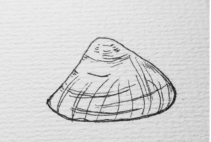
16. Inking: Hatching: Now for our final shell, we're going to use
guess hatching. I've sticked my shell
with some kneaded eraser, because you can sew
it in same place, so just ignore that
part of the shape. Using Number 003, start
lining the lightest areas. Then do the same with
the darker parts. This is so we can establish
our overall line weight. Now we have the base
of our drawing, we can go ahead and
do the hatching. Keep in mind that all lines should follow a same direction, but also the curvatures
of our object. I'm going to make this
area just a tad bit darker to give it
a sense of depth. You see how we can
create dimension just by using lines in
the same direction. I'm focusing on adding shadows
all over the right side, while also considering the
markings of this shell. I'll mark these lines where
the curves meet a bit more. See how important
line weight is. Finally, I'm adding some other linear
texture of that shell. You can barely see it on camera, but I think it
adds a nice touch. Makes it look like a vintage illustration,
don't you think? We're done. Finally, we're going to erase
our pencil marks, make sure that the ink is
fully dry for this step. This is super important to
avoid smudging our drawings. Take your kneaded eraser, form a ball and just
go over everything. That's it. What do you
think of these results?
17. Digital Cross Hatching: I wanted to share
the time-lapse of this drawing for all of
my brokerage students. Let's get to it. I start by drawing the
semicircle and use the liquefy tool to
adjust proportions. I then add the
details on the sides. Also, you know, I'm not using a reference image for this one. Once I clean it up I added
the lines of my shell. This is still my sketch, just a more detailed one. I then erase some of these lines so that
everything could fit better. When then mark where the
crosshatching might be. Because this one is an
illustration from my head, I like to have
everything mapped. Now that that's done, it's time to make
my actual drawing. I started aligning my shape, and now in some of
the line weight. For this step, I'm using
the perfect liner in round. I then need some hatching
where my darker areas are, and added some crosshatching to. To get more variation, I also added some small
dots here and there. The finer lines you
see here were made by using the same brush
but as an eraser. I'm trying not to
make my lines touch. I also added some random lines just to get a sense of texture. Then I added the darker shadows following the shape
of my object, and on a separate layer, just in case, I didn't
like the result. I really like this
draw variation. It's basically yes
doing your lines every charter and completing
them with a smaller line. Then I just fill
in the rest with hatching and added
some crosshatching, whatever I wanted to
deepen my shadows. When it comes to
the total hatching, the advantage here is
that you can zoom in. Now thing is, if you're a
perfectionist like I am, you might also get
lost in details. It's a good thing to remember
to take a step back. Then I just added some random
scrapes here and there. Remember to keep some
variation in your line. Since I wasn't happy
with the bottom area, I just erased it and try again. I think it ended up
being a good choice. Then I just added my last
bits of crosshatching. For my final result, I added a photo of a paper as my background and a squirt, just to add a little
something on the borders. That's it.
18. Fixing mistakes: When drawing digitally, layers allow us to
easily fix our mistakes. Unfortunately, that is not the case when it
comes to inking pens. But fear not because
I'm going to show you some
tricks to fix them. The first one, is just own it. Because remember how
when I was drawing this seashell this
seemed like a mistake. Well, I just add some more lines and combine
that with my drawing. At the end if you saw
the final result, you wouldn't even tell
there was even a mistake. Now, if it isn't salvageable, go grab your white pen, your knife blade, and a wood sanding paper. Let's say I want to
erase this line. The first thing you
have to realize, is the thickness of your paper, if it's really thin, then I would advise
you to either own that mistake or use the white
gel pen to paint over it. There are other materials you
can use such as white ink. Unfortunately, I don't have it, so I'm just going to list it in the description in case
you're interested. You will use painting
over though. If your paper is on
the thicker side, then you're in luck. First things first, wait for your drawing to fully
dry and I mean it. If it isn't dry, you can make things even worst. I would at least give it half
an hour, just to be sure. Grab your knife
blade and slowly and gently begin
scraping your paper. I like to use this
knife blade as opposed to others because
of their rounder tip. It just helps us being gentler. Take your time. You don't
want to rush things. I like to clean my blade
every now and then. Maybe just you some
tissue paper for that. One thing to note is to
switch in-between directions. I just find this to
be more effective. This erasing method works
because we're extracting the first layers of our
paper that contain ink. You don't want to
scrape too much though or you could
end up with a hole. No one wants that. It's a good idea
to grab a brush, use to swipe away all
of the paper crumbs. Don't use your hands because the oil in them could
mess up with ink. If your paper was
left a bit uneven, here's when our sanding
paper comes to place. Fold it like so, to create a finer tip. Slowly go over your correction. I like to going in
a circular motion. The number of the grid
is super important. This is a 220, which is the finest
one I could find. I also shows a
wood sanding paper just because of the color. I feel like if you use
one of the black ones, the color could potentially
transfer to the paper. That's one thing
to keep in mind. The reality is that your paper will never
be the same as it was. But if it's just a tiny spot
that you need to correct, then you won't even tell when
seeing the whole drawing. When going over
with your ink pen, I advise you to use one that
doesn't have much inflow. This is super important because notice what
happens if you don't. See we've built that first layer the ink is prone
to smear all over. But if we use a pen
that's low in ink, notice how this
isn't a big issue. Another thing is that you can also use the sanding
paper on its own. This one is actually my
preferred method of choice. I just feel like even though you end up scraping a wider area, it just seems more
gentle with the paper. But at the end is your choice
which one you want to use. That's all for fixing mistakes. Hopefully you found
that helpful.
19. Congratulations!: Congratulations, you've made
it to the end of the class. So which chain technique ended
up being your favorite one? I think mine is stippling
and crosshatching. If you enjoyed this class, don't forget to follow me
here and leave a review. Your support is
always appreciated. I would also love to see what
you guys create so if you happen to fill in the worksheet or do an illustration
of your own, please share it in
the class project. You know, I love seeing those. Plus you'll also get
personalized feedback. It's a win-win situation. If you like the detail
brushes we've used, they come from my
Pointillism brush set. Make sure to check
it out if you want. I created this one to achieve a stippling look in a
more timely manner. It also has a couple of
half-tones plus a video tutorial. The link will be in
the description box. Before I leave, I have
a surprise for you. I'm giving away a full year of Skillshare membership
to a lucky student. All you have to do to
participate is just post a class project
and leave a review. You can also get an
additional entry if you follow me
on my Instagram. Just make sure to send me a DM so that I know
that you are in. So go ahead and
post your projects. Contest ends on December 15th. See you in my next class.
 María Fe K., Artist | @MFK_draws