Transcripts
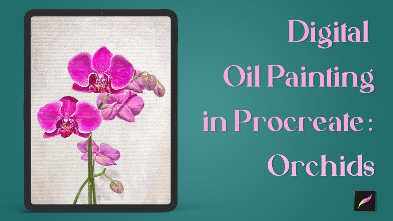
1. Intro: Hi there. Welcome to this detail
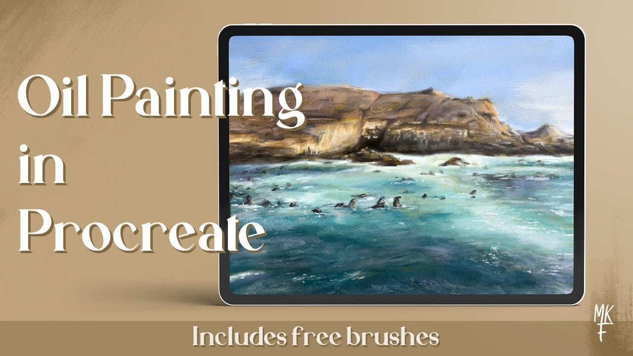
Oil Painting Class. I might have fake an artist
with over a decade of experience in both legal
and Traditional Mediums. In today's lesson, I'm
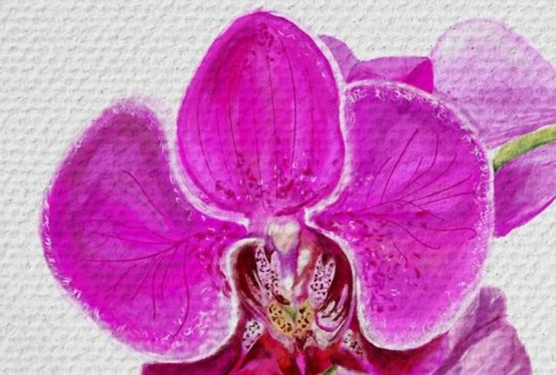
delighted to share with you how to create these
beautiful Orchid painting. I'll walk you through that
preparation of your Canvas. That sketch plane down the
base colors in detail. And of course, how to achieve
the Oil Painting effect. For this class,
you'll need an iPad, the Procreate app, and
then Apple Pencil. Apart from those own materials for this class, are included, such as some of my
custom Oil Painting brushes for my own
set and Album. We several Orchid photos. And again to let canvas effect. This class is same. At intermediate levels are some basic drawing and color
theory skills are required. But I do really encourage
everyone to join us. You'll be surprised of how doable this Oil
Painting effect is. So with that being said, let's go and start our painting.
2. Creating a Canvas: Hi everyone and
welcome to this class. Today we're going
to start painting some Orchids in a Digital
Oil Painting style. Already created a canvas
with these measurements. But if you want to
create one yourself, Here's how you can do it. Press on this plus
icon and then on here. So the measurements I chose
for mine are 44, 30 by 6,000. So let's go back to proceed. That icon in here. Insert the measurements, which by the way, there in pixels. And you can change that in here. As far as the DPI, we're
going to go with 300. And you can also name
your canvas in here. Since I had already
made my canvas, I'm just going to go back to my gallery and select that one.
3. Downloads: Okay, so now for the
class materials, they can be found under this
class in the Resources tab, simply click on the
filename and then you should be able to
find them under downloads in the file app. This is how my app looks like. So for this class, I've included a photo album with lots of Orchid
photos I took. So you can't really choose
the one that you like best. I'm going to choose this one, which is called the
main reference. So make sure to save that one if you want to follow along. If you really want to
dive into details, you can use this one too. You can really see of these gutters and
spots from up-close. So now you're going
to want to save the images you'll be using
by clicking on this icon. Click on Save Image, and they will be
stored in your camera. Roll. Repeat the same steps
for the rest of them. Now, let's go back to Procreate. Now we're back. Let's add our image
as a Reference. Click on the tool icon. Under Canvas, toggle
the reference option. Now click on image and importing yours from
the camera roll. Now we can see our image in app alongside with our canvas. Move it around, or resize
your image like so. So go ahead and rearrange your
workspace to your liking. Now let's go back to the file SAP to
import our brush set. Find the file, which is this
one that ends in brush set. And yes, click on it. Procreate should
have been write-up. Now you should be
able to see us it at the top of your
brush library, like so
4. 04 Sketching: Let's now start with our sketch. I'm going to be using
that texture Oil brush. Make sure you have
a blank layer. We can start off by marking this stem that translates
to a straight line. So now for the flowers, I'm going to quickly place
them as ovals like so. I can see where to
place each one of them. And let's add another
one right here. Then we have this curved
stem for which we'll follow these movement. Just like so. Now for the flowers
in the background. So we have one here. And don't forget
these other stem. Let's add this. But unless continue
with a flowers, buds on the background. So as you can see, I now have a general
idea of where to place each item just by
using ovals and lines. This way, It's also much easier to Greg the
placement of things. So go ahead and give it a try. Once you're happy with how
everything looks like, we can start and
add some details. Let's begin with the pedals. Notice the general
shapes like in here, which kinda looks
like a teardrop. Mark the center. We can actually use the shape of our
overall for this one, you still mark the
edge of our petal. Now it's all starting
to date shape. Since we are going to
color everything in. Yes, Mark the general shapes. Don't worry too much
about the details. Now, it's finally time to
add our coloring layer
5. Creating a Palette: Let's now add our
coloring layer. And then click on
the color circle, because I'm going to
show you how to create a palette using your
reference image. Start by clicking
this plus icon, which can be found under
the palette section. We're going to go
with new firm photos. Select the photo
you're working on. Scroll upwards and you should
now see your new palette
6. Base Colors Pt.1: I'm going to start by
coloring the petals, sunlight tissues,
one of these pinks. I think this one will be fine. So make sure that you're on a new layer and then increase the brush
size to your liking. So I think I'm gonna go with a paint streak brush
for this part. Start by lining the pedals
and then color everything in. This is where you can start
to refine some of the shapes. Now that we're approaching
the darker areas, Let's go unchanged colors. This will also help us to create the separation
in-between these petals. Let's go with this one. And I'll place it wherever
I see that darkest shadows. At this step. I'll try
not to get lost into too much detail as we were
just placing our base colors. So let's say we wanted to go
back to the seller color, but RNA, remember
which one was it? We can either select
it from the history or lump breast on our Canvas to activate
the color picker. Now, Yes, drag it around to select the color you
want to choose from. An LDS, keep adding more of these lighter pink in
the lighter areas. One deep foreseen
the base Colors of an area is squinting your eyes
and focusing on that spot. You can also try and look at your reference image from afar. That will help to. I think that one might
be done for now. Now for the next one. Something I haven't
mentioned yet is a, you can also color drop Lysol, unadjusted dress whole by
drawing your pen site-to-site. Here, I'm going to use a medium pink to bring
this pedal to the back. And really fine
some of the shapes. Now I'm going to add the
rest of the shallows. Things are now starting to
take shape, don't you think? So before we go any further, I want to turn my background. I'm going to pick that color
from my image and place it in a new layer
right below my sketch. Drag that color to
fill the whole page. And that's it. Now let's add a new layer and start placing
the color of our stamps. So as I said, you can be the color from the image or choose
one from the Palette. Actually, I think
these might work rate. And let's play this layer
on the tobacco for flowers. On the same goes for this step. I'm going to paint
the darker areas first and then add
some lighter hues. Time to change colors
to a lighter one. Let's go with this one. I'm going to place it
here, for example. Now for an even lighter shade, that one seems a bit too
light for that area. So I'm just going to slowly
drag it down to a darker hue. This way, we've created dimension with basically,
yes, three colors. Darker, one for the
shallows, a meeting, one for the median tones, and a lighter one for
the brightest areas. This trigger rule is great for quickly laying down the base
colors of our painting. Now I'm going to go
with this color. Let's continue with our petals. I think that color
might be too light. So I'm just going
to go to my desk and drag it to a more
desaturated version. That way, you'll get a
sense of death because colors that have more saturation tend to pop more to the front, as opposed to the
saturated colors that blend better
with a background. So it's okay if you go over the stem because we
can fix that later on. To use our eraser with the
same brush we were using, simply lung, prostate, and it
will automatically change. Now we can use it to erase a part that went over the stem. An earthquake for nailing the shapes is guy in yourself
with a blank spaces. Like I can tell that here, I might have to go
wider on that pedal. So focus on those flank
areas and look at the forms. I'll Y then this part to me is going to
pick that color up. At those bits. Change your brush
size as needed. Now I'm going to choose this lighter pink for
the lighter values. And as I said before, you can create the shapes
as you go. Liking here. That's the my IQ of
the Dell Painting. So again, just be the
color and refined shapes. So for this part, we're going to use
a lighter pink. So let's pick one of these. Actually that might
be too light. So let's just drag our color
to a darker one on the disk, or start by picking
a different one, Andrei to a lighter shade. So let's take a
look at this shape. You can practice your stroke by moving your pen in the year. And yes, repeat that same
movement on your actual Canvas. I'm going to add that
with more in here. And it's important to
look at our Painting from afar every once in awhile. I'm going to keep that in
the shapes of these petals. Do the outline, and
drag that color. Then we're going to bury my colors for the flowers
in the background, for more desaturated ones used to make those to
really bump into Front
7. Correcting mistakes: Actually, now I'm looking
at these from afar. I can see that I'm missing
some space right here. So I'm going to show
you how to fix that. First, select your layers
by doing this motion. And then pressing here. You will now be able to
resize the whole thing, sunlight to make
it a bit smaller. It's important that you
select this uniform option. Your drawing doesn't get
distorted when resizing it. I think that looks a
bit more accurate. Now we have more space. I'm going to select
my sketch layer and correct those areas.
8. Base colors Pt.2: Now we've fixed our composition. Let's complete our butts. I'm going to use the same color. So let's start with the
outline and color drop it. Now repeat that same steps. Remember to keep each
element on their own layer. One way to make it
less confusing. Every naming your
layers like so. And I meant to say stem. I don't know why I wrote binds, so just ignore them. Here to my keyword
was just in Spanish. So sorry about that. But you get the idea. Yes, label layers as you will. So something I haven't mentioned
yet is to make sure you fully close every inch of your outline before
color dropping. Because if you don't,
the color will spill and sometimes it won't be faced
by adjusting the dress hold. Us have to go back, go over any blank spaces in
your outline, and try again. Let's now add some darker hues. And I'll keep, are we
finding shapes as I go? Really? I'll just continue with those same steps for the
rest of the painting. Another thing is that
you can also activate the color picker by clicking
on this blank square. I'll redefine some of
the highlights now. I'm going to insert
already shown right here, used to add that pop of color. Now that that's done, let's clean this part. Let's add these
shadows I was missing. So let's go ahead and grab a medium tone and
just paint that on. Channels like these will really help give a sense of realism. And F, I'm going to use that same color to add some
darker areas on this flower. I'm also missing the stem
that holds stays flower. Let's add that one
on its own layer. And silly me forgot
to erase the part of the flower so that I
can see when I'm painting. So let's go to our flower layer. Really easy opacity
with this slider. I knew race, who
are the stem goals. And now we can get
everything back to normal. Again, I'll use keep on picking colors I already
used for my Canvas. Correct. And filling the
areas that needed. Now let's see your
Painting from afar. Since we already have most
of her Painting plans out, we can go ahead and deactivate. Our sketch layer. Looks much cleaner right? Now let's go ahead and do
the Oil Painting effect.
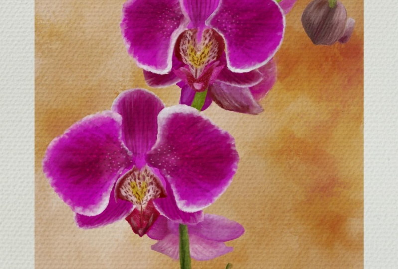
9. Canvas effect: Now let's do an
essential part of the delta Oil Painting,
the canvas effect. Let's go to our files app and
click on these paper image. As you can see, this photo has a high texture which will blend seamlessly
with our Painting, making it look just
like if it was painted on top of this Canvas. You'll see, go ahead and save the image
to your camera roll. Now let's go back to Procreate. Click on the tool icon, and then click on Add, then on Insert a photo and
choose the paper image. In here, we can
adjust the placement. So make sure you have the
uniform option setup, right? They, they image to 45 degrees and click on Fit to Canvas. And then with a
free form option, expanded sites until it
fits the whole Canvas. Now let's go through our
layers and duplicate that one. The activated. And let's click on
the N. For this one, we want to find that
multiply effect. So you scroll upwards and then reduce the
opacity to your liking. So now for the other paper
image, do their thing. But for this one, apply
the overlay effect. As you can see, this
effect will brighten your canvas while the
other dark and seed. You can play around
with a layer order. It's up to you,
whatever you choose. The thing goes for
the opacity amount. This is just what works for me. It will somethings vary
depending on the artwork. If we zoom in, we can see this gorgeous canvas effect that really adds that painterly
quality to our artwork. Don't you think? Now it looks like we're
ready to add the details
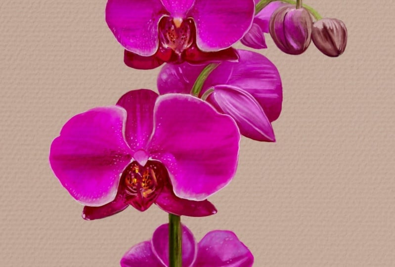
10. Broad Orchid Details: Now I'm going to paint this
flower along with you, so you can see the whole
old painting process. Let's start by going into our layers and select
the flower one. For a rush. We're going
to use that Textured Oil. I'm going to zoom in on my reference so that we can
really see the details, especially this part that
we haven't quite defined. Okay, So let's place
this yellow part, unlike the sample that color. So if we draw a straight line, you can see that it is kind of in the middle of this point. So I'm going to use that as a
guide and place our yellow. I really love this brush as it helps planned everything nicely. So at this point, something we can tweak to is the opacity of fur
texture images. I think I'm going to
decrease the opacity a bit, as in 1D effect
to be too strong. This is totally
up to you though. With that said, Let's
take a look from afar. And I like what I'm seeing. So let's leave it like that. Now let's go back to
completing our Orchid. I'm going to reshape
this petal right here. Yes, trim it down a bit. But first, the main
might say mistakes and make sure that you're
in the correct layer. So now let's erase this
area that these darker hue. So this is why I
love this brush. It really helps give such
a natural Painting effect. And words refresher. Since D, D. Now we can go ahead and add
a wider variety of colors. As you can see, we have a really intense
bright pink in here. So let's try this one. The crystal size a bit. And then maybe too
close to her base. So let's try another color that's more like what
I've been looking for. I'm just going to add
this bright pink wherever I see those more
saturated areas. Colors vary in appearance depending on which other
color there next to. So it's important to make small swatches to see
if that one will work. Now I'll add one that's
closer to our Base. Now one will really
help with a blending. See how the colors
get mixed nicely. For the shadows. I'll use dark in that color. We're going to start
with this area. With this brush.
The more you tap, the more sharps
the color will be. That's why I'm lifting
my pen in-between strokes on the darker areas. These are the shallows
we're trying to achieve. It's important to take a
closer look at their shape. And I think we can
even go darker. So let's drag that
color a bit more. Now let's increase our brush
size to add these lines. So again, I'm lifting my pen and tapping again in the
areas I one more color. It's a very subtle brush, but the worst wonders for
our Realistic stroke. Let's also add these
brighter pink through here. Use a finer tip to achieve
more of that linear texture. This rash really helps, not worrying too much. I will using colors that blend. He just worked with
what's already there. Now for this darker area, Let's use this color wheel
ray half on her palette. And just added here. We can sue mean if we want, we get a closer look. Not some work through here. Now for this male part, Let's go with red. And yes, blended in
with the existing peak. Like so. It's important for this
Oil Painting effect that we get rid of
these hard edges. Which to me just makes
everything look to the tail. And we can use that same
pastel red for this. I'm now going to use our Base pink to blend
everything a bit more. Now we can add some of
these texture right here, which kind of looks like Banes. That color looks a bit too red. So let's change it for
a more purple one. Now that some bright pink too. Yeah, that works. Now that that's done, let's go back to this area. I'll start by erasing
this blank space. So let's put it through here. You've got, I got yourself with what's already on your canvas. And I'm going to
redefine this curve. If you use your imagination, this area looks like a heart. So let's follow that shape. This is a trick I
can solely use in my shapes that resembled
my subject to help me place everything together and blend these hard edges. Just by grabbing colors I
already have on my Canvas. Let's add these
triangular shapes now. Menial area looks
a bit more purple. So let's correct that. I'm using my palette to
guide myself where to start. From there. I just triggered a color a bit. Try it on. And if it
isn't quite right, I'll just change it until
I find one I'm happy with. I'm not gonna lie. Painting in the
style takes time, especially if you're
Fund in reality Zoom. But it will all be worth
it in the end I Burmese. So now I'll add these inner folds as well as some details. Here. I'm lifting my pencil
and dabbing, dabbing. The paint doesn't blend and
I get a more intense result. And I'll do the same
on the other side. Now, we have adjusted
that shallow. I can tell that the petal, my needs some searching. So I'll sample that color and
also lightened eat of it. Now I'll just expand
this side of the petal. Let's put those highlights back. It's all started to look more
painterly. Don't you think? Let's add these highlights. Unmarked the
surrounding channels. By the way, let me know
if you've referred to see everything in real
time like this or not. I know places
shallow right here. And again, I'll yes. Stepped up to up more paint
and drag my pencil to blend If you look closely, there's a more saturated
pink going on in here. So let's change to that color. And let's accentuate those
highlights a bit more. We went to send this part
of the barrel to Lubbock. Add a more desaturated pink. Just like in the photo. You can also use this
circular motion to blend whatever
works best for you. Really focus on getting
rid of these sharp edges. I really like how everything
is starting to look. The texture. Yes, that's richness to the Painting than
you think. None. Let's complete this bottom area. I'm going to start by
placing that bright red. Let's start with a small brush. And dry are color. That one seems okay. So I'll just stick
to it for now. And now I'll use a darker shade to contour that bright red. We just placed somewhere detail wherever I
see that same color. And I'm missing this white part. So let's stop that up to put more Gardner and lightly drag to blend. Now let's go back on
completing that yellow area. And if I mess up
my color choice, either really erase it, I prefer to just put
another color on top. That's what happens when
painting with real Oil Painting. So anyways, I think that
colors end up blending together and that just adds
to create a richer variety. Now let's define this
little curve right here. At this bright highlight. And now you sees that
same color for this area. If I mess up, I just sample this other color and
use it like an eraser. Now I'll add a
more saturated red in here just to make things pop. And then even brighter
red for this part. Bury your brush
size to make things easier depending on the
area you're working with. Now, I think I'll go I'm
brighten up that yellow. That looks better. Let's darken that B2. Let's really find this, but let's also add some
more highlights. If we zoom out, we can tell that things are starting to
look more realistic. Well, if we take a closer look, we still have that
painterly quality. Every once in awhile, I'd like to stop and take a little break just to
have a first look when I come back and that way a rapidly notice what
needs to be changed. This is how I realized
that this petal is at that bigger sunlight
to modify that. And I'll just use that base
color to extend that area. And of course, Let's
add those shadows back. I'm blend those edges. Again. I like to zoom out to get a
better overlook. And I'm missing some
white drew here. Change your brush
size as needed. Let's not forget to blend. I'm also going to
blend this edge because right now it
just looks too harsh. I'll add some of the
finishing dashes, like this part, which
is more reddish. And finally, let's blend
this side a bit more. And that's it for this part. Let's now go on
at summer Details
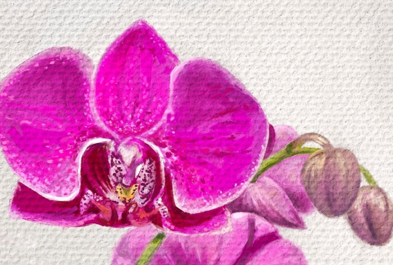
11. Finer Orchid Details: Now for the details, basically, we're now going to focus on adding
all of these dots. For this part, I'm going to
be using the row Oil brush. Now, I recommend
adding a layer on top. Yes, all have colors
don't blend together and the details pop a bit more. So let's begin with this part. And as I said, I'm using the rural Oil brush. I'm starting with a
lower opacity underbrush on the thinner side. Let's begin with some white. I recommend to try out your brush and see what
needs to be modified. Now I'm slowly going to
build all of these textures. So I'm not going to paint every single detail exactly
SIC it because we wanted our, our word to have some soul
and be unique in its own way. So even though I'm
following a general idea, I also try and make it my own. This is why I like
working in another layer. If you missed up,
you can just erase. Without worries. You can always go
back in-between layers if there's something
you need to change. I'm just going to
briefly speed things up because I was having a
tough time blend in this part. All because I just didn't realize I wasn't in
the correct layer. So always check yours. Now for this area, I'm going to leave
my pen tool and tap multiple times to
create these dots. Did is degree their gradient. So we're going to
concentrate them more on the edge and
disperse them as we go and bury the shades so
that it looks more natural. Let's also add
them on this edge. I'm going to change
my color because that one is barely noticeable. Cl tapping makes for an
interesting texture. And I'll use that same effect for accentuating the highlights. Were these see opacity for
a more seamless blend. And if you're big on blending, you can also use this icon to long press it to change
to your current brush. With this tool, we can
soften some of our marks. And I'll keep on tapping and
tapping where I need to. This brush has
pressure sensitivity, which in this case means
that if you press harder, you'll get a bigger stroke. While if you press lighter, you'll get a smaller one. So use that to your advantage. Let's change our color. Now let's add these darker dots. I'm going to increase
the opacity for those. Perfect. That was the
result I was looking for. I think we can make you do with a lighter color and the
background for this part. That way, will this have
to add that darker dots? So let's go back to
the flower layer. And I'm using that same brush. I'm just going to play
some white strokes like so And a darker pink
here for the shadows. Now let's go back to the detail layer and
select that darker color. Perfect thing. We can even go a bit darker. It's much easier to paint
these dots like this rather than if we were to paint the background
around them. So remember, always work
smarter, not harder. Let's just keep on dotting. I love to see how everything
is slowly coming to life. See you've seen that wider
base made things much easier. I really think that in this many details just
makes a difference. Or this part, we're going to go lighter and even lighter now, to emphasize that
gradient effect, we can reduce the opacity
and increase the size a bit. I'm gonna go faster now, but you get the general idea. And we're slowly as she
mean that gradient. Erase any mistakes
along the way. Let's go over those whites
to really make them pop. Let's now add some software
dots through here. At this many as you like. But remember to keep
changing colors. It'll look too
monotonous otherwise. And also change your opacity
is in-between if needed. Now for this color, follow those lines right here. Let's redefine this shape. We're almost done. So keep hanging on. And we're done with this one. Did you like the results?
12. Bonus Layer Tip: Now for bonus tip, there's something
I like to do with a details that I
like to show you. Keep in mind, it sometimes works better than others
depending on your painting. But I'll show you anyways. Yes, so that you have
it as a Reference. Drag the detail layer on
top of one of the textures. See how everything just
pop right to the front. As opposed to this. Let's see that again. This is a quick tip
you can apply to make the details look more like if
they were up in the front. You can even try to put
that layer right on top so that no texture
goes through there. And therefore, we create the
illusion of Thicker paint. So just try it out and decide if you like
this effect or not. If you do decide them
which order to keep it. I think I'm leaving mine on top. Okay. I've made up my mind. I'm going to put it on top. And now we're finally
done with this Orchid. I'll show you how
we make that Buds
13. Painting Buds: So now for our butts, Let's go back to
our flower layer and add somewhere corners. You can either use
the color picker or I think I'm going to use
this one from Mark bullet. And I'm going to go back and
use that texture Oil brush. Change the brush size as needed. Let's start with the stroke. You want to really
define those shapes. And I can see a blurry
part right here. So I'm going to try
and mimic that. I'll use a blending brush. Books that might
be a week-to-week. So let's use a smaller brush. And maybe you see
eraser to analyse. Keep on blending. Let's redefine our shapes. I know we can go
with a darker color. I'm gonna tweak my
opacity and brush size. I'm going for a more
transfer in purple. Kind of like how we will do
glazing on an Oil Painting. And let's put some
more true here. Check from afar. We can even go a
bit darker here. Now let's add the highlights. Not convinced by this color, so let's change it. But first, I'll redefine
this bottom Area. Am play some of
these other lines. The correct my shapes as I go. Just like in New York, eat slowly, keep on adding more details. Pick the color to fill
in those missing areas. We can place some
are lighter colors. Now, let's add those highlights. Thing we can even
go a bit lighter. Just mark where ever you
see the lighter areas. I'm happy we have
this is looking. But I think I'm
missing some pink. So I'll just choose
this bright pink. The Christi of basicity. An app like, kind of
like a wash of color, just like we did
before with a purple. Think that looks better now Let's place some of those
darker purples again and gradually increase
a bit of the opacity. Let's take a look from afar. And I'm not convinced
by this border. So blend the edges a bit more and add some more of these
green in its own layer. Looks alright. And I'm going to emphasize those
highlights a bit more. And let's change to the row Oil brush and erase
those previous strokes. That looks better. So if you feel stuck
at some point, try and change brushes
because that might help. Let's also add some
dimension to this stem. And use some darker
colors at the bottom. Just to add that sense of deaf. I'll do the same in
this green area. I'll add a darker green one that blends in-between. Also mean to get a better look. And you can also undo by tapping on your screen
with two fingers. I just realized I painted this
stem in the flower layer. So click here. And let's fix that by using their freehand option
in the selection tool. Here, you just outlined your stem and close your selection by
tapping on the white. Just like that. Then
drag three fingers down your screen and select
that cut and paste option. Now you should see that
on a separate layer. So just drag it to
wherever it should be and merger layers together. And that's it. That way, we're still going to keep
everything organized
14. Middle Back Orchid: Okay, so now we're
going to go through the next segment a bit faster. Since we already went
through the basics. I'll start by checking that
we're in the correct layer. Choose one of the color from the Palette and
modify if needed. Dry your brush. And I'm going to change
mine to the Textured Oil. Start by marking the shallows and then create separation
through the highlights. I'm going to blend this
area with her Base Color by slowly going from my
lighter to the medium pink. And continue with a
flower in the background. Modify my shapes as I go. Let's continue to work
on those shadows, slowly building them up. Once we're happy
with the results, we can add the medium
hues that will help us integrate
everything better. I really love using
this brush for this, it blends seamlessly. I'm also going to add
some of these Details. And let's go with a
brighter pink while also lowering my opacity used to
add a bit of saturation. Let's the bend some
of these channels. I'm going to add a new layer
for this part of the stem, because her flower layer
is currently Blocking it at some more
darker channels here. And extend that show on the green stem while also
marking some of the edges. Good thing about being in a complete different Layer
is that we want effect our flowers while also create more of a
separation for the stem. Time to take a break and
look at things from afar. Okay, so I'm going to change
my brush to the blender one, which is colorless and blend
the edges of my flower. This will help tie
everything together. Now let's continue
with the petals. Let's try the row Oil brush. Check that we're on
the flower layer. And I'm not fully convinced. So I'm just going to use the texture Oil which blends
better in my opinion. Let's widen that projected
shallow and darken the rest at some of the lighter lines here. And I'm going to do
everything on a new layer to create separation enough
Thicker paint illusion. Really work on those details
and refined the shallows. Now for the highlights, see how having this on a separate layer mesa paint look like it fits on
top of the canvas. Now I'm gonna give a
wash of color with a more vibrant Q and
a lower opacity. Just like a glaze Oil Painting. Let's see how that
look from afar. And I'm happy with the outcome. I'm just going to add some of those linear textures
on the petals. I'll use the blender brush to
soften some of those edges. And then go back to
the texture Oil. Let's take a look from afar
and keep working on her stem. I'm gonna go to the
latest stem layer we created and paint there. Let's widen this part. And now I'm going to drag my stem layer below
the flower one. Click on a flower layer, I'll reduce its opacity. Now I can erase where
my stem should be. The flower layer won't cover it. With that done, go back to the flower layer and get
the opacity back to 100. Let's erase here and there. And now I'm going to merge that stem layer will remain one. Go back to my flower
layer and use the blending tool to smudge some of the edges we just raised. And I'm gonna do the
same in this area. Erase and blend. Correct some of my colors. An array somewhere stem, as well as blending the edges. Now I'm going to
change the color of these Area to a warmer pink. Let's deepen the shadows
who run into stem. And let's head over
to that top area.
15. Top Back Orchid: Looking at this from afar, I can see that those
highlights when my Buds could be lighter. So let's go ahead and do that. This place them on our Detail
layer on top of our canvas. I'm sticking with
a texture brush. Let's also redefine this edge. Now, let's focus on the
shape of this other flower. This pedal needs to be reshaped. So let's go to its layer
and erase some of it. As I said before, in this step, I focus on the blank spaces
to map out my shapes. I'm gonna clean this part by cutting it out with
the selection tool, selected directory fingers
down and click on cut. Let's they know this
term. And this one too. Okay, so now let's work on
that flower in the background. I'm going to start by
placing my shelves. As you can tell, I'm going
for a more desaturated color. This is to create separation from the flower on the front. Then I'll add these
tiny bit of petal. I'm blend this one
with a background. I'm going to use a lighter pink to define the rest
of the petals. And at some orange with a lower opacity to
create some worms. Blend some of those edges. And that's some of
that linear texture. Let's go over some
of the highlights. And that might be
a bit too harsh. So I'm going to do some
blending on the detail layer. This continued to work
on the flower layer. I'm gonna deepen my shadows and do some smudging. Perfect. I'm also going to blend those linear
highlights a bit more. Remember to always
take a look from afar, at least every once in awhile. We're almost done with this one. I'm going to darken the
bottom of this Tim. Unmodified that top area. Finally, let's darken the flower to bring this stem to the front. I'm using the color
picker for easier access. Let's take a look from afar. And there are some minor
things I like to change, like expanding this
petal right here, accentuating this highlight
and darkening the speed. And that's it for this one.
16. Bottom Area: For the lower part
of our canvas, Let's begin reorganizing
our workspace. I'm going to start
painting the stem. I'll erase part of the flower
that is covering my stem. For a clearer view, Let's reduce the opacity of the layer and I'll change
my brush to the row Oil. Click on a flower layer and
erase all overlapping areas. I'm going to work on my stem. Let's widen this part
and add these meetings stem and add darker color
to create a shallow. Alice blend some of those edges. If you look up close, we're missing a turquoise hue. So let's add it
with a low opacity. Now, let's add that highlight. I complete the rest of our stem. Create a difference in color
in between these two stems. Let's extend this other one. Now let's put the flower
opacity to the max. And let's move on to our flower. Using that texture old
brush as an eraser, I'm going to rise slightly
reshape my petal. I'll also change my color because the one I
use looks a bit too pale and fixed
my shapes as I go. I'll change my pink color for this other petal and
erase this remains. Let's continue to give
shape to each petal. And as I said before, I'm using other things he
might canvas to guide myself. For example, this petal right here is too big in
relation to the stem. We're going to fix that. And this one too. For bigger areas, I used to erase with
the selection tool. It truly is a time-saver. I'll give my canvas
another over a look. I'll continue with this stem using the eraser
to carve out this. But I also love using the selection tool
to move things around. Like so. I'll erase
this area as much the edges and place my highlights and smudge once again to really achieve
that painterly effect. I like blending things
in the back a bit more. This gives a wider
sense of death. Some more highlights
through here. Some turquoise. And let's add these shallow. I'll clear this part of
my layer, reshape this, but I redraw this area to that size, looks better. Now I can go ahead
with a details. I'll start with this highlights. I'll add some of
those pinkish use. I'm back to the
highlights. Here. We have some green
reflecting from the stem. So let's add that. It's okay to try
different colors until you find the
one that works best. This will help you
get a better feel of the Colors and eventually
pick them out more easily at some
blending on the edges. And you can also experiment
with different brushes. Now I'm going to add
those curved lines. It's all finally
coming together. And then on the detail layer, which is the one on
dopamine canvas E mesh. Other Martha highlights with a lighter color for a
more painterly look. This really gives a
Thicker paint illusion. How Theano this stem and
add the missing Shao. Finally, I'll blend this edge
17. Bottom Orchid: Now let's work on
this other flower. I'll go to my flower layer and
start placing the shelves. I'll change my brush to the texture Oil to
blend while coloring. See how everything just
blends together more nicely. I'll try to place
the color I'm using in all areas that
seemed close enough. Plus this one could really
use some more warmer hues. Also cut this pedal down so that it doesn't clash
with the other flower. And blend this area
with a lighter color. Now place some of
those Byron tones, slowly building them up. I'll then gradually add some more darker tones
and make some areas more vibrant to I'm going to mark
a better separation between these two petals and add this missing
part of the stem. Always remember to change
to the correct layer. Everything is starting
to come together. Let's start in this area a bit more here to see how that helps bring
the stem to the back. Let's do some blending. And that's it for this part. Now let's go back to
Painting this flower. I'm going to work on
those darker areas. She's a size of your brush according to the area
you're working on. And let's add these lines. In, densify the
pinks here under. And let's add some orange to create a stronger separation between the petals and stem. And that's it for this one.
18. Middle Front Base: Now I'm going to work
on this other flower. Let's start by shortening
this pedal of it. Here too. I'm going to guide myself
from that reference image. Now let's erase those remnants
with the selection tool. Drag three fingers down, cut, and we're done. Let's now reshape their
risks with the eraser. Unfeeling those missing areas. I'm gonna use a pale pink
to blend the edges of the petals and then change
to a darker pink if needed. Color picking really helps to situate ourselves
on the color wheel. We can use the place to have
an idea of where to move our color upwards for a lighter tone or downwards
for a darker one. Let's continue to work
on those borders. Keep in mind, I'm
just using a lighter being to blend, not the blender. Correct. Any mistakes along the way with the help of
the color picker? Let's deepen this shallow, slightly changed this tone. Now I'm going to add
this bright magenta. Let's lighten these areas too. I feel like this really
makes a difference than you. I'm gonna add more
of a shallow through here. And here swell. Extend this pedal I with more uncorrect my
shapes as I go. This white area is
more like a triangle. Selects fix that. The brain, these shelves at this highlight, blend and move this
shell to the side. Now let's add the yellow center and dark and its surroundings. Let's add this curvature. Covert this blank space. Cut this area, and add
these spiky shapes. As well as this shell. Looks like we're ready to
start with a finer details.
19. Middle Front Details: Let's begin extending this area. Ambler the outline
with a lighter pink. Just like so. If you're willing
to really, some, do not forget those
tiny details. Now I'm going to really find these meal Area and add this channel as
well as these lines. Then I'll use the blender
brush to soften them a bit. I'll go back to the texture Oil, pick a color and add all those lighter areas
where the sun hits. Let's also, and can some of those corners when we see
more of a contrast here. So let's deepen this shell. This petal has more
of a diagonal full, some going to change that
Using the color picker. Let's extend that tiny highlight to Netscape bad in those lines. Sometimes it helps adding
detail from a distance. You still see the aurora
colors a bit better. So that's what I'm doing here. Let's add this shallow to. Now. Let's see now this white area. Amply so more intense colors
here reshaped the center. I know that these white
areas on both sides, we those in place, I can see that these bright area needs to be moved to the side. That's better now. I'll also widen this pedal. I repeat the blending, darkening some of
those shadows too. Now let's focus on
that yellow area. I'll place a darker yellow around to blend
that bright spot. Now for this great part, Let's add all of
those tiny details. And actually I'm going to color pick that area of my image. I'm focusing on the
highlights now. I'm back to those tiny details. Now I'm going to add that
bright red highlight and a more saturated
color as a medium hue. That really makes
everything pop. Now a lot more
saturated border here. Let's make this edge
a bit more round. I'm put some more
contrast here and here to erase this tiny edge and add these tiny,
tiny highlight. As well as extending this. Refining the bottom
of the spiky part. I'm giving it a finer tip. Now let's add these
casted shallow. If you're heading
for reality Zoom, it's important to
add these details. Now, some highlights. And so more refinement
on those channels. Okay, I'm happy with that. Now I'll work on in densifying
some of these areas. If the color doesn't work, I guess hit undo and try again. I can barely see it. So I'll just go for
a more reddish hue. That's better. I'll add E to the
other petal too. Now let's blend this edge or the urine canvas for a
more comfortable grip. And since we're at it, also blend the wrist
just very slightly. And again, I just
undo and try again. If something doesn't
turn out my way. Let's check our canvas. And I'm going to work
on the male part. I'm going to accentuate
these yellow highlight. Now let's change the
color of this area. Let's intensify
those highlights. Now let's blend these two colors and add this middle line. Now I'm going to work on all of those darker areas
in the center. I'm back to focusing
on those highlights. I'm going to blend some of
these white areas with a pink Let's gradually
darken this edge. Now back to Mark
in those shadows. I see some orange here. So let's add that to. And let's dark in this. Let's see what else
there is to be done. And I'm going to widen
that meal area a bit more and thin out this line. Now I'm gonna go
to my detail layer and go where my white
areas so that they really send out my painting
here, that canvas texture. Once you through making
all of these areas bulb. Let's see how that looks. And let's do the same here. You step lender. If the edges are too harsh. I'll add these tiny cut. See how this technique helps us create a separation
with our canvas. And let's lighten this edge. Now I'll do some
doting on this area. And some details here to keep in mind the
opacity of my brush. I'll repeat the same steps
for the rest of the borders. Another thing to this
really took a lot of time, but to me, the
results are worth it. Now I'm going to
blend the ones in like and continue the alerting
along all of the flower. I'll mainly place them
on the outer edges. Kind of like making a gradient. I'll do the same
for the center of the petal and lower my
opacity for the inward ducts. I'll repeat the same
steps for this one. And now I'm going to paint
some of those veins. I'll change my color to a darker one and do
some blending to lower its intensity at
some more through here. And now I'll play some
dots with a darker color. I lower my opacity as needed. I'm very my shade
depending on the area. Let's not forget
about these areas. Some more highlights
through here. I know we have a
darker color on hand. Let's go ahead and place
all of those darker dots. It's much easier to paint them over then to paint the
background around them. So you gotta keep in
mind these shortcuts. I really love how this
one is turning out. Even though these
processes time-consuming, I find it to be relaxing. Guesses because seeing the end result feels
really rewarding. Now that some are lighter dots. And so more true here. Blend. And I think
this one is done
20. Background: For the oldy make
painterly look. Let's add some brush
strokes to the background. Star by increasing
your brush size to the max and color
pick your background. Actually, let sample our image and things like color
is barely noticeable. Let's darken it. Now. I'm just going to add
some brush strokes in various directions. By the way, I've seen Using
that texture Oil brush. Once we're happy
with their results, we can readily go darker. You can also blend with this major and dry out
different brushes. And I just realized in severity may brush
strokes for my shadows. So I'm going to select this border carefully
going around the shadows. And just to be sure, I'll remove this area
for my selection. Select gut and paste. And now it's gonna go
to a different layer. I'm gonna rename it. And this one too. Now let's get back to
our paint streaks. Let's go with a lighter color. I'm just placing my strokes very freely in the
directions I see fit. Let's change colors to a
darker one and paint around. We can also lose some
blending without worrying about
disrupting or shells. Since everything is
in its own layer. Now I'm going to
gradually darken the corners of my background. Trying different colors
and blending if needed. Playing around with
different brushes. I knew in different
directions on my background. I think I prefer that
texture Oil for this step. Now just continue
the same guidelines for the rest of the Painting. Keeping mind that
I'm not completely following my reference image. Since I really want the
background to wring out these Oil
Painting qualities. I know that I have the overall
tone of my background, which is on the warmer side. I can delete the shelves. We made our way too cool. So let's hit over to
our shallow layer. Go to adjustments and
select color balance. Here, we can drag through the sliders to adjust the color. If it's not changing,
click here. And in my case, I'm going
to select midtones. This will depend on the hue of color you're
trying to change. Now, if I move my sliders, you can see how the colors
in immediately change. I'm going to move mine
to a warmer tone. Okay, so before we
apply any changes, we can see it
before and after by dabbing outside and
heating on preview. Once you're happy
with the results, Click here to save. Now I'm going to continue
with my background. Let's add some final smudges
on the paint streak Layer. And in a new layer, I'll add my signature. Let's also add some highlights
to the background. Blend. Let's take a look at
the before and after. Now. This is the
before and after. I think it really yes, to a painterly effect. Let's now add some
final details.
21. Final Adjustments: Now I'm gonna make
some final adjustments to these flower. Select the flower layer, pick a color and
adjust your brush. I'll be using that Textured Oil. I'm going to deepen my
shadows and do some smudging. I'll also retouch
some other areas and just deepen my
overall Charles. These other show, these 12. I'm going to blend
that white area on my stem and extend these two. Now back to my flower layer. Let's play some more
saturated colors and add some of these details. Blend the edges and some of
the inner brush strokes. Let's give it a wash of
color with a row Oil brush. Now back to the texture Oil. I'm going to intensify
this area. Annexin. Do eight, this linear texture. Some more minor adjustments. Let's add some
orange through here. I'll use a real old brush
with a lower opacity. Let's look at those
highlights back. Now I'm going to deepen
that bottom, shallow. Take a look from afar. And I'm going to
smudge this area that looks a bit to linear. I went too far. So I'm going to undo, I'm drawing again
with a lighter hand. This area looks to plane, so we're going to spice it
up with a different queue. Let's take a look from afar. And that's something
I mentioned to this, but we're gonna go
from dark to light. Slowly building up Colors. Much redder. We're finally done. The, you like the results?
22. 23 Conclusion: Congrats on finishing
this lesson. I hope you learned
something new. So what did you enjoy the
most about this class? I will love to read
your thoughts. Feel free to share it in
their reviews down below, as they mean a lot
for us teachers. Also, you can post a class break and leave
a comment there do. Apart from giving you
personalized feedback, I will also really love to
see what you guys create. So please do share
it down below. And as a thank you for
taking this class. I want to share with you
and exclusive coupon code. Yes, in case you want to try out my full or Painting Brush it, which by the way has
over 50 plus assets. You follow the link in
description box or use a coupon skills here at
checkout for 15% of. Finally, if your ear
to learn some more, make sure to follow me here to know where my next lesson drops. And I also invite you to shake my other classes on the
platform like this. Oh, Painting class that focuses
on Painting Landscapes. Thanks for watching and
see you in my next class.
 María Fe K., Artist | @MFK_draws