Transcripts
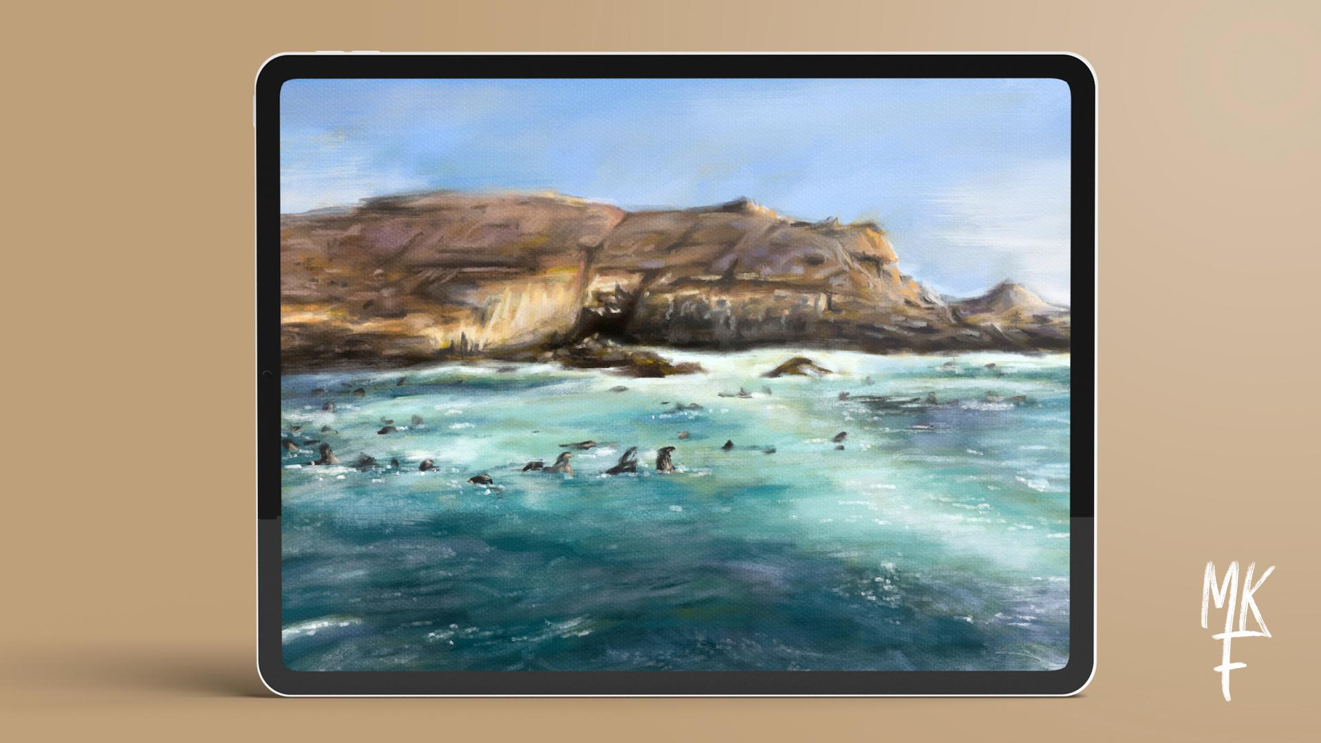
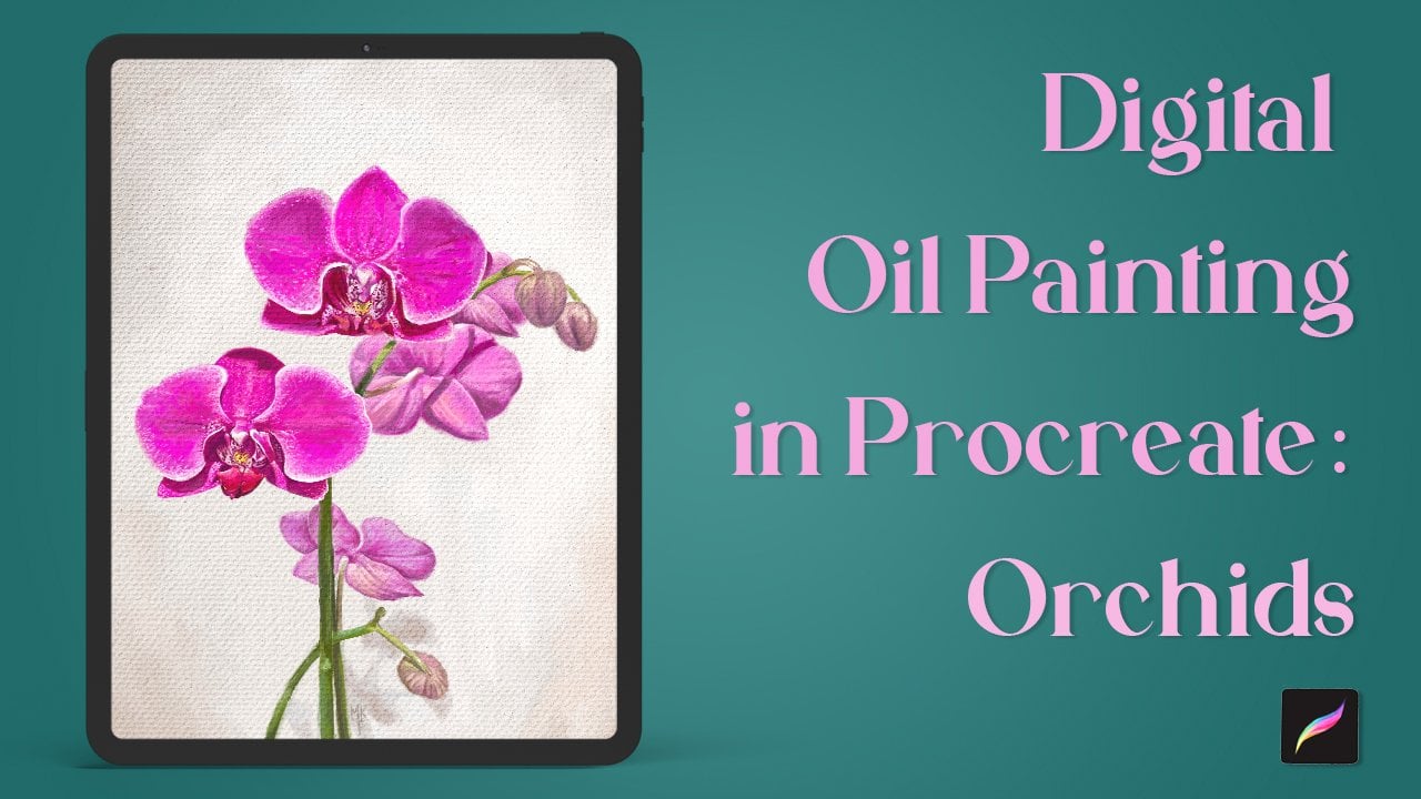
1. Intro: Do you like painting with oils but can't seem to mimic the effect digitally, then this class is for you. In this class, I'm going to teach you all my secrets for creating an oil painting using Procreate. Hi, everyone. My name is Maria Fe, and I'm an artist based in Peru. I have over a decade of experience in both digital and traditional mediums. I'm going to guide you step-by-step on how I made this landscape. You will need an iPad, an Apple Pencil or stylus, and Procreate. To help you achieve this effect, I'll be including a free bundle of my custom oil painting brush set, now available on my [inaudible]. I'll also provide my reference image or you can opt to use your own. Whether you're a traditional artist looking to hop into the digital mediums or a digital artist looking to learn more realistic techniques, then this class is for you. At the end of the class, you'll have everything you need to create this effect and mimic oil paintings on your iPad. Are you ready to start?
2. Class Project: Your class project will consist of following all the steps shown in class, in order to achieve a digital oil painting effect. You can choose to paint the same image as me, choose your own, or just sketch along. The important thing is learning the technique. When completing your project, consider sharing it with the class in the Break and Resources tab. I will love to see it.
3. Downloads: You will find all of the downloads for this class down below under the break and resources tab. Click on that file on your iPad to begin downloading. It will then be stored in the files app under Downloads. To unzip the file, just give it a tap. Now, you can access all of the files. To load the brushes and palette in Procreate, simply tap on each file. If you want to use my reference image, then make sure to save it in your camera roll. By the way, in case you are wondering, this is the Palomino Island located in my home town, Peru. Now that we have everything loaded, we can begin with the lessons.
4. Starting: To create a canvas, click on the plus icon in the top-right corner. I want to have a high resolution canvas, so we'll be selecting the HD A4 option. Next, I want to rotate my canvas. Since we will be working with layers, I recommend making sure that you have more than 10 available. To check, click on the tool icon, click on canvas and check under the layers option. The number of layers will depend on your iPad's RAM and capacity. If you don't have enough layers, just go back to your gallery and create a smaller dimension canvas, within the same aspect ratio. Now, we're going to learn how to upload a reference image within the canvas.
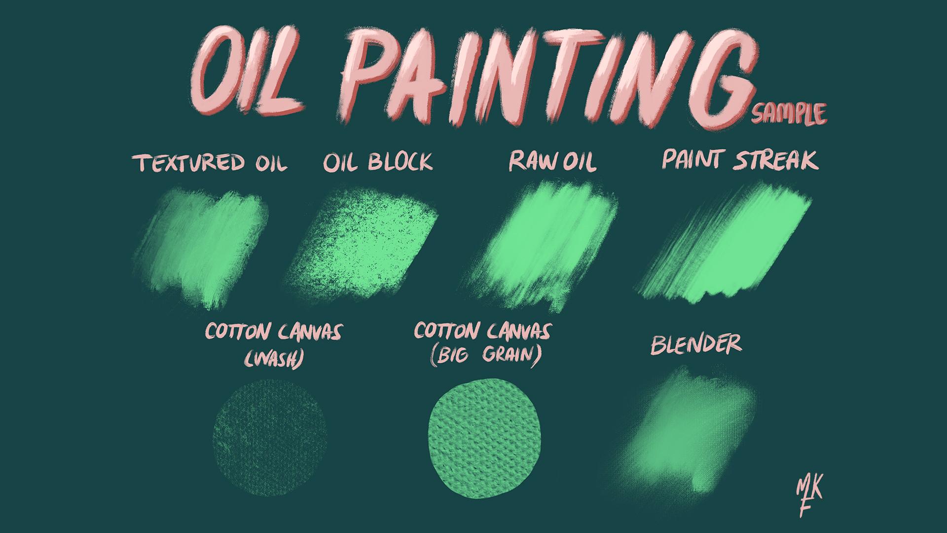
5. The Sketch: To use a photo as a reference image, click on the tool icon and then click on the Reference option. I already have my image imported, but you can import yours by clicking on the Import option and selecting it from your camera roll. You can now move or resize this up to your liking. Now, make sure you have a blank layer for this next step. Traditionally in oils, you start off by painting a thin wash of paint and solvent on your canvas. The most common tones to use are earth tones, such as the ones on my color chart. But for this painting, I decided to use yellow, which I think will also complement this landscape. The main goal in this step is simply working in a canvas that isn't white because that can be a little hard on the eyes. After selecting your color, use a Textured Oil brush and paint the whole canvas. Just focus on coloring the white. Next, I'll be selecting the Cotton Canvas brush and a white color to add some texture. I'll place this on a new layer. I'm going to zoom in. As you can see, it keeps a subtle canvas texture. If it is too harsh on your base color, you can reduce the opacity by clicking on the N on that same layer and sliding a blue bar to your liking. After you're happy with the result, go ahead and blend both layers, then add a new layer. Here, we will be doing a rough sketch. I'm going to use the Textured Oil brush again and a brown color. Adjust your brush size and more space to your liking. In this case, I'm going to start with the yellow. Good thing about sketching landscapes is that you don't have to be super accurate. You center on gaining a general idea of where things should be placed. Make sure you mark all established line between the island and the sky. Start by blocking in shapes and shadows as you see there. Don't dive into detail just yet. Then I will be sketching the sea. Don't worry about having a super clean sketch. This is just a guide that will help us when coloring. Blocking all of the deeper shadows. I then placed some of the sea lions not really caring about their shape, just on their placement. If you want to sketch them because of the level of detail, that is fine too. Just focus on what you want to show on your painting. When you're done, reduce the opacity at around 40 percent. See you in the next lesson.
6. Blocking in colors: Now we can finally start applying colors. If you're using the same referencing much as me, then you already have the palette imported from the downloads. For those using their own image, I'm going to show you how to create your own color palette. Click on the color icon on the top right corner and select the Palettes option. Then click on the plus icon and choose an option depending on where you have your image stored. Click on the image you're going to use and that's it, a color palette will be created instantly. Now, we can start by blocking in colors. Start by adding a new layer. Then select the closest sky color you see in your palette and cover the whole space. By the way, I'm still painting with a texture or brush. Once you're done, direct your color to the left to obtain a lighter color. Paint wherever you see a lighter areas and apply the same technique for the darker areas. This way, we're going to start building in depth. If you went too dark on some places, you can always go back and select the first color we've used from our palette. To keep things organized, I'm going to name my layers and add two more, one for the rocks and another for the sea. Once you're done, select the rock layer and apply color with the same technique choosing the closest one from the palette. Drag the sketch layer on top of the sky, so you can see where the island starts. Use the same technique as before for the lighter and darker areas. If you are familiar with color theory, I encourage you to choose colors aside from those on the palette through our scene of what do you see. Once we have learned for not getting lost in details, please do not zoom in. This will limit you to look into more general colors and shapes. You'll also work much faster this way. I think I can finally start painting the scene now, always make sure you're working on the correct layer. If you're feeling confident with colors by now, you can go ahead and choose one freely from the color wheel. I think I'll start with the darker shades. Now all we have are darker values plugged in, let's add a main color. Cool thing about this brush is that it doesn't have any rough edges, and blends seamlessly with the other colors just like real oil food. For those who are working with a novel pencil, it is also pressure sensitive, so you can use that to your advantage. If you want to go back to your previous color, just select it from the color history. Now, let's go from medium to light. This where the under painting comes in handy. You can really tell where we shall add more paint. If we had white as a base, we wanted to see where to place our highlights. Keep on adding more hues of blue whenever you see yellow peeking through. I feel that the colors from my palette are not enough, so I'm going to pick some from the color wheel. If you want to alter colors on the rocks or sky at this point, make sure to do so in the correct layer. My canvas is completely covered by now, so I think I'm calling this step done. Now, let's add some detail.
7. Adding detail: Now we have all of our colors placed, we can hide our sketch layer and drag it down. Add a new layer at the top exclusively for the details and name it accordingly. We are now going to start and play with colors. I'm going to switch to the oil block brush for this step. I'm also changing the opacity and size of my brush. For the colors, I'm seeing a purple hue on the rocks. I think I'm going to start with that. Then I'll be accentuating my darker and lighter values, adding a now wider range of colors and details as I see them. I will start marking my darker colors first. Notice how I am still not zooming in on my canvas. I want to avoid focusing in just one spot. I then move to the lightest part on the island. Marking our darker and lighter values first will make finding our medium tones much easier. The reason we're working in one layer is because we want our strokes to overlap with each other. Things are finally starting to take shape now. Keep your strokes as loose as you can. See the island is surfacing on a rematch. Keeping things this way will help us with a depth of field. I feel that my sea is a little too green, so I'm going to add a wider variety of tones that have more cyan to them. If you make a mistake, avoid using the eraser and fix it by painting on top. Simply because that is what happens when using the real medium. Yes, it will take more time, but it is good color practice and we'll make it look more like the real thing. I'm now going to change my brush to the texture oil brush. This brush is great for blending colors with each other while also adding some texture. It really acts like real oils. Now I'll go back to the old block brush, but feel free to use the one you refer. I am now adding more highlights to the sea, which you notice will really make a difference. I'm going to speed up some other progress, but you get the general idea. Keep in mind that this process does take time, so be patient and keep practicing. Remember that practice makes progress, not perfection as they say. I'm happy with the results. I'm going to add a new layer for the sea lions. For the step, I'm using the raw oil brush. I actually forgot to use my sketch layer for the sea lions. Simply unhide it and drag it on the top of the detail layer. Now you can paint with a guide on the layer we were working on. As we did before, I'm going to block in the shapes with a single color. For the ones on the back, I'm using a lighter gray color. You can zoom in and add as much detail says you want now. But for the purpose of this class, I'm going to leave them loosely painted. They all look very convincing and that's because they're lacking their shadows. Let's add them on the sea layer. Now that I added those shadows, I can tell that I need to make the front of the sea a little darker. Let's go and add more paint there. I think I will be going back to the other layers and add some final touches. I didn't use my blender brush, which is a colorless brush you can use to blend colors while maintaining texture. I like to use this brush only for small details. I feel that for achieving an oil look, the less blending you use, the more painterly it will look. I'm going to go to my other layers and also do some blending there. Another advice I can give is to use this brush mostly for things located on the back, since in a painting those are generally the less detail areas. I then change my brush to the raw oil to add some more detail to the island. I feel that when doing a painting, you'll have to stick to your reference image a 100 percent. It is good to add unique touches to make it look more like your personal style. I changed my brush again to the texture oil for some small changes. I then decided to add a new layer for some paint streaks that will add to that painterly effect. For this step, I'm using my paint streak brush. But if you're not using an Apple Pencil, I recommend sticking to the texture oil brush. The paint streak brush wonder our all colors, while the texture oil brush has some more wet feel that does combine them. See that top left corner, this is the effect that we want to achieve. I'll add some final highlights on the sea. I've exaggerated some of them do really make it pop. I'm still not happy with the overlook of my island, so I'm going to zoom in and add some more details. Take your time to add as much details as you like. This will definitely contribute to their realistic effect. Try to work on the overall shape and not just in one spot. Don't forget to keep in mind what I said before about the depth of field. The greater the detail, the most likely that object will look closer to the viewer. I'll add some more details on the sky and I think we're almost done. Now let's head to the very last step.
8. Canvas Texture: This last step is my favorite, and you'll see why. Let's start by changing our brush color to black. Add a new layer and rename it to Canvas. Then change our brush to the Cotton Canvas brush- Big Grain. This brush I've created makes adding texture super easy. Now go ahead and fill the whole Canvas. Let's change the blending mode to soft light, and change the opacity to your liking. I like to set mine somewhere around 40 percent. The black adds more contrast to the painting, and if you zoom in, you'll see a Canvas texture showing through. If you're painting it more light instead of contrast, then apply the same steps, but instead of using black, use white. Here's the before, and here's the after. What a difference. I love to do this effect in procreate. That's it. What do you think of this effect?
9. Bonus: To add a glare effect to your painting, simply add a new layer, then select the Cotton Canvas Wash brush, and select a white color from your color wheel. Fill the whole canvas in one stroke, and we are done. As you can see, it adds an instant glare effect that occurs when photographing a painting that is still wet. You can also reduce opacity if it is too intense, or even use the soft airbrush to erase it and keep the effect only in some places. Will you be using this effect?
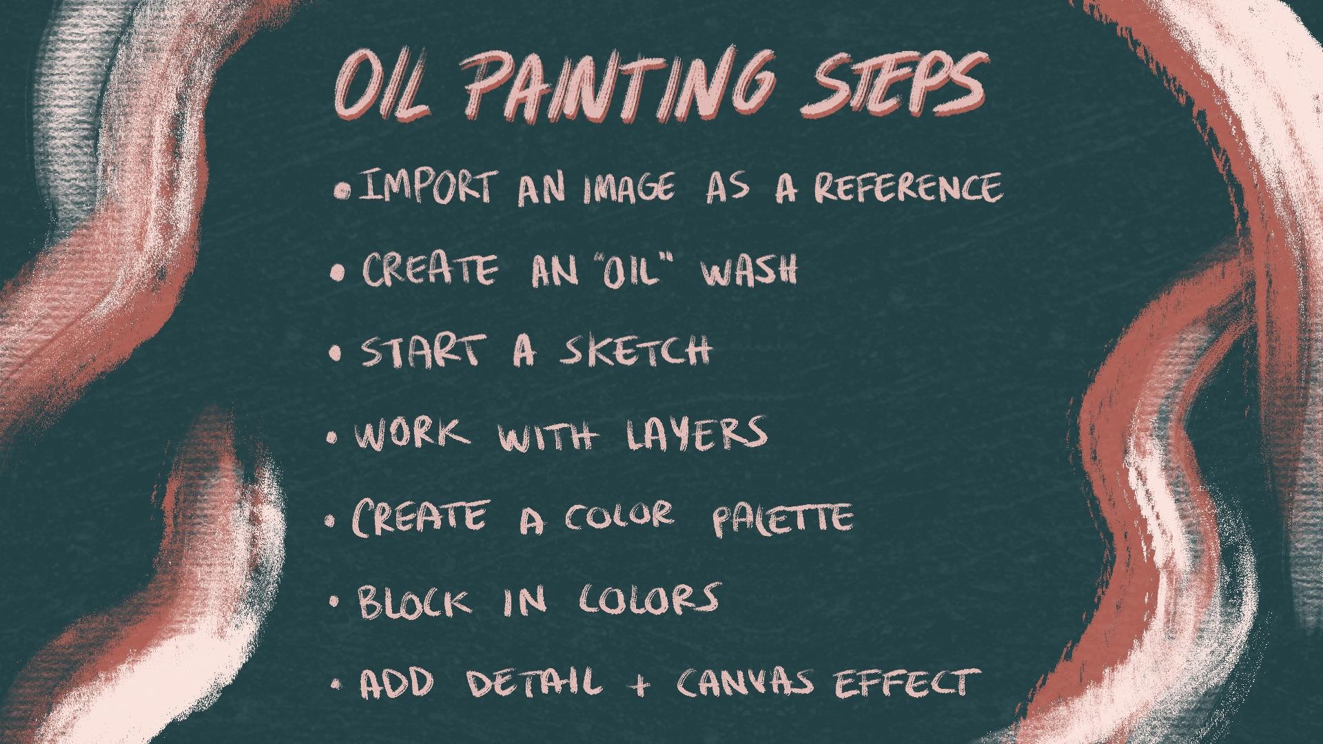
10. Conclusion: We have finally finished our painting. Congratulations. To recap all of our steps, we started off by importing our image as a reference. Then, we made an oil wash and made a sketch. We then learned how to work with layers. We also created a color palette from an image. Blocked in colors, add detail and finally, apply the canvas texture that tied it all together. If you like the brushes we used, then make sure to check the complete set on my gallery. The link will be on the break description. This set has over 50 plus items that include painting brushes, canvas textures, blenders, texture background images, and even some video tutorials, so you can really get the most out of it. It has everything you need to achieve a realistic oil painting effect. Also, don't forget to share your projects with me in the projects and resources tab, remember that it doesn't have to be a final project. It can be just a sketch showing the techniques we've learned in class. Don't forget that you can always update your project later on. I would love to see them. Finally, if you have any questions, don't hesitate and ask them on the discussions wall below. I hope you enjoyed this class and learned something new. Make sure to follow me here to stay tuned for my upcoming classes. Hope to see you again. Bye.
 María Fe K., Artist | @MFK_draws