Transcripts
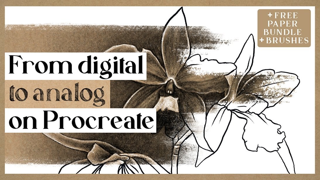
1. Intro: Are you interested in learning
how to draw illustrations and shade in procreate using
a realistic ponteism style? Do you want to make your
digital illustrations more eye catching or do you simply
like drawing floral motifs? Then you've come to
the right place. In this class, I'll
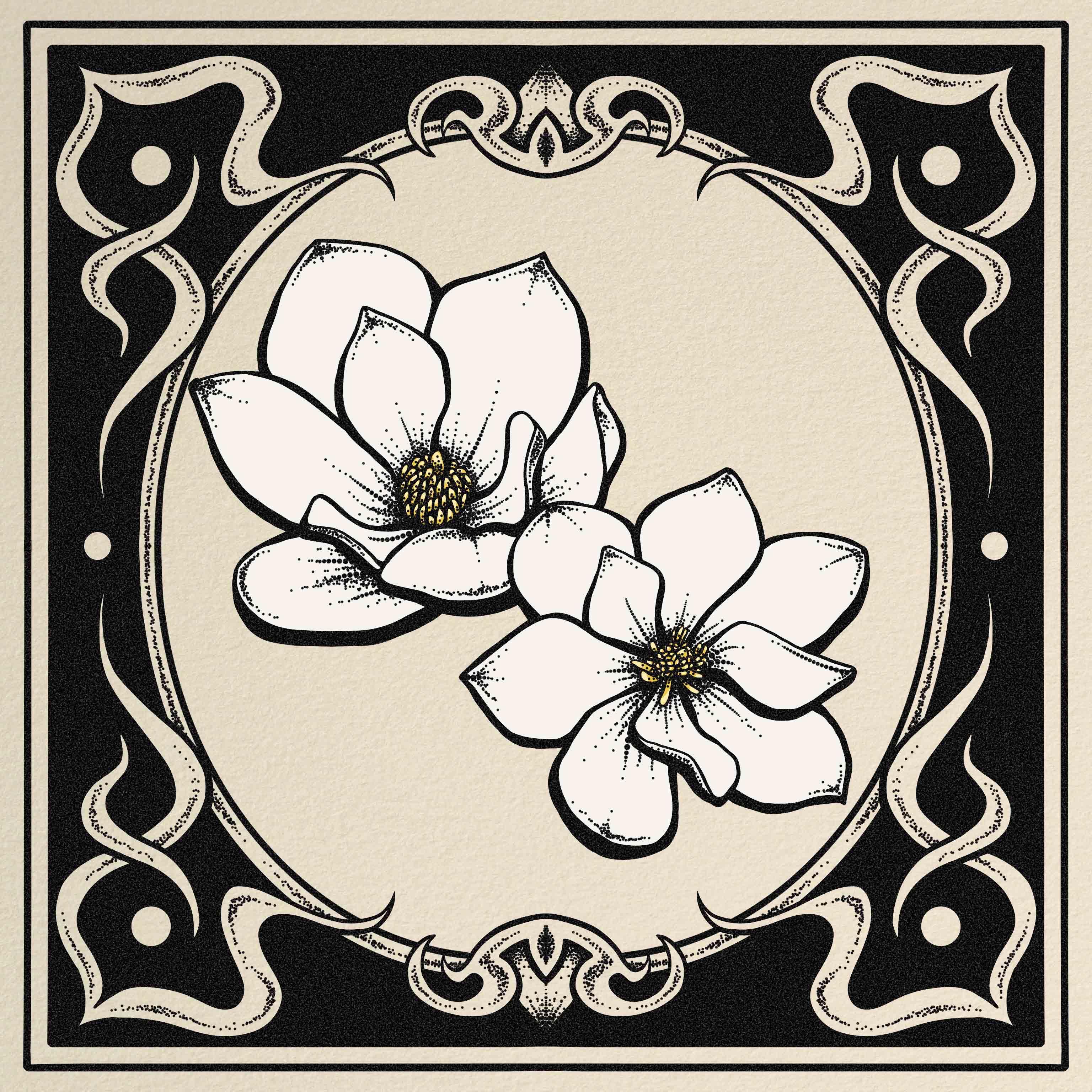
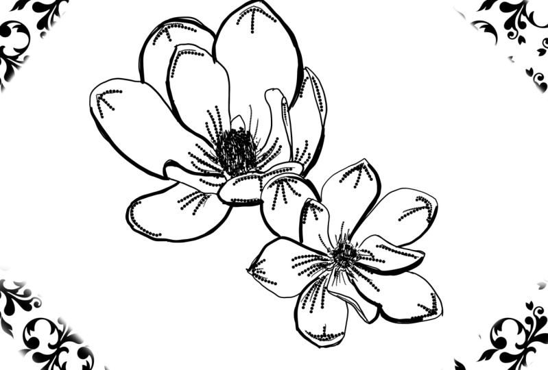
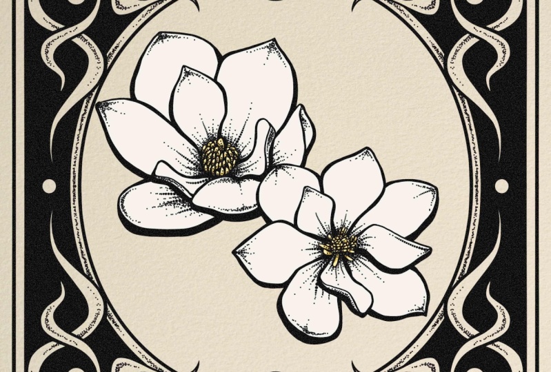
teach you how to draw these magnolia flowers using various procreate tools
like assisted layers, mask layers, symmetry features,
reference best practices. Uneven texture. This class is a more direct
approach to the ponteism or stippling technique
we learned in my previous class called drawn shade Sichels
with ink pens. But this time entirely
focused on procreate. So make sure to check that
one out if you haven't. And as for me, I'm a rife. I'm a digail and
traditional artist with over a decade
of experience, and you can find my artwors
online as MFKDraws. The materials you'll need
for this class are an iPad, the brcorate app,
and an Apple pencil. I'll provide the brushes
we will be using. As for your class project, I want to see your
interpretations of these Magnia flowers using the pointesm technique that
we will learn in class. So are you up for the
drawing challenge?
2. Class Project: For your class project, I want you to follow
what we learn in class and draw your interpretation
of the illustration. Or follow along while using
the pointesm technique. Also, don't forget to share your illustration down below in the project and resources tab to get
personalized feedback. Can't wait to see
what you guys create.
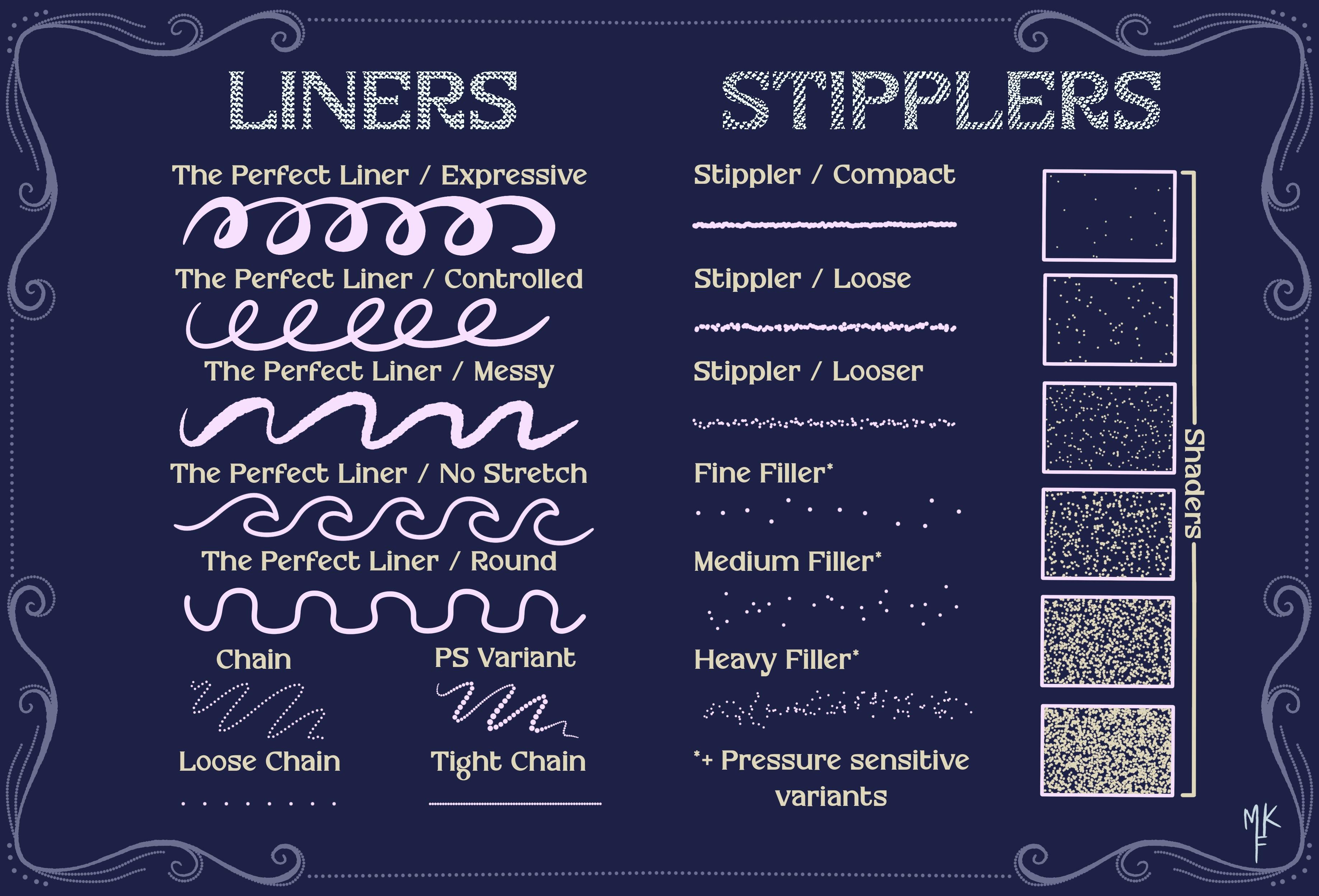
3. Resources: So these are the resources that I've included
for this class. There are four images of the magnolia flowers so that you can choose the one
that you really like. I've also included this
paper texture and, of course, our brush set. So to import it, you can just drag it down to
the Procorate app. Or you can just click it, which is even easier. For the aches, I've
included three. These two first ones have
pressure sensitivity, which means the more you press, the thicker your line will get the same goes for this one, but this one is all dots,
perfect for pointeeism. This one is also pure dots, but the sizes won't change. This helps to give
more precision. You'll see when we
use it in real time. Now we can move on to
creating a reference image.
4. Reference image: Let's start creating our canvas
by pressing on this sign. I'll use the square measurement. Now, let's click
on the tool icon. Click on ad and then
insert the photo. Think I'll start with this one. Now, I only want to
use this flower, so I'll select it like this. Click on this icon and make sure you have the free
hand selection on. Then just outline
the whole flower until you reach the gray circle. Like so. I've noticed that I'm
missing a tiny piece here, but I can just add
it by circling it. Just make sure that below, you have the add option turn on. Now I'm going to
drag three fingers down and select cut and paste. This will move our
selection to a new layer, so that way you can just delete this one and stay
with what you want. Now I'll repeat this step for another photo
that I want to use. So now that I have
my two flowers, I'll play around
with the size and position until I'm
happy with the results. And why not rotate
it a little bit? And you could also change which one to have
in front like this. Okay, so I think I'm
happy with this result. Now select this layer
and click on mask. You'll see that now we have this white layer on
top of our flour. I'm going to select
this brush that comes from the native
procreate brushes, making sure that I
have the layer mask selected and choose
the color black. Oops, let's undo and try
again with a smaller brush. Okay, so as you can see, the way that this mask works is that black equals to erasing, but without actually
hurting the main layer. If we were to use
the white color, we would go back to
our original layer. This is a great way to make changes without hurting
the base layer. So now that you know this trick, you can use it in
your other projects. Okay, so now that I'm looking
at my flowers from afar, I think I'll move them a
bit more to the center. I'll select both layers
by swiping to the right, and now we can
move both of them. I think I like it here. Now I'll go to Actions, Share and say this as a JPEG.
5. Flowers: sketch: Okay, so now we
have two options. You can add a new
layer on top of these flowers and lower
the opacity on both of them and just draw on the top layer and use
the flowers as a guide. But I want to
practice sketching. I will select both of my
flower layers and group them. Now let's hide them and
select this new layer. Then I'll click here, Canvas and toggle the reference option. Here, I'll click image and impart the image
we just saved. So now I have this
little window that I can use as a reference
inside of Procreate. Isn't it great? Okay, so now I'm going to start my
sketch in this new layer. I'm going to fix my reference
to fit to screen like this. Using the mercury brush
that came with Procreate, I'm going to start drawing
two circles. Like so. And think I'll move them around. Think I'll lower
the opacity now. Time to start drawing the
center of the flower. For each petal, I'll do
a circle very roughly. Just to have an idea of
where I should place them. Feel free to go over some of the shapes if you
are not convinced. So now it should look
something like this. I'll add this additional
shape. Like so. Okay, so now we can move
on to the other flour. I'll basically do
the same process. I'll spit this one up, starting with the center and then moving
forward to the petals. Actually, I think
I'll change my brush. Think I'll choose tinderbox. Let's try it out, and yeah, that one seems much better. I'll just lower
the opacity a bit. Now I'll lower the opacity of my layer and start with
the actual sketch. Adding first a new
layer on top and start slowly drawing more defined using my base drawing
as a reference. Good thing about drawing flowers is that
you can improvise, as nature can always
surprise you. So just have fun with it
and try to do your best. Take a good look at
all of the curves. So you see if I turn
off this layer, we'll have a much nicer sketch, while also practicing
our drawing skills. Let's continue to
work on our flower. Let's turn off the base
layer one more time. I'll refine these
petals a bit more, and I'm happy with that. So let's move on to the next. I'll start with the center and then move on to the petals. Slowly defining every
detail that I see. You see how the circles
really help to guide us? Now, let's clean
it up. And we're ready for the next step.
6. Flowers: outline: So now let's go to
our brush library. I'll be using the Magnolia set, which I included for this class, and I'll select this one
called the perfect liner. Now let's decrease
the opacity of our layer in order to draw
on the layer on top of it. And we're ready
to start drawing. Let's begin with this petal. You'll see that this brush works with pressure sensitivity, meaning that the more you press, the thicker your line gets. Wever I see the lightest
parts of the petal, I'll make my lines thinner to create the illusion of light, and the opposite goes
for the shadows. The thickness in our lines will create the illusion of darkness. And remember that
you can always go back and perfect your
lines as you go. That's a magic of dital drawing. The sketch we did before
really helps me to plan out my drawing and see
where each petal should be. By the way, this is
a brush I created. My goal was to create
a brush to help with linear drawings
with features like thickness control and
movement stabilization. In case you're interested
to see the full set, this one is part of my
pointesmPcrad brush set. I will leave the link
in the description box. I'm not afraid to make some
adjustments in the way. After all, this is the whole
point of drawing digitally. I like to zoom in
and out as I go. I tend to zoom in
whenever I have to do a very precise adjustment, and I zoom out in order to have a more global perception of how my drawing
is turning out. Now let's start
drawing the center. But first, I want to fix
the shape of this petal. Now that that's done, let's
go back to the center. For this part, I'm
not really worried about being super precise as there is too much detail
and you want to simplify things when doing this kind
of illustration style. For example, I'll take into account the direction
of the statements, but not really draw one by one. Just enough to give a general idea of the
direction and the shape. For those of you who don't know, statements is this part
that I'm drawing right now, don't worry because
I also had no idea. Let's take a look from afar, and yeah, I'm happy with
how it's turned out. Let's just thicken some of these lines to create
more dimension. I always zoom out to
see if I'm liking it so far and then move
on to the next one. Okay, so that flower is done. I'll show you how
I did this other one in more of a
time laps style, as I used the same
method as before. Another tip is
rotating the canvas. As I think that for me, it's sometimes easier
to create lines in certain directions when my
wrist isn't that flexed. So I suggest that
you try it out. The more comfortable you feel, the better you will draw. And you'll also see an
improvement in the precision. So I think I'll go back to
my other flower and make some minor adjustments to make both of my
flowers more coherent. I'll add this bigger part in the center like
we did before, and I think it now
makes more sense. Now I'll hide my sketch layer as we don't need it anymore and select both of the layers of my flour and move them a
bit more to the center. The orange line indicates
the middle of the canvas. Now I'll go back to making
some of these lines thicker, especially for the ones at
the bottom of the petals, as it will help add
more dimension. Okay, I think we can move
on to the next step now.
7. Flowers: pointillism base: Now let's move on
to the shading. Let's add a new layer
and put it on top. I'll adjust my canvas and I'll change my brush to the chain pressure sensitivity. The way that this
brush works is, as its name says it, by
pressure sensitivity. It is composed out of full dots, so the less you press, the smaller the dots will be. Well, if you press harder, the dots will increase in size. And keep in mind that
the effect can be more dramatic depending
on your brush size. So following the same
principle as before, when we did the outline, I'll press harder on the darker parts and lighter on the parts
where the light hits. This will create a
gradient illusion. I'm placing my lines in the
darker parts of the petals. So basically, whatever
I see more pink, while doing so, I'm trying to follow the shapes
of the petal. This will help give my
flower some movement. I'll also add some on the edges. And you can see that our flour is really starting
to take shape, delete the parts
that you don't need. Isn't it amazing to see that
just by adding these lines, it already makes such
a huge difference.
8. Flowers: adding details: So now let's add
even more detail. I'll change to the
tight chain brush. We can adjust the
size of the dots by playing around with
the size of the brush. I think the size is fine. I'll start by adding
some tiny dots, following the lines we
already did like this. And then manually try to mimic the brush
strokes we just did, but to the side
and more delicate. Just try and follow the same style as the
one we did before. Focus on adding dots
whatever the pink is, and just have fun. There will be a point where
you will just want to add some random dots to make
things look more interesting. I invite you to do that. Because remember, you
can always use and do your strokes and try again if you're not
happy with the result. You see I'm following
the same pattern. This helps to create a gradient. I'm focusing on
making the center darker and then adding some more dots just
for the fun of it. I really love shading with dots. I think it's really
a cool way to shade. It's very interesting to see how so many dots can create
shadows and shapes. Mm and it's starting
to look more complete. Now we can zoom in and clean all of the parts where we
might have overdoted. Actually, I think
I'll add some dots on the center of the flower just
to make it more cohesive. I'll try to place
them at the core of each statement to
create more volume. Now I'll make this part darker to give out the
illusion of a fold. Let's check it out from afar. Let's continue with our dotting. I don't know about you, but I really find pontism therapeutic. There's something about making your drawing come to
life just by using dots. I think this flower is done.
9. Background: sketch: So I just did the flower of camera as I follow the same
principles I just teach you. I'll now close the reference
as we don't need it anymore, and let's add a layer to play
around with our background. Make sure that this
layer is at the top. So for this part, I'll change my brush to the perfect
liner controlled. Let's go to the actions. I'll turn on the drawing guide, and let's edit the
drawing guide. Select symmetry and
click on Options. You want to select quadrant. This will mirror everything we do on one corner on each side, saving us lots of time and making it look
perfectly symmetric. Now that that's done, make
sure that the layer that we are going to work
on says assisted. This means that the
mode is activated. Let's start drawing some
frame on the corners. You see how it does
the same thing we're doing on each corner. To create a straight line, you tap outside of
your canvas with your other hand and your line
will automatically correct. Lift your finger when
you're happy with the result and then
your line will be set. You can perfect it even more by zooming in and going
over some areas. Now we'll go to our layers
and duplicate this one. Make sure to have the uniform
mode selected and just make it a that bit smaller in order to create kind
of a square frame. Remember that when you
see both orange lines, it means that your design
is totally centered. Now we're going to go to
our layers and merge them. Just like that. Now
let's add a new layer, click on it, and
select drawing assist. This will activate
the mode again. I'm thinking of adding
something to frame my flowers. Maybe something like an oval. Let's go with that idea. Okay, so let's try to
sketch it out first, just like we did before
in order to have a guide. As ovals can be tricky. I want to do
something inspired by Acnubo so I'll create kind
of like a vintage frame. I'm just going around
and improvising as I go, seeing what works
and what doesn't. And if not, I can just erase. I think that this frame really helps making the
drawing more dynamic, which is what I was looking for. Plus, it's very fun to play around with
this mirror effect. Okay, I like where
this is going, but let's maybe do some
kind of wavy pattern. I think that helped to
give it some movement. And I refine stuff as I go. And maybe a t out here. Why not? I'm just raising the
parts I don't really like and overlapping some of the shapes to create something
a bit more interesting. Okay, I'm pretty happy with
how this is turning out. But maybe let's also
add a tiny out here. It's kind of hard to create
a circle with this mode. So I'm focusing on touching
only the edges of the guide, and then altering the
points of the arc. So I think this is
fine as a circle. And why not add
another wavy pattern? Let's overlap this one too. I think that this is it, but maybe let's add the
border to the oval shape. Remember that if
you want to undo, you can just tap
with two fingers and that's it for a
background sketch.
10. Background: outline: Continue with our background. Start by lowering the opacity of our sketch and add a new layer on top with a
drawing assist feature. Now I'll try to do my oval, but it's actually kind
of hard with this mode. And eating my points is not
really working out for me. So I tried to manually fix it, but honestly, it
wastking too much time. So I do not recommend
doing this. But I didn't want to cut this
part out so that you guys can really see what happens
even if you're a teacher. We just have to find a
solution and keep going. So at the end, I give up
and added a new layer. I lowered the opacity
of the one before, and I drew a noble on top without using the
assisted feature, and it will give me the
option to do an ellipse. So now I have the option to
move it around as I like. I'll clear the previous layer, and let's continue with
our drawing and ops, I forgot to put the
opacity back to normal. Now let's continue to go
over all of our sketch, but in a more cleaner way. I'm thinking that we need
some black contrast. I'll make it all pop. I'll darken these corners and fix some of my
shapes as I go. For this shape, it's
really convenient to change between the
eraser and the pencil, as you can also use it to draw. I'll speed up this part as it
is pretty self explanatory. I continue to use our
sketch as a guide, paying attention
to every detail. I rotate my canvas as I go to make it easier
for me to draw. I'll click on a layer where we did the ellipse
and drag it down. Now feeling like my
ellipse is a bit crooked, so I'll try and draw it again. Let's hide this layer. And add a new one. Click
on Drawing Assist. And now let's follow the sketch. Notice how I leave the
Apple pencil pressing on the screen until
the arc is created. Let's try again, and that
one seems to be much better. I'll stay with this shape and just clean it
up a little bit. Let's increase the
size of our brush. That's actually much better. I'll complete this part. Now we can go back to our previous layer and continue working
on our background. I'll start to line
all of the edges. This will help us
to color later on, and let's not
forget the ellipse. Now let's click on this
layer and select reference. Add a new layer on top, and we'll start color
dropping on this empty layer. See how Percreate knows what we want to do thanks to
the reference option. And let's not forget to
turn on the drawing assist. This is a good way to color without affecting
our main layer. Now lower the opacity to
see where we over painted. So let's fix that just
by using the eraser. We draw the circle, hold, and tap with our finger to
create a perfect circle. Now we just fill the inside. The same goes for
this other one. I hold and tap to create
the automatic circle shape. I forgot to fill out this part with plaque, so let's do that. Let's also erase
this wavy pattern. Now, I'm just going back through my layers and deactivating the one that has the outline of this shape so I can
clean it a bit better. And I'll go back
to the layer with this other outline to erase
wherever it overlaps. I know that this layer
stuff is kind of confusing, so don't be like me and name your layers when
working with so many. You'll think yourself later. But if you're already
late for that, it can also be helpful to
decrease the opacity of the layer to see which one is the one
that you're selecting. Now we want to erase
this part that overlaps. But since this is a round shape that took us so long to do, I don't really want
to erase it forever, so I'll use a mask. This will bring a
new layer on top of it that looks completely white. So the way that this works
is kind of like an eraser. So black means that it erases, while white restores
back to normal. So now that I change to
black, let's try it out. This is a great way to make changes while preserving
our original layer. I still have these tiny
details that I have to erase. Let's find out in
what layer they are. Now that that's done, let's
go back to our layer with our black background and let's see what else
needs to be changed. Now thinking that we
forgot to add our border. Let's delete this layer
which we're not using anymore and let's duplicate
this layer with a mask. Let's delete the mask, and now let's make it
smaller to create the frame. Make sure to have the
uniform option on. Cool. I'm happy with that. Now let's clean up the
edges that overlap. Now I want to thicken this part, so I'll make sure that I'm in the correct layer by turning
the layer on and off. I let's continue to modify. So now I have to find
where I have this spot, and I'll do that by turning
the layer on and off. So let's erase that part and go back to our
previous layer. Now thicken this area. And soften these curves. And that's it for the
base of our background.
11. Background: pointillism: Now let's add some pointeism
to our background. I'll start by adding
a new layer on top and changing my brush to the
chain pressure sensitive. And actually, I'll make
my layer assisted. Let's start again and
select drawing assist. Now we can start shading. For this part, I think
I'll change my brush to a tight chain to create
more precise dots. But I'm just
improvising as I go. One tip is to follow the shapes and try to
give them some movement. I try to find ways to
create dimension and depth. Once in a while I zoom out to see how my
drawing is going. I try to stick with
the movement of the shapes and try to
enhance them in some way. Always go at your own pace and figure out how you
like to do pointeism. I think that is starting
to look more cohesive. Let's add some more here. Notice how unvarying the
amount of dots as I go, creating more dense areas
to give out the illusion of shadows and more dispersed areas just to enhance my drawing. Let's add some more
dots through here. And I think that
we're almost done. Now let's take a look at
the before and after. I'm happy with how it turned out, so let's leave
it like that. And actually, let's add some
more dots in this part. I think it looks a bit
weird to leave this petal without any shallow,
let's complete that. Let's change our brush to the
chain pressure sensitive. Let's go through
our layers and make sure that we're selecting
the correct one. Now let's do one line
like we did before, and then let's change
brush to the tight chain. Now let's manually
dot this part. And we're finally done
with our background.
12. Adding shadows: So I was thinking that now that we have our
background done, our flowers look like
they need more weight, like in the lines
of the shallows. I'm going to go
ahead and do that. Let's add a new layer
and drag it down. Now I'm going to change my brush to the perfect liner controlled. Now let's go to actions
and click on reference. But this time, instead of
image, let's ooe Canvass. This will allow me to look at my full canvas in real time
while making the changes. It's super useful
for moments like this where you have to zoom
in to be more precise. Let's start thickening our lines and see how a reference
image changes in real time. That way, we can see
if it works or not without having to zoom
in and out all the time. And I'm just following
the previous shapes of the petals thickening the lines where I think the
shadow should be. And this flower is almost done. Let's give it a look. And yeah, I think it looks much better. I just felt like the flowers
were losing importance, and this really helps
make them pop again. And I then the line even more on the bottom
of the petals. Remember that we were
working on another layer. So if you're not happy
with what you're doing, you can just erase
or reduce the line. And it looks like
we're almost done. Now we can close our reference, and let's have a look at
the before and after. And yeah, it looks much
better, don't you think?
13. Adding textures: Now that we finally have
our drawing complete, we can make it even
better by adding some texture and color.
I'll teach you how. So first, let's go
to our layers and lead all the ones that we
won't be using anymore. Now let's select all of
them and group them. Now let's duplicate the mold
and hide our previous group. Now, let's merge
all of the layers. Now we have our whole
illustration in one single layer. Let's go ahead and
click on adjustments. Click on noise also means so
that you can see the effect. Let's slide our Apple pencil to the sides in order to
adjust the amount of noise. Go ahead and play around with these features until you find
the combo you like best. Think I leave mine at 40%
and with these settings. This is an easy way to add
texture inside a procreate. It's a bit subtle, but to me, it makes a big difference. Now I'll teach you another
way to add texture. Let's go to actions and
select insert a file. I'm going to insert this picture I took of one of my sketchbooks. I'll use it as a base for my drawing to create
even more texture. Let's rotate it. And then
using the freeform option, I'll expand it to fit
in all of my canvas. Now let's wrack the layer down. And you see it
looks much better. It's very cool to see how these two little changes
can change it all. But I think that the flowers
are getting a bit lost. So I'll go to my other layers and merge the one
with the flowers. And then select the insides. But for some reason,
it's not really working. So let's figure out why. Now remember, it's because we left the reference
option on another layer. Let's go ahead and disable it. Now we can go back to our flower layer and
select all of the petals. We can also adjust the
threshhold like this. Don't worry if you touch the outlines as it won't
make a difference. Remember that you can tap
with two fingers to undo. Okay, let's go back to our paper layer and
hide our group. Drag three fingers
down and click on cut, and the camera is not
doing it justice. But in reality, we just cut the flower part of
the background. Now let's manually
erase the middle. I think I'll change my
background to a warmer white. Now I'm thinking that we can
add a bit of a pop of color. So let's add a new layer. So I'm going to
change my brush to the perfect liner and
change my color to yellow. Make sure that you're on
the layer we just added. And looks like I failed
to select yellow. Let's try again. Now let's
paint all of the middle. I'll start by lining
everything so I can color drop it afterwards. Just like so. I think that adding yellow
was a good decision. So let's do the same
with the other one. And let's create more depth
by adding some highlights. I'll choose a lighter yellow
and continue with the other one and placing the
lighter parts at the ends. Let's do the same on this one. And looks like we're done. So this is the before
and the after. I think that these
last changes that we made really make a
difference, don't you think? And that's it for this art
work. Thanks for watching.
14. Congrats!!!: Congrats on finishing
this class. I'm so proud of you. I hope you learned something new today. And if you enjoy this class, please don't forget to follow
me here and leave a review down below so that I can keep on creating more
teaching content. And remember that I would also love to see
your illustrations. So please do share them down below on the project
and resources tab. And if you enjoy the
brushes we used, they're part of my
Pontyism brush set, which has everything you
need to help you share like a ponteismP in a
more timely manner. So if you want to
check them out, I'm leaving a link in
the description box. And that's it for today. Thank you so much for joining. I hope to see your projects and see you in my next class. Bye.
 María Fe K., Artist | @MFK_draws