Transcripts
1. Introduction: Hi, there, creative.
I'm Shannon, a hand letterer and artist, and I love using a lot of different tools to
create my artwork. In this class, I'm going to
be focusing on procreate and showing you how to draw and paint a watercolor
crystal cluster. First, we'll break
this cluster down into basic shapes to
create our sketch, and then we'll briefly
look at how light interacts with crystals so that we can capture
them realistically. After that, we'll dive right
into painting and blending, so that by the end
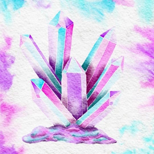
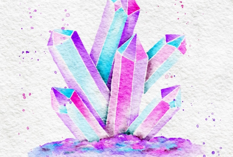
of this class, you'll have created your
very own version of this vibrant crystal cluster that you can share in
the project gallery. The tools you'll need
are an iPad and is compatible Apple pencil along
with the Procreate app. As for the brushes to
sketch out your design, you'll be using the six B
pencil from the Procreate sketching Brestt and for the
painting and the blending, You're going to be using a
custom rough textured brush. We'll also be using a custom watercolor
canvas that I've created, and you can download it from the projects and resources
section of this class. So if you're ready
to start painting, grab your supplies and I'll
see you in the first lesson.
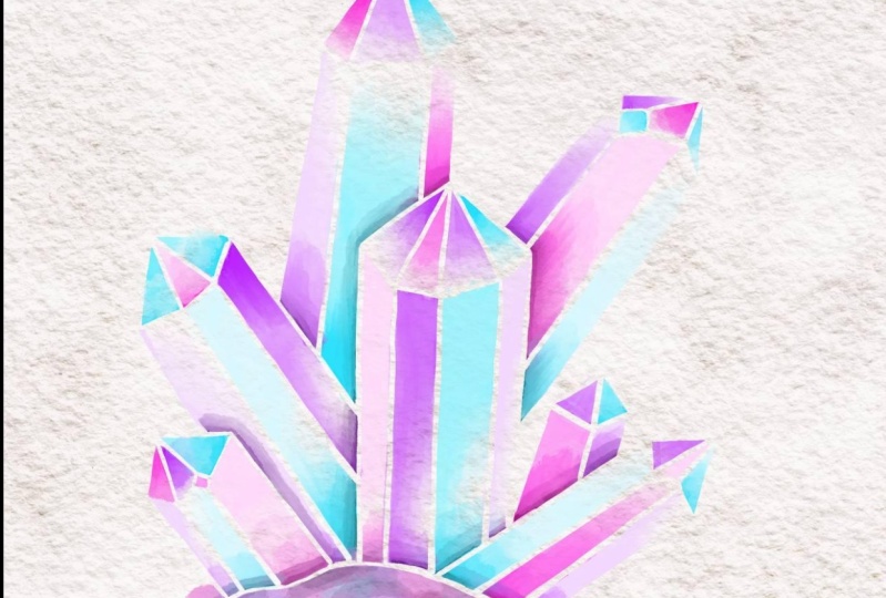
2. Let's Sketch Out the Crystals: It's really easy to draw
crystals because they're geometric and made up
of straight lines. We're going to start by using the six B pencil to sketch some overlapping
rectangle shapes. Each of these will represent a crystal that makes up the
cluster that we're painting, so you can sketch
as many as you'd like in a few
different directions. I'm going to be painting six, but you can start
out with about three if you feel like
six is too many, and I'm doing this sketching on a new layer above
the paper texture. Once you've finished
with a sketch, you can resize it by
using the move tool and then head to the layers panel to lower the opacity
of this layer. Then create a new layer
on top and we're going to refine this sketch
and create our crystal. Simply draw a lane and hold your pencil on the screen to
make it completely straight. To create the top
of the crystals, and just join two diagonal
lines that meet at a point similar to how you
would form the letter A. So just continue joining
these lines all around that sketch that you laid until you have drawn in
all your crystals. Feel free to change things
up as you go if you feel like the original layer
that you did isn't working. Then you can move on to
creating the base of the Once you're finished, you can then delete that
initial pencil sketch that you did because we're
going to be using this refined sketch
moving forward. The base of my cluster ended up looking a
bit too crooked. So I added some drying guides to help me even it out a bit. So I didn't create a
completely flat base, but I was able to dry with the help of the guides so
that it is a lot more even. Now we're going to
divide these Okay. For this first one,
I started with a smaller diamond
towards the top and I'm just going to be
connecting the points on that diamond to different
points to the size. Okay. Another way you can create these divisions is to just draw two
parallel lines from the apex and connect
those to the outer edge of the crystal and then draw two lines to connect
it to the bottom. You can also look at
a reference image to get a better understanding of how you can divide
your crystals. These lines, they
don't have to be the same length you can make
them longer or shorter. You're just connecting them to the size of the crystal
as well as to the bottom.
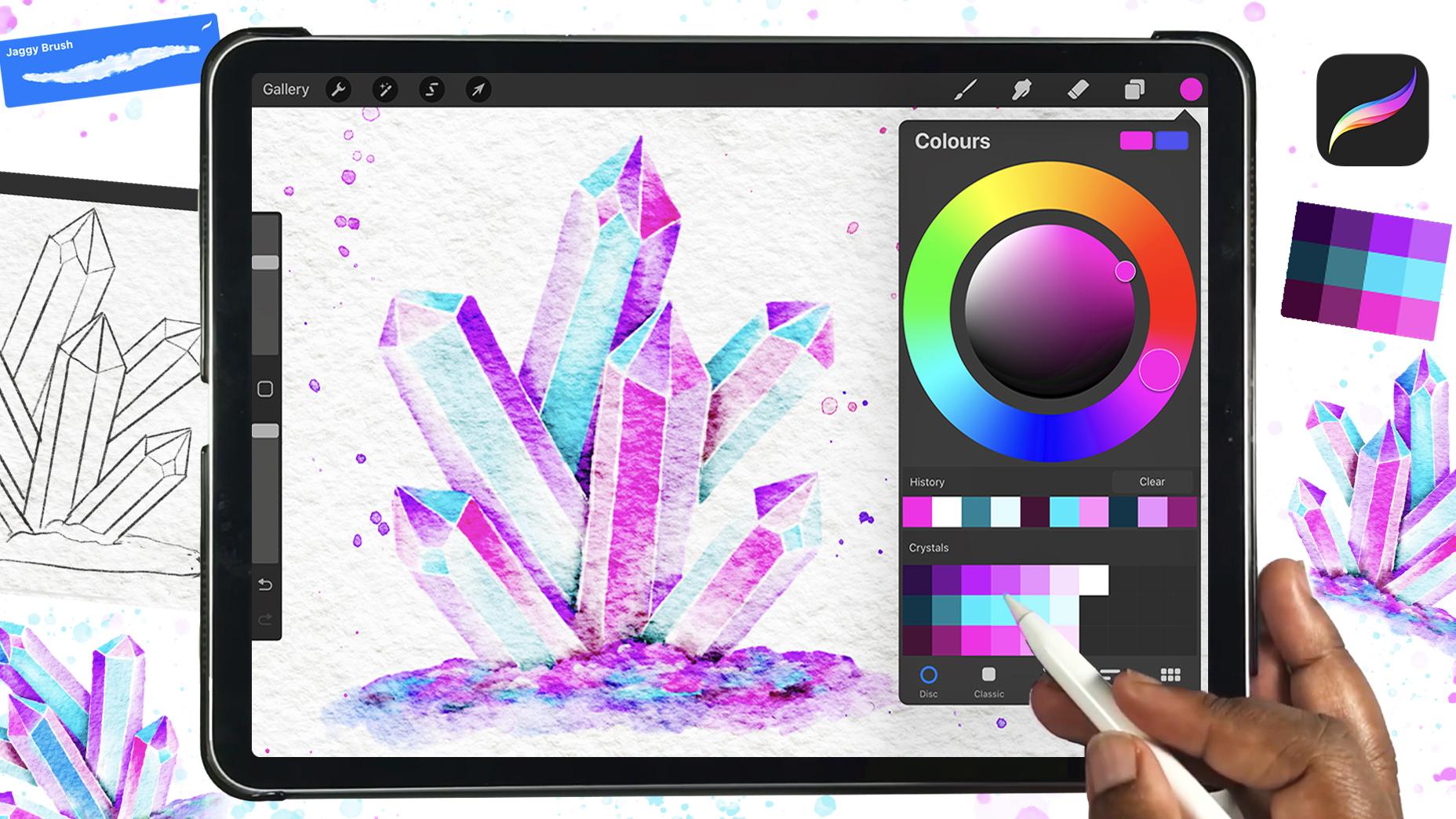
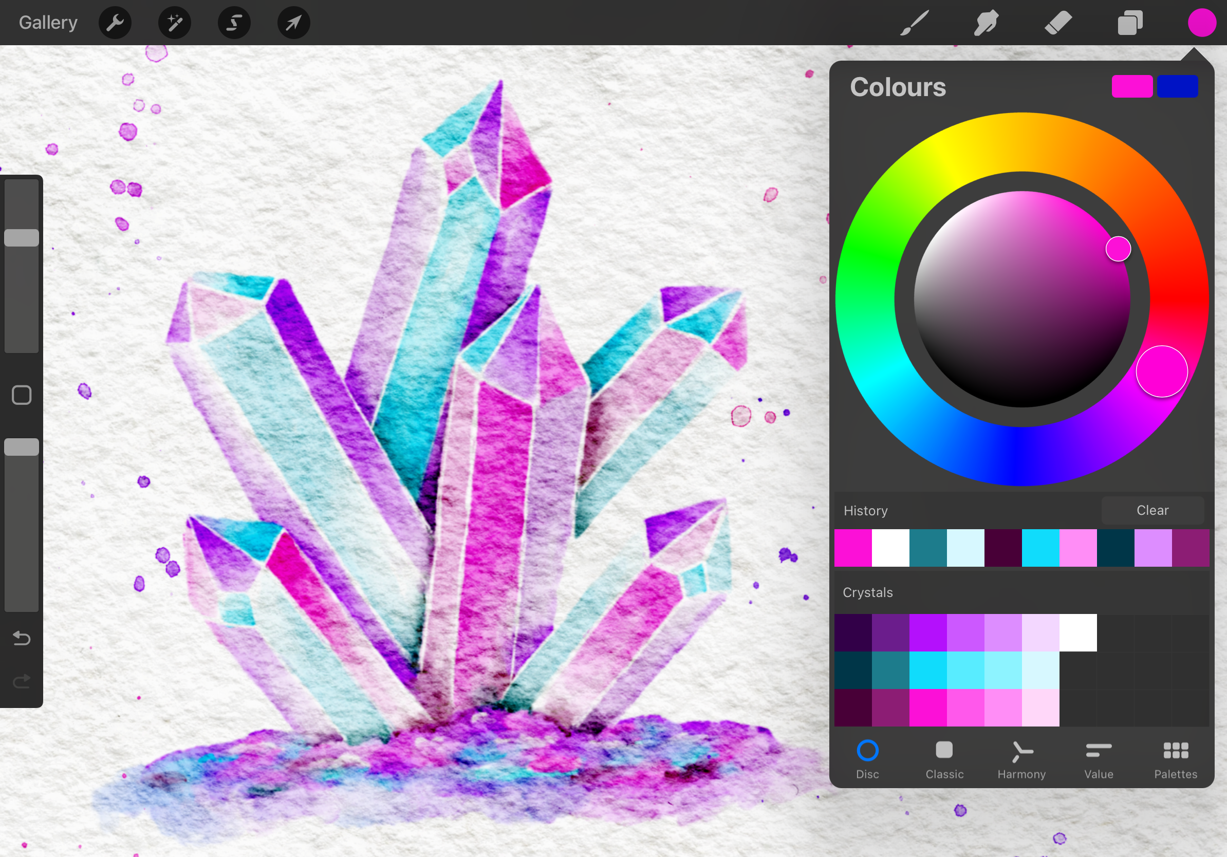
3. Painting the Crystal Cluster: So now we're going to
lower the opacity of that, and we're going to start adding our color underneath
our paper texture. I'm switching to the jaggy
brush and I'm going to be using the lightest purple
in the palette first. But before we start, I want to show you call light interactive
crystals so you can have a better idea
of how to shade them. Generally, you have
a light source, which is what I draw num and
your light source gives off light which hits the surface
and with a regular object, that is where your
high lights will be. Typically, that area would be the latest part of
whatever your joint. But with crystals, because
they're transparent, the light usually passes through that part and settles
on the opposite side. So if your light source is
in the upper right side, like in this painting
that I'm going to do, the bottom and the left side of your crystals
should be lighter. Well, the top and the right
sides should be darker. So I'm going to start with
my light purple first. I can pretty much
start anywhere. I am going to start right here on the first crystal and
at the bottom side of it. I am not filling in
the entire section. I'm going to be
creating a gradient. So I'm going to be adding
color then blending it to a white or
very light color. And in keeping this
later color on the side of the crystals that are of B from
the light source. So once you're finished
adding those colors, I'm going to switch to the smudge brush
and I want to use the same brush that
I added color with. I'm just going to press on that smudge brush
and it's going to automatically switch
to the same brush that I used to add color. I'm just going to use that
to blend that darker color into the whiter area and
you will see that it creates a really nice
gradient from light to dark. Okay. Now I'm going to go in and add
my lighter blue, and I'm adding that in the
same manner that I added my purple color by leaving
out some white space. And then I'm just going back
in with the smush brush to blend it into the white area. And the key to adding
colors to make them pop is to add different
colors next to each other. After I've added those
three lighter values, I'm going to go in
with next value of color starting
with purple again. And I'm adding these
to the areas where the light source will be hidden and these areas
will be the darker areas. So you can just go
around the painting and in and out to kind of see
how things look together. So you can continue adding in your colors by alternating
where you place them, so none of the same colors
are next to each other. But overall, you can just
have fun with the process. So as I got to my
last face right here, you see I ended up
with purple next to a crystal that had purple
and run and zoom out. The two colors are kind of
feeding into each other. There's no direct separation. So I had to erase that
and I was able to swap those two colors and have the blue color on
the outer face, and then the purple
on the inner face. So that is a good
example of why you shouldn't put two colors next to each other and just
how you can fix it. So once you're done adding
your color to the crystals, it's going to move on
to painting the base. So I'm just going to
be adding the colors randomly and then I'm going
to just blend them together. I also use the brush to lightly blend out the bottom so that
it doesn't have a flat edge. Okay.
4. Adding the Shadows: So now we're going to
add darker colors on the faces that are going to have the light
reflecting on them. And then I'm just
going back in with the smush brush to blend in. Once you're finished with that, we're going to add shadows
where the crystals overlap, just to add some dimension. So here, the front crystal is overlapping over
the purple section of the crystal behind it. So I'm using the darker purple
to draw in that shadow. I'm doing it for all
the other parts where there is supposed to be a
shadow on a purple section. When you're done adding those colors you can handle
the harsh edges as well. The one it was done with the overlapping parts
of the crystals adjust in and added
shadows to the face, as well as white to a few ears, and then I just bended
everything together.
5. Adding the Final Details: Final thing we're
going to do is to separate the faces
of the crystals. So you can hide the
sketch there and then use the six pencil or
the jaggy brush as the razor to create some white lace to
separate each face. Okay. So if you would like your crystals to
be a little more vibrant, you can duplicate that layer
and change the blend moot to multiply and just
adjust the opacity until it is the
vibrant that you want.
6. Wrap up: For my lesson today. I hope you enjoyed painting
these crystals with me. I look forward to seeing
your vibrant painting, so be sure to share it in the project gallery
before you go. I also want to encourage
you to leave a review, share your thoughts
on this class so that others who
may be interested in learning about
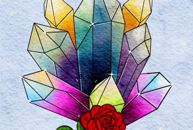
digital watercolor art can know what to expect. If you would like to create even more realistic watercolor
projects in Procreate, you can check out some of my other classes over on
my skill share profile where I show you how
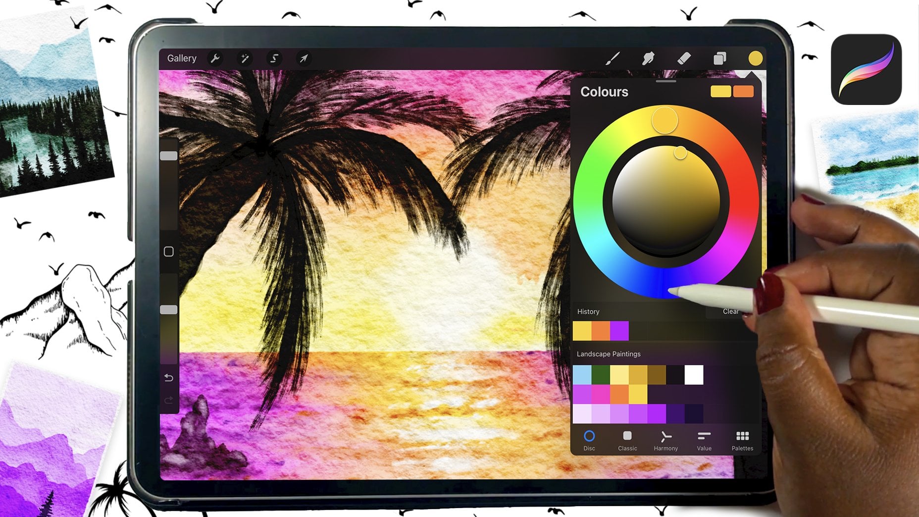
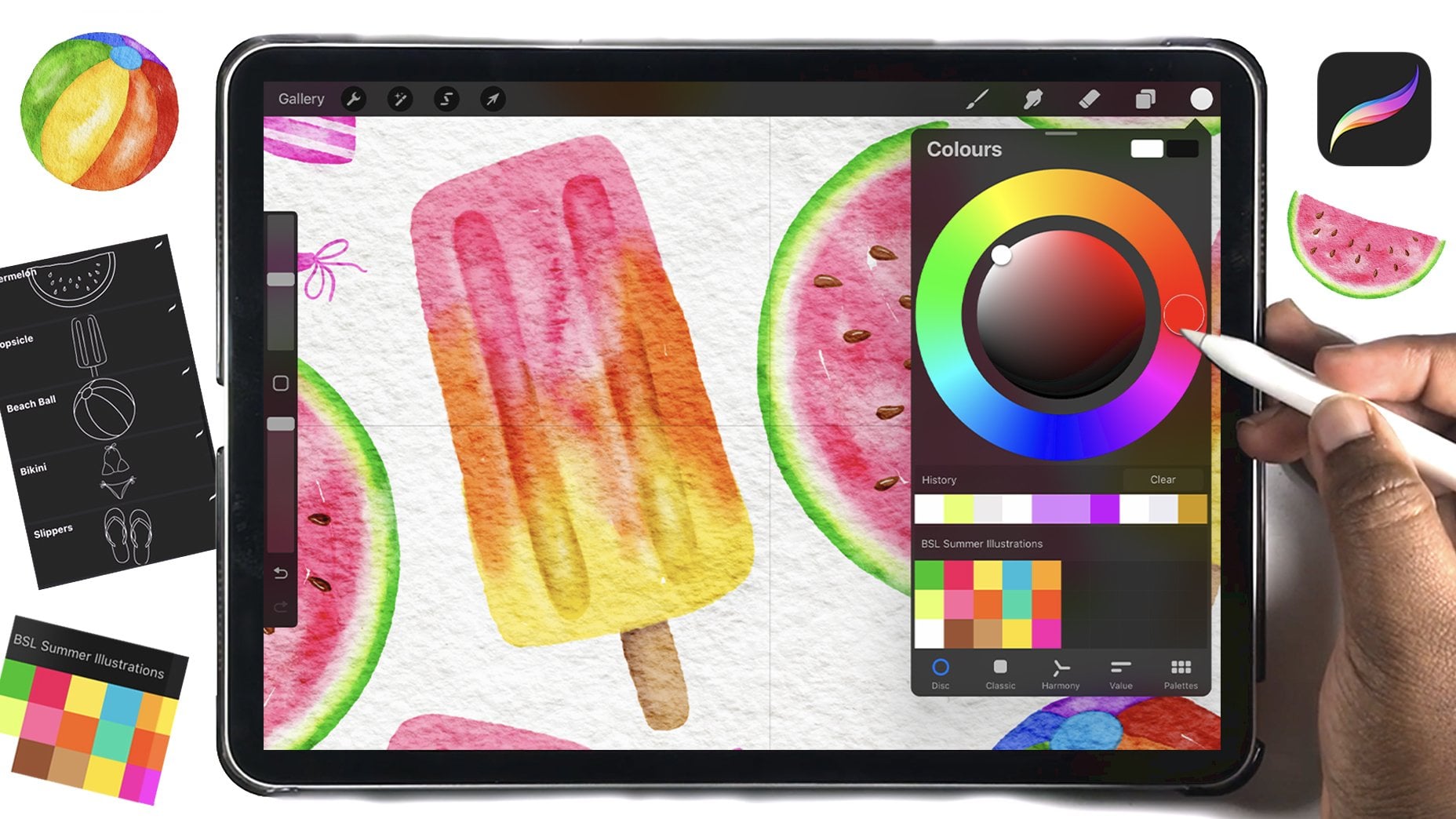
to paint a range of other things like vegetables, summer illustrations, aterin and even landscapes
all in Procreate. Thank you so much
for joining me, and I'll see you soon. Okay.
 Shannon Layne, Lettering, Procreate & Art