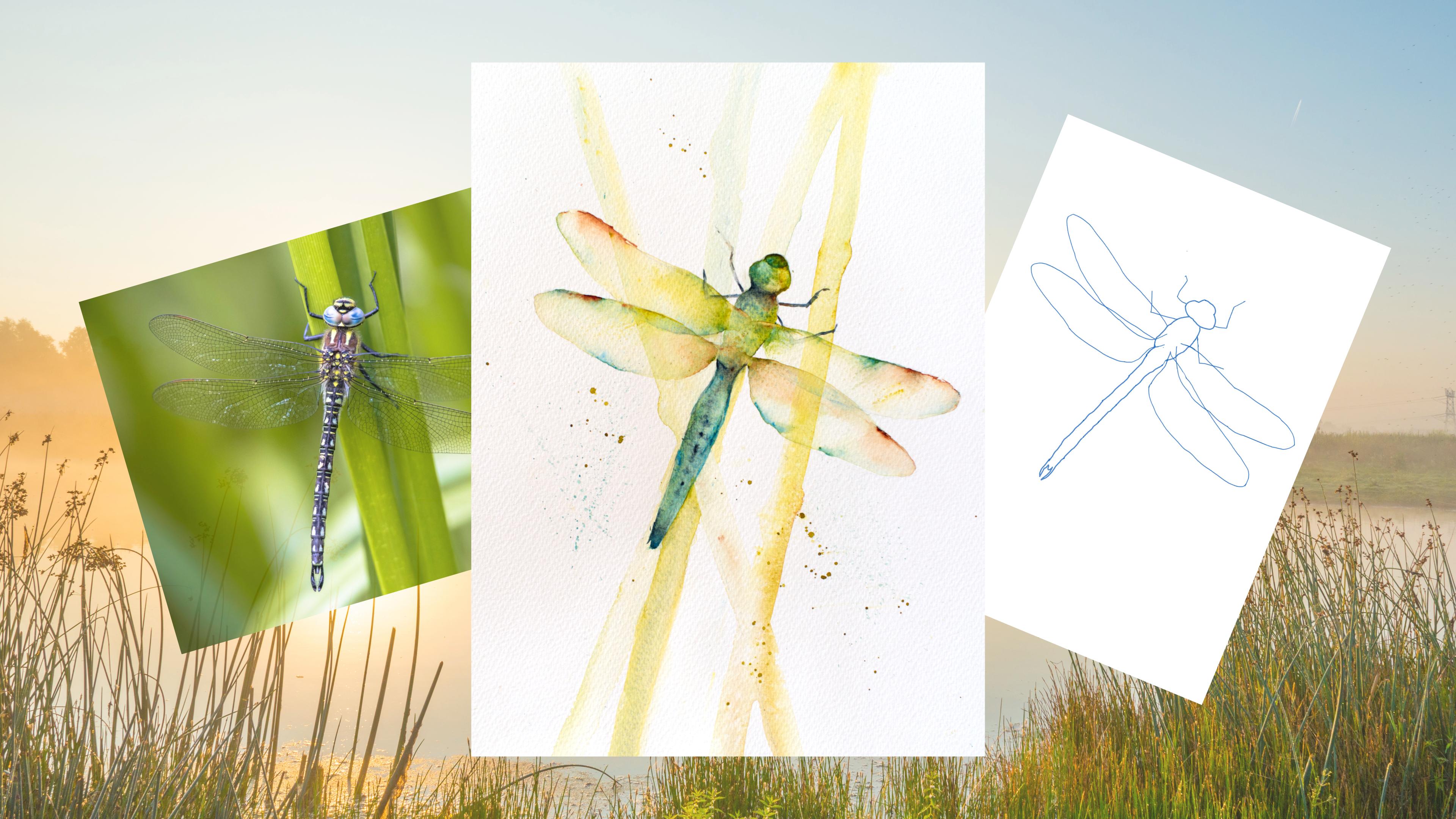
Transcripts
1. Introduction: Hello and welcome to use all
levels watercolor class. Today we're going to be painting these pretty dragonfly together. This is a lovely different class that taps into watercolors delicate side to
give us something magically, light
and translucent. It also has many
possibilities to play around, have fun, and enjoy. I'm Jane Davis. I live, paint, teach, and walk my lovely spaniels in the beautiful South Downs
National Park, England. Over the last 15 years, I've taught myself the
free flow technique that you see today. Not having been to art school, finding my own way has been
fun and sometimes daunting, but it has allowed me to
develop my own style. This has led me to
teach the others, either on a one-to-one
basis as part of a group in a wonderful studio in the heart of the South Downs. Also run a successful
commission-based business, painting pet portraits and wildlife art in my
own home studio. In all my classes, you will follow
along in real-time. What I can guide you
to keeping your work loose and fresh
without over fasting. I have over 20 classes are
valuable and Skillshare. Now, if you're
just starting out, my three beginner
classes will guide you. Then you'll find over
20 masterclasses covering a wide range
of beautiful subjects. In each one, I'll share the techniques that I use in
my own professional work. We have a lot of fun together and you'll gain the
understanding and competent to
incorporate everything you learned into your own work. Plus our share a few of my tips and tricks
along the way to. As ever, I provided you with some lovely reference photos along with a downloadable
template for you to print out. The template will give you
a stress-free drawing. You can just enjoy the painting. I'll show you some very
simple technique to create those reads is ever
so easy and fun. I'll be guiding you through
an interesting technique of dragging paint out that help
stop you from overfitting. I'll also be showing
you how to achieve that wonderful translucent
wings with a list of touches. Of course, our share many
of my professional tips, tricks and musings as we work
our way through the class. You're going to love
the simplicity. If you'd like to learn more
about me, all my work, please pop over to my website at Jane Davis watercolors.co.uk. This can be found
on my profile page, along with links to my
Instagram and Facebook pages. I'm very active on my
social media pages. Well, I love sharing my art, especially on stories
with many ideas, works in progress and
tales of Student Life. I really hope you will share your paintings on the
projects and resources pages. As I love senior most PCs. And don't forget,
I'm here to help if you get stuck or
have any questions. I want you to
experience that buzz of painting in this
liberating wet on wet, loose style. So
come and join me.
2. Materials: Welcome along to this lovely and I like to think quite
beautiful little curves. Now, I'm going to run through all the materials
I'm using today. And as normal, I'm
going to start off with my paint selection. Now these are all
Daniel Smith and I'm going to start with my top one, which is a rich gold green. You can see is the
greeny tones in there. I've got quinacridone,
burnt orange. Really nice color actually. Doesn't unusual sort
of patternings, but we only use it in
little hints of it. I've got manganese blue
hue, which is a lovely, so bright, bright blue, goes very well with
a rich gold green. And I've got Luna blue. Don't use it a huge amount. It's just for the little
darker areas and it's nice granulating paint to know, I appreciate you probably
don't have all these colors. This really doesn't matter as probably I will
say this to most, the beginning of
most of my classes, but use the colors you want. And you have to hand. Obviously, if you
look at dragonflies, there's a huge variety
of coloring them. You don't, don't feel you have
to stick to these colors. The reads, the glass, whatever, whatever you
want to call them. They can be again, sort
of any colors that don't feel constrained having to
use the same colors as me. Now, my piece of paper, I've actually haven't
even stretched it today. I just really want to keep
this class Nice and simple. It's one of those. You can push, grab the piece
of paper and have a go. You don't need to
prepare for it. It's just a nice, fun, easy little light class. So don't worry too much
about stretching your paper. Just go for it. I've got my puzzle water. I've got a little bit of salt which I've put on the reads. Again, you don't need
to have to do that. That's entirely up to you. I got a little the heart has a say and it just about the entire but it just
allows me to tilt paper. But actually we do quite
a lot of holding as well. So just, just something
you can pop your butt, your piece of paper
up with kitchen roll, paper, towel, little Ababa. And I've got a pencil. And I've got three brushes. I've got something a little
bit larger that was just about to run down those weeds. I've got a number eight, which I did most of
the painting width. And then I've got a
small number two. And now I've got a hairdryer
off camera as normal, it's handy but not a
central by any means. Also, there's a
reference photo and a template on the projects
and resources pages. Now I made a slight error
when I sketch this out. And as you go on and do
this sketching out lesson, you'll find me telling
you to be very careful about your
placement placements. I didn't get that quiet right. Obviously, I'm filming
the materials, the end as it were, so I can show you my
finished piece so I can, I know what happened in the
class if that kinda makes it. So just make sure you follow the reference photo
or have the template. The template will be right, but try not to follow this
finished painting because I show you this wing really needed to join a little bit further
up in the body. It's only a minor tweak
and I'm probably being a little bit picky about it. But have a look at the reference
photos that are pop up. And again, look at the template. That will be right, or at least a little bit
more white than that. Yeah. Lovely. Right? Think of Wofford enough. It goes Get him out and say make sure you get that
when placement right?
3. Sketching Out: So before we get get
on with the paint, we obviously have to
sketch them out first. So I'm just gonna give
you a few little tips. Don't be afraid to use
that pen template. Just give you the right shape. So once you lift that
away, if you do use it, then just make sure things
are nice and symmetrical. They're quite, they're
quite a symmetrical thing. So make sure that
they're lined up. And also the feet are in the right place for your reads or if you
do your read first, make sure I put this way, I would suggest doing
the dragonfly first, putting the feet in
the right place, then putting your reads in so you get, get them
in the right place. So it looks like he's
actually purchasing. I've actually been quite,
quite good for me. I've actually done proper
straight lines for those reads, but we are just going to
just run a brush down, so just a guide. These wings are nice
to get overlapping, although they don't
do a huge amount of overlapping on the
reference photo, it's just nice to get that
double layer just here, just gives a nice little element
to this little painting. Part from that thing
has much else. We just try and keep it
simple and try and keep your pencil marks as light
as you possibly can. Especially on the
wings because when we, we don't want to see them on the finished
piece that will give those wings that beautiful,
translucent look. So obviously a minor, quite heavy, but
that's really just for you to see what I'm doing. So let's go and get
some paint on him.
4. Reeds: Okay, So this onto the fun bit. We're going to do
those lovely reads and we're going to do a little
bit of a tilt as well. So first of all, I'm going to pop my little heart underneath my piece of paper just so
I've got a little tilt, but I may end up
lifting it up as well just to allow that
water to run even more. The time being that will do so. I'm going to pick
up my big brush, wet it down, rubber out the way. Just take off a little bit of excess water out and we're
just going to run down. Well, I've done my pencil marks, so they will be my guide for
the middle of the reads. So I'm not going
to worry too much. Obviously with its nature. Nature isn't always
dead straight. So we're going to
start on this one. I'm just going to
run alright downs competently as I
can over the wings. Because we're going to do
these reads, ever satellite. Next one over the top of him, around down x, y
along that down. Just nice and quick
and swift and that we usually give
you a straight line. Try to be as
confident as you can. Add a bit more water. Because what we're gonna do
is add that paint at the very top and allow me to answer, make sure they're nice and wet. The bottom are going to probably have dried out a
little bit because we've obviously gone all the way down and run out of water, so give them a
little bit of help. And again, to be very light, so we're not going to add
a lot of paint because obviously we've gone
over the dragonflies so we don't want to
distract too much from him. So I'm going to pick up my
green and also the blue. I'm just going to literally
touch the top of that. Who EC just going to allow
that to run ever so light. And if it's gone too heavy, you can just keep adding
water to almost in effect, wash it out but go light. Keep adding water. The idea is, should all flow down those
stems beautifully for us. To add a little bit of blue. Just to break up the
colors a little bit. Now, I'm going to have to give
it a little bit of a tilt. See if I can keep you on
camera and allow that to run. Let's see. We'll see
you can't use it. I'm just adding more water probably rather than
any more paint. So what needs to
be ever so light? It's just an idea of reads and flick it
right off the bottom. I know you can't
quite see the bottom. There. It's a flick it off the bottom. You can see this one
hasn't got enough. So I might, as was potluck
down for a minute, almost a little bit too light. So let's add a little bit
more paint at the top. Blue. I will add just a
little bit of orange. Just lower down, just breaking up the
color isn't nothing. It'll tiny little bit
of the darker blue. Again, we're going to tilt. Allow that to run. Preferably don't want
a big blob there. You can do the read a little bit lighter through the body. So don't add paint actually. In the area where
the body is easy. We don't really want
to see the reads that much through the wings. Quite nice because
obviously those wings are a transparent. So let's make sure we got
color there with a very, very subtle layers,
which is so beautiful. Watercolor is all
about, isn't it? Let that run off into, shake that off a little
bit. Yours looking. Just going to lay that
down for a minute. I'm just going to put
a few sort of novels, I suppose, just to
show that there. Say they read, but it's
just a nice little, just a tiny little pullout. It just gives a
nice little effect. I think. You could just do them on
a, on a few, few of them. You don't have to
do that every side, just a, just a little, little hint to them some way. One up here, be random. Add just a tiny bit of blue. Let's give it another tilt. Looking nicer, say the mini, you got something
you're pleased with. Always the thing is to
pop it down and leave it because you can carry on fiddling and not
make it any better. That's looking okay. Lovely. I think I'm gonna
allow mine to dry. Now. I'm going to talk a
little bit higher than my heart and
allow it to dry. I'm going to pop it down for
a minute just so it really does continue flowing
down and give you a sense of movement. And as it begins to dry, I know a couple of
my practice pieces, I just sprinkled a
little bit of salt. It just gave it a little, the read a little bit
of texture almost. You can imagine a
little bit of water on there, the village you, um, that's quite nice
but you don't have to. So just allow those to dry
in their own time really. And then we can
start the dragonfly
5. Body: Okay. How did you all read dry? So once you've once they're dry, lay, lay it flat again. And then we're going to
give it another template. Actually, pop what
wherever you are, wherever you found
is sort of an inch high papa underneath the board piece of paper. If you're doing it like me, and you probably don't
need your bigger brush. So i've I've got
that to one side. So pick up your I've got my number eight
and we're going to pick up the green and the blue. And we're going to
add some paint, the head and allow that
to run down the body. Now it's quite
important, I think, to keep this as lovely
and as loose as you can. So don't add too much paint. I'm just going to put a
small amount here actually. So if you have got pens,
give it a good well, so you want a nice amount but not too much because
we can always add. And it's very easy
because it's actually a, quite obviously quite a
thin subject is quite easy to add too much
and it becomes bulky, then it loses that
nice sort of movement. So once we've got that
little double of paint, touch more blue in
there, I think. Clean your brush. Now we're going to touch the edge of that, go into the round
head and just follow that line down to
the the body here. Fully aligned. It's a bit tricky. I've
lightened some of mine so it's almost
disappearing, doesn't it? Little helped side there. We can add some more
color if we feel we haven't got enough
strength that it's better to do it that
way round them to put too much and try
and soak it up on this subject anyway
in a bit more gray, but I would just keep
adding it to the top and allowing it to run down rather than adding
it further down to you're just allowing again, you can give it a bit
more of a tilt if you find that moves the
paint a little bit more, pop that down just a minute because I think it's
easy for you to see rather than me trying
to paint a tilt. Now clean your brush. Grab your blue. We're going to put a nice
probability of blue just here. Just on the tail starts. Clean your brush again
and we're going to be the same as we
did with the body. And we're just
going to allow that or to run all the
way down like that. Now if you've got it on a on a tilt as we'd ever we tilt to make sure you keep
an eye on this. This doesn't bother me too much. You can find you get a
little pool of water there. Now at this stage
you can just look at your piece and tinker
where necessary. Bear in mind, the top will dry quicker than
the bottom as well. So a little bit more blue there. Now you can almost tilt
it onto one side as well. Then it will give
you an illusion of light on one side and
dark on the other. Pumpkin, try and keep
a little more simple. I'm just going to
keep it on one angle, but it's worth playing with. Now I've gone a little bit, I've gone into that little
area there, you see corner. So I'm just going to leave that I can tidy that up afterwards. Not ideal, but me trying to paint from
say, a little way away. Yeah, I think that's
looking really pretty. I say it's keeping it
light is the trick with this subject and it is
what makes it beautiful. We can add. And
then what we gotta do is now just a
sort of watch it. And we can add little bits of other color in as
it begins to dry. So I'm going to pick
up the lunar blue. As it begins to dry. I'm just going to put, I'm not going to do all that detail. There's so much
beautiful detail, but we're going to try and
keep this nice and simple. So just a little bit
of lunar blue just to break up where the head is. Just very gently
just tap it in and allow also going to
pick up that orange. Kinda put a little bit there. I'm not trying to almost trying to find something
that's going to look pretty rather than trying to
do the detail would be good. Any good at doing an a
guide to dragonflies, widow people go, What, what breeds that
specimen Have you found? I'm going to put a little
bit down here as well, a little bit the
lunar, lunar blue. Just to break up that tail. We're gonna do, uh,
just a couple of markings down the tail as well, but that needs to you just need to get it the stage which
just starting to go off. You can start to see the
texture of the paper coming up and rising above
and almost dry. It's been quite clumsy here. I've gone out there as well. I'm just going to say you
need to add a little bit of Luna blue right at
the bottom as well. Just allow that to go up. Just very gentle. Just watching it, seeing
how it's drawing. It's a little bit too
wet still to put that. Blue down. Blue dots are the little
bubbles down the, down the main part of the body. Just going to pop,
that begins to dry. Things won't move as much onto tiny little bit of orange there. My Luna blue from the body has blended a little
bit too much. I've probably got it
down to tug too quick. Tap it in there. Keep
everything ever satellite. I think that's looking okay. Alright, let's see
if I can get this. Put that one down. So I might do it
with a little brush. Make sure it's nice
and clean in the tube. And I'm going to
lay it on the side. Just gently tap some
of those lines down. Don't try and do a couple of other horizontal ones as well. They don't try to do the markings because you'll
be there for ever and it won't I'm not sure if I
like the very exact details. So I've just dropped a little bit of water
in there just to make sure that sort
of breaks up as well. They would be fun to you to do if you like detail is to do
one really loose like this. And then if you like, the detailed aspect of
watercolor painting, and then to do a really detailed piece and see what you prefer. And it'd be lovely
to see them as well, because I'm sure they'd
be a fantastic subject to really sit down and get get detailed if that's
what you'd like to do. Don't think I have the patients, so just having a little Tinker. I think that's
drying quite pretty actually are more just wanted to add a little bit more blue for almost a
little too washed out here. Just on one side. Now I have to be careful
because we're getting to that stage where bits
are beginning to dry. And it's very easy to over, it's to put little marks in
and things aren't quite draw. Things are beginning to
dry and you can get messy. So it's always best to down
your brushes and leave it. Because you can in theory do another layer if you wanted to. But it's quite nice to have
got it down into one layer. But I think we're going
to allow that to dry and see, see how we get on
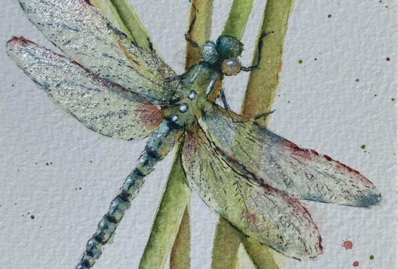
6. Upper Wings: How's your little
dragonfly body dried? I hope it's hope it's
been successful. So we just need to lay flat now. So take your little support off. And we're going to do
these beautiful wings. So it on with a similar color is actually we're going to
use the green and the blue. And a little bit like the head, we're going to pop a little bit of code right up
against this wing. Rather be at the body
where the wing starts. Just a little pallet
of two colors. It doesn't matter which order. But just so you got a
little little two colors sitting there. Blue. Again, you want to be even more so don't put too much
paint onto. Go easy on it. Because you almost want almost on what the law
that we need to be shown. So it's just little hints
of color just so you, because those wings
are see-through, they're transparent,
aren't they? So there's not really any color, so we just need to add something so your eye
can see there's a wing. So it's just putting
a needle into color. So what you're going to
start on the right-hand top one we're gonna do allow going to paint the top and then we're going to
allow it to dry and then do the two bottom ones. So it's the first one's
top ones to start with. Switching to pull that color
out, just going to touch it. And then pull it out
by pulling up just meaning I'm touching it and allowing that paint
to run into the wing. Now again, you can give
it a little bit of tilt. And if you find there
really isn't enough color, you can always add tiny bits, but let's do then next, swing beside it and when
then we can have a look, so we actually join them up. Then just pull that one out. One's got a little bit more
color, hasn't it? Round? So they stay within your lines. Make sure they, if
you can see them, then what you want to
do is not to fiddle too much and just allow
that to work. I'm going to put
I've got picked up a little bit of the
blue and I put a tiny clean my brush top, it's got a bit contaminated. I think put a tiny little
bit of blue on top there. Such a lovely color. Tiny bit down, down on the tip. And I also want just to make sure that a little
bit of color here. So when we overlap those wings, you can actually see that
lovey layering effect. Actually going to put tiny
bit of orange as well. Because I like that She
funny little markings aren't Neff and I'm sure there's lots of terminology
I'm not saying right, but there's a little,
little marks here. Just put bows in. Do the same the other side. How does it look? Now he does bear in
mind, it does move. So might do is just to give it a little bit of a
a swirly round. So you can kind of give it a swirl and allow
those colors to move. You can tilt it. See what works for you and what allows them to flow and move. Add a bit more water,
It's begins to dry and then carry on
doing a bit swirling, adding a bit of color
if you need to, but go very careful and cautious with adding
too much color. You'll see this appearing. You slept flat again. Going to pop this the minute is a little bit of angles, right? Tim, covering up what I'm doing. Tiny little bit of there
should be the blue bits, got a little bit MCI, quite a bit blue-green. Again, I want to make
sure there's just a tiny bit of color
down here as well. Pop, pop a bit of
blue and the green. Just make sure you're nice
and tidy up here as well. As normal. I'm working a little bit
way away from it and it's a quite a delicate subject
to be away from it. We'd put a little bit of water, give us any interest. I'm not using salt. I did try salt. It was a little bit
too bubbly and I think the wings and I just kept lovely and smooth and smooth. I don't show where the end is. Okay. I think I just need
to allow that to dry. It's given me I don't think
I need to do anymore to it. Again, just watch your
piece as it dries. So it's always worth just
say sort of monitoring. It's a, you're
watching it drawing. And if you think
you need a little bit of strength somewhere, I might as it begins to dry, put a tiny little
bit more strength, orange just here,
but it's quite wet. It's going to move to much. So again, I've just because
we're monitoring it and add if I need,
but be careful. Don't add too much color. It's very easy to
enjoy doing this. And before, you know, you've blocked in the wings. So I think it's nice keeping
them very, very translucent. So we just need to allow that to dry and dry flat as well.
7. Lower Wings: Okay, so once, once your
top wings are done, we'll start the second. So again, we're going to add that little bit of
green and a little bit of blue light into those corners
right up against the body. Always bear in
mind if you've got one columns with very dominant, obviously don't add
as much as that and add a little bit of your color that's not
maybe quite as dominant. Okay, and we're gonna
do exactly the same, touch, that little
bubble of paint. And we're going to run around and follow
that pencil mark. And just allow that
painter to move out. Russell, if it's not moving. Make sure you stay in your
lines and make sure you go over that. First wings. You get that nice, some, hopefully that nice layering effect again onto
the next swing. Pull it out and allow tinker. It isn't moving. Suggest making sure that you have as your wet
or the wind down, you don't want it to dry patches because it will run
around that and won't give you that nice movement. Now, again, you can give
a little bit of a swirl. You can add a bit more color. I think I'm going to
add a little bit more blue because it's
gone quite grainy. Going to pop a little
bit of blue up there, just a tiny amounts little bit of water
to keep it moving. Touched down here. There's not much point look
in the reference photo, is there because there's
no color particularly, so you're just doing something that's pleasing to
your eye really. And obviously if you want
to fill them into that will really brightly painted
it, that's fine. It's really, this is a very simple either class
fear for you to enjoy. Just have a play. But a little bit
of orange there. Because, why not? And again, they put that little marking
there in that corner. It's probably a bit too soon, so it makes sure
it's a little bit. The paper is just
starting to go off before you do those things. Doesn't matter. I can quickly, easily to soak it up. Hold for a little bit on this wing because again,
that's quite saturated. But just check you've gone
over that first wing, so it's just a nice
element, I think, that overlapping and making sure you've got a
sort of lined up. And all your shapes are right. You haven't missed any bits. And again bit like
the first wing, just allow, just put
your paints down. Have a look, see what you
think. How is it drawing. I'm liking that. I don't think there's an awful more
I want to do to it. It always seems a little
bit too easy, doesn't it? And you think there must
be more to do that. Sometimes you don't
need to do much more. Normal. I can't quite just a tiny
little bit of BlueJ down there. Sometimes you just summing goes. That would be nice. They're just something
there as well. So it's trust your instinct because quite often
That's right. Problem, water will just push. If I drop water here, that will push that paint
right up against the edge and get it leave you with
a really lovely line. I think what I need
to do actually is to, is to leave it because again, but like the first one,
the more you tinker, sometimes the worst it gets in. You want this to be
lovely as flowy, but I will again just watch this little edge
here and as it dries, I'm going to pop a little bit of orange there, just to give that. You see there's a very obvious little markings
on the edge of the wing. So I'm just going to allow
that to dry a little and add that and
we're almost there.
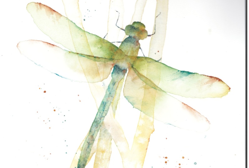
8. Finishing Off: As you can see, he's,
he's almost done. And what I really want to do is the Robert
those pencil marks. But before I do, I think
we need to put the feet. In. Other words,
we're going to well, I will rub out the feet. So crappy little
brush, nice and wet. I'm going to use fitter
the lunar blue and just, just don't want to
do them too dark. Let's have a little
bit of the orange. Now we're gonna do the
first one's top ones first. Now, go light on. Don't make them too
heavy because we're just literally just
painting these on. So I wouldn't go overly heavy. But lay it will have a look
at that reference photo and make sure you
get the shape right. So we'll just follow
your pencil marks if you've got those
nice and correct, that you need much
more than that. I'm just going to put
a tiny little bit of orange edge to break
it out really. And same on the other side. And keep one side light
if you want if you were trying to tilt it to one side, like I mentioned at one point that you could have
left the body drawing on a tilt that would have made one side
light in the other. So you can do one leg a little bit lighter
than the other. Let's do that on that one. A little bit of orange there. I don't want any of
these heavy sound. I'm trying my best to be as light as I can because
I can always darken, but it's not so
easy to enlighten. Then take your brush
away, have a look, see we think that looks okay. So now onto the lower ones, back ones, it goes
underneath the wing. So what we're gonna
do, we're gonna take the darker bit on the
white sheet of paper. Then go out and clean
your brush a little bit. And then using the paint
that you've just put on, just join it up. So in theory, underneath the wing should
be a lot lighter or hopefully give you
the impression that these aren't covered
by the wing. So you will see them
clearer and darker. And same for the
other side as well. It's just a quite a nice
little element put in again is we're out there. Again, just joint clean your brush and then
just join them up. I think I might have been
a little bit over cautious that you can add a
little bit more paint as I can't even see the
one underneath the wing. Now it's gone too dark. Gently sucky off,
it goes too dark. You can just very
gently sort of suck up the part that's in the wing. Again, take a brush
or a see what you think that's worked out. Okay. Don't think I want to
add anymore really. I don't want to get too
detailed into bits and pieces. So I think he's probably
there without one. So let me pop those down. And what we're going
to now gonna do. So I don't want to
do too much detail, but actually doing the little, why should I look to
all the, what the, where the anatomy is called
but the very front part. So what I would call
his nose maybe, sorry. If you're into dragonflies
and know your terminology. Just wet that down again. Even if you've gone
quite strong here, even by merely wetting it down, you'll end up with
a sort of a line. But I'm just going to put, I'm gonna put a little bit of blue because it's quite green. So I'm just going
with the contrast. So I'm not necessarily following the reference photo
and all the colorings. Just, just something
that's pleasing and kind of a theory on light. We can see how that drives. Now I did take out, I think on the once
I let this body dry, took out a little bit,
I made a mistake. So in case you're wondering
where that's gone too. Okay, I think that's it
for that little bit. Now. With your lunar blue
or whatever color, I just want to put a sound. It's very easy not to get
carried away with detail, but I'm just going to
put the tiny little line here underneath where
that head joins the body. Pretty sure that might
be called a head. And then I'm going
to soften that line. I don't want to I don't really
want anything too hard. Just to soften it
away a little bit. When you added
your little bit of color there that might
be strong enough. So again, with all
these finishing off bits that it
becomes a little bit subjective and on what
you're painting looks like and how yours is looking. Right? So the next thing
that we need to do is to join up the wings. It work because
they're kinda stuck on the outside at the moment. So all we're going to do
just bear in mind that these little areas
are dry issue. You don't necessarily
need to touch them, but just be aware of them. We're just going to touch
the edge of that wing Bring them into the middle. Get that little lighter
vessel just with pulls in. Yeah. Take your round brush
away so you see how it looks. We can pop a tiny little bit
of orange just at the top. Try to keep them sort
of symmetrical as well because they are
very symmetrical. Aren't just that little
Bobby, just enough actually. And then I'm just going
to move my finger, just gently drag that away. Let's say meals. I'd be careful that leg. Lovely. And we're going to
do exactly the same with a 0 or one lower ones. Can you brush first? We're just going to
gently stroke on John. Paul goes in. I'd probably gone a
little bit too far down. I think I should have swept
up a little bit more, but not to worry. Sure. I probably told
you in the sketching out is to make sure everything
he just looked, just write a little
bit of the swing. And again, just to
pull it out in the late and pull it out a
little bit with your finger. By doing that, actually,
if you've got rough paper, you'll find it just gives you a little bit of texture as well. You join those up if you want. And we're just kind
of a bit of a switch. Really don't want anything
too obvious or too hard. Just softening over
that a little bit. Maybe a touch of orange. As I've gone wrong a
little bit and gone, gotten a little bit too low or probably don't want to
make that too obvious. But if you've been a
bit more diligent, what I might do on the
hopefully on your template, I'll make sure I've got these wings a little
bit higher up. So you've probably
got your things in the right place
if you've used the template. That
looks absolutely fine. Okay. I just want to say
any little bits of light out what I
think is necessary. I'm going to take just a
tiniest little bit out. Just bear in mind that
might be a little bit wet. I'm just going to take a
little bit lighter here. Just very gently. Just take a little
bit if yours has got a beautiful mark and you're
really pleased with it, then you don't have to. You're wasting effects. Improved it. Squishing, but I think
it's quite nice. It just squishes the paint around rather than
lifting it up. It just disperses a little
bit and then you get obviously get a little
bit on your finger but it doesn't lift
it straight out. I quite like a little
squished, move my finger. I'm liking how
that's all looking, or I might do. I'm going to add
a little bit more stripped down on this read here, which kinda got a
little washed out. Partly because I made a bit of an error here when I was
painting it and went over. So I've tied to the edges
while it was drawing. Now I've lost the
liner that read. But it will also be
quite fun just to get one quite strong. So I'm just going to wet down
where that read should be. Straight off the page like
we did when we put them on. And I'm just going to add just a little bit of green
right at the very top. Make sure I then get a good shape for the
body of the dragonfly. I get a nice sharp edge. I can give it a bit of a
tilt to lose your camera. Just as we did before. I'm just allowed
that to run down. I might add that for a minute. A little bit of orange
and a little bit of the lunar blue. See how that looks. I don't want to
get due to strong, but it just kinda just
disappeared a little bit. So I'm going to put that in.
You'll see me. Can't you? Make sure that it's
nice and neat and crisp? So yours might be fine. So this is a little
bit meeting cream where I've probably made
a bit of a mistake. It's fun to experiment with
these things and this is a difficult class is about really just having a bit of fun. And it's very quick,
quick, easy piece. Quite a few different
possibilities really. Okay, I think that
looks quite nice. Let's put that down again. Just make sure age
is nice and crisp. Okay, and just
make sure I've got tiny bit lost a little
bit here as well. I haven't I would
have been up here Me is perspective and straight
lines is not my forte. I should be careful
what I'm doing here. Okay? Right. Okay. I think that's
looking, looking nice. I still want to really
wrap these lines out. But as my reads a bit wet, so that wouldn't be ideal. Okay, Let's download
for minutes. Now you could take little
bits of light out of here. If you feel you got
a little bit heavier within your wings
and just again, clean brush, wet it down. So I take the excess
water off and just take any color out if
you feel you needed to. But what we're going to do, this is probably I probably only do this on one wing
or maybe two at most. I'm going to put the
minute is a little bit of color right at the top there. And then we've a finger, make
sure it's clean and dry. I'm just going to she says I just need
a bit more paint now that it was working. Just give it a little bit of
a cool down and you're fine. If you've got a little bit of texture paper, it would just, it may not even come out until the camera and show how well
that's going to come out. Just gives you a little
bit of texture because the paint just off the lights across and picks up
some of the tops of the nobles of the paper. Let's try it with a blue
and try it up here. If I can make it be
more obvious for you. It's only tiny and it's only just a little thing I was playing
around with really. But it was, it gave quite
a nice interesting. Because I don't want to
put weather vane done. Again, something you
might want to do. So I'm hopefully just giving you the bare bones of
an idea and you can tinker as you see fit. That's too much and I've got a lump of green on my finger. That's what you don't
want to be doing. But if you just gently wipe, you will finally get a little, just little hints of
texture is quite, it's quite subtly
mine or even to say, necessarily show on
this on the camera. Hokey dark. Now I don't think
there's an awful lot more to to do really. I'm just checking my notes. I haven't forgotten
anything very obvious apart from
popping those lines out. So I'm just gonna give
it a quick hair joy, and then I'm going to
give up those lines out, but I want to make
sure everything is nice and dry before I do that. So I'm just going to
head right first. Okay. So very gently rub any
of the pencil marks out. But as I say, be really mindful that you lovely and
dry before you do. And this is where you really
hope you've done the wings. You put the pencil marks on the wings as light
as you possibly can. Because this will
give you that lovely, Lost and Found look lovely, translucent this
and you'll be able to see those layers as well. Okay, I went to do too
much more time away. I'm jiggling the
camera around Jupiter. You can see these nice to get
rid of those pencil marks. The only other thing you can
do is to add some splatters. Some of my practice piece, I did, some I didn't, so I'm not sure but I will do them just so you can see
what they look like. See wherever you think
you would like some, I'm going to use the blue, wet my brush down a little bit, tiny bit on my brush. Now you can always practice
on a scrap of paper. I have a scrap of paper. Well, one of my practice pieces, just practice to see how
that feels because sometimes it can come out a little bit too bright or you've
got too much on. So I tend to practice on a scrap first before doing
all my main piece. Where the fancy really, so you just put your
finger underneath the bristles and flick backwards and hopefully
you, something comes out. You can again, another
way of doing it. I've got the green
this time. Same again, wet your brush, getting
a nice mountain on you in the end. And then you can hold your brush against over the top of
your paper and then tap, and that will give
you bigger splatters. You can just do them
wherever you fancy. I wasn't sure if I
like them or not. Quite fun on this. Gives you a little bit,
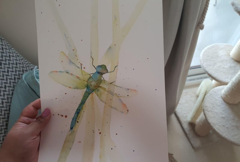
add a sparkle, doesn't it? That really is it. Now, this can obviously
be elaborated. You could have done more reads, you could add some
more dragonflies. You could have done a huge
piece and added three or four, are done one very, if you like having detail, you've added your
really detailed piece and another one further back. So I hope this is
just giving you just a nice easy piece that kind of illustrates how little paint you need and how
beautiful watercolor, even when it's done very subtly
racist that we've added. So let's such little paint, but it's giving us a lovely sort of free and easy in theory. All look, isn't it? So, I hope you enjoyed
this little class. It's not quite as complicated
as some of them, is it? So as ever, thank you for
joining me and please do share these on the projects and resources pages because
I do love to see them. So thank you again.
9. Final Thoughts: So I hope you
enjoyed this class. It's wonderful to
work so delicately. How did the reads go? Remember if the
paint doesn't flow, just add a little more water. Did you find adding
the paint and dragging stop you
from over fiddly? The trick is just to allow
the wings wonderful to paint. I found it forced me to
work mindfully and gently. We look forward to seeing
you in the next class
 Jane Davies, Professional Artist and Teacher