Transcripts
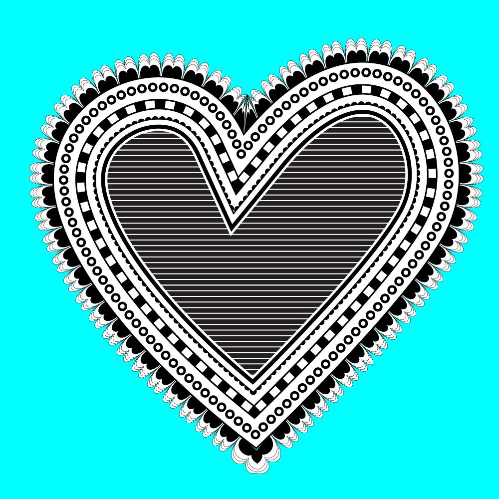
1. Graphic Design for Lunch Doodle style Heart Introduction: Hello, I'm Helen Bradley. Welcome to this Graphic Design for lunch class, Doodle Style Heart in Adobe Illustrator. Graphic Design for Lunch is a series of classes that teach us a range of tips and techniques for creating designs and for working in applications such as Illustrator, Photoshop, and Procreate. Today we're making a doodle heart. We'll draw the shape and then decorate it with a doodle star brush that we'll make. We'll also add some appearance panel effects. You'll also discover that it isn't easy to get perfectly scaled shapes in Illustrator, although you might think otherwise, and do a lot of work around for achieving scale shapes anytime you need them.
2. Doodle style Heart Part 1: To get started with our doodle style heart, we'll create a new document. I'll choose "File" and then "New". I'm going to make this a square document, so I'll just make it 1,000 pixels by 1,000 pixels. I'm going to make an RGBA and then just click "OK". Now, we're going to start out by adding a background just so that we can make sure that everything's going to look good over our background, so I'll click on the rectangle tool. I'm going to drag out a rectangle, in actual fact the square, that is the size of the artboard, and I'm going to fill it with the color. I'm just going to add this blue color. I don't want it to have a stroke, so I'm just going to turn off the stroke. I'm going to the last panel because I want to lock this down. I'm just going to click here to lock it. That means I won't be able to select it by accident when I'm creating my heart. The next thing we need to do is to start to develop our brush, so we're going to do that using the Pen tool, but we're going to do it very simply, so if you don't like the Pen tool, don't worry because it's not going to be a really big job, but it's a nice little bit of Pen tool practice. I'm going to click on the Pen tool and I'm going to set my color fill here to white. I'm going to set my stroke to black. I'm going to start by drawing a sort of M shape. I'm going to click and drag in an upwards direction here, and then I'm going across here to where the point of the M is going to be and I'm going to click and drag down. You can see that I'm getting this M shape. Now, I want to go back up here and to make another loop, you can see that right now I'm pointing off in the wrong direction. That's easily solved by holding down the Alt or the Option key, and that turns the mouse pointer into this little bend arrow. Now, I can click on this handle and drag it around in the direction I want to go in. Having done that, I'll let go the Alt key and I can continue to make my shape. I'm want to come all the way down here to approximately opposite where I started and just drag up. Now, that's the shape that I want, but you can say that the mouse is still attached to this line, so I'm going to hold the Control or Command key just to stop it from drawing. We have the starting shape for our brush. Now we want a couple more of these, so I'm just going to zoom in close and we're going to make some copies. I'm going to select the selection tool and select this shape. I'm going to choose "Edit" "Copy" and then "Edit", "Paste in Place". That paste a copy of the shape immediately on top of the original, so I can just scale it down. I'm going to do that once more, "Edit" "Copy" and then "Edit" "Paste in Place". I'm just getting a layered look here. Then I'm going to do it once more, "Edit" "Copy," "Edit" "Paste in Place". Now this time I want this to be smaller, so I'm going to size it in here and drop it down and across something like this. I want this to be black filled. I don't want it to have a stroke, so I'm going to turn my stroke off. I'm going to click here on the "Fill Color", and I'm just going to set that to black. That's going to be the basis of the brush that I'm going to use. Now the problem with this is if I create it as a brush right now, when I apply it to a line, it's going to be applied across the line pretty much like this. This would be the line and the brush would be applied across it. I want the brush to be applied over the top of the line, so I need something to balance it out. What I'm going to do is add a rectangle exactly the size of this shape below it. I'm just going to start by drawing it here and I'm going to draw it over the top of the shape. Now, it doesn't matter too much how big its width is, we just want it to be smaller in width than the shape itself. But we do want it to be pretty much the same height. We don't want this to have any stroke or any fill. Having drawn it to size, I'm now going to just move it down here. This is going to be my brush, this space up here, and this space down here. I'm going to select over everything and we'll make a pattern brush out of it. To do that, I'll click on the brushes panel here to open it, and with this entire object, including this space of paste down here selected, I'm going to drag and drop it into the brushes panel. Now, the type of brush that we're going to create is called a pattern brush. We're going to use this one element to go all the way around the edge of our heart, so I'm going to click on "Pattern Brush" and click "OK". Now, in the pattern brush dialogue you get to make some choices. What you get to choose is what these corners look like, because you can see that the brush is going to paint down the sides of a shape, but we need to choose the corners. If you click down here you can see your options for this outside corner. Illustrator has made a pretty good choice to me there, I think that's a really nice corner. As for this inside corner here, there is no choice already made, so we get to choose. I'm going to click "Open" here and see if any of the options here suit me. Well, I think this is a nice shape, this one here. I've just selected it from the list. Now, you can make your own corner pieces if you want to, but since this is a doodle style brush, it doesn't really matter if the corners aren't perfect. It's going to have a hand-drawn look to it. Now, if I wanted to be able to recolor the brush, I would choose "Tint" from the drop-down list here. But I want this to be a black and white object, so I'm just going to go ahead with this and just click "OK". That's now created as my brush. I'm just going to move it out of the way for now because if it needs any alteration, I've got all the pieces that went to make the brush, so I could just make some minor alterations and resave it, so now we've made our brush, we're ready to go ahead and create our heart.
3. Doodle style Heart Part 2: I'm going to press "Ctrl 0" just to size back my document so I can see everything that's going on here. We're going to create a heart. We're going to do it with the Pen tool again. But it's very, very simple, so even if you're not happy with using the Pen tool, you'll be able to draw this heart. I'm going to click on the "Pen Tool" to select it. I'm going to make sure that I select here a black stroke, but I don't need any fill. I'm going to start at the inner point of the heart. I'm just going to click here and drag in the direction that I want to hit in, which is up towards the top left of the document. Now I'm going to let go and you can see I'm about to swing around and make this curve of the heart. I'm going to click and drag here and I'm going to click and drag in this direction. Click, drag. That makes the curve of the heart. Now I want to get down to the pointy end, so I'm just going to click here once. I'm not going to click and drag because I want to point. Now I'm back on this side. I'm going to come back up here and I'm going to click and drag to make this shape. I'm going to come all the way back to the finishing point at which point everything's going to fall apart. Don't worry that it's about to fall apart, but you're going to click on the starting point and drag in a downwards direction here. You can see that what's fallen apart is the beginning of the heart. But you've still got your pen in your hand, so hold the Alt or Option key and you can click on this handle here and just move it back up. Now we've got our heart drawn. It's not perfect, so let's go and make it a little bit better. We're going to do this using the Direct Selection tool, and we're going to select over the points that we made and we can adjust them. I can just pull out these handles here, click on this anchor point, drag upwards, and just shape my heart. Now, you may want your heart to be a little bit uneven that will give it a folk style look to it, so don't hesitate to make it look a little bit uneven. When you're done, you can just click away from it. I'm using the Move tool here to click away from it. Now that we've got our heart, we are ready to apply our brush to the outside of it. We'll go and get the shapes. I'm going to open here the last pallet and say that this is the heart shape that I was working on, so I select that. I'm going to my Brushes palette and I'm just going to click on my "Pattern Brush". Now the Pattern brush has been applied to this shape but not the way I wanted it to be applied. I wanted it to be on the outside of the shape, and I also wanted it to be much smaller than it is. Now I can adjust the brush using this option here, Options of Selected Object. What I'm going to do is to flip it across so that it's on the outside of the shape instead of the inside, and I'm going to make it a bit smaller. Now, everything's pretty good except I'm not really happy with this pace here. What that is, is this space here; the third element in our pattern brush. Let's just go back to the brush and see if we could make a different choice. I'm going to double-click on the brush here to reopen the panel. Now, I can fix the flip across thing permanently by clicking here to make sure that the shape is flipped across for all of the times that the brush is used. Now it's this space that I'm concerned about because it's just not working as it should, so I'm just going to open up this panel and see if there's another option that I could use. Let's try auto-centered, and I'll click, "Okay". Now Illustrator is asking me whether I want to leave these strokes as they are but just change the brush for the future, or if I want to apply it to this shape here. Of course, I want to apply it to this shape, so I'm going to click "Apply to Strokes". That's a better fix for this space. It's not perfect, so we could perhaps have another shot at it. Double-click on the "Brush" and just see if we could find something different again. That's a better fit. The brush is still too big, but it's fitting in the corner a whole lot better. I'm going to re-select my shape, again, click on this option here so I can scale the brush down. I'm just looking for a nice edge effect here. I think that's pretty good, so I'll click "Okay". Now we've got our heart shape and we've got the first of the decorations around the heart. We're going to go ahead next and create some decorations for the middle of it.
4. Doodle style Heart Part 3: If we want this entire doodle look to be in black and white, we're going to need to fill a heart with white instead of blue. With the heart selected, I'm going here to the appearance panel and I'm going to set the fill here to white. I'm going to click here and apply white as the fill to my heart. Now, I'd like a slight edge around here, so I'm going to add a stroke here. We've already got one stroke, which is this pattern brush, so we're going to add a second stroke. I'll click here, ''Add new stroke''. Now this stroke, I want to be a two or three-point line so that it's just evenly over the edge of the brush here. I'm also going to move it above the brush, so it's going to sit above the pattern brush. Then I'll just click away. That's a good start to my heart. What do I want to do next is to add a series of dots around here. They are going to be dots that have a hollow center. They going to look as if they have a hollow center. In fact, they going to be black dots with white dots on top of them. Again, I'm going to re-select this shape and I'm going to add a new stroke. Now this stroke the stroke that I want to have my black dots made out of, but I need to insert it, so I'm going to drop it in, to the middle of the heart here. To do this, I'm going to select ''Effect'' and then ''Path'', and then ''Offset Path''. Now the default offset is 10 pixels, which is way out here. You can see that that lines just appeared in the middle of my pattern brush. I wanted offset to be in a negative direction. I'm just going to start pushing it down. I'm looking for this line to appear inside the edge of the heart. Now I want it to be quite big because it's going to be black circles with little white circles in the middle. I'm going to take this down to about minus 21 pixels and click, "Okay". Now there's no science to this. You just eyeball it and if it looks pretty good, then call it good. Now I'm going to this strike because I need it to be wider. I want it to be thicker for my black dots. I'm thinking that that's probably a good line width. But right now it's a line when I want dots. To get dots, I'm going to click here on the word ''Stroke'' to open up the stroke panel. The way we get dots is first of all to select cap round because it needs to have round caps on it. We're going to click on ''Dashed Line''. We're going to set the dash to zero, and we're going to set the gap to approximately the same value as the weight of the line which is 16. I'm just going to click in here and just press the up arrow key until I get a 16 point gap. You can see that I've got now a series of dots. If I increase the gap, then the dots are going to be pushed away from each other. That might be a suitable look as well. You can experiment here by clicking on this icon to see if you get a better result in the corners. Let's have a look at that. You can say that these corners are overlapping here a bit. But when we select this one, we've got a better alignment. Now, I think I want my dots to be a bit bigger, so I'm going to increase my white. I think I want them to be separate a little bit from each other, so I'm just going to up this to about 22 points, and then just click away. I've got my black dots. If I want to have white centers in them, I'm just going to drop a set of white dots immediately on top of the black ones. We're going to take this dashed line and we're going to make a duplicate of it. I'm going to click on it and I'm going to drag it all the way down here to this Copy icon. It's the one immediately next to the trash can. When I let go of it, we make a duplicate. I've actually right now got two sets of black dots on top of each other. Let's start by making the black dots, white dots. You can say just a very shadow of the effect that we're looking for. All I need to do now is to decrease the size of my dots. My white dots are becoming smaller and because they're over the top of the black dots we think the black dots with the white dots on top. That's got to do with the fact that we created them this way and they stack this way in the appearance panel. For example, if this white one were behind the black dot one, we just wouldn't be seeing the white dots at all. There's a stacking order here and the ones at the very top of the ones that we're seeing. I'm pretty happy with those dots right now let's just click away from the shape, and we'll go ahead in the next video and add some extra features to our heart.
5. Doodle style Heart Part 4: Now I'm pretty happy with the outside brush line, so I don't need this brush piece any longer, so I'm just going to select it and delete it. The brush is still in my brushes palette. Now in the introduction, I mentioned to you that Illustrator does not scale shapes perfectly. I want to show you what the problem is and I want to show you a solution to it. I'm just going to select back over my heart shape. Now this is just a single heart. If we have a look at it here in the last panel, you'll see that there's just one path, and all of these effects have been applied to that single path. Well, I'm going to make a copy of it. I'm just going to drag it down here to the new icon, and now I've got a second heart immediately on top of the first. Now for this heart, I'm going to set it back to the default values. That is a black stroke and a white fill. I do that by just pressing the letter D. Now I've got that heart selected, I'm just going to size it. I'm holding the Shift and Alt keys, that would be Shift and Option on the Mac, and I'm just going to drag it in. I'm going to let go. I want to show you the problem that we have with this scaling in Illustrator. Because you can see that the distance here between the original heart and the scaled down heart is very small, but over here it's really big. Here it's quite big too. The scaling is just not working, and that's a problem with Illustrator. It's also a problem with Photoshop. When you scale something that is not a circle or a rectangle, basically they don't scale properly. I'm just going to undo this re-sizing by pressing Control or Command Z. I'm going to show you a way to scale this shape so that it is a perfect re-size of the original. Now so that we can see what we're working on, I'm going to change these colors. I have the second shape selected. I'm going to give it a different outline color, a different stroke color. Let's just make that pink. I'm going to give it a different fill color and we're going to make that yellow. You can see the heart that we're working on. What I'm going to do is I'm going to start cranking up the stroke. Now, the stroke itself is set to middle. That's the default, Align Stroke to Center. That's what we've got here. What I'm going to do is I'm going to push that stroke quite a ways out, because in a minute I'm going to cut this out. Well, I'm looking for quite a big amount. What I've got here now is a heart that has a big stroke on the outside and yellow bit in the middle, and I'm going to expand that. I'm going to choose Object, Expand. I'm going to expand both the fill and the stroke and click "Okay". Now if we go to the last panel, we'll find that we've got a group here. We've got a group that has the outline, and then the inside. We're going to select both these pieces within the group. I'm going to click on one, Shift, click on the other. I have selected the outline area and the inside of the heart. I'm going to the Pathfinder and I'm going to click here on Minus Front. When I do, what happens is I remove that line from the edge and I get a perfectly scaled heart. Whereas the previous attempt that I did to scale a heart by creating a duplicate of this one and just re-sizing it failed miserably, you can see that this approach has been successful. There's an even spacing between the yellow of the inside half and the outside heart. That's a handy way of re-scaling shapes in Illustrator and it'll work with any shape. Now we've got our re-sized heart, we'll come back in the next video and do something with it.
6. Doodle style Heart Part 5: With our re-sized heart, I'm going to add a checkerboard effect around the edge of the heart. I'm first of all going to select it, and I'm going to make sure it's filled with white. I'm clicking on the "Fill Color", I'm just going to fill it with white. I'm going to give it a black stroke. I'm clicking on the Stroke here and we're just going to give it a black stroke. Now, the stroke needs to be a little bit heavier, so let's just open up the appearance panel because that's where we're going to be working. I'm going to click here, and I'm just going to increase the stroke to about three points for now. Now, what I want is a checkerboard effect. I'm going to duplicate the stroke here. I'm just going to drag it down onto the new icon, and I'm going to increase the size of it to quite a large size. Let's just push it out here. That's a pretty good size for my dashed line or my checkerboard effect. Now, I'm going to open up the stroke panel here by clicking on the word "Stroke", and I'm going to click on "Dashed Line". When I do that without the cap being set to round, you will probably see a series of little dashed strokes here. We're just going to increase the size of those dashes. I'm going do that by increasing the dash value. The gap value is staying the same. What's happening is that these dashes are increasing in size here, they're now 21 points, and the gap is 22 points. I'm just going to reduce the gap a little bit. Now, I've got the beginnings of my checkerboard effect, but the problem is that these little dashes are over the top of my line, when I want them to be inside it. Well, I'm just going to click here again on my "Dashed Line", and I'm going to use the Offset Path effect to bring it in. With the Dashed Line selected, I'll choose Effect, Path, Offset Path. I'm going to click on preview because I want to see this, and you can see that immediately, it gets offset to default of 10 pixels, which is way too much. I'm just going to start bringing it into a negative direction. Here, minus eight pixels is working perfectly for me. Its making sure that the dashed line and that stroke are butted up against each other, so that's perfect. I'll click "Okay". Now, what I want is the same thing, that same line on the inside of this dashed line. I want a copy of this particular stroke, that's this one here. Turn it on and off, you can see the stroke there. That's the one I want to make a copy of. I'm just going to drag it onto the new icon. Then I'm going to pull it above, right right to the very top of this panel. I'm going to select it and I'm going to use the Path Offset to work on it and to move it into where I want it to be. Effect, Path, Offset Path. Click "Preview". Of course, it jumps to where we don't want it to be because it's always defaulting to 10 pixels. Well, we just have to decrease that value. Just clicking in there and then pressing the down arrow key until I get my line in the position that I want it to be in, and I'll click "Okay". That gives us this dashed checkerboard look to our heart. Now, before we go ahead, I need to make another copy of this heart and I need to size it down. I'm going to go through the exact same process as we did previously to make a smaller version of this heart. The first thing I'm going to do is choose Edit, Copy, and then, Edit, Paste in Place. This is got the second heart selected. The second version, that topmost one, the copy I just made is selected. I'm going to press the letter D to set it to the default values, which removes everything from it, except its fill and a single line strike, a one-point stroke. Now I'm going to recolor it just so we can see what we're doing. I'm going to choose pink for the outline, and I'm going to choose yellow for the fill. I'm going to my stroke, my outline, I'm going to push that up to a very, very large value. When I get it to where I want it to be, I'm going to expand this object. Object, Expand. I'm going to select Fill and Stroke and click "Okay". When we go to the last pallet here, we're going to see this group, and the group is the outline and the fill. We're going to select both of these by clicking on one, Shift-clicking on the other. We're going to use the Pathfinder, and we're just going to click "Minus Front". That's given us a yellow filled heart. That again is an exact scaled resize of the original heart. Having done that, we're ready to go ahead and finish off our heart in the next video.
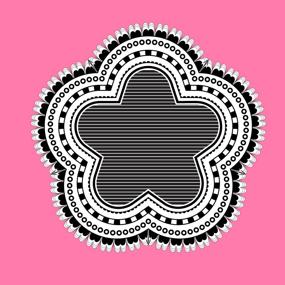
7. Doodle style Heart Part 6: For the last piece of our heart, we're going to do a couple of lines and then fill it with a pattern. Let's go ahead here first and select the fill. We're just going to set that to white. We're going to set the stroke to black. Now for this stroke here, I want a set of scallop edges. I'm going to the appearance panel because we'll create it in the appearance panel. Now the stroke that we're going to use to make the scalloped edges is really just the same circles we created earlier. I'm going to just increase the stroke width here to something like 10 points. I'm going to click on the word stroke. I'm going to give it round caps because that's going to give us the circular shape that we want. I'm going to click on dashed line. I'm going to set my dash to zero and I'm going to set my gap to about the same value as the width of the line, so I'll type 10. Now I think it's a bit small, so I'm going to start increasing this. I'll take the weight up to 14 points and I'll take the gap up to 14 as well. That's looking pretty good. It just doesn't look like a scalloped edge right now. It looks like a series of dots. But that's got a lot to do with the layering because right now we have our stroke on top of our fill. If I pick up this fill here and dump it on top of the stroke, then this is what we get. The fill covers up the inside part our circles and we get a scallop style edge. The next thing I'm going to do is add another line inside here, so I want another stroke. I'm going to click here on the fill layer. I'm just going to click add a stroke, and that just adds a stroke on top of everything. Now this stroke is dashed, so we wanted to take it back to just being a single line. I'm going to open the stroke panel and want it's cap to be just normal and I don't want it to be a dashed line. Now, we've got a 14 point stroke over the top of everything that we just spent all our time making. Let's just decrease the weight of the stroke. I'm taking it down to about six points for now and let's push it inside this shape. Now, anytime we want to push something inside, we're going to use that path offset. With our stroke selected, we'll choose effect path, offset path, click, preview, and course it gets sent out 10 pixels because that's the default. We just need to decrease this value to push our line inside. I'm going to push it to about minus 14 pixels. Again, I'm just eyeballing it and just looking for something that looks good. I'm going to also increase the stroke weight a little bit so I'm just going to make sure I re-select my shape because I seem to have lost that and just increase the stroke weight a little bit. We're going to finish off by filling the inside of the heart with a pattern. I want another fill. I'm going to click here on add new fill and by default this is filled with white and it's also, as you can see, it's been extended so that it's over the top of the original shape. We need to bring this fill in quite a bit. Again, we need to offset its path. Let's choose effect path, offset path. Because you can offset a fill just exactly the same way as you can offset a stroke. I'm going to start bringing this in. For now I'm going to settle on 20 pixels and just click okay. I now have a fill which is white, so we're not actually seeing it right now that is inside this shape, and I want to fill it with a pattern. Well illustrated comes with a whole lot of patents that we can use. Let's go to this fill option here, and let's click to open it and here is a little drop-down menu. I'm going to click to open it, and I'm going to choose open swatch library, and I'm going to select patterns. I want basic graphics lines. I'm just going to click that to select it. Now let's just go over that again just in case you got a little bit lost. We've got to open up the fill panel here. We're going to click on the menu. We're going to choose open swatch library, patterns, basic graphics, basic graphics lines. Now these are line patterns that are shipped with Illustrator. With my fill selected, I can now click on these lines and test them inside my shape. Now you can see I've got a slight white line around there which I like, but I don't think it's quite enough, so I'm going to solve that in just a minute. What I'm looking for now are some lines that are going to look good in the middle of my heart. I actually like the lines that I was working with. Actually, that looks really good to me. I'm going to select that. Now I'm going to work on this little white line being a little bit bigger. The way I can make it a little bit bigger is to shrink this fill a little bit. Let's go back to our fill here, and this is its offset path. Now I don't want to offset its path again, I just want to make a change to the offset that I created previously. I'm going to click here on offset path. That just opens this dialog backup again. I'll click preview so I can watch what I'm doing. I'm going to click here and just bring it in a little bit and you can see now that I'm making this white gap just a little bit bigger. I'll click that and click okay. There is a doodle style heart created in Illustrator. Now you might have seen here that there's a slight line through this. Now, Illustrator has a really nasty habit of creating lines in patterns and if this happens to you and you want to get rid of it, we can do so. I'm going to re-select that shape and I'm going to re-select this fill here. What I'm going to do is scale it down. To do that, I'm going to choose object, transform, scale. I don't want to scale the object, but I do want to scale a fill. But what's happened is that everything's got scaled. I'm just going to deselect this. I'm going to deselect transform objects. You can see that the patterns themselves, they're going to be transformed but not the object. All I'm going to do is adjust this pattern size until it's pretty much its original size, which would have been 100 percent, but just a little bit less and where I can't see lines in my heart. Well I can't see lines here at 94 percent so I'll just call that good. I'll click okay. Now when I click away, I've got my doodle heart shape. We've created our own heart shape, we've created a brush, and then we've used various things that we've done with the appearance panel to create these hand-drawn effects around our heart. Finally, we filled it with a pattern that was shipped with Illustrator, which of course you'll have in your Illustrator collection. Now your project for this class is to produce your own heart or other shape doodle. You want to create your shape and create the brushes and some of the internal effects using the appearance panel for your shape. My name's Helen Bradley. Thank you so much for joining me for this episode of Graphic Design for Lunch, and I look forward to seeing you in an upcoming episode soon.
 Helen Bradley, Graphic Design for Lunch™