Transcripts
1. Welcome to the Class: Painting meadows and skies is a peaceful way to
enjoy nature's beauty, where the lush green
fields me the open sky. With gentle brush strokes, you can show the
soft grasses and the graceful movement of
wildflowers in the breeze. Hello, friends. My
name is aninNapil. I'm an artist, an art
instructor, and an author. Gouache is one of
my favorite medium because it's so versatile
and easy to work with. It allows you to create stunning, detailed
artwork effortlessly. This class is all
about exploring the charm of sunsets
over peaceful meadows. We'll create three
stunning paintings, each using a distant
color palette. With every painting, you
will discover how to blend colors to achieve glowing
skies and serene landscapes. This class starts with a comprehensive look
at the materials. We will move on to mastering
the essential techniques, setting a solid foundation
for your skills. Once you're ready,
we will proceed to the painting process where we will put everything
into action. This class is designed
for beginner and intermediate artists looking to improve their guar skills. If that sounds like you, join me as we paint
some standing landscape together and take your
art to the next level.
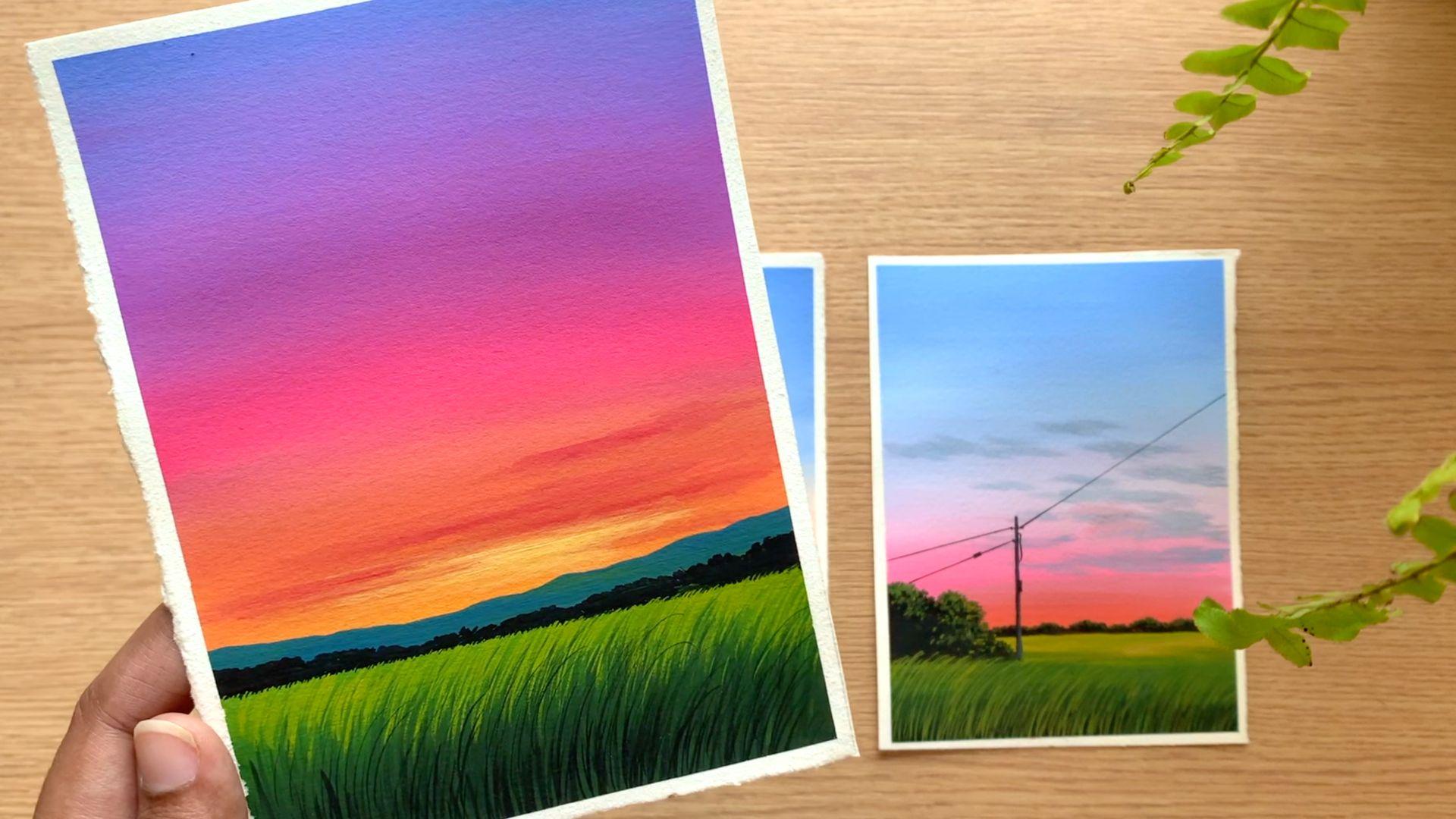
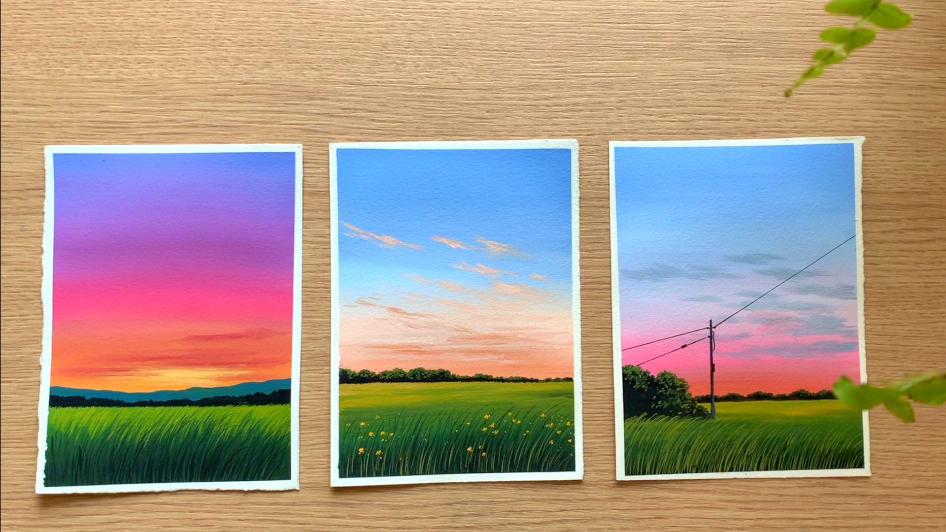
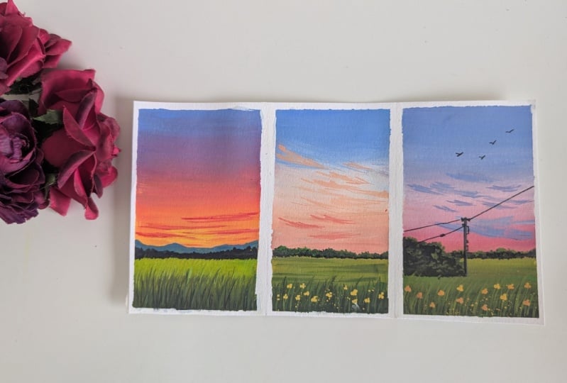
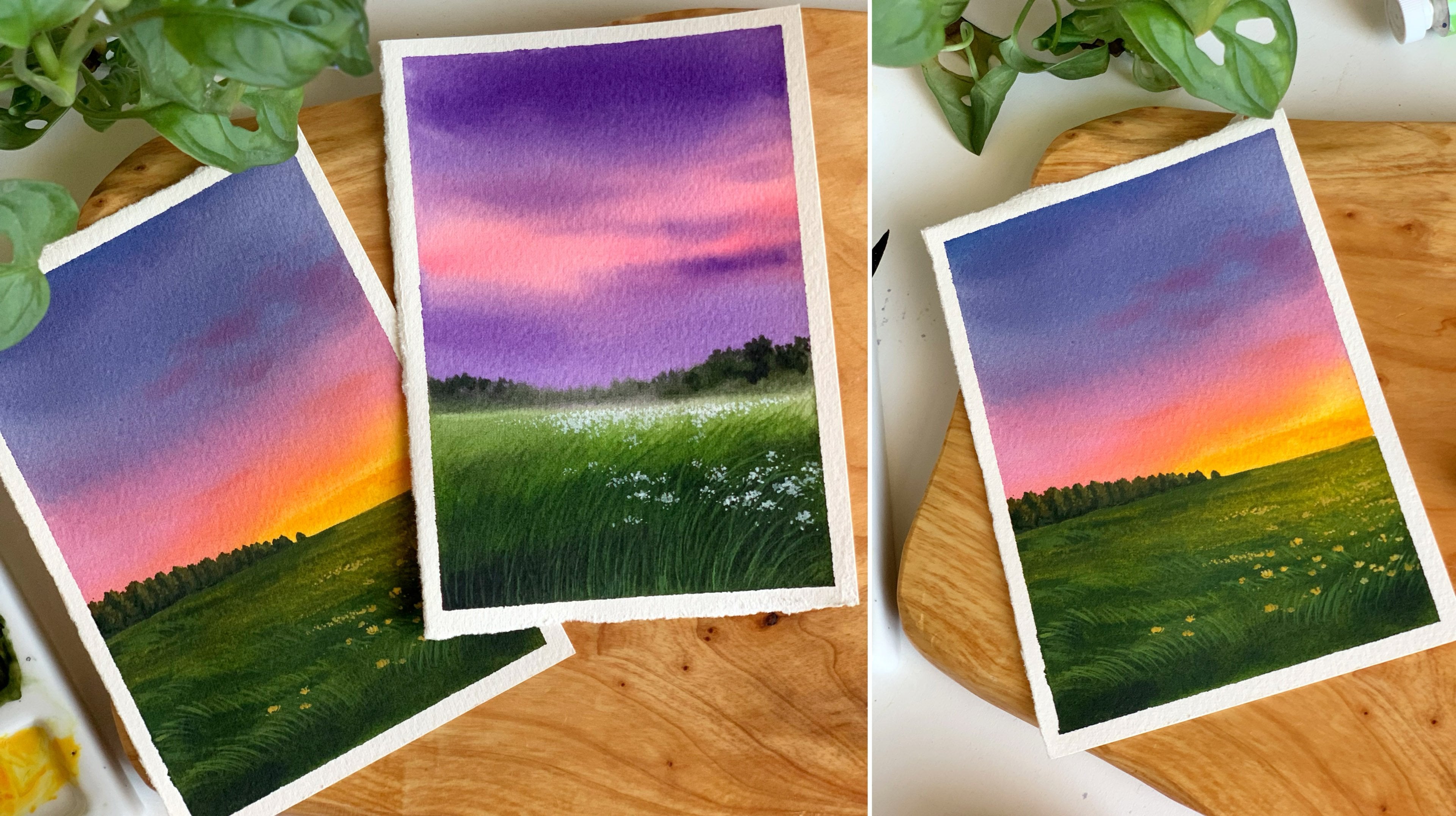
2. Class project + Essential Techniques: So these are the three paintings that they're going
to do in this class. They are bright and beautiful. Here's the first one.
It's a multi colored sky. There are five different
colours in the sky blue, violet, pink, orange and yellow. His sky is going to be
a wonderful exercise in learning how to blend
different colours. Then we have some
mountain and landscape in the background and
a gorgeous meadow. It's a beautiful painting. So here's the first one. Now the second one
is a pastel sky. I have used a pastel blue and a pastel orange for
this particular sky. It's, again, a beautiful sky. I really love soft
and gorgeous skies, and this color combination
is my favorite. Okay, then we have some
elements in the background, and also again, a gorgeous
meadow with some tiny flowers. So that's the second one, and
we have one more painting. Which is a different
sky. It's, again, a pistil blue and a bright pink and another bright orangish
pink at the bottom. Then we have some
landscape elements and a meadow to finish
out the painting. Now before we start
with our paintings, I'm going to quickly
introduce you to some techniques that are
common to all these paintings. There are some quick techniques which wouldn't take you
more than 10 minutes. This will give you a better idea on how to approach
these paintings. So let's try them out on
a scrap piece of paper. Here's the first painting, and you can see that lush greenery. First, we will paint
the base layer, for which we'll have
a lighter tone on the top and a darker tone
of green at the bottom. Then onto that, we will
add some grassy pattern. This is the brush I'll be using. I want those lines to
be very thin and clean. So it is very important to go a smaller brush or a
brush with a pointed tip. I will take out
some black paint, and I will show you how you
can add those grassy lines. It's not a complicated
technique, but to get a hang of it,
you might take some time, especially for a beginner. So the best thing is practice. Whenever you find some time, try adding them on a
scrap piece of paper. Take out any paper. It doesn't need to be an artisory paper. You can even use a used paper or a normal notebook and just
try adding these lines. Okay, so the paint I'm
using here is a bit watery. When I say watery, it is
just a few drops of water. It is not too loose
like watercolor. If your paint is
dry, you will end up getting a cracky
and dry line. So to get a clean, crisp and
beautiful line like this, you have to add a few drops
of water into your paint. Don't go with a dry
paint. See that? Now when you're adding
them, try to go with a different height,
ten different shape. Some of them can be Cove,
some of them can be longer. This will add a realistic
touch to your painting. And the best part is these lines doesn't need
to be perfect. It is just a matter of adding a lot of them to
create that density. So if you look at here,
you can see I have some lighter lines as
well as some taco lines. So the two key factors
here is the tonal value. Try to play with
different tonal values of green and also add them
in different heights. For the second one, along
with those grassy pattern, I will also be adding
some tiny flowers to make it look
more interesting. And for the last one,
it's again, the same. I have used different tonal
values of green here, but it is just a matter
of adding a lot of them. Okay, so that is one
of the major and the common element for
all the three paintings. The next one is these
plants in the distance. It can be a group
of plants or trees. So there are two ways
I have added them. For this painting, I
have used a solid color. I haven't added
any other details. So I'm just adding a rough
shape along the top. It is just a simple
irregular shape. Now you can add a line along the bottom, then
you can fill it up. So this is one way
how you can add your trees far away
along the horizon line. It can be just a straight
line at the bottom. Initially, whenever I did
a landscape painting, I used to add a straight
line along the horizon. There is nothing bad in it, so this is one way of doing it. Now, if you want to add a bit
of realistic touch to it, there is a simple
trick you can do. Use the same brush and just keep adding some
teeny tiny lines. Let me show you. It's a
very interesting step, but the kind of impact it has
on your painting is a lot. So what we're going to do is instead of going for
a straight line, we'd add a similar line
along the horizon. Let me show you that here. So just keep on adding
some teeny tiny lines. Again, it doesn't
need to be perfect. Just add them however you can. Don't go for a straight line. See that? It's a simple
messy, spiky line. I don't know how to explain it. So what I mean is instead of
going for a straight line, just keep adding these tiny
lines along the horizon. Over here, the background is
just a white plain paper. So you might not feel anything, but if you look at
this painting here, it's the same thing I have done. But as we have that green
colour in the background, it looks like there is
some grass far away. For this painting as well, I'm using the same technique. But just add some tiny lines. That's all you have
to do. When we're doing our actual paintings, you'll get a better
idea about it. Right now, I just wanted
to introduce a technique. That's all. But
for this painting, I have gone in with
a straight line. Honestly, I don't know why I went in with a straight
line for the horizon. Maybe it would have been more beautiful if I added
those tiny lines. Anyway, you can go with
any method you like. It can be either a straight line or that spiky line is
totally your choice. Now, the last thing
I want to show you is these plants
in the background. You can see I have
added some texture on it using a lighter green. So first, I will add a base
shape using a darker tone. Then on to that, I
will add some texture. But for this painting,
it's a single color. I haven't added that texture. You can see the difference here. This one is a solid color, and the other one
has some texture. Again, for this asphel, you can go with one
of these methods. So just like that
spiky horizon line. These are very simple details, but might add a lot of
beauty to your painting. I have a solid shep here. I have just applied black. Now onto that, I'm just adding some tiny dots, using
a lighter cream. It is literally some
random dots. See that? So just keep adding
them on the top. You can use a medium cream. It can be sap clean
acetas or can use a lighter cream and just add some tiny
dots on the top part. You don't need to add any
dots along the bottom. Just on the top, add a few
dots using a smaller brush. Okay, so just keep adding
some messy tiny dots. That's all. Let me
show you that here. See that? So it's just a
matter of adding that dots. When I add them
on a blank paper, it might not make any sense. But if you do the same
thing on that landscape, it is going to make
a real difference. So yeah, if you find
it interesting, you can add them as you paint, or you can just go
for a solid color. For this painting, we have similar elements
in the background, as well as a bigger group here. It is the same technique. The only difference is
the size and the shape. Okay, so once you have
defined the shape, just keep adding
some dots onto it, using a medium green as
well as a lighter green. Okay, so these are the
common techniques I want you to introduce before we
start with our paintings. Now you know what to expect, and you will have a
lot more confidence while you're approaching
your paintings. I'll talk about the rest of
the details as we paint. This sky is different
for all the paintings. I'll talk about the
color combinations and how you can do them as
we try each of them. Alright, I think
we're good to go. Let's embrace this
man with open arms, ready to learn,
create, and thrive.
3. Materials you'll need: Let's start by looking
at the materials we will need for this gorgeous
painting session. I think I will start
with the paper. So here's a paper that I'm going to use for all the
paintings I'll be doing. It is from Canson. And
this particular one is from their Heritage Series. It's a hard pressed
watercolor paper. See that, and it's 140 B, and it's 100% cotton
watercolor paper. You can go with any
paper that you prefer, preferably a thick paper
with less texture. That's the only thing you
have to keep in mind. And here's the
size of the paper. It is a six in size. You don't need to
stick to the same size and the same orientation. You can compose a painting
however you like. Okay, so that's all
about the paper. Next, I'm going to
talk about the colors. At the beginning
of every painting, I'll be explaining
about the colors you will need for that
particular painting. So I'm not going to
discuss about that. You can use any gouache paint, whether it comes in jar
or tube or cheli cup. All of them will work for
this painting session. The next thing you
will need is a mixing palette to
mix these colors. You can go with a
plastic palette or a ceramic palette or any
palette you have got. Next, let's talk about the
brushes you will need. So basically, you will need only three brushes for
this painting session. The first one is a medium sized flat brush or
a filbert brush. This is the one I'll be using. We'll be using this brush to apply paint onto the background, mostly to blend the colors. Okay, so that's the first
brush you will need. We'll be using this brush to paint the skies and
the backgrounds. Okay. Now the second brush you will need is a round brush, a medium sized round brush. This one is size number four, go with four or six
or three or even two. Okay, so that's the second
brush you will need. Now, we will need one more
brush along with these, which is a detailing brush. We'll be using this brush to add all the grassy patterns
and all the fine details. You can see all these
grassy lines here. So I'll be using this brush
for all those detailing. If you don't have
a detailing brush, you can go with a liner brush or any brush with a pointed tip. Okay, so those are the
brushes you will need. The next thing you will
need is a jar of water. Unlike watercolor,
you don't need two jars of water
at the same time. Whenever your water
is turning dirty, you can just replace
it with clean water. If it's a bigger jar, you can
use it for a longer time. The next thing you
will need is a paper towel or a cotton cloth. You can dab off the
water or excess amount of paint from your brush
using a paper towel. So that is what this is for. And the next one
is a masking tape. I'll be using a clear tape. You can use a washi
tape or a masking tape, any particular tape that you normally use for your paintings, and you can fix it
onto your table or onto a drawing board. Now, finally, you will need
a pencil and an eraser. There isn't a lot of sketching involved in these paintings. It is mostly some horizon
line or some small details. Okay, so that summarize all the materials you will need for this painting session. Keep them ready, and I will
see you in the next video.
4. Painting 01: Hello, dear friends.
Welcome back. Now it's time to try
the first painting. I absolutely love this
gorgeous blend of colors. So there are five different
colors in the sky. There is some blue on the top, then violet, then some
rose orange and yellow. So for the background,
we'll go with a blend of these five colors. Then onto that, we will add some clouds to make
it more interesting. Now, I'll quickly
show you the spatches of the colors needed
for this painting. So the blue I'm using
is ultramarine blue. Then you will need some violet, crimson, then some yellow. Okay, so I have the colors
ready on my palette. These are the colors
I'll be using. It's from Indian
brand called Bastro. I have ultramarine blue, violet, crimson, and mid yellow. It can be any blue,
violet and yellow. Now, in case if you are
not really comfortable, blending four colors, you can skip using ultramarine blue, and then you can
just go with violet, crimson and yellow or
you can skip using violet and go with ultramarine
blue, crimson and yellow. Feel free to modify the colors according to what you are
more comfortable with. Now, along with these, you'll
also need some white quash. We won't be using the colors
in its original intensity. We will add some
white with all these colors to make it a bit lighter. I'm taking some white, mixing
that with ultramarine blue. So that's a color I'll be
using on the top of the sky. It doesn't need to
be ultramarine blue. You can go with any
blue of your choice, or you can even skip using blue. You can start with
violet, then go with crimson, orange and yellow. Okay, so that's a first color. Next one is violet. Again,
I'm adding some white, and I'm making it lighter. So the colors can be
a little different. It doesn't need to
be exactly the same. Depending on the amount
of white you're adding, the color can be a bit
lighter or darker. Those things are totally fine. Don't worry a lot about that. All right, so that is violet. Now coming to the third
color, which is crimson. Again, I'm going
to add some white, and I will make it lighter, so it will turn
into a bright pink. It's a bright and
a beautiful pink. I have just added some
white with crimson. So that's our third color. Next, I'm going to add some yellow into this
pink I have created. So that will turn into
a beautiful orange. Which is our fourth color. If you have orange, you
can use it as it is, or you can just mix and
create your own orange. Now coming to the last
one, which is yellow. So according to the brand
of color that you're using and also according to the
amount of white you're adding, the colors can be a
little different. As I said earlier,
that is totally fine. Don't worry a lot about that. We have the same
colors well and good. If you don't have them,
that's totally fine. Just go with the colors
that are nearly similar. Okay, so those are the colors
I'll be using for the sky. We have blue, violet, pink, orange and yellow. We'll be creating a blend
of all these colors. That's going to be
the base layer. Then to enhance the sky, we'll also be adding some clouds using red and some yellow. Okay, so that's how the
sky is going to be. Next, I'm going to
talk about the greens. So with every brand, the colors can be slightly different. For example, I have
sap green here. This one is a darker green, whereas I have sap green
from another brand, which is a very bright
and fresh green. Then there is two more. These ones are more
of a darker green. This one's deep green
and olive green. So depending on the brand
of color you're using, the colors can be a
little different. As we're going to paint
an evening scene, I want the green to be
a little dull and dark. I don't want it to be too fresh. So I'm going to use
some olive green. Depending on the color
that is available for you, you can use olive green or
deep green or sap green. I have taken some olive
green on my palette. I will show you how this
color is looking like. So you'll have a
better idea. See that? It is slightly darker
than sap cream, but you don't have it,
it's totally fine. Just go with sac cream.
Towards the bottom, we will be using black
to make it darker. So even if you're
using sap cream, it doesn't really matter. Now, I'm adding some yellow with olive green to make it lighter. I'll be using this colour
along the horizon line. So along the horizon line,
the color will be lighter. Then towards the bottom, we'll have to gradually
make it darker. Okay, so we'll use a lighter
tone than a medium tone, which can be olive green,
deep green, or sap green. Then towards the bottom,
we will introduce some black to make
it more darker. Into that mix, I'm adding some more yellow to
make it lighter. I think the previous
color was a bit dark. This one is much more closer to the one I have used
in the painting. Okay, so just add
some yellow with olive green or sap green or
any other green you're using. The next color I
want to show you is the one I have used
for the mountain. It is actually a mix of green, blue, and a bit of white. Let me show you how to mix it. I have some ultramarine
blue on my palette. I also have some green, as well as that lighter blue. I'm just mixing them together. Okay, so that's a color I'm going to use
for the mountain. It just need to
be a mix of blue, green, and a bit of white. Okay, so that's how
it has turned out. I think the color I used
here is a bit more lighter. Maybe we can make it a little lighter by
adding some more white. Let's try that out. Okay, so this one is much more similar to the one I used
for the painting. So just go with a mix of
green, blue and white. It can be any green
and any blue. Don't add a lot of white
and make it lighter. We get a medium tone or
a slightly darker tone. Alright, so those are the
colors you will need, keep them ready on your palette. We already had a look
at the techniques, so now we can give it a try. First, I'm going to take out
the colors onto my palette. As we discussed earlier,
I'll be using blue, violet, crimson, and also
some yellow for the sky. If you don't want to use blue, you can just start with violet, violet crimson and yellow,
even that is good. So we'll start with
blue violet, crimson, then some orange
color over here, and yellow to at the bottom. Okay, so let me squeeze out
the colors onto my palette. The blue I'm using here
is ultramarine blue. You can go with any
blue of your choice. We'll be using a lighter tone, so we'll add some
white quash to it. Okay, so that's the first color. Next one is violet. If you don't have violet,
you can skip using this. So you can go with blue,
crimson, and yellow. Feel free to modify the colors. It is not necessary to
go with four colors. Next, we will need some crimson
and finally some yellow. Now for the sky, I'll be using all these colors
in a medium tone. I don't want to bright
and intense tone. So what I'm going to do
is I will just add some white onto all these
colors I have taken here. For now, I will just add some white next to all these colors. If you want to make
it more lighter and if you need more white, we can do that as we paint. Okay, so I have all the
colors ready on my palette. Keep them ready
before you start. Now, I'm going to add a line just to define the
sky and the meadow. I'm adding that a bit below
the cent of the paper. So that's where the
horizon line is. Now we're going to apply
four colors onto the sky, starting with blue, violet, crimson, orange and yellow. We're not using orange
as it is for the sky. As to mix crimson and yellow, we'll automatically create
an orange in between. Okay. Now I'm
starting with blue. This one is ultramarine blue. I'm mixing that with white
to create a lighter blue. That's a color I'm going to use. I'm adding that on
the top of my sky. I'm using an angled brush here. You can use a flat brush
or a filber brush. And apply that on
the top of your sky. Go with a similar tonal value. Don't make it too
dark or too light. We need a medium tone. Okay, so that's blue, which
is the first color. Now I'm going to clean my brush, and we'll co with violet. If you don't have violet and if you don't want to use violet, you can just keep using this and go with crimson directly. For this, as well,
I'm adding some white to make it a medium tone. Now, I'm adding that
right next to blue, and we'll blend them together. To make the blending easier, I'll pick some blue, and I will add that right where these two
colors are mating. Okay, so that is
blue and violet. You can see how easily
I blended those colors. When you're using a
thick and creamy paint, it is much more easier
to blend the color. In a way, that is
blue and violet. Now I'm cleaning my brush. I feel we can make violet
a bit more brighter. So I'm adding some more violet. Then I will quickly blend
that with blue again. Then we can go with crimson. So just keep running your
brush back and forth, only in a horizontal direction
to get a clean blend. If your paint is dry, you
can add a drop of water. That will also help in blending. Okay, so that is
blue and violet. Now I'm going to clean my brush again so that we can
go with a third color. You can add these colors onto
your sky in any proportion. If you want more blue and less violet, that's
totally fine. Or if you want to add
more red and yellow onto the sky and just keep a little of violet and blue,
even that is fine. Okay, so that's a mix
of crimson and white. I think it looks
really, really bright. I want the colour to
be a bit more lighter. So I'm going to add
a bit more white, and I will make it lighter. This color looks fine. Now I'm going to blend that with violet. So I'm picking a little of violet with a wet brush
and I'm blending it. Okay. So that is blue,
violet and crimson. I think I can add some
more crimson onto the sky. So first, I will clean my brush. There is some violet
on it. So I'm mixing crimson and white again, and I'm adding that
color over here. Just to introduce some
more brighter pink. Okay, that looks fine. Now I'm going to go
with an orange color, which is actually a mix
up crimson and yellow. So the same brush, I'm
picking some yellow, mixing that with crimson. Okay. Now I'm going
to add that color right next to that pink,
and I will blend it. And towards the
bottom most area, I will introduce
some fresh yellow. I feel it looks like a
unicorn or maybe a rainbow. We have so many colors. And I think it is
looking pretty nice. Anyway, I'm going to
pick some yellow, and I will add that
at the bottom. As I said earlier,
if you want to omit, as I said earlier,
if you want to omit one color from the sky,
that's totally fine. Maybe you can omit
blue or violet. I'm hoping by now you guys are confident in
blending the colors. In that case, I think you should use all the colors.
You can do it. Anyways, that's a base layer. We have blue, violet, pink, orange and yellow. Now I will clean my brush, and I will keep this one aside. Next, I'm going to add some highlights onto a
sky using a roundish. This one is size
number four roundish. I'm taking some bright
crimson and using this fresh, I'm going to add some
lines onto the sky. You can add few drops of
water into your paint. Maybe that will make it easier. And with that
slightly wet paint, add a few lines onto the sky to make it
look more interesting. Just to add a few random lines only at the bottom part where you have that orange and yellow. Okay. You don't need
to add these mining, maybe you can only go for one
or two, even that is fine. Now clean your brush, and with that damp brush, quickly smudge it to
give it a softer look. We don't want them to be
too rough and prominent. So right away, when
you have added those lines, make it wet, and with that wet brush, smudge the paint slightly without putting a
lot of pressure. Okay. So gently much the paint. So just by running
that wet brush, I made them look softer. Okay. Now, if you want to add more lines,
you could do that. Maybe a line on the
top or at the bottom. You can add them
however you want. I'm kind of happy with the sky, but I think I can add
one more line over here. Now I will make my brush wet. Now with that wet brush, I will gently smuch it. You can see how bold and
beautiful it is turning out. I'm really loving the sky,
but we're not done yet. There is one more
thing we have to do. So I'm cleaning my brush, and for that last step, I'm going with some yellow. I'm just mixing a
bit of yellow with white to make it a lighter tone. And the same way how we
added those lines using red. I'm adding one or two lines at the center using
that lighter yellow. This will make our sky look
even more interesting. So we're trying to make it
look like the sun has just set or maybe the sun
is behind the clouds. I think that is a
better way to put it. Anyway, what you have to
do is go with some yellow, a lighter yellow, and add
a line at the center. We can make it a bit more
lighter if it's not prominent. Okay, so just add that in. We only need this at the bottom. Okay? So right at the center, add the yellow to give an
impression of the sun. Now, just in case if you feel it is very prominent and loud, you can use the same
trick we used earlier, dip your brush in some water, make it wet, and smudge it a little to give
it a softer look. Again, don't put a
lot of pressure. Be very gentle. Don't
disturb your base layer. Now, if you want to, you can go with a
lighter tone and add a bit of paint at the center to create a glow effect here. This step is
completely optional. If you're happy with your sky, you can just leave it as it is. You don't need to
add in more paint. Okay. So that's how
it has turned out. Next, we are going
to paint the meadow. We can paint the
base layer first. For which we will
need some green. I'm using olive green. This one is not too bright. This one is more
of a dull green. The sap green I have from this set is kind of
bright and fresh. We are painting
an evening scene, so I don't want the
green to be too fresh. Okay, so I have
taken up some green. I will also need some
yellow as well as black. I think this yellow
won't be enough. I will need some more. So
along the horizon line, I want the color to be lighter. If you have a readily available lighter green with you,
you can use it directly. Okay? I'm adding
some more green. Alright, that color looks fine. Now I'm going to apply that
along the horizon line. Then as I'm coming
towards the bottom, I will introduce
more darker green. Okay. So let's start
with this color. Right now, we're
painting the base layer. To get more texture, we'll
be adding some grassy lines. Okay, so for now, just apply that lighter green on the top, then go with clean green. It can be sap green
or olive green. Apply that right after this. Then towards the
bottom, introduce some black to make
it even more darker. Okay. Now I'm going to
pick some olive green, and I will add that next. Maybe first I will just
fill up that entire area. Then gradually I
will add some black. Okay, I'm using the same brush I used for the sky and I have
created a clean blend here. Next, we will have to
introduce darker tones, so I'm going to squeeze
out some black. I will just add that
right next to green. I don't want too
much of darker tones on the background,
just a little. So I'm picking some black, adding that at the bottom. Then I'm blending
that with green. See that? As we're
painting an evening scene, the colors has to be a bit dull. It shouldn't be too
bright and fresh. That's the reason why
I added some black. Okay, so that's a base layer. Now I'm going to keep
this bush aside, and I'm switching to a round fresh. This is the
one I'm using. It's size number four. Now I'm going with a darker
tone of green, and using that color, I'm just adding some grassy
lines at the bottom. Only at the bottom, that is something you have
to be careful about. You can add as many as you
want, but only at the bottom. We have some lighter
green on the top, leave that area as it is. So the color I'm using here is a mix of black and a
bit of olive green. If you don't have olive green, just add a bit of sap cream. You can also add a
few drops of water. It doesn't need to
be 100% opaque. If your paint is
really thick and dry, you won't be able to add
those nice curvy lines. So just add a few
drops of water, and with that paint, keep adding some lines onto the
entire background. They don't need to be
perfect at this moment. We'll add more later. For now, we are just trying
to introduce some texture. So go with the darker tone, which is a bit watery. Remember to leave the top part. But you can add as many as
you want at the bottom. Okay, so just keep adding them. As I said earlier, the
paint can be a bit watery. They don't need to be
too prominent right now. We'll be adding more later. For now, go with
the watery paint and just add as
many as you want. Because when you go
with the watery paint, the lines will be
more crisp and clear. If you're using a
dried paint, I mean, an opaque paint
without any water. The lines will be dry and rough. They also might have
some breaks in between. It won't look like a
smooth curvy line. Okay, so just add a few drops of water if you feel
your paint is dry. Okay, so that is looking fine. We have added some grassy
lines using a darker green. It was not 100% opaque paint. It was a watery paint.
Next, I'm going to repeat the same process
with a much more darker tone. You can either go with
black acets or you can just add a bit more black
into that darker green. Again, it's a watery paint. Now keep on adding a few more. Only at the bottom, closer
to your masking tape. Don't add any onto the top. So just at the bottom,
add in a few more. Okay, I won't be adding a lot. Just keep in mind, we need these darker tones only
along the bottom line. Okay, so that part is also done. I have added them only
along the masking tape. I didn't touch the top part, so the top part is still the same. It is really important to
retain the lighter tones far away to create a sense of
distance in our painting. Anyways, now we can
go the next step, which is adding a
mountain far away. And for that, I'm using a bluish green or
a greenish blue. I'm using the same brush. We'll add them over here
above the horizon line. I only have a bit of
ultramarine blue on my palette. Into that, I'm adding
a little of green. So it's just a mix
of blue and green. You can add a drop
of white as well, because the color I
had on my palette, which was already a pastel blue, so I didn't have to
add any extra white. So that's a color I'm using. I have mixed olive green, ultramarine blue, as
well as a bit of white. Your color will be slightly
different according to the green or blue that are
using and also the ratios. Even for me, if I try to create the same color
tomorrow or day after, I might not get the same color. I mean, the exact same color,
and that's totally fine. The color can be a bit
more greenish or bluish. Anyway, with that color, I
have added the mountain. I have added the
shape on the top. Now I'm going to fill that
up with the same color. You can modify the
shape if you want to, but at the center,
try to make it lower. That's where we have
the setting sun. Now carefully fill up that entire mountain
in the same color. Okay, so the mountain is in. Next, we are going to add some more grassy patterns
using a smaller brush. We want the lines to be
really thin and delicate. So using a smaller brush or a brush with a pointed
tip is really important. You can add a few
more drops of water. So the color I'm using
here is a lighter green. I have added some more yellow. Just like I said earlier, if
the paint is a bit loose, you can add those
lines quite easily. If the paint is dry, they
might not look that great. Now, this time, there
are a few differences in the way we are
adding the lines. First, we're adding them
from top to bottom, and we're using a
lighter tone. See that? So just add them from the
top towards the bottom, and the lines has to
be thin and shorter. So go with any of your brush, that has got a pointed tip, and just add some thin, delicate lines from top
towards the bottom. Okay, it doesn't
need to be perfect. When you add too many
lines close to each other, it will look really nice. But the only thing
you have to be careful is the brush size. Go the smaller brush and go
for thin and delicate lines. Okay, now we have to do this
for the t horizon line. Just keep dragging your brush from top towards the bottom. You can add them in a curve
way to make it look more natural and add them only where you have
the lighter tone. Don't add any lines
towards the bottom. You're focusing only
on the top part. Here's a closer look, and you can clearly see the
way I'm adding them. I'm just dragging my brush from the top towards the bottom. The major thing here is
the size of the brush. I'm using a smaller brush, and the paint is a bit watery. See that. These lines doesn't need to be
of the same size. Some of them can be longer and some of them can be shorter. Those things are totally fine. You can see the way
how I'm adding it. They are of different length. Actually, those things will add a lot of beauty
to your painting. I mean, it will add a realistic
touch to your painting. So just add a few on the top
using that lighter green. We don't need a lot, only a few along that top to
create more texture. I'm nearly done. I only have a small area
on the left side. So let me quickly finish that. If you want to, you can add
some more towards the bottom. Just a little. We want to retain those darker
tunes at the bottom. So just make some of them longer to add a realistic touch. Now I'm switching
to a darker green. I already have some black and
green hue, I'm mixing them. Now with that paint, I'm going to add the
horizon details. We want to add some plants
and trees far away. It's going to be very
simple rough shapes. They're not going to
be well detailed. So first, I will
add a random shape on the top using
my smaller brush. Then I will fill up the bottom. It is just a rough shape. I'm trying to add those
trees and plants far away. This will also define
the horizon line. It's a simple step, but there is one thing you
have to be careful about. At the bottom, I'm adding
some teeny tiny lines, just some irregular lines. See that? So this will create an impression of the
grassy pattern far away. So don't add them
as a straight line. At the bottom, just
keep on adding some tiny lines
and some patterns. Then you can add
them on the top. I hope I'm making sense. If you add a straight line, it wouldn't give you that
impression of a grassy field. That's why we're adding these
tiny lines at the bottom. We don't need to be perfect. Just add them close
to each other. And then on the top,
you can introduce a very rough messy
shape and fill it. You can see how beautiful
that section is looking. If you go for a straight line, it won't create that depth. With a simple detail, you can create an impression
of the grass far away. Okay, so once you're done, you can just add some
random shapes on the top. At some places, it can be
taller, and at some places, it can be shorter, go for a natural shape. So
that's the first half. Now we have the other half left. So these are the trees
and plants far away. You can either add them as different groups by leaving
some cap in between. So over here, I
have left some cap. Now I'm adding another
group of plants. At the bottom, I'm adding
those tiny pattern. Then I'm just filling it up. Okay, so you can either add them like this by leaving
a cap in between. You can add them as
different groups, or you can just simply fill that entire line
without any caps. I'm planning to add them as a continuous line
without any break. So you can either add this way or with the
caps in between. It is totally your choice. You can compose your
painting however you want. So I have added the plants. Now at the bottom, I'm going
to add those tiny lines. Be sure to go the smaller brush. If it's a bigger brush,
it will go out of scale. So go with the smallest
brush you have cut and add some tiny
lines close to each other. So it's just a
matter of creating that spiky thing far away. They don't need to be perfect. Just add them however you can. This one is a size
number zero brush. I just love this brush. It works well for all
kind of detailing. I'll show you that one
more time. See that? So just keep adding them. All you had to do was add
these kind of tiny lines. Initially, when I
paint my landscapes, I always go for a
straight horizon line. Then it is recently
I realized adding these tiny lines can bring a lot of difference
in your painting. It will instantly add
a realistic touch. So ever since I always
add these tiny lines far away along the horizon line to give it a more
realistic impression. Now, before I wrap it off, there is one last
thing I want to do OS is completely optional. So I want to add some more
grassy lines at the bottom, using a taco tone, using a smaller brush,
only at the bottom. But if you feel there is already enough of grassy patterns there, you can totally skip this
step. That's totally fine. I'm using a watery
version of black. If it's too watery, dab it on a paper towel before
you add these lines. Now, just add a few more lines at the bottom,
using a taco tone. The color I'm using
here is mostly black. There is no green in it. It's
a slightly watery version to get that clean curvy lines. You can see the way how
I'm adding it. See that? Some of them are long and curvy, and some of them are shorter. So the major thing
here is the brush. It's a smaller brush. It has got a really nice pointed tip. I don't want thick lines, and I'm adding them
only at the bottom. Make it really long
and curvy. See that? So simply add them
from bottom towards the top and add
wherever you wish to. Just keep in mind, don't
add a lot towards the top. Focus at the bottom where
you have the darker tones. This is just to introduce
another tuner value and make it more dense. But as I said earlier, it
is not really necessary. Anyways, that was the last step, and with that, we're
done with our painting. So here's my first attempt. You can see those grassy
pattern. It looks different. I like the sky, but
the grassy pattern, I feel it's very busy, and even for the mountain, I changed the color a little. Anyway, that's how
it has turned out. I hope you all liked it. Now it's time to peel
up the masking tape. Now, in case if you're not really happy with
your first try, please don't get
discouraged by that. You guys already saw
my first attempt. This was my second. So
those things can happen. It's totally normal. Anyway,
that's our painting. You can see that beautiful sky. I really like this spot
where we introduce that yellow and the
mountain, the meadow. I think everything has
turned out really well. We used four different
colours for the sky, and I think it has
come out really nice. I hope you all it too. Thank you so much for
joining and happy painting.
5. Painting 02: Oh. Hello, dear
friends. Welcome back. Here's the next painting
that we're going to try. You can see the beautiful
sky and the gorgeous meadow. To paint the sky, we'll
be using two colors, pastel blue and a pastel orange. We'll be blending them together. Then onto that, we'll add some clouds using
a pastel orange. Okay? It's a very
interesting sky and a very pretty sky, too. Then we have a lush
green meadow here with some wild flowers on it
and some horizon details. Okay, so that's a painting
we're going to try. I will swatch out the colors as well so that you
have a better idea. As you could see here, I'll
be using a pastel blue, as well as a pastel
orange for the sky. The pastel blue is
ultramarine blue plus white, and the pastel orange
just orange plus white. To add the clouds as well, I'll be using pasil orange. Okay. Now let me swatch it out. I have some blue on my palette. I'm mixing some white with that to turn that
into a pasil blue. So that's a fist color
I'll be using for the sky. So three fourths of the
sky is going to be blue. If you don't have
ultramarine blue, you can go with any other
blue of your choice. Just add some white into it and turn that into a
similar tonal value. We will start the
sky with this color. Then as we come
towards the bottom, we'll make it lighter
by adding more white. Okay, so that's a
color as west out. The second color is orange. First, I will clean my brush. Then I will make some
white with orange. To turn that into pastel orange. If you want to go
for a different color combination,
that's totally fine. Maybe you can go for gray and orange or maybe gray and pink, or even blue and
pink will also work. So if you want to, you can
modify the colors as you wish, and you can just follow the same technique to paint your sky. Okay, so that is pastel
blue and pastel orange. Now, I'm going to add
some more orange into the same mix to make it
a bit more brighter. So this one has less
white and more orange. I'll be using this color along the horizon line to
give it a contrast. So the color I'm
going to use for the sky is in a similar order. On the top, we will have a blue. Then towards the
center, we'll have a lighter orange and
along the horizon line, we will use a slightly
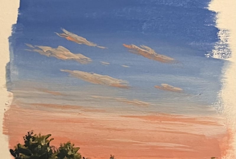
brighter orange. Then using that lighter orange, we'll also be adding some clouds onto the sky to enhance it. I think I have added
quite a lot of clouds. You don't need to add that many. You can just add a few on
the top or at the bottom. I'm just going to add
some random shapes like this onto the sky. On the top, I will
have similar patterns in a slightly inclined manner. Then towards the bottom, I will add them as
a straight line. You can add your
clouds however you want. It doesn't matter. Maybe you can just add some lines at the
bottom where you have orange and you don't need to
add any towards a blue part. Okay? So those things
are totally your choice. Compose your painting
however you want. Just because I'm adding a lot of clouds doesn't mean you
have to do the same. So just add them however you can ignore the way
I'm adding it. Make yourself comfortable, and just add them
the way you like it. So right here, I added those clouds on a
plain white sheet. That's why it is looking weird. But I'm going to use
the same technique for our main painting as well. You can see them
here. The colors lighter. That's the
only difference. It's going to be in
the same technique. Next, I'm going to
show you the colors I will use for the metal. So I wanted a very moody, dull green as you're
painting an evening scene. And these are the
colors I chose to use olive green
and yellow ochre. If you use lemon yellow or
any other lighter yellow, the green will be more
brighter and pleasant. If you're painting
a bright sunny day, you can go for those
kind of colors. But as you're painting
an evening scene, I would prefer using very
dull and moody greens. So if you have olive green
or any similar darker green, go with that, or just go with
sap green and yellow ochre. So first, I will mix these
two colors together, and I will show you that
moody yellowish green. So it's a mix of olive
green and yellow ochre. See that? It's more
like a muddy green, and that's the kind
of color we need. We'll be using this color
along the horizon line. Then towards the bottom,
we will use olive green, as well as we will add some
black to make it darker. So that's olive green. Okay. So those are the two major colors I'll
be using for the meadow. Along with that, I will
also be using some black. Okay, so these are
the colors we'll be using to paint the
meadow, the base layer. Then onto that, we'll be
adding some grassy pattern, just the same way how we tried
in the technique section. Then we'll also be adding
some tiny yellow flowers. If you take a closer look,
it is just some dots. Let me show you. So I'm just going to add some tiny
dots close to each other. They don't have any
proper shape or pattern. At some places, I will
add a group of dots. Then in between, I will just add some random dot task for. Here's a closer look, and you can see it is clearly some dots. It is nothing complicated. I'm not going for a
proper floral shape. I'm just going to add some
dots using yellow color. When I add them using black
on a white background, it might not make any sense. I know it looks quite weird, but we're going to
do the same thing on a green background, using yellow color, then it will all make sense. All
right, so that's it. We discussed about
everything you need to know. Now let's give it a try. Okay, so I have added a horizon line a bit below
the center of the paper. Now I'm going to
take out the colors. The first color you will need is ultramarine blue or any
blue of your choice. We'll be adding blue almost
to three fourth of the sky. Then along the horizon line, we'll add a pasil orange. I'm starting by mixing
some ultramarine blue with white to create
a lighter blue. So the major part of the
sky is going to be blue, and only towards the bottom, we will introduce
a pastel orange. So that's a color I'm using. Now, I will apply this
on the top of the sky. Then as I come
towards the bottom, I will make it a bit lighter
by adding more white. You can use any blue
of your choice. It doesn't need to
be ultramarine blue, add some white and turn
that into a medium tone. I feel like the blue can
be a little lighter. So I'm adding some white on
top of it to make it lighter. Okay, that seems fine. Now, as I'm coming
towards the bottom, I'm gonna make it even more lighter by introducing
more white. I think it's gonna
be a good idea to clean my brush before I make it lighter
because there's a lot of blue on my brush. So I'm just cleaning it off. Now I'm going to pick
some clean white, and I will add that right
where I stopped blue, and I will make it lighter. So the first step is more like a gradient wash. You have to start with a medium
tone or a lighter tone, then make it even more lighter as you come towards the center. Okay, so that is blue. I'm totally happy
with the plant. It looks very clean. Anyways, now I'm going
to clean my brush. Then I'll switch to orange. So both the colors I'm using
is from different brand. Altamarine blue is from Bastro
and orange is from flash. Both are Indian brands. Okay, so I'm picking
some orange. For this guy, I'm
using pasil colors, which means to turn orange
into a pasil orange, I'm willing to add
some white with it. Okay. I already have
some orange on my brush. I'm going to mix
that with white. You can go any orange
you have caught, or you can just mix some
yellow with red and create an orange and then add some white with it to turn
that into pastel color. Okay, so that's a
color I'm using. It's a mix of orange and white. I will add that a bit more. Then I will make it lighter, and I will have to blend
that with the blue. No matter which orange
and blue you're using, try to go the
similar tonal value. Okay, so that is
blue and orange. Now I'm cleaning my brush. Now with that clean wet brush, I will pick some white, and I will make this area lighter. I mean, where these
two colors are mating, make that area lighter
and blend it together. So just keep running your
brush back and forth in a horizontal direction until you feel you have
got a clean blend. Okay, so that's how
it has turned out. Now, I want to add a bit
more brighter orange, only at the bottom. For the wrist, I'm going to
retain that basal color. So I'm picking some more orange. And just at the bottom, along the horizon line, I'm making the color a
little more brighter. This step is not necessary. Only if you want to, you can
add some more brighter tone. Okay, so that is done. Now I'm going to keep
this brush aside, and I'm switching
to a round brush. Here's the brush
I'm going to use. It is size number four. Now I'm going to go with the same
orange I created earlier. It's a mix of orange and white. Now with that color, I'm going to add some
clouds onto the sky. It doesn't need to be 100% dry. A few drops of water. Now to its orange part, I'm just adding
one or two lines. You can see, I'm using
a pastel orange. Now I'm going to add a
few towards the top. Towards the bottom,
I'm not adding a lot. I'm adding more clouds at the center where blue
and orange is meeting. The color I'm using here
is a pastel orange. If your paint is
dry, you can add one or two drops of water,
but not more than that. Don't make it too watery. If it's too watery, you will end up disturbing
the base layer. Okay. So keep adding similar clouds onto the
area where you have blue. You can see how
beautiful it is looking. If you want a dramatic sky,
you can add more clouds. And if you're looking for
a soft and subtle sky, you can just add a few
clouds here and there. So the freedom is totally yours. You can compose your
painting however you want, and you can add in as
many clouds as you want. Okay. So the base layer is a blend of pastel blue
and pastil orange. Then onto that, using
a pastel orange, we're adding some clouds. It's a beautiful color combinon. And if you add those
clouds on the blue area, it will look really beautiful. So just try adding one or
two clouds on the blue part. My paint is really dry, so I'm adding a drop of water. Now I'm going to
add more clouds. So you can add these
clouds however you want. You can go with any
shape and any location. So right here, I'm adding the clouds in a slightly
inclined manner. You don't need to
follow the same. You can add them in
a straight line. Okay. So just add them
however you want to. Just stick to similar
tonal values. Other than that, you can
add them however you want. Okay? As a beginner, adding the clouds can
be a very tricky task. Trust me, I have been there. I used to paint the
sky as a solid wash or a gradient or a blend of two or three colors
to the maximum. That was the kind of
skies I used to paint. I was too afraid
to add the clouds. I always feel I
will ruin my sky, so I always avoided them. But when you add them and
when you get a hang of it, it is impossible to stop. You can see how I'm adding more and more
clouds right now. So that is what practice can do. Whenever you find
some spare time, just invest ten or 15 minutes. Then just try smaller skies, go for different
color combinations, and add the clouds
in different ways. And gradually you will
see the transformation. Anyways, I'm going to add
another cloud on the top. I was actually planning to
start with the previous cloud. But you see, I'm
adding them again. That is what will happen
when you get a hang of it. You will just enjoy adding the clouds and you will
keep on adding them. Okay, so I just added a
tiny bit on the right side. Now, I'll just add a few more at the bottom using
a lighter too. Then I'm planning to go with
a brighter tone of orange. I'm not really sure how
that is going to turn out, but I'm in the mode
to experiment. So I think I will
just try adding a few more clouds
using a brighter tone. But I would not recommend
you guys to try it out. Maybe for now, you can
just give it a watch, and if it's turning out nice, you can add few similar clouds. Okay, so that's a
brighter orange. I'm adding a few lines. It's a slightly watery version. I have added a few
drops of water. Okay. Now I'm just marching
it with a wet brush. I don't want them to
be too prominent, so you can clearly see
the color I'm using. It is not too bright. It
is just a medium tone. I'm planning to add some
more clouds onto the left, using the same color onto the
side, in an inclined way. So this one is
completely optional. Only if you want to do
it, you can go ahead. Otherwise, you can
just give it a watch. I will always recommend experimenting and coming
out of your comfort zone. That's where you learn, but I also don't want you guys
to ruin your painting. So maybe you can try it out
on a scrap piece of paper. And if it's coming out nice, you can do that on
your main painting. Okay, so the color
I used right now was a slightly watery
version of orange, and I think it has
come out pretty nice. I don't want to overdo and
make it look too busy. But if you're up for
some experimentation, you can add more clouds, either using a lighter tone
or a brighter tone. See that. So just add a few more
if you would like to. Otherwise, you can
just coll it do. As I said earlier, once
you get the hang of it, you will really love
adding the clouds, and you will always
be in the mood for experimenting and exploring. Okay, so for now, I
think I should start painting the sky and go
the remaining details. It has come out really nice. I'm happy with the
color combination and the way the sky
has turned out. So I'm going to keep
this brush aside, and I'm switching back
to my flat brush. Now we're going to
paint the meadows. Let me show you the
colors I'm going to use. So it is olive green
and yellow ochre. If you don't have olive green,
just go with sap cream. So that is olive green.
Now the next color you will need is yellow ochre. Okay, so we have
the colors ready. So on the top, along
the horizon line, we will be using a lighter tone. Then towards the bottom,
we will make it darker. So first I'm starting
off with olive green. I will add that at the bottom. Then as I go towards the top, I will add some
yellow ochre into the same color to
make it lighter. Whenever you feel
your paint is dry, don't be afraid to
add a drop of water. That's totally fine. Okay,
so that is olive green. Now with the same
brush, I'm going to add some yellow
ochre on the top. So the sap green I have from this brand is a very
bright and a fresh green. I don't want to use such a fresh green for an evening scene. That's why I'm
using olive green. But the colors can be a bit different according to
the brand you're using. I have sap cream
from another brand. It is more or less
similar to this one here. So depending on the
color you have, you can choose to go with
olive green or sap green. That's totally fine. It is not going to affect
your painting. Okay, so I have added
some lighter green on the top and a brighter
green at the bottom. Now, I'm going to blend it. And also, along
the horizon nine, I need to add some more paint. I'm just adding a
straight line here. Okay. So that's a base layer. Now let's make it a clean blend. There is one more thing
I want to mention. Instead of yellow ochre,
you can actually use any other yellow of your choice to make
your green lighter. But if you're using a lemon
yellow or any other yellow, the green will be more
fresh and bright. Okay, so that's a base layer. Now I'm going to pick
some more yellow ochre, and I'm just going to
add some random lines onto the background,
mostly onto the top part. This is just to
introduce some texture and some depth in our painting. Otherwise, it'll be just
a flat wash of colors. Now in a similar manner, I'm just adding a few lines
using Olive green asp. So it's just a matter
of adding a line, and you can see the
difference it made. See that? So just add
one or two lines, mostly on the top, but
you have a lighter green. Okay, so that's has turned out. If you want to add some more
lighter tune on the top, or if you want to
add some more lines, you can do that right now. Okay. And also, if you
want to use a n Brush, instead of a flat brush,
that's totally fine. Okay. So it's just a matter of adding those lines
on the background. We don't need a lot, one or two. That is all we need. Now I'm going to make the bottom
part a bit more darker. We haven't introduced
any plaque, so that is our next task. I'm squeezing out some black, and we'll add that along
the bottom most area. I'm pretty happy with the top. To create a depth and
a sense of distance, we will have to introduce
some Taco tone. So that is what I'm going to
do next picking some black, adding that at the bottom, and just blend that
into the background. So add that darker tone
only at the bottom, closer to your masking tape. The rest has to be that olive green and the lighter green. Okay, so that part is done. Now I'm going with a entrech
and using a darker tone. I'm just adding a bit of darker tones onto these
lines I added earlier, a little onto the outer sides.
I won't be adding a lot. This is just to introduce
some more texture. So only onto the outer sides, make it a bit more darker. This area is far away, so don't add a lot
of darker tones, only add a slight
touch. That's it. Next, using the same brush, I'm going to add
some grassy lines. You can add few drops of water so that your lines will
be more clean and smooth. Now, simply add some grassy
lines along the bottom, where we have the darker tones. They can be long and curvy. They can be of any shape. Right now, I'm not
really focusing a lot on the shape because the color we are using right now
it's a bit watery. They won't be too prominent. Litho we'll be adding more
lines using a solid color. For now, we're just trying
to add some density here to bring in that
texture of the grass. So go the watery version
of a darker green. It's a mix of black
and olive green. I have added a few
drops of water. It's not a thick and dry paint. And I'm simply adding
some grassy lines along the bottom part where
I have the Daco tones. As you can see here, I'm
not adding any on the top, where I have the lighter tone. I want to retain most of it, and that is how we're
going to create a depth in our painting. So no details around
the horizon line. We are adding them only
along the bottomost part. This is actually a
thump which you can follow for any
painting that you do, the things which are far away, which are along
the horizon line. You don't need to add a lot of details because
they are quite far. And the things which
are closer to you, which are the fground elements, you will need to make
them more detail. So no matter what subject or what kind of
painting you're doing, the foreground has to be more defined than the background. Okay, so here's a closer look of the grassy pattern
I have added. I added them using a
medium size brush, and the paint I used
was 100% opaque too. It was a watery version. Now, I'm going to keep
this brush aside, and I'm repeating
the same step using a smaller brush with a
much more darker tone. Here's the brush
I'm going to use the size number zero brush, and I'm picking
that darker tone. This time, I'm not
adding a lot of water, and I'm adding a few more
lines at the bottom. Only at the bottom, I'm
not going to add a lot. We already have got
a fine texture here. So just to enhance it, I'm adding a few more grassy lines along the masking tape. The top part has to
remain the same. Okay, so just add in a few
more using a smaller brush. When you're painting
a meadow and when you're adding
a grassy pattern, it is really important to play with different
tonal values. That's how we create a sense
of lush greenery there. So it is really important to go the smaller brush when you're
adding your fine patterns, you can see the way
it is turning out. Earlier, we used a watery paint. That wasn't too prominent. It has a faded look,
and right now, the color is much more opaque, and it is way more prominent
than the previous pattern. Okay, so that's a meadow. Next, I'm going to
add the horizon details along that line. Remember how we
added these ones. So I'm going to add
in a similar manner. On the top, we will have a rough shape, and
at the bottom, we will have a spiky line to show the impression
of the grass far away. So we can start by adding
a rough shape on the top. That's the height
I'm going with. Go with a similar height. Don't make it too huge. Okay? So I have
added a rough shape. Now we can fill
that up in black, and as we're coming down, we can add those tiny
lines close to each other. Okay? So for now, simply
add a rough shape like this and fill that in either a
darker tone of cream or black. Okay. As you reach green, you can add those
teeny tiny lines. Okay, so I filled it. Now with the same
brush, I'm adding some teeny tiny lines
along the bottom. It's a very simple task. All you have to do is add some teeny tiny lines
close to each other. Okay. Go with any of your smaller brush or a
brush with a pointed tip, and just keep on adding
some tiny lines. It doesn't need to be perfect. You just have to add them
close to each other. Okay, so that's a first step. Right now, I have
only used black. Now, to make it
look more natural, I'm going to add some
texture using green. I'm using the same brush,
picking some grain. And what I'm going to
do is I will just add some tiny dots and some small
patterns onto the top part. It is not visible, so I'm adding some yellow into the same color. And with that lighter tone, I'm repeating the same step. So it's just some tiny
dots and random patterns. They're adding them only on
the top to create a texture. I think the difference is
really prominent here. The right side is looking a lot more realistic than the left. Okay, so just go the
lighter tone of green. It shouldn't be too light,
maybe a medium tone, and just add some tiny dots and some random patterns only on the top to introduce
some natural texture. This is another simple
technique that I use to create that texture
in the background. It's a very simple step, but has a lot of impact. Okay, so this part is done. Now we have the whole
right side left. Over there as well, I'm going to introduce
similar patterns, but I think I will make the
height much more lower. Okay. So as I'm going
towards the right, I'm making them shorter.
You can see the height. It is much more
shorter than the left. Again, it's another
simple thing. The technique is the same. We are only reducing the height, but it is going to
bring a beautiful scene of distance in our painting. So always focus on these
kind of little elements. When we are adding some
landscape or trees far away, go with a natural shep and at some places make it lower
and at some places, make it higher and also play
with different tonal values. Now I'm leaving some gap
in between. See that? Another one and the last
one on the right end. I think it really brings out
a sense of distance here. It looks like this
area is quite far. Now we need to introduce
that green texture on it. But before that, I think I will add the grassy line
along the bottom. So I'm picking more paint, and I'm going to add those teeny tiny lines close to each other. I think I told you this before. These lines doesn't
need to be perfect. Just keep adding them
close to each other. That is what
matters. Don't leave a lot of spacing in between. Just keep on adding them until you finish
that entire line. And also try to go
the smaller brush. If you're using a bigger brush, those patterns
will look too big. And it won't capture the sense of distance in your painting. Okay, so that's how
it has turned out. Now I'm switching to
green to add the texture. And with that, we'll be
done with the horizon. So let's go back with
the light two green. It's a mix of olive
green and yellow ochre. We just need a lighter green. It can be a mix of any
green and any yellow. Okay, so go with
a lighter green, which is not too bright and
fresh and using that color, just add some teeny
tiny patterns along the top and finish off your
trees and plants far away. I'm thinking of closing these caps in between
with that green. I don't know,
earlier, I liked it, but right now when I
look at the painting, I feel like I don't
need those caps. So I'm just filling up those caps using that lighter green. Okay, so that's how
it has turned out. I really love the
horizon details. The painting is looking
very well defined, and it has a complete look. So if you're happy with the
result, maybe at this point, you can wrap it off, or you can follow along and add
a few more details. So the first thing I'm going
to do is I'm going to add a few more grassy pattern
using a lighter tone. For this, I'm missing
a smaller brush, and I'm missing a
color that is a mix of yellow ochre and olive green. Okay, so I'm mixing
them together. It's not too light. You don't need to add a lot of yellow. Okay? So that's the
color I'm using. And here's the brush.
Now, randomly, I'm going to add a few lines. They are very thin,
go in a similar way. Don't make it too
thick. Don't add a lot. We only need few here and there. The major part should
be that darker green. So go with any of your
smaller brush or a brush with a pointed tip and use a
lighter to to add these lines. This is the part that
is in the foground and that is much more closer to us compared to the horizon. So we have to add more details and make it look more defined. That's the reason why I'm
adding few more lines here. This one is totally optional. If you're already happy
with your background, you can just leave it as it is. You don't need to
add extra lines. Okay, so that's how
it has turned out. Now, there is one more
thing that I'm planning to do is adding some tiny
flowers using yellow color. This step is also optional. Only if you want to add
them, you can go ahead. Otherwise, here is your
finished painting. Anyways, here's the
color I'm going to use. It's mid yellow. You can use
any yellow of your choice, or you can use white
or a different color. I'm squeezing out some paint. Now using my smaller brush, I'm going to add some teeny tiny flowers in a
very random way. Again, just like I added
those grassy pattern. I will be adding very few. I don't want to
make it too busy. So go with any of
your smaller brush or a brush with a pointed tip. You don't need to add any water, go with that fresh paint. Okay? Have taken some
paint on my brush. Now with a tip, I'm going to
add some teeny tiny dots. I'll be adding them as a group to make it
look like a flower, but I won't be adding
them in a proper shape. I hope you can see them. As I said earlier, this step
is completely optional. Maybe you can just
watch what I'm doing. And if you like it,
you can add them in, or you can totally
ignore this step. Anyways, what I'm doing is I'm
just adding some tiny dots close to each other to
create a group of flowers. See that? So in a similar way, I will add some more
flowers here and there. Again, I won't be adding a lot. I don't want to
make it too busy. So I'll just add few dots
in a very random way. You can see they don't have
any particular shape or size. I'm just adding some dots
using yellow colour. At some places,
it is super tiny, it is just one or two dots. And at some places, I'm
adding them as a group. Okay, I hope it is clear. I'm quite happy with
the right side. Now, let's add a few on
the left side as well. So this is how it is
looking right now. There are some tiny wildflowers. You don't need to
put a lot of effort, add some tiny dots
close to each other. Honestly, I don't want to
add a lot and make it busy. I want to make it very
simple and minimal. But in case if you
want to add a lot, if you're liking it,
there is no problem. You can go ahead and
add more flowers. This one is a very
simple approach. We are only adding some dots to create an
impression of flowers. But in the coming months,
I have plans to paint some sunflower fields
and some daisies. I think that's going to
be really interesting. Anyways, with that, we are
done with our painting. I cannot tell you
how much I love the color combination
and that meadow. And I think that tiny flowers made it look even
more beautiful. When I tried this color
combination for the sky, I wasn't really expecting
it to be this beautiful. I'll be 100% honest. This was an experiment, but I love the way
it has turned out, especially those clouds
on the blue background. Even the greenery is
really beautiful. I like the horizon details and also those tiny wildflowers. Okay, so that's our painting. I hope you all enjoyed it. Now, I'll spell out
the masking tape. I'm paling it up very carefully. And here is some painting. If you haven't tried it
yet, please give it a try. I won't say it's going
to be really easy. It might be a bit challenging, especially if you're a
beginner, but give it a try. Only if you come out
of your comfort zone, you will learn a lot. Otherwise, you'll be just
stuck at the same place. So without any fear, give it a try and let me know wherever you're
facing any problem. I will add some extra
videos to help you better. You all know how
to blend colors. So here we are using a patel
blue and a picil orange. Blend that and just add
some clouds on top of it. You don't need to add
these many clouds. You can only add
few at the bottom, if that is more
comfortable for you. We have tried painting meadows in the previous ones, as well, so I think this part will be a little more easy for you
compared to the sky. Anyway, give it a try. I'm very eager to
see your paintings. Thank you so much for
joining and happy painting.
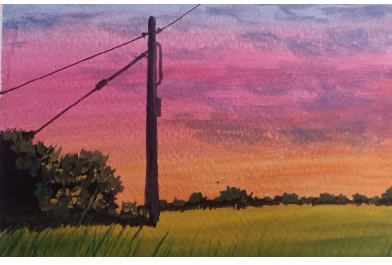
6. Painting 03: So here's the third painting
that we're going to try. For me, my most favorite
part about this painting is that bright orange color
along the horizon line. Now, I'm going to take you through the colors
you will need. The first color you will
need is a lighter blue, and to create that lighter blue, I'm mixing some white
with ultramarine blue. You can go with any
blue of your choice. It doesn't need to
be ultramarine blue, but remember to add
more white than blue. Okay. Now I'm going to
swatch out that color. See that? It's a mix of
ultramarine blue and white, more white and less blue. Okay, so that's a first color. Depending on the amount
of white you're adding, your color might be a bit
more brighter or lighter. So that's a first color
we will use for the sky. The next color is a pink, which is a mix of
crimson and white. If you have a similar pink with you already, you can
use it directly. You don't need to mix
and create this color. Okay, so just add some
white with crimson, and you will get
a beautiful pink. Okay, so that's
our second color. So we will start by blue. Then we will switch to pink. Now, to make our sky
more captivating, I'll also be adding some
orange along the horizon line. Here's the orange
I'm going to use. So I'm going to take
a little of orange, and I'll mix that with a bit of pink, and let's
see the color. That's very little orange. I think I will need to
take some more paint. Okay, now let's mix it. See that? So that's the kind of color we'll be using
along the horizon line. Maybe we can add some more crimson to make
it more brighter. Okay, so depending on the
amount of colors you're adding, whether it's crimson or orange, the color will be
a bit different. That is totally fine. Let
me show you the swatch. So it's more like a peach color. It's a beautiful color
to use for sunsets. I just love this color. You can add more orange and see how the color
is turning out. Okay, so you can go with
any color that you prefer. It can be more
pinkish or orangish. As we're using a light blue
and a light pink for the sky, and this bright
orange will enhance our sky and will make
it more captivating. Okay, so for the base layer, we'll be using
those three colors, and we'll be blending them. Then onto that, we
will add some clouds. And to add the clouds, I'm going to use a grayish blue. It's a mix of blue, a
bit of black and white. I have taken some black.
I'm mixing that with blue. I will need to add some white. I don't have any
white on my palette. So I'm picking a bit of white and I'm mixing that
with this color. So just to add a
bit of black with ultramarine blue and
some white asphalt. We need a lighter
to medium tone. I think this one is
looking quite dark. We will have to add more white. So you can see, it's a
very dark bluish gray. I'm adding some more white
and maybe a bit more blue. Okay. I think that is
looking much better. As I always say, the colors
can be a bit different. That is totally fine because when you mix and
create the colors, the ratios can be different. So just go with a color
that is nearly similar. It doesn't need to
be exactly the same. So we'll be using this
color to add the clouds. I think the color is pretty dark compared to what I
have used for the painting. So I'm adding some white
to make it lighter. We're looking for some
soft subtle flowers. We don't want them
to be too loud. So remember to go
the lighter tone. This color is looking much more better than
the previous one. The first one I tried
is much more darker. So always try your color
on a scrap piece of paper before you add these
clouds on your main painting. And once you feel the color
is perfect, you can add them. Okay. So just add
some random shapes onto the sky to create
that cloudy effect. You don't need to
add these many. You can just add one or two
on the top or at the bottom. Now, in case if
you don't want to add the clouds, that
is totally fine. Just go the beautiful blend
of blue, pink and orange. Okay, so that's
all about the sky. Now for the meadow, the
two colors I'm going to use is olive green
and yellow ochre. You can see the
colors on the top. If you don't have olive green, just go with sap green or any other darker
green you have got. The last thing I want to talk
about is this Eltric lines. To add them, I'll be
using a roller and a pen. They are simple straight lines, so we just need a
roller and a pen. Those landscape details we have tried in the
technique section. So I think they're
good to go. The rest of the details you
can see as I paint. Okay, so it's time to get a try. I'm starting by squeezing out all the colors onto my palette, starting with ultramarine
blue, then white. Now some crimson. We discussed this already. We're going to turn these
colors into pasty colors, which means into blue
as well as crimson. We need to add a bit of white. Okay, so the colors
are already here. Now, I'm going to
add a line here, which will separate the
sky and the meadow. Next time starting by mixing some blue and white together. That's the color I'm
going to use on the top. Then gradually I
will go with pink. So go with any of your flat
brush or a silver brush, preferably a medium to
bigger size brush so that you can apply paint in one
twipe on a larger area. Okay, so this is the kind
of color I'm going with. If you want to make it a little more lighter, that's
totally fine. Add some more white into it
and go with a lighter tone. Okay, so that's blue. Now,
I'm going to clean my brush, and I will go with
some more white. I will make the blue lighter. Then gradually I
will cover pink. Maybe we don't need
to wash the brush. I will just quickly make it lighter by adding some
more white paint. Okay, so we have a
medium tone on the top, and now we have made it lighter. I will add some more white, and then I will switch to pink. Okay, so that's a first step. Now I'm going to clean my brush. And I'm switching to pink, which is a mix of
crimson and white. Turn your color
into a pasil tone. If you have pink
with you already, you can use it directly. You don't need to mix and
create a similar color. Now, add that at the bottom, and slowly blend that with blue. So you have to run your
brush back and forth in a horizontal direction
to get the best blend. Don't mix up different
kind of brush moments. It will leave some brush
marks on your sky. It won't look like
a clean blend. So run your brush only
in one single direction. Now I'm cleaning my brush. Now I will pick some white, and I will blend these
colors together. Try to go for a clean blend. Okay, so just keep running
your brush back and forth, only in a horizontal direction, and you can see the car just
blend we have created there. Okay, so that's a base layer. Now, as I mentioned earlier, I'm going to add a bit
of orange at the bottom. So I'm switching
to a smaller brush and I'm picking some orange. I think I will add a
bit of white. Okay. So picking a bit of white, adding that with orange. Now, I'm going to add that at
the bottom right over here, closer to the horizon line. The color is not really bright. I think we can make it
a bit more brighter. I want the bottom
part to be really bright and prominent
compared to the top. Okay. So I'm going to pick
a little more of orange. And I'm adding that bright
orange along the horizon line. Okay? The rest is going to stay acetusOly along
the horizon line, I have added some orange. So that's a base layer. Next, we need to create a bluish
gray to add the clouds. So I will squeeze out some
black first, just a bit. We want a color
which is more like a bluish gray, so
mix some black, blue and white together
and create a bluish gray. Okay. And to add the clouds, I'm going to use my size
number four arm fresh. Okay, so the color
is ready here. Now I'm going to add some
clouds onto the background. If you want to make the
color more lighter, you could do that,
or even darker, that's totally up to you. Okay. Now, just in case,
if you don't want to add the clouds,
that's totally fine. You can just go for a
nice blend of colors. Even without the clouds, the sky is pretty decent. So if you want to skip this
step, that's totally fine. Now using a lighter tone, I'm adding some more
clouds onto the top. You can experiment with
different tonal values. If you want to make
it more darker, you can do that,
or even lighter. Try and experiment
different tonal values and make your sky
really beautiful. This one is a really
beautiful color combination, something that we
all have witnessed. The most interesting part about this car is that bright
orange at the bottom. Otherwise, it's going
to be quite plain. So it is that little
brightness at the bottom, which is making the sky
look more beautiful. Anyway, I'm going to add
a few more clouds onto the top and maybe a few
more onto the left side. And with that, I'm
going to call it done. Then we can go with the meadow, maybe some small
pieces onto the top. Sometimes you don't need
to add a lot of clouds, maybe just one or two
streaks. That's all we need. You can leave the rest quite
simple and minimalist. Okay. I'm adding one
more cloud here. Now, another smaller
one on the top. You can keep adding
more if you want to add more clouds or if
you're happy with the result, you
can stop it here. Now with the dam bridge, I'm
just spreading those clouds a little more to
make them bigger. Earlier, the shapes were quite small. So I'm just
spreading that. Okay, so with that,
our sky is done. Next, we're going to
paint the meadow. And for that, you will need
some green and yellow. I'll be using olive
green and yellow ochre. I will squeeze out these two colors onto
my palette first, that's yellow ochre, olive
green, and a bit of black. Now, I'm starting
with olive green. On the top, I will make it lighter by adding
some yellow ochre. And towards the bottom, I will introduce some black
to make it darker. Okay. So the color I'm
using here is olive green. Now I'm picking
some yellow ochre, adding that on the top. Okay, so along the horizon line, I want the color to be
more like a medium tone. Then towards the bottom, I
want to make it more darker. So go the similar color. If you don't have olive green, you can just use sap cream. That's not a problem.
Mix that with some yellow ochre, then
blend it like this. It can have some textures and some lines in the background.
Don't worry about it. Next, I'm going to apply
some black at the bottom, and I'm again blending
that into the background. So that's a base layer. Now you can add some lines in between to add more textures to give
a realistic feel. See that? You can add one more
line in between. Okay, so that's a base layer. Now I'm going to go
with a smaller brush and I will add the details
along the horizon line. I mean, all those landscape. So first, using black, I'm adding a basic shape. Then gradually we can start adding more textures
and more details. For now, just focus on the
overall shape and add that in. It can be a bit bigger on the left side, then
make it smaller. See that? So that's the
shape I'm going with. Now I'm going to
fill that in black. I spoke about the detail
earlier along the bottom, add some teeny tiny lines
close to each other like this. Then you can fill up the rest. This will make a real
difference in your painting. Don't go for a straight line. It doesn't need to be perfect. Simply add some
teeny tiny lines at the bottom to represent
that grassy field. Now I'm going to extend
the shape a little more. You can go with any
shape that you prefer. It doesn't need to be this tall. Now along the
horizon line asphll, I'm adding some detail,
some shorter detail, not as big as this one. Y I So far, I have only used black, and you can see the
shape I'm going with. It's a very basic
irregular shape. I haven't really put
much effort here. Now I'm going to go
with a smaller brush, and I'm picking
some olive green. Okay, now using this,
I'm going to add some teeny tiny
patterns along the top. Maybe we can add
some yellow ochre. Okay, so any green
that you prefer. And then on top of
that black shape, add some tiny dots and shapes. Towards the bottom, the
black color can stay. Only along the top, you can
add these dots and patterns. Again, they don't
need to be perfect. Just keep on adding them
until you're happy with the result and try to use a smaller brush or any
brush with a pointed tip. So the first step is to add these patterns using
a medium green. Then gradually we will
go with a lighter green. We can add more yellow
into the mix and add more dots using that lighter
tone, only along the top. Okay, so I'm mixing
some yellow ochre. I have made the green
a bit more lighter. Now using that color.
I'm adding similar dots again onto the
background. See that? You can see the
difference it made. Earlier, it was
just a black silo. It was looking quite
plain and boring. Now we're adding more
details onto the same to give it a more
three dimensional feel. And I think it's
working. I'm really loving the way it
is progressing. Similarly, I'm
adding some patterns along the horizon as well. Over here, I won't
use a lighter green. I will just go with
the medium green, and I will add some random
patterns on the top. This one is quite far, so you don't need to put
a lot of effort here. You can quickly add them in. Okay, so we're
done with the sky, the base layer of the meadow, and also the landscape elements. Next, we have to add
some grassy pattern onto the meadow to make
it look more interesting. It's a closer look, you can see the way
it has turned out. If you want to add more
patterns, you could do that. Next, we can go with
the grassy pattern. So I'm going to use
the same brush, and I'm starting off
with a darker green, which is a mix of
black and olive green. Now using that, I'm adding some grassy
lines at the bottom. So for this step, we have to use different tonal values of green. You can start with a darker
green or a lighter green. That doesn't matter, but try
to go with a pointy brush, a detailing brush
or a liner brush, and keep on adding some free
hand lines at the bottom. We try the same in the
technique section. It is exactly the
same technique here. But try to use different
tonal values of green to add more
realistic character to it. Okay. So first go the
round of lighter green, then a medium green
and a darker green. You can go in any order. Okay, I'm adding
some yellow ochre, and I'm mixing that
into a medium green, adding a few drops
of water as well, so that the lines will be
more fine and continuous. It won't be a dry, cracky line. Now, let's add these lines. If your paint is dry and thick, the lines won't be this crisp. It will look appear
cracky and dry. So just add a few drops of
water in case if you feel like your paint is too dry and
then add these lines. Okay. Now, I want to tell you you don't need to focus
on each and every line. Just keep on adding them
close to each other. Some lines can be messy.
That's totally fine. When you add a lot of them,
it doesn't make a difference. Okay, so be confident, be brave, and just add them in. Next, I'm going to go
with a medium tone, and I'm adding some
lines on this side, closer to that
landscape element. I'm adding the lines on top of them so that overlapping will make it look
more realistic. For this painting,
I'm not going to add any flowers, but
if you prefer that, you can add some tiny
yellow flowers or white flowers or pink or
any colour you prefer. Okay. And also, if you want
to add more grassy lines, that is also totally up to you. I will add some
more on the side, and with that, I
will call it done. Then we have one
more element to add. Over there is the
electric lines. I'm going to quickly
finish this. I Alright, my dear friends. So that part is done, and you can see how gorgeous
it has turned out. I really love the sky and
the color combination. Anyway, now let's go
the final detail. And for that, I'm picking some
black with the same brush. Adding a few drops of water. Now, I'm going to
add a straight line. You can place your electric
line wherever you feel like. I'm going to add that over here. So add a thick black line
first. That is our first step. It is the post. Then we can add the electric
lines using a pen. Okay, next, I'm going to pick a bit of gray using
the same brush, and I will add some
highlights on the right side. So right now it is
just a black line. Now onto the right side, I'm introducing a
little of gray. Okay. It's just a little bit, not a lot and be very careful. The line should
not be too thick. Go with a similar thickness. See that? So go with a gray and add that
onto the right side. Okay, now it's time
to switch to a pen. This one is a waterproof pen. I'm not sure what are
these details called. You can look at the
painting and add them in. So on the top, I have
added a line and a dot. Now on the right side,
I'm adding a wire, adding another tiny line there. Now, from that point, I will add an electric line using a ruler. Okay, so pick up your ruler
and add a line from there. If you're confident enough, you can use your brush
for these details. Honestly, I'm not
confident enough. I don't want to
ruin my painting. It is looking quite beautiful, so this is a better
option for me. Anyways, I have added one
line on the left side. I will add one more here
onto the other point. Then maybe I will add one
more on the right side. That's all. Okay, so there are two lines
on the left side. Now, from this point, I'm adding one more
towards the right. Maybe I will extend
this part a little bit. Okay. Now let's go
with the last line. I'm adding that over here. I think the electric line
made a lot of difference. Earlier, it was looking beautiful, but it
was quite empty. Now it looks complete. I think this was a
missing element. Finally, I'm adding
a rectangular piece here, and that's it. That's our last painting
from the series. If you want to add some birds onto the sky, you could do that. I'm not planning
to add any birds, so for me, it's time to
peel off the masking tape. And here is our last
painting from the series. I really loved the
colour combination. I hope you all enjoyed painting this gorgeous
sunset with me.
 Zaneena Nabeel, Top Teacher | Artist | Author