Transcripts
1. Hello and welcome!: Hello, everyone, and welcome to my beginners Dian
Calligraphy course. You are at the right place. If you want to progress
with this skill, maybe you've never tried anything calligraphy
related before, that's absolutely fine. This course is super
beginner friendly, or maybe you're here
because you just want to go back to the foundational
work to just make sure that you have
very strong basics and foundations that you
can then build upon, which is very important
in calligraphy, especially because without
those foundations, without those
basics, it's really hard to make real progress. So here we are. We're going
to refine everything. We're going to take
it step by step. We'll start with some really
basic exercises like just practicing some drills and learning about the basic
strokes of calligraphy. Then we're going to learn
to form Lorics latte, and I'll show you how all of those basic strokes make
up so many lettuce. It's really amazing when you
see it all come together. It's really exciting.
He'll also practice some uppercase lettus that
are really beautiful. And that's when you
can really kind of start making your calligraphy
flow a little bit more. We'll then dive into
letter joining, and I'll share some
tips on how to make your spacing a bit
wider or a bit more narrow, how to be in control
of your spacing, and we'll try some
different styles. It's going to be a lot of fun. From there, it's all about just practicing some short words, some short phrases,
try not to overwhelm yourself with
really long pieces. So we're going to keep it
very kind of step by step, and by the end of the
course, you'll be able to letter your own greeting
card, short quote. It's going to be exciting. So if you signed up for
this course and you've never seen my face
before, I'm a leaner. I'm a calligraphy
artist and teacher. I'm also a creative
business mentor. I have been practicing
calligraphy for ten years, over ten years, over a decade, which
means that I've learned so much and I want
to share it all with you. I want to collapse time for
you so you don't have to go to all those little bits that
come up in your practice, and then, you know, it takes time to
kind of overcome them and learn how
to work around them. So I'm here to really kind of put everything
on a plate for you in a very structured course that will help you progress. I'll be sharing everything
you need to know. So it's really up to
you how much time you can dedicate for
your practicing. I would say shorter sessions have better the longer sessions. So even by doing like 20
minutes a day is excellent. If you can squeeze that in,
that's absolutely amazing. I'll keep it fresh,
I'll keep it fun, and I'll keep it
productive as well. I hope you're excited. I hope you've got your
tools ready to go. So let's begin with
the first lesson.
2. Supplies: In this lesson, we're
just going to get familiar with all the
supplies you'll be using. So we'll need our pen holder, and I highly recommend using
the speedball pen holder. It's a straight pen holder, which is important, and it's
very beginner friendly. So it's suitable for lefties and right handed people,
which is wonderful. There are also
oblique pan holders, but I highly recommend starting
with the straight one. They'll also need our nib, and I highly recommend
learning with a Nico G nib. So this nib is just
wonderful for beginners. It achieves beautiful thick
down strokes and very, very fine hairline strokes, which is what we
want in Caligafy. And it's fairly flexible. It's really, really
good for beginners. I can't recommend it enough. I use it for everything. Then we'll also need ink, and I normally buy
this sumi ink, and I've tried countless
black calligraphy inks, and this is what I
always come back to. And I really, really
love this ink. So I normally just
get a little pot, like a glass jar, and I pour it in there, and then I keep it in there. Just remember to shake it. Before you pour
it. Always always give it a good, good shake. So that's our pen, nib, and our ink, and also paper. Paper is very important. In calligraphy.
We want to letter on smooth, fairly thick paper. And I really love
this HP color choice. Paper, it's in 160 GSM. Again, you can find all the
links, all the supplies. Just check the materials needed section is right
at the beginning. I highly highly recommend this, especially if you're
printing your worksheets. Now, if you want to just
practice and have a book, like a little notepad to
keep everything together, I highly recommend
these rodeo pads, and this one's dotted. So I highly recommend the dotted ones in particular.
They're really good. I absolutely love them because you have those dotted lines, and they just act as baselines
when you're lettering, and that can be really helpful. So you'll need to
insert the nib into the pen holder, and
this is how you do it. You just kind of
slot it in there. Nice and snug, so it doesn't
fall out, obviously. And this is where it
kind of wants to be. So you push it as
far as it goes. Try to be gentle
when you're handling your nib and try not
to handle it too much because it can just
interfere with the ink flow later on
our hands have like, natural oils, so we don't
want to handle it too much. And here we are
ready to practice.
3. How to hold the pen: In this lesson, I'll
demonstrate how to hold your pen to achieve beautiful
flowing calligraphy. So we're going to begin
by just positioning our index finger right on
top of the pen holder. Then we're going to grab it with our thumb and middle
finger on the side. Let's position our wrist flat on the page with the nib
pointing down straight. Okay, so the wrist is flat. The nib is pointing down. So the idea is that
you want to find that perfect sweet spot in
between having your wrist flat and then resting your
side of the hand on paper. So somewhere in between, your wrist doesn't need
to be completely flat. So the angle we'll be holding our pen at is really important. So we don't really want
to hold it upright. What we're aiming for is a nice 45 degrees
slant from pay Pot. So if you point your nib down, try to look for this
like 45 degrees slant. Now, the lower, the
better I'd say. So so having your pen holder
slanted down will just make it so much easier to
achieve thick down straw and just make everything
flow a little bit more. So just try to slant
it towards yourself, so it's pointing at your chest. Now again, your wrist
is kind of flat, so try to find that perfect
spot that feels comfortable. Try to relax your hand, try not to grip
your pen too hard. And again, just make sure that your nib is pointing
down, so it's straight. So you're not rotating it to
the right or to the left, it doesn't want to
be just kind of flat on the page, if
that makes sense. When you're lettering, you
might notice that you're pointing your neighbor towards
the corner of the page, towards the right
or the left corner. That is fine if you're
trying to achieve a slant. You can also try to
rotate your page. Some people find it very
comfortable to rotate your page. Now, again, this will come
in handy when you're trying to do calligraphy at a sat and slant,
which we'll do a lot, you'll just notice
that sometimes, you'll kind of naturally
adjust and sometimes your neighbor won't be pointing down straight like
this, and that's fine. Now, let's try applying
some pressure. So when we apply pressure, when we press down hard, you'll see that the
twines of the nib open up and you'll see that
they kind of split. You see there's like
a split happening. So let's try this
together without any ink. We're just going to
press down hard and then imagine that we
are doing a downstroke, so we're just
gliding up and down. So when you go down, you apply a bit of pressure. Now, let's also try going up where we don't actually
apply any pressure at all. We're just gliding our
hand really gently up. So just try to get used to
holding your pen correctly, applying pressure
when you go down and gliding your hand up very
gently with no pressure. So these are so this is the number one
rule in calligraphy. But we go down when
we do downstrokes, any downward movement, we're
going to press down harder. And when we go up,
we're going to release. So we're going to go
really, really lightly. So all the downstrokes
will end up being thick and all the upstrokes
will end up being thin. So just play around with
positioning and pressure, and I'll see in the next lesson.
4. Basic strokes: In this lesson, I'm going to demonstrate how to dip
your pen into ink, and we're going to practice the basic strokes
of calligraphy. So let's go ahead
and dip our pen. So you'll see that in your name. There's a little hole, and it's called a vent. So as you dip, try to dip
just past that little hole, submerging kind of like half of your nib just above
that little went hole. We definitely don't want the actual pen holder
touching the ink, and I highly recommend either shaking off the excess
or maybe just wiping your nib on the side of the jar after dipping just to kind of get
rid of the excess. You can always have a look, so you'll always see
there's a bit of ink. On the back of your name, it doesn't need to be a lot. Even just like this is
actually quite a lot. So you'll get used to it. So the inkflow is something that will come naturally slowly. So this is where
we just trying to be patient and gets to know it, gets to learn a little bit, and adjust as needed. So let's just practice dipping and creating these down strokes. So we are dipping our pen, and then we're applying heavy
pressure as we go down, gliding our hand down. Now, if this happens, if your stroke kind of
looks like an outline, that just means that you run
out of ink, and that's fine. You just need to re dip. We always want to try and dip in advance, you
know, if possible, it's really hard at first, and you'll get used to
it the more you do it. Now, if this happened, if you get a big blob
coming out of your nib, that just means that there's
too much ink in there. So try to dip a bit less. So try not to go past that
little hole too much. So just practice a little bit. And sometimes, if you do over dip or if you just want
to clean your nib, you can always use a bit of
tissue to gently wipe it. And while we're
talking about ink, let me just share
a few tips here. Sometimes it's a good idea to
give you in a little star, especially if you're
practicing for a while, especially if you're using
colorful or metallic inks. And I love using the other
side of the panhodaT star. It's a nice little
trick. And try to be quite mindful of
your inks consistency. Sometimes it'll thicken up, especially if you're leaving your jaw uncapped
for a long time, and you'll just need a
couple of drops of water. Okay, if you're feeling ready, we are going to go ahead and start practicing
the basic strokes, and we are going to begin
with this fast page. So make sure your
wi book is printed, or if you're doing this
in your own guidelines, you can always refer to the
video and just copy me here. And we're going to start by
practicing down strokes. As we glide our pen down, we are going to
try and go slowly. We're going to
press down hard so the split happens and a
lot of ink flows through. Let's not forget to dip our
pen. These are fairly big. You might want to dip your
pen quite frequently. It'll be obvious
when you run out of ink. Again, just adjust. It's very normal to
run out of ink or to have big blobs coming
out of your nib. If you're doing this
for the first time, just let's be patient and you'll only get bet
as you practice. So keep going. So on these
guidelines, we have a slant. We have a slant line,
and it's at 60 degrees. So in modern calligraphy,
you want to go for, like, a 55 to 60 degrees slant. So these are 60 degrees. Now, it's quite slanted. It might feel quite unnatural. And this is where
you can definitely rotate your page a little bit. So depending whether you are
left handed or right handed, you might want to
do this clockwise or anticlockwise, it's
really up to you. But it can really help. I find that rotating it slightly anticlockwise helps me get the
slant a little bit better. And just for the sake of following the
guidelines properly, I'm doing it here, but
I wouldn't recommend slanting or rotating
your page too much. It can get a bit
confusing later on. So normally I just
try to keep it fairly straight. So there we go. So these are downstrokes, really juicy, really thick. Don't be afraid to press down. Now we're going
to try upstrokes. So these are the opposite. These are going to
be super light, maybe even a little bit quicker. Now, these will look super
shaky and not very pretty. If this is the first
time you're doing this, I just want to put it out there. That's very normal if they're shaky, if they're inconsistent, if it's hard to
keep them straight, just now that it's
very normal and we're just warming up here,
we're just practicing. It's definitely not about
what it looks like. Here, we're just practicing. Mine as well,
sometimes are quite inconsistent and
it's very normal. It's really hard to
get that control, especially if you're warming up or if you haven't been
lettering for a while, or if you're new to this, obviously, just go with it. Whatever happens, just
give it go very light, thin upstrokes. Now,
this is interesting. So we're going to do
another thin stroke that also goes up, which is called the
entrance stroke, and this is something you'll see often when we begin the letter. So it just makes it look
a bit more complete. You'll also see this when
you're joining letters up and the connection stroke looks
just like this very often. So let's just practice this
one with a lot of precision. It's much easier than
the previous one because it's smaller,
it's shorter. And we can just make
it a bit more focused and do it a bit slower
with a bit more intension. Still taking it fairly slowly. There we go well done so
that's the entrance stroke. We're going to practice
some under tant as well, and it's just a U shape really, but it's such a good
stroke to practice, and this is why it gets
a little bit tricky. So we're going to transition
from thick into thin. We're playing with
pressure here, so we're starting thick and
then we are starting to lift the pressure as we go down and then
finish, really thin. Now, take your time here. I'm doing quite a few of these. I've been doing this
for a long time, so I've definitely got
that rhythm going already. So please take your time. You can definitely just do maybe four or five or just
do the whole line, whatever feels right for you. I keep going to demonstrate it. You can look up
and you can always see that I'm demonstrating it. So just refer to this example, but you can go five times
slower if you need to. And I actually really
encourage going slowly. Calligraphy loves
slow, gentle movement. This is definitely not
something we want to rush. So to help you make that
transition a bit more smooth, just make sure that
you're kind of thinking about it in advance. So as you go down with
your down stroke, try to think ahead and start lifting that
pressure a little bit earlier than
you think you need to to get into the thin stroke. So it all happens kind
of at the bottom of the stroke when we shift
from thick into thin. Well, the, just do
a few of those. If you need to pause
the video, go ahead. It's a self pased course. You can definitely
do that and be in control of how quickly
you're watching this. And when you're ready, we're
going to try some overtons. So overtones are really fun, so they're just pretty much
the same as the undertons, but they're upside down. So this time we're starting
with a thin stroke. So we're starting thin, going slowly up and
then rounding it up at the top and then dropping down with a
heavy, heavy stroke. Now, we are still trying
to follow the guidelines, try to follow the slanted line. You can always
start your shape on the actual slant line just
to help you with that slant. And also try to keep both of these strokes quite parallel. So a very common mistake is to open it up
too much so that it looks quite open and
stretched almost. So we definitely want to keep both strokes parallel to one
another, like train tracks. So everything is very parallel. That's the best way to think
about it. But keep going. Again, do a few and
try to do it really, really slowly. Well done. When you're ready,
we're going to try some compound curves. Now, this shape is
really interesting. We're going to see this
a lot in lettuce like and H. And here we're going
to try two different ways. So there's one that starts with a thin stroke, then
goes into thick. And there's one that
starts with thick, then goes into thin
and back into thick. So maybe let's just
pick one and just do one way a couple of times. Otherwise, it's just too much
multitasking and thinking. So let's just maybe do thin up, thick down and thin up. Again, it's like we're joining both of these shapes
that we practice, overtons and under tens
together in one go. These are quite small, so it shouldn't feel too hard in a way that you need
to stop or dip your pen. We can definitely just
do them in one go. Again, try to keep
everything parallel, maybe try to focus
on the slant again, follow the slant lines
as much as you can. You don't have to be
super strict with it, but it's nice to try
and keep it quite consistent and take it slowly. There are a lot of
pressure changes here, and you can help yourself
by just slowing down, focusing, making
these intentional. Slowing down really,
really helps. And they're going to try
some ovals, as well. So it seems like a little shape, but there's quite a lot to it. So now it is the point that
I'm starting the shape from. So I'm starting it
with a thin line, then going down and
then going thin again, joining up to that initial thin. So we're starting
it kind of from the middle on the right side, so going up, down, up, up, down and up and just joining those two thin
strokes up at the end. So again, take it slow. Breathe. Remember to breathe. Try not to hold your breath. This is something I hear a lot. A lot of students just hold their breath because
they're focusing so much. So this is my reminder
for you to breathe. Just let go. Try to relax your hand a bit more,
drop your shoulders, rest your elbow, just make it comfy and try not to overthink. It's not about what
it looks like. I'll keep reminding you because I know that a lot
of students get frustrated when they have big blobs
of ink on their page or things don't look
very consistent. That's very normal, and I just want you to know that
right from the beginning, you're just learning. Well done. Okay, when you are ready, we are going to try some of
these ascending loop shapes. So at the beginning
of the workbook, I talked about guidelines. So I hope that you're familiar with the way the
lines are called. So this shape goes all the
way to the ascender line, and there's a little
loop formed at the top. Hence, it's called
an ascending loop. So it's a really common shape. Again, we'll see this a
lot in Licase lattice. So let's practice
this thoroughly. So we are starting the shape from the baseline
of the guidelines, and then we're forming the
loop at the top and we are positioning the actual
shape on the baseline. Again, trying to go slowly. So starting with the loop, see if you want to slow
down there at the top, slow down a little bit and then drop down a bit quicker
maybe with a downstroke. So we're starting to
apply a little bit of rhythm to our lettering as well. So maybe start the loop really, really slowly and then just go a bit faster
as you go down. That might help you kind
of build up that momentum. And wherever you are, see if you can slow
down a little bit more. I always see my students rush, and it can be actually really, really hard to slow down. But that's when
the magic happens. Trust me, the slower you
go at the beginning, the more everything
will sink in. You don't need to do as
many as I'm doing here. Just do what feels comfortable. Let's remember to dip
our pen, as well. It's normal if you
run out a thing. It's normal if you dip too
much and a big blob comes out. All those things are normal. Just keep going,
keep practicing. And we're going to
try the opposite or we're going to do
a descending loop, which means that we are
dropping the shape below the baseline and it stretches all the way to a descend line, which is the fast line
right at the bottom. Okay, so we're starting
with a thick downstroke, trying to follow the slant
lines, even a little bit. Doesn't have to match
the slant lines. It's actually quite flexible. In modern calligraphy,
your slant can be whatever you want. It doesn't have to follow
anything specific. These are just recommendations. But because modern
calligraphy is so expressive, you can definitely
just play around. My calligraphy, for example, is quite upright naturally, but I love using slant lines because it keeps everything
quite consistent, and that's why that's why we are practicing
the slant line. There we go. So there's a big pressure
change at the bottom, so try to go a bit slower
and then just lift again, maybe a bit earlier
than you think you need to to get that
smooth transition. Well done, so these are the
basic straws of calligraphy. You can do some extra
practicing in the space below.
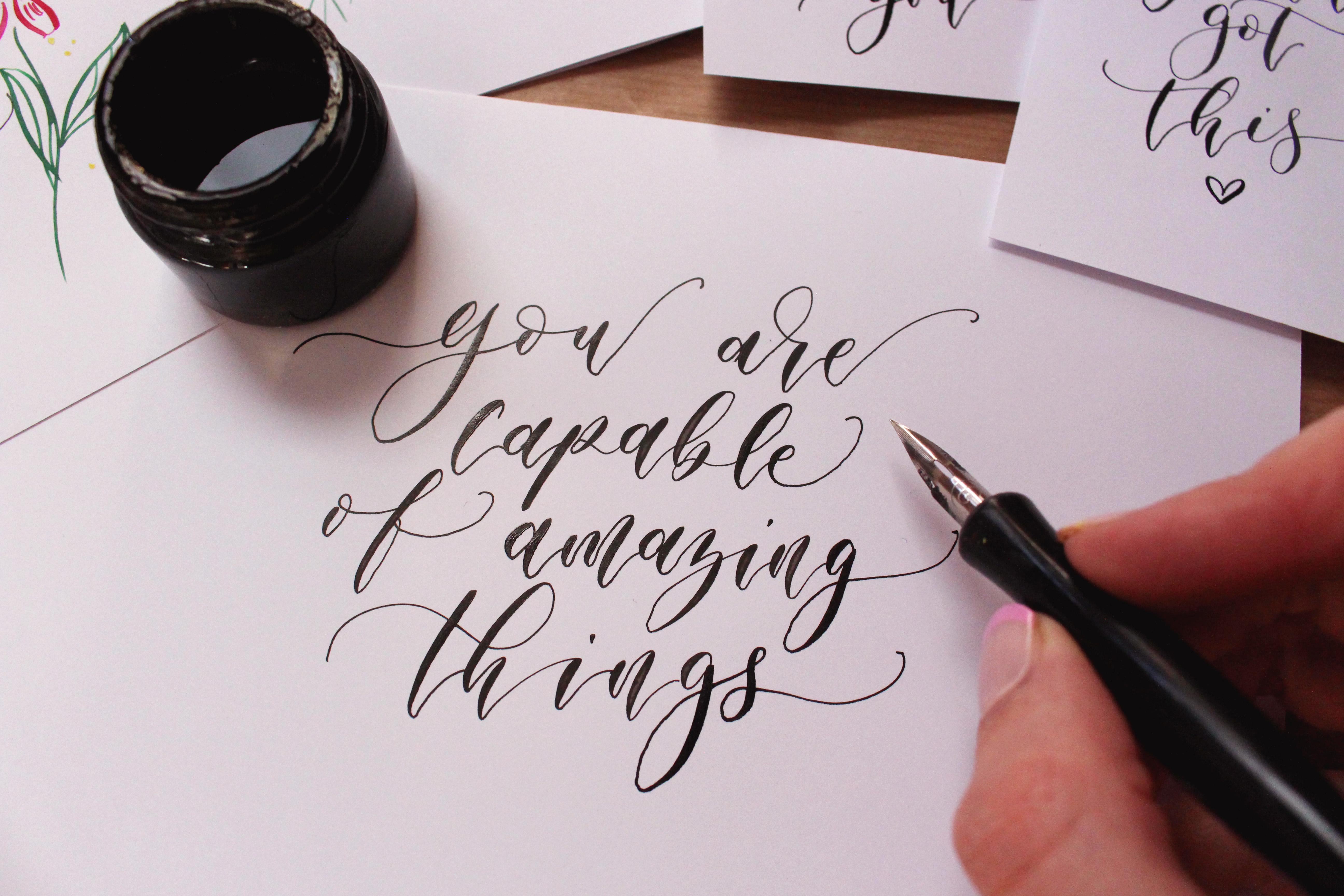
5. Lowercase alphabet part 1: Now that we practice the
basic strokes of calligraphy, we are going to go ahead
and form each letter. So we're going to start
with a lowercase. And in this worksheet, you'll see that every letter has its own little
formula, if you will. So you'll see that each
letter is built out of shape. So we have a look
at the letter A. So we can see that it
starts with the O shape, followed by the U shape. And when both of these
are put together, we get the letter A, and
let me just demonstrate. So the reason we are trying
to find shapes within lattice is because we stop
in between the shapes. So now is how I've done
the fast shape, I stopped, and then I attached the U shape, and obviously it's
not all way up. We're kind of finishing
the U shape a bit earlier, so it does look
like the letter A. And again, starting
with the one shape, stopping and then
attaching the neck shape. So this little pause in the middle is super,
super important. Now, you might feel a bit
strange at the beginning, and you might think that,
that would just take me ages to do any
words or phrases. But the truth is, you
get into a nice rhythm, the more you do it, and
these little pauses just become really automatic. So carry on practicing the letter A free
hand a few times. Try to go really, really slowly. Notice how slowly
I'm going here, focusing on each shape, trying to follow the slant line, keeping everything consistent. And that little pause
in between the shapes is the perfect
opportunity for dipping. So you can dip your pen
when you're pausing. And when I say pause, it doesn't mean that you need to stop and go make
yourself a cup of tea. That little pause
is really quick, like one or 2 seconds just
to kind of help you reset, prepare for the next shape. So now that you've
done one line, just have a look at
your letters A and pick one that looks the best for you. They might look rubbly,
they might look shaky, and that's very
normal if you're just starting out. Well done. We are now going to have
a look at the letter B. So the letter B starts with
the Asenda loop shape. And then we're attaching this little shape that we
haven't really practiced. But if you have a closer look, it looks like the overturn. It starts in the same way, we go up, thin, thick down, and then we're just attaching a little
loop at the bottom. You can also think of this
as an inverted C shape. What's important here again is that we're
pausing in between. Now, another place
where you can pause is when you're doing
the last stroke. Now this is what I'm doing here, I've done the first shape. I'm just re dipping my nib to
make sure it has enoughing. Now I'm doing the second shape, and I'm stopping when I
get to the downstroke and then I'm starting that
little tail at the end, which is called the exit stroke
of the latter separately. So again, getting to the
downstroke, stopping, and then kind of avoiding that downstroke and then starting the little tail on
the other side. So once again, doing
the second shape, getting to the downstroke point. Stopping and then extending that little upstroke separately. So we're having a
little pause there. There are actually
two pauses here. One after the first shape of
the latter, and the second, when we hit this downstroke, of the second shape. And then we stop there and
then extend the upstroke. So the reason we're making that little pause at
the end is because when you go through
your downstroke really quickly with an upstroke, you might smudge the ink
out of your downstroke. So sometimes it's a good
idea to kind of avoid it, but you don't have
to do it always. I normally just judge and see
how wet my downstroke is. And then if it's really wet, I'll try to avoid it or if I haven't dipped for a while,
I'll just go through it. But it's definitely a
good habit that you can start building having
that little pause there. Well done. So we've done
two lettuce so far. Now we're going to car on, and we'll find the lettuce C. Now, the lettuce C is just kind of like a shape in a tone, so we are not really dividing it into any particular shapes. We're just doing it as
one flowy, flowing shape. So it starts in a very similar way to the
letter O, to the O shape. So we're starting with
a little upstroke at the beginning and
then going down thick and then
finishing with thin. Now, let's try and
do it very slowly. So as you start your upstroke, try to be very precise,
very intentional. As you go down, pick up
a bit of momentum there. And as you finish, and
this is important. As you finish the shape, you want to slow down even more. So you might feel a bit counterintuitive to slow
down right at the end. So I see this a lot in
beginnings that they kind of, like, flick the last stroke. They kind of have that fog for the first part
of the letter. But then they're kind of losing up and just let go at the end. So let's try and keep
that focus right till the end. Well done. When you're ready, we're going to have a look at the letter D. And here we can actually
find three shapes. So let's have a look. Let's break it down. We're
starting with the O shape. We're attaching this
acenda loop shape, and notice how this
acenda loop shape merges with the letter U with
the underturn shape. And we kind of merging them both together and they become one, forming this like L shape. So in theory, there are
kind of two shapes here, forming the letter D, so
we're doing the first shape. The letter O, then stopping and then starting with a
loop up down and up. And it's, so useful to be able to understand how
every letter is formed. So keep going, fill in
this line with this shape, try to go really slowly. You don't have to do as
many as I'm doing here. Even if you just do one or two, even if you just trace in the example ones,
that's good already. But the idea is that
we want to make sure that we understand
these letters, we practice them
again and again, we do a lot of repetition before we move on
to anything else. So this could be something you definitely do
again and again. Well, done. So let's
have a look at the letter E. Similarly
to the letter C, this is a one stroke letter, in a way, so we can attach a little
entrance stroke there. And that's what we're going
to do. So we're going to start with the
entrance stroke, stop, and then start forming
the loop with a thin stroke. Again, I'm just making sure that my nib is loaded with ink. Sometimes it can be hard to
dip when you're focusing. You're going to forget to dip. Okay, so the entry stroke
first, loop pause, and then we're starting to form the letter E with the loop. And notice how this letter
sits within these two lines. So this is the X height, something we call
the X height space, and the letter E just
kind of sits there. So we're practicing like a very simplistic
baseline style here. We will be exploring
another expressive style, which is called
bouncy calligraphy. But to do that, we need to
make sure that we understand the balance and
the proportions of the letters first. Well done. Okay, so the letter
F looks scary, but we want to break it down. So again, we're going
to start with the same stroke like the letter E, so the entry stroke. And then we're going to do this kind of like
the ascender shape. So we go up down, but we're also attaching this
upstroke and a little loop, like extra loop, and
all of that is thin. So the only thick part
of the letter F is the down stroke unless
chart this again together. Notice how tall this latter is, is the only later that
stretches all the way up to the ascender line and all the way down to the descender point. Super big. It's quite long. Let's just make sure that we're following the proportions. I think having it
quite big as it is, makes it a bit easier
to kind of separate the shapes and make
them flow a bit more. It's definitely quite
a flowing letter. So just explore a letter bit. It might be a bit
hard to keep within the slant, but that's okay. It doesn't need to look
perfect. Please remember that. It's very normal if all of
this doesn't look good at all at this point. Well done. When you're ready, we're going to carry on with the letter G, which is much more
simplistic than the letter F. So we're starting with the O shape, stopping. And then we're just
attaching a descender loop. So notice how we're also extending the last
stroke of the lacta. So see how we do the first part, starting with the shape, stopping, then doing
the downstroke. And then as we go up, we stop again to separate
that long upstroke. So we're just giving
ourselves a bit more time, and we're being
cautious of, you know, going through that downstroke, especially if it's
really, really wet. We don't want to smudge it,
so we're kind of avoiding it. We're doing that last shape
of the latter into two parts. So down up, stopping, and then finishing
and continuing with this long upstroke
all the way up. So again, just try to build up this habit of doing it already, and you'll just kind of become automatic when you do it later. It's that muscle memory. Okay, let's carry
on with the letter H. It's my favorite
letter of all times. I love this letter.
It's really satisfying. To form. So we're going to
start with the ascending loop. Then we're going to
stop, and then we're going to attach a
compound curve. So very, very clear. So we definitely have these two separate shapes
that we are putting together like a jigsaw
to form this latter. We could have attached the
entry stroke here as well. But let's just keep
it simple for now. Now, just a quick tip. So when you finish
your first shape, and then you start a second, I love to imagine that at the
bottom of this downstroke, I'm kind of going to
the right a little bit. So I'm going down, and then
as I start the next shape, I kind of go right
up down and up. So I'm actually
going like one tiny, tiny millimeter to the right to try and kind of stay away
from the loop a little bit. So going up, down, stopping, and then quick little
maneuver to the right, just really short stroke to help you kind of start
that compound curve. With a bit more momentum,
so it definitely helps. It helps the ink flow. It helps to get that
transition beautifully. So I hope that makes sense. At the bottom of the downstroke, just imagine that you're
going to the right very, very slightly before
you start the upstroke. Obviously, it doesn't
want to be very visible, but it's kind of like the
thought process behind it. Lovely. We're going to do
a few more letters before we pause for the fast part
of the letter forming. We're going to do the letter I, which is fairly simplistic. We're starting with the
entry stroke, stopping, then we're attaching
the U shape, but again, we're not finishing
it all the way up, so the upstroke is quite short. This is where again, we really want to focus
on that last downstroke. Try not to do it really quickly. As you finish the letter, we want to actually
slow down a bit more. Keep that focus. There we go. As you do the dot on your I, I love to do it after
I finish the letter or even the word if you got
the letter in the word. You can just apply
a bit of pressure and point your nip down and
a bit of ink will come out. You don't have to
actually draw the circle. We're going to carry on with the letter J when you're ready. So it's quite a nice later. We're starting with
the entry stroke and then we're just going down, forming a descending loop, and then we're
extending the upstroke. Again, this little
trick where we are trying to avoid
the downstroke. Again, getting to the point where you're touching
the downstroke, then picking up your pen
after you've formed the loop, and then we're continuing
the exit stroke, the last thin upstroke
of the letter kind of separately on the other
side of the down stroke. I hope that makes sense. Again, we're just trying to
build that habit early on. Doesn't mean that you
always have to do it, but it can be very handy. Okay, so we're going to finish this practice with the letter K, which does look scary, but let's break
it down together. So we are going to attach a little entry stroke
at the beginning, and then we're going to
form the ascending loop. And then we're
attaching this I like to call it a little
ribbon like a bow shape. Again, something we didn't
really practice, but again, it's quite similar to the
overturn and undertan shapes. So after you do a downstroke, just kind of find that
spot where you'll start forming this
little ribbon shape. So as we go down, we go
back to the downstroke and then we keep this shape
within these two lines. So that's important for
balance for proportions. Let's try again,
let's take it slow. So we're going up down, back to the downstroke
and then down and up. Notice how I'm
separating everything. Notice how slowly
I'm going here, especially right at the end, as we're stretching
the upstroke to the side, let's do it slowly. And this is where we'll
finish today's practice, and we'll carry on
in the next lesson.
6. Lowercase alphabet part 2: In this lesson,
we're going to carry on with the Larges alphabet and our next letter is the
letter L. Let's get started. I'm dipping my pen,
getting ready, and we are going to start the letter L with
the entry stroke, then stop, and then just form this acenda U shape,
merged look together. Remember this is very
similar to letter E. It's just a
little bit taller. Now it is how the top of the
loop touches the top line. We're trying to keep everything balanced and proportional. Start with your entry stroke
right on the baseline. Following these guidelines is
the best thing you can do. I will really help your muscle memory and help
you form balanced letts. Well, done. Okay, so
here comes the letter M, such a good example
of demonstrating how calligraphy is all about just drawing shapes and
putting them together. There are a lot of
shapes in the letter M, which means there are quite
a few stopping points, those little pauses
that we make. So let's just break
it down together. We are starting with
the entry stroke, stopping, then doing the
downstroke on stopping, then attaching the
over tan shape, stopping, and then attaching
a compound curve shape. Okay, so let's just
try it together slowly and notice how I'm
stopping so frequently, those pauses are important, especially when you are
practicing and just learning you really want to pay attention
on those pauses, you might merge a
few strokes together here and there when you're
doing longer words or phrases. But normally, these are the actual stopping
points we have, even if you're doing words, even if you're doing
something really long, we'll always always stop
in between the shapes. Okay, so let's carry
on with the letter N, which is actually
very, very similar. So we're just skipping
that middle part, but it's exactly the same. So just do a bit
of those as well. They are very similar. We can also try forming the letter O, which, again, is
something that we practiced in the fast exercise. So it's essentially
just the O shape, and then we can embellish it. So I've showed two
ways of doing it here. I personally really love this way where you're starting with a downstroke and then you are doing a big
loop at the top. I love starlizing it this way. It looks really good. So this
is how I do my lattice O. You can also make it smaller, a bit more simplistic and
start it the way we started. Practicing the actual O shape, remember, we started
with an upstroke. It's really up to you which
style you decide to go for. You can try them both. Feel free to pause
the video if you need a bit more time before we do the letter P. So the letter P is actually quite
similar to the letter B. So again, we're trying to
spot those similarities. So by practicing one letter, you're actually improving
some other letters as well. So we're starting with
the entry stroke, stopping, then doing the
down stroke, stopping, and then attaching
the same shape that we attach to the letter B, if you remember, just going up down and stretching
to the side. Now the biggest struggle
with the lettuce P is to make the downstroke
beautifully slanted. So try to pay attention on that early on to just try to
follow the guidelines, the slant lines to make sure your downstroke is looking
proportional, balanced, and beautifully slanted,
well done. Lovely. So we've got a few lettuce left. So let's turn to another page, and we are going to
do the letter Q. So the letter Q starts with
a very familiar shape. So we're going to
do the O shape. So we've done it so many times. Hopefully, it starts to
feel a bit more familiar. So here it comes, and this looks really similar to the
letter F. So we're going to go down up and form a little loop and
then stretch to the side. It is important to stretch that little stroke to
the side because this is essentially what will connect this letter to another letter. So try to always imagine that you're catching
another letter as you're stretching
this letter to the side. Let's try to do a few of these
to just make sure that you downstroke touches the
descender line at the bottom. Again, trying to keep everything proportional, super important. That's what we're
focusing on here, trying to make these balanced, try to understand
all the shapes, try to follow the guidelines, and understand where every latte sits so that we can then do it free hand and it still
looks proportional. It still looks consistent.
That's the trick. We're building muscle
memory. Well, done. Okay, so here comes
the letter R. Now, remember, we are practicing like a very simplistic
baseline style here. I will show you
what the stylize, what the stylized version
of the letter R looks. So it looks bigger.
So the fast part of it will be bigger. But we're trying to stick
within these two lines for now and trying to
do the smaller version. So now it is how I'm doing
the little loop shape, and then I'm doing
this like U shape. So you can connect
them both together. You don't have to
stop necessarily, especially if you're
doing it very, very small like this. But if you're making it bigger, if you do like a bigger version, you definitely want to separate these strokes with a pause. So for now, let's
just stick with this fairly small version. You can stretch slightly above the line just to make it kind of easier for yourself to
separate these shapes. But in a simplistic
calligraphy style in more of a classic
looking clapy style, that's how the latter R
normally would look like. So it's quite small. The beginning part is sometimes
even smaller than that. But just keep this in
mind that this will differ when we do
bouncy calligraphy, which is more of a modern, kind of bouncy looking style. You are doing great. You've
done so many letters already. That's a huge achievement.
Let's keep going. We are going to
try the letter S, and the letter S just
flows beautifully, and this is where we
can try and extend our entry and exit
strokes just to kind of get into that flowy feeling. Do try to keep this letter
within these two lines, but again, try not to
be too strict either. It can definitely stretch
slightly above or below. Especially when we are
stylizing calligraphy, which is something we'll
do a lot later on. This particular letter will normally be quite big
with bigger loops. But for now, let's just
keep it simplistic, maybe slightly
bigger. Well done. Notice how the letters
just flows in one go. Then we're going to move on to the letter The letter T
is fairly simplistic. We are just doing a
straight downstroke and then we are stretching.
It's like a U shape. We're just not finishing
it all the way up, so a downstroke and
then we're attaching a little upstroke to it as well. Now, after you do your
downstroke, upstroke, we are then going to
do the cross bar to the cross line of
the letter Now, now this where it sits. It's just kind of below the Acandline and
above the waistline. And now it is what
I'm doing here. I'm separating this long
stroke into two parts. Do you remember we've done
a lot of this already, so you can definitely go through your downstroke in one stroke. You can try that and see
what happens with your ink. See what happens with
your downstroke. Does it smudge through? Does it create a smudge? Sometimes that can happen, but you can also just
separate it to be safe. You can also try doing the cross line the other way around, starting from the right side. I actually like it recently. It feels more natural to me in a funny way.
I don't know why. But yeah, try doing it
from left to right and from right to left and see
what works better for you. Again, remember, you can
always pause the video just to catch up if you need to, and we're going to carry on with the letter So the letter
U consists of U shapes. That's quite straightforward. But it's quite interesting
how they merge together. So let's just break it down. We're going to start
with the entry stroke. It's a nice and slow, beautiful entry stroke,
and then we stop. Then we form the fast part of the letter and then when
we do the second one, we're kind of overlapping. That previous upstroke. So see how they merge together. So we do stop in between. But as we start the downstroke, we're hiding that
previous upstroke. So try that a few times. When you're ready, we also try doing the let V a few times, which got a really sharp
bottom of the letter, it's a little upside
down triangle. Again, the entry stroke, slanted downstroke
and then we're finishing with an upstroke
and a little loop at the top. Now it is how this downstroke
slants in a different way. We're not following
the slant lines here, but we're just slanting it. In an opposite way, which
can feel quite strange. And that's what
makes it a fairly difficult letter
because you don't really want to move your hand
to adjust to the position. You want to try and keep
your hand where it is and then just kind of glide your whole arm in that direction where you want the slant to go. And the letter W
just consists of two letters V. So we
are breaking it down. We're starting with
the entry stroke, doing the first V shape. And here you can
join them together. So down up, stop and
down up and finish. So you can also, of course, just pause
out of the down stroke, just like we did in the letter. But with such a small letter, I think it flows just
nicely as it is. So we can definitely
just do two part, one letter, and then another
letter V next to it. Well, Dan, we've got a
few more letters to go. You're doing great
for practicing, for showing up, for being here. Don't worry if it looks
messy, messy is good. Messy means that
you're learning, that you're getting better, that you're practicing,
you're pushing through, I will get easy I promise. Okay, so let's try the letter X. So the letter X is
really interesting. So we are going to start
it with a compound curve, so you can go up down, up. And then we're going to stop and we'll realize that
once we do the first part, we've already done
most of the letter. All that we've got to do is
just go through the upstroke. So let's do the
compound curve, stop. And then we're
just going through that downstroke with a wavy upstroke to
finish the latter. And again, you can go straight
through the downstroke, or you can separate that
upstroke into two parts. So you don't smudge the ink
out of your downstroke. So again, just see what
works for you and always remember that that's
a possibility that you can always always stop. Two more letters to
go. You've got this. So we got the letter
Y and the letter Z. So the letter Y is
quite satisfying. It's quite a nice letter. So we're starting with
the entry stroke, then we're doing the
U shape, stopping. And then we are forming
this descender loop shape, so downstroke, forming a
little loop at the bottom, and then stretching
off with the upstroke. And again, you can separate
that upstroke into two part. I hope it's starting
to make more sense. So just because it's very long, we're just making it
easier for ourselves and just separating
it into two parts. So take it slow, try
a few more times. Take your time with this. Again, you don't have to fill in the whole line all at once. So maybe your hand is
starting to get tired. It's better to do just a few, but do them properly,
do them with focus. So it's definitely
quality or quantity here. And we're going to finish
with the letter Z. So the letter Z has one stopping point and it's right in the
middle of the letter. Now, let's be mindful
and try to stretch the letter all the way
down to the bottom line. So again, focusing
on proportions, and it should flow quite nicely. So these are fairly
different shapes, so we haven't done a
lot of these shapes. But again, it's actually quite similar to the letter
P to the letter B. So that second shape,
that we've practiced. But here we go. You've
done the whole alphabet. That's such a huge achievement. Now, there's a bit
more space for you to practice freehand, if you like. And this is what you can always come back to and practice
again and again. I would say, try to get
familiar with these lattes, try to do them more than once. Try to get fairly comfortable. Maybe you want to print
these worksheets and do them again before we move
on to the next.
7. Uppercase alphabet part 1: Now that we practice
the bracse alphabet, we're going to move on to
the uppercase lettters. And here we're going to start
and loosen up a little bit, so we're not going to be as
strict with our guidelines. We are going to apply a
little bit more style, a bit more movement,
and float or lettering. So this is where it's going to start flowing a little
bit more, hopefully. Now, just be mindful
of dipping here. Obviously, these
lattices are bigger. So notice how big they are.
They're up against lattices. They tend to be bigger, and we are going to need to dip
our pen a little bit more. So if you start tracing
and it feels like the ink flow is just
off, it's normal. I'll take a bit more time
to adjust to this new size. Okay, so let's maybe try forming a couple of these opergas A's. We're starting with this thin first part and then we're just adding the second part or the top is where
the pause happens. After you do the actual letter, you can go through with
the cross line and again, you can separate the
cross line into two parts to avoid a very wet
downstroke and smudging. I'm only going to do
each letter a few times. You can, of course,
just carry on and fill in the line if you
like. You're in control. You can pause the video
and just carry on. But even if you just do them once for now,
that's really good. If you can do it a bit
more, that's excellent. See how your hand feels and how far you want
to take it today. And let's try forming
the letter B. So the letter B starts with the entry stroke and flows
into the down stroke. So we can join those two up. If you like, you can
also stop in between. And then we start
attaching the second part. You can create a little loop
in the middle if you like. You can do the top part first and then stop and
then do the bottom part. It's really up to you see
what feels comfortable. If you need that
pause in the middle, feel free to stop. I notice how I'm
making this big, big loop at the
bottom of the latter. So this is where we're
starting to stylize it a little bit. And it
looks really good. It can definitely stretch below the baseline,
and that's fine. Let's try doing the letter C. Let's play with rhythm here. Notice how slowly I'm
starting the letter C, and then I'm going a bit faster on the
downstroke and then finishing the letter
super, super slowly again. So it's all about
the rhythm here, trying to develop that flow. I'm dipping my pen after every single letter
here. This is quite big. It takes a lot of ink. So the dipping is
definitely more frequent. Well, don't see if you can do a couple and let's move on to the letter D. It starts in a
similar way as the letter B. Quick entry stroke. You can stop there and do the
downstroke and then start attaching this inverted
C shape almost. Then we're looping
it at the bottom, going through the downstroke. There we go. See
what happened here. This is very common
with capital Ds and whenever you attach a thin
stroke or a thick stroke, so there's a bit of
pooling going on. I just had too much
ink in my nip. What I normally try
to do when I have the situation where
the downstroke meets the upstroke in this way, I'm normally just leaving
a little gap in between. So as I start the upstroke, I'm just leaving a
little gap there, just a really tiny gap. So it doesn't actually
touch the downstroke. You can always color it in later or just fill it in later. So this is something I've found very useful in my practice, especially if I know
that I've just dipped my pen and a lot of thing
is going to come through. Okay, let's try doing the
letter E. What a flowy letto. So we're starting with
a thin entry stroke. And then we can
stop and actually form it in the same
way as the lavacaseE. So remember, we always start
with the entry stroke. We stopped, and then we
started forming the loop. So there's a little
pause there at the top, and that can be very helpful. Relax your hand.
It'll be so much easier if you try to loosen
up your hand a little bit. I know it's really
hard, but try your best to sink into those strokes, to relax your hand. Let's move on to the letters F. So the letter F is
fairly simplistic. It just starts
with a downstroke. I mean, there are
so many variations. This is how I do it. So this is how I do
it in my own style. As you start practicing, you'll probably be exposed
to so many different styles. You'll start spotting
different letter variations, and that's how you
start building your own library of styles. But it's nice to
learn from something structured like this and
then always be open, just be open minded to
variations later on. I started the downstroke
and then we just did two lines crossing through. We're going to do the letter G, so let's be mindful
of proportions here. Notice how it sits
on the baseline. And then we are attaching
a descending loop. We can show that beautiful
loop at the top, that can look
really, really good. I love this letter.
It looks quite good. Again, I'm just being a bit more mindful and making sure I don't overstretch
the downstroke, so it keeps its proportions, and that's why we
have guidelines. And as you're practicing? Start being your own
little detective, so you could always apply some constructive criticism to your own practice and just be
your own teacher in a way. Just go through what you've done already.
That's very important. Just look back and notice what actually
needs practicing more. So make notes, make
lots of notes. So it's really important to
also spot what it is that worked that's worked really well and make a note
of that, as well. So I really liked my last G. On my lines I've
added a little hard, but I did make a note where I overstretched
my downstroke. So this will just really
help you progress. So instead of repeating, you know, the whole letter
or the whole alphabet, you can just focus on
those individual strokes on those individual parts that, you know, you need
to practice more because you made a note and you know that
you want to improve. So you can refer
to these examples of the letter H practice, and notice how I'm
stopping on here. So when we reach the
first downstroke, we stop, and then we continue
with the second shape. It's quite a flowy letter. It's quite nice. It does
look really good as well. So you might want to watch this slowly just to kind
of get it right, but once it clicks, it
really, really clicks. Well done. So let's do a couple more letters
in this session. So we're going to carry
on with the letter I. And again, it's quite
simplistic in my own practice. I just love doing this
thick downstroke and then adding on
these curved lines. Okay, so everything that goes to the side in calligraphy
is always also thin. So just like upstrokes, all the side strokes are always thin as well. So that's
something to remember. All the cross lines,
all the crossbars, all the lines that
are horizontal. They will always always
be thin as well. Well done. And the letter
J is fairly similar. We're just carving this
first stroke slightly. So we're starting
with the downstroke, try to follow the slant line, and we're just adding like
a curved line at the top. Now we go, just try
to do a couple of these we're going to finish with the letter
K. So we're going to start the entry stroke, stop. Then do this curved stroke
just like the letter J. And then we're going to
start from the very, very top and go back to the
middle of the down stroke. Again, just refer to the lines to help you keep it balanced. Notice where every
single stroke sits, and then try tracing, try doing it free
hand once or twice, just kind of get
that muscle memory, get used to these lattice. Remember to stop,
remember to dip. Hopefully, your inkflow is starting to feel
a bit better now. But here we are. We are going to finish and wrap
it up here today, and then we're going to
continue in the next lesson.
8. Uppercase alphabet part 2: In this lesson, we are
going to continue with the uppercase lattice and our
next lattice is the letter. So let's start it with this nice kind of
long entry stroke, which is quite sideways. And then we're flowing
down at the slant, try to follow the slant line and then a big movement
to the right again. It's quite a big letta. Notice how it's
touching the top line, how it's sitting
on the baseline. Try a couple of times free hand. And remember, this is just one variation of doing the lattice. We are then going to
move on to the let M, and we are going to
divide it into strokes, just like we did
with the lowercase. We're going to go up and stop, go down and stop, go up again and have
a pause and then go down and finish the lettera. Quite a few stopping points. It's a little bit different from the lower case, the strokes, we're separating more,
we're separating the actual strokes because
they're quite long. That lip pause just really, really helps to refocus. But it does start
to feel quite nice after practicing
for a few times. So just try doing a
couple free hand, it might be very difficult,
which is very normal. Again, just remember
your learning with every practice session, you'll make a bit of
progress and then it'll all compound There we go. So the letter is fairly similar. I love stylizing it
slightly in a way that I'm stretching the last
upstroke really high. And it creates like a
nice little umbrella. Look for the next lettuce to follow. It looks really good. There we go. So
again, we're just setting a very strong
foundation here. So you can always learn
flourishing later on. You can learn to
stylize them more. But for now, let's keep
them fairly simplistic. They're still really beautiful. And fairly stylized, I'd say, for the beginning stages. So it might feel a little bit out of your comfort
zone, which is fine. Just keep practicing. Okay,
so let's try the letter O. So it's quite a big later here. I'm really stylizing that top of the letter with
a big, big loop. I notice what happens. So we are starting with a thick downstroke
and then we just doing a really big thin
stroke around the downstroke. The letter P is very similar to the lowercase. It's just big up. It's reaching up to the
top line and then we're taking that space in between
these two top lines. Notice how the actual base of the letter sits on the baseline, just like all capital
letters sit on the baseline. Just being mindful of those proportions
of the guidelines, that's why we're
practicing the guidelines. Well done, so we've
done another page, and we've got a few
more lettuce to go, so just reflect, maybe practice these a little
bit more if you like. And when you're ready, let's
move on to the letter cube. What a beautiful lettter. It does look a bit confusing, so let me just guide
you through it. So we're going to start from the right side here
with a thin stroke. Then we're going to go
down, and then we're going to kind of curl
it in a little bit. So we are definitely just carving that
last stroke inwards, and it creates this
beautiful shape. And then it's got a
little cross line. That goes through the
bottom part of the latter. And again, we're trying
to avoid that downstroke. You can definitely just
be mindful of that. So we are separating that
thin stroke into parts, going through that
downstroke. Give it a go. When you're doing
it free hand, it might look a bit funny at first. So just try to find out sweet spot where
it's looking round. It's looking beautiful. Or even if, you know, you don't like the end results, don't be too hard in yourself. I'm sure it's looking
better than you think. And when you're ready, we're going to carry
on with the letter, which looks very
similar to the letter. The difference is
that we are making the second part a bit more big, so a bit more flowy and kind of a bit more detached from the actual
downstroke if that makes sense. So imagine that it's stretching
a bit more to the side. So we're doing the entry stroke, stopping, down stroke, stopping, and then you can do the second part in one go
if that feels comfortable. Give it a go. And then
we're going to do a nice big letter S. The
letter S can look really good. I normally make my lowercase a bit bigger as well,
but this is capital. This is definitely quite big. It's reaching to the
ascender line at the top. You can also stretch below the baseline a little
bit if you like. That can look really
good. Relax your hand a little bit more
as you go down. You want to get that heavy hand feeling so you get a
beautiful thick down stroke. See if you want to pick up a
bit more momentum as you go down and be a bit slower
on those upstrokes. And we're going
to try the letter T. So we're going to start with a long thick downstroke and we're positioning
it on the baseline. And we're just trying to go over the slant line as we
do the downstroke, just to make sure
that it's consistent. You can also just maybe try doing it next to the
slant line to add in a bit more challenge
and see if you can make the slant fairly
similar and balanced. Give it a go. And then we're
just finishing with the top, which is just a curved stroke. And a capital U. So it's a big letter. I can definitely feel
like you're doing a lot here and you
need a lot of things. So just be prepared,
dip in advance. You might want to dip for every single letter
as you practice here. And as you do the
entry stroke here, see if you can start it with this little feeling that you
just kind of flow into it. There's a bit of a
momentum there for sure. And then slow down
on that down stroke. So every lector kind
of has its rhythm, and you'll find that
in your own practice. The more you practice, it's really hard to achieve at those beginning
stages when you're just trying to focus
on your strokes, trying to, you know, go from thick into thin and focus on pressure on all of
those things like inflow. But once you start getting
comfortable with those things, it'll add in more flow
into your calligraphy, and that's a really fun part. Well, done to just referred to these examples for the letter V, and we're going to do the
letter W in a very similar way. Very similar to the
lower case here, so just stopping in
the middle again. And try to be super mindful
as you finish this letter. So try to really slow
down right at the end. It's always a good idea to
slow down right at the end, be extra intentional there. Super focused. I maybe try one or two free hand let's add a lot of flow and movement with those long
entry and exit strokes. Well, done, only three
more lettuce to go. You've got this. So the letter X is just
the same as the lowercase, bigot we're starting
it at the waistline, or you can also start
it at the baseline. It's up to you with
this entry stroke, and then we are just
adding on another stroke. You can make the stroke. The second stroke quite curved, or you can keep it straight.
It's really up to you. I think it looks quite nice
when it's slightly curved, and it just sits
on the baseline. Well, done. So two more lettuce. We're going to do the letter Y. As most of these lattice, we're going to begin it with a long stroke at the beginning. The reason why we're
adding this long stroke is because it just makes the
lettuce look finished, more complete and adds a
lot of movement as well. Let's do the entry stroke. Stop, do the U shape, stop, and then start forming the senda loop shapes are
going down, forming the loop. And as we come up, we
know that we're going to separate the a stroke into two parts because we've
done it so many times. And hopefully, it starts to
sink in a little bit more and starts to become a bit
more natural. Well, done. And the let z. So you can do your letter z in a similar
way to the lowercase. But I really love this style. It just looks a bit
more elegant, I think. So again, we're starting with a thin sideways stroke
and then going down. And you can stop again, as you do the last
outside way stroke, which I'm going to
call the upstroke. So as you finish the
last part of the letter, you can divide that long
stroke into two parts. And same with the cross line, you can divide the cross
line into two parts as well. And hora, we finished the
alphabet. That's very exciting. So we've done a
lot of work here. And remember, this
is something you can always revisit again and again.
9. Entry and Exit strokes - bouncy style: As we progress with the course, we're going to start
focusing on letter joining. But before we begin
joining the lattice, we are just going to focus
on these connection strokes. So just have a look at
these connection strokes at the bottom of the page and
notice the difference. So the first one
is quite V shaped, and the second one
is quite U shaped. I notice how all
of these lattices are slightly different
from what we've practiced. So you'll see that these
look really bouncy. So if we call this style
bouncy calligraphy purely because of its bounds, you can see how satin
strokes bounce below the baseline and they bounce back up above the
baseline again. And this is my natural style. This is how I teach
modern calligraphy, and I really want to focus on this style
a little bit more. So now that we
practice very kind of baseline looking
lowercase lattes, we can go ahead
and just explore a little bit more and
try to stylize them. And in particular, we
are going to focus on the very first stroke of the letter and the very
last stroke of the letter. And let's just have a look at
the letter A, as you trace. Noice how the last down
stroke of the letter is kind of going below the baseline and then
stretching back up. So let's just keep that in mind. In bounty calligraphy, we
want to try and replace all those U shapes when we're joining the
lattice with a V shape. So everything is a
bit more angled. You can see that in the lettuce
C as well in the letter D. So all the bottoms of the lattice are
quite sharp looking, especially the last downstroke. So normally we would bounce the last down stroke
of the lattice. Now, some lettuce are more bouncable the letter B
isn't very bountable, but I've just stretched some part of it
below the baseline, and that's kind of
adding movement as well. But lettuce like A or H
or they are so bouncy. You can definitely
stylize them a lot. And as we practice
these lattice, you'll notice that every letter
has a long entry stroke, which is the first part of the latter and a very
long exit stroke, which is the last
stroke of the letter. So understanding entry
and exit strokes is super important. It's very crucial when you're starting to join
lattice because what happens essentially is that these entry and exit strokes become the connection
strokes in your lattice. So imagine that
there's another letter beforehand and another
letter afterward. So we would join them up. With an extended stroke, right? That's what we're focusing on. We're doing this
lowercase alphabet again. So yes, there's a lot
of letter practice, but because we're trying
to learn this skill and practice as much as we can before we start doing
something different, like putting letters into words. We just want to make sure that
we understand the basics. As we trace, we're
going to extend every single entry stroke and
every single exit stroke, and just try to be curious
here, trace each letter. Notice how it sits on the line. How it stretches
below the baseline, how it's full of character. There's a lot of movement there. It's very playful. It's very different from that baseline style that we practice, but we had to do that
so that we understand the very basics first
before we start stylizing. I personally really love
bouncy calligraphy. This is my natural style. I think it looks very
elegant, full of character. But I also know it can
be really hard for beginners to make it look good, that's very normal and
that's why we're tracing. We're building that
master memory. And this worksheet is here for you to practice again and again, and I highly
recommend printing it more than once and
just filling this in. You could spend a
whole week just focusing on the
alphabet worksheets because they are the ones that will aid the most
progress because, again, these are the basics. Dog in discourage if you tried it once and it doesn't
look really good, if you're still struggling
with transitions, that's very common, very, very common. I see
this all the time. In my beginning classes, people really
struggle to go from thick to thin in a smooth way. They struggle to
control the ink flow, and just take into account all the tips I've
been sharing here, and it will get easier. Think about your
strokes in advance, try not to lose the focus. Try to go super slowly
as you're tracing, as you're practicing, follow the guidelines
as much as you can. It's just practice. Just like
any other skill in life, this will take a
bit of practicing. So a lot of movement here really stretching those thin entry
and exit strokes to the side. Relax your hand, lobby
your pen holder. Check that it hasn't traveled all the way up and it's
not looking upright. We don't want it to be upright. Remember, we are looking
for that low slant. So I'll keep reminding you
because it's easy to just maybe not even notice if you change the
position of your hand. So just check check
in, you know, with yourself and
notice if it changes, remember to breathe and
drop your shoulders. Position your feet on the floor flat so
you feel grounded. Try to keep your back fairly straight and cross your
legs if they're crossed. So all of these
things can really, really impact your calligraphy. And we're going to
finish today's practice by just practicing
these strokes. So this is a very important
stroke in calligraphy. So you can think of this as
a U shape and a V shape. So I bounty calligraphy, we try to make it to
be sharper like this. And in baseline style, we are rounding it up. So this U shape and V shape essentially becomes
the connection stroke. So we're just practicing this before we do
the next exercise where I teach you how to
join up Loricase lattice. And this will come
in really handy. So if you understand
this and you practice these long flowing strokes, it'll just be so much easier
to then join the lattice. So again, I've
done the letter A, and we can try this together. So you can see the first
one is on the baseline. So it just sits on the baseline, and the second one is bounced. So you can see that
we've stretched the last down stroke
of the letter A below the baseline and then use the upstroke to
stretch it back up. So here we are. I hope
you enjoy this lesson, and let's get ready for the next session where we'll
be joining everything up.
10. Letter joining: This lesson is all
about letter joining. So now that we practice
entry and exit strokes, we can start joining
some letters up, and this is what will help you build confidence
when you start joining these letters
into words and creating phrases and
doing some longer pieces. So let's just recap. So
here on the top line, we have some examples of just a simple ABC in baseline and bouncy
calligraphy style. And we remember the
main difference between these two styles is that we are altering the connection stroke
and the down stroke. We're either keeping it round in a U shape or we're making it a bit more sharp
in a V shape. So let's go ahead and trace these examples on
the second line. Notice how slowly I'm going. So to join ABC together, we're not doing anything
different, really. We are just constructing each
letter out of its shapes. So you can always
have that letter formation sheet in front of you if you ever forget
how each letter is built. So we're starting the letter A, attaching the U shape. And if you widen that
stroke, that exit stroke. I'll create a bit more
space between your lattice. So this is how you can
control the spacing by widening or shortening
that connection stroke. You can stretch it to the
side or you can stretch it a bit more upwards if
you want tighter spacing. If you stretch it to the side, it will open up the gaps
between the lattes. Just notice how
slowly I did that, how many times I stopped. So we're definitely having
those pauses again. The worst thing we
could do here is letter everything in one
long chain without stopping. So that's what makes calligraphy different
from handwriting. So we are stopping in between. And we'll also try
this bounty style where we're just making
the downstrokes. So each last downstroke of
the letta a bit more bouncy. We're stretching it
below the baseline. And now it is as I'm doing
these connection strokes, they're kind of digging
into the next letter. And then we're overlapping that previous stroke
with the next letter. So again, I'll just
show it slowly. So as I do this U shape, I'm stretching the stroke
into the letter B, and then I'm overlapping
that stroke with the downstroke of the letter B. I'm finishing the letter B, and I'm digging that
downstroke into the lettuce C, and then I'm overlapping that
stroke with the lettuce C. So that was a bit dramatic
and I probably overdid it. But you get the idea. You can overstretch your
exit strokes and you can then overlap them
with the next shape. I'll just create a really nice smooth joining up point
between the letters. We are going to
do this exercise, which is actually
quite difficult. That's absolutely fine.
We are ready for it. I've practiced enough, but I
want you to be open minded. It doesn't need to
look amazing the first time you try,
especially free hand. When you trace in
field bit easier. I do recommend maybe
starting with tracing. And when you're ready,
you're going to really slowly do the whole
chain free hand. You can trace with me whilst
I do this and you can do the free hand exercise a
bit later if you like. But the idea is to just
practice each letter slowly. Not changing the way we
do the actual letter. So we are still building
it out of shapes. I'm going to sound
like a broken record, but it is so important
to make sure that we are dividing those
letters into shapes and not doing everything
in one long chain, just like when we do
it in cursive writing. So take your time. The pauses
can be as long as you like. Maybe you need to dip your pen. Maybe you just want
to stop and refocus. Maybe you want to
stretch your hand and reposition your hand. That's absolutely fine.
Just take your time. Although it's one, it's
like a long, long chain. We are doing it in
short, short bits. So it all kind of
joined up together. There we go. So taking our time. So this is all positioned
on the baseline, so this is a baseline style, and there's a bouncy
calligraphy example underneath. You can always try that as well. But as we're doing this, here, we're just purely focusing on each exit stroke and trying to keep our
spacing consistent. There's so much to think about here. So well done
for doing this. You're doing amazing.
For even trying this. That's a huge step already. We've come so far,
so just remind yourself of how far
you've come already, and this exercise you're doing here is quite advanced already. So this is not a very
beginning stage anymore. So you've done a brilliant job, and it will only get
better with practice. Remember, practice
makes progress. And the best thing you can do
here is to just go slowly, try not to rush
through this exercise. Even if you just do
one chain today, that could be your
whole practice session. You can easily divide this
worksheet into three, 20 minute practice sessions. That could be really productive. There's no need to rush. Again, we want to get
this right before we do words and before we
start doing phrases, so you can spend another week just practicing letter joining. I know how tempting
it is to just rush and start lettering your
favorite song lyrics. That's something I used to do a lot when I started learning, but it actually just
overwhelmed me. I remember this so much. I would do lots and
lots of song lyrics. I would put on my
favorite song and just letter away,
do calligraphy, do these long, long phrases, but I wouldn't actually improve because my practice
wasn't focused. Sure, it felt good, but I
wasn't progressing until I started practicing with
a bit more intention and refining my
work along the way. That's also very important. So well done, if you
manage to do one chain, that's a lot already, and just be proud of yourself. That's a huge achievement. Even if it looks shaky, even if it looks inconsistent,
that's very normal. So, that could be your draft, and the more you practice,
the better you'll get. Now, again, you can
have a look at which bits actually didn't quite
work out and then refine
11. Lettering short words: This lesson is when the things start to get a lot more fun. So now that we practice the
alphabet so many times, it's time to put
everything into practice. So we're going to letter
these short words. And again, you can trace just
to help your muscle memory, and you can print
this worksheet, and we're going to do
these short words in baseline and bound
calligraphy styles. So we're starting with
the word moon and again slowly constructing each
letter out of shapes. Then we're going to do the
bouncy version for contrast, just to see how it changes
and how we can play with these letter forms to
make them a bit more jumpy, add a bit more character. The lettuce M and N are
excellent for bouncing. That last downstroke of
these lattice is just perfect for stretching
below the baseline. And when you're ready,
let's do the ward love, and we're going to focus on a very long entry stroke so that it looks beautiful
and kind of flowing. And we're going to
finish the letter E with a long exit stroke. So the word looks
complete, fairly stylized. It does look really, really good when we lengthen our strokes. And let's carry on with the
bounty version and we can clearly see that the letter L stretches below the baseline. We are keeping the lettuce
O and on the baseline, but then the letter E stretches below the baseline as well, and we're finishing with
a longer exit stroke. As I said before, some
lettuce are definitely more bountable and this
will come with practice. But normally lettuce
like O or B, they're quite small lattice, the height lattice can
sometimes just be a bit smaller in bounty
calligraphy style. Let carry on with a wide smile. So these are all really
short just to kind of give you a little taste
of lettering words. Obviously, not every word
is going to be the short, but this is a very
good starting point. And again, as we do
the bounty verse, notice that we've got
the letter M again, and we're bouncing it down in the same way as
in the wide moon. So hopefully that has
given us some practice. Now it is how the bottoms of the lettuce are
quite sharp looking. We are implementing that V shape that we talked about before. Let's carry on
with the wt bloom. And here, I've given you some room for some
freehand practice. So give it a go. Try doing it freehand. We've done so much tracing here, and tracing is
just excellent for building up muscle
memory and pen control. But it's also nice to just try it freehand
and you are ready. You can refer to the guidelines. You can see where every
single letter sits and just give it a go slowly,
try not to rush. And here's the thing
that some days calligraphy will feel
really difficult, and some days it'll
flow will be better. And that's very
normal. It happens all the time to all of us. And just be mindful of that that if it feels really
frustrating today, it doesn't mean that, you know, it's the end of your practice. It might be much
easier tomorrow. And sometimes those
struggling points are actually when you're
making the most progress, and that's when the
breakthrough happens. So now notice how the
bouncy version of this word is a lot more jumpy. So we started the letter
B with a big loop. Then we've stretched the
letter L below the baseline. We've kept the lettuce
O quite small. Remember, those X height lattice can be quite small sometimes, especially Os and E's. And we've done, like, a big, big stretch and drop on the letter M. Let's
try this free hand. So take your time, see if you start to develop
a bit more rhythm. You can always start playing
with that rhythm a bit more. You can start doing
certain strokes faster and certain
strokes slower. So it's normally the end of the word that you want
to do a bit slower, the last joke of the word. And then if you have a long entry stroke
at the beginning, it's quite nice to do it fast because then you kind of flow into the fast letter with
a bit more momentum. And I personally love doing
my down strokes a bit faster. And doing my abstrk a little
bit slower in general. But then again,
it always varies. So it is quite personal, and I think it just takes time to develop that rhythm, and
that's very normal. So as you start to accumulate
a bit more experience, you'll notice that your
calligraphy flows a bit more and just becomes
even more relaxing. I know it might not feel
relaxing at this point, which is fine and very normal. But it is a very relaxing skill. It feels really therapeutic. I don't know about you,
but when I'm practicing, the world just disappears. I'm able to switch off, and it just feels really good. I hope this resonates with you. So the word smile in bounty style is very kind
of dramatic looking, so he jumps up and down. So we have the
letter M in there. I've also made the letter S quite big at the beginning,
so that's quite fun. It's still lowercase letter, but it's just stylized
with a big, big loop. You can play with the
width of your loops. That's also another way of
stylizing your lettuce. And again, just observe each free hand practice
and make some notes. See what needs improvement. Maybe you're struggling
with particular lettuce, and that's very
normal, very common. I used to struggle
with letters K, letters R, letter C, round my friend at all. But now I love those lettuce, so it just proves that it
would just take a bit of time. Let's do it about happy. So just notice how
we're focusing on the downstrops of the lettuce
B being fairly similar. So they want to look the same, so that they look balanced
at a similar slant. So just try to focus on that as you as you do it free hand. Remember to stretch them low enough maybe when we
do this freehand, we can focus on the super, super slanted version where everything is a bit
more tight together, and the word kind of appears
a bit shorter in a way, because the spacing
is very tight, that can be quite fun as well. Just playing with
spacing, experimenting. There are a lot of guidelines
that I've included in your workbook that you can
print in different ratios, so you can just experiment and do these words again
and again freehand. Well done, you're doing great.
12. Short phrases: In this lesson,
we're going to go ahead and put together
a few phrases, and I'll show you how you can start doing calligraphy
on your own stationery. So you've got this lovely
worksheet that you can practice on, you can trace. You can do it free hand. It has some guidelines here. So I just added a baseline. Sometimes you don't
need to have, like, the whole
set of guidelines. Sometimes having the baseline
is also really helpful. So I got out some
gift tags here in different shapes, in
different textures. So some are quite glossy
and some are quite smooth. The craft ones are
always be textured. So it can be hard to letter in them because
you get lots of, like, paper fibers and, like, texture being
caught in your nib, but it can be
really, really fun. So I'll add a couple of links
where you can source these. So normally, even on Amazon, you can buy a bunch
of these, you know, the hobby craft and some online marketplaces
sell stationery like this. And let's just
practice together. Let's create something fun. You can also just do a
little mock ups of these. If you don't have the
actual gift tags. You can always get them later, but we can just practice some
of these phrases freehand, and we're going to do thank you. As in this example, but we are going to stack our calligraphy. So in this worksheet, all of the calligraphy
is on one line. But I also want to show
you that it's really, really fun stacking
your lettering, so you can do one word at the top and then another
word at the bottom. And this always
looks really good, especially in bouncy
calligraphy style. It can be a bit tricky
because sometimes some longer strokes from the top line can interfere
with the bottom line. Talk about that a bit more when we do a greeting card design. But for now, let's
just do some of these. So you can see how I've lengthened the entry and
exit stroke of the word, which is a good trick to fill in the space if your second
line is much shorter. We can try doing
well done together. These are really lovely
little gift tags. I really love these craft tags. They look really good. You can always try
some white ink. On these as well, it's
just the best combination. Craft, paper and white
ink always looks amazing. And if you can get your
hands and some more inks, I highly recommend exploring, trying different inks,
especially colorful inks. You can mix them yourself, if you like, with
some gouache paint. That's also an uphone. I also sell inks on my website if that's
something that interests you. But it's just a lot of fun
just getting creative. And even if you just have black, that's already amazing.
You can do a lot. You can add some drawings. I love drawing
with a nib because you can obviously
alternate the pressure, and it's really lovely to
be able to do some thin, delicate strokes and
some thicker ones. And as we just touch
basing on composition, I want to maybe share
a few tips here. So if you have a bigger tag, so I've got this hard shape, it can be a bit hard
to make sure that your lettering is scented, so we can use some
pencil guidelines. So whatever you create, be it a greeting card, be it a gift tag
or a place card, I always recommend
finding the center point. And this can be quite rough. You can eyeball it, obviously, or you can measure it out.
It's really up to you. But this little circle where the ribbon goes is
my center point. And I've also marked
some margins. So on the left and on the
right, I've just done, like, a little line with a pencil, so I know I'm not going
to go over those strokes, and I've also done a
little line at the bottom, kind of marking, again, a little frame that I'm not lettering outside
of those lines. And I'm just doing
a short phrase. You're capable of
amazing things. And you can see here that
I'm doing four lines. And sometimes it's nice
to do more lines on little shapes like
this because you can stack your calligraphy and you can make
your letters bigger. As opposed to having it all in one line because that would be impossible on this little hard. So it's a lot of fun. It always looks
really effective. I'm just referring
to that center line, and it really helps as
I do every single line. I try to refer to
it and I try to position the word if it's
like a single word like here. I try to position the
middle of the word, the middle lettice right
where the center line is. And this will take practice, and it can be a bit hard, but that's why you can use a pencil. You can always
sketch it lightly, and then just go
over with your ink. And this looks really good.
You can always add ribbon, attach it to a gift. Calligraphy opens up so many
possibilities for projects. I always, always do a lot of calligraphy for, like, my kids. I always do like nursery cards or gift
tags for all the seasons. You can always attach
this to a little plant or use this for wedding
stationery as wedding favors. The possibilities are endless. A lot of people start selling
these on Nets as well. If that's something
you would like to try, that's definitely a possibility. That's definitely an option. Or even just for yourself. You know, it's such
a wonderful hobby, and it's also very useful because you'll be able to create your greeting cards,
your gift tags. You won't have to
spend money on them anymore. It's a lot of fun. And there are so many
different surfaces that you can do calligraphy on. And I had this little bag, and I thought I'd just show you. So even by just writing
something really simple, like treats, you could use this for events, weddings, parties. You know, you could fill
this up with some goodies. And that could look
really lovely. And place cards, of course, always look really
wonderful in calligraphy. And I thought I'd actually
demonstrate maybe two names because
we haven't done a lot of we haven't done any uppercase and lowercase
letter connections, and that can be a bit hard. So I'm going to show
you two examples. So in this first example, we're going to do a name Robert. So you can see that we're
starting with the letter R, and we have a lovely
exit stroke here. So the last stroke of the letter flows into the letter
O, which is great. So we have a nice
connection stroke and everything is
joined up. Okay? Now, I'm going to show
you a different example. And this can happen
with certain letters, and I just want you to be
ready for it if it happens. So as you're doing names and you've got a capital
letter, let's say, we've got the letter
So now it is how here, we don't really have a
connection stroke of the letter So I'm
doing Thomas, so, Tom. So I am attaching the letter H, but I'm also starting it with, like, a long entry stroke. I'm not attaching
it to the base of the letter but it
still looks joined up. Modern, really fun. So it looks effective. So sometimes you won't have
that connection stroke, but you can always
position the next letter just very close to
the uppercase letter.
13. Final project: In this last lesson
of the course, we are going to create
something beautiful together. So you can grab a blank
greeting card in any size. I'm using this a
six size or just fold the page and consider
this to be a little mock up. And we're going to begin
by planning our design, and you can use this planning
process for any project. So I'm beginning by marking the center of the page
horizontally and vertically. So you can see that
at the top and at the bottom, and on the side, I've done a little line
showing where the center is, and I'm eyeballing this, but you can always measure
it out, of course. And then I'm also kind of
drafting this little frame. So on each side and also at
the top and at the bottom, I'm just doing a little line, and it kind of looks like
we've got a little frame now, and these are our margins, so we know we're not going to go over them without clicker fee. Now, let's just think
about the word happy. So we're going to
count the letters. We have five letters
in this word, and let's find the center point. So the third letter, so the letter P is where
the middle of the word is. So it's really helpful
to sometimes do that, especially for shorter words
because now we know that the letter P should be approximately where
our center line is. So this is super helpful. And I highly recommend
doing this for short words. Obviously, you're not
going to be counting every word every time. But especially if this
is your first line, if it's the top line, it's quite nice to start it
in a straight way. Okay, so now I'm just
refining the second word. So we got the word birthday, which is much longer. So for such a long word, we can start playing the
spacing a little bit, so we can definitely
make it a bit more tight so that it doesn't
stretch too wide. And let's be mindful of the
letter Y and the letters P on the top line because they
can interfere with our T, H, and D on the second line. So I'm just rubbing some pencil lines out and trying again, and
this is very normal. You'll take a few tries. And because we're keeping our lines fairly close together, which I recommend doing because it always
looks really nice and colligahy when both
lines are quite close, and there are no big
gaps in between. But it also means it can
be a bit hard to position those Asenda letters
on the second line. So the idea is that we want
to have the letter T kind of on the side of the letter P so that it's
not right underneath, but it kind of slots like, towards the side of it,
if that makes sense. And happy birthday is actually
quite a tricky example. So don't worry if some of your strokes overlap the
first time you try it, but let's just try
and avoid having our letter P and T overlap. So I'm just testing my ink flow before I begin
lettering on a card. Highly recommend doing that. I do it all the time. When
I'm lettering place card, I would always do, like, the first stroke after
dipping somewhere else just to ensure that
my nib is not overloaded. And we can start tracing
our pencil lines slowly and you might already kind of alter a few things as you
go over your lines. You can always consider our
pencil line to be a draft, and then we're improving
upon that draft when we are actually
going over with ink. So I'm definitely going to
bring the letter T a bit more to the left so that we can clearly
see how P and T are not underneath
one another. And then the letter H slots really nicely in
between the Ps and the letter D. Is on the side
of the loop of the letter Y, so it's not underneath. So this just allows for both
lines to be closer together, and that looks really good. So it's like we're working
around our first line. And you can clearly
see here that we're just trying to slot in and make those ascenders and
descenders look very snug. Right by each other's side.
I hope that makes sense. So again, this will take
a lot of experimentation, of course, but just give it your best and have fun with it. Lovely. So I also
highly encourage you and recommend trying
a few colorful inks. You know, if you're able
to get some colorful inks, I highly highly recommend. They are so much fun
to use for drawing. So you can always embellish your colega f with some simplistic drawings
in the background. It doesn't have to be
anything difficult. Even doing something
really simplistic, like this little flower. So I'm just doing two
down strokes as a pet. And then I'm just joining
those two strokes at the top with
like a wavy line. And then I'm just going to add a little stem and maybe
draw a couple of leaves. Even if you just
have one ink colour, that can look really good. It doesn't have to be like
a huge collection of ins. And then I'm using
very light pressure to add a bit of
shading in there. So that's why I love
drawing with a nib. You can control the pressure. You can mix thick and thin, which just looks amazing. Just like in calligraphy, it can also look really
effective in drawing. And then I'm just doing
some simplistic leaves. You don't need to know
how to draw to do this. This is very simplified. You can also just
do simple dot or little stars or anything to
decorate your background. If you can draw, that's amazing. The possibilities are endless. So you can always mix. All of your skills together, and by learning calligraphy, you might become a bit more curious about drawing as well. I certainly have. I could not draw before I started
practicing calligraphy. But since then, I've learned to love watercolors and drawing, and it all just comes
together really nicely. I'm just doing some
simple dots in the middle for the
center of flower. And we can do a few here. We can definitely just
experiment and try doing these five petals
and then adding a stem and then
doing some leaves. You can do as many as you like. Drawing is also a
very useful way of filling in the gaps
in your composition. So let's say your word birthday just looked like it's a bit
too much of the right side. You can then fill in
the left side with a nice drawing and it'll
just balance it out. It's definitely
very, very useful. And I always use this
technique where I'm just filling in the background just to
balance something out. I can look really, really good. So just continue doodling,
continue drawing. You can decorate this
as much as you like. I might just do a
couple more branches just some simplistic leaves. At the top, again, to just balance out the
composition a bit. If it's a bit heavy
at the bottom, it's nice to balance it out with some drawings
at the top, as well. And by drawing, you're still practicing the
pressure control. So it's also very productive. So we're not focusing on
the actual letter forms, but we are still
working with a nib, and that can be like a
nice creative break. But you're still using
an ab and you're still working with
ink and ink flow, but you're not focusing on anything particular on
any particular lettuce. So there we go. I think I might just finish with this one. Now, obviously, we have
some pencil lines, so I don't recommend touching anything before
it all dries fully. So let's just leave it there for a good amount of time
before everything dries, and then we can rub
out the pencil lines, and that'll be the finished. I also really love adding little dots like it clusters of three dots
around my calligraphy, around the flower drawings. I always freshens everything up and just makes
everything look nice. And I can never stop, of course. So it does. The creativity
does kind of take you. And sometimes with drawings, it can be hard to
know when to stop, and I'm sure you'll
experience that as well. So now I've waited patiently. I know it skips to the stage, but I waited patiently
for this to dry, and it's completely dry, so I'm going over with my eraser and I'm just
rubbing everything out. So make sure you use a
good quality eraser. This one's by tumbo, and it's a really lovely
brush calligraphy. Brand with lots of
lovely brush pens. And if you ever happen
to use dark color card, when you rub your
pencil lines out, you might leave white marks. You can always get dark erases. I've seen some black ones, that you can use
them like dark card. So there we go, just a
quick tip. But here we are. I hope you're happy
with your project. I hope you're happy with what
you've achieved. Well done.
14. Well done!: Well done for going
through the lessons, for completing the course. You should be very proud of yourself if you've gone
through all the lessons, if you completed worksheet. That's a huge achievement. From here, remember your
journey doesn't end here, from here, it's all about just
exploring and practicing. There's so much more that you
can learn in calligraphy. Flourishing,
different styles and lettering quotes and
some longer pieces. And it's all really wonderful. I hope you keep learning. I hope you keep practicing, and you're definitely
at the stage where you can start making
your own stationery, like reading cards for
friends and family. It's always really
really fun or start working on your Christmas
cards ahead of time. It's always a good idea. So hope I hope you'll keep yourself busy with some
funnel projects down, just kind of keep
the spark going, and I hope you enjoy your new
hobby more than everybody.
 Alina Snepste