Transcripts
1. Hello!: Hello, I'm Alina from Creative Feel Designs and in today's class I'm going to teach you how to letter four different greeting card designs for Christmas. We'll be using a nib and an oblique pen holder. And I'll be guiding you through every design, giving you lots of tips and tricks. So let's begin.
2. Warming Up: So let's begin by assembling your nib. You want to slide it like this sort of half way through So it touches the letter g as we're using a Nicole G nib. So that should be your guideline. And just slide a flange all the way back in to your pen holder before we start this warm-up exercise. So once you've dipped your nib into your ink, let's start by making these very simple down strokes, and upstrokes. If you're not familiar with these, all we want to do here is apply a very heavy pressure, going down, going very lightly on every upstroke and we're making our upstroke a little bit slanted here. Give it a go, try your best. You probably want to dip after every three strokes. Just to keep your nib full of ink. If you run out and your stroke appears really dry, you can always color it in or just re-dip your pen A bit more often. Feel free to pause the video if you are going at a slower pace, there's no need to rush. Try to be very mindful of every single stroke. Well done. Once you're ready, move onto the next exercise where we're going to letter this zigzag shape. It is connected in one long chain. But what we're going to do here, we're going to separate those chokes and only do two at a time. Up and down. We're going to pick up our pen just for a second. Go back in where you finished. And once again, two strokes at a time. So just having a little pause after every two strokes, so it's just one set of up and down. Having these pauses will help you to adjust your pressure. Think about what's coming. And it also allows you to dip your pen in between. You can also try lifting up your hand after every single stroke. If this is a bit too complicated, just remember one step at a time. Let's do some of these U-shapes. So we're going to do a regular U-shape and an upside down one so these are really good to practice if you need to do like a really quick warm up. So starting with an upstroke, nice and thin, and transitioning into a downstroke. So just in one motion, try slowing down before you change the pressure. Instead of picking up your pen from the page. Remember the bigger your letters the more often you need to dip your pan. So these are relatively big. So I'd recommend dipping our every shape just to make sure you have enough ink to finish your U-shape fully. Well done, we're halfway through, let's carry on with the O shape. So this is a very important shape in calligraphy. Let's give it our best. starting with a downstroke, transitioning into a very thin upstroke Try doing it in one motion again. So very slowly, try not to rush. Try pressing down a bit more on your dow strokes to create a very nice and thick stroke. You'll see your nib split. That means the more ink is flowing through and is allowing your stroke to be thicker. The last shapes we are going to practice our called ascender and descender shapes. So these are very important and they pretty much look like a deconstructed version of letters like P, j, or uppercase D or k. So these are very good to practice. Instead of doing a full letter. Amazing, let's get a bit more festive and practice these fun Christmas tree shapes. You can see that we're using pressure to
00:05:59.110 --> 00:06:03.715
create these thick and thin lines that at the end, will look like an actual tree. You can use the technique for your greeting cards or gift tags. It's very simple and effective. And remember to take breaks in between your strokes. So instead of doing it all in one go, we want to stop three of four times. So you will notice that these strokes are a bit more horizontal. And what I find really helps is trying and lowering down your pen holder all the way down so that it looks almost parallel to your page. So that's a bit of exaggeration, but give it a go, just lower it down a bit more and see if it helps you to control the pressure. Maybe it makes you upstroke is a little bit smoother. Maybe it stops your nib catching the paper as that's Something that tends to happen for beginners is quite a lot. So try to find the position you're comfortable in. But for this particular exercise, I find that it's very, very helpful.
3. Festive Phrases: Before we start on our Christmas card designs, let's do a bit more practicing. We'll use this practice sheet and trace in some of these short phrases. Start with the first phrase and follow the arrows. Remember to think about the pressure and lift up your hand from time to time. You can see that I'm lettering this first word and I've lifted up my pen from the page quite a few times. Top up some ink if you need Notice how the second word is very, very close to the first word, this is what we want to try and achieve in calligraphy. We always try to keep all words closely together without leaving big gaps. The word Christmas is surprisingly long. It doesn't seem like but when you're lettering it, you'll notice that it's quite long. Very often if you're doing a card is quite easy to run out of space. If that happens to you in the future, Try squeezing those letters closer together. While spacing is very important, you might notice that sometimes your phrase is very long and you still want to fit it on your card. So all we can do is just try making your lettering a little bit smaller and decreasing the spacing in between your letters.
00:01:38.920 --> 00:01:41.300
For this next phrase, we're going to combine two lettering styles together. So I started this phrase with a very simple uppercase block lettering. So I've just used the tip of my nib to create this style. And I'm carrying on with calligraphy style right below it and making it fairly big. So you can see the contrast between both. And then going back in and doing the uppercase lettering once again and finishing it up with the word 'bright' and trying to align it to the word 'calm'. To do that, I need to make this word slightly smaller as it is a little bit longer. And I still want both of them to be nicely aligned. So this is another trick you can use - just decreasing the spacing between your letters when the first word you are aligning to is bigger than your next word. And it's your turn to try it free hand. So just try to copy a design on the left. So we started with some block lettering and then going in on a very big word 'SNOW' So we're making the letter S, exceptionally big. So this is a very nice stylistic feature you can use - starting your word with a bigger letter try to embellish it and then carry on as normal. So let's change it up a little bit. So we're going to letter the next phrase in one line. So before we were stacking all the words in a column style. So here we're just going to do it in one line. And you will notice how much room it takes. Although your page is fairly big. We're only lettering two words here. And you can see that it's taking the whole sort of a middle / center area. That's why I always advise to try and stack your words whenever you can. Keep lifting up your pen from the page, you've probably run out of ink in the middle of this word 'wonderland', as it's quite long. So you can make a little pause. I'm dipping my nib twice here. So see what works for you. Let's try drawing some of these fun snowflake designs. So very simple. We're going to start by just drawing a simple snowflake. Just making a cross line. And then draw two diagonal lines through the centre. And then adding this little tick sign And the end of each. Very simple but looks really lovely. So try doing it freehand a few times. Try varying the size. It looks really good for when you make a little one next to the bigger one. This will be very useful for embellishing your greeting cards or even the envelopes. Well done, let's draw another style, so we're starting with a cross again and two diagonal lines through the centre. And here we're going to add a little circle at the end of each line. Just like this. And then start drawing these needles. So pine tree needles trying to keep the same count on every line. So it looks balanced. Don't worry about being too careful. It actually looks really nice. When it's a little bit messy, it looks handmade. You don't want it to look like it's been designed on a computer. It is hand-drawn, after all. Great, so let's finish up by tracing in this last design. We don't want to overdo it today. And if you feel like your wrist is getting a little bit tired, it's really good to do some stretching exercises. And remember, just try to relax your arm down from your shoulder as much as you can. Just have a very good grip in your fingers, but the rest of your arm and hand should feel nicely relaxed. If you ever run out of ink mid word, you can always go back in and color it, just like this. Feel free to leave the rest of the page for another day or finish it up in your own time.
4. Card Design No 1: Let's get festive and make our first card design. This one's going to be a snowflake card. Sowe're going to letter to let it snow and decorate with snowflakes. Use a pencil and very lightly mark your guidelines. So these will be the margins. You know that you can't go over with your lettering This is very useful when trying to keep your design balanced. And we're going to start by lettering our phrase. So I'm starting with a long entrance stroke and I'm going to letter the word let it's quite a short word So I'm going to use my crossline over the letter T to extend it all the way to the right. So that the word looks well centered and aligned. Try positioning your next word right in the center of your first word and not making any big gaps in between those two words So you want them to be very close together. And once again, I'm going to play with the crossline for the letter T and try to get a bit creative. here, you can even flourish it a little bit or bring it all the way up or down. Just to make your design a bit more interesting. We're going to finish up this phrase with the word snow. So try making it a little bit bigger so it looks like it pops from the whole phrase. As that's the most important part of this card. And when you finishing your word, make sure you stretch your exit stroke all the way to the right to align it with the rest of the phrase. Once you're happy with your lettering, start drawing the snowflakes. We've practiced these before. Remember? So all we're going to do is just vary the size of them and position them all around your phrase. It looks really good when you make a big one and then make a tiny one right next to it. Maybe you only want to have two snowflakes or maybe you want to fill in the whole card. It's up to you. Take your time. You can even vary a design, blend in something of your own.
5. Card Design No 2: We're going to start our next card in exactly the same way so we're just marking some guidelines. And we'll need a mug to draw. A circle shape so place you mug on your card. Make sure it fits your card. So maybe you need to go for a bigger or smaller mug. And we want our circle to be fairly close to the bottom of the card. Make sure you align it. And very lightly sketch in your shape. And your circle should be looking like this. And we're going to go in with lettering. So you can use white ink on your kraft card. It's a very nice combination and looks really, really good. I'm going to do it in black this time. So we're going to start at the top of the card. So find a center and then draw this infinity sign So we're creating a little bow. Once that's done, rotate your card and start lettering the word joy. And we want to stretch it out. We're going to attach it to the bauble. So when you're finishing your word up, just finish off with a straight line which is completely horizontal, connecting to your bauble. Take your time. Feel free to pause the video. Once it's done, we're going to draw the top of our bauble, which will be a little rectangle like this. You can colour it in with some lines or dots And it's time to do some lettering on the inside of the bauble. So we're going to letter 'to the world' completing the whole phrase And you want to keep your letters And words really close to the outline of your bauble Maybe not touching it, but just sort of keeping it very close so it takes the shape of the bauble itself. So I'm starting with these two words at the top. And I'm going to make the last word much bigger so that it covers the second half of the bauble. You can add a bit of bounce to make your word a bit more playful. If you notice that you're running out of room, just make sure you reduce the size of your letters towards the end. And this is your second card. Well done. You can always embellish it with gold leaf if you like. Or you can go over your pencil drawing with something a bit darker. I personally like the look of the pencil here If you go over, make sure it's a fairly thin marker or pen
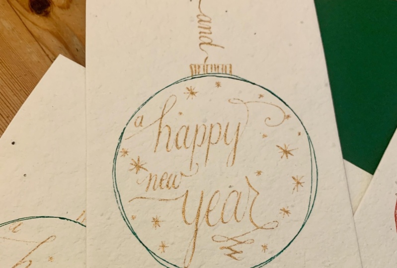
6. Card Design No 3: For the third card, we are going to focus on the bauble design once again, but this time in a bit of a different way. So we want to mark the margins of where our bauble is going to be hanging from above So this time we want our circle to be fairly in the middle. So use your mug to draw a circle shape. Once again. It takes a bit of time and focus to align the mug. So just make sure it is right in the center before tracing it. And this time we want to go very, very lightly, as we will be erasing the circle shape at the end. If you have any overlapping lines just use an eraser to tidy up, dip your pen into ink. And we're going to start with the top of the bauble. So I'm just finding the center, making a little dot. And I'm going to draw a rectangle right above, making it slightly bigger than the previous one. And a little loop at the top of your rectangle. It looks like an actual bauble You hang on a tree. I love adding some lines like this. Just adds a little bit of texture. And we're going to fill in this bauble with lettering and tiny snowflakes. So you can just odd two snowflakes to start with. Just say you know where your margins are before you start lettering the first word, You want to touch the left side of your bauble with your first entrance stroke of the letter M. So notice how it's touching the pencil line. And we're going to do the same thing when we'll finishing our word up. So I'm stretching My exit stroke for the letter y, all the way to the right so it touches the right side of the bauble I've just done some block lettering for the word and it looks very good when you spread your letters out for short words like this And just finishing up with the last word using the same technique. So you can see that my entrance stroke of the letter b is touching the left side of the bauble and I'm going to do the same thing when I finish this word up Bare in mind, this is quite a long word So we probably want to make it a little bit smaller and we want to reduce the spacing between the letters. Well-done, You're doing great. So all we need to do now is just fill in this bauble with as many snowflakes as possible. So the idea is that we want to frame this round shape. So you can see that I'm drawing my snowflakes very, very close to the outline. So this will help to ensure that we do end up with a circle shape. when we erase our pencil line. So I'm just using very simple snowflakes. It looks quite effective. Be very mindful of smudging. So it's very, very easy to smudge your design. So feel free to rotate the card if it's a bit easier for you. Blend in some snowflakes in-between your letters You can see that the word 'and' sort of starts to disappear. So what I'm going to do, I'm just going to go over it once again. Just to make sure that it pops a little bit more. If you'd like to embellish it even further, you can add some golden dots. They usually looks really good. You can use gold ink or maybe Posca pens, they're quite good for little details like this or any sort of gold pen or marker you can find. And that's the finished look, well done. Make sure to wait for the car to dry completely before erasing the outline of the ball ball.
7. Card Designs No 4: For the last card we're going to use gold ink so you might need a little bit darker card stock maybe something a bit more colorful. Usually like dark red or dark green. Works really, really good. So I've just prepared my ink. Remember, you always want to shake and mix your metallic inks. very often all the pigment settle at the bottom of the jar. So feel free to use the other side of your pen holder to mix it very, very well. Once you've traced in the guidelines, we're going to letter the first word which is going to be merry So we're going to do merry Christmas, with a Christmas tree in the middle. Take it slow. It's a bit tricky. Lettering with metallic inks or paints. It takes bit of time. You will realise that you need to dip your pen more often. So very frequently. Give you ink a very, very good stir before dipping. You'll notice that you need to stir your ink, very, very often, hence it's quite a time consuming process, but the end result is so worth it and a Nikko G nib is known for very, very thin upstrokes. So if you're using this nib, you might notice that your upstrokes look sort of faded or they're not contrasting enough. Don't worry, you can always go over your upstrokes once again. Once you letter your first word try to find the center right below it. That's going to be the top of your tree. And then start drawing this sort of triangle with a wavy line on the bottom. And add a small star at the top of the tree. We're going to let it dry, a little bit and then add in some lights. We're going to letter the second word and I'm just shaking my ink to wake it up. Once again. We're going to let out the second word Christmas. Make sure you start this word very close to the left edge of the card, as it's quite a long word and we need to make sure that we have enough room for all the letters in it. Try adding a little bit of bounce to your lettering here playing with the height of each letter I usually like to bring my letter r all the way down and back up to connect to the next letter which is positioned a little bit higher. Well done! We're going to let it dry for a little bit so you can use this time to erase any pencil lines very carefully. We don't want to smudge our lettering. And once you're ready, give you ink another stir And we're going to add in some lights for our tree. So that's going to look lovely. So we're going to start from the left side. I'm just adding these lines and imagining that the lights go behind the tree Just working with this wavy line covering some parts of the tree feel free to add some dots or stars or snowflakes on your lights. Or decorations. That will look really nice. Remember gold ink always looks lighter and brighter and shinier when it dries. If you'd like to try and add some gold leaf to your card, use PVA glue to secure it.
00:05:32.000 --> 00:05:36.965
So I'm just using a brush to transfer some of the glue to my card
00:05:36.965 --> 00:05:41.210
So I'm just sort of making these little dots and letting it dry a little bit. So we want it to be very sticky, not too wet. Maybe you want to do it only in the corners usually looks really good If you do opposite corners like top left and bottom right. Or if you want it to look full on like this feel free to just decorate the whole card
00:06:05.075 --> 00:06:11.270
And then take your gold leaf flakes and start putting them on your card. Covering the glue. Make sure to press down quite firmly with your fingers. As it needs to stick very well. You can add a few layers. It's quite a messy process that will require a little bit of tidying up afterwards. But the results are very, very worth it. It's good to let it dry for half an hour before doing this next step. So what I'm doing here, I'm just using a dry brush, or even just my fingers to scrape any excess foil off the card. So we're left with a very nice polished look. If you notice that the gold flakes are coming off too easily it probably means that the glue is too wet So just let it dry a little bit more maybe another ten or 20 minutes and try again. It should be gently flaking off. See you still have quite a lot of gold leaf left on your card Well done! I hope you're happy with your hand lettered Christmas card collection!
8. Wax seals: Adding wax seals to your stationery can add such a beautiful touch. I'm going to guide you through the process. I've added all the links to all the supplies you'll need for this. So feel free to refer to those. We'll also need a couple of cubes of ice to keep our stamp code. I usually like to place my ice cubes on a little saucer we will also need a little sheet of baking paper. We're going to start by adding three of these wax pieces into our spoon. I usually like to go for three I think it creates a really nice size stamp. Place your spoon right above the flame of your tea light and keep it there for about a minute. You'll notice that your wax starts to melt. So give it a bit of time until it has completely dissolved. Try keeping your spoon as low as possible, but don't put your candle out. So just be careful. It's quite a relaxing process, you'll start noticing that it starts to melt. And the most important thing here is to not overheat your wax. So as soon as you notice that there are no hard bits in your spoon anymore. We're going to pour it So I think I'm about 30 seconds in So I'm starting to prop up my wax stamp on the ice cube using my free hand, just ensure that it's as cold as possible. This is just a very good trick to help and avoid your wax sticking to your stamp. As it can happen sometimes, they can be so frustrating to clean. So we're going to make the first wax on the baking paper just because you can then peel it off and attach to any stationary you like. So mine is almost ready. Feel free to check in with yours. Alright, so this is how it should look like. Nice and watery I'm just pouring it, trying to make this sort of circular shape on my baking paper sheet. And I'm grabbing my cold wax stamp. You can always wipe it with a bit of tissue to get the liquid off. And then with a fair amount of pressure, we sort of want to place our stamp right in the middle. Pressing down. It doesn't need a lot of effort or pressure so just
00:03:24.500 --> 00:03:27.930
Try to be gentle but sturdy. Whilst we wait for the wax to harden, I'm going to design my envelope. I'm just using some gold ink and lettering warm wishes at the back of this red envelope. It will look nice and shiny when it dries. It takes a bit of time for the wax too harden So the worst thing you can do is start lifting it up so just be patient. Give it a bit of time. Alright. I'm going to go and check on my wax. I can see it's hard, so I've lifted my stamp and now I can carefully peel off my wax seal and it's ready. So now you can stick it on anything you like. You can add it to your envelope just like this. So that's how you make it in advance. So you can prepare many of these and just attach it to your stationery. The next one we're going to make will be directly on the envelope. So let's give it a go. We're using the same technique, I have some gold wax here and I've just put three pieces into my spoon and I'm waiting for it to melt. If you stamp was really hard to remove is probably means that your wax was too hot
00:05:09.215 --> 00:05:10.730
So try not to overheat it. I'll show you how it might look like when it's too hot. You will notice little bubbles in your wax. If that happens, just make sure that your stamp is very, very cold. That you did prop it on your ice cube just before you placed it on top of the wax I can see it's getting very hot and you can see there are tiny bubbles in there so that's not very good. So I'm just taking it off and I'm going to pour it And it really looks piping hot. So I think I went for a bit too long there as you can see, my wax is sort of bubbling. That's okay. I'm just making sure that my stamp is going to be cold. And here I'm just adding a little bit of gold leaf into my wax, as it's going to create a really nice pattern, when it dries once again stamping and leaving it there for a bit. And when we're ready to lift. we're going to check it first If it comes off easily, we're going to proceed and you can see that I'm struggling here a little a bit. Although it wasn't that bad and the wax didn't stick to my stamp. And there you go. So this is how you create lovely wax seals You can also add some dry flowers into your wax that would look really nice if you're using white wax. Maybe with some lavender or dried florals That would be really nice for wedding stationery. And just remember to clean your spoon. You want to hold it above your tea light and all the residue wax will melt You can just use a tissue paper to wipe it I hope you enjoyed watching this. Don't worry, if maybe the first one doesn't come out the way you like it to be. So just keep practicing and hopefully you will achieve really nice results.
9. Thank you!: Thanks so much for taking this class. I hope you're happy with your designs. You should all be very proud of yourself. I'm sure your cards will be very much appreciated. I would love to see your designs. Feel free to share and tag me on Instagram. You can find me @creativefeeldesigns Or if you would like to learn more. I have lots of tutorials and my website and YouTube channel. So feel free to subscribe. Thank you so much and see you soon.
 Alina Snepste