Transcripts
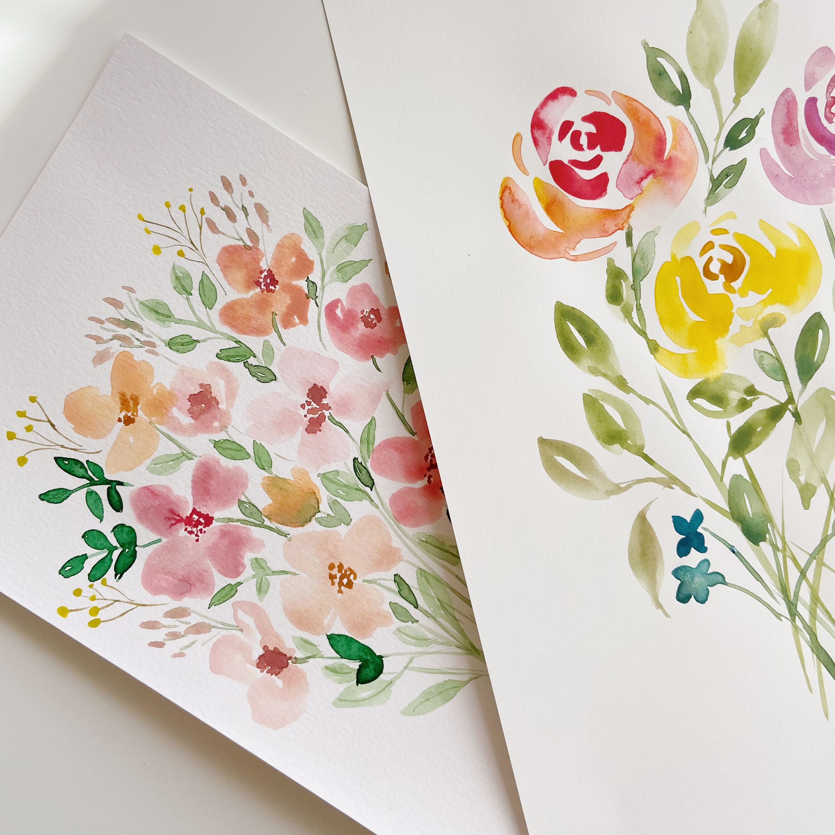
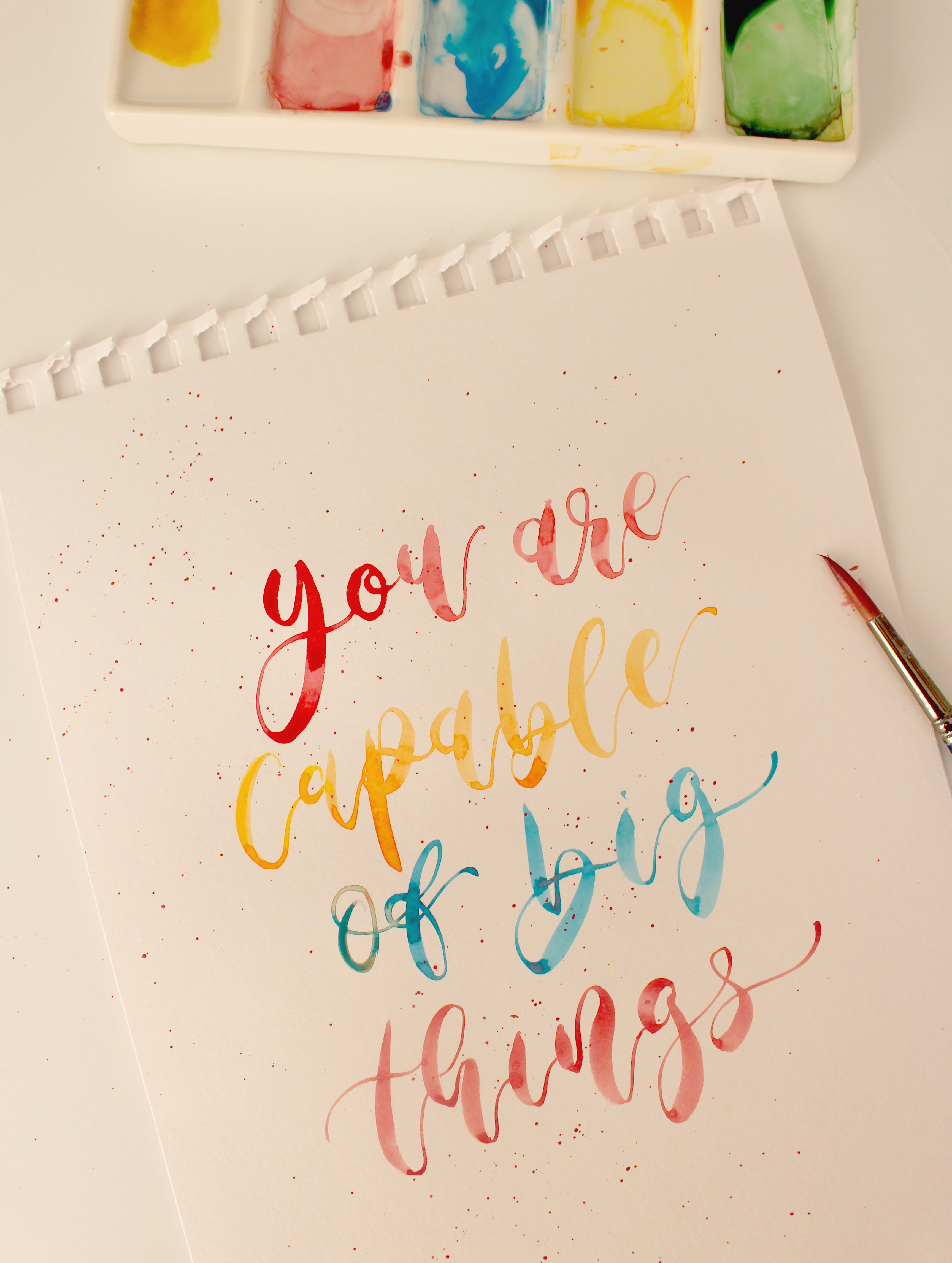
1. Hello and welcome!: Hi guys, I'm Alina from
creative field designs, and I'm so happy
to see you here, and I'm really excited
for you to learn watercolor, lettering
and painting. I feel so passionate
about this topic. I've been practicing
lettering and painting for about
seven years now. And I feel so passionate
about teaching it to others because it's
such a wonderful scale, it feels so therapeutic and with variety
tools and guidance, it's not that hard to learn. They'll cover lots
of different topics. So we'll start with lecturing and then we'll explore
some painting. I'll show you lots of different
florals you can paint, will try some
flower arrangement. So yeah, it's going
to be beautiful. If you'd like to share your
rock along the practice, you're welcome to join my private Facebook
group of modeling. Just have a look in
the description. If you'd like to tag
me at any point on social media just to get a feedback or just
show your work, I'll be so happy to say it. It will absolutely make my day. So feel free to tag me on
Instagram or Facebook, or if you have any questions, I'm always up in the chat. So get your tools ready
and let's get started.
2. Colour theory and paint mixing: So in this first exercise, we're just going to
get familiar with your watercolor palette
that you are using. So I'm going to be using this Wonka watercolor
palette and he has 15 different colors. Us might be different. You can use any
watercolor. You like. Maybe you only
have eight colors, are only 12 colors. That's absolutely fine. What
we're going to do fast, just going to grab
some watercolor paper. I'm going to be using this Baylor and brownie
mixed media pad. You can use any watercolor
paper you like, but just please don't
use copy paper. I've got my brushes ready here
and a fresh pot of water. You can use any brush you like. I'll be using this
master touch set. You might need a bit
of paper towel and a pen or a Sharpie so we can make some notes on this page. Wrapper, medium-sized brush. I'm going to be using size
ten for this exercise. And what we'd like to do fast, we're just going to sample
the colors in your palette. So we're going to start from left to right and
go horizontally. So we're going to start
with the number one here and finish this line
with the number five. And then we're going to go
into number six and finish row number ten on
it to number 11, affinity strove
with the number 15. So we're going to
start counting from the left and continue
to the right. The fast we want to dip
our brush into water, make sure we do pick up
quite a lot of paint. Then I'm going to pick
up a little bit of white little swatch
here on my page. And I'm going to
number this one. So this is number one. I'm going to do the same
with the next color. Just rinse your
brush in-between, make sure it's clean from
your previous paint. Then pick up a
little bit of that, make sure it's nicely diluted. Do a little swatch here. Number which is number two. And keep going this way. Rinse your brush
in-between again. I've got a lovely
blue color here. Again, a quick swatch. Let's number right,
this is number three. Rinse your brush bell. Blue is quite a dark color. So rinse your brush,
pick up more water. We're going to
sample this brown. Notice how I'm mixing this paint a little bit before
I transfer it to pay part. So do diluted with water. The more water you add, the higher value your
paint is going to have, which means it's
going to be less see-through and it will have more paint to make them water. If you want a lower value, you can add more water. Your paint is going to look more diluted, more transparent. Picking up more paint here
and doing little swatch. You can move the solid if
your brush up and down, which you can move your brush side-to-side. It's up to you. This is a very dark color again, so I'm just going to rinse my brush and I reached the
end of my palette here. I'm just going to start
with this yellow. Again. I'm going to do it
in a new line here as well. Just to have the same
layout as my palette. If you do accidentally mixing some darker color in your paint, just rented with water until it reaches its
original color. Again. Have lovely yellow
here and I'm going to do a swatch here. This bright red. Again, are they more water? Another type of blue here. Lovely vein. I do love this palette
because it's very versatile. You have a few green tea, a few blues, a few
yellows and reds. So these are quite
important colors, especially when you're doing. Flower painting, for example. If your water gets very dirty, it's a good idea to pick
up a fresh pot of water. And again, keep going. This is my column number ten. During my brush, a very good range before I dip into this. Another yellow swatch. Lovely sky blue on another type of green here, which is sort of brighten
up, looks very lovely. Another type of thread,
it's more pinkish. Hey, that's my column number 15. So these are all of
the paints I have available in my palette. Very useful to know, really good to have a
reference of this on the page or you'll be using for
lettering and painting. Next, let's just cover some
basics of the color theory. There are three primary
color is that can't be achieved by mixing
other colors together. Those colors are
yellow, blue, and red. Primary colors, reds. Write this down. Red, yellow, and blue. There are secondary colors, which you can achieve by mixing these primary
colors together. So those are called
secondary colors. And those colors are orange, green, purple. For example, equal parts of
red and yellow make orange. Equal part of yellow
and blue make green. And equal parts of blue
and red will make purple. So we do actually have these colors available
in this palette. But sometimes if you want to create a variation
of that color, or you might want it to
be darker or lighter. You can play with these
colors and mix your own. So that's where
we're going to try. Next. We're going to grab
a little bit of red. I'm going to use
my number seven. We're going to add a little
bit of yellow to it. I'm going to use number 11. I'm going to mix these together. I'm going to rinse my brush. I'm going to grab
a little bit of red transferred to my
mixing palette here. You can also use a
separate mixing palette. Rinse my brush again, and then grab a little bit of yellow and mix these together. I've achieved really
lovely orange color here. This is more of a
Halloween orange. You can see that we don't really have an
orange color here. We have a darker yellow and
we have a brighter brown, which sort of looks orange. But this is lovely to
know that you can achieve a very pure looking orange color by mixing red and
yellow together, you will call, this
might be different, but just find red and yellow on your palette and
do the same thing. Also try mixing our own green. So we'll pick a blue color. I'll do number three. Just pick a blue color
from your palette. And I also need yellow, so I'm going to use
this number 11 again. And I'm going to
grab my brush again. I'm going to start with
quad lot of yellow, so I'm going to start
with lighter color here. I'm going to add it to
my mixing palette here. Rinse my brush,
and add some blue, just a tiny bit to start with. You can always add more. I've achieved this lovely
light green color, which again, I don't really
have in this palette. The last color we'll try
mixing together, it's purple. So we will need a bit of
red cell golf for number seven and a little bit of blue. This time I'm going
to use number 13. I'm going to rinse my brush, grab a little bit of red
to my mixing palette here, and then add a bit of blue. Just create this lovely, sort of purplish bluish color, which looks really lovely. And again, it's a
brand new color that I don't really have here. So that's just a little
bit about color theory. This is quite important to know, and you can also play
with these colors. You can add more
water to make them a bit more transparent,
a bit lighter. So I'm just adding more water to this orange swatch and you can see how It's
quite different. I'm gonna do the same
thing with grain. Once it dries, it's just
going to be very, very light. Tan, the same with bar poll. Let's see what happens
when it dries. Now have to mix your
own secondary colors. Next, I'm just going to show some very lovely color
combinations you can use. Draw this course or you
can also of course, come off for your own. What I often like to do, I like to mix red
or pink with white. Usually it looks
really, really pretty. So let's go ahead and
try mixing number one with number 15. And see what happens. I'm making sure that
my brush is very clean because I'm picking
up some white. Then I'm going to pick
up tiny bit of this red, sort of pinkish color. Not much at all. Sort of getting this lovely
pastel pink is a really, really nice color for
flowers, for example. That I love to do
the same with blue. So I'm going to use white with
the sky blue, which is 13. Again, just try to find a
similar colors on your palette. Again, making sure that
my brush is very clean. Grabbing some white and then adding a tiny
bit of this Blow. Not much at all. It looks really, really pretty. Another thing that might
be useful is muting down your greens because sometimes when you're painting
leaves in particular, you want to have a lovely
variation of grain. I'll show you some of my
favorite tricks I love to do. So you can also mix your own grain or you can use
the one from your palette. So let's say we are using
this column number nine. And I want it to look a bit more bluish so you can add
a tiny bit of blue, let's say number three. Make your brain a bit
more interesting. So let's see what
happens when we do that. So I'm just picking
up this number nine. Transferring to my mixing
palette, to my brush. I'm going to add a tiny bit, just a little bit of this
blue, just number free. You can add a bit more to
see how your color changes. So if you're painting
something like a eucalyptus, for example, this can be a
really, really good trick. You could use. It's quite interesting.
It's sort of times out. By the number 14, you can add even more blow to
make it darker. Let's try adding a little
bit of red to this grain. Subject got number nine
plus number seven. If you run out of room
on your mixing palette, you can use one of
these plastic ones, or you can also
just use a plate. A ceramic plate will do a trick where you can
also just wash out. This palette, I'm
just going to grab my plastic palette here
and keep mixing here. Got number nine,
which is our grain. Going to add a tiny bit off
number seven. Donate much it. So let's see what happens here. We get this really lovely
sort of olive color here, which looks really pretty. I'm going to add a
lot of character to your leaf paintings. In particular, if you
love pastel colors, you can always just add
white, your colors. If you ever need to
make your color darker, you can add black. When you do use black, always make sure that you
are adding just a tiny bit. It's a really,
really strong color. So let's say 18 plus Pi. Let's see what happens here. I'm grabbing what lots of this blow in a very tiny bit of black. Again, it's orange tones down
your color straight away, makes it a bit darker, make, makes the bit cold dark. In a way. It's quite nice
color you achieved here. Could look really pretty for some florals or
lecturing as well. Let's say we wanted to
achieve pastel green. So let's try and
mix 14 with one. Achieve a really nice summary. Possible color, which again, you can use in your
leaf paintings in particular. You don't need much. We're just doing a
little swatch here. Rinse your brush very well
before you dip into white. So we don't want
quite a lot of white here as opposed to black. So we always want a lot of
white and a tiny bit of black. So we started getting the
lovely turquoise color. Those really pretty and fresh. So this is a really
relaxing exercise. You can try mixing
different colors together. This is going to become really, really handy when
we are actually preparing our palette for
a particular project. You can keep experimenting. You can try a few more. When you finish, you don't
have to wash out your paint. You can leave them in there because you can always just add a bit more water and use them again from your mixing pallets. So even here, this
will just dry. If you just leave it like
this for a bit, it will draw. You can close it
and open it again. You can just add more
water and keep using it. Hope you enjoyed this
lovely exercise. I hope you found this relaxing.
3. Strokes and shapes: In this lesson, we'll be
practicing basic strokes. And we will also keep
learning about color theory. I've also added this PDF file to being a little bit
more about color theory, just to have it all written
down and we'll be using some of this color theory
for this exercise two. So it's just very,
very useful to have a color wheel in front of you. When you are doing column mixing or when you're planning
out your phrase, you're thinking
about which colors will look good together. So having this color wheel
printed out or just having it on screen in front of
you is super, super useful. Today in particular,
we're going to talk about complimentary colors. Complimentary colors are
those colors that are opposite one another
on the color wheel. For example, green, red, yellow and purple,
blue and orange. These are the colors that
the most contrasting. So it will stand out if you
pick yellow and purple. Contrast really, really well. Sometimes you want
your phrase to look as bright as possible. If that's the case, you
can use this little trick, maybe a few words in yellow
than a few words in purple. And you can use different
shades of yellow, yellow, green, yellow, orange. And the same goes for purple. You can use blue, purple, red, purple, and play with
these colors a little bit. No, this is great. If you're looking for a very, very bright or
bold color scheme, there are sat and shapes
and strokes and up letters, and we'll practice these
shapes individually before combining them into
lettuce and then wide. So you might know this already
if you're doing lettering, but you can't
practice this enough. This is really,
really important. These are the foundations
of lettering and as we do, these strokes will also focus
on complimentary colors. So grab your color palette, make sure you have
fresh pot of water. And for this exercise we'll
be using a Pentel brush pens. So mine has a fine tip. You can also use any
water brush you have. And we don't necessarily
need to mix colors. For this exercise. You can just use college
you have already, or if you still have
few colors mixed up from famous exercise. And if they're dried, you can just use a spray bottle
if you have one. And just spray this a
little bit like this, we'll just use your brush
and transfer a bit of water in here so your
paint activate again. We do want them to be diluted. So let's start with
the first row. If you go into practice,
some downstrokes. We're going to pick our first
color from the color wheel. Let's go for green. You can use any granulomas
from your palette. Begin by wetting your brush. So I'm just dipping
it into my water. And instead of drawing
it a little bit, and I'm going to dip
into this grains quite lovely color here. So I'm just going
to what makes it. So it has a lovely texture. We want it to be quite runny. Your pen at 45 degree angle, make sure you are
resting your elbow, holding your pen
at the slant log. This will help you to use
the side of the brush. And that's what we want to
try and do for downstrokes, you're going to engage
this side of the brush. We're going to press down, apply heavy pressure, and drag our pen down just like this. So I'm starting the first one. I'm applying very
heavy pressure, gliding my hands down. And it creates this
lovely thick stroke. So don't be afraid to
press down quite hard. Tried to be very mindful
of every single stroke. Focus in the space
in-between the strokes. Try to keep it similar. Try to keep your strokes
straight and carry on all the way to the right
until you run out of room. Notice how I'm dipping my pen. After every single stroke. Try to start your
stroke thick already. So instead of pointing the
tip of the brush down, try to point the side of a down as you do this downstroke. So you can see that
I've engaged the side of the brush a little
bit more here because my stroke start very thick whilst I sort of pointed
down the tip of my brush. Hence the stroke sort of stars thin and then becomes thick. So we do want it to
be quite consistent. Make sure you have enough room. On the right rest your elbow. Do need a bit of space here
to maneuver your brush. Notice how slowly I'm
going try to do the same. Feel the control of the brush. Let's do two more. Some of them are going to
look better than others. Warming up our hand here. Very good. So this is our downstroke
by pressing the brush down, using the slant of the brush
to access this side effect. They're going to rinse our
brush now because you're going to dip into another color. Then we're going to
practice upstrokes. Be very important stroke
in brush lettering. So make sure your
brush is clean. Diffusing bit of tissue. Instead of doubling it. We need a complimentary
color to green. And if we have a look
at the color wheel, we can see that red is
right up the green. So we're going to use
red color for a very, very good and strong contrast. You can use any sort of
shade of red you like. I'm just going to dip
straight into my palette. And I've got this
lovely pink red, which is also fine. Make sure it's nicely diluted. For this exercise, we're going to hold the pen in
exactly the same way. Try not to do this. I know it's really tempting
to do this when you go on, try not to hold your pen in exactly the same way you did when you were
doing downstrokes. We want to focus on
the tip of the brush. Instead. We're not going to be
pressing the brush down against the PayPal on its side. But we're going to very gently touch the page
with the tip of the brush and then glider hand up to achieve thin stroke with
very, very light pressure. Here we go. Just like this. You can see how it's very, very different
from the fast one. Again, try to focus here
as much as you can. Leave similar spaces
in-between these strokes. Go fairly slowly. This does take a lot
of concentration. You can make them
fairly slanted. You can also go straight
up, It's up to you. This is much harder than
downstrokes are done by Ray. Is there looking a
bit shaky at first? What I like to do, I'd
like to prepare my hand. So before I start, I sort of imagine
doing it in my head. Sort of sulcus
where I'm going to start and how the polls then. But a lot of confidence
in one movement. I'm going to do this upstroke. Not using as much
pain for upstrokes. You don't actually have to date out there every single stroke. You can do a few. Once you run out of room. And you can't really hold your
hand on your page anymore. You can just place it
on your desk and then just use this to
rest your hand on. We do want to rest it. We don't want it
to be in the air. Let's finish this line so you can see how both of these are very, very contrasting already. You're going to rinse
our brush before we do the next stroke. I'm going to do stroke
cold all the time. Again, let's pick another color. Let's go for blue. Then check
what opposite blue here. And we have a range. So we're going to use
these two colors together and see how contrast
in there look. I'm going to start
off with blow. I have a lovely blue
here in my palette. I'm just transferring
a little bit here, mixing it around slightly, making sure it's diluted. An overtime is just
an upside down U. So you're going to start saying, and then go round at
the top and then price down very hard to
achieve a thick stroke. So you're combining
these two together. Now this how I'm keeping my
hand in the same position, try to do the same. Try to keep your
downstrokes trade. Now, this how, if you
slice this in half, the left side would be thin
and the writer will be thick. So do try to transition
from thin to thick, right at the top, just in the middle here. Going up, slowing down before
the transition happens, and starting to
engage the side of the brush pressing down. So very similar to this, we want to try the
underturn stroke. We're going to use
orange color for this. And I already have it in my palette here from
the previous exercise, so you can use yours as well. An underturn is
just the letter U. So we starting sake, slowing down at the bottom. And very, very carefully
and mindfully finishing this upstroke might add a bit of red because my paint has a lot of water minute here, and I do want it to
be a bit more dense. So start by using the
side of the brush. Press down nice and
thick and the re, slowly transition from thick
to thin out the bottom. And it takes a lot
of focus to go. Do take your time. Right, very good. And we can see again how contrasting both
these colors look. Next you're going to
try compound curve connecting three strokes. To get off. For this, we're going
to go for yellow color. Let's just check what
opposites we have. Purple, dark yellow here, which will be nice. Just diluting my pain. Am I starting with
an upstroke k? So I don't really want too
much paint in my brush. So very carefully going to wipe it before I start
lecturing like this. You're going to start off
with an upstroke and then go down and then go back up again. Quite a lot going on here. Let's try this again. Starting very thin, very slowly, pressing down as you reach the top and slowing
down before going back into very,
very thin stroke. This is an excellent
stroke to practice. You can just pick one of these and just fill in the whole page. That's something you can do. That'll be a really,
really good exercise. So they're just
sampling them here. You can always
practice a bit more. Next we're going to try
doing an oval shape, which again is very, very important in lecturing. We'll come across quite a lot. Again, rinse your brush
carefully, clean it. I have a nice
purplish color here, again from yesterday's exercise. And this is quite tricky. So we have a downstroke and then a quite a long
upstroke to connect again. So we're going down, slowing down at the
bottom and very carefully guiding our pen up. Notice how slowly I'm going. Make it. Let's try again. Flat brush using the side of it. Going up. I'm connecting to the top. Try not to carve your
downstroke a keep it straight. Though your downstroke
bit faster here. Then do your upstroke very, very slowly with a
lot of focus on this, How contrasting this look. This is a beautiful combination. If you want to make
your phrase pop. And two, they're going to try
doing this ascending loop. On the other side,
you want to try doing descending loop.
For this exercise. I'm just going to go for green, blue, and red, orange. Which is going to be
quite similar to this, which is going to
alter the shade of blue and orange hair cell. That's going to look quite nice. I'm just going to take my grain. Then I'm going to add
a bit of blue to this. To make it look a
bit more turquoise. We're going to try this
sort of loop shapes. So we're going to start
with an upstroke. Go up and then create
this lovely lobe. And then do a downstroke
would lay down. So do make sure that your
upstroke is fairly long. You can even make
it a bit longer. So very long upstroke going up, starting with a curve and then slowing down into top and
going very slowly down, pressing the brush down. So we achieve a very nice
thick stroke. Let's try again. Long upstroke with
a bit of movement and a thick downstroke. You can see how this could
easily be part of your laptop. So we will get into that. Let's print out brush before
we do our last shape here, There's going to be
descending loop. We need red, orange, so orange here already. And I'm just going to add a
bit of this red color here. Just to make it a bit more bold. You can use any shade of red
and just make sense to hear. They sending lobe is going to
be the opposite basically. So we're going to start with a downstroke and then transition into an
abstract just like this. Now this have it going up, but instead of going to decide, so any strokes that are all going horizontally
across your page, like cross lines, for example, are also going to be thin. So we are only applying heavy
pressure to downstrokes. Just going to correct
my downstroke here because it didn't turn out
the way I want it to be. So this could easily be
the letter J, for example. You're starting to
see some similarities to some of the lactase. And before we tip it
to the next exercise, do try to practice
this a bit more. Grab another page and just do some of days a
few more times, especially the ones you
struggled with the most. In this lesson,
we've learned all of the basic strokes
of luck terrain. And they also looked at complimentary colors
like green and red. Blue and orange,
yellow and purple, turquoise and red orange. Have fun practicing days. I'll see you in the next lesson.
4. Alphabet lettering: In this lesson we're going to practice lettering alphabet. So basically we are going to
connect all of the strokes we've practiced into
actual letters. I'll guide you through
each uppercase and lowercase
letter very slowly. So let's do this together. In terms of color theory, we can also try
something interesting. If you have a look at this page, you'll see that the color wheel
is split into two halves. 1.5 is cool colors, and another half
refers to warm colors. You can try picking either
warm or cool and doing our alphabet using all of
these colors on the left. All right, I think
I'm going to go over the cool color scheme here, just because I have quite a
few blues in my palette here, I'm going to pick three colors and just use them throughout my alphabet lecturing so
those color to be blue, blue, purple, and green blue. Before I begin, I'm just
going to make sure that I have those colors available. You can also use your
ceramic or plastic palette. And because we have some of
the colors here already, you got a lovely blue. So I'm just going to top it up. So I'm going to grab
a bit more blue, mix it in here, lash in some more water, just have it ready to go. I also have this
blue purple here. And I think I'm
just going to add a tiny bit more blue to it. Take your time preparing your chosen colors by adding hotel and
mixing them around. And have a lovely green
blue here already. I think that's going
to be the color I'm actually going
to begin with. So before we start
letter in the alphabet, I highly recommend just
grabbing a pencil. I'm just doing very,
very rough guidelines. Just having some sort
of a line to follow. It will be very, very helpful. So we can fake letters, a, b, c, d in here. Then dou E F G H I J K L M N O P Q R S T U, V W, X, Y and Z. And try not to start
your fast laptop very close to the edge. So we do want to
leave a little tap on the left and on the right. We can also divide this. So we have for little grass, this is the space
for my first letter. Second letter, letter for lactose. So just having a little grid to follow will make things
much, much easier. I'm going to start
the first line with this lovely turquoise color, which is just green and
blue mixed together. So preparing your paint, mix it around later, bet. You're going to start
the first letter, which is the letter a. And as you do these letters, notice which shapes
they consist of. So you're going to
do the uppercase a, which is just an
upstroke, a downstroke. We're going to do this
lovely cross line. Let's do the lowercase a. We're going to start a lowercase with a C shape or O shape. You can pick up your pen is omnipotent shape for
the rest of the lactose. So just now notice how these are the shapes if practiced
in the previous exercise. You're going to do
with the uppercase B. Starting it with this
ascending loop shape. You can pick up your pen, maybe dip your brush
into more paint. I liked my letter B to
be fairly stylized. You can always make
this loop a bit bigger to make lighter
more interesting. Let's do the lowercase b. So starting with an
ascending loop again. Next day I got the C shape, which looks very easy, but it's actually really tricky because we need to
transition from light, crash into heavy pressure and finish off with
light pressure again. All right. Heavy. Night. Take your time
here. There we go. You got the letter D. Starting with this same
shape as the letter B. We have lovely loop. I can stylize it
slightly as well. Notice how slowly I'm going. The lowercase d, duty our shape. A very controlled downstroke. Upstroke for the
rest of the letter. I'm going to rinse the
brush and I'm going to do my next line in this blue color. Let's say the letter E.
Let's try and do it in one. Go. Keep an eye on your paint. Notice if it's still running, maybe it's a bit too thick. The lowercase n, starting
with a very long upstroke, so do make it fairly long. Then using a water brush, your lettuce won't be
perfect and they don't have to be trained with this brush. We also have going
for us in particular. So try to embrace it. Let me start with this downstroke
and then do these fun. Wavy lines. The lowercase is a bit more
tricky to this shape first, so we're quite
familiar with this. For the rest of the
left, salvage is doing this thin stroke. If we go up to the left making this
little loop in the middle. Let's stretch in
the last straw to the right of the letter g. Starting with this outer shape. Lowercase is exactly the same. Now this how they finished with this descending loop shape. In automate the uppercase
hedge quite stylized. So I'm going to start
with this loop. Shea. Let's just do
this. Pick up the pen. We're going to continue with this cross line and
guide the pen off again. For the lowercase.
Go up and down. Let me just add a bit of
balance here. Very good. Rinse your brush again before we deep into this sort of dark
or below this purplish color, might need to mix up a bit more. I'm going to grab a bit more blue and a bit of red or orange. Let i is fairly simple. We just got this downstroke. These wavy lines. Again. The lowercase letter j. Quite a tricky transition
here from thick to thin. Maybe slow down before
the transition happens. The lowercase j in one
go. Murray, right calf. When we finish that
upstroke here, the letter K, going to
start with this shape. Then are done
through this letter. Guarding the pen to the
left and back to the right. The lowercase is exactly the
same, just with smaller. I said the letter L. Try and do it in Mongo. The lowercase Latin letter E. Just that have longer rally. Alright, let's go back to this turquoise color
for the next line. Make sure that your
paint isn't to Rene. Mine is a bit runny,
so I'm just adding a bit more green and blue again. Let em, let em, instead of naturally
very bouncy. The lowercase is the same. If you've got over your square a little bit some letters or to the white doll, that's okay. Tend to lead to n. You can have a nice stopping point here. And then we're going to
do this lovely O shape and in practice this already, but this time it's going to
add on this thin stroke. Then doing your lowercase o in exactly the same way
about uppercase, just mole of alum, the letter P. We'll
just start with this loop shaped going to rely. And then pressing down
and then adding on. Making this latter
fairly stylized. We can do the lowercase. Going to do the lactic q.
If you do it is our shape. You can then add in this lovely little detail
and a lowercase letter j. So starting with
this O shape again, I'm just making this lecture
bit more interesting. The lead to our
lovely loop shape. Quite tricky. Let's
take it slow. So we've done this loop shape, picked up the pen, and then go back in here,
started upstroke, down stroke, loop around
this downstroke here, and then again down and
very slowly called backup. And the lowercases bit easier. I usually like to do
this little loop. And then finish the
rest of the letter. Unless they're the letter S. Let's make it flow in one go. And the lowercase is the same. We've got the letter T, which
is a nice little laptop. Normally cross line.
The lowercase, always play with the
cross lines here. You can make them a bit
longer, even flourish. And if you lie, quite hard to do flourishing
with this brush, but even just adding a bit
more style will look good. I'm going back to
my darker blue. Notice how your color
scheme sort of starts to look really nice. Have a nice variation of days, cool towns, laser, the latter. You can notice undertone
shape and then go back in. You can go over
your abstracts are once again making it thicker. They're going to
do the same thing. Lowercase. So starting
with the U-shape, then going in and adding another U-shape and
Doppler effect. I said the Latin V. My paint is very,
very watery here, so I'm just trying
to make sense. More red and always sort of
wipe your brush a little bit. If your paint over able
to read this will help. Lovely elected v lowercase. Try to keep this set of triangles shape upside
down triangle here. The guiding our pen slightly to the right and then backup
to the right again. So our downstrokes and
abstracts are a bit Slanted. Lens or the letter W. Slanting does downstrokes
quite a wide lactose, so torta account for that. There we go and nearly that. Let's let x. You can start with
this downstroke and then do I convey the
upstroke going up? Nice and stylized,
smaller version of it. So you're going to finish
with light is wines that. And I'm going back to
this turquoise color. Starting the vector y
with a nice entry stroke. You can pick up your pen here. Go down. Let's do the lowercase. Keeping it fairly simple. So starting with the
U-shape, then going down, we've got the last lecture, which is the letter
that you can do the first part of the laptop by starting
with this upstroke and going down are done. The second part. So the trick here is
to sort of play with this last upstroke as it is for quite a few
of these lactase. So when we finish our
lattice do extend this law strokes quite
long to the side. And a lower case. It's sort of like
a number three. There we go. So this is the alphabet to try
to keep it safe. You can always refer to
this when you're left to right and phrases
the next exercises. And if some of the lectures
didn't quite work out, trust me, that's so normal. It just means that
you need to practice them a little bit more so you can maybe pick the lats you struggled with and filling
the whole page with that. And that'll be an
amazing exercise. Before we carry on. I'm quite pleased with
this color scheme as well. I think all of these sort of cool shades look really,
really good together. If you're done mattering
for today, rent your brush. Make sure it's clean. Use a bit of tissue to draw
it or just let it air dry. For the next exercise.
I'll see you soon.
5. Practicing words and exploring colour schemes: For this lesson,
just make sure that you have a fresh pot of water. And I recommend having a bigger
brush for mixing Payne's, we will be using
our Pentel brush for lecturing you just a little bit too fine to be
doing a lot of mixing. So a bigger brush, any sort of water brush, similarly sized to this,
there'll be perfect. So we've talked a little
bit about color theory. You have this PDF file and I highly recommend
giving it a good read. But have to be create
beautiful color palette. Where do they seek inspiration? How do we make them
look harmonious? That's the most important thing. You can be very
theoretical about it and you can just
follow the rules. You can pull out
some color theory, refer to the color wheel, and I will give you
a few more tricks. Another way is to seek
inspiration somewhere else. There are a few resources
I highly recommend. For example, this
palette perfect book by Lauren vega is a beautiful
book full of inspiration. It's got lots of
different color palettes inspired by fashion,
art and style. And if you need a
bit of inspiration, you can always pick some of these color
combinations and then try mixing them yourself. Another way is just seeking
inspiration in nature. If you go for a
lovely walk one day, just notice some flowers. Notice what color flowers
grow close together. Notice different
greens in nature. It's all really,
really beautiful. And by following some of
those patterns in nature, you're just going to achieve
very natural looking, beautiful color palettes
and color schemes. So let's just jump in with
a little bit more theory. So we've covered a few
basics about color wheel. We know what the
primary colors are. I mean, are the secondary colors are the rest of the
colors in-between, like blue, purple, red, purple, red, orange, are
the colors that are made of primary and secondary
colors mixed together. We can use this to our advantage
by knowing a few tricks and we have already
covered some of them. So for example, we know
what cool colors are, warm colors are, and we also covered
complimentary colors. So those are the colors that
are opposite one another. Another quick trick
you can use to find colors that will look great
and contrasting together. So similarly to find the
complimentary colors, for example, purple and yellow. If you form a triangle
within this color wheel, for example, you pick one
color, let's say orange. And then you go
three colors down. And there's purple. You go three colors
up, and there's green. So we get this lovely
triangle here. So again, these colors
will look beautiful together and you can vary
these throughout your phrases. And you can do it
other colors as well. Pick one color and then form a triangle from dark color
in this color wheel. So that's a great
trick you can use. Another thing you can do
is you can try finding analogous colors in your wheel so you can read about it here. Basically what it means is
finding one color and then using other colors either to the right or left of this color. And you will just achieve,
again, beautiful harmony. So let's say red, red,
purple, and purple. They look lovely together. Or yellow, yellow,
green, and green. So that's one of
the ways you can create beautiful color palettes. And lastly, one of my
favorite things to do is creating very simple,
minimalist look palette. And to achieve those, you can pick one color
and then keep adding white or black to it to
vary its tints and shades. So let's say if you pick red, you can then achieve a lighter red which
sort of become pink. And keep adding white
key part in black. And again, those
colors are going to look beautiful together. Very simple, very minimalistic. I thought we can try mixing some of these colors together, creating a few color schemes. You can also refer to the PDF file I've
attached to this lesson, giving you some ideas if you want to mix up
your own palettes. But also just keep
experimenting. I'll just show you some of my favorite ones and then
we'll try lettering. A few rods are washed
out my palette and maybe how few colors in
this over day, that's fine. If you run out of room, you
can always clean it as well. To clean this, I usually use
a big brush and just run it under some cold water and
it'll just wash the paint out. So we're going to
use my sharpie again just to label a few things. So let's just draw and see how a triadic color
palette would look like. I've got my triangle here, and we're going to
sample some green, some orange and purple. So I'm just picking some
green from my paints here. You can also mix this
up a little bit. You can add maybe a
bit of red if you want it to be a bit more earthy. I also need some orange. And actually from the
previous exercise, I have read in here already. I'm just going to
dilute this paint. And then odd little
bit of yellow to this to create a
lovely orange color. Let's sample this. I also need purple. So I'm just going to
mix blue with red. So I have blue in here again. So I'm just adding
quite a lot of red. Does quite a dark purple. Looks quite nice. So this could be one of the
color schemes you got four. Next, let's try mixing
some analogous colors. So those are the bonds that are very close together
on the color wheel. So let's say I'm going
to go for yellow and then I'm just going to add
some yellow, green, and green. So those would be
my three colors. You can pick any color you like. I'm going to start
with a yellow. I'm just grabbing some
yellow from my palette. And then I have
some green in here. If you don't just
add a bit of green, and I'm just going to mix
green and yellow together. Achieve yellow, green. That looks quite nice. That I just need
a regular green. So I'm just going to
dip my brush in here. Every gun that looks really, really subtle, very harmonious. It's just beautiful. Let's
say you wanted to let tau and inspirational
phrase in these colors, that will look really pretty. The last thing we can try
is a monochromatic palette. I'm going to use this palette
and just pick one color, any color you like. I'm going to go for
this sort of pink, red straight from my palette. I'm not mixing this color. So I'm just going to transfer
a little bit in here. And I'm gonna do my first swatch with just
this original color. Then you can either add white to it to achieve different
tints of that color, or odd a bit of black to achieve different
shades of that color. So I'm just going to try both. So I'm going to add
a bit of white. Just make sense.
Tiny bit of white. Becoming a bit lighter. I'm going to make
sense, even move by. Just transparent
white paint to here. And again, it's going
to be much lighter. And I'll try to
lighten it even more. Because I'm going to add
quite a lot of white. You can see how it's
just sort of becoming much lighter and it will
look really, really pretty. If you, for example, use this
for your lettering phrase. Let's just try adding
a bit of black. So I'm just going to pick
the same color again, transfer all little
bit of it into here, and just sample it again. I'm going to start adding
a little bit of black. So weak acids the block again, it's a really,
really strong color. You don't need much. Just dark and beautifully. So these are just a few
tricks you can use, is really, really
important to understand. This color of the eraser. You can then start
experimenting on your own. Next, I thought I'll
just share some of my favorite color palettes
that I really, really enjoy. Using, so one of my
favorite things to do is combine Navy and yellow. But I'm doing floral paintings, but also for lecturing. So let's just see how
it looks together. Maybe have a look. They are actually
quite contrasting. So if we have blue and
then we have orange, which has the same warmth
as a yellow color. So that's quite interesting
to note that I'm gonna do, I'm just going to add
a bit of yellow here. And then I'm going to pick
up a little bit of blue. And then mixing a, the dark blue or black. You darken this color. Adding a tiny bit more blue. I'm going to sample this. Just looks really,
really pretty already. So you can use
these two together. I also love adding a little
bit of purple and pink. Today's combination. We have some purple here, but I'm just going
to add a tiny bit of white to lighten it up. So I mean, like a violet color, more like a lavender. And that can look really nice. And let's add a bit of pink. And we have some
pink here already. That could be a really
nice color palette. For example, one of my favorite colors to
mix is a peach color, and you might enjoy it as well. So to achieve pH, we need to grab a
tiny bit of red. You're going to combine
that red with orange, which we have in here already. Or if you don't just mix
up some red and yellow, just transpiring quite a
lot of orange in here. Then we're going to add
quite a lot of white. There we go. Two lovely,
beautiful peach color. Another color I really loved mixing up these days is jade. It usually looks
really beautiful. You went to grab some grain who prefer some of
these colors and then later some rods then may need like a
darker blue for this, like a royal blue. And then we need a bit of
black or very dark navy. That looks really dark. I'm just going to
add a bit more blue. Maybe a bit of a lighter blue. Sometimes it takes a bit of
experimenting to achieve the color actually planned out. That looks really,
really pretty. Even these two together
look wonderful. We can keep experiment
that you can keep trying out different things. Actually, you have a
few colors mixed up before we start
practicing some words.
6. Phrases and composition: Water has become really diaetae. It's a good idea to change it now before we start lecturing rods that just practice
lettering some rods. So I'll just give you a few tips when it comes
to joining got letters. And before we begin, once again, we're just going to
do some guidelines. We're going to let out
the days of the week. So we will need seven
lines going down, like so try to keep them fairly centered that I need to
be perfectly straight. 123456. Seven. You can use any of
the college you have in your mixing palette. We'll be focusing more on
lecturing at this point. So we're going to start
lecturing and you want to hold up brush at
the slant like this, make sure you rest
your hand again and your elbow on your desk. You're going to make sure that our paints are nicely diluted. So I'm just going to
dip my brush in water. And then I'm going to dip
into this lovely jade color. When you start your VOD, always make sure you start
with a nice long entry stroke. So do make sure you lift
up your pen frequently. You can refer to
the alphabet page. If you need a bit more guidance. Now it is how I'm bouncing this letter M below
the baseline. Pick up your pen after you
finish your fast lacto. Then we're going to
do the next letter O. Notice how I'm
bouncing the light and also below this line. Remember to keep
picking up your pen. The letter d, we can do
something interesting. We can start with a
little flourish here. Like this. Bring it slightly
below the baseline. I'm dipping my pan pretty
much for every single letter. Or even more frequently. The letter y sort of
goes all the way down. Now this how I finished
this bar with a long, long exit stroke as well. So let's do that by Tuesday
in a different color. I'm just rinsing my brush. I think I'm just going to
pick up a little bit of yellow for my painting
palette here. I'm just diluting
the paint slightly. So let's do it about Tuesday. Starting with the lead to T.
Doing a lovely cross line. You don't have to follow
your lines perfectly. This time we're going
to keep the letter D sort of regular. Somehow. There's little
bit of green mixed up into my yellow,
which is fine. You can also of course, combined pains like this
you can do if you will, that is in one color and then rinse your brush and
dip into another color. I'll just blend beautifully. In finishing the bug. Lot of focus, stretching
to the right. I'm just going to edit
my lines slightly because I wanted to spread these rods out a
little bit more. So I'll make my next line here. It's useful to have an
arrays the next two years. So you can always adjust. Lovely. So let's do it
about when new day, which is pretty long, but I'm going to use this lovely peachy color
may mixed up here. It's quite watery. Notice how water it looks. I'm going to start this
right a bit more to the left because it's a bit
longer than these two. Starting the letter W. Dividing this letter
into two parts. Keeping these lectures
fairly small here. Just to make sure we have
enough room to fit all of them. Keep going, keep lifting
up your pen frequently. Try to have a little
stopping point after every time you've
finished your letter. Lovely. So that's our fad, but let's see if I need to adjust my guidelines
in the next part. Here. For the next part, I'm
going to use pink. You can use any color
you have available. Might odd a little bit more red. So I'm gonna go back and
add a bit more white. That'd be lovely color. Again, this is quite long, but another interesting
thing you can do is vary the color within your rods. So Let's say if I
wanted to add in a bit more orange for
the next lecture, make sure you rinse your
brush and then dip into your next color and tone
it to be too dramatic. So we do want to keep sort of colors in a very
similar color scheme. So if I won't call it
stick to warm colors. Making this word fairly bouncy. You can make some of the
leftist lighter by Adi more water and then come back with a stronger color. You can even go back
in and just top up your letter with a bit
more paint like this. Dabbing your brush. Lovely so you can see how the
letter S is much lighter. I wanted to draw it to the left. Really pretty. I'm going to add some
blue color to here. So let's do Friday in blue. Sometimes this can happen. One column might bleed
into another color. Sometimes that can
also look quite nice. I'm just making my blue
bit brighter here. Now it's quite dense, so I want to add
a bit more water, so just keep playing
with your pain. It's quite a slow process. Sometimes you can let your
brush run out of paint. You can see that I'm
not taking care of my letters just become lighter and lighter and that
can look beautiful as well. Creating a lovely gradient. To make my next
line a bit lower. I'm going to use this
lovely lime green we mixed up previously. It has a quite a
lot water. Here. You can see the base
color is very light. So it looks very soft tone. We can now add a bit more
green to make the color a bit darker and maybe use
it for the letter R. Sometimes you need to adapt your word to your previous word. And just because I had
a very long lecture, why going all the way down, I didn't have much
room for the letter D. So just bouncing back, made it a bit loud and
they just rocked out. Okay. So we got the
last word Sunday. I'm not very happy
with my yellow here. I think my brush
was a big data set. I'm just going to add
in some yellow in here. And try again. Again, this is quite watery. Always draw your
brush like Tibet. If it has too much
water and paint in it. To go to rate might be quite difficult to
control your brush. So do make sure that
it's not the puddle, but we do want it
to blend nicely, so do make sure that
it is quite diluted. There we go. Lovely right here. And again, extending that
law strove to the side, sadden colors convey
certain emotions. For example, yellow can
look cheerful, happy, energetic was blue can look very calming, fresh and clean. If you're lecturing
or by calming phrase, you can use blue
or green colors. So that's another part,
It's called Theory. To take into account. I hope you enjoyed
this exercise. Do let me know how you're
getting on in Facebook group. And we have one more
lesson left for this week.
7. Painting leaves: So let's try and paint
a few simple stamps. So I'm going to start with
a fairly dry brush and then make sure the consistency
of my paint is good. So I think I need to add a bit more actual paint if you're using this
Winsor and Newton Palette, I find that it needs less water than this one golf palette,
which is interesting. So that's just
something to remember. I'm just adding a bit more
green to my earthy green here. And I might need to splash
in a little bit of red. So keep mixing your
paint along the way. Just making this a little
bit thicker. Lovely. So let's just start with a simple little branch, simple little stem of leaves. So I'm going to do a very, very long thin stroke going
up and up the top of pain, the first leaf and I'm
gonna do a myriad leaf. So I'm doing 1.5. Another half. There we go. Then I'm going to do this side. So I'm holding my I'm holding
my brush at a slant here. I'm going from the stem and imagining how they
would grow naturally. So I'm starting from the stem and then just auditing
on another leaf. Correcting the tip of
the leaf a little bit. If you have two, I'm mixing a bit of, a bit more red just
to bury the color. Make it a bit more
interesting here. There might be one leaves
looks a bit brown in a way. So I'm gonna do
another one here. And this time we're going
to try and pointed down. So we're starting from the stem. But once we reach,
once we reach, once you read a
thick middle stroke, we're going to press the
sourdough our brush down. And that looks very, very brown. So I'm just adding a
bit more green again, doing the second half. So that can look
quite interesting. And then I think that's
plenty for this side. And I'm just gonna do the
same on the other side. So keep varying
different grains. Try not to have really
drastic variation in color. Tried to stick. I wouldn't dip into green blue here because
that will just be a bit too much and the contrast will
just look a bit unnatural. So I'm sort of going
between these earthy tones. I'm going to do the second
half in a mirrored way. So just like here, they're all sort of coming. So they both come
from the same base. So I'm going to try
and do the same. There we go. I might add a bit of this sort
of brownish color. I mixed two days grain. Just keep varying
your shades of green. Again, starting from this base and this time I'm going to
hold my brush this way. So instead of having
it at the slant of how it operates a bit more, it just makes it a bit easier to go in a different direction. Starting thin, then
pressing down. I made this one a bit thinner. So try to bury them
in size and shape and color even if they
are on the same stem. So this will just look
more interesting. Let's paint another leaf. And this time I'm gonna go
for this blue green color. And instead of having them
come out of the same base, this time, we'll
try and alter them. So again, starting
with the stem, I'm going to keep the sort
of longer and a bit smaller. So my first one, and I'm going to start my
first one on the right here. And then I'm going to do the one on the other side a
little bit lower. So it comes out of this stem here but
just below this leaf. And again, I'm going to do
this right side underneath. Again. Keep going, keep
varying the position. I'm going to blend in maybe a
bit of this brownish green. See what happens. That's quite a nice
variation there. Then we can make one. Maybe you can make some of
them a little bit smaller. There we go. So that's quite
an interesting little branch just lengthening my stem here. And the stem always wants
to be sort of dark course, you can always go over
your stem once again. That looks quite pretty. We can do another one here. Maybe one that goes down. You can try some models
around leaves we've practiced that might
look quite pretty. So they look very,
very different and keep altering the grains again. You can always dab in a bit more paint again
here on the stem. So just to bleed out
into the actual leaf. Maybe do a little wonder. Then the bigger one here. That looks quite pretty, sort of comes down, hangs over. It looks really nice. Now I'll show you one of my favorite tricks
you can try and do. I really loved doing this where I'm just painting
a little branch, will stem and then just
flattening my brush like this. Then I would just sort
of flattening my brush. I'm going to rotate my page. And I'm just a
flattening like this. And he just may exist the
natural-looking leaf. I'm going to carry
on in this side. Just make sure that
it's pointed bit is the top of the leaf here. So you want the flat, you want a thicker. On the top of this thick debt of the
brush B and the stem. Your paints do want to
be very wet for this. So given this ago, this can look very
nice in wreath, in different rate or floral arrangements
will probably use this technique later on. They probably use this
technique later on. You can also do like more of an interesting leaf auditing, a bit more movement so you can carve them with
a C curve a little bit. So the C curves are really, actually useful to
practice as well. So you have a lot of movement here going in
different directions. Maybe some of them look
a bit folded and again, maybe some of them. Go to the side. Maybe you can only
see half of the leaf. This can look really pretty. Maybe there are a couple
coming out to the same stem. Use the tip of the brush to control the shape of
the leaf and then use the thicker body of the
brush to add in thickness. So this can be quite
interesting as well. The last thing
we're going to try, we're going to try and paint
a little eucalyptus branch. So we're going to
add a little bit of more blue to this green. You want it to be very sort of blue-green looking quite dark. So I recommend using
navy or purple. To achieve this look. I think that looks quite nice. I'm going to just start
by painting these round, very, very round leaves. And they're going to
start with the top one. I'm going to start from
the bottom here and then round my brush. You might do this and
you might need to do this again to make the bit around a bit more round. So I'm starting from the
base here, curving it. I'm trying to do the
same on the other side, so base, just sort
of carving it back. We can also just add
on another one on top, like this, starting from the base here and
then I'm curving it. Make sure you have enough water. Then you can then you can just sort of add on another
one next to it. And then just curve your brush. They don't have to be perfect. You can do some of
the other side. So very laying around motions, hate, maybe even a bigger brush would walk backed up on this. Tried to find the position of the brush that
feels comfortable. I'll just keep on
adding these leaves. Maybe one of them
is sort of going across the stem like this. Just press down to
achieve the thickness. Then I'm going to grab this little brown
color I've got here. You can just use brown
from your palette. Ideally, we would want
to wait for this to dry, but I'm going to very carefully
use the tip of my brush. I'm going to draw a little stem. And then just connect all of
these leaves to the stem. You can correct a few bits, can make sure your
leaves look good here, you might even add
in another one. The thing that
eucalyptus is that all the leaves are very, very close to the stem. Mike, even correct
days and make them appear even closer
to the stem here. Just go back in with
more paint and you can all tell the way you position them basically
by going over again, making them a bit more puffy, a bit more round. Audi more water to
some of them so they look a bit more transparent. There we go. That looks a bit better. So I do want to meet in the
middle here that we got. So just keep practicing. Maybe paint a few more. Try different colors
again, keep experimenting. Maybe try using a bigger brush. That might feel really nice. So I just grabbed my size 12. And this is quite very big. Should feel very different. So another way to make your lives more interesting
is use a bigger brush. So I just grabbed my size ten. This is going to make your
leaves look a bit more puffy. A bit more interesting as well. You can play video stem, you can make it a
bit more curved. You can see that this
is much thicker. It's also just adds like
a smoother texture. It looks really interesting. Keep varying between
your grains. Maybe our donor
little odd then a little odd in a smaller one. So try to vary the size. A baby one that sometimes you might need
to extend the stem. There we go. That looks quite pretty. Another thing you can do. If you want to add like
more detail into your leaf, you can wait for it to dry
and then go back in and just add in these little lines
with a darker color. I'll show you in a minute. So just wait for this to dry. And I've grabbed this tiny, tiny brush which is size 0. And I'm going to grab
like a saturated green. I'm going to wet it. And then grab this sort of
very thick green color, preferably darker. So I think this
will be quite good. And then you can just add
these lines in here like this. So more paint, so just a quick little lines
going through the middle. We have a line going
through the middle here. You can also are then they sort of smaller lines
that go to the side. Right? Quick movements,
very thin strokes. I don't usually do this. Our minds do the
middle line sometimes. But because I'm
doing quite a lot of loose watercolor painting, I don't necessarily think
this fits with my style, but sometimes definitely
has its place. This one's still a bit too wet, so it's hard to
it's hard to see, but it definitely
adds a bit more depth and it's a good way to
add some details later. So keep practicing these leaves. Maybe you also have
some references here you can grab
from your garden from are always find some photos of leaves and try
to deal with them. Try to copy them. It's just really,
really interesting to keep experimenting. And I'll see you soon
in the next lesson.
8. Practicing florals - Rose: In this lesson, we're going
to practice painting petals. We'll practice some
different petal shapes, and I'll give you
some tips on painting three different flowers with
the petals will learn today. You'll do more floral
painting next week. But let's start small and just
practice a few flowers to begin with and use them for our watercolor
wreath painting. Later on, I'll show you
trade the front petal types. And we're going to start
with a C curve, lactose. So I'm going to use my
number eight brush again and make sure you have fresh pot of water for this lesson. You can grab any color you like. You don't necessarily
need to mix colors. For this lesson. If you don't want to,
maybe have some colors ready to go, It's up to you. I'm just grabbing this
lovely yellow color and I'm already some water
making sure it's quite watery. They're going to
practice these C curves. So basically we're
going to start thin and then flatten our brush and then
curve it slightly. And finished thing again, so very similar to what we did without watercolor leaves
in the previous lesson. So starting thin,
flattening the brush. Just making like a little curve. Let's again try doing it
from different angles. Try one going from the
top to the left and down. And then maybe one
going horizontal. To draw some vertical ones. Try some horizontal
ones, keep adding water, maybe do a few that
are very, very watery. See how that looks. Now this hello, I'm
holding my brush so it's still at a slant like this. Try to do some smaller ones. And to very watery once you start to notice
what's happening here, It's so start to form a row. So obviously this is
far from rows just yet. But combining the C curves together and adding a
bit of theory into this, you're going to paint
a really lovely rose. Let's actually go
ahead and do that. So fasting I highly
recommend is just grab a pencil and draw a circle. Try using your whole arm to draw this instead
of doing this. So drew a fairly sort of
medium-sized circle like this. That looks quite big actually. You can even go a bit
smaller if you like. So very, very faint. What are you going to
do? We're going to start with the
center of the rose. If you feel confident with the shapes, Let's
give this a go. If you need a bit more practice, pause this video,
practice a bit more on, then come back to this. For this route, we
can eat two colors. One is going to be
slightly darker and another one's going
to be a bit lighter. So I'm going to use
yellow for this rose. And what I like to do, a lighter made the middle
of the Rouse a bit darker. You can do that by just making your paint a bit more saturated. But I also just like adding
a tiny bit of brown. So it does create
like a dark color. Looks just a little bit. There we go. So that looks quite
good. Mustard color. And if you have a
mass and a color, you can also use
that. Of course. We don't want it to differ from the yellow will
be using too much, but making it slightly darker will be really
nice for the center. I'm actually going
to make my circle a bit smaller just so we have enough room for all the other flowers
on this page cells. Just going to make it this big. Sorry, faint. That'll be good. So I have my darker
center color. Ready? We're going to start by
sort of adding tiny, tiny C curve shapes right
in the middle here. So I'm starting with
the tip of my brush. With ferric saturate paint. I'm adding these little curves, leaving little white
gaps in between, like tests, just
like we did here, but sort of placing them
a bit closer together. And then doing a little big one. Once it starts to get
further away from center in auditing
another big one. And then this is where
it gets a bit tricky because we want all rows to base the fading out towards
baseline, the circle. So all the outer petals
want to be quite diluted. So I'm doing one here and I just dipped my
brush into water. Then I'm picking up
tiny bit of paint, but I'm still keeping
it very watery and I'm doing this very, very diluted strokes
following the circle line, making some of these
curves, baker, making sure to leave nice
wide gaps so they'll form really natural highlights and it's going to
look really pretty. And you can keep going
of course far you want. It doesn't have
to be this small. But do try and keep
it in a circle shape. And then you can go back in with your saturated paint and maybe just dark and
it's slightly again, just adding paint to the edges
of the petals if you like. Just auditing a bit of this darker yellow to
some of the strokes. So the idea is to keep
that middle quite dark. You can even allow for this
to dry and then come back. An odd mole. Darker paint in the middle. Once it dries, you can
erase the pencil lines. So this could be a
lovely rose example. What we can do, we can add
in some leaves now as well. Just going to grab my greens
here from previous lessons. Maybe are then more of the
sort of regular green color. And remember, we want
the brows leaves to be quite big and round. So that's what we're
going to try and go for. And I will try and
imagine that my leaves behind the flower like this. And they are sort
of coming out here. Coming out like this. Nice and round. Too late to leave it like this. From the same stem but
going different directions. This can look quite nice. Don't worry If a little
bit of green bleeds into your petals. That can actually look really, really nice as well. But if you do mine that
I know some people do, just make sure that your rose dry before you paint at hopes. This c curve is really, really useful for lots of
different types of flowers. And Rao's is one of them.
9. Practicing florals - Cosmos: Next we're going
to practice Islam. They jagged almond shape. It's a lovely, lovely shape. I do like it a lot. And I'm just going
to use some sort of purple color, pink or purple. I'm into my palette here. These are particularly lovely
for Cosmos of flowers. We're going to try and do
single petals and fast. So what I usually do, I place the side of
my hand on paper and then I'm going to do one that's
sort of facing that way. And I'm starting, notice
how I'm holding my brush, so I'm not holding
my hand like this, but it comes up here. Then I'm starting this upstroke. Then I'm sort of doing this
is like jagged movements. And then I'm going down
to connect to the stem. And we're going to try
and do another one. So holding my hand like this, Going up with an
upstroke and then sort of using the tip of my brush and applying
a bit of pressure. And if you have a
bit of a gap here, you can always call or retain. So if I was gonna do
it with a pen cell, it will look like this. So I'm sort of coming back
to this base with my brush. So that's what we want
to try and copy here. So this little shape and try doing some of them
may be a bit more watery, so I'm just adding more
water to my paint. So light pressure and density of going a
bit more heavy down. Maybe try another one
that's facing that way. So now I'm going to
hold my hand like this. So instead of this,
I'm doing this. I'm sort of slanting it
docked Bay going up. So you can really
get creative here. Just do this jittery movement up and down and
see what happens. This is a lovely way to get
creative and just experiment. Maybe let's try going
down with the next one. So I'm still holding my
hand in this position. Is it tip of the
brush that creates this lovely, lovely edge here? I'm just moving my hand
down some slant towards me. Using the side of the
brush when we need to fill the shape with paint, I'm using the tip
of the brush for this to create this
lovely role looking edge. Right? So let's go
ahead and try to put this into an actual flower. So once again,
we're going to draw a circle and then
mark the center. So sand is going to be here. This is a very
simple possession. I'll talk about different
ways of positioning your flowers in next
week's lessons. But for now let's just do
the simple one where we have circle and a small
circle in the middle. So this is quite visible, so I'm just going to make
it a bit more faded. You're going to start
doing these petals. And they will also end
by the circle line is. And you're going to leave
the middle and then let the petals dry a little bit
and then odd in the middle. So let's have a painting, a Cosmos flower here. I'm wetting my brush. I'm making sure I
have paint ready. So maybe mix little bit of this pink or any other
color you're using. And you're going to
do eight petals. So I'm going to start from
the middle facing up. So I'm positioning my
hand this way again, just like we practiced here. And going back to center. So this is where our center is. Maybe do the next one
a bit more saturated. Just keep going and you can
rotate your paper as well. That helps. You can rinse your brush, maybe add some more water
to do the next one. A bit more diluted,
maybe even bigger. So we got 12341. I need to kind of fit for more. Don't worry too much. We can always imagine that
some of the petals are hiding below are the petals. And also don't worry if you go over your circle a little
bit, That's also fine. Nothing is uniform in nature, so we can experiment a bit. Another thing I like to do, instead of auditing
in this same Strauss, if you need to like correct, sound the shapes or just
sort of making those petals. A bit more interesting. So there we go,
That's our flower. And we're going to wait tiny
bit before we do the middle because very often
it can just bleed everywhere and it just
won't look as good. So let's give it a second. And whilst we wait,
we can do the leaves. And cosmos flowers have a
really, really thin leaf. So we're going to use the tip of the brush to kind of
achieve that shape. So we're not going
to use the flat part of the brush too much. And I think actually this lovely green blue is going
to look really good. So feel free to use
any granulomas. I'm just going to imagine where the stem of the
flower is coming. So I would say it will be here. You can draw a little
stem and I'm going to very big one because we
have another flower here. Then I'm just going to
start painting these very, very thin leaves. Very thin, hardly
coloring the men as well. So you can leave some highlights that maybe some of them can come out of here imagining hiding
behind the flower. Sometimes painting base
can be a lot of fun because you don't know
what's going to happen. And sometimes a bit of
paint might bleed into your actual flower
off like it did here. I like this blue
accidents I think. Just makes your flowers
look really cute. She wasn't the tip of
my brush and odd in this very delicate
little leaves. So they quite very long. Then it can be shaped in
any way you like really. There we go. The
middle of my flower, I think, is fairly dry. So I can use this lovely
yellow for the middle. I don't want my paint
to be too watery, so we're not going to or
too much water today. We're going to do little dots. So basically, when
your brushes ready, Try sort of like dotting it
in the middle to begin with. Like this. So that's usually where the pollen
of the flower is cell. Yellow always looks really nice. If you want, you could add an even smaller circle in there. Like a dark color. I might grab a little bit of this mustard and having
it very, very saturated, I might just dab in a few dark
adults or even tiny bit of brown. There we go. Unwanted dry again, you
can erase the pencil line, but you can see we get
a really nice go here.
10. Practicing florals - Geranium: Alright, and the flower
will try in this lesson. Is it uranium? So that's again,
another lovely flower. You got to practice
doing heart shapes, which are always fun. They can look really,
really lovely. They can add a lot of
texture or very soft look. And I'm going to use this red for these
heart-shaped petals. So grab your paint. You can use any color you like. And just very similar to what we've been
doing with our leaves, will be made at round leaf. You're going to start with
a fast half of the heart. So going up instead of down and then just adding on another. You can make these
as wide as you like. You can make them long if
you like as well like this. Then you can color in the highlights or leave
a little highlight. And then Mr. starting from the same stem during
the second half. And you can sort of
finish a bit higher up. You don't have to go
all the way down. Try doing another one
that's very watery. So I'll just sort of went off. Then I flattened my
brush and it made this lovely half of
the little heart. Then I'm going back to the
base and doing the same thing. And it just creates this
lovely looking petals. These look really
nice, especially when they're quite watery, so try not to make
them too saturated. Something fun to do
is also to maybe blend a little bit
of yellow into this. Again, petals can't be
identical pandemic, so bearing the color
slightly might look really, really nice tool about
that flat brush movement. And they sort of look like
Valentine's Day cards done there because they're red. You can make this a little
bit jittery. If you like. The top here, then I have
to be very smooth and even. Alright, there we go. So again, practice this a bit more. If this feels quite
difficult to tell. When you're ready,
we're going to try painting a little geranium. Very similarly to this. We're going to circle. I'm gonna make
this fairly small. The center of the flower
is going to be here. Again, I'm just making sure
that my paint is very watery. I'm not picking up
too much effect. Then I'm going to stop with
this fast heart shape. I'm starting from the middle, Vi, from the center here. During the first half. The second half. Then just keep going,
going back to the middle, starting from here with
a thin stroke going up. The odd in this
lovely round shape. You can always
correct it slightly. So make sure you
reach your petals right to this circle line. It's okay if you do go over, try not to, but if it
happens, it's fine. And I might blend in tiny
bit of this orange I mix. We're kind of aiming
for five petals here. They can overlap as well. That might look quite nice. Some of the sort of
blended together. But it still looks
really pretty. Similarly two days we're
going to wait for the middle, just to dry a little bit
whilst we paint the leaves. Uranium leaves are very big, so it's actually the
shape with them practice. You can just give it
a go, get creative. So I'm going to use
this sort of yellow, green mix for this one, it to be fairly bright. If your pains get
to big data age. So grab a clean brush and just slightly mixed
set and rinsed again. You can do this a few times
to make it look tidy. Again. I'm quite happy with this color. I'm just going to draw a
stem fat again and try to imagine where is my
stamp coming from? Some outside It's
coming from here. Let me just go into odd
index like jittery, round leaves, Auditing like three little
leaves to the base. The base is here, so I'm just sort of Oddi
country different leaves. You can do another one. Round and very, very
uneven. Here are the top. Maybe there's some hiding
behind the flower. Again, I'm just being
careful not to touch the red because it's still
a bit wet. I can tell. You sort of slumped in
that way, but that's good. It's good to practice
different positions here. So yeah, that's
something you can do to make the leaves a
bit more interesting. We can blend in like a
darker green at the base. Just let it bleed. See what happens, making
the stem bit darker. For the middle,
you can also use a dark red that will
look white noise. It's still a bit wet, so I'm gonna give it a second. And whilst you wait,
you can always practice during this lovely leaves a bit more if you like. So they're really,
really interesting. So just make sure your
brushes into a rat. Mom is a bit too wet here. And if it ever happens, you can always grab
a bit of tissue. And this is called
lifting the paint. So you just lift a
bit of paint with your tissue and then go
in with a dry brush. And you can always blend
this out a little bit. All connecting here on the base. I'm just adding
these textures here. If you ever want
to blend colors, you just draw your brush on in like a darker color and
just blend some of the ten. It looks really pretty. I think this has
dried a little bit. So I'm just going to pick
up dark yellow again. Just dab in here. It was still a bit wet so you can see sort
of bleeding out. But again, it looks quite
pretty to be honest. Yeah, feel free
practicing these a bit more before we paint a ray. And I hope you enjoyed it. Let me know how you
get town with ACE.
11. Floral wreath design - part 1: In this lesson,
we'll be painting a lovely watercolor
floral wreath. And we'll mainly be
focusing on roses. So that's a flower with
practiced in a previous lesson. So we'll need around objects. I'll usually use a
vowel like this. So this sort of
sides kind of fit your page to have it
too big because we do want to have a bit of room on this side at the
top and bottom here. So I'm going to go for this one and then make sure you have freshwater and decide what
colors you're going to use. I would say golf or
maybe two base colors. I'll probably do
pale pink, orange, and then just have
plenty of grains ready to go probably from
your previous lesson as well. Step, I'm going to
grab my pencil, and I'm just going
to trace a very, very loyal to circle
with my pencil. So I'm just going around, but I want to make sure that positioned this very centrally
so you can use a ruler, of course, if you like. But I usually just sort of imagine how it would
sit in the middle. So this seems right. And I'm just going around very, very sort of faded light
pencil line here like this. I hope you can see that. The idea is to paint a cluster of roses
here, for example. So you can do maybe
one big one and again, maybe do these very
large circles. Just to give you a
little bit of guidance, to remind you to keep
those roses nicely round, to have a bigger one here. And then I'll do sort of
smaller ones on the sides. And then I might do
quite a big one here. Quite a big circle, maybe a smaller one
attached to it here. So have a look. Quite nice. So let's begin by just
preparing the palette. So I'm going to grab some red. I'm going to transfer
it into here. So depending on
what colors you are mixing go slightly different. I'm going for pale pink hair, so I'm mixing red and white. I'm just going to
take some of this white and start
adding it to my red. So I need quite a lot of white. So I'm just my y is getting a bit darker,
but that's okay. I'll just clean it afterwards
after I've finished. Otherwise, if I keep
rinsing my brush, I'll end up wasting
a lot of paint. Today. We got to
have some sort of pale pink here and it looks
quite nice already day. And then I want to
do some orange. I have some yellow here
from the previous lesson. I'm going to add a tiny
bit of red to this. That looks quite nice. I also make sure that
yellow is available. We might do something
to yellow as well. And for leaves, I know that
they're mainly wanted to use like a blue green and I
want it to be fairly dark. So I'm just making sure
again that it's ready to go. I'm just combining
green and blue. Dog blowing particular. You still want more
green than actual blues. So I might actually add in a tiny bit of red to
make it a bit more muted. It's quite bright at the moment. There we go, I think
they're starting to become quite nice. There we go. That's
my green ready? Hope yours is ready to. There we go. I'm just going to
rinse my brush, make sure it's nice and clean. And we're going to start
painting the rows. I might actually grab the
brush number ten for this. So we want those two
big fluffy petals. And having a bigger brush
might make it easier for us to start off
with this big arose. It's gonna be right
in the middle. And just like before, I'm starting from a center doing some of these
C curve shapes. Then starting to blend it out. The more petals. Making them very watery than going back in with dark color. Blending in some more
paint in the middle. I'm sort of using the
tip of my brush to dab in some more paint here
towards the middle. And also just around your
battles if you like. If you want, you can
grab a bit of red and make your paint a bit dark
coffee using the same color. And then just blend in
even more darker color. Looks quite nice. And the next one
I'm going to do, I think I'm gonna do a
yellow next to it here. You don't have to follow
your circle exactly. Again, of course you can go over the lines just doing
these big petals. Around the middle. The Rouse is going to be a
very loose watercolor rate, so you don't have
to worry too much. You can make it quite loose and just try to
have fun with this. Once it dries, it
always looks better. So I'm going to grab a bit
of mustard and just blend. Landed here into the
middle Leyla bit. Just to make no distinction
between center of the flower, the petals, and they
still have bled together. And that's okay.
That can happen. When you do this sort of
orangey loci in one here. I'm just adding more
yellow and more red. Doing a little one here. And you can always
position the center of your flower at the
different angles. So it can be facing towards
the left, towards the right. So I've made mine a bit
lower down to the left. And I'm just gonna
do more petals around it this way. There we go. So I have a little bit
too much water in here, so I'm going to use
a little trick. I use a bit of tissue
and just dab it. And then I can go back with my brush and just correct it slightly and my
brush might be a bit too wet, so I'm just drawing it and then just correcting
this little petal data. There we go. I'm
going to go ahead and do the same on the
other side here. I'm going to maybe to
one in this pale pink, but I want it to be more pale. So now it's just how you will
keep altering your pains. Might need to add more white or a different color to make
it the way you like to be. I wanted mine to be
a bit more pale. So I'm gonna do this one. Lovely pale pink color,
making bigger strokes. And he can go sort
of a big motor the inside of your race. That's absolutely fine. Blend in a bit of this
orange towards the middle. And I'm going to do
another yellow one here. Wetting my brush
on a more paint. So this looks very,
very summary. Lovely colors. Maybe dab in tiny bit of mustard
in the middle. Not too much. We go. So you can always wait
until your flower dries and then see if you
want to change anything. If you want to add more
color in the middle.
12. Floral wreath design - part 2: The next thing
we're going to do, we're going to start
adding leaves. And from this section we're
going to odd leaves this way. And this way. And from this section
we're going to go off to the side here, so they're going to meet
right in the middle. Hopefully. Let's
see what happens. I'm going to use my
green color here. Probably start
painting leaves here. So we do want to
follow the circle. So the first thing
I'm going to do, I'm just going to add in some leaves coming
out of this rows. Remember we were doing
big lovely leaves here. And then maybe another
one facing this way. And then try to sort of
follow this pencil line. And this could be your
stem essentially. And then you can keep
adding leaves too wet. And I'm just going to add a
bit more blue to my green, so it's nice to all the color
slightly as we did before. I'm going to add a few, maybe even coming out of here. This will take time. It will depend on your
individual composition. So try to imagine what some of these leaves
poke out of your flower. I'm going to leave it
there for now and then try doing this side as well. So again, we have maybe a
nice leaf coming out of here. Notice how I'm holding
my brush here, so this position is very handy. Wanting a smaller one
might add a bit of red to my green to
keep it interesting. Let's say we have like some
leaves coming out of here. Maybe hanging, poking out. You don't have to
be too precise, just really get creative here. You can also grab
a smaller brush. So I'm using ten. I'm going to go
back to my eight. I might add tiny bit
of yellow migraine. Maybe add another leaf here, maybe go over this
one once again. We can also add a different
type of leaf Coast. I'm just going to
mix this, blow. Me have a few they sort
of leaves poking out. Remember when we were using our brush and I'm just
making these blow these colloquia noises, pillows. Then again, imagining that those leaves are
underneath as well. And like how would
they come out? Maybe there's another
one poking out here. Auditing some more here. We can also try and maybe blend
in a little bit of brown. Perhaps add some fun
berries here as well. I'm just going to change to this number six brush
because it's a bit thinner. And I've got some
brown color here. I'm just picking a tiny bit. I don't want too much. I want it to be fairly dry
because I need to make quite precise strokes here. So my flowers have dried
already a little bit more into sort of make
like very thin stems. Some bearings here. When be some coming
out here as well, going towards the
inside of the wreath. Subject meeting each other here. So it'd be just be
lots of berries. So it won't look unnatural where these meet, which is nice. And coming out of here. Maybe. The idea here is just to add a branch with
lots of other branches. Always looks quite nice
when it's very delicate. Mighty, even dark
and this sort of circle here where it carries on. And I'll use the same brush
and add another leaf in here, it looks a bit empty. As I paint. I'll make my berries in this
lovely mustard color. Just adding little circles. The tip of my brush
here like this. Instead of berries you
can also maybe are done tiny flowers if you like. It's really up to you. You can also make
them red or pink, Of course, if you like. Well might make some
of them a bit more. Orange. Might have another of these sort of low
leaf sticking out here. So just keep filling it. Keep going for as long
as you like until you're happy with the way it looks. Swapping to a smaller brush can really out in lovely detail. Having fine strokes and
contrast with these big leaves. Color quite pretty. I think I'm nearly done here. I'm just going to maybe blending few more
of these berries. Close this little gap here. But I'm doing a stem, so I'm being super light
and quick as well. I'm just using my brush and
then just imagine how this first branch sort of grouse
going different directions. Maybe add some yellow
berries as well. Why no more of this
orange one as well? I'm just going to do it, this one coming out of here. And then just try and
assess your wreath. And jack if you have
any big gaps and, but you need to add
in maybe some leaves. I have a bit of a gap here. So I might actually
make another leaf here. So that might look quite nice. Just make it a bit fuller. And this here looks
a bit sort of empty. So I might bring out
another leave to the side, a little cluster of
leaves like this. You know, you don't
want to overdo it, so be sure to stop eventually. I think I'm just going
to leave it here, although it is quite sort of
leaning towards the right. So I think I'll just add
in another leaf here. Perhaps just hanging out here to sort of make it a
bit more central in a way. There we go. This is our array. Let it dry, and then you can try doing some lettering
on the inside.
13. Floral wreath design - part 3 (lettering): When you're ready, grab
your Pentel brush pen and you can go for
very light pastel. You're looking color,
any color you like. I think I wanted to
go for this very, very dark blue, almost
black, to be honest. So I'm just going to make sure
that it's nicely diluted. I just made a bit of mess here. So if this happens, just going to have a
bit of tissue and very quickly dab at it, soaks it up straightaway. I want my lettering to
have a nice gradient, so I'm going to add
quite a lot of water. I'm just going to lead to
something really simple. Just two words. They still, I think that will look really
nice with this design. And I'm just going to use
my pencil tool very likely. Do the layout just to make
sure it's nicely scented. And if it's not, just erase it again before you do
actual lettering, right? So I'm going to go in
with my brush pen. Just like we practiced before. We're going to separate those strokes stop
from time to time. Although I'm using
a very dark color, notice how it sort of
becomes quite light. Band diluted with
a lot of water. So that's quite nice. I'm sort of altering between dipping into a darker
color and then dipping into this sort
of diluted paint here. Just add a bit of variety. I'm trying to make my
lettering look way round so I wanted
to look very soft. And rounding up those
edges can really, really help with
that. Transition. Here is extra round
if you have a left. And there we go. So this
is a finished look. The last thing I'll
do, once it dries, I'll just take my
eraser and very gently go over
those pencil lines. But to be honest, I can't
actually see many of them. There are few here, and obviously the text as well. But I need for this
to be completely dry. Before I do this, I would
love to see your wreath. Please let me know how
you're getting on. I really, really hope
you enjoyed this lesson. Good luck with practicing.
14. Painting different types of flowers part 1: Hello and welcome to the
third week of this course. I hope you're feeling inspired and you're enjoying
painting with me. And this week is going to be all about painting
beautiful flowers, practicing different
type of flowers. Arranging them into
different compositions is going to be a lot of fun. Let's begin with this
week's first lesson. Make sure you have some
freshwater for this lesson. And I'm not going to mix up new paints for the
first exercise. So I have quite a few panes
here in my palette or how migraines and I
have a few colors mixed up from the
previous lessons. I also have my palette here. I'm, I just dip my brush
and water in them down a bit when I need them so you can do the same if you don't want to wash your palate. So in this lesson we're
going to practice painting flowers from
different angles. So if you remember
last week we painted one which we fit into a circle. So there's a perfect circle. We had a center and we painted
petals around that center. There are also similar
length and they all ended at this sort
of circle shapes. So it was a perfect
round flower. But nothing is
perfect in nature. And we want to show that
natural movement so we can paint a few flowers that may be facing to the left
or to the right. Or maybe sometimes you'll
only see half of the flower. Maybe you'll have some buds
which haven't flowered yet. Let's just try to
fit those sort of natural aspects in your
paintings as much as we can. Let's try painting this one. We're going to start
with the middle. This time. I'm going to grab my
number eight brush. And I'm going to pick up
a bit of this yellow. You can use any yellow you like. I'm just diluting
it slightly but we don't want too
much water here. So I'm just going to
add the center fast. So I'm gonna do with
this yellow half circle. I'm going to make sure
it's not too watery. Try not to add too
much water in there. Like they're sort of
half the circle shape. Rinse your brush and
pick any color you like. I've got this
lovely blue here is going to add a bit
of a darker blue, bit of a lighter blue. Mix them together,
make them very watery. And just start auditing
lovely petals here. I'm just doing the sort
of one stroke petals or marriage stroke petal just like with the leaves,
if you remember. I just have coming out of
this base complained in a dark color to bury them slightly loose, very simple, which
is going around this shape and odd
again, these petals. I also have star
from this base here. Feel free to leave some
white for highlights. This is just a very
simplified version and we can only see half of this flower in a way blend in some brown specs in the
middle if you like. Just to make the color
a bit more interesting. There we go. And let's just
add a simple sample stem. So I'm just grabbing
a bit of grain. Imagine that there
is a green stem here and then the
leaves are coming out with a stamp imagining
that I'm starting from the stem and then
the pulp out here. Stack could be a lovely
little flower to try. You can always blend
in some darker blue. Add in another layer of color. If you like. Audience and dark lines here. Just to fill it in a bit more. On these quick strokes. Making sure that the leaves
are quite close to the base. I'm just sort of going
around in a very dry brush, just correcting those petals, just blending in
a bit more color. So this could be a
nice little example. Let's try another one to have some reddish orange color here. I think I might add a
bit of white to it. I'm just grabbing a bit of
white audience in here. I'm just gonna do
a couple of days. Very jagged movement,
petals here like this. They also have base here and they're all
coming back to it. Basically be sweet
peas for example. And then I have a dark
version of pink here. And I'm just going to blend in tiny bit of this
color in here as well. Maybe do another one. Now this time going up,
flattening my brush. I'm going down, again, starting from the same base. So very, very jagged. Perhaps you could do
another yellow here. I'm just going to
dilute my yellow. Run out of space. I'm
going to do it on mobile. So you do want these
to be fairly watery. This one is very watery. So soon as you get like a lot of water on the surface
of your paper, that just means you probably
have too much water. So are they more paint
or draw your brush? This can look really pretty
and again, very simple. We're just doing these
very soft movement here. Now we need to wait for
this to dry slightly. So whilst I'm waiting, I'm just going to mix
up a green color, Adi and more green in here, making sure it's nicely diluted. I'm just going to add
like little stems here. So very, very loose. I'm doing very thick,
rough lines here. So I'm just using the
tip of my brush and just dragging my brush very quickly. And just are done some leaves. I'm going to go for smaller leaves that are sort of coming out from a similar base here, but going different directions. So keeping them
fairly, fairly small. Mine to another one. Just playing with the leaves. Lending domain might
touch the base here, make it a little bit bigger. Sort of like a little triangle,
upside down triangle. This is the base
of the flower is very delicate little flowers
with small little leaves. These can look quite nice. Maybe one is hanging
down like this. Maybe another one's
hanging down. Keep playing walls. You'll petals are drawing here. Landing a little one. Might need to extend
your stems so it looks a bit
more proportional. And once they start to dry, we're going to blend in like a darker color in the middle. So I think I'm just going
to go for this very dark. It looks like bargain day. Almost. Actually it's quite
light, so I might need to add a bit of lack or navy to this is
going to blend that in. So I got like a little
purple color in array. I'm just going to add more of that red is it does
take time because it makes what you've imagined. So it does need to be darker
and also more saturated, so less water or more paint. And just make sure
that this is dry. We're going to do,
we're going to think By the middle of the
flower would be here. I think I could fit a little
circle shape in here. So that's what I'm gonna do. I'm just going to add
in a few dots here. Just imagining this is
the middle of the flower. Be quite tricky. Finding the center,
raise. This one here. I'm just going to go
for a mustard color. I've got it here already, so I'm just going to
grab a bit of that. I think I could fit a
little circle in here. So this could be the middle of the
flower is served nicely opening the sides here. If it's still a bit too vacuole, see that it starts to
bleed a little bit, which is fine again, it just looks quite nice when
it does blend tiny pits. So for this pink one, I'm just going to
grab a dark red. So we just wanted to find a darker version of
this original color. And that would be the middle. This could be the middle here. If you get it wrong. Dunbar
way, it's your flower. You can always learn from
your mistakes as well.
15. Painting different types of flowers part 2: As we keep going, we're
just going to experiment with some other flowers. One of my favorite things to
do is grab a bigger brush. So let's say I'm going
to go for number ten and I'm going to
find a color I like. So perhaps I'm going to mix this color in here. So I think I had a
bit of green in that. Sort of muted it down slightly. It looks quite nice. So making sure it's quite
saturated and also watery. And what I'm gonna do,
I'm just going to add in the set of
stamps of my brush. I'm just stamping
my brush like this, going different directions
and as I go down, it gets a bit more narrow than you would have one at the top
and one at the bottom. And then feeling besides going a bit wider,
if that makes sense. Let this dry slightly. And I'm also, you guys might
actually do another one. You can grab smaller brush. I have brush number eight here. I might try and do this
in different color. Let's say I'm going
to grab more blue. I want this to be sort of
very bright blowing away. Do another one here. There's one at the top and
I'm starting the sides. Lovely. And then you have a smaller brush that'll be
really, really helpful. So this is number six. And all I'm gonna do, I'm gonna draw stem so it's a bit too dry, it might pick up a bit more. Then just connect all
of these together. You don't have to
be too precise. They also have connected
to the middle here. This could be a
lovely little filler. This can look
really, really nice. And you can do this
with a lot of things. You can also decide maybe to paint Lots of tiny blue flowers. I'm just picking off a bit
of this brighter blue. I'm just going to
stamp my brush again. I'm going to make
these five petals. I'm gonna deal with
this quite a few times. I'm just moving my brush, keeping the same point of the brush towards the
middle of the flower. Making some of them
a bit smaller. I think five petals here or
six aiming for five really. You can also do a set of scattering them around, but kinda keeping
them fairly close. Landing in some very
small ones here. Now I'm just going to rinse my brush and pick
up some yellow. Again, not too wet. I'm just going to dab in yellow paint the
center of the flower. And some of these might bleed a little bit and that's fine. I'm just going to grab
this darker brown here from this palette. This was a bit too light. Again, just sort of
connect them all together. Let's say we put a little branch here in these thinner lines. That's definitely
something you can try. It can look really, really good. We can also paint
a lovely flower. Let's start with the yellow
center for examples. I'm just dabbing
some yellow in here. And I'm going to use
this reddish color. And just start auditing in
the single stroke leaves. I'm just going from the
base and just around. You can blend in slightly
different color, maybe dilute it a
bit more as you go. This can look really pretty. Make sure it's nice and watery. Just go round and your brush. Flattening your brush. You can use any size
brush you like for this. Might just brown in here. So dark in it. In the middle. And you'll see once this dries, it will look quite nice. You can just add them like
individual leaves to this. Maybe have some leaves
poking out of here. Can blend in more of these strokes wherever
you have a little gap. These are very watery and
it kinda looks really nice. Overlap some of them. Some keeping these
very thin and watery here that we can keep going
until you're happy with desk. And I'm just going to
grab a bit of green here. And remember when we
talked about an odd in detail in your leaves, always is odd then this
little line and then smaller lines show a bit
more detail in your leaf. Again, it's just needs to
be a bit more dry for this. Then painting metal batteries
is always a lot of fun. This could be a really, really nice fill out. So I'm just definitely
to my brown. I'm going to start with
a little stem this time. So very, very thin. Quite far coast. Just adding lots of little branches coming out
with this main branch. Can definitely be a
lovely little filler. I'm just going to
pick up a bit of red. This looks really good. I can look autumnal. Philip. I'm just adding
this little circle basically on top of each other. Another thing that's quite
nice to do is paint a BAD. So sometimes your flower
Omby fully opened. You can pay like a
lovely little bud. So I'm just sort of starting
from the top and flattening my brush down like this. Then you can also add like little petal on the side like
this and just color it in. Leave a little whitespace that
ideally this would be dry, but sometimes I just
like dabbing a bit of green in there like this. This can Beth, they
look really nice, especially if it's like
hanging out from the side, like going down, maybe dab a bit of green in there. Let's say this is a rose. Just something to try, something to
experiment with before we start arranging this.
16. Painting Peonies: And another really,
really lovely flower we can paint to
get out is a peony. So peonies are just beautiful. They look lovely in watercolors. I thought we could do
it in a separate page because sometimes they can
get really, really big. So I don't want you
to run out of room. So let's go ahead and practice
painting some P RNAs. So I highly recommend using
the biggest brush you have. How number 12 here? That's what I'm
going to go with. And pianist come in
different colors. They come in all
sorts of colors. That can be sort of dark pink, very light pink, purply pink. So just pick up any
color you like. And they go for this pink here, which I'm kind of running out
of part a should be enough. I'm just transferring some of
this to my mixing palette. I'm going to start with
very watery strokes. So again, make sure that you dilute your paint
very well here. My data bit of white
because I want it to be a bit more pale like this. So that's quite a nice color. I think. Maybe even
a bit more. Why? There we go. So that's sort of looks
like a P on a color to me. Before we begin. So I highly recommend just
using a pencil and try to do a very light
U-shape like this, sort of, this vague hope
you can see right here. This will be the
middle of our flower. And that's why we're
going to begin. So we're going to
do the fast stroke right in the middle here. I'm starting by sort
of going up and pressing my brush and then going down as well and
kind of pressing it again. And I'm going to do
one that's suicide, sort of following this U-shape. Like this. You can
leave a bit of whitespace in-between
if you like. And then doing another one here. So really flattening my brush, making these very,
very chunky strokes. I'm just making sure that
my paint is very watery. I'm going to paint
sort of very faint. Petals are sort of like a
rough shape here on the top. So leaving this white middle way and just make sure that it does go like in a round shape as much as you can like this. And then I'm just going
to keep painting petals coming out of here.
Sort of going off. Very, very light, very watery. You can have some poking
out here as well. Coming out to the sides. Now this is how I live, my paint this here. And again, just maybe adding
some petals here at the top. These C curve shapes,
if you remember, we practiced before
trying to keep everything in this U-shape as
much as we can. Maybe another one
coming out of here this way from the base and kind
of going to the side. Very watery, very light. Then have another one here. So I'm leaving work
late too wide up here. Some of these petals
fold towards me. Are the more water to my paint. Again, the jagged movement
here, big battles. Lending some smaller ones and going over
this middle again, Mark need to make them bigger. Just odd in this C-shape. Petals here to fluff it all
up a little bit like this. This is a very, very light
color I'm using here. Notice how light it is. So I'm doing these very,
very quick center. See calves just add shape
to this a bit more. And I might do like
a very watery, a few very watery
petals behind here. So this is like the
back of the flower in a way, very, very faint. When you're ready, grab a
darker version of this color. So either how much in here, but here it is, just
going to dip in here. Then I'm just going to add
a bit of this dark paint. It's going to blend it in like this whilst it's still wet. So this is why the base starts. And this is where these
petals fall towards me. So I'm just blending like
a dark, call it that. And also I'm going to
blend like a darker color here in the middle. Then you can also add
a few dark or toes. Just do a bit of layering here. You can go forever here, really just maybe odd in these quick align to
the tip of your brush. Especially here in the middle. But it's usually all very
dense together, isn't it? So just doing this very
quick, quick movements. More water here, maybe
close those gaps. If they are a bit too big. This can look a bit confusing because we don't really have the center of
the flower just yet. So when you're ready, grab a bit of yellow. When it starts to
look like a peony, bobby do have this U-shape going up and this sort of
round shape overall, I'm going to grab a bit
of yellow and just start dabbing a bit of yellow
here in the middle. This starts to look
a bit better now. It looks a bit more like a
peony with this middle here. Odd in this like tiny dots. Some of this yellow might bleed into my petals,
which I don't mind. I think it looks quite nice. I'm going to leave it
there for a second and you might need to add something
in once it dries. So just have a look. You can go back in with a darker paint and just
add in some more petals, some fine lines again, if you like, or you can
draw your brush and blend your petals a little bit, see what it needs. While surveyed. I'm just going to
make migraines. So peonies have kind of
like a dark green color. I'm just going to make screen
with a little bit of navy. Black as well would
look white noise, but just a tiny bit, not much at all. That sort of very,
very dark rain. Piano usually has leaves very, very close to the stem, to the bottom of the flower. So I'm actually going to
start with those leaves. So imagining that
coming out of here, peony just has like quite big
brown leaves, doesn't it? Maybe one. Instead
of going this way, hiding behind the petal. You can draw the shape with
the tip of your brush fast. Then Cholera ten. Then I'm going to do
the actual stem coming out of here fairly thin. And imagining again, there are some leaves coming that way. So I'm painting this
little shape of the leaf. The coloring attain, try not to touch the petal because
it's still wet. Might actually
come back to this. While the petals a bit more dry. Maybe one of them
is hanging down. Like this. Again, you can correct the shape with the tip of your brush. Always going to make
my stem bit darker, so I'm going over it once
again, quite likely. Then just keep adding
some more leaves. Your big brush. Again, I'm starting
with a standard kind of imagining that I'm
going through here and then having leaves
come out of it, trying to make
them look natural. Fairly big leaves here. It makes them a bit more jagged. Make it interesting. Maybe a bit smaller. Keep playing here. There's no right or wrong. You can position your
leaves where revenue like even if they look a little
bit out of place to you, John, to tell when this dries, it's just going to all
fit nicely together. So try not to worry
about it too much. Actually have a
really big gap here. But sure how that happened. So I'm just going
to clean my brush, just making sure that
it's very, very clean. I don't want that in green on my just fill it in
slightly like this. I'm just going to mix this
darker green with a bit of black to a T like a
darker green color. So again, not too watery. This time. Then just odd again. Quick little line in here. Just for a bit more definition. You'll leave don't
want to be fairly dry for this and maybe darken it my stem a little bit as well. The EBITDA. And once this dries, obviously we can go
back in and erase this. Pen cells are very gently. I'm still wet a little bit, so I'm not gonna do it now. This could easily be a
really nice little poster. So you can always lead to
something if you like, of course, grab a bit
of yellow, maybe. Dilute it slightly. Just try lecturing something. Even just one word
might look quite nice. It'd be hard, it'll
activate these brushes, but you can always have a go. Just gonna write summer. And that's the finished lecture. I hope you enjoyed
it and don't worry, if it didn't go right the
first time you did at peonies, how particularly
difficult flowers to paint, but the top tricks, or just to have your paint soup watery for those initial petals. So very, very light and diluted. Keep a bit of space
in the middle so you can add in that
yellow and then go, although a darker color, once you initial
light color dries and just fill it
all in with leaves. And I'm sure it's
going to look pretty. You can always paint
another one next to it, like just a bag of
peony if you like. Try not to overthink it and just have a go
and have fun with it.
17. Floral Composition part 1: In this lesson,
we're going to paint a lovely floral arrangement. So put everything
we learned so far, tickets are combined
all the flowers. Before we begin,
I'll just talk about the composition a
little bit more. Let's say have a greeting
card or a bedding imitation, or just a poster. And you would like to add some lovely floral arrangements. So there are a few base, you can position them. So the one we're going to
do today is just going to be sort of in the
middle of the page. Very irregular,
classic looking wrong. But let's say you wanted
to have your flowers in the background and then maybe do some lecturing
in the middle. I'll just show you two
of my favorite ways of positioning your flowers.
Such stationary. So the one I like a lot is positioning your
flowers in coordinates. For example, you would
do a big rows here, then do a smaller roses here, and then have some
leaves coming out of here and some filler flowers, like the ones we've
practiced already. So we would do it here. Then we'd have the
leaves come out of here. Maybe blend in some
more flowers here, like branches of low barrier. So that could be a really, really lovely
floral combination. And then we'll try and mirror
that on this side as well. So again, we do a bigger roads, let's say two smaller
ones, lovely cluster. Then have some leaves
coming out of dam. An audience of filler
flowers as well. That could be one
of the debates. We're not going to paint this. So this is just to
give you an idea. Always try positioning
them in such way. Another way you could try
and fit your flowers in the background is having
them here and then here, leaving this middle for a wedding invitation,
for example. Well, let's say you're
doing like order of service for a wedding. Just very rough example just to give you a bit
of inspiration. And then you could do like
a bigger flower here. And again, smaller
ones on this side. Having like leaves
come out of that. Again, having some
filler flowers that this is just a
very rough sketch. Just to give you a little idea really what it would look like. Then try and mirror this
at the bottom as well. So we will do another big
flower to smaller ones and just fill it in with leaves and filler flowers for the rest. That could be a really, really
lovely way of doing this. Just to show you
a quick example, I've got this card here. You could always just
do the top as well. So I just have some
roses here coming out to the top and the
side of the card. And I have lecturing here
at the bottom of the card. So there are many
ways to position your flowers and combine them with your
lettering as well. So today we're just
purely focused on making a lovely composition in
the middle of the page. So let's get our college ready. So let's make sure
we have enough pain. We have some freshwater here. I'm going to probably use my
number ten brush for now. And the college I will use
today are blue, yellow, pink, maybe a bit of purple cell probably have yellow
from here as it is. I have my blue here, so I'll probably
just mix it in here, maybe add a bit more blue
color as we go along. I don't really have purple, so I might actually
mix a bit of path will have some red here already. If you don't have
any orange or red, just grabbed some
from your palette. And I'm just going to add
this blue color here, which is sort of
purplish is Raul. I'm just mixed up
this lilac color. That looks nice. I'm just preparing this. I need a bit of pink, which I'll prepare
here in the middle. So I'm going to grab a
little bit of this red. That's the one I used
for PNAS as well. I'm going to combine
it with white. Just odd in quite a lot of y. I want it to be quite pale. Color theory we learned, try to pick the
colors you prefer. You must have experimented
quite a lot at this stage. Just like combination of these four colors
I'll use today. You can do the same if you like. I'm going to be paying
such compositions. We always want to start
with bigger flowers fast. So that's what I'm going to do. I'm just going to start with maybe a big brows slightly
to the left here. Starting with the middle
and starting to OD. These diluted stroke. So very soft battles. Do-overs the outside, and then coming back in
with strong the paint. Just grabbing a bit
more than dark or red. Blending some in, especially
in the middle here. So imagine that we're looking at these flowers from above. Basically, we won't
see any stems really, so it will be all
just flower head and some filler leaves. Jane, just a very loose
watercolor style, doesn't have to be
super detailed. Nice when it's just sort
of blends and creates this array instead of
soft looking strokes. Lovely. So that'll
be my first Rouse. I'm going to add perhaps
another one using my yellow. Got some lovely yellow here. Might add a tiny bit
more white to this. How it a bit more muted. There we go. I'm going to
position this sort of very, very close to the fast Rouse, but just a bit lower. The petals are almost touching. Don't want the big
gaps in between. Very big chunky strokes here for this row is
trying to make it fluffy. Once your browsers
have slightly dry, you can go back in with
a bit of a darker color. I'm just grabbing a little
bit of this red color here. I'm just going to
blend in a bit more. In the middle. That is very
light brush strokes in say, straightaway, sort of looks. There's a bit more
depth to this flower. Just blend it, some
thickest strokes as well, kinda keeping them
quite watery, stale. I'm going to rinse my brush. I'm gonna do the same
thing with this yellow, making sure it's not too thick. Just adding a tiny bit
more paint in here. Now what is how this rouses are very, very close together? What I'm going to do
next, I'm actually going to add button does
flower is we've practiced in the previous
lesson that I've sort of had this middle of the flower. And then I did blue
petals around it. Basically, I'm just mixing
this lovely blue color. I want it to be fairly dark. Bit more water, a bit of
a darker blue in here. I'm just going to start our denominator a
little petals here, making them quite long. Not really overthinking hair, just going for it. I'm just imagining
that this one here hiding behind this flower, some gently going around. This way. It's going to blend in
like a darker blue here. The base. Just letting it dry. All of these flowers
are very, very close. So I'm not least, I'm trying not to leave
big gaps between them. So it's nice to stop it. Bigger flowers fast to have these rows is here
in the middle. I might just odd in polygon
P on a flower here. Just starting with
this sort of shape. And don't worry if some
of the paint bleeds. A little bit of this blue
sort of got into here. You can even lift it
with a bit of tissue or just leave it that might
actually look quite nice. I'm going to blend in some darker color
in the middle here. I'm going to wait for
this to dry slightly. And then our data bit of
yellow in the middle here. I might add in this little
purple flower here. Again, I'm trying to sort
of fill in this gap here. Making this sort of
burgundy color here. I'm starting with
this little bet TO imagine if my center
of the flower is here. I'm just making
these little petals. Odd again, this
thinnest strokes. Just to fluff it
up a little bit. Actually, no, I did
another one bath. So this is quite watery here. Just waiting for these
two to draw it to odd in some yellow rust away, they can start playing with
the leaves a little bit. So I've got a green color. And remember we are looking
at these flowers from above. So we don't want to see
any stems, Rayleigh, So wait till believe
sort of coming out or the flower poking out
on the side here. So here's one for this rose. Maybe there's another one coming out that way.
Another route here. And I'm just thinking how the leaves fall
from here really. So let's say my stem is tilted down that let's say it's
coming out like this. The flowers are fairly dry, so I'm just grabbing
a bit of this yellow, making sure it's
quite saturated. And just adding some dots here. And also here, this flower. I'm going to add some
black to my green. I have a darker green
for this peony flower. Maybe do a few leaves here. Imagining the day sort
of coming out of that. Maybe having some leaves
poke out of here. Makes up this other green here to add in some
leaves, this flower. So I would imagine that the
stem is sort of coming from. The leaves would probably
come out of here. So let's say it's going behind. I'll make these
sort of quite thin, bit more clustered like this. Now let's say we have
another one coming out that's very similar
from this flower. Imagining that there's a stem of leaves of reaching from here. So if you're unsure
where to position thing, just try to imagine
what's going on behind and by the stem start. That's usually very helpful. Lovely. So I might
add a bit more blue to this burgundy color. Maybe do one of those
little flowers with practiced in a previous lesson. Imagining that it's sort
of popping out of that. So the stem will be behind this rose marred actually
ordered one here as well. So imagining that instead
of coming out of that, this way of thinking
actually have to be quite focused thinking
that the stem is and how does it reach
behind other flowers. So I'm going to wait for
this dry slightly. Then. I'm going to Alden, darker middle, center
of the flower. I'm really tempted to do
another blue flower here. I feel like there's
a little gap. So your composition
might vary from mine. You might have gaps
in different places and it does not have
to be the same. So just use mine as a guide, but don't worry if if it turns out very
different, That's also fine. Again, I'm trying to
fill in these gaps. I'll start my first petal here. Against it are
waiting for this to dry before I do the middle. And I might do a few buds. So like a rose bud. Let's say we have one bulky Note here and maybe another one poking out here. Next arouse Israeli. Maybe one's hanging out of here. Rinse my brush and
then grab a bit of grain and dabbing bit of
green here at the bottom. So it's sort of bleeds out and connect to this little bulge. And it might look quite nice. So I'm imagining that
this is hanging this way. So I'm just connecting
it to the flower, all that stuff
next to it really. So it looks natural, becomes out of that Ralph Iraq. And with this color,
I'm just going to add a bit of black to this. Again, you might be at a
different point right now. You can just use this as
inspiration and just create this lovely dark color which
I can use for this flower. I'm just dabbing in. This one wasn't quite dry
scissor blade quite a lot, but it will still look
nice when it dries. And then I'm going to grab
a bit of yellow again. I'm quoting patient. So it wasn't dry either. I'm just going to
grab a bit more blue. I'm trying to even it out, just blending in more blue color down and it will
look quite alright. I think. What I'm gonna do
now, I'm going to switch to a smaller brush. So it's quite nice to have a
variety of stroke thickness. Thin out leaves or stems
might look really good. In contrast with
these big flowers have some green color here
and I'm just going to add in some leaves really
just imagining that they're coming out of here. For example, let's say there's
a little stem of leaves. What migraine to be fairly dark, so I'm just going to
add a bit of black. So that's quite very
dark, actually. Odd some leaves to
these buds here. Small little leaves in
contrast with the bigger ones, which makes this darker green
with this lighter gray. Just to tone it down
slightly and add some more leaves maybe here. This flower, just keep going, just auditing in more leaves, different types of leaves. You can make some of
them round like this. A bit more detailed. Might have a similar ones
coming from behind of hair.
18. Floral composition part 2: So now it's all about
sort of filling in the blank space, Israeli. And what we can do, if you remember what we did
in the previous lesson, why sort of auditing? Lovely little berry, so
lovely little flowers. I'm just going to mix this very, very pale pink here. So I'm just diluting
this pink with white. Now I want these to
be fairly neutral, so I'm just going to
add some of these. Remember Bobby just
going to flex stamped our brush imaginary that
some are coming out of that. And maybe there's quite
a lot going on here. So I might actually
have some here, maybe, maybe actually here. It's quite neutral, this color. So what actually
look quite nice. So I'm going to rotate
my page for this, starting with the top and then
making it slightly wider. Before make me narrow again. I'm going to let this
dry a little bit. Quiet time to, to
blend in like smaller. Flower is my deal
with little cluster. Let's say here. Again, I'm just stamping
these little petals. So very slowly, take
your time here. Maybe even some here. I'm going to do it in middle of the flower a little bit later. Let's wait for this
to dry a little bit. These don't have to be
perfect really just kind of back your way around by filling
in the gaps here. Let's wait for that to dry. I think that's all I'm
gonna do, flower voice. And what I think I'll try is maybe throbbing even smaller brush
I will have number six. Make my grain fairly saturated so not very thin
as it was before. I'm really tempted to
just do like some tiny, tiny little leaves, so much more delicate, so very, very small stem, very thin stem. I mean, they just are adding on these small
little leaves like this. Using the tip of
the brush to make the shape and the color written. Maybe have another
one come out here, sort of done that already here. So again, very similar. This time fast, make it come out of this arrangement naturally. Also paid for these
flowers to dry. You can also grab
like a darker green. So just add in a bit
of black if ally, I'm just going to add
these very quick lines. Do you remember? We kind
of did a little bit of this in one of the lessons. So I'm not going too crazy, but just adding a bit
more depth and detail. You have time to do this. If you're waiting for
your flowers to dry, That's something you can do. It looks quite nice. You want these to be very thin. Very quick, thin movement
to the tip of the brush. And also use a smaller brush
if that's easier for you. I think number six might
even be a bit too big. The more I look at it, the
more leaves I want to add. So do make sure to
stop eventually. I think you can just keep
going forever really. If you don't know what to paint, just odd and more leaves,
That's how it goes. Right. So I believe these
are fairly dry. I'm going to stick with
this number six brush. Just dab in a bit of
yellow here in the middle. Do be patient for days to dry. Otherwise, I mean, see mine
aren't actually that dry. So they are bleeding slightly, but I think it looks quite nice. Then lastly, we're going to grab a little bit of brown
so we can finish these lovely pink petals we've painted here and
also connect these. Blue flowers. And I want to use a very, very thin, tiny, tiny brush. And the smallest you have, I've got this size 0 here. This can be tricky to
collect the paint wet. So just make sure that you do have paint on it may be
tested on another page. I've got brown color here
and I just want to make sure that it's nice and dark. I might actually add
a tiny bit of black. You don't have to,
but I just feel like it might look
a bit too light. Now it's a bit too dark. It takes time to find. I'm quite happy with that. Now what we're gonna do again, imagine how they're
coming out to pair. So let's say I'm connecting one to here and this
is going behind. And this one's falling
from the same brand. Same with these connected. And let's connect these again. These are coming from here. Let's say I'm just adding these thin little lines connecting them all
together to one stem. You don't have to be
super precise here. You can make these
barely visible, but it's good to connect them. And again, try to saying how
they would grow naturally, escape and imagining
what you're looking at this lovely flower
bouquet from above. So what do you say? Bad days leaves come from? Rather they fold. So this looks good to me. I think the only thing I
can see that on this side, there's a bigger gap here, which isn't a huge problem, but I might just quickly
corrected by adding in some smaller leaves
hanging that way. So just assess yours and you might need to
do something similar. You can just leave
the little gap. It's not a problem. I'm just balance it out. I'm going to add a
few more leaves here. It's quite easy to
overdo it as well. So do stop. At some point. Also have this thin brush. I'm just going over some
of these leaves again. These are new that I've painted
artwork into thin line. Very light pressure. I think I'm going
to leave it here. Otherwise, I'm never
going to stop. And this is just a really
lovely little composition. And you can always lead to
something at the bottom if you lie or sticking to your
ball, something to look at. And also don't get frustrated if it didn't go the
way you want to. Trust me. It took me a long
time to practice. And it's all about
just maybe finding references and recent photos. You can always google a
flower bouquet from above. And then you can just
try and see where the flowers are placed and try to copy that in your painting. I really, really hope
you enjoyed this class. I had so much fun putting
it all together for you. I would love to see your work. I hope you feel inspired and
ready to keep practicing. And I'm here for you. If you need me, you can
always post in a group. I'll be happy to help give you some feedback or
answer any questions. And I really hope
to see you at one of my other courses again. Thank you so much,
everybody take care and happy
lettering and painting.
19. Well done for completing this class!: Well done to you. You should feel very,
very proud of yourself. I hope you enjoyed
learning with me. It was an absolute
joy to teach you, and I really hope you had fun exploring your creativity,
working with watercolors. And I hope that you'll continue practicing this
scale because it is all about practice or learning
a new skill like this. It was really lovely
to have you here. Make sure to check
my other courses. If you're feeling inspired
and motivated to learn more, and if you'd like
to connect more, follow me on Instagram. You can find me at
creative field designs. You can also find
me on Facebook. And I would absolutely love
seeing some of your work. Happy lettering, and good luck with
everything. Take care.
 Alina Snepste