Transcripts
1. Intro: Hello, and welcome
to this course. My name is Julia, and
I'm a teacher and self taught illustrator from Lovely Oldenburg,
Northern Germany. When I first got into
drawing about 12 years ago, I solely worked with analog
mediums such as pencil, watercolor, ink, oil
pastels, guh, et cetera. And up to this day,
using analog mediums is my favorite way of working just because the process is
the most fun for me. But after having
taught myself using digital mediums such
as Adobe Photoshop, adobe Illustrator and procreate, I absolutely appreciate the huge benefits of
working digitally. Mainly, being able to
undo each and every step, which enables me to try
out all different kinds of compositions and colors
in a non destructive way. If I don't like the way
something turns out, I'm always able to get
back to my original. I also feel that, especially
when it comes to color, it can be a huge benefit of being in near
complete control. Simply by entering certain
hex codes into my program, I can get the exact
colors I want to work with and even do multiple
colorways of the same artwork. Over the past year,
I've developed a method that
combines my love for analog pencil drawing with the ability to experiment
with colors digitally. This approach allows me to play with various color schemes without risking damage to the original pencil drawing
that I've worked so hard on. In this course, you will learn
how to scan your drawing, add it and import your scan. And then prepare
it and procreate. So it becomes very easy to color your artwork in a quick and
professional looking way. You will also learn about adding quick pops of colors
using blending mode. Removing the white
paper background by using either the selection
tool or a layer mask. And last but not least,
adding texture, highlights, shadows, by using clipping masks and different
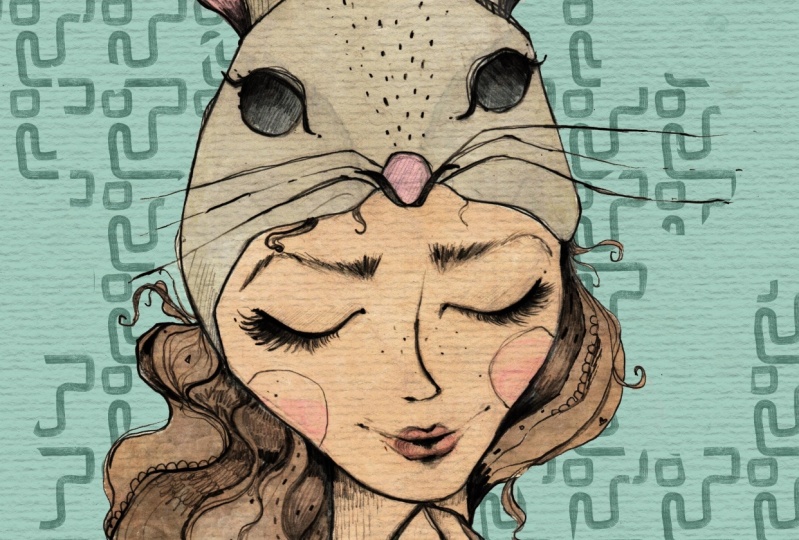
brushes and stamps. Your class project will be to either scan and color in
one of your own drawings or to use my pencil drawing as a template for you to practice
the different techniques. I really hope to
see in class. Bye. No.
2. Scanning In Your Pencil Drawing: Welcome to this lesson. So the first thing I'm going to do is to
scan in my drawing. And you can see here, I opened the software of my
scanner, slash printer. I'm using the Epson
Ecotank, ET 28 20. And yes, I will hit scan. What I will then do
is to scan in color, even though it's just a
pencil drawing because sometimes I like the
yellow tint of the paper. I always scan in
color and I can get rid of that later on
if I want to anyways. I set that a scanner to the highest resolution
possible here, that 600 DPI. Choosing a high
resolution takes a bit longer and the
file size is larger. But you can also enlarge the image later on
without losing quality, and that's why I'm using
a high resolution here. Yes, I've got removed
background off. I can do that later on, and the image format. I don't know what
you can choose here. Yes, it's JPEG that
makes the most sense for me because I will be working with it and procreate later on. PNG would also work, but I wouldn't choose PDF. Okay. So I hit start. And yes, there won't
be much to see now. There's no preview or anything. I'm just waiting now that my scanner will
scan in the image. Okay, so here you can
see the scan in image, and I'm happy with that so far. So I just hit next
and then save. And now it's saved in my camera. Let me quickly show
you here it is. So in the next lesson, I will show you how
you can edit your scan in your photos app to already enhance the look
of the image a bit. See you there. No.
3. Importing Your Scan: Welcome back to this lesson. So if you want to import a
photo or scan into Procreate, you've got basically
two options. One option is to create
a canvas that is already the size that you want your artwork
to be later on. So if you want to do that, you can hit the plus sign here. And I've already got quite a
lot of canvases saved here, and I normally just
tap on one of these. But to show you how you
can create a canvas, I will hit the plus sign here. And I want an A two canvas, which would be very
nice if I wanted to have a really large
print of my artwork, and I will go and
choose millimeters. And then I will have a 420
by 594 millimeter Canvas. And I intentionally
set the DPI to 300. So if you remember, I
scanned my image at 600, and now what will happen if I put in my scan here later on. And the resolution of the
Canvas is just 300 that will help the image to nearly stretch out on
the whole A two Canvas, even though my original
scan was just, I think about maybe 20
by 20 centimeters big. So this is really a good option
to enlarge your artwork. Now, I don't have a lot of layers if my canvas is that big. Let's see whether I can
work with just 11 layers. Um, the colorful profile, I always start with RGB,
which is for screens. Unless I really know that
I need to have it in CMYK. At one point, then I
would work in CMYK. But normally, I just use RGB, and the display P three
is my preferred setting. Okay, so I will hit Create. And now to import my scan, I just go to the
wrench ic in here and go to add insert a photo, and that brings me
to my camera roll, and I just tap the photo. And as you can see, it's
a bit smaller here, but it nearly fills
the whole canvas, which is, like I said, before, 420 by 500 and
millimeters large. So that is option number one. If I didn't want to
remove the background of this image here with
a certain technique, I would just keep on working
in this canvas here. But since I want to show
you another way to import, and the other way works
better with my technique, I will show you
the second method, and that is to just tap photo and then go and
insert your file. And here it is. So this Canvas
is actually still 600 DPI. Let me just quickly show you
here Canvas information. He can see this is 600 DPI. So if you want to use the image for a print on
demand side later on, I would recommend to
change that to a 300 DPI. Yes, that's it as far as it goes to importing your
image into Procreate. In the next lesson, I want to show you a very
quick and easy method to just add some pops of color
and not change much more. And you can do this by using
blending modes in Procreate. See you in the next lesson. Bye.
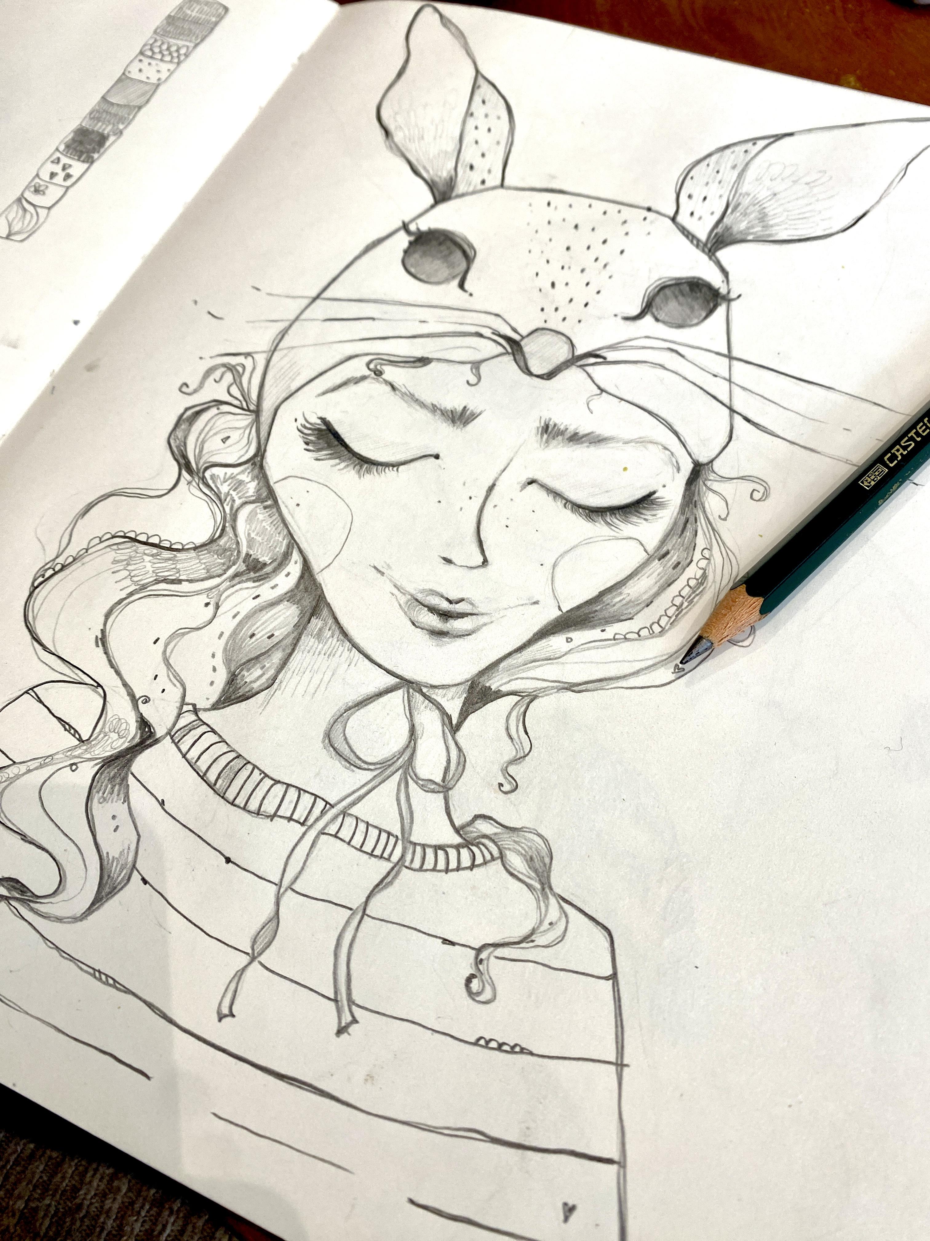
4. Editing Your Scan: Okay, so this is my image. After taking a
closer look at it, I realized that I put it
very close to the edge, so the ear actually is
cut off a little bit, but I don't mind that
too much because I can work on that and
procreate later on. So the first thing I will
do is to hit edit here. And then I will crop my image
a bit because I don't need this here and here and it done
and then go to edit again. Then I will just go through
all of these settings. I will start with exposure, and I will bump that up a bit. And I very much do this
quite intuitively. So I always look whether using the setting helps the
look of the image. And this is actually
quite tricky sometimes because
sometimes if you feel that the linework pops
out so much more nicely then you get these shadows
that you don't want. But I can of can get rid of the shadows in
the background later on, so I will just bump up the
brilliance here as well. And I'll go to highlights, and I feel I don't
like that too much. So then to shadows. Contrast and brightness. Most of the time I'll leave
the brightness as is. Blackpoint always
helps with line work. So I very often bump
that up quite a bit. Okay, so here you if you
just tap with your finger, you can see how your
image looked before, and this is what
I've done with it. So I feel that the
linework pops quite a bit, and that's what I
wanted to achieve. So I will hit done. Yes, and then the next lesson, I will show you how to import your artwork into
procreate. See you there.
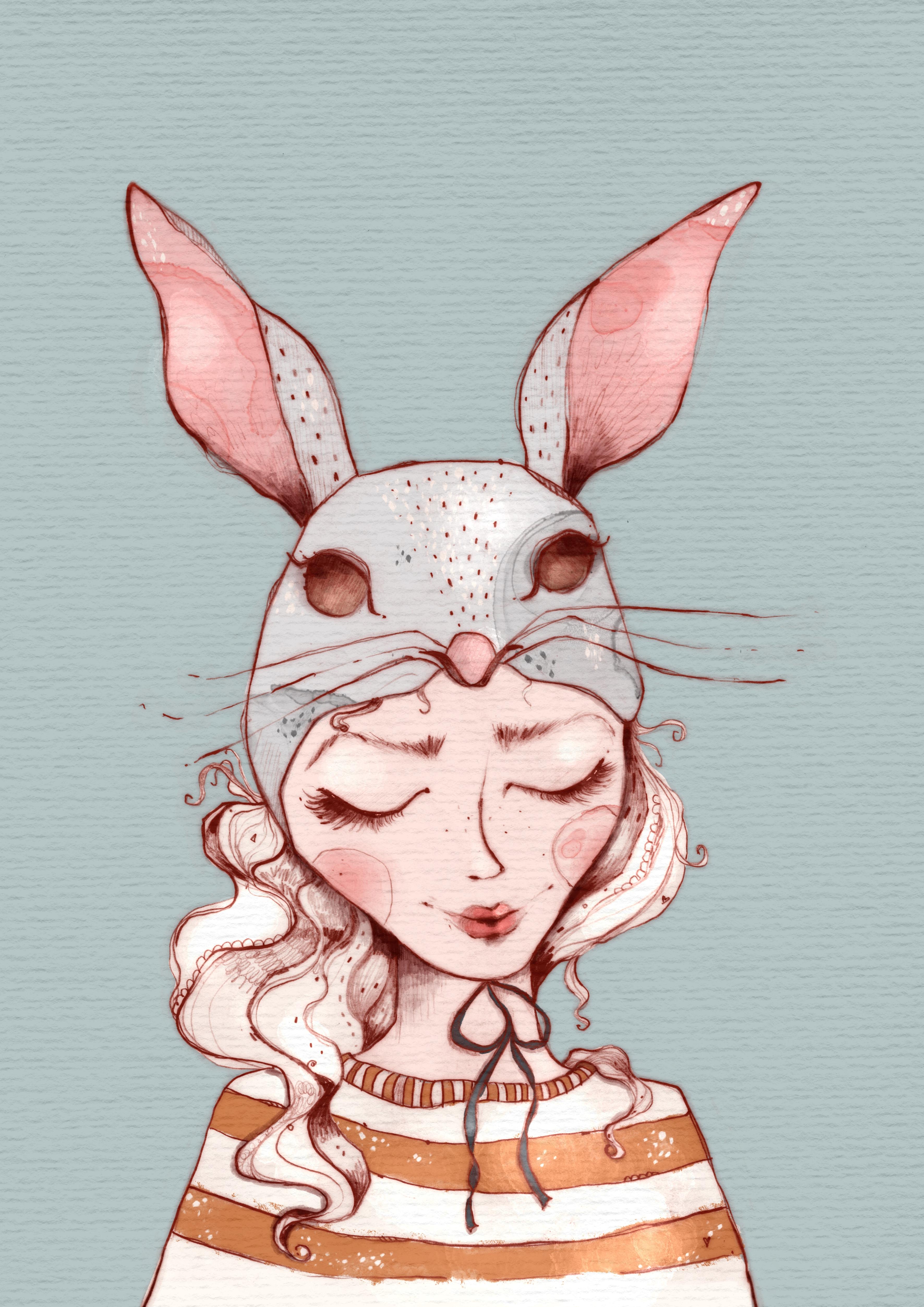
5. Quick Tipp: Adding Colour Using Blending Modes: Welcome back to this lesson. So a very quick and easy way to add some color
to this drawing. If you don't want to
change anything else is to create a new layer by
tapping the plus sign, then dragging that layer beneath the layer
with your scan. And now you set this
layer to a blending mode. And you do that by
tapping the n here, and you have to choose one of these blending modes that's
on top of the normal mode. So I will start out
with linear burn, but you could also use
some of the others. I will show you in a
minute how they look. And now what happens if I paint beneath the layer that
set to linear burn? Let's just choose this red
here and maybe the Eagle hawk, which is a procreate native. So what happens here is
that the color is visible, but also the line work. Let's just choose, or maybe I will just finish that
here because later on, I want to show you how the different blending modes
also affect the color. So I chose a dark red for this. So let's use some kind of
light skin tone for the girl. Maybe just this one here. It's not that
light, but anyways. Now, this method is great if you already know that you want
to keep your line work, maybe mainly black and white, and just want to add some quick pops of
color here or there. So I choose another layer, and maybe let's use some kind of gray for that bunny mask. And just to give you an idea how the colors
might be affected, I will also be adding some
other colors like maybe some green here and maybe a yellow, and blue. Maybe this one as well. And maybe also some
kind of orange. Okay. Now, like I said, this layer is said
to linear burn. If I were to put
it back to normal, you wouldn't be able
to see the color. And now, this is how it looks if I set it to darker color. This is how it looks. If
I set it to linear burn. Now, color burn
doesn't work very well with the parts where
there is no color at all, because like you can see, if I leave out areas, I I don't color in areas, then you can't see
the line work either. So that will be the
darken blending mode, and the last one
is the multiply. And I will put them side by side in a slide for
you to compare. Like I said, I mainly
use linear burn or multiply because I
like these the best. Now, if you were to go down, you still got some fun effects, but I think there is really no blending mode that
would work properly. This is quite
interesting, actually. This is the what is it
called light to color? So this could look
very interesting if I were to color in all of
the all of the areas. Oh, Yes, overlay, soft light. Hard light, again,
interesting look, but doesn't really work
with what I want to do. Okay, so that's it
for this lesson. Now, in the next two lessons, I will show you two
ways of getting rid of the background
of this artwork. And then in another lesson, I will really go into
depth concerning my coloring process of an illustration like
this. See you there. Bye.
6. Removing the Background: Selection Tool: Welcome back to this lesson. So I've gotten rid of all
the colors I used previously to show you method number one of getting rid of
the background. Now, I use this method
mainly if I want to just get rid of the part
that's around my illustration. So say if I wanted to get
rid of this white here or yellowish white and want to retain it
inside of the girl. So you do that by simply
using the selection tool, and you set it to automatic. And now I can tap on the
parts I want to select this. And what inevitably
will happen is that it will also select parts that you don't
want to be selected, like inside of this ear
and also down here. I want to retain that inside of the pull
over of the girl. So what I do to work around this problem is
using a layer mask. So once I've selected
whatever I want to select, I go to invert. And then I go to
my layers panel, tap on the layer and hit mask. And you can already see it
got rid of the background. I wanted it to be gone here, but I don't want it
to be gone here. So what I can do now, if I'm on my layer mask, and I am because the layer
mask is a dark blue, I choose white, Now, if I double tap the
white area here, it automatically goes to white. And then I choose a
brush, let's say, the dry ink, which is a
procreate native brush. And now I, I have to deselect. So again, make sure I'm
on my layer mask. I am. And now I paint on
the layer mask, and that will give me back the parts that I want
to still retain, like the inside of this ear, and also down here where
I've got her pull over. Now, this method is
great because I cannot just get back the parts that I want to retain
in my illustration, I can also get rid of parts
that weren't selected, but that I don't want to have. So for that, I have
to choose a black. I double tap that here, and then it automatically
goes to black. And again, I make sure I'm on
my layer mask. I still am. And now if I paint with
black on the layer mask, the bits and pieces that I feel I don't want to include
in my illustration. Will be erased. So they are not actually
erased, They are still there. If I were to paint with white on that same area, I
would get that back. But that's not what
I want right now. So let's see, maybe here. And Yes. That's about it. So now, what I can do if
I'm happy with my work, I can just pinch
these two together, and now the layer
mask is applied. And if I now set it to a different background
color, as you can see, I still got the paper texture in here or the color of
the paper as well, but I've gotten rid of the
background completely. Now, in the next
lesson, I will show you the method that I use
most of the time, and that method
is a quick way to get rid of not just
the background around my illustration, but also inside of
my illustration, while still retaining some parts of the lovely paper
texture I've got. See you in the next lesson. Bye.
7. Removing the Background: Layer Mask: Welcome back to this lesson. So for the next trick,
I'm going to share. I have to give full
credit to Mel Armstrong, who is a wonderful illustrator
and pattern designer and teacher on Skillshare. And she always has the best photoshop
and procreate Hacks. So I got this hack from
her YouTube channel. And ever since I saw it, I've been using it
on a weekly basis, and I'm so grateful for
her to figure that out. So, what you have to do is to tap your layer
with your artwork. And do copy. Then you add a new layer, and you fill that
layer with black by just dragging in the color. On that layer, you tap
and then you do mask. Now you do a three fingers wipe, and you just go to to paste your artwork that you've copied before onto your layer mask. Now, the last step
you have to do is to do invert, and that's it. So if I toggle of the
visibility here of my original, and now let's see, use this
as a background color. You can see this got
rid of the background. But it still retains
the paper texture. And I feel that's what's so
amazing about the trick, because one of the reasons I'm
drawing on real paper with real pencil is because I want my illustrations
to look more handmade. And yes, this is a way to really get a good digital
version of it without getting rid of all the
lovely paper texture and maybe little bits
and pieces that can make your drawing
look so one of a kind. So let's get back to white here. Now, again, I will pinch
these two together. And another handy trick, if you want to change the
color of your line work here, what you now can do is
to add a new layer. Set it to a clipping mask and then choose a color that you
want your linework to be. So I will just choose a color that will
make it very obvious. I I now drag in that orange
into my clipping mask, my layer or my
linework got orange. And if I were to choose. I don't know, this green here, it would get green and so on. What I do most of the time
is instead of using black, is using a very dark
reddish brown. Let's see. Let's use this one
like this one here, and I still feel it's not
red enough for my taste. So what you can also
do is go to curves. And then if you are on red
and you bump that up a bit, this will Maybe
let's zoom in a bit. This will make your linework
appear more reddish. And I feel that's the
look I want to go for. Again, if I want to apply that, I will just pinch
these two together. And Wala, here I've got my linework without
the background, ready to color it completely. So in the next lesson, I will share my coloring
process in Procreate. Hope to see you there. Bye.
8. Colouring in Procreate: Okay, welcome back
to this lesson. Now, before I color my image, I will do a few
small adjustments. So the first thing
I will do is to put this transparent line
drawing onto a new Canvas. I will just hit the
layer and tap. Copy. And then I will go
back into my gallery, and by hitting the plus sign, I will create a new de document, and that will be an
A two document here, which is 300 DPI. And I will just do a three
finger swipe and paste. And here is my image. Okay, so now I will
drag that down a bit. And the first thing I
need to do now is to get rid of some of that texture
that is around the girl. So I will keep the
texture inside of her, but I will try to get rid of the rest of the outside texture. So I do that by using
the selection tool and just kind of loosely, but closely draw
around The line work. Now again, I will
do a three fingers wipe and hit cut and paste. And what that did is to put the inside now
on a new layer. And if I deselect that here, a lot of the outside
texture is already gone. But I need to be a bit more meticulous,
especially around here. So what I will do is to again
work with a layer mask, tap the layer, tap mask. And then I will use
black and the dry ink. And I will use that
to get rid of even more of this texture
around the girl here. I also used the time to
erase some minor mistakes, so I can still see some of
the lines which I erased, and I can now
completely erase them. There was a little hair in here, which I might have scanned in. But sometimes I
also keep some of the texture that's
close to a drawing, like here, for instance, especially if I feel it doesn't really hurt the look of it. I only erase the texture at the parts where
it is too obvious. What you can also do is to
use the selection tool here. Again. Then if you
have got coil enabled, you can tap that and that will fill this
selection with black. And since I'm on to lay
a mask that helps me to get rid of a bit
more of the texture. That's it for now. Let's see. I will pinch these together. If I later on feel that I
have to remove a bit more, I will do that, but
I will be working with this image now. I can get rid of the texture here by just
deleting that layer. And one thing I also want
to do before I go into the coloring process is to
make the ears a bit bigger. Now, I drew this
in my sketchbook, and I was actually limited
by the size of the paper. So I wanted her ears to be
bigger right from the stars, but I couldn't do it. But that's the magic of
digitizing your art. You can just manipulate it later on to make it look
like you wanted to look. Now, we'll just
disenable colorful. So I've got my selection
tool set to free hand, and I will draw around
one of these ears. And then I will hit the arrow. I will go to free form
in this case to drag the ear a bit like
I want it to be. Maybe that's already
a bit too big. That's better. I try
to make sure it's Aligning with the rest
of the drawing here. Doesn't work completely. I could try warps, and that will do the trick
here, at least on this part. Like that. Now I'll go for the
second ear, again, using the selection
tool, free hand, trying to be a bit
more meticulous here around or close to the head, and then tapping the arrow
and going to free form, making that a bit bigger. And a bit slimmer here. So and then again, trying to align it to the head. Okay. And that will work for me. So before I start coloring, I will do one very last thing. I will duplicate this layer. And then I will lower the opacity and set
it to linear burn. And then I will
try whether I like the look of using the
ggan blur on this layer. Sometimes if you use that trick, and that works right
now very nicely. You drawing gets kind of
the look of an old etching, like they did with needles on I think they did it
on some kind of metal. And I sometimes really
like the look of that. And again, I have to give
credit to this time, Lisa Glance because I learned this trick from O
of her tutorials, and I've been using it
quite a lot ever since, so yes, make sure to
check out Lisa Glance. She's on Skills Share and on YouTube and all the
other channels as well. Okay, so I will make
these two lineworks a group and call them linework. And then I will be adding
a new layer and they're dragging that beneath
the linework layer. And I think I will
start by coloring in the bunny mask
she has on her head. And I provided a palette that
you can use if you want to, if you like the colors. And I've already
selected a gray here. It's a light gray,
which I will be using. And I've also created a very small brush
set that you can use. The first four procreate
native brushes, which I've just copied. But this and this are
brushes I created myself, which I use quite a lot. I actually can't
do without them. This is an alcohol ink stamp, and this is some kind of texture stamp that I use in
most of my illustrations. Yes, you can use these. I will probably sometimes be accessing these brushes by
doing a four finger tap, and that makes the
quick menu pop up. And I've set a quick menu with these brushes
from the brush set. I feel this is much easier to access your brushes this way. So if you want to
learn how to do that, stay with me till the end. I will tell you then where you can learn how to sit
up your quick menu. Okay, I will start. Let's
see, with the Blackburn. That's kind of a solid brush. And let's again see, yes
I'm on the right layer. And I will just be coloring
in this area here. Now, if I'm in the
mood for drawing, I use a brush to
color in my drawings. What you can do,
especially if you've got a larger area to fill
in the beginning, and you like your color
to be completely opaque. You can use the selection tool
and set it to color fill. And what you could do
is to just go and drag around that line here and
here and tap the gray node, and that will immediately
fill your drawing with color. But today, I'm kind of
in the mood to draw, so I won't be doing that now. So the parts where I'm getting
a bit closer to the edge, I will be using the
dry ink brush because that can be a bit
more precise here. Okay, let's go on to the ears. Again, I will just show you the method with
the selection tool. You can just drag your
selection like this. And then tap the note. Now, what I just realized
when I was filling in the gray is that I
forgot to fix the ear, and it really would
have been better to do that before I've gotten
rid of the background. But now I have to work
with what I've got here, so I will try my best. I will toggle of the
linear burn layer. And then I will just try to grab a bit of the line
work that I've got here. And do a copy paste, and then it over here. Now let's see whether that
works with the liquefied tool. I will try to shape
that into form. Okay. Maybe let's go to the other ear. I think with that one, I
will just try to Let's see. Let's grab the brown. We'll just try to draw
in what's missing. And that's much better. So I feel I have to live
with that here now. I'm not quite happy with it. Maybe let's give it
one last try with a liquefied tool. Push that. And that's a bit better. I feel there maybe I can erase. No. Maybe smudge it a bit to make the borders
layers obvious. Okay, so that's the solution
I will go with for now. So I will enable the
linear burn layer again. And I don't know if you can see, but this is really the
effect I told you about, like, you've got this very
old engraving or edging. Okay, so let's pinch
these together. And then let's go on
with the coloring. Now, on the next layer, I will do her face and the neck. And I will choose
this very light pink, and I will go again with the Blackburn and make
that a bit larger. Make sure I'm on a new layer, and just color in her
face very roughly. And I will be using
the dry ink when I get closer to the edge just
like I did before. Getting to the dry ink. Okay, so let's move
on to her sweater. First of all, I think I
will drag the face beneath the ears just because it
makes more sense that way. I like to be a bit
organized with my layers. Now, I will put the sweater
beneath the face as well. And I want her sweater
to be this kind of off white and to make it
a bit more quick now, especially since this
will be a large form. I will just do that with
the selection tool. So draw around that. I don't mind drawing
over the hair because I will be doing
the hair on a new layer, and then I will
set that layer on top of this pull over layer. Just tab the knot. And it's actually not
really off white. It's more like kind of
very, very light pink. And I want this of white or of pink to alternate
with yellow stripes. But I'm just trying maybe if I wanted to be
a bit more light. So I'll go to saturation
brightness and make it Yes, a bit brighter. 250 2%. And so first of all, I will make sure that I've gotten the edges here correctly. So I've drawn a bit
over the end here. And I will have to
add a bit more here. This is actually the face
which I have to erase. Okay. Some part is missing. Here, it's quite
difficult to see. Because the color
is just not that h, I'm realizing I'm still
using that color, but I made it brighter. So let's grab that actual color. So I disabled the line work, and I've gotten the actual
color I've got here now. And I'm going back to
that layer and now. This is the same white. So this was just because with
the situation brightness, I made it a bit brighter and that changed the color a bit. Okay, so I want to add
the yellow stripes, and I will add them
on a new layer, and I will just set that
to a clipping mask. This is not a completely
necessary step, but it will help me not to
draw outside of the white. And I've got this yellow here, and I maybe we'll do that
with the Eagle hawk, which is a brush that
is a bit more textured and not as not as opaque, as you can see, maybe. So if I draw on it several times it gets more and more opaque. Let's see whether I
like the look of that. Some of the texture
spills over here, but I don't mind that but I
don't mind that too much. I actually like it when you've got some tiny bits and pieces, which make your illustration
look more alive. Now I can see since I'm
on a clipping mask, I can see that the white
is not far enough here, because that yellow just applies to the layer
that's beneath it. Now, if I go on and
paint that here, paint that in here, let's see over there if it's
the same can't really tell. Then you can also
see the yellow. Now, if I didn't make that
a clipping mask, let's see. So the yellow would reach
even beyond the white. And if I set that, tap it and set it to
clipping mask again, it just stays in the
area where the white is. Let's get back to my yellow. So the first stripe, and let's do the next one down. Here, And again, you can see here the white is not going all over to the side. So if I now paint in the white, the yellow appears as well. So I think I will also make the color or I'm not
quite sure if this is a color, but, you know, this edge of p, I will make that yellow as well. And here again, you can see the white is not
reaching far enough. So I will just have to
fix the white here, and then the yellow
will appear as well. And I think here I didn't
reach far enough with the yellow since fixing
the white didn't work. And here, I still
got a little bit of the skin It's visible there. Okay. So, I'm nearly
halfway through. I will just go on
back to the ears, and I want to make the
inner part of the ear pink. So I will add a new layer. And since I've already got my gray set down quite
meticulously to the edge, I will again make
that clipping mask. So I can be a bit
more loose with my pink and not worried to paint around
and paint over here. And I will just have to be a bit more careful
when it comes to the part down here where I
still want to retain the gray. So ear number one
ear number two, I think I'm still using
the Eagle hawk here. Yes, I am. Not 100% sure whether I like it to be pink
all the way up, but I will just leave
it like that for now and maybe get
back to it later on. Now, I want to also
have maybe a pink nose, but I didn't draw the
gray onto his nose, so I will just
quickly do that here. And then maybe on the
pink layer, paint in the Pink. Okay, so on a new layer, I want to make her
cheeks be a bit pink. And for that, I will be
using my alcohol ink stamp. Mm. This is similar
to watercolor, but I feel it always looks much more interesting
than just watercolor. And I will create a new layer, set that to clipping
mask as well. And I think I will be using the dark pink since the
stamp is transparent. Now, just let me tap that here, and here you can see
parts of the stamp, and I will make that
a bit smaller here. And then let's see which part do I want to be in her
cheek? Maybe that. I still got it set to free form, and that helps me to be able to make that fit the cheek here. Maybe that like
that. That's nice. Another option could be to just use a watercolor
pen, for instance, like this fresco pen, and just paint that
in quite softly here. If you're not such a
fan of these types of textures like you've got
them here with the stamp. You could just paint that in. If I put that down lightly, it just applies a very
very transparent color, and if I put it down more hard, the color gets more opaque. So that's an option
here as well. I feel it got a bit
too intense there. So I feel I like them both. Maybe I we'll be adding
some of that here as well. Okay. So now let's
move on to her lips. I want her lips to
be quite visible. I will be using the Eagle
Hawk and just draw in that pink color like the Um, fresco brush, the Eagle hawk also is transparent,
but not as much. But if you press
down very lightly, it's not that opaque. And if you press down harder, it gets more opaque. So here on the edges, I want the color
to be very light. And I want it to be more
dark in the middle, so I will put push
down harder there. And maybe smudge it a bit here. Because I really want the inside of the lips to be the
most intense color. Again, going in with a brush and then
leaving it like that. Okay, I'm already quite happy with the look
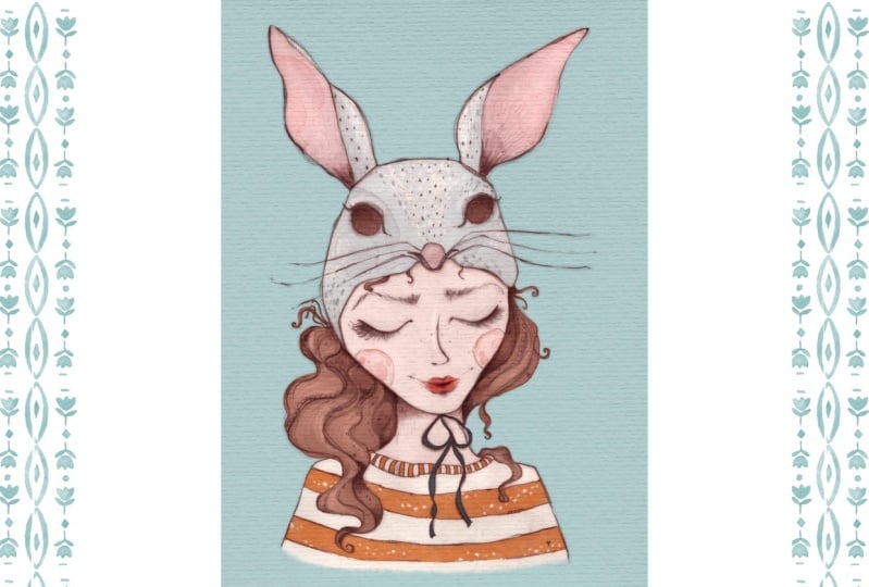
of the illustration. I want to try to change
the background color. I had my mind set
to a light blue, and that's this one here. And I feel this one really works well with the yellow and
the off white and the pink. But I actually have to
say, I like it both. I like it to be white or maybe I would make
it an off white, but I also like the blue tone. I will keep on working
with that now. But that shows me that I have to drag down the off white
of the pull over here, so we'll just quickly go back to that layer and paint that
in with the Blackburn, which is an opaque pencil. And again, I realized that I changed the hue of this white, so I have to get back to it and just grab it
with a color picker. And then I will have to
paint in the rest down here. L et's turn on the linework to see again where I'm painting. So and since I've done that, I also feel that I
have to drag down the line of the linework
down here as well. And again, I will try to get that original look by
going to that layer and using the selection tool and just kind of stealing
that line from here, going to copy paste. And now my iPad
doesn't work anymore. So, there it is back again, copy paste, and
here is that line. So I can drag that down
now and put it down here. And with the free
form tool, maybe Yes, and that worked fine. So I will just duplicate
that and drag it over here, where there's a bit of
the line missing as well. And this also gave me some
of this brim texture there. I always say brim.
It's not a brim, I think, but you
get what I mean. That line is actually
a bit curved. I don't want that to be
curved into that direction. So moving it like that,
and that's better. No, okay. So we'll just
pinch these two together. And since they are missing
on my linear burn layer, I will just let me see, duplicate them,
setting that layer to linear burn as well. Doing the ggan blur I think it was about
four or five or 6%. And there it is. Okay, so now, I actually really love if
the hair is not filled in, but that doesn't really work
here with a dark background. Now, what I could do is
just to make it white. But I will try both. I will also try some kind of
brown for her hair. So let's do that on a new layer. Yes. And now I've got the
maximum of my layers reached. So what I will do is to
make that a bit smaller, even though I wanted
it to be A two. I need some more layers. So I will go to the wrench icon, go to Canvas, crop in resize. And what I will do now is
to hit resample Canvas. And that will automatically
keep the ratio. So I will just show you
hit resample Canvas. And I will just make that a bit smaller, maybe set it two. I don't know, 500. And then I hit done. And now I've got a
few more layers. Let's see how far I
will get with that. So tapping to create a new
layer for the hair color. And then I'm going to this
very light brown here. And I will do the first part with the selection
tool set to color. And then I will get into
more detail with the brush, and I will be using the dry
ink brush here and really zooming in to get these
fine strands of hair. And this also fixes
the edges where my selection was not
that meticulous. So I'm erasing some parts, but I'm also drawing
in some parts. And while I'm at it, I'm seeing the white here got
a bit too far. I'm erasing that as well. Getting back to the hair. I can see there is a problem here with the
yellow of the pull over. So first of all, you can't really see
that. Oh, yes, you can. So I just have to erase my hair here so the
yellow is visible again. But here a bit of the
skin is missing here. That's the wrong color. This is easier to spot now since my background is a dark color. Getting back to the
hair yet again. Erasing a bit of the neck. I think I kind of gotten confused with my
line drawing here with the bow and the
line of the neck. I haven't noticed that before. And again, I'm noticing
that the color of the skin is not extending
all the way to the edge. So I'm fixing that here. Okay, so that's the
girl with brown hair. Now. If I wanted to look, whether I like it more
in brown or white, what I could do is to just
set a clipping mask on top of that brown and drag
in another color, like in this case, white. So this is how the girl looks with just the white paper hair. And this is how she looks
with the brown hair. And I think I like it both. I like the brown with this blue, but I also like the look
where the line work and all the little details and the patterns really pop out. So I'm not quite sure which
one I will use in the end, but for now, I will
just go with the brown. And yes, I think I'm nearly done with the main
and base colors. I want to try one last thing, and that is adding some kind
of color beneath the eyes. And I will just go
with that yellow here. And I feel let's have a look. Quite sure actually whether
I prefer it with or without. Maybe set that down. The opacity. Yes, I feel
I like that better now. Now, I want to add some
color to the ribbon, and I will go with this
very dark teal blue. I will be using the dry
ink for that again, and it's a bit too big, so I make it smaller. Choosing a dark color
for the ribbon also helped with adding
some contrast. So I've got this
dark color here, and then I've got a lot
of light colors as well. And that is always what makes an illustration look
interesting if you've got contrast between
lighter and darker colors. Okay, I feel that's mainly it. I will be adding some
smaller textures and maybe also a
paper texture on top, and I will share that
in the next lesson, and I hope to see you there. Bye.
9. Adding Extra Texture: Hello, and welcome
back to this lesson. So I'm sorry for my voice. It's a bit raspy
since I had a cold. But I hope you can
understand me. And yes, let's go
on with the lesson. So I'm already quite happy
with the result here. I like the colors. And I'm also quite happy
with the linework. I feel that the
artwork is already quite textured since I've
got the paper texture, for instance, here,
and also the texture I created by doing
these marks here, for instance, on her hair. Um, yes, but I want to try out one or two more little tricks to add even more extra texture, and I want to share
that with you. So the first part I will
work on is this bunny mask, and I will create a new
layer on top of that. And since the ears here, the pink of the ears are
already on the clipping mask, The next layer I will create
is a clipping mask as well. And I want to use my
alcohol ink stems, and I will start with this gray here and then
make it a bit darker. And then I choose the alcohol ink stamp you've
got in your brush set. And I will just tap here once. And I feel the effect
is barely visible. So what I can do. It's because the gray is very
similar to the gray here. So what I can either do is
set that to a blending mode, like, let's say, multiply. So this will be
more visible then. I think I'll also make it a bit smaller and drag it over here. Or what I could also do
is just to go to set uration brightness and then
put down the brightness, and that makes the
stamp go darker. And now, as you can see, this is much more visible. And I feel it looks quite nice, so I'll leave it like
that and maybe do a second one on the other
side of the head. Let's see. I will make the gray bit
darker now and tap over here. And I feel that's too much, so maybe just over here. Oh, yes, I think that's nice. So this is one way of doing it. I will also show you using
a pink stamp on the ear. So adding another layer here and making that clipping mask. And then I will choose
the dark pink in my color pette and just
tap here on the ear. And maybe here as well. No, I don't like that. Now I have to be careful. This is a pink, and if it bleeds into the gray,
which it will do. I think it doesn't look
very nice on the gray. I would just erase that here. Or another thing you could
do if you wanted to keep this edge is to go to liquefy, and then you can push the stamp, make it a bit bigger, and then you can push the stamp in the direction
you wanted it to be. Okay, that's it for
the alcohol ink stamp. Now I've got another stamp, which I really like to use, and I will use that
on the mask as well, tap to create a new layer. And that's the smudgy diamonds. And I will use that with white And this is nice with both white
light or dark colors. So this adds this kind of very I feel for a digital brush, very handmade looking texture. Now, we'll just add that
maybe here and here. It doesn't work. If
I put it on there. Let's just drag
the layer on top. So now it will also be
visible on her ear. Okay. So, um, Yes, just to give you an idea. I'm not particularly sure
whether I like it on the ears. I think I will erase that here. Maybe put it here. Okay, so just to
give you an idea. We'll just show you how it
would look with a dark gray, maybe here, and here. And like I said, I also want to add
that to the white, the yellow stripes of the pover. So we'll create a new layer. Tap that layer, go to the white. And then I will be
adding some of these to the yellow of the pullover. And while I'm at it, I
realized that I feel I want this to alternate
between yellow and white, so I will just quickly do that. Now, I feel that
looks much nicer, and I will leave it
like that. Okay. Another thing you can do to add extra texture is to actually
put in a paper texture, and I will put that on the
very top of the illustration. And now I don't have
enough layers anymore, so I will again go to Canvas, crop and settings and resample Canvas and
make this even smaller, so let's set that to
300 millimeters Now, this will give me
some extra layers. So hit the plus sign here. And go to add, and now I go to insert a photo. I've got this paper
texture in my camera roll, and I will also provide
that for you to use for your illustrations in
the resources section. So insert a photo. And then we'll go
to favorites here, and this is the
texture I want to use. So right now you can see
this is just opaque, but I'll just drag that
onto the whole canvas. And now if I set it to either
linear burn or multiply, I'll go with the
linear burn here, and then maybe reduce
the opacity a bit. I've got this nice
looking paper texture that extends over
the whole canvas. Okay, again, like I said, I feel that there is
already quite a lot going on with the linework that
has a lot of texture, so I won't add any
more texture here. I will just quickly fix
the ear here because the pink stamp also
reached onto the gray. One more time, go to no, sorry, go to the liquefy. And push that onto the pink. Okay, so I've got one more
lesson prepared for you, where I will quickly share how I add shading and lighting. And I hope to see you
in that lesson. Bye.
10. Adding Highlights and Shadows: Welcome back. So still
the raspy voice. I hope you can bear with me. I just quickly wanted
to share with you how I add shadows and highlights. I feel, in this case, I don't want there to
be too much shadow and highlight because I
actually don't go for a realistic rendering, but more kind of an
illustrative look. And I feel that the color is
okay to be quite flat here, since there is a lot going on with the texture of the
hair and the linework. But let's just see how it looks if I were to
add some shadows. So I would put a layer on
top of everything here. But beneath the linear burn
layer with my paper texture, and I hit the plus sign. I set that layer to multiply. And the brush I will be
using is the eaglehak, since I can draw with
it quite precisely. But I can also vary the opacity by pressing harder or lighter
onto the canvas. So let me just
quickly show that. I will just use the color. I will go on and use for the shading that's
this purple here. And if I press down,
it's too small. And if I press down very
lightly, it looks like this, and if I were to
press down harder, this is the drying. So let me just quickly show you. I will use the color
I use for shading, that's this desaturated
purple here. And then I will go on
and use the eaglehawk. And now if I press
down like this, very lightly, you can see the
brush is quite translucent. But if I were to
press down harder, it gets quite opaque. It's not completely opaque, so I would have to paint over it at least two or three
times to get it opaque. But still, you can
vary the opacity, and that's nice if you
want to shade something. So for the shading, I will just look where a
shadow would naturally fall, and that's where objects or
parts of her body touch. So one obvious
part is here where the head protrudes,
and there is the neck. So I've already got
some shading here, which I did with a pencil, but I will go on and deepen that a bit by using the brush. So let's just find
the right size, and it seems to be quite okay. So I will press
down harder here. And then I will be applying less pressure where the
shadow gets lighter. Like this. And you can
smudge the edge here to make the transition from shadow to non
shadow even softer. Now I will go one more time
very close to the neck. I will press down
harder and deepen the shadow and
maybe here as well. And while I'm at it, I will
also deepen the shadows, which I've already indicated
with a pencil drawing, but I will deepen that
here a bit as well. And again, use the
smudch tool to make the edge a little
bit less visible. Now, other parts where I
could apply a shadow is, for instance, here,
the middle or here. But as you can see, I've
already created shadows with the pencil here as well, so I won't overdo that. And I could create a
shadow here beneath the mask since
there is the mask, and I'm just seeing I have to paint the skin a bit more
closely to the edge. See here as well. I wasn't that precise. So let me just quickly fix that. So back to my shadows layer, going for the desaturated
purple and Eagle hawk. Yes, so I will create a shadow here right beneath this mask. I'm realizing I forgot to color this strand of hair with brown. So we'll just quickly
do that as well. Okay, again, back to my shadow
there and the eagle hawk. So I'm also going for the hair
that's close to her face. Okay. And other parts where there might be
shadows, for instance, could be here beneath her hair. And maybe next to the bow here. Here again, I already
indicated shadow with a pencil drawing There's still something wrong
here with her neck. I will just try to very quickly
fix that by erasing it. Oops, that was too big. And I've learned from
my previous mistakes, I will just simply
redraw the line here with the dry ink brush. No try to fix it any other way. Okay, so that has to do
back to the shadow layer. Now, this is actually quite nice if you keep on working
on your drawing, and adding some extra texture
and shading and highlights, that every time you go back
and zoom in two parts, you realize that there is still something that
has to be fixed. So I feel shading and adding texture is already also
helpful in that way, even though it's not the
main reason for doing it. Okay, so beneath this strand of hair as well, some shading. And now you could go on, also maybe making this
part a bit darker. If you don't like the way
your smug tool works, quickly check which brush you are using for the smug tool. I'm using the stucco
at this case, and I like how it looks. But for instance, if you were
to use some kind of very. Let's see, where are
these? I never use these. Some kind of I don't know, medium heard or hard airbrush, I feel that wouldn't the
smudges quite nicely as well. But if you don't like
the look how it smudges, then go for another brush
here with your smudg tool. Okay, so just go on
with that brush. Okay, so I could also
add some shading down here and maybe also here or
dark in these parts here. I little bit obvious. So, let me just
quickly show you. I feel the difference
is not that big, but it is still visible, so with the shading and
without the shading. Now, one last trick I want to show you is to add
some highlights, and I like doing that
by using the ad mode. You could also go to
lighten and screen. These two are not that obvious. And I will be using
a light color. Let's say this very light pink or maybe even this off white. And I will be using the
fresco brush for that. And just go to some parts where I want
there to be highlights. And the ad mode can
be very intense. So this is a quite
soft brush, and still, it can be very It can be
visible very quickly, and it can also be
look quite off, so I will just be very careful with the highlights
I'm adding here. Taking this bit lighter there. We also just dabbing the pencil and maybe
going for the ears. Now, I will just quickly show
you this is how it looks if I put down if I
press down the brush, so this is very obvious. And if I just press
down very gently, the effect is much more subtle. And I do this quite
intuitively, honestly. I just look where I feel. I want there to be
some highlights. Now, with the brown,
I definitely would want some more
variation in her hair. For instance, like this
and maybe like this. But I feel I might also just go with the solution where
I applied that white, and now I have the
hair white again. And this would not make it necessary to have
these light effects. So let's just add
some effects to her pull over and
maybe also to this. No, this doesn't look good. I thought about adding
some to this bow tie, but I don't know if I
like that. Maybe not. Okay, so I will
just quickly check whether I like the
effect or not. I feel that I like it, but I
feel that it is too intense. So one thing I could do is
to just lower the opacity, and that's what I do
in most of the cases. Or I could also try to go for another effect like the
screen or the lighten. But these virtually
both do nothing, so I will just stay with the
ad and lower the opacity. Okay, so that's it
for the course. I hope that you got
quite a lot out of it and make sure to hop on
over to the next very, very quick lesson
where I will share on how we can connect.
See you there. Bye.
11. Let's Connect: First of all, thanks
for taking my course. I really love sharing what I've learned over
the past years. And I also really like
connecting with you. You can find me on
Instagram and Cara, and my handle is Ad Julia Underscore Alford's
Underscore Illustrations. If you are interested
in draw with mes or quick Procreate or art in
Illustration Tutorials, hop over to my YouTube channel. This is also at Julia Underscore Alford's
Underscore Illustrations. On my YouTube, you can
also find a tutorial on how to set up your Quick menu
with your favorite brushes. I will put a direct link to that in my course description. If you like the look of
my alcohol ink Stems, you can buy them on Super peer. I will leave a link for that in the course description
if you're interested. I'm also really looking forward
to your class projects. And if you share
them on Instagram, please make sure to tag me
so I can actually find them. So, have a great day. Keep on making art, and I hope to see you soon. Bye.
 Julia Ulferts,