Transcripts
1. Introduction: Hello, my lovely artist. Welcome to my class, and let's dive into
digital watercolor art and paint altogether mysterious
forest with cute rabbit. Get ready to learn a
couple of new watercolor painting techniques for
procreate. My name is Zingay. I am an artist, and
I'm here to show you the digital
watercolor is magic. And you can create
magical world with all these cute characters and whimsical nature
with your own hands. And for that, we're
going to need procret and a little
bit of inspiration. In this class, I will start by telling you where to
find freebies and how to get ready for painting
process like creating watercolor paper in procret and exploring all the
brushes that we have. I think it's hard to create a good art without
inspiration and references. So I prepared for you a source where we can
get some inspiration. And then we will prepare sketch. I will show you the
simple and fast way how to do that and how
to create lovely rabbit. And finally, we will move
to painting process. I will show you how the colors, shades and highlights to our art from the sketch
to detailed illustration. So we will make our
painting advanced. And in this class,
we will explore the blending layer modes a lot. And the most important thanks to a couple
of cute details, we will add magical atmosphere
to our realistic drawing, and by the end of this class, you will be able to create cute and magical illustration
of rabbit in a forest in procreate using different
watercolor techniques in fun and simple way. During the course, I will slowly move you throughout my workflow, explaining every
step and describing procreate features and
watercolor painting techniques. I hope you will like it. And you will learn
more about procreate, more about sketching
techniques that I use, how to create watercolor
paper texture, how to use different watercolor
painting techniques, how to apply those
techniques in procreate. Also how to use layers
blending modes, how to add volume and color
variations to your art, and how to create cute art in procreate using
digital brushes. So what you will need
for my today's class, I will use procreate with
iPad and Apple pencil. You also can use procreate or some other drawing pads or just regular watercolor
paper and paints. Again, whatever will
help you to feel happy and inspired about
the course resources. As a bonus, I will
share with you all the digital tools that
were mentioned in a class, such as texture paper,
custom brush set, color palette, my own
pictures that I created. And who is this class for? The class is great for
intermediate level. Also can be useful for beginners if you have
basic understanding of procreate features for those who is
interested in digital, watercol art, cute characters,
and magical illustrations. And one thing that
I want to mention your opinion and your feedback
are super important to me. They help me to grow and
they help me to build my future classes depending on your preferences and what
you would like to learn. So, feel free to tell
me what you think about this class in discussion
or review section. I will be glad to reply
to you and, of course, share with you and also, and, of course, share with me
your beautiful artworks. I will be so happy to see what you created and
what inspired you. So my dear art fellows, I can't wait to start
this class. Like I said. I definitely can't wait to see what you upload
to project section. So let's not wait.
Grab your iPad, Apple pencil, inspiration,
and let's paint together.
2. About Class Project: Now let's talk about
class projects. Just follow a few steps. Create an illustration of magical forest with cute
rabbit in watercolor style. That will bring joy to you. Of course, don't forget to use the tips that
I gave you today. Explore different
painting techniques and choose the ones
that suit you most, and then create
beautiful artwork. It can be cute rabbit or
something totally different. Anything that helps you to feel happy during the
painting process. I'll use procreate for this class with iPad
and Apple pencil. You also can use
them or it can be just some other drawing pads or just regular paper and pens, like I said, whatever you want. In today's class, I will show you how to paint
watercolor illustration, and it will be
magical forest and cute rabbit as a
center of composition. Also, we will experiment with different painting
techniques and tricks. We will play with light a lot. And once again, you can choose completely different topic
and draw something new, try experiment, and
enjoy painting process. Also, guys, share your
final project and step by step pictures with
me here on a page, you can just click
Submit Project button, and it's so easy. And if you have any questions, so I need more tips,
please let me know. I'm here to help you.
3. Tools and Paper: This class, we will talk about resources and where
to find them. It's pretty simple
follow the steps, go to projects and
resources section, then download the freebies, go to Fils app, and then invert all the
files into the Procreate. Also, it's hard to create watercolor illustration without
watercolor texture paper. So we will fix this issue. Let's talk about it in detail. Well, I think we are
ready to get started, and first of all, our first step will be
let's create texture paper, and then I'll show you where
to get all the freebies. So in Procreate, then we need to tap plus
and tap plus again. Then we need to write 4,000 per 3,000 pixels with
300 DPR resolution. And as you might see, we have
83 available layers here. Then tap ding ding ding. So that's our paper after set, we need to duplicate our
layers a couple of times, and let's just rename it. First, we'll write paint here. We will write shade. And here we will write sketch. And on the top layer, we will write paper. And now for creating
texture paper, we need to find the
freebies. So how to do that? So you open my class in browser, then you go to Projects
and Resources section, and in right corner, under the headline resources, you will find all my freebies. After that, you need to split
the screen into two parts. From right side, we will have Procreate and from left side, we're going to have files. Okay, perfect. So I
mean the freebies, you will be able
to see our rabbits sketch in pingi format. Along with magical
rabbits catches actually our final projects gate that we're going to use in
the middle of my class. Additionally, we have
watercolor paper, we have brushset and swatches. Also, how to move all those
freebies into the procreate. So we just need to drag
and drop it like that. And same we will do with sketch. I need to duplicate it twice, and here we will have our
magical rabbit. This one. And let's go to the second layer and also move our
magical rabbit, drag and drop it
into the procreate. Same we need to do with
brushes and swatches. Then when you transfer your swatches into
the color palette, you need to press three dots
and press set as a default. Then go to this and we will find all our
freebies right here. Then we're going to
do with brushes, drag and drop it
into the procreate. I already have my brush
installed into the Procrite. So now let's talk a little
bit more about the brushes. I'll turn out the sketches for a while and we will go
to paint here layer. We have our paper. Let's just move multiply press. First, we're going to
have six B pencil here. Next, we have run inker
very lovely brush, Runny inker big where
you can adjust posit it. It's very good for creating
some leaf elements. Then boards took my
favorite, favorite brush. You can just see how well the colors are blending
on each other. And by the way, we actually didn't create our
texture paper yet. It's just like the first step. When we set it as a multiply. Bow water drop additionally
one of my favorite brushes. It really gives you very
natural watercolor feeling. B, dark, watercolor edges, good, natural watercolor brush,
which is very good as a basic shader and
basic like main brush. Bou heart edges
brush another brush, which is perfect filling
brush, filling color brush. It already has very
lovely watercolor texture inside of the brush strokes. Bitransparent watercolor,
this is good shader. Natural stains
brush and blender. So you can use it as a brush, or you can use it as
blender. So long tap. And here we have
natural stains brush and blender as a blender. See blend colors very smoothly. B of diffuser, and
as a blending brush, which soften techniques soft. Blending technique is soft. And pull up is
slightly for adding those lovely tiny
fleshy elements like final touches to our art. Tin in the end, I will show you how to
add those stem brushes. Now let's jump into
creating paper stage. As you see, we have tiny
blank spaces from the edges. My suggestion, let's go
to paper air uniform, AI we just need to move our paper a little
bit to the edges. Then go to sharpen and sharp our paper a little bit
because we transform it, there might be some changes in visibility of the sharpest
tiniest details in the paper. So I think when we
increase the sharpness, it really helps us to make
our paper more stand out. Duplicate our paper
layer three times. And then we need to change
blending layer mode. First, we have multiply. Second, we need to
go to color burn, and the third one, we will go to linear burn. After that, let's
duplicate color burn layer one time and select two
layers with color burn, blending layer mode and
then merge it together. Now let's go to linear
burn blending layer mode, and we're going to do the same. By swiping left, we have the duplicate option,
so we need to press it. And now we duplicated linear burn blending
layer mode layers. And then swiping right, I selected two layers with linear burn blending layer mode. And now I just need to
merge it together too. You see the paper became a
little bit too sharp and dark. In this case, I will
lower the opacity of linear burn till 65% color burn, maybe 90% and multiply. You see it's very
sharp till 75%. I do like this paper. Now, it looks very, very crispy. So what you're
going to do next is make group with
our paper layers. By swiping right, I selected additional
two layers with paper, and then on the
top right corner, we have a group button.
Let's just press it. Can we see button
right? And here we will rename and write paper. Then Paper is ready, and if you're happy with
everything, let's just lock it. Why we need to do
that, in case if we accidentally paint
on those layers, we should avoid these mistakes.
That's why I lock it. Even if I by accident, will be on one of
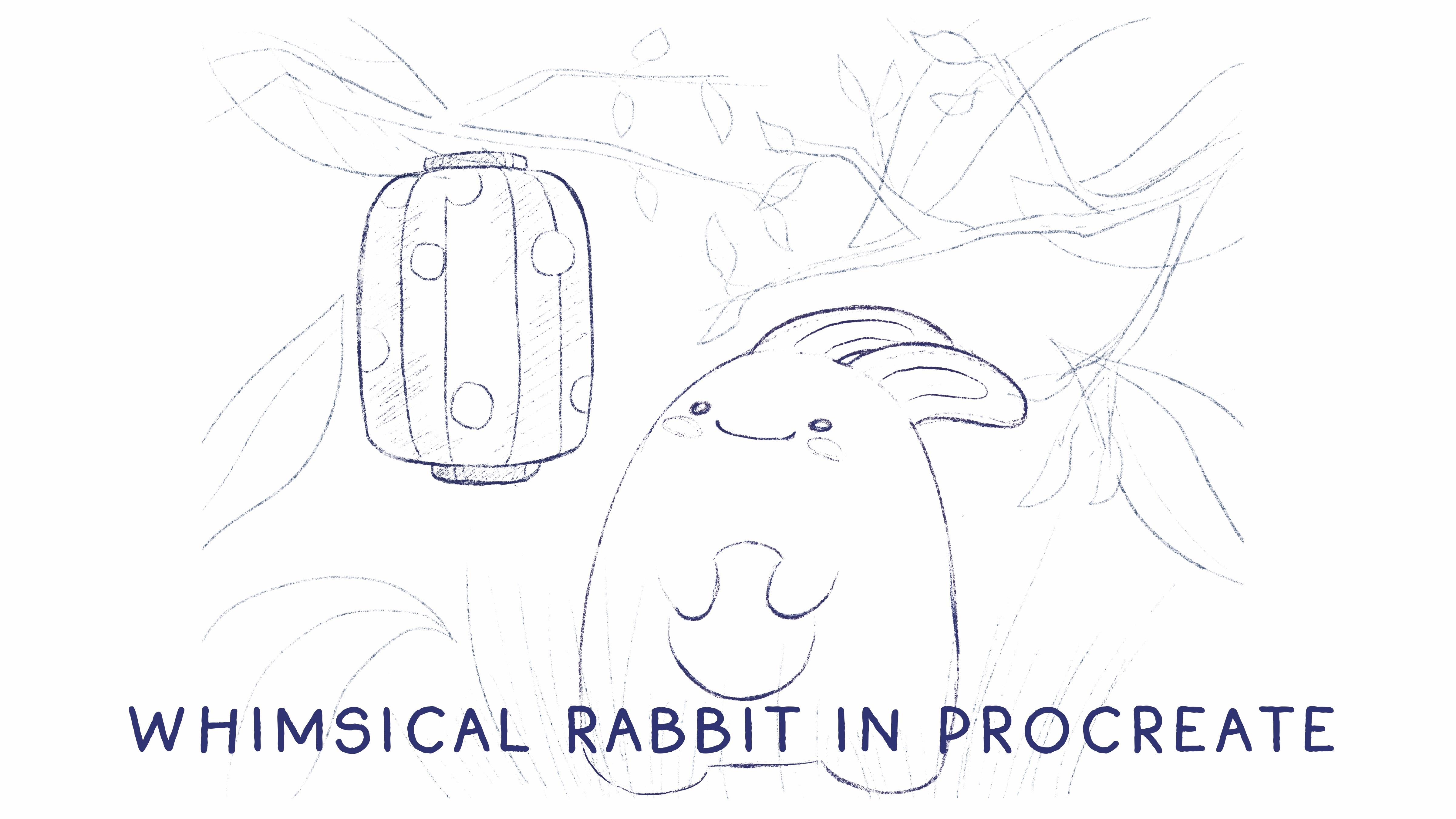
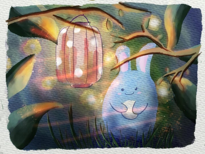
the paper layer, I will not be able to paint on it because of the locked layer. Now we are on sketch layer. That one, we have
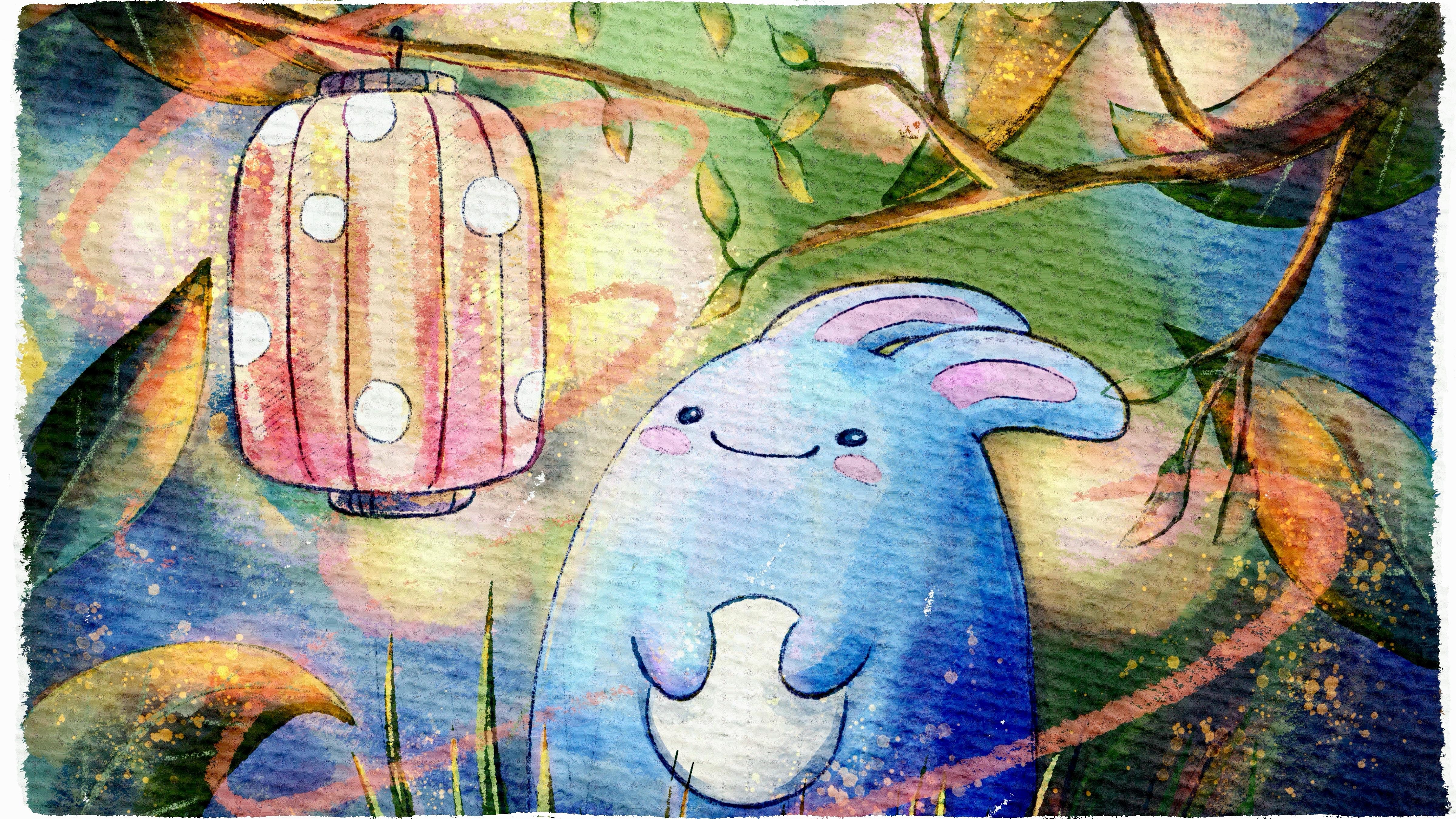
tiny rabbit who is looking at a
beautiful lantern, and we will add more details,
some wooden elements. But this part we will
finish a little bit later. So now let's just briefly
jump into next stage. And it's not about painting. We will talk about inspiration and actually where to
get the inspiration.
4. About Inspiration: Finally move to the
very important class where to find inspiration. What about reference
pictures and how to create art with
some magical wipes? Let's talk about it now. Please follow my
steps carefully, and if something is not clear, I'm here, always ready to help
you in discussion section. Now let's talk about our
source of inspiration. So this is pexels.com. As you see, I just
opened the website, and already we have so
many beautiful pictures. For example, this picture can be a good example that
really suits to our topic because today
we're going to paint lovely forest illustration with magical wipes and cute creature. You can paint this cute creature on the top of this
house, for example. Oh. We can add some butterflies.
It's very beautiful. Okay, this picture is cred too. Or, you can just write or,
like, magical atmosphere. It's also good. This
is so beautiful. I like this picture a lot. Oh, I like that one. Some
fantasy illustrations. I like this composition. It's beautiful. Let's see
what might work best for us. When I was preparing
for this class, I didn't use any
reference pictures. I just added some elements
little by little, step by step, and it
really helped me a lot. Oh, this is also
a lovely picture. So still but I think
we have too much of, you know, artificial
magical elements. So what about writing
some mysterious forest? Mm hmm. Look so much
better Ix this art. Oh, it's very similar to
what I'm going to draw. Let's just look at this picture. And I was thinking to
paint to add some of the tree branches,
like in this way. I like. Okay. So look at the
art that you might like. Maybe you want to
change the style, the settings. It's totally fine. Or you can just,
like, simply write forest and see which
picture will we have. Yeah, swim better.
I like this one. This composition is lovely, too. I'm gonna save those
illustrations. This is very, very beautiful. So if you're gonna have
not exactly the same one, but with similar wipes. Like to play with the light to create
this contrasty feeling. And here we're gonna grab some you see like
position of tree branches. Mm. For me, that's it. I don't need more. I
like the colors here. They're so soft. Okay, I can just
spend here hours, like, searching for
some inspiration. Okay, and second
inspiration will be rabbit. We need to see how
rabbits look like. Where's my rabbit? So cute. So we want it safe
picture, not safe, I will not save because my
rabbit is pretty simple. I just need to know
how to paint ears. So it will not be
that realistic. I think very similar to this illustration, very similar one. Okay, so that's where I got
my inspiration at pexels.com, and you can go and search for the pictures that
might inspire you. You don't need to follow
exactly my steps. Like I said, search for
maybe different settings. Maybe it's not forest, maybe it will be like, I
don't know, like, the seaside illustration
and whatever would help you to enjoy the
painting process. Okay. Now, let's do it. Let's jump into create
and sketch process.
5. Creating Sketch: Now time for sketches. We will explore some
fast and simple ways of creating sketch. So it won't take a lot of time. Feel free to follow my steps
or use your own sketches. Be creative. Okay, now let's jump into creating
lovely rabbit sketch. So here I show you the way how
I create the illustration. What are the steps
that I'm following. And as you see in the end, we're going to use the
last illustration. But I just want to show you
how the rabbit would look, what are the basic
shapes and how I actually create
rabbits step by step. So let's start.
When do you think? I'll just love or
sapacity like this. And also write sketch. So as you remember,
from the illustration, from the reference
pictures there like rabbits that are very
cute and soft and big. So in my perception,
it's like a ball. So B B pencil will be my brush. First step that I do, I need to paint a line, like first line. That's the middle
position of our rabbit. Then we have eyeline, belly line, and
then like paw line. After that, it's not
like an actual ball, but it's some kind of oval. So in this case, I'll
make it a little bit bigger from the sketch
that we already have. Then if you want, you can just as eraser, I'm using Burn incur. So if you see that
you have some of the parts that you
want to improve, you can erase it or go to
liquefy increase size till 50, 60%, and just smooth
some of the for lap. Like that. I think I want
to make it slightly bigger. Like an egg. It's very similar to shape
of egg. Like that. After that, we need
to define where we have eyes and belly
and hands and, like, poseia and ears. So I think I would make it
a little bit lower here. So the line's not
actually too straight. So let's remove previous line. And then in the middle, we're going to have belly. Happy rabbit. It's fine. We can just, like, paint on
another layer on top of that. So this one is just
like the base. If you want, you can keep all of the sketches from the beginning or you can just,
like, erase them. All your brush strokes
shouldn't be perfect. When you paint, of course, you might make some corrections or you might not paint
everything from the first time. That's also, pretty hard to do. And we're going to
paint two lovely hands, and you might paint legs, or you can just paint
something very simplar. You know that rabbits
have very long legs and very strong legs. So just make the shape
a little bit different. Mm hmm. Like sand. A rate sauce over lapans. That's a lovely rabbit. If you are happy
with everything, we can keep it this way. Let me exaggerate. So it looks like that. Additionally, we can create
one more layer above, switch to multiply
blending layer mode. If you want, you can
change the color. So you will see the
difference between the layers and then paint on top of the
previous sketch. Let me just lower the
opacity and turn off turn off our previous sketching
layer and just add more elements or prey
with the intensity of So, if you want to redraw it second time and don't use previous
sketches, it's also okay. Like, in this case, your sketch will look clean. I tend to keep all
of the sketches. I like the pencil
lines everywhere. Exactly. Mm hm. B. Ding ding ding. So and then I will just delete our previous
sketch. Successful. And additionally,
like I said, liquefy. You can still make the changes, make it smaller, bigger. I want to make it a little bit shorter and puffier in some areas and deepf
in other areas. Like it. Yeah. So now I think this
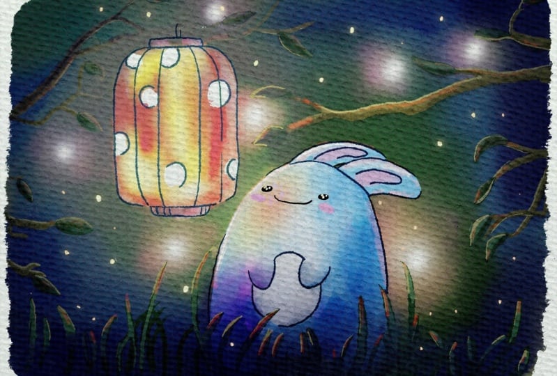
is very cute rabbit. And this is a sketch
that I created. You can change the position
like I told you here. You can paint it like that. It's trying to hug
you this rabbit. Like rabbit is looking
somewhere in the sky. It's actually the
last illustration, that's what we're
going to create. And as you see, I exaggerated
some of the lines, and made it more vibrant, and, yeah, I forgot about chicks. We also need to add chicks to our also, my another suggestion, this type of sketching
that I like, first of all, let's not
forget about blush. And second, I do like to
have those pencil strokes. Like, I like to add
it here and there, go beyond the lines, just make our illustration
more like children style like, it shouldn't be that perfect
and nitty like that. Also, we're gonna have
shadow in this area, too, maybe tiny belly button. Let's see where else. Maybe we need to show the area
where Rabbit is staining. Like, it's not floating in
the sky, something like that. We can just do
sketching this way, show a little bit of
the brush strokes. You know, it's about checks. You can just do it this way. And then if you are
happy with everything, you can duplicate it, and by duplicating it twice, we're going to have
more vibrant sketch, and I think it's good. So this is our lovely rabbit. Let's jump in the next
part, and we will little by little create and finalize our composition for
the final project.
6. Final Project Sketch: Okay, now let's finalize
our final project. So I decided to grab our last rabbit for
this illustration, and also I painted
some kind of lantern. And let me create one more
above just in case if you need to make some
corrections, right sketch. So here we will need to actually
create the composition. And why I did it on a
separate layer because we're going to keep this sketch when
we create an illustration. But that one is more
like schematical one. So we need to see
where we're going to add our elements
on the picture, but most likely we're going to use just watercolor
brushes for that. We don't need to use pencils for those elements because our
today's class is special. We're going to make
our illustration very realistic and true to life. And I will add a lot of
shades and highlights, so it will be like more like three D art
but in watercolor style. So here we will have a cross. Different thickness
of the grass, some leaves, like that. Okay, and after that, I
was thinking we might add some kind of leaves
here and there, like that. For example, we're going
to have leaf here. And then what if we
add leaf in this area? Maybe thicker. Lax it. And I'm trying to make my leaves different so I will look at
different direction. Like maybe from this side. Hm. L. So in this case, this leaf will be thicker. I kept doing changes
so many times. Then you can use a
liquefied tool and adjust some of the
angles for the leafs. Okay, let's keep it this way. Schematically again. And now I want to add some
tree branches. So we need to see that actually, our enter is hanging on a tree, on a tree branch, not just, like, floating in air again. Let's do it on a new layer in case if I want to
make some changes. So layer for the tree branches. Something like
that. In this case. I always had problems
with tree branches. They look too sharp when
I paint them always. Maybe rabbit will be bigger. So I want to place
rabbit right in the center of our composition. So then lantern will go up, but will go a little
bit down. Cool. Now second step. We're gonna paint three
branches from another. Now this part, I'm
going to cover, so it will not
interfere with flower. Okay, let it be like this way. Okay, so approximately, the
sketch will be like that. So as you see here, we have three layers of sketches.
Let's write it. Sketch three, where we
have the tree branches, sketch two, where we have leaves and grass and sketch one. This is our main
sketch where we have our main elements,
main characters. We can paint our
lovely cute rabbit and this beautiful lantern. Then we have prepared
our final project, and now I think it's time
to start adding colors. And
7. Adding Colors: Now we are ready to jump
into painting process. Use the brushes that I
provided Evans Freebies, all native procreatos,
all your own brushes. Don't forget to paint on a layer set up under
the texture paper. We will have very special
painting technique today. So let's not wait and
go to our illustration, and I will show you
everything right now. So let's jump into painting process and already
rename some of the layers. I create a background
layer as our first layer, and then paint here
where we're going to add some shades and
rabbit and lantern, and then we're going
to have shade, cheese, we don't need
paint here layer. And our sketches are
here on the top. We can just group
them and write sketch in order not to paint on our sketch layers.
So background. Then let's go with green color. And grab boo running in your
big brush, even bigger. So we need to have these
scratch edge lines. If you press harder,
you will have more live. Ding ding, ding ding. I zoomed out the sketch a little bit because,
like I said, we will have some
like the edges, we will not touch
with ding ding, ding, ding, ding,
ding, ding ding. Of course, you can just paint an outline and then
dragon drops a color, but I tend to paint
everything with brush. Maybe leave such
tiny white spots for the more natural
effect. You see? Like, I have some empty,
like, white gaps. I think they add more realistic feeling to our
art because in watercolor, we might have some
white gaps like that. If you are happy
with everything, let's just duplicate
background layer, go to the lower layer, hue saturation and brightness
and merge together. Then we're going to
have some shades here. So I'll just press
clipping mask and move to multiply blend layer mode. Here, my suggestion go with bo artistic brush and grab
slightly darker shades. So what we need to do
is just to show some of the color balance,
this balance. So from this side. So thanks to clipping
mask blending layer mode, we will not go beyond the lines. You see? Some more bluish shade. This brush is very
precious sensitive. I like that. We're gonna
have bluish color here. If you don't want, you can keep it as a normal
blending layer mode. So in this case, the colors
will be more vibrant. I think that's what we need. Even purpler shade
here and there. Green color, maybe slightly brighter because we're going
to have lantern around. So then we will go with both soft diffuser brush as a blender and just
blend the sharpens. Additional other way
what you can do, if you want to have this
beautiful blending effect, you will need to go to gahenblur
and blur a tiny bit to, like, 24, 20 or 15%. So in this case, the blending will be very natural and soft. I'm going to use
Goshen blur. Why not? And then if you want, you
can go to curves and also play with colors intensity and see what might
work best for you. Made it a little
bit more saturated, to see if that's what
we had and what we will have right
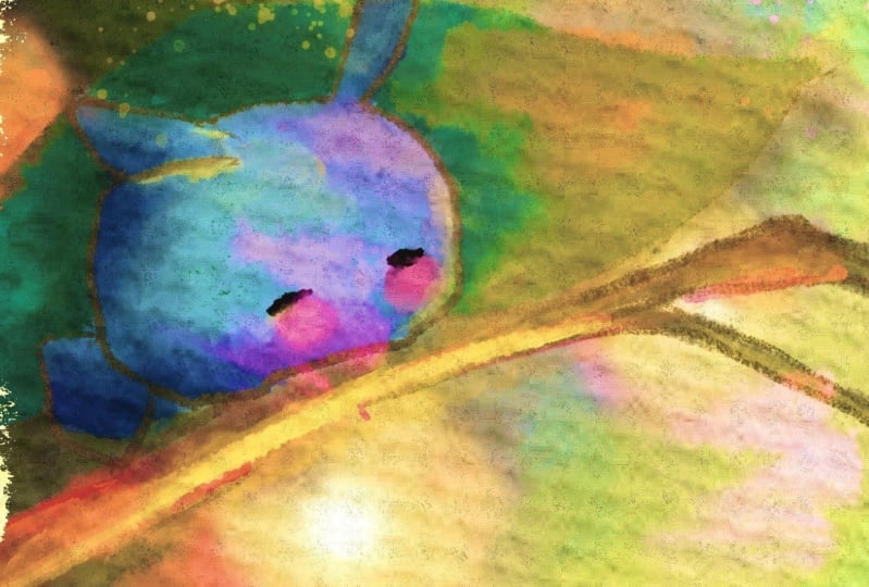
now. Okay, perfect. Now let's go to rabbit and
Lantern. Another layer. It's a normal
blending layer mode. I will go with blue color. Again, you can go
with board itick, but I would like to use
bow hard edge brush. Think this brush is very nice. Bu dark watercolor edges
is also very good option. Just see what works
best for you. So this painting out today's
class is very special because we will have,
so many details. So it's, like, very
time consuming task. But it will help you to create like three D
dimensional painting, like, very realistic,
but at the same time, keep this natural
watercolor look. Now let's erase. As an eraser, I will use Buran inker
because I want to have very sharp edge lines. As you see here, I
have tiny gap that I didn't cover layer with color. I just use liquefied tool, move to 25% around this and I'll just move parts where I went beyond the
lines to the edges. Because we're going
to keep this sketch, so everything should
look very tidy. At least I like to
make it look tidy. Again, it's all
your preferences. You can keep the outline, you can turn off outline. It's up to Mm hmm. Now lantern, where
is my beige color. Tinting dt, dt dt. Here, try not to lift your
Apple pencil from the screen, so you will see the
background color coming through the
brush strokes. Second here like that. And now belly belly. I almost forgot
about about belly. You can grab white color. So it's some type of
relaxing painting where you just enjoy painting process and just
take your time to colour. And my suggestion, let's remove the transparency because you see that the green
background color is coming through the
color of our rabbit, and we need to get rid of the transparency in
order to keep this, like, beautiful, natural
blue look of our rabbit. Let's increase the opacity
of the second layer. So a duplicated rabbit and
lantern layer one time, and then we go to huge
attion brightness and move the brightness
all the way up to 100%. Then it duplicated this layer
two times and two times. So as you see now, background color doesn't
affect our rabbit and lantern. Okay, next step, let's just add. It's not the end obviously, but I just want to color
all our beautiful elements. And I think let's add
colors to leaves. We actually can
write like leaves. Don't worry. It will
not be the same color. Let's go with dark water color
edges prior to this time. If you want to go beyond the edges of the
background layer, you can just create a new layer and set it as a clipping mask. So now everything if you paint, you won't go beyond the lines. Duck. If you want, you can also remove
the transparency, citrian brightness, and
then merge leaves together. Next, let's go to She's layer, and I want to paint a
grass this green color. And let me find the brush. Bow rauny in your beak. You see this brush is
very pointy at the end. So it's really a
good choice if you want to create some leaves. But you need to go
all the way up. Okay, now we need to remove this part that goes
beyond the lines of our background color because I want to be in
front of the rabbit, I cannot use clipping mask mode. So I selected the area that
went beyond the edges of the background color and then three fingers
down and press cut. Then that's it. Okay, another suggestion,
I think I want to make it a little bit lighter. To my mind is too
Okay, done with crass. If you want, we can
just write cross. Then we're going to
have tribs branches. Still let's add colors
to this part, too. And for that, we'll go
this brownie shade. Let's have the same
running ink brush. Or other options that you
can use is artistic brush, which is also good choice, but this one is very
opaque, and I like that. Mm. Again, play with curves. I want to desaturate
it a little bit. Make it not that bright. I think we're gonna have
a lot of bright elements, like, a little bit later. Okay. Then we also have
those lovely leaves, and also I will paint them on a new layer because I will need to change the
different blending layer mode. So we're going to
have some changes, and I will use another brush for that artistic brush too big. Because the leaves
are hard to control. So we won't add too
many details here. Okay, done with this part,
and I think that's it. That's it for adding for
coloring all main elements. Now let's jump into second part where we're gonna add
more and more shades.
8. Adding Shades: It's time to move to add and
Shay and highlights part, and we will use so many
blending layer modes. In this part, we will spend more time and paint
way more details. Let's not hesitate. Okay, second step. But before we do
the second step, let me just move our lovely
rabbit to the front, this cross. Like that. Let me show you what I will do. I just want to set everything
as a clipping mask. So in this case, we will be painting a layer, but in the same time, it will not affect our rabbit. The rabbit will be
on a separate layer. Okay. Perfect. Next step
that we're going to do yes. But actually, I'm thinking, I want to add our rabbit to this clipping mask,
too. Hand grass. So everything will be
in clipping mask mode. I think it would be
easier this way. Okay, so let's
duplicate shade layer because it's where are we going to add a lot
of shades right now? First, we need to add shade
to our lovely rabbit. And here, my
suggestion let's use Bonatural stains brush
as shader brush. Next. Wine, why? It's not clipping
mask. Clipping mask. Everything clip okay. You can play with
blending layer modes. Mm. Colorbond is so nice. Multiply is good, too. Luminosity is good and multiply. They're pretty similar. So I'm
gonna stick with multiply. And then you can
grab artistic brush. Okay, and about grass, my suggestion
duplicates the layer. One will be normal. Second, it can be screen, and you can lower
the pasit tiny bid. Duplicate shade layer. Okay, we created a
little bit some kind of shade under the rabbit area. Just blend it more.
Okay, perfect. Next step that
we're going to do, let's just add some highlights. And let's place it under the rabbit and lantern
layer and write highlight. Light. Duplicated
a couple of times. First layer, let's go with this yellow color and
grab water drops brush. Likes it? This is so
simple. Let's see. I want to put it behind of
the trees and leaves too. So it's basically like
almost the first layer. Okay, cool. While will be here. Then we'll duplicate it. And with the second color, I want to change the
color to reddish one, something like that,
more saturated. Maybe a little bit more vibrant. So you see, we have a yellow and pretty bright,
reddish shade. Then about the reddish shade, I will just smve it like that
to show some kind of shade. And now we can see whether we want to change
Blendilaar mode. Mm, this is pin light so nice. Okay, pin light is good for you. And another thing
also additionally, you can go to Caution Blur and blow a tiny bit.
This is one option. Another one, you can just lower the opacity and make
it not that saturated. So it's up to you. And we need one more highlight
layer. Let's clear it. And here we need to go to white color, purely white color. Still stay blue water drops, and we need to paint
like a white heart of our beautiful like highlights. And then here my suggestion, go to coach and blur a tiny bit, like tum and change blended
layer mode, obviously. Blend it more. Okay, after that. Let's keep adding some elements, for example, to our lantern. Let's stick to the
rabbit and lantern, and here we need to
press Alpha lock. So now, when we
paint on the layer, we won't go beyond the lines. We will go with Burn inker
and just a white color. So when we use Alpha lock, you see what's good, you
don't go beyond the lines. You just paint within the
frame of your painting. Ding didn't ding Okay, done with this part. Now, what about chicks? Did ding ding ding, ding, dT. Then we turn off Alpha lock. And next, let's just add color shades and
highlights to the leaves. I'll create one volar
above, multiply, and I don't know what it'll
be the next second one. Maybe soft light. Leaves, sheets sheets
and leaves. Let's in. So now we are on
leaf shades layer. Let's go with this dark green
color and wartistic brush. I made the lights a
little bit bigger, how I did it by selecting all of the
three highlights layer, and then I just grab
selection tool. I selected each of the light and I made
them bigger or smaller. We're going to have
a leaf shades. I will grab artistic brush, grab this greenish shade and oo. Here's the problem that I have. Then what is it here? So it's a source of
light in a center. So are you gonna have but here is the source of
the light will be from opposite side cut because the light is coming through
the center like I said, so this area will be in shadow. Erase part that went beyond the edges of the leaf like that. Okay, now let's go with a
little bit brighter color. Leaves highlight. We are on this part on this
layer, same brush. Let's set highlights. Like it shouldn't be everywhere. Obviously, you can keep
the original color. And my suggestion, grab a full natural stains
brush and blender. We are on leaves shades and
I just want to blend it. Make the shade a little
bit more natural. So the I will soften the edge lines because I
think it would look better. Like that. Now about
the highlights. Soft light is too soft. But what if we do this way? I'll duplicate it. You see, by duplicating and it became
a little bit brighter, and then I will go to
histration brightness, and I want to make the color
a little bit more vibe. And then we'll grab
soft diffuser, and we'll just blend the most sharpest edge
lines tin Tintin. Okay. I think it looks nice. Leaves shades. Let's go to curse and also play with the
intensity of the color. And I lover the softness
of shade a little bit. Okay, I'm on linear light. I lover the opacity. Now, next up, I want to add some highlights and
shades to the grass, too. So let's go to the layer
with grass, this one. We're going to duplicate it, right highlights
grass, like grass, highlights, and then grass
rice grass grass grass. Shades. Okay, so let's go with shades first,
grab darker color. Bow in your brush in this case, because grass is so, so small. And we'll just go
maybe even darker. Okay, great. Now what
we're gonna do is let's go with green shade and go to
highlights. Okay, soft light. Max. Okay. Then let's go with
artistic brush and grab this peachy color. I'll do it on you layer, too. Highlights from the
light. Like that. Also, we're going to
have some light here. Don't worry. It's
not that harsh. We're gonna adjust.
So in this case, we're going to have
light on nearly everywhere on our
lovely rabbit too. Let's make it softer on ears. So there will be light from the lantern and from the
lights at the background. Okay perfect light here. Of course, that's
our main source of light and also at the branches. So that's our main highlight. Okay, now we can play and see what blending layer
mode we would like more. Let's stay with hard light, Goshen blur, and let's
just show the glow. Like I said, I think glow
would look very nice. Just a little bit to, like, 15%. And you barely can see
it, but it's still there. So we've done with adding
some shades to our art. You see it looks so
lovely, so puffy, am. And now let's keep adding more shades in next
part of the class.
9. Adding More Shades & Highlights: Well, next step, like I said, let's keep adding more shades
and more highlights to our art and add more color
variations, I think. Okay, we still need to add
some colors to the lantern, and I think let's
start with this one. So more shades in
clipping mask mode. Okay, let's add colors. Yeah, this color. And
then artistic brush. I like it like artistic
scratch lines. So I'm gonna stick to this. And what about the yellow color? I want to add some yellow
color variations and erase parts where we
have a white dots. Let me think. Okay,
keep it this way. I don't want to change anything. Maybe some shade in this area. And some reddish color. So if you want to
make it movie brand, you have two options. First, go to saturation and
brightness or go to curves or go to blending layer mode and see what style might
work best for you. Multiply is nice. I think I will
stick with multiply in blending layer mode. Okay, now let's add shades
to the tree branches. We totally forgot about it. Okay, let's find branches here. Okay, let's go to branches
and write shades. Banes. Not benches, branches. Shade. Ding ding ding, multiply,
slightly darker shade. Which colour to use. Let's stick to this one.
I'm fine with that. Okay. And about leaves, I'll add some shades to leaves. And then natural stains
brush and blender, then blend the sharpness. Same what we do with highlights. Make it a little bit softer, but at the same time, still
keep the shade. Okay. Little by little, we kept adding shades and
it looks very nice. Next step, slightly darker. And then I want to go
to Burani inker brush. It's too dark. And we're going to do the same
with is we need to show that they're not
just floating in air. They're like,
connected to the tree. So it's a little bit
time consuming process, like I told at the
beginning of a class, but it should be done. Mm hmm. Here we can
blend some parts. Okay. Now we need to draw a line here, like runny inger Like also that the lantern is
not floating in the air. I still want to add tiny bit
of shades to the leaves. Let's crab olive color. More shades. Now we can lower the sketches of the branches a little bit
more and say these leaves. Like I said, we didn't really need them in our illustration. And what about ears? I think we can add Runny incur this pink color of the ears. Like said. By, so we, we forgot
to add shade to our rabbit. That's
super important. I'm gonna stay on shade layer. Let's go with but transparent
watercolor brush. Super soft gives very
soft, very gentle shading. So I think it should be fine. When you press
harder, you will have more, more concentrated shade. So it's perfect
for shading lexis. Tuck belly in a shade
in this part too. Tiny bit. Blend, blend, blend, so the lines will be
sopped. It ding ding. If you want to
exaggerate the shade, you know what to
do. Selection tool. Then select this area, feather, 50%, and then
curves meters curves. You want to make a tiny
bit darker, like that. And if you have
some sharp lines, just blend them like these edge lines and make
them a little bit soften, softens them a little bit. Likes it. Okay, I think, in this case, the rabbit look a little bit more vibrant, more dimensional. Okay, when we've
done with this part, if you are happy
with everything, let's go to the shades layer duplicated a couple of times. We also can use it as a
clipping mask, clipping mask. I'll put the shade here
above everything, almost. And in this case, let's go to multiply. But later we're going to choose another shade and go
with purple color. And now about the brush,
you have a few options. You can use Bonatral
stains, brush and blender. You can use Bartistic but
water drop, Bani in gear, I will stick to B artistic
brush because like I said, I like the sharp, edgy
lines, contrasty wipes. See it's so good to make it like a circular way of painting like you paint
and circle around. Something like that. You can even add some
colour to the rabbit. Okay, if you're happy
with what we have now, we can play with
blending layer molds. Later, we're gonna
play with a pasity too, so don't worry. A this part color
dodge is so cool. Look at this brightness. It gives you such
amazing wipe. I like it. I'm gonna I want to keep it, but we need to make this
light a little bit darker. Wow. Ed is also so cool. Ah, so hard to decide. Okay, overlay is nice, too, so it's actually the layer
that I'm going to use. Gene if you want, or you can keep it in more
shades with this brush. Or you can lower the intensity can We can add some shades, more shades to the rabbit, tiny bit of shades to
our lovely lantern. So this brush is super cool. But what is lacking to my mind, we need to have more highlights. I think it's a
little bit too dark. Remember, we're gonna
have colored dodge, which is also super impressive, but this colour dodge
gives you highlights. If you want to have
blueish wipes, stick with this dark blue color, or you can go to purple shade, and you see you'll
have purple shades. I'm going to mix
those two colors together because rabbit is blue, obviously, but we also
have some reflection, and red and blue would give you this pretty bright
pink wipe like that. We also have pink shades here. Let's create. And I want
to add some brightness. What about reddish color? So now, that's where we're
going to add a lot of shades, a lot of highlights,
Nazi shades. Belly. Okay. Okay, keep it this way. I'm happy with the results, but I still want to
add more highlights, and I'm going to
use another layer. So still we need
shades because we're going to add final
touches and stemps. On the top, I'm going
to use a hard light. Dan tan tan, you can use this pretty bright
yellow color or make a little bit to orange
wipe, Burani incairbush. Maybe too orange. I don't want to have a lot of orange shades because
we already have so much orange like reflections. So we have, like, very
magical illustration. Later, I'm going
to add more. Fine. Don't worry. I will lower the intensity of
the color later, so it wouldn't it would
not be sad, bright. As you see, this style
that I'm using today is different from the
one that I usually use. This one is more detailed. We spend more time
on different layers. My suggestion sometimes
when we have, like, inspiration, we have time, we definitely should
paint something like that because this is an art where you
spend a lot of time, definitely you should
be proud of yourself. Like accomplishing such task
is not an easy task, too. So we're going to have
some reflections here. Wow, it gives very special
feeling, like, very delicate. So if you want to
make your shades a little bit less saturated,
you have options. You can go with overlay too. You see the feeling that
it creates also very nice. Let's add a little bit
of sparkles around. Now you might hear some rain at the background.
So sorry for that. But let's create this SMR
atmosphere and keep painting. So I will talk less. Let's go with his overlay. And he required some slackers. At that's too much cut. I think it looks great, but I'm thinking
about the colors. Let's make it a little
bit darker, like that. So you see thanks
to the splatters, we have this beautiful magical
feeling from our light. And I think the last step is, let's add stem brushes. Mm. Ding ding ding. Dark sheets, multiply. I would like to put this shade actually underneath
of everything. Okay, here. Couple of shades. Let's go with Blue watercolor
samp nine, blue color. And now I want to use it somewhere here. Looks great. Another shade. Let's go
with dark green color. We need to show shade
from the arches. Now, here like And now we're gonna create We're gonna place a shade
above of everything. Like said, what about
some highlights? Highlights here again. Wow. And the last
last tiny part, we're going to add some details.
10. Adding Final Details: It's almost the
end of the class. Now it's time for
the final details. We will add tiny details
to our paintings. Well, the details, I created one layer above of everything, but below the sketches. I go to multiply
blending layer mode, and I will go with Blue
runny inker brush. But the color I grab
this bluish color. Oh, we control the size. Maybe too sharp. Bluish color. It's already pretty good. I'll paint eyes. The rabbit is looking at this
beautiful, magical lantern. We created this lovely, magical atmosphere with the
surroundings of the forest. We have a lot of sparkles. You don't need to underline,
like, everything. Just areas where you feel
you need to add some color, 'cause it's better to have different thickness
of the brush strokes. Here, definitely we would
need to add some details. We can keep adding as many
tiny details as we want. I switch the color to purple one because I think it would
match with the lantern. So let's enjoy rainy atmosphere. Let's see. Okay,
what I wanted to do, I will grab greenish shade. I will go to shades layer where we have normal
blending layer mode. That's what I needed.
Use BHB pencil, increase the size, and I want
to add some pencil strokes. I didn't use runny incur
because it's too opaque, and I want to have
the pencil lines. So as you see, I added
some type of texture. Makes the illustration a
little bit more dynamic. You also can underline some parts and can
grab darker shade. And on the contrary, you can just make some
elements more contrasty. Pencil is perfect and
goes with everything. You can see it
yourself. So nice. Okay, where else? We need to
add some shades, maybe here? An guys, this is our
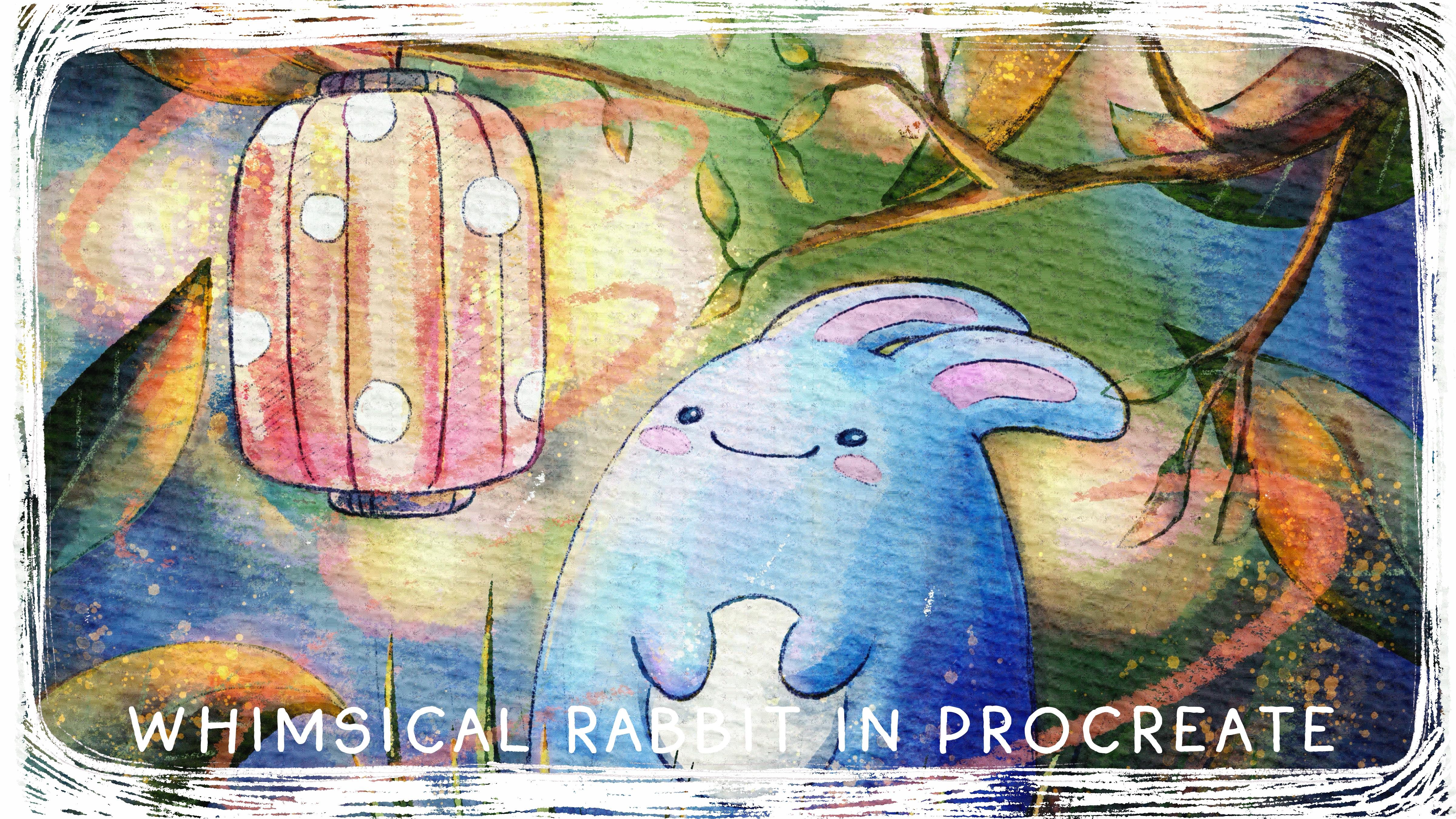
lovely illustration of magical forest and it
rabbit in this forest. I hope you enjoyed
this tutorial, this small class,
maybe not too small, but you learned some new
ways of painting, like, three D objects in
watercolor style, and you got some inspiration. Congratulations. This is
the end of A today's class, and now you definitely
should be proud of yourself. You learn some useful things and create a beautiful painting. And in the future,
you can create more. So what we have learned
and why we did it. So now you know
more about procret, about sketching
techniques that I use, how to create watercolor
paper texture, and how to use different
watercolor painting techniques. Also how to apply those
techniques in procreate. But most important, how to use
layers and blending modes, also how to add volume and
color variations to your art, and how to create mysterious
illustration of forest with cute rabid in procreate using
digital watercolor brushes. Why this class was useful Hmm. Now you can experiment
with your own style. You gain some inspiration
and creative ideas. What's more important,
we can create digital art that is so similar to traditional
watercolor medium. And I think this is great. Guys, I will be happy to see all your artworks in
project section and, of course, give my own feedback. Also, I would really appreciate your opinion about this class. You can do it in review section. And what's next? In my future class, we will keep exploring
water color and keep adding magical
atmosphere to our art. So florals will be
our next project. So let's see as in next class. Bye bye.
 Inga Yoon, Digital illustrator and teacher