Transcripts
1. Intro to Desert Serenity Watercolour Cacti composition in Procreate: Welcome to class today. We're
going to dive into creating a vibrant and textural
project where we'll be exploring how to create a unique watercolor
cactus composition, drawing inspiration
from real succulents and artistic reference online, including some Pintres
gems that I scouted. There are so many breathtaking
examples out there to pull ideas from in
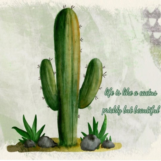
preparing for this class, I found one particular design that really spurred the
direction of my own work. Now, I'll be the first to admit mine didn't come out
looking exactly the same, and that's the beauty of it, but I definitely incorporated
elements that inspired me. What I love the most
about this type of project is the
creative variety. Whether it's playing with the
different forms of cacti, adding beautiful
little flowers as accents or experimenting
with composition ideas, the options are endless to
make this completely your own. While I chose for
this particular demo not to add flowers, feel free to experiment
with them on your version. Additionally, I'll show
you how to incorporate unique textural effects like
salt texture and blooms, as well as how I layer
in blend colors to give depth and realism
to each of the cacti. To make the process go
as smoothly as possible, I've refined my
watercolor set and included in this class only the brushes I
think you'll need, all versatile, but
really approachable. You can focus on the
creative part rather than feeling overwhelmed
with too many tools. If digital watercolor is
new to you, don't worry. With these layers, we
can make adjustments, we can rework areas and create amazing compositions that
will showcase your vision. It might take a few tries, but
I think you can get there. Throughout the
course, I'll walk you through how I build
up the shapes, how I add shading for
depth and dimension, and position each cacti to
create a cohesive design. But remember, your
personal flare and experimentation
with color and technique is what's going to transform this into something
that's uniquely yours. Stepping into digital
art allows you to have that undo button and
maximum flexibility. But the principles we'll cover also mimic traditional
watercolor methods. You learning skills you can
apply across several mediums. By the end of the class,
not only will you have a stunning watercolor
cactus composition, but you'll feel more
confidence in blending colors in using textures and working with digital
watercolor techniques. Grab your brushes, follow along, and let's get started.
2. Lesson 1 Design lnspiration and Artistic Direction: Welcome to Lesson one.
In this first step, we're laying the creative
groundwork for your project. I'm going to walk you through
a bunch of examples on Pintrs to start you thinking
about layout ideas. You'll also start
thinking about how to bring your own personal
style into this piece. Don't worry, the
piece will develop as we go through
all the lessons, but by the end of this lesson, you'll be ready to
dive into the hands on process with your artistic
vision fully formed. I'm bringing you a shot of
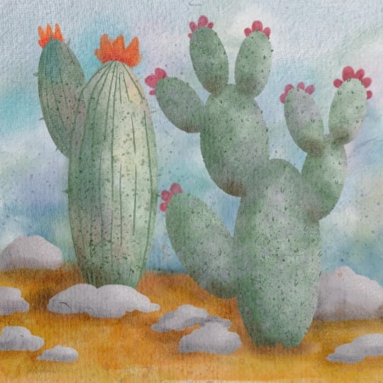
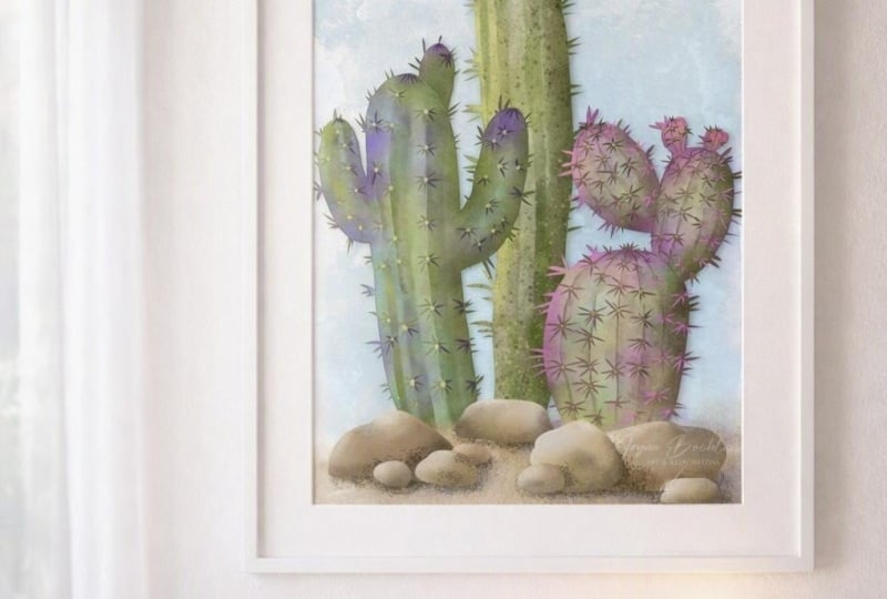
Pintrs to help you get a little inspired for creating a watercolor cactus composition. There are a lot to choose from, but I zeroed in on this one. I can't say that mine turned
out exactly the same, but I definitely use some of
the inspiration from this. You'll see eventually
how I create these little spikes on
one of the cactuses. I loved that there were so many different
variations of the cactus that I could see here as far as positioning and adding
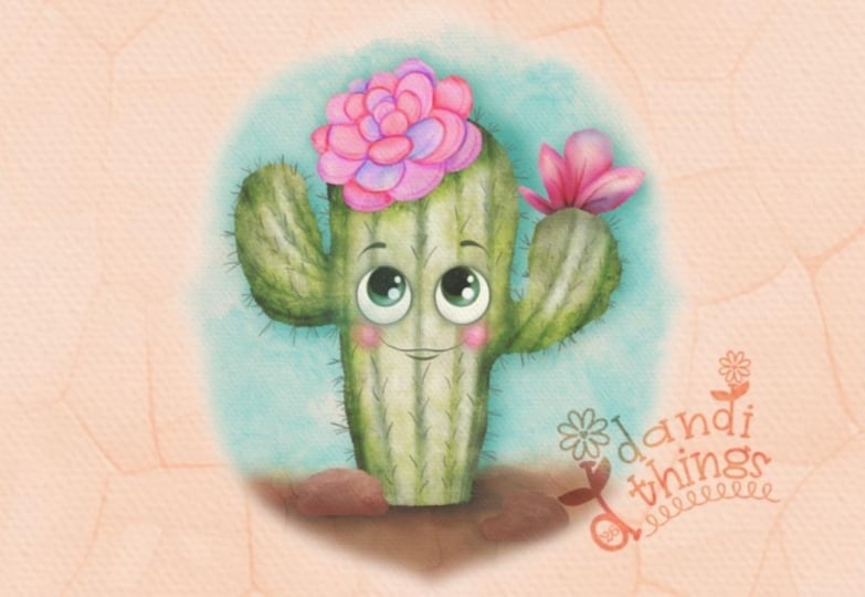
additional parts. Like, these flowers
are gorgeous. I did not add a
flower this time, but that's something I could
definitely go back and do. I might even experiment
and do a few of these. In general, a lot of them are just a pretty straightforward watercolor painting technique, and I have isolated a few brushes that
seem to work for me. So I've included with the class a few brushes so that you're not
overwhelmed by the choice. I do have a big watercolor set that has, like, 60 brushes. Almost too overwhelming if you get to using
it because there are so many that are very close to each other as far
as what the technique does, but just have really
minor differences, which is something I needed at the time when I
was creating the set. But now I've kind of perfected my watercolor
technique with a lot of practice and use of the set. And so I thought
it would be just a lot easier for you if I went to a very small amount of brushes for you
to get used to. You're going to be
able to pull off the exact technique that I did because you'll be able to use the exact same brushes as you're working
your way through. So lots and lots of
different options. But I wanted to just kind of get a soft really textural
watercolor look to mine. I did a lot of
sort of mixing and matching and blending of colors. Even this sort of technique here that you see in
one of the petals of this succulent is similar
to what I try to create. I even got in some of that
little bit of salt texture. Maybe if I put that
in the search here, I can find you an example of
what the salt actually does. This is to explain to you
how the salt texture works. You add salt when the
paint is still wet, and then you tend to get
this strange reaction of the pigment and paint
and the water to the salt. And I really like that, especially if it's
used sparingly. So I don't use it too much, but you can see a few
different techniques that can be created. One of them is by using alcohol. There's a technique that
people call the gin technique. This is sandpaper, perhaps. This is actually lifting off color by using straight
water on your brush, and you can lift off the color to create this sort of a look. I do use a little bit of
white when I'm working. You'll see me do that, I'm
sure, within this class. In general, what we're going
to be doing is filling the stencils that I create
a brush set that I have. I've got a new
succulent brush set that has a ton of
different cactus shapes. I'm going to be showing
you that as we work on, and I'll give you a few
of them to play with. But the cactus itself will be the placeholder
for the watercolor. So you'll be able to
stamp on the shapes that you want and then go in
and individually paint them. Here's a nice example. I could
have given you this shape. I didn't, but you could work
with a preexisting shape, which just kind of helps
you to get started. It saves you a little bit
of time at the beginning. By all means, if you're
comfortable with a quick draw, these are not difficult shapes. You can just draw basically upturned
teardrop shape and erase the bottom and you've got a
beautiful succulent. I am doing a lot of working up my shades and my dimension
as I work my way through. So when I paint the
cactus initially, I don't necessarily hit the nail on the
head as far as how dark some areas need to be or how light some
areas need to be. I want to encourage
you to be patient with yourself as you're
doing this lucky thing about working with
digital watercolor is that you can continue to add and subtract things because you'll have all of the
parts in separate layers. I did three different
cacti shapes, and then I painted in
a lot of the detail. I'll just give you a quick
look at it here in Photoshop. You can see what I've done. It's a quick version of some of the examples
that I've shown you. I'll be explaining everything as I do it so that you can see, and you'll be surprised
at how simply a lot of these little extra
accents can be done and added to quickly change your cactus into
something very unique. All three cactuses were basically painted with
the same technique. As you can see, all of them had these green spikes
to start out with, but I added different details on each one in order to
create that final look. Let's meet and Procreate and get started on that first
bit of our design. And U
3. Lesson 2 lnitial Stamped Shapes with Fill in Watercolour : Hey there. Welcome
to Lesson two. We're going to start
building the core of your composition by stamping and positioning
the cactus shapes. I'm going to show you how to import a reference photo two. We won't copy this piece, but I can point out
techniques this way. Using custom succulent
stamp brushes, you'll learn how to
arrange these shapes into a design that feels
balanced and cohesive. I'll show you some
tips for resizing and grouping elements and creating
a solid base to build on, all while keeping things as
simple and fun as possible. The continue to
inspire you here, I want to also show you time lapse of me
creating this project. Now, I had stamped those
two cacti on here. Eventually, I got another one. You can see I'm experimenting as I go along with
different colors, different finishes
and techniques. Here I was trying to figure out what I could do to the bottom. I had toyed with the idea
of putting it in a vase, but instead chose to add some soil at the bottom and a few rock and you can see that. The more and more I
work on this is the more I am adding
additional shading. I'm experimenting with
different finishing techniques on the individual cacti and having some fun with these little
accents that I'm adding. Again, you see me going back, adding more shading, adding a few little flowers on
this particular one. And overall, I'm building up a lot of interest in texture. Now, you saw that where
I repositioned and resize that plant and added
a bunch of shading to it. I used duplicates
of these plants, filled them with just
a deeper teal and then use that to also give that impression of depth
with my illustration. On the title slide, I use this
a little bit differently, and that's achievable because I have left
everything in layers. I've got each cactus
labeled and individual. This was really
great when I went into Photoshop to
make my title slide. I was able to move
things around. I even changed the
coloration of some of these on the title slide
when I was in Photoshop. I've organized my layers
really well so that I can hide whole backgrounds or all of my filler
elements here. If we're to look
at the sky here, all I did was import a big
watercolor blob that I had. I painted these years and
years ago and scanned them in and have used them
for so many projects. I'm going to give you a
couple of those because you'll see that
they're really great. They were scanned at a high resolution and
also at a large size. I did enlarge them a little bit just to get a little bit
more of that grain in there, but that worked super well to create a really
interesting vignette. I also added a paper
texture over everything. At the end, every single
one of the items that was in my composition was
textured in the same way. You'll see that thing, even
though some of the brushes had texture and I did add
some of that salt texture, you can see that salt
texture in areas like this. Over that one paper texture, I think, really
made a difference. Let me just turn it
off for you to see. To me, this looks okay, but it just doesn't have that same real watercolor feeling until I add the paper, and then I have used
the linear burn as I always do and reduced it down
a little bit in opacity. That's the basic breakdown
of how I constructed this. I want to do a completely
different one to show you did have another one
that I was working on, I had done a completely
different look with this might do a class on this
one completely separately. This was a mixed media finish, maybe more like a gouache paint. I want to add a completely
new document here. I'm going to make it ten by ten again and
I'm going to start fresh just so that you get the feeling for each
individual thing that I did. For this lesson,
all I want to do is drop in the shapes
that I'm going to use and I told you about this succulent brush
set that I created. I was in Florida creating
these succulents because we saw so many succulents
when we were traveling. I took many pictures of do love drawing inspiration
from real life and we were lucky to get
in on the season just before they started
to flower and then we saw the flowering
on a bunch of them. A lot of the reference that I use when I'm doing something
like this is looking back at those
original photographs just to get a
different sense of it. It's different than looking at the already illustrated ones
on Pinterest and the like. It's different because you
are using your brain to interpret the look and change it so that you have
more unique artwork. Being said in a case like this, this a design that
we're doing is going to become very unique because of the finish that you're
going to put on it. I doubt that if I assign this to a class of 30 students
in high school, that there would be any two that even looked close
to being similar. Let's get started by first stamping on the
brushes that I want. This one, as you can
see, I've already enlarged in my properties
panels because I wanted to get big enough to fit the space a
little bit better. I think I go larger. This is one of the things
that you will likely have to do when you are
playing with these brushes. I keep them small in the brush preview here just
so that you can see it. Otherwise, you're
not going to have the full feeling of what
that piece looks like. So that's one of the ones I use. Just for the fun of it, I
think what I'm going to do is actually make it completely different
from the original. I'm going to add a couple of
little branchy bits here. I'm too worried about enlarging. I know that I
caution you all the time not to do a
lot of enlarging, but watercolor is a very
forgiving technique, mainly because most
watercolor paintings are done on that
really textured paper, so they end up quite rough
on the side anyways. I've put this on a separate
layer to help me position. To make it easier for
me when I'm painting, I am going to put
those three together. It's kind of a weird
looking cactus, but let's do something
a little bit different. So we'll take maybe a
more plain one here. Again, I want to do
it on a new layer. I'm going to enlarge it. Those will be the ones that
we'll work on in class. I only want to do two just to expedite things
a little bit here, but you're still
going to learn all of the techniques regardless. Now I'm just roughly
positioning them. I've done them in a light color, which allows you to
see what's happening. Personally, once I have it done, I just about always go
and fill it with white. I know where it is, and
then I go to my watercolor, I check the color first, and then what I do is I put
an alpha lock on my cactus, get my brush nice and big. I'm going to go for a much darker color
so you can see it. But here you just start
painting in your watercolor. As you see, what I'm doing here, when I lift my brush, I'm getting these blooms
and things in there and it's starting to
look yucky. Don't worry. We are going to do
a lot of work to this before we consider it done. I'm going to just go ahead and do that with this one as well, drop in the white,
put Alpha lock on. I'm going to go with a
slightly different color. You have to go fairly dark
with this particular brush. This is my really pretty
and loose watercolor. If you don't lift your brush, you don't get as
many of those bloom. And these aren't
blending very well, as you can see, but it's a
great way to get started. We've got all these guys done, and this is where you can start building up a little
bit of shadow. Lots is going to change
here and you can see sometimes I'm just
painting by dragging, but other times I'm also happing to get additional texture
and blooms in there. You can be thinking
about this. This looks, in my opinion, at this point, really terrible, but there are so many things that
we're going to do to make it look better. In the next lesson,
I'm going to be showing you just ways to really finish these so that they like an
authentic watercolor. Even import right now, while this lesson is
still going, a reference, I'm going to import an image
and the image I'm going to import is that one I showed you that I really
liked. This is one of them. There's another one that
I really liked as well. We may switch it
out at some point. But if you take a look
at this really close, check out how many times you do see blotches of color and stuff. Let's meet in the next lesson
and I'm going to show you different ways now to start making this look better than
what it looks like now.
4. Lesson 3 Enhancing Depth and Adding Visual lnterest: Lesson three here is
where we'll start enhancing depth and
adding visual interest. This is where things start to get really exciting, I think. Lesson three, we'll focus on bringing life and
dimension to your cacti. I'll guide you through techniques
for adding shading and highlights and subtle textures
to make your artwork pop. You'll also experiment with blending modes and layering
to create realistic depth. Trust me, this step will completely transform the
look of your composition. The first thing I would do
right here at this point is work on some of these
things that are mistakes, things that I don't love. There's a variety of different
ways that you can do this. I have included in here
the perfect blender. I will reorder and
renumber these for you. But what it does
just smooths out and removes any dark lines that you don't not going to take
them all away by any means, but I'm just going in and using it to create a little
bit of a blend and thinking all the
time about how I want the contour of this
to look once it's done. I don't necessarily want to take all of this out
and I don't even mind those little bits of light stuff that's
coming in here. This is so underneath
everything when you're done, you're going to be
making so many changes over top of this that you don't have to overdo it at this
point on these things. We're just going to go in and maybe take out a
little bit here. I didn't really work
on the contour enough. Thing that I could
do is to go in with that same pretty and
loose watercolor or even the bloomer here. This is an example of
where I might go in with a little bit of
white to lighten up or go with an eraser that uses that pretty and loose
watercolor and then just go in and just lighten the interior
of that a little bit. Like I said, this is
the stuff that ends up being lost after you put
everything else on there. But if we start doing
this contouring now, it'll help us to really get
our composition to look good. I'm also going to show you this lumor which I really love. That one, I might start introducing different
tones of green. Here I could go a little
bit more to the yellow, and this is the one
I'm working on now. Let me go quite a bit darker. I could add some really
authentic looking blooms. Blooms occur in natural
watercolor painting when you dip into your watercolor
and your water and you add it to a
semi dry surface. The surface is still
wet enough that you're going to get
the paint spreading. But what happens is you get this almost flower like shape I have created these
brushes so that they're really natural
looking, really authentic. I've used stamps that are very textured and have lots of these
holes showing through, which is how real watercolor
actually behaves. You can also experiment with
the size of your brush. The smaller you go is the smaller the detail
that you're adding. This would be great at
some point when you're adding little bits of
texture like that in can almost use it like water has splattered where
you're painting and you can keep building on part
of the surface like I am doing here to get the
edge to be a lot darker. As I lift my brush and
bring it back down again, I'm overlapping and I'm tapping and pulling at the same time, if
that makes sense. I'm starting to create some
real depth and shadow. I would go in on these spikes. You might want to keep one
side a little bit darker. This side maybe a little bit lighter or whichever
way you decide. I was building up this side, so maybe I'll just
stick with that and I'll get this side a
little bit darker. I could even go in with
almost a full black here. It's still going to
come out transparent. But as you can see, I'm able to really work it to be darker. The other one that I really like is this watercolor blending. I call it blenderific. This is one that I've had I created a long time ago and it can be super useful in adding bits of other
color within your cactus. Look how beautifully that works. The way this brush is set
up is light pressure, it's very little color there. But if you go and press hard, you're going to get
a big amount of color and a really nice bloom. I think this is starting to look really good.
What do you think? In comparison to this one, this one is looking
far more realistic. Other three brushes that
I've added here are specifically textural brushes
for something really fun, really contrast your
color and try playing with those a little bit to
just add accents like this. Aren't you finding
this hard to believe that this can be
accomplished so quickly? If you have been
a person that has done a lot of actual
watercolor work, you know, this is
not something that happens very quickly
with watercolor. This last one here
that I'm adding, I want you to see it
before and after. This is without salt texture and that's with
the salt texture. That's one that I use usually with lighter color and you can tap it on quite lightly to get this additional
texture added. You're going to see
it really show up here and this is where you could also switch to a really
dark version of your color. Just use it again
along the edges to add some shading and contour. I'm looking at my timer on my video and this has
taken me 7 minutes to do. Let's see how quickly we
can do this other one here. For this one, you might want to consider something
like this where you've got darker areas and then some other
color in there. I quite like that the
darkness is with green, but the lightness
is with yellow. To experiment, let's switch
to the right layer and here we've got me just
starting with terrific. You could also go with a pretty and loose watercolor again. We did some of that blending, but now you could go back
and just drop in bits of the darker when I was getting towards the
end stages of this, that's when I started to add those really dark edges here. I'm going to show
you a technique that makes that really quick. That's the reason
I'm not adding that. What that normally is when you see an actual watercolor is that just naturally when the pigment and the
water dry on the paper, they pool around the edges. You've probably
taken a couple of other watercolor classes from
me if you're interested in this technique and
that's a technique that I'm going to
show you how to do in two different ways. I'm going to go quite
dark at the bottom. Then I'm going to take my blenderific and I'm going to add a little bit of
that around the edges. Can you see this that my tip to my stylus is not even actually on the
cactus a lot of times. I bring it right up to the
edge, but for the most part, what I'm trying to
do is just spray some of the color
into the cactus, but not disturb what I would consider the
highlight in this case. I think I could go a
little bit darker on this side if I'm trying
capture that technique there. Remember that with
these when you look at the stamps,
in this case, I have combined two brushes, which is a fairly complex
way to create brushes, but this part of the brush has
that shape and this grain, and then this part of the brush has this shape and this grain, and it took a lot of
experimenting to do this. But what's really great about these brushes is that
you can literally just tap them and get some of that extra
texture coming in there. Sometimes when you see me really lightly tapping like this, it's because I'm trying to stamp on the texture and build
it up a little bit. We haven't introduced
any other color in here. I think this would be
a good time to do it. With my original example, I did alternate colors
on some of the cactuses. Let's say this is this
one here, this one, let's go now more into
the teals to see what we can do to make this one
look really unusual. I'm going to switch to this
coarse salt texture again and I'm going to start adding some texture
in that teal color. You can see how different
the effect is and this time I'm adding a lot more salt texture
than I did here. I think I would go in with
a super dark teal in spots. In some areas, I'm simply stamping and in some I'm
actually scribbling it on, I think I want to
introduce a little bit of purple into this one as well. You could go to a
slightly warmer purple and add a little bit of
that here and there too. Remember, undu is your friends. You can always two fingertap and change anything
that you've done. Let's go with one of these
other This is a wash with blooms and let's go back to a teal and I want you to
really be able to see it, so I'm going a little bit dark, but you see how this one,
if I press really softly, the color is very light, but if I were to go in and
press and go over the spot, I can get a really deep bloom. This is the thing you could
add sparingly or build up. Overall, I just really want
them to look different. I'm going to go in on some of these spikes and add a
little bit more depth. I think what would be
great next would be to bring in that
background so that we can start to get a
feeling of the depth of the entire piece by adding some shading
and stuff in behind. In the next lesson,
what we'll do is import the piece that
we're going to use as a sky and then we'll
do a little bit of work to create the
Earth and the rocks, and we'll start adding detail. See you in the next lesson.
5. Lesson 4 Adding Earthy Elements to the Composition: You there. Welcome
to Lesson four. Now I'm going to add some final grounding details
to your artwork. I'm going to add
soil and rocks and earthy touches that give
your piece a sense of place. I'll walk you through how
to integrate these elements seamlessly while
enhancing the balance and harmony of your design. You'll see how just a
few thoughtful touches can really bring your
illustration together, and this is open to anything. Think about some of the things that you might like to add. For inserting a new file to
put into the background here, I'm not going to use photo. You could, if you had it
saved in your photos, if that's where you choose to put these when you
download them. That works perfectly fine, but I'm going to insert a file. These are those watercolor
blotches that I've saved. Let's just choose
a random one here. I don't mind if it's different
from the original anyways. It's big enough for
what we're doing. Now, if you find
that that texture is just a little bit too small, then you can create your own or you could leave it
at the size that it came in initially and
you could do things like duplicate and
maybe flip horizontal. Let's take both of these
and pinch them together, and then duplicate them and move them down here
to the bottom, pinch those together,
and then take all the techniques that I just showed you in the other class. Is something I would make
quite a bit bigger in this circumstance
and just quickly blend anything out that
you don't like and then use the
textured wash brush. Right now, we've got
it sitting on top. Let me just turn
those others off so you can see what's
happening here and then keep working it until you get it looking like what
you want it to be. You can go to here white because I'm going to
be using an overlay to add the color to this because all of mine that I have
are black and white. This will and of course, you can make changes to the edges so that it doesn't
look exactly the same. Let's grab the pretty
and loose watercolor as an eraser and we can go in and just gauge it up a
little bit so it doesn't look like you duplicated
it from the top to bottom. That's just a very
quick way to do this. You could even have just
painted your own background. You can go in with any of
these textures that we have the coarse salt
texture and just fix up those lens that you did so they look fairly authentic
and please don't sweat it because this
is going to be tucked into the background here
and mostly covered. Let's turn these two on. I will bring in another color. I'm going to do a new layer
and I'm going to bring in a turquoise sky blue color, and I'm going to
use a blend mode to add the color
to the background. Green works well. I
think it's my favorite, but soft light is very good. You experiment, but I
think you're going to find it's going to be between
screen and soft light. Of course, once you
have your layer here, you can change the
color of it and make slight adjustments by using hue and saturation brightness, saturate it more or
less, make it brighter, or you could also have done
it by selecting your layer, changing this to color fill, and then you could go through
and change your color here. Two quick methods aim to serve. I give you as much
information as you could possibly need and many
different ways to do things. You could take those
two and put them into a group and call it sky, if you wanted to resize it to fill shape a
little bit better. I love this loose border in
white around the picture. If you were creating
these for greeting cards, I would suggest you work
right at the size that you need five by seven so
that you get that border. Exactly the same everywhere. Now, let's talk about
doing some of these rocks. This technique is a little bit different than
the one that I did, but it's going to
work perfectly fine. Decide where you want to do
your soil or your rock stuff and add a layer painted in probably using this
pretty and loose watercolor. We're going to have
to work on that to make sure that
it's opaque enough. Let's choose a color
that might work. We're going to create it using a sandy color and remember
that you can build it up. But look getting
that transparency, what you want to do here, if you want to keep this
watercolor edge thing here, I would duplicate
this a few times. And then pinch them together. Now, if you don't
like that edge, which mine did not
have that edge, then you might consider just
using any brush that you have like your monoline
brush or pen pressure brush, whichever one works for you. You can even use something
with a little bit of texture. I like a good gouache brush
in a situation like this. I can draw what can be my soil. You can shape it the way
you'd like, color it in, and this one appears to
be a bit transparent, so I'm going to duplicate pinch those together and
I've got my soil. There's a little bit
showing through here. You can repaint or do
whatever you want on that. But again, don't sweat it because we're going to be doing all the watercolor
finishes to it. Let's get into the watercolor
set that I'm giving you. Let's start with the pretty
and loose watercolor. We want to alpha lock it. You can also do it
with a clipping mask, but I found with the watercolor, it seemed to be better
for me to just do it right within that layer
with an alpha lock so that I had a little bit the transparency
and the mixing of colors happening
naturally because they were mixing in
with the background. Again, let's just not spend too much time on
this at the moment. For the rocks, you could
use the same brush. I had used that Guash
with a soft edge. I'm going to stick
with that gouache with a soft edge for this, even though I know it
wasn't fully opaque. What I'll do is I'll duplicate
this one, find it first, and then duplicate it and
put this one into your set, and then you can go
in and make changes like working with rendering. Instead of intense glaze, you could do intense blending
or uniform blending, reducing the dilution so
that we get it darker here, and then you can draw out a few rock shapes,
rock like shape. You can do them on
separate layers so that you can move them
around afterwards, vary the colors because I think that helps
with the realism. If you've got one
and you want to do a second one here and
they're not even touching, go for it because
you're going to be painting them
separately anyways. You can see from
this example here too that they're
varying in sizes. You could have definitely
some very little rocks. If we have one that's on a separate layer like that
one in the background, then we could add
onto this layer, which is three rocks now that
could be in the foreground. Then with these, same thing, Alpha lock and start with your pretty and
loose watercolor. But honestly, I want
you to experiment. Try even things
like the bloomer, which helps to give you those darker shadows
like this rock has here. Again, you are trying
to be loose and not get too hung up with what
that dimension looks like. When you look at
this person's work, look how simple the
shadows and things are. A lot of times it
just runs along the bottom and you can see it's a little bit darker there, but also there's going
to be some darkness that we'd put in on the background. But let's say this
rock and this rock, I'm trying to do the
same. That's this layer. I'm going to do this dark
section as if there is a dent in the rock and then I'm going to do some
more along the bottom. In one here. They've also gone with a much smaller brush and gotten a little bit
of a hard edge here. It could have occurred
naturally when the watercolor pigment
was actually drying, but you can see how that gave me that look of a dent in
the rock really well. I can go back to this one
here and do the same thing. I'm going darker a little
bit along that one edge. I could definitely
go through and do a couple of things on
these others as well. Let's alpha lock this one
and I'm going to this one, I want to experiment with adding a little bit
of lighter color. We're going maybe
even pure white. Let's go to the pretty
and lose watercolor and add some pure white. Which watercolor doesn't
have a pure white. You don't actually paint white
your watercolor paintings. What you do is you leave more of the paper showing or you
thin out your paint. Being able to use white paint is a little trick that we have as digital
watercolor artists. I've added quite a bit of
white to the top there. But this is where
I could also go in with soft edged
wash that we just added to our set and just put a little bit of a highlight
on the top of that rock, much like what you
see in this one here. I would do that maybe
with this one as well. You could do it on any of these other rocks to, let's say, add a highlighted dent on it, but then go in with your
pretty and loose watercolor with white and just work up
the lightness on that edge. Think I would do then
dark right in beside it. Now that we've added
this squash set, it's not watercolor, but
now that we do have it, we could use it a little bit doing things like
this at the bottom, and of course, you could take in and blend it with your bloomer. We've got the rocks. I think those look okay
and then what we'll do on the soil layer is to also go in and start adding
a little bit of shade. I think we'll do that with
this pretty watercolor and let's go quite dark at this point and just work on almost casting
shadows with it. And this is where
you can see that if I were to go really dark here, then it would get more of that impression of
it being a shadow. You can always go back
with your lighter colors. You can add highlights and a little bit of contrast
with a different shade. I know in the area we were
in in Florida that a lot of the soil was really reddish
in color, almost adobe. You could add a few
touches of red in there. I like also using a real contrast like
opposite on the color wheel. Let's do that one with
the salt texture. Just a little bit
of salt texture. Let's make it smaller
and not quite so opaque. That would be a nice thing
to add in your shadow areas. I also do think that you could add just a tiny touch
of the turquoise somewhere in there
because what repeating colors does is it helps
to unify your piece. This lesson has gone
on long enough. I want to bring you into the next lesson showing
you how to put some of the detail on your calc tie to make them look really individual.
I'll see you there.
6. Lesson 5 Details on the Multi Branch Cactus: Oh you there. Welcome
to Lesson five. Lesson five is all about
finessing the details. We'll refine the textures
and add highlights and adjust colors for polished
and professional look. This time, what I want to
do is start adding some of this detail onto this
particular cactus. We will add a layer to this one and we're going to
make it a clipping mask. Most of the time it's going
to be within the cactus, but just in case I go over
the edges or anything, at least I've got that there. I'm going to use my pretty
and loose watercolor. What I've done is
brought it down in size. This is at about
3% that's not bad. I do like that it's a
little bit variable. If this was bigger, you'd
know that as I press harder, I can make it thicker. I also love this darkness that I've built onto
the edge of this brush. If you were to look
at this brush, it's also one of these that has two brushes combined
to make that effect. So let's go back
down to three to 5%, depending on the
look that you're trying to achieve yourself. I'm going to go with a
bit of a duller green, and I'm just going to
free hand these lines in. I want you to not have the
stabilization set high. Here on stabilization,
try to keep it low. I don't want you to try
to make perfect lines. I want you to try to
make imperfect lines. If your hand is shaky, I think that that gives
a much better effect that looks more like
natural watercolor. I'm also very amount
that I press, how hard I press and how softly because then I get those
thin and thick lines. Plus, I don't mind these
breaks in the line. Like I said, try to
loosen up for this, and don't be too
hard on yourself. I'm not quite sure
how this would work, but let's maybe just try
something like this, so we can end that one and be able to add the details on this. Let's just continue
here. I'm going to do a little dark area. I'm sure a lot of this
I'm going to change when I'm perfecting it at
the here on this side, I'll just lighten a little
bit so that it's in keeping with us getting the illustration
darker on this side. That one I probably could
have done pure black. However, I know that I'm
probably going to be going in and making adjustments
to what's underneath, so I'm not going to
worry about it too much. My original color
there, and again, breaking the lines here
and there and changing the amount of
pressure I put on to give it a little
bit more variety. The other thing that I
noticed when I was looking at this real close
is how some of them had additional tiny bits
of shadow on the one side and that I think you could accomplish with one
of the blenders. Let's try both of them to
see which one works best. You could be working
on this same layer because you can see that you can blend out the
lines a little bit. I think that might be
the most natural way. You could do an additional
layer for this but to me, it doesn't look quite
the same because it's not actually blending
into that layer. I think I'm going to stay
working on this layer. I love how you can get
this really watery look. Depending on what
color you've got also selected, that
could make a difference. You could go with a lighter
green or you could go with darker green and just blend out the lines a
little bit just in spots. So it's not like it's
being done everywhere. I'm going to probably stick
to light a little bit grayer. You can see that the
more I run this, when I first set it down and start working
it, it's quite dark. But if I continue to work it, you see how it lightens up and it blends out
a little bit more. Use the power of the stylus
or the pen to do that, something like this,
how I can still even go back on it and blend
it out a little bit more. That's what I like about
these blenders and you still get maybe a
bit of a shadow of it, but that's exactly what I'm seeing here in
this illustration. I think if you go
through and you do that on all of these, and I don't mind that this is getting softened right here. Like I said, don't
do it everywhere because in some cases, the lines were pretty sharp
and clean and in other spots, they're blended out quite a bit. Go through and do that
wherever you feel. This is your artwork
at this point. Keep your brush. At a
reasonable size to control. Like I said, keep going over it if you want it to blend more. Don't lift your stylus
and keep blending and you're going to get that
thinning out of the paint. I think this is actually turning out better than my
other one that I did. I like that and
that's how I would go and just prepare for that next stage of adding those little bits of I
think they're spikes, but they're almost like a
little flour, in my opinion. That's something I would
probably do on another layer. What I used was
my perfect blunt. This one here and
I'm going to put that in your set because I want you to really try this out. Let's pick something
that same color, which is a deep terra cotta. We're on a new layer here. Right now, we're just
painting what would be the little spiky bits. You can just go through and put in as many of these as you want. You don't have to
evenly space them. They don't look to be evenly spaced on any of
the ones that I've seen and just go through and drop a bunch of
these dots on there. Have them darker or deeper, you can put additional layers, tap it more than once. Some of them you could
leave quite light, some of them could be slightly bigger or slightly smaller. I'm trying not to line them
up straight in a row or at an angle that makes
it look too planned. That's my
interpretation of this. This shows you that
even though you're using another artist's
work as inspiration, the way you're going
to end doing it and the way it looks at the end is going to be very different. Let me just experiment here
and see if white is going to then sit on top of that,
it looks like it will. I could do white or I could do really bright lemony yellow. Again, I'm tapping
additional taps when I want to go a
little bit brighter. Would mean that as I'm getting lower down or into the darkness on the side that I might go with a little bit less brightness.
That makes sense. On this side, I
would probably do bright and then these
I would barely touch and I could even add some
that you can't really see the spikiness of
the orange underneath. You can obviously go back and add it if you
don't like put it in. These are darker,
this is perfect. Same thing with
this, I could go in on a couple of these
that I wanted darker since I'm now on a
different layer and I could darken some of
these lower ones. This is the layer that I did and it goes
with this cactus, so I'm going to bring
it down closer. This one should be a
part of this layer. I'm going to pinch these two
together and I want them to both be a clipping masks
at this particular one. This is almost the same
technique you could do to draw a deal pickle. I'm going to group these and
we're going to call this one Cactus one and you can go in there and make
additional changes. I think that now that I've got those things on the cactus, I'm going to start
working a little bit on the background because
I want you to see that. You're going to go
in and do something spectacular, I'm sure, with this cactus, you could
do different kinds of spikes. I'll give you some
ideas for that. I'll leave the
background for stuff for the next lesson. I
will see you there.
7. Lesson 6 More ldeas for Detailing Your Cacti: In Lesson six here, I'll share a few tips for applying textures like paper layers to make your work feel a little
bit more authentic. By the end of the lesson, your desert inspired
watercolor composition will be complete and I think you'll be amazed at how far it's come. Of course with this
one, because it's got the spikes on the outside, you could go in with maybe the pretty and
loose watercolor again and go small and
go with a deep green. You can go in and maybe make
another clipping mask layer, go in and add some spikes
to a few of these. We're doing a hybrid
because this is what I'm going to do on this one is
maybe light green spikes, but you could add
some to this one as well just so that it makes sense with the spikes that are on the outside of your
whole cactus there. Into this cactus
here, I'm going to show you a different technique. For this one, I'm not going
to do any lines like this. This one, I'm going to simply do the idea with the spikes. I'll show you one real quick and then you can decide exactly
how you want to do that. But I think I would go with
a darker green for this one. Let's try this perfect
bloomer at a small size. What I'm doing is a dark center and then I'm pressing harder to additional shadow so as if it's poked right
into the cactus. You could start
with the light and then add little dots to it after a sharp brush if
you want, a smaller size. I'm going to do that real quick, but do it something
like this and then go back to a smaller size
and you can even go with a darker color and
then go in and just add some darkness
in the middle. Don't make them
perfect little dots. You want to circle it
and go over a little bit so that they're imperfect so that they look a little
bit more organic. You could add a few
dots here and there, just little dots just to add additional
texture here and there. Don't be afraid to build those
up to a really deep color, even if it means going back to something like the perfect
blunt and going really small and dotting in the dead
center of those a little bit of a darker shade area because that's what's
going to make it look like it's got depth, it's going in you're seeing the partial shadow and then
it gets darker as it goes in. I think that's
what's going to make your spikes look better. In this case, I'm
going to use white. There used to be
something called pelican white that we used to use to add white to
a watercolor painting. This would be an example
of doing that technique. The pelican white
was an opaque wash like paint and this could
give you the same effect. The one thing I
would want to have is variety on the
thick and thin. I would go into the properties and really increase the taper. Maybe I'll give you two versions of this brush and I'll call one pointed taper so that
you know which one to use. The nice thing about that then is you could be really quick with your spikes because they don't have to be
absolutely perfect. They're a star shape
in most cases. You could work your way
through doing all the ones in one direction so
that you don't have to change the position of
your hand all the time. This is the way I
do things to be more efficient and look at
how sloppy I'm doing them. I'm really not being perfect
is one if you wanted to, you could increase
your stabilization maybe a little bit if you wanted to get them a
little bit straighter. But I think that honestly, this adds to the
character of it a lot to have this really
loosey, goosy look. I would do most of the
ones that are lateral, then maybe switch direction of my canvas and decide whether
you can get a better line by starting in the middle and flicking outwards or whether you prefer to go from outside
right to the middle. These are the stylistic decisions
that you make that will then end up making your work look different
than the examples. We're looking at this, but
we're certainly not trying to be exactly the same
as that person was. I think in retrospect, I should have done these
a little bit heavier, so I'll probably go
back and do that. If you want to cheat to make
them a little bit bigger, you could duplicate
and then just use your tapping and then
just slightly tap them to the side and
you could create your little spike know if you can really even see
that in this image, but there's also a little bit of a shadow being cast
by those spikes. You could also duplicate, I would alpha lock it, then I would choose
a color and fill and I will have created
a little bit of a shadow that I could move and have below what I have there
to really make it stand out. First of all, take off the
Alpha law and then go to your Gaugin blur and you
can blur it slightly, and that's really
made them stand out. Then you can decide whether
or not you want all of those little dots and things
that you drew to be on top. This will give you
a different effect completely. Think about that. I'm sure I'm going
to do a lot of work on this as you will. I have spent very little
time detailing this. I will spend probably a lot
more in finishing this, which I'll probably do tonight. I also might consider
doing things like bringing my cactus to be in front of the soil and behind a rock a
little bit so that it looks like it's a little
bit more in the foreground. Then I would also duplicate
that whole cactus, take the bottom one
and flatten it. It still has the
alpha lock on it, so I could do one of two things. I could just choose
a color and fill it. I could choose a darker
color and fill it. You can see now
that it's a solid. Then from that, I could do a number of things,
one of them being, of course, the technique of blurring to take off the
Alpha lock to do that. That would be a way of
adding depth in behind. The other way would be to go in and this is what
I did with mine is I used liquefy and I really
pushed my cactus around, and then I played with
blending modes and the blur until I got something that I really
liked in the background. Would say darker color might be a good one or linear color
burn, thinking darker color. Then that I really blurred
and I think I even reduce the opacity
a little bit so that it would blend
with the background. Then also going back to each of your cactuses and back to
that base layer of it. Then this is a good
time to go in and really add more
depth and shading. You could add additional layers, so this could be a clipping
mask and I could do a blend mode and just
experiment with which blend mode might
give me better and darker shading to really make it stand out
against the background. Those are all little stylistic
choices for you to make and take a look at this
one again and you can see, basically, I did the
exact same things as Josh explained for you to do. You could add
additional cactus here, you could add any little animal, a butterfly or an insect. You could duplicate one of these to help fill
out your background. I would maybe duplicate
the other one. Let's group it and duplicate
it and you might do a smaller version of flip it so it doesn't look
identical, maybe tuck it in, hide it a little bit over here, and even go in on the main cactus itself
and use your hue and saturation to just slightly
change it so that you've got something different going on and you're starting to
fill out the background. There are two additional
quick little things here that I want to show
you before I stop and this particular lesson I'm going to obviously do a lot
more work on it tonight. I think I'm going
to actually tone down those shadows that I put behind the this type things because I find that they're just a little bit too obvious. You can do it by
reducing the opacity or by blurring them
just a little bit. They can be really subtle. I just wanted to show
you how to do that. One of the other things
that I would do, I would also import the paper texture which
I will supply to you. The 24 by 16 watercolor paper I've given away in many classes, you can enlarge it to fit. Just keep it on uniform so that the texture doesn't get altered. Bring that right to the very top above everything else and you
want to set this one to be linear mode and then you'll see that it is applying the texture to anything that has not really got that
watercolor texture. Personally, I also
usually go in and go to hue saturation and brightness and lighten
it a little bit, or you could choose to erase some areas of it because
remember we did have a lot of texture on ground as it was so you could
take something like the textured wash and set it nice and big and
you're on that layer. You can see I just erased
out a little bit here. I'm leaving the
texture more so on the cactus itself and
just lightening it. I know it's really hard
for you to see it, but if you were to look
at my thumbnail here, you can see the areas
that I've erased out. I want to show you one
last thing here and that's to create a little
bit of a pooled edge, almost like an
outline on this and I've got an automatic
way of doing it. Let's turn off the
Alpha lock here. We're going to use the
automatic selection to select and you want to drag to make sure that you've got most
of it selected there. Then zoom in a little bit here, tap on feather and then you
can set the feathering. I'd say 3-4%, you're going to be able to play
with your opacity, but let's do about 4% and
then we'll go and make a duplicate layer and we're
going to fill that layer. I can see that it's overlapping a little bit into the image. All you need to do
here is specify it as a clipping mask and
you can see that it's now given you what looks like that really nice pooled
watercolor edge. That is one last thing that you can do to all of your different cacti to make them look even more like authentic watercolor. Okay, I got to end
this lesson now, but I look forward to seeing
you in the last lesson where I will show you my work
finished and on mockups. And if I think of anything else to tell you when we're
doing that review, I will let you know,
I will see you there.
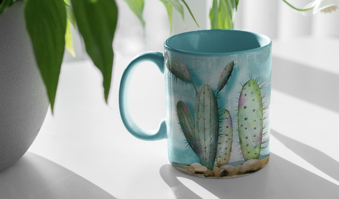
8. Lesson 7 Closing Thoughts and Mockups : Hey there. Congratulations
on completing the class. Throughout our lessons we've
learned how to take an idea and transform it into a
fully realized piece of art. From finding inspiration and planning your design
to adding depth, textures, and final details, you've brought your own Desert Serenity illustration to life. As we wrap up, I'll share a few examples of
finished projects and mock ups to spark ideas for presenting
or sharing your work. Remember, no two compositions
will look exactly alike, and that's the beauty of it. I can't wait to see
how you've brought your creativity and
uniqueness into this project. Be sure to try it on all
kinds of different pieces and experiment with changing the background to fit
different shapes. Be sure you share
your finished piece in the community and don't hesitate to reach out for support and encourage
others as well. You're a part of an amazing
creative group here. Keep experimenting,
keep creating and thanks for being
part of the class. I'll see you next time.