Transcripts
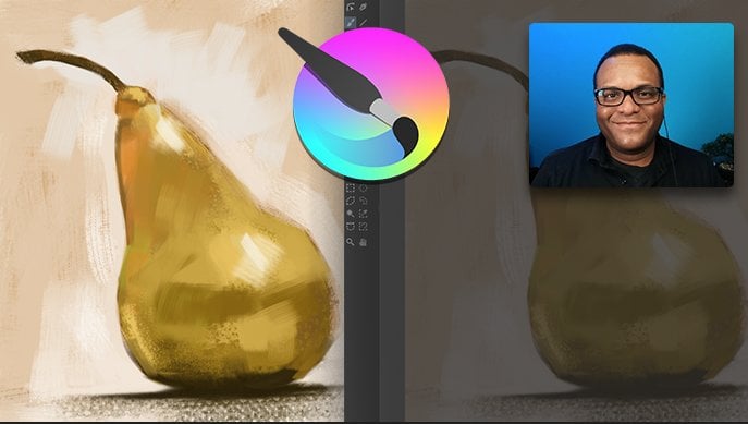
1. Intro: Welcome to another digital
painting class and credit, where in this class we
will focus on using texture to elevate
our paintings. My name is Erin Porter. I've been a professional
graphic artists for many years. And I've been teaching
at a junior college for more than ten years. I'm also a traditional painting. In this class. I'm going to bring some
of those techniques together to show you how to create a very
simple digital painting, a simple digital
still-life in the free, open-source software
called credit. So this is the project that
we're gonna be working on. We're going to first create
this very simple image. And then we're going to
add a texture overlay, which will elevate it and
make it much more impactful in organic in a very simple way. So grab your drawing tablet and stylists or mouse if you prefer. And I'll see you in class.
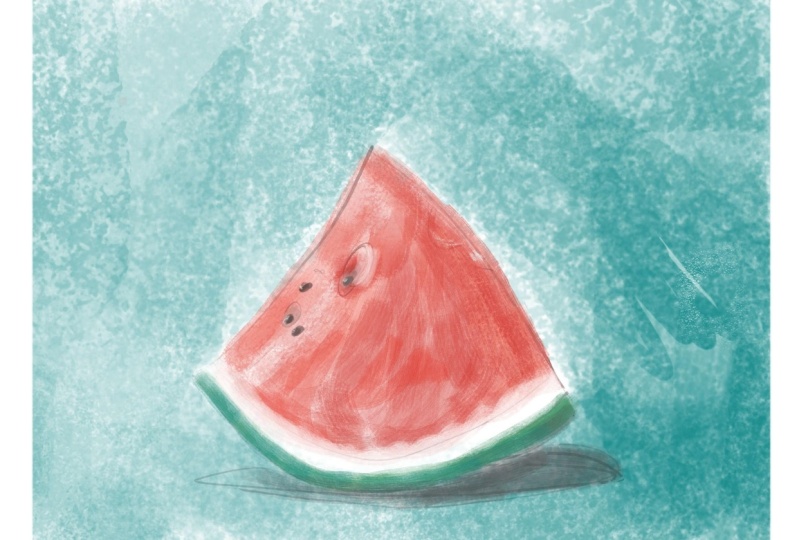
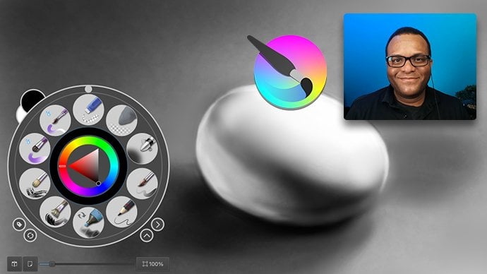
2. The Project: This is a class project. We're going to do a very simple digital painting
where you will follow along with me and create an
image that looks like this. We're going to start
from the sketch. We're going to move
on to blocking in the color and adding
a bit of detail. And then we're going
to apply the texture. If you don't have Krita again for credit as a free
open-source software. But if you want to use
something different, the techniques that I'm
showing you how to use in this course are not
specific to critter. So feel free to
use something else like Procreate or Photoshop. And if you want to
be more creative and use a different subject, feel free to try out the techniques and please do share it in the project area.
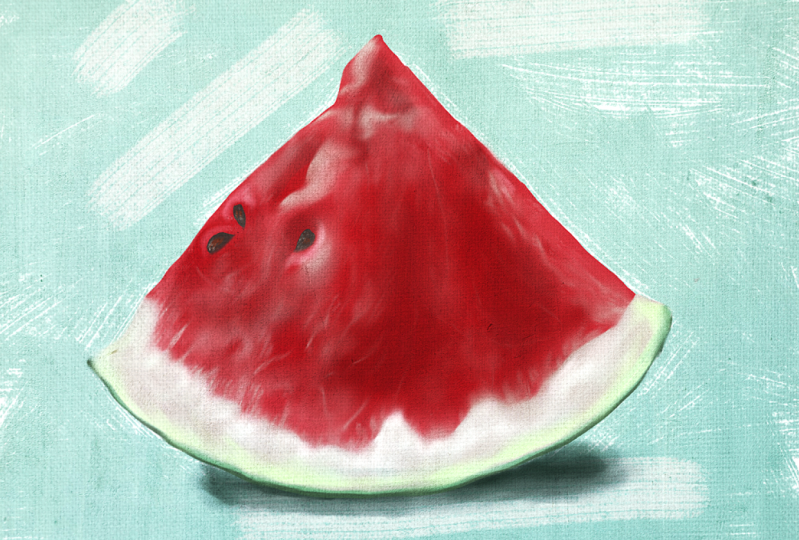
3. Why texture is important: One of the goals of
this course is to explore texture in our art. Textures, one of the
key elements of art, along with line shape, form, color, value in space. Texture refers to the
surface quality or the feel of an object
or an artwork. Texture can also be used to
create a sense of realism or three-dimensionality
as well as suggests different materials or surfaces such as wood, stone, or fabric. And that is what
we are after here. And here we're going to
explore various textures, as well as applying
a Canvas texture, which is going to give our digital painting
that feeling of being, or the look of being
a painting on canvas. So you can see, I have this very simple image
of a watermelon right here. But by adding texture to it, it can add a little
bit more depth. I don't know if you
saw on the Toggle, I'm toggling this on and off that little bit of texture here. It just makes it a
little bit richer. And then we add a little
bit more texture. And now it's paint, a
painting on canvas. And you can find those textures
and photographs online. Or perhaps you can find
textures in real life. You're walking down
the street and you see a concrete wall or
something that has a nice texture that might apply itself nicely to your
digital painting. So in the next video, I'm going to discuss the
project that we'll be working on it a little
bit more detail. Then we're gonna
get into a sketch.
4. Setting up the document: Alright, so I've
opened up credit and we're gonna make
a new document. And I'm going to choose
new document, a new file. And I'm gonna make this a
US letter size horizontal. So I'm going to click
right here where it says image size predefined. You free to make it whatever
dimensions you prefer. And right here this
little icon is, is horizontal
orientation portrait right now the default
here is on portrait. I'm going to click horizontal. And you can see
here the width is 330 pixels per inch
and the height is 25, 50 pixels per inch. And what that ends
up being with us on the size is 300 is
the resolution. And I'm just going to
hit Create. Alright, so I'm going to zoom
out a little bit. And here is my image. Okay, so right here, I'm just going to get started. I am going to, I'm going to choose
a brush or pencil. I'm just going to
right-click here. One thing I do want to show you, you see like I have a
lot of brushes in here. The default, I can't remember. I believe it's
somewhere around ten, but you can change that
here in the preset. So I'm gonna go to
the preferences, I'm going to go
crazy preferences. So here we are in the
preferences and you see general go all the way down here and you can
see pop-up palette. And right now I have the maximum number of
brushes set at 20. Okay, so you can change
that right there. So I'm just going to hit okay. I'm just gonna go
with any thin brush just I'm going to click on that. Actually may grab my drawing
tablet and my stylus. And let's get started.
5. The Sketch: Alright, so I usually
just test it out, whatever, right-click to
get the pop-up palette. And again, I think I
chose this brush here, and I actually chose that one. There we go. That looks good to me and
I'm gonna get rid of this. So to delete this all, I'm just going to hit
the trash can here over my layers panel, bang. And then I'm going to click the plus symbol
to get a new one. Alright, so now
that I have that, I need to bring in my
reference material. And you can bring in the reference material
or download that. And I'm just going to
bring that over here. And I'm going to open
this up right here. So I'm going to
right-click Open With, and I'm going to open this
as a preview document. Scale it down. And this is what we're
going to be working from. Feel free to choose something
different if you like. In this drawing as you can see, or this digital painting, we're just going
to be using this, doing this main image here. We're not going to worry
about the second piece, but feel free to do
that if you like. Alright, so now we have
the image here and let me center this a little bit. Maybe zoom out just a little so I can see
the whole thing. Okay, and I have this
first layer here. There's the background layer. So this layer, I'm
gonna do my sketch, and this is going to be
a real simple sketch. Doesn't really matter the color, but maybe I'll
switch the colors. Okay, so here I'm just drawing in the shape
of the watermelon. I'm not really too concerned about making sure
that this is perfect. Okay. I mean, it's triangular shaped and it's a watermelon. As far as believability, that's all you really need. I'm not going to spend
a whole ton of time, again making it perfect because
it's not like it's about this bean are very particular
piece of watermelon. So we'll just keep
it nice and light and nice and loose
and relaxed, right? That should do it there, but let me right-click
and I am going to choose a larger brush that I want
to use for an eraser. Let's see, actually
an easy way to do it. You see right here
this tool right there. If I hover my cursor, it says
freehand selection tool. Very quick way to do that is I'm just going
to click on it. Press down again, I'm using a drawing tablet
and a stylus pen, but if you're dealing
with the mouse, just click hold your finger on the button and you see
it selects that area. And I can just hit
the Delete key to remove all this
extraneous stuff. When I go to click and drag, it just makes a new
selection and delete key. Now if I want to, I
gotta get rid of that. So I'm going to go Select, de-select, or I can
just sit here, right? Hang on, right-click. I need to be on the brush tool. And I can just right-click
and choose another brush. This brush here. And I can just come up
here and choose ie, hit that eraser right there, or hit the E key to get the eraser and I
can just erase it, erase it nice and normal. Just like a regular eraser tool. There we go. I'm going to right-click,
choose that again. Right-clicking brings
up the pop-up palette. And there we go, That just going to
add this in there. Other, other images of
watermelon that I saw, but I really liked this
one because of that little divot right here
in the, in the slice. It just adds a bit of depth. And then there's this dark right here and the
light right here just, I thought it made it
a little interesting. I'm just going to shoot a
imaginary line right down the middle and you can
see where it intersects. So there we go. Just kinda comes over that way. And again, I'm not going
to be too precise, but I don't want to
change it too much. Because if I if I don't see, I don't want to use
the eraser here because this line is so thin. So I'm going to
switch to this one and then make sure
that's on the eraser. And right-click and
go right back here, turn off the eraser. I just think compositionally
the seeds being where they are actually matters. So if I change it up too much, it's going to affect
my affect my dry. There we go. There is my sketch. I'm moving on to the next star. The next video where we
will start to block in the colors and with a big
focus on the lights and darks. When you punch in
those, those darks is where it really gives
you that dimension. Okay, I'll see you
in the next video.
6. Mixing Colors: Okay, so here we are. I'm going to right-click and I like this brush right here, and I'm using a stylus. So let me see the way I can enlarge this brush
by right-clicking. And you can see right here
in the pop-up palette, I can make this larger
by scaling that up. And that looks good. I liked this one
because of the way it rotates with my brush. So if I show you
this here, I can, it will rotate as I
turn the stylus around, whereas something like this one. You can see it's not
rotating. Here we go. This is actually right here, one of my favorites, but you can see it
doesn't rotate at all. Okay. With this woman. If I want to rotate
it and tilt it, I have to change the angle right here and that
kind of slows me down. But but I do like the
look of this brush. You can see. So yeah, I like the look of that brush. The one thing that I
will say about this, again, let me repeat that. If I need to rotate that angle, just come right
here and adjust it. I can scale the size, but the way I usually scale it is by holding the Shift key. So you see right
here on my keyboard, I hold the Shift key right here. And so I'm going to hold the
Shift key and then I just drag right or left, okay, right to make it larger, left to make it smaller. Again, that's just a little
bit quicker than changing the size right here. Okay, So I'm going to block
in this background color. Although maybe I'll do
the background color and a different layer. I'll block in the
watermelon color. Actually, I'm gonna go
with the black first, I'm going to click here,
choose the dark colors. One thing to get
this palette here, let me see if I go to Window
workspace. Let me put it on. So I want to open
up a new Docker. So I'm gonna go Window
settings Dockers, and come down to palette. Okay? And I get this
palette right here. And I'm going to hover my cursor right in
the middle, right. You see those little
dotted lines. I can hover my
cursor right there, and then I can drag that down
and then I get the palate. So if I click and
hold right here, I can choose different palettes. Like here's these,
there's markers. What do we have here? A number of different
palettes right here. I created this one here, these prismacolor prisma colors. And I show you how to show, I demonstrate how
I put these colors in here in a different video. But actually maybe
I should be using. Let's try this at the default. And we go and we'll
just go with that. That's probably going to
throw me off because I always use those other colors. And let me put that advanced
color selector back on. Yes, these colors,
they're kind of garish. Okay, but we're
gonna go with them. We're just going to
mix some colors here. So here we go. For my watermelon. I'm going to click here, and I'm just going to
mix some colors. So I can get some nice
colors that I like. I'm just gonna kinda
brush into them. Get a little bit of an overlap
and you see where overlap, I can sample those. So I can sample, hold my Command key to
get the eyedropper. Or I could click here
and get the eyedropper, but I'm going to sample there. And then I can make
a nice solid color their brush over where
it blends a little. And now I have a little bit
of variation and my colors. Again, this is
just like the way, this is just the way I
would paint in real life. Although I think these
are little bit pink. Just get a little pink in there. Don't want too much. But yeah, in real life, this
is the way I would paint. Mix the colors
sometimes while I use, usually mix them on a pallet or I will mix them on my canvas.
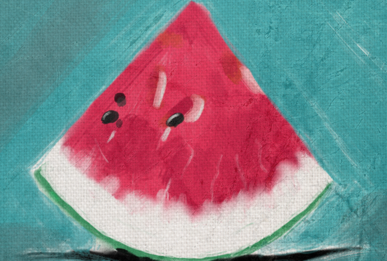
7. Blocking in Colors: Alright, so I'm gonna go
back to this brush where I get a little bit
of rotation here. Although, which brush? That one? Let's try this one. That's
got a little bit of texture. Fills water, Melanie, and I'm just going to block this in. Actually it's a little too
much texture for me right now. Let's try this. I'll go back here. Alright, nice and soft. I don't want to go
into heavy with this. I'm right-clicking to get that rotates so I can get that angle. And if you're using a mouse, you might have to
adjust the flow here where to get that sensitivity. And I just like to vary
up that angle quite a bit when I'm working because actually I'm
going to switch over. No, not that one. That one. There we go. I just liked it the
way it switches this, a little rougher brush, but it gives me that ability to to get that angle
and it doesn't, it's not the same. Working with a mouse
does slow me down a bit. I'm going to hold the
command key sample. And I can add in that dark area. Just sort of hit that
area up right there. I'm going to sample
this pink here and then just trim back on that. So you can see very quickly, I can add that color and I'm going to sample in a white here, hit across that very lightly. Again, that by using
the drawing tablet, I can adjust the sensitivity. Otherwise it with a mouse, I'd have to really slow down
and go up here and adjust either the opacity or
right-click and adjust the flow. So opacity and flow, or the flow, or the opacity
is up here as well. I'm just going to
click there, and I'm just going to sample holding the Command key or Control on a PC and then I can
trim in on that. I like to keep things
nice and loose. So you can see that had added some dimension with just a
couple of strokes right there. I'm going to sample,
block this in. That looks good to me. This isn't going to look exactly like what I've
posted already because it's it's a different painting and it never comes out
the same the second time. Alright. Okay, so I'm going to
sample the white extra. I'm going to sample that little gray here and bring that in. I can sample this color here. And if it's a color that I like, I'll just smoosh it up up
here so I can re-sample. And we go again. I'm not trying to
be very precise. Actually, I forgot I did
this on my sketch level. I wanted to create this
on a separate layer than my sketch so I could
bring the sketch back. That was a mistake,
but I'm just gonna go ahead and add a new
layer right here. And let me shorten this up so
I can get in there little. Alright, so the way I like to work is I like to use larger, larger brush sizes as
opposed to smaller. Like you can see here, there's just a little
bit of green here. A lot of people might be
tempted to come in here and now we get a very
precise line right here. But what I like to do, make a larger brush sweep
across there. It real sloppy. And again, this, remember
this is a new layer. So since this is a new layer, I can erase this and bring it back into
control, rate control it. So I'm going to hit that
eraser tool and see I can just trim this back down and
have that very thin. Whoops, I went too far, hit Command Z or Control Z on a PC. Bring that down. I'm going to turn the eraser off because I don't
like the shape. There we go. Get
that shape right. Eraser. Just go back to
trimming it down. I don't want to scrub
because if I scrub, then if I make a mistake,
I lose everything. So if I swipe across release, that way, if I need to undo
it because I went too far, I can undo it just saves me a little bit extra steps
on a sample that white, I'm going to reduce
my brush size. And now I'm going to be
a little more controlled and come across this right here. Okay? I'm liking this now. I need to add in that black, so I'm going to sample a
nice little dark color. And I'm just going to
power in actually, I'm going to hit Undo a
couple of times Command Z, Command Z. I'm going to
make a new layer case. I make a mistake, and I'm just going to
blast in some dark colors. Alright? I kinda like that now this time rather than I could
just erase this, but I want to get rid of
some of that sketchiness. I can sample the white and then come right
back on top of that and remove paint on top with a white as
opposed to erasing. I kinda like that. Alright,
now I'm going to add in, I'm going to sample that black. Although technically I think I want that to be a little
bit just a touch lighter. Alright, I'm gonna get them
on a separate layer here. Hang on. Let me change
that up a little bit. I'm on a separate layer, at least away from
this watermelon. So if I punch that
and right there, actually I do want
that a little darker. But I don't want to go
100% black. There we go. Now I can go to my eraser
and I can trim that down to size and get the
shape of that just right. I'm going to sample that again. Come over here and add
that in there. Okay? I'm going to sample
this color here. Add that color in, sample that white,
and add that in here. So I'm happy with this. Now, I am going to fill
in this background. So I'm going to
make a new layer. And that turquoise color. I'm just going to blast it on. And again, this is a new layer. So if I make a mistake, I can, I can bring it back. Because you can see
here's a new layout. Turn the visibility
off. There we go. Everything is nice and safe. Underneath. Alright. Again, yes. I know I don't I didn't use
this in the promo picture. I use one with a with
a white background. I mean, it shows the Canvas
pretty clearly there. And just a little variation. I hope that doesn't
upset anyone. All right, Here we go. That looks good to me. I kinda like the
scribbly aspect. I'm not going to
fill in everything, but say you do want
to fill it in. One way that you can fill it in and still add a
little variety is this little Q-tip swab thing with a water drop That's
a blending brush. And I'm going to do
this and undo it. You can see you can
blend over some of these things if you
don't like all that. The strokes, it
just kinda blends. If you'll likely it
won't completely bland. Maybe even in here,
maybe you have too many strokes or it
bothers you too much. Actually, you can see it's not blending. There's nothing here. I'm on the wrong layer.
So what I'm gonna do now is merge
things down here. So I'm going to right-click and I'm going to go merge down, merge with the layer below. And I'm over the
layer right here. I'm going to do that again,
merge with layer below. One more, merge with
the layer below. I don't want to just flatten it because I don't want to
go all the way down. So here we go. So now
things have changed. Actually, I should
make sure to save. I'm gonna go file and save this. I haven't yet, I
haven't saved it yet. And there we go.
8. Refining the Painting: Make sure you save
because if your computer crashes,
you'll be in trouble. Alright, so like
I want to soften this edge here that's
a little bit too hard. So again, I can scale
this up and down by holding the Shift key
drag to the left, make that a little smaller. I'm just going to brush over
that edge just a little bit. And maybe over here. Because here I really want to soften this area up in here. Get a little less brushy. Okay. I don't wanna go too
much just because I like, I like having a lot of texture. And you might even
want to come back and grab some of these
other brushes, like actually right-click, you see that brush right there. If you can find it. Hang on. What's
the name of that? Let's see. It says G, Dry texture creases. If I click on that,
that is a canvas brush. So I'm going to make a new
layer because I don't want to wreck things hit Plus. And you can see if I
paint that in there, that gives me some of
that nice canvas texture. So here I'm going to sample. I have this color here. I'm
not going to sample it. I'm gonna come
over here and just apply a little bit of that
and I'm going to sample, and I know this color
doesn't match up just right. This is a bit more turquoise, that's a bit more green. But I'm just gonna go with it. You can see I can add
texture this way. And it just makes it a
little bit more interesting. And I like to just sort
of power it in there. The good thing is say it
again because this is, remember I'm on a new layer. If I move over that
line right there, drag that back over it. If I go a little, oops, too far, I can just hit that
eraser and take this out. But again, remember my layers. The main painting is down
here and this is up here. So that's the advantage
of working with, with layers is it gives
me a lot more control. Actually, I'm going to hit Undo. I kinda like the little
bit of an edge there. Okay, so I think
I'm done with this. I can, actually, I do want
to add a little more detail. I'm going to reduce the size
of this dragging right? Hit some light, a light color. And you can see there's a bit of a highlight on each
of these seats. That'll just give that just
a little bit more dimension. Actually, I'm going to, okay, I was going to make a new layer, but I think I'm pretty
safe here where I can just kinda not that in there. Hit the eraser, ink, come back and trim it back, maybe brush over it lightly, lighten it up a little bit. There we go. That added a bit of dimension. Maybe. Take the eraser off
again at a little bit. Add a little bit of color here. And I'm going to trim
this back a little. I'm just adding a little bit of punch of color and
different little spots here. Because you can
see the watermelon has a bit of reflection. And in different little spots just makes it feel
a little bit more. I don't know. Liquid. Alright, maybe add a few
of these little lines. And again, I know these are
really large, but again, I like to hit that with the
eraser and come back and just knock them down
just a little bit. It just for me, rather than making
just a solid line, they tend to have
a little bit more. I don't know. They just seem to fit a little
better and I'm just brushing over this extremely lightly trying to
lighten them up. Sometimes you might take
that a little too far and then you have to just
erase it and start over. Okay. I think I'm liking
what's happening. I'm adding a nice little
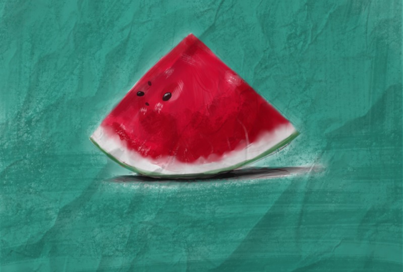
texture here and we're good. So I'm going to stop
working on this right here. And from here. Then I'm going to show
you these textures and we're going
to bring them in. And I'm going to
show you how to add those textures to the painting, which is really going to
take this to the next level, but I'm happy with this. And this is a perfectly fine
drawing or digital painting. And I could stop right here. But again, by adding
those textures is going to level it up
just a little bit more.
9. Applying Texture to Your Painting: So now it's time for us to bring this texture into play finally. Alright, so here we are with the painting
that we created. And I'm going to,
I have this layer, it's in two layers,
while there's three layers actually hear
the background layer. And then I have this layer,
but I'm just going to merge that down by right-clicking right here on that top layer and
merge with layer below. And that'll just simplify
things not necessary. Alright, So I have
several textures. I have eight textures here
that I have uploaded. So you have access to these, but I'm going to
play with this one. This one that says
Image Check texture, this one that says canvas. Then there's this one here. It's sort of a watercolor paper. It starts out with Olga. So I'm gonna go ahead and
use that one as well. And so what I need to do is
open these up and Christa, and then we're going to copy and paste them
into the document. Alright, so I'm going
to start things off. Let me minimize that. I'm going to click on
that, hold the Shift key. Click on that actually it's
going to select, Okay, I clicked selected the three of these or you can do
them individually. Again, I was holding the
Shift key to select each one. I'm going to right-click
Open With and choose credit. And now let me open
that up down here. Let's see. And you can see they
opened up in tabs. So let me stretch this across. Okay, so here's the watermelon. And I'm going to start out with this one because this is one
of my favorite textures. It's a nice marble texture. And it'll be pretty
obvious what we're doing. So I'm going to go select, excuse me, select all. And you can see
the dotted lines. I'm going to go Edit, Copy. And now I'm going
to move over to the watermelon and I'm
going to go edit, paste. Alright, it's a little
small for this document. I'm going to stretch
it up a little bit, expanded a little bit, but you don't want to. I'm typically expand
these too much because if the
image becomes soft, your texture, then
the whole thing begins to look just
a little bit soft. But I'm going to
see how this works on this large document. So I'm just going to click right here on the transform tool and expand that and hopefully playing and
I miss that hit Undo. I'm just going to expand
that. That looks good. And I'll hit the Enter key. Alright, so the
problem is now you can't really see
the image below. So if I turn the visibility off on this layer there it is, I can reduce the
opacity and that's something that we'll want
to do. But you can see it. It just makes
everything look muddy. What you see right here
where it says normal, that actually is something
you would call a blend mode. Maybe some of you know
what blend modes are, maybe some of you don't. Blend modes. It's difficult for me to
explain exactly what they are, but a blend mode affects the way one layer will interact
with the layer beneath it. Some blend modes will make
the white areas disappears, some will make the gray, some will make the black, and some will make the
colors interact differently. So you just kinda
have to play around with it, but right here. And yours may look different
from this butt right here. Like I can see, like multiply is one that I use. Overlay screen. These are some of
the ones that I use for this technique a lot. But like say normal is
where we're at now, where normal, It's
basically not interacting. It's a complete solid layer and that's where it
was that already. So I'm gonna change
this to multiply. And now you can see how that
texture really affects this. And you can see that's
before and after. I mean, it's overkill, but I think it makes it
look really interesting. So now when you play
with this in combination with this opacity
bar right here, you can see how you
can add a nice bit of texture with and it still
looks fairly natural. So now I'm going to try a
couple more blend modes. I'm going to try the overlay,
which is a bit softer. You see it's a
little bit brighter. So now I'm just going to
increase that opacity. And you can see
this really makes a nice impactful image here. And you can, Let's
see, I'm going to try. Screen is a good one. What squeak screen does
the exact opposite, it makes the black disappear. So depending on what you want. But again, there's a
ton of these here. Soft light, this is
one that I like. I'm gonna go with soft light. You see it, it applies that
texture in a very soft way. Let me try a couple more. There's a ton of them down here. I'm going to click on this
thing here that says mix. I'm going to toggle that open. And there is one here. Let's see, if you
check these little, these little check marks, they will appear in your favorites, which
are these up here. So you'll always
see these because yours will likely look
different from mine. Up top. These are my favorites. Feel free to copy these or play around and
see what you like. But I'm going to go
in here to the mix. There's one here
that I want to add. Grain, grain merge. That's the one I want.
I want to try that out. Alright, so now I'm going
to toggle that close, but again, go through these,
play around with them. They don't all
behave differently. You could do a Google search
and I'm sure you can find something that will give
you an idea of how each, each of these blend modes
behaves differently. Alright, so I'm
gonna go with grain, and this is just so
many blend modes. Alright, so I'm going to
check out grain merge. Okay, that is quite impactful. And then I can just drag, I'm going to drop
the opacity here. And you can see how you
can make different, again, achieve different levels
of of that texture. Okay, so now I'm just
going to show you, I'm going to turn that off.
I'm going to leave it there. I'm just going to turn
the visibility off, but look at that. It goes from looking
rather plain to BAM. A lot more interesting. So I'm just going
to try a few of these and I'm going
to copy and paste, then I'm going to
edit it down so you don't have to sit
here and watch me go back and forth,
copying and pasting. But actually I'll do this one. I'm going to hit Command a to select all command C to copy. I'm going to close
this and save changes. No, and that's the canvas
I'm going to click here and Command V to paste it. Alright, now I'm going to change that blend mode and clicking right here
where it says normal. And I can change this to, let's try soft light. That we have nice Tech,
a nice canvas texture. Okay? Actually, I'm going to try
this with the grain marriage. No, I don't like that. I'm going to try multiply. Okay? Overlay is a good one. That's a nice neutral kinda. This, it's nice and bright. But again, you can see how it's affecting the colors a bit. But in vivid light, Let's
see what that does. Whew, alright, No. Maybe I'll just go
back to the first one. I use the either blend
mode or soft light. Soft light blend mode. Multiply, multiplies too much. But actually it's really
making that Canvas heavy. It almost looks like it's
an image printed on Canvas. But then if I drop that opacity, it looks very natural. It looks like it was painted. Now, what you can do also is you can use multiple textures. So if I turn this layer
on bank, look at that. You have multiple
textures and this is actually what I have in that in the main image is
I'm using multiple textures. So anyway, this is
a very easy way that you can add
multiple textures. Okay? And here is that
watercolor texture. I don't exactly think, well, this does kinda make it changes it to look more
like a watercolor. I was going to say that I didn't like the way it was
interacting with the paint, but it does feel like
a watercolor painting. So here we have
watercolor painting, and here we have a
painting on canvas. So you can see how this really, it really opens up a whole
new world of possibilities. And I have one more that
I'm going to show you. And just for kicks, I'm going at this one
here open with Rida. Alright, just because this
one's kinda out there, I'm just curious to see
what this looks like. So if command a, command C, come over to
watermelon Command V, I'm going to zoom out a
little so I can wrote this, rotate this command T, again control if you're on a PC. And move that into place. Now I'm going to
change the blend mode. Let's see, I'll
start off multiply. That's a bit heavy. Let's try not normal overlay. I like overlay. That's interesting. Again, you can always play with the opacity and that is
how you can apply texture. I'm going to have one short video that I'm
going to add here, just one little short one that I'm going to
add after this one. And just show you a very
quick way that you can create your own textures and which you could probably
figure out on your own. Just use a paintbrush, make your own textures, and use them in
exactly the same way. But again, I'll see
you in the next video. And that's gonna
be very short one. What I'm going to show you that.
10. Making Your Own Texture: Okay, so here we are. This is gonna be
the, the last little thing that I showed you
in this class here. And I'm just going to create, I'm on this top layer, I'm going to click here,
or the paint layer. I mean, I still haven't deleted these other textures because I want to play with the route, play around with them later. But I'm going to click on that. And then I'm going
to click here on the plus symbol to add
a new blank layer. And this time I'm going
to use my drawing, draw my own texture. So here I can. I'm going to pick a nice brush. Actually, I'm going to pick one. That one looks good right here. Any brush will do. There we go. So you can see how I
can add some texture. And again, make sure
you're not doing this on top of your image. And one thing that
I'm doing here is I'm adding this texture, but I am doing it very
precisely like here. I'm going to hit E to
erase some of this so I'm not applying
the texture on the, so much on the watermelon. I am applying this texture
very heavily background, maybe just a little
bit on the watermelon. And you can see I'm
painting with white. So I'm going to end up choosing
a different blend mode. Another way around this is
when you are doing this, you can change the blend mode. So here I'm gonna
go like multiply. The opposite of multiply
would be screen. Let's see. Screen. Nothing. Okay, there. Okay, so multiply makes the white just completely disappear. Let's try overlay. Okay, It's doing something
I'm not happy with those. Grain merge. Soft light. There we go. Soft light does a soft light does a little something here. There are more things that
I wanted to show you, but I don't want to throw
too much at you at once, play around with these and
see what you come up with.
11. How to Upload Your Project: I hope that you share
your completed project and upload it to
the project area. Here, I'm going to show
you how to do that. The first thing we need to do is reduce the size of the file because there's a two
megabyte maximum file size. So if I move this here, I'm on a Mac, and if I click on that image and I go Command I, you can see that's that this is the two megabyte
compared to what this original file is, 135 mb. And that's because of
the layers and the, you know, it's a fairly
large file size. Alright, so the first thing I wanna do is save a copy of this. So I'm going to
go File, Save As. And I'm going to give this another name and I'm
just going to type small in here and make sure
you pay attention to where the location that
this is going to land. And I'm going to hit Save. Alright, so from here, I'm going to come over
to my layers panel. You can see I have some textures in here and some other layers. So I'm going to
right-click on this, and I'm going to choose to
flatten the image right there. Alright, so that
should eliminate a lot of the excess file size. Now, I'm gonna come
over here to Image, and I'm going to choose scale, image to new size. And from here, the maximum size. Here we go. Let's see, I have that here. The official page, and you can see it says how do
I post an edit? I'll include this link in the text area on how to
upload your project. You can link to this if
you want to see this. But here it says down here. When uploading the cover image, the max file size, the ideal size is 69388 pixels. And if you upload something
that's a little different, It's going to crop the image. And I haven't figured
out a way to get around not uploading the cover image. So you can make it so that
it fits in this size. Or you can just upload it twice. And that's what I'm gonna do. I'm just going to upload
the original image. And then if it
doesn't look right, if it gets cropped wrong, I'm going to upload
it a second time. Alright, so you can
see here, it says, if you'd like to add an image with the body of your project, click the image button
under the ad content and the file size should
not exceed 1,000 by 690. Okay? The way that what I
usually do is just make the maximum width
no more than 1,000. And I'm going to, I'm going to close out of this. Alright, so here it says the
width is 330, 3,300 pixels. Alright, so I'm just going
to make that a 1,000. I'm going to just click, whoops, re-select
that and type 1,000. And this is, it's
above that 690, but even if it
crops a little off, it should still fit fine. So I'm gonna hit, Okay. And you see it reduced the size. And then if I zoom in a bit, I can see that it still has
maintained the image quality. My computer, it's
glitching here, so this image looks
a little off, but other than that, it should still be fine. Okay, so now that
I have this here, I need to save this as a JPEG. So I'm gonna go File Save As. And I'm just going
to change this right here where it
says accredit document. I'm going to make this
either JPEG or PNG. And since the final destination is going
to be on the web, I'm gonna go with P and G, and I'm gonna hit, okay? Alright, make sure
you paying attention to where it's going to save. And now I'm just going
to hit that Save button. I get this thing here and I can large file size,
small file size. I'm just going to leave it
right here in the middle. This doesn't need
to transparency. I believe usually it says
store alpha transparency, but this is again, this is completely flat image. So I'm going to make sure
that that is unchecked. And I'm just going to hit, Okay? Alright, so it's saving.
Finished saving. Alright, so now let's
check this out. And I really don't need
this image right here, the small credit document, but I didn't want to take
a chance on reducing, reducing the file size and if I forgot the Save As
I might lose it. So I'm going to throw
this in the trash now. Alright, so I have this one, and this one was 135 mb, the original n. Now let's
see what this is at. Alright, 1.6 mb, well, within that two
megabyte file size. So now we're gonna go
back to Skillshare. So I'm here on the
Skillshare website on the on the class. And you can see there is
the about area, reviews, discussions, and we want to be on the project and resources. So I'm going to
click right there. And right here this big green
button is create a project. I'm going to click on that. And from here I'm going
to choose Upload Image. And from here, I can choose
that image here small. Actually this is the
wrong one because you can see that say it's 19.6 mb. We want this one here,
watermelon project, Aaron at 1.9 mb and
I'm going to hit open. You can see here, you can
scale this up and down. So if I want to crop
in on it, I can, but I'm going to scale
that all the way out so that it shows
everything and I'm going to hit Submit when
problem that I've had. And I haven't been able
to figure a way around. It is sometimes when you see this says cover image and
it's going to crop it. So I'm going to add
a second image to, to, to try to fix that. So I'm going to
write here it says add more content because again, the cover image will be cropped. I'm going to click
Image and choose the same image once
again and hit open. And it should add that and
it won't crop this one. Okay, so I'm gonna give
it a project title, and I'm just going to call
this course demo project. Okay, So from here I can
add a bit of a description. Here's a good place
if you have any, anything you want to say to
me or unit any questions, you can put that right here under your project description. This is my demon, them on stray illustration
project and a Smiley face. And I'm just going
to hit Publish. And that is how you upload your project. I hope
that was helpful.
12. Wrapping it Up!: I hope you enjoyed this, and I hope you enjoyed
playing around with texture and maybe learn a little bit
more and getting a little bit more practice
with digital painting. Thank you so much for
taking this class. I look forward to seeing you in other classes that I've
created and please do make sure that you
post your project in the project areas so that I can see it and others who are
taking the class can see it. And I can't wait to see what creative things that
you do with texture. And I will see you
in my next class. Bye bye.
 Aaron Porter, Illustrator