Transcripts
1. Intro: I've been fascinated by the fantasy world
since I was a child. I started drawing ever since then I realized
that most of the drawing, I've made our fantasy related. Ten years ago, I got
my first tablet ever, and I am working hard
to pursue my dream to be a part of the game
industry ever since then. Right now, I have eight years of experience working
in a game industry, including outsourcing for
international companies. Hello, my name is
area urban, aka n Pi. I have been virtually in a game industry for
over eight years. In this class, I'll
be showing you how I create a
fantasy character. We'll start by getting an idea and how to pin
it with Photoshop. For this class, I'll be
using Photoshop 2021. But if your family and
with similar software, if it worked just fine as well. Don't worry, if you are more
of a traditional artist because you can use
the knowledge and ideas for creating
fantasy characters, adapt them for use in
traditional work as well. I love fantasy rows. There is no limit, no
rules, no right or wrong. I can put my imagination into my painting and create
my own character. In this class, I
will be painting this image starting
from scratch. You will also see how I use the tools and what kind of met, but I used to achieve this. If you love find a 02.1 to
create your own correct that, then grab your
pencil and join me. I would love to see
you in the class.
2. Finding Ideas: Hi, Welcome to my class. I'm really happy to see
you here. In this class. We are going to design our
own fantasy character and focus on getting
ideas and how to put a fantasy atmosphere
in your paintings. If you're not familiar with
how to render faces yet, I suggest you use
photo references. I cannot emphasize enough why using reference
material is a must. Even though you're
painting is going to be fantasy and stylize. The fantasy world is boundless. You can create your character using references
from many sources. Think of different time periods, like a dystopian future
or the Middle Ages. Perhaps you're more
into stories like myths and legends from cultures
all around the world. Maybe making your character half human and half
animal is also an option. And of course, watching
movies, playing games, reading, or even listening to music can also give
you idea as well. The method that I use
often is playing games. Because I work in
a game industry. And in addition to being
a great way to relax, is a great source of idea
for my work as well. I usually create my characters
from abstract keywords. The fact that these words
are not always related to each other can make the
character look more interesting. Take a look at this abstract
keywords that I note in the resources folder in case you want to use these
for finding your ideas. Here are few examples of using simple keywords
to create characters. I create this work from the keywords black,
swan and gold. This character represented
so dx sine areas. The keywords are
Aries, RAM, and fire. I designed this piece
from the keywords Fox, vendors, and night. For this painting, I use the
keyword forest and Dragon. This bending is one of my
personal favorites and uses the keyword sword,
Ariel, and wings. These are just examples that
make use of this method. It helps in creating fantasy paintings and give
them an interesting feeling.
3. How to make your painting look like they are in the fantasy world: In addition to create a fantasy
wife from the character, another thing that's
equally important is creating atmosphere of a fantasy world
around set character. A common trait that widely used is to make things sparkle, glitter, or adding
something that looked going to give
it a medical field. You don't need to
have the light source to make things look realistic. Remember that is your world and you can do
whatever you prefer. Another method I often like to use is adding geometric shapes. As you can see here. This will not only make
more magical atmosphere, but also make your painting
look more powerful. And I use this very
same technique in my traditional
artwork as well.
4. Finding references: In my opinion, one of the best websites for gathering
references is Pinterest. You can create a
board and gather your references without downloading them
to your computer. Here you can see a board that I created just for this study. If you're interested,
you can check it out in the resources folder. The reference boards
that I use often are portraits and inspiration art. You may be curious
why I have adiabat is because this is one of the
better knowledge resources. As all these photos of those
are taking by professionals. They have very
beautiful outfits and pretty faces with solid
lighting and composition. My style painting
is semi realistic. So it's very similar
to this dose. That's why this is a great
resource for me that I can study and emitting painting my character to achieve
this kind of look. And to collect references, I use a software called PRF. You can download the
software at pure ref.com is very easy to use. You can just copy
the image you want and then paste it on
the pier of page. The download is free of charge. But if you want to donate
money to support the creator, feel free to send
them some love.
5. Composition and Value: While the arrangement of the artistic composition is very important to
create a nice image, you don't need to know
all the rules by heart. Throughout my career,
I've found that the most commonly used
elements are rule of thirds, the golden spiral,
radial symmetry, and including the use
of geometric shapes. Here you can see examples of
this kind of composition. The values of the painting
using the contrast between dark and light is important in terms of
telling the distance. Use a lighter value for upticks in the
distant background. The middle ground will be
darker than the background. And see if the darkest
values for the foreground. Using values in this way
will give you a rough model.
6. Photoshop Basic: This is the default
window or Photoshop. You can adjust according to your personal
preference by going to Window Workspace and click at the windows that you want it
to appear in your workspace. The window that I recommend are layered color and the Navigator, we knows this is the layers
we know how to use it, is to create a new layer
by clicking the plus icon. Then a layer window will pop up. Layer on top. It will also be the layer on the
top of the canvas. You can hide that
layer by clicking on the icon to import brushes. Go to Window Brushes, then click on the
top right corner and click import brushes and select
the brush to download it. Now you can see that the
brush you downloaded is here. For those of you who
are new to Photoshop, I'm going to introduce you a few keyboard shortcuts
that I frequently use. B for choosing a brush
for erasing Tool. Control plus and minus
for some n and Alt. Control M for the curve to control you, for
Hue Saturation. Control J to duplicate
layer Control. C for copy, control, V for paste, l for
the Lasso tool, and I for the eyedropper tool. For those who are
completely new, need an extra bit of help. Don't worry. I'll
give you a picture of all these shortcut keys
in the resources folder.
7. Step 01 Sketching: Open up Photoshop and
create a new file. Choose the canvas that is
3,000 by 4,000 pixels high. And you will get the
patient like this, create a new layer and separate it into four
squares for sketching. Because you want to find
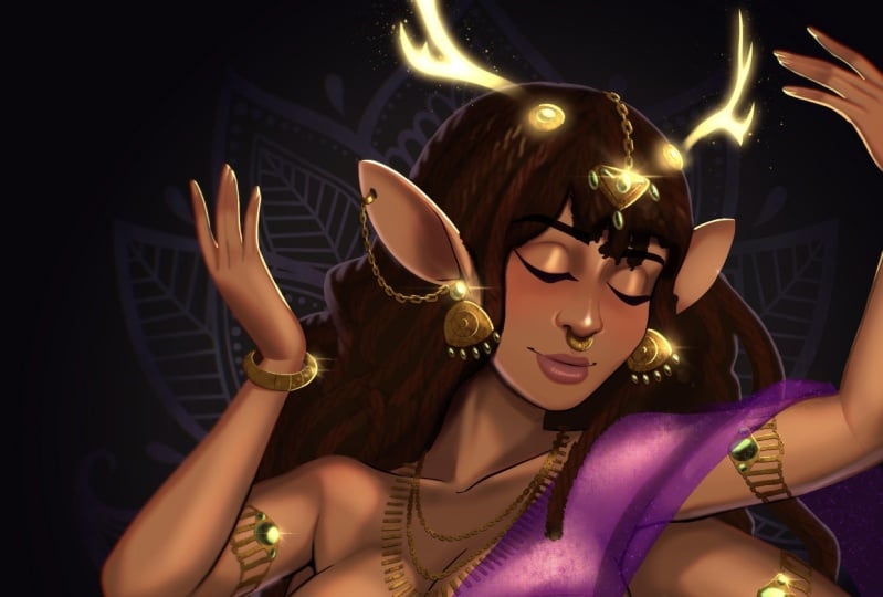
the base compensation for the painting. For this image. The keywords use our
natural magic and deer. I start by drawing a rough sketch to see which
composition works best. I then recreate the layer and change the background color. It's loaded I can roughly
pinned to make the image clear. Ultimately, I choose
the first sketch because I think it is
the best looking one. I used the rule of
thirds composition. And it just the image so that
the eyes are at the level of this line and the glowing uptake is at
the level of another line. Once I got the rough sketch, I want I started sketching
in detail again. I started with the head
structure and then the tarsal. The character is
viewed from the top. So I had to pay attention to the perspective
of the character. Here, I flip the canvas. To do this more quickly, you can set a shortcut by going to Edit Keyboard Shortcuts. Choose Image, scroll down a bit and you'll see
image rotation. Then simply double-click on
the flip canvas horizontal. And entry to set
up the short key. I recommend you to
flip the Canvas frequently in order
to refresh your eye. Because when you draw one
picture for a long time, you get used to it and it
becomes harder to see errors. Periodically
flipping the canvas, we'll give you a clearer
view of what's wrong. So it's a good habit to pick up. I use the picture of their
antlers as a reference because I want to add them as
a feature of the character. By using an image
of the real thing, I can avoid making errors. For some people, it may feel a bit like cheating
to use reference. But trust me, when I say it is the backbone of nearly
all professional artist. Here, I press L to select the Lasso tool and then hit Control J to duplicate
the selected area. A simple right-click and
choose flip horizontal. And move it to the other side. We'll create a perfectly
symmetrical image. A similar way to achieve this by using photoshops,
symmetry feature. Select your brush and
go to the Options bar. Take the butterfly icon
and select Vertical. Your brush will now be mirrored. And you can quickly paint
a similar article image. Now that I have a rough
outline of the character, I'm going to start
sketching the costume. I pick up these
pictures for friends. First. The hair, and follow up with
athletes and accessories. With the rough sketch company. I decrease the opacity and create a new layer in order
to really sketch in detail. I'm still not quite satisfied
with the proportions. So I go to Filter, Liquify and make a desperation on the part that I
wanted to improve. And once everything
is to my liking, I press Okay to apply.
8. Step 02 Rough color sketch: Here, I opened the
background layer and made some minor edits. I have roughly colored
the character, but don't worry too much
about this specific point. It's mostly for myself as I just want to see the
big picture again. I made a screenshot of
the sketch and resized. And in the upper left corner so that I can see a rough painting of what I wanted to paint. As I keep working, I may come up with new ideas and forgot what my
first sketch was like, which make it harder to
actually finish my work. Because I am tempted to
keep painting and painting whenever I get new inspiration and they'll know when to stop. But if I have a
rough sketch with me so that I can look
at it and decide if it's enough is mostly
a personal problem. But if you're guilty
of doing these two, then this is a great
way to stay on track. I create a new group and place the unopen layers in it so
it can serve as a backup. Then I start coloring the
local color for the character. I hit L for the lasso
tool and hold Shift. To increase the area
that I want to select. I choose a color. Use the paint bucket
tool and click on the area that I select to create a logo color
for the skin. I recreate a new layer on
top of the skin layer. Right-click and choose
Create clipping mask. Separate the clothes
from the skin. Creating a clipping mask is
very useful to stay within the bounds of the layer and only paint over the
color of that layer. I create yet another layer
for the well and hair. Then another layer after that, where I changed the
layer mode to Multiply. I proceed by picking the blue
color and pouring in it. Now, we will get the color of the atmosphere on the
character as well. By using the Eraser tool, the soft brush, you can erase the part that you
want to be the light. In this painting. I want the
light to come from above. So I erased the part that will be getting the
illumination from above. I create another layer, shank the layer mode
to multiply and color the bottom part of the character to
make it look like. It's really in the atmosphere
of the background. By creating a new layer and setting the layer
mode to overlay, picking a red color and
gradually paint over the skin, it becomes more
vivid and lively. Another new layer is
added and is used to roughly colored part that
would be the glowing optic. Perhaps. It is some
source of mating. But for the most part, I like to leave it up to the
viewer's interpretation. You might be overwhelmed by a mother players
that we used here. But keeping them organized make it a lot easier
to work with.
9. Step 03 Overall sketch: I created a new layer, above the background layer, but below the character layer
for sketching the trace. Because I want the setting
to be in the forest. While I am working
on the background. I also start sketching
the foreground as well by making a new layer on
top of the character layer. Keeping mind that the top of
the layer that you see in the layer window will also be in front of the
painting as well. I figured out
decomposition and try to experiment with different ways to make the character stand out. Eventually, I decided to fix
the character's poses first. I want her to sit on a branch. So it would look
more interesting. And for the brightest part, I create a new layer and then change the layer
mode to color dodge, select a blue color and gently painted on the hair so it
becomes more prominent. After I got my rough sketch, I disabled the layers that I
did not use at this moment, which are the light
and the shadow layers. I created a new layer again, set it to multiply and gently
paint on the shadow areas. Color selection is
important here. For the style. I recommend a desaturated color to avoid making the work
look like a cartoon. Creating lights and shadows depends on the
shape of an object. The human body is
somewhat cylindrical in shape of surfing the light and shadow off cylinder car optic
will make it easier for you to understand how these values interact
on a humanoid shape. For white clothes,
I recommend using pink and blue colors to help making them
look even lighter. I merged the character
layers into a single layer, excluding the shadow layer
because I will do this letter. I locked the line art layer because I want to
change the color. Then for c2 shows right
to paint the line art, that is the part
of the skin color. I use the light blue to
paint the hair and race. But depending on what color
your character's outfit, you may need different colors. Try choosing the colors
that are close to each other in order to make
it easier to work with. If we click open the eye
of the shadow layer, we will see something like this. But we're going to
disable this first. I then drag the line layer
down into the group of color layers and create a new layer to begin
painting on the character.
10. Step 04 Character painting part 1: For the character's face, I choose the photograph as a reference in order
to use it as a model. And let me solve the
correct proportions. As far the coloring, I don't have any special tricks. All I do is pick the
color by hitting I and paint over and over until I'm satisfied
with the result. It takes a lot of trial and
errors to get this down, but don't become discouraged. Keep practicing until you
develop a good feeling for it. Now, let's offset the shape
of what we are painting. E.g. if you are
painting the eyes, don't forget that human
eyeball has a rounded shape. So the darker part
is going to be the tip and the inner
corner of the eye. If you try to draw something, try to simplify it
into a basic shape. It will make your work
easier and more realistic. Under the nose is a very dark part because
most humans have the tip of the nose
that protrudes from the face and is
exposed to the light. So the shadow part of
the nose tends to be d2. In the part of the mouth. The upper lip is usually
darker than the lower. Due to the shape of the mouth. The upper lip is blocked
by the light from above, so it will make them
appear lighter. Applying dark shadows
under the chin, the lips, and a note to give your character a more
three-dimensional. Here, I'm trying to find
another photo for reference. This picture I got from
Pinterest is a cost player. Since the ears I'm trying to draw belt occur in real life. I tried to bring the light and shadows as close to the photo as possible and to make the ears look
three-dimensional scenes, the area of the ear
canal is deeper and the color in that area is
darker than the outside. As for the hair, I want it to look smart and
silky. Slide please. Another reference here
and try to observe fish parts were usually
dark and this light, in order to give my
character a healthy look, I opened up the shadow layer to see if the color I
had pinned up good. Then proceeded to
paint the cloth. I took pictures of my
own hands as reference, but it closes off the hand. Many artists struggle to paint hands and I
am one of them. So I need a photo to help. Here you can see the
reference work is magic. The hand I append look much better than how
they were before. I cannot stress enough how
important it is to use photos, because that is how we learn. I know many people are afraid
to use reference material. And I used to be one of them. Because someone
once told me that using reference images
is like cheating. But after working in the game industry for
almost ten years, I learned that unit references, no matter what you draw imaging, you wanted to draw a bird, but at this stage of your life, you have never
dropped her before. Do you think you'll
be able to draw a bird just like that
without looking at one. I know, because I can draw birds without reference
images either. So if you're using reference and someone
tells you is cheating, that means they don't know how
professional works at all. The best thing you can do
is ignore them and move on. Alright. Now my painting
looks something like this. I wasn't happy with
the shadow layers, so I changed the
color by hitting Control U and change the
color until I will satisfy. Here, I'm looking
on the detail of the character in order
to make it look better. I paint over the line art and around the hair so that
it wasn't too stiff. And make it look like
it's a real thing that ammonia show
and messy look. For the outfit. I use the brush texture in order to
make it look not too stiff. I use the Liquify
function again to adjust the head because I felt
that it was way too high. And now it looks so much better. I said the shadow layer to
normal and pick the color from that layer to paint
over the areas that I have removed
and wanted to fix. I also retouch it the light to make it
look more complete. Again, I work on the
skin tone by shooting a light orange color to paint in the shadows to make
it look healthy, Rosie, and even more beautiful. Now that I have colored the character the
way I won't have much all the character layers together to make it
easier to work with.
11. Step 05 Background: I'm going to start working on the forest background in order to make it
look more complete. I choose a light blue to paint the part of the light
that's hitting the trunk. I write in the background
because I feel like it was too dark and met the
branches barely visible. I choose the brush with
a tree branch texture. You can download this
brush set that I use from the Resources folder. Now that I have got a
rough Branch background, I created a new layer. Change the layer
mode to overlay. I selected various
colors to paint over the background so that
it doesn't look too boring. I continue by using a filter and blur the
branches behind them. By going to Filter blur, and then choose
Gaussian blur to push the distance further to create a feeling that the
branches behind them, we're really far
and not in focus. I went to the website textures.com to download a
wood texture for my work. And after I got the
image that I want, I drag it into my Canvas
and unlock the layer. I press Control J to
duplicate the texture layer. Then hit Control T to select. And finally, right-click to use the function to place the
texture along the trunk. I merge the texture layers and change the
layer mode to only adjust the color values slightly to match the
colors of the atmosphere. I create a new layer and change
the layer mode to screen, then isolate a light green color to paint on the light part. Once I was satisfied
with the result, I merge the three layers to make it easier to
continue working on. I'm going to show you
how to make a new brush, but the branches, first, I recreate the canvas. Then pick the color
for the branches and use the hard brush
to paint a circle shape. Then pick the color at the light part of the
root and Penny down, making sure that it's similar to the color of the branches
from our artwork. Now we have this. It looks close enough
to the branches. I then go to the
mixer brush tool, hit Alt and drag it. So I get a tube shape or
a snake shape like this. We will use this for the tweaks, make it look more natural. I made a slight adjustment to the atmosphere
of the background, and I reworked on the branches a bit to
make them look better. I made the background darker to make the
character stand out more. Then I use the smudge tool to make the branches
look a little blurry. Once I'm satisfied
with the background, it is time to work
on the foreground.
12. Step 06 Foreground: I go to textures.com one
more time and pick the photo of branches and plans and
then drag it into the canvas. At this stage, I wasn't
worried about the color, so I gradually selected a picture that would
be the painting. This is a common mess
up that professionals use to get the work done faster and produce
better resolved. This technique, known
as photo bashing, uses photograph or 3D assets, then recompose it and
paint over on top of it. I started to adjust the
color of the photo batching layers and use the smudge
tool to blow the branches. Then use the eraser
tool to remove some parts of the photos so it doesn't look
too photographic. I use the same map, but for
the other images I've used. Until I get the result I want. Once again, I use the photo patching methods to
make the background. I tried to adjust the colors
to match the background, but now I feel that the
background is too cluttered. But since this is not
a problem for now, so I'll fix it later. I drag in the photo again
to make the foreground. Then I recolor the
newly added branches to be darker than
the background. For the background, I
use the smudge tool to blend the branches are bit to make it look more natural. I'm still working hard to make
the background looks nice, but not too prominent. Since the most
permanent thing in this painting should
be the character.
13. Step 07 Character painting part 2: Once I was satisfying you the
background and foreground, I went back to further detailing the character,
starting with the head. I want the character to
look gentle and friendly, so I narrow the eyes
slightly to a shift. I use the Lasso tool to select
the area I'll be painting in to make it easier to work on selecting a specific
part to paint. And don't forget that because
the light comes from above. It heavily affects the
nose and the forehead, since these are the most
protruding parts of the face. As what a ears. I added orange because they
are quite Rosie. And when exploit to the light, making the blood cooler
more noticeable. If you're not quite understand
what I'm talking about. You can search for subsurface scattering to help you get better
grasp this concept. I choose the photo of
the AMA for reference to see how steelworks and that's how it
has to be painted. When it comes to still, there is a mixture
of very dark areas and areas that are
heavily affected my life. So using reference material
is once again very necessary. It will help us know
which part should be the light and which parts
should be shadowed. To paint the gems, I usually use a triangle brush and use
a color dodge layer. Use different colors like red, green, blue, and gradually
paint over them. Once I got the color I wanted, I gently erase it
the excess parts, and then pick a
white color to paint the brightest highlights of
the gym to add some luster. Afterwards, I began to detail the other parts of the
body such as the antlers. I feel like the
shirt was to plane. So I met a new layer and
draw a window pane pattern. Then turn it at a 45-degree
angle and pleasant. The characterised by
using lower command, the director line of
the shirt pattern to match the color of the shirt. Then changing the layer to divide and gradually
removing the excess. When I achieve a look that
I was satisfied with. Here, I'm going to
start drawing a gym that is the power source
of these characters magic. I pick a reference that it
close to what I am imagining. Then use the lasso tool to
create a diamond shape. I gradually erased
the darker part because I wanted to make
this **** looks translucent. I went with light blue color and depending on the
corners of the gym, to give it a glossy look. As before, I choose a
triangular arch and pick different colors to paint over it to make the
**** looks better. Then I pick the white color and paint it in the
corners of the gym. I proceeded to go through
the symmetry tool and begin drawing the antler
shape by selecting the brush, go to the option bar, click the butterfly icon
and select the vertical. Now that I have
the shape I want, I create a new layer, change the layer mode
to Linear Dodge, and pinned it on the
antlers to make them glow. Then I create a new layer, change it to linear
adults as well, selected a bluish green color and began painting
over the crystal. Then merge the
crystal layers into one so it will make it
easier to organize. After that, I regret the
layer to Color Dodge again and slightly painted on the antlers and the area around the crystal
to make it glow. To get a sense of fantasy. I erased the protruding part of the crystal because it's supposed to be on the
back, The finger. I created another new
layer and select it as smoke brush to make it look like the character is
casting a spell. Once I have the shape of
the smoke that I want, I gently remove the access and adjust it to a bright color. Then you use the warp tool to make the smoke seems to be
blend between the hands. I wanted the shape of the
smoke to look like it was a transmission of
energy between the hands. Once I'm satisfied
with this shape, I create a new layer
and change it to color. Dodge. Pick a light
blue color and painting in the
brightest spot to add some extra fantasy
fill to the artwork.
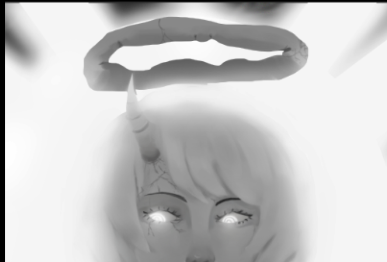
14. Step 08 Character painting part 3: To check the value
of the painting, I go to Window, arrange and select
a new window for the file that I'm working on to get another canvas like this. Then I go to View Proof setup, Custom, and this
window will show up. Finally at the
device to simulate, I changed it to S
Gray and click Okay. The value of Shake will help
the painting looks better. I adjust the intensity of the
image to make him proof of the overall image and make
the character stand out more. I went to textures.com
again and dollar less present to use the
magic wand tool. I select the white area, then hit Control Shift I to inverse the selection
and click Delete. Then I put the less
images together and use part of it for the
well by hitting Control J, duplicate and control D to
select and then moved it. And then use the var command
to make the list much v2. Well, I proceeded to paint it over to blend
the whole thing together. And the outer part of delays will be used
for the clothes. I choose a texture brush
and draw a pattern. Then place it on the
whale using the webcam. And then I set the layer mode to
hard light and reduce the opacity so that the pattern doesn't
stand out too much. I tried to draw a pattern
of the skirt as well, but it felt too cluttered. So I will come back
and fix it later. And then after that, I will go over the details
of the clothes again. I use Liquify to
adjust the characters, but somebody, because I feel that it's still
look unnatural. Once I had made a
few adjustments, I edited the character again. You can see that I added the
character several times. The large part of creating art is the need to
adjust in order to meet a customer's demand or simply sharing things to
your personal preference. I tried drawing the
pattern of the skirt. Again. Wish I wasn't
really happy with, but I'm just going to
forget it for now. And then I proceeded to use a brush to paint
the skirt and well, he did the oil again and then added more detail
to the accessories. Once again, I used
the less texture, selected, the white area. Press Control Shift I to
inverse the selection. Then press Delete
to remove the axis. Here, I'm going to use the
last pattern underneath, using the rock cool
man to adjust it. Then I start making the antler accessories to create the effect of the line of
gemstone running down, adding more shadow
to the character.
15. Step 09 Final touch: For the final touch, I have redrawn some of
the character details to add more detail to the part that I wasn't quite satisfying. I created a new layer and
adjust it to Linear Dodge at shows a blue color and paint it over the part
that will affect alike. Then made sure to
check the value as well so that the light part
doesn't stand out too much. I choose the orange
color and paint it over the flesh color parts to make
her skin look more human. I add this some patterns on the character's face to
make her look more fantasy. Once I'll satisfy, I painted the effect to make the work look like it's
interim or matrix. First, I use my brush to create an atmosphere
of particles. Then at glitter badge to create
sparkles on the artwork. I choose a light blue to create the aura of the James in
the character's head, which would add more
depth to the artwork. Then I use the
glitter and effect brushes all over the painting to make it look more fantasy, you can download these brushes
from my resources folder. I adjust the entire image by using the curves and
color balance tools. Then slightly pink,
the orange color on the skin in order to make
it look more beautiful. This is just a
personal preference. Don't have to follow along and simply finished the
painting before it. Just think the curved. But I prefer to keep the
image low contrast. Alright, with that said, this course is over. Congratulations. I hope you learn and gain some knowledge to help you
in your future endeavors. If you have any questions,
feel free to ask. And if you have an arrow, you wish to share
with me, please do. I would love to see
what people have created after taking this class. Thank you so much
for joining me and good luck on your journey
to becoming a great artist.
 Ariya Abeen, NPye