Transcripts
1. Introduction: Hello, Skillshare
people. My name is Paul. I've been a Skillshare
teacher for six years now, and
over that time, I have taught classes here on traditional watercolor
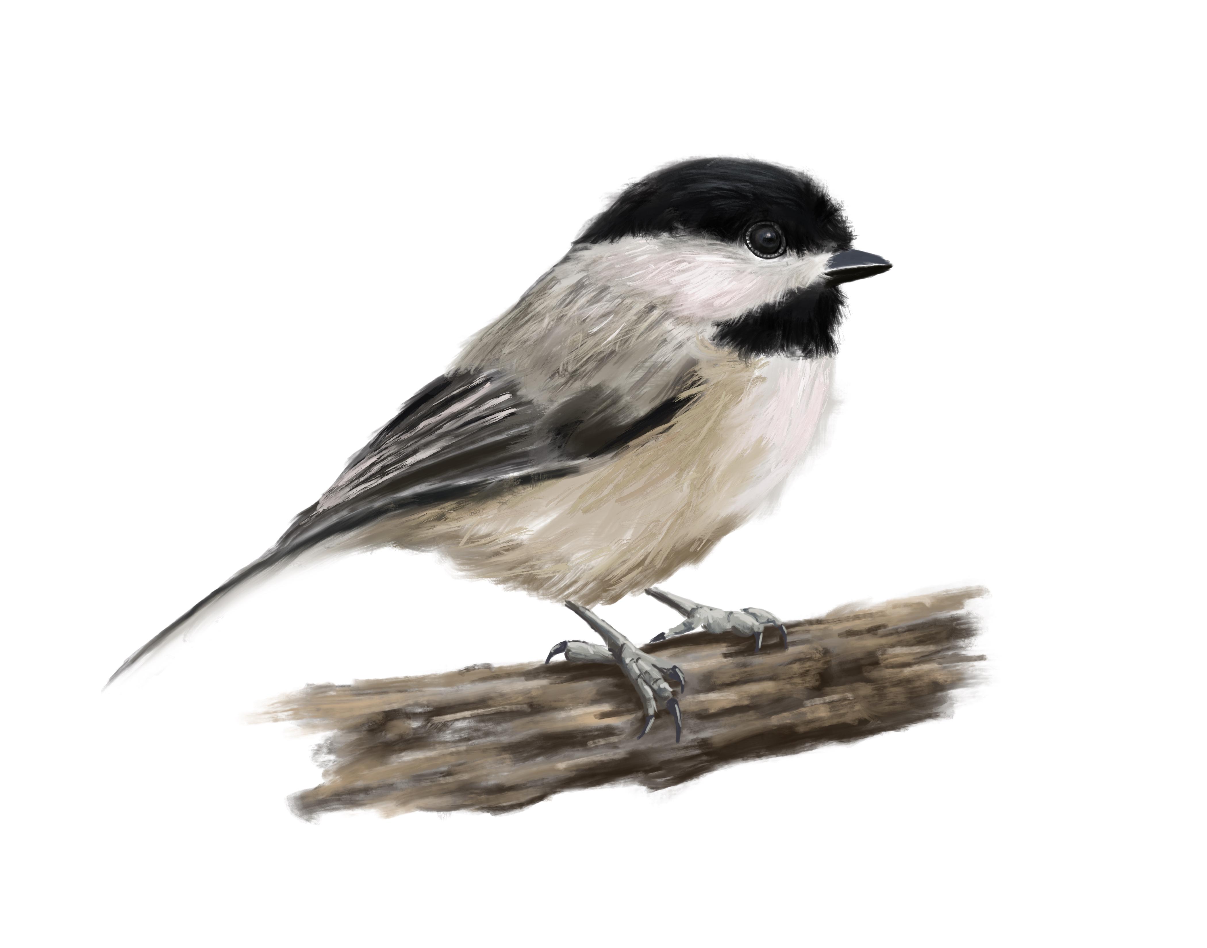
painting as well as digital painting. Today, we are going to go into the digital side of things and paint this lovely chickadee, using Procreate, an Apple pencil on an iPad. You know the deal. This class is definitely
for all levels. We start off by roughing
in the painting, and then we build
up the layers using traditional oil painting
techniques applied to procreate. Now, some of the things that are not covered in this class are little things like bringing your artwork
into Procreate, bringing your drawing
into procreate, setting it up and
things like that. I've covered in many
other classes here, such as my Learn to paint a pet portrait
in Procreate class. So maybe check those out first. If you're not too sure and you're just getting
started in Procreate, those might be a
great place to start. Other than that,
anyone can do this. Well, maybe not anyone, my dog, Luke Skywalker, he
might struggle. But other than him, I think anybody can do this. Make sure when you're
done that you post your finished artwork
in the projects and resources section so that
I can offer you feedback, and you can inspire other people when they begin their painting. I hope you enjoy it.
Let me know what
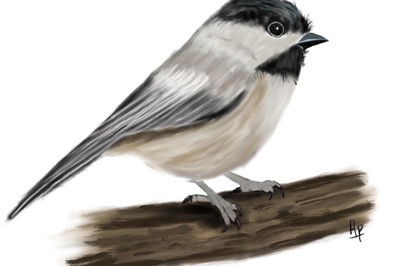
2. Roughing in the Painting: Let's take a look
at our painting. You'll notice the
sketch underneath is a bit off because I scaled the chickadee during the
painting process, and it moved. Anyway, so we're
going to start from scratch and so that
doesn't really matter. Let's open up the layers here. You can see here where I have my sketch underneath
the painting there. I've turned on my
branch underneath. Here, you can see
where the branch is. You'll notice that it's
underneath the chickadee. That way, I can paint without having to worry about the feet. First thing we're going
to want to do is put a new layer underneath
our drawing. That way we can still see the
drawing as we're painting. Okay, we're going to use
mainly these two brushes here, Paul base medium with oil and the linseed oil
up above there. So basically, I use that as a wash kind of thing or like
to mix and blend the paints. We'll use some of the
other sot as well, but for the most part,
that's what we're using. Now we've got our hickey
reference pitcher already imported in here. If you don't have this already, you can go up to the
little wrench icon, click Add, and then
select your picture. It's already add reference
picture from there. Once you have your
reference picture, you can change the size of this little window,
zoom in and out. You can pick colors from
here. It's very handy. So now you'll see that I'm
holding my finger down, and you'll see that brought
that color up there. Now with that brush selected, I need to make sure that my
brush is the right size, so I can fill in these
areas around here the black areas that we're
going to work on first. So I've got my brush
kind of the right size. I'll adjust it as
I go. But I'm just basically making
strokes with the brush. So getting it the right size, and I'm just making
strokes just like I would with a traditional
oil painting brush. If you make a
mistake, don't forget two finger tap on the
screen will undo, three finger tap will redo. You'll notice I'm just
basically slapping this on, criss crossing and going
around, just filling it in. This is how I would
paint normally with an oil painting brush. So I'm just going
around, filling this in, and I'm going to do
all around here. Don't worry about
the eyeball there, because if we cover it up, we can always erase it after and see if we
can just open that up, and then we can
come back to that. But for now, don't worry about that right now. Just
get some paint on. Basically, you want the
blacks and the black areas, the white and the white areas, the browns and the brown areas. Just fill it in. Don't worry about details or
anything else yet. Now, you're gonna notice
this white area where I'm painting isn't actually white.
It's darker than white. So what we're doing
is we're putting the dark colors
underneath, like, where our shadows
are or whatnot, and we're going to add the
lighter colors on top. This is the opposite
of watercolor in oil painting and in most
other painting mediums, you put the dark down first and the highlights and
lights over top. In these little wing areas here, I'm just kind
of blocking it in. I'm leaving some
space around just that I know what
and where is where. Like, you can see there's
different sections there where the wings
are clearly defined. Again, taking the darker color, putting it down here
first, underneath. Even though this is not
brown, it's actually white. There is brown underneath it. That is where the shadow
areas come from and also from the light being
hidden from the wing over top. It. Now we're going to bring the beak into play. We're going to use a different
brush here for this, but we want it to be
kind of smooth here. So we're gonna grab the
Paul base oil streak brush. It's basically like
a streaky oil paint, a brush that has more pigment
on it and less medium, like linseed oil or something. So, again, we're just getting
the brush the right size, and we're picking some base
colors and blocking it in. We don't want to go
crazy at this stage. Just get the colors
in. You essentially just want to get
rid of the white. Fill in something. That's your approach to
traditional oil painting, and that's how I approach
digital painting as well. It makes it so much easier.
3. Painting the Eye: For those of you that have
seen some of my other classes, you'll know that
I generally leave the eyeball until last. But today, we're going to
do it differently because I was near the beak and
I'm just being lazy, and it's right here. So let's paint it. Let's
zoom in nice and close. You want to be nice
and close. I want to look at these details here. So look at the bottom here
where we had the black. And inside, we've
got this blue area. We've got a highlight
area there. There's called the
specular highlight. Got some browns grays very subtle all the way
around and more black, kind of lining everything. If you look closely,
like, the bird has, like, black eyeliner around
it and on the inside. And there's this neat
little white area with these little dashy
lines through it. Now, as I said before, we can
always grab our eraser and clean up around here so that we know what we're doing and
where we're painting. I don't need to go all
the way to the edge. I think I made my sketch a
little bit large in this area. I know that from when I did
the painting the last time. And now we're going to
grab that same brush, the streaky one with
lots of pigment on it. Basically, it does a better job of filling in these areas here. Let's start with this
light area around the eye. Whoops too big and make the
brush a little bit smaller. There we go. We're just
going to paint in, like, the colors
that we see them. We're still the same approach, just like we did on the beak, except this one has more
areas and more colors in it. You'll notice sometimes if
you select a color from, like, by holding it on there, it doesn't appear as light. That's generally because
of what it's up against, and that's a bit more
complicated of a subject. But for now, I often will go and lighten the color
like I just did here, even though it's not that light in the picture, but that's okay. It just makes it easier
and clearer for me to see. Now we're over here on
these brownie areas there. Essentially, brown is orange that has not a lot
of value in it, or sorry, more value in
it and less saturation. And so, again, you don't
see this color in the eye, but I'm using it because I
know it's like an under layer. Like, I'm painting
it, and I'm going to put grays and blacks
over top of it. But I do want that brown, kind of gray brown to show up. Now, it wouldn't be
a typical Paul class if I didn't babble
on about something. Let's look at the color window here and explore
colors for a second. If I go to the top,
you'll see it's white. If I go to the bottom,
you'll see it's black. As I move this slider around, it becomes more and more saturated or has
more pigment in it. If I move it up, it
becomes more orange. If I move it down, it
becomes more brown. If I move it back over here, it's less saturated
and fully black. Okay, let's get our brush
size nice and small, and we're just going to define
this area around the eye. Essentially, we're
gonna call it eyeliner. And I'm just drawing
this in, really. I'm not nothing special here. You wouldn't do this with a traditional oil
painting brush. I mean, you might, but you'd
have to keep going back and putting more and more
paint on because your brush would be really tiny. This one here just magically picks up the paint and
puts it on for you. Now I started making those little dashy
lines around the eye, forgetting to fill in some
of the white area first. So I will say, oops and start
over and then go back in. Whoop, there I go.
And now I'm going to change this opacity
down using the same brush. I've just lowered the opacity. I'm essentially making
that black a gray. And I'm trying now to you
can see I'm smudging it, which is why I shouldn't have
put those lines down first. And I'm just
basically filling in this white area so
that it's not white. You'll see in the actual
painting, it's not stark white. It has some very subtle
white highlights, but it's not stark white. That's very important to notice. That's one thing that will
make your painting look very funny if you get
things like this wrong. And once you've done that,
you can go ahead and fill in those little lines, essentially, little black lines that go through this
little white area. And again, just draw them
in. Nothing special. They're just lines. Don't
try to overthink it. One of the great things
about classes like this is you can stop
at a point like this. You can look at the eyeball on the right and the
eyeball on the left, which is the real one,
and you can see how drastically terrible the one on the right looks
compared to it. I think this is
where most people get frustrated and give up with their drawing process
is they sort of get to a point and then
they don't know how to proceed to go further. If you ever find yourself
in that kind of situation, you can always improve on it. Just stop and look and pick one thing that you
see that's different. For example, you could say
the light blue area on my painting versus
the darker blue area on the other painting
where the eyeball is. And how would you make
that look the same? And just to tackle
it step by step. Okay, now I'm going to speed
things up a little bit as I go around here and fill
in some of these areas. One of the things I
want you to notice is how the colors blend together because there's a reason
why I put the brown down the way I did and
why I'm putting the black down the
way that I did. This is one of the
things that is so wonderful about oil
painting and makes it such a fantastic medium to paint in is the colors bleed. It stays wet and the colors bleed together, and it blends. And as you'll see, as this
painting comes together, you'll notice how
important that blending is and how we take basic
just blocks of color, put them together,
and then blend them. And speaking of blending, I'm going to grab
my blending brush, which the one I
have selected here, it doesn't show is the
linseed oil blending brush. It's pretty much the
only one I ever use when I'm painting with
oil for the most part. So what I'm doing
now is I'm dragging that blending brush into the colors and
pulling them down. So I'm pulling that blacks
down over the white. I'm pushing them
up over the white area and just taking away some of those stark white areas because they're not
actually really white. I'm just pushing the
colors around and bleeding them together,
softening those edges. In traditional oil painting, you have actual blending brushes that resemble makeup brushes, and this is exactly
what you do with them. You blend the colors together. And again, I'm going to
speed things up here. I'm just blending
everything together. One thing I'd like to
point out is there are some lines in the background
that don't get covered up. Those are the actual
sketch lines. I'll turn that off
later. Remember with your blending that you're
pushing and pulling. You don't want it
just one direction. You don't want to just push
the black into the brown. You want to go back and forth and blend those
colors together. The more you do it,
the softer it gets, the more of a gradation
that you have. Something I should point
out that's very important is if you look around the eye
in the reference picture, it's actually black and
around ours, it's very white. So we want to make sure that
what we're looking at when we're looking at our painting to see if the colors are accurate, that the colors around
it are accurate. They're the right colors because that will make a
huge difference. Lighter colours
will look lighter or darker colors
will look darker depending on the
background that they're on or the colors that
are around them. And now that we've done
that, let's go back to our blending brush and just
finish off the blending. We're gonna darken around the
eyeball a little bit more, maybe around some of those
white areas a bit more. We're just brushing the
blacks in pushing and pulling like we did
before earlier. We're just finishing it off now. Now let's zoom out and
look at what we got. Look at that. It looks
like an eyeball. Let's compare it side by side.
4. Adding the First Details: Okay, time for
some details here. I'm going to start putting some highlights
in the head here. I basically chose, like a color off the top of the head there, but it's coming out a little
green, as you can see. It's a bit on the green side, so I'm like, why is this green? So maybe I will pick
a different color. Try again. I can
slide it over to the blue, see how that looks. You know, sometimes
you're just gonna have to fuss around with
this kind of thing. And that's not it.
Let's try again. Undo, undo. Nope. And we'll pick it from
the top of the head. See how it changed
from green to blue, just depending on where
I pressed on the head. And that's gonna work fine. I think. We'll blend
it in. I'll look good. So to blend this, I'm gonna
choos some black here, and I'm just going
to use my brush to put some black
paint in over top. It'll pull that light color with it and just kind of
smear it all together. You can see how it's
starting to come together. Now I can use my blending brush, and I'm just going to
start at the ends there, and I'm gonna push
back against where the sort of the end
of those lines are. It just makes them blend in
and seem more realistic. Something else to
keep in mind here. Depending on where that bird is looking, what angle it is. If it just turned even a
millimeter in another direction, those highlights and
everything else would change. So don't stress too much about trying to make it
look exactly the same. Just gonna focus on what happens when light hits the bird's
feathers there at the top. Okay, now I'm just going to add in some of the finer
details, like, where the little feathers stick out on the top of the bottom, and then we'll put
some highlights in the bottom underneath
the beak area, as well. Okay, now let's get some of the highlight areas here on
the white part of the bird. Remember, we painted it with the dark shadow
color underneath. So now we can just
take our brush. Again, we're just using the
oil paint with medium brush, the one that we've been
using for the most part, and we're just kind of
coming along and flicking in some brush strokes that give it that feathery
kind of layered look. Okay, now moving on to the little brown area underneath
the white area there, it's up to you how
detailed you want to be. If you zoom in and look closely
at the reference picture, there's a lot of sort of criss crossing kind of feathers there. I don't personally like
doing all that detail. To me, I'm more of an
impressionist painter. So I just kind of do what
I think looks right. And so, basically what you want to do is you want to do
the same thing again. You're going to build up the
lights over top of the dark. So I'm just using little
criss cross hatch strokes here with a lighter color. And then as I want more detail, I'm going to add in a lighter
color and so on and so on. There's a tiniest little
shadow area right here that I'm just gonna use some of the brown color to fill that in, and then I can blend it later.
5. Painting the Wings: Okay, let's get some
wing going on here. Earlier on, when we put
in our base colors, we blocked in this little
area there with some black, and then the one above
it, we did in gray. As you can see, there are these
little white lines that kind of come down, and I'm just going
to put those on. The trick here is really getting a fine line that is straight, which I seem to always
get too squiggly. So feel free to
turn your canvas, get your brush size
the right size. If you make a mistake,
just tap and undo. It's just a tricky spot. So just take your time and
add in, like, what you see. So if you see a gray
line, add in a gray line. If you see a white line,
add in a white line. If you fill it in too much,
like I just did right there, take a black or something and
put it back in the middle, so you can sort of
define your lines there. So now I've got a darker color. There we go, and
I'm just putting in some of those lines there. Don't overthink it.
Don't do it too much. Just get it kind of
roughed in at this stage. I've always found this part
of birds very challenging. There's just too many fine lines and too many fine details. And it's a balance of, you
know, getting it right. Like, how much is too much? How much is too little? And for me, as you'll see, I'm doing here, it's
a trial and error. I go back and forth. I think
my lines are a bit too big. You know, maybe I want a
finer brush or more control, and, you know, or
they're not straight enough or they're going
in the wrong direction. But basically, I
put it down. I look back and I'm like,
No, that's not right. I try again and try again
until I get it right. Essentially, you know,
you can see here where my lines are just
they're too squiggly, so I'm going back and trying
to make them straight again. And this is a
problem that I have. That doesn't
necessarily mean that it's gonna translate
into your painting. I mean, your
painting. You'll find other challenges or
different things that are. But, you know, the
nice thing about this is, unlike
traditional painting, you can just undo
and do it again until you get it right.
Now, speed this up. You can watch as I go through and add in these
finer details and little white stripes and streaks and lines and
different things like that. And I'm just trying
to get it so that it looks how I think
it should look. But overall, don't be
intimidated by this part. Essentially, all I'm doing is I'm going back
and forth and I'm using white lines
and black lines until I get the right balance. You know, and again, as I said, there's
always a fine line of, like, how much is too much,
how much is too little. I want it to be an
impressionist painting, but I also want to show that this is this
part of the wing, and this is that
part of the wing. And now we're moving on to the underneath part
of the belly here. I'd just got a
darker brown color where that shadow is area there. I just picked it up from
the reference picture. And I'm just putting
that in along here, and then we're going
to add in some of the lighter colors over top
to fill in the chest area.
6. Finishing the Beak: Okay, let's get started on that beak and the
area around it. So we've got it blocked in, just like we did
the other areas. This isn't going to be any different except we're going to keep it smooth and not feathery, like, because, well, there
aren't feathers on the beak. There's feathers
around the beak. So basically what I'm
doing is I'm drawing in this black line that you'll
see at the top of the beak, and then I'm going to add in, like, the other areas and blend them around with the
blending brush as well. So you can see now I'm
pulling this color down, making it more seamless, trying to get that blue
blended into the gray. I'm just going to quickly add in the black area that comes
down around the beak. I accidentally left
that out earlier. And now with my canvas turned, I'm just gonna put
this black line, basically the top of the bottom and the bottom of the top of the beak, where it
opens and closes. This is sort of like
the bird's mouth. I'm gonna put that
straight down. Again, I've got my canvas
turned because I can't draw a straight line
sideways to save my life. Mm. And now we need to fill in that gap at the base of the beak and
where the feathers meet it. So I'm going to grab some of
the blue on the beak here, and I will use a soft blend
brush just because, again, we want this not to be feathery, we want it to be
smooth like a beak. And if you want to bring
those feathers out further over the beak, like
in the reference picture, switch your brush up so that you've got something
not as smooth, and you can just pull some
black areas down there. Remember, change the
color. I didn't do that. So we're gonna slide this
down, grab some black, and now we can pull this down
and put those feathers out, those little whisky
bits out over top. Now, zoomed out, you can see
our beak looks pretty good. There's a little bit of a blue area there
that I left that, you know what, it looks fine. I'm just gonna throw in
a few more whisky bits, not that long, and then we'll
move on to another area.
7. Painting the Feet: Okay, let's get into the feet. I often leave feet
out of my birds, but I figured I'd do it in
this one. I don't know why. So let's grab our Trusty
PC base with oil, medium brush, whatever
you want to call it. We're just going to
select the mid tone kind of gray out
of the feet here, and we're gonna fill in
the entirety of the feet. Don't worry about covering
up your lines because our pencil drawing is
underneath our painting. If it's not, you
might want to fix that because you won't be able
to see those little lines, like where the nails are, where the little foldy bits
are and stuff like that. And just like the rest of the painting, don't
worry so much. You can see how poorly
I've filled that in. You're just grabbing whatever, throw it in, get your
like, fill it in. Just make it gray. Don't
worry about anything. Just get paint on there. This is your base layer paint. The other colors will bleed
into it as you add them, and they'll all mix around
and be happy together. Okay, let's start
adding some details. So let's look over here
on our reference picture. Basically, what we've got,
we've got a light area on top. We've got a dark
area on the bottom. We've got some cool
little lines here, I guess, where the birds feet
bend and stuff like that. We'll call them
knuckles. So let's grab some of that dark area, zoom in a bit, and
we're gonna put that down the side there where I just showed you on the
reference picture. And here we go. Make
sure your brush is the right size. And you
have the right brush. I'm gonna switch to this,
the more squishy brush that doesn't have as
many scratchy bits. All the technical
terms, squishy brush, scratchy bits, those are really important to
remember, as well. So just like we did in the beak, I'm essentially just
drawing in what I see. If you look closely at my lines, they're not perfect.
They're not straight. They're not anything. I'm just sketching them on,
putting them in. I'm gonna go all around the feet and sort of fill
in the dark areas. The eyes in any painting, to me, are the most important things and that's where you
want the viewer to look. So I'm keeping the details
on the feet to a minimum. I'm not putting in
all the knuckles. And now for the highlight area, I'm going to grab
a lighter color, put that in on the top
where the light comes down, sort of where it hits
some of the knuckles. And once we've done that, we
can grab our smudge brush, again, the same one that
we've always used again, make sure you've
got the right size. That was way too big. It's gonna have to be fairly
small for this, and we're just blending
these in together. We're just blending the
colors together so they don't all look so streaky and
separated from each other. We want it to be nice rounded shadow lines
and highlights. I think it looks
pretty good. So far. We need to put in the nails and maybe a bit more darker shadows. Let's work on that part there. Grab some black. I'm gonna add in a few more
details in the knuckles. Make sure again your
brushes are right size. And just like we did with
the rest of the feet, we're just filling in the nails right now and just using black. I mean, I paint them all black, and we can add in the
highlights and blend them in together like we did with the
feet and everything else. If you look at our claws,
you'll see there's like a little shimmer
area on there. So I'm just gonna grab,
like, a grayish color, pretty much the same
as the feet and put a little highlight on where the light
would be hitting it, which would be
from the top area. And if you feel so inclined, you can put some of that
on the foot area as well, not just on the claws or nails or whatever you want
to call them. And
8. Painting the Branch: And we don't want
our poor little chickie floating in space, so we need something for
those feet to sit on. Our little branch here, we are
going to work on that now. And if you recall, as
I mentioned earlier, we're going to put the
branch on a separate layer, which makes it much
easier for painting. We don't have to worry
about getting in and around the fine details of the feet.
We just put it underneath. To get the layer
underneath, we just press, hold, and drag it down under
until it moves underneath. That's it. Easy
peasy, as they say. So let's grab our brush,
make it a bit larger. And we're going to
use a dark brown. I pick the brown from
the base of the tree, like the bottom underneath so that it'll shadow area there. And we're gonna
fill that all in. Don't do a cross hatch like that because that's not the line
or the shape of the branch. It's just easy go
back and forth. Just fill it in. Scribble
away. Just do your best. Just get in there
underneath the feet, try to stay within
whatever lines you made so that it
looks realistic. That's about it. Realistic,
meaning that the birds feet are actually touching the branch and not
floating above it. Darker on the bottom,
lighter on the top, just like in the picture.
Just get it filled in. Don't think too much about
it. Just remember to put some shadow areas
underneath the feet because the bird's feet
will cast shadows. Once you're happy
with your scribbling, pick a lighter color and
put some of that on. Just stick it in in
various different places. You know, basically,
this is the light hitting the branch
in different areas, so we're going to build
up from dark to light. You can continue to
lighten the color by selecting your color here and moving it around
inside that window. You don't actually have
to choose anything. You can just lighten
the color itself. If you want to get real
crazy, you can try and put in some of the darker little
lines that you'll see there, like the birch or
bark areas, I guess. To me, I like to keep this
as a minimal focus area. Again, I don't want to
take away from the eye. That's where the viewers
should look, in my opinion. However, this is your painting
now as you're doing it. So if you want to have
those little bits in there, by all means, feel free. Something I like
to do. And again, this is totally
optional is I like to take my blending brush, make it really big and
kind of pull some of these features in and out of
the white area of the page, so it's not such a stark
object just sitting there. This takes a bit of practice,
so play around with it. And again, this is
completely optional. I'm going to do a little
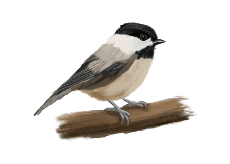
bit more on the bird, as well as far as blending goes. And again, completely optional. And that is it. I am ready now to almost ready now to say that this
painting is complete, a few little extra touch
ups here and there, and while we are done. Yay.
 Paul Cheney, Teaching watercolour and digital painting