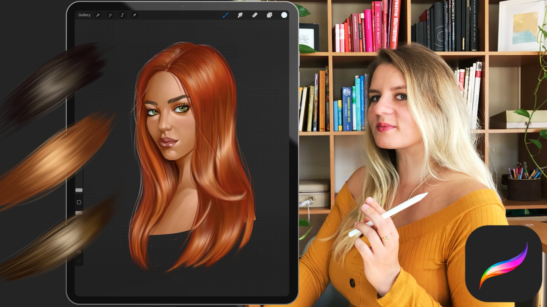
Transcripts
1. Introduction: If you want to
learn how to create beautiful expressive
black and white portraits in Procreate, then
this class is for you. Hi, I'm Gabrila Shel. I have been working as
a professional artist and illustrator for
over ten years. What once started
as a passion for art as a kid turned
into a profession. Since then, I have worked
on a variety of projects, creating characters
for video games, and illustrations for books. Ever since I can remember, I love to paint portraits. I love to capture the human essence in a portrait painting. My very first portrait,
I painted with four, and I still keep painting portraits professionally
and for fun. In this class, I will teach
you how to easily paint a beautiful expressive
black and white portrait and procreate using the
digital oil brushes. We will talk about the basics of facial proportions and
how to simplify them. Will also talk about finding good reference photos which will make the painting
process easier. Later, I will show you
how I used to default oil brushes and procreate to layer color and mix
different values. I will also provide you with a free brush set which I
used to paint my portrait. Later in the demo
part, I will guide you through my painting process
from start to finish. Feel free to paint along. Join me on this
wonderful journey where you can learn how to improve
your portrait paintings. So when you're ready,
let's get started.
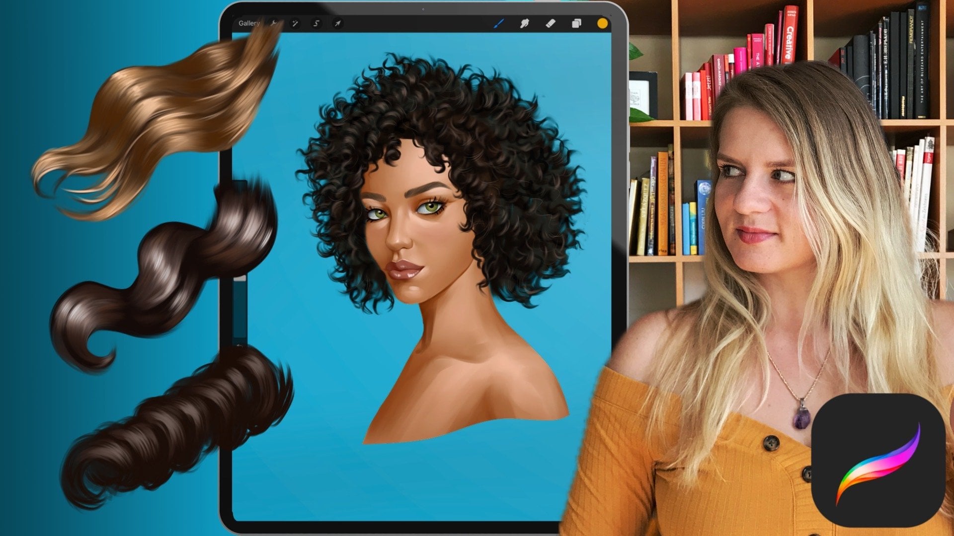
2. Class Orientation: Thank you for joining my class. I'm really happy to
welcome you here. In this class, I hope
to make it easier for you to start with digital portrait
painting and procreate. I love painting portraits. They are so much fun to paint, but come with their
own challenges. Even if you're an
experienced artist, I hope you can learn
something new for yourself. The most important
thing, though, is that you have fun
and enjoy the journey. Today, we will be painting expressive black
and white portraits using digital oil brushes. You will need an iPad with Procreate apple pen and a bit of your time
and imagination. We will be using some of
the default oil brushes, as well as my free oil
painting brush set, which I will provide
for this class. For the class project,
I encourage you to create your own expressive black and white
portrait painting. Since the class painting
demo will be in real time, feel free to paint
along and share your process in discussions
or in the project section. In the resource section, you will find several
reference photos as well as some free brushes to kickstart
your portrait painting. Feel free to use your own
digital oil brushes as well, as well as your own
reference photos. Please don't forget to share your paintings in
the project section. You can also ask
me any questions you might have here
or in discussions. I will be very happy to clear
any doubts you might have. Also, upon finishing this class, I will be very
grateful for a review, as this helps me greatly to further improve
my classes for you. I can't wait to teach you some wonderful and
fun techniques on how to achieve a painterly
look in your artworks. So prepare your iPad, and let's move on to the
first lesson in discourse, how to find proper
reference photos.
3. References: Finding good reference photos is an essential part in
the creative process. Good reference photos
will provide you with the necessary amount of
information for your painting, making it easier to create a more realistic and
believable painting. There are a few
things to keep in mind when looking
for references. Below, you can see some examples of different reference images. Left, you can see an image which at the first glance
looks like a good photo. Yet if you actually want to
use that for a painting, you will quickly realize
that there is a lot of essential information
which makes it less valuable as
a reference photo. The photo on the left, for
example, has no clear shadows. The lighting is super soft, and if you use that
photo for a painting, we run the risk to get a
very flat looking result. We have basically too little
information to work from. Compare it now to the
photo on the right. We have some strong
shadows and lights, and the tonal value
is much higher. I mean by that that we have a bigger gradient of
values to work from. Resolution is also
high enough to provide us with enough
detail to work from. It's much easier to work
from a photo like that. Both photos are mostly
lit from the front. The studio light
photo on the left removes all structure and
texture from the face, while the naturally
sunlit photo on the right allows us to see so much
more complexity on the face, which we can adapt
in our paintings. This leads to the next example. I always try to avoid
photos that are too soft, nearly as if a blurry
filter was applied. This can happen due to a bad
camera lens or low pixels, but also simply because
of a style of editing. Super soft blurry photos remove so much valuable
information about the face. If you now take a look at
the photo on the right, you can see so much
more structure. The left photo also has
very few contrasts. If we were to work from
a photo like this, our end result would
look quite flat. Compare it now to the
better reference photo. The facial features
are well defined and we have a nice amount of
different tonal values, ranging from quite deep darks
to fairly bright parts. By the way, it doesn't matter if your reference photo is
black and white or in color. I use color photos all the time from a black
and white portrait. If you prefer to work from a black and white reference
for your paintings, you can quickly edit your
photos to be in black and white and then upload them
as reference photos again. Next photo here looks like
a professional photo, but personally, I
wouldn't choose it as a reference photo
for my portraits. The photo is too bright, we have few shadows or contrasts, and the skin looks too perfect. As a painter, you can
make the decision to remove some blemishes or slightly correct
parts of the face. In fact, that's something
that has been done for centuries in the
painting of old Masters. Yet they were working from real models with
real unedited faces. Having a photograph
that is heavily edited removes so much
information from the image, which basically leaves you with an idealized
image to work from. This not only leads to much
less interesting end results, but actually also
makes it harder to read things like
planes of the face. On the contrary, we have a
natural looking photograph. This photo might be edited, but the editing
was quite minimal, so we still see a lot of
details. The face is well lit. We can see some shadows that help to show the
plasticity of the face. We can easily read the
different planes of the face, which will allow us to translate it into the painting easily. See also how a light source from the side allows us to see the form of the
facial features, while direct frontal light
makes them kind of disappear. Now, here's another example
for a beautiful photo, which isn't suitable
for the type of portraits I want to paint. It's not only very bright, which makes it have
hardly any shadows, the face is also quite obstructed and covered
by the glasses, the hand, and the hairpiece. Now, this works
greatly as a photo. It would probably also work great for a different
type of illustration, such as more flat
looking artworks for painterly realistic
portraits, yet not so much. We want to choose
a reference photo where the face is
clearly visible, not obstructed by any objects with nicely defined
shadows and lights, which isn't too
bright nor too dark. To quickly summarize
it, look for well lit, well defined
reference photos with good lighting that will show
a decent amount of shadows. I prefer lighting
from the top side so that we can have some
nice shadows from the nose. Look also for unedited
photos if you can, and make sure they show
the facial structures and the different
planes of the face. I find a lot of my
reference photos on royalty free websites
like Nsplash and Pexels. You can also use
websites like Pint Rest. Just keep in mind
that photos from that sites don't usually come
with a commercial license. Of course, the best thing is always to shoot
your own reference. If you have friends or
family, you want to paint. For that, I love to put them
in a free quarterly view and put the lights from aside so that you can see
some nice shadows. But I understand that
is not always possible, and sometimes you
just want to find a quick reference online
to just start painting. In the resource section, I will provide some royalty free reference photos
for you to choose. Feel free to use any of the reference images
for your paintings.
4. Structure of the face: Before we start
painting the portrait, I think it's important to keep some basic anatomy in mind. There are many ways
to start a portrait. Some use exact grids on the reference image
and the canvas divided in squares
to make it easier to eyeball the placement
of the facial features. This allows to paint perfectly realistic portraits
with good likeness. While it's a good method,
I personally prefer to start with a sketch where I roughly draw in the proportions. That way, I can create
my own version of the portrait and add some
stylization if I want to. With experience, it will
be easier to just eyeball the placement of
the facial features without a detailed sketch. You can also trace over
the main facial features to make the start easier and focus on the
painting itself. Yet knowing the structure
of the head and especially the different
planes of the face will lead to a more believable
and better painting. Let's take a look at
some proportions. There are many
different approaches to drawing the human head. Some are more exact
and scientific, others have a loser approach
based on observation. Let's take a look at
the simplified approach on how I would divide the
head from the frontal view. I like to start my head
drawings with an oval. Important to note that I'm talking here
about an adult head. Children have a somewhat
different anatomy. I like to divide that
oval in the center with the line separating the
two halves of the face. I divide the middle of the
oval once again with the line. We now have a kind of a T or
a cross dividing or oval. With horizontal line, we mark
the position of the eyes. Now we will draw
another line between the bottom of the oval
and the eye line. This line marks the
position of the nose. We divide the lower space once again marking the
position of the mouth. The eyebrows lie on a
separate line above the eyes, which will lie slightly
over that line. That line also marks
the start of the ears, which end roughly at the
position of the nose. The hairline usually starts one third counting
from the bottom. The space between the eyes is roughly the same
width as one eye. Keep in mind that this
is the very basic of proportions to make starting
drawing a face easier. Each human has a somewhat
different anatomy. We can also further exaggerate those proportions to create different characters
in the illustrations. For a three quarterly view, I like to start with
an oval as well. Instead of drawing
now a straight line, we will slightly curve the line to mark the rotation
of the face. I do the same with the eye line. That way, we can directly show the position and the
rotation of the face. I once again mark the nose in the space halfway in
the middle between the eyes and the chin and the mouth in the
middle of those two. Now, additionally to
the lines I've drawn, I will also show an ellipse
to mark the side plane. This ellipse will change depending on the
perspective of the head. From the center of the ellipse, we will draw a curve towards
the mouth, marking the jaw. That will help us to
consider the muscles below the skin when placing the lighting during
the painting process. Let's not forget that the
nose and the eyebrow and the forehead is extruded in comparison with
the eye socket. Let's take a look at the planes to make this easier
to understand. We use the planes method to simplify the different
planes of the head. This is a stylized
version of reality, as in reality, we don't have hard edges between
different planes, but practicing
drawing those planes will greatly help you
improve your paintings, as you will be much
more conscious when placing your brush strokes. The Asaro head, after which
the first model was made, helps to visualize how light
falls on the human face. I got this model from
a wonderful app, which you can download for
free from the app store. It's great because you can rotate your head, putting
the light source. And basically, you will see how different planes act and
where the shadows will drop. Now, if you unlock
the full version, you have much more
varieties of heads, and basically, you can
adjust so many more options. But I think this
one works great. So feel free to use that one
as a reference, as well. In the next section, we will take a look
at the brushwork.
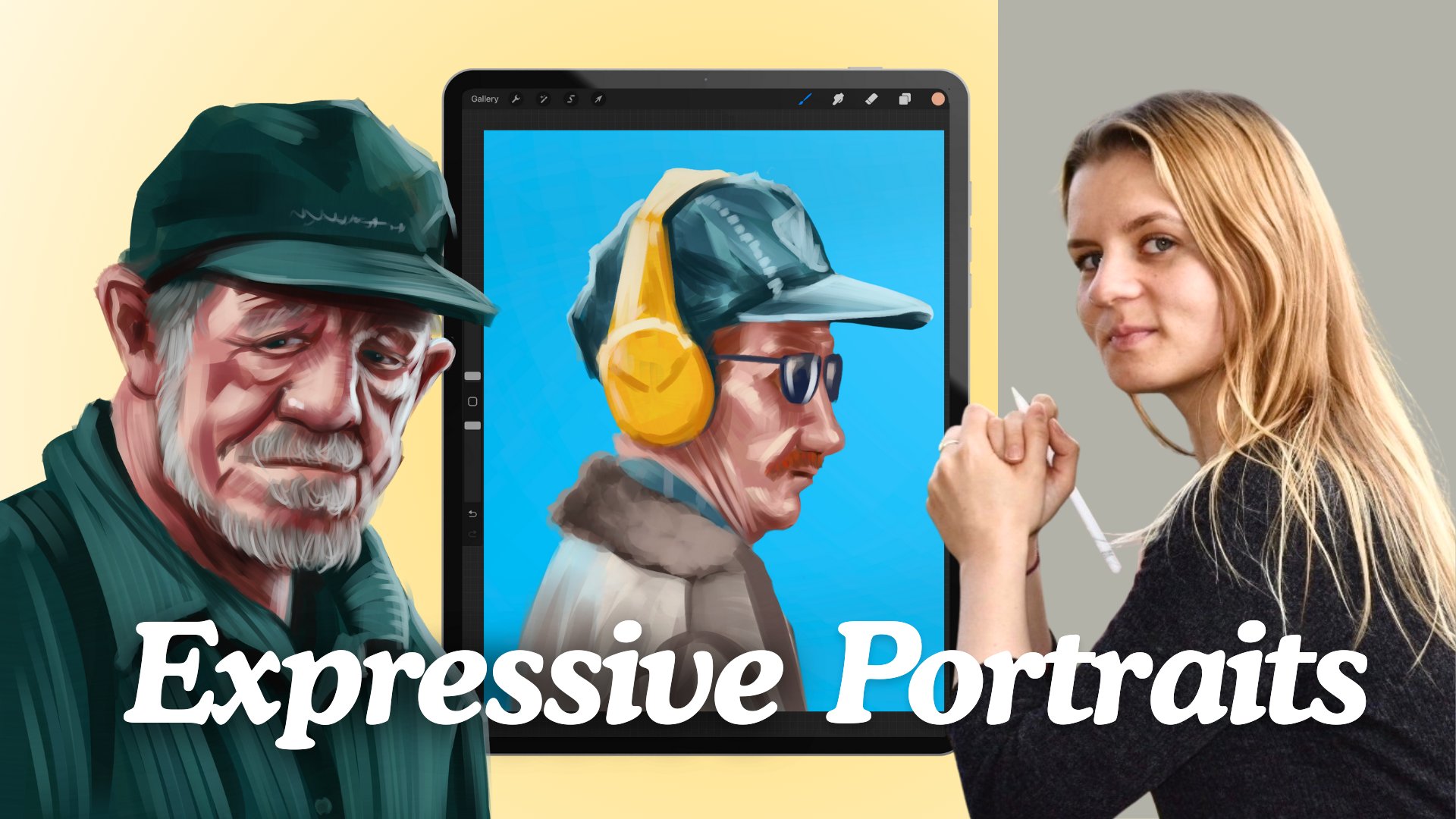
5. Brushes and brushstrokes: Let's talk shortly
about brush work and my techniques to layer
color or in our case, just black and white values. If you haven't yet
downloaded my brushes, feel free to do so now from the resource section and
add them to your library. You can also use the
default oil brush, which comes with
procreate if you prefer. So there are many ways to layer brush strokes and mix
colors in digital painting. And while we will be painting in black and white, the
principle is the same. Depending on what style
you're working in, you might want to achieve
a very smooth finish or a very placaty flat look, like we can see in many examples
in publishing or comic. For more painterly works like the ones we
will be creating, we want to work with
similar techniques to what traditional
painters would use, but apply to the digital
medium and using the wonderful array
of digital tools that we have at our disposal. We will be using mostly
digital oil brushes, which have a wonderful
wet feeling to them. What makes them so unique
is the fact that they drag a bit of that color with
them with each brushstroke. That allows us to do two
things at the same time. We can create a wonderful
painterly texture due to the bristle
texture they have. We can at the same time make soft transitions due to
the fact that the brush will pick a bit of the
already applied color and mix it with
each brush stroke. That's wonderful
for two reasons. That way, we can already
mix a bit of a new value, which does half
the work and also make a smoother transition
between the brush strokes. The typical way to
create new values or color in case you work
with color directly, is to paint a brush stroke, then paint a new one
on top or next to it, and color pick in
the middle to pick up some of that newly
achieved color or tone. Depending on your transparency
in your brush settings, you will have more or
less colour transfer with each brush stroke. This is about playing around and experimenting and see
what you like the most. So generally, I
like to start with a color base so as not to work directly
on a white canvas. I like to start
with quite strong brush strokes when I
first start painting. What I mean by that
is that I like to press harder on my
pencil to create a brush stroke with less
transparency and to lay opaque color at the beginning of the painting to have a nice
color base to work from. While at first, we might
use the color wheel more frequently to pick up
new colors and tones, later on, we can basically
work directly from the canvas, picking the color we already
established and mix. I use the color picker constantly to add more
variations of color. Obviously, you could always open the color wheel
and choose a new color, but that would be not
only very time consuming, but also much harder to do, as it is hard to find
the correct tonal value which you already
established in the painting. So I definitely recommend using that method to
create new colors, even if just in gray tone. Later on, when we
have a nice base, we can start adding
brass strokes with less transparency to layer color upon color and slowly work away up towards
the finished illustration. A few words about
the smudge tool. The Smudge tool is
a very useful tool which I recommend
using sparingly. I would avoid using it to
mix colors on the canvas, as it will create a way
to soften transition, and when working in
color oftentimes creates grayish colors. Use it for small details to
smooth out a specific part, but definitely try to mix color using the color
picking technique.
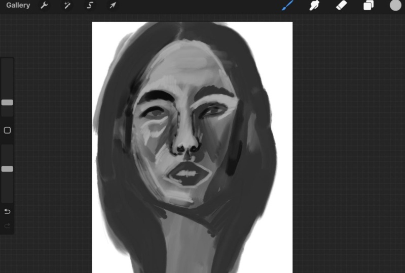
6. Demo: Sketch: So it's time to start painting. In this part, I will guide
you through my painting demo. So we start our illustration
by opening a new file. This is super individual. I personally love to work
in 2,500 by 3,000 pixels. And just in case I want
to print it later, I use 300 DPI. If you're working with
an older iPad model, you can consider working
on smaller canvas. First thing I do is to set up the reference window
with a reference photo. You can upload the reference
you have saved in photos, and it will be floating in the little window next
to your painting. So to save time and be able to focus directly on the
painting process, I will quickly outline her proportions
directly in the canvas. Usually, I sketch the
faces from scratch. This not only provides a
completely unique face, even if you try to make it as photo realistic as possible, but also lets you input some subtle stylization
of the face. The sketching process can therefore take quite
a bit of time. In this class, I want us to focus on the painting
process itself. Therefore, I'm outlining
on a layer on top of the photo layer with a sketch brush or any brush you like, really, the overall
shape of her head. For that, I've uploaded the reference photo as well as a single layer on the canvas. I recommend lowering slightly the opacity to make it
easier to see or sketch. Luckily, procreate
instantly creates a new layer on top of
the background layer, so we don't have to do that. I remember how many paintings I had to start from the
beginning or try to separate later from the
background just because I forgot to create a new transparent layer over
the background layer. When outlining, I focus on
the overall proportions, the flow, and the
direction of the hair. I sketch the shape of her face, outline the form of the nose, the eyes with the
eyebrows and the lips. I work around the
contour of the face, but don't worry if you're
not working too cleanly. We will paint over those parts later and define
the lines better. I also like to draw
in the shadows. That will help us later when we start filling the
shape with color. I also try to keep the facial structure in
mind when sketching. We tend to simplify and make the facial structure
softer when we paint. So keep in mind that
Asaro head we were looking at and keep
the plains in mind. I lower the opacity of the sketch layer so I can
better see what I'm painting. I also try to keep my layers organized and name
them accordingly. In the next step on a layer
below our sketch layer, I will start filling in the
shape with the middle tone. I chose a middle gray which lies more in
the darker values. It's still lighter
than the shadow color, but definitely much darker than the lighter
part of her face. And I take some time
to fill in the shape. I like to fill in the shape and lock the transparency
of the layer. You can do that by sliding the layer to the right
with two fingers. That way, when creating
other layers on top of it, we won't be able to paint
over the contour of the form. I also duplicate
the base layer just because I like to keep
extra cupies just in case. On this new layer, I start
painting in darker shadows. For that, I chose a
somewhat darker tone. I like to outline the
face by painting in the dark spots on her
hair, contouring her face. I work around the
contour of the face, but don't worry if you're
not working too cleanly. We will paint over those parts later and define
the lines better. See how I make the brush strokes in direction
with the hair? This is already half of the work to create a realistic
hair later. Having sketched in the
limitations of the shadow in our sketch layer before will help us to know where to
paint in the shadows. I also use the same color to paint in the shadows on
the side of her face. I do the same on the
neck on her cheek, keeping the structure
of the face in mind next to the nose and
below it above the eyes. Let's also not forget the
shadows under her lips and, of course, below her face. That's where we have
most of the shadows. Having sketched in the
delimitations of the shadows in our sketch layer before will help us to know where
to paint in the shadows. So let's talk quickly about
how I work with layers. For complex illustrations, I usually tend to have
separate layers. So let's say I would have
a different sketch layer, then I would have layers for different objects or parts
of the face or clothing. For painterly portraits
like this one, I actually prefer to
work on very few layers. So I would have a
background layer. I would have the main
layer with all the colors, and I would have a
sketch layer on top, which I will be gradually removing or lowering
the opacity of. I do that because of the
weight brushes we're using. The reason for that is that digital oil brushes work when we have a good
base of color. Also, I think it's a personal
preference because I just really like to work like I would in a traditional way. I also use the same color with a somewhat smaller
brush size to mark the outside of the nose and
the shape of her skull. You can squeeze your eyes
slightly at the photos to make it easier to see which parts have subtle shadows we can add. At this point, our painting looks much darker than
the reference photo, and that is okay because we will be layering layers
upon layers of color. Well, in this case,
black and white. In that way, we will lighten
our illustration as we go. There are many ways to
approach painting a portrait. I usually prefer to start
with the middle tone. That way, I have better control over the other two
important parts, the shadows and the lights. It also gives me
more flexibility to lighten or darken the
painting as I see fit. In the next step, we will start adding the first
light to a portrait.
7. Demo: Creating a base: Now we will start adding
the first lights. For that, I repeat the procedure with the
layers as before. I duplicate our shadow layer, and on a new layer which
I will now call lighting, I will continue adding
more brush strokes. All of my layers have
the transparency locked, which is called Alpha
lock and procreate, which means I cannot paint outside of the already
established contour. That way, we don't have
to worry about being too precise when painting
around the edges. I choose a lighter color, not too light yet and start adding the main masses
that have the most light. If you look at the photo,
those are on the top left over the eye on her cheekbons
below the eyebrows, and on the bridge of the nose. We also have a bit on the chin. This is a delicate process which can take a bit
of time to get right. I always try to paint in the
direction of the planes. At this point, having a
rough understanding of the structure of
the face and how the muscles work below
is a great help, as you can visualize
the direction in which it's best to set
the brush strokes. The oil brushes allow for soft smudging when
applying low pressure. That way you can make your
brush strokes somewhat softer. I also occasionally lower the brush size to paint
in smaller areas. I carefully paint in the
lighter parts of her face without much brush pressure and following the
form of the face. As those brushes allow for
soft smudging while painting, I use that to make
softer transitions between individual
brush strokes. The most amount of shadows can be found on the left side of her face as her light source comes from the top
left side corner. Therefore, I'm concentrating
on that area first. But we also have
a bit of light on the right cheek
and to show form, it will be important
to paint it. The eyebrows lie above
the eye sockets on the extruded part of the skull and have therefore
quite a bit of light. You can use the smudge tool to soften the individual
brush strokes. While for later, we want
a painterly texture for layering color in
the beginning and until we get the right
values for a painting, it can be very helpful
to use the smudge tool. I smudge tool can also be used to softly push the paint where we needed to be. It's also fun to experiment
using different brushes with the smudge tool and see what textures and
effects you can achieve. In this painting, I will
be mostly using it for some minor adjustments and
to soften the base layers. Also, please don't forget that any painting always passes
through an ugly face. It's absolutely normal and every creative
passes through it. It's important at this stage to believe in the process
and keep on going. The end result will be worth it. I'm smudging the transitions of the shadows to
make them softer. This will help me continue
building up color later on without getting
distracted by sharp edges. I click on the little N
next door sketch layer to lower the opacity
of the layer. That way, I can better
see what we have painted, and at this stage, I don't need this guidance to be
that strong anymore. In the next phase, I will
start detailing the image. In this case, I
actually forgot to duplicate the layer
as I did before. By the way, I decided to proceed
on the same one anyways. As the sketch layer is
now not that visible, we can clearly see some parts of the illustration that needs
clarifying and defining. I start defining her
facial features. I pass over the lips, adding some darker tones, and add some more defining
lines to her eyes. For that, I color pick a
somewhat darker color. I basically draw out the lines that I initially
had in our sketch, going over the
contour of the eyes, the iris, so we have a
darker base to work from. I do the same with
the nose outlining the nostril somewhat and giving more definition
to the eyebrows. The nose at that point, doesn't have too much structure, so I start by painting in the
lower planes of the nose. This will make the
nose appear like an actual three
dimensional object instead of just a flat
shape on a canvas. As you can see, I do half
of the work of defining the eyebrows by painting the lines in the direction
of the growth of the hair. I also love to rotate
the canvas as I paint to make it easier to place brush strokes in
direction of the form. As you can see, I always
jump around the painting. Now I'm adding a bit more
definition to the nose, and here's moving a
part of the eye a bit. I occasionally switch values as well just to add a
bit more variation, and I also regularly change
the brush size as well. In the next part, we will continue adding more
lights to the painting.
8. Demo: Adding more lights: Now we will start adding more variety of values
to our portrait. For that, I choose a
slightly lighter value. I start adding the
first highlights to where the face
catches more light. Those are being the lips,
corners of the mouth, the nasal lab fold, the nose itself, and the cheek. I do it with small, careful movements without much pressure. I want to build up
the value slowly, controlling each
step of the process. I observe the photo for
lighter parts and add brush strokes which move with the direction and
form of the face. We haven't so far added
any on her right side. The side that has
most of the shadows. But if you look closely, you can see that
her right cheekbone has some lighter shadows on it. The part on the nose bridge
is also particularly lit, as well as on the
top of her forehead. The process is really about observing the photo reference. If you have difficulties
making out the lighter part, try squeezing your eyes slightly to help you see
which parts are lighter. I carefully smudged
the brush strokes with the same brush by applying
very low pressure. That's what I love so much about oil brushes and procretes that they allow you to smudge parts that need lesser texture. I spent some time carefully
placing lights on her chin, cheek, and the part
above her mouth. While I'm still working rough, I simultaneously softly
blend the brush strokes. I work quite Zoomed
out in order to focus on the main masses of
light that need to be placed. I'm adding some darker color
to create more volume. I'm adding reflected light
into the shadow from her nose. Reflected light is
light that gets bumped back into a shadow
from shiny objects, which are too dark to illuminate
the shadow completely. Shiny objects could be things as white paper on the table
or bright clothing, but it can also be skin itself. Those reflected lights give us the information about the type of material we're painting. In this case, that the
skin is slightly shiny, is not completely mat. It's important not to
add too much light. Otherwise, it won't
look believable. When painting teeth, it's important not to give too
much emphasis on them. Start very carefully adding slightly lighter
patches of light where the teeth reflect
the light without painting the dividing
shadow of individual teeth. Just a hint of highlight, and I assure you our brains
will do the rest. They will help us visualize what we need to when
we look at the image. I add more variation
of values to her lips and start defining
lighter parts stronger. What makes a painting
interesting is often the contrast between soft
contrast and strong contrast. So we want some strong contrasts like the darks of her nostrils, the shadows of her
hair framing her face, the line of her mouth,
versus the skin babove. But we also want
some soft contrasts like the shadow from her nose, which is much softer
in comparison, and doesn't have
such a clean line dividing shadow from light. Painting noses is probably one of the most difficult
things in a face, as they have so many
different planes. I recommend going
back occasionally to face models such as their Saro head to familiarize yourself with
the different planes. But see how adding that
little shadow plane on the right side instantly makes their nose appear
more t dimensional. I also add some highlights to the eyelids and start adding a bit of definition
there as well. We will now start
adding details. As usual, we will basically
paint on one layer. Yet still, I like
to duplicate it for orders sake and rename
it to the details stage. That way, we can clearly see the different stages
of the process. So I continue by defining
the lips further. I now add darker parts and basically make the
lines a bit cleaner. I add the shadow that
curves around the mouth and soften the highlights on
the lips I added previously. I work on her lips, slowly starting to define
the form in more detail, focusing on the
smaller differences in tone and gradients. Now I also define a bit the ear and adds to the
shadow on the eyes, which we get from
the upper eyelid. To define the eyelids, I closely observe
the reference photo and the little
variation in values. Painting realistic eyes can
take a bit of practice. The good thing is that we don't have to work
into many details. Try to observe the form of
the eye from the photo, looking at it as
different shapes rather than an actual object. That will make it easier to get the proportions
in the form right. I decided to lower
the opacity of the sketch layer further as
I no longer needed guidance. I slowly started working on
smaller areas of her face. With a soft brush, I now
add more variation on values in the shadow side of her face and keep on
layering brush strokes. I layer them following
the direction of the form I'm
painting, basically, as if I were to apply
paint on a real face, and the direction of her
face I would follow. Due to the brush I'm using, I'm slightly softening the brush strokes while
I'm applying them. You can see me jump
around the face, switching from one
part and moving to the next while working on
defining her features. That's also the
best way to prevent any overworked part and assures that you're equally advanced in all parts of the painting. Now, let's define the
nose shadows further. You can see that the
right part of her nose, which is in shadow is somewhat lighter than
the shadow itself. That's what's giving
us the illusion of the reflected
light on her nose, probably bumping back from somewhere outside
of the image frame. We also have a similar patch
of reflected light right on her lower part of her chin and right below it on her neck. I will define those later. I'm changing the
brush size quite regularly depending on
what area I'm working on. That way, I can slowly
work on smaller details. I define her neck,
which in truth, I neglected during most
of the painting process. While most of her neck will
be hidden by her hair, it's important to get
the values right. I slowly add more
lighter colours. The neck definitely has
quite a bit of brightness. I'm painting in the light following the
direction of the form. You can see how the patch
around her left eye on her forehead and over the lips gives more volume to the face. For that, I'm using
my oily round, which has a bit more texture
than my oily soft brush. I use it to add some brighter
highlight around the eye. You have probably noticed how I oftentimes go over the same
place for several times. While in the first
step, we added some very soft light on the
lighter part on her face. I now gradually
raise the intensity on those lights by
going over them again. The highlight color
I'm using is also brighter than the color
I've been using before. I'm using it to add some
small patches of color. I define the eyes a bit more clearly now focusing on
making a proper circle. Some artists like to use the lasso tool to make
a perfect circle, but I enjoy doing a free hand. I like to fill in the iris with a big brush because I will be working on
the detail later on. I zoom out once again to check
the values of my painting. I'm adjusting a
shadow part which was too dark by
softly smudging it. As I don't want
the fault between the nose and the
lips to be visible, I soften it up a little. A if you squeeze your eyes slightly, you can see that there is
still work to be done, especially around the
left part of her nose. The shadows now look too dark, and I will have to go
over it again with a soft brush to make it
appear softer again. Sometimes when
painting, I just take little breaks just to have a better view of what
needs to be fixed. In fact, good art schools will
actually encourage you to step away from your painting for a few minutes so you
can relax your eyes. Y. I now add the reflected light on her chin. The reflected light should be a bit brighter than
the shadow color, but never as bright
as the light color. You can see a good example
of it on the nose. See how it makes her
whole face pop out. I constantly use
the color picker to add lighter and darker
values to my painting, layering brush
strokes and colors. With each step, I get more
exact than what I paint. I'm adding some
better definition to the side planes of her head. I use the same color to deepen the shadows
around her eyes. When painting the side planes, think of the tree d model
we were looking at before. I also add a few more hair strands that
aren't actually in the photo on the right side to make your portrait
more interesting. In the next part, we will start adding highlights as
well as a background.
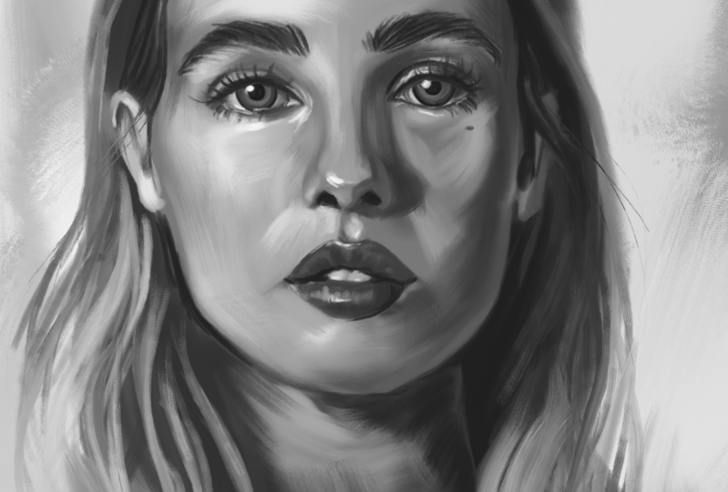
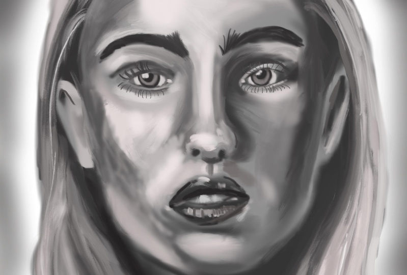
9. Demo: Highlights: Mm. We can now start adding
sharper, brighter highlights. For that, I move the value
much higher in brightness. With a much smaller brush size, I start adding smaller
highlights such as on her cheek, the eyelid, and below the eye. I brighten the vies of the eyes and add some little
bright spots on her skin. The upper eyelid has
quite a bit of light. There is also some satellite
next to her cheek. If you look at the photo, the corner of the eye also
has quite a bright spot. I also add a bit of that
light below her eye. I brighten the
whites of her eyes by carefully painting
around the iris. The upper part of the white of the eyes is now a
bit too bright, but I will later on
add some shadows. I highlight the hairs of the eyebrows by painting in
the spaces between the hairs. I do the same on
her ears and lips. I add some specks of
light on the ears, but apart from that, I
leave them quite undefined. I'm also adding some
little highlights on the inner part
of the nostrils. Occasionally, I would
switch the color to a darker one to mark
the eyes a bit more. I also add a few
hints of eyelashes. I paint I will paint the upper eyelashes
later on when I'm fully satisfied
with the eyelids. To paint the eye, I add a bit
lighter tones to the eyes. I made them a bit
lighter than they are in the reference image and add lighter parts on the
lower part of the iris. That will give them more depth. I make the pupils look darker so the eyes
really stand out. Also, a little fun fact. Making the pupils
look bigger than they actually are will make the
subject look more friendly. With a darker color, I paint
the shadows of the nostrils. I use the same color to paint the lines where the
eyelashes will be. That's the first time I'm actually introducing
a really dark color. And as you can see, it instantly
creates much more depth. I also use the same color to darken the line
of the eyelashes. I also start adding more texture and overall
detail to the hair. I use the same dark color to paint where the different
hair strands meet. Those little occlusion
shadows between the different hair strands will help to make the hair
appear more realistic. In order to make her
face tand out more, I will be darkening the shadows on her hair on the right side. I work steadily and carefully in the
direction of the hair, each brush stroke adding
texture to the hair. At this time, I'm not using
very small brush size. You can see that my brush
size is fairly big. I then switch back to
lighter color and keep adding more lights on her
face to create more volume, just as we did previously, but basically layering
more color on top. I really like this approach of gradually adding more variety
of values to my painting, as it allows me to have a lot
of control in my process. By gradually building up the darks and the
lights of my paintings, I have the liberty to decide which parts of the face I
want to accentuate more. A that gives me the liberty to decide if
I want to put the accent, for example, on a
specific part of her face by basically raising
the contrast of the values. I also define the edges of
the nose in more detail, focusing on smaller gradients
and changes in value, as can be seen in the photo. Seeing those
gradients and changes takes a bit of practice. But the more you
paint portraits, especially black and
white portraits, the more you will be
able to see them. And I take some time to work on the left
plane of the nose and work out the little
differences in values. Sometimes I go over
the same place various times because I'm not satisfied how
it's turning out. And that's okay. Painting
is a gradual process. Since I don't want to lose the painterly feeling
of the artwork, I try not to go into much detail when
rendering the painting. I want to add just
enough details to make the brain do the rest of
the work for the viewer. When painting, we
actually achieve the feeling of realism by
getting the values right. Values are basically the most important
thing in a painting. If your values are correct, and even if you paint with
huge abstract brush strokes, when looking from afar, the
painting will look realistic. That is, of course, if you are
trying to achieve realism. But that's also a fascinating
thing about your brains. We are able to see
separate brush strokes and perceive a whole picture. I add some very sharp
highlights on the point of her nose and also add the
reflected light in the eyes. Observe how that instantly
makes them come alive. One thing I recommend doing, especially when painting
painterly work, is to think of one area
which you want to emphasize. You can do that by adding
slightly more details in that area than in
the rest of the face. Obviously, in a reasonable
amount, of course, especially if you plan
to keep the painting painterly and not
too hyperrealistic. I kind of put a focus on the upper part of
her face, the nose, and the eyes while leaving
the rest such as the neck, chin, and ears a bit more rough. This kind of imitates how the eyes work because when
we look at something, we are actually only able to focus on something
right in front of us. I paint the eyebrows by drawing small lines in the direction
of growth of the hair. I also darken the pupils to make them stand out more and the
circle around the iris, just because I think it looks
more beautiful that way. I continue with the process of layering color upon
color for a while. I smooch some things. Sometimes
I switch to my smuHtol. But usually I just use
the brush picking up color with the color picker
and adding more details. You can also see how I
come back time and time again to some areas I'm not
very satisfied with yet, like the nose, for example. So I keep on layering color, putting more brush stroke until I find the
form that works. I really like to lighten the inner part of the iris
just next to the pupil. You can see this especially
with lighter eyes. I also really like to darken
the iris on the outside. I'm basically giving her
husky eyes at this point. I choose an even brighter color to work on even
sharper highlights. I slightly brighten the left
chin side and the bridge of the nose as I want to add a bit more contrast
to my painting. I use that new
bright color to go over places which can
be lightened a bit up. Basically, I like
to work in batches. So basically, when
I choose a color, I try to use it all over the painting where I
can use that color, kind of like you would do
in traditional painting. I'm brightening some small areas like the bridge of the nose. I also once again add some sharper highlights
in between the eyebrows. At this point, I'm basically painting small specks
of color here and there just to add little accents of brightness
all over the face. Adding a little light
accent on the corners of the mouth makes the mouth
look more realistic. I also add little accents on the bottom part of her teeth. I switched to a darker color to paint in the curvature
of the eyeball. Usually, we also have
a little accent light on the corners of her eyes. I totally invented
the one on the right, but you can clearly
see the one on the left eye in the
reference photo. I lowered the brightness of
the accents of the eyes by softly painting with
a darker color on top as it was a bit too bright. The eyelashes follow the form of the eyelid and grow in
different directions, starting from the eyelid. Don't make them too
symmetrical or perfect. A few short curved lines to
show the growth is enough. Also, try not to space them out evenly because eyelashes tend
to grow in little patches. Once again, I'm zooming
out to check for values and basically to see how the painting
looks from afar. So far, we have been painting
on a white background, but let's add a bit more
interest to the painting. I like to create a painterly background for my illustrations. So basically, I like
to keep them abstract, but add a bit more texture
to the background. I do that by painting
big blobs of color with a big soft brush just
to give some texture. So in the next lesson, we will work on smaller details and basically finish
the painting.
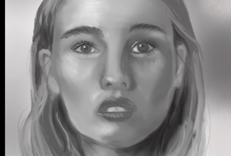
10. Demo: Detailing: In the next step, let's
get to work on the hair. So far, we have mostly only added the
shadows on the hair. Since I want a hair to be blond, we will need to lighten
it up significantly. Observe the lighter
parts on the hair. I start adding lines following
the flow of the hair. I start doing that with
a big texture brush like the oil one which has
a bristle like texture. I always start with big strokes, marking the big strands
of hair first and slowly lower the brush size
to add smaller strands. We can quickly achieve the illusion of full
voluminous hair by recognizing the
lightest parts of her hair and placing
the highlights there. If you take a look at the photo, you can see that those highlights
are on top of her head, basically facing
the light source. Some of that light is also reflected in the
length of the hair. Additionally, blond hair
oftentimes gets a bit lighter in the ends due
to years of sun exposure. I'm adding another strand
on the right side as well as I won't be
painting her pullover. That way, I will slightly cover her body and also make the
painting more interesting. I soften her hair and add a
hint of her clavicular bone. We are in the finishing
phase of the illustration. I could consider the
painting done by now, but I really like to work on some small areas that I
still feel need refining. I like to soften some areas that have too much texture
like in the shadows. We don't want too
much texture in the shadows as it draws
the eye too much. Plus, it's rather unrealistic, as most of the texture
can be perceived in the middle tone area
between light and shadow. When I'm painting portraits, I usually spend
the longest amount of time on the rendering
process itself. You can quickly add
the right values to a painting with some
big brush strokes. But in order to create a
more realistic painting, spending time to properly mix different brush
strokes and work out details will make
a huge difference. I'm working on softening
the texture in her face. The cheek has many
different brush strokes which aren't properly mixed yet. And with low opacity
and low pressure, I spend some time going over the different brush
strokes to soften them up. When doing that, I also regularly zoom out
to check my values. One thing I like to do is to slightly smash the
painting with a big brush, kind of connecting the
foreground to the background. I do that very softly adding some stroke from
the shoulder area upwards. You can also do that on
some hair on the back, but I wouldn't do that
on her face directly. I would do it somewhere
where it's not so visible, like the contours of her head. Now let's also add
some more details. Little skin marks like moles or even imperfections can add a lot of realism quickly
to our painting. So I will be adding
a few bird marks. You can also add wrinkles
or any other face marks. I feel like having a bit
more texture in the face generally helps to better convey the character of the
person we are painting. Depending on how
photorealistic you want to be, you can even invent
some things like scars to make the face
look more interesting. I'm working on the contour of her lips and the shadow between
the mouth and the nose. In this stage, I just go over small issues I
see here and there, parts that need definition, making the lines cleaner, little hair strands
here and there. I'm paying attention
to the direction of the overall light so that even the smaller shadows look
coherent in the painting. I'm color picking colors
directly from the painting at this point and go over parts that I haven't yet defined,
such as the right ear. While it's in the shadow and not as visible as the other ear, we still need to bring it to a similar level of
finish as the other ear. I really liked to paint some
small hair strands over the ears and basically leaving
the contour of the face. For that, you might
need to unlock the alpha lock by swiping with two fingers to the
right so you can paint outside of the
contours of the painting. You can also do it
on a separate layer. Also, don't forget to define the area where
the hair starts. To avoid making it
look like a wig, I like to do that by drawing small lines to connect the
hair line with their head. I slowly start going into smaller details and add tiny lines where they
might be needed. Now, this is a
personal decision. Basically, I decided to
detail it a bit more, but it's up to you to
decide when you consider the artwork to be done and
when to stop rendering. Overworking is a real thing in every artist has at least
once experienced that. I generally tend to
overwork my works, so I need to stop myself oftentimes before
I start working on tiny details which contribute nothing to the final image. After adding and removing a lot of values in the area
around your mouth, I decided to add
a bit more light. This adds plasticity to the face and adds a
wider range of values, making it more
interesting to look at. With a somewhat lighter color, I go over the forehead and
make it a bit brighter. At this point, if you
compare it with a photo, we have a bigger range of values than in the reference image. I decided to add brighter colors to create more contrast
in the painting. With that bright
color, I go over parts that might benefit
from sharper highlights. Apart from the forehead, I placed them on the
bridge of the nose below the eye and in the
corners of the eyes. I also add a subtle lighter
line to show the inner lit. Now, in this painting, there is still some room
for improvement. So I add a little
details here and there, lights and textures where I feel they will
improve the artwork, like for instance, defining
some of the shadows. And I work on some small details, cleaning the line between
her lashes and adding the same light color to make
the lashes stand out more. I also use the same color to add more highlights
to the lower lip. I add a bit more definition
to the corner of the mouth and define the
contour of the lower lip. I also gradually
start summing in more because I started working out on more
smaller details. I add some very
sharp highlights on the I go over the
nose rails as well, making the line which separates the shadow cleaner
and more defined. Don't forget also to zoom out occasionally just to see your
picture from further away. That way, you will
be able to spot mistakes which you might
have gotten used to. I add another little
bird mark on her neck. Time to work a bit more on
the shadow on her neck. I tried to leave it
painterly and add just a few brush strokes
with a big soft brush. As part of her neck should
be naturally in shadow. I think we're nearing
the finishing line. Overall, I'm happy
with the painting, and I would consider it done. You can work as long
as you want on yours. While likeness was
never my goal, I still feel she looks
quite a bit like the photo. I changed somewhat the form of her face and just made
her generally blunder. Overall, I'm happy
with the painting, and at this point,
I'm considering done. Anyhow, I hope you enjoyed this class and see you
in the last lesson.
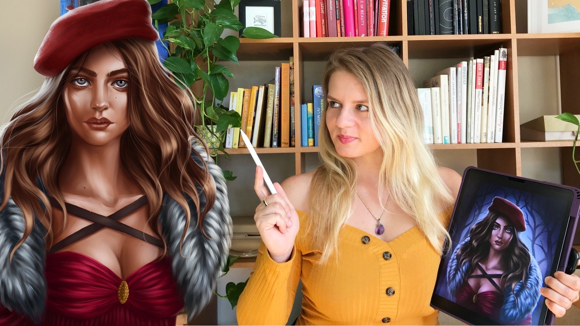
11. Final words: Congratulations on
finishing this class. I hope you learned
something new, and most importantly, I hope
you had fun to recount. Took a look at the basics of
the proportions of the face. We learned what to look for
in good reference photos, how to use the
digital oil brushes to achieve a painterly look, and I walked you through my
portrait painting process. Don't forget to share your paintings in
the project section. Also, feel free to ask me any
questions you might have. I'm super happy to help. You can also follow me here on Skillshare or on Instagram, where I upload my latest
artworks and class updates. I had a lot of fun teaching this class, and I hope you too. I can't wait to see your beautiful paintings in
the project section. So thanks again and see
you soon. Happy painting.
 Gabriela Shel, Illustrator and Concept Artist