Transcripts
1. Welcome!: [MUSIC] Welcome to Digital Letterpress
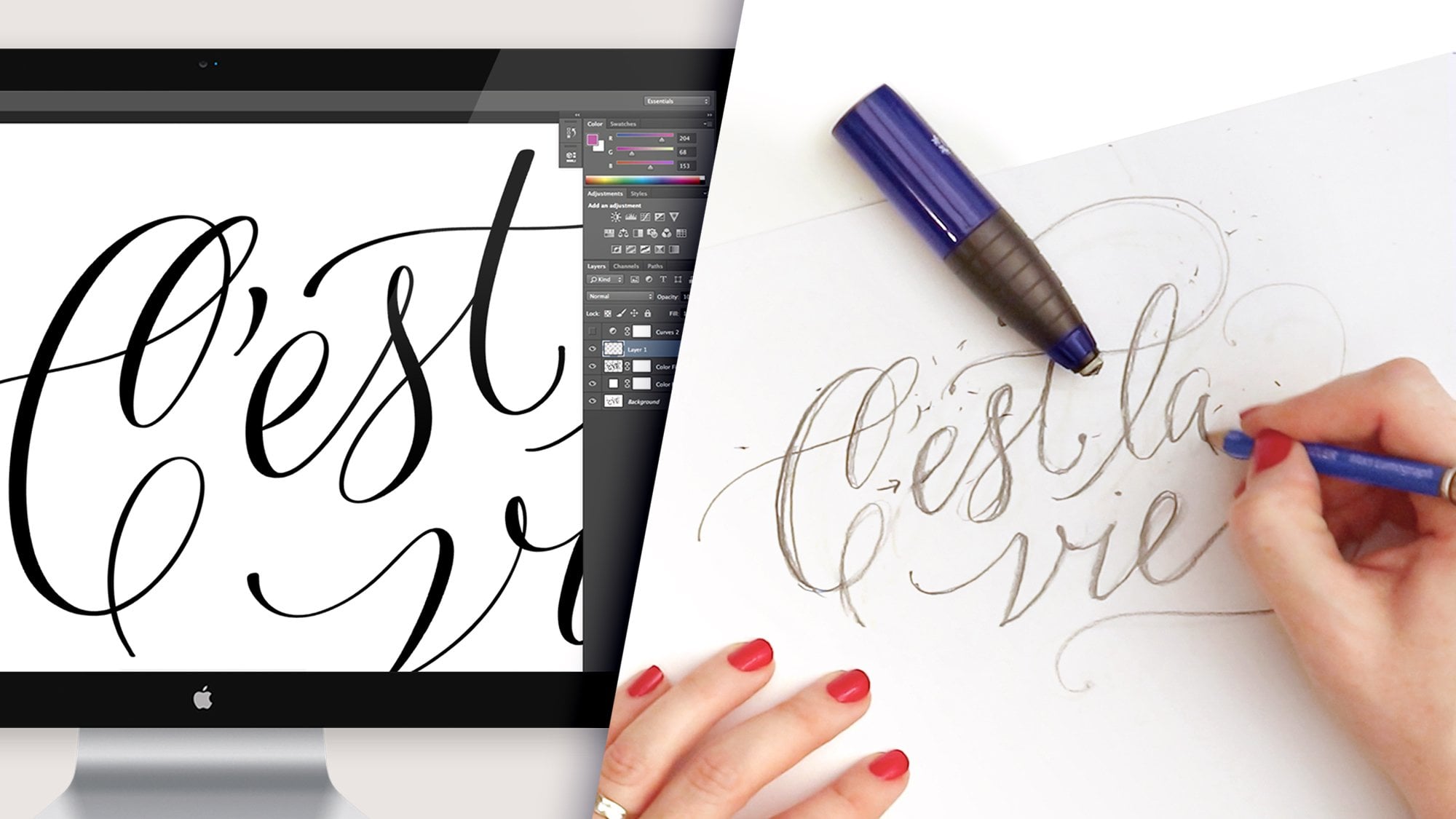
Effects in Photoshop. I'm Molly Suber Thorpe,
a calligrapher, teacher, and author of four
books for lettering artists. I'm here to teach you my
technique for creating realistic letterpress
designs in Adobe Photoshop. Traditional letterpress
creates printed texts and images in relief by
pressing a raised surface, usually a metal plate
into thick paper. The effect is a beautifully
textured impression with soft edges and shadows. As a calligrapher, a lot of my work gets letterpressed
for clients. Creating mock-ups
of my designs has been an important
part of my workflow. I have devised a combination of Photoshop effects
in conjunction with real paper textures that emulate real letterpress printing
with stunning results. In this class, you will learn a couple of digital
letterpress methods, how to save your effect to use over and over again
in the future, and how to take the effect
to the next level by overlaying digital ink colors
in a single composition. Without further ado,
let's dive right
2. Set Up Your Adobe Photoshop File: The first thing we
have to do to set up our letterpress project is to set up our
Photoshop workspace. I'm here in Photoshop 2022. If you are using
an older version, everything I'm going
to show you is still going to work
because these are pretty basic Photoshop
techniques we'll be using today, and of course, if you
have a newer Photoshop, it's going to work as well. If you're a beginner to Photoshop and you're
not really sure where all of the menus and
tools are, don't worry, let's start right now
and make sure that our Windows and workspaces are set up to be exactly the same. Come to Window, workspace
and just select "Painting" and you'll have pretty much the same
workspace that I do. You'll probably have
different swatch colors in your palette over here, but that's totally fine. I'm going to start by
double-clicking this "Brushes" menu to collapse it, so it doesn't distract us because we don't
need it right now. Then I'm going to create a new file by going
to file, new, and I'm going to
switch this over to inches because it's
easier for me, and I'm going to make this
10 inches by eight inches. But you can make this
really any size you want, but I do suggest maybe you
follow along with me and make a medium-sized high
resolution file right now, just so that we're all on the same page as
you follow along.
3. Add a Paper Background: Now, I'm going to place a paper background here because the point
of letter press is really to emulate the look of lettering or artwork
pressed into paper. Now, I've given you a free file with a paper background texture. This is a real scan
of real paper here. I've given it to you for
free in the Projects and Resources section
of this class. You can either download that and use it as I'm going
to be using it now, or you can use your own scanned paper texture
or you can find one online at a free
stock photo website, whatever you prefer. I'm just going to
File, Place Embedded, and then I'm navigating on my computer to
where that file is, it's called white
paper background.jpg. Double-clicking it.
Now it's placed in my file and I'll hit
"Enter" [NOISE] or Return. Now I have this paper background
right here to work with.
4. Select and Place Artwork: I'm going to show you
later in the class, how to apply this effect to an editable font
which is really cool. But for now, I'm going
to take a piece of lettering art that I created. Here it is in Photoshop. It's on its own layer transparent background
that is crucial. If you turn off the
background here, you can see that this
is a transparent file. You can create your
own art either in Photoshop or in Procreate. You can create it as a
vector in Adobe Illustrator, Affinity Designer,
whatever you want. The important thing is that
it's a solid color like this, and that it's line art, meaning that it's
not multiple colors. It's not like a photograph, it's not like an
illustration that has lots of colors all in one file. It just has to be a single
color piece of artwork like this or as you'll
see in a future video, you can just type in
irregular digital font, and achieve the same effect. I'm going to select
this calligraphy layer, and copy it, "Edit", "Copy". Then I'm coming
back to this file. I'm going to "Edit", "Paste". Now I'll zoom out by going
to Command and minus sign, and then hit "Command
T" to transform. Holding the Shift key, I can now resize this without affecting the actual
ratio of the artwork. Then I will drag it into
the center of the piece, and hit "Return" so that I can place it right
in the middle. Now Command plus sign
will zoom me back in. Command minus to zoom out, Command plus to zoom in. Now it's just time
to save our file so that we don't lose
any of our work. I'll come to Command Save, choose a place on
my computer and a name, and we'll be good to go.
5. Letterpress Effect Settings: You may find that it's
going to help you to hit "Pause" or
slow down my audio or even take screen captures as we go because
what I'm about to do is actually show you every single setting that I use to create the letter press effect and I just want you to
emulate them exactly. Then later on, if
you're a Photoshop pro, you may slightly
edit the effects to suit your particular
style for a given project. To create effects for
any layer in Photoshop, you need to make sure that you've selected your art layer, that you're on your art layer
and then double-click it. It opens the layer
styles palette. This is where all the
magic is going to happen. Let's click over here
to "Bevel and Emboss" first and make sure the checkmark
is there and turned on. Before we do anything, I want you to hit "Reset
to Default" at the bottom, just in case you've made
changes like this in the past and it's defaulting to the last settings
that you use. We want this reset to
Photoshop's defaults. I'm changing the
style to Outer Bevel. Techniques stays on
smooth and depth changes to 30 percent. I'll change the
direction to down, and then make both of
these settings for pixels. Coming down here,
I want to turn off Global Light and then
in Highlight Mode, I'll change this
to Linear Dodge. Double-click the "Swatch"
next to it or just click the "Swatch"
actually once next to it. You'll be able to
input down here at the bottom your own
hexadecimal code to create your own color. All I want you to
write are six as. You should get this light
to medium gray hit "Okay". Next we're changing that
opacity to 40 percent. Under our Shadow Mode, we're changing this
to Linear Burn, tapping the swatch
and changing this to 606060, so like 606060. That just creates a slightly
darker gray and we'll change this opacity
to 60 percent. Now the Bevel and Emboss
settings are done. If you want to take a screen
capture, now is the time. Now, click "Inner Shadow". Again, reset to
default immediately then change your Blending
Mode to Linear Burn. Change the swatch color
to those 6as again, the lighter version of the gray. Keeping angle at 90 percent, you're just going to
turn off Global Light. Now, your inner shadow
settings are complete and you can take a screen capture
of these settings as well. Next turn on Inner Glow. I want you to again
reset to default, then change your Blending
Mode to Linear Burn. Change the opacity
to five percent, change the swatch to that
606060 again, medium gray. Then come down here
and under Elements change the size to 40 pixels. Now again, take a
screen capture of your Inner Glow settings
because those are done. Next we're turning on satin, reset to default immediately, then change Blending
Mode to Linear Dodge. Change this color to our medium
gray 606060, hit "Okay". You'll probably now start to
see in the background and number of changes taking
place to your lettering, but it still doesn't really
look letter pressy yet. Let's change the opacity of this blending mode
to eight percent, then change our angle to zero. Then change these
settings down to three pixels and three pixels. Screen capture your settings here and we have
just one more to go. The final one is drop shadow. I want you to reset to default, then tap "Linear Dodge", change the swatch to 606060. Keep your angle at 90 percent, but turn off Global Light
and change these settings to a 10 percent spread
and a 10 pixel size. Now screen capture this
before we tap "Okay".
6. A Note About Transparency: Now, we technically have our
letterpress settings set, but it still does not
look very letter pressy. Real letterpress actually has
a slightly translucent ink. You're able to see the
paper texture through it. That's partly due
to the fact that most letterpress papers have
some really nice texture, they're cotton papers
or handmade papers. But even when they aren't, the build of the paper still
does show through the ink. If we are still
selecting our art layer and we were to reduce the
opacity of this layer, the opacity of the
layer would reduce, but so would the effects themselves and we
don't want that. We want our effects
to stay dramatic while the digital ink
color is reduced. The way to do that is
to reduce the fill. If I reduce this all
the way to zero, you're going to see
that we actually create this bevel and emboss effect, which basically means a
letterpress without ink. But if we increase this, I'll just play with
it a little bit, we can get a nice medium gray that has a
letterpress effect to it. But there's still a
couple of more edits to make and we'll do that
in the next video.
7. Color Change in One Click: You can see that right now, this digital ink still
looks a little bit crisp, and looks like it's lying
on top of the paper. But to change that, we're
going to use blending modes. Make sure you're still
on your art layer, and then come up here to
our blending modes palette, and change down to multiply. This difference was subtle, but we're going to just
change this away from any color other than pure black, and I think you're going
to see the magic happen. There are many ways to
re-color artwork in Photoshop, but for me the easiest because I like
instant gratification, is to create a color
fill layer that you'll be able to adjust
with just one click. Come down here to your
adjustments palette, and then select Solid Color. I'm just going to select
anything right now. Let's do something
fun like this yellow. Now you can turn
this on and off, and see that your artwork is
still right underneath it. How do we get it to affect
only our art layer? Well, that's through something
called a clipping mask. By hovering in-between
these two layers, I'm just going to
hold the option key, and my cursor changes to
this Clipping Mask icon. If I click one time, the color of my design,
my artwork changes. Now I can turn this on and off, and you can see that the
color of my art changes. If I have this solid
layer selected, I can come up to
my Swatch palette. I can choose any color, and the color of my
letterpress changes. I can even double-click
the solid color layer, and I can choose any
color that I want. Now, real letterpress
classically, even though it uses black ink, here in Photoshop digitally, the one-color that
doesn't work super well for this letterpress
project is pure, pure black, which is
down here in the corner. Because this is a blacker, black [LAUGHTER] than
real ink could ever be. If you want to use
a black I suggests coming up somewhere on
the left side here, and choosing something
slightly grayer, realm, it will even
make it go warmer. Gray. It's still very dark, and now you're on the art layer, remember, you can adjust
that darkness using fill. The difference may not show up completely on screen
here on the video, but I assure you that this is a more realistic
looking black that emulates ink a lot better than the super black that a
digital screen will produce. I'm going to save this to
something more interesting, like a Toeplitz, let's do something
maybe like this. Let's zoom out, actually I want something even more
interesting than that, and there we have a
letterpress effect. There are a lot more fun
things we can do with this though, so keep watching.
8. Edge Effect Adjustments: If you feel like the
edges of your artwork are still a little bit
crisp for your taste. This can happen,
especially if you use vector art that's
like super crisp. You may find that
a little bit of realism is lost
because the edges are really straight
lines and not that soft, beautiful look
that a metal plate in soft cotton paper
would achieve. You can just add the tiniest bit of blur to your art layer. If I click the art
layer here and I go to Filter Blur, Gaussian Blur. I don't want anything
dramatic like that. But if I actually start basically a zero one
and bump this up a little bit and just carefully
watch edges here as I go. Let's see. I think three is pushing it too,
feels pretty perfect. The differences really subtle, but here's the before.
Here's the after. Basically, all it
did was make it look even more like the ink itself was coming up into the little indented
groups of the paper.
9. Imprint Depth Adjustments: The next thing
that you can do to adjust is that if you have really bold lettering like this, you'll maybe see a slightly
different effect than if you have really fine lettering
or a delicate illustration. One change you may want to find yourself making from
project to project, is to adjust the
depth of the image. A quick way it can be
adjusting that fill. Sometimes making it darker automatically makes
the shadow of the depth stick out
more and makes it look like it's impressed
deeper in the paper. But another quick way
is to double-click your Bevel & Emboss effect and play with this
depth setting. We have it at 30 by default, which I find to be a
pretty universal number. But if you increase
that dramatically, you get something
very unrealistic. But increasing it up to,
let's say, 40 or 50, that can have quite
an impact on making the art look like it's pressed
deeper into the paper.
10. Save & Re-apply Your Styles: Now, I'm going to
show you how to save all of these effects settings so that you're never going to have to go into this effects
palette again and do all the tedious
adjusting and setting up of each and every effect. The quick and easy way
is to save this to your layer style library. All you do is open your
effects palette and click, "New Style" right here
on the right side. Let's call this letterpress. Keep everything here checked unless you don't use
your Cloud library. Actually, I don't want to save
this to my Cloud library, so I'll uncheck that. But you do want to have
the layer effects and blending options both
selected and hit, "Okay," and then hit
"Okay" here as well. I'll show you how to
access those in a moment, but let's save a
second version of this effect that we
can easily use later, and that version is the
blind emboss version. Bring that fill down to zero, and here, you get that
nice blind emboss effect. Let's, for the fun of it, save that as well. We'll double-click "New Style", we'll call this blind
emboss and hit "Okay". Now, to show you how to access those styles that we saved, I've created a brand new
document for myself. It has that same white
paper background. I called it
letterpress sample 2, and I've copied some other
calligraphy that I did, and I'm pasting it here. I'm going to do an image
rotation 90 degrees clockwise, so now we have this
nice composition here, and my calligraphy
looks really digital. It looks like it's sitting
right on top of the paper. I'm going to double-click
this and call it artwork. To access those styles, you will come to
Window styles and it opens up your effects
pallet or styles palette. You should see the two
styles you saved down here. If your menu looks different than this, you may have it set, for example, to small
list, large list. This can be helpful
if the names of styles are important for you. Let's leave it
like this for now, and I have my artwork slip layer selected and all I'm
going to do is tap, "Letterpress", and
instantly all of those styles you
can see down here the effects, they appeared. Let me zoom right in. In fact, let me start
by changing out this fill a little
bit and add a color. I'm going to solid color, option click in-between the
two to clip that color in. Now, let's zoom in and turn
on and off these effects, so no letterpress effect
with the letterpress effect. We can adjust this fill so
it can be really beautiful, ethereal, light-looking
letterpress, or I can tap "Artwork" and
hit "Blind Emboss" and now that blind emboss
effect that we saved is automatically added.
11. Use an Editable Digital Font: Now I'm going to show
you how to apply the letterpress effect to a digital font so that you
can type out your text once, apply the letter press effect, and then edit the font without having to redo any
of the effects. This is another paper
background that have given you for free in the
resources section, you can see up here it's
called vintage car.PNG. It's a PNG, meaning a transparent background
file because you can see the card itself is actually on a
transparent background, and it has these nice
realistic edges. That could be something
fun for you to play with. I'm going to come over
here to my text tool, and I'm just going to tap
anywhere in the middle. Whatever default font you have for the last font that
you use in Photoshop, that's what's going
to come up here. I already have some texts that I've copied to my clipboard, and so I'm just going
to paste it here. To bring up my text
editing palettes, I'm just coming up to window, and I'll choose character. That should open up your character palette with your paragraph palette
right next to it. Here in my character palette. If I select all of this, you can see that I have
this font called Charlot, which happens to be a
font that I designed. I can enlarge the size of it. Over here. Let's
make it much bigger. Let's make it maybe 60. Let's change the letting. Then up here I can actually
center it on the page. I'm making sure I
click these three dots, and hit "Canvas". Now I have here this
nice crisp digital font sitting on top of a
paper background, and I can just come over
to my effects palette, and hit "Letter Press". So satisfying before, after, before, after. Now the cool thing about
this font being editable, is that not only can
I now come in here, and add text and the
letter press effect stays, but I can quickly
change the color without even adding
that color fill layer. Long as I'm on the text layer, I can actually come over
to my Swatch palette and just choose any
color in the palette. That looks really
beautiful, I think. Yeah, this pale green, I'm a sucker for pale blue, and really pale
translucent letter press, but you might want
something much darker. Remember that you
can adjust the fill. Now let's see what happens
if they come back to my Text tool and I
type, here again. Let's change this font. This one is called honeydew. I actually also
designed this one. If you have this selected, and we come over, let's just already make
this a different color. Let me zoom in quite a lot. If I come to my effects
palette and I click any of my effects, this
automatically adjusts. Now remember that if you want the depth to look a
little bit different, you can double-click
the Bevel and Emboss and adjust this. Let's change it down
to, let's say 30. The difference between 30, and 40 is subtle. Not sure if you can really
see it on the screen, but it just creates a
little bit of difference in the depth or the
level of impression. Then, I want you to notice that if I were to overlap these, you can actually see just
like in true letterpress, that the two inks
are true colors actually overlap each other
in real letter press, unless you're using foil, the inks are translucent enough that printing one
on top the other tends to create this
overlapping colors where the multiply blending
mode effect of these, that creates this realistic
ink overlay effect. That's pretty cool too. I hope that you
have fun creating some cool compositions
where maybe you combine digital
fonts with artwork. You make different
colors, you overlap them, but we'll get into
more of that when I assign you your
creative class project.
12. Paint in Letterpress!: The last one thing
I want to show you is that you can actually draw and paint in
Photoshop, in letterpress. I again have this original
white paper background and I made a new
blank layer above it, you just click this plus icon at the bottom
to make a new layer. Now I can come over to any of my brushes right
here in Photoshop. I can click this brush
icon and then over here at that brushes palette we collapsed at the beginning, can double-click it
and I can have access to a bunch of cool brushes
that come in Photoshop, but you can also buy a lot more for different
types of artwork. Let's just stick with this
hard round monoline brush. Now if I draw something on
my screen, and I zoom in. Pretty boring,
just normal paint, but with that layer selected and my effects or styles
palette open, I can just instantly turn
that into letterpress. More blind emboss. Now the layer itself has the
letterpress applied to it, so if I keep drawing, I'm actually painting
in letterpress. Now I can change my color over here and I can keep painting. If I change my color again, notice and keep painting, I do not get that double
ink overlay effect, so the way to create that
in your paintings is simply to create another
new blank layer over here, apply the letterpress
effects to it, and now if I paint on
that new layer above, I get this beautiful
overlay effect.
13. Class Project & Inspiration: Now it's your turn to make some letterpress
effects of your own. I hope that you share them in the class project section so that the rest of us
can all have a look. I would love to see
what you create. I wanted to give
a few examples of some really creative
ways that you can use this letterpress
effect in Photoshop. If you're a designer who
creates works for clients, you could use this effect
to create mockups, of letterpress
designs that you're eventually going to
send to print to be actually letter
pressed or you can create designs that you
share on social media as holiday greetings
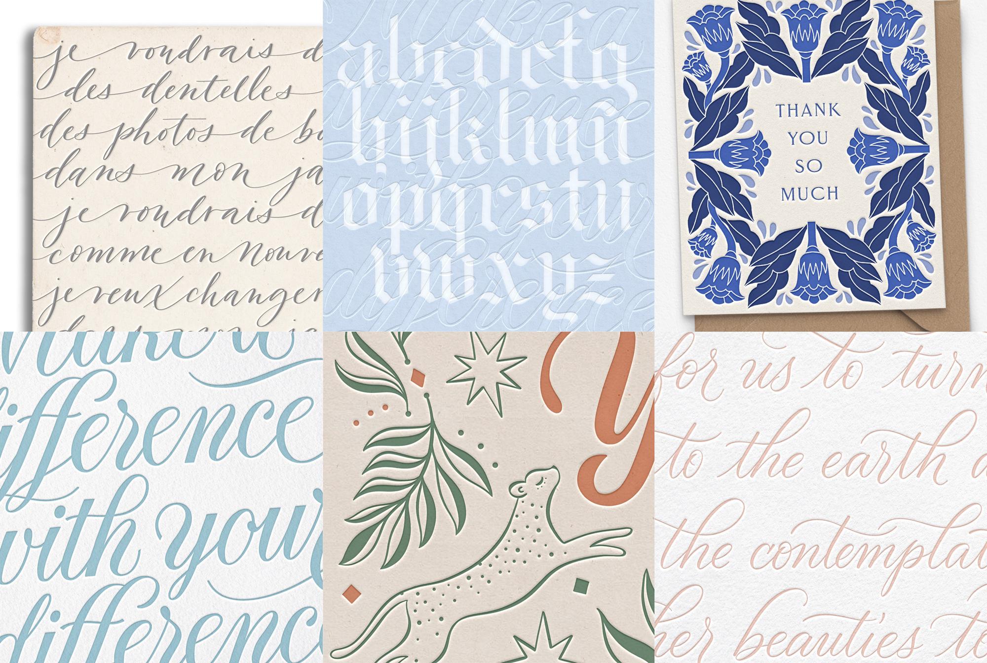
or thank you notes or just illustrations. Here's an example
of a hand letter thank you design that I created. You can see here it is without
the letterpress effect, I did put a paper
background behind it and I colored certain
accents within it. Then I just applied the
letter press effect and it looks like a
magical transformation. Here's another example of
something creative you can do. Again, these are examples
of my calligraphy, which you could use digital
fonts for this as well. I had these two
calligraphy designs, one was this black
letter calligraphy, and I first applied to the letter press effect
to that and of course, I used a mock-up of
a real paper card. Then I did some
script calligraphy and I placed it over top and I set it to Blind Emboss so that you'd get this double
letter press effect, where one looks sort of like
white foil and the other looks like just an
endless blind embossing. I think that that has
a really cool effect and it can allow you to create the colored lettering
as your important message. Then you could put
even a pattern or a flourished design
or some simple line art over as the blind
embossed design so that it's not supposed
to be readable anyway, but just some added effect
that is pretty eye-catching. Here's an example of a design I created also in calligraphy, that was created in
multiple colors and actually I had originally
quite a dark background. What I did was I lightened
up the background, added the letterpress effect, and then added a
solid color over it, so that it took away the
separation of colors and then I just set it to blind emboss
a very slightly filled. But you can just see how some of these really fine hair
lines lend themselves really well to this deep kind
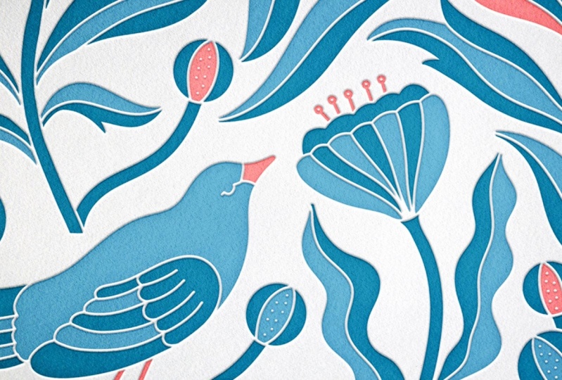
of letterpress impression. Here's an illustration
that I drew. This is a calligraphic
illustration, but I'm sure you can
see how this lends itself to really any
type of line art. Then I added on this
editable font right here at the bottom and applying the
letter press effect to it, you get a really nice little
greeting card mockup. Speaking of greeting card
mockups, here's another one. If you took the last class that I taught here
on Skillshare, you would've learned how to make this exact symmetrical
border design in Procreate. You can check out that
other class of mine, but this is a mockup using
the design I created for that class and I made a
really deep kind of in bevel. Again, this is an
editable font and the border itself we just
isolated on the page. You can see the border
itself is already multicolored and so when
I applied the effect, the effect applied to
the whole design and it looks like three color
letterpress printing. Finally, another
cool use is to use the Blind Emboss Technique as an embossing for
other materials. This is great for
creating product mockups. For example, these are some
mockups on leather goods, but I can definitely
see this being used for other types of mockups. Anything else that
is impossible, you could definitely create little mockups using
blind embossing.
14. See You Next Time!: Thank you so much for following
along with this class. Please check out the
resources section for the free downloads and check out my description
that has all links in it. That's where I'm
giving you links for other cool paper
backgrounds that you can buy or download, some cool Photoshop brushes. I've even included in the downloads some of
these designs you're seeing here just to provide some inspiration for
you while you work. I'll see you back
here, next time.
 Molly Suber Thorpe, Calligrapher & Designer