Transcripts
1. Intro: Are you ready to start creating awesome illustrations in
Procreate and then you start and you get all confused
about layers and masks? Maybe you're not even
sure what a layer is. What if you're thinking like, what masks? These mask? Not those kinds of masks. It has happened to
the best of us, but fear not, I'm here to help. I'm Sandra Mejia. I'm a Colombian Canadian
freelance illustrator and pattern designer. I work with companies
around the world and they license my artwork
to put on their products. I'm also a top teacher
here on Skillshare. I use Procreate every
day in my work to create illustrations for my
clients on my portfolio. I always use layers and
masks to create files that my clients love because they are very organized and
they're easy to edit. Even for my own artwork, layers and masks give me
the opportunity to create super cool effects and add textures and depth
to my artwork. I find that the
use of layers and masks is sometimes confusing, so I want to explain them to you in a fun and hands-on way. In this class, I
will show you all of this as we create
actual illustrations. You don't have to be confused
with all the theory. You can just learn
as you apply it. Even if you're a total beginner or you are a bit more advanced, you can follow along
because I will show you every step needed to complete
these illustrations. First, I'll explain
what layers are and how they can make
your life easier. Then we'll dive deep down
into the creative process. I'll explain how to
set up your canvas, install brushes and
color palettes, and create a simple but
pretty floral illustration. Then I'll teach you how to add a watercolor paper
texture to your images, try out new and
unexpected color ways, and how to export your files. After you have all
the basics covered, I will show you the uses
and benefits of Alpha Lock, clipping masks and regular masks while creating this
mushroom illustration. I'll even show you how to add the paper textures just to your image so that
you can use them for stickers or clip art or anywhere that you need
a transparent background. What are you waiting
for? Join me and let's start making masks and layers.
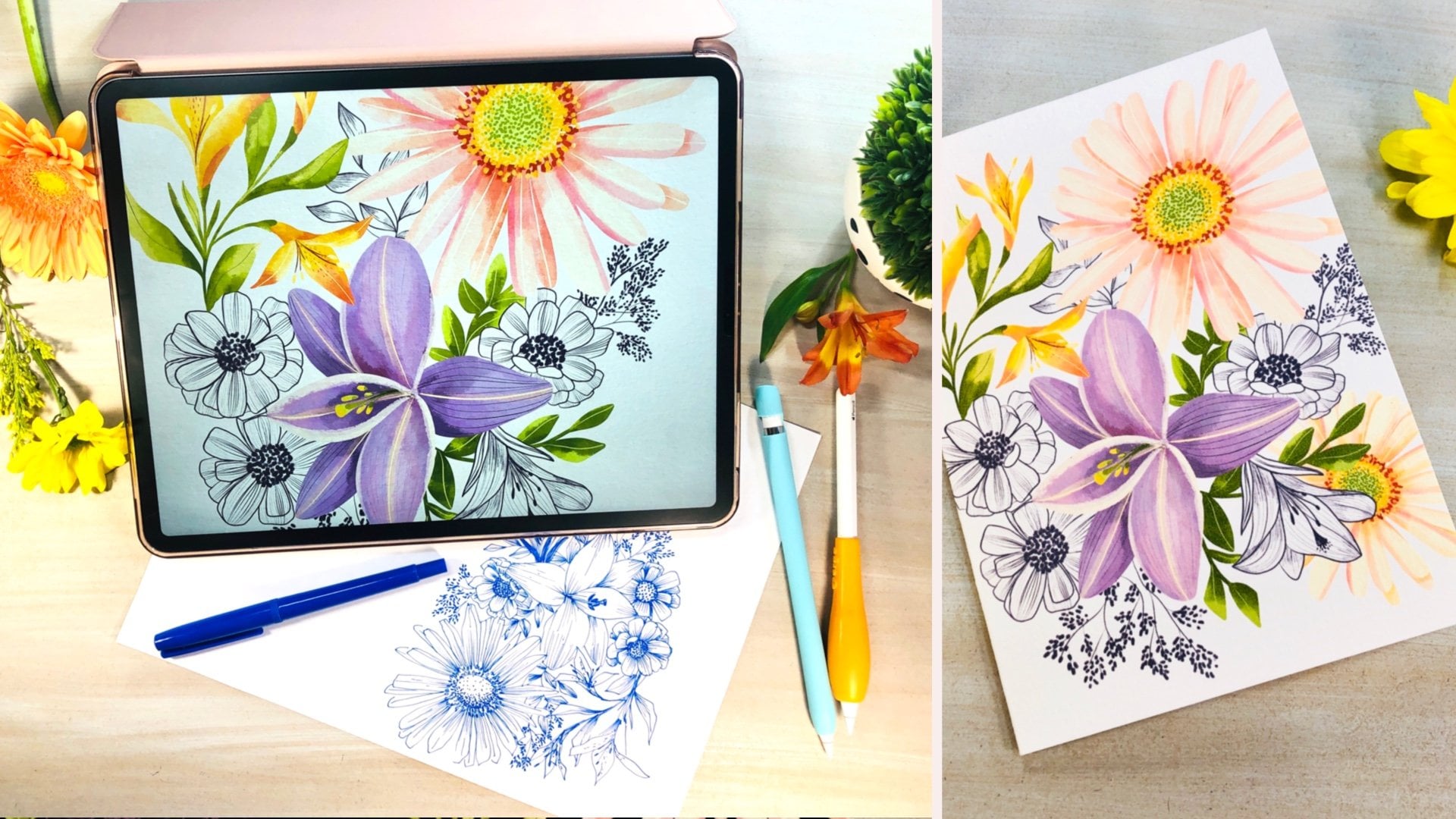
2. Project and Supplies: For the class project, you will create a floral
or botanical illustration using layers or masks. You either make floral or
botanical illustrations. You are free to create
whatever you want. Just make sure you apply
what we see in class. Remember to post your projects
in the project gallery and ask any questions you have
and if you want feedback, let me know what you
would like feedback on. For this class, you
will need an iPad with the Procreate App installed. I have provided my
basic sets, brush set, and my watercolor paper
texture brush for you to download and
my color palette. I have also included
the sketches for the two illustrations we will be working on in this class. You can use these
resources or you can use your own brushes or color palettes or
anything you prefer. If you prefer working
from your own sketches, that is great too. To download them, make sure you're accessing
Skillshare from an Internet browser and go to the Projects and Resources tab. On the right side, you'll
see the resources list. If you have an Apple
pencil that is great. It's not necessary, but it's very useful because it's very precise and it makes
the drawing process so much easier at
least in my opinion. I use a silicone grape holder in my pencil because it
makes it more comfortable for me to hold for long
periods of times and I use a matte screen
protector on my iPad because I don't like drawing
on the slippery surface. I also use a drawing
glove so that my hand glides easily
on the screen. None of these is required, but it's just my preference. I will list all the materials in the class description area.
3. What are Layers and Why do I Want Them: In this lesson, I'm going to
show you why working with layers can make your
life so much easier. I'm going to create a new file, and I'm going to drag my
color palette out here. Don't worry about the
dimensions or anything. This is just to explain
to you the layers. This is where the layers
live in Procreate, and you always start
with a background color, which if you tap, you can change, you can select from
your pellet, done. And you always start
with one layer. Let's say you draw this
leaf from this layer. If on top of that, I want to draw another leaf, for example, and then I want to add
some geometric shapes, it's all in one layer. That means if I
change my mind and I want to change the
color of this layer, or I want to move it around, I won't be able to because
it's just one image. Some people like working in just one layer and
that's totally okay. I just wanted you to
understand the benefits of using layers and how to do it, so that if you have to choose, you're choosing with the
knowledge and not just because you don't know how to do it or you don't understand it. Think of it like trying
on different sheets of tracing paper and then
stacking them together. If you make a mistake or you
want to change something, you don't have to throw
away the whole piece, you can just edit the
parts that you want. This is how layers in
Procreate work too. Keeping elements separated on different layers
will allow you to edit or delete parts of your illustrations in
a very simple way. This way you can resize,
rotate, duplicate, re-color, or delete elements even after you're done with
your illustration. This is also very
useful when you're working with clients
and they ask you to fix something and
you have to go back into that file to fix
things and believe me, it's way easier if
you only have to change one layer and
not the whole thing. Let me show you
what layers can do. Let's delete that and create the first leaf
in the first layer. Now we'll go here, you
add another layer, and there we create
this second leaf, and then we add another layer, and there we create the shape. Now I have one
element per layer. I can tap on that
layer and rename it, Leaf 1, for example,
press Return. Let's tap on it again. There's a bunch of other options that you can work
with, with this layer. We will be seeing them
progressively as we move along. I can also hold it and drag it up or down and reorganize it. If I swipe, I can lock it. That means I cannot draw
on that layer by mistake. It's great when you have a lot
of layers and maybe you're going back and forth and you don't want to touch the layer, you can lock it. Let's swipe to the left
again and unlock it. You can duplicate that layer
and you can delete it. Also if I swipe to the
right on several layers, I can group them and I
can rename that group, or I can flatten it. That means it all goes
into the same layer. But we don't want that, so let's undo that. I can also merge layers by
pinching them down and see, now that is one layer and
this is another layer. Again, I don't want that. If you want to take things
outside of your group, just select the layer and
move it out of the group, and you can reorganize
groups also. This is great because you can change the order of elements, for example and change the
whole look of your drawing. These are the basics of
the layers in Procreate. In the next lesson, let's put this to work and
create floral illustration.
4. Setting Up the Canvas: In this lesson, we're going
to set up the canvas for our illustration and install our brushes and color palette. If you want to create
a new document, you just press plus here and you will have some
pre-made sizes. But if you want to
create your own, you press on the plus sign here and this is where you
create a custom canvas. Here you give it a name, let's call these vertical. Because Procreate is
not a vector program which uses mathematics
to scale images, so if you create something
small and you scale it up, it will always look crisp. Procreate is a raster program, which means that it creates
pixel-based images. That means that if we
create a very small size and then you enlarge in it, the edges will start
looking blurry, so that's why in Procreate
and any raster program, you should be mindful
of this size. You create your artwork
in and create it as large as possible so that then you can shrink
it down or keep it at that size and not
loose any quality. I usually like to
work in inches and my vertical files
are always 11 by 15. Why? Because I design a
lot for greeting cards, so a regular green
card is usually five by seven, for example. The width will be five
but I work twice the size so that's 10 and I add one
inch to have a margin, it's called a bleed. It's for that when you
print the products out, you have a safe zone
where if you cut it, you're not going to
get a white border and that looks ugly and that is required
if you're creating client work to have
a certain bleed. Then 15 it's the
same thing as 7*2, 14 plus one inch bleed. The DPI is a resolution, 300 is the least that you
want to have for printing. Always keep it at least at 300. Here it shows you the
maximum number of layers you will have
with your iPad. It depends on your iPad model, how many layers you
will have in Procreate. Newer iPads that have more RAM, will have more layers. I created art for
three or four years in a very small iPad and it had seven layers at
the maximum size, and I created professional
art with that, so there's a possibility, and don't worry
about it right now. Now here's a color profile. The differences between RGB and CMYK used to be very simple. RGB was if you were going to
design things for screen, like computers, tablets, phones, and CMYK, if you were
going to print it out. Now, a lot of printers
have started using RGB files because it
produces brighter colors, so there's not a right
or wrong answer. This is a difference between
an RGB file and a CMYK file. You can see that the pinks and the greens are more
muted in the CMYK. That's why I like
creating things in RGB because it's brighter. If a client asked
me for a CMYK file, I would take that into
Adobe Illustrator and modify the levels and adjustments and you
can make the colors brighter and then
match the colors. But in reality, I have
never had that happen, so I create everything
in RGB and I choose this profile every time. Here at a time-lapse settings, Procreate has a super cool thing and instead it
records your strokes, so then you can show these in
social media, your website, or you can even just
look at it to see your process and I
think it's really cool. I keep it at 1080p so that
it doesn't consume a lot of memory and at good-quality and that has worked
great for me. You can create larger and
better quality time lapses, but this is how I use it. Then in the Canvas
properties you can choose a
background color for all your canvases and if you want to start with a
transparent background, you would turn this on. I don't like that, so
I just keep it off. Now you click Create and it has created the new
document for you. If you go back to the gallery, you can rename it, flowers. Now, if you're going to
create a new Canvas, you'll see that it has added
this as a preset here, so the next time you don't
have to do all that, you just press here
and there you go, you're ready to start working. I have provided the
brushes that I use for my commercial work
for you to download, so go to the class resources and download them and
have them in your iPad. Once you have downloaded them, just close Procreate, go to your files folder
and locate them. I have them on my iPad, they're here, just press on
them and they will import. When you go to your brushes, you'll find them up here. They will be the
first ones after the recent folder.
Here they are. The way to install
that is very similar to the brushes I
showed you one where you close procreate
and you go to the Files folder and find
it wherever you saved it. The other way to do
it is to drag up here slowly and you will find your most recently
used apps here. Since I use the file's
app recently it's here, so I will just touch
it and drag it over and this creates
a split screen. Now I will just go and find my palette and I will just
drag it into procreate, and then I can close this here. You see it here because
I already had it there, but it will install it in
the bottom of your stack, so just go down and there
you will find that. If you hold this here, you can drag it up
and reorganize it. In the next lesson,
we'll start creating the basic shapes of our
floral illustration.
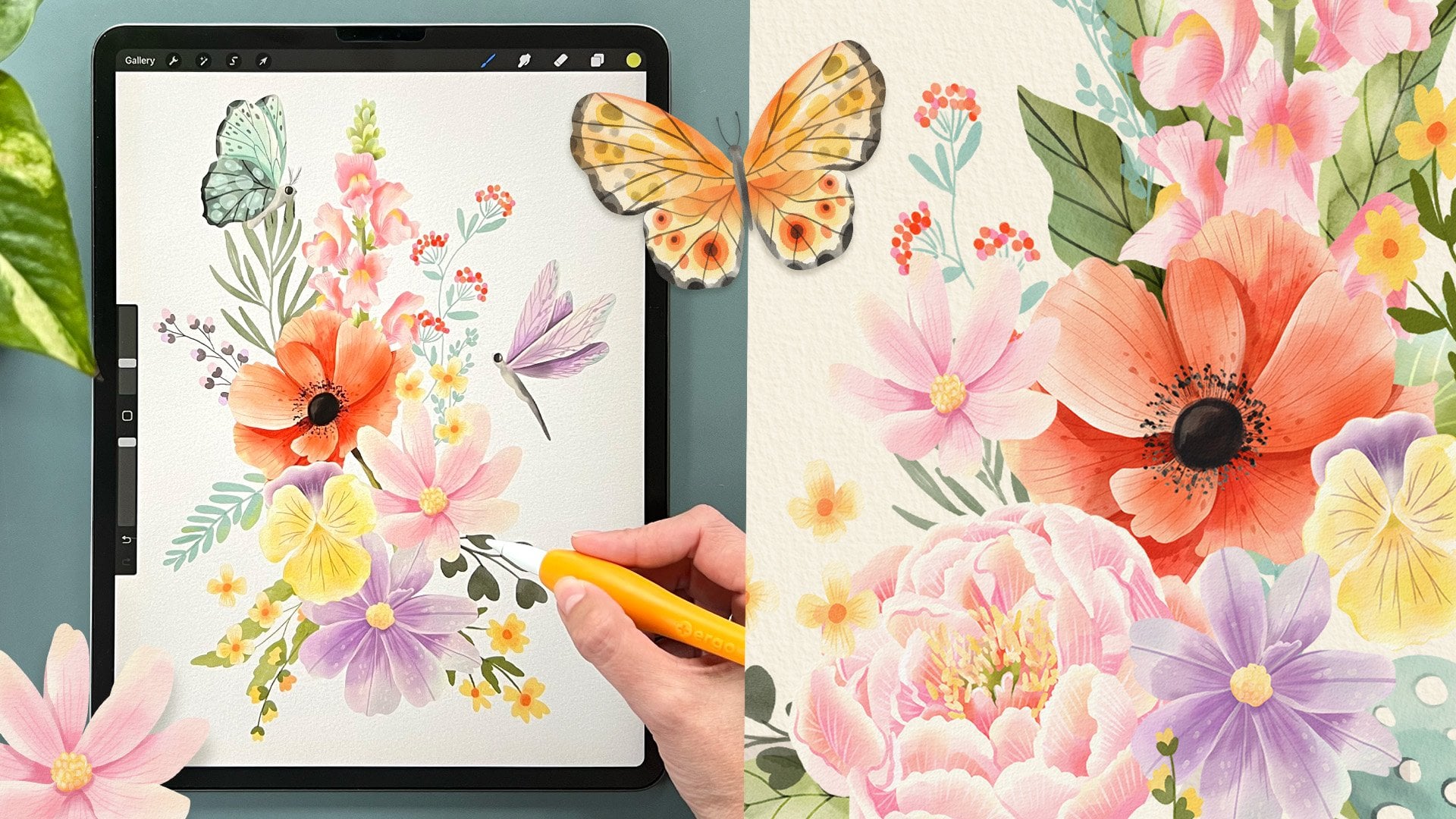
5. Creating the Basic Shapes - Florals: In this lesson,
I'll show you how to create the basic shapes for a simple floral
illustration by using layers. One of the best uses for
layers is to be able to add sketches to
create our artwork. These sketches can be drawn
by you in one of the layers, and then use that as a sketch. Or you can import sketches
like the one that I have included in this class so
that you can follow along. Make sure that you
have downloaded your sketch to your iPad, and now I'm going to show you how to import it
into your Canvas. Go to the Actions panel, Add, insert a photo and
you can download this catch from the
downloads area of the class. Select it, then tap
here to set it. Then you can rename it and
call it sketch for example, sometimes I like to be
very organized with my layers and I named them all, and sometimes I don't. It's your preference. Here, if you tap the N, you can change the opacity
of that layer. Make it more transparent
or less transparent. When I'm working with a sketch, I like to make it
less transparent, usually like these where
I can barely see it. But I'm going to leave it this midway so you can
actually see what I'm doing. These are all blending
modes for that image. I like to select Multiply, because what it does
is that it gets rid of the white area and just
keeps the colored areas, and makes it look
like a tracing paper. Let's tap on there
and add a new layer, and I'm going to work
underneath my sketch. Leaves, and I went to select my brush and
start creating the leaves. For this, I'm going to
go to the basic sets and use the gouache brush. Maybe I want these
color of leaves. I'm just going to start
filling these in. I'm going to move this down because I'm going to
show you something. There's still ways to
fill in this area. One is to drag this
color into the area, and you'll see that
trust holds shows up. If you see white lines
around your color. Just keep your pencil press down on the screen and drug right, until the point where it only floods your image and
not the entire screen, then I will release. The problem with this is that
it creates a solid color, which is great if
you're creating solids. But because I'm using a
brush that has textures, it doesn't look so good. The other way I like
to fill this in when I'm using brushes
that have textures, is to just color
it in as if I was using regular colored pencils. It takes a lot more time. But it keeps these
textures that I love. If you like solid
shapes with no texture, I suggest use a brush like
the mono line in calligraphy. This brush is super smooth and it's great
for solid shapes. I'm going to go back
to my gouache one and fill in all these areas. I never worry about following
sketches super closely, because I feel that
when you do that, it makes your drawing
very contrived. I like using it just as a guide. If you don't like these
little areas here or this brush is not precise. You can reduce the size, go back in and fix those areas. This brush has some transparency so you can see where
you went back in. But I don't mind that because gauche sometimes looks like that when you just
paint over it. That will be my first layer. Let's call that leaves. Now we can create
another layer on top, let's call it petal one, and we can start making
the back of the petals. Let's use a darker
color for the back. I'm going to make your brush larger and start thinking of the figures on
how they overlap, for example, these
petals are on the back. This one, this one and this one. Then I would make the center of the flower
in another layer, and then in another
layer, the front petals. Your brain will soon
get used to the layers and you won't even be
thinking of these anymore. Let's reduce the size of the
brush and create this one. But see, this layer is
in front of this one, and I really want these
body here to cover the petals as if they were
coming out from the body. I'm going to delete that, and I'm going to go and create another layer that's called bud. I'm going to drag it
underneath the leaves. Once I dry it, it's underneath the green. I'm going to reduce the opacity
of the sketch a bit more. Because now you've
seen how I'm doing it. That way, I can see what
I'm painting way better. Now I'm going to
create the centers of the flowers on top
of the petals one. Create a new layer, centers, and we'll
create those width. This dark color. Sometimes you have
to tap twice to select the color when
you're pallidus here. Great. Now I want to
create outer petals. There I'm going to use
this little pink color. Make sure it's selected here. Here we go. We're
almost done with this. See that I can still see
some of the seats in there. It's because this brush
has some transparency, you can just go back in
and paint the shapes. That way you won't
be able to see it. Same here with the leaves, I can cover that area. But I love how
this brush leaves, those dry brush marks that real gouache
leaps on the paper. Now I only have to do
these little bud leaf. I want to do it on
top of these ones. It's still under the leaves. I go here and I click the
pause sign, rename this one. Now that I'm done with that, I can go to my sketch layer and I can either turn it off here. That way you don't see it, but it's still there. Or I can go ahead and delete it. If you need extra
layers, just delete it. If not, and you want to keep it there, you
can keep it there. Some people like their
illustrations to be very simple or just made
of basic shapes, so it's very graphic. This could be you.
But if you're like me and you like adding
more and more details, then in the next lesson, I'm going to show
you how to do that.
6. Adding Details: For some reason, I love adding details to
my illustrations. I think they just look
more finished this way. But even if you don't want to add more details to
your illustrations, come with me and in this lesson, I am going to show
you how easy it is once you have created your basic shapes in
different layers. Now, I'm going to go into the back petals and I'm
going to add more details. I'm just going to
keep that brush and select maybe this color.
Let's try it out. Make the brush smaller. I'm going to reduce the
opacity to maybe 25 percent. I'm not pushing too hard on my pencil and see I
have it slanted a bit. Now I want to add details
to the leaves too. I like my art to
be very detailed. I'm going to choose this color to just maybe add some lines. Let's see. Yeah,
lines look good. I overlapped here and this is where I want to
show you the eraser. So this is the eraser. The eraser basically it has exactly the same
brushes as your brush. You can choose what
brush you use to erase. I always use in airbrushing, a hard airbrush if
I want clean lines. Or if I want to use the
same brush I've been using and have some
texture on my eraser, I can go to the recent brushes and choose
the latest one I've been using or whatever brush you want and then I can
erase with texture. I'm going to erase
here and I can perfect the shapes if I want. Now I'm going to keep adding a little bit more details and just go to the
brush there and add a tiny bit of light maybe with this
yellow to the center. These floral illustration
is done but in the next lesson I'm going
to show you how to add watercolor paper texture to it to make it look a little
bit more hand-drawn.
7. Adding a Paper Texture: In this lesson, I will
show you how I add watercolor paper texture
to my illustrations. I will be using my own
brush for this and there's a lot of ways to create these but I'm going
to show you mine. If you want to add a paper
texture to your illustration, you can go to your Layers, create a new layer on top. I'm going to call it Texture. If you go to your brushes and
go to Sandra's watercolors, you'll see there's
two brushes here, add line and paper and
add paper texture. I'm going to select
the add paper texture. It says set layer
to Linear Burn. I'm going to go and do that. Tap here in the end, set it to Linear Burn. This makes a transparent, and ingrain itself into
the paint underneath. Then I'm going to
choose this color here, any muted color works. That's not too dark and with the maximum opacity and
the maximum brush size, I'm going to go over
the whole canvas without lifting my pencil. You don't see what's
happening now, but you're going to
see it in a bit. Now that we've covered
the whole canvas, I will lift my pencil and you can reduce your
canvas so it's easier. Go back in maybe three
times and paint it. You don't see it
but when I zoom in, you'll see that now it has
this pretty paper texture. This is it without the texture and this
is with the texture. I really love this
paper textures. This is something you can
do to add like a handmade feel a bit more of handmade
feel to your illustration. You don't have to do
it, it's up to you. If you create a new layer
and you select a color. Let's choose this
green for example, and you drag it
into your Canvas. It will fill the
whole layer and if we reduce the opacity a bit and
start going through these, you'll see how it changes
the whole mood of the image. Sometimes it creates
really pretty combinations you hadn't thought of. Like for example this
one I really like. I like to play with
this sometimes and see what our color
combos I can get. Look at that one for
example without the layer, with the layer, without, with. I actually like this color
better than the one we had. I find this is a super fun way of experimenting with colors and unless I am working for a client with a very
specific color palette, then I won't do this, so I don't alter the colors I already use. But unless I'm doing that, I always do this to my
illustrations just to see what fun and new and unexpected
color ways I can create. Sometimes they surprise
me like this time, I'm going to keep it this way. In the next lesson, I am going to show
you how to export it.
8. Exporting: In this lesson, I'm going
to show you the options that Procreate has
for sharing files. Now that you have
your image and it's ready to share with the world, you can go here to actions, share and you'll find all the formats that
Procreate can export to here. This one is for images, so the whole thing and
this one is four layers so it will export individual
layers you have created. Here, in the image area you
will find these formats. Procreate can only be
opened in Procreate. But the good thing
is that if you back up your files this way, you will keep the
time-lapse video. This is the only
format that exports both the time-lapse video and your image in the same file. This is Photoshop so
it will export as an Adobe Photoshop document and it will keep all
your layers intact. PDF JPEG will create a
flat image, so no layers. PNG will export with a
transparent background. If you export it as it is, it won't export with a
transparent background. But if you go to your layers and you turn off the overlay and texture and turn off the background color
and you export these, it will export it with a
transparent background. Finally, TIFF is
a flattened file, but it's very high-quality, it doesn't lose any resolution. Sometimes this is
preferred by clients. Here you can share all
of your layers in a PDF, so it will export each layer into one of the
pages of the PDF. Finally, these are
for animations. We won't go into that. I'm going to show you the video. Here, you see the
time-lapse replay. You can see the whole process of what you've done in your Canvas. This is so cool. Done. Here, you can turn off your time-lapse recording and it will ask you if you
want to purge the video. That means to delete
the existing video. I'm going to say don't purge. If I want to pause it
for a certain time, and now I want to try
some things here that I don't want them to be
in the time-lapse replay, this is how I do it. Once I'm done with
that and I want to continue with my recording, I will just turn it
on and it will just start recording
from this point on. Finally, you can export just a time-lapse
video and you can choose between full
length or 30 seconds. The option for 30
seconds will only be activated if the video is actually longer than 30 seconds. Since this one is very short, I'm just going to
choose full length. Now I can share it or save
it to my iPad and that's it. That's how you export your
videos and your images. Now you know how to export your files on even your
time-lapse videos. Let's go to the next
lesson and start working on our
mushrooms illustration.
9. Creating the Basic Illustration - Mushrooms: In this lesson,
we'll be creating the basic shapes for our
mushrooms illustration. I want to create this
image as a square. I'm going to go and
create a new file, but I need to create
a new Canvas for it. Press here and I'm going
to name it square. I'm going to make it
inches, 12 by 12. I have 47 layers. That's a lot. I'm not touching any of
these and click ''Create''. Now I'm going to
import my sketch. You don't have to import
a sketch every time, you can sketch here in one layer and then use
that as a reference, or you can just start
painting directly. But for the sake of this class, I have created my
sketches beforehand so we can work on them
at the same time. If you want to import a sketch, just go to Actions, add, insert a photo or a
file wherever you stored it. I stored mine in the photos
of my iPad so I choose insert a photo and we're going to create these
mushroom illustration. Just click here to set. I'm going to do the same
thing as I always do. Go to my layers, reduce the opacity to about
10 and set it to multiply. I'll create another layer,
drag it underneath, and rename it, and I'm going to start by creating
these first mushroom. Let's use the basic
sets for these one. I'm going to be using
the gouache brush, but you can use any
brush that you prefer. Now, let's take our
color palette out, just palette and I'm
going to drag it here and start painting
the head of the mushroom. I make sure the opacity is at 100% and I'm going to
make it a bit bigger. I'm going to color
it in as if it was colored pencils so I
get these textures that look a bit like wash. Now, let's create another layer. Here I want to carry this stem. But before I paint it because
I want it to be very light, I'm going to choose
my background color. Let's try that one for now. Press ''Done''. Then I can start painting
my mushroom stem. I'm going to use
this light color and I'm just going to use the
eraser and erase this part here so that it
looks like this is the top part and this is the part underneath
the mushroom. I'm going to create
another layer, and this will be the
second mushroom head. See I stopped and started again. Because this brush
is transparent, it will make this
effect where you can see that you're
going over an area. If you don't like
that, just color the whole thing at once
without releasing your brush. Now I create a second
stem so another layer. Same light color. Again, I'm going to erase here. Here, I don't mind that
it erases very straight, but here I want to delete
some of these stem, but I want it to still
have this texture. I'm going to go into my brushes and go to my basic set
and choose gouache. and this way I get to keep
the pretty rough outline. Let's create the back leaves. I'm going to drag this layer down because I want that to
be underneath the mushrooms. Make sure I'm using the
brush. Choose this color. I'm going to reduce the size
and start coloring them. Now I'm going to
create another layer and I'm going to create
outer leaves here. I'm going to reduce the size of my brush a bit and maybe choose a green color, maybe this one. Now, in the next layer, I'm going to create a text. For that, I'm going to use
my textured mono line brush. I'm going to choose black and all these colors
I can change later. I'm just making some
quick choices here. I'm just going to go around. I actually don't want
it to be on the back, I want it to be on the front
so I'm going to drag it up, and I'm just going to continue lettering I'm happy with this. What I'm going to do is
turn off my sketch layer. Now we don't see it. Now I have the basic
shapes ready for this illustration and
in the next lesson, I'm going to show you how to use masks to start coloring them in.
10. Alpha Lock and Clipping Masks: In this lesson, I'm going
to show you how to use Alpha Locks and clipping
masks so that you understand the differences
and how to use them, and when to choose each one. Let's select this mushroom head, and concentrate on
these for a bit. If you swipe on your layer
with two fingers to the right, you will see that a checkerboard
appears in the back. You can also tap here
and select Alpha Lock. Alpha Lock means that
you can only paint on the areas of your layer
that were already painted. Let's choose this yellow. I'm going to go back
to my gouache brush. Now if I paint on this, I'm not going outside the line. I'm staying inside
the mushroom head. This way I can add more
details and textures, and I'm just painting there. So this is great. I can also use a stamp brush, for example, this one. Let's make the opacity
100% on top here. That texture will
only cover this area. Let's undo this and let me show you how that looks
in the layers panel. The yellow is on the same layer. So later, if I want to
modify that yellow, I want to make it bigger, or I want to change the colors, it's going to be attached
to this mushroom head. It's going to be a bit
difficult to do that edit. But this is a great
work around when you want to add something
to our layer, and you don't have too many
layers to start stacking up. It has its pros and cons. I really like using these, but there's also
another way to do it that creates a
non-destructive edit. What a non-destructive edit
means is that you can then come back and edit that and
not alter the original image. Let's undo this and create
a new layer on top. When we touch that layer, we will select clipping mask. Now you'll see this arrow here. What does that mean? It means that everything
you paint on this layer, even if you paint
something out here, it will paint it on that layer, unlike the Alpha Lock, which will only
paint on this area. But since it's using
these as a clipping mask, you will only be able
to see what's in here. Now if I stamp that texture, it's all here in the layer, but it's only showing what's
on top of the mushroom head. This is really
cool because later I can come and move it, I can scale it down, and it's not affecting
the outer layer. Same way if I want to draw here. It's on a total separate
layer so I can turn it off, I can turn it on,
I can delete it. I'm going to be
using clipping masks to color this illustration. Now that I made
this yellow here, I don't like how
this stem looks. I'm going to use this eraser. Yeah, that looks better. I'm going to keep adding
details to this mushroom. I could do it on this layer, but I can also add
another layer, create that as a clipping mask, and it is still clipped
by this element. So you can have as many
clipping masks as you like. Let's say I'm going to
add these white dots, and then smaller ones. Because it's a clipping masks, these dots are being clipped
and not shown completely. I want them to come out of the mushroom because
sometimes in real life, they're bumpy these
little mushrooms and the white things are
actually raised. So I want to give
that impression. Since I didn't do it here
as an Alpha Lock mask, I have the possibility to touch here and deselect Clipping Mask, and now I can actually
see the whole thing. That works great. Now let's
go to the mushroom here. I want to add some shading to these things for the same reason because
they're are bumps, so they should
create some shading. I'm going to use a darker
color, this brown, maybe. Just create some shadows. I'm just creating the shadows to the bottom as if the light
was coming from up here. I like that, but maybe I
don't want these ones to be so white so I can
go back to the layer. I haven't named this one. But let's call it dots. I can make this an Alpha Lock. I can do two things. Let's try these yellow. I can tap on it and
choose Fill layer, and it will feel only the parts of the layer that
were already colored. Say if I didn't
have an Alpha Lock on and I chose fill layer, it will fill the entire thing. Alpha Lock is very useful
to recolor things. But in this case, I don't want
them to be a solid color. So I'm just going to add
a bit of yellow to them. For that, I'm going to reduce
the opacity of my brush, and just very softly add a tiny bit of yellow
here to the bottom. Maybe just to the big ones
and some of the small ones. I already think
that looks better. Now I want to do something with the yellow part underneath. Because I have it
in its own layer, I can Alpha Lock it too. I'm going to up my opacity. I'm going to choose this color, and I'm going to create
a border like this, just so that it looks like the under part of the mushroom. I'm going to choose
this dark color again, make it even smaller and
just make some lines. My lines are so wobbly. I can undo that. Go into the brush,
go to stabilization, and add a streamline, a stabilization. Press Done. Now my lines are so much better. Maybe add some white ones there too just to give it
a bit more interest. A cool way to practice
these on your own art and your own style is to select other types of
mushrooms and do this, but with different mushrooms
and a different word. That will make it your own. I'm going to choose
this brown again and then go back in, and cover these lines. Then make sure you
go back to brush and remove the streamline on stabilization if you're going to keep painting with it. Because for painting, I
don't think it works so well when it has
streamline applied. I think that works well. Now I'm thinking I want to add texture to these mushroom head. You can go to the mushroom head layer
and then go to gallery, insert a photo, and you can add a texture. Press here to set it. Then if I go here, again, I can play with
these blending modes until I find something
that I like. Multiple layer is pretty great
again because it creates like tracing paper feel. You can see the color
underneath but then you can see the texture on top become
ingrained in the bottom layer. I think that's super cool. I'm going to leave it like that and I'm going
to go to the stem. This is one way
to Alpha lock it. I'm going to add
some shadows here, just because these will be
creating a shadow on it. Then I want to add some little
details, just some lines. You could also add
darker shadows. If you reduce the opacity, then this brush will
add a grainy texture. I'm going to do
exactly the same thing to the other mushroom stem. Create an Alpha lock, add some shadows here just so it's separated
from the front one. Then raise the opacity and
create the little details. Now we can go to
this mushroom head and do the same thing. I'm going to create a new layer, touch in it, clipping mask, and I'm going to choose this yellow color and make
the inside of this mushroom. This one maybe I'll
actually do like this, so I leave the border visible, and I want to add a shadow to
this shape so I'm going to touch it, Alpha lock it, reduce my opacity, and use this color
to add a shadow. Then raise the opacity, reduce the size, and
add some details. Now I want to add the
same texture to this one. I'm going to go here and
swipe to the left and duplicate it and I'm
going to drag it down. If I put it underneath an
existing clipping mask, it will automatically
create a clipping mask. I think that works
perfectly fine. Now I just want to add another layer and
create the white dots. Let's do the same to this
one and use some yellow, reduce the opacity, and add a bit of
a yellow to them. This is not necessary and it always depends on your style. I just like adding
shadows and things. I don't like flat images. A lot of people do, so that's why I add textures and details
and more textures. But there's no right
or wrong answer here. I'm using these shadows that I created here on the mushroom. I'm going to go back to the head and use this
very dark brown, up the opacity and add them. I'm not seeing a real
separation between the head of the mushroom
and the stem like here, so I'm just going to go back to this area and add
a bit of yellow there with less opacity just
so I create some separation. I could also go into the stem and add a bit
of a darker shadow. That works too. I'm
experimenting all the time. The reason why I don't pre-color my illustrations
before I teach a class, I just make the sketch
is because I want you to share the process with me of exploring and experimenting. Because if I already solved all these problems beforehand, then you want to see how
my mind works as I develop an illustration and then you would lose a big
part of the process. This is the reason
why I preferred to backtrack and I'm always going back changing colors because that's how
it is in real life. I don't want you to feel bad and think that every time
I paint something, it's ready or it's
perfect for a client. There's a lot of back-and-forth, even if it's just for myself. I want you to be part
of that process. For example here, I really think I should
have a shadow here somewhere so it shows that
this one is in the back. I'm going to go into the layers, into the mushroom
head and I need to make sure the Alpha
Lock is on so that I can add this shadow here
and some to the stem. Now I'm going to add some
textures to these ones. These are going to be pretty
basic textures because I want the mushrooms to
be the main elements. I'm just going to create an Alpha lock on
the leaves mask, and with a darker color, I'm just going to tap. This squash brush
is really great because you can use it
both as a brush but also tapping and it creates
really cool textures. Maybe you want to go in with a lighter color and
add some light, and then you can go in
with a darker color, and make it full opacity
and add some details. Then do the same to the
leaves, Alpha Lock. I'm going to choose this green. Maybe I can color softly. See, I'm barely touching the Canvas and I'm
slanting my pencil a lot. You can add some
darker shades still. Creating dark contrast with
light colors I think it's the best way to give depth to your illustrations and
make them interesting. This might be like a circle or some element in the back
to bring it all together. I'm going to create a new layer. I'm going to call that circle and just drag it to the bottom. I'm going to use
my gouache brush. Maybe use this color, make sure it's 100
percent opacity. There's something really cool in Procreate and it's
that if you draw a circle and you don't
release at the end, you'll see this show
up here and you can either use it as an ellipse and modify it from these points. I can make it a bit oval like or I can make
it a perfect circle. I think something
not-so-perfect would be great. Something like that. Once I'm happy with it, I can just stop there
and color it in. This works for squares and rectangles and also
for straight lines. For example, if I want to make a straight line and I
hold it at the end, it will snap to a perfect line and if I
touch my finger here, it will snap by
increments of 45 degrees. This is almost done,
but there's still some little details
that I want to fix. In the next lesson, I'll show you how to
use a different type of mask to finalize
this illustration.
11. Masks: In this lesson, I'm
going to show you a totally different
type of mask. This is a mask that conceals or reveals a part of your image. This is called a
non-destructive edit because you can delete
parts of your images, but if you change
your mind afterwards, you can bring those images back so you're not losing
the information. If you use the eraser to
erase a part of the image, it's gone forever, but if you use a mask, it's just concealed under
the mask. Let me show you. For example this
green leaf here is crossing under my word, and I want this one, but just this one to
cross on top of it. What I need to do is delete these little line
that is covering the stem. I'm going to go into
my lettering text. I'm going to click on
it and add a mask. For the mask, I like to go to this color selector and work
with either black or white. Everything we paint with
black is erased and everything we paint
with white comes back. I'm going to reduce
the size here and go with my black and erase this part that
is covering the stem. Here it's covering the leaf also and then I have these
vine crossing over my word, but it's not the same as
erasing that part because if I ever want to change
the position of this leaf or I change my mind, I just have to go to my
layers and either make it invisible or swipe to
the left and delete it. Then I'll have my
whole word back. This is very useful. I'm going to undo this because I do want to
keep my layer mask, and I'm thinking I
just need to add a bit of detail to this word, so maybe you can go on
top of it and create a new layer, call it decor. Using the texture monoline, maybe this color, I can
create an internal outline. Maybe change the color of grow. I just swipe to the right. Now it's in Alpha lock, and I'm going to choose
this dark brown, go to the layer, tap it
and choose "Fill Layer". I liked that, but I don't
like the background now, so I'm going to go back to the background and maybe
use the classic view. I think that looks better. I just noticed something, my line is crossing over the
leaf and I don't want that. I'm just going to go
back to my decor, add a mask to this also and remove this part
of the illustration too. Now the following
step is optional, but I'm going to show you how to add a watercolor
paper texture or an overlay to change
the colors just to the illustration part and not
to the whole illustration. This way, you can export it with a transparent background
and you can use it for things like clipboards
or stickers or anything that needs a
transparent background.
12. Adding Textures to a Certain Area: In this lesson, I'm
going to show you how to add textures and color overlays to
just the illustration and not the whole page. Now you can export it and keep the watercolor paper texture and the color overlay but have
a transparent background. What I'd like to do
for that is go to the gallery and
duplicate this file. Now go into the
copy, open it up, and swipe right on
all of the layers, except the background,
group them, and then when I go
here to New Group, I can press this
arrow to close it and if I tap on it,
I can flatten it. If I want to add just
a texture to that, we will create a new layer, select our add paper
texture brush, choose this color maybe, and color over it. Once lift your pencil, twice, lift your pencil, three times, lift your pencil, and set it to linear burn. This way, it's going
over the entire canvas, so you have it on
the background too. But if you tap on it and
you create a clipping mask, it will only go over
your illustration. Then if for some
reason you want to export this as a
transparent file, just turn off the background. If you did not have this as a clipping mask and
you exported this, it would have this
beige background and you don't want that. You can also add overlay
layers this way. Remember, on our
otter illustration, we had these pretty
overlay color here, without it with it. If you want to do that again, you just go into this file, add a new layer, use this same
green color we had before. Go to the blending modes and where are you
divide? It was divide. Maybe you want to make
it more transparent. I think that opacity is good. Now I just set it
to a clipping mask. There you have it. It's not
affecting the background. You've made it till
the end of the class, so in the next lesson, we're just going
to wrap things up.
13. Wrapping Things Up: You made it until the end. I hope you had lots of fun and that you're not intimidated or confused by the use of
masks or layers anymore. Now you know how to create
illustrations using layers and how to
add Alpha Locks, clipping masks, regular masks to take your illustrations
to a whole different level. Now you even know how to
turn your illustrations into clip art or stickers with
a transparent background. I can't wait to see
what you create. Please post your projects
to the project area and let me know if you have
any questions or comments. If you want some feedback, let me know what I can focus on. If you want to post your
projects in social media, tag me with
#learnwithsandramejia. I'd love to see what you create. Remember to review the class
and leave me feedback. If you liked it, share
it with a friend. See you soon. Bye.
 Sandra Mejia, Illustrator + Pattern Designer