Transcripts
1. Intro: Hey there!: Hey everyone. In this
class we'll be jumping into the magical world of creating watercolor
characters in procreate. Hi, my name is Brian. I'm a graphic designer
living in Montreal. And most of my work is
designing marketing materials, social media posts,
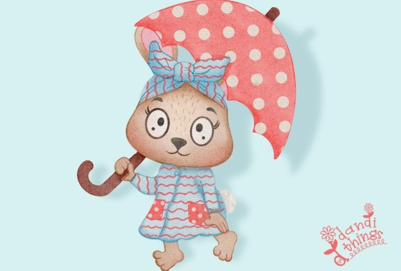
and video editing. Now you might be asking why choose watercolors
in procreate. Let me show you, with just
a few tabs and swipes, you can achieve stunning
watercolor effects That feels like
traditional painting. In this class, I'll give you
the process of setting up the canvas to achieve that perfect watercolor
texture plan. We'll explore creative
shading techniques to add that and dimension
to your character. And I'll show you how to create good contrast to make
your illustrations pop. And don't worry about
materials I got you covered. I'll provide all the
brushes, paper, textures, and patterns you need
to make your artwork look like it's been painted
in real water colors. This is a therapeutics
experience that you can enjoy
anytime, anywhere. And the best part, once you've created your masterpiece,
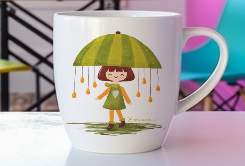
you can print it out. Use it in so many ways, whether it's framing it as
a personal piece of art, putting it on the mug
as a heartfelt gift are showing where the world
possibilities are endless. So see in the class.
2. Class Project: All right class.
It's time to put your new found skills to test
with our project section. For this project, I
want you to create your own unique
watercolor character using the techniques we flirt. Feel free to get creative, experiment with different
shapes, colors, shadings. Remember the beauty
of digital art is that there are no limits. Once you finish
your masterpiece, don't forget to share it
to the project gallery. This is your chance to
showcase your talent, inspire others in the community. So I can't wait to see
what you come up with. Happy creating and I'll
see you on the next video.
3. Materials and Overview: Hello everyone. In this
part of the video, we're just going to talk about the materials that
we're going to use. You will need an
ipad and Apple pen. This is my ipad,
it's actually the 12.9 and I'm using
the Apple pen. This is the second
generation that could clip here and also charge
the procreate app. The main software that
we're going to use, we'll be using the
paper texture that makes for water
color paper texture. This is the short link. Copy this one and then
I'm going to do a demo. Past out the link, you get this Google file. Download it right here. You can download it.
It should goes to your download folder also. You can save it or open
it in procreate directly, or save it into your file. The watercolor brush, this is actually coming
from procreate itself. For procreate brushes, this
is the link going to be a watercolor brush set and
it's coming from Julia. So this is a free one. And you can just download
the brush set right here. Then you can see something here. You can just download. All right, Once it's downloaded, it's going to show you the
check mark right there. And then you can just click this opening and
then you can just procreate and it will automatically be imported
in your procreate. And you can see brush set, These are all the
watercolor brushes that includes in the package. And lastly, we need the practices sketch
that'll also be providing. This is the short link
for the practice sketch. This is going to
be our practice. You can just download
it as well like what we did and you
can just import it. Procreate app. That's all
there is for this video. I'll see you on the next video. Where we actually set
up our workspace, import our act, then we should be ready
to do our painting. All right, I'll see you there.
4. Setting Up the Workspace: Hello guys and thank
you for tuning in. And in this video, I will just quickly set
up our work space. Specifically, we're dealing with the watercolor paper
texture effect. We will achieve that by just
following this few steps. These are just one
of the methods that you can get that I
learn and test it out, that it really does work. I'm going to create
a Canthus first. This one right here, 11 by 8.5 I'm just going
to customize it. So I'm going to inches. 8.5 by 11, so make
sure you're inches. I'm going to set
the DPI to 300 just because it's a little bit
crispier when we print it out. And it has more flexibility in scaling compared to
if it's below 300, the maximum layer,
take note that's 59. I'm just going to hit Create. I am going to use the brush,
this water color here. We're going to test it
out with number four. I am just going to have
this magenta right here. The size is pretty much,
it doesn't really matter. As you can see here, it already has the
water color effect. Now we have to import the paper texture that we downloaded from
the previous video. So I'm just going to add it from this range or
the action button. Just have to insert a photo. Okay, I was able
to import it here. I'm just going to scale
up my canvas here with my fingers something like this. I think it should be.
Okay. We're going to duplicate it two times. There's definitely
three different layer of the same paper. This is just some of the formula that I tested and
it worked okay? Let's rename it one. It's easier to target two and
then rename it like three. All right, so you don't
see anything just yet. Just because we haven't
do anything special. We're going to start with
the first layer right here. I'm going to click the letter right here with the layer
number one selected. And then we're going to
go for darker color. This is actually a blending
mode that you could test out. It's actually the one
that will help us achieve the paper water color texture. I'm going to set
to darker color. I'm going to go for 84. Then for the second one, it's going to be a color burn. We're going to go and
change the capacity to 64. Also selecting the number two, we're going to go for the
adjustment right here. I'm going to select
and saturation, We're going to decrease
the brightness to something like 44. And then through the last one, we're going to blend
it to lighten. And then we're going
to de, decrease the opacity to 27,
something like that. As you can see, you can
already tell there's a water color effect. We're going to group it
and just do it like this. We could take a look at
before and after before. After. You could see there's a water color texture effect
that's happening right here, especially with the darker ones. You can adjust the layer two, you can adjust to achieve
more of the effect. Something like this.
See, it gives you some. And you can also
play with the lights here if you want to make it
a little more matt finish, play with it,
something like that. That's how we achieved
the watercolor effect. Yeah, this is our workstation, and I'll see you on
the next video as we continue our watercolor journey here. All right, see you there.
5. Painting Time: Hello guys and thank
you for tuning in. This is actually
the part that we are going to start to paint, but before that I'm just
going to address something on the layers that we created
from the previous video. These layers actually
need to be on top of everything to get that effect. So I'm just going
to lock this one right here and then
make a new layer, put the layer below this one. Actually, I'm going to rename
it so it's easier text. I'm going to name
it texture effect, I'm going to lock it so it does not interfere
with anything. And then for this layer
right here onwards, it's going to be below the texture effect layer just to make that clear so we
get that consistent effect. As you can see the
texture right here pod, hope the camera picks it up. Good. We're going to
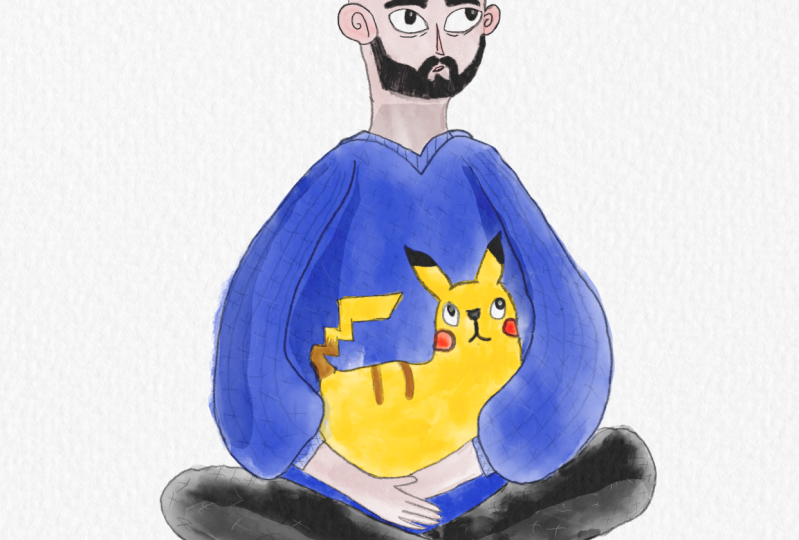
import our sketch here. I'm going to go to the
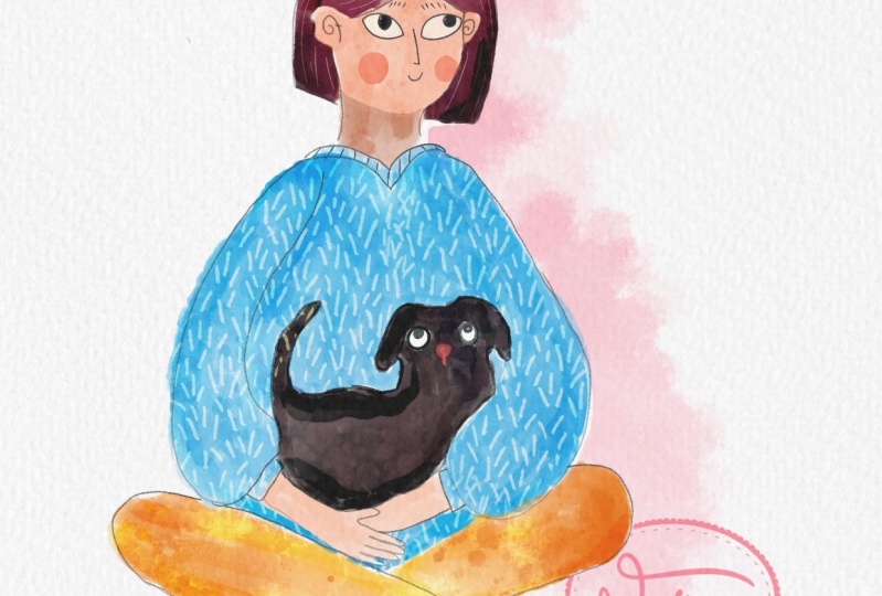
range or to the action. It's a male version. You can actually do something with this if you want
to make your character. You want to make it like a girl, you can make a cat. It's pretty flexible.
You can just delete this right here. You can actually get
something in the sketching. You can go six pencil, You can just make
this turn into black, you can turn it
to something like a girl, something like this one. Or you can turn it into
something like anime character. You can even do this, or you
can do Afro if you want. You can change the
eye and all that. This sketch is pretty flexible, but I just want to
do this one right here because this
represents me. I think. I guess we're going to, I'm just going to delete
this one right here. And I'm going to put,
I'm going to rename it, if I could like sketch. I'm going to turn
the blending to multiply, multiply right here. And I'm going to
decrease the opacity. And I can actually leave it
right here on top of here. I'm going to also lock it. And from there we could
create a new layer, put it at the bottom of
the text texture effect. And we could start,
I'm going to start with the skin first, like the outline of everything. I'm going to select a color wheel like red and you can go
somewhere right here. We also, for the brush, I'm going to use the
number four usually. This is the only
thing that I need. Number four, watercolor brush, I'm just going to
start painting it in. The targeting are just
the one that's visible. Just I think you can change the skin color
to anything that you like. I'm going to get the era. I like to use the
winning callography, the water pen to erase
something carefully, erasing the part that we don't
need, something like this. Then we can just
fill up some stuff that we need to fill
something like this. And we just keep continue erasing the
part that we don't need. All right, we're
finished with the skin. I think it's dark. I'm going to go to the layer on this layer six, right here. I'm going to just
adjust the hue and saturation or the brightness, you can make it a little bit
brighter, just like this. You can, you can even turn
it to something like this. That's too much. I'm just looking at the face. I think something
like this is fine. We can always work on
it a little bit later. But I think Cool. I'm just
going to rename it. That's pretty good. I'd like to work on the hair right now. Since it's on its own layer, I'm going to go for
something brown, brown, something like this. We can always modify it. Once we're finished
with the hair. I'm still using the same brush. And number four, you can just start doing this
to introduce color. You can just point
point like this. Then we can always blend
it just like this. This is flexible. It could be like a blender or it could also
introduce some colors. You're hitting two
different results in just play around it first. That's why I like this. I'm just doing carefully. I'm going to introduce colors
here, pretty much the same. Something like this can make
the brush to blend it out. Then we're finished
with the hair. I'm just going to get the
eraser still the same thing. I'm using the water pen
from the calligraphy. It's also like a free brush
and something like this. You can do some rough
edges if you want. It has that hand drawn feeling it could go erase again and then start
waking it out. That's for the hair. We're going to go for the
T shirt or the sweater. I'm going to go for a
different layer right here. I'm going to get the same
brush, the number four. And I'm going to go
for orange shear. Since we are on the same layer, we can just do a free hand. We could start small and then go figured a way up,
something like this. I'm going to just introduce
colors, something like this. Then I'm going to blend it, like smudging it,
something like this. It's okay if you
go around or out of the T shirt because we can, oh, this is a mistake. We don't really
need that in there. Yeah. You just have to
do something like this. Can make it inches
color and then blend it as you go so you don't have to switch different brushes
at the same time. Like this. Then yeah, we could start deleting some areas that we need
to just like this. Okay. I guess we're
finished with the out the painting for the shirt. Okay. I missed something here. Actually, this needs
to be filled as well. I'm just going to
delete something here. Erase all the parts that
we don't need here. Okay, So it's actually good that it's a little bit
darker here because it is actually a good foreshadow and making it dark,
that's quite good. We're just going to rename it. We don't. I'm going
to just name it. This one is the hair. I'm just going to rename it. I'm going to go shade
the pants right here. I'm going to create a new layer. I'm going to go for
loose block right here. I think this is good.
I'm going to use the same brush number four. I think it's good here. I'm going to introduce some
colors, something like this. I'm going to just blend
it just like this, like the effects gives you some a real water color
effect right here. Just can't believe
what I'm seeing. It's good that there's
a hard edges and soft edges because that's
how water color is. It's unpredictable. So you can just do
something like this. It's looking good
already. I like it. Let's change this color and
then blend it as we go. We could something like this and I like the effect
right now, it's cool. Let's just make this one
darker here. All right. We're going to hit the
eraser tool and it's not much actually to
delete or to remove. And I like the edges
of this, I think. Yeah, something like
this. Also here. Just quickly. Just like that. I think that's pretty good. Yeah, I'm going to
go for the dog, I'm going to rename it pants and I'm going
to color the dog. I'm going to get the
dog like the darkest as possible and I'm going to
color this lighter color. I'm going to just get something a little bit
different brush here. I'm going to go for
probably mercury. Let's try that out because
it's still bleeding. Right here. It's a nice effect. It has a bigger stroke. I'm just going to just do
this roughly right here. I'm going to just drop the
color. And that's the dog. It's pretty easy. You can
see the texture right here. It's very watercolory. I am just actually, I'm going to use
the same something. I think it's good or yeah,
something like that. I'm going to go switch to
black because I'm going to feel this is right here. All right, As we go
with the dog features, I'm just going to outline
this probably dark brown, just to outline this
one right here. Something brighter, something We can now make the
outline for this, but get the selection
tool right here, and it needs to be freehand. We're just going to
trace this part right here just like that. We can just go to the
adjustment and we're going to increase the brightness,
something like this. I'll see you guys
on the next video.
6. All About the Details: Hello guys, thanks
for tuning in. And in this part of the, we're going to specifically
put details on the face. And then the here we
go along the way. So let's just do that. I'm going to turn on
and off the sketch. We know how we did. I'm turn on the sketch and
then we're going to go, we're going to do outline
actually on the face. All right guys, I decided
to use the number five. I'm going to go for
complete black color and then we're just going
to start tracing it, especially the features here. I'm just going to go
something like this. Pretty much just tracing
the sketch that we have. Lower capacity we can do, multiply, something like this. I'm going to add a
new layer actually, but I'm going to
merge it later on. Turn on the sketch
is going to draw the pupil right here and
I'm going to drop color, introduce white to put
some sparkle there. Really merged layer 11.12
and then call it facial. I'm going to introduce
some shading here. I'm going to go for the skin, get the selection, introduce
something like this. You'll see what I am aiming for. I'm going to go for
the adjustment. Lower it a little bit, something like because
by the fall is 15, I'm going to go around 45 and
see if it has a good look. Let's see if it looks good. Going back to the facial,
I'm going to introduce some pinkish tone to it. And I'm going to go
for number four brush. I'm going to make a new
layer just above the skin, a little unsaturated red
color the ears and nose. I'm going to lower the size
here just to fit the nose, something like
that in the chick. We can introduce
some colors as well. I forgot to put
color on the eyes. I am just going to go
on top of layer 12. We can get a new layer, then I'm going to
get the white color. I can just color
it just like this. We could turn off the sketch
and you can see that there's a little bit more character
to it. That's cool. Introduce more shading
on the face for now. We delier 12, 13 and the facial, I'm just going to merge them, go to the skin, then that's when we hit the entire
skin of the face. I'm going to go for a selection. I'm just going to go
something like this, like a feather it out, adjustment, introduce
brightness, something like that. As you can see, it
has a little bit more dynamic on the facial, on the spray paint. There's a flick right there, you could go probably red. And then we could start
experimenting with it. You just add like a couple
of freckles and stuff. It just adds a little bit
of texture on the face. I think it looks good. Something this to lower
the brightness to 48, it gives a little bit
of shadow right there. We're going to go to the hair. I'm going to create a
new layer, the outlines. If you go to rest or
if you go water color, you just have to
select number five. It needs to be I'm using here. I'm just going to start
outlining it just like this. If you're happy with it, you can just merge it to
the hair layer and I'm going to create a
new layer black. I'm going to do some texture. We could lower the
capacity. Right now. You could go zero first
and then we can work our way up just a little bit of a visible,
can barely see it. Something like this. If you're happy with the texture
that we created, you can just merge it together, introduce shading right here. It gives a little
bit more dimensions. We can see that there's a separation between
two hairs here. I will get this part, probably something like this. Then I'm going to probably
a little bit of shading, something like 47, not too much. I'm going to go back to the skin and introduce a shading as well. So I'm going to go
just outline the hair. I'm going to rename it
to Facial selection. I'm just going to select
this part right here. And I'm going to
darken it a little bit just to add a little bit more character,
something like that. I think that's quite good. I'm going to turn on the
sketch just to see how we did. I think it's good.
On the next video, we're going to do the
shirt and the pant, probably the dog, but I'll
see you on the next video.
7. Patterns and Texture: All right guys, thank
you for tuning in. We're going to go
for the sweater, we're going to turn
on the sketch, just to give us
something to look at, create a new layer here, just above the shirt. I'm going to get the number five and I'm going to go
to the start outlining. I'm going to go just pretty
much everywhere we can start, but I'd like to start here. All right, that sounds good. Turn it off. A sketch. For now. I'm going to lower the
capacity to something not too distracting because that's not the main focus of
this illustration. Something like this,
Kind of barely see if you're happy with it, I'm going to just merge it and I'm going
to create a new layer. This time I'm going to
create the pattern. Same brush number five. And we're just going to go,
if you're happy with it, you can decrease to opacity. Yeah, merge it back and I'm
going to create another one. This time it's a little texture that we did with the hairs. Okay, I guess that's it. We're going to put
it on the side. We're going to
lower the opacity. Something a little bit
visible, something like this. See, it's not that visible. Just going to merge it. And I'm going to introduce some shading. So I'm going to use the
selection tool here for the hands. I'm
going to just go to the skin layer and
create a new layer. I'm going to go for the brush, which is the shirt and
the pan for the extreme. And I'm going to
turn on the sketch. And I'm just going to quickly, just to quick sketch right here. I like that. Imperfections
right there, put some shading. So I'm going to go
pretty much the same. It's going to add a little
bit more depth on the hands. So we're going to
slay the pants layer and then we're going
to add a new layer to outline it as the number
five brush on the same set, we outline it just like this, I guess that's okay. Lower
the opacity of the outline. I'm going to turn off
the sketch as well, see if it looks good. I like it. I'm going to
merge it another layer. Yeah, the black color. And then I'm just
going to do the same. Then we're going to
lower the opacity quite a bit. Just like this. I'm going to merge it if I'm happy, if you're happy with it. And then we're going to
go some shading here, increase the brightness as
well. Something like this. So I'm just going to get this
one add and also this one, we could just increase
the brightness, add one more layer. I'm going to go for block
and pattern right here. And let's just put it
back maybe 9% layer, just above the shirt to
give you the final outline. We're pretty much done here. I'm going to see you on the next video for
the final thought. Yeah, I'll see you
on the next video.
8. Final Thoughts: Hello guys. Thank
you for shooting in. This is actually the
last part of the video. I need to decrease
the outline of harsh. I'm going to just decrease it. And pretty much that I'm
going to increase the cold. Just put something like
a broken line here. It enhances the contrast. Like this look, have that
watercolor paper look. If we turn on the
effect right here, it doesn't look good. Well, it's still good because it's a cleaner and all that. But if you turn on the
watercolor effect, it gives you this k handmade feel that we did this
without the effect. It just looked like a
drawn from the ipad. It's quite okay as well, but if you turn on
the paper effect, it feel like it was hand drawn. The print that I did for
this one, here's some ideas. You can also print it
on like a mug to be a perfect gift for
anyone who loves pet. Also, you can print it
as a greeting cards or put some happy birthday on the side,
something like that. I hope you guys enjoy and learn this technique and we'll see
you guys on the next video.
9. The End: Thank you! : Hey guys, welcome back. This is actually the end of
the class and thank you so much for spending the time with me and watching this class. I really appreciate it and I hope that you learn
something new. I hope you've enjoyed exploring the endless possibilities
and discovering how to bring your digital illustrations to life with an authentic
watercolor art. And I can't wait to see
what you come up with. And I'll be happy to
see Beautiful Project. And if you have any questions
and for clarification, feel free to send me a message on the discussion
panel down below. For sure, I'll get
back to you and I'll see you on the next
class. See you there.
 Bryan C'ngan, Graphic | Web Designer