Transcripts
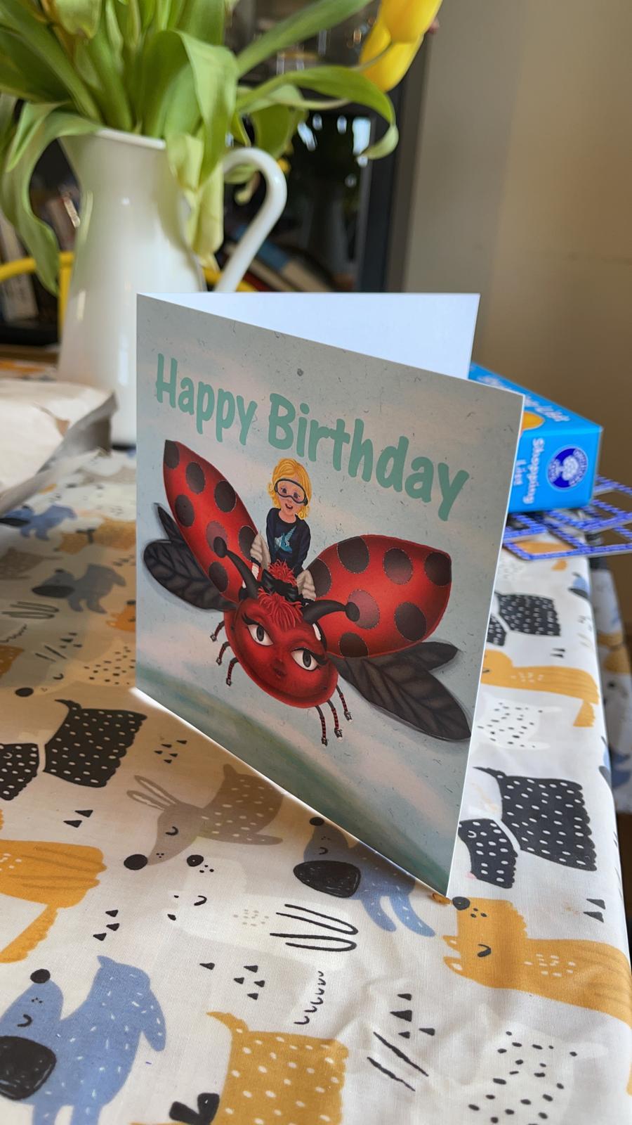
1. Introduction: In this class we're going to look at Digicel childlike illustration. My name is Mariah may not. I'm an eventual, an artist and illustrator from South Wales. I've always loved the work of children's book illustrator such as Quentin Blake, RAM Oakley, and stocks is ace. I don't think I would've studied Art and Design if I hadn't been introduced. They work as a young child. I've always been interested in the way that children say in betray the world. As a trained artist, it can be hard to ignore the fundamental principles in the way that children do. The aim of this class is to create a beautiful fun illustration that could have come from a children's book. This class is perfect for creators of all levels, from beginners just starting out to artists looking to strip back and simplify their style. By the end of the class, you would have created a professional looking, childlike illustration for anything from drawing for pleasure, creating commercial art prints, social media posts, or even a birthday card. And the thing that you can think of to use your new skills will all be using Procreate for my piece, but you may use any drawing software that you're familiar with. Thank you for joining me in this digital drawer in class. I can't wait to see you in office clubs.
2. Class Project & Page Set Up: For our class project, we're going to make an ongoing piece. Each class will bring us closer to creating a beautiful illustration that could have come from a children's book. For your projects, I want you to feel connected to your drawing. I find the best way to do this is to make it personal by choosing a subject matter that you really enjoyed, wanted, or dreamed about as a child. By the end of this class, you will have a fully rendered childlike illustration that has a little bit of your personality in it that you can either kp will give to somebody as a gift. First of all, let's look at setting up our canvas. I like to start sketching on a 2000 by 2000 pixels square, which will give us a 130 layers to play with. When it comes to the color palette, I'm going to leave it on RGB because RGB is the color profile for screens. However, if you're like he's give this to someone as a gift. Well, you want to get it printed. I would recommend changing that to CMYK. If you're going to have an attitude social media profile, leave it in RGB because it's going to be seen on people's phones. Again, like I said, is going to be the best color profile for that. I'm going to change one last thing before we set up our canvas. And that's the background color to Rava, leaving it on a white which can be quite harsh and quite strong on the eyes. Well, I'm gonna do is I'm going to change that to an off-white. At this point I have two traces. So if I wanted it to be a warm piece like a JV today, I'm going to move it to the red side of the color spectrum. If I wanted my piece to be a little bit cooler, I've moved that to the blue side of the color spectrum. Now what we need to do is press Create and we're ready to go. Now we have our page setup. Let's have a look at our brushes. When I do child-like, I like to use these five brushes, but procreate pencil for sketching. The 6 B pencil for final sketches with streamline turned on to 50 percent bonobo chalk, the studio pen on the dry ink pen. The reason I chose these patents is to give them more authentic look to our illustrations as these are the kind of pens that children will have readily available. Now they're nice and easy to find in procreate with both of the pencils on the job in the sketch section, on both for the pens in the ink section, we've set up our page, looks to our brushes. So all we have to do now is import our references. If you look in the resource section of this class, you'll see that I've provided some references for you to work with. If you'd like to bring your own references the next class, feel free today, say, thank you for joining me in this project. I have a view and Page Setup class. I can't wait to get on to the actual drawing. So join me in the next class to choose our references and start sketching. Don't forget that you can replay or pause this video if you need to remind you of anything before we move on to the next class.
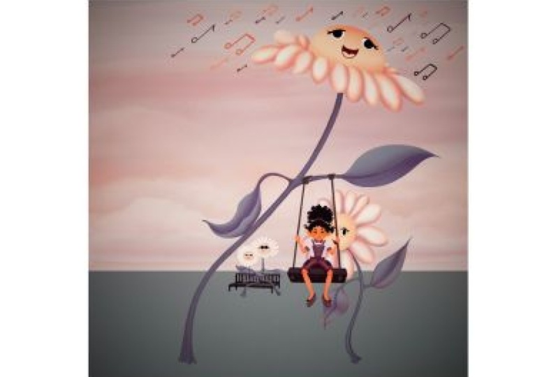
3. Drawing with References: Welcome back to this childlike illustration class. In this session, we're going to look at using references to make a scaffold we can use to build an original sketch. We have quite a few references to work with, but I recommend using about five or six at a time. Today. I'm going to pick this little Gardner in the corner. She's just so cute. I can't resist. We've got this rabbit in the middle intensity staring off to the left. And these daisies next to the color palette. I love the way that the bacteria look like they gossiping and the front one just isn't allowed here, but he really wants to know what's going on. And we've got this little jump on the swing. I can see him hanging off one of those daisies just way, way he'd look so cute. And in the middle, you've got those two days, he's a little bit lovers sitting on a bench somewhere just in a complete world of their own. So I think I can do quite a few things with these images that I've selected. So what I'm gonna do now is I'm going to copy them into a working layer. I'm not going to cut them because I want to make sure that it's reference sheet stays intact. Which means if I want to, I can go back, can change or add an a thing that I like. Let's go back to the working page that we set up in our last clubs. We can paste the references that we've just copied over. I'm also going to drop the opacity to about 10 percent to make it easier to sketch over and add an extra layer to start sketching. When drawing over references. I'm looking to create a copy of the structure of my reference material. We're not tracing this child. When making a scaffold, we can use to create our own sketch of a child. When it comes to drawing figures, I like to turn them into stick people using circles to show that major joints. It's much easier when it comes to the flowers. What I'm trying to do here is draw the shapes that I can see rather than the shapes I expect to see when the flowers overlapping, you can see that it's not a perfect circle on either of the flowers. I'm also going to map out what vessels so I can understand the relationships. When it comes to drawing my actual sketch, I can make them larger or smaller, but I understand where they are in relation to each other. While I'm mapping out the rest of my references, there's a few things that you should remember. First of all, drawing from reference is not cheating until you have a full comprehensive reference library stored in your memory will spend a long time studying the science of drawing. You're just not going to be able to draw something without looking at a reference. So please don't beat yourself up about it. Number 2, don't worry about how messy your sketches are. This is not your final piece. Just get the information down on, move on. There's nothing worse than spending ages redrawing sketch lines that people are never going to see. So now we have our basic structure. Let's refine it on a separate layer. We can duplicate off the sketch and reduce the opacity to around 20 percent. Pay topped it for 3D sketching references is to do each one on a separate layer. This will allow us to move each one individually when it comes to making composition thumbnails in the next clause, when you refine your reference sketches, It's important to remember your goal is a childlike drawing, which means keeping your shapes and lines simple. It's easy to spend too much time on our rough sketches. Keep your hand quick and loose when sketching. If you do, you might find shapes that you wouldn't have when drawing slower. It's important to remember that we probably won't use all of these in our final composition. And they will need a lot more detail before you get onto that stage. Thank you for joining me in this drawing with reference class. Before you move onto your next video, don't forget to add these reference sketches to your project library. I can't wait to see your project from start to finish. As always, don't forget if you need to, you can pause or re-watch this video as many times as you like before you move on to the next class.
4. Making Composition Thumbnails : Welcome back to digital childlike illustration. In the last class, we looked at using reference images to make a few structural reference sketches. In today's class, we're going to use those structural reference sketches to create three or four thumbnails that we can use to choose a final composition, I would recommend going back to the gallery screen and duplicating our working page. There are two reasons that I do this. The first is that it means that I can remove or flatten any old layers without the faith. I'm going to remove something that I need later. It's also nice to see each stage of a drawing. Let's give ourselves a little bit more room to work with. If all your structural sketches are on the same layer, don't panic. This is a great time to copy them onto separate layers. Before we move on to the next stage 4, we use our structural sketches to create thumbnails and got to add in a few little fun extras that I envisioned when we look to our references. So first of all, I'll add the pension. I also want to add some leaves onto gossiping flowers. And I really wanted to look at the front one, has got his hand on his head. So I'm going to try and make it look like the leaf is setting on his hip. He is standing there with attitude. Before I move the child on the swing over, I wanted to make it look like they're swinging slightly higher. So I'm going to use the distort tool to pinch the top of the swing in, which will make it look like He's swinging at a higher angle. Now the swings in the right place, but unfortunately it's covering up part of the back flower. So I'm going to use the free select tool just to move it slightly out of the way. I really like the way that the swing and the flowers combined together. Let's see what we can do with the rest of the sketches. This can be a fun way to come up with different compositions that you might not have thought of. The tree size flower has given me an idea to come up with a giant rabbit dominating the countryside and a tiny Gardner looking after her massive garden. Before we start making compositions, we should check that our layers are all named. This will make it much easier to find them later. I'd also recommend putting them all into a group that you can make visible and invisible when necessary. Let's look at giving our drawing some depth. The easiest way to do this digitally is to use the perspective guideline. If you've never used this tool before, don't worry, it's quite simple. Click anywhere on the blank page and it will set up a vanishing point and a horizon line. Don't worry, you can move this by just holding on to the vanishing point and sliding it around. As you can see, there are lines radiating out from the vanishing point on either side of the horizon line. You can use these to work out how much smaller if something would be when it was further away from the observer. You can also use the distort tool to change the angle of any selected image or layer. Moving the middle dots on either side will change the angle of your drawing. The dots on the top and bottom corners can expand or retract that side of your image. I'm going to use all of these tools to come up with four different compositions. I think it's very important to play around with layouts, as it's very unlikely that I'm going to come up with my best idea this time. When choosing which one I'm going to take further, I tried to look at visual flow. How well does the piece guide your eye around itself? Or do you find that you're getting stuck in an awkward place? I concentrated on the flowers in my compositions. There's something very fun and abstract about this idea. It makes the viewer think of questions. I think this is something as a child that makes you come back or fall in love with a book when you're constantly asking questions about the image or the story, wondering whether I could go further. This is what will really take your imagination. Thank you for joining me in this creating compositions thumbnails class. I really enjoy this part of the process because it lacks my imagination, had the chance to go wild. And I really hope you enjoy this too. I can't wait to see what thumbnails you've come up with. So don't forget to add this stage to your project library. As always, don't forget that you can pulls or re-watch this class at any point. I can't wait to see you in the next class.
5. Sketching: Welcome back to digital childlike illustration. In this class, we're going to turn our rough thumbnail sketches into final sketches, ready for us to choose our color palette by creating color thumbnails, as we've done in all the classes before, I'd recommend duplicating your working page and starting work on the duplicate. Let's take our chosen thumbnail and reduce the opacity to 10 percent. Before I start sketching, I'm going to change the flower with a swing on it. I want to get my piece a sense of innocence and making the eyes and the head beggar is going to give that impression. The way I like to sketch when working digitally is quite simple. I used the ability to reduce the apostate on the previous layer, like I would on a layout pad, allowing us to reset job work as many times as we need to before we're happy with our sketch lines. As I get further in, I'm adding more details. You might notice that I'm not tracing my previous line. I'm making sure that each line has a better position than the last one. When I change com, this is, I might also reduce the size of my pencil to make those lines look precisely. Thank you for drawing with me in the sketching class. I hope you found the hints and tips useful and I really can't wait to see what you came up with. Don't forget to add your sketches to the project library. And as always, if you need to re-watch anything, you can always pause or re-watch this video anytime. I can't wait to see you in the next class, what we're going to look at color.
6. Colour Thumbnails & Base Colour: Hi, Welcome back to do so, childlike illustration. In today's class we're going to look at choosing color palettes and adding base color to our drawing. There are a number of ways that you can add color palettes to Procreate. You can choose your own or you can import them from a photo. You can also add them from another app of your choice. I like to use an app called cooler, which is available on both the app and Android store, and is also free if you use the website when it comes to choosing color, I would recommend using five colors that work well together. The reference material, you'll see that I provided some color palettes that you can use. I find selecting colors the hardest part of an illustration. So I normally use a color thumbnail sheet to help me by using a color thumbnail page like this. I can see quite quickly if the color schemes I've chosen are going to work or not. Before I've done all the hard work, filling in the base color or my entire sketch. As always, before making any major changes, I'm going to duplicate my canvas and move on to the duplicate. The best thing about using a color thumbnail sheet is you can use your chosen thumbnail as both a color and the sketch reference. While we're coloring our base color, I would recommend to call it each element on a separate layer. Don't forget to name your layers and groups. It will make the process a lot easier in the long run. The snap tool can be really useful when coloring. So don't forget to use all the tools at your disposal. Once you're happy with your base color shapes, you can turn Alpha lock on to make sure that you only stay within the shape that you've got as your base color. A good way to think about light and shadow is to remember that the side of an object with less light will be a darker version of that color, but will have a slight hint of red in it. So this means moving your color towards the red side of the color spectrum. Normally giving your color is slightly blue or purpley tint. When you're looking for light. Obviously it's going to be lighter, but you're gonna move it to the yellow side of the color spectrum, which can sometimes give it a greeny orange or yellow. We tend to the color that you've got. Thank you for joining me in this color, thumbnail and base coloring class. Don't forget to add your color thumbnails to your class projects. I can't wait to see what colors you've chosen. As always, don't forget that you can re-watch or pulls this video at any point before you move on to the next class.
7. Texture & Shading: Welcome back to digital childlike illustration. In this class, we're finally going to get to the exciting bit, turning our base colors sketches into vibrant textured pieces. I'm sure you've already done this by now, but it's time to duplicate our canvas and start working on the Jeep picket. This time, it's even more useful because it means that you can go back to your duplicate and copy any layers out that you'd like to redo in your final piece. If you're anything like me, you probably spend a considerable amount of time trying to make things like eyes and ears symmetrical. A major benefit of working digitally is the ability to duplicate and flip layers, allowing us to skip this tedious step in the process. I would recommend doing this before adding too much detail. Some definition can be lost in a pixel-based programs like Procreate. I like to build texture and shading into my work at the same time by using clipping layers on a light touch, it's a buildup depth. I normally start by blocking in shadow with the studio pen, which I blend with the bonobo chalk. This job is perfect for building up texture and shading. Even with a light touch, it come that quite dark. Reducing each layer's opacity to 50 percent will allow us to see more of the texture that we filter. Let's add some warmth back into these leaves by adding the pink blush. For the sky, I'm going to need a larger nib on my drawing pen along to leave a copy of the original in the stack. So I need to duplicate it before changing the nib size to maximum. In the property section. My a mola here on the clouds is to build up layers of cloud with a stormy sunset peeping through and reflecting off the cloud bugs. Before I finish, I want to give this pace a little bit more drama. And I'm going to do this by darkening the background. I want to keep the peace friendly however. So I'm going to change the background shape to a circle to give it much more of a friendly feeling. Thank you for joining this class on texturing and shading your illustration. I really enjoyed doing this class with you. And I can't wait to see what you've come up. Just because the class is finished. It doesn't mean that you can't add any extra bits to your sketch, like sparkles, texts or accessories. Join me in the last video to see what I've added to mine. If you do add extra bits, please don't forget to upload the before and after image to your class project. As always, if you need to, you can pause or re-watch this video at anytime.
8. Final Thoughts: Thank you for joining me in this class. I really can't wait to see what you've come up with in your class project. If you've enjoyed this class, please feel free to follow me on Instagram. It's resume, hyphen illustrations. If you do post your work, please tag me in it so I can show your work with the rest of the online our community again. Thank you for joining me and hopefully I'll see you again soon. Okay.
 Maraya Maynard, I’m an artist & illustrator from the UK.