Transcripts
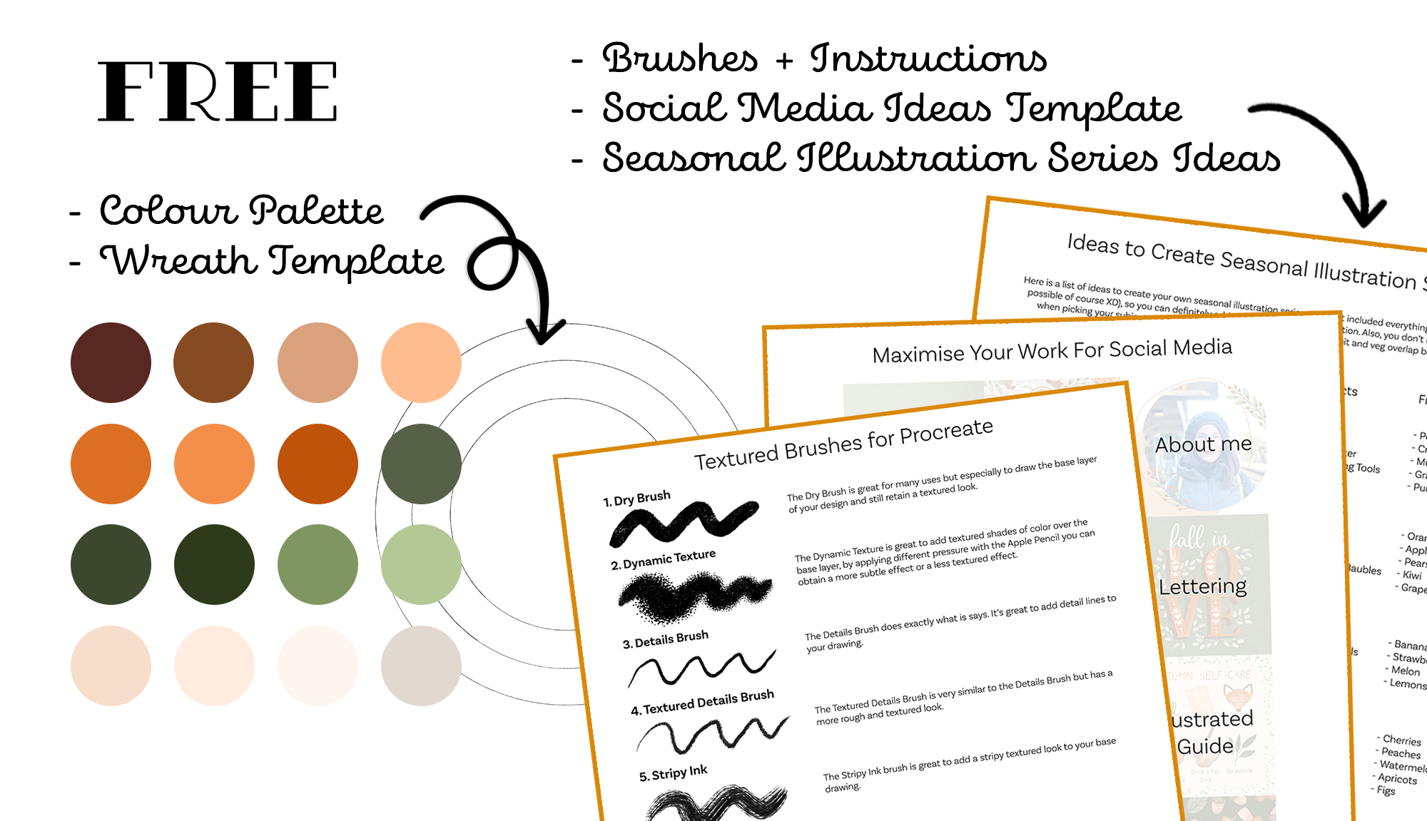
1. Intro: When illustrating digitally, textures can really make a difference in your work. They have the power of making a design pop and appear more pleasing to the eye. That's because, in real life, everything has some textures, shadows, and highlights. My favorite way of having textures to my work is in the appropriate on the iPad. Hi, my name is Cynthia Walter, I'm a soft designer and illustrator. In today's class, you learn hands-on my except method to enhance a flattened illustration while designing a seasonal wreath. Not only you will be able to create a finished piece ready to be gifted to someone, or added to your portfolio, but you learn all the skills you need to master brushes provided, and you'll be able to apply these methods to many more designs. We'll start by looking at different composition ideas for your wreath. Identifying the focus elements of your illustration, then we'll move on to the actual illustration learning about layering color, and textures to achieve that hand-drawn look. This class is geared towards sprint and illustration designers or digital design enthusiasts. Whether you are already familiar with Procreate or you're brand new to this app, I'm going to provide tons of tips and tricks along the way that will come handy for your future administrations. By the end of this class, you'll have gained of deep understanding of how to create your own texture, wreath innovation. Plus, when you take this class, you'll get all the texture brushes high graded, a PDF with the description of each brush, a template to create your own wreath, the color palette I'll be using, and a PDF with ideas to create seasonal illustration series from where you can also pick and choose elements for your own wreath. The other great bonus you get is a template where I show you ideas on how three different illustrations can be turned into 15 posts for your social media account. Are you ready to create your wreath in the station and rock those texture brushes? I'll see you in the next video where we'll talk about your class project.
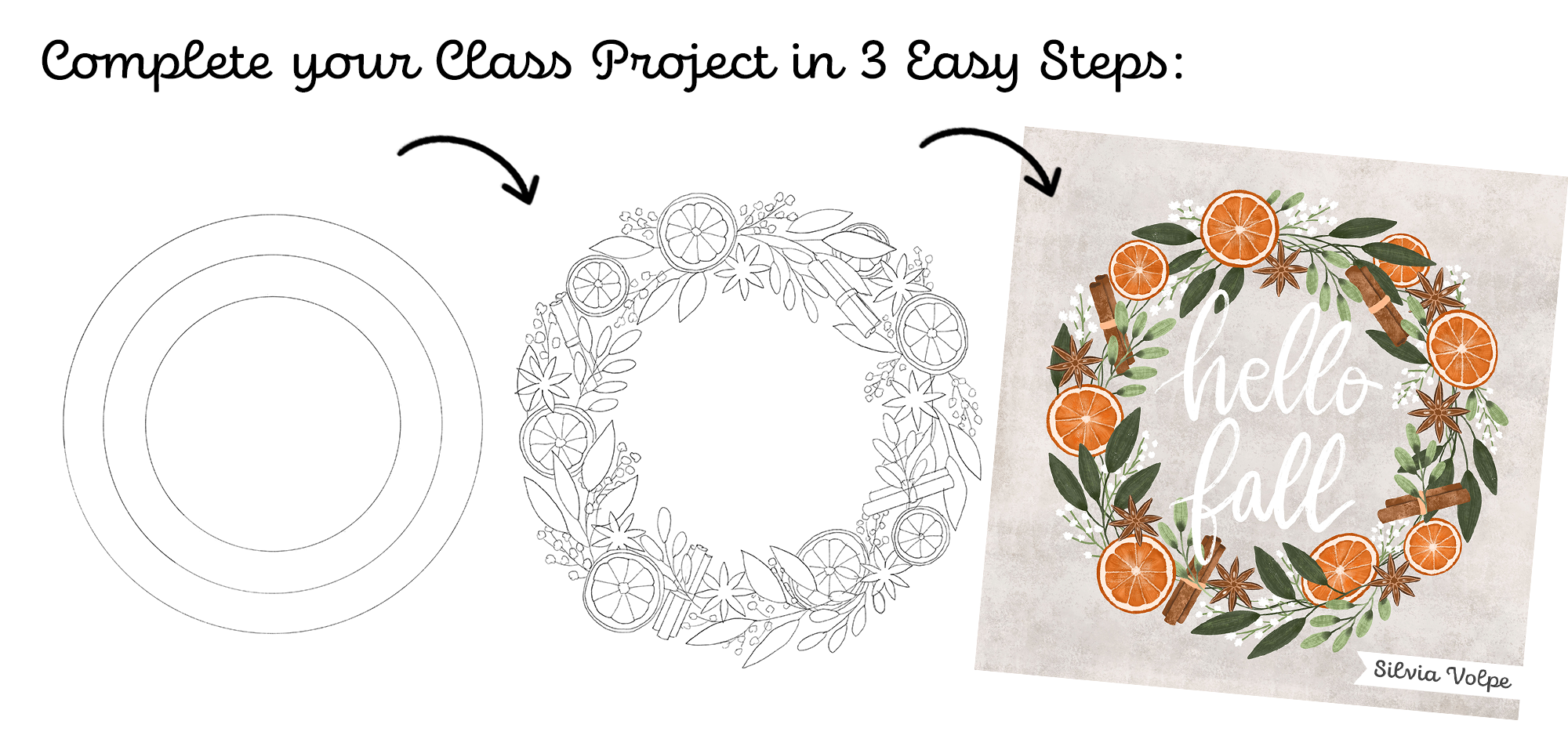
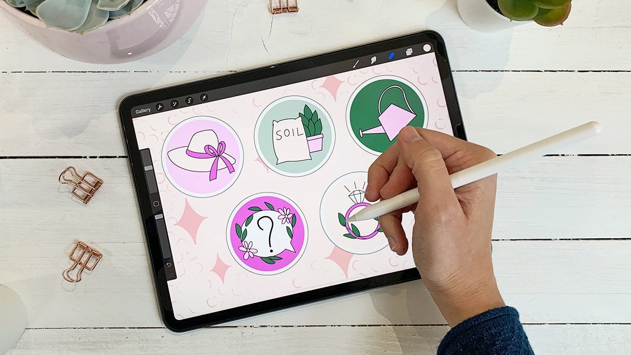
2. Class Project & Resources: In this lesson, we are going to cover what the class project is, how to access the class resources, and how to post your project in the project gallery. For this class, we are going to be creating a wreath illustration on the app Procreate. You can choose follow along with me drawing a fall themed wreath, choose a different season, or draw something else entirely. The general process would be the same. To download the class resources, you need to be on a computer, or on Safari on your iPad. All you need to do is go on the projects and resources tab. And on the right-hand side, you will find all the class resources. So, what I'm going to do is stop on each of them and save them in the downloads folder. That's because the Procreate files are automatically going to be saved there whereas the PDFs are going to ask me where I want them to be saved. So, in this way, I'll have everything in one place. These two files are the procreate brushes, which we'll combine afterwards. Now that I have downloaded everything, I'll hope in the folder location by swiping one finger up, from the edge of the screen. Then I'll drag it to the left to split the screening two, in this way. As you can see here, I have all the sources we have just downloaded. I'll swipe one finger up again from the edge of the screen to open the apps I have recently used and swap Safari for Procreate by dragging it to the right. The first three files are PDFs and I'll explain them later. Then these two files are the brushes files. This is the wreath template and the last one is the color palette. I'll tap on the wreath template first to import it into Procreate. As you can see, it appeared at the top of my gallery. Then I'll tap on the color swatches, which are also imported into Procreate. To check it went through okay, open any Canvas you like, tap on the color symbol, and you will find it at the top of your palettes list. Finally, I'll tap on the brushes files. Once imported, you will find them at the top of your brushes list. As I said, we will merge them together later on. Going back to the PDFs, I'll just give you a quick overview. This is the PDF with all the brushes descriptions which you can access whenever you want through the class. This is the PDF with new ideas for your social media. These are ideas for your Illustration series. Once you have everything set up, you can make the Procreate window big again by swiping one finger to one side. To share your project, you need to be on a computer or on your iPad, tapping the projects and resources tab. Then on the green button above the class resources that says Create Project. From here, you can upload a cover image for your project and add the title. Here, you can have text to describe your work. Here, you can tap to add an image, video, or other. To upload your class project, you can tap on image and add as many images as you like, and then tap on Publish. Alright, I'll see you in the next lesson where we're going to dive right into the class project.
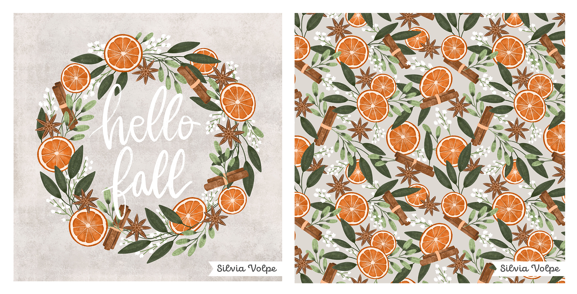
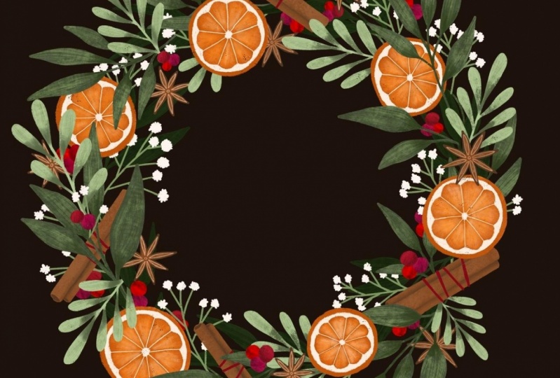
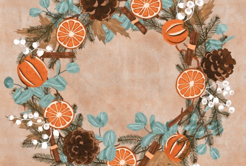
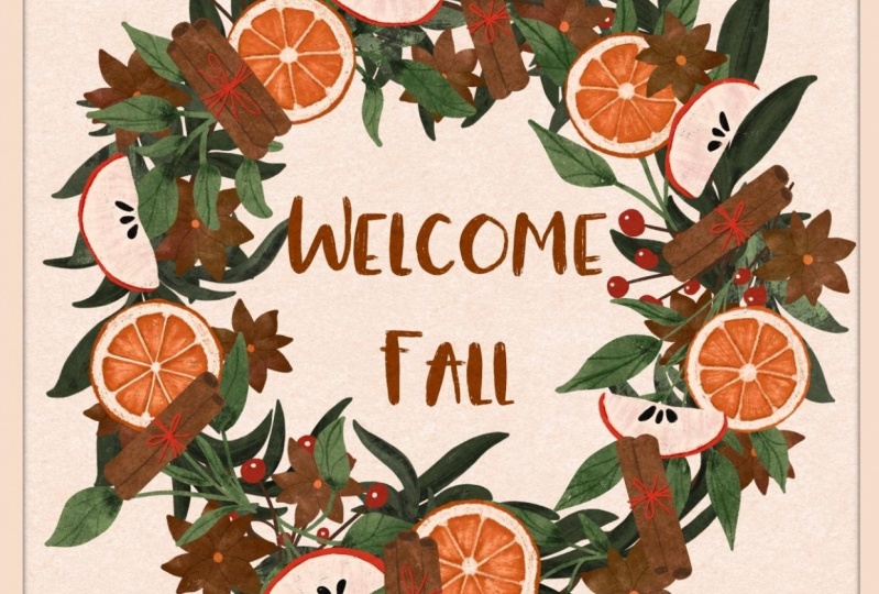
3. Plan Your Wreath: I like to divide wreaths into two main types: symmetrical and asymmetrical. Within these two micro-groups, you can usually find variations based on the shape of the wreath, its material, the theme, whether there is a sentiment or even a centered object you want to draw attention to. Whichever type of wreath you're aiming for, there are some common elements that can help in the composition of your perfect wreath. The first one is a focus element. It tends to be either fruits or flowers, but it can also be objects. For instance, in this case, we have a symmetrical wreath and the focus elements are the flowers and houses. The second common element you can find in a wreath is a complementary element and that often tends to be greenery. At least one to two types of leaves, possibly of different sizes and shades of color, so that they are visible, one against the other. In this case, we're looking at an asymmetrical wreath and we can see we have bigger leaves on the bottom left and smaller ones on the other side. Once colored, this will probably be of different shades of green and probably will have different textures to make them more varied. The third common element you can find in wreaths are some highlight elements such as smaller flowers or berries or other objects that can give movement and add light to the whole design. In this example, you can see how these smaller flowers make the wreath come alive. The fourth and last type of element you can usually find in a wreath, is any additional element that complements your illustration, such as an object that can reinforce the theme of your illustration or a sentiment or any other decorative element really. In this case, I have added the sentiment hello as well as the lemons to reinforce the theme of this wreath. In my case, I know I want to go for a classic circle-shaped wreath and its theme is going to be fall. I'm not going to have a central piece but I might add a sentiment at the end instead. I already did the exercise of gathering ideas and inspirational photographs on Pinterest, and I have decided that the focus element of my illustration are going to be oranges, cinnamon sticks, and star anise. For the greenery, I have chosen two different types of leaves, one is going to be bigger and of a darker color, the other is going to have less pointy leaves and it's going to be smaller, and it will have a lighter green. For the highlight element, I have chosen the baby's breath flowers even though they aren't relevant to the fall season, I still think that will work quite nicely with the other elements. Finally, to complete my illustration, I'll probably add a sentiment in the center of the wreath and it will probably be, hello fall. Now that I showed you my example, it's your turn to gather your ideas, decide the theme of your illustration, and the three to four elements that make your wreath. To help you in this exercise, I have included a PDF document in the resources section where you can find ideas for your composition. Of course, Pinterest is also a great resource to be inspired. Don't worry if you think you need to change things later on because that's absolutely normal and you don't need to have everything figured out at this stage. I'll see you in the next video where we're going to start sketching.
4. Sketching Part 1: In this video, we are going to start sketching our wreath and placing each element to obtain a balanced composition. As you can see, I've already opened the Canvas file which we have downloaded at the beginning with all the other files. This is a 3000 by 3000 pixels at 300 DPI file, set in RGB mode. It should be perfect for most of the uses. But if you need to work on a different file size, you can go back to the gallery area, tap on the plus symbol, and then on the little plus icon on the top right corner. Here, you can choose the size. You can choose to use pixels, inches, centimeters, or millimeters. I personally tend to stick to pixels. For the DPI, I suggest to keep it at, at least 300. If you do decide to go for a higher DPI, keep in mind that this is going to affect the number of layers available to you. Here, you can choose the color profile depending on the use you're going to make of your illustration. I personally tend to leave it always on RGB mode, because I find that if I use CMYK right at the start, I'm already limiting the amount of colors available to me. and it's going to be more difficult to revert back to those bright colors that RGB has. I'll tap cancel because I don't need to create a new canvas. As you can see in the wreath template, there are three circles. The one in the middle is the one around which the wreath is going to develop, where all the branches, oranges, etc, are going to be placed around. Whereas the other two are just there to help you keep the rounded shape on both the outer and inner side of the wreath. Of course, you can go over them and I will explain why later. By having these lines still help you keep the general shape. I'll tap on the layers symbol and then on the N. I will reduce the opacity by sliding the blue dot to the left, and I'll set it to around 24 percent. Then tap on the plus symbol to create a new layer, and this will be where I'll draw my sketch. To start my sketch, I will tap on the brush symbol, and I'm going to use the Narinder pencil, which is a default brush that you can find in the sketching section. Then I'll tap on the canvas to come out of the brush library. I'll start by placing the focus elements I've chosen for my wreath. I know that they are going to be the oranges, the star anise, and cinnamon sticks. I'll start with the oranges first. What I'm going to do is drawing one orange slice and then I'm going to copy it over and over around the wreath. Because this is just a sketch. I suggest you do the same. You sketch each element once, especially if the same object is going to repeat around the wreath, and then you just copy and paste it so you don't spend too much time on your sketch. I'll start by drawing a circle and by holding the Apple pencil down, Procreate turns it into an ellipse. In fact, here it says ellipse created. By tapping one finger on the screen, I can even turn it into a perfect circle. I'm still holding the Apple pencil down, and by moving it far or closer to the center of the circle, I can even resize the circle. Once I'm happy with the size, I lift the Apple pencil and the circle is created. Now I'll create another circle. Again. I'm holding the Apple pencil down and I'll tap with one finger to turn it into a perfect circle. This time, before I touch the screen again, I'm going to tap on Edit Shape and recenter my second circle. Then I'll tap on the Transform symbol to unselect. Then I'll draw a few details of my orange slice. This is just a sketch, so I'm not paying too much attention to details because I don't need it at this stage. This is my orange slice base layer and I'm going to resize it by tapping on the Transform tool because I don't need it this big and I'm going to place it here. Then I'll tap on the Layer symbol, and with my layer selected, I'll swipe it to the left and tap on Duplicate. In this way, I have created a copy of my original layer and to move it, I'll tap on the Transform symbol and move it to the side. I also want to reduce the size a bit. As you can see here, uniform is selected. That means that whatever I do, whether I make it bigger or smaller, its proportions will be maintained. But if I tap on freeform, that means that I can resize it without keeping the proportions. That's exactly what I want actually because I want the orange slice to be at an angle, and I'm also going to rotate it by tapping on the green dot and I'll place it here. Then I'll go back to my layers and create another duplicate of my original orange slice, and the reason why I do that is because copying from duplicates can reduce the pixel quality of your drawing. It's always best to copy it from the original layer. I'm going to place this orange slice here, and I have the freeform selected, which I use to give an angle to my orange slice so that my elements don't only have a front view, which would be a unnatural, and this helps having variation and depth to my wreath. I'll duplicate the original layer to add another orange slice. Again, with the Transform tool, I can resize it and move it where I want. I'll keep adding orange slices, adding different sizes, and pairing them closer wherever I need, and I'll speed up the video and I'll meet you once I've finished. I think I have placed all my oranges. I'll go to the Layers panel, tap on the top orange layer, and with the other finger on top on the last one, and I squeeze them together to merge them into one single layer. I can then tap on the name, tap rename, tap on the keyboard symbol, and I'll name it oranges and tap on return to unselect. I'll tap on the plus symbol to create a new layer, and this time I'm going to draw the star anise. Exactly as I did for the oranges, I'll draw one and I copy and paste it many times. As you can see, I already know what I'm drawing because I have my reference photos in front of me. I'm looking at the elements that I want to retain to simplify my shape as much as possible. But as I said earlier, I'm not focusing on the details yet because this is just a sketch to understand the general shape, the proportions, and the location of each element. Depending on your favorite method, you can decide to add details now or spend time on that later when we will add textures. This is my star anise base layer and I'll tap on the Transform symbol to move it and resize it. I'll make copies of it like I did with the oranges. Then I rotate them to a variation. I think I have all the star anises I want, so I'm going to merge these layers into one as I did with the oranges layer, and then I rename the layer. The last focus element I want to add are the cinnamon sticks. I'll create a new layer and draw one, which I'll then copy and paste like I did with the other elements. As you can see this time, I'm drawing a line, and by holding the Apple pencil down, it has become a straight line, which I can then point to any direction by moving the Apple pencil. Once I'm happy with the line and direction, I want, I lift the Apple pencil. I'll show you again by drawing another line, which as you can see, is a bit wobbly. But since I'm holding the Apple pencil down, that line has become a perfectly straight line. Before I make my line definitive by tapping somewhere else, I can tap on edit shape and modify and move my line. If I wanted to, I can also turn it into an arch. But that's not what I want in this case. I'll tap two fingers on the screen to undo and tap on line to make it straight again. I'll move it closer to the other one. Then I'm just going to zoom in and draw the top and bottom of my cinnamon stick. Then I'll duplicate this layer to create another cinnamon stick behind the first one I've drawn. I'll make it smaller and then I'll tap on the erase tool so I can erase what's behind. I'll duplicate my first cinnamon stick again and do the same thing on the other side. This is my base layer for this cinnamon sticks, and it's a group of three. I'll merge these three layers and place it here. While I'm reducing the size and actually realizing that I want the cinnamon sticks to be a bit taller than they are. With the Transform tool still selected, I can tap on the yellow square and change the reference axis of my shape. I will then tap on freeform and make it longer. And actually, I want to show you what would happen if I didn't change the reference axis of my shape. so I'll tap two fingers to undo what I've just done. If I don't rotate the reference, the moment I tried to make this shape longer, it's not going to do it along the right reference axis. It's actually going to distort my shape. That's not what I want. I'm going to rotate the reference axis by moving the yellow square, and then I'll make the cinnamon stick longer. Now I can duplicate this layer to create another group of cinnamon sticks, and this time I'll make it into a group of two. I'll use the Erase tool to delete one. And then I'll rotate it. I'll add another group of two. I'll duplicate this one and move it to the right. If you want to add a bit of variation, you can also tap on flip horizontal, which is going to mirror the shape along the vertical axis. Then I'll duplicate the group of two again. This time I'm going to place it on the bottom right. I'll see you in the next video where we will complete our sketch with the other elements.
5. Sketching Part 2: Now I have all my focus elements, and what I want to do is fill all of these gaps with greenery. I'll do that with the two leaves I had chosen earlier. I'll tap on the layers panel and actually I need to merge the cinnamon sticks first and name my layer. Then I'll tap on the plus symbol and create a new layer. I'll start with the bigger ones and this time I'm not going to use the copy and paste method because I do want to have variation in my sketch. Also, because the leaves are going to follow the shape and curve of the wreath so there will be different every time. I'll draw the leaves following the wreath guidelines. I'll draw my first leaves and as I mentioned earlier, the inner and outer lines do help you maintain this kind of big doughnut shape. But at the same time, you do want to go over them because otherwise these lines will be too visible and you don't want that because it's going to make your breath look less realistic. I'll keep drawing the leaves and I will purposely go over both the inner and outer lines. The other thing I'm also trying to do is go over other objects because if objects overlap a bit, they will contribute to make the drawing look more realistic and they will also add movement. Remember, this is just a sketch so if later on you actually notice that things are not quite in the right place, you can always move them, rotate them, and resize them. I think I have enough of the big leaves so I'll rename this layer and create a new one for the smaller leaves. These leaves are less pointy and since they will have a lighter shade of green, I know that there will be visible against the bigger ones. While I'm drawing I'm also trying to make sure I change direction of my leaves to add variation and I'm also making sure that they don't all look the same by having branches with two, three, or more leaves. I think I have enough of the smaller leaves. So I rename this layer into Leaves 2 and I'll create a new one for my highlights. My highlights are going to be the baby's breath flowers, which are very small and white and I feel like they would be perfect for my wreath. So I'm sketching these flowers really quickly because I know that they are going to be so small that adding details doesn't make much sense. I think I have all of my elements, the last thing I want to add is the phrase that is going to be in the center of my wreath and it's going to be "Hello Fall". I'm going to sketch it just so I remember I need to add it later. But I will not be focusing on the thickness of my lines because I know that the hand lettering brush that I'll be using later is going to take care of that for me. I'm noticing that the word "Fall" is a bit smaller than the word "Hello". So I'll tap on the Selection tool and with Free hand selected, I'll draw around it and tap on the Transform tool and make it a little bit bigger. So I'll hide the wreath guideline by un-checking the little square on its layer to see if there is any space that I left empty or that doesn't convince me. I'm noticing I probably need something here so I'll draw a few more leaves. Alright, I think I have the general shape of my illustration. So go ahead and sketch your illustration using the three to four elements you choose earlier. I'm going to clean my sketch and I'll meet you in the next lesson where we're going to finally start adding some color and texture.
6. Focus Elements: Oranges : In this video, we'll start coloring our wreath illustration starting from the focus elements. As you can see, I went ahead and I cleaned my sketch. This is what it looked like before, so it's not that different. But what I really wanted to do was get an idea of what was behind and was in front. Although these might change later on when I add color, it still helps me to do it beforehand. I'm going to delete my old sketch and I keep the guidelines. Before we start, I want to give you a quick overview of the brushes provided. As you can see, we have downloaded two sets. Although in reality, it's just one set of brushes. The first thing I want to do is combine them together because the file was too heavy for me to upload it as one. Tap on the brush set called SV-part 2. Tap on the first brush and then swipe to the right on the other two brushes. Then tap and hold with the Apple Pencil until they're all grouped together like this. And then you can either move them over the brush set in which you want to move them to, or the easiest way for me is tapping on the brush set while I keep the Apple Pencil down and then lift the Apple Pencil once I'm inside the brush set. Now, they're all within the brush set called SV-texture brushes. If you tap on SV-part 2 brush set, you'll notice that the folder is empty. Since we don't need it, I'll tap on it and then tap, "Delete." Now that we have all the brushes together, I'll tap on the layer symbol and I'll reduce the opacity of my sketch layer, which I'm also going to rename so I don't get confused. I create a new layer, and here I have the color palette we downloaded earlier. I'll tap on this orange and I'm going to use the dry brush. So just a quick overview, the dry brush is great to draw the base layer of your design and it has a nice small texture. The details brush and the textured detail brush are great to add fine details. Then the rest of the brushes are different types of texture brushes that can be used in many ways. Sfumino is great to add texture and blend your colors at the same time. Textured sponge and Rolled sponge are also great for backgrounds. Then the last one at the bottom is a lettering brush that is great to add a phrase to your work. And we will be using it at the end for the "Hello fall" phrase. On the PDF included in the resources, you'll find descriptions for each brush so you can look at it for reference in the future. But don't worry, I'll show you how to use them as we go. As I said, I'll start with the dry brush because I want to draw the base layer of my orange slices. I'm already on a new layer and I'll start drawing. The nice thing about this brush is the fact that the edges are not perfect. That is exactly what we want when we're drawing something that doesn't have a smooth edge, like in this case with the oranges. Now, you could go ahead and drag, and drop the color to fill the shape. But by doing this, you lose that nice texture. And since I want to see it, I'll tap two fingers to undo and I'll color the inside of the orange manually. This brush is also pressure-sensitive. So that means that the more you push, the bigger the brush stroke will be. Here, I'm not pushing and here I am. It doesn't take too long to fill our shapes. I'll do the same with the other oranges while I'm still on the same layer. As you can see, I'm not using the trick to create a perfect circle like I did in my sketch because again, oranges are not perfect. I want to retain this imperfection in my drawing. If you need to adjust your drawing, you can tap and hold on the Eraser, and the Eraser is going to automatically use the brush you're using. You can basically erase with the same brush. I'll speed up the video and meet you once I finish drawing on the bases of my oranges. Now that I have all my bases, I create a new layer above this one, and then I'll turn it into a clipping mask. By doing this, everything I draw will only be visible if it's on the oranges spaces. I'll tap on the "Layer" and then tap "Clear" to clean my layer. I'll choose this light beige color over here, and this time I use the dynamic textured brush. I'll reduce the size of my brush and I'll start drawing the inner white part of the orange. I'll draw one line to define the area and then I'll change brush. This time I'll use the texture details brush to add my details. I'll start drawing the center of my orange. You'll notice that with this brush, the more you push, the more ink and coverage you get. If I don't push as much, my line is going to be more faded. For the inner line, I'll use the other details brush which has less texture. Then I'll go back to the dynamic texture brush. I'll tap three fingers to redo because I've just undone my brush stroke. I'm going to go over the center again because I didn't push enough to cover the lines. I'm going to make this line thicker and while I'm doing that, I'm also trying to draw an arch for each segment. Then I'll just fill this gap. The first orange is complete, I'll carry on doing the same with the other orange slices. I'll speed up the video, so you don't have to watch me. I've finished adding all the white parts and now I'll start adding some shadows. I'll create a new layer and I'm going to choose the darkest orange that is in my palette. The brush I'm going to use is the rough plaster. Before I start, I'll also make sure my layer is a clipping mask, so that the shadow only appears on my base layer. I also need to move this layer behind the white parts. I'll drag and drop it with the Apple pencil. I'll reduce the size to see what it looks like and I'm also going to add some shadows behind the white lines for each segment. As you can see, my shadow is too crisp, so I'll tap and hold on the smudge tool to blend with the same brush I'm currently using. I will then come in and blend the strokes I've just drawn. Once I'm happy with the result, I move on to the next orange slice and I'll go through the exact same process. Now that I've finished adding shadows, it's time to add some more texture to the main base layer. I'll tap on the Base Layer and then tap "Plus," so that a new layer is created and it's already a clipping mask. I'm going to use the lighter orange and I'll use the stripy ink brush which is going to add a very nice stripy texture to my orange slice that otherwise will look too plain. Before I move on to the next focus element, I actually want to add another layer of texture to my oranges. I'll create a new layer and with the same brush and these dark orange, I'm going to do the same thing I just did, adding the texture stripes. But this time I want to use a different blend mode. I'll tap on the N and I'll choose the Soft light because I already know this is the effect I want. But feel free to experiment with these blend modes because you never know what beautiful effect you're going to get. I don't know if you can see these but these blend mode is making the orange appear most saturated and bright and it adds a nice pop of color without being too strong. I'll keep adding them, drawing rays from the center of the orange slice. I think I'm happy with the result, so the last thing I want to add are some highlights. I'll tap on the Shadows Layer and tap, "Plus" to create a new layer and I am going to choose...Ops If you add a color by mistake, tap and hold and tap, "Delete Swatch." I'll choose the same light beige we used earlier and I'll use this Sfumino brush. I'll start adding some highlights here and there. You'll notice that the more you push, the more ink you get. But this brush is great because it can blend your strokes really well. If you realize that actually the overall effect is too strong, you can go on the layer you're in, tap on the N and reduce the opacity. I'll reduce mine to about 60 percent. I think I'm happy with the orange slices and I'll move on to the star anise. In this video, we saw how to use some of the brushes and how you can use texture, colors and blend modes to create different effects. Experiment and play with these brushes to create the base layers and start adding some texture. I'll see you in the next video where we'll keep working on the focus elements of our illustration.
7. Focus Elements: Star Anise: In this video, we will keep working on the focus elements of our wreath by adding the star anise. Before I start, I actually want to group my layers. I'll tap on one and swipe to the right on all of the other layers. I'll tap on Group. Then I'll tap on the name, tap Rename, tap on keyboard, and I'll type oranges. I'll create a new layer, and I'm going to use the darker brown. I'll tap on the brush symbol, and I'll choose the dry brush again to draw my base layer. I'll go ahead and start drawing my star anise base layer. I'll fill the shape exactly as I did for the oranges to retain the texture. The next step is creating a new layer and this time I'm going to use the lighter brown and the detail brush. I'll also turn this layer into a clipping mask. What I'm going to do is basically color the inside of the star anise so that it's lighter. Now that I have added this lighter part to all of them, I'll create a new layer and choose a lighter brown. And with the same brush, I'll draw the top edges of the star anise. I'm drawing almost like a drop shape, and I'm also try and to follow the edges of the lighter brown below. What I'm also trying to do is make these lines touch each other and meet so that together, they create the center of my star anise. Ok, I'm happy with this and I'll carry on doing the others. The last thing I want to add are some highlights. So I'll create a new layer. I'll choose this light beige and the Sfumino brush. I'm just going to add a few brush strokes here and there. As I said earlier, you can decide to make these strokes as light or as strong as you want, depending how much you push with the Apple pencil. And if you decide that it's still too much, you can tap on the N and reduce the opacity like we did with the orange slices. Actually, for this one, I don't think I need to reduce the opacity, so I'll leave it at 100 percent. To group my layers, I'll tap on one layer, swipe to the right to select all the others and tap Group. I'll then tap on the name and rename it: star anise. The next elements we'll be focusing on are the cinnamon sticks. I'll see you in the next video.
8. Focus Elements: Cinnamon Sticks: In this video, we will complete our focus elements by adding the cinnamon sticks. Now I'll be focusing on the cinnamon sticks. I'll create a new layer and use the dry brush again to create my base layer. As you can see, some of the cinnamon sticks are in the foreground, and some are behind. For now, I'll be focusing on the ones that are in front. I'll start drawing a line and I'll use the same trick I used in the sketch to turn this into a straight line. I'll do the same to create a curve at the bottom. So I'm holding the Apple pencil to turn this line into a smooth curve. I'll have the top part and fill the shape by coloring the inside. Then I'll tap to create a new layer and drag and drop it behind the one I just used to draw the cinnamon sticks that are behind. To help you in this process, you can either decide to hide this layer or you can reduce the opacity, which is what I'm going to do so that you can still see it, but you can also see what's behind it. The next thing I want to add is some shadow on the cinnamon sticks that are behind. I'll put the opacity of the front layer to 100, and I'll create a new layer between the two and choose the darkest brown I have in my palette and I'll choose the Rough plaster brush. To help me, I'll also slightly reduce the opacity of my base layer so I can see where I need to add the shadow. I'll use the dry brush again to create my base layer. and I'll use the medium brown. I just want it to be a tiny line and actually, I'm going to use the smudge tool to make it less harsh. I'll turn this layer into a clipping mask and you'll have noticed that when I turn this layer into a clipping mask, it became more faded. But that's only because I have reduced the opacity of the layer underneath. So once I put it back to 100 percent, the shadow that is above this layer will also go back to its maximum opacity. I'll put the opacity back to 100 percent so I can see this better and make any adjustments needed. I'm happy with my shadows. and I also need to add the shadows that are inside the cinnamon sticks. I'll start with the ones at the front and create a new layer and turn it into a clipping mask. Then I'll do the same for the cinnamon sticks that are behind. The last thing I want to add is some texture. I'll create a new layer and choose the lightest brown I have in my palette. This time I'm going to use the rolled sponge to brush. I'll make this layer a clipping mask and I'll reduce the size and see what it does. I quite like this, but I need to make some adjustments. So I'll move it behind the shadow layer and I want to see whether there is a blend mode that would work nicely here. There is nothing that quite works for me here, so I'll leave it as normal and reduce the opacity. Yes, it works much better now. I'll do the same on the other cinnamon sticks, and I'm tapping very gently because I don't want it to be too strong. Actually I want to try another method. I'll put the opacity back to 100 percent. I'll then tap on the brush and tap and hold on the eraser tool so that I can erase with the same brush. I want to see what it will look like if I erase some of the texture I have just added. I'm tapping here and there, and I'll do the same for the texture layer that's behind. What I also want to do is try and see what the texture sponge brush does. I'll create a new layer so it's easy to go back if I don't like the result. and I'm going to play with the blend modes again. The Add mode is quite nice. Luminosity is not too bad either, I think I'll go with this one. So you can see that the blend modes are quite fun to play with and can give you many, many options. The last thing I want to add is sort of a ribbon that holds the cinnamon sticks together. I'll create a new layer and I use the light orange and the Dry brush. I'm holding the pencil down to get a smooth arch, and I'll lift it once I get the right line. And this time I'm not using a clipping mask because I don't want the ribbon to go over the edges of the cinnamon sticks. I can see this ribbon doesn't look quite centered. And since it's on the same layer as the other ones, but I still want to move it, I can tap on the selection symbol, and with Freehand selected, I can draw a circle around it. Tap on the transform tool, and move only that part. Then once I'm happy, I can tap on the Transform tool again and deselect. Actually this one also needs to be resized, so I'll select it as I did with the other one earlier. I'll use the same trick I used in the sketch to rotate the transformation box so that I don't distort the shape. Alright, I think I'm happy with the result of my cinnamon sticks, which complete my focus elements. Go ahead and draw your focus elements, combining your base layers with textures and blend modes. In the next video, we'll start filling our wreath by adding some leaves as the complimentary elements of our wreath illustration.
9. Complementary Elements: Leaves: In this video, we are going to start filling our wreath initiation with some leaves. I'll tap on the Layers panel, and as you can see, I've already grouped all my Cinnamon layers, so I'll create a new layer. I'll choose this green, and again, for my base layer, I'll use the dry brush. This is too big, so I'll tap two fingers to undo and reduce the size. I think four percent will work. I'm drawing these leaves keeping in mind that this central line is where the main branches of my wreath are going to run, and therefore that's where these leaves will come out of. The nice thing about this brush is that it has a bit of a stream line to it so that when you are drawing, the lines become a bit smoother, but not so much as to completely change your drawing. I've drawn the outlines, and I will increase the size a bit to fill the shapes. And I'm using the other hand to help me rotate and zoom in and out as and when I need it. So I'll keep drawing my base layer and I'll speed up the video and meet you once I've finished. The next step would be creating a new layer to add some texture. This time, I'll use this slightly darker green, and I'll use the stripy ink which is the same brush we used on the oranges. I'll make sure my layer is a clipping mask, and I will increase the size to about 21 percent and see what it does. I think I like it, so I'll continue with this size. I'm not pushing too much because I still want to see the lighter green underneath, and I'm also trying to follow the direction of the leaf. While I'm drawing, I'm also rotating the Canvas to help me. I think I'm happy with the result, I'll create a new layer and make it into a clipping mask. Now, I want to go over each leaf again, but this time with a lighter green. This is going to add an extra layer of texture and brightness to my leaves. I'll increase the size and give just a few brush strokes here and there on each leaf without pushing too much with the Apple Pencil. The next thing I want to do is add some shadow, so I'll create a new layer and this time I'll use the darkest green, and I'm going to use the Sfumino brush. Basically, what I'm going to do is adding some shadow at the bottom of each leaf and some is also going on the branch. This really helps me because it adds depth to my drawing. The first type of leaves is complete, so I'll group my layers and call it Leaves 1, so I know these are the bigger ones. Now, I will be focusing on the smaller leaves, so I'll create a new layer and I'll use the lightest green and the dry brush. These leaves are smaller but they're also less pointy so that they can stand out more against each other. Now that I have my base layer, I can add some texture. I'll create a new layer and choose this darker green, and I'll use the stripy brush again. I'll make sure this is a clipping mask and I'm going to do exactly the same as I did with the other leaves. Again, I'm not pushing the Apple Pencil too much because I still want to be able to see the lighter green base layer underneath. The last thing I want to add is some shadow, so I'll create a new layer. I'll choose this green and this sfumino brush again. I'll add some shadow to the smaller leaves to get more depth. Looking at it, I actually realize the green I chose doesn't add enough contrast, so our quick way to change my color is tap on the layer and then tap on "Alpha Lock." Then I'll select the darker green, go back to my layer and select "Fill Layer." This is much better. What I've done is basically fill only the pixels where my shadow was with the darker green. This allowed me to also retain any area that had less opacity. I'll tap on it again, uncheck Alpha Lock and then group my layers. In this video, we saw how to use the same brush to obtain a different effect and we looked at how to change colors, retaining the opacity of a layer. In the next video, we will get closer to finishing our wreath illustration by adding the highlights and doing some layer adjustments.
10. Highlights & Adjustments: In this video, we will look at adding highlights to your wreath and adjusting your layers to get variation and movement in your design. The next step for completing our wreath illustration is adding the highlights, which in my case are those tiny flowers called baby breath's flowers. I'll create a new layer and choose this green and the dry brush. What I'm going to do is basically fill all these gaps, following my sketch without being too literal about it. In fact, I'm not drawing every single line of the branches because that's going to make my illustration look too busy at this tiny scale. Now I need to add my flowers, but since I want them to be white, I'm going to change the color of my background so I can see them, and I'm going to use this gray. I create a new layer and choose white. With the dry brush, I'll start drawing these very simple flowers. As you can see, I'm trying to fill these spaces going over my guidelines where necessary. I'm going pretty fast with these, and I won't be adding any texture because the scale is so small that it won't make any sense. I just need some spots of light, that's all. I think, I probably need something here and something here. Actually, I forgot this one. I'm going to add a few more flowers here and there. I'll go back to my base layer and use the green again to add the branches. Then I'll go back to my flowers layer, change my color to white, and add the flowers on these two branches. I'm not going to draw any flowers here because I already know these layers going to go behind everything, so I won't be able to see them. I'll add a few more flowers here and there to fill any other gaps. I'll group my layers like I did for the others and call them highlights. The next thing I want to do is make some adjustments so that I can have some elements in the foreground and some behind to add some variation. The first thing I'm going to do is drag and drop the highlights group below the other layers so that they are behind everything else. I want to have these oranges in the four corners in front of everything. I'll open the group of layers called oranges, tap on the base layer and tap on the selection tool. Now I can draw around these oranges to select them. I'll then swipe three fingers down and tap cut and paste. As you can see, they disappeared, but that's only because the layer has become a clipping mask. I'll drag and drop it outside of the group, and you can see now that it's visible again. Now what I need to do is repeat the same process for each of the texture layers. I'm going to rename the groups so that I can recognize them. Now I can move this group of orange slices above everything by dragging and dropping it at the top. As you can see, these oranges are now separated from the others and are in the foreground. The other thing I want to do is move some of these star anise to the front. I'll repeat the same process I did for the oranges to separate them, starting from the base layer. I'll use the selection tool to select them. Then swipe three fingers down, and tap cut and paste. Then I move the layers I have just created outside of the group and keep going with the other layers. Now I can group my layers and check I got everything, and rename the groups. As I may not have enough layers available, I'm going to delete parts of these branches so I don't have to separate them. I'll select the base layer of this leaves and erase the parts I don't want to see. The next thing I want to do is add the branches that run along the wreath because in reality, they are the ones that hold everything together. I'll create a new layer and choose this green. Then I'll increase the opacity of my guidelines layer so I can see it better and I'll move it to the top. Maybe a tiny bit less opacity. I'll tap on the new layer we have just created, and with the dry brush, I'm going to draw the branches. Actually, I'll move it to the front just for now so I can see what I'm drawing. I'll tap on clear to erase everything that is on my layer and draw my branch, creating a wavy line. I'll stop the line here without worrying about how to join it because it's going to go behind the orange, so I won't see it anyway. I want to add another branch, so I'll create a new layer and choose a lighter green, and I'll add another line trying to complement the other wave. I'll move these layers back where they were, I'll hide the guidelines layer, group the branches layers, and give a name to their group. In this video, we saw how to add simple highlights that bring movement and brightness to your illustration, and how to use the selection tool to separate layers and add variation. Now it's your turn to add highlights to your illustration and experiment with layers to make all the adjustments you need. I'll see you in the next video where we're going to work on the background of the illustration and finally use the hand lettering brush.
11. Background & Phrase: In this video, we are going to complete our illustration by adding some final touches to the background, and the phrase that goes with the wreath. I'll start by creating a new layer, and the color of my background is already set. I think I will leave it like that. I'll use this dark brown and the brush I'm going to use first is the roll sponge brush. I'll hide the sketch layer and see what this brush does to my background. This is obviously too dark, so I'll try different blend modes to see what they do. I'll choose a darker color and reduce the opacity. It basically became a darker gray than my base color. I'll create a new layer and this time I'll use this light beige and the texture sponge. Mmm I don't like it. Let me go back to the lighter page color. Much better. Let's see if there is any blend mode that I like. I think I'll keep it as normal and reduce the opacity. Now, it's time to add the hello full phrase. I'll create a new layer and turn on the sketch layer and slightly increase the opacity. I'll move the layer I just created to the top, and I'll choose white as my color and the textured lettering brush. If you want to, you can open the Actions panel and activate the drawing guide. Tap on edit drawing guide, and adjust the size of your grid to fit the letters of your sketch. You can also move the grid by dragging these blue dot. Now it will be a little bit easier for me to write in a straight line and keep my letters proportionate. This brush is great for hand lettering because the brush is going to follow the pressure of your apple pencil on the screen. Here I'm not pushing so much, but with my downstroke I'm pushing a bit more. As you can see, the stroke has become bigger. When drawing upstrokes, my hand is slightly pushing and with my downstrokes, I'm pushing a little bit more. If this is the first time for you with hand lettering, feel free to take your time drawing each letter. There is no need to rush. If a letter doesn't quite convince you, you can always make adjustments or redraw it. I don't like that the "F" of fall is smaller than the other letters, so I'll tap two fingers to undo. I'm going to move this part of the sketch a little bit down so that I can have more space to draw. I'll tap on the "Selection Tool" and draw around it, then tap on the "Transform Tool" and move it. Now I definitely have more space to add the word "fall". I'll deactivate the drawing guide and hide the sketch layer so I can look at my drawing and see if I need to make any adjustments. I'll go over some of the strokes to make sure that they are visible enough and I'll move the phrase up a bit so it looks more centered to the illustration. I'm not happy with this "L", so I'll erase it and redraw it. I think I'll have to redraw them both. Much better. Now I can recenter the phrase, and if needed, you can toggle on and off the magnetic and snapping tools to help you. Because I'm a bit fussy when it comes to my drawings, I want to reduce the height of this "L", so it's levelled with the other one. I think I'm happy with my illustration now. In this video, we completed our design, adding those final touches and textures that really make the illustration pop. We use the hand lettering brush to personalize it even more. Once you complete your drawing, you can export it and upload it to the project gallery. Before we wrap up with some final considerations, I have added a special surprise for you for your social media content. I'll see you in the next video.
12. Bonus: Social Media Ideas: In this video, I'll walk you through the social media example template that you downloaded at the beginning of this class. In the PDF, I show you an example of my Instagram grid and how I turned three different illustrations into 15 different posts from my social media account. It's a mixture of spot illustrations, patterns using the same motifs as the original illustration, quotes, about me posts, mock-ups, as well as recipes, lettering, and even a fun autumn self-care illustrated guide. On the second page, you'll find letters that help you identify which of the three illustrations I used to create that particular social media post. Of course, these are just examples and the template can definitely be changed and adapted to your needs. I myself struggle a lot with preparing posts in advance. I've just thought that this could be useful for you too, if you're promoting your illustration business online. What makes this scheme strong from a design point of view are mainly two factors. The color palette is consistent and there is an intended checkerboard effect achieved by alternating darker and lighter backgrounds. Also, this checkerboard effect is intentionally not perfect because sometimes when grids look too perfect, they tend to appear fake and not genuine. But, of course, it's not always the case. These two features, the consistent color palette and the checkerboard effect, really stand out to the eye. So keep them in mind as you plan your posts. You can use this PDF as an inspiration reference to plan your posts in advance or follow my scheme. The fourth and last page will tell you the type of posts I'm converting each illustration to. If you're looking to create personalized icons for your Instagram highlights, I also recommend watching my very first class on Skillshare called Pumped Up Digital Icons in Procreate: Enhance Your Highlights, of which you can find the link in the description below. Or you can find it by going on my profile page, linked below this video on the right-hand side. If you liked this class, I also recommend watching my other class, Draw a Gouache Illustration in Procreate, where you can learn how to create a digital illustration that looks like a real gouache painting. I'll see you in the next video for some final considerations.
13. Thank You!: All right, guys. Thank you so much for taking my class today. We covered all the steps, tips, and tricks to create a digital wreath illustration, layering textures and colors. We learned how to plan a wreath design and how to arrange each element to obtain a balanced composition. Then we used the brushes provided to create a beautiful textured illustration. Don't forget to upload your class project to the project's gallery, and if you post it to your Instagram either as a post or story, feel free to tag me, @silviavolpeart so I can share your work. I would also be so grateful if you could leave me a review. Your feedback would mean the world to me as it will help me become a better teacher. If you want to receive updates on my new classes, click on the ''Follow'' button above this video to follow me here on Skillshare. Thank you so much for taking my class and I can't wait to see what you create. I'll see you next time.
 Silvia Volpe, Surface Designer