Transcripts
1. Class Preview: Hello and welcome to digital
Calligraphy in Procreate. My name is Kimberly
Shrack and I'm the calligrapher and illustrator
behind hooplaletters. And today I'm super
excited to share with you my personal favorite
program for creating Digital Art and
Calligraphy Procreate. In this class, you'll learn absolutely everything you
need to know to get started. Digital Calligraphy, from customizing your
workspace and Procreate, to creating your own brushes, to add color and how to share your beautiful
artwork with the world. Total calligraphy
movie, No problem. We'll cover all that to from
the ten basic strokes to the lowercase alphabet and also how to connect your
letters to form words. So whether you're a calligrapher hoping to learn a
new way of working. An illustrator or
designer hoping to incorporate digital calligraphy
into your current work. Or just someone
who wants to learn a new and superfan ART form. This class is for you. Now, one note before
we get started, you will need an Apple iPad Pro and an Apple Pencil to
complete this class. So go ahead and grab those,
and I'll see you soon.
2. Intro & Materials: Hello and welcome to class. I'm so excited that
you decided to join me today to learn all about digital calligraphy
in Procreate, I promise you will
not be disappointed. It is a lot of fun to do. So just as a little refresh, my name is Kimberly
track and I'm the calligrapher illustrator
behind hoopla letters. So I'm going to tell you
before we dive into class, tell you a little bit
about my experience with procreate and my
journey to get there. Getting in the way back machine, going back to when I first started licensing
my illustrations for greeting cards
and stationery and Walmart back when
I first started that. And also create an art prints. I would script out the phrase or the design
that I was going to do, scan it, cleaned it
up in photoshop. Think this needs to be
changed a little bit. Do it again, scan it again, clean it up again, you see where this is going? Over and over until I finally got it right and
it was taking forever. And I realized if I was going to make this a big
part of my business, I needed a much better
way of working. So I began testing out different drawing pads
and different stylus. Stylus will say stylus,
it sounds right? Well, so it tested
about outer bunch of stylists and I was
really disappointed. Nothing looked natural. It didn't look like my
calligraphy and looked digitized. It looks wonky, it
didn't look smooth. I was really frustrated until, until I was introduced to the Apple iPad Pro Procreate
and the Apple pencil. And I tell you that
this changed my life. I mean, I really read it. It mimicked my hand perfectly. And by that I mean, it
looks like my calligraphy. It looked like actual
scripted calligraphy, not, not digital. It was wonderful
and there really wasn't much of a learning curve. There was, of course, a little learning
curve, but I can say, well are really get
in there right away. Now, of course, there was a lot of trial and error that I'm hoping to help you
avoid with this class. But it was a really,
really smooth transition. So if you're a calligrapher, you're coming to class today to learn a better way of working or a different
way of working, I should say, to
digitizing your artwork, then you are in luck. You're all set. Now, if
you're coming here as a current graphic designer or an illustrator
and you're like, I already know procreate, I
need to learn calligraphy. Dude, what are you doing here? Don't worry. You're
going to get that too. There's a whole section of
class today did this all about teaching you how to do
modern brush calligraphy, but digitally instead
of on a pen and paper, we're going to learn
everything from the ten basic strokes to
the lower-case alphabet. Even how to connect your
letters to form, to form words, which is something you might not think you need to
learn how to do, but there's a trick to it. So you're going to
learn that as well. Now if you're coming to
me today and you're like, I'm not a calligrapher, I'm not a designer
or illustrator, should I be here? Yes, absolutely, totally shed. So this is a super fun art form, doesn't need to be for work. It can be totally for learning how to create
things just for yourself. So personally, I use Procreate for a lot
of personal projects, like creating holiday
cards or announcements, or birthday invitations or signage or social
media graphics. They use a lot of
different ways. This does it mean to
be for calligraphy and doesn't need to be for
your graphic design business. That can be just for you too. A new art form, a new way
to express your creativity. Now I'm going to show you a few things they've
made in Procreate. Like I said, I
license my artwork. So here are a few cards that I've created using Procreate. You can see very
calligraphy heavy. And if you've taken any of my
other calligraphy classes, you know that this
matches my style, right? This looks like this looks like my handwriting because it is, am I telling you that
the Apple pencil and the iPad and Procreate
our dream team. I really mean it. Here's one from everyone's
favorite grocery store. And another. These were a lot
of fun to create. And because I created
them digitally, there was no Scanning, there was no cleaning up little brush spots
or anything like that. It's great. It
makes your work go really much, much faster. Here are also some art
prints that I created and I sell these on my
website and on Etsy. So some are just
straight up quotes like this that I created. While others are illustrations
that are calligraphy base. This is what I'm known for, so this is my
all-time best seller. It is a cat. And it's made up of a
quote from Mark Twain. And I actually had a
version of this that was just done in pen and
ink that I digitized To make an art print. And when I tell you
that took forever, that one was probably
the reason that one of the impetus for being gotta
find a better way to do this, because I remember
that That one took a very long time to perfect. Now, I still have
that version saved, but this procreate
version, I like it better. This is the one that
I have in South. Now, there's lots of different
ways you can use it. Here's actually a mug that I created that I solemnly
website and on essay. This is also created in Procreate calligraphy and
some illustration elements. So there's lots and lots of
ways that you can use this. It's another art of few things you're going
to need for this class. Obviously, you're going
to need an iPad or an iPad Pro with
Procreate on it. The reason we need
the pro is because you also need the Apple pencil. The Pro works with
that Apple pencil. Now, I'm gonna be using
procreate version number five. This is, we're
filming this in 2023. If you have an older
version of this, maybe you have an older iPad that doesn't support
version five. That's okay. Some of the things may look
a little different on yours, but for the most part, most of it should be
the same. Regardless. Everything I'm going
to teach you about calligraphy is going to be the same if you're coming
to me from the future. It might also look a little
different, but again, pretty good at
keeping the basics in the same spot with the same
name so it's easy to follow. Another thing you're
going to see me use that you might get a little
weird, but I promise. Maybe it's still weird but less worry when you
hear what it's for. It's like wildfire Angola. Very cold spiral glands. So you don't need this. But I'm going to wear
it during class, so I figured I might as
well tell you what it is. So I use this for two reasons. One, in Procreate, you can have it set up so that
when you touch the screen, it reacts to your
finger touch to your, to your to your hand touching. One of the reasons I where this is so that I don't accidentally create marks on the screen
when I put my hand down it. Another reason I wear this
is specific to calligraphy. If you're not familiar with calligraphy and we'll talk
more about this later. The movement for calligraphy doesn't really come
from your wrist, comes more from your
elbow and your shoulder. Now on paper that's a
little bit easier on the screen and your hand
gets a little sweaty, it can be hard to move your
hand across the screen. So this is helpful
in helping it glide. Does it look a little goofy? Yes. Do I care not in a sinus
because it's really helpful and I'm going
to include a link to this in the
resources section. Now another thing I find in
the resources section or a couple of downloads that I've
made just for this class. First we have the guidelines. You go ahead and download those. And I know video. I'm going to show you
how to upload those so that you can use them to
practice your calligraphy. There's also going to be an
alphabet practice sheet as well for you to download and
script over to practice. Another thing that I've
included as a brush that I made specifically
for this class. And it's going to fit
those guidelines really well so that it kinda
just plug and play. There's also instructions in
there on how to upload that. How to add that to
your brush holds. So go ahead and get
those downloaded. Grab your iPad,
grab your pencil, or your Apple pencil rather, if you have a super cool
blog like me grab that too. And I will see you
in the next lesson.
3. Document Set-Up: Once you've logged
into Procreate, it'll take you to a gallery where you can
create a new document. To create your new document, you're going to
press the plus sign. And then next to
new canvas There's another little black folder with another plus sign. Go
ahead and tap that. We're going to start
with our dimensions. So I'm gonna go ahead and switch the measurements here
from pixels to inches. I'm gonna make my document
a letter size which is eight-and-a-half by 11 ". Now the DPI has to do with
the resolution of your image. So how, how it's going to appear on
screen or in a printout. Hi resolution is at
300 DPI or above. That will also affect some
maximum layers you can have. So in a 300 DPI, we can have 75 layers that is more than enough
that we're going to need for our
calligraphy practice. If you were illustrating, you would probably need more. Some of you might,
if you follow me on social media, you
know what else to do, children's book illustrations and surface pattern
illustrations. And so often I need a
lot more than 75 layers. But for us, for our purposes, this is going to
be totally fine. The next category, you want
to look at its color profile. The two big options
here are RGB or CMYK. Again, you're not
familiar with any kind of artwork, digital artwork. Rgb is usually the color profile you'll select for Digital Art. So if it's going to be on a
website or on social media, that's only going to
be seen on a screen. Rgb is what you're going to use. And traditionally
CMYK is for printing. Now I say traditionally because Procreate does a lot
of things really well, except, except for
it's CMYK colors. In my opinion there CMYK
colors are a little dull. So when I'm working, I always work in RGB, even if I'm going
to be printing it, if you are going to be
printing this later, what I do is I create an RGB, then I send it
over to Photoshop. And from there I am able to adjust the color
mode to CMYK. Again, it's just because the color profile here
and Procreate tends to be a little dull and CMYK
RGB is so much brighter. I usually just select
the second option here. Srgb, IEC, time-lapse settings. You don't really
need to mess with this unless you're
planning on creating a really high-end video
of your time-lapse. Otherwise you can leave it
as is Canvas properties. Again, leave this as is
its background color. And whether or not the
background is hidden. You can always change the
background color later, but most of the time
white's gonna be just fine. And again, like I said, you can change that easily
within the document, so might as well leave it
as white and then create. Okay, Now we are going to
bring in our guidelines file. So in the resources section, there's a file called Procreate
Calligraphy guidelines. If you haven't, go ahead and download that onto your iPad. And then to add that
into our document here, we're going to click the little
wrench, which is actions. Then the plus sign which is add. And I'm going to
say Insert a file. Then I'm gonna go to on my iPad because that's where I saved it. Procreate Calligraphy
guidelines there. Now if you saved it as
onto your camera roll, you would do the same
process except for instead of insert
photo or insert file, rather, you would
go Insert a photo. So now we want to lock this, which means that we can't
accidentally move it around. So if I don't lock it, I
could accidentally grab it and move it around.
That's a bummer. So one thing you just saw me do is I did a double-tap
with two fingers. Just tap and it undid
what I just did. So spin it around, tap, it goes right back. So if you do a lot
of digital artwork, you will know the plight of when you go back to do traditional and you
make a mistake, you tap the paper
and nothing happens. To make sure this
doesn't move around. We're going to click layers, which is the double square
appear on the right. You're going to find your layer with the guidelines on it. So we only have one layer, so it's not hard to find. Then you're going to
swipe to the left. When you swipe to the left, you'll see a few options here. You're going to click Lock, and that's going to
lock that layer. So it see, I even tried
to move it and it already tells me you
can't move this. So we got either unlock
it or open the layer. So I open the layer
and you see I can't do anything to it. Okay. So from there, we can go ahead and get started
with our calligraphy. So that's how you
set up your file. And I will see you
in the next video.
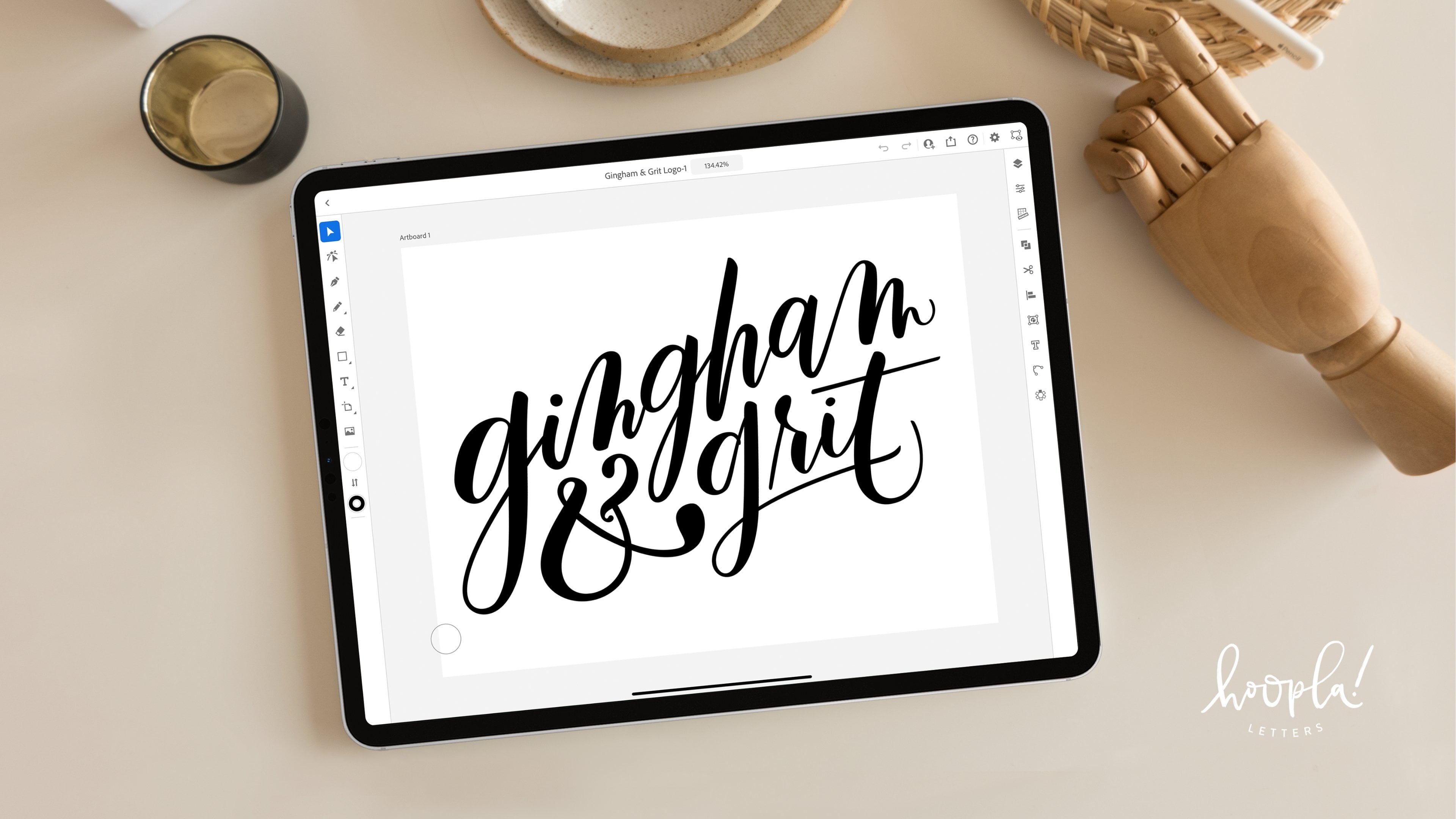
4. Calligraphy Brushes: Now you have your
document Set-Up, you have your guidelines
all ready to go. You have created a new
layer to script on. And now we're going
to take a look at all of the cool
brushes that we have. But before we do that, we're actually going
to go ahead and hide these guidelines. So to hide it, you
just click the layer. You'll see there's a
little check mark here. Just tap it to uncheck it and
those guidelines are gone. Now I'm going to
turn I'm going to turn the paper so that it's landscapes that
I have more room to work. So to turn it, you just
use two fingers to pinch. You can zoom in,
you can zoom out, or you can twist and turn
like I just did there. Now let's take a
look at the brushes. We're going to tap a
little Brush icon up here. You can see there are so many brushes in Procreate for lots
of different things. There's sketching,
drawing, painting, spray paints, vintage textures, luminance, so many things. And then of course,
there's Calligraphy. Now calligraphy is
where we're mostly going to stick to for
obvious, obvious reasons. If you look at this,
you'll see that I have a lot more Brushes, then you do literally
just open Procreate. So anytime you see this
little swirly symbol, that means it is a custom brush. So that's either a
brush that I have created or it's a brush
that I have purchased. In the resources section, I'm going to share a few
places that I like to get. I'd like to get my brushes from. But even if you don't have
any of these new brushes, the native brushes, the
default calligraphy brushes in here are
actually pretty good. Let's give it a try. I'm gonna go ahead. Let's try chalk here. So over on this toggle, you can adjust the
size of your brush. You can also adjust the opacity. The opacity is the
bottom part here. So if I were to
lower that, you see, I have a nice opaque
script there. We'll go ahead and undo that. So to undo, you just
tap with two fingers and that undoes
whatever you just did. This actually, this Brushes
actually pretty cool. It's super texture. We have a nice calligraphy look with a thin and the thick line. If you are new to Calligraphy
in your thinking. And then thick line. How did she get that? How does she do that? Is it magic? I don't know. Well, I'm happy to report. It is not magic happy in a little side because
would be cool if it was, what it is, is all
about pressure. So in calligraphy, we wanna make sure that we have a
variation in pressure, in line thickness depending on the amount of pressure
that we're applying. We'll talk a lot more about this in the
calligraphy section. But all you need
to know for right now is that anytime you're applying a very light
amount of pressure, you get a thin line. Anytime you're applying a
heavy amount of pressure, you get a thick line. That is really what makes
calligraphy, calligraphy. And so it makes it
different than Lettering and other types
of fancy writing. Now, most of the brushes in the calligraphy
section are going to be pressure sensitive again because they want to
mimic real calligraphy. So let's try a couple more. Let's try Blache. That's definitely
pressure-sensitive. Very cool, has a really
FUN texture there. Undo. Let's try streaks. This is another default. Brush, lives up to its name. Very streaky, lots of PFK-1. Now some of the brushes in here aren't pressure sensitive. So for example, this first
Brush and calligraphy. You can see you don't know
how hard I'm pushing, but I'm telling
you I'm adjusting my pressure and it's
not changing at all. That's because this
brush is based on a different type
of calligraphy and more italic calligraphy where you work with a square brush. We're going to be focused on
pressure calligraphy today. So because of that, you always want to
test out the brush, makes sure it
adjusts to pressure. Mono line, that's
another one that's not going to adjust to pressure. I'm not sure where
they put it in the calligraphy section and
not the inking section, but it's not my, not my software water pen. Let's give that a try. Very sensitive to
pressure, lots of PFK-1. But my all-time favorite
default calligraphy brush in Procreate is
called the brush pen. The brush pen has
really nice thin lines, really nice thick lines. It's really smooth and it mimics actual Brush Calligraphy
with the flow of ink. You can see that when we're
using light pressure, the ink is flowing less than
so we have a little bit of transparency there,
which is nice. We'll go ahead and try
scripting out a word here. We'll just script out Brush. Now again, in the
calligraphy lessons, we're going to get into all the nitty-gritty of
creating actual calligraphy. But for now I just want to
show you how that writes. It's very, very nice. I like in a lot. Now, not only do I like
this brush to use, but I also like this brush as a jumping off point for creating
new calligraphy brushes. And in the next video, I'm going to show
you how to tweak this brush to create
your new one. But before we do that, we don't want to damage
this brush at all. So we want to duplicate it. You can see I've duplicated
it a lot because I like to tweak this
pen. To duplicate it. You're going to make sure that the pen you want is selected the brush you want to select it. Swipe to the left,
hit Duplicate. Now it'll create a new file. Yours will probably say
Brush Pen one mine says Brush Pen for because
I've done it a lot. Then you're going
to tap that and it will take you to
the brush studio. So go ahead and tap
that and I'll meet you in the Brush Studio
and the next video.
5. Create Your Own Brush, Part I: Okay, Now we are in
the Brush Studio. So the Brush Studio is aware, we are going to totally
customize our Brushes, are brushes to get
exactly the kind of brush that we want, exactly the kind of style. And look, if you're
anything like me when you first arrive at
the Brush Studio, the first thing you may be feeling is extreme overwhelmed. Because there are so
many different things here that you can tweak and customize and it's hard
to know where to start. First of all, take
a deep breath. I promise you, that even though they're
in a lot of stuff here, there aren't really
only a few things that I ever mess with, and I'm going to
show you that today. So this is actually
one of the reasons that instead of
starting from scratch, I usually like to start
with a current Brush. In this case, we've started
with the brush pen, native Brush in the
calligraphy section here on, on Procreate, we have
duplicated that Brush. And now we're going
to use that as a jumping off point to
create our new one. I'm going to walk you
through how to do that, how I liked to do it. Now, yes. You could technically go in
and change all these things, but again, I don't do that. I'm going to show you the
ways that I tweak it. So we're first going to start
out with stabilization. That's the second category here. So stabilization really has to do with how smooth the line is. How has stabilized
it's going to be. So this is by far and away the thing that I tweak
most as I'm working. So let's say I have a
brush that I'm using. I've already saved it. I have it exactly how I want it. Streamline is one thing I
will go and tweak as I'm working without starting over and creating a
totally new brush. Because sometimes your
needs change depend, depending on what
you're working on. So the streamline
section in particular is mostly what I focus on. Streamline. This is a good way
to think about. This is kind of like a filter. Like if we're talking
Instagram or TikTok. It smooths out any
imperfections. So the lower streamline, the closer to reality, and the higher the streamline, the more smoothed and perfected
the line is going to be. So let me show you what. We're gonna go over
to drawing pad here. Go ahead and tap that, click Clear drawing pad. Then this gives you
the opportunity to script the brush
as it currently is. As we make changes,
this will change, but right now it's just
the native Brush pens. So this is what it
looks like naturally. Normally, the way that
it's already set up, you can see the streamline
is pretty high. It's at 94. But if I
were to lower that, take that filter away, it starts to show me what
was more closer to reality, what's closer to the truth? The truth is if I had
scripted this as fast as I did without any of
the streamline on, it would look pretty wonky. So if I clear that
drawing pad again, we'll do it again
without the streamline. Now of course it's easier
when you can view it. See if you can see there's
some walk there didn't smooth all those edges out. It kinda left them in. Lowering it again,
takes that filter away. So most calligraphy
brushes you'll notice have a pretty high amount
of streamline, usually at or above. That's because, why not? Right, with Calligraphy,
we want nice smooth lines, rounded curves, non
shaky, non shaky Strokes. And this helps get rid of
any of that shakiness, any of that funkiness
that we might have. And I usually keep mine up pretty high when I'm
doing Calligraphy. Now, you might not want it
all way up to 100 and to the max because that can prevent you from
making certain shapes. It's gonna be hard to see on
here because you don't know what's in my head,
what I'm trying to do. But sometimes over corrects. So I usually keep it somewhere in the '80s and up
when I'm doing Calligraphy. Now when I'm illustrating, I actually move it in
much lower because I want a loose
quality to my line. I don't want it to
look too perfect. So maybe depending on the
style of calligraphy, the style of your brush, you might want to have that
a little lower as well. But for now, I'm going
to leave it pretty high for this new
Brush recreating. I want that streamline to
be pretty high and all remember that I can
always adjust that later. The next thing I
will tweak to create our brand new Brush
here is the shape. The shape refers to the
shape of your brush. If you were to tap the brush on the drawing pad here you can see it gives us the same shape, just in little oval shape. It'll be larger and darker. If we apply a lot of pressure, it will be smaller and more transparent if we
apply less pressure. So most calligraphy brushes have some type of round shape. Maybe it's a perfect circle Maybe it's a little inky blog. Maybe it's an oval like this. Most of them around, not always, but
most of the time. So let's see what happens
when we change our shape. We're gonna go up to Edit
next to shape source. This brings us to
the shape editor. Now, maybe you have a shape
that you'd like to use. Maybe you have made adopt your actual calligraphy pen and you want to use
that as your shape. Or maybe you've created a shape here and Procreate
that you'd like to use. You would tap Import. And then if you've
created it in Procreate, you can just paste
the shape right here, or you can import the photo
or import a save file. One thing I like to do, especially if I'm not totally
sure what kind of Brush and what is I go to
the Source Library. It'll source library
has a ton of different shapes that we can choose from like so
many different shapes. Some of these are awesome
for calligraphy like this, inkblot, mess Blache, those would be really
cool for Calligraphy. Others, not so much like leaf, maybe not the best
for Calligraphy. Cool for illustrating
and patterns. Flower lightening, again, cool for
illustrating and patterns. Maybe not so great
for calligraphy. So kinda go through here and
see what might work for you. Let's take a look here at
try this water Blache, one. That's very cool. So that's, that's an
example of something maybe you could even create on your own
if you'd like this, but it's not exactly
exactly what you want. Can always scan your own texture and let's go ahead and try this. Done. I'm going to clear
the drawing pad and I'm going to test it out. So how does my brush looked
change with the shape? Changes quite a bit. So it looks much brushes as I figured because it's
much different shape. Softer looking. This
would be a very cool, kinda soft light brush. Let's go ahead and
change it again. See what else we can do. Go to Import Source Library. Let's try, let's try flat ink. That's a very cool shape. Let's test it out.
Hit done drawing pad, clear drawing pad. And give it this ago. Very nice. Very brushy. I really liked that end there. This looks really realistic. This looks like like you
were using actual inks. I actually, I really like that, but let's try one more
import source library. I would like something
that's maybe kind of watercolor R3. So let's take a look, see what we can find. How about this one? Oval. But if you look, it has a
very cool watercolor texture. Hit Done. I'm going to try that, clear the drawing
pad. Give it a try. Very nice. Now this is kinda what I'm
looking for, for this brush. I was thinking something kinda softer, more watercolor look. And you can see that it's very streaky because of the
texture inside here. I like it. I'm going to
stick with this one. Now you can see here there's
lots of different sliders. So feel free to play around
with these scatter changes, how the shape kinda
presents rotation, obviously how the shape
rotates as you move. I wouldn't mess with
that one to too much. Because again, this is giving us the nice
calligraphy luck. If we bump that up, we get wonky tops there. We don't necessarily want that, but you can play around with it. For right now. I'm gonna leave it as is. I'm not going to mess
with these sliders. Right onto the next thing. So the next thing I like
to tweak is the grain. So the shape, again is just the actual
shape of the brush. The grain is the
pattern inside of it. So right now our shape
has a pattern, right? It's sort of textured
on the inside. Are grain source is
just a flat color. So all we're seeing is
that watercolor texture, but we can also change what
this grain sources as well. So let's, let's give it a try. We'll go to edit
gradient editor. Now you can import here. If you have your own texture
that you'd like to use, maybe you have a watercolor
texture you've created. And I'm an ink texture. Or whenever you have, can import it again
as a photo from a file or paste it
directly from Procreate. Or you can go to
Source Library just like was a library
foreign shapes. There's also a library
for the grain as well. So right now we have
just blank solid. So let's test it out. Let's see what we can find. How about let's try it. Let's try these warm dots. So that's kinda cool. Let's see what that looks like. Okay, clear the drawing
pad. I like it. Maybe not what I want for this brush, but it is very cool. I can see how that would. That would be very
cool Brush to have. Go back to import
source library. Let's try. How about how cardboard
that's interesting. So that looks like
they literally just scan a piece of cardboard. Very cool. Let's try it out. Clear drawing pad. Very nice. You can see a who have a nice little
cardboard texture there. Now, you can also adjust
here these sliders. You can adjust the scale so
how large that grain is. So it'd be really,
really cardboard look, we could bump that way, way up. Very cool. Could also adjust the movement. How does it, how does the
movement affect the shape? So the lower this is, the more more blurred
your grain is. You have it all the way up. It's almost like
a stamp. Alright? Okay. I like it. Don't love it for what I want. Gonna go to Source Library. I would like something
that kinda is mimicking the watercolor watercolor shape. So let's see if we can find a nice watercolor texture here. So there's dry cool like okay, Here we go. Wash, wash. That's funded. Let's give that a try. Okay. Clear drawing pad. Very nice. I like that. Kinda soft and subtle. Nice. You know what, like
it, don't love it. Let's try one more. Unlike planning on doing three. But man, I want something
a little bit more opaque. Let's try. Let's try dry acrylic
wash, drawing pad. That's better. That's more what I
was looking for. Okay. So that is very cool. It's a nice water. We get the nice
watercolor texture from the actual
shape of the brush, and then we add in
that grain and we get even more of that again, you can adjust this here, the movement, the
scale down just a bit. This is one of those things. I don't really go
in with a plan. I just mess with the sliders until I find something I like. I like it. Onto the next one are brushes. Look at pretty cool guys.
6. Create Your Own Brush, Part II: The next thing that I
change is Apple Pencil. So Apple Pencil in this you
can control how the pressure, an angle of your actual
Pencil to the tablet, how that affects the Brush. Know, again, like a lot of things that
sounds really complicated. But again, there's
only a few things that I really tweak here. The one thing I tweak
the most is the size. So when it comes
to the pressure, so all the way to the max means that the pressure
is very affected, or excuse me, the size is very
affected by the pressure. If we reduce that,
you can see it. It reduces the
difference between light pressure thickness and
heavy pressure thickness. So if we go all the way to zero, there's no difference at all. It's all the same thickness
regardless of the pressure. If we were to go below zero, it does inverse or heavy
strokes or a thinner. We don't want that
because we do want it to still look
like calligraphy. So I'm going to bump this up. I actually like there to be
a lot of line variation are a lot of weight
variation in my lines. So I'm gonna keep that pretty high, which is where it was. You can also adjust the opacity, how pressure effects that. Right now it doesn't
really affect it at all. Can also adjust the flow. Now, the flow is,
is impacted here. So the standard Brush
Pen in Procreate. If you are applying a
very light pressure, it tries to mimic the
actual flow of ink in a real pen by reducing
the amount of flow. So if we were to get that
all the way to zero, you would see there's no
change in the amount of flow. The amount of ink flowing, depending on pressure,
there's no change at all. If we go below its inverse, we're heavy pressure
means a low, a lower amount of flow. But again, that doesn't
mimic real life. We want to keep it
at zero or above. So I Wasn't it in the 40s, which is pretty
solid difference. I want to make it, I
wonder to be a difference, but I want it to be
on the more subtle. I'm going to put it around 23. Okay. Now the last the
last thing that I changed, I will say too, I don't
mess with the tilt. Right now you can see in
this particular Brush, everything's at zero anyway. Feel free to mess with that. I've never found a need to. Again, part of the reason
for that is because we're starting out with
a calligraphy brush. Feel free to adjust
it if you'd like. Not something I usually do. Okay. So the last category
I tweak when I'm creating a new brush pen is properties, Brush properties. There are few different
things that you can change here and Brush behavior, mostly what I do is the sizes. So this refers to the absolute
maximum size of the brush. So if we, right now
it's in the 70s, if we pump it all the way up, you can see we get
a really be feeling their minimum size is again, how small it can be. So I don't want it
that large actually. I I think I want it more like I wanted to mimic
a round watercolor brush, but like a thinner brush, I'm gonna bring it
down to about 36. Let's give that a try. Okay. You know what,
actually maybe want a little bit more than that. Pump it up just a bit
clearer it this way. It's nice to have
this drawing pad here so you can practice. Nice. Actually going to reduce the
minimum size just a bit. It doesn't make that
big of an impact. But it does make sense. You can see that
it's definitely, that is definitely thinner. I'm actually gonna bump it
up just a little bit more. Here we go. Yeah, I think that's good. About where we add it. Actually, we were up in
the '70s a little bit. So this is a little
smaller, maximum opacity. I would like mine too. I don't really mess
with the opacity here because you can
adjust the opacity in the actual in actual studio
area when you're drawing. And that's a better, a better place to
adjust it because there'll be times you
want to reduce it. But if you adjust it here, if you make it
anything below max, it's just not going to
serve you very well, so I don't usually
mess with that. Okay, so now we have
our brand new brush, so we're going to hit Done
and then test it out. Now that we've finished
up our custom brush pen, Let's see how it compares
to the original. This is the original Brush
Pen, would it look like? And now I have my new brush pen that we just created selected. So let's go ahead
and script it out and see how it compares. Much different. It's a much different pen. I like it. I like
both from so now. I've got two very cool pens for two very cool
different purposes. So it just is just to show you what a massive
difference you can make. Just by adjusting
those few things.
7. Calligraphy Basics, Part I: Alright, now that we've
learned all about the brushes, we're going to start
learning about calligraphy. So in this lesson, I'm going to talk to you about some of the definitions that we're going to be using, some of the vocab we're
going to be using. But also about how we use
pressure in calligraphy. So as we've already
mentioned with the brush, you know that anytime you use light pressure,
you get a thin line. Anytime you use heavy pressure, you get a thick line. So you know that but do you know when to do each when
do we make it thin? When do we make it thick? What do you take a
look at this here. You'll see, you'll start
to see a pattern emerge. You'll notice that
anytime you bring up, let me get a thicker brush
there so that we can see to a monoline brush, anytime you bring that pen up, you're going to get a thin line so you can see or anytime you
move it sideways, you're going to use
light amount of pressure to get a
nice thin line. So I'll go ahead and highlight
those here so you can see all those red areas. Those are all thin lines
and those also happen to be spots where you're
moving the pen up, okay? Now conversely,
you'll notice that all the thick lines are
happening on downstrokes. So anytime you
move the pen down, we're going to apply a lot of pressure and get a thick line. Okay, So let me
show you that here. You can see in red, these are all areas
where we're moving the pen down and so we're
getting a thick line. So if you ever get lost as your scripting
and you're like, I don't know, it should
be thinner, thick. Just remember, you're moving up. It's a thin line. Moving up, thin line
or moving sideways, then line that's
called an upstroke, moving down, lots of pressure, thick line, that's
called a downstroke. So that's a trick
for if you ever get confused about where
you should be. Now, you also have your
guideline sheet here. And I'm gonna show you how we're going to
use that guideline. So you'll see that there are two dotted lines and then two
solid lines and each row. So the first dotted line, the bottom dotted line, a little bit, that is
called the baseline. You'll notice that is where
all of your letters sit. All of your lowercase letters
are sitting on that line. Now there is a thing
called bounce lettering. You might have heard this
with bounce lettering. Your letters don't
all sit on that line. They bounce around
back-and-forth, back-and-forth, bounce lettering or staggered baseline
Lettering is I call it super trendy and
super-duper FUN. But when we're
learning calligraphy, it's best to learn
it on this flatline. Once you get
comfortable with that and keeping your letters
all the same size, then you can move on to
the bounce lettering. Then that brings me to
the second dotted line. This is where the tops of
your lowercase letters hit. This is called the midline. So they sit on the baseline, they hit the midline. Now, again, the reason
we start with that, we don't do bounce lettering in the beginning
is we want to work on keeping our letters
the same size. That's trickier when we're
doing bounce lettering, right? Because we don't have the
exact guideline to go on. For now. We're going to stick
with it this way. Now you might notice there
are some letters that aren't exactly fitting in to these. Between the baseline
and mid-line, we have our ascender
letters like L, H, K. All those Letters extend
above the midline. Those are called ascenders and they all hated the same line. This line is called
the ascender line. Then all these guys that dip
below the baseline like G, P, Y, we also have like
letters and J and Z. Those are all called descenders. They hit at the same point
called the descender line. Okay. So just to go over that again, letters sit on the baseline. They hit at the midline. The ascenders headed
the ascender line, and the descenders hit
at the descender line.
8. Calligraphy Basics, Part II: Now when I'm
teaching calligraphy and when I'm teaching
traditional classes, there are four keys that
I focus on to getting the brush pen or the calligraphy pen to do
what you want it to do. The first one we've
already talked about and that is pressure, heavy pressure, a thick line, light pressure, thin line. Now I'm going to talk
about the other threes, some of which are still very important for digital
calligraphy and others. Not so much. So the
first one is the angle. In calligraphy. You want your pen to touch the paper at a 45 degree angle. So that means that It's
not straight up and down. It's not horizontal. It's right in the
middle, 45 degrees. Now connected to that is your grip where
you grip the pen. So to get at that
45-degree angle, you have to grip the pen higher up than you
normally would. We usually hold our pens down toward the bottom
when we're handwriting. If you do that, your
angles too high, you can't get it low
enough for 45 degrees. So for that reason, we hold our Brush an inch
and a half to 2 " up, that helps us stay
at 45 degrees. So if I'm holding an inch
and and after 2 " up, I'm able to get both the thin line and the thick line without
adjusting my grip there. Now, this is less important
for digital calligraphy. You still want to
aim for 45 degrees. You still want to try to grip it an inch and a half to 2 " up, in my opinion, but I'm
also a purist, right? So let's see what happens
if you're holding it lower, like you normally would. Therefore not at 45 degrees, we're going to try
to do this again. Can you tell the
difference? Not really. Now, if this was
traditional calligraphy, you are doing this
with a brush or a nib. You'd be able to
tell the difference. This will look like hot garbage, but Digital smooth
things out a little bit. It makes it less important. But I'd be remiss if I didn't tell you traditional
calligraphy, it needs to be the grip
needs to be an inch and a half to 2 " up so you
can get that angle. So I would try it this
way so that when you move on to doing calligraphy
with your brush pen, you'll be ready for it. But if you don't wanna do it and it's working for you
just fine that way. Go for it as much as it
pains me to say that. Now the last key is movement. So now this one is still important to digital
Calligraphy. A lot of folks think that the movement for calligraphy
comes from your wrist. And of course some of it does, but the big movements come
from your elbow and shoulder. Part of the reason for
that is range of motion. With your wrist. You
can only go so far, whereas with your
shoulder and elbow, you can go all the way across
the page, which is awesome. Another thing has to do
again with that angle. While Digital does make
up for that a lot, it's can only go so far. If I were to draw
a really long line and only use my wrist, not lift my pen off the paper. Eventually it starts to
thin out at the bottom, no matter how hard they push, you do want to make sure
the bulk of that movement is coming from your
shoulders and your elbow. In the next video, we will
discuss the ten basic strokes
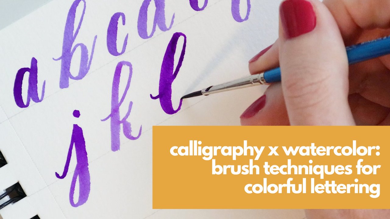
9. 10 Basic Calligraphy Strokes: This video, I'm going to cover the ten Basic
Calligraphy Strokes that you'll need to create
Your lowercase alphabet. Now, I am using a brush that
I created for this class. All I did was tweak the
Brush Pen default brush. And I've made that available to you in the resources section. So go ahead and get
that downloaded to, upload that to your library. You're going to click Brush
Library plus sign to add. And then just go
straight to import. And then from there you can find your brush and add it in. I've already got mine in here
since I designed it here. So I will go ahead
and find that. Then before we start
doing anything, you want to make sure
the sizing is correct. You can adjust the size
here on the left side. So I'm making sure that
it's going to work for these guidelines and it is you can adjust
your size as needed. Also want to make
sure that again, if you're on that second layer, you're not on top
of your guidelines. If you've locked on, you won't
be able to draw on them. But just double-check. Now before we get started, I want to point out
that I will probably be adjusting the angle of my paper. Not probably, definitely. So to do that, you use
two fingers to pinch. You can squeezed together
to zoom in or zoom out, squeeze apart to zoom in, and then to tell you just
tilt it the way you want it. Now, deciding how much to tilt your paper is really up to you. What I like to do is I like
to script for a minute and then see how it feels and
then adjust as needed. So good trick for that is to put your Ipad perpendicular to
you and close your eyes. Which is important but weird. I know, but go with me. Close your eyes, but your pen on the paper and pull toward you. Just draw a nice
thick downstroke and then take a
look at that angle. My iPad is already
tilted slightly, so my script is already
going at an angle. The reason I have you
close your eyes is because this allows you to see
where you would write. Naturally. When we are eyes are open, we tend to try to move
our arm to adjust. So looking at this, I think. Yeah. Okay. That's that's
tilted pretty good, but I like my Letters
and my script to be a little bit
stronger angle. So I'm going to tilt
my paper a little. I'm going to try
and get them up. Close my eyes again. I'm going to pull us toward me. You can see it made
a more of an angle. I want to point out this
little glitchy thing here. This is not an air with the
program, believe it or not, On Air with, then this has to do with a nasty little
thing called Greece. I cleaned my iPad very
well before this class. I want to look, want
it to look nice. But one of the
problems with that is once you've cleaned it, anytime you touch it
and your fingers like a little bit of oil,
a little bit Greece. And that makes a little
spot on your computer. And then when you run over it, it it can kinda get
jagged like that. Now after you've cleaned it, it'll do that for a little
bit and then that will stop. Eventually when you're holding covered in the same amount
of oil. I know that's gross. But that's what it is. If you noticed that happening
and then I just undo it. It's not a glitch
with the program. It's not a glitch with my pencil is all about because I
cleaned my screen too much. I did too good of a job. Okay. So that was a good angles. I'm going to keep my page
tilted about like this. But what you do is up to you. Okay? So now we've got our
brush, we're ready to go. I'm going to start with the upstroke because as our first of our ten basic strokes, so we're going to
start at the midline here and push up in
a thin hairline. Push. Now you can go all the way
the ascender line like I did, or you can stick to just
going to the midline here. It doesn't matter. These are just strokes, this is
just for practice. But the guidelines
are helpful to get you to keep you going in the
same the right direction. Now, if you are a
traditional calligrapher and you try this
and you're like, Oh my goodness, my
upstroke is so smooth. You are welcome. Because I made this streamline
on this brush pretty high. Normally when we're
just starting out, we're doing upstrokes
are very shaky. But Digital man, that allows
us to fix some of those, some of those little
human errors. Okay, the next basic stroke
is a thick downstroke. So for the thick downstroke, you're going to apply
as much pressure as you can pull down at the baseline. Now, you don't want to
linger at the baseline too long because then
it creates a line. So you might have just
seen that thing pop up. It creates a perfectly
straight line. There's not necessarily
a bad thing, but we are still wanting this to look like calligraphy
and not like a font. So I don't really like to make lines as I'm doing
perfect lines, rather as I'm doing
my calligraphy. Okay, so we can apply all the
pressure you can pull down, pause at the baseline. You up next is our horse shoe. For the horse shoe,
I'm going to do these a little bit smaller. So I zoomed in a little bit I'm going to start with
a thin hairline up gradually add pressure,
gradually release it. Gradually, add, gradually released so that gradual out-of
pressure is important. So we get that
nice, rounded top. Gradual release. I think before I said gradual
add, gradual release, that's gradual add and
then just stop before shu. Okay, up next is the U-shape. So for the U-shape, you're going to start with that midline. Do a thick downstroke, gradually released that
pressure and push up. Then hairline gradually
release, push-up, that gradual release
is important, so we get that nice
rounded bottom. Now if you're right-handed, this might come a
little bit harder. Last one. So if your left knee and you're
like whew, this is easy. That's usually how it
goes in my classes. The left is usually think
this one is easier. The righties are like What? What are you doing? That is our U-shape. Up next we have our V-shape. And this is my favorite stroke because it's like a
little roller coaster. So for the V-shape, we're going to start with
a thin hairline. Gradually add,
gradually release. Then hairline up, gradual
add Gradual Release. Little roller coaster. Now this is a stroke. We're going to use a lot
in our lowercase alphabet. So this is definitely a
good one to practice. Up next is our S shape. So for the S shape, we're going to start
with a thin hairline, gradually add,
gradually released. You can see I have
the ink dots there, so even Digital, I can't
get away from the ink dots. Okay, so thin hairline
gradually, gradually released. So it looks kinda like a
fortissimo if you're a musician. Now for the 0 shape, we are going to start
on the right-hand side, do a thin hairline
up, gradually, add pressure, gradually
released it, sweep up. Then hairline up, gradually
add gradually released. Overlapped it a little bit
there but you get the idea. Thin hairline up, gradually add gradually release, sweep up. Don't worry you I
getting it perfect. This one has a little tricky. You can see it
this every day and I still don't get it
totally perfect there. This is one that I find to be easier and regular Calligraphy
rather than digital. But that's like the only one. Next we're going to
do our upward loop. So the upward loop is you're going to start at
the midline actually. And you're going to sweep
up gradually add pressure, gradually released it up, gradually add,
gradually released. Looks like an L based. I mean, it isn't now doesn't
look like an L it is. And whether you
made your first up, you just did your first
letter way to go. So now if that was
basically an L, Our next stroke
is basically a J. This is the downward loop. So we're going to start
at the mid-line again, but instead of going up,
we're gonna go down. We're going to do a
thick downstroke, gradually released
pressures sweep up, thick down stroke
gradually release. We've this one's a
lot of PFK-1 to. Our last basic stroke
is the dot and whisker, or the loop and whisker, which is an adorable name, but it's a very tiny
little strokes. So let me show you
first how we'll use it. We'll use it in certain
letters like ours. So there's the dot and
that's the whisker. Or if you wanted
to make it a loop, where you go a little
loop and whisker. We also use it when we are
connecting certain letters. So for example, W to I. There's that dot and whisker, or like C 02. I wait. Here we go. Loop and whisker. That's how we're
going to use it. So to practice it, you're just going to
apply pressure and then sweep to the right as
you let go of that pressure. So kinda like a
little Nike swoosh. And to practice the loop, you're going to start
with a thin hairline up, a little pressure as
you sweep to the left and then swoop out
with no pressure. For light pressure rather, up a little pressure
and then sweep out up a little
pressure, sweep out. Those are the ten basic strokes. So let's go ahead
and recap those. First, we have our thin
hairline, thick downstroke. Our horse shoe. U-shape, V-shape, S-shape, 0 shape, upward loop, down or loop. And whisker, or
loop and whisker. Those basic strokes make up the entire lowercase alphabet. So now that you know these, we are going to
go ahead and dive into that alphabet
in the next video. So give this a little
bit of practice. Maybe fill up a few of these
rows, trying this out. They don't need to be perfect. We're not going for
perfection here, but getting your hand warmed up, getting to know these Strokes, it's gonna be super
helpful as we navigate the lowercase Alphabet. See in the next video
10. Lowercase Alphabet: In this video, I'm going
to show you how to use the ten basic strokes
you just learned to create the lowercase alphabet. So I'm going to break down each letter by stroke so
you can follow along, create your very own
lowercase alphabet. Now I also have in
the resource section, I will have a one cheater, or you can see all the
letters laid out at once. But this is where you'll learn how to break
them all down. Alright, let's start with a 0 shape, U-shape, 0 shape. U-shape. Again, I'm using the brush that I created for this class available in
the resource section. If you have not
yet downloaded it. Be upward loop, square
the bottom. Horse shoe. Sweep it in. For loops. Square the bottom. Horseshoe. Swing it in letter C, 0 shape. But don't meet those hair lines. Shape. Don't meet the hairline. D 0 shape, upward loop, 0 shape, upward loop. You'll notice I start that upward loop
right at the loops, right at the point where the hair lines meet on
that 0 shape right there. Upwardly. For the letter E, we're
gonna do another 0 shape. But instead of starting
it on the right side, we're going to start
on the left side and in-between the baseline
and the mid-line. So we'll start with
a thin hairline to the right and then go right into our 0 shape without connecting
the hair lines. 0 shape. Oh, shape. Now for the letter F, this is a big one.
This is a big letter. This is going to extend from the ascender line all the way down to
the descender line. We're gonna do an upward loop. All the way down to
a downward loop. What we're going to sweep to the right instead of the left. And then a dot and whisker
up to the midline. Upward loop, downward
loop to the right dot, and whisker to the midline. H. I'm sorry. G. My goodness. Thank can spell. Can't do the own, but
my kindergartener could teach me anything or do. Okay, So for G, we're
going to do an 0 shape. And then a downward loop shape. Downward loop. H. Upper loops square
the bottom V-shape. Upward loop, square the bottom. V-shape. I. Thin
hairline, U-shape. Then hairline, U-shape, dot J. Then hairline,
downward loop, dot, thin hairline, downward loop, K, upward groups. So you'll see I accidentally selected the eraser that there's a gesture on here that sometimes accidentally
selects that, that happens just click
back over to Brush. It'll automatically be
what you were using. So for for K, I had to do the ABCs in my head. I'll do an upward loops square
the bottom thin hairline, and then a backward S-shape. Upward loop, square the
bottom thin hairline. Backward S. So that backward asked
to see it separately. It looks like this So it's actually
easier if you're right-handed than
the regular S-shape, which of course looks like this. L as you've already done, Let's just the upward loop. For loop. Upward loop. M or shoo, shoo, V-shape or shoo, shoo V-shape. N, horseshoe, V-shaped. Whoops. Must have a fingerprint. There are Shou
V-shape. There we go. Horseshoe shape, 0 0 shape. But instead of meeting
that hairline, we're gonna do a loop
and whisker shape. Lupin whisker that one more
time because so much FUN. 0 shape, lip and whisker. Letter P. Then hairline, long downstroke all the
way to the descender line. Or shoe, sweep it in. Hairline. Long, downstroke to the descender line, or shoe, sweep it in Cu 0 shape. Then we're going to do a downward loop
that's going to move to the right dot and whisker 0 shape
down or loop. Dot and whisker. Downward loop to the right, I should say, for the letter R, then hairline, dot
and whisker, U-shape. Thin hair line up
to the midline, dot and whisker, U-shaped. You want to try a loop
and whisker here. You do your thin hair line up to the midline
and then go right into that loop and
whisker a lot of PFK-1. This is how I usually make my ours for the letter
S in hairline up. And then our S-shape
in hairline up. S-shape. Then to connect to the letter
S for another love letter, you will do a thin hairline out. For the letter T. We're going to do a really long upstroke all the way
to the ascender line. And then a really long U-shape all the way back
down to the midline. And then a thin hairline across. Really tall upstroke, really long U-shaped,
thin hairline across. For the letter U, V shape,
U-shape, V-shape, U-shape. You can also skip that
little, this area. If you want to skip that. Like let's say you're
starting your word with a you and just go right into that U-shape and
then another U-shape, letter V, you have a V-shape. And then dot and whisker. V-shape. Dot and whisker, just like the you, if
this is the first letter, you can cut that out. You'll still do
this kind of shape, but you just won't start at the baseline of
the startup here. Okay? W, V-shape, U-shape, dot and whisker.
V-shape, U-shape. Gotten whisker. Just like
with the V in the EU, you can always skip this part fits the beginning of the work. X. We're going to do a
really wide V-shape. Then a thin hairline up, wide V, then hairline
up for the Y. V-shape, downward loop,
V-shape downward loop. And again, this is the
first letter of the word. Skip that V part and just
do a U shape downward loop. Lastly, we have our letters Z, which is a horse shoe. And a smaller horse shoe, go right into a downward loop. Now that's a little weird.
Let me show you again. Horseshoe, smaller horseshoe
right into a downward loop. Let's just do it one
more time since this is our last letter and
it's a tricky one. There you have it a to Z. So go ahead and give that a
practice on your guideline. Let's go ahead to
will hide that, create a new layer. I'm just gonna go through
this one more time, one letter at a time altogether
11. Connecting Letters: Now that we've learned
are ten basic strokes and our lowercase alphabet, we're going to learn
how to connect our letters to create words. And we're going to do that
with something called joins. Now I'm calligraphy. We used two main joins, diagonal
and horizontal. Diagonal join is when you
connect letters using a thin hairline that goes from the baseline
to the midline. So you've already done this
and you're ten basic strokes. So how do you know
when that's the line? That's the kind of join to use. Well, it has to do with the
letters you're connecting. If your letter ends with an upstroke or it ends
around the baseline, then that's when you're going
to use a diagonal join. So for example, letter a. It ends with that upstroke. From the baseline. The letter I ends on an
upstroke from the baseline. Same thing, you get the idea. All of those letters are
going to have diagonal joins. So let's try one. Now, let's connect
the letters a and I. You'll notice that this one ends on the upstroke and
the I has the upstrokes. So how do we combine those? Well, we just split the difference and use
just one upstroke. So we're going to do a
and then add our U-shape. We're gonna go all the
way up to the midline. Then instead of drawing another hairline up with like we did with our I
like this right here. We're just going to skip that. And we're going to
start with our U-shape. Hey, to try another one. Let's do I to end. So again, this is what it
would normally look like. We don't want to have
both of those there. So we're going to do I hairline up and then
go right into our N. Now, what if the
letter we're going to doesn't have a thin
hairline ahead of it. So for example, what
if we're going to the letter a that doesn't have in hairline
in front of it, right? That starts as a
circle or for going to the letter G or D, or any of these letters
that start with an 0 shape that don't have that thin hairline
the beginning. How do we connect to those? Well, it's not too hard. So let's do I to G. So we're going to make our I and we're gonna go up to
around the mid line. I usually stop a little
bit before I get there. Then we're going to do our 0 shape of our
next letter and just make sure it overlaps that upstroke and then
finish your letter. Let's do Let's do E to a. Again, I'm going to pause
just a little bit below the midline and then do
my 0 shape for the a. There we go. Now another way you can do it if you don't
want to pick up your pen, as you can, always
kinda curve it over. So let me show you what I mean. Let's do a to D. So when you do your
diagonal here, you just come up, make
it a little curve, and then start your letter. Now that's not
usually how I do it, but I just want to show you
that that is a possibility. Also. Those are diagonal joins. So let's try word that
just uses diagonal joins. Let's see how about
we'll start with mine, like this is mine. So we'll do our M up to that midline just a little bit below the midline rather. And then go into that. I just gonna go straight into the end. Stop at just a little below the midline and
then start that E. Mine. There we go. Okay. Now how about made
like M a, D, E. Try that one. Then we're gonna go into
that round letter a. Go up to just below
that midline. They're starter. Same thing. We're gonna go into another
another rounded ones. I stopped just a little
bit below the midline. And then I'm gonna
show you a couple of different ways to do the ISA. Last time I showed
you this method where you stop and
then you start your E If you wanted to do it in
one continuous motion, a little trickier, but
you definitely can do it. You just go straight
from that stroke, right in to the E. Those are diagonal joins. Now a horizontal join. You're going to use that when instead of ending
with a thin hairline, that going from the
baseline to the midline. If your letter ends
strictly at the midline, there's no upstroke to connect. Then you're going to
use a horizontal join. So letters that use a
horizontal join, R, 0, V, and W. You'll notice that these, all, these all use the loop and
whisker dot and whisker. That's how you are going to connect it
to the next letter. Okay, so let's try a
couple of examples. Let's do oh to way. So we'll do our OH,
loop and whisker, stop at that midline
and then go into our I try W to a. So how do we do it
when it's surrounded? One, same as we did
on the diagonal. You're going to do
your horizontal join your dot and whisker
loop and whisker. And then you are going to go
right into your next letter, just making sure
that they touch. So that can be a little take
a little bit of getting used to getting the
spacing correct. Let's try V E. So now this is not one, you're not going to be able
to go right into the E because see you in your E
would be super high up. So you're going
to go right into, go up to your midline
and then you'll create your E. Let's try a couple words using
horizontal and diagonal joins. Let's try round, round. So we'll do our and then that is a diagonal join because that ends with
that thin hairline. Then we're going to go into oh, that is a horizontal join because the line
ends at the midline. Now for you. So you know, normally
we do or you like this. But again, we're going
to skip all this up BBB and we're just going to
start at that downstroke. Then for you to go right into that letter
N with a diagonal join. And then a diagonal join to D. Round. Okay, Now how about, alright, now how a
mouse or another word? How about? We'll
do ran so obvious. It's a word I like, it's
my daughter's name. So we'll do W. And then we're gonna do
a horizontal joints, so dot and whisker. And then we're going to
go straight into the ER. So now normally the
R is like this. Remember, we're going
to cut out this part. So we're just going to start
on that dot and whisker. So it's gonna be a
double-dot and whisker. Then we're going to do to
E right into the cell. You'll notice when
I connected the E, R to the E, I just paused
it a little bit lower, just so I could start
the E and the same spot, but you can go all the way up as well as I want it
to and could have gone all the way up and
then started the E. You'll, you'll learn as
you go your personal, your own personal preference. So those are joins, horizontal or excuse me, diagonal and then horizontal. Those are the only joins
that we're going to use. But there is a little, I want to go over connecting descenders and ascenders because it's the same kind of join, but it's done just a
little differently. For ascenders. The way that you're going
to connect those is you're just going to start
right at the ascender part. So like ascenders
like D doesn't matter because you're connecting
to the 0 shape, not the upward loop, but if you're connecting
to an upward loop, let me just kinda show
you how that will go. So let's, let's do
the word slack. For Slack, we would do there S. Come up to the midline here. Then we start our upward loop. So you script, you do your diagonal join
up to them in line And then do your upward loop. Diagonal join, diagonal join. So now this is again, we're diagonal to the midline. Start that upward loop, and then go on the rest of
your, rest of your letters. Now what if we're joining it? Oops, what if we're joining
it from a horizontal line? We'll do the words horizontal join rather will do
the word spooky. Diagonal, diagonal, Horizontal,
Horizontal. Now I'm gonna do the same. I'm going to end it right
there, the midline, and then I'm to start
my upward loop. It's pretty much the same as
the other, the other joins. You're going to do
them the same way. The only difference
is then you're gonna go into an ascender. And then connecting, if connecting to
ascenders is a little different than connecting from descenders is a
little different, but it's usually still
just a diagonal. So for example, let's try the
word jazz. Will do our J. And then we'll go up
right to that midline. And then do our connection. Same with a to Z and Z to Z. Now, some folks choose not
to connect their descenders. That's okay too. So for that we could just do
J and then dark with a to Z. And if you didn't
want to connect it, you would just
start the next one, the same distance away. So keeping that space and consistent takes
time, takes practice. But you just want to try to keep that consistent throughout. For this next one, we will do the word. I believe it's
pronounced who, God, but correct me if I'm wrong, I was see it and I
want to think I think hygiene, I'm pretty sure to go. Okay. So we're going to do our H and then a diagonal
join into the why. Now we're going
to connect our Y. So we're gonna do
a diagonal join. I'll close to that midline, go to our G, we're
going to connect it. So again, bring that
into the midline. Do our next G. Then I'm going to stop that
just a little bit below or lower because we're
connecting to the E. There we go. Now if you didn't want to
connect those letters, that would be fine to just have to, again,
watch the spacing. Personally. I like it connected better, but it's just, it's
just a choice. Now that you know
how to create words, I'm going to show you
how to take all of your Digital Calligraphy up a notch with a
little bit of color
12. Color, Part I: In this video, we're going
to talk all about color. So you might notice our
views a little different. We've got, we're kind
zoomed in here because I want you to get a good
look at everything. We're going to be
taking a look at here. So to get started with color, you have a circle up in your top right
corner of your screen. Depending on the color
you have selected, that color will be different. But by tapping that, that brings up all of
your color options. So I'm gonna show you a few different ways that
you can select your color. And the first option is, so in this disk, you would drag around the outside of the circle
to select your hue. And then within the circle, the smaller circle
to do the brightness and saturation so you can get
the exact color you want. You'll notice that as I
hover over these colors, I see them here and here. We can see exactly what, exactly what color
we are choosing. Classic, this is the
one I use a lot. You can use this slider
here to adjust the hue. And then you can go
within here to find, to adjust the saturation
and the brightness. You can also do that down here as well with these sliders. Next is a really FUN one. So this is harmony. With harmony. You can pick a
color harmony here, and it will tell you the exact colors to choose
for a perfect harmony. So let's go triadic here. You can see this slider adjusts the brightness
of the colors. I want my colors to
be really bright. I'm going to pump that up. Then let's just swing this around and see what
we come up with. So let's say I want, I'm doing a piece where I
want some green in there. So I've got the green
and then it shows me the other two colors that
will form a triadic, Triadic rather triadic
color combination. So let's go ahead now
and just save those. I'll make little marks here
on my page. I'm on green. Then to get to blue,
I just tap the blue. Go back here and
then tap that pink. That's fine. We have a nice little
bright color palette there. And we know that they're
going to go well together because this has
shown us that they work, that they complement one
another, which is great. The next one is value. The value, the value
section is really good. If you have a very specific
color you want to use. So let's say you're working with a brand or you're
creating something for your own brand and you have a very specific
color in RGB, you can adjust it here. Just the red, the
green, the blue. Or if you have the
hexadecimal code, you can put that
in here as well. So this is where you want to go. If you have an exact
color you need to use, then the last way to
choose colors is palettes. And this is when I use a lot, as you can see, a lot of different
color palettes. For those of you to follow
me on social media, you'll know that in
addition to calligraphy, I also do Illustration, especially for kids books. So you can see I had
different characters here. There, color palettes that
I always have them handy. So I have a lot more than
maybe the average person. But if you're in here, you will have some default ones. But I'm gonna show you
how to create your own create your
own color palette. Click the plus sign
right up here. You'll see there's a lot of different options
to choose from. There's choosing
from the camera. So let's say you, you're taking a photo
of a beautiful floral, floral arrangement
and you want to pull the colors from there, could do that, or from a file of a photo or previous thing
that you worked on, you liked the colors. Those are all options. What I usually do is
I start from scratch, so I would click
create a new palette. Then we're going to use
these colors that we just pulled from the harmony section to create our own palette. I'm going to hold
onto the color of my finger or your pen. And then it will change
the circle up here. That means that
green is selected. So any color that you see up here is what's going
to draw out there. Then I'm going to tap it
into my color palette. So now that color isn't
my palette and I'll do the same for the other colors. There. I have my very own color
palette that I can go back to. And I will have to find
those colors every time. This is a great way. You're using colors a lot. You want to make sure
that they go together. You want to make sure
you have them on hand. You can create a color palette
13. Color, Part II: So now we have our color
palettes selected. We'll go ahead and start
with this blue color. I'm gonna clear this layer. So to clear the layer, you're going to
swipe to the left. And then this red here is clear. There It's clear. Now I'm going to script
a word here that we can, so we can test out
how to change colors. But before I do that, I would like some guidelines
here and I'm not that doesn't mean I need to insert the guidelines that
I just sent you. Instead, I have a
handy little trick. Go over to the Actions tab, which is the little
wrench there. The second button is Canvas. Then 1234 down is drawing guide. So go ahead and click that. That swipes over and
you can see that I have a nice grid here is
perfect for me to draw on. Now there are other types of drawing guides you
can do as well. So let's go to Edit
Drawing Guide. Let's say we want us to
make this much larger. The squares. We could go blow them up,
we could shrink them. We can change their
color, the thickness, their opacity. There's
also isometric. So two different triangles, this is, can be really helpful if you're
scripting and angles. Perspective, which
is a lot of FUN, you see you put a select an area and then it shows you exactly how you should
draw on perspective. Not so useful for calligraphy, but for illustrating
extremely useful. Then the last tier is symmetry. So symmetry,
whatever you draw on one side will appear
on the other. So long as you have
Assisted Drawing selected, you can make it
vertical symmetry, horizontal, quadrant, radial, and then you can even
have it rotational as well. That's great for if
you want to make like a mandala or
something like that. But for our purposes today, we're going to go
back to 2D grid. Bump it up just a little
bit and hit Done. Now the great thing
about this grid, let's say you forget
to turn it off and you save it as a photo or
you go to print it, this grid won't show up. They want save in the photo. It won't print off. It's just there for you
to use as guidelines. I've selected the brush pen that I created for this class. I'm going to pump
the size way up. And then I'm going
to script a word. So I've got the blue selected. So you'll see that I've
got a nice shade of blue here. Oh my goodness. Will just script the word
color apropos for this class. Oops, you ever do that? Because you know, the
double-tap on does. So sometimes I do
that unintentionally. Right here in the bottom, you can see there's undo
and redo just hit Redo. I'm going to move
this to the center of my table of my paper. So I've grabbed the arrow there that allows me to
move this around. Okay. I could also make this
larger or smaller. Just remember that
if you make it much larger than what
you've scripted, it'll be pixelated and you
don't want to do that. So I'm just gonna
leave it as is. Okay. Now that's great. We've got a beautiful
blue for our script here. But what if we wanted to change the color after we have
scripted and how do we do that? There's a few different
ways. The first way I'm going to show
you is alpha lock. So to do alpha lock, you're going to select
the layers panel here. Find your layer that
your text is written on. Tap it, and you'll see the
menu right here with options. There, you're going
to select Alpha Lock. Now, what Alpha Lock
does, actually select it. What Alpha Lock does
is it makes it so that whenever you draw on the layer, nothing outside of the outside of what you have
drawn will appear. So let me makes more
sense when I show it. Rather than try to
explain it like that. I have my pink Brush here. I'm going to just run
it across the page. You can see the only
time it shows up is when it's over what we
already have on the page. So it locks everything
outside of what you've drawn. So to color and alpha lock, you can just get your
pen and color over it. You can also do a color fill. So to do color fill
its undo all that. You grab your color
here and drop it. Color fill. So
that's Alpha Lock. Alpha lock is also cool
to for making patterns. So let's grab our green here. Let's do a little
bit of a texture. Let's see, here. Will go to artistic. Let's try old bleach. That's sounds, that sounds FUN. You can add a little bit of
a texture or some stripes, whatever you wanted to do. And you can see nothing
appears outside. Nothing appears outside
of the alpha lock So that's alpha lock.
It's very cool. The only thing with alpha
lock that's not the best is, let's say I've done all this
and I think, you know what? That would look really
great if it was blue, if that green was blue instead. Like can't really just change that green because right now I only have one layer of color. So even if I grab that
blue and brought it in, it would kinda
change everything. But in a weird way, right? It just basically overlays
the blue on top of it. So it's not, it's worked great for changing it
to one solid color. But not necessarily if
you want to turn it, if you want to do a bunch
of different colors on it. Okay, so let's go
ahead and do all that. But boop, boop, boop, boop. Get it back to that
solid pink color. Great. I'm going to turn off the
Alpha Lock to turn it off. You tap. You see there's a checkmark
next to alpha lock. So I'm just going
to tap that again, that turns off the alpha lock. So if I were to draw
on that layer again, it would go all around. Okay, another way
to change the color is by using something
called a clipping mask. So to do that, we're going
to create a new layer and make sure that this layer is above the layer that
we want to color. Then I'm going to tap it. Again, this menu comes up. I'm going to select
clipping mask. Now, everything that we paint or draw in here is going to
show up on top of our work. So we've got this old bleach
makes a cool texture here. You might be thinking,
well, this is just like, this is just like Alpha Lock. Why go to all this trouble? Why do this? Well, because let's
say I want to add another texture onto it, not just that blue. I'll do another layer and I'll select clipping mask again. Try the green now. Now I can add the green to that. But it's not all on one layer, which means it can
easily be changed. Let's say I'm
looking at that and I'm thinking that's cool. But that blue, that
blue is a little much, I can't see any of the pink. I want to reduce the
opacity a little bit. So I'll go to that blue layer. The little N there, I will select that. It's on normal. We'll talk a little bit
about these in a bit, but for now, leave it there. But you can see that you
have an opacity slider. So I'm just going to slide
that down a little and we can see that blue can thins out. Now if I had done
this on alpha lock, that would not have
been an option. Wouldn't been able to do that. I can even just
totally get rid of it. Delete, add a new clipping layer and there are new clipping mask. Rather, add some
of that blue bar. I guess I'm in like
a Barbie mood, Barbie movies about to come out and I'm aging
this a little bit, but I'm very excited. So we have a Barbie
at is look here. '90s, '80s. Very cool. I love it. I love
the way that looks. That's clipping mask. So it gives you a
lot more freedom to be able to change things
up if you change your mind. And I changed my mind a lot. So it's good to have. Okay. Now another, one
thing that we can try is adding an effect to the
whole, to the whole layer. There. We go ahead
and get rid of these. Goodbye, goodbye. To add a color effect. You're going to go over
here to adjustments. So it's the little magic wand. There's a couple of
different ways we can adjust the color. First, select Hue,
Saturation and Brightness. If you select that, you can use the slider down
here to change that color. Now this isn't going to be as specific as what we just did. But this is good. If you're thinking, I I know the coloring
is to be different, but I'm not totally
sure what I want. You can use something like
this to guide you along. You can adjust the saturation. You can adjust the brightness. Let's make this maybe like
a, that's a pretty green. We'll leave it there. Well, maybe not. We'll do orange. That's a little bit
easier to see on-screen. Okay, so that's one
way that you can change it through
the adjustments. You can also change it
with color balance. In color balance,
it allows you to adjust the cyan
levels to the red, magenta, to the green. Yellow to the blue, doesn't make much of
the difference here. That one I don't use
very often, honestly, that's more for photos, but it is something
that you can use. I'm going to show
you one other way that we can change the color. And that is by messing
with the brush itself, which I know is a little
scary because it's like, I don't know. What are we, how do we
messed the Brushes? I'm going to change
things. So we'll do what I like to do, which Duplicate that brush before
we make any changes. So this was the
Brush I was using. I'm going to duplicate it. 11, tap it. And I'm going to go into my brush studio over
to Color dynamics. This is one that we didn't use. We didn't use when
we were making our brush because this is
one of those things that I don't want my brushes
to automatically do this, but sometimes I like to just it while I'm working so
that it will do this. We can change the way that. We can change the way
that our pen works with color or Brush works with
color rather, by doing this. So what I like to do is go
over to color pressure. This means, is it means that our colors will change
as we apply pressure. Depending on the pressure apply, our colors will change. So I'm going to bump
this up like 68 or so. It's hard because you
can't really tell on the drawing pad because it
does just black and white. This is one of those
things you might want to play with a little bit. So I've just bumped the color pressure
hue up to around 68%. Go ahead and clear this layer. Alright, now let's write
the word color again. See what happens. Rainbow. So it's very cool. Sometimes it's hard
to tell exactly what it's going to do because
I have blue selected, but it still showed up as green. So let's go ahead and make
that small move you over here, buddy will start a new layer. And we'll adjust that
brush a little bit more. So let's maybe knock it
down just a little bit, make it lower like on 22. Let's see what that does. This is pretty so the higher up, the higher-up that
we move that slider, the more colors is going
to, we're going to get, the lower we keep this flyer, the closer to the original
we're going to get. So our original was blue there. That is very cool. So this is another way
that you can play. You can play around
with your color. This was adjusted by pressure. You could also, let's see, let's go back into here, see what happens if we, instead of the hue, we do the saturation. Let's see how that changes it. This one's not as much, this is not much
of a difference. It does change the saturation
when you're going light. But honestly it just, it looks more like a
flow, a flow change. So let's skip that. Let's go back. Let's mark that back down. Let's go back to our hue. Let's go crazy. Let's see what happens if
we take it to the max. Oh my goodness, what's
gonna happen now? It looks like at max, the most pressure we
apply is going to get the exact color
that we're using. So you can see that's where
the most pressure is. And then as we release
that pressure, that's when we get our
little rainbow colors. That's very funny. I love it. That's just another
way that you can play with color and
your calligraphy
14. EFFECT: Shadow: Now that we have learned all the basics of our digital
calligraphy and Procreate. I'm excited to show you a few cool effects that you can add to your calligraphy to like, really take it up a notch. So the first thing I'm
going to show you is Shadow. How to create a shadow. So I have a new
layer set up here. My brush selected, I'm
gonna do the color green. So let's just go ahead and do the word Shadow to
keep things easy. Just size of my brush there. I go ahead and grab
that and just move it into the center here. You don't have to do that. That's just a sticking
point for me. Now, how do we create a shadow? So the first thing
we're going to do is duplicate this layer. So again, to duplicate,
you're going to swipe, select the layer, swipe to
the left, hit Duplicate. Now we're going
to make sure that the layer underneath
is selected. Hit the arrow so that I can
grab it and move it around. I'm just going to
move it just slightly down and to the right. Now I want to change the color. I'm gonna go ahead and just do an alpha lock color change here. I'm going to click the
layer, select Alpha Lock, I'm going to pick another layer, another color from this. We'll do this dark blue here. I'm going to tap the layer
and select Fill Layer. Then I'm going to
unselect Alpha lock. So you see there we have
a pretty cool Shadow. Now, we can adjust
this a little bit by, we can adjust the opacity by selecting on our Shadow layer, the end there, and
adjusting the opacity. Now looks like we don't
want to do that too much because it starts to blend in. But another way to make it look even more like a shadow.
I'm excited to show you. So we can keep that Shadow
very close like this. We can make it further
away like this. Pick the distance you want. So I want my letters look
like they're floating. Pretty, pretty solid distance,
so we'll go right there. So now with my Shadow
layer selected, I'm gonna go over
to adjustments. And then I'm going to
select Gaussian blur. Then I'm going to put the pen on the screen and slide
it to the right. And you can see as
I do that, those, that Shadow layer starts
to blur to really give it a cool Shadow look all
the way and you're going to, it's going to disburse too much. But like around,
let's see, is 7% 109. I think right there, 8%, that looks pretty good, right? So that's a way that you
can create a cool Shadow. Now if you want to
group those layers together so that they
don't get separated, you would select one
layer and then swipe right on the other
layer that will select them together
and then hit Group
15. EFFECT: Dimension: Another effect you
can do that's very similar to the
shadow is dimension. So adding a little bit of
thickness to your calligraphy. So I have a light
green selected. And on a new layer, I'm just going to script out the word bold. Okay. Go ahead. Alright. Now it starts out the same
as it did with the shadow. So we're going to
duplicate that layer. And then on the bottom layer, going to select Alpha Lock. And I'm going to make
this a dark green. I select my dark green, go back to layer,
tap, fill layer. You can't see it yet. But once I move it, you can see that it's
a nice dark green. So now this would be fine to do, to give it just a little
bit of dimension. I'm going to make mine
a little bit thicker, pull it over here and select. Now if we leave it
just like this, it looks sort of like
a weird shadowy thing. So we aren't going to
connect the dimension layer, the dark green layer, back
up to the green layer to make it look thick.
Here's what I mean. We're going to zoom in here. I'm actually going
to make the size of my brush a little smaller. Then we can fill this in. So once you have that connected, you can drag the color. There wasn't quite connected. Drag the color, fill it in. So we can connect it here too. So you want to make sure it's
connected at all points. Okay? You can see that that
looks much better. It looks like it's
got some dimension to it now you can totally
leave it just like this. Or you can add a little bit of shadow to it to make
it look even more 3D. So to do that, you've got
your dimension layer here. We're going to create
a new layer above it. Tap, select clipping mask. Now we are on our darker green. We're going to keep it there. But what we're going to
do is we're going to change the type
of layer this is. So instead of being
a normal layer, we're going to tap that N. We're going to scroll all
the way up to multiply. Then we're going to
change our brush, go ahead and select the brush. Go down to the spray paints
or excuse me, airbrushing. Airbrushing will
go to soft brush. Okay, and now we're going to add just a little bit of shadow. So let's say the sun was
right up above here. There would be
things that will be covered in shadow here. So for example, this area
just lightly go along here, will actually make that
just a little larger. And you can see now we
have a little bit of shadow that makes it even extra, gives it even more dimension. If you want to take
it up even further, you could add some highlights. So let's start
another layer here. And instead of normal, we're going to
swipe down to add. Go back to that light green. And you can see here
this layer is above the the word layer, not the dimension layer. We can add a little
highlight to that with our clipping mask. We forget to add
the clipping mask. That's why it was
going over everything. We can add a little
bit of texture there. Make it look kinda like it's
glowing. Just a little. Very nice. So I'll go ahead and turn off the drawing guide
so you can really see it. There you go. That's another way
you can add a little, a cool fact your
calligraphy with dimension
16. EFFECT: Tie Dye: This section, I'm
going to show you how to create Tie
Dye Calligraphy. Now for this effect
and for our next one, you want letters
that are pretty, pretty beefy when I'm
doing pretty thick. So what I did is I duplicated
the brush pen down here. That's the native Brush. And then I went down
to Apple Pencil and I reduce the flow to zero. Another reason why is because when the flow
is up the way it was, we have some areas
of transparency. We don't want that. We
want totally opaque line. So just knock that
flow down to zero. Again. I duplicated the brush so that I didn't
ruin the original. But you do you know, I think the best word to do for Tie Dye
calligraphy is groovy. So that's what we're gonna do. So I erase that because it
wasn't quite thick enough. We want our Letters to
be really thick here. Better. Okay? A little perfectionist there. Okay, so now we're gonna do, is we're gonna go
ahead and hide that. A little bad boy, unclick
the square there. Then we're going to
create a new layer. Now we're going to create
the tie-dye pattern. So I want you to go to Actions, little wrench over to
Canvas, edit drawing guide. Had it on Tuesday, but we're going to do now
is put it over to symmetry. Then we're gonna go to
Options, make it radial. We're going to uncheck
assisted drawing. You don't want assisted drawing, we just want this it'll
these guides to help us. Then hit Done. Now that you have your
radius guidelines Set-Up, go ahead and create a new layer. You can keep it on
your brush pen. It doesn't really matter. And then we're going
to fill these squares, these triangles rather in with
the colors of the rainbow. Don't need to worry
about it being perfect, real Tie Dye as messy. So that's what we're
going to stick do. Okay, once you get your
little rainbow completed, we're gonna go over
to adjustments. Little magic wand,
go down to liquefy. And I've got the size and the pressure pulled
up pretty high. First thing we're gonna
do is select crystals. Will pull the distortion if we can always adjust this later. So for crystals, I'm just going to go along the edges here, kinda roughen up the edges. So we don't have
perfectly straight lines. That looks good. Then I'm gonna go to twirl left. And I'm gonna put
my pen right in the center right where
those guidelines are. I'm just going to hold
it there. Groovy man. And it gives it a
nice little twirl for us, which is very cool. Now if you want to
make a couple of more, you can do a twirl
right over here. Let's see, that's going
to bleed everything. I'm going to just
undo that. You can. I'll just show you
a few more things. Expand. We get like a nice little fisheye look there
or pinch to bring it in. Actually, that's kinda cool. I think I like that. Yeah. Reconstruct here. And so you make a mistake and you went to go
back to normal. You just do all that.
We don't want it. We're going to leave
it like it is. Once you have a
nice little sore, I'll go in there. We're going to get out of that. You're on the layer here. Now. I don't like to
swirl it to too much because then it's
not large enough. So once I get to this point, I'm going to select, I'm going to select
the arrow and then I'm going to
make this larger. I'm going to keep it uniform. Now. Yes, you do run the risk
of this getting pixelated, but we're gonna make a couple
more adjustments to it. So I'm not really
worried about it looking, looking too pixelated. So I've got that done. Now. I'm going to use
the smudge tool. So the smudge tool is this
little fingerprint up here. So when unclick that, and
then you can see this takes you to another
set of brushes. It's the same brushes
that we used before. But we want to get a painting. Luck here. So we're in
the painting section. Let's try watercolor.
Let's see how that looks. So we're gonna go up to
these colors and you see, you're just going to
pull it out like this. Kinda give it that natural Tie Dye, look. Now that those are brushes
a little bit vague. Bpp, BPP. Be back, back, back, back, back. Sure. To check that. I'm going to lower just a little bit minds around the ten. There we go, that's better. And so you're just
gonna go through and pull out these edges. Okay, so now you can see I've got a cool little
Tie and I look here. So now I'm going
to actually go and turn off the drawing guides
so we don't see that. And then I'm going to
do a clipping mask. Going to turn this
into a Clipping Mask, turn that layer back on him. So I guess I headed off site. And there we go. Let me show you that again, since I was all upside down, we have our layer
here are tidy layer. I'm gonna go ahead and, and
turn on the Groovy layer. Then I'm going to tap my tidy
layer, hit Clipping Mask. And there we go. Now I have very groovy
groovy written out there. So now let's say I wanted to adjust where the Tie Dye
was showing up on here. I can move it around. I actually like where it is. So I'm going to leave that. Now. If I'm happy with that, I can always flatten it. But I like I said, I was like to change my mind. So what I would do is group it. So you have one layer selected, swipe the other layer, right? Select group. Now if you want to
have one that's just a solid word that you can, that you can use as a graphic. You can always duplicate this, hide one of them, and then flatten the new one. So now always see
is the word groovy, there's no mask on it. This is just what it is. But because I copied
it, Let's say I'm looking at this
and I'm thinking, I don't like the
pink, they're delete. Go back to my group
and I can adjust. So that's why I
don't really delete much that I always have
the option to go back. But there you go. You got some calligraphy and
you made it Groovy
17. EFFECT: Celestial: For our last effect, I'm going to show you how
to create an outer space, seeing that you can then
impose on your letters. Just like with the Tie Dye, we want a very thick brush. Again, I'm using the brush pen that's native to the program. All I've done is bring
the float down to zero. Okay, and now we're going
to script R word again. We want it to be
very, very chunky. So space always makes me think of horoscope and astrology. So I'm gonna do mine
which is libra. You can see I am making
my downstrokes very thick because we want we want to make sure our
space shows up in there. Was a little big. Let's fix that. There we go. Okay. Alright, and I just like before, we're going to hide it. New layer. Okay, so now we want to create
a layer for our, our background and space. So I like to do
almost black, blue. I'm going to grab
that on the back. I'm gonna go ahead and turn
off these drawing guides now. Alright. Now I'm going to introduce
you to a very FUN Brush. We're going to
create a new layer. And you're going
to scroll down and the Brush Library to luminance. And you're going to click
the blast one Nebula. That's what we're going to use. So right now we're on
this very dark blue. I'm going to select a dark
purple here for Nebula. Was so much FUN. Nebula. You can draw
with it like you can, like I just did, or you
can do spots like this. It layers really well. So I did a purple. You can do other colors. I'm going to start
another layer here. I'm gonna do, I'm
going to select a blue this time and see
can have that reacts. So that's pretty cool. Maybe just do a little night. Light blue, I like the
purples and pinks. Then we're going to
add a layer of stars. There's a couple of
different ways to do stars in spray paints. There's flicks. So go ahead and select that and
then you can select white. Then you might just need to play around with it a little bit. So if you want like a
Milky Way kinda look, you can do one of those. Or if you just want little
spots of starch dropped, make it make the size
a little bit bigger. And then you can
reduce the opacity. Another thing I like to do for
the stars is in luminance. Again, there's glimmer. You can go all the
way across like this. I like to do it a
little bit more, a little bit more subtle. I just do kinda
spots throughout. Remember our word is right here. So if at any point
you want us to be reminded where you're
word as you can, grab it and bring it
up to the top layer. There we can be reminded
where a word is, so I'll make sure I'm
adding some stars in there. Okay. Go ahead and hide that. Okay, That's looking
pretty good. Then you can always add more. You can change this layer
right now it's a normal, you can change it to
add, to make them, give them a really glowing look. Reduce the opacity just
a little bit there. Actually, I think
I will keep it on, add a little bit more stars. Okay? So now we have, now we have all of our
outerspace drawn there. So I've gone ahead and Drug
my text layer to the bottom. Now, what we're going to
do is do a clipping mask on all these layers
down to our work. So we're going to start with
the layer right above it. The dark blue layer,
tap clipping mask. Looks weird, but I
promise we'll get there. Nebula tap clipping mask. Because my word
was hidden, makes sure your word is not hidden. Tap Clipping Mask. And then finally
tap Clipping Mask. There we go. We have a very spacey Libra scripted out there.
It's very cool. It looks really cool. And you can do this. This would be really FUN to do. My daughter's
obsessed with space. So for like a birthday party, I'm looking at this thinking
this would be great for our party invitations to
add this effect to it. So just like we Tie Dye, this really only works
if you are doing a super thick letter because you want to be able to see it. Now we can also
adjust those layers like let's say we want some
of these nebulous shapes. We wanted, we wanted
to just kinda play around and see where they are. We can do that. That's kinda cool. We get that there. Same
with the star layer. Sort of adjusted if
we want to there, I think that looks good. That is how you make a
Celestial inspired Calligraphy
18. Save & Share Your Work: Okay, so now that you've
created your beautiful artwork, how do you go about sharing it? Well, Procreate has made
it super-duper easy. You're going to do
is click over to the actions and over to
share the little arrow. And it gives you all sorts of ways to share your
piece so you can share it as a Procreate
file if you are trying to send it to another device, maybe what I usually save it as depending on
what I'm going to do with it next
week, it's all done. I'm making no more changes. I'll save it as a JPEG or a PNG, or sometimes a PDF,
but rarely, sometimes. If I'm going to continue to
work on it in Photoshop, I'll save it as a PSD file. Then I can toss it
over to my computer. So let's just go ahead
and select JPEG. And then you can see here, we can just save it to a
lot of different places. We can save it as an
image to our photo roll. We can e-mail it, we can post it to the ground, pop it on Pinterest, lots of different ways
that you can share it. Now if you want to share it as a PNG and you want a
transparent background, or you have to do is click over to layers, unchecked background. And that gives you a nice
transparent background. And then you can save that as a PNG and export it as a PNG. Now, if you want to check out the want to check out
the time-lapse video and share that. Let me show you how to do that. So click over to
actions, over to video. And then you can see I had
time-lapse recording checked. It's automatically checked. So it should have
recorded the time-lapse. So let's take a look now. You'll see that shockingly, I didn't get this
right the first time. I did have to record
this a few times. See me create and
recreate groovy, but I just want to
show you what the time-lapse replay it looks like. And then we're at the end. So if you wanted to share
that on social media, go to export time-lapse video. You can select the full length, or if your video was really long, longer
than thirty-seconds, you can select a
30-second version and then export it again. You can post it
right to Instagram, or you can save the
video to post later. That's how you share
your beautiful work. Now, for the work you're going to share
with us for class, go ahead and save it as a PNG or JPEG and those are
going to upload the best. And I can't wait to see what you're going
to do on in fact, in the next video,
I'm going to tell you all about the class Project
19. Class Project: Congratulations you did. You made it through glass. You are well on your
way to becoming a digital Calligraphy
Pro, in Procreate. Now for today's class project, what I'd like you to
do as script to be word or a very short phrase, like one or two words. I would like you
to add some color using one of the methods we
discussed in class today. And I'd also like you to
add at least one effect. So that could be the
Shadow Dimension, Tie Dye, Celestial, or it could be a combo
of some of those. Then I want you to save and
export as either a JPEG or a PNG and upload it here
to the Project section. You can do one, you
can do all four, or you can do endless
combination, whatever you do. Just be sure to upload
to the Project section so we can do and
overeager beautiful work. Now if you'd like to share
on social media as well. Awesome. Be sure to tag me at
hooplaletters and skillshare. At skillshare so that we can see it and then share
it with the world. Now I do have one more
requests before I go. If you enjoyed this
class, I would love it. If you could rate and
review here on Skillshare, that is super-duper
important and it's the best way for other
people to find this class. If you liked this class, also, Please go ahead and
check out my profile and all the other calligraphy
classes that I have here. And I've got even
more coming at you. I wanted to thank you again
for joining me today. I hope you learned a lot and I hope you had
a lot of PFK-1. And I hope that you will keep scripting and
making beautiful things. So until next time. As always, happy scripting
 Kimberly Shrack, Modern Calligraphy & Illustration