Transcripts
1. Class Preview: Hi. I'm Kim Shrack, the calligrapher behind Hoopla Letters. If you're a calligrapher too, chances are you've been asked to design a logo at one point or another. Now, logos need to be 100 percent scalable. That means they need to be able to go from teeny-tiny on a business card to huge on a billboard, and the way we do that is by vectorizing our calligraphy. Thanks to Adobe Illustrator for iPad, we can now vectorize our calligraphy much easier, faster, and way more intuitively than ever before. In this class, I'm going to show you how. Hope to see you soon.
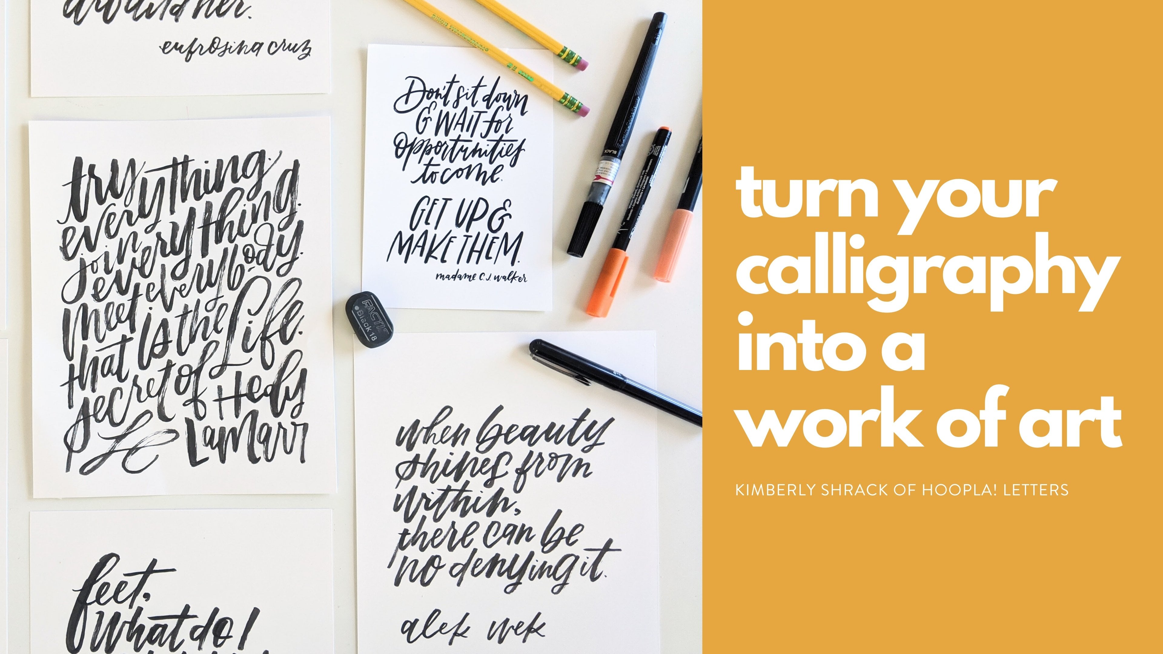
2. Intro & Materials: Hi, everyone, and welcome to class. I'm Kim Shrack, the calligrapher behind Hoopla Letters. Today, I'm going to show you how to create a simple calligraphy logo using Adobe Illustrator for iPad. Now when it comes to designing logos, we're not talking about creating an entire brand identity, that can take years and millions of dollars in budgets. What we're talking about today is creating a simple calligraphy logo for clients, such as microbusinesses like bloggers, or photographers, event planners, Etsy shop owners or makers of any kind. You see microbusinesses like that one a logo that is beautiful and unique, that's not pre-packaged or made of a font. But they want something that's just all their own, but they don't have $1 million budget to spend. That's where you, that calligrapher extraordinaire come in. Now, logos, unlike any other project you might make with your calligraphy, need to be 100 percent scalable. That means they need to be able to go from a teeny-tiny logo on a business card to a huge logo on a billboard without losing any resolution. Now, if you think of blowing up a photo you found on Internet and the larger you make it, it starts to get fuzzy, that's because those photos JPEGs are made up of pixels. While that might be fine on your teeny-tiny business card, it would get really irky and muddy when we blew it up. Instead of designing our logo out of pixels, we are going to use a vector which uses anchor points. Using the anchor points, we can blow a logo up and down without losing any clarity or resolution. Now, traditionally one of the best ways to create a vector is by using Adobe Illustrator. Now if you don't have any graphic design experience, like I didn't have any graphic design experience when I got started with Illustrator, it can be really, really intimidating. There's a lot of functionality and frankly, doing what we're doing, there's a lot of stuff you don't need, and so it can get really confusing, and on top of that, it feels unnatural. As a calligrapher we're used to scripting smoothly in beautiful lines, we're used to drawing, and so placing individual anchor points to create a vector, at least for me, it felt very, very unnatural, and that's why I was so excited when Adobe came out with Illustrator for iPad. This version of Illustrator allows you to create a vector of your calligraphy much easier, much faster and way, way more intuitively than using the desktop version. Today, that's what I'm going to show you how to do. Now you are going to need a few things before we get started. First, of course, you're going to need an understanding of calligraphy. Now I'm guessing if you're here, you already have that, which is awesome. But if you don't, I highly recommend you take my introduction to modern brush calligraphy course here on Skillshare. Go take it, watch it, come back, I'll be here waiting for you. Now assuming you have that basic calligraphy knowledge, you are going to need an iPad Pro. The reason you need a Pro is because you need to be able to use the Apple Pencil, so you're also going to need your trusty Apple Pencil. Of course, you're going to need the Adobe Illustrator for iPad app. Now, if you have Creative Cloud and you already have an Illustrator account on Creative Cloud, so you have Illustrator for the desktop, you already have access to this app. Just go to the App Store, download it, and then sign into Creative Cloud and you'll be able to use it. Now if you don't have Illustrator for the desktop, no worries. You can actually just use the app, which is great if you don't need all the functionality of Illustrator, but you still want to be able to vectorize your calligraphy when the occasion calls for it, as it does now. As I'm filming the app on its own is 999 a month, which is a really great deal. It's a lot more affordable than the desktop version. You're also going to need something to design the logo prior to vectorizing it. Today, I'm going to be using Procreate, which is an app on the iPad Pro, that allows you to draw and create all sorts of things. I use Procreate for most of my drawing in digital work. Now, I like to use Procreate for this kind of work, even the sketching phase, because it's makes it easier for me to send to the client to review. If you would rather do everything on paper and then digitize it to send to your client to review before you start the vectorizing process, that's totally fine. In that case, you're going to want a pen, paper, pencil, ink, whatever you need to actually create your calligraphy. It truly doesn't matter which way you want to create your designs, whether in Procreate, on paper, or in some other kind of app. But just pick one and stick with it. In the next video, I am going to talk to you about how to work with the client once you've gotten that logo job. See you soon.
3. Step 0: Design Prep & Client Workflow: Now before we put pen to paper, we need to do a little bit of planning. Now the emphasis for this class is on little when we aren't talking about developing a full brand identity here. Now if you want to learn about that, there are so many wonderful classes here on Skillshare that can teach you all about developing your brand identity. But what we're going to be doing is creating and the simple calligraphy logo for our clients that are maybe on a little bit more of a budget. Remember, these are our microbusinesses are bloggers, photographers. So they aren't looking for our purposes. We are going to be working with clients that are looking for a full branding identity. We're just working on this simple calligraphy logo. Now, with that in mind, I do want to share with you my process for working with a client. Once I we decided that we're going to work together on a simple, simple logo. This is kinda the process that I would follow. Now I'm very, very excited to share that throughout this class, I am going to be walking you through working with an actual client. So I am working with a blog called Gangnam and grit. And together we are going to be creating a logo for their blog. So you're going to get to see me through that process. I'm very excited to be able to show you that. So once I have worked the client, we've decided we're going to work together. What do we do next? What's the next step? So the next step is to have a call, a collaborative call. We're going to discuss the client's vision for their logo. Now, you might be thinking, can I just do an email now? Can I just do on your own? You need to really talk with them so that you can have a back and forth about this. Now before you have the call in order to make the most of it, because we're all busy, busy people, it is good idea to send them an e-mail with some things to think about before you jump on. So this is what I like to ask my clients. Number 1, I want to know not just what they want for the logo, but what they have envisioned for their personal brand or business. Again, we're not getting into the full scope of branding, but it does help to have that as a starting point. So I like to ask them to give me four to five words that describe what they want people to think and feel when they think of this person's brand. So if we're talking about the blog, you know, what does our blogger want people to think and feel when they think about her blog? Do, does it, do they want it to be inspiring as it should it be inspiring or funny or happy or thought-provoking. So I know those things might seem like what does it have to do with the calligraphy logo, but trust me, that really helps one, it helps get your client more specific about their vision because we all can think we know what we want, right? But then when we really start to dive in deep, maybe what we want is different than what we thought we wanted. It's very meta in deep, but that's a good place to start is asking about, okay, M4 call you to think about four to five words that describe how you want people to feel when they think of your brand. Now another thing that I like to ask them is to come up with a little bit of inspiration. So this is where you can hit Pinterest. Okay, so have him head over to Pinterest and make a board that can make it a private board that they share just with you of inspiration logo. So now this can include other logos. This can include photos that have like an aesthetic to them that they're going for. This can include color palettes. So really anything that they look at me think, ooh, I like that. I would like my logo to kind of embody that in some way. So this is why the call is important, right? Because they are going to go through it and discuss if you like, okay, this is what I like about this picture or this is what I like about this one. Now another thing that I ask them is I usually send them a link to my website as well as a link to my Instagram. Now chances are they've already been to both of those places. But the reason that I do this and I want them to take a look at things that I've already done. Remember we're working on a simple calligraphy logo. So if they see a logo that I've already done or not even a logo just like a piece of artwork and they're like, Oh, I really like this style, then that gives me a great place to start from. Okay, so this is a little recap when you send them that email before your first call, you want to them to include four to five words that describe what they want people to feel when they think of their business. You want them to send over a Pinterest board that you guys can look at together, how to make it a private board, pin, things that match the aesthetic they're going for. Color palettes, they like. Maybe logos that they think are interesting. And then finally, you want to send them over your work so that they can take a look at your different calligraphy styles and see if anything there speaks to them. Now once we had our client call, now we can move on to the next stage. So a comp is a concept sketch. So these are not overly detailed, right? These are just different concepts that we're sending over to the client so they can review and we have a clearer picture where we want to go next. So what I'm showing you now are the concept sketches that I sent over to the client for the, for the blog. So you can see that styles are, are similar, but the layouts are all pretty different. By making them all pretty different. This gives a client lots of different things to look at and lots of different options to go with. It can be, it can be very difficult to know what we want. We don't want until we see it. So giving them a few options will definitely help with that I like to do for comps, I find that that's a pretty good number. Now, once they have the constant hand, we give them a moment to look them over and then you can discuss. So the client might say, I love number one, go with number 1, love it. Pretty scripted up, Let's do it. Or they might say, I like the layout of number one, but I like the style of number four, and I like the ampersand and number three. Right? So that again, it seems like no, I have to do it again, but honestly, that gives you just more clarity. So what I usually do if they're in a lot of things that need to be combined. If I just do another rough sketch, again, nothing. This shouldn't be taking you hours. This stage should not be taking you in ours. That should be rough sketches. So I'll do a rough sketch of everything combined, send it over. And then if the clients like, yes, that's it. Great, Then we'll move on to the next stage. The next stage is actually scripting out the logo based on what the client said in the comp stage. So I decided to use Procreate to sketch out, to ink, ink out my logo. So I'm, what I'm showing you now is what I inked out in Procreate, I always like to script the word or phrase in black ink. So if you are doing this on paper, you definitely want to script it in black ink so that you have a great amount of contrasts that's going to help you when you, when you are vectorizing. So if you take a look at this, you see it's not perfect, like not even close, but that's okay because we aren't going to be sending this version to the client. We're going to take this into Illustrator for iPad and vectorize it. Then we are going to send that vectorized version to the client to review. Okay, So now you have everything. It's time to head over to Illustrator for iPads and get your iPads ready. You have a cup of coffee or something else. I'll see you in the next video.
4. Step 1: Set Up Your Workspace: In this video, I'm going to show you how to set up your workspace in Adobe Illustrator for iPad so that you can begin to vectorize your calligraphy logo. So when you log in, you're going to see your recent work here. It's probably not going to be a bunch of woodland critters driving vegetable cars, but I don't know. Maybe it is. And you'll see up here a little cloud logo showing me that, you know, everything has kicked to the Cloud. And then this little icon here is my Creative Cloud account, so they know that I'm logged in. Now the reason that this is so great, if you have Creative Cloud and illustrator for your desktop, this is going to connect everything. So as soon as I draw something in here, when I go to my desktop and I open up Illustrator, it will pop up, which is awesome. I don't even need to do it AirDrop or anything, it's just there. And now if you don't have illustrator for your desktop, no worries at all. You can actually just get a subscription for Illustrator for iPad without having the desktop app. Now the desktop, a program obviously has always more functionality. But if you are a calligrapher or lettering artist and you're only really using Illustrator on occasion and you're using it for things like I'm going to show you today, this might be a better option for you. Okay? So we have the option now to pick our art board. So I'm gonna do a custom size here. Let's see. Illustration was who we got. You know, I'm just gonna go ahead and customize it myself. So I want to landscape and this is a letter size, so that's fine. Cmyk, I'm actually going to do RGB because this logo is going to be four, a blog, so it's all going to live online. Rgb colors are going to show up a little bit better for us. Now I'm going to be doing most of the work today in black and white, all of it. And I do the coloring later, but it's just a good idea to start here. So I'm gonna go ahead and give it a name. King him. Oops. And go. Okay. Create file, right here we go. Here is our art board. Now in Illustrator for iPad. Sorry, the focus there, there we go. Here's my hands focus. In Illustrator for iPad, there are three ways to draw vectors. There is the pen tool, the pencil tool, and the blob brush tool. But now, in my experience, in my opinion, the best tool for creating a simple calligraphy vector is the pencil tool. So unlike the pen tool, which creates paths by placing individual anchor points, the pencil tool allows you to actually draw the path and it automatically adds the anchor points as you go. So this not only gives you greater control over your path, but it's also a much more organic and intuitive way to create your vector. Now if you are creating a simple logo and, uh, you know, you want to do it in a very efficient amount of time while still being a very clean vector. This is a great way to do it. So, yes, the pencil tool is available for standard Illustrator on the desktop. But to get the most out of it, you needed a drawing tablet to connect to the computer. And even then, sometimes you know, the paths created Rural little bit clunky. So having Illustrator for the iPad makes this whole process just like a dream. And like I said before, it also eliminates the need for you to get illustrator for the desktop if this is only what you're using it for, this, again, does not have as much functionality, but it does have the ability to use this pencil tool, okay, here is how we're going to do it. Here's how we're going to set up our iPad or excuse me, our art board and get it ready. So the first thing we wanna do is import the photo of our logo. So you're going to click over here the little photo icon. Now, I went ahead and did mine in procreate. But if you want to create yours on pen and paper and then take a photo of it. That's totally fine too. It doesn't matter as long as you have the photo of it. And you can see here, if you look at it, it's not perfect. There's a little gap here, There's some extra over here. It doesn't need to be perfect in this step because we are going to fix any imperfections as we create the vector. So don't worry about it. Getting it. Picture perfect, ready to go, because that's what we're gonna do next. Okay? So once you have your image in here, you're going to go down to this little toolbar. Now this little toolbar is going to be our best buddy. Throughout this, this is where we're going to be able to make a lot of changes and you get r, get done, what we need to get done. So I'm gonna go ahead and reduce the opacity. So you're going to click on this little icon with a checkerboard and just drag this little dot to the side. You get it where you want to know. I like mine pretty light. So we'll keep it right there. Okay. And then just click off the art board and that will bring you back to your toolbar. So now I'm going to click the little lock icon and I'm going to lock it so that I don't accidentally move this layer around. All right, now, before I forget, I'm going to create a new layer for my, for my artwork on top. So I'm just going to create that. Before a hint before I forget. Now if you do forget, it's really not a problem. Illustrator layers are very different from Photoshop or Procreate later layers. They can separate them out, but I like to just keep everything on their own separate layers just for my own sanity. Okay, so now we're going to get the pencil tool all ready to go. So I'm going to click the pencil tool over here. And now we're going to come down to this little panel right here. So this button, this little circle, that's the fill. And that's going to be the fill of our what we're creating here. So I like to have my fill empty. So you're gonna click that little crossed out section there to keep it empty. This little guy down here, this little bottom button, this is the stroke. I like to have my stroke black. I find that black is much easier to work in. It's, you get the most contrast, it's easier to see. Okay, so got the pencil or fill is empty, our stroke is black. We're doing good. So now the next thing we want to set is the smooth. So you click this little tilda here. This is the smoothing setting. Now unfortunately, this is not like the smoothing tool in the desktop version. And unfortunately, the iPad version does not have that smoothing tool. Adobe, if you're listening, we would love that for the Illustrator for iPad. So actually what this does is a little different. So instead of, instead of smoothing out paths after you've created them, which is like what the smooth tool does on the desktop version. This smoothing is more like the fidelity option on the desktop version. So this smooths out your path as you draw. So the lower, lower you pull that down, the lower your smoothing number, the more anchor points it's going to drop, the more reaction that is going to have to your pencil, the higher up you have it, the smoother your line is going to be, the less anchor points are going to be drops. I'm going to go ahead and we're gonna do a little demo here. I'm just gonna turn off this back layer. Okay? I'm on my top layer, I just want to show you, so that's a good idea to experiment here before you get started. So I'm going to bring the smooth tool all the way down. So you can see, so we've got a bunch anchor points there. You can see where I had a little hiccup there. It you know, it caught it. Right. So this is catching every little point. Now, if we take it all the way up and see it's a little different. It's smooth it out as I went. So it kinda made some guesses, right, about where I wanted these anchor points to go. Some other guesses were good. Guesses. Net see again. Okay, So we have a lot less anchor points. It's much smoother, but you also, you know, maybe can't get some of those really tight corners that you want. So I like to do I usually start, I usually do my smoothing around six. I find that that works for me because I want to have I wanna keep my logo pretty tight. I don't want it to be really bumpy on the side. I want to keep it pretty tight, but this is a little too tight. So I just try six, let me see how that works much better. That gives me, that gives me a look that I want. It's hitting on the anchor points I wanted to hit. And of course, we can fix those anchor points that don't work later. So experiment with it. Give it a try. See what, what works best for you.
5. Step 2: Draw: Now that you have your workspace all set up and you have the pen tool the way you want it, you can begin tracing. So I recommend so well actually, before I even say that, let me show you using two fingers on here, you can zoom in and out and you can turn the art board, which is a really nice feature to have so that you're not just turning your iPad all the time. So what I recommend you do is that you trace around each stroke. So trace around the letter exactly how you would write it. So don't start over here and go around. You want to trace exactly how you would write it. So asserting here all the way up and around. Now the reason for this is twofold. First, it looks more natural, right? Then if you're just kind of going all around it, sometimes if you go all around it, you get a weird bubble letter look like something is just off and you can't quite tell what it is. And sometimes that's the culprit. The other reason is that if we do this stroke by stroke instead of just all in one go, we're going to have an easier time refining and editing it later. So resist the urge to just trace all the way around and instead go in stroke by stroke. So I've got my pen tool selected over here. I have it set how I want it, and I'm going to go ahead and just start tracing. Okay. So you saw there was like a little skip there. We're not going to worry about that right now because when I get to the refine a section, I will show you how to fix and clean that up. So for now I'm just going to start on the middle circle. There. It's cut a couple of skips. So we'll just start that over. And you see at the end there, the ends it in quite me and it's snapped it together. So again, there's just some little issues right here which we will fix in the refined stage. Okay? Now what we wanna do is we want to fill this shape in. So to select an end, to do that, we have to use the shape builder tool and select both of these lines. So you're going to switch over to the Select tool, yellow arrow there. And then you'll notice this little circle in your screen. This is like the Shift key, so hold that down and then press the other line. So now you have both of them selected. Okay, So now we're gonna go over to this toolbar and we're going to select the shape builder tool. It's the little squares, overlapping squares here. Now one thing I love about using Illustrator for iPad is that the shape builder tool gives you a preview of what it's going to look like, which is awesome, because sometimes I can't remember what all of these do and I'll find myself just trying a bunch of different things before I was like, Oh right, right, right. So this is a nice to have this preview. So I'm going to select Minus Front. Okay, so now it's combined as one shape. So to make sure that it worked, I'm going to go over here where I've got my fill and my stroke. And I'm going to hit these two, this two arrow, double arrow symbol that's in-between them and that's going to swap them. And so now we can see that we've created our shape. Okay? Now I'm just going to keep going around the letters O. So you can see I started drawing there before I swapped the fill and stroke back to their normal. So that's why it kinda filled in there. So I'm just going to go do that. Some people like to work with the fill on. I prefer the stroke. So whatever works for you. Now if you have to stop like I just did, don't worry about it. You can just start back at that point. And it will allow you to continue. Again. This is just getting the anchor points and the paths down. We are going to refine them later. Hips. Okay, there we go. Okay, now that I have that traced, I'm going to hit the swap. So now I have my shape. And so now what I'm going to do mental, get the Select tool, hold down this button, click this other shapes so that they're selected. And then I'm going to group them, to group them using the toolbar down here, you're going to select that little square with the two squares in it. And that's grouping, that's made them grouped. So see now I can move them around, okay, Now if I want to ungroup them, all you do is hit Ungroup and ungroup them, but I want them grouped. Okay, so now I'm going to go through and finish tracing the rest of these letters. It's okay. Now we have everything laid down. So I'm going to take a look at this and we're going to make some changes. So at first glance it's, it's not bad, It's okay. But there's definitely some corrections that need to be made. That's okay. I had a writing professor once that said, God bless the one who makes the first draft. Because you're always going to need to fix that and that's okay. We're just getting everything down. So in the next video, I am going to show you how to refine the paths you drew with the pencil tool.
6. Step 3: Refine: Now that you have your logo all scripted using the pencil tool, we are going to go in and refine it by adjusting some of the anchor points using the direct select tool. So the direct select tool is right beneath the Select tool. It's a little arrow that's got the looks like it's pointing to an anchor point. That is what we're going to be using. So what you can do at this stage if you want, you can create a new layer and you can go through and you could circle all the areas that need to be that needs to be fixed. What I like to do typically is I go stroke by stroke, letter by letter, and then I look at the whole thing as a good look at it as a whole and make any final adjustments there. So I'm going to walk you through how to make these adjustments and some of the tools that you have at your disposal. So what is go ahead and start by looking at this curve here. I'm going to go ahead and put it. There we go. So you can see that when you've got the direct select tool highlighted, it shows you the anchor points in blue. So those blue dots are all anchor points. And then it shows you the Bezier handles. The Bezier handles, that's what you use to change the curve of your letter, right? Or of your, of your path rather. You'll notice that there are some of these anchor points are circles and some are, some are squares. Circle, circle, anchor points are curves and the squares are corners. So why looking at this wide, we have all these curves and we have a few corners right here. Well probably what happened is as I was scripting, maybe the pen pressure dip slightly and so it started a new path. Whenever it starts a new path, it starts on a corner. So we just have a couple there that, that we'll need to fix up. So the way that you fix up those points, if you want to change him from a curve or a corner or from a corner to occur is down here in this little toolbar. You will see, if you, if you take a look, you'll see the scissors that's for cutting a path. Then this little curve here, that's for turning an anchor point into a curve, the corner, a little triangle is for turning it into a triangle. This little dude here that's grayed out is the join. So let's say I had cut this Pat accidentally, like when I was drawing it, I accidentally deleted an anchor point or I did something that broke the path. This is, you would click this to join it together. And I'm this tour here with a little three little dots. That is the simplified path tool. So when you click that, it's going to simplify your past. So let's just go ahead and see what that does. No good, you click that. So wow, that did a lot. So that actually got rid of a lot of anchor points. So if we go back, let's see this. Right now we have 1, 2, 3, 4, 5. So it took us from a lot more than five down to five anchor points. So that's really helpful. That's a good tool. In fact, I find this simplifying path function is a little bit better than the one on in Illustrator. You don't have as much control as you do with the one on the desktop, but I find that it makes a better guess the first time around. And Illustrator, whenever I do it the first time around, I always get a few. A few, too many taken away. Now, the more you press this, the more it will simplify. Okay, so you saw I just simplified it there, so it again, so I took out another anchor point. And that's maybe a little bit more than, than we want. Actually, I think we can take it out. And I'll show you how we can how we can fix that up. So I've taken away some of those men actually fix some of my problems. So there was an issue over here and reducing those anchor points sort of helped. But I'm going to just get off of that. Sometimes it helps me. I don't like to see all the anchors when I'm looking at it. So kind of a little wonky spot here and a little bit of a wonky spot up there. Let's see what we can do about that. Oops. So we have, we have found the purpose of our wonky spots. That's because these anchor points that are remaining are actually corners. We want those to be curved. So I'll just click this one where I noticed the wonky spot. Click the curve here. So you can see it just made a slight change and it might not make a change at all. So that one you didn't really even notice. Here, this one I think will make a big change. There we go. And this guy here, okay? So now what I'm going to do is I looking at this and we know changing this to a curve sort of mass, this little angle up a little bit. I'm going to make some adjustments using these Bezier curves. So I'm going to click this anchor point and zoom in here. And I'm just going to hold that. Oops, Drag it out. So actually what I wanna do is right now, I don't want to mess over with this over here with this bar. So if I just automatically start doing this, it's going to, it's going to change the curve or the angles on both sides, the curve on both sides rather, if you want to just move one of those handlebars, what you do is you progress. The little circle here that it's called a touch shortcut. That's like the technical name for it. I've been calling it a little circle, but you get what I get what I mean. So if you hold down on it, then you can just move one of the curves. So I'm going to do that and that's going to help me get that. Now what that did is it changed this back to it change this back to a corner, but this is under it's going to be covered over here, so we're not going to see that little corner, so I'm okay with that. So now let's say now you want to go back to moving both of them at the same time. Okay? So if now because I've made that change, it will just automatically do just a one handle. So if you want to go back to doing both of them at the same time, you would press the touch shortcut and pull down. And so you get that bright white dot there and then they will move back together again. But of course we don't want to do that. But either you can, you can see that that is how it is duns. I'm going to zoom out. Take a look. It looks better up there. This is a little wonky. So let's see what we could do to picks that up. I think that's looking a little better. I think subtle the wall I'm seeing is because of this inner circle. So let's go ahead and deal with that buddy right now. So I'm going to take a look here. So I showed you the simplify, simplify path tool. But the other thing, whoops, other thing that we can do, you want a little bit more control over than that, is we can use this truly awesome function called Smart, Delete it. This is, this is new to the Illustrator for iPad and I love it so much. So what this does is this will delete an anchor point without actually deleting, without actually changing the shape of the path. So if you've ever worked with Illustrator, you know that if you delete an anchor point, it kind of messes with the shape of your path. So if you get rid of, if you click an anchor point and it is truly superficialis, it will delete it without changing your shape. Now, if it's not suburbs, if you actually do need it, it will change your shape, but of course, it's easy to redo. So this whole area right here, there's just a lot of points. We definitely don't need those. I'm going to click that one. Smart Delete is this little x here. And it's also worth noting that everything that's down here is also over here on the sidebar using this simplify, this simplify path tool. So you can see it over here and it tells you what they're all called to select if you get her home, her what something is, you're going to come over here and check it out. So okay, so I've got that anchor point. So I'm going to press the little x here. So that made some changes, but I think we're okay. I'm going to press this one and I'm going to delete that. So now you may be thinking, we don't look like we're okay, right? No. That's all right. We can fix it. I'm just going to use these curves. Okay, I think that's gonna get us closer. And I'm going to press down on, oops, grab this guy and move it over a little bit. There we go. I think that's really going to help. And then so we still have that walk on this side, we will fix that someone else take a look at here, the other anchor points that don't need to be here. I don't think this one needs to be here. Let's Smart Delete that. I don't think this one needs to be here. Now why is the number of anchor points matter? Well, the more anchor points you have, the larger your file's going to be. No, We always like to give clients and smallest possible right. See you in a one-to-many. We always want to give them the smallest file possible. But in addition to that, more anchor points usually means more mess later on. So if you can just reduce it, that's going to save you some headaches later on down the road. Okay, so now let's figure out what's happening here. I think Let's see if we can I don't know that we can delete this guy. Just something a little wonky. So if this ever happens where you're like something just ain't right and I'm not real sure what you'd do it sometimes it helps alleys, but I like to do is just start over and add a new anchor point. So what I'm gonna do is I'm going to click the pen tool here. I am going to add another anchor point, kinda like really pretty close right to that one. I'm going to click back on the old one. I'm gonna get rid of it. And then we're going to see if we can't. And fix some of this problem a little bit now that might be redundant. But for me, sometimes I just have to start over, right? Because if you adjust the curve so many times that you can kinda get lost in it. And it's nice to have that option to start over. You can also, as you can tell here, you can definitely get in the weeds. Can definitely get in the weeds of trying to figure out what the problem is. Because there is a problem here and I'm not. Let's just try getting rid of that. No. See, you're seeing in real time my frustration. There we go. That's what it was. Kim. So simple. Such as simple fix that handles were too long. Sometimes you just gotta experiment. Figure out what the heck's going on. Much better, much, much better. We just still a little short. Beliefs Sima. Okay, there we go. That's good. So you can see we made some tweaks there. Now I'm just going to head on over to the next stroke here. See what we convex. So now one thing I like, one of the reasons I told you to do strokes is because one of the things I'm noticing here is that this line that's supposed to be a hairline, the thickest changes up. So that's obviously a problem. We want that to be fixed. But now if I would have traced just around this and didn't have this path crossing over. When I would go into make these refinements, it would be a huge pain because I would have to redo the whole shape this way. It flows just so much nicer. So I'm seeing there's the issue here. The top here is not, I'm not crazy about it. So let's start with this first. So you can see it's grouped. So that's why when I click it, it shows me the whole thing. And that is the shape there. So now we've got just that selected. All right, take a look here. Let's try. Let's see, it looks like we, let's do a little bit, a little bit of deleting here. See what we can't get rid of. So take a look. Sometimes it helps to have that gone. Now you can kinda take a look at everything here. So I think I can get rid of guy there. Good That worked out I think, and get rid of that guy. He be that guy. If you're wondering, how do you know what you can get rid of? Honestly, it's because I've done it, but it's trial and error. It's something you will get better at, at. The more you do this. You'll just, you'll start to get pretty good at seeing where stuff might be a little superfluous to actually getting rid of that anchor point helped the overall shape. That's awesome. I love it when that happens. I love it when that happens. Well, that didn't go quite how I wanted the sky out. Okay, I think I can, whoops, leave that guy right there. So dude, this little dude. Well, I can go ahead and see the last anchor points you have to, the easier it is to make changes because you don't have a whole lot of stuff you could change. So I'm just going to woo x. It's going to pull that a little bit. So you see because it's all connected, instead of having to redo the whole out silhouette of that shape, I can just make these changes and it's so nice there that looks much better. And I bring this guy down a little. Here we go. Nice smooth curve of Lebanon, live in at 11. And now I'm gonna go up here. And this guy is a corner, so I could just go ahead and push this here. You can also use this little circle to turn it into a corner point and drag it, oops, sum. So if you hold, if you hold down, it will delete the anchor. So that's why you're seeing that happened to me so often because I press down and hold it and it deletes it. So you gotta, you gotta move quickly up there. Right? Now, acumen, get rid of over here. We can get rid of this guy. And then I'm actually going to pull this up well at all, I don't particularly care for a super rounded tops. I'm going to hold this down so that this Bezier handle doesn't move. So that I get kind of a rounded top but a little bit more square. That's gonna give us the look. I'm more of a calligraphy look, right? Rather than, oops. So I'm going to use this to just give it, get rid of that harsh edge. All right. Let's take a look at that as a whole CDO. How I feel about it might be a little thick here. Okay, nice, nice. So again, it's, this is still grouped. So one thing that you might be, might be tempted to do at this point, once you have the letter R, Look, you know, you want actually still bothering me down here. So one thing you might be tempted to do once you have the letter looking the way that you want is to create a shape, is to create a shape, merging those together. I would encourage you not to do that. Again, we want to keep this as easily editable as possible until we know we have the final version. There we go. I just see that that anchor point lower, much better. And if you combine the shape now let's say the client gets back and he or she is like, Well, I don't know about this or that or current. Want to change us. It'll be easier. You make your life a whole lot easier if you haven't already combined to that as a shape. So now you've seen me make some of those adjustments and see how you can use the Direct Select tool to really get in there and make some changes. I'm going to go through this whole thing and really refine our fast forward so you don't have to sit through it, but you can just sit back and watch and see how I make these changes. In the, in the, in the, in steady state. It stays. It stays, steady state. Stays in the if statements. In steamed, think it is in steady state stability. The next step, in thick skin. It in a, in a, in a stays steady state. The state. It may be the case if a team in a space in it and in different states, in the state of the state. In good faith. It. In India, I think they still exist. At this point, your logo should be looking pretty good. So I've gone in and I've refined it. You can see it was you're watching the video, you can see lots of little moving parts. So at this point, it is ready to show to the client. Now, like I said, I don't think it's a great idea to combine everything now like to merge everything as a separate path. But what you can do is group it so that you don't accidentally shift anything around. This also allows you to change the color if you want to check that out. So it depends on what you know, what your client wants and what they're expecting you to send over. Sometimes it's helpful for the first draft for them to see it in this state just in black and white.
7. Step 4: Finish & Export: Let's say you've sent this to the client and they love it. They are ready for the final logo. There's just a couple more things that you need to do. You want to, right right everything is grouped. It'll all move around together, but it's still in pieces. We don't want to send the final logo to your client like that. We want to actually combine everything into a single shape to make things super-duper easy for them. Now, I would recommend that you save a version that's like this just for you to have. In case down the road and he had little changes need to be made, you have a copy that's easy to work with. But once you are ready, you're done, it's final, no more changes need to be made, head over to the shape builder tool here. Go to combine all, first option. Now that has turned it into a shape, sorry, I've clicked it. Then the last thing you want to do is head down here to convert to pass. If you look at it, even when you click "Combine all", you can still see the separate paths. We want to convert this all to one solid path, and there we go. Now it's all just one solid path. No need to group anything. They can use this logo in a number of different ways because, again, it's vectorized, so we can do whatever we want with the sizes. Now, if you are using Illustrator on the desktop, you can open that up. This will already be on there if you are in Creative Cloud. If you want to just do everything from here, you're going to export it. I always recommend that you export the logo for your client in three different ways. An AI file or an SVG file so that they are able to have the original vector as a high res JPEG for print items, and as a PNG for web. Now, of course, they may want something different, but that's, I feel like a pretty standard thing to send. Then you're just going to go up here to publish and export. It gives you these options, a quick export as an AI, a quick export as PNG, or you can hit "Export as", and then it gives you all these different options. Like I said, I like to add a JPEG as well. It also gives you the option for an SVG, a photoshop file, for some reason they want to photoshop file, a PDF. I can't imagine why you need a PDF, but if you do, there you go. That will save that for you. Save it up in the Cloud and you can send it on to your client. Like I said, this is a great way to make a simple logo. If you've got something as simple calligraphy logo rather. If you've got something that's super-duper complicated, then you might want to, of course, take it into the desktop. But for simple logos, you can use it on your iPad and it really does go quickly after you've done it one time, you will be amazed at how you fly through it. I hope that you have learned a lot in this class. In the next video, I will be telling you about your project, but you can't guess what it is. See you there.
8. Class Project: That dear calligraphers, is how you vectorize your calligraphy to create a simple calligraphy logo in Adobe Illustrator for iPad. Now for our project, I want you to create your very own logo. Now, what I went through today was actual client work, but you don't have to have a client to do this. In fact, if you want to build up your portfolio of logos, this is a great way to start. Start building it up now, don't wait for a client. If you're thinking, if I don't wait for a client and I don't have a client, what do I script up? I have a fun idea for you. I want you to think one one of your favorite TV shows, or books, or movies, and think of a business that was in one of those things, and I want you to script up a logo for that business. For example, I really like Parks and Rec, so maybe I would script up a logo for Rent-A-Swag. That's Tom's business, or the Pawnee Goddesses. I would do something like that, or if you're a big Stephen King fan and you want to do the Overlook Hotel from the Shining. I want you to pick a business from a fictional story or movie or TV show, and I want you to script up a logo and I'd like you to do it the whole process. Start from the beginning and I want you to first share with me four to five words that are going to embody the feeling that you want your business to give people that you want when they see the logo. Then I want you to do for camps so like what you would send over to the client, script it up, in procreate or on paper, show us a photo of that. Then finally take it to Illustrator and vectorize it. I cannot wait to see what you come up with, be sure to share it here in the project section. Then if you're on Instagram, I would love it if you share it on Instagram, be sure to tag me @hooplaletters so that then I can share your beautiful work. Like I said, I can't wait to see what you come up with. I hope you learned a lot and happy scripting.
9. BONUS VIDEO: How to Price Your Logo: We have a bonus video. In this video, I'm going to talk to you a little bit about that very sticky subject that is pricing your work. Now that you know how to create these beautiful calligraphy logos, I would love for you to get some work out of it. Like I said, this can be a sticky subject. A lot of people are very coy about how much they charge not only with other calligraphers but with their clients as well. You have to fill out a form on the website to get a price quote, which is totally fine if you want to do it that way. Sometimes if you have really complicated projects and in some really simple ones and you want both, that can definitely be helpful to have them request a quote. However, I like to just do the simple ones, so I went ahead and put my packages on my website. I thought it might be helpful for you to take a look and see what I offer. I offer two packages. The first is the basic one. That is basically what we did in class today. Everything that I talked to you about, so this one, one charge 650 for it. It includes the introductory call with discussion of vision, the four comps, and collaborative review, the final scripted logo as well as the final deliverables as a vector, JPEG, and PNG. We discussed all of that in class today. The only extra I have here that we didn't discuss is a brand identity PDF and outlines, colors, and any fonts that might be used. Basically what this is, is just a PDF like it sounds, and then it has an image of the final logo, as well as images of all the colors used alongside their respective RGBX and CMYK codes. That way your client has it all in a document. They can just open or keep open on their desktop when they're designing their website or business cards that you don't want them to have to open the file every time to eyedropper it, to get the code, you just want to give it to them. Regards to the fonts being used every now and again, I'll have a client that wants the main word and script and then they went a little bit of sans serif font below. If I use that, I just write down the name of the font on this sheet as well. Again, this is just to make their lives easier when they are designing their other elements of their brand identities such as their website or business cards or things like that. Again, I charge 650 for that. I also offer a premium package which is the same items, except there's also a couple more things. There's also a final scripted sub marks, so like a sub logo, as well as up to five website and social media headers. For example, you can see this is a web header, so your client might want blog, contact, about, all of that in calligraphy and it will match their logo. That's something that I offer in the premium package and all of that is 800. Now there might be some calligraphers looking at this saying, oh my gosh, that's way too much money, and there's probably some calligraphers saying, oh my gosh, that's not enough money. I guess that it's a very subjective thing, so how did I come to these prices? Well, the first thing I always do when I am coming up with prices is I consult the Graphic Artists Guild guide to ethical pricing. That book and I will include a link to it here in the resources section. That book, you can also get an online version, has lists of and ranges of pricing for every kind of thing you might design. That's usually the first place that I go when I'm pricing something out, and then from there, I make decisions based on what I'm going to be offering, based on what the client's going to be getting, and honestly based on my skill as well. There's a really great story about Picasso in a restaurant and a woman recognized him, and she saw him doodling on a napkin. She asked if she could have the napkin. He said, "Sure you can have the napkin but it's $10,000." She said, "What? It's just a napkin. You were already doodling on it. It took you five seconds." He said, "Well, you're not paying for the five seconds, you're paying for the 40 years that it took me to be able to draw that in five seconds." I'm not in any way comparing myself to Picasso. What I am saying is, you don't want to undervalue all the time that you've taken to develop your craft. That is included in the pricing as well. Also considering that these folks are going to be using their logos for lots and lots of different things, it's not just for business card design, it's not just an item they're going to use once on their website. The logo is something that's going to represent their business and that they're going to be using for a long time in a lot of different ways, so you do want to price accordingly. But this is a good jumping-off point for you if you're really not sure where to start. I hope this gives you a little bit of insight into my pricing process, and I hope that you can now take the skills you've learned in class and use them to add logo design as part of your revenue stream.
 Kimberly Shrack, Modern Calligraphy & Illustration