Transcripts
1. Class Preview: Looking for a way to add color and dimension to your
brush calligraphy, look no further than watercolor. I'm can track the calligrapher
behind flaw letters. In this intermediate course, I'm going to teach
you how to create some seriously stunning
script using watercolors. In this class, you'll learn
what to look for in supplies, how to control your
brush using pressure, angle, grip,
movement, and water, how to script the
ten basic strokes and lower case alphabet, different watercolor
blending techniques, ways to use your new found
watercolor calligraphy skills, and so much more. Because this is an
intermediate class, I highly recommend
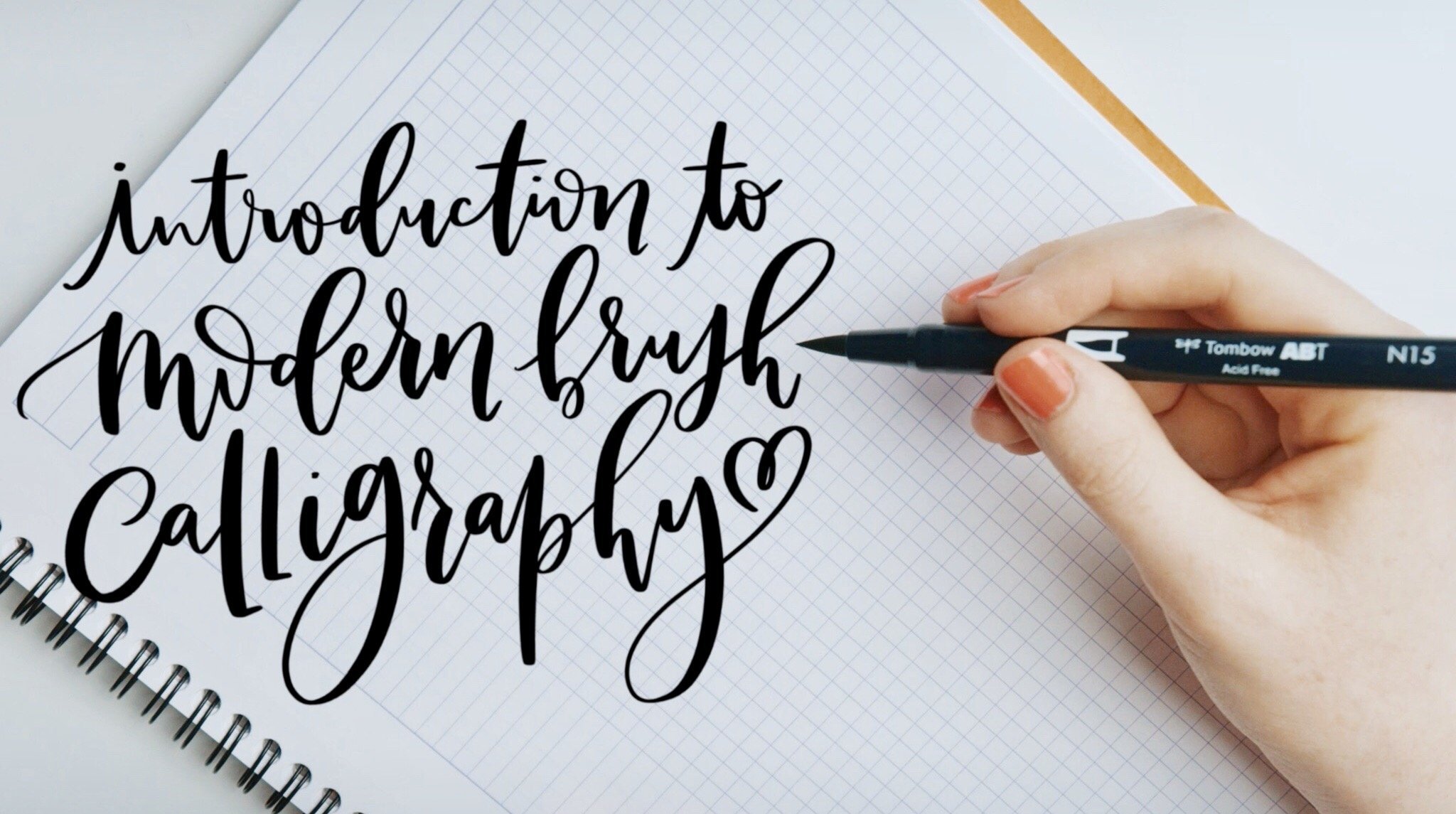
you first take my introduction to modern
brush calligraphy course. If you're ready to give your brush calligraphy a
very colorful makeover, grab your brushes, your
favorite watercolor set, and I'll meet you in class.
2. Intro & Supplies: Before we get started, you're going to want to gather
up all of your supplies. First, you'll need
watercolor paper. I am using canson
watercolor paper. I love this for practice because it's relatively
inexpensive. It's also pretty good
for calligraphy because it's relatively smooth
for a watercolor paper. Watercolor paper is always going to have some tooth to it, but this is pretty
smooth and we don't want super textured paper when we're doing watercolor
calligraphy. This is the son Excel. Seven by ten is just
a cold pressed paper, you could get this at Michael's or most
art supply stores. But again, what you want
to look for is that it's watercolor
paper and that it doesn't have a heavy
textured tooth. You're also going to
want some round brushes. Now, some watercolor
calligraphers use liner brushes. That's totally fine. But for this class, I'm going to use round brushes just
because that's what I prefer. I have a bunch of
different sizes here. But honestly, the ones I
use the most often are the number one and
the number is zero. Let me find the zero here. Yeah, the one and the zero or sometimes the two
are mostly what I use, but I have a few bigger ones and a few smaller ones here as well. Now, another option for a
brush and this is totally optional is the
quash water brush. Something like this, again, it's a round brush and that
it comes to a point there, so it acts like a round brush
rather than a liner brush, and you can see
the bottom screws off and you can fill
this with water. I can also fill it with pigment as well, if that's
what you want to do. Again, this is totally optional. I don't typically use these, but there are a
couple techniques that this can be really fun in. Beyond the paper
and the brushes. Of course, you're going
to need watercolor. I have a couple different types of watercolor I'll be
using for this class. First, this is a
traditional pan set, and this is actually a guash. Guash is a very
opaque watercolor works really well for
watercolor calligraphy. I'm also going to be using some tube calligraphy,
tube water colors. These tube watercolors, you can see just like they sound
like they come in a tube, you're going to add
some water to them. This is Faber Castle, but there's lots of
different brands out there. If you're using the tubes, you'll also want a palette. You can use the palette to
for any of the water colors, but it's especially important when you're using the
tube watercolors. My other favorite
watercolor to use watercolor calligraphy is this concentrated
liquid watercolor. My favorite brand is
doctor P H Martins, but there's two different kinds. I want to explain
to you what the difference between the two is. The one that's just called radiant concentrated watercolor, It's not as light fast. That's not great for a
finished work of art. This works really
well for envelopes or cards or things that don't necessarily need to
stand the test of time. If you're doing a
finished art piece, especially one that'll be
hanging in a room near a window where it will
receive a lot of light, you want to use the doctor
PH Martin's hydrous version. The hydrous version is
much more light fast, so it won't fade
in the sunshine. You'll also want some
water. I put mine in a mug. You can see this one is
well worn, but be warned. Make sure you don't
put it next to a coffee mug or a tea mug. I have definitely put my brush in a cup of coffee before.
Just be careful there. I also like to use a spritzer. This is actually a plant spritz, but I don't really have
much of a green thumb, so I use it for water color. This is really great when
you're using the pans. You can see these are
really dried out. I give it a little bit of spritz and that helps
loosen it up a bit. Okay. You'll also
want to have on hand just a little towel
or a paper towel or a rag to wash your
brushes off with. As always in
calligraphy classes, a pencil and eraser and ruler are also great
to have on hand, especially if you want to
sketch out some guidelines. But again, not necessary. Now, one last thing you're going to need for this
class that I can't exactly hold in my hand
and show you is you really need to have taken my introduction to modern
brush calligraphy course. I highly recommend you take that before you
take this class. The truth is watercolor
calligraphy is very similar. To the brush pen Cligraphy but it is a much more
intermediate technique. These brushes are a
little trickier to use. If you have the foundation of brush Cligraphy
with the markers, it's going to help
you tremendously. Now, we will go over some calligraphy
basics in this class, but not in as great of detail as we do in the
introductory class. If you haven't taken
that class yet or you don't have any background
knowledge of brush Cliigraphy, I highly recommend
you take that. If, however, you've
taken that class or you have a background
and brush calligraphy, then go ahead and
gather your supplies, and I'll meet you
in the next video.
3. Applying Pressure: Before we begin actually
scripting with our brushes, I first want to share
how you can best control your brush and get it to do exactly what
you want it to do. If you've taken my brush
pen class, which, again, I hope you have, then lots of this is going
to seem familiar. The truth is the rules for brush pen and
watercolor calligraphy are pretty much the same. But it's just a little bit
different in practice, since a watercolor
brush is so much more flexible and fluid
than a brush pen. Let's chat first about pressure. Just like in standard
calligraphy, the hallmark of
watercolor calligraphy is the presence of
thin and thick lines. The way that we
achieve this variation in line thickness is by adjusting the amount of pressure that we apply
while we're scripting. Anytime we're moving the
brush up and away from us or anytime we're moving
the brush horizontally, we are going to be applying a very light amount of pressure. When we apply a light
amount of pressure, we have a thinner line. Conversely, anytime
we're bringing the brush down and toward us, we're going to
apply some pressure and get a thicker line. Now notice I have said,
apply some pressure. Not as much pressure as we can, and I'll talk about
that a bit in a minute. Now, the reason for these
changes, it's not magic. It's not that somehow magically pressing lighter
results in a thinner line. The reason that pressure changes the thickness is because it changes how much of the brush is touching
the paper at one time. I'm using a liquid
concentrated water color here. Now, if I use a very
light amount of pressure, then the only thing that's
touching the paper, the only part of
the brush touching the paper is the very
tip of the brush. Since only the tip of
the brush is touching, we get a thinner
line, see? No magic. Now conversely, if we
apply a little bit of pressure that brush bends
and when that brush bends, more of it is touching the paper because more of
it is touching the paper, we get that thicker line. Now, you notice that I said, we're not going to push
as hard as we can. In the brush pen
classes, I always say, push as hard as you can to
get that really thick line. Well, because this brush
is so much more flexible, if I push as hard as I can, I'm going to get
something like this. We don't want that.
We don't want that. You need a much lighter touch. Again, this is one of those
things that's easy in theory. Less pressure, fin line, more pressure thick line. But it's a little bit
trickier in practice, especially if you're
used to a brush pen because this brush
is more flexible. You're going to want to use a much lighter touch than you would use for your brush pen. What that means is any flinching can adjust your pressure and give
you a thicker line. It does require a little bit of a light touch and I'm
going to be honest, a lot more patients. You need a lighter touch to
get the thin line and you don't need as heavy pressure
to get that thick line. Go ahead and give this a
try. See how it feels. Do a few thin upstrokes, making sure you're using the lightest amount
of pressure possible. Only the tip of that
brush is touching, and then do some
thicker downstrokes applying just a little
bit of pressure. You can adjust that pressure, try different thicknesses,
see how it feels. This is a time for
experimenting. Go ahead and experiment, play
around with the pressure, and I'll see you
in the next video.
4. Angle & Grip: Like I said in the last video, whether you get a thin line
or a thick line isn't magic. It's all about how much of the brush is touching
the paper at one time. You get those
changes by pressure. Yes, but angle and grip
are also important. Now by angle, I don't mean
the angle of your letters, I mean the angle at which
your brush hits the paper. For best practice is you want your brush to hit the paper
at about a 45 degree angle. That's not straight up and
down or totally horizontal, instead that is
right in the middle. How do you know if
you're at 45 degrees. Do you need to bust
out the protractor? I'm happy to report. No, you do not because I don't even think I would know
where to get a protractor. No, you don't need a protractor. Instead, it's all about
where you grip your brush. To get that 45 degree angle, you're actually going
to grip your brush about an inch and a half to 2 " from where the
bristles meet the brush. You're going to hold
it back a little bit further than you would hold back a regular pen or
anything like that. By holding it back
at this angle, it allows you to be able to make both the thin lines and the thick lines without adjusting the position
of your brush. With my grip back an
inch and a half to 2 ", I can get those
thin lines and with just a little bit of
pressure adjustment, get those thick lines. Well, now, there's
a caveat here. In brush pen, when we're
talking about a brush pen, that 45 degree angle is extremely important because
the brush pen is not as flexible and so we need to
push as hard as we can in order to get that thicker line to have enough line variation. But because these
are so flexible, we don't actually
need to push that hard to get the change in
line thickness if you recall. You can definitely hold it back at a half to 2 " to get
that 45 degree angle, or you can fudge those
numbers a bit and scoot your grip up so that I've seen
it as high as 20 degrees. I have seen some very scaled
watercolor calligraphers hold their brush much
closer to the bottom. That's because we don't
need to push as hard as we can to get that thicker
line. Let's give it a shot. I'm going to hold my
grip a little bit lower actually a lot lower, my brush touches the paper at about 20 degrees instead of 45. I'm going to do my
thin upstrokes. Now you'll notice
as you do this, you might feel like, Hey, I have a lot more I have a lot more control
over this brush, making those thin lines
a whole lot easier. Then when you apply pressure
to get the thick line, because we don't need to apply as much as we possibly can. Those are still
beautiful thick lines, even though our angle
is pretty high up. This is going to come down
to personal preference. For me, I much prefer
to hold my brush back at 1.5 to 2 " back to
get the 45 degree angle. That is just more comfortable
for me, but maybe for you. It's more comfortable to
hold it lower. Try both. There I just tried 45 degrees,
and I'm going to lower it, and I'm going to try 20 degrees. Okay. Both work. It's really just comes down
to a personal preference. You'll notice I get a little
bit finer point here. If I'm doing really
detailed work, that is a time when I do
lower my grip a little bit to make my angle
just a bit higher. Experiment with this. See
what works best for you. Try it at 45 degrees first and then slowly
lower your grip bit by bit by bit until you
get as high as 20 degrees. That would be gripping it pretty close to where the
brushes meet the barrel. Experiment, give it a shot, see what works best for you and I'll see you
in the next video.
5. Brush Movement: So now we understand pressure, angle and grip when it
comes to our brush. Now let's talk about movement. So when we move our brush, we are going to use our wrist and our
fingers a little bit, but we don't want to
totally rely on them. That's because if we do, we have a really small
range of motion. I'm just using my
wrist and my fingers, my range of motion
is very small. Instead, I want to use my shoulder and my elbow to make these big movements.
How do we do that? Well, first, you want to think
of your hand, your wrist, your forearm is one solid unit that your elbow and shoulders
are going to guide around. Now, to be able to
glide across the page, your hand can't be super
duper firmly planted. It needs to be able to glide, like an air hockey puck. With your hand on the paper,
you don't want to float it. It does need to be on the paper. We start from one side. Use your shoulder
and elbow to guide that forearm hand and wrist
all the way across the page. Now, it might feel
a little funny. We aren't used to
handwriting like this. If you're like me and you're not used to scripting on a notebook
and your hand falls off, you might be a little shaky
at the end there, that's all. Keep that hand
planted on the paper, but allow it to glide. You don't want it so firmly planted that you can't move it. Use that shoulder and elbow to really push across the page. Again, you will use your wrist, you will use your fingers, but those big movements
really need to come from your shoulder and
elbow. Keep practicing this. Like I said, this is
one of those things that feels a little
funny at first. Give it a shot. Once you feel comfortable
with that movement, I'll see you in the next
video to talk about water.
6. Water Control: Hand in hand with movement
is water control. By water control, I mean the amount of water that
you have in your paint, the amount of water that
you have on your brush. The amount of water that
you're using is really going to affect the
flow of the paint. It's going to affect how
long you can script for. It's going to affect texture. Water is super important. To demonstrate that, I'm
actually going to move over to my pan guash. Remember, guash is the
type of water color, but it's much more opaque. That makes it really
great for calligraphy. So now, because the
pan water colors start out dry or the pan wash in my case start out dry,
you want to moisten it. I have used my spritzer here, and I have sprayed
down my color. Then I'm going to add drop
fools of water into it. It's always best to
start with less water because it's easier to add more than it is to
take some away. I've added some water here and now I'm going
to see how it flows. You can see here, purposefully added not quite enough water. You can see how it's
pretty textured here. Now that's not too bad. But that's not what I want. I want it to flow really
nicely off my brush. I need to add a bit more
water to help it flow to reduce the amount
of texture textured there. There we go. That's what I wanted. It
might be a little tricky to tell might be a little
tricky to tell on the video, but these are much more texture. The first one more so,
this one a little less, and this one flows
nice and smooth. We have nice crisp edges
here, no feathering. We have a really beautiful flow. You can see how I just had to experiment a little bit to get
the right amount of water. Okay. Now, can you
add too much water? Yes, you absolutely can
add too much water. If you add too much water, your lines won't be maybe
as fine as you want them to be because if you're
using watercolor paper, you really shouldn't
have an issue with bleeding, but
it can happen. You'll know you have
too much water. Again, if your lines
aren't quite as fine as you are running them
to be even though you're applying a
very light amount of pressure or you have standing
puddles on the page. Now, because we are
moving horizontally here, we're not applying
very much pressure. We're not expelling that
much water or pigment. I'm going to show you an example of what it would look like if we were scripting with
downstrokes as well. We'll just do some
V shapes here. I want you to pay attention
to the saturation, the tone of our color as we go. You can see as we move
across the page here. It's becoming less
and less saturated, but we still have enough water, so it's still it's
still flowing. Now this is one of the beautiful things
about water color, is that we get this
lovely variation in tone. Now the more water that you add, the more diluted that pigment is going to be. Just
keep that in mind. That's one of the reasons I love Guash because Guash is opaque. Even if you add plenty of water, it is still very opaque
and easy to read and see, which is important when
you're doing calligraphy. Experiment with this as well. See how adding
different amounts of water affects the flow of this, affects how long
your pigment lasts. How quickly it fades, how quickly you get
that color change. Now, in this case, I didn't have quite enough
water to keep going. You can see I run out
of water a little bit. Now it's so flowing, but I
have these textured edges. The water again, is very
important for the flow, but also important in how
pigmented you have there. Let me actually just add a ton of water so you can
see what it would look like. If we were very diluted
from the beginning. So there you can see an
example that's probably too diluted because it fades
extremely quickly. That's maybe a little
bit too much water. I'm just going to shift
that water around a bit. There we go. Much better. Water is one of those things that you just really
need to get a feel for, you need to play around with. You'll know you
have enough water when your paint is
flowing out smoothly. You don't have any
textured edges. You'll know you have
too much water if the pigment is super diluted in the beginning
and doesn't last very long. That's an indication
you probably have a little too much water.
Experiment with that. All of those things
together, our pressure, our angle, our grip, our movement, and
our water control. That's what's going
to help you control this brush and get it
to do what you want. Now that we know how
to control this brush, we're going to move on to
the ten basic strokes.
7. 10 Basic Strokes: Now that we know how to control
our brush with pressure, angle, grip,
movement, and water. Now I'm going to show you the ten basic
calligraphy strokes. Again, this will
be familiar from my introduction to modern
brush calligraphy course, but I do think it's important
to practice this now with our newfound skills
with this brush because just like the other
things feel different, this feels different with the brush and water
color as well. I've switched back to the
concentrated watercolor. Concentrated liquid water color, simply because that requires
less fiddling with water. You can just watch me do the
script instead of watching me fiddle with getting
the consistency. Let's start first
with a thin upstroke. We are going to do the
very lightest touch possible and push up
in a thin hair line. Again, make sure
just the very tip of the brush is
touching the paper, very light touch and push
up Now, this is tricky. Because it requires
such a light touch, you might find yourself
with some shaky lines. That's all. This all
comes down to practice. You can see how slowly
I'm moving there. Remember two, you can also lower your grip and see
how that helps you. Perhaps this is more
comfortable for you. Now, for me, like I said, I'm much more comfortable
with my grip back here, as you can see from that
one is a little bit wonky. But give it a try, see if maybe lowering that
grip a little helps you out. Our next basic stroke
is the thick do stroke. We're going to apply some
pressure, not a lot, not as much as we can,
just some and pull down. Now when we get to the baseline, we're going to pause
and lift our brush up. We pause so we get that
nice square bottom. Again, add some pressure, pull down. Square at the bottom. Now, it's really
important to keep your pressure consistent
as you are pulling down. If you adjust your pressure, you could end up with
something like this. Probably not that dramatic. But the point is because
this brush is so flexible, any flinch will
adjust your pressure. Keep the pressure
consistent and pull down. Okay. Next, we have
our horseshoe. For the horseshoe, you're going to start
with a thin hair line up and then gradually add pressure and
square at the bottom. That gradual add of pressure
is really important, so we get around
the top outside, but also on the inside. If we move too quickly, we risk having a little
stair step on the inside. The brush can do what
I call snapping back where if you adjust
it too quickly, it wants to go back to
this original shape. When you're applying
pressure, it's splayed, and if it snaps
back too quickly, you can end up with
this little stair step. That's more of a problem
when you're going from heavy pressure
to light pressure, but it can still happen here. Again, the light pressure up
gradually add and pull down. The next basic stroke
is the U shape. This is one where that
snapback can happen. You're going to start
with some pressure, when you get to the base sine gradually release that
pressure and push up. Again, the gradual
race is important, so you get that nice
rounded bottom. I was a little thick there. Got a little excited.
That's all right. Again, really slow release of pressure so you don't get a stairstep on the
inside of your letter. Okay. Probably
aging myself here, but I say snapback. The song I keep hearing in my head is snapbacks
and tattoos, which it's a great song, but now it's stuck in my head. Now it's stuck in your head.
I'm so sorry for that. Our next basic stroke
is the V shape. For the V shape, you're going to start with a thin hair line up. Gradually add pressure. Gradually release
it and sweep up. Then hair line up. Gradually add pressure, gradually release
it and sweep up. One more time, Tin hair line up. Gradually add pressure,
gradually release, and sweep up. Our next basic stroke is the S shape. Now, I'm
not going to lie. This one has a little
bit trickier with the bristles because you
are push to the left. Whatever you are pushing
horizontally to the left, you run the risk of those
bristles splaying out. You want to make sure your
touch here is very light. With a very light touch, you are going to move to
the and then gradually add pressure and then gradually
release it and move left. Now, this bottom move to the left is a little
easier because again, our bristles are already splayed out and we're just letting
them go back together. They want to go back together,
so that's a little easier. This is a little trickier
at the beginning. Again, the trick
there is just to have an incredibly light touch. And then start adding
pressure and pull down. You might have noticed there,
it did snap a little bit. It was using a very light
amount of pressure, but apparently not
quite light enough. There we go. This is one of those
strokes that I find to be a little trickier with the brush than it is with the brush pen. Our next basic
stroke is the shape. For the shape, we're going to start on the on the right side, with a thin hair line up. Gradually add pressure,
gradually release it, sweep up meet the hair line, but then keep moving. Why do I keep moving? Well, I keep moving
to blend those edges. With the concentrated
water color, it's not as big of an issue. Well, let me go ahead
and add a little bit of water to this so you can see. What can happen is you can lose some of the pigment
there and so as it fades, then you have a hard
more pigmented edge meeting the faded edge, and it's not blended
really well. So By continuing to sweep up, we can blend those
edges together. There was an example
where it was going to be a very sharp edge, but I kept moving and so I
blended those edges together. Tin hair line,
gradually add pressure, gradually release it, sweep, blend those edges together. Okay. Up next, we
have the upward loop. For the upward loop, you're going to do a
thin hair line up, gradually add pressure,
gradually release. Thin hair line.
Gradually add pressure. Gradually release. Do
got one more time. Tin hair line. Gradually
gradually release. Next, we have our downward loop. For the downward loop, we're going to start with heavy pressure and then
gradually release the pressure, let that brush go back to
a point and then sweep up. You can see I had a little
bit of a textured edge here. My pressure was a
little bit off. Tilt my paper just
a little bit more. Again, we're going to start
with a thick down stroke. Gradually release that pressure, let that brush get
back to the fine point and then twist up or
sweep up brother. By letting that brush
go back together. Getting back to that fine point, we get that nice rounded bottom. Again, if you do it too quickly, I tried to get a
stair step there. I didn't quite, but you can get a stair step in there if
you do it too quickly. Okay. Our last basic stroke is the dot and whisker
or the loop and whisker. For this stroke, you're just
going to apply pressure and then release it as you
sweep out to the right. Apply pressure, pull down and release it as you
sweep to the right. You can try a loop and whisker. For the loop and whisker, you're going to do a
thin hair line up. Gradually add pressure
as you pull down into that loop and then
release it as you sweep out. Tin hair line up, gradually add pressure as you make a loop and
then sweep it out. And there you have it. Those
are the ten basic strokes. Let's do them all together now. We have our thin hair line up using the lightest
touch possible. Mine was a little shaky there. That's okay. Let's do it again. Tin hair line better. Now we'll do a
thick down stroke. Remember, just a
bit of pressure, not as much as you can do, just a bit square at the bottom. Horseshoe thin hair line up. Gradually add pressure,
square the bottom. U shape thick downstroke, gradually release that
pressure and push up. V shape, pin hair line up. Gradually, add pressure,
gradually release, sweep up. My gradual added pressure
was a little off there, so fudge it a little bit. That's okay. Nobody will know. Great thing about water color. It's wet and it blends. Then we have our shape, very light touch for that
thin line moving left, gradually add pressure,
gradually release it. Shape, thin hair line up,
gradually add pressure, gradually release, sweep up
when you meet the hair line, keep going through
to blend the edges. Upward loop, thin hair line up. Gradually, add pressure,
gradually release. Downward loop, we'll start
with heavy pressure. Let that brush go back together as you lean off the
pressure and sweep up. Then finally, a dot and whisker, apply pressure, sweep to the
right while you release it, or loop and whisker,
Tin hair line up, gradually add pressure and then release it as you sweep
out to the right. Those are your ten
basic strokes. Now remember, these are the building blocks of
the lower case alphabet. By understanding
these, it's going to help you create your
lower case alphabet. Now, because this is
an intermediate class, we are not going to do
a stroke by stroke, breakdown of the
lower case alphabet, but you can see a review of the alphabet
in the next video.
8. Lowercase Alphabet Review: Like I said in the beginning, this is an intermediate
skills level class. Because of that, we're not
going to be doing a stroke by stroke breakdown of
the lowercase alphabet. If you would like a stroke by stroke breakdown of each letter, you can go back to
the introduction to modern brush
Caligraphy course. That being said, a little
recap is never a bad thing. I am going to script the lowercase alphabet
now in watercolor. If there's any letter that
you're struggling with, you're not quite
sure how to get it, you could always come
back to this and find the letter and give it a watch to see
exactly how I do it. Because you probably
don't want to hear me yammering on this whole time. I'm going to play
a little music. I am going to keep
the speed the same, I'm going to keep it natural. I'm not going to speed
it up just so you can see exactly how it's done. Without any further ado, here is the lower case alphabet and watercolor calligraphy.
9. Blending Watercolors: Now we are going to talk about
blending our water color. I've gone ahead and I'm using a tube water color for this. I've added a little bit
of paint and then I've added water in to thin it out. I've just played around with the consistency until I've
got it the way I want it. Now, in order for the
watercolor to blend, it needs to be pretty watery
and that looks good there. To blend the watercolor, when you're using the same
color, it's pretty simple. The key is though that it
needs to be very watery, because without that water, we're not going to
get the blending. Let's just give this a try. I'm just going to
do these V shapes. On my way up here, it's still plenty of water. I'm going to quickly
pick up some more. The quickness is because
we do want it to flow and you have to act while
everything is still wet. If you wait too
long and it's dry, it won't blend very well. Okay. So you can see, I just
pick up some more paint. I like to start kind of in the middle of the
upstroke there. Just sort of drag the paint up. Okay. And then keep going. Now, if it's not blending. This line here, you can see it's blending just a little bit slowly,
same over here. When I first put it
down, I was like, I don't know if
that's going to work, but you have to
trust the process. If as long as it's still wet, that water color will blend. Now you can help it
along a little bit. I see here at the edge is
just a little bit sharp. I'm just going to add a little
water there, not too much, just to even it out, more water will help blend. You just have to be careful
not to add too much. Now let's script
out a word here. Okay. Since our color we're using is called Mav. Let's
just write that out. You can see how I blend
as I'm scripting. Like I said, I always like to do the upstroke and put
the blending in there, the new start up in there
just to help blend. I like to have it blend in there versus in the actual letter. But that's also just a
personal preference. You can see I added it in there, right now, the line
is pretty sharp. But it was still wet, so it shod, start to blend in there. But to help it along, I'm going
to get my brush a little. Just a, not too much. Drag it along, same over here. Any edges that you see You can use a little bit
of water to soften them. But you don't need
to go too crazy. We're not expecting
totally perfect here. But it can help
smooth things out. Yes, you can tell I've
definitely reloaded my brush. That's not a problem. We know we're going to be doing
that with water color. But we don't really
have any hard edges. We have it blended very nicely. That's how you blend
with one color.
10. Blending Technique: Two Colors: Now that we have
blended one color, let's try blending two. I have added another color here. It's the fabricsto ultra marine. It's very important when
you're blending colors, two different colors
to make sure they are close to one another
on the color wheel, purple and blue, very close. They will blend really well. If you choose colors
that are too far apart, say red and green, they will not blend well. You will end up with
a muddy muddy mess. You want to make sure
they are close together. You also want to make sure
you have plenty of water. To help them blend. I'm going to really load my brush up here. Just like before, I'm going to make sure
everything is really wet. I'm going to grab that blue. I'm going to start just a
little bit before where it ends so that they
can begin to blend. You see they already
started blending to drag that pigment up my purple. Okay. And blue. You see, because it's so wet, they start blending
together immediately. Because I'm not washing
my brush off in between, I am getting some of
the purple in the blue, a little bit of the
blue in the purple. That's okay for me. I like that look, but if you
want it really delineated, you can always wash
it off in between. Now those actually look like they're blending really well. But if I wanted to soften
some of the edges, I could get a little bit of
water on my brush and just drag the pigment into one another just to
soften the edges. But again, I think
those look pretty good. Hi, so now, let's do a word. It reminds me very ocean,
the purple and the blue. Let's just do the word ocean. Grab Purple blue. Start just a little bit before. You can see it's very watery. Go that purple start just a little bit
before where I ended. You can see it immediately
begins to blend so nicely. There you go. I could go in there and drag some
of those colors, little bit of a sharper
edge right here. I'm just going to blend
it just a little bit, but the rest look good. I like the way they've blended. You can have a lot
of fun blending the colors and you don't have
to stop at blending too. You could blend more than that. In fact, you could create
an entire rainbow, which is what we'll
do in the next video.
11. Blending Technique: Rainbow: Another fun blending technique
I'd like to show you is creating a rainbow blended
rainbow with your water color. For this, I'm going to
be using my pan guash. It might not be able to
tell from the video, but everything is pretty wet. I spray it with my
little spritzer. I'll give it another sprit. One thing that's
really important about this is that everything is really wet beforehand because you're going to
need to move quickly. I also have a clean
glass of water hair, as well as grab it as
well as a little towel. That's going to be important
to clean between colors. Let's get started.
We'll start with red. Because we're going
to be blending, we want to make sure
this is pretty wet. Okay. Okay. I'm ending it and it's nice and wet. Now I'm going to rinse off there and I'm going to move
right over into the orange. Remember to get it blended, I'm going to start just
a little bit before. I'm going to drag
that pigment up. A bit more on here. Remember, we want it to be
wet so it'll blend well. Okay. Now we move into the trickiest color. That's yellow because
yellow is so light. This one gives me a little
bit of headache sometime, but you'll see what
I mean in a mite. Again, we're going to
get that nice and wet. We're going to start over here. A bit more water on there we go. Then I'm going to that color up. We get some of that
orange in there. Yes. Making sure that's really wet. Before this dries, as I said, you have to act quickly. I'm going to rinse
my brush off there, so I don't get too much
yellow in here and I'm going to drag some of that
orange up and into there. Add a bit more
yellow. Like I said, this yellow is a little finicky. You might need to play
around with it. There we go. That's nice. Go ahead and do
it while it's still yellow. Now we're going to
add that green. I'm going to start
in the middle here. I need a little bit more
water on that green. There we go. You can see
it's starting to blend. I'm going to drag it down. Before I move on with that. I'm going to blend this
out a little more. I'm going to start with
the yellow and push it up and over. A little bit more
green there just to make it a bit more opaque, a bit more saturated. Be onto this really pretty blue. Again, we're going to start in the middle of this upstroke. You can see it started
to blend really nicely. I'm just going to
drag that color in. That one blended really well, so we don't need to
do too much there. I'm going to add a little bit more water on that
curve of the B. Okay. Now we're going
to grab our indigo. Starting in the middle
of that upstroke, a bit more water there. Okay. I'll blend it just a
little bit better. So that blue took over. Normally, I will blend it up
and into the next letter, but just because I want to get a little bit more of
that blue in there. Okay now we'll do purple. Starting out in the
middle of that. And Whisker. There you go. Now what I'm going to do
is I'm going to clean my brush off again, dry it off. I'm going to start
while it's still wet. Now, unfortunately, these
have dried pretty well. If we want to do any
dragging over there, we need to add a
little bit more water. I'm just going to add a little
bit more of this indigo in here. There we go. That blends it much nicer. You just can go in here
in Finesse we actually did a pretty good
job blending that. You can see the
yellow to the green. The yellow to the green could smooth out a little bit
more. Smooth that out. But like I said, the
yellow is a little tricky because it is so light. We can see we've
got that orange. Maybe we need to add
a little bit yellow. Little bit more yellow into
that downstroke. There we go. Okay. Okay. That's how you do a blended
rainbow water color. Again, you want to start. I recommend using
the pan water color just because you'll have
everything in front of you. If you want to use the palette and use
a tube water color, you can definitely
do that as well, but just because there
are so many colors, I like to use the pan when
I'm doing this technique. Again, it's super important to make sure everything is pre moistened because you need to have it wet while you blend. If you're spending a lot of
time getting the color ready, the previous letter could dry before you have a
chance to blend it in. Give that technique a
try. I hope you enjoy it.
12. Blending Technique: Water Brush: Okay. I'm going to show
you another way to blend your watercolor
using in a quash brush. If you might remember
from the supplies video, this brush allows you to
do watercolor on the go. So you fill this
barrel up with water, you can unscrew the top,
fill it with water, and it allows you to do
watercolor when you're out traveling or just don't
have a cup of water on you. But what you can have
a lot of fun with is filling this up with watercolor
instead of just water. I put a little water in there, and then I also put in some of this doctor PH Martin's radiant
concentrated watercolor. This color is moss rose. When you push on the barrel, you might be able to
see in the video, that fills the brush
up with pigment. Then I'm going to do
is I'm going some of that purple that we
were using earlier. I'm going to load my
brush up with that. Okay. And then I'm going
to start scripting. So you can see it
starts out purple. But as that purple
begins to wear off, that pink that's coming out of the barrel
begins to show up. So pretty then by the end here, We have this beautiful
bright pink and you can see it's really gradual and
it looks really lovely. You might have noticed me
struggling a little bit there. I struggle with the
shape of this brush. I know once you get used to it, I'm sure it's much easier, but it's for me to grip it because I do grip mine
a little bit farther back, but you might not
have as much trouble. Let's try a word. I'm
going to go ahead. Remember, it's important to
start by squeezing that. The reason I'm not squeezing
it over the paper is because sometimes it does drip out I'll just go and squeeze
it over the paper. You can see it does
drip out like that. You can see it's really
pigmented and pretty. I'm going to add my purple. These colors really
remind me of Barbie. I have two girls, so my house is a house of pink and purple. Let's go ahead and write
out the word Barbie. We'll start with that purple. But as that purple
starts to wear off. We'll make sure there's a
little bit of pink in there. We'll see what blend from there. Blend up in that
be. There we go. Who as that purple wears off, that pink really comes out to shine a little
bit more purple. Blending this, remember,
we'll start back a little bit so that we can drag that pigment. So. I love it. Because now I have
the songs stuck in my head, we'll go ahead and
just finish this out. Again, make sure you
fill that barrel. That's more of a
reminder to myself because they always
forget to push that. But it's really important. Otherwise, you won't get the blending techniques
that we get there. It's really important
to start back a little bit here,
pull that pigment. We get that purple,
drag it up here. Okay. So pretty. I love it. If you do have an
aquash brush on hand, this is a really fun
technique to try. It's important
though that you do put the lighter color in here. Just because it'll
help you in the end. It just works a
little bit better. I did want to give a shout
out I found a creator on YouTube that's where I
learned this technique. I cannot remember their name, but I am going to look
it up and I'm going to put it at the bottom of the
screen right now. Okay. Okay. So there they are. If you
want to check them out, just wanted to give
them a little bit of a little shout
out because again, this is the technique
I learned from them, watching YouTube a while back and I had so
much fun with it, so I hope that you
enjoy it as well.
13. Ways to Use Your Watercolor Calligraphy: Okay, now that we have learned all these super fun watercolor
calligraphy techniques, I'm going to show you some
ways that you could use them. The first and maybe
most obvious way is to create pieces of artwork. This piece of artwork
here was created using doctor PH Martin's
concentrated watercolor. This is done in the hydras so that it's nice
and light fast. But you can see it's a really
beautiful, vibrant color, one of the things that I really love about watercolor
and I hope you can see it here on the video is the difference in tone
as you move along. You can see that the color is more saturated
in some places, less saturated in others. It makes a really some really beautiful
tones along the way. This is a eight by
ten piece of artwork. Here's another one. It's one of my favorite
quotes by Madam CJ Walker. This one I created using that hydrous pen with the
concentrated watercolor inside and then dipping it into some purple faber castle
tube water color. Again, you don't have to
use that hydrous pen. I had a lot of fun doing
that and so I wanted to show you what a finished art
piece might look like there. Another thing that you can use your watercolor
Clography for. That's a lot of fun is cards. You can buy watercolor. These are just folded cards that are made out of
watercolor paper. You can buy them like
this, or you can just fold your own
watercolor paper. There's nothing wrong
with doing that as well. But you can make some really
beautiful custom cards. You see this unfortunately I got a little smudge while I
was moving things around. But again, you can see
the beautiful tones that we get here
with the watercolor. Now, along the same
lines as the cards, you can also use watercolor
calligraphy on envelope. You might be thinking, well, what happens when it rains? That's a really good question. If you were to send this out
and it were to rain on it, it would bleed all
over the place unless you use this guy here. This is micro glaze. It's actually a wax. I would take this Okay. And I rub it all over my envelope after I
have done calligraphy, watercolor calligraphy on it. I didn't wait quite long
enough for this one to dry so you can see it's
smudged just a little bit. But once you wait for
it to totally dry, you just put a very thin layer of this wax on the envelope. Now, what that will do is
if it does get wet at all, that wax will repel the
water. It's pretty neat. I have done lots of
envelopes in water color. They've all made
it to the person they're going to
without bleeding, and that's because I
have put this wax on it. Now, if you don't have this
wax and you're not doing a ton of calligraphy envelopes and aren't keen to
buy a whole tub. I have another little hack
for you that you can try, but it doesn't work as well. I'm just going to do that caveat before you do 100 of these. If you're professionally, doing these doing calligraphy with watercolor, you should
definitely use this. But in a pinch at home, you can take a
white taper candle and just rub the taper
candle over top. It'll cover it in wax and
it will do the same thing. Those are just a few
of the ways that you can use your watercolor
calligraphy.
14. Class Project & Wrap Up: Congratulations. You did it. You finished class, you are
now a watercolor calligraphy pro and I cannot wait to
see your newfound skills. With that in mind, let's
talk class project. I'm going to give you two
options for this class project. Option one is to script a word or simple phrase in
watercolor calligraphy, using at least one of the blending techniques we
talked about in class today. That could be as
simple as one word in one color that you blend along the way
as we learned today. Or you could do
that in two colors. Or you could do it in
a rainbow of colors, or if you have a water brush
like the Pentel a quash, you could do that really fun gradation technique
that we learned there. That's option one, one word or a simple phrase using one
of the blending techniques. Option two is kicking
things up a notch and using your new found skills to create one of the projects
that I showed you today. In the uses video. For example, you could create a finished art piece like this using your
watercolor calligraphy. Now, if you're not sure where to start in terms of layout, I highly recommend you take my turn your calligraphy into artwork class
here on Skillshare, that I'll give you the scoop on how to create a
calligraphy layout. You could create a finished
art piece like this. You could also do
greeting cards. Oops, eyes are upside down. This is a thinking of
card and a birthday card, but you could honestly get
as creative as you want. You could do fun holidays. You could make them
very personalized. Have fun with these, and you can use the watercolor calligraphy
cards like I've got here, or honestly, you could just cut and fold your own
watercolor paper. It's the same thing. I promise. You could also do an envelope
of watercolor calligraphy. Now if you're going to go
this route, as always, when we're doing envelopes, be sure to use a fake address. We don't want to share
anyone's address online. You could do one of those. You could do all of those. You could do all
of those 15 times. But whatever you
do, be sure to take a picture and upload it to
the class project section. If you've taken my
classes before, you know I'm all up in the class project
section. I love it. I love to go in there and see
your work, comment on it, find out what pens you're using, learn more about
your techniques. I just love it. It's also great for your
other fellow students, to be able to see
what they are doing. And there's nothing
wrong with showing off a little showing us
your new skills. Speaking of showing
us our new skills, if you'd like to share on social media as well,
I would love that. Be sure to tag me at Hoopa letters and tag
Skillshare at Skillshare. So if you enjoyed this class, which I really hope you did
and you'd like to take more, you'd like to see
more of the space. You can head over to
my profile and you can see all the classes that I
teach here on Skillshare. They are all calligraphy
classes and they run the gamut from just
an introduction to modern brush calligraphy to digital calligraphy to how
to decorate holiday cards, it really runs the gamut, so you can have a
lot of fun there. And if you enjoyed this class, I also would ask that you rate and review that is
super helpful for teachers and super duper
helpful for other students because they can more easily find us and see what
it's all about. Again, I want to thank you all so much for joining me today. I hope you had fun.
I hope you learned a lot and I hope I get to see
you soon in another class. Until then, happy scripting. That goes all my stuff.
 Kimberly Shrack, Modern Calligraphy & Illustration