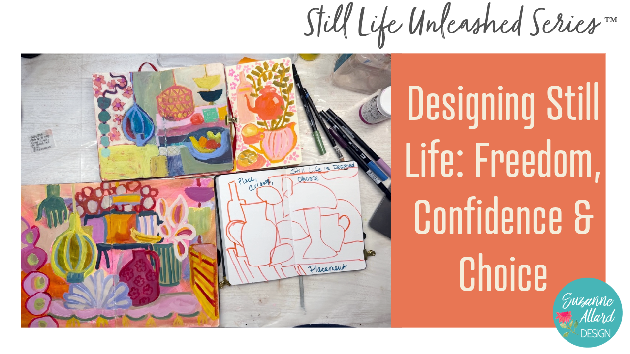
Transcripts
1. Class Intro: Hello. Welcome to
Designing Still Life, freedom, confidence, and choice. Those are the three things
I hope to instill in us through this whole still
life unleashed series, freedom, confidence, and
choice. Sounds great, right? In this class, we're going to step away from
painting for a bit and focus on how still life
works as a design process. So this is kind of
the unlearning part, the design first class. And it's about loosening habits and building
confidence and stepping out of the need to
have something look correct before you
even start painting. Have you ever
noticed how quickly your brain jumps to what things are supposed
to look like? This is automatic and it
worries about realism, perspective or whether
things make sense, even when you're trying
to work more freely. So that pull toward correctness is strong, I'm sure
in you, as well, and it can make still life feel tight and frustrating
or for that matter, anything feel tight
and frustrating. So we're going to replace it
with something more useful. Choice. We will work
in a sketchbook using simple shapes to explore the key decisions that
build a painting. Placement, relationships, hierarchy, intent,
and inspiration. So instead of
focusing on accuracy, you'll start to see how
these small decisions are actually what create
strong expressive work. For your project, you'll
create a series of quick, simple still life sketches, are not finished drawings, but thinking tools,
and each one explores a different idea and we'll write the concept right on the
page before you begin. So these are meant to be
loose and exploratory and something you can
come back to as you move forward
in your painting. If you're new here,
I'm Suzanne Allard, and I started painting
later in life and learned through online
classes just like this. And now I license my art, sell my work, and teach what
I've learned along the way. Alright, so let's open
up our sketchbooks and start building the structure
behind a still life.
2. Design: Placement: Okay, so again, this class
is not about drawing. It's about how to learn
to make decisions for these paintings and what are the factors that we're looking at and the choices
we get to make. So rather than
relying on a photo, we're learning about four
to five different areas, four really for the structure of a painting because every
still life painting, no matter the style is
built on a structure, although you could say
that about every painting. And the structure comes from
the choices that we make. So in this class,
we're going to focus on five of the most
important ones. R four are part
of the structure, and then the last one is
where our ideas come from. So I use a sketchbook like
this I try to I've been pretty good about keeping this sketchbook for
this kind of activity, like when I take a class or you know, I'm
practicing something. But you can, of course, use
any sketchbook you want. Or you can just put this
on a piece of paper. But I would encourage you to put it somewhere where
you can refer to it. And as far as what
I grabbed some of these Tambo markers
just because I love color, but you could do this
all with a pencil. So the five areas we're going
to look at are placement. So where we place things
in the composition. Relationships, how the
objects relate to each other? The hierarchy, or you can
also call it emphasis. You know, what is going
to be more important? The intent of our design. And then, like, I would say, these are the structure. And then inspiration is maybe, think of it as the fuel. Fuel. Okay. So we're going to
look at each of these. And then in the painting
classes that follow, we'll be focusing on each module each separate class will have a different focus,
different intent. And I really like working
that way so that I can practice a certain thing
and try it on for size. So we're going to explore
each of these, though, in this class in a simple,
really simple sketch. And color, by the way, because you know I'm
obsessed with color if you've taken any of my classes flows
through all of these. It has a role in all of these, but it's not separated
out for that reason. Okay. Y. So here's
the important part. Nothing you do
needs to be right. This is not about
right and wrong. This is about making
decisions and, you know, shaping the structure. Try to think in your mind, you're not fixing something,
you're choosing something. So, you know, it's kind
of flipping form and shadows and all that on its head and really being playful here. Playfulness is the
emphasis here. But we want to have
some idea of structure. So let's start with placement. I want to look at
first some examples of placement decisions
that artists have made. Okay, here are the placement
artworks that I've pulled. And by the way, these are
in my Pinterest board, which is linked to
in the supply sheet. And where I could, I've
identified the artist. But like here, I cannot these are from Pinterest
and the Internet. I can't read what
that signature is. So this artist, you know, you talk about placement, really interesting choice they made. You have lots of white space with some
different visual interest, and I just want to
make sure that you, you're not seeing
too much glare here. Maybe that helps you.
And the objects, though, are just all
kind of concentrated on this table and kind
of squished together. It's just really interesting to me that the artist chose
to do that this way. Um, look at where things sit. Look how much space
is around them. And, you know, this is the underlying structure
of this painting. They made a conscious decision. They have little
bits of interest out here really interesting. I think it says Star fruit, looks almost like a
child handwriting and some little sketches. This is part of what
that artist does. But the structure of this is pretty clear
what they decided to do. Okay, let's look at another one. This one I did say it's
Pamela Hoffmeister. And she is using, again, some really interesting
placement of things because you
know that this is you can imagine this was not a still life setup like
this that she was copying. So because you've got a plate here and maybe that's a table, maybe it isn't fruit just and flowers just
floating off of here. They don't appear or they're not obviously
connected to anything. Then some leaves
too that are like that one scratched
out, painted over, and then these wine
glasses are up here and you can imagine
this is a table, but maybe it isn't
and it doesn't really matter because it works. The painting works. So it can be really good to
look at things like this. When we're painting, or
when we're about to paint, when we in our mind going, Well, that doesn't make
sense, so that's not right. But that's what we're
trying to do in this class, and this whole series
is undo that kind of thinking so that we
can be more free. Alright, let's look at one more. This is a famous
artist Raul Duffey. I'm gonna see if
my brightness is turned all the way up
just to make sure. Yeah, it is. Okay. So here, again, the placement,
I thought was really interesting in this painting. I mean, I suppose you could
say he was sitting at a cafe and saw all of
this right where it is. But it's kind of doubtful. And even if he were sitting there and
got the inspiration, just the placement of, you know, some sketches of tables
and chairs back there, then just an outlined
house there and there. And then a really
small salt or oil and vinegar here and
this fruit bowl here. He made some design decisions. He didn't just copy the scene that he was seeing.
That's the point. This one is more realistic
than the others, but it's still very, very loose. His work is beautiful. Oh, and here's one more. This is a painting actually
that my aunt has. I recently visited my
88-year-old aunt in Michigan, and she's an artist, but she has these she loves the artist. He's no longer with
us, but ZikJankowski. He's quite well known in
the New England area. And, um, his placement on this is so
interesting, I think. He has these color blocks here, but then he places
these three vases, this one's in the
middle, but not exactly. Then there's this one over here, this one over here with
another one next to it. Just really unusual placement. I think nothing is
bunched together. It's also not spread out evenly. It's not centered in the canvas. It's not just on one side. It's just fascinating. Alright, so if you
think about placement, let's go to my
reference photos here. And these I took
at Glenda'sHuse. So she had done these. She has wonderful
objects on Glenda, and she had and I'll put these photos in
the class downloads. The artwork photos, since
they're not my artwork, I'm just going to keep
them in the Pintersbard. You're welcome to go
look at them under the Pintersbard called
still life Art that I have. But these I will put
in class downloads. So she has these
beautiful objects, and we put them together,
or she did, really. And then we took pictures. And then there were other
like this lamp I had to have a picture of and then we
got playing actually, that's a book about
Zig Jankowski, the artist, and I thought,
Well, that's kind of pretty. And let's put these
objects around it. We went crazy. Then
we got out her. She has this wonderful
habit of buying, like, an interesting shaped table, and then she just spray paints the heck out of it
in these colors. So I pulled this one from the garage and this
one from the basement, and we were playing with
these arrangements. But for this purpose, my
favorite photo is this one because it allows us to just pull any of these objects from it and
see them all at once. And then there's my
aunt and I painting. She had a lot of golden paints. I usually use Nova Color or
golden. But look at her. Isn't she a doll? She's
such a wonderful artist. Okay, so let's use
this to come up with just a placement sketch and just explore some ideas
around placement, because, like I said,
this one allows me to look at all of
the things at once. So, if we're using that
and we want to play with some some sketch ideas, then you might pull that photo
for yourself to look at. And this is where you could, like I said, sketch and pencil sketch anything you want, Cray. But, you know, I did actually play with a
composition when I was there, the one where I was
painting because I was obsessed with this lamp. But, you know, I had to think
about where to place it. And I've done a few
different sketches where, let's say, you know,
we put the lamp here. And, again, we're not clearly not trying to make
we're trying to make quick idea sketches. And then you could
play with, well, you know, this red picture, should that, you know,
would I want that over here and the handle of it, you know, would I want
the handle of it? So maybe I want it sort
of horror over here. And we're gonna talk about relationships next,
but, you know, there's overlap on
these structure ideas, but this is an example of
a relationship because I'm putting the vase
behind this lamp. But I could have put it,
you know, over here. And if I wanted the handle, uh, on this side, then I obviously
could just change it. Um, so, thinking about where
to place things, you know? I mean, do you put
do I want a lemon, you know, down here, or do I want, you know, like we saw in some
of the artworks, some sort of floating
lemony things here? Um and do I want, you know, sort of an image of a tray likes in some
of these photos? You know, she had this,
I wanted to take it this papaya tray that she had bought art an
artist painted it. I'm gonna have to paint
that at some point. But, you know, is there
a tray back here? Maybe, you know,
with a design on it. And so you can see
how we're just using the sketch to make decisions
and to think about things. You know, maybe
there's a bottle, a wine bottle back here. Uh, maybe there's kind
of a table going here, you know, so this is
just placement ideas. So when we're thinking
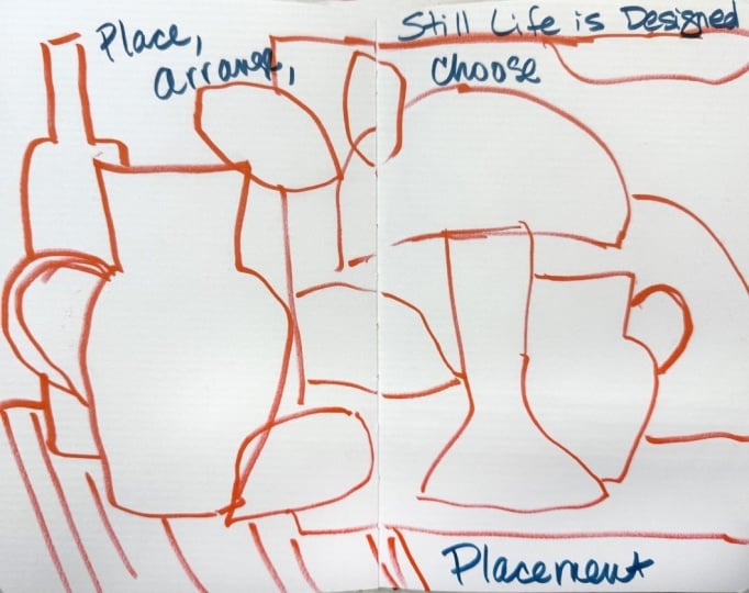
about placement, I'm going to write
it right in here. Um, in your sketchbook, still life is designed. At least this series, still life unleashed is
designed not copied. And so we place things. We arrange them, you know, like almost as if you were a decorator and you're just arranging things the way
you like, and we choose. So those are the
things I want to sort of help us remember
for placement, and we'll put placement here. So basically, I've made a spread here around the
idea of placement, reminding myself that still life is designed and placement we are placing things,
arranging things. And you can see
that I could turn the page and do a completely different exercise
around placement. So that's what you know, and, you know, you
can say, Well, like, this feels crowded here, so maybe I wouldn't do that
or this feels crowded. And maybe I'd rather just
have some white space. I probably would and maybe some flowers
coming out of here. So all of that, you can see that I'm
not copying anything. And this allows you to use any photo you want
because you are taking some time to figure out the structure of what
you want to create. Okay, so and these are the same decisions we're
gonna make in paint. So next we'll look
at relationships, and that's how these shapes
relate to each other.
3. Design: Relationships: Right, so now we've
looked at placement, which is where things we've
decided where things go, but we're also now going to look at more relationships, how they relate to each other. And as I said, they're
kind of joined, but they're enough of
a different concept to make sense to review them. So let's look at how some
artists use relationships. I pulled some artwork, and again, these are
in my Pintras board. This painting is Three
Roses by Alexander Shandor, and I thought this relationship
was really interesting because the look at all
of the negative space. So similar to a painting in the last underplacement that I showed you where there was
a lot going on around here. But, you know, there's like this little
picture is hugging this. And then this bowl, this
is in front of this. So this is touching,
but this is by itself. And I've actually
done a painting where I had a cluster of things, and I separated one out, and I realized later this
being vulnerable here, but that was an expression
of how I felt sometimes in social settings
in certain groups where I just felt like
I was on the outside. And so this isn't an extreme example because
it's not that far, but let's say we're over here. Anyway, there's just some who knows what the
artist intended, but I thought the relationships in this one were
really interesting. This one, this is Anna Valdez, and she, you know, does very sort of
meticulous detailed work, not something we're
working on here, but I thought it was a good
example of relationships because and I do use
plants this way. If everything feels a
little too disjointed, like, I don't feel like
it's holding together, I will take plants and since you can do
any shape with them, and I'll bring them into
something to sort of almost, like, hold hands with everything in the in the composition. And I feel like that's what I don't know if she
intended to do that, but that's how it
feels to me because all the leaves are reaching out and touching something else. There's nothing here that isn't being touched
by something else. It's all in relationship
to something else. And then this I thought was interesting because
it's very simple. But these are all
connected to each other. You know, we've got one,
two, three, four, five, maybe six cups stacked,
isn't it beautiful? And that's the
relationship these have. Nothing is off by itself. And then I pulled another
Jankowski painting picture that I had taken it on Glenda's. Again, he does so much
interesting stuff with placement and relationships because look how so you've got the bench kind of
bringing things together. So you've got these
beautiful florals here. And I just love how it's
sort of spilling over. You can't really
tell where those flowers are from and who cares. And then there's these three little pieces of
fruit over here. Again, like, these
two are connected. These you want
variety like this. You know, there's
a mystery there. Like you know, how did
those wind up there, or they're just a bit of color, and it's nice. So relationship. Let's turn the page and do
our little sheet on that. So relationships. We'll write at first this time. And think about distance overlap. In tension tension was that idea of either lots of space like there was or something
being kind of just off, you know, in a strange
way somewhere else. There's lots of ways even this is a little bit of tension, the idea that, Are
these gonna fall over? So let's go back to our
reference photos and practice something
related to relationships. I think I'm gonna use
that same photo with all those objects in it. You can use any
photos you have with objects that you take at a
store or around your home, or you can put objects in front of you and play
with those. Okay. So let's think
about relationships and the space between
things a little bit more. So if we have, say,
this, you know, vase in here, we could have, you know, a bowl
right in front of it. Or we could want, you know, the bowl way over here. We can also have a relationship
with off the page, which I think is really
interesting to do. You know, have,
like, a picture that is going off the page on purpose or a lemon off the page. So if I were to say
having these objects, and I thought, Well, I want
to unify them somehow. Well, I would want maybe
some more objects, too, but let's play with that idea of using flowers or plants
to connect things. So let's say I have that
little yellow fat picture. I love that thing. I really
wanted to grab all of Glenda's cute objects and put them in a box
and bring them home. And so, I've got
this behind there. And so, thinking about
the relationship between, like, this is not
tied to anything, this is not tied to anything. So I could if I had flowers
coming out of here or leaves, let's say, I could kind of
have them cascading this way. And that kind of
brings this together. And I could leave this guy
over here and just say, you know, that's
the way it's gonna be. That's the way I want it. Let's say I had a banana,
some bananas in here. Um, As long as I
know what they are, when I'm sketching, it
doesn't much matter. Maybe I've got this
coming down here. So now I've got these
things tied together. Can you see that? But let's
say I decided to just leave, like Jankowski did on some of those some little bits over here and look
to some cherries. Like that. Maybe one's kind of touching this
one or next to it. Then I think this becomes
interesting without this vase. So and I use my hand
a lot that way. If you've drawn in a pencil, you can just erase, but I think that composition is interesting. There's a little bit too much flowing all
the way down here, so I might pull put some
leaves on this one. Something like that. Yeah, I think that's a little
more interesting. And then I just think this is a complication
that's not needed. So distance we used and you
want a variety of distance. So, if you have little cherries, let's say, these
actually should be a little closer to each
other and not lined up. So there's some differences. You know, don't put
three cherries all the exact same distance away from each other
and from the lemon. And you don't want to have
everything like at this plane. It's going to be some
things up higher, something's lower, and
we're overlapping. So we've got, you know, this
one in front of that one. This one's in front of that one. And if we wanted, we could put like let me just
use a different color, so it's maybe easier
for you to see. We could have, say, a table and the table doesn't
have to go the whole way. Maybe the table kind
of comes like this. Or remember that one artist, Pamela that we looked at? I mean, it sort of didn't even couldn't tell what
table was there or not. Um yeah, or you
could have, like, a different color of
something over here, you know? So some lines. And then this entire tablecloth is now having a relationship
with these items. And you wouldn't want
the whole painting to fall off to nothing, so then you could have, let's
say this picture is gone. You could have another
bit of color over here, you know. So anyway,
relationships. Alright. Now let's
look at hierarchy.
4. Design: Hierarchy: Alright, so we've
looked at placement, relationships,
hierarchy is next, and I pulled some artwork
for us to look at where it really the
hierarchy jumped out. This is by Well, it says collage created
by Joan Neki Van Mir, but this is not a collage, so you know how Pinterest is. But just in case
that's the artist, I put left that in there. So the hierarchy, though, when you look at this, I mean, that white vase just
jumps out to me. And there are other really
interesting elements, but I think they wanted that
white vase to really pop. Now, you may look at it and
see something else first, but the idea of hierarchy
is you can think of it as emphasis is
what is most important. Where does your eye go first? W shape is in charge here? Everything else plays
a smaller role. So let's look at another one. I love this artist
Gordon Hopkins and it is hard sometimes to
find hierarchy in his because they're
all so colorful. But for me, this turquoise
because it's larger, and it's also turquoise which is a bright color jumps out first. Um so that's how I mean, this bright blue
really jumps out, too, but this to me is placed
higher in the hierarchy. And then this one I
thought was interesting. This is by Laura Grosso, and it's interesting, isn't it? Because at first, I think, Okay, the blue the
ultramarine blue bottle and that blue jump out. But then look at this
orange, you know, down here. I don't know, right? What jumps out first. So let's take a look, and I'm going to show you some
of my artwork and some of the decisions I've made when we get through each of these, especially in the
inspiration section. So hierarchy. Now, you make the
hierarchy decision based on your as part
of your composition. So let's go back to
the reference photos, pull my favorite one again and just before we draw
our hierarchy page, I'm looking at this going, Well, what if I had to
choose hierarchy here? Well, this I made big, and this is equally big. So if I really wanted the lamp to be the
star of the show, then I do that maybe with color, and I could subdue
this with color. So color is really a
tool on all of these. Hierarchy here, it
depends on whether I would really fill this pot
with lots more leaves, you know, maybe they're
spilling over here, and that kind of is it? Or do I end up doing
more florals here? I suppose I could
have even made, depending on how I proceed
with the fruit bowl, but I think it would probably
be either this or this. Alright, so when it comes to
hierarchy, um, hierarchy. It's hard to spell. I
already misspelled it. That's why you can use
emphasis if you want. Hierarchy creates clarity. And this is one that I would say I kind of
struggle with because I tend to be more like the Gordon
Hopkins where everything is, you know, emphasized. And so I really have
to work on this one. So scale, that's how big
something is, right? Dominance. And focus. Those are kind of the three
guiding words on hierarchy. Alright, so let's
intentionally, you know, work on this in a
way that we're kind of paying attention to the
hierarchy from the get go. So that means that
I'm going to choose one shape that I'm going
to make large, larger. Here's that one vase. And, you know, you can show
hierarchy and focus emphasis, focal point,
anything you want to call it in so many ways. We talked about color, but you
can also do it with edges. Let's say that my other
objects were big, but I really wanted this,
and maybe I've got, you know, some really
pretty designs in here. And, you know, I
sometimes really get into making a beautiful piece of pottery with pattern
and so forth. So let's say I really
wanted this vase, not even things
coming out of it, but just this vase to
be the focal point. Well, I can make the edges sharper around it
in the painting. You know, I can do
things like that. I can use pattern. And, you know,
stuff like that to really get it to be
more kind of the focus. But so then we have maybe it's an egg plant here,
kind of behind there. And um, we could have a bowl of lemons,
kind of behind there. Maybe it's down here. I don't want to make
anything too big or to take away from
our emphasis here. This kind of looks like
it's an extension of that, but, you know, it
was an eggplant. Um, and I can have some
other things here. You know, maybe it's just the
wine bottle is back here, but it's behind here and
it's not super prominent. And sometimes I'll take, like, a, um, like, a little little vase, you know, and have some sort of sweet little flowers
coming out of it. So it's not it's not dominating,
but it's still there. And then I can have some I
can have a table or not. Maybe this table goes
all the way across. Um, I don't want to fill
this whole thing up, so let's just say this painting. This sketch ends right there. And and do I have
anything in there? I don't know. You know,
we could put things in there to help accentuate it. Yeah, I probably do. So you can see that this becomes about this
and that these, like an actor, you
know, in a movie, that this is the
star of the show, and these others are
supporting actors. You can even do some
some old cherries for some interest down here, or sometimes I'll do, you know, a pattern in the tablecloth. But if I really wanted
to emphasize this, then I would make sure
to make other things, you go to the background
more with color, with focus, with scale,
that sort of thing. Okay, so next, we're
gonna look at intent.
5. Design: Intent: Alright, we've
looked at placement, relationships and hierarchy. Now we're looking at
intent. This is where we get really freedom. You know, hierarchy
is sort of we're thinking about how we
want things to be. And same with these two, intent is really what is your intent for this
particular piece? And choosing realizing
that accuracy is a choice, making it look
like that thing is a choice that you can
make or not make. So this is about
feeling some freedom in your structure and deciding
how real things need to be. So let's look at some artists that push the
boundaries on that, and there are many, much more that are, there's so many
examples of this. But here's a few. This is Cornelia O'Donovan, and this is a still
life with plants. But, you know, nothing here makes sense in the way
we think of what we look at. We're looking at a table top down when the plates
are top down, but the vessels are
sideways, right? So, let's say this was a plate. We're looking at the
plates this way, but we're looking at the
flower pots this way. And then off of this table, if we were looking top down, you think you would see,
like, the floor or something. But no, she's got plants, and there's even a
little animal there. And so I just show
you these things, and I look at them
myself not to copy, but to just help us break free. Different viewpoints, and she chose design over
accuracy, okay? Shapes are flattened.
And lots of texture. This one is very
similar in the intent, but completely different
delivery, different style. But we still have the
multiple perspectives. We have the plate
viewed from top down. Everything else is
viewed from the side, and then we just have
some design elements. Maybe these things are a table maybe because there's
a legs there. This is by Anna Himes
beautiful artist. Accuracy is optional. That's what I want you to
what I want to remind us. Here's one that I just thought it's a little more
realistic realistic, but still very kind
of juicy and loose. And look at all of these. They obviously had the intent. This is Shando Alexander
of giving, again, a lot of negative space and having the really
vibrant color here. But then look at this
bright bright green here. Um lots of design
ideas went into this. It wasn't overly fussy with maybe those are
shadows on the wall, and this is a cloth,
but it's not rendered. Nothing's rendered
super accurately, which I personally love. I find that very interesting. Um, so let's play with
this idea of intent. And the following the modules, the other classes that follow this on the Still Life
Unleashed series, all choose a different
intent for each one. And that was my whole kind
of approach to this was, you know, let's do one that's
modern and flat top down, and let's do another one
that's more intuitive, and let's do one that's
really abstract and let's do, you know, all these
different ones. So but let's play with if we were doing something
more flat and top down, let me write out of our
clarifiers for this. It's really around intent,
choosing accuracy. I don't know.
Hopefully you can see the pencil choosing accuracy. And in the class downloads, I do have a cheat sheet
with all of this in there, but we are reinforcing that design is greater than or
more important than realism. That's what I'm teaching here. I mean, I think if you wanted to learn super realistic
still life, you probably wouldn't
be in this class. And that we want to feel
freedom and not pressure. Okay, so we can just do a sketch that's got this sort
of flat thing mixed. Let's say we have, let's just make our
painting about this size. And let's say we have a
plate here of some cherries. I wouldn't make
them all the same size or the same distance away. Maybe they're
overlapping like that. And I could have a picture here, going back to a
reference photos, big old picture here
and I can have maybe just some really big but
simplified flower shapes here. That's face on.
This is top down. I could have a fork
here. It's face down. Sometimes you'll see that
and maybe a knife over here. Um, I could maybe I'm
sitting down for lunch, and I have also some tea. So maybe up here,
I have a teapot. My spots a little weird, right? And maybe I have, like, a three colour
teapot or something. And, um, well, I know where I did that 'cause I was looking at Anna's painting, so I don't want to copy that, so let's just color
it and solid. And what else? Back to our reference photos, we had the tray. No, I don't want to
put the tray here because I guess I could.
I could make the tray. Well, I would say
the papaya tray. Well, I guess it could
be under here, maybe. Maybe this could be a
tray that's got the, this could be a tray that has the teapot and the cup
with my tea in it. Maybe even a saucer up there. And there's kind of a tray
here. I could do that. Um, what else do
we Oh, the lamp. We could stick the lamp
in here if we wanted. Let's try that other lamp, that green one. That's so fun. Oh and these you see how I got all
of these lining up? No, no. That's a no, no. So in my mind. Now, you know, I've got some relationships
between these things, but you'll notice
a lot of this art, sometimes the top down and
flat art is there's space. Well, let me show you. Like,
here, there's space between. None of these objects
are touching. And that's just,
again, a choice. I decision choice. But since I think I
want in this one, this to be more prominent,
I'm gonna make it bigger. And then Everything is
not at the same spot. You can also have a place mat, if you want it, but I
like the tray here. But, you know, we might have a tablecloth with
little flowers. So this is just
trying to play with the intent of a top down
and flat still life. You can have all
kinds of intents. You could do, like
the Anna Valdez, where it's a lot of detail and, you know, you could do any
kind of idea like that. So let's move to inspiration, and I'll show you some of
the inspiration examples and then a lot of my own
work and what inspired that.
6. Design: Inspiration: Okay, so for inspiration, what I want to show you is how to look at either, you know, a photo or that you've taken or something out in
nature or some objects that you have or even
another artist's artwork and not think about copying, but think about what decisions do I want to make
about this photo? And what decisions
did this artist make? And, you know, that
way with inspiration, we're getting inspiration. We're getting direction,
not instructions. Direction, ideas, okay? Not copying or instructions or rule books or
anything like that. So think of its fuel and we are borrowing
editing, translating. So let's take a look at some of the artwork that
I have for this, and then also my own work. Well, I had to use another
Gordon Hopkins because I so this is a perfect example
of see how you can see the I think it's
probably oil pastel, but he gets this
wonderful textured look. So either, you know, you probably either like
that or you don't love it. And so I'll study artists
like this and go, I wonder how they're
getting that, you know, and then maybe do some research and then play
with some of those ideas. That doesn't mean I'm copying. I'm never going to get the
look he gets from his process. I don't want to get his look. I want to learn about
what part of this I love. That I want to learn
about and play with. Here's another artist, Guy Hoyt. And she uses a lot
of different things, collage and painted papers, and I love doing that
sort of thing as well. There's definitely going to be a collage class in my future, but you know, studying other people's art and
what they're doing and the decisions they've made,
I think, is fascinating. This is another
artist Hope Olson. Look at the very specific types of decisions here around color, very limited color, and
very specific process. Like, you could take one idea, which is not her idea. Like, the fact that she's painted everything
over this kind of off white base is not she's not the only
one who does that, so you don't have
to feel like, Well, I can't try that because
that would be copying hope. No. I mean, if you painted this thing
or anything close to it, you would be copying and
that's a definite no, no. But if you said, I want
to practice painting my shapes in an off white
color all over my composition, or I want to practice
outlining more shapes, or I want to practice bits of collage or I want to
practice boil pastels. You see, you can borrow
from in that way. Um so let's do let's
just pick well, actually, let's
pick one of mine, and I'll show you
what inspired it. So this is like a
Bohemian look that I did, and I follow this Mango
manner on Instagram, and she's I can't remember if she lives
in Florida or where, but she has these pictures of her home that she
posts, reels and things. And so I was just looking
at the various objects, and I kind of combined these two photos and picked what I wanted. So I thought that yellow
dresser was interesting. And then I think maybe it's another photo
of hers where she has, like, a lamp and there's
a here's the bench, but I I changed everything. I put a pillow. There's
a pillow there, but there's a straight
pillow. There's a banana. And then there's
another light fixture from another photo and, like, a Bohemian hand. I can't even remember
what this was. Maybe a tassel. And I
just had so much fun. Like this, you can see
here is from that blanket, but the couch isn't even there. And so I was inspired by the
photo by the whole vibe, and I just played with ideas. And I think, actually
this might have been from another compilation of
her pictures and things. And then this one I played with some
ideas around pattern, but also leaving some
of the paper blank, you know, and not painting it in and then just really
moving the objects around. Um, this was a lot of fun. And then there was something
funny I want to show you. Oh, I was, you know, in the nail salon and I getting a pedicure,
and I thought, Well, why not try to make some sort of something from
the things I see? It was just a fun exercise
to do while I was there. Or here's a spread where my
daughter went to Morocco, and she sends me pictures I bother her and say,
send me pictures. So I sketch this from
one of the pictures, and then I sketch some just
different shapes of vases. Here I was playing
with a new pen. But here I don't really remember what
got me painting him, but I was playing here with some just this
limited color palette and different
compositions like that. So you can just plate. And in the painting classes, we're going to do
just that and paint. We're gonna paint
a lot of these. Here's when I just started. So if we use this
as inspiration, let me show it to you
better so you see it. It's just the first
layer or two. I've always loved horses.
I used to have one. And so I started
just playing with my inspiration in this one was
really around big objects. I'd seen an artist that used, like, just more big things. So I was like, Oh, you know, let's try some big things, like, instead of a
lots of little ones. So, you know, I
had this pot here. It's probably not big enough. And sometimes, like, that even in itself is a fun
thing to play with. Have you seen florals that are just filling
up like you only get a part of the pot and a little bit of flour
because a lot of it's off, you know, so big, big
things like this. And, you know, I had my horse. I was I'm go see quite possibly
the worst horse sketch. But my sketch is for me to
know what I'm doing there. And also, I I just
want kind of a I like sort of a primitive
looking style. Maybe he has a big man. And then I had a big
plant coming here. And I had an even
bigger branch here. So it's just fun to pick something that is
inspiring to you in either in somebody's
work or in that you see, you know, maybe you've
been somewhere and saw the most incredible
bouquet and you want to be to be part of
the composition. And maybe just some
dots back here. Isn't this orange beautiful? I've been into orange lately. So use inspiration for ideas and for a direction
on a particular project. And we're going to do that, as well in the upcoming
painting module. So to review, I
hope now you have, well, one, two, three, four, five pages with each of these, placement relationships,
hierarchy, and ten, and then your fuel inspiration. And you can reverse these, you know, you can start
with inspiration. I didn't want to
start with it because sometimes we don't know where to start and we don't feel inspired by something until we start thinking
about these things. So that's why I
organized it this way. But if I were gonna
start painting, I would either look
through my own work and find things that
I like that I did. Like, I painted the front and the back of this sketchbook, actually, of a
YouTube, where I did this, and I really love it. So sometimes I'll pull it out or pull out
something that's in the sketchbook. I
forgot about this one. I used just three colors, and I thought, Won't it be fun if there was, like, a curtain? And, you know, you can see that I'm trying something different almost
on all of these, and I love using my
sketchbook that way. Here, I use some wax crayon, and here I scrape
through on things. Let's see if there's any
more. Still lives in here. That was fun. This book is literally one spread
away from being done. Can you believe
that? But anyway, I would say that I hope, okay, this is a good
idea for inspiration. It has nothing to
do with still life. But I just she was in a
catalog and I just thought, Let me try to paint her walking across in
that green dress. So I hope this gives you
ideas and kind of prepares you for the potential discomfort and freedom in the
painting modules that follow so that you don't
get as hung up on, but that's not what that
looks like, or, you know, that's not what the
vase looks like or that's it's bigger than that or it's smaller
than that, or whatever. Let's be free and see
what we see what happens.
7. Class Wrap Up: I hope you enjoyed working through these still
life explorations, and I hope it got you
starting to think about still life in
a different way, which I hope exploded
the whole genre. In this class, we focused on
the before painting thinking that really is part
of painting and makes painting feel more
free and more confident. Instead of worrying about realism or getting things right, we practice making design
decisions where things go, how shapes relate,
what matters most, and when accuracy
can be optional. So what I love working
about this way is how much confidence it builds before you
ever start painting. When you trust your
decisions early on, painting feels
more open and less precious and much
more enjoyable. So now it's time to
take those ideas into the painting classes in the
Still Life Unleashed series. And those classes are where
this really comes to life. You're going to take
the same decisions we made, placement,
relationships, hierarchy, intent,
and inspiration and start using them to paint paint to create bold,
expressive finished work. So, or semi finished, you
know, we're learning here. But each module will explore a different way of working
from loosening up and breaking habits to using pattern and rhythm
to simplifying shapes into strong shapes and building graphic
design driven paintings. So you're building directly on what we've already done here. As you move through
into these classes, keep asking yourself,
What am I choosing? What matters most? What can I let go of? That's a tough one. I'm so glad you took
this class with me, and I can't wait to see what
you create as you continue through the still life
unleashed series. Let's take these ideas
and start painting. I'll see you in the next class.
 Suzanne Allard, Landscape, Floral, Abstract Painting Teacher