Transcripts
1. Class Introduction: Hello, and welcome to
an epic design journey. Now, do you find it hard to
harness your creativity. Do you wish you could come up
with more compelling ideas? Do you want to be more
confident in your design? Are you looking to improve
your design process? Or are you simply
looking to level up your design game and improve
the quality of your work? If you said yes to any of these, then this is the class for you. Come join me as I teach you how to harness your
creativity and yield exciting outcomes with a tried and tested
design process? This is a class
where the world of urban culture and sneakers
inspires our creativity? In this master class, we're stepping into the art
of poster design, drawing inspiration from
the iconic presence of sneakers in pop
culture and advertising. Sneakers are more
than just footwear. There are a canvas for
personal expression and a mirror to the evolution
of graphic design. In this class, we'll use the dynamic and diverse world of sneaker culture to fuel
our design process, leveraging adobe creative
software to craft posters that embody the spirit and style of contemporary
urban culture. This isn't just about
learning software. It's about harnessing
a design process to capture the essence of a
global culture in your design. So my name is Gareth David. I'm a creative director with over ten years of experience
in the design industry. In that time, I
have worked across many projects from logo
design to branding, which I've had the opportunity to harness my design process. And I've also been creating online education videos
for over five years. Now, some of you
may know me from my YouTube channel where
to date I have over 700,000 subscribers and have released lots of design education material
like this there. So in this class, I'll be taking you through
a professional, tried and tested
poster design process, sharing the techniques I use and have observed
in my career. We'll start with a design brief, gather research and
create mood boards. Then learn how to
choose the right fonts, what poster grids we can use, how to generate ideas
with sketching, and then jump into in design
and illustrator where we will bring our ideas to life to create multiple
poster designs, and then we'll
look at how we can present our design to
clients and colleagues. From start to finish, I'll be taking you
through each key step. Now, there are many
software options for creating poster designs, but in design and
illustrator are the industry standard
for creating professional layout
projects like posters. So for those of you who have a preference or may
be unfamiliar with in design or illustrator and want to know more about
them and how they work, this will be a great
opportunity to learn some crucial tools while creating a fun and
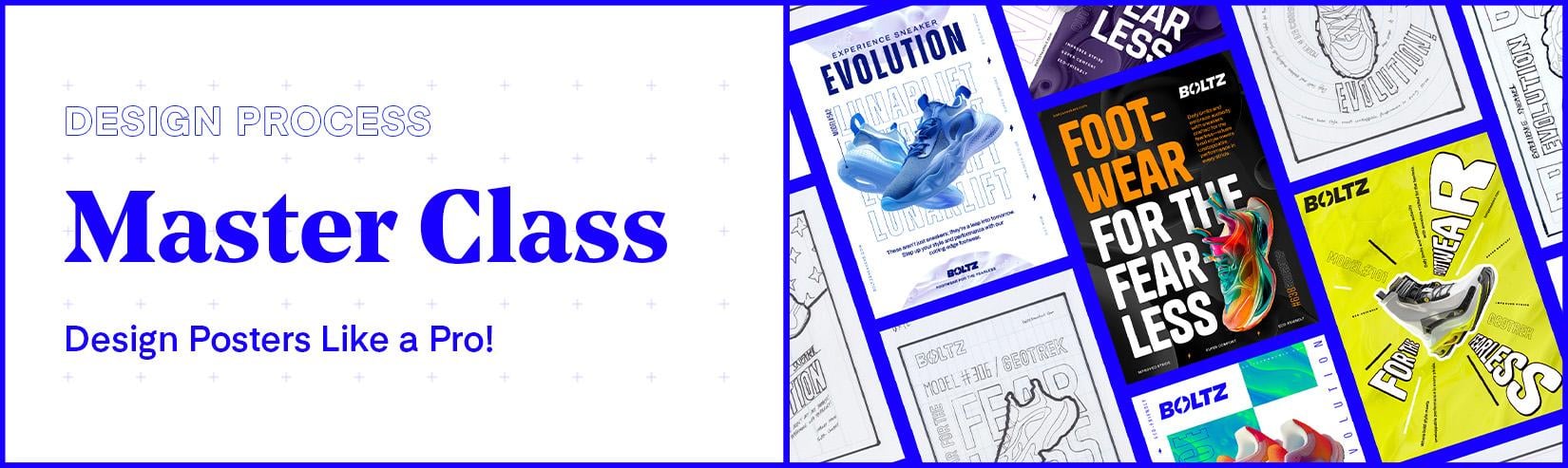
dynamic project. So here I am in Adobe Bridge, and these are some posters
I created earlier using the techniques I'll be demonstrating on
this master class. For this poster
design master class, we will be looking at a
fictional design brief for a sneaker company looking to advertise their
new product range. All of these posters have different styles with
different layout approaches, so there is going
to be something new to learn in each
design we create. Some of these have
been made using in design and some
using illustrator. Later in the class, when we get to crafting our
designs in software, we'll be learning how to
set up poster grades, manage type, images,
structure content, work with color,
create variations, and export ready for print. So in this master class, I'll be demonstrating a
poster design process, how I develop my designs and use in design and illustrator
to bring them to life. But I would also encourage
you to have a go at your own poster
design process and artwork your own
post designs as we move through this class
to practice your skills. In this class, I have set
many key tasks for you to undertake at each key step for you to get the most
out of this class. Practice your skill
and have something to show for your effort
and time at the end. After this class, you will
be able to think like a pro and design bold and
dynamic posters like a pro in in design or illustrator to bring them
to life super easily. Now, in this class, we'll be
focusing on poster design, but this is a
design process that you can easily use in anything, whether you're looking
to design logos, brochures, websites,
or social media. So get ready to blend
craft, style, technology, and creativity as we transform our fascination with sneakers into visually
compelling posters. Let's create something that showcases not only
our design skills, but also our connection to
the vibrant urban culture. So let's get into it.
2. Class Preparation: So before we get started, there are a few things I would highly
recommend you have in place at the start to fully maximize your
class experience. The first thing you
will need is one, the class download folder. In this master class, I'll
be featuring a ton of resources to help with
your design process. Before we begin the class, I would highly recommend you get hold of the class
download folder, so you have everything
you need to open, as I mentioned them and
present them in the class. Once you acquire this folder, you will see a
structure as follows. Class Link PDF. The first file included
is a class link PDF, and this document includes all the important links I mentioned throughout
this class, to help you with your process and to effectively follow along. Next, you will see
Task List checklist. In this class, you're welcome to follow along with my process, but I would also encourage
you to have a go at your own design and
practice your own skills. This contains all the
key tasks I recommend you undertake to get the
most out of this class. To start the class, I
recommend you print this off and keep
it to one side, so as we move through the
class, you can check them off. And next, we have some folders. One, design process files. In this folder, you will
find additional folders, Design brief, design
process checklist, anatomy of poster checklist,
moodboard samples, typography, poster
grids, sketch examples, and blank project folder. The second folder
is post templates. In this folder, you will find additional folders for assets, in design illustrator, and an design file
called all posters. The third folder is
poster artwork examples. In this folder, you will find additional folders for
poster final examples, institute examples,
and present deck, and the last folder
will be media kit, which includes all the
design assets as part of the design brief we will be
using in our poster designs. To download the class folder, check the project and
resources section, two, create your
own project folder. Now, this is a big one. An important step in an effective design process
is to be organized, and it really helps to have a well organized project
folder to keep all of your files so you
don't have to worry about where everything is
and hit the ground running. Before we begin, I would
insist that you duplicate a copy of the project folder from the class download folder. During this master class, you will be encouraged to
create your own files, so you will need
someone to place them. To make it really
easy to follow along, I prepared a project folder for you just simply duplicate, so you can place them
inside as we go along. This should keep
your whole process organized and streamlined. Your first task for this class is to create a project folder, which we will be
saving all our files in as we create them
during this class. Once you have acquired the
class download folder, going into the first folder, one, download process files, down to Folder eight
blank project folder, make a copy and paste this somewhere where you
will be able to come to during the class and rename this to Bolts sneaker posters. Once you have this in place, you're in a perfect spot
to start the class. Three, drawing equipment. Now, in this master class, I'll be demonstrating a
complete design process where in the initial phase, we'll be undertaking
some sketching. Now, this part, the
class is optional, but if you would
like to participate in this phase and
practice your skills, I'd recommend you have some
sketching equipment ready. So when we come to that part, you will be set up to have a go. A Sketchbook, some pencils
or markers should be fine. For creative software. Now the last thing you will need is certain software installed. In this class, I'll be
demonstrating how to create posters in both in
design and illustrator. So if you want to learn both or have a preference,
I've got you covered. To follow along and
have a go yourself, I would recommend you have
a copy of design installed. I'll be using the most
recent version of in design, but if you have an
earlier version, this should be fine as backward compatible files
will be provided. As well as Adobe in design, I will also be
demonstrating how to create posters in
Adobe Illustrator. So it will help if you have a copy of Illustrator installed. I'll be using the most recent
version of Illustrator, but if you have an earlier
version, this should be fine. Lastly, photoshop. To develop our poster design, we will also be using
Photoshop to work with images, you will also need a copy
of photoshop as well. Once you have acquired the
class download folder, duplicated a copy of
the project folder, have some drawing
equipment ready, and your software ready, we can begin our
creative adventure and start the master class. To begin, I'm quickly
going to discuss the posted design process we're going to follow
in this class. We're about to embark on a tried and tested
design process that I have perfected
and works every time. See you in the next video.
3. The Poster Design Process: So one of the most
important parts of your creative approach should always be your design process. And I can't emphasize
that enough. A solid design process
is the ultimate path to harnessing your creativity and yielding high quality results. Now, if you're watching this
and you don't currently have a design process you
can confidently lean on and you are struggling
to harness your creativity, then this video is
going to help you out. So, ultimately, design is
an answer to a problem. Design is not the destination
but the journey that is taken and the process of what
goes into solving problems. When taking on a project, amateur designers will sometimes dive straight into
tackling the end result, drawing from their
head or jumping onto the computer to
artwork immediately, making it up as they go along or at worst, following trends. Now, this is not
necessarily a bad thing, and I've seen it happen a lot, but taking this approach
can be tiresome and inspiring and not always
yield the best results. As a designer, if you want to improve the
quality of your work, you will want to avoid making arbitrary designs and consider
giving more thought to your design process
and endeavor to take steps to develop the
best creative solution. So what is a design process? Well, a design process
is a roadmap that guides us from a blank
canvas to a compelling, meaningful and
appropriate solution. A design process will
include steps to ensure you undertake adequate research,
discovery, development, brainstorming, sketching,
and implementation to answer complex questions with sophisticated and
appropriate answers. Just as in fashion,
architecture, product, or web design, the design process in poster
design is a critical element that drives innovation,
relevance, and excellence. So in this video,
before we embark on our creative journey that
goes beyond aesthetics, we are first going to delve into the poster design process. We will be following
in this master class. So let's get into it. So when undertaking
design projects, a designer knowingly or not, will initially focus on a
process of thinking outwards, leading to a process
of thinking inwards. Psychologist JP Guilford termed this process as divergent
and convergent thinking. And it's this
thinking process that is fundamental to
the design process. Knowing and understanding
it will be very helpful when tackling
complex design problems. The term thinking
outside the box is basically another term
for thinking divergently. Divergent thinking is
to expand your options. Think as open as
possible and to be open to all possibilities
and inspirations. Imagination and creativity live in the realm of
divergent thinking. I divergent is to
think outwards, well, convergent is
to think inwards. Convergent thinking
is to contract your opinions and narrow
down possibilities. Convergent thinking
is to question, challenge, criticize,
and consolidate. Discipline, logic, judgment, and decisiveness live in the
realm of convergent thinking. So it helps to think of divergent
thinking like a shower. The more discovery
you undertake, the more water source
material is added. The more connections
you make will add to the pressure to create a
bigger spray of ideas, which will reach
further where ideas will become more
conceptual and original. Convergent thought is like the funnel where we capture
all the creative thinking and ideas and challeng them down to identify the best
potential solutions. These two thinking processes
go hand in hand and will be required multiple times throughout the
course of a project. Now, what makes a
good designer is harnessing the power of
these two thinking processes and striking a good balance and finding a good balance will help generate results swiftly. So here I have a printed
design process check list, which puts this process of divergent and convergent
thinking into practice. I use this as a
reference to keep me on track and to harness the
flow of creative thinking. Here, the poster design process consists of four main phases. Discovery, concept and design, visual artwork and design, and present poster designs. First, we have phase
one, discovery. In this first phase, we seek to understand key steps, to understand everything
about project, the challenge, and get inspiration to drive
our initial design thinking. This phase consists
of four main steps. Step one, review design
brief and poster contents. In this step, we seek to
understand our projects goals, the audience, and
everything that the poster needs to include. Step two, visual research
and inspiration. In this step, we seek to explore the world around us for
sparks and creativity. Step three, focused mood boards. In this step, we channel our inspiration and narrow
down our visual direction. Step four, choose typefaces. In this step, we
seek to look for appropriate and
relevant typefaces we will want to work with
for our poster design. Step five, review poster grids. In this step, we can review
all the different types of poster grids to see which ones would be suitable
for our design. Next, we have phase two,
concept and design. Now, in the second phase, after we have synthesized
all the information we have discovered and learned
in the previous phase, it's then time to
start generating possible solutions to solve
the creative problem, and this consists of one key
step, sketching designs. In this step, we
seek to generate the blueprint of our
creative vision. Here we do this by
sketching composition at layout ideas to identify the strongest ideas
we can take forward. Next, we have Phase three, visual artwork and design. In the third phase,
once we have spent sufficient time
generating ideas, and we are satisfied, we have some good
options in the bag. We can then look to bring these to life using creative software. This phase consists of one main step,
artworking and design. In this step, we look to use creative software tools to
develop our design ideas, refine and finalize our design. Finally, we have Phase four,
present poster designs. In the last phase, we will take our final polished
poster artwork and place it into a poster
proposal document, ready to present to a
client or team members, and this phase
consists of two steps. Place poster design into
in situ visual examples. In this step, we look to take our poster designs
and place them into in mock ups to give the right context to
our poster designs, create a proposal deck. In this step, we consolidate our file poster designs and visuals ready for
the world to see. Here, we will place in our
file designs and mock ups into a deck ready to propose to a client
or work colleagues. If you want to take
a look and print out your own copy of this
poster design checklist, you can find it in the
class project folder. This is located in the
design process files in the design process folder. Then, why does this
process matter? Well, great design is rarely borne from random
strokes of genius. It's a deliberate
pursuit of solutions. It's about understanding
a problem deeply and responding with
designs that are not only beautiful but meaningful and perfectly tailored
to our target audience. The design process ensures that every decision
we make is informed, intentional, and
aligned with our goals. Keep in mind, when we design,
we're solving puzzles, telling stories, and engaging with our audience on
a profound level. We are aiming for more
than just good looks. We're striving for relevance,
impact, and connection. This is the process we're going to undertake in
this master class. During this class,
you will explore how a structured design process can elevate our work from
good to unforgettable, ensuring that every
poster we create is not just seen but
felt and remembered. Let's now jump in to
the first step of the design process
and take a look at the creative challenge
that lies ahead. In the next video, we will be looking at the design brief.
4. Client Brief Review: In the design industry, the first step in
the design process will typically start
with a design brief. Now, a good design brief is the foundation of every
successful design project, outlining the goals, challenges, and direction for our
creative endeavors. Now, this isn't just paperwork. It's the first step to understanding and solving
the design problem at hand. The design brief guides us ensuring our designs aren't
just visually compelling, but purposeful and targeted. It's a critical
tool for aligning our creative vision with
practical objectives. In this video, we start
with the first step in the design process by
reviewing a design brief. Let's dive in, see
what's in store, and get ready to tackle
this poster challenge with creativity fueled by
clarity and direction. So let's get into it. So for this class, I have
prepared a typical brief one may receive in the design
industry from a client. This includes all
the key criteria we will need to know to develop
our created solutions. If you were to take a look
at this design brief, you can find it in the
class download folder. This can be located in the design process files folder in the design
brief folder. Now, I won't read
the entire brief out as this would
take some time. However, I do advise you to take a look over this
before moving on with the class to get a good idea of the creative goals we will need to work towards in this class. So my brief here is
split into two parts. One client overview and
two design overview. Part one is where we can
get our understanding of the context and the business
we are working for, and Part two is where
we can learn about the creative challenge,
goals, and objectives. Now, generally, when I get a
design brief, as I read it, I will highlight certain areas I feel are significant
to keep in mind, which will drive relevant creative considerations
in future. Here, you can see how
I have highlighted my brief to pull out the
bits I feel are important. This will make it easier
for me to look back over the key details
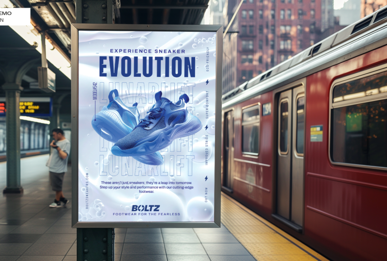
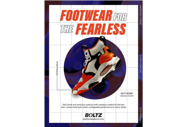
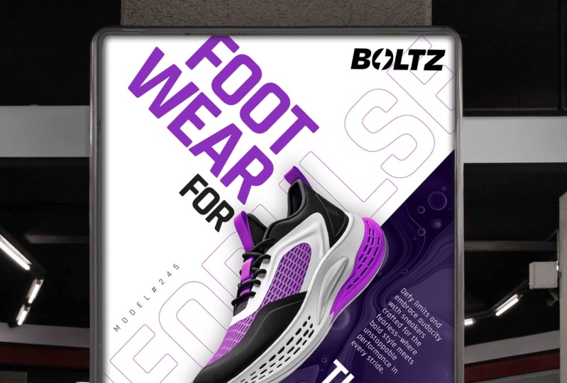
during the process. So to sum up this brief, we are required to
design posters for a fictional sneaker
company called Bolts, and they are looking to create some poster designs to promote some of
their product line. The main audience are those who crave unique fashion,
personal expression, and cutting edge designs
that resonate with those eager to make a bold
individual statement. Bolts followers are
trend setters united by a passion for distinct style
and pushing boundaries. The goal of the poster designs is to be bold and
eye catching with dynamic visuals that will be showcased in urban
street environments. Bolts seeks to
captivate with posters that fuse futuristic
and rebellious styles, making it sneakers icons for
bold and forward thinkers. The company has provided us
with the contents to include photography of the products and some visual assets which
we can use in our design. And they have stated in the
brief that they want to see some exploration of
typography and layout. So this will be the starting
point of this master class. As we move forward, let
the brief be your compass. It's more than an exercise. It's an essential practice
in the design world, preparing you to think, design, and deliver with intention. So your second task for
this class is to read over the design brief to get a good understanding
of what is required. My recommendation
is to print it out and keep it available
during this class. Be sure to refer to
the task list PDF in the class download folder for more instructions for this task. Once you have read
over the brief and understand the
challenge ahead, we can move on to the next
step in the discovery phase.
5. Review Poster Content: Now, before moving on to the
next key discovery step. Another important thing to
keep in mind when designing a poster right at the start
is to consider the contents. Before designing a poster, it helps to have a good
understanding of what needs to be included in the poster design as this can help you
understand the scope, plan, and be prepared
with what to include in your
design and layout. It helps to consider things like how much type to
include, any photos, textures or
illustrations, any logos, or any tables or charts. Looking back at
the design brief, we can see that the client has provided us with the copy
to include in the poster. Photography of the products and some of the visual assets, which we can use in our design. The logo is provided,
photos are provided, textures and assets
are provided, and they have requested, they want to see
some exploration of typography and layout. Here we can see a poster
content deck is available, which when we open,
this includes the copy options to
use in the posters. On the next page, we can see the products with
the names of each, and also texture assets we can
use as part of the design. So once I'm aware of the elements I need to
include in the poster, I can then start to think about my design approach and take the next steps in
the discovery phase. So your third task
for this class is to familiarize yourself
with the content required for the posters. Be sure to refer to
the task list PDF in the class download folder for more instructions
for this task. Once you are familiar,
we can move on to the next step in
the discovery phase.
6. Visual Research & Inspiration: When creating a poster design, it can really help to undertake some initial research
to help spark ideas. Now, of course, this
step is optional. You don't have to
undertake research. However, this can give you some inspiration if you're
not sure what you want to create initially and can also be good if you
have an idea in mind for a particular theme or style that you may want
to research further. Moving into the second step
of the design process, we're diving into a
crucial discovery step, visual research and inspiration. In this video, we are going
to look at some techniques to research and some good
places to get inspiration. So let's dive in, get hyped for our design project and gather some research. So let's get into it. So once I'm familiar
with the design brief, and I have a good
understanding of all the important criteria
such as the context, audience, and goals, I then
seek to look at a broad range of research and collect anything that
I find of interest, and that could be relevant
and inspirational. So a good place
I'd like to start with is with my
digital scrapbook. First, I like to reflect on
research I may have acquired previously of images online or photos I have
taken out and about. For found research, I like to keep this in
a place where I can easily access it and see
it as a whole at a glance. Now, these could
be images I have gathered from
previous projects or just images I have
seen out and about and have captured to
add to my scrapbook. Now, my old technique
was to keep found images on the computer
in a scrapbook folder. But as of late, I have
been using Figma, Now, Figma is designed for
UI and UX design, but I like to use Figma
because it offers a vast digital environment
for which you can paste hundreds of images
into one digital wall, where I can move them around and organize them and come
back to them at any time. And the best thing about this is that it's backed up online, so I can never lose it and
can constantly add to it. And it's incredibly
organized as well, where you can have multiple
walls and organize your found research into
comprehensive categories. So here I'm using Figma
as a digital scrapbook, and I find this to be an
amazing platform to gather, collect and store research. So here is a huge board of poster images I've
researched recently online, including a lot I have
collected in the past. So a lot of research
I can look over here to get some
initial inspiration. And here are some
examples I have consolidated that focus
mainly on sneaker design. So two really good platforms
to discover and build inspiration are Pinterest
and design spiration. These two platforms are
similar in that you can do a lot of research
and build boards. So here I am on Pinterest, and I have a broad range
of research I have gathered that contains a lot
of sneaker posted designs. As we can see here, there are many examples with lots of
dynamic design approaches. Here we have very
dynamic typography, images, and texture layouts. Now, next, I'm over on
design spiration again, you can search for
a wide range of creative inspiration and then place them into specific boards. If you want to
take a closer look at these two research boards, you can find them in the
important link stock in the project folder. Now, another two
good resources of inspiration are
Behance and dribble. Here you can search for
specific design criteria and scroll through the vast results to see if anything
stands out to you. Now, unlike Pinterest
and design inspiration, these platforms don't offer the functionality
to create boards. Once you find an
example you like, you're going to need
somewhere to place it. For me, this is where
Figma comes in again. Whatever I find on
platforms like this, I can copy or take a
screenshot and paste it onto my growing digital
scrapbook on Figma. So to recap, when
undertaking research, you can consider a
variety of approaches. During the research phase, you will want to
think divergently looking wide and collect a broad range of visual research initially to get you started. To do this, you can reflect on found
research in a scrapbook, research and build boards on Pinterest and
design inspiration, or browse through
design creative work over on Bhands and dribble, collect and add to
your scrapbook. Your fourth task for this
class is to undertake some broad research to find samples of what you think is interesting and
what inspires you. Be sure to keep in mind what will be appropriate
for the design brief. Now, you're welcome to follow along with my initial research. But if you want to have a go at this process and
practice your skills, to find your own research, take some time to do this
now and be sure to refer to the task list PDF in the class download folder for more instructions for this task. Try and spend around 20 to
40 minutes on this exercise. Once you have undertaken
some broad research, it's time to look at the next
step in the design process.
7. Create Focused Mood Boards: In the early stages of
the design process, it can be very beneficial to
undertake broad research. Depending on how much time one will spend on
initial research, one may cover a
lot of ground and accumulate lots of
creative options. Now, research is great,
but at some point, we will have to stop and turn it into something that
will work for us. It's the synthesis of visual research that
becomes crucial and can determine
the direction of your potential design solution. So when we have explored
enough research, it's then time to
edit this down. Moving into the third step
of the design process, we're now looking to focus on a more decisive direction
for our poster design. And we do this by
creating mood boards. Moodboards are our visual
brainstorming tools that bring our ideas, inspiration and visual
direction into focus. Typically, mood boards
are a grid or collage of design elements
placed together to capture the essence
of a design vision. In the last step,
we were thinking divergently and
looking outwards. In this step, we start
to think convergently, where we will look inwards and start to establish
a direction. Mood boards are great
to keep you focused on a particular direction
and can also be good to share with work
colleagues or even clients to help present and sell
your design intentions. In this video, I'll
be demonstrating how I develop my mood boards
for poster design. So let's get into it. So in the last step, I demonstrated how I collected and explored
visual research. In that video, I showed how I use figma to create a huge wall of inspiration and pinterest and design inspiration
to create boards. Once I feel I have
gathered enough research, I will then look to generate
a focused mood board. This is where it starts
to get more decisive. What I do next is take some select samples from the vast amount of
research and then consolidate it down onto one page of a few
examples that give me a distinct look and feel and suggest a style and
direction I want to go in. Now, this could be one
or a few mood boards, depending on the
nature of the project, but each one will
be distinct and suggest a clear vision
for a look and feel. Now, there is no specific
rule in how you lay out your moodboards or
what to include in them. It's important to mention that depending on the
design discipline, be it interior design, product design or fashion, the nature of mood boards can change and the
contents may change. Some may include color samples, photography, products, swatches, typefaces, materials, and graphic elements to suggest certain
details and outcomes. Whatever design discipline, the mood board should be simple enough that you get it
in around 10 seconds. Ultimately, the mood
board should be on one page and give a
very distinct impression, so it goes without saying what direction you're
looking to go in. For poster design, we will typically be looking
at poster layouts, typography styles, color
palettes and applications. When it comes to layout, you could include samples that are all the same size in a grid. You could include samples and organize them into sections. You could create more of a cage, or you can use a grid and scale certain samples
up to pop out. For this project, I have
two main mood boards, one moodboard that looks
at poster layout style and typography and another moodboard that looks more at
color and texture. So for the layout and
typography style mood board from all of my research, I consolidated mine down
into this mood board here, where I have placed
my samples on a page in photoshop and
printed them out on paper. For this board, I have used a simple grid and scaled
certain samples up. Now, I do this because it
breaks the monotony of images and also highlights some of the samples that I'm
most excited about. For this moodboard, I
included poster samples, just looking at layout styles
and typography I like. This is about as
far as I go with my poster layout moodboards. I don't like to include
too many samples as it can get a bit
busy and complex. Here is my mood board showcasing the
dynamic design style, I think would be an appropriate
response to the brief. Here we have layout
examples where there is high dynamic
in layers and contrast. The sneakers are cut out and interact with typography well. Overall, the layouts
feel very energetic, vibrant, spontaneous and have that youthful rebellious
quality to them. They may be slightly different, but they are all familiar in their overall energy
and approach. Reflecting back on
the design brief, the main audience are those
who crave unique fashion, personal expression, and
cutting edge designs that resonate with those eager to make bold individual statements. Bolts followers
are trend setters, united by a passion for distinct style and
pushing boundaries. The goal of the poster
designs are to be bold eye catching
with dynamic visuals. So in this instance,
I think this would be an appropriate design
approach to take in response to the brief to
appeal to this audience. So keep in mind here,
I have not picked these samples out because I
simply like them necessarily. I have picked them because
I think they would work well to solve the creative
problem of the design brief. For the second moodboard, I have focused more on
color and texture here, where I have included
images of the products and textures supplied by the
client in the content deck, which I will need to use. For each, I have also extracted some colors from the
products that I could use as themes and placed
certain textures next to each product that
I could use for each product specific
poster design. This board, I have organized
them into sections, and I've done this
because there is a specific product
range that I will need to cater to each product will have its own
theme potentially. Here I have bunched them
up into their own areas to suggest a texture and color that could be
used for each product. One moodboard for
layer concept and one moodboard to manage the products and look
at color and texture. Now, I could explore other layout and typography
style mood boards for concepts and look at
other direction options. But for the sake of this
class, I'll keep it simple. If you want to take a closer
look at these moodboards, you can find them in the
class download folder. This can be located in the design project folder
in the moodboard folder. So your fifth task
for this class is to refine your broader
research and create a layout and typography
style mood board of your own for a posted direction you would
like to develop. With your broader research, identify samples
of what you think is interesting and
then consolidate your samples down into one single layout and
typography style moodboard. Be sure to refer to
the task list PDF in the class download folder for more instructions for this task. Now, you're welcome to follow
along with my mood boards. But if you want to have a go at this process and
practice your skill, take some time to do this now. Try and spend around 20
minutes on this exercise. Now you may be wondering
why have I not included typefaces here
in my mood boards? Well, that's because when
it comes to poster design, this is a task in itself. Once you have completed
at least one moodboard, it's time to look at the next
step in the design process.
8. Choosing Typefaces: Now, one of the most
important steps in the design discovery
phase is research. In the early stages of
the design process, especially for poster design, as well as researching
layout and style, it's practical to
think about typefaces. Moving to the fourth step
of our design process, here we delve into the art of choosing typefaces for
our poster design. Now, typography is not
just about readability. It's about personality,
tone, and impact. The right typeface can
elevate your design, convey the right message, and resonate with a
particular audience. So choosing typefaces
should not be done lightly. Before we start thinking
about poster design layouts, it helps to have a good idea of the style of typefaces
we will want to use to capture the
right result in our design when we come to
layout our posters later. Now, keep in mind, searching for the right type
can take a while, and it can take a lot of trial and error to find
the right typeface. By deciding on our
typography early, we ensure we consider
options that are well thought out and are appropriate
for our design solution. This also offers a
seamless transition into our artwork phase later, keeping our creative flow
uninterrupted and saving precious time during
the layout phase where we can hit
the ground running. To make the process of
creating my artwork easier and to have
something to start with, I like to be ready with at
least a handful of typefaces. In this part of the class,
we'll explore how to choose typefaces that are aligned with our mood board, message,
and aesthetics. This step is all about
preparation and organization, ensuring that when
we begin to build our poster in the
creative software later, every piece fits
together perfectly. So let's dive into the
world of typography and prepare ourselves for a
smooth, efficient process. Remember, the fonts you choose are the voice and
tone of your poster. So let's get into it. So in this video,
we are going to be covering three main topics. One, considering typefaces, two discovering typefaces and
three previewing typefaces. So quickly reflecting
back on the design brief, the main audience is those
who crave unique fashion, personal expression and
cutting edge designs that resonate with those eager to make a bold
individual statement. Bolts followers are
trend setters united by a passion for distinct
style and pushing boundaries. The goal of the poster
designs are to be bold and eye catching
with dynamic visuals. Looking at my layout and
type style moodboard, These are some options I
thought work really well to align with that sentiment
in the design brief. Here, we have
examples where there is high dynamic in
layers and contrast. The sneakers are cut out and interact with
typography well. Overall, the layouts feel
very energetic, vibrant, spontaneous, and have that youthful rebellious
quality to them. This is what I
thought was relevant in the research I found, and this is an
appropriate approach, I think would be
a good direction in response to the design brief. This is the type of
visual communication that would appeal to this
type of audience. Now, regarding the typography, the type as a whole
is very impactful, punchy, and has personality. We have some stroke
effect here and we have some typefaces with a
bit of flare to them. Looking closely, we can see that the typefaces that
have been used are bold sans serif typefaces with the occasional use of a serif typeface and some custom type. In this instance, the layouts are rather busy and
there is a lot going on. So the simple typefaces
used work well not to overclicate the design and to ensure a good
degree of legibility. For my posters, I want to
aim for a similar approach where the typefaces are both impactful and have
flare to them. Your sixth task for
this class is to review the typefaces used in your layout and typography
style mood board. Look carefully at the
typefaces in your research, identify the styles
of typefaces used, and look at how they work
as part of the designs. Once identified, make a note of the styles you feel you want to use in your poster design. Try and spend around 5
minutes on this exercise. Once you have an initial idea in mind of the styles of
typefaces you want to use, you can move on to the next step where we can search
for typefaces. So once I have a
clear idea in mind of the style of
type I want to use, it's time to go out and
look for some type faces. Now, there are many ways
you can source type faces. You can buy type faces, you can make type faces. But today, we are
lucky enough to have a wide variety of
free type faces. If you click into the
important Links doc you can see a list of font websites I have listed that you can use, some of which are free and some where you can
get paid fonts. For the sake of this class, we will use some free typefaces. Now, there are lots of websites where you can search
for free fonts. For this class, I want to
showcase a helpful resource. I have put together
to make the process easier and that I
am currently using. Now, as researching,
specific styles of fonts can be laborsome
and time consuming, I use my font book, which is a collection
of typefaces. I have put together with
over 1,000 free fonts. So in the important Link stock, there is a link to
the GDS font book. And if we click this, we will come to the
Font Book website. On the home page,
you can see that currently there are a
range of categories we can choose from from San Serif all the way through to
brush and Extended. If we click on these, we can see a curated list of free fonts, Google fonts, and Adobe
fonts to choose from. Here we can simply browse
the type faces on offer, and if we click on one, we'll be taken straight to the
typeface to download it. This can save you
a lot of time if you know what style
of typeface you want, where you can dive directly into a category and see
some quality examples. For my approach, before even looking at any type examples, I knew I wanted to look for
some really strong sands of typefaces that would work well on a
typographic poster. I was also open to looking at some examples with a bit more flare that could add another element of style and expression to my poster designs. Here, I looked into the sand
serif category, the serif, the slab Serip, the display, the chunky and the
condensed category. Now, one technique
I like to use, which I would also
highly recommend is to preview your
fonts as you find them. I find this helps me to get a nice holistic view of a
typeface to quickly see the qualities and if
they are suitable for my design and also quickly
compare them to other fonts. For this, I'd like to use
an illustrated document. I have prepared where
I have set up a series of pre filled text boxes
where I can simply change the font on
the fly to look at the qualities of the typefaces and get a first impression. Here I can quickly look at the upper and lower
case letter forms to get a quick feel for them. After a while of exploring
a range of typefaces, downloading them,
installing them, and placing them
into my type sheet, I then printed it out on
paper to take a closer look. Here I have three sheets
with nine samples on each, and I have done this to get
a good view of a range. I think I spent about
half an hour on this searching and selecting
a few to place in here. If you want to take a look
at this type sheet preview, you can find it in the
class download folder. This is located in
the design process files folder in the
typography folder. Also, if you click on
any of these fonts, I have included the links, which will take you directly
to them to install. Here on the first page, I'm looking at some
bold sands of typefaces with a range of qualities with some that are
more condensed. On the next page, I'm looking
at some extended sands of typefaces and also some
with more rounded samples. On the third page, I looked at some other typefaces with a bit more personality
and flare. Here I have some slab
serif and serif examples. After careful
consideration, you can see I have a nice
range of type faces to choose from that I feel
are appropriate for my direction that I can consider using in
my poster design. Now I have my visual mood boards and my typeface research. I am now in a really
good position to move on in the process. Now, keep in mind this process
is just to get me started. There is still a chance
some of these fonts I chose may not work in
the final layouts later. But there is a strong
chance that Sam will and at the very least I have some good samples
to get me started. The seventh task for
this class is to acquire and preview some typefaces
to use in your design. As recommended, you can either go to the
Font Book website, browse at the platforms or use any typefaces you
may already have. Be sure to click the
Class Link Doc in the class download
folder to click on the Links for font
websites to explore. Be sure to refer to
the task list PDF in the class Download folder for more instructions for this task. Try and spend around
30 minutes to an hour on this exercise. Once you have settled on
a final set of typefaces, you would like to
see in your design, you can then move on
to the next step.
9. Poster Grids Review: So when it comes
to poster design, one key principle we should
always consider is alignment. Aliignment is how we can
make sense of a design, how we can create
order, structure, and suggest relationships
between visual elements, which can all lead
to a clear sense of visual hierarchy
in our design, which is something we should
always be striving for. When we design a poster, we should always be
thinking about alignment. Now, one of the key ways
to focus on alignment and help with alignment in our
poster design is to use grids. Moving to the fifth step
of our design process, here we look to review poster grids that we
can use in our design. Now, starting with
a blank canvas can often be bewildering. But if we start with a grid, it can help give us a framework to help lay out our
visual elements. Now, if you sometimes
struggle with your design and want more
ideas and inspiration, then this video is
going to help you out. In this video, I'm
going to discuss grids and the various grids
you can consider using, which is really
important for those of you who want to improve
on your layouts. So let's get into it. So what is a grid? Well, in design, a grid is an underlying structure
that can be used to align and contain
visual elements. Most often, grids are
visual frameworks, a design can be based, but in some instances, a grid can be part of the
visual design itself. So why are grids so important? Well, there are a lot of
reasons why grids are beneficial and why a designer
will choose to use one. Ultimately, grids help
solve layout problems. When it comes to layout design, a grid can establish a solid
foundation to work from, which can help create
order, structure, and establish
consistency in a layout. A grid can help
break a blank page into sections to contain
and align visual elements, which can help develop
relationships between elements which leads to more structured and
pleasing layouts. What are the different types of grids we can use
in poster design? Well, there are a variety of grid systems you can
consider in your design, which all serve
different purposes. So here I have a
document that contains the different types of
poster grids you can use. This is a quick
reference document you can refer to as part
of your process. If you want to take a look
at this grid reference PDF, you can find it in the
class download folder. This is located in the
design process files folder, in the poster grids folder. Some of the classic
grids that are commonly used in poster design
are column grids, modular grids, hierarchical
grids, and baseline grids. However, there are also some alternative grides that one can consider such
as axial grids, diagonal grids,
and radial grids. One of the most
common grids used in poster design is
the column grid. The column grid is one of the most simple and
practical grid systems. A column grid separates a
page into vertical zones, and typically columns are
contained in a margin, which is the space around
the outside of a page. Depending on the amount of information intended
for a design, a column grid can vary from
two to several columns. A column grid can easily
divide your page into clear sections in
which you can assign content or line type or image. Another common grid used in poster design is
the modular grid. Now, the modular grid
builds on top of the column grid with the
addition of horizontal rows. Where the column grid divides pages into zones and sections, the modular grid divides a page into multiple
squares and rectangles. These are called modules, and the gutters between help add breathing space between contents contained or lined to modules. Depending on the amount of information intended
for a design, a modular grid can vary
from a few modules to many. Another common grid used in poster design is the
hierarchical grid. Where the column and modular
grid will typically present a neutral structure of repeated modules and columns
of the same proportion. The hierarchical grid
will typically include modules of various
proportions to outline order and priority to establish a clear primary
hook or focal point. Even though it's possible
to use both the column and modular grid to establish a
very clear visual hierarchy, the hierarchical grid is
used for the sole purpose of establishing a very
clear visual hierarchy. A typical hierarchical grid can include a column or
module grid base, though contain additional
areas which can cross or overlap to establish a focal point with
supportive elements. Another column grid used in poster design is
the baseline grid. Now, the baseline grid is
made up of a series of horizontal lines that typically
fills the entire page, just like a page from a note
pad that can be adjusted. The base line grid is
not normally used to structure or line image content
like the previous grid, but more so to manage type and define lines
where type can sit. Those are some of the common
grids designers will use, but there are some
other grids to consider using for more alternative
layout approaches. The first to consider
is the axial grid. Now, unlike the
previous grid system, the axial grid is free
from technical columns and modules and encourages a
more free and simple layout. A axial grid consists of a distinct axial line running
along through a system. This axial line
can be horizontal, vertical or tilted in
different directions, and we'll typically divide a composition into two
distinct zones where text and images can
then be placed or aligned on either side
of the axial line. Another alternative grid system to consider is the
diagonal grid. Diagonal grides are
column, modular, or hierarchical grades placed on the diagonal rather than the vertical and are used to create more edgy and
alternative layouts. In essence, diagonal grids are
a little like axial grids, where they can suggest
a clear direction and movement of content. However, tend to
be more complex, sometimes using multiple
and contrasting directions and include more visual content. The last alternative grid system to consider is the radial grid. Now, unlike all the
previous grid systems that tend to be rigid
in their approach, the radial grid offers a far
more organic alternative. Where other grade systems flow vertically, horizontally
or diagonally, the radial grade revolves
around a central point, pulsating and emitting outwards. Visual elements aligned
to a radial grade tend to gravitate around or emit from
a central point of focus, which can stem from anywhere
in the composition. Depending on the
nature of the design, the eye is either drawn inwards, pushed outwards,
or moved around. Okay. So in conclusion, grids simply make
sense and can give us confidence as designers to know that there is order and
structure to our design. When you're designing posters, be sure to consider using a grid as it can help you solve
your layout problems. So the eighth task for this
class is to familiarize yourself with the
various poster grids we can use for our design. In the next step,
we'll be moving into generating ideas
for our poster design. So this will be a good task to undertake to gain some
inspiration for what comes next. Be sure to refer to
the task list PDF in the class download folder for more instructions for this task. Once you're familiar with
the poster grid types, we can then move on
to the next step.
10. Generating Layout Ideas: At the heart of every
great poster and indeed, every great design
lies a powerful idea. Design in its essence is about solving problems with
powerful solutions. It's the process of
thinking, questioning, and exploring before arriving at a design that speaks,
resonates, and connects. In today's fast paced
technology driven world, it's tempting to dive straight into digital tools
and start creating. Of course, creative
software excels at helping us execute ideas, but does it truly excel
at making us think. True creativity often starts
away from the screen. So before we launch
our creative software, there's a critical step that ensures our designs aren't
just visually appealing, but are meaningful
and effective. Moving to the sixth step
of our design process, here we undertake the process of generating ideas for
our poster design. Before we jump into
software tools, it's crucial to take
some time to think about our design intentions and the direction we
would like to go in. It's an important time to
reflect on our mood board and begin to use our imagination
to generate ideas. And one of the most
effective ways to do this is by sketching. Sketching is not
just about drawing. It's about translating
our thoughts and inspirations into
tangible concepts. It's where our ideas
begin to take shape, offering a direct path from
imagination to visualization. Sketching is a timeless, tried and tested process that has worked for
hundreds of years. So as we continue into the sixth step of
our design journey, we move into a new phase where
we enter into the realm of sketching to generate
visual concepts for our poster design. So why is sketching
so important? Well, essentially,
sketching encourages us to think divergently, which encourages us to be more inventive and go beyond what may be in front of us to discover more compelling
creative ideas. Sketching is an essential
part of the design process where creativity flows without
the confines of software. Also, the great thing about sketching is that
anyone can do it. It's not about perfection here. It's about ideas. This hands on approach ensures that when we move
into design software, we're building on
a solid foundation of well thought out ideas, not just improvising
on the screen. I find there is spontaneity
and chemistry when sketching. A lot more magic can happen on the page than on the screen. Also, ideas can come very
quickly when sketching, which allows us to realize creative solutions much faster. So in this part of the class, we'll dive into
sketching techniques that lay the groundwork
for our poster design. You learn how this crucial step not only streamlines
the design process, but also elevates
the final product. Let's grab our pens
and pencils and start sketching our way
to compelling designs. So in this video, we are going to be covering two main topics. One, generating rough ideas and two crafting refined scams. So when it comes to design, I often like to start
on paper first. Having an idea first
makes the experience of artwing on the computer
later much easier. So I'm not just pushing pixels around on the fly and hoping
for something to look nice. A process I'd like
to take is to first reflect on the subject of
my poster and its contents, consider the anatomy of the poster design checklist and review the poster grid
types reference dock. In this instance, I can look at the poster contents deck
supplied by the design brief, where I can see the copy
options available to me, the product photography, and also design assets
I can include. Also, I'll have my color and texture moodboard I
have prepared earlier, which outlines all the visual elements I will
need to consider. The anatomy of poster
design checklist is something I have
prepared earlier, which I use as a tool to
help me in my process. Here, I can look over all
the important elements. So when I'm sketching, I can keep in mind what
I need to include. And the poster grid
types reference dock is another tool I can use to consider how I may
want to manage the visual elements and how
I may want to lay them out. So once I understand
the design brief, I'm aware of the
poster contents. I have my mood boards
for inspiration. I can then begin to sketch
out poster design ideas, keeping in mind all
the key criteria. To do this, I like to draw out poster outlines on paper first, where I can sketch my
initial design ideas easily. Now, drawing out poster
outlines can be time consuming, so I often use a template
doc I have prepared earlier. Provided in the class
download folder is a grid sketchbook containing a range of poster
grid templates, similar to those contained in the poster grid reference doc. I can use to sketch on. On the first page is a four by two layout of portrait
poster outlines. To do this, I'd like
to first print out some poster outline sheets from the poster grid sketchbook. This is a sketchbook
I have carefully created from scratch
that contains lots of grid samples I prepared earlier that I can use
to base my design on. Instead of purchasing blank
or generic grid sketchbooks where I'll have to draw out
my outlines multiple times, here I have prepared specific
grids on individual sheets, which makes it easy for
me to print out, focus, sketch, and plan
my poster design quickly and effortlessly. From this sketchbook,
I'll print off some simple poster outlines
on a few pieces of paper, and then I'm ready to start
generating some ideas. At this point, I can also reflect back on my
poster grid types reference dock to
consider what kind of grids and structure I
could base a design on, and then I'll start sketching out some initial design ideas. Now, this will typically
start out really rough where I'll sketch and
test some initial concepts. Here you can see a range
of ideas I had for a variety of layouts and
permutations of my ideas, also considering the types
of grids I could use. When sketching, it's important to think about visual hierarchy, how I want to lay
out my elements, and how I intend
to balance them. Personally, I like to use fine line markers
as I like the ink. And if I make any mistakes, I can use hip BAX
to remove anything. Here, I'll just
draw with a series of very simple lines to map out the form of my poster and how I want certain
elements like image, type, shape, form, and
space to work and how I may divide the page up into sections and place
on my elements. Across the ideas, I'm looking at various ways in which the
sneaker product images and the type can work as the primary hook and how the other elements
will work around them. As you can see, this
is mega Ruff here, where I'm just going through
lots of ideas quickly. Now, while sketching, it's very common for one idea
to trigger another, and this is why sketching is so important because
you can generate a lot of ideas fast and generate ideas you may
not have had originally. So your ninth task for this class is to undertake
some quick sketching. Now you understand
the design brief. You have your own mood board, and you have some
type faces selected. Have a go at sketching
out your own designs. Remember, this is not
about perfection. It's about ideas. So try and travel fast and
sketch down your thoughts. Be sure to refer to
the task list PDF, the class download folder for more instructions
for this task. Now, you're welcome to follow
along with my sketches. But if you want to have
a go at this process to explore your own ideas and
practice your own skill, take some time to do this now. So give it a go, start
rough and try and generate eight to
16 layout ideas. Try and spend around an
hour plus on this exercise. And if you do undertake
some sketching, be sure to share them in the
class project section below, as we would all love to see
what you can come up with. So once I have lots
of ideas down, and I feel satisfied I have
covered lots of ground. I will then start to think convergently and shortlist
the ideas that I think work best and stand out to me as options I'd like
to develop further. Now, if I'm only
sketching for myself, I'll just generate a bunch of rough sketches
like you see here. That makes sense to me. They
may be a bit rough here, but that's okay because
these are just for me, and I could now jump onto the computer and start
to work these up. However, sometimes when
I'm working on a project, I may have to show
work colleagues or even a client in
the early stages, or I may just want to take a closer look at how
type will play a part in my design to get a more accurate preview to see if and how a
design will work. Sometimes I may
even have to pass these concepts onto another
designer to work up. Sometimes, as a
creative director, I don't always design the
finished products myself. Sometimes I will pass on
ideas to other designers. To brief them and give them
something easy to follow, a scam will do that perfectly. If this is the case,
then I'll generate more refined sketches that
outline an idea more clearly. These are called scams and are more refined clear drawings, which clearly and
comprehensively outline the approach and
intention for a design. Where my initial sketches
were quick and rough, these are a lot more refined, where I will focus more on the individual elements
of the composition. For these, it should be very
clear what my intention is and how I want to manage
the elements on the page. At this point, I may
also reflect back on the tight face research
I did previously, draft and incorporate the font to see how this will look
and work in the design. Also, in the scams, I will focus more on
the grid that I plan to use and draft my layouts
on grid templates. I can print out and see more
precisely how I can manage the layouts and what approach
I may take on the computer. To do this, again,
I can print off some poster outline sheets from the poster grid sketchbook. This time, I can scroll through the many grid types and samples included and print grades
that I'd like to explore. Normally, I'll compose
these either on a separate page or include two on a sheet to maintain clarity. For this, I printed
out a range of grids and drafted my
designs on these. For my scamps, here
you can see a range of compositions I felt
worked quite well. Here I'm using a mix of column
grades, baseline grades, moledula grides and even
diagonal radial and axial grids to realize various outcomes. This enabled me to look at how
a range of type alignments could work to explore how dynamic I could make
my compositions. From these, I can see how typography can work
inside the grid, and what kind of type
faces will work to fit the message comfortably and not compete too much with
surrounding elements. What I also like to
do when drafting my scamps is draw a thick line around the part of the poster, I want to draw the two
first, the primary hook. In this case, the
sneaker product images, and the rest of the elements, I draw with a range of
different thicknesses and weights to see how the supportive elements
work in the hierarchy. With some other layouts, I have explored going bold
with the logo and using modules where I can include some image textures
and graphic imagery. Here I have some very
typographic layouts, where I'm making the type
large and eye catching. Here I have some
more alternative designs looking at diagonal, radial, and axle compositions. Right now, I feel
these are pretty clear and I can see
how I'd like to manage each element
in the composition and the types of grids that
I can use to construct them. Now, keep in mind, these may
not be final designs here, but they do a good job of clearly showcasing a
concept for a design, which can be good to
discuss with colleagues, clients, or other designers
in the initial stages. So this can save a
lot of time over committing to a design
on the computer where discussions and decisions
can be made before investing time to
artwork a final piece. So once I feel I have
some good ideas down, I'm excited about some
of my compositions, and I know which ones I want to develop into
finished designs. I'll then think about jumping
onto the computer to start crafting my design and
bringing my designs to life. So your tenth task
for this class is to try and refine some of
your rough sketches. Now, this task is optional, but if you feel you
would like to have a go to practice your skill, pick at least two ideas from the rough sketches and try and draft them carefully
into refine scamps. Now, if you're
curious, you can open my scap examples to see how I have approached
this as a reference. Be sure to refer to
the task less PDF in the class download folder for more instructions for this task. Now, try and spend around an
hour plus on this exercise. If you do undertake
some refined scams, be sure to share them in
the class project section below as we would all love to see what you
can come up with. Once you have undertaken
some sketching and you have some ideas you
want to develop further, we can now jump onto the
computer to bring them to life.
11. TUT #1 - Typographic Baseline Grid Design - Adobe InDesign: So everything we have done up to this point in the
class has been in preparation for
this moment where we begin to bring
our design to life. In this step, we move
into a new phase. The previous phase was all about generating ideas for
our poster design. Now we have some solid
ideas in the bag. It's time to enter
the third phase of the design process where we come to artwork our design
on the computer. By this point, if you have been following the
design process, we will have looked
at a design brief, seen the poster
content required, undertaken visual research,
prepared a moodboard, selected some type faces, and sketched out some designs ready to bring
onto the computer. So I have all my prerequisites
ready here in front of me. Now I'm ready to jump into in design and bring one
of my posters to life. This video, I'll demonstrate
how to use the tools of in design to create this
poster design specifically, and later, we will look at
how to make some variations. So to create our
poster in in design, we are going to cover
the following key steps. Step one, project
folder setup, step two, document setup, step three, grid setup, step four, working with type, Step five, working with image, step six, working with color, Step seven, refine composition, Step eight, create layout variations,
and step nine, exporting. This is a methodical
process that will ensure we create quality poster designs and not leave
anything unchecked. So get ready for an
epic design adventure. After this video, you
will be able to create dynamic typographic posters like this in Adobe in
design super easy. So let's get into it. So here I am in in design, and these are some
dynamic posters I created earlier
using the techniques I'm about to demonstrate. If you want to take
a look at these, you can find them in the
class project folder. These are located in folder
two poster templates. If you open the all
posters in design file, you should be able to
open them like so. Now, for this tutorial,
we're going to focus on this
poster design here. If I select this poster,
with this selection tool, then come over to
the Link panel and click the edit icon
at the bottom. We will jump into another
in design document, where we can see variations
of the same poster design. Basically, what I had there was an in design document with
links inside to other files. This is the file where I
created the poster design, but this dock here is just so I can see all my
posters at a glance, and each of these is a link
to a different document. In the poster document, what
I have done here is develop a poster design from one of my sketches, which I have here. And on the computer, I have
looked at how this could work in different variations with different fonts and colors. Now, if I also press
W on the keyboard, I will be able to toggle between preview mode and normal mode. In normal mode, you can see the grid system that I used to structure
this poster design. So your 11th task
for this class is to follow along with my
poster design method. The purpose of this
task is for those of you who may be
unfamiliar with in design. This is a chance
for you to learn some crucial techniques and get comfortable working
in Adobe in design. Now, this stage is optional. You can either watch
and participate or follow along and develop
your own poster design. However, I will be encouraging
you to do this later. So let's now jump
into in design and look at how we can develop
a poster like this. And we are going to
start with Step one. Now, a quick step I like
to take before I begin any project is to first
set up a project folder. This is going to set me up
to be super organized and have a place to
keep all my assets and know where everything is. When working in in design, it helps to be organized
to improve your workflow. I can either set this
up from scratch or I can duplicate a folder
I created earlier. So if you have not already
done this yet in the class, come into the class
download folder, into the design process folder, and the last folder
called project folder, we'll have some additional
folders inside. Now, these folders are going to help us organize our project. So to begin, I would recommend you copy this
folder and paste it somewhere you will be able to access through this
part of the class. For now, I'm going to
paste all my files into the folder I created
earlier in this class. So once you have your
project folder set up, let's start art working poster. So in in design to begin, I'm going to set
up a new document. I'll come up to file new
and select document. Now, on this occasion,
I'm going to use a standard print
size document. On the top tab,
I'll click print. I'll click view or presets. I'll select A three.
Over on the right, I'll make sure my orientation
is set to portrait. I'll set my units
to millimeters. Now, this is just my
personal preference. You could use whatever units you feel most comfortable with. Deselect facing pages. I'll leave pages
set to one for now. On this occasion, I'll
set my margins to zero. I'll set the bleed
to 3 millimeters, and I'll do this because
some printers like a three millimeter bleed
when sending off to print, so I'll just do
this at the start. I'll leave my slug set to
zero and click Create, and up will pop my new document. So here we have our
new document set up and you can see
around the outside, we have the bleed line. Now, for those who don't
know what that is, it's where you extend your
artwork off the canvas area. When a printer cuts the artwork, they can trim a little bit off so you don't get white borders. Again, if we press
W on the keyboard, we can flick between
normal and preview mode, and you can see when
in preview mode, you cannot see the bleed line. Now, if you're following along, make sure you can see
your control panel at the top of your UI. If not, come up to
window and make sure there is a tick
next to control. Now, you're also
going to need to have your swatches, layers, and links panel visible, so make sure to come up to window and click
these to activate. Another thing to make sure
of is come up to edit, scroll down to
transparency blend space, and make sure to
select document RGB, and this will
prevent your images from looking dull when
you bring them in. Lastly, if we come up to view, come down to display
performance on this occasion, let's make sure to select
high quality display. So that's our document setup, and before we continue,
I'd like to save it. So I'll come up to
file, save as navigate to the project folder we
set up early in the class, into the second folder,
concept and design, into the design
folder and save it in the design folder as
Bolts surge step. Okay, so before we start
adding any visual elements, I want to set up a grid. Now, looking back at one
of my original sketches, I really like this idea here of having a very typographic
poster and having the statement footwear for
the feelers run boldly down the left hand side with the product image
in the bottom right. As you can see, I
like the idea of the sentence running
across five lines. This was a really rough
sketch initially, but when I looked at
this poster design a little closer in my scamp draft. I worked out that to do this, I would position the
type on a baseline grid and each line would fit into three baseline grids like Zoe. For this poster design, I
determined that I would need a baseline grid of 17 for five lines to fit into
three lines and to give me two leftover
for foot elements, one on the top, and
one on the bottom. As you can see here,
I planned to position all the type elements within
the baseline grid structure. So first, I'll set up a simple baseline grid
to match my sketch. Do this, I'll come up to layout
and select Create Guides. Upon click, le Pop a menu, and in here, we can easily
set our parameters. Now, I know I want a baseline
grid of 17 on my page. First, I'll make sure
preview is checked, and for the rows, I'll
type in 17, and for now, I'll set the gutter
to zero, click k, and now the poster
Canvas is divided into a baseline grid
of approximately 17. So with the initial grid setup, we can start to bring in
some visual elements. Now, depending on your design, sometimes it can
be easier to start with the image
elements of a poster. But for this particular design, I want this to be primarily type based and include
the image on top. So to begin, I'm
going to start with the type elements
in the background. So looking back at my sketch, I want the main heading
type of the poster to sit on the left hand side
and run across five lines. So let's start with this part. To start, I'll come
over to the tools menu. Click on the type
tool, come over and draw a frame to start under the first baseline and drag onto the bottom baseline
across the page like Z. Upon release, we will
have our first frame, which I can place in some type. So at this point, I'll jump
into the Poster content Dock, and I can do this by coming into the class download folder, into the Bolts media kit folder, and double clicking
on the content deck shortcut to open in the browser. So on page three, I'll see
the poster text contents. For this poster, I'll
go with option two. I'll copy the title, then
back into in design, I'll paste it in,
and now we have our first bit of
type, which is small. So I'll quickly push
up the font size to around 50 so we can see what
we are working with here. So at this point, I need to
look at how I'm going to fit this type into my baseline grid as I designed
previously in my scap. And also, what type
face am I going to use? So first, let's look at the
typeface I'm going to use. So at this point, I
could use any typeface, but I already have an idea
of what I want to work with. In a previous step, I undertook some typeface research
where I looked at a range of typefaces
I'd like to use. Now, on the first
page of my research, I quite liked the look
of this type face here. The reason for that is because
of its condensed nature, which would allow me to fit
the headline onto the page. And if we look at my scamp, this is how I planned
it would work. So to start, I'll apply my font, and here I'm going to start
with the typeface Zoom Cut. With its large cap
height to letter width, this is a particularly
condensed typeface. So a good option if
you want to achieve a text heavy headline
in your poster design. Also, this typeface has a very distinct look and feel with its slight
indentations, which gives it a bit of a flare. This is a very bold and
impactful font and would work really well in this
particular design direction. This is an adobe font and can be used for free if you
have an adobe account. You can find the link
in the typeface PDF in the class download folder. In folder one design process, in folder five typography, and if you open the PDF, you can simply click the font and it will take
you to the link. Now, if you're
watching this and you do not have an Adobe account, for whatever reason, for now, I'd recommend you use BBAs, which is a free font
which you can get by clicking on BBs on the type PDF. This is another condensed font that should work just fine. So Ben in design, I'll select the type and
up in the font selector, I'll type in Zoom
and apply the font. Next, to adjust the size. So with the type fa selected, I'll just type in 200
points and hit Enter. Now, I'll just punch up
the points until I can see the x height of the letter
forms in the top row. I'll fit nicely
into three rows of the baseline grid,
just like my sketcher. Now, in doing so,
we can see that the leading between
the words is way off. With the type still selected, I'll press and
hold alt and press up on the keyboard until the letter forms fit nicely
into three baselines like Z. Now we can see we have achieved something very
similar to my scap, and the type is looking
really bold there. Now, at this stage, we could
even tweak the tracking, but I'll leave that for now. Now, if I quickly press escape and then V to
activate the selection tool, I can grab the middle
frame anchor on the right and pull
out to the right. And we will see the
words will come across. But in this instance,
I actually want the words to cut across
into the next line. So this is one occasion I actually want to have
hyphenation turned on. Up in the control panel, I'll click the paragraph
formatting control button. We can see that in the middle, we have the
hyphenation turned on. I'll move the frame
back across so my type breaks into
each line like so. Perfect. So now for some
quick housekeeping. Over in the Layers panel,
I'll double click on the Layer name and
change this to type. So with the biggest
piece of type in place, let's look at the next one. Looking back at my scamp, here I also want to include a paragraph of type to
the right of my header. Back into in design,
I want to place a new text box
here on the right. So with the type
tool again selected, I'll try and click and
drag up to the top right. But when I do that, it's selecting back
into the type box. So this time, I'll grab the
frame tool and draw the box, and it should place the
box here with no problem. Next, I'll select the type tool and click once into the box, back into my content document. I'll copy the paragraph
text, back into in design, I'll paste, and push the type up to 25 points so I can see it. Now things are starting to get a little loose here on my page. My main headline is positioned nicely in
the baseline grid, but now we have this
paragraph text box, where am I going to position it? So I have my baseline grid looking at how I manage
things vertically, but what about horizontally? Now, I didn't think about
this in the sketch. But as I look to bring
it to life here, I could think about this now. A solution here
would be to bring in a column grid to
give some structure. So at this point, I'll
come up to layout, click margins, and columns, and apple pop in menu. So I'll go ahead and look at
how many columns I can use. So first, I'll make sure that the preview tick is selected, and I'll type five into the column number and click
into the Gutter to apply. Now, I don't think
this is looking right. My problem here is it looks like the headline has no way to sit on the left
side of the page. So here I'll look at a margin, but only on the left and right. So I'll come up to
margin and make sure that there is a
line through the lock, so they are not all the same. Then on the left, I'll push it up to 20 as I like to
have a round number, and I think that looks good. So I'll type 20 for the right, and that looks like a nice space on the left and right
for my margin space. Ever, I still don't think I have adequate columns for
the new textbox. Sometimes when it
comes to columns, you have to play around
with this a little. So I'll go ahead and
type seven this time. And I think that's looking
a lot more promising. See here, I have two
columns here where I can place my elements
down the right hand side. Lastly, I'll bring the
gutter space down. I'll type 2 millimeters. I'll click, move my headline, so it sits nicely on the
left margin and resize my new paragraph frame to sit into the two
far right columns. And I think this is
beginning to work. Keep in mind that sometimes you will have to make
some adjustments to grids and things on the fly as you develop
your composition. Even though I had a good idea of the baseline
grid from my scam, I didn't think
about the columns. So when working this
up in software, I needed to solve
this problem here. Okay, so this sorts out my grid structure
for this poster. Time to bring in my
next type elements. So looking back at the scamp, there are some footer elements and some other type elements, but next, I'll look to place
in the footer elements. So looking at the scamp, I want to include
three lines of type, which I can see
on the copy deck. I want these to sit
equ distant from each other at the base
of the poster design. Now the most
straightforward way to do this is to use a simple table. In my poster, I'll
select the frame tool. I'll draw a frame from
the left margin on the last baseline and drag to the bottom right
margin of the poster. Having this new column grid
here is really helping me. Next, I'll select the type
tool and click into the frame. I'll come up to table
and click Insert table. I know my body rows will be one, and I'll set the
columns to three and click k, and there is my table. Now, I'll click on
my selection tool, which will select the frame, and I'll come over
to the middle of the control panel and
click a line center. And now the table will sit nicely in the
middle of the frame, sitting perfectly in the
bottom baseline space. Perfect. Now, I'll
just come into the copy deck and select
each footer one at a time. Come back into the poster,
click the Type tool, click into the table and
paste in its contents. And I'll do this for the middle cell and the far right cell. So right now, the
type is justified to the left in each table cell. So with the type tool, I'll click into the
middle table cell, and up in the control panel, I'll set the text
to align center. I'll click into the third cell, and up in the control panel, I'll select the text
to align right. Next, with the type tool, I'll click into
the first cell and drag across into
the third frame, so it's all selected. Then up in the control panel, I'll make sure that all
the lines are blue in the table stroke box and set
the table stroke to zero. I'll click the selection
tool to D select, then press W to enter
into preview mode, and now we can see the type in the footer is positioned
exactly how I want it. Perfect. So before we move on, let's look at the typeface for these two new type elements. So the font I'm using for
the headline is Zoom. But this is an epo
case font only, and I do not want
the paragraph font to be epacse as well. So I'm going to need to
apply a different font. So to compliment the bold sand serf typeface
in the header, I think I'm going to look for a clean sand serf typeface
for the other type elements, but nothing that is going
to compete too much. So looking back at my
typeset, on the first page, there is one typeface I thought looked like
it could work well. For my body copy, I chose to go with a typeface called Dagla. This looks like a
nice clean sanseraf with a nice look and feel to it, and it has a very subtle
personality and flare that will work well in my design to complement the
header typeface. This is another adobe
font and can be used for free if you
have an Adobe account. If you open the
type research PDF, you can simply click the font and it will take
you to the link. If you don't have
an Adobe account for whatever reason, for now, I'd recommend you use Archivo, which is a free Google font, which you can get by clicking
Archivo on the Type PDF. Go back into design, I'll select the paragraph
frame once and then double click into it and dive
into the type selection. I'll press command A for
Mac or Control A for PC, and up in the font section, I'll type in D go
and select medium. I'll hit the paragraph
formatting button and deselect hyphenation, and just press Escape
to deselect the type, and I'll leave the
type as it is for now. Next, I'll select the type tool, click once into the first cell of the table and drag
across to select all. Up in the Font selector, I'll type in D go
and choose medium. I'll set the size to 18. Then I'll come to type, scroll down to change case,
and select uppercase. Click on the selection tool to D select and press W to
enter into preview mode, and that's looking good so far. But I'll quickly
double click into the first frame to
select the type. I'll click and drag
to select all three, and I'll press and hold
Alt and press right five times to push out the tracking a bit to give the type
some more space. I'll click on the selection
tool again to D select, and that is looking good so far. Looking back at the sketch, I can see that I also want the web address to
be in the top left. An easy way to do this will be to duplicate the type below. I'll press W to go back into normal mode with
the selection tool, I'll click on the
bottom foot to frame, and while holding alt, I'll drag it up
and place it into the top baseline space to
make it quick duplicate. Easy. So now, in my copy dock, I'll select the web address, and with the type
tool, I'll select all free frames and press
delete to remove the type. Then I'll click once back into the first cell and paste and
it will sit in there nicely. Looking back at the sketch, there was another type
element I wanted to include, and that is the product
number and name of the sneaker as a
design element to sit in the bottom right
of the poster next to the product image,
but align vertically. Also, on the sketch, I wanted this to
be in uppercase, similar to the main header font. On this occasion, I'm going to look to use the same
font as the head. So back into design, I'll press W to enter into normal mode. With the selection tool, I'll
click on the head of frame, press and hold alt and
drag to the right to drag a copy into the
pasteboard area. I'll come into the
poster content deck, product name page, and I'll select the
name for surge step, copy and back into Indesign, paste it in L exo. On this occasion, it will
completely disappear because the type is now
too large for the frame. With the frame selected, I'll come up to window
and select properties. In the properties
window, I'll come down to type size and set this to 50, and now we can see
the type inside. Right now, I have my type
and a huge frame around it. A quick tip here, if you have a type box with only a
small amount of type in it. If you double click on the
bottom right anchor point, the frame will snap to
hug the type inside, which will make it a lot
easier to work with. Great. So I'll drag the new type
element into the poster. I'll press r to activate
the rotation tool. I'll place my mouse
cursor next to the bottom right
anchor point and click and drag up and hold shift to snap to approximately
90 degrees. I'll press V to activate
the selection tool, and I'll drag it down to sit against my grid comfortably
in the bottom right so. So, now looking at my sketch, I also want this weight
to be different here. So I'll use the text tool to select the first
four letters. I'll come up to the drop down on the font family and
change this to light, and that's created a nice
bit of contrast there. Also, you may have seen that the type no longer
fits in the frame. So I'll zoom in and use
the selection tool to grab the middle anchor and
I'll just drag it up like so. Now on this occasion,
I want to try a different style
and effect for this. So with the Type tool,
I'll select Serge step. Then over in the Tools panel, I'll make sure the
type icon is selected, and I'll click the Swap
fill and stroke to set a stroke effect
to the type instead. I'll come over to
the stroke panel and set this to not 0.5. I'll click on the selection
tool and click off to D select and
press Command plus zero on MAC or
Control plus zero on PC to fit the Canvas
area to my work area, and we can get a
good look at this. And our main type elements are now composed on our poster. I'll press W, and
we can see that the header sits perfectly in the baseline grid
on the left margin. Paragraph sits nicely in the last two columns
comfortably, and the foot elements sit in the bottom and top
baseline space perfectly. So right now, I feel the type is working
and is in a good spot, and I can begin to think
about working with images. So looking back at my sketch, we can see that for this poster, I want to include an image of the product at the bottom right. Looking at the content deck. On the product lineup page, there is a product here
called surge step, and this is the one
I thought would work well in this
poster composition. Looking at my poster design, I plan to have this
sitting in the bottom right in that space
next to the type and possibly cover some of
the type to achieve some dynamic layering to suggest a clear visual hierarchy to
get you to look at it first. So let's see how we can get
this image into our poster. First, let's jump into
the class download folder and into the Bolt
media kit folder. This is the folder that
the client has supplied, which includes everything we
need to design the posters. I'll come into the product
images folder and start by opening the surge
step image in Photoshop. This is the product image
that has been supplied to us. Right now, as it stands, this image is not going to
work because for my design, I want to have the image. Out. So for this poster design, I'm going to have to cut
the sneaker out first. Thankfully, this is
a very clear image, and it should be very
straightforward to cut this out. So I'll just zoom in here
to get a better view. What I can do is come over to
the rectangle Marquee tool. I'll draw a selection
around it and up in the Control panel and
click Select and Mask. Up in the control panel, again, I'll click Select Object, and Photoshop will do its
best to select the sneaker. Now, if I zoom in here, I can see that it's not perfect. Now, there is another thing
that you can do here. Over in the Tools menu, there's a button here called
Object Selection Tool. If I click this and move
my mouse over the sneaker, Photoshop will see what I'm trying to select as an object. I click this once, I will see all the imperfect bits have
magically been brought back, and that is looking
a lot better. Now, if I zoom in on this, I can still see some bits
that need to be removed. I can do this easily by clicking on the
Polygon Lasso tool, and if I press and hold alt, the icon will turn
to a negative. If I start to click around, once I get back to
the staff and then double click to commit
to the selection, it will take that part away. So I can spend a little
more time going around my object here and fine
tuning the selection, and once I'm happy with it, I can click in the
bottom right corner, and the selection will be made. The new selection, I can
come over to the Lays panel, and at the bottom, I can click
the Ad layer mask button. Upon clicking, I have now added a layer mask and cut
out the sneaker. Perfect. Now, I don't want
the image to be this large. I don't need the space
around the sneaker. So I'll come into my lays panel. Press and hold command on Mac or Control on PC and click
on the Layer mask. Upon click, a selection around
the sneaker will be made. And if I now press C on
the keyboard to crop, a crop box will appear
around the sneaker. At the top in the control panel, I make sure delete crop pixels is unchecked
and press enter twice, and that will crop the image. Perfect. So I'll press
command Shift F on MAC or Control Shift
S on PC to save. I'll navigate to
my project folder. I set up earlier and save
this into the assets folder and save this
as surge step PSD. So now I have the sneaker
image nice and prepared. I can now bring it
into in design. So back into in design, before I bring in my new images, I'm going to do
some housekeeping. Over in the layers panel, I'll come and click the plus
icon on the bottom right. This will add a new layer, and I'll call this images. Now I'll click the Lock icon
on the type layers so as to not accidentally
select anything while I'm dealing with the image
I'm about to bring in. So with the images
layer selected, I'll press Command D on MAC or Control D on PC on the
keyboard to bring in an image. So here, I'llnavigate to
the project folder into the concept and design folder
into the design folder, into the Assets
folder and select Serge Step PSD and click Open. Then click and drag a frame like so to drop in the image. Easy. So once the image
is in in design, it's easy to resize
and position. With the image selected, I'll press S on the keyboard, and this will activate scale. Now, the best practice
here is to move your mouse just under the
bottom right anchor point, and if I press and hold
shift, then click and drag, you can increase or decrease the image size to
scale like, so. So I'll just scale up
the image until I'm happy and place it in
the bottom like so. So that's the first
image in my poster. Now, if we come across and
look in the link panel, we will now see
our image in here. It's from here where we can keep an eye on the links inside our document where we can make edits and
changes in future. So next, I want to bring in another image that will
work as a background image. Now, as part of the
media kit provided, there appears to be a range
of graphical textures. For this design, I'd
like to use one of these to add some interesting
texture to the background. In design, I'll come over
to the layers panel, add a new layer and
call this base. I'll be sure to click and
drag this to the bottom, so it's under my other layers. Again, I'll hit the lock icon on the image layer to not
accidentally select this. So I'll come over
to the frame tool. I'll press W to enter
into normal mode so I can see the bleed
around my canvas area. I'll click and drag
a frame from the top of the left bleed corner
down to the bottom right. My frame in place,
and it's selected, I'll press command D on Mac or Control D on PC to
place in an image. So here, I'll navigate to the media kit folder provided
into the texture folder, and I'll select Gel Flux
J peg and click open. Upon click, this will
place into the frame. Right now, the image
is in the frame, but we can see it's
not positioned in the frame correctly. Now, if I zoom out here
with the frame selected, if I press A, this will activate the
direct selection tool. This will then
enable me to click into the frame and
select the image inside. If you do this
correctly, you will see the outline of the
image is now visible. So what I'll do here is move my mouse over the middle
right anchor point. I'll press and hold shift plus t and then drag to
the right carefully. And as I do this, I can scale the image up inside
the frame like so. What I'll do here is
scale the image up inside to crop more into
it like so. Easy. If I press W to enter
into preview mode, we can see the image in the
background more clearly. With the image still
selected in the frame, I'll press up or down
to reposition the image inside to position how I
feel it works the best. The next image I want to bring into this poster is the logo. I'll press W to go
back into normal mode. In the layers panel, I'll hit the lock on the base
layer and this time, unlock the type and
the images layer. I'll select the image
layer and press command D on Mac or Control D on
PC to place an image. I'llnavigate to the media kit, and I'll click into the
logo folder and select the Bolts logo Black EPS
file and click open. So this time, I'll come up
to the top of the poster. I'll click at the start of
the second from last column. Click and drag across the
last two columns and release. The logo will now be placed inside the poster
across two columns. And for now, I'll move my paragraph type below
to give it some space. The last image I
want to bring into this poster is the little bolt icons to sit in the footer. On the images layer,
press command D on MAC or Control D on PC
to place an image. I'll navigate to the media kit. I'll click into
the images folder and select the bolt icon. Black EPS file and click Okay. This time, I'll come to the
bottom near the footer and click and drag to place
in a small bolt icon. Then I'll press S
to activate scale. Move my mouse cursor
to the bottom right and click and drag
while holding Shift to scale to a size
I'm happy with and place between the first
and second footer element. Click on the selection tool, click and hold lt and drag
to the right to quickly duplicate the bolt icon and place between the second
and third footer text. I'll press command
zero on Mac or control zero on Windows to fit my
poster to the view area. I'll press W to go
into preview mode, and now all the major elements are included in the poster. So up to this point, we
have been working to get all our elements
into the poster design. This point, everything
is now in the poster, but it's important to keep in mind that nothing is final yet. I still have some tweaking to
do to get this all perfect. Now everything is in,
we can now start to think about color and
finalizing our design. When it comes to poster design, I typically don't start
thinking about color until the overall poster composition
is in a good spot. I typically work in
black and white, and once everything is in, I can then start sampling
colors and applying colors. The first thing I'm going to
address is the background. I like the texture, but right
now I think it's way too vibrant and takes away from the impact of the type
and sneaker image. I'll come into the layers
panel unlock the base layer. I'll select the
background image frame, come into the link panel, click the edit original button, and for me, it'll
open in photoshop. For this image, I want
to transform it into a black image so I can really
punch out the type on top. I'll come down to the
bottom of the layers panel, hit the adjustment layer icon
and select black and white. I'll then press
command shift N on MAC or Control Shift N on
PC to create a new layer. I'll come to the
Paint Bucket tool. I'll make sure to set to 100%
up in the control panel. I'll set my fill color to black and click once
to fill this in, and I'll set the lay
opacity to 80% for now. So I'll press command S on MAC or Control S on PC to save. I'll navigate to the
project folder into the Concept and design folder
into the design folder, into the assets folder, and save this as
Gel flux dot PSD. Now, back in in Design,
I'm going to replace the current image in
the background with the new image I just created. So there are a few
ways we can do this. One is to come into
the Links panel, right click on the
Link and select Rink, and navigate to the
project folder, into the concept
and design folder, into the design folder, into the assets folder, and select the Doc I just created, gel flux Black dot PSD. Click open, and now that will
update in our in design. But right now it's
looking a bit flat. So with the image selected, I'll click again in the
edit original image to jump back into Photoshop. So this time, I want to add
more contrast to the image. So the black and white
adjustment layer selected, I'll come down and this time add a levels adjustment layer and pull the right handles
in to increase the blacks. I'll change the opacity of the
black layer on top 80-60%. I'll press Command W and Mac or Control W on windows
to close and save. Then back into in design,
the image will update, and we can now see a more dynamic image in the background. Great. So now I'm
going to change all my type to white real quick. With the selection tool, I'll
click the headline frame, press and hold shift and select the paragraph frame next to it. With them both selected, I can come over to the fill
and background color in the Tools menu and make sure
to click the T symbol below. This will make it,
so whatever color I set here will
apply to the text. So I'll come over to the Swatches Panel and
set this to White. One set, I'll select
the Type tool, click once over the top footer
element to click into it. I'll then press Command A on Mac or Control A
on PC to select. Again, make sure the type
icon is clicked on under the fill and background color and set the fill color to white. I'll click once into
the left footer element at the bottom to
click into the cell. Then drag across to
select all three. Again, make sure the type
icon is clicked on under the fill and background color and set the fill color to white. Then click off with the
selection tool to D select. Next with the Type Tool, I'll click into the
product name frame. I'll select the
first four letters and change the fill
color to white. Then I'll select the rest, click on the stroke color
and set this to white. Perfect. Okay, so now all the type elements
are set to white. I need to change the color of the logo and the
both icons below. So again, these are all
links inside in design. This time, if I press A on the keyboard to activate
the direct selection tool, I can click directl
12. TUT #2 - Modern Column Grid Design / Adobe Illustrator: So now we can move on to the second poster design
exercise in this masterclass. In the previous video, we looked at how to create a
poster design in in design. Now in design is a
powerful layout tool, but some designers may have a preference to work
with Illustrator. So the purpose of this
video is to demonstrate how Illustrator can also be used to develop quality
poster designs. In this step, we move
into a new phase. The previous phase was all about generating ideas for
our poster design. Now we have some solid
ideas in the bag. It's time to enter the third
phase of the design process, where we come to artwork
our design on the computer. In this video, I'll demonstrate
how to use the tools of Illustrator to create this
poster design specifically, and later, we will look at
how to make some variations. So to create our
poster in Illustrator, we are going to
cover the same steps we used in the
previous tutorial. Step one, project
folder setup, step two, document setup, Step three, grid setup, step four,
working with type, Step five, working with image, step six, working with
color, step seven, refine composition, Step eight, create layout variations,
and step nine exporting. This is a methodical process
that will ensure we create quality poster designs and
not leave anything unchecked. So get ready for another
design adventure. After this video, you
will be able to create dynamic posters like this in Adobe Illustrator, Super Easy. So let's get into it. So here I am in Illustrator, and these are some
dynamic posters I created earlier using the techniques
I am about to demonstrate. If we were to take
a look at these, you can find them in the
class project folder. These are located in folder
two poster templates. If you open the
Illustrator folder, you should be able to see
the file called Luna lift. So in the Illustrator
poster document, what I have done here is develop a poster design from
one of my sketches, which I have here, and I have looked at how
this could work in different variations
with different fonts with a light and
dark color approach. If I come up to view and
click off Trim view and press command colon on MAC
or Control Clon on PC, I can toggle on and
off the guides, where you can see the
grid system that I have used to structure
this poster design. So your 11th task
for this class is to follow along with my
poster design method. The purpose of this
task is for those of you who may be unfamiliar
with Illustrator. This is a chance to learn
crucial techniques and get comfortable working
in a Dope Illustrator. Now, this stage is optional. You can either watch
and participate or follow along and develop
your own poster design. However, I will be encouraging
you to do this later. So let's now jump
into Illustrator and look at how we can
develop a poster like this, and we are going to
start with Step one. Now, as demonstrated in
previous posted tutorials, a step I always like
to take before I begin any project is to set
up a project folder. This is going to set me up
to be super organized and have a place to keep all my assets and know
where everything is. When working in Illustrator, it helps to be organized
to improve your workflow. So I can either set this
up from scratch or I can duplicate a folder I
created earlier in the class. So if you've not already done
this as part of the class, go into the class
download folder, into the design process folder. The last folder called project folder will have some
additional folders inside. Folders are going to help
us organize our project. So to begin, I would recommend you copy this
folder and paste it somewhere you will be able to access through this
part of the class. For now, I'm just going
to save all my files into the folder I created
earlier in the class. Once you have your
project folder set up, let's start art
working, the poster. In Illustrator, to begin, I'm going to set
up a new document. I'll come up to file new
and select document. Now, on this occasion,
I'm going to use a standard print
size document. On the top tf, I'll click Print. I'll click view or presets.
I'll select A three. On the right, I'll make sure my orientation is
set to portrait, I'll set the units
to millimeters. I'll set my bleed
to 3 millimeters, and I'll do this because
some printers like a three millimeter bleed
when sending off to print. I'll just do this at the start. I'll set my color to RGB and
make sure my raster is set to 300 and click create and
upward pop my new document. You may be wondering
why I set it to RGB. Well, I like to start
with RGB because if I decide to use this artwork for a digital composition later, perhaps for a social media post, it's not easy to change the
colors from CMYK to RGB. However, it is easy to convert the colors into CMYK from RGB. So to avoid extra
work in future, I'd like to start with RGB. So here we have our
new document set up, and you can see
around the outside, we have the bleed line. For those who don't
know what that is, it's where you extend your
artwork off the Canvas area. When a printer cuts the artwork, they can trim a little bit off so you don't
get white borders. Again, if I press command colon on Mac or control colon on PC, I can toggle on and
off the guides to toggle on and off
the bleed line. If you're following
along, make sure you can see your control panel
at the top of your UI. If not, come up to window and make sure there is a
tick next to control. Now, you're also
going to need to have your swatches, layers, and links panel visible, so make sure to come
up to window and click them to activate
and have them to hand. In this instance, I have a lot of these panels
down the side here. So that's our document set up, and before we continue,
I'd like to save it. So I'll come up to
file save as and navigate to the project
folder we set up earlier in the second
folder concept and design into
the design folder, and I'll save it in
the Illustrator folder and call this Lunar lift. Okay, before we start
adding any visual elements, I want to set up a grid. Now, looking back at one
of my original sketches, I really like this idea here of having a typographic
poster and having the product image set on top of the product name repeated
in the background. I like the idea of this
being a symmetrical design. And since the product
is called Lunar lift, I thought it would
be cool to have it floating in the middle in space with perhaps
a cropped moon coming in from the
top and the bottom. Perhaps some footer elements
positioned at the side. Now, this was a really
rough sketch initially. But when I looked at
this poster design a little closer in a scamp draft, I worked out that to lay
all my elements out neatly, I would position
everything in columns. For this poster
design, I determined I would need a column grid of 16. Here you can see how
I want to position my type aligned in the
center so I can have a nice clear space left and right with approximately
two columns on each side. Now, in my sketcher,
I did not account for a margin space
around the poster. When I come to second this up, I think I'm going to
look to include one. Setting up a grid in
Illustrator is a little different from setting
a grid up in design. There are various
ways to do this, but here is a really
good tip on how to set up a column grid
in Illustrator. To begin, I want to
establish my margin space. To do this, I'll come up
to illustrator settings on Mac or edit on
PC and click units. With the manu open, I'll
be sure to set general to millimeters and click k. I'll come over to
the Shape tool, grab the rectangle tool and draw a box to the full size
of the Canvas area. Next, I'll come up to object
path and click Offset Path. When the menu appears,
I'll type in minus ten and set mita limit to
zero and click Okay, and this will reduce the size
of the box by ten mills. So I now know that there is a ten mill margin
around my Canvas area. Okay, now to set the grid. So with my shape selected,
I'll come up to object, down to path, come across
and select split into grid. Upon click, a menea pair. First, I'll click on preview, and up in the rows,
I'll leave this to one. In the columns, I'll
set this to 16. In this instance, I'll leave
the gutter set to zero. Notice now how the grid
is set into the shape. Once happy, I'll click k. Now this is where
the magic happens. With the block still selected,
I'll come up to view, scroll down to guides, come across and select, make guides. Upon click, we will now
transform the block into guides, which we can now use
for our poster design. To finish, I'll come over
to the Layers panel. Double click on the top
layer and name this grid. And now I have a
nice column grid I can begin to develop
my poster with. And if I press
either command colon on Mac or control colon on PC, we can toggle on
and off the guides. Perfect. So with
my margin, guides, and bleed setup, I
can now begin to compose my visual
elements on the page. Depending on your design, sometimes it can
be easier to start with a image element
for the poster. But for this particular design, I want this to be heavily type based and include
the image on top. To begin, I'm going
to start with the type elements
in the background. Looking back at my sketch, I want the main heading type on the poster to sit at the top of the poster and for the name of the product to
repeat in the middle. This occasion, I
think I'm going to work my way out from the middle, so I'll start with
the repeated bit of type in the middle. To start, I'll come
over to the Tools menu. I'll select the type tool
and click once in my poster. Upon click, this will
create a type element. Right now, I have a default
Fontupli, but that's okay. I'm not going to worry about
that too much right now. So looking at my sketch, I want to place
some repeated texts in the middle with the
name of the product. So I'll jump into the
poster content Dock, and I can do this by coming into the Class download folder, into the Bolts Media kit
folder and double clicking on the Content deck shortcut
to Open in browser. On page four, I'll see
the product names. I'll copy the product
name for Lune Lift. Back into Illustrator,
I'll paste this in, and now we have our
first bit of text. Depending on your default
properties, here, I'll just push the type up a little bit to
fit on the poster. With it selected, up
in the control panel, I'll select a line center, and I'll also click and drag on the corner pin while holding shift to scale the type
up or down like so. So with my first piece
of type in the poster, I'll quickly want to change
the typeface for this. So at this point, I
could use any typeface, but I already have an idea
of what I want to work with. In a previous step, I
undertook some type research where I looked at a range of
typefaces I'd like to use. Now, on the first
page of my research, I quite like the look
of this typeface here. The reason for that is because
of its condensed nature. Looking at the scamp drawing, we can see that I need
a condensed type in order to capture this
stacked repeated text. With its large cap
height to letter width, this is a particularly
condensed typeface. A good option if you want to fit a wide word on your poster
design across the page. Also, this typeface has a very distinct look and feel with its slight indentations, which gives it a bit of a flare. This is a very bold and
impactful font that would work really well
in my design solution. This is an adobe font and can be used for free if you
have an adobe account. Find the link in
the Typeface PDF in the class download folder in
Folder one design process, in folder five typography. If you open the PDF, you can simply
click the font and it will take you to the link. Now, if you're
watching this and you do not have an Adobe account, for whatever reason, for now, I'd recommend you use BBS,
which is a free font, which you can get by clicking
on BBAS on the Type PDF. This is another condensed font that should work just fine. Back in Illustrator, I'll select the type and up in
the Font selector, I'll type in Zoom
and apply the font. Now, I'll quickly double
click into the type, and while holding Alt, I'll hit right a few
times to push out the tracking a little and add more space between
the letter form. Once I feel that's looking nice, I'll click on the
selection tool, grab the corner and scale up, so it touches the last
but one column like so. So looking back at the sketch, I want to repeat
this product name around four times in
the middle of the page. This can be done really easily. So I'll double click
into the type, select all the type copy, then hit right on
the keyboard to place the corner at
the end of the type. Simply press enter and paste, enter and paste, and enter and paste until I
repeat it four times. Next, I need to
tweak the leading. Again, I'll double click into
the type and select it all. Then down in the
character panel, I'll be sure to
adjust the leading, and I'll pull this in until I have something
that looks like this. Now I have this type element
in the middle of the poster. I can move on to the next. Looking at my sketch, I want to include the head at the top. Back into Illustrator,
I'll select the type, and while holding
Alt, I'll click and drag up to duplicate
the type above. Back into the contents deck. On page three, I need to focus on the type
for option one. I'll select the word
evolve, I'll copy, and back into Illustrator, I'll double click into the type. Press Command A on
Mac or Control A on PC to select all and I'll paste. Next, I'll do the same. Back into the contents deck. I'll select the first
part, experience Sneaker. Then back into Illustrator, double click on the
new type layer. Select All and paste. This is way bigger than I want, and here I'm also going to use another typeface to give more prominence to the
header type below. To compliment the bold San
Seraf typeface and the header, I want to look for a
clean Sanseraf typeface, nothing that is going
to compete too much. Looking back at my type
sheets on the first page, there is one typeface I thought looked like it
could work quite well. For my secondary typeface, I chose to go with chivo. This looks like a nice
clean Sanseraf and comes with a huge font family with
a huge range of weights. Typeface has a very subtle personality and flare that will work really well in my design to compliment the
header, typeface. Now, what's great
about this typeface is that it's a free Google font. Simply click on Archivo in the typeset doc and
you can acquire it. Back in Illustrator, I'll select the type and up in
the Font selector, I'll type in Archivo. I'll select medium
and apply the font. With it still selected, I'll reduce the font
size to 30 points, and down in the type panel, I'll click on the A CAPs button. I'll press and hold Alt
on the keyboard and press right a few times
on the keyboard to increase the tracking, so it's around 200
in the type panel. Easy. So with the
selection tool, I'll click on my middle
bit of type here, and then over in the
tools menu at the bottom, I'll hit the swap fill
and stroke button once. And that will apply a stroke around the outside of my type, and now we have
some nice contrast between the type layers. Next, I'm going to place in the paragraph text that will appear below the repeated type. This time, I'm going to use a different technique with
the type tool selected. I'll come down and click
and drag a type box from the second column across to
meet the last but one column, and upon release, I
will create a type box. In the contents
deck, on page three, I'll select the paragraph
contents for Option one. Back into Illustrator, I'll
paste in the new text. I'll click into the box
and press Command A on MAC or Control A
on PC to select all. I'll change the font size to 23. Make sure the font is
set to Archivo Medium, and click on the drop down for leading in the type
panel and select Auto. If the type is in OCPs, I'll be sure to click
off the All CAPs button. And now I have my first
paragraph of type, and I'll also make
sure that it's a line center up in
the control panel. So that will be good for now. So looking back at the sketch, we can see that under
my logo at the bottom, I want to include a slogan. This is a single
line, so will require me to duplicate a
single line below. Just like before, I'll select
the top piece of type, press and hold alt
and drag below. Into the contents deck, I'll select the header
from O option two. In Illustrator, I'll paste in the type and change
the font to size 16 and adjust the tracking to 100 and I'll leave this
at the bottom for now. Looking back at my scamp, I also wanted to include
four footer elements on the side of the page here and
include an icon in between. I need to place
four pieces of type here going up the side
of the page vertically. A quick technique you can
use to do this neatly. First, I'll press
command y on MC or control y on PC to enter
into outline mode. Now, when we enter
into outline mode, we can see the bounding box
around the paragraph type. Okay, so I'll select
the type tool, and in the pasteboard area, I'll click and draw out
a block of type like so. Not too wide and not too tall. Next, I'll come up to the
control panel and look to click the Align center button next
to the area type option. This will set the type neatly in the center of the
box vertically. I'm also going to make
sure that this type is aligned center horizontally
next to the paragraph option. Perfect. Okay, next,
with the selection tool, I'll click and drag while
holding Alt on the keyboard to drag and duplicate across
until the end meets like so. Upon release, I'll
press command D on Mac or Control D on PC, and that will
duplicate another box. And I'll press that again, and that will duplicate
a fourth box. So with the selection
tool, I'll click to select all four boxes. I'll press R on the keyboard
to activate rotate. Click and drag up
on the mouse while holding shift to
snap to 90 degrees, then I'll move them across
and into my poster design and place them in the center
on the very last column. With the more selected,
I'll come up to the top middle
anchor and click and drag up or down to fit perfectly into the height
of my column grid like so. I'll press command
Y on Mac or control Y on PC to come out
of outline mode, and we can see the
four stacked pieces of type sitting there nicely. So now it's just
a case of quickly changing the font
and adding the type. So I'll click into
the bottom box and press Command A on Mac or
Control A on PC to select all, and I'll type out now. Then back into the content deck, I'll select each foota
element and come and paste them into the
remaining three boxes. Then I'll select
the top text box. Press and Hole shift
and select the three below until I
have all four selected. Down in the character panel, I'll change the
font to chivo thin, set the font to 13 points, adjust the tracking
to 250 and click the all caps button to make sure the text is in all
caps and click off. Next, I'll select the
bottom footer element. Press and alt, click
and drag over to the left to place at the
bottom of the first column. Into the copy deck, I'll select the web address, back
into Illustrator, paste it into the type box, and align the type of the
bottom footer on the right. I'll click off of
the selection tool. I'll press Command colon on Mac or Control Clon on PC
to toggle off the guides, and now I have all my type
elements inside the poster. Looking back at my sketch, we can see that for this poster, I want to include an
image of the product in the middle as if hovering in
space on top of the type. This image will become
the primary hook for the poster, the
attention grabber. Now, looking at
the content deck, on the product lineup page, there is a product
here called Luna lift. This is the composition with
a complete pair of sneakers, composed in a way that looks
like they are floating. Looking at my poster design, I initially planned this out
by drawing a different shoe, but for the artwork, I'm going to use the right
product for this poster. So let's see how we can get
this image into our poster. So first, let's jump into the class download folder and into the Bolts
mediate kit folder. This is the folder that
the client has supplied, which includes everything we
need to design the posters. I'll come into the product
images folder and start by opening the Lunar
lift image in photoshop. This is the product image
that has been supplied to us, and right now as it stands, this image is not going to
work because for my design, I want to have this
image cut out. For this poster
design, I'm going to have to cut the
sneaker up first. Thankfully, this is a
very clear image here, so should be very
straightforward to cut this out. I'll just zoom in here
to get a better view. And what we can do here is come over to the rectangle
Marquee tool. I'll draw a selection around it, and up in the Control panel, I'll click Select and mask. With the quick selection
tool selected, up in the Control panel, again, I'll click Select Sbject, and Photoshop will do its
best to select the sneaker. Now, if I zoom in here, I can see that it's not perfect. Now, there is another
thing you can do here. Over in the Tools menu is a button called Object
Selection tool. If I click this and move
my mouse over the sneaker, photoshop will see what I'm trying to select as an object. I click this once, I will see all the imperfect bits have
magically been brought back, and this is looking
a bit better. I can also click on
the left to select the other shoe and improve
the selection there as well. Now, if I zoom in on
this towards the top, I can still see some bits
that need to be removed. I can do this easily by clicking on the Polygonal as tool, and if I press and hold alt, the icon will turn
to a negative. If I start to click around, once I get back to the start, then double click to
commit to the selection, it will take that part away. So I'll do this
on the other side to fine tune the selection. Once I'm happy with
it, I can click k in the bottom right corner, and a selection will be made. With the new
selection, I can come over to the layers panel
and at the bottom, I can click the Add
Layer mask button. Upon clicking, I have now added a layer mask and cut out
the sneaker. Perfect. Now, I don't want the
image to be this large. I don't need the space
around the sneaker here. I'll come into my layers panel, press and hold command on Mac or Control on PC and click
on the Layer mask. Upon click, a selection around
the sneaker will be made, and if I now press C on
the keyboard to crop, a crop box will appear
around the sneaker. At the top in the control panel, I make sure delete crop pixels is unchecked
and press enter twice. And that will crop
the image. Perfect. So I'll press command Shift S on MAC or Control Shift
S on PC to save. I'll navigate to
the project folder. I set up earlier
and save this into the Assets folder
as Luna Lift PSD. Now I have a sneaker
image nice and prepared. I can now bring this
into Illustrator. Back into Illustrator, before
I bring in my new image, I'm going to do
some housekeeping. So over in the Lays panel, I'll come and click the plus
icon on the bottom layer. We'll add a new layer, and
I'll call this images. Now, something you can keep in mind here with the layers panel. If we click on the
top right menu and come down to panel options, for example, we can click
on small medium or large, but we also have an option
here to add a custom size. If I type 70 pixels into
other and click Okay, my thumbs will now be a
lot bigger so I can see a better visual glance at
what's going on on each layer. Now I'll click the Lock icon on the grid layer so as not to accidentally select
anything while I deal with the image
I'm about to bring in. With the images layer selected, I'll press command Shift P on MAC or Control Shift P on PC on the keyboard
to place an image. Here, I'll navigate the
project folder into the concept and design folder
into the design folder, into the Assets folder, select Lunar Lift
PSD, and click Place. Then click and drag a frame
like so to drop in the image. Easy. Now there is an
image in our document. If we now come over
to the L link panel, we can see the Lunar lift PSD. If you can't see a link panel, come up to Window
and click Links, this link panel is
going to be very important to work with
images in future. Be shu, to keep an eye on this for all images in your document. Once the image is
in illustrator, it's easy to resize
and position. With the image selected, if I come to any one of the anchor points, I
can click and drag. If I press and hold shift,
then click and drag, you can increase or decrease the image size to scale like so. I'll scale up the
image until I'm happy and place it in
the middle like so. That's the first
image in my poster. Next, I want to bring
in another image that will work as a background. Now, as part of the
media kit provided, there appears to be a range of images and graphical textures. Looking back at my sketch, this is going to be a
very symmetrical design, and I like the idea of
the moon cropping into the top and bottom
parts of the image to draw the eye into the
center of the poster. Now, I want my next image to
be placed under everything, so I'll come over to
the layers panel, add a new layer and
call this base. And I'll be sure to
click and drag this to the bottom so it's under
all my other layers. Again, I'll hit the lock icon on the image layer as to not
accidentally select this. With the new base
layer selected, I'll press command Shift P on MAC or Control Shift P on
PC to place in an image. I'll navigate to
the media it folder provided into the images folder
into the texture folder, and I'll select moon
dot PNG and place. Then click and drag a frame
like so to drop in the image. Now, if like me, you
cannot see the image. This is because there is a
white layer covering this. When we set up the grid
earlier in the process, it actually created
a solid white layer. If we unlock and click
into the grid layer, you will see a
solid white layer. Here, we can simply
select this and delete, then hit the lock icon again and come back
into the base layer. So I'll zoom out a bit
and move up the image of the moon and scale up a little so it's
positioned like so. Now, in this instance, I also want another image
of the moon below. I'll click and drag the moon down while holding ult and also hold shift to make
a quick copy of the moon image and drag it
down perfectly straight. For now, I'll just place it
down at the bottom like so. Easy. Right now, I have a lot of artwork spilling out
of my Canvas area, which can be a
little distracting. Illustrator, there is no preview or normal mode like in design. However, you can come up to
view and click Trim view, and that will just remove all the visibility of everything in the pasteboard area to allow us to focus more
on the poster itself. The next image I want to bring into the poster is the logo. In the layers panel, I'll hit the lock icon on the base
layer and this time, unlock the grid layer
and image layer. This time, instead
of placing a file, I'm going to open a file. I'll press command O on Mac
or Control O on PC to open. I'll navigate to the media
kit folder provided. Into the logo folder, I'll open bolts
logo black dot EPS. Since we are working in Illustrator and
working in vector, it's easy to paste in
another vector element to give us the flexibility to
change the color later on. With this selection
tool, I'll select the vector logo copy and jump back into the
poster and paste. The logo will now be
placed into the dock, and I can come to the far
right middle anchor point, press and hold Alt
plus shift and click and drag inwards to scale
the image down like so. I'll simply place
it at the bottom of the composition for now
on top of the moon. Easy. So the last image I want to bring
into this poster is the little bolt icon to sit in between the type elements
on the right footer. So just like the
logo, I'll press command O on Mac or
Control O on PC to open. I'll navigate to
the medicate folder provided into the icons folder, and I'll open Bolt
icon black EPS. With the selection tool,
I'll select the vector icon, copy and jump back into
the poster and paste. I can come to the far
right middle anchor point, press and hold both
ult and shift, and click and drag inwards
to scale the image down. I'll zoom in, scale down
to a size I'm happy with, and I'll simply
place it in between the top two elements of type. I'll click and drag
the icon down while holding Alt and also
hold shift to make a quick copy of the
icon image and drag it down perfectly straight in
between the next type element. I'll do it once again and
press command zero on MAC or Control zero on PC to fit the Canvas area
to the work area, and now we can see we have our image elements
in the poster. Looking back at the sketch, there is one additional element
that I want to include. As a small design detail, I also want to include
the model number to sit up on the top left
of the middle type. For this, I want the
typeface to be really condensed like the
header title here. I'll select the header type and drag across into the
pasteboard area. And if I cannot see this, I'll come up to view and
make sure trim view is off. I'll come into the poster
content deck and I'll copy the product number
from the product page back into Illustrator and paste, and I'll also add the
word model before it. I'll click on the selection
tool to select the type, and I'll change the
weight to light. I'll hold down Alt
and press left on the keyboard to
pull in the tracking. I'll bring the font
size down to 32. I'll press R to activate rotate, click and drag up while holding shift to
snap to 90 degrees. Then drag it back into the
poster design and position it to align to the top of the repeated type
in the background, and also make sure it sits comfortably in the middle
of the column to the left. Now, for one last detail. I'll click on the
image layer. Zoom in. I'll click on the line tool, then come just
under the type and click and drag down to just
over the sneaker image. Upon release, I'll come into the stroke panel and
set the weight to one. Click in the stroke color and make sure it's set to black, and on the end point, I'll click the drop down
and select the circle. I'll click on the
Selection tool, click off to D select. Press Command Colon on Mac
or Control Colon on PC, Toggle on the guides
to see my grid, and zoom out to take a look. And that will just create a small little detail where
the product is labeled. Up to this point, we
have been working to get all our elements
into the composition. At this point, everything
is now in the poster, but it's important to keep in mind that nothing is final yet. I still have some tweaking to
do to get this all perfect. Now everything is in the poster, we can now start to think about color and finalizing our design. When it comes to poster design, I typically don't start
thinking about color until the overall poster composition
is in a good spot. I typically work in
black and white, and once everything is in, I can then start sampling
colors and applying colors. For my poster
design, I don't have any specific colors planned. However, I do know that this
is a moon themed concept. I do want to keep
it bright white, but with a blue
twist to reflect on the color of the
sneakers and the moon. Here I can take some color
inspiration from the sneakers themselves to create a
harmonious color theme. A cool technique we can
use in Illustrator is to generate a color theme from an image. To do this is simple. So first, I'll come
up to view and click off trim view so we can
see the pasteboard. I'm going to click on the image of the Sneakers press and hold Alt and click and drag up to make a quick
duplicate like so. With the new image selected,
I'll come up to window, scroll down to image trace and click to activate the panel. With the panel visible,
I'll click the Drop down preset and
select six colors. And then Illustrator
will process this image. So once it's done,
I'll come up to the Control panel
and click Expand. Illustrator will
process the image and turn it into vector graphics, splitting the image into various vector parts with
colors you can select. So now comes the cool P. But the image selected, come into the Swatches panel, click the Top right menu, click the new color group. I'll name this Luna
Swatch. Click Okay. And now in the Swatches panel, we can see a new folder with
a new color group inside. So this is now a perfect
start for us to use color. So I'll come back up to
view, click trim view, and come back and focus
on the poster design, and now I can start
applying some color. With the selection tool,
I'll first click on the large block at
the top evolution. I'll make sure that
the fill color is selected in the Tools menu. Then I'll come across and select the darkest blue in
my new color palette. But right now, I want
this to be a lot darker. I don't want it to be black, more like a dark navy. An easy way to do this is to come to the color guide panel. With this panel open and
the dark blue selected. In the guide panel,
you can see a range of shades and tints of
that selected color. In this instance,
I want to go for a richer, darker navy color. So I'll select one of
the darker shades. Come over to the Swatches panel, hit the menu at the top
and hit new Swatch. I'll call this dark
Navy. On this occasion. I'll make sure to click
global color and click, and with the type
still selected, I'll come over and set my type to this new dark navy color. And that is looking more like the color I want
for my type there. Even though we used the image of the sneakers to create
the original theme. I then used the
theme to generate a new color that I felt will be better for my overall design. Okay. Now with the
selection tool, while holding Shift,
I'll click on the other type elements
above evolution. Select the paragraph type, select the small label type and the type under the logo
to select multiple. With the all selected,
I'll come into the Swatches panel and click
on the new Dark Navy color. I'll also click on the stroke, Make sure the stroke
color is selected, and also apply the
dark Navy color. Looking at the type,
I think it works, but I still want to bring some blue back into that dark color. Here I can come and double click on the dark Navy color and add a little more blue back into the color by tweaking the
handle on the blue value. Click Okay. And because
it's a global color, the new color will apply
to all elements in the poster with
that swatch. Easy. So next with the selection tool, I'll select the
type in the middle. I'll make sure the stroke color is selected down in
the tools panel, and then choose one
of the lighter shades of blue from the theme. I'll select the surrounding
foot to elements, make sure the fill
color is selected, and down in the tools panel, I'll set this to the same color as applied to the middle type. So now to change the color of the logo and the bolt icons. Because these are simple
vector elements in the poster, first, I'll select the logo, and while holding Shift, select all the bolt icons, I'll make sure the fill
color is selected down in the tools panel and change
this to the dark navy color. And now we have a nice, fresh, dynamic depth of blue
color in the poster, which has synergy with
the sneaker image. Now, this is looking nice, but I still think we could go further with the moon
image in the background. Currently, it's gray, but I'd like to see what
a blue tint would look like to complement the overall blue tone we
have here in the poster. Now, I could try and apply some color effects
here in Illustrator, but it may be better
to go to the source. So I'll come into
the link panel, and here we can see the
moon dot PNG image. So I'll click this
and hit the edit in Photoshop button at the
bottom of the menu, and now we are
back in Photoshop. So currently, this is a PNG, and there is a really easy way to apply a blue tinted to this. So first, I'll jump
back into Illustrator. I'll come and click
on the middle type. Double click on the
lighter
13. TUT #3 - Axial Grid Design / Adobe Illustrator: So now we can move on to the third poster design
exercise in this masterclass. In a previous video, we looked at how to create a
poster design in in design. Now, in design is a
powerful layout tool, but some designers may have a preference to work
with Illustrator. So the purpose of this
video is to demonstrate how Illustrator can also be used to develop quality
poster designs. In this step, we move
into a new phase. The previous phase was all about generating ideas for
our poster design. Now we have some solid
ideas in the bag. It's time to enter the third
phase of the design process, where we come to artwork
our design on the computer. Here I am in illustrator, and these are some posters
I created earlier. In this video, we are going to take a look at the axial grid. Now, this is a grid system where a distinct axis line runs along
or through a composition. This axis line can
be horizontal, vertical, or diagonal in
different directions, and will typically divide a composition into
two distinct zones, where text and image
can then be placed or aligned on either
side of the axis line. This can generate a
lot of movement in a composition and
create a lot of impact. So in this video, I'll
demonstrate how to use the tools of Illustrator to create this poster
design specifically. And later, we will look at
how to make some variations. To create our poster
in Illustrator, we are going to
cover the same steps we used in the
previous tutorial. Step one, project folder setup, step two, document setup, step three, grid setup, step four, working
with image, Step five, working with type, step six, working with color, step seven, refine composition, Step eight, create layout variations,
and Step nine, exporting. This is a methodical
process that will ensure we create quality poster designs and not leave
anything unchecked. So get ready for another
design adventure. After this video, you
will be able to create dynamic posters like this in Adobe Illustrator, super easy. So let's get into it. So here I am an illustrator, and these are some
dynamic posters I created earlier using the techniques
I'm about to demonstrate. If you want to take
a look at these, you can find them in the
class project folder. These are located in folder
two poster templates. If you open the
illustrator folder, you should be able to see
the file called Nopulse. So in the illustrator document, I have done here is develop a poster design from
one of my sketches, which I have here, and
I have also looked at how this could work in a variety of different versions. Now, if I come up to view
and click off Trim view and press command plus Clod on Mac or Control plus Colon on PC, I can toggle on and
off the guides, where you can see the
grid system that I have used to structure
this poster design. So as stated earlier, an axial grid will typically use one prominent line that runs through the center
of a composition. Here we can see how this
works on each poster. We have an axial line running
through the center of each composition and run in perpendicular across
the axial line. I have some other lines, which will serve to
help align text and other elements to
the main axial line. So your 11th task
for this class is to follow along with my
poster design method. The purpose of this
task is for those of you who may be unfamiliar
with Illustrator. This is a chance to learn
crucial techniques and get comfortable working
in a Dope Illustrator. Now, this stage is optional. You can either watch
and participate or follow along and develop
your own poster design. However, I will be encouraging
you to do this later. Let's now jump into
Illustrator and look at how we can develop
a poster like this. We are going to start with Step one, project folder setup. Now, a quick step I'd like
to take before I begin any project is to first
set up a project folder. This is going to set me
up to be super organized and have a place to keep all my assets and know
where everything is. When working an illustrator, it helps to be organized
to improve your workflow. I can either set this
up from scratch or I can duplicate a folder
I created earlier. If you've not already
done this in the class, go into the class
download folder, into the design process folder. The last folder
called project folder will have some additional
folders inside. These folders are going to
help us organize our project. T begin, I would recommend
you copy this folder, paste it somewhere
you will access throughout this
part of the class. For now, I'm going to
save my files into a folder I created
earlier in the class. Once you have your
project folder set up, let's start artwing poster. Step two, document setup. So in Illustrated to begin, I'm going to set
up a new document. I'll come up to file new
and select document. Now, on this occasion,
I'm going to use a standard print
size document. So on the top tab,
I'll click Print. I'll click view presets. I'll select A three.
Over on the right, I'll make sure my orientation
is set to portrait. I'll set the units
to millimeters. I'll set my bleed
to 3 millimeters, and I'll do this because
some printers like a three millimeter bleed
when sending off to print. So I'll do this at the start. Set my color to RGB, make sure my raster is set
to 300 and click Create. And up will pop my new document. Now, you may be wondering
why I set this to RGB. Well, I like to start with
RGB because if I decide to use this artwork for a
digital composition later on, perhaps for a social media post, it's not easy to change the
colors from CMYK to RGB. However, it is easy to convert the colors into CMYK from RGB. So to avoid extra
work in the future, I like to start with RGB. So here we have our
new document set up, and you can see
around the outside, we have the bleed line. Now, for those of you that
don't know what that is, it's where you extend your
artwork off the canvas area. So when a printer
cuts the artwork, they trim a little bit off so
you don't get white edges. Again, if I press
command plus colon on Mac or control
plus colon on PC, I can toggle on and off the guides to toggle on
and off the bleed line. Now, if you're following along, make sure you can also see your control panel at
the top of your UI. If not, come up to window and make sure there is a
tick next to control. Now, you're also going to need to have your swatches, layers, and links panel
visible come to window and click these to activate
and have them to hand. In this instance, I have a lot of panels down
here on the side. So that's our document set up, and before we continue,
I'd like to save it. So I'll come up
to file, save as, and navigate to
the project folder we set up earlier in the class, into the second folder,
concept and design, into the design
folder, and save it in the Illustrator
folder as No pulse. Okay, so before we start
adding any visual elements, I want to set up a grid. Now, looking back at one
of my original sketches, for one of my ideas, I explored using an
axial grid system, setting the product image front and center angled in line with the diagonal axial line across the page with type set
perpendicular to the axial line. Now, this was a really
rough sketch initially. But when I looked at
this poster design a little closer in my scamp draft, I was able to outline my
visual elements to get a better idea of how I would like to compose b poster design. I like the idea of cutting the type across the axial line. Here you can see the guides which I have used to
align my type elements. Step three, grid sector. So for this poster design, the grid is going to be
a little unorthodox. Setting up a diagonal grid
like this in Illustrator is a little different from setting a column grid or a modular grid. Here is a good tip on how to set up an axial grid
in Illustrator. So the first thing
you want to do is start with the main axial line. To do this, you can come
over to the line tool, then click and drag across your Canvas area to create
the line how you want it. For my poster design here, I have a particular
angle in mind. So with the line tool active, I'll click once into the Canvas area and up will
pop the line tool option. The length, I'll type in 500. For the angle, I'll
type in 225 degrees, I'll click on Fill
line and click Okay. Upon click, my stroke
line will appear, and I can just click
and drag it into the Canvas area with
the selection tool. Okay, so this is my
main axial line. Now, if we look at my sketch, you can see I have
these other lines perpendicular to my
main axial line, which I want to use to
align my type elements. So to create these
lines is easy. With my main axial
grid line selected, I'll press Command plus C on Mac or Control plus C on PC to copy. Then I'll press Command
plus Shift plus V on MAC or Control plus Shift plus
V on PC to paste in place. Then come up to object, click Transform and
select Reflect. Upon click, a menu will appear, I'll click on vertical
and click Okay. Upon click, that will
reflect my line. So right now, that
line is a bit long, so I'm just going to shorten it. So with my selection tool, I press and hold alt and shift. I'll place my cursor over the
end of one of the points, and I'll click and drag in, and both ends will move
towards the middle like so. And I'll just click and drag and move it until I get
something like this. So now I'm going to look to duplicate these lines
across my axial line. So I'll press and hold shift, then click and
drag my line along my axial line to
the top like so. This time, I'll press
and hold Alt plus shift, then click the line and
drag it down like so, putting a little space
between the previous line. Upon release, this will
duplicate a new line. Next, I'll press command plus D on MAC or Control
plus D on PC, and this will duplicate the action duplicating
the line again. I'll press command D on
MAC or Control D again, and a few more times
until I have a number of lines along my
axial line, like so. So by duplicating my axial line, reflecting it, shortening it, and duplicating it
along the axial line, I've been able to create
this diagonal grid system. Now, this is where
the magic happens. So with the selection tool, I'll click and drag over
all my new strokes. I'll come up to view,
scroll down to guides, come across and
select make guides. Upon click, this will now transform the stroke
lines into guides, which we can now use
for our poster design. To finish, I'll come over
to the Layers panel, double click on the layer
and name this grid, and now I have an
axial grid system. I can begin to develop
my poster design with, and if I press either
command plus colon on Mac or control
plus colon on PC, we can toggle on
and off the guides. Perfect. So with my
guides and bleed setup, I can now begin to compose my visual elements on the page. So for this particular design, there are a lot
of type elements, some of which will be placed
on a background image. So to begin, I'm going to start with the image elements
of the poster, and when these are in place, I can bring in the type. Step four, working with image. So Looking back at my sketch, we can see that for this poster, I want to include an
image of a product in the middle at the same
angle as the axial line. This image will become
the attention grabber, the primary hook for
the poster design. Also, my intention for
this design is to split the poster in two
across the axial line. To do this, I'm going to place a background image to fill
the right hand side space. Let's see how we can get this background image
into our poster. To start, I'm going to come over to the layers panel and hit the plus icon at the bottom of the layers panel to
create a new layer, and I'm going to call this base. With the layer selected,
I'm going to click and drag it underneath
the grid layer, and then I'm going to hit the lock icon on the
grid layer above as to not accidentally select and change anything
on that grid layer. With the base layer selected, I'll come over to the tools
menu and grab the pen tool. I'll make sure that my
for grown color is set to black and the stroke
color is set to transparent. I'll come over to
the top, right hand side of my axial line guide. I'll click once just
outside the Canvas area, and then come down
to the bottom left of the axial line and
click once again. I'll hold shift and
click down just underneath the Canvas area to
draw a straight line down. Then I'll click over
to the right and then up to join to
complete the shape. Easy. So this is the shape that I want the
background image to fill. Now I'm going to bring in
my image to fill the space. So I'll jump into the
poster content Doc, and I can do this by coming into the class download folder, into the Bolts media kit
folder and double clicking on the Content deck shortcut
to open in a browser. On page five, we can see all
the gel tech textures that have been provided as part of the guidelines for
these posters. For this initial poster design, I'm going to look to use
the Gel redux texture. Back in Illustrator,
I'll press command plus Shift plus P on MAC or Control plus Shift plus P
on PC to place an image. I'll navigate to the media
kit folder provided in the download folder into the
graphic textures folder, and I'll select Gel
redux dot PNG and place. And I'll just click and drag over my shape area releasing, and that will place
in my texture. So upon placing my texture, I have now placed this on top
of my black vector shape. So I'll right click
on my new image, come down to arrange
and click center back. So now I'm going to use the vector shape as a mask
for my background texture. But before that, I need to change the color of
the vector shape. Currently, this is set to black, but I will need this
set to white in order to effectively
mask the image below. So I'll select my
black vector shape, make sure the foreground
color is selected, come up to swatches
and set this to white. Apply the mask, we are going to need the transparency
panel visible. If you cannot see your
transparency panel, come up to window, scroll down
and click on transparency. Next, I'm going to use
a selection tool to select both the background
texture and the shape vector. With them both selected,
I'll come over into the transparency panel
and click Ma Mask. Upon click, the
white vector shape will now be applied to the mask. And if we look carefully
in the transparency panel, we can now see two thumbnails. To the left, the graphic image, and to the right, the mask. Now, if we look carefully
between the two thumbnails, there is a lock icon. If I click this once
to release with the image thumb selected
in the transparency panel, I can press up and down on the keyboard or click and
drag with the selection tool, and we can move the
background texture around within the mask. Also, I can click
on the handles of the bounding box image inside the mask and scale up and down. So if you want to
change the position or scale of an image
inside a mask, you just need to make sure that the lock icon is unchecked
in the transparency panel, and the image thumb is selected. But remember, once you're done, be sure to click back on
the Lock icon in order to control the position of the mask image on
your Canvas area. Should you wish to
edit the placement or shape of the mask
itself, this time, in the transparency panel, click on the mask
thumbnail to the right, and this will
enable you to click and drag to move
the mask around. Also, you can use the
direct selection tool to select anchor points
on the vector shape, which you can click and
drag to move around. Or you can also grab the Pentool to add additional
anchor points to the shape, and again, click and drag those around to edit the
shape of the mask. So I'll just press
Command plus Z on Mac or Control Plus on
PC to undo that. Click on the image thumbnail in the transparency panel and click off to deselect my image. And that's the background image now placed into
our poster design. And if we come up
to the link panel, we can now see the image link
present in our document. If you can't see
your link panel, come up to Window and
click Links. Easy. So that's the first
image in my poster. Next, let's look at how we can bring in the product image. So back in the
poster content dock, on page four, we can
see all the products. For this poster design, we are going to be promoting the purple sneaker
called Nopulse. So first, let's jump into
the class download folder, into the Bolts media kit folder. This is the folder that
the client has supplied, which includes everything we
need to design the posters. So I'll come into the
project photography folder and start by opening the
Nopulse image in Photoshop. This is the product image
that has been supplied to us. And right now, as it stands, this image is not going to
work because for my design, I want to have this
image cut out. So for this poster design, I'm going to have to cut this
sneaker image out first. Thankfully, this is a
very clear image here, so it should be very
straightforward to cut it out. So I'll just zoom in here
to get a better view. What I can do here is come over to the rectangle
Marquee tool. I'll draw a selection
around it and come up to the control panel and
click, select and mask. The Quick Selection
tool selected, up in the Control panel, again, I'll click Select Subject, and Photoshop will do its
best to select Sneaker. Now, if I zoom in here, I can see that it's not perfect. Some of the bottom of the
shoe has not been selected. Now, there is another thing
that you can do here. Over on the Tools menu is a button called Object
Selection tool. If I click this and move
my mouse over the sneaker, photoshop will see what I'm trying to select as an object. If I click this once, I will see all the imperfect bits have
magically been brought back, and this is looking
a bit better. Once I'm happy with it, I can click k in the
bottom right corner, and a selection will be
made around the sneaker. With this new selection, I can come over to
the Layers panel, and at the bottom, I can click
the Ad layer mask button. Upon click, I have now added a layer mask and cut
out the sneaker. Perfect. Now, I don't want
the image to be this large. I don't need the space
around the sneaker. I'll come into my layers panel, press and hold command on Mac or Control on PC and click
on the Layer mask. Upon click, a selection around
the sneaker will be made. And if I now press C on
the keyboard to crop, a crop box will appear
around the sneaker. The top in the control panel, I make sure delete
cropped pixels is unchecked and
press enter twice, and I'll crop the image. Perfect. So I'll press
command plus shift plus S on MAC or Control plus
Shift plus S on PC to save. I'll navigate to
the project folder, I set up earlier
and save this into the assets folder as
neo pulse dot PSD. So now I have the sneaker
image nice and prepared. I can now bring it
into Illustrator. Back into Illustrator, before
I bring in my new images, I'm going to do
some housekeeping. Over in the Layers panel,
I'll come and click the plus icon on
the bottom right. This will add a new layer, and I'll call this images. Now, something you can keep in mind here with the Layers panel. If I click on the top right menu and come down to panel options, we can change the
size of the thumbs. For example, we can
click on small, medium or large, but we also have an option to
add a custom size. If I type 70 pixels into
other and click Okay, my thumbnails will now be
a lot bigger so I can get a better visual glance at
what is on each layer. Now I'll click the Lock icon on the base layer so as to not accidentally select
anything while I deal with the image
I'm about to bring in. With the image layer selected, I'll press command plus
shift plus P on MAC or Control plus Shift plus P
on PC to place an image. Here I'll navigate to
the project folder, into the concept
and design folder, into the design folder, into the assets folder, and select neo pulse dot
PSD and click Place. Then click and drag a frame
like so to drop in the image. Easy. So now there is an
image in our document. If we now come over
to the link panel, we can see the neopulse
dot PSD is present. So once the image
is in Illustrator, it's easy to resize
and position. With the image selected, if I come to any one of the anchor points, I
can click and drag. If I press and hold shift,
then click and drag, you can increase and decrease the image size to scale like so. So I'll just scale up the image until I'm happy, drag
it into the middle. I'll move my mouse cursor to the bottom right of
the bounding box, then click and drag to
rotate the image until it's in line with the axial line
and the background image, and that sorts out the
product image for the poster. So the next image I want to bring into the
poster is the logo. This time, instead
of placing a file, I'm going to open a file. So I'll press
command plus 01 Mac or Control plus 01 PC to open, I'll navigate to the media
kick folder provided into the logo folder and I'll open
bolt logo black dot eps. So since we are working in Illustrator and
working in vector, it's easy to paste in
another vector element to give us the flexibility to
change the color later on. The selection tool, I'll
select the vector logo, copy, and jump back
into my poster. I'll make sure I'm on the
image layer and paste, and the logo will now be
placed into the dock. I'll come to the far right
middle anchor point, press and hold both
ult and shift, and click and drag inwards to scale the image down like so. And I'll simply place it in the top right corner
of the poster. Easy. Step five,
working with type. So now all my images are
placed into the poster design. I can now start working
with the type elements. Looking back at my sketch, I want the main heading
type on the poster to run perpendicular
to the axial line. Here we can see that part of the headline type
is on the left, and part of the headline
is on the right, and some of the
supportive type elements run in parallel with
the axial line. To start, I'll come over
into the Layers panel. With the images layer selected, I'll click the plus
icon at the bottom of the layers panel
to add a new layer, and I'll rename
this layer to type. I'll hit the lock icon
on the images layer as to not select anything
on the images layer. And to begin, I'll start
with the headline type. So with the type layer selected, we can come into the Tools menu, select the type tool and
click once on the poster. Upon click, this will
create a type element. Right now, I have a
default fontapli, but if that's okay,
I'm not going to worry about that
too much right now. So I'll jump back into the poster content dock
and on page three, we can see the copy options. I'll copy the word footwear
from the title Option two, then back into Illustrator,
I'll paste it in. And now we have our
first bit of type. Now, depending on your
default properties, here I'll push the type up
to start working with it. And on this occasion, I'll set the font
size to 150 points. Or with it selected, click and drag on
the corner pin while holding shift to scale
the type up or down. So with my first piece
of type in the poster, I quickly want to change
the typeface for this. At this point, I could
use any typeface, but I already have an idea
of what I want to work with. In a previous step, I undertook some typeface
research where I looked at a range of
typefaces I like to use. On the second page
of my research, I quite like the look of this type face here
called Raj Tanny. Looking at the scamp drawing, we can see that I need
a condensed type in order to fit the type into
the left and right space. This is a good example of a condensed typeface that
works well in all caps. A good option if you want to fit a wide word on your poster
design across the page. Also, with its subtle
round corners, this typeface
presents a clean and minimal aesthetic
with a softer tone. Coming with five
distinct weights, this is a versatile
and impactful font that would work well in
this design direction. Now, this is a Google font
and can be acquired for free. You can find the link
in the Typeface PDF in the class download folder in
Folder one design process, in Folder five typography. If you open the PDF, you can simply click
the font on page two, and it will take you
directly to the link. So back in Illustrator, I'll select the type and
up in the Font selector. I'll type in Ragt Hany
and apply the font. And on this occasion, I'll
set the font weight to bold, and in the character panel, I'll set it to all caps. Looking back at the sketch, we can see that for the
main headline text, this runs perpendicular
to the axial line. I have also broken this into parts to allow for the
typeface to be large, legible and impactful to work
around the center image. Working with a layout
like this can be a little tricky as it's set to an angle. But we will just have to craft the layout
to get it right. The first thing I'll do is select the type with
the selection tool. I'll move the mouse cursor to the bottom right of
the bounding box, then click and drag to rotate. As I rotate, I'll
be careful to align the bounding box with
the guides like so. Once I have one type element
in place and aligned, duplicating and
editing will be easy. So I'll select my type element, press and hold t
and just drag down slightly to quickly
duplicate another. Now, looking back at my sketch, I can see that to have the
full word footwear would be too wide of a word to fit
and balance the elements. My approach is to split the word to fit in the space
more comfortably. Back in Illustrator, now I have two type elements with
the word footwear. I'll select the
first type element, double click and select the
last four words and delete. I'll press escape to
deselect the type. I'll select the next type
element, double click. I'll select the first four
letters and press delete, and press escape to
deselect the type. Now I have these
two type elements of the two parts of the word. I can click to
select them both and move them around in that
space to position them. So I'll just move them up
to the top of the canvas, and with them both selected, I can click on the middle
right anchor and press and hold shift and click and
drag to scale them both up. So at this point, I can see that the product image
in the center of the poster is a little
larger than I want. So to help me place my type in the space more comfortably, I'm just going to reduce the
product image down slightly. So I'll come over
into the layers panel and unlock the images layer. I'll click on the product image. Click on the right
middle anchor point while holding Shift plus Alt, click and drag in, and this will scale the
image down nicely. I'll select the
two type elements above and just move them into position and scale up a little more until I find a place
that I'm happy with. Notice for this top type, I'm cropping the word foot just slightly off the top
of the canvas area. If I come up to view
and hit trim view, this will remove the visibility of everything in the
pasteboard area. Now we can get a good look
at the current layout, and we can see where the
type has now been cropped. Now, I'm doing this to add a little bit more visual dynamic to the poster composition. When all visual elements are kept inside a
poster's canvas area, this can feel neat and ordered. However, when we start
to crop elements out, it starts to break free
of the surrounding frame. This makes the design feel
bigger than it actually is. This can create momentum into
or out of a canvas area, which can create movement. This is a very appropriate
design quality for this poster as we wanted to
feel energetic and free. For now, I'll just leave my first type
element at the top. With the selection tool, I'll click and drag
over them both. I'll press and hold alt on
the keyboard and click, drag them down to duplicate
two new type elements. I'll just tuck these
under the product image, and with them selected,
I'll make sure the fill color is selected
in the tools menu. I'll come up to swatches
and set them to white. Now, it's just a simple case
of changing these two words. With the selection tool, I'll click on the top word, double click, Select
All and type in F EAR. I'll press escape
to deselect a type. Select the next
type element below. Double click, Select
All and type in LESS. I'll press Escape
to deselect a type, and with the selection tool, I'll just select the words and rearrange them until I have something that
looks like this. So now we need to
add in other words to complete the phrase
footwear for the feelers. This can easily be done by selecting one of the
type layers above. I'll press and hold
alt on the keyboard and drag down to quickly
duplicate the type layer. I'll double click into
my new type layer, select A and type in FOR. I'll press a scape to
deselect the text element. I'll click on one of the
corner anchor points, holding shift and scale
down and tuck just under the word where until
I have something like this. My new type elements,
I'll press and hold alt, click and drag down and
above the word fear. I'll make sure the fill color is selected in the tools menu. Come up to the Swatches
panel, set this to white. I'll double click into the text, select all and type in T H E. So that now completes
the headline title. If I come back up to
view and hit trim view, we can see that this bottom bit of text is cropped as well. So now we can see that
it feels like the text is flowing in from the top and flowing out from the bottom, creating some interesting
movement there throughout the poster with the product image in the center. The main headline set, we can now look to incorporate the product name
into the design. Now, in my sketch, I had this quite small over
here on the left. But if we look in
the final design, I like the idea of
having it quite large in the background in line with the axial line set
as an outline. I liked how this added a bit more texture to
the poster design. Let's now look to bring that in. Again, I'll come up and select one of the larger type elements. Press and hold Alt
on the keyboard and click and drag down
to quickly duplicate. I'll move my mouse cursor
down to the bottom right, bounding box anchor point, click and drag to rotate, and I'll carefully make
sure that the bounded box aligns exactly
to the axial line. With my new type element, I'll double click, select all, then type in NEO PULSE, and press Escape to deselect. That is my new type element aligned perfectly
to the axial line. Next, I want to scale
this up and have it running from the bottom
left to the top right, cropping in slightly and
cropping out slightly. I'll select the new type layer and drag it down to the left, partially cropping the
letter off the Canvas area. I'll press and hold shift
and click and drag on the right middle anchor point to the right scaling
up the text like so. Now, on this occasion, I'd
like to reduce the tracking, with the type layer selected, I'll press and hold t on the keyboard and simply
tap left on the arrow, and this will bring
in the tracking. Press left a few times to bring the tracking until I have
something that looks like this. Then I'll press and hold shift
on the keyboard and again, click the right middle
anchor and drag out to scale up the word
to fit on my Canvas. Right now, we can see that this new type element is
appearing on top of the image. So I'll come into
the layers panel, click the type layer
and drag it down below the images layer and make sure the lock icon is applied
to the images layer. This will now change
the hierarchy of the layer structure and allow
the image to appear on top. Now things are starting to get a bit busy on my composition. I'll press command plus colon on Mac or Control plus colon on PC, and this will toggle
on and off the guides. We can start to see
things more clearly. I'm going to click back
on the word Nopulse. I'll come to the Tools menu and click the Swap fill
and stroke color. This will set my word
to a outline stroke. Next, I'll come into
the Lays panel and click the Lock icon
on the base layer. I'll select the
background image, and I'll just move
this down a little. I'll click back on
the word neopulse, and just move this down
a little to allow for more space for the top words to breathe in the space above. Next, I'm going to
add the model number. I'll click on the word Nopulse, as it currently has
the right orientation. I'll press and hold
all to click and drag up to quickly duplicate. I'll click on the
far right middle anchor point press
and hold shift, scale down drastically to
reduce the size of the font, and just place it in the
space above like so. Back into the poster
content deck on page four, I'll come and copy the
model number. 245. Back into Illustrator. I'll click to select
the new type layer. Double click, select all and
paste in the model number. But this time, I'll also type in the word model
before the hashtag. Next, I'll come over
to the Tools menu. Click the Swap and fill. I'll come up to
the control panel, click down in the Font
family tab and choose Light. I'll press Escape to deselect the text with the text
elements still selected. I'll press Alt on
the keyboard and tap the right arrow
a number of times to increase the
tracking until I get around 720 in the
character panel, and I'll set my
type to 20 points. And that completes the
initial type elements in my poster design. Now it's time to bring in smaller type elements and look to complete
the poster design. Next, I'm going to place
the paragraph text. Now, looking back at the sketch, we can see that my
initial idea was to place the paragraph text just above the larger
text on the right. This time, I'm going to
use a different technique. With the type two selected, I'll come down and
click and drag a type box above the
white text on the right. Back into the contents
deck on page three, I'll select the paragraph
contents for Option two. Get to Illustrator, I'll
paste in the new text. I'll click into the text
box and press command plus A on Mac or Control
plus A on PC, select all. I'll change the font size to 19. Make sure the font
is set to medium. Be sure to click off all caps. Click on the drop down for the leading in the
character panel. I'll select Auto and set
the fill color to white. And now I have my
paragraph type. I'll press escape to
deselect the type. With the selection tool,
I'll click on the middle, right anchor point
and just drag it out slightly to alter the
ragging of the text like so. Next, I'll need to carefully
rotate this paragraph text, so it runs in line
with the axial line. Now, when rotating
paragraph text, you will have to be careful. If we move our mouse
cursor down to the right, click and drag as
we usually would, this will rotate the frame, but not the text
inside the frame. In order to rotate
the paragraph text, we will need to use
a different method. Instead of clicking and dragging
on the right corner pin, this time we're
going to press R on the keyboard to activate
the rotate tool. As I click and rotate, the whole paragraph text and frame will
rotate as a whole. Remember, if you want to
rotate paragraph text, you will have to
press R to activate the rotation tool to
click and rotate. So I'll click and drag slowly
and make sure that the bounding box aligns
perfectly with the axiane. And then click and drag down to align with the
white headline text. Looking back at my sketch, we can see that in
the bottom left, I have some additional type
elements and the web address. So let's get these in. Now I
have my paragraph type box. I can just come, select
this, press and hold all, click and drag and quickly
duplicate this down. Back into the contents
deck on page three, I'll select the Foot elements
content on Option two. Back in Illustrator, I'll
paste in the new text. Into the text, I'll select all. In the character panel. I'll
hit the all caps button. I'll click the drop down on the font family and
set this to bold. I'll press and hold Alt on the
keyboard and press down to increase the leading until I see 40 points in the
character panel. Also, while holding Alt, I'll tap the right arrow
button to increase the tracking until I see
200 in the character panel. I'll press escape to
deselect the text,
14. Present Your Poster Design: Now, whether to the client
or in your portfolio, the way you showcase
your work can be just as important as
the design itself. Presentation is more than just showing off a
finished product. It's about providing a window into the world where
your design lives and its context to convey the story and the strategy
behind your design. Presenting your design allows viewers to see
your work in situ, helping them to understand not just what the
design looks like, but how it interacts with its environment and
speaks to its audience. Moving to the last and final
phase in our design process, here we undertake the process of presenting our poster design. In this video, we'll explore how professional
presentation techniques can elevate your designs, making them more
compelling and impactful. We'll take a look at where you can find good mock up samples, and we'll look at
how you can use a presentation deck like
this to present your work. By the end of this video, you learn to craft presentations that do more than just
display your work, but narrate the design's
purpose and place, ensuring it resonates
with the right audience. Remember, a well presented
design not only looks great but also clearly communicates its message and
achieves its goals. Let's make every presentation an opportunity to
impress and engage. So let's get into it. So here I am an illustrator, and here I have a deck that I can use to present
my poster design. This is a typical approach when showcasing any design to our
client or work colleagues. In a presentation deck, I'll typically
begin with a recap. I'll show inspiration, which
will include my mood board. I'll show my process where
I'll include a few sketches. I'll jump into the design, where I'll show a bunch
of poster in mock ups. Then round it up with some clear versions for reflection at the
end and then close. This makes for a tight
PDF presentation, which showcases a
holistic approach to the design process which
helps to install confidence. I could either present
one to one over a conference call or
send it via e mail. Once I have completed
my poster designs, if I'm sharing them with
a client or team members, I'll typically place them into a deck like this to present. If you want to take a look at this deck that's provided
as part of this class, you can find it in the
class download folder. This is located in the project
artwork examples folder in the presentations folder. Now, there is also an
design version available. So if you have a preference,
you have options here. Now, finding the right mark ups for your design can make or break the WOW factor of your presentation and
save you a ton of time. So where can you find high quality mark ups
for your presentations? Right now, there are lots of resources out there you can use. So here is my top five
in no particular order. So here are some really
good platforms to acquire some mark ups
for presentations. If we were to take a
look at these platforms, you can find them in the
class Links PDF document in the class D load folder. As you can see, this deck
includes several insitu visuals of my poster designs with accompanying layouts that
support the presentation. Now, each of these insitu
images are links to Photoshop files I can jump into to change and swap
out poster designs. Now, it's also important
to mention that these are specific mark ups for
urban city environments, which may not be appropriate
for every design approach. If using mock ups, remember to keep the context correct to elevate your design. If you want to take a look at the Insitu templates provided
as part of this class, you can find them in the
class download folder. These can be located in the poster artwork
examples folder in the Insitu examples folder. So here I am in Adobe Bridge, and here I'm looking
at the folder of Insitu markups
I have created, which you can use to
save you some time. From the folder, simply open them in photoshop and
you will see that each template has the base
image with a smart object, which you can double
click into the layer and simply place in your
design close and save. Now, getting them into
Illustrator is easy. So, into the deck, you can see that some templates
are already linked. Here, we can either come
into the links panel, locate a template, we want to change, and
with one selected, we can hit the edit in photoshop
button at the bottom of the panel to jump into Photoshop and change
the smart object. Or we can click on the link, and in the Links menu, we can re link the template
to a different one. Now, the best thing about taking the time
to create awesome in CT mock ups is as soon as you're done
with the presentation, you can include them
in your portfolio and also use them
again in future decks. So your 13th task for
this class is to place your poster designs
into IST visuals. If you have been following
along and you have created your own posed designs
in response to the brief, now's the time to
place them into IST visuals, ready to present. Feel free to open the poster
mockup templates I have provided or use one of
your own mockup templates. Be sure to refer to
the task list PDF in the class download folder for more instructions for this task. Once you feel you have a few
mock ups you're happy with, you can then move to the
last and final step. So once I have my poster design ready and prepared
some insitu mock ups, it's just a case of
populating my deck. For the inspiration
and process examples, these are also links that can be opened and changed in photoshop, and the plain poster
designs at the end are also photoshop files that
can be opened and changed. A very flexible and easy to
update and swap out images. Once I have all my text
changes and updates, I can simply export this
out as a PDF and share. Your last and final task for this class is to complete a
poster presentation deck. Feel free to open the deck
template I have here, edit the photo shop
templates or place in your own poster
markups and designs. Be sure to refer to
the task list PDF in the class download folder for more instructions for this task. Once you finish this
final step in the class, you should now have something awesome to show for your time. Have some great
examples to include in your portfolio and
a template deck to use in future projects.
 Gareth David, Graphic Design & Process