Boltz - Sneaker Posters
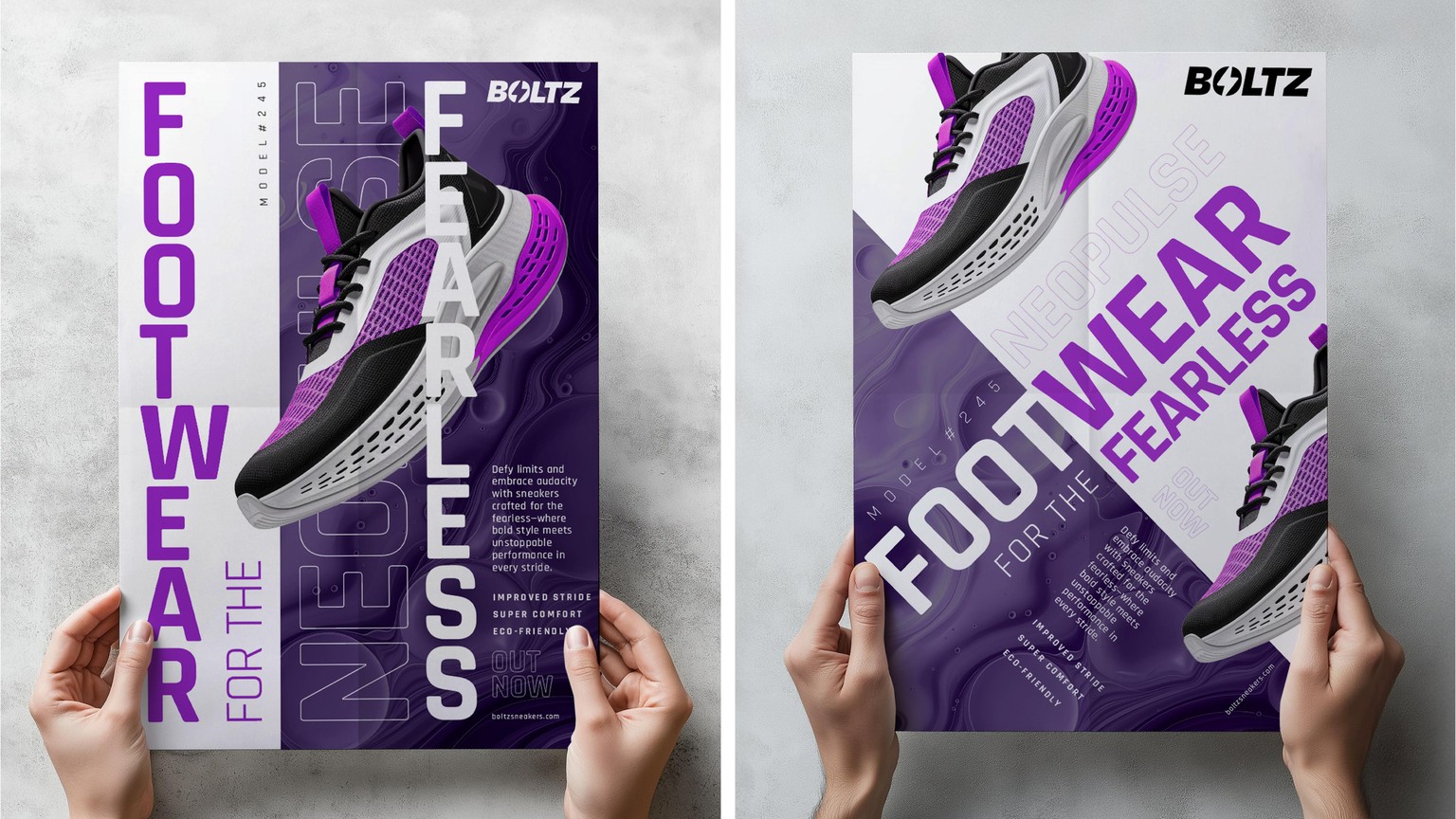
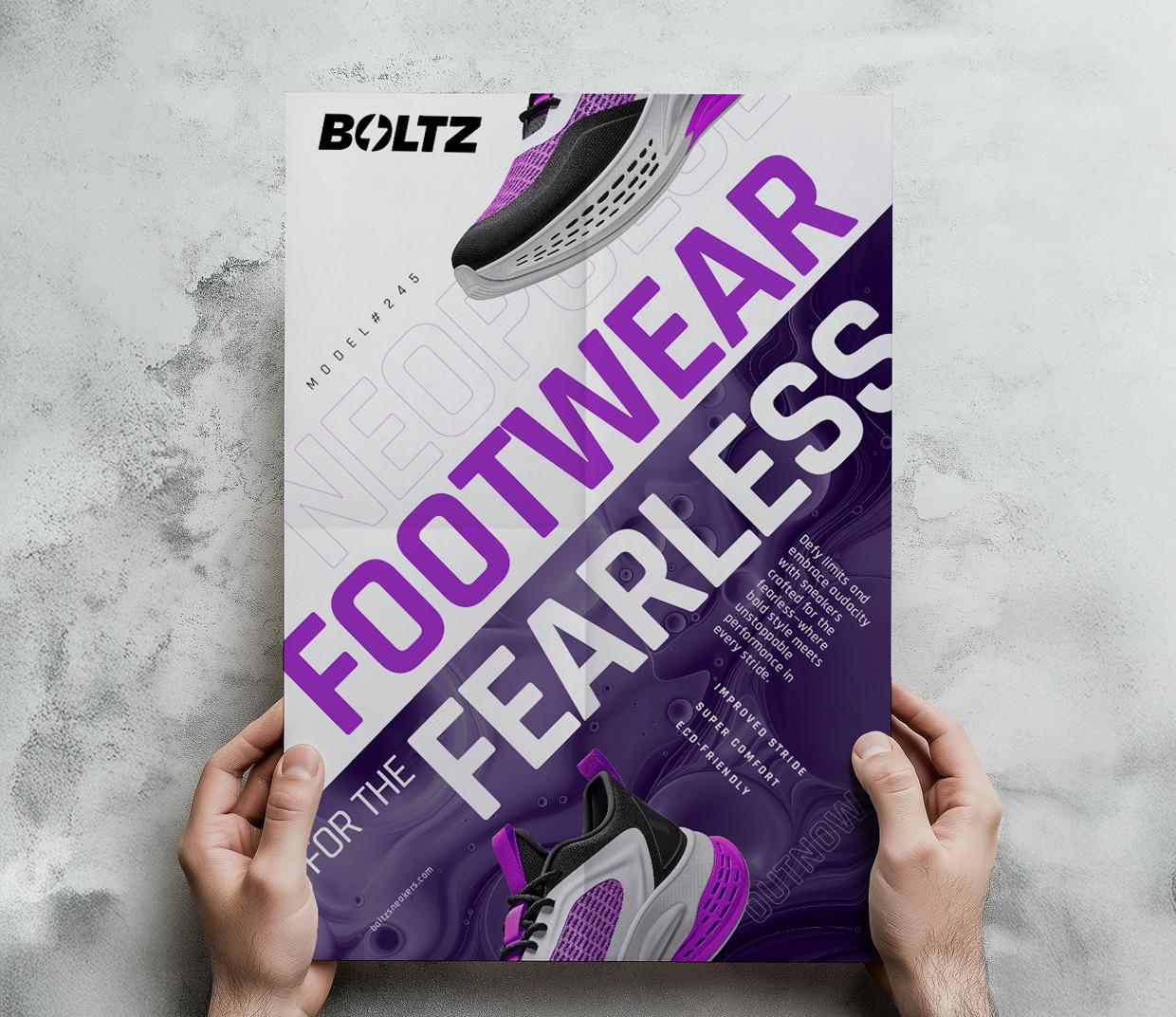
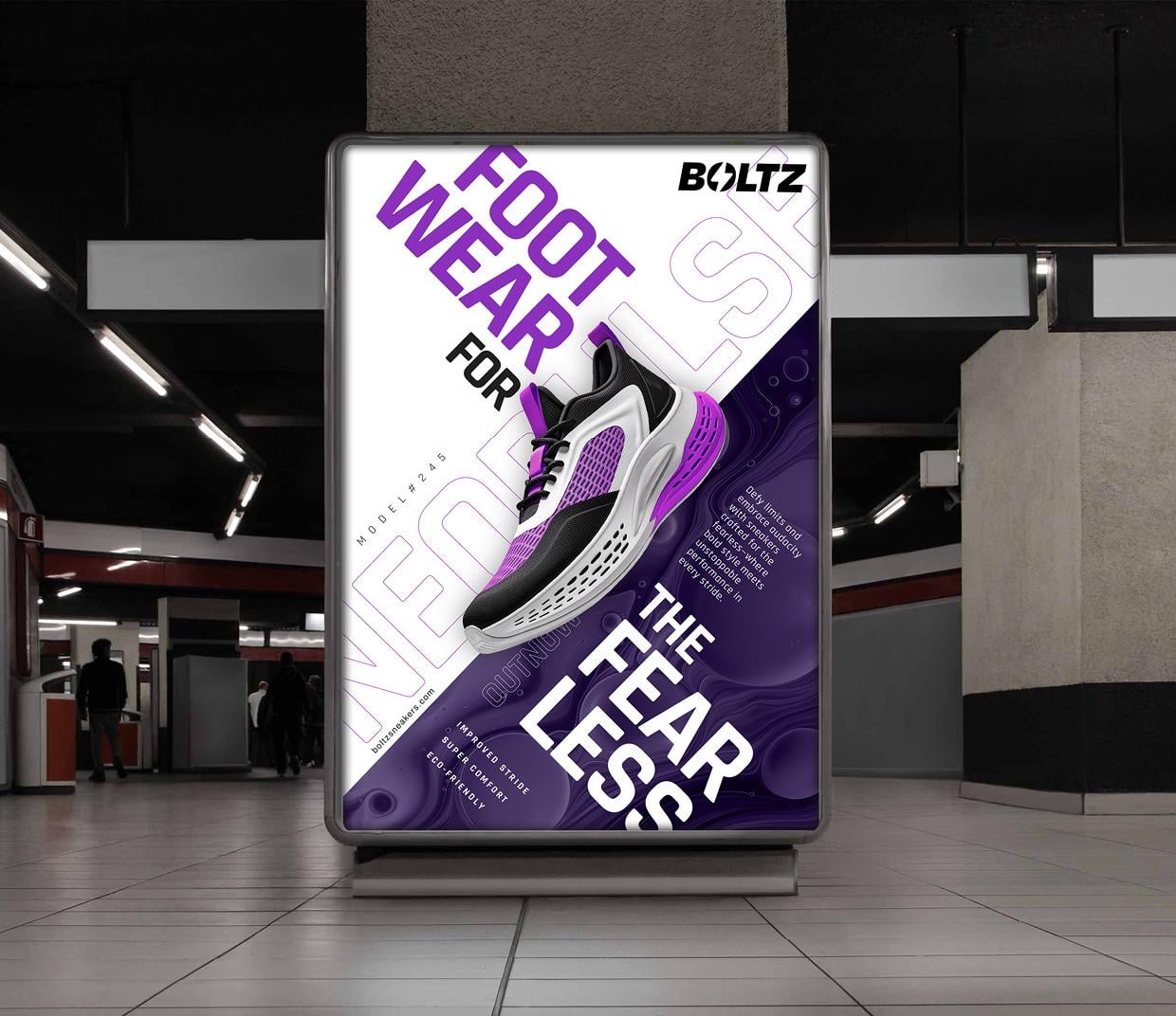
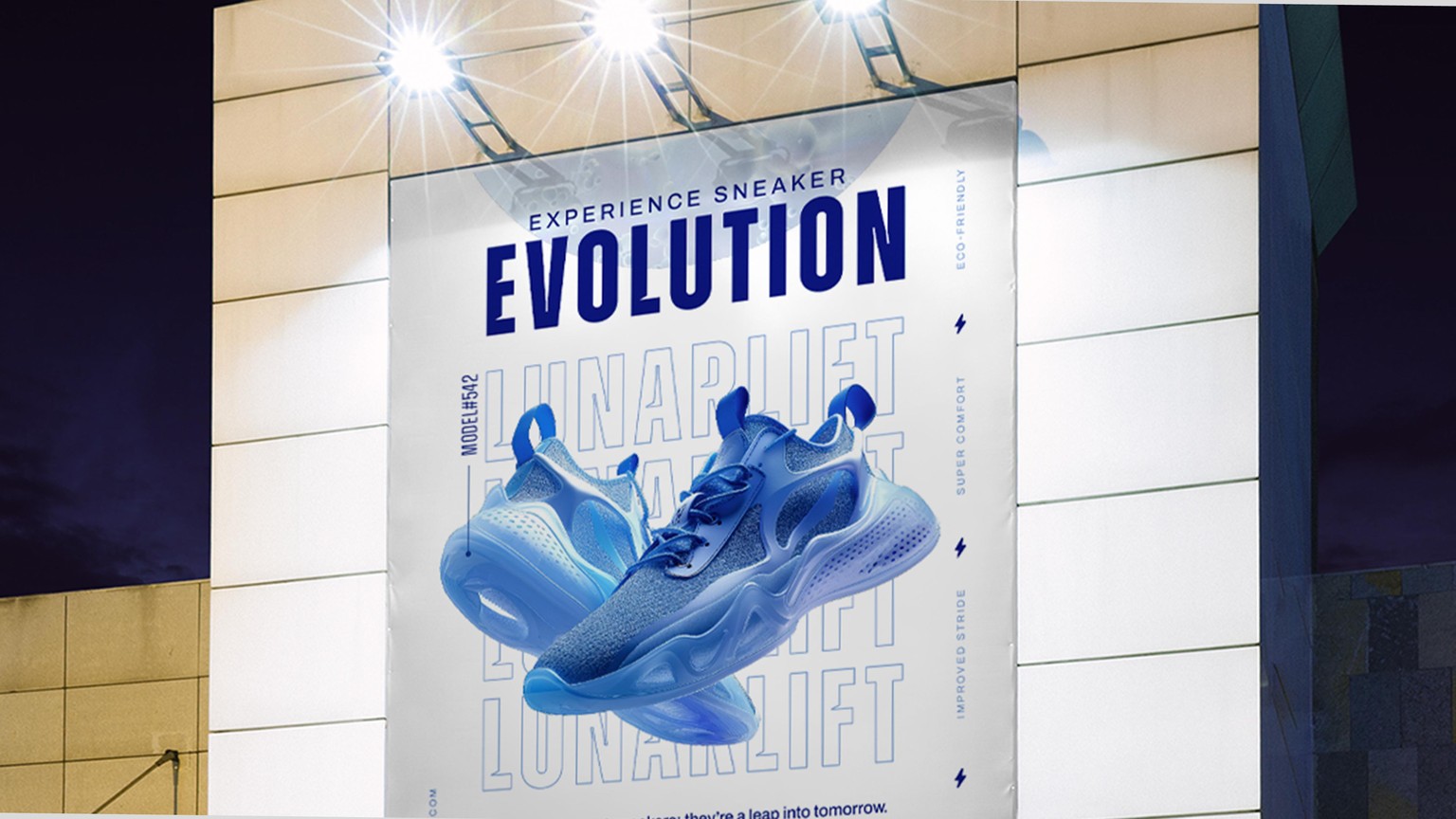
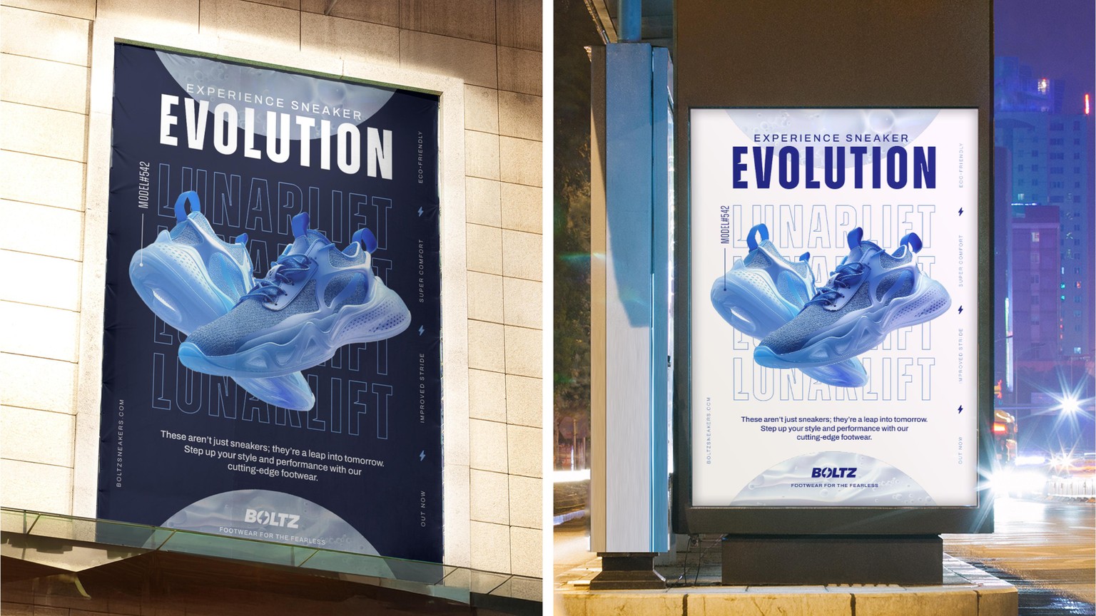
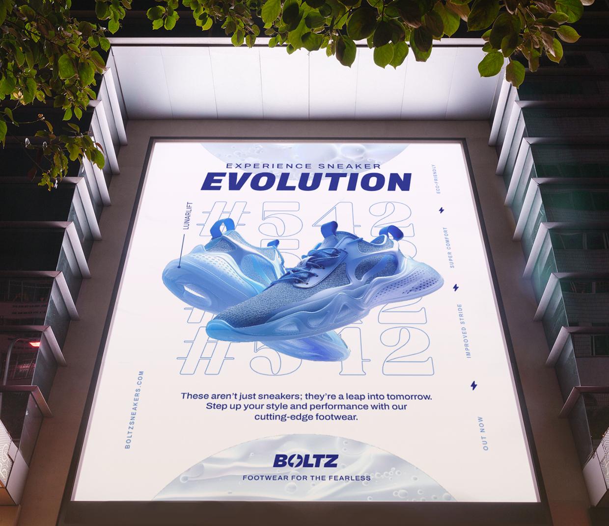
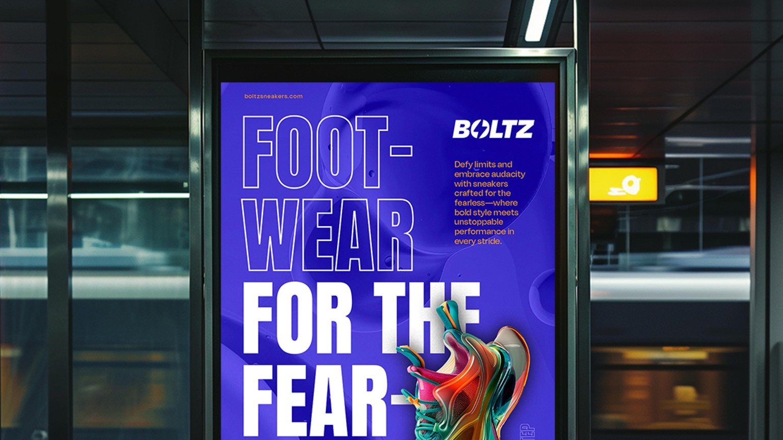
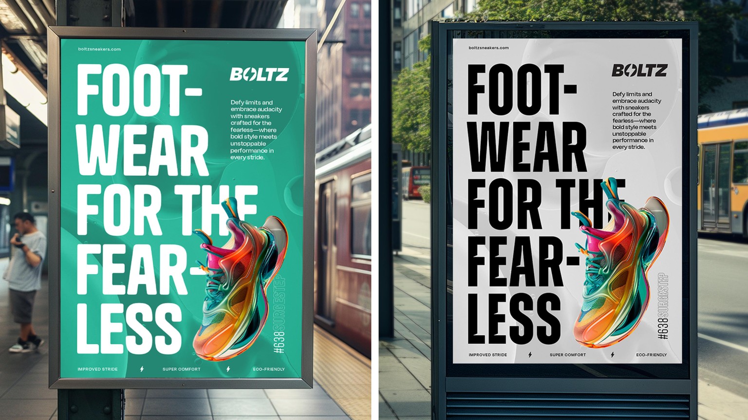
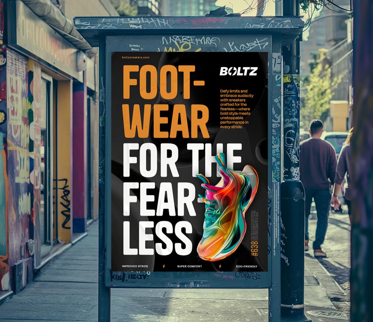
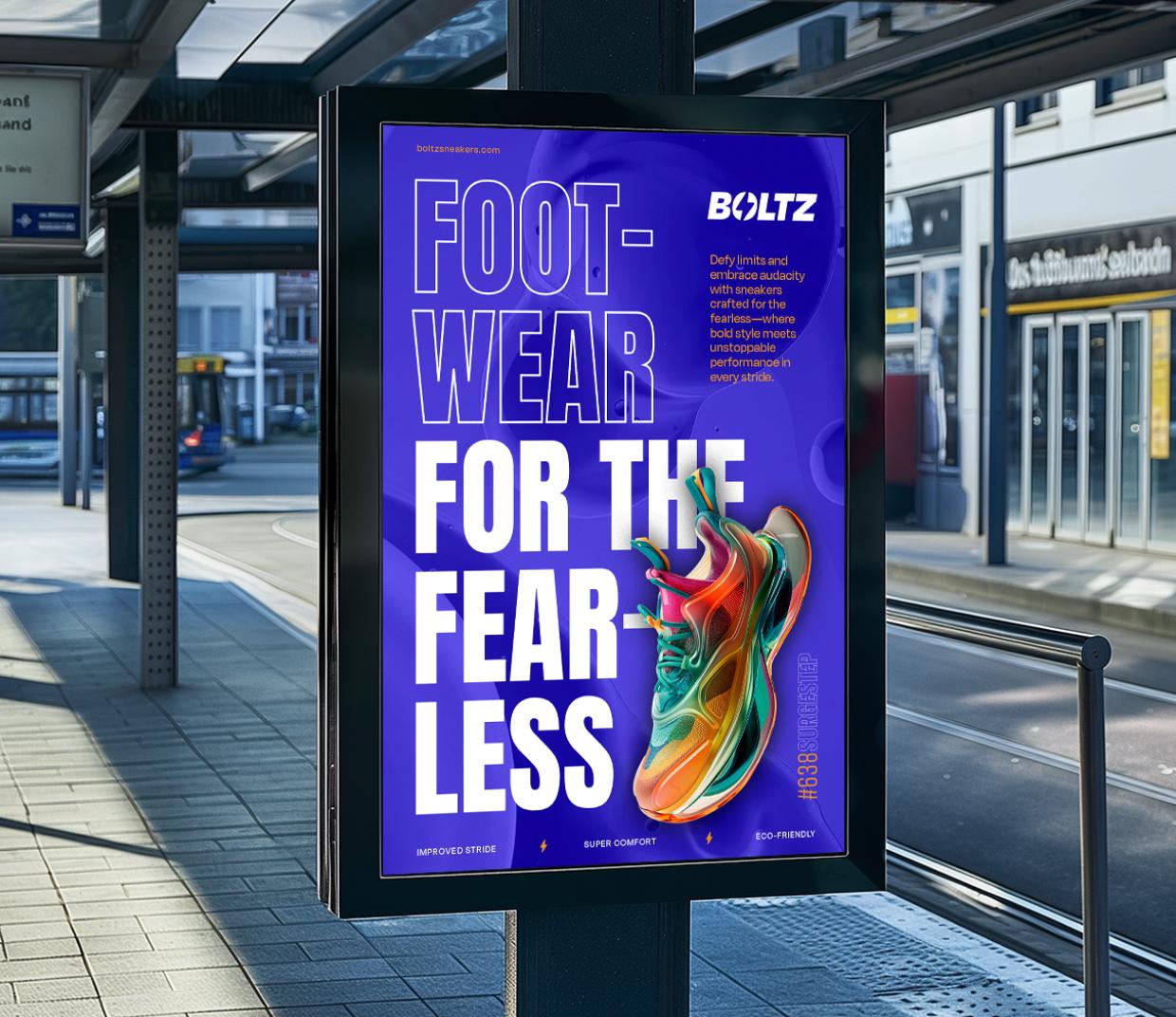
Using various grid systems, I explored different ways to organise visual elements, ensuring that each poster felt unique yet cohesive within the series.
The grids allowed me to experiment with balance and composition, framing each design in a way that directs attention to key visual elements. Typography, colour, texture, and cut-out photography were all used strategically to create visual interest and movement, allowing each poster to have its own distinct identity while still feeling part of a unified campaign.
The layered approach to the design allowed for depth, where the juxtaposition of bold typography against clean, minimalist backgrounds allowed the sneakers to stand out as the focal point. Meanwhile, vibrant colours and graphic textures were incorporated to inject energy into each design, reinforcing the brand’s modern, high-impact persona.
I was able to strike a balance between structure and creativity, allowing the poster layouts to feel dynamic yet purposeful, with each one capturing the essence of the sneaker brand in a visually compelling way.