Transcripts
1. Introduction: Hey, there. Welcome to
this quick design class. We are going to be creating
a very fun graphic today using Canva as our tool. Our project is to create
a playing card design. This is something that
I've noticed in a lot of different art prints
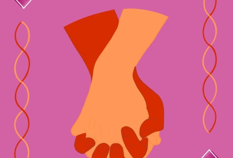
or patterns lately. I feel like playing cards
are a little bit on trend. So we're going to be
creating one that you can very much customize
to your tastes. I'm going to show you a bunch of examples that I created and then briefly take you
through each one just to show you some ideas. And then we're going to walk through the design
process together, start to finish, so that
you can create your own. I'm also going to show you
a couple examples of how I envision these being used
to get you inspired. It's really great
about this project is that there is a lot of
room for creativity, but also a very strict framework as to how playing card looks. So those parameters, I think, are what help us develop
even better design skills. So this is going to
be a fun project. I hope you'll join
me for it, and if you're ready, then
let's get started.
2. Examples to Inspire You: Before we get started on
the actual design process, I'm going to show you a couple
of samples that I've made, and then some suggested
use cases so you can get an idea of how you might use your design
after you're done. So this is the first
one I came up with. There are a lot of playing card style things that you want to play
with in this design. I did round the corners of this rectangle in the background to look a little bit more
like a playing card. There is the suit
in the two corners, which is fairly typical
with a playing card design. I've also put a box in
the middle just to give a border design that is
an optional approach. The image in the
middle does have some correlation with the
suit that we are looking at. The ACE card is
like the one card, so there's one image
in the middle. There are a lot of
design conventions that you can choose whether
to follow or break, your decisions around these are what's going to make
your design unique. For example, here,
I've kept with the Ace letter in the corner and the heart
is a typical suit. But I didn't put a
heart in the middle. I did a flower in. All the samples that I did,
I found that sticking with a cohesive color theme really
helped unify the piece. So this is something you
may want to consider if you have a theme or a
vibe in mind for yours. In the next one, I just played
with some different fonts. Here we have a diamond shape. I went with a
traditional diamond in the middle for the
ace of diamonds, but I put a pattern
in the background, and I just put it overlaid with the white rectangle
in the middle. And because the pattern is colored the same
as the background, it just made it kind
of look seamless. So that's how I did this
sort of subtractive design. Next, I did this really
feminine cute design just to see what else
I could come up with. Now I've switched over
to using the two. So I've got two swans here,
and they are mirrored. All I did to do this was
simply click on the icon, rotate it 180 degrees, and then it is the
mirrored image. But in reverse, as well, you could also choose to use the mirror tools,
which is under flip. So you could do flip horizontal, and then they would
be perfectly mirred. But I think for
cards, typically, we want them to be sort of
not a perfect reflection. Design came together primarily because of the unity
of color themes. I have a lot of
different elements here, so this bow is kind of almost
like a watercolor painted. This is a solid shape. The stripes are solid. So all these different
elements look more unified because they are all using the same color
palette, two colors. In fact, the light pink
and this light blue. Certain elements in the
Canva graphics library like this one are
actually editable, so you can see that there's
a color swatch here, so you can change the color, even though it's
an illustration. If that wasn't an option
and you had, like, a picture and you
wanted to recolor it, you can sometimes get a good
result if you go into Edit. And then down to Duotone. And there's a bunch of
other color ways you can pick here using a
different feature. So that's useful if
the color select doesn't pop up for a
graphic you're using. Next sample, this is a lot more traditional looking like
a real playing card. I just use the spades logo icon. I chose to mirror these ones so that no matter which way
you hold this card up, technically, it
would look the same. And I added this border here. This is just a regular
rectangle with a border added using the
stroke weight tool and the solid line border. Corners rounded using
this tool here. But to get the little
gap where you see the image start to
show up and stop, I just added a box behind it
that is the same color as the background and
just aligned it there. So it kind of looks
like the line isn't continuous where it
intersects with the text. This is another example I came
up with doing a face card, so that's like a Jack queen
king. I did a queen card. I added the cues in the corner. There's no white
border in this one, so I went with a
full card design. I added the flower that
matches these flowers as the suit rather than
a heart or something. Again, this is just art, so it's more symbolic than
representational. Because I wanted to
have that symmetry, I just looked up
women's silhouette in the Canva Elements
library and found this one, and I mirred it or I flipped it and then
put them together, and that created this sort
of two faced queen card. And I added some flowers
in the background. So it's actually pretty simple, but I think it looks quite cute. And finally, you couldn't
forgo a lot of the convention altogether and just
make it a text card. Sometimes people
would like to just put a message or
something cute there. So I went this really
simple design. We have the blue background.
We chose the Ace just because it's sort of
iconic, I guess. I don't know. Is that weird to say
of a playing card? I added the star because it
matched the design better. It's not a real suit, obviously. And this text is actually just an element from
the Elements library. I just searched for slogan, and it gave me this, which I could customize the colors of. You can also do a font
based design if you prefer. So those are just a
couple design ideas. I hope that that inspires you before we get into
our design process. And finally, I just
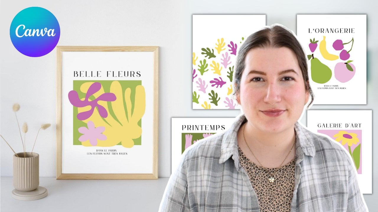
made a couple of mock ups to show you use cases. So this is the queen card
designed as an art print. I think they can look really
charming, especially with, like, a white background or
something that corresponds. Another option is I did, like, a greeting card mockup here
with the Bella vita design. This one, in
particular, I think you could do a lot of
text based designs. You could do puns on, like, card things. Like, I don't know. I can't even think
of a pun right now, but something like a
happy birthday that was a card pun on top of a
playing card on a card. Is that enough uses
of the word card? Okay, so those are my
inspiration ideas. If you wanted to
turn the card you design in this class
into something else, I would recommend exporting it from this design that
you're making and then import it as a graphic
into Canva on its own and use that to
arrange it on a backdrop. That would just be my approach, but you can do
itever way you like. So with these inspiration
pictures in mind, let's head into our lesson and start designing
our playing card.
3. Design Lesson: I opened up a new canvas for
us to start designing in. Now, in terms of size, a typical playing card
is two to three ratio. If you were doing
a massive poster, I would recommend working
on a much larger canvas. But for something like a
greeting card or whatever, I am working on a four
inch by six inch canvas. So it's 4 " along the top
and 6 " along the side. So once you have
your design open, the first thing I'm going to
do is make the background. I'm just going to
leave this as white. But depending on what you're going to be doing
with this card, you may want to change
the actual background. It's only going to be visible
behind the rounded corners. A little note, if you have a free account on Canva,
when you go to download, you can do transparent
background, but it is a premium feature, so you have to
have a pro account to remove the background. So if you just want it to have transparent rounded edges,
that is what you will need. So if you have a pro account, that is the option you can
use to export your card. If you do not, then you just want to think
about what kind of background you're going
to be putting it on and figure that out now. So if you're doing
a greeting card and you want a blue
background, for example, you would make it blue here, but it'll just be visible in
these rounded corners. So keep that in mind when
you're doing your design work. I'm going to leave mine as
white just for simplicity. So we're going to start
with a rectangle, and you can get a shortcut by
typing R on your keyboard. I'm not going to worry
about the color yet. I'm just going to fill the whole design with this rectangle. And then we'll go
into rounded corners. And you can decide how
round you want them to be. I think probably about 25 is
where I'm going to leave it, but you can make them
rounder if you want to or you can leave them
square if you prefer. So now you're going
to choose your background for your card. I think I'm going
to do a night sky, like a blue and yellow, sort of starry theme just because I think
it could be fun. But I would encourage you to
think about the style that appeals to you or if you're
making this as a product, maybe a digital printable
or something like that, then look at different trends that you may want to be
tapping into because this is a project that's very easy to design in several
different aesthetics. So for me, I'm
going to go with a dark midnight blue
with that being done, now I'm going to add the
letters in the corners. I will hit T on the keyboard
to make a text box appear, and then I'm going to type in the letter or the
number of the card. I'm going to go with seven just because there's a
star constellation called the seven sisters. I think again, going with the
solar theme, I'll do seven. Make it a little bit bigger
and put it in the corner. Now I'm going to look at font. Again, just finding something
that matches the style. I like this elegant
looking seven. The font is called Pony
Club, if you're interested. That being done, I'm
going to duplicate it and then use the rotate tool, which we will use a lot in
this project to make it 180 degrees and put it in
the corresponding corner. Like I said, I want
to do a star theme, so I'm going to
go into elements, and I'm going to type in star. I think I'm going
to go with this one because it's closer
to a diamond, so I think it would read
as the diamond suit, which I think could
be quite nice. I'm going to make it
white just for now, and maybe I'll change
the color later, and we'll line it up
right below the seven. Duplicate it. This one I don't have to rotate because
it's symmetrical. Okay, so there we go.
Now we have our stars. Now is the fun part, which
is decorating the middle. I'm just going through different
elements in the library, and I see this star
icon and also this one. And together, that makes seven because there's three in
one and four in the other. So that would work
for my design. And I think if I put them kind
of at an angle like this, it sort of looks like a
diagonal spray of stars. I'm going to just make
this a bit bigger. And individually go in and
change the color to white. I think this is a
prettier concept. Again, we're preserving
the shape from the corner. There's a continuity here, and I think we can
add another element to make it even pop even more. I'm thinking of a spray
behind it of a yellow color, so I'm going to try this one. It might not work. But that's part of the fun of designing. I want to make sure this
is in the right order. I want this yellow behind so
we can click on position, and then it shows us all the
layers in this one page. So this is where the
yellow stars are. I'm going to drag
them to the back just above the blue background. That is close to
the idea I want, but let's see if we
can do something else. This one is more gold stars, so they're already the
right color there. I think that's kind of
cool. I like this design. Like I said, there are
lots of rules you can play with here and decide
to break if you want to. So for example, one of the rules that I think
I will not break in my choices of design is that I want the number
in the corner that represents the card
to be accurately depicted in the
image on the screen. So for example, I don't
have to put seven stars, but it does become a
bit confusing if I don't I think there's a
bit more leeway when it comes with the king and queen
and Jack and maybe even the AC card because with ACE,
you can just put one image. And with any of the face cards, you can also just
put one image rather than necessarily having
to repeat anything. So that is the
flexibility around that. I do think it is fun
to mix up these suits. If you were doing a set of
four of these, for example, to do you could do four
in a single print, like a grid, or you could do four separate framed
images on a wall, like a gallery wall, I think that would
be really cute, too. You could do one of each suit or create your own
suits because, of course, you do not have to stick with the traditional four. Maybe it's four kinds of
flowers or four types of animal maybe it's just four
color coded type of designs. One of the design principles of a playing card that I
do think we have to adhere to is keeping the
icons in the corners, these two diagonals,
because I think they are the most recognizable elements that indicate this
is a playing card. If you were to switch these
around or remove them, I don't think it becomes clear what this is
supposed to be. I think that's also
true for the fact that we rotated this to
be upside down. There is an expectation that playing cards can be rotated. Even if the image in the middle doesn't necessarily rotate,
that sometimes happens. The top and bottom
should at least be legible so that they are
functional playing cards. Oh, as you can see, it's not
a very complicated project, but it does let you have
a lot of decision making and creativity to create something that is
very unique to you. I would love to see
the examples that you come up with
for this project. So I would say, pick a
card that appeals to you. An Ace is a very easy one, in my opinion, because you're looking for a single object. But if you are going
to do a number card, consider if you want an odd
number or an even number. An even number means you could
have six, you know, two, two and two objects all looking really
symmetrical and tidy. An odd number means you do have one extra one
to figure out. You can't just lay
them in a grid. So you can do something
diagonal like this or just try something a
little more unconventional. If you're trying to
unify two colors together, so for example, I had this blue swan and
the pink background, I brought the blue in
by adding borders. It's very small, maybe
I might be hard to see, but I'll zoom in. So you can see
there's a border on this outside rectangle and
also on the inside one. I just added that again, using the border style. We went to stroke weight two on this image in the background. I chose the color
was the light blue. And that just helps
bring some of that color into the full
design so it doesn't feel as confusing or I don't know, they
merge a lot better. And if you're more
of an artsy person, you can absolutely
illustrate your own image. You don't have to just
use Canva graphics. For a face card, you can even use a photograph of yourself, play around with Canvas
different tools. And finally, feel free
to put text on it, make it cute, put a saying
on it, put happy birthday. Like I said, there
are some rules. There are lots you can break. There's just a few
fundamentals that go into this project that
keep it looking identifiable for what it is. And I hope you find a really cute way to
use this project. So if you followed along and created something
you'd like to share, I would love to see it. Please feel free to upload it to the class project section or chat about it
in the discussion, and we can see what
you came up with. Finally, if you
enjoyed this class, it would mean a lot to me if you took the time to review it. It helps other students
find my classes and also lets me know what you liked or disliked about my work. I'm so happy you were here to join me for this design project. I had a lot of fun making
the samples for this class, so I knew that it would be fun for my students to
make these projects. I hope you liked
it and use it as a starting point for creating some really cool
projects that you can use either as
products you can sell or things you can use
to design your own home. Take care, and I'll see
you again next time.
 Rebecca Wilson, Artist