Transcripts
1. Introduction: You like designing in Canva or want to improve
your skills at it, then you're in the
right place because today we have a very
fun project for you. We are going to be
creating some custom Mattis inspired art prints
that you can either print at home on your
home printer or you can have sent out to a print
shop totally up to you. But this design style is
very aesthetic, very cute, very easy to customize, and it's a lot of fun to
collage the pieces together. This is sort of
inspired by the kind of art prints you see in
gallery gift shops. So if that appeals to you, then all you're going to
need is a free Canva account and our video course
here to get started. When you're ready, let's head into the first lesson together.
2. Designing in Canva: You see on the screen here is just a little sample
collection that I made to show you what we
can create in this class. As you can see, it's easy to create a collection that
looks good together. You could print in
different sizes and make a gallery wall or arrange
however you like. To get started, we
are working in Canva, and I've opened up a new Canvas. Now, if you are going to be printing this on
your home printer, then keep in mind what size
your printer can print. Typically, that's going
to be 8.5 " by 11 ". A standard sheet of paper. So you can make your
canvas this size. But if you are going
to be making it to print at a print
shop as a poster, then you may want to pick something a bit
bigger to work with. We are working on an 18
inch by 24 inch canvas. Like I said, you can make
it whatever size you like, but that's just for
point of reference. Now, the very first step
before we get designing is, I think we should
pick a color palette. And this is going
to just help your design look really unified. The way that I'm going to
suggest doing this is to find a reference photo that
you like the colors of, and then we're just going
to make a little palette up here on Canvas. So I'll start on the new page. First, I'm going to go
into the Elements library, find a picture that suits the vibe of what
I'm looking for. I picked this meadow
picture just because I like all the green tones but also the little bits of color. We're going to
create our palette by putting some
circles on the page, and I'm just going to tap
C on the keyboard and then resize it, drag it up top. And we'll just do I think
I'm going to do five colors, but you can pick as many as
you like for your project. I would recommend keeping it 3-6 just so that you're not having
too many to compete with. Now I'm going to
click on each circle, and we're going to
change the colors to colors from this picture. So I will click on
the color here. Click on Add a new color, and I'll use the dropper
tool right here. Drag this over, and I can pick
a color from the picture. I'm going to pick a
light blue from the sky. It's red from this flower, the blue from this flower, pale green from some
of the greenery, and that dark green from
the greenery as well. So this is my little
color palette I'm going to work with. You can make yours
really harmonious. You can do high contrast, but I just like to
pick from a photo because I feel like it brings together an interesting palette that is reminiscent of
something specific, and in this case,
this sort of medoVbe. Now that we have our
palette established, we can go and start
creating our designs. We'll take a look at
this example one to look at the structure, and
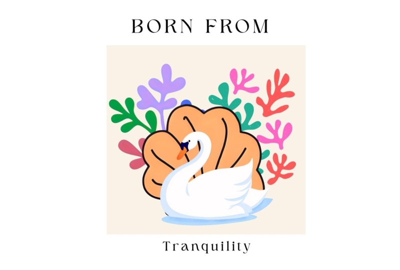
then we'll recreate it. These art prints are
inspired by Matis, and Matis did these cutout
paper projects where he cut it all these shapes and
would arrange them in different ways and use
that to make his art. That's sort of the idea
behind these pieces. Matisse was also
a French artist, which is why I have
used French text here. You can do whatever
you like, of course, but we're going to kind
of keep this theme going. I've chosen a large text at the top and then
some smaller text at the bottom based around this rectangle to kind of
keep the design framed, and then I've just
layered a couple different keto paper elements. So let's create a new piece
that is similar to this, but with our new color palette. First, I'm going
to start by adding that square in the middle as
sort of our grounding point. I'm going to tap
R on the keyboard for a rectangle or a square. I'm going to make this
bigger by holding shift on the keyboard and
then dragging it bigger. And I'm just going
to try and put it in the middle of the page. Next, I'm going to color it
one of our palette colors. Now, this is a little
jumbled because I have some colors from
my example, as well. But if you forget, you
can just scroll up and figure out from here,
what color you want to use. I'm going to use the light blue, but we can always
change this later on. Next, I'm going to add the text. I will hit T for
Textbox on my keyboard, and then you have to think
of what you want to write. So let's just try writing Matis, since that is our inspiration, and we're sort of doing a
mock version of his work. And then you can play around
with the font to make it a bit bigger to fit the
size of the square. I'm going to pick a font
that is a serif font. The one that we're using here
for this project is called zure serif. So you
can find that. It's a free font in
the Canva library. I'm just going to
make it a bit bigger, but I don't want it too big. I'm going to actually use the spacing tool and drag
this to space it out more. Now I can size it right there. As for some complimentary
text on the bottom, you can write whatever you
like. You can put a date. You can put an
interesting quote. If you want to stick with
my sort of French theme, if you don't know French,
you can just hop into Google Translate,
type in a sentence. This just says, In the garden, the flowers are very pretty. So I'm just going to copy it. There we go. And for this one, I've just made the font
a little bit smaller, and I did not use the spacing. So this is sort
of our framework. It kind of looks like a
poster you might see in, like, an art gallery shop. And next we're going to add
the Mattis inspired elements. Luckily, they are all
in the Canva library. So if we go to the Elements
tab and then type in Matis, we'll see that there are
lots of things that pop up, but we can go to graphics, and then you'll see
that there's a lot of paper cutouts that we can
use for collage style art. Many of these, as you
see, have the pro icon. If you have a Canva premium
account, you can use them. If you don't, then you can make it easier just by going to the filter tool here
and tapping on free, and that will just make sure you only can see free elements. This is where we're going
to find all the bits and pieces that we can use to make our posters by collaging together these
different elements. I'm going to just grab
three blobby shapes. We will do that one,
this one, and that one, and we'll just sort of play around with them and layer them, and then also change them to our color palette
for our project. So first, we'll change
this one to the red. This one can be that sort
of cornflower blue color, and this one will
do the light green. I think it's nice to go outside of the box a little
bit with some of these shapes as you make them
bigger just because it kind of makes the piece
a little bit more dynamic. And if you want to
adjust the layering, that's just located up
in position layers, and then you can drag and decide what order they go on
in top of each other. It's just a little
bit easier to do in this tab than to figure
it out over here. There we go. That's sort
of a first version. Now, if you are at this
stage and you think, Oh, my color palette is not
exactly where I want, I want to add another color,
you can do that here. Sometimes it's
easier to figure out palettes once you're
playing with the pieces. So, for example, maybe
I want this one to be similar to the red but maybe lighter, more
like a pink color. Then you can do that
there and just add that into your palette for
future reference. And that's the basics of how to create one of these posters. Now, there's lots of
variations you can do, and I'm going to show
you just a couple of my examples to
give you some ideas. So this element is
just a big rectangle with this single
floral one over top, and I've changed the colors
of the flower elements into that palette this one just
has a single word on top, which is spring in French. Next, I did this collage
of different fruits, which you can find as you scroll through this section of cutouts. I did change the colors of these fruits to be
within my color palette, even though they may
not be realistic, and I think that's okay. I think the harmony of
it all is interesting enough that it doesn't have
to be realistically colored. This one I left off a
rectangle in the back, and I'm just using
the white background, which I think also
has some cool impact. I sort of arranged the fruits in a square pattern so that even though there isn't
that background square to give it structure, the images themselves sort
of create that structure. Next I went for something a
little bit more figurative. This little figure character is in this library somewhere. They're there, and put it over top one of
these other cutouts. I just went for something
without any text for a little bit of variety
for the gallery wall idea. Next, I took a single shape
from this collection, and I just duplicated
it many, many times. I left some breathing
room at the top, but made this sort of
repeating pattern below, just using the different
colors and the same picture, but rotated in
different positions to add some visual variety. I will say that the Mattis style of art doesn't really rely on grids a lot in that the pieces are usually
more free form, so they're not all lined
up, very organized. And I think this
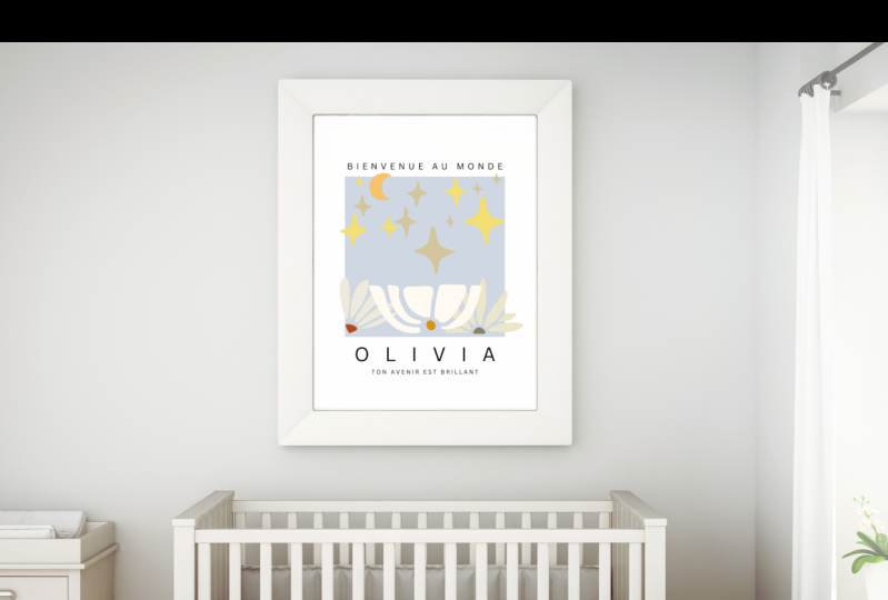
piece embodies that. Next, I went with another
just a floral graphic on top of a square
with the text. This is an example of putting a location on the
bottom of the text. This just says Art
Gallery, Paris, France. And I find that when I'm
creating these pieces, I try and use keywords
for the texts that are evocative of some sort
of aesthetic vibe. What I mean by that
is all the words here are just like picnic words, and I think picnics have a similar aesthetic to this
sort of cut out art style. I think it's thematic.
So it just says picnic and then baguette
and fruits and wine. And I've just played around with some stars and this
big pomegranate shape. Times using the
same cutout shape, but scale differently
can be really impactful. You can also use the flip tool if you want a little
bit of variety. So for example, clicked
on that one, flip, and you can flip it horizontal just so that you're
using the same picture, but it doesn't look
identical because you've rotated it. Those are
just some examples. Hopefully, that got you
thinking about how to create these Mattis inspired art prints that you
can make at home. Now, you can download these as a PNG or a PDF and send
them to a printers or, like I said, print them at home. Canva also has a
printing service, and they usually partner, I think, typically with
a Stables print store, but it may depend on your area. And you can access that just by clicking on Print W
Canva right here. If it doesn't automatically
bring up posters, you can go back and
just search for posters here. The
price will vary. It's a little bit expensive just given that I'm in Canada, but you can pick the pages
that you would want printed. It gives you a nice preview of what that poster
would look like here, example of sort of
what we're creating, you can see it in
some mock ups here. And it gives you lots
of other options for sizing, framing, et cetera. I hope you enjoyed
this fun project. You can make these
for your own use. You can make these to sell
as a digital product. It is a pretty popular
aesthetic style, and I would encourage you to
add your own flair to it, find a way to make it a little bit unique so that it stands out amongst competition if it is something you are selling. So, for example,
you could rotate the text to be vertical
rather than horizontal. You can find other ways to do different pages
that are outside of the structure that are more like acid pieces to go with
your other collages. There's a lot you can
do and just as a note, if you wanted to
make a little page like this that just shows
off all your designs, all I did was download all of these pictures as
JPEGs from Canva. Then I uploaded them here
in the design space, arranged them on this page, and then I used the shadows effect right
here and just hit glow, and that's what gives
it a little bit of definition around the sides. So if you wanted to
make a mock up style like this, you could
do it that way. With that being said,
I would love to see your work as
the class project. So any of the posters
that you create, whether you copy
one of my styles or create something
totally unique, I would love to see it. So please consider downloading it from Canva and
uploading it to our class project so that we can all take a look and be
inspired by each other. If you have any questions, please just pop them in
the class discussion and we can chat about it there. If you enjoyed this class, I have lots of others on
various design skills, art projects, digital products, all kinds of things that
interest creative people. And if you want to
leave a review for this class, I would
really appreciate it. I read them all, and I love hearing your feedback.
That's all for now. Happy designing, and
I'll see you later. Bye.
 Rebecca Wilson, Artist