Transcripts
1. Dare To Color - The Intro: Welcome to prompt number
eight of the Creative Jews, a series dedicated to boosting your creativity
without pressure, but with lots of fun. This class is your
free pass to explore four fundamental color schemes without worrying about
drawing a perfect picture. We'll stick to oranges, but with a twist. You can use any
color but orange. To give you a great start, we will first create
our own color wheel from which we can choose the
colors for our sketches. We will then put four basic color combinations
to the test. Analogous, monochrome, triadic
and split complimentary. By the end of the class, you should be able
to confidently step away from true
to live coloring. Whether you are a
beginner looking for an easy way
into the world of color theory or
someone wanting to playfully expand their
color comfort zone. This class is for you. All you need is a bunch of colored pencils and
something to draw on. I can't wait to see
your confidence in using color grow.
See you in class.
2. Your Tools & Your Project: M. Welcome to class. Before we start our
color adventure, I want you to grab all the different colored
pencils you can find. We will only need 12 in the end, but it's good to have a
couple to choose from. Aside from that, you will need paper or anything
you can draw on. To support your learning, grab your worksheet from the resources
section of Sk share. That makes it super easy for you to follow each
step of the class. Now, this class is prompt number eight from its big sister class, the creative choose,
which guides you through the creative
process step by step. If you haven't
watched a class yet, I highly recommend you watch at least the
sketching lessons. There's also one
creativity short class in D Series, doodling
with intention, which is super fun
and already has fantastic projects that
you should explore. Now, speaking of projects, your project for this
class is really easy. As we dive into four
different color schemes, it's sufficient to
share at least one of your color sketches
in the project gallery. You can upload a photo or a screenshot if you
work digitally. Got your colored pencils ready. Then let's get crafty and
build a color wheel with me. I can't wait to get started.
3. Let’s Build a Color Wheel: M. To build our color wheel, you will need 12
colored pencils, and I will show you
exactly which 12 we need. To spread them evenly and
create a balanced wheel, I use equal sided triangles. The first one you
see here is for our first colors,
the primary colors. The main characteristic of primary colors is that they
cannot be created by mixing. At the top point is yellow. So yellow is our first
color in the color wheel, the first primary color. To the right of it is red
and to the left is blue. Our three primary
colors are th complete. Let me add the next triangle
for secondary colors. They are created by mixing
two primary colors. Yellow and red, mix together, make orange, red and blue, make violet, and
blue and yellow, mix together, make green. Third, we have our
tertiary colors, and we need the next triangle. T tertiary colors are
created by mixing a primary color with
a secondary color. If we mix yellow and orange, we have this yellow
orange or amber. Next, red and violet, make red violet or magenta. And third, green and blue
make turquoise or blue green. Now, three more spots are
open for tertiary colors. For this, we need the last
triangle. Yes, perfect. The mixture of orange
and red results in red orange or vermilion. And I love this color so much. The mixture of blue and
violet is blue violet. And if we mix green and yellow, you will get yellow green. So let's add the last pencil, and our color wheel is complete. Fantastic. Your task now is to create your own color
wheel with 12 colors. So grab your colored
pencils and get started. You can watch the video again or skip to the part
you want to repeat. Now, here's a pro tip. Create a color
wheel on a piece of paper by swatching
all your pencils. It's best to also note the color number you can find on your pencil if it is marked. For example, with this faber
Castel pencil, I have, let's see, number 125
middle purple pink. Here you can see my color wheel with the different numbers. In the second step, you can
also sample each color in different saturations so that you have a color
gradient to hand. Okay. Are you ready? Then let's choose the very
first colors for drawing.
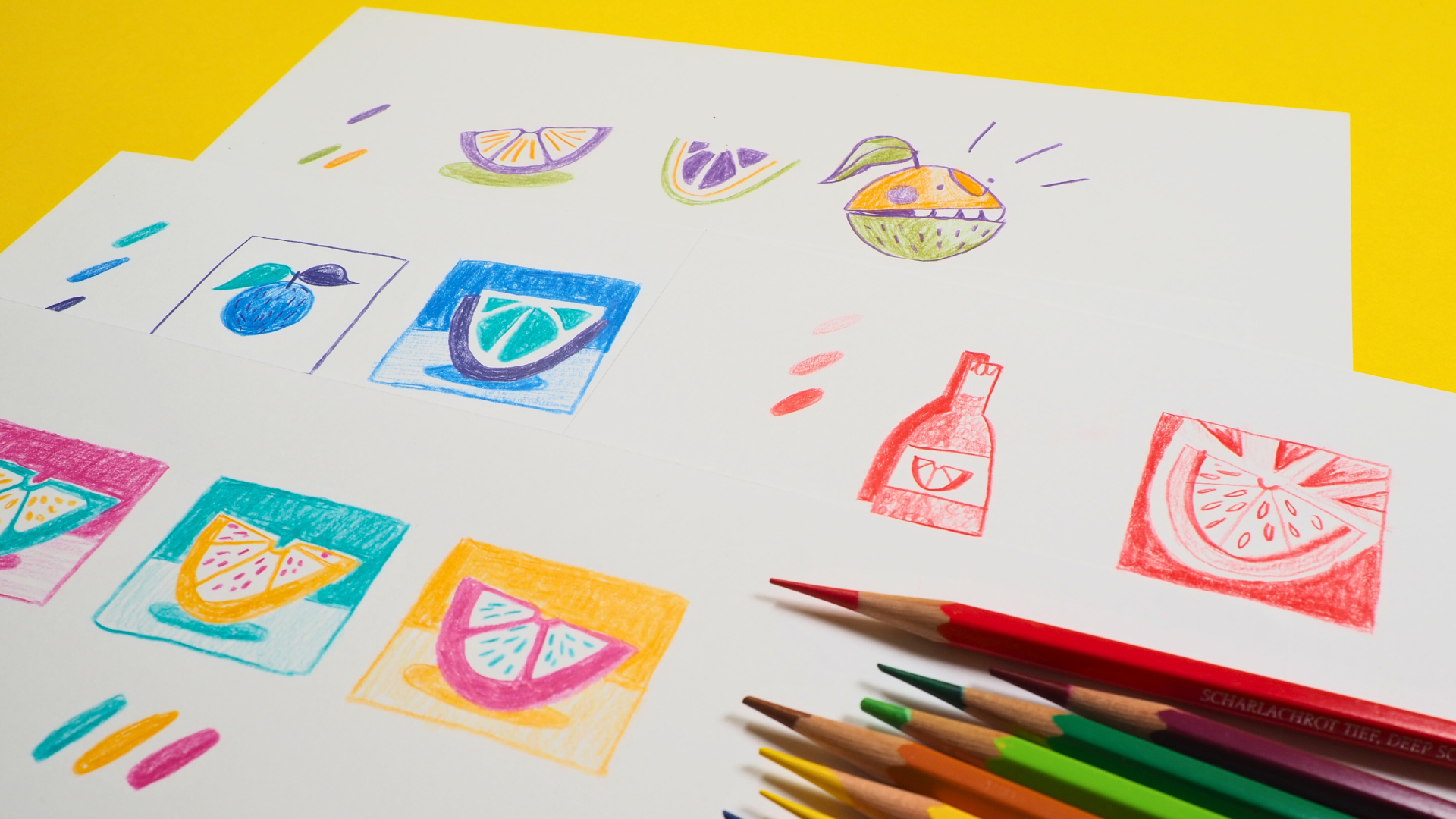
4. Analogous Colors: H Before we start choosing our first
colors, there's one rule. Please use as unrealistic colors as possible in this class. Since we will be drawing
many sketches with oranges, let's largely avoid
all orange tones. Be bold and choose colors
that are very unusual. For the first combination, we will use analogous colors. This is a group of
colors that are next to each other
on the color wheel. Like best friends,
they are really close. For example, if I choose blue, the closest colors to
the right and left are turquise and blue violet. Voila, my first
color combination. You task now is simply to choose your favorite color and then select the two adjacent colors. If, for example, red violet
is your favorite color, then the friends that join
forces are violet and red. Now, here are my colors again. Turquoise, blue,
and blue violet. Oh, they look stunning already. I wish you lots of
fun choosing yours. Once you're ready, we will
see each other for drawing.
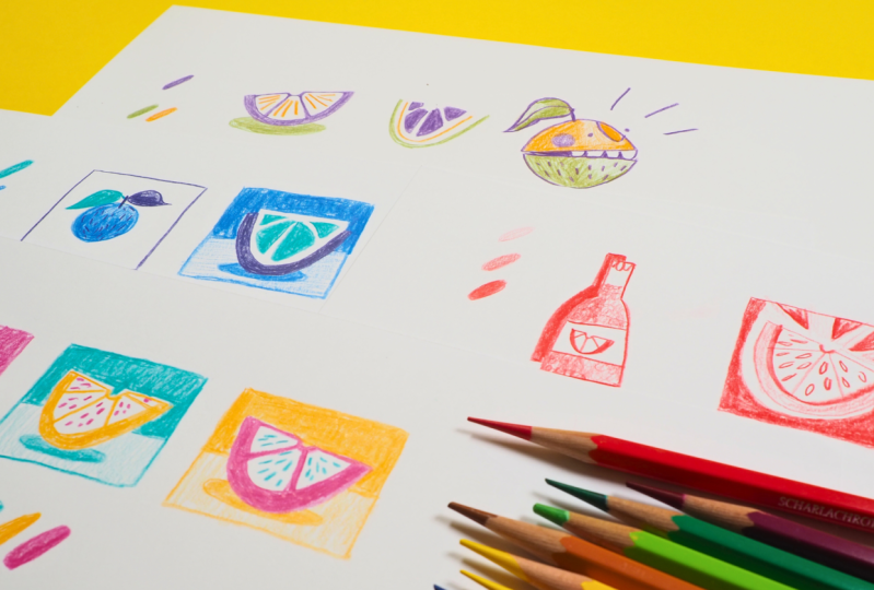
5. Draw With Analogous Colors: Welcome to our first
drawing exercise. Since this is a class
of the creative Jews, we stick to our general theme, oranges, and we only draw
them in very simple shapes. This class is not about
drawing a pretty picture. It's about diving into color. Therefore, we will use
color thumb nails. They are perfect
for experimenting with different
color combinations. Call it your safe
space to try out the individual colors without
worrying about the result. I start very simple
with a blue orange. As you can see, I work
with a lot of pressure to get the most intense
color possible on the paper. Our next color blue violet. This will be my first leaf. I also draw this with
very bold strokes to let the colors appear next to each other in a simular saturation. The only color left is
turquoise as my third color. So let's draw another
leaf with it. Oh, great. This combination
looks fantastic. And you can see
how easy it is to step away from realistic
color choices. A tip to level up, create a small history of the colors you used underneath
your picture. The color sample will help you reconstruct colors
in the future. In the second frame, we'll simply try
out half an orange. But first, the frame like this. Okay. Now I take my beautiful blue violet
to create the peel. Clearly, you have all artistic freedom in
your color sketch. I'm going more graphic here. So I simplified the
peal quite a lot. Now I use tour aqui for the individual
segments of my orange. You can see that deviating from realistic colors gives your
picture a whole new twist. Analogous color combinations are great for beginners because they appear harmonious and do not overwhelm
the viewer's eye. Remember, they are best
friends on the color wheel, and they create a
coherent overall image. If you want to create
a specific mood or atmosphere in your picture, consider an analogous
color combination. If you like, add a
background to the picture. You can divide it into a wall surface and
a table surface. You can see it here. I make the wall surface in a
saturated blue. Yeah, this can be a bit of work. So, great. And the table
surface is the same color, but with less intensity. You can vary the
tone by using it a bit softer or
highly saturated, depending on how much
pressure you use. But we will look at that closer in the next
color combination. Great. That looks pretty good. So this was a simple nice start. With the third frame,
I'll just draw a space where you can
experiment yourself. Enjoy the exercise and
don't overthink it. It's all about exploring colors. Once you're ready for the
next color adventure, I will meet you at the color
wheel for monochrome colors.
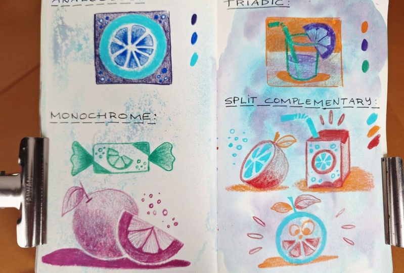
6. Monochrome Colors: N a monochrome color palette, you use only one color in its different variations.
Let's give it a try. Choose your favorite color
here on the color wheel. It can be any color
despite orange. For me, it's vermilion, or it's so beautiful. And once you have
chosen your color, take a piece of paper where we can apply its
different variations. Okay, we might need some space, W to achieve the lightest color. We work with minimal pressure. You can see how I hold my
pencil at the very end. The further you hold your pencil towards the middle or the tip, the more pressure you can apply. This will result step by
step in a richer color, as you can see here. For my last circle, I hold the pencil very
close to the tip, and you can see
it's quite easy to achieve an intense rich color. You can also do this
with layered hatching, and I will show you
in just a minute in our drawing exercise
how to do that. But first, choose
your favorite color on the color wheel and
create your gradient. Once you're ready, we
can start experimenting with just one color.
See you there.
7. Draw With Monochrome Colors: There is my beautiful
vermilion pencil. The only color I'm using
for this color experiment. In the previous lesson, we learned how simple
it is to create a little monochrome
color palette by focusing on one color
and its variations. This approach can
save a lot of time and simplify the color
selection process. The gradient I create here
is just a personal reminder, but feel free to make yours
as detailed as you wish. Let's begin with
the first object. This time, it's
something different, but still related to oranges. Let's see if you can
guess what it is. Yes. It's an orange soda bottle. I'm outlining with
a bit more pressure to create a nice red. I'm also drawing my small
label a bit more strongly. When drawing the soda
inside the bottle, use hatching or
similar techniques. For example, I use light curls. To make varying
intensities of red, I draw a bit more
loosely to the right, and then I go over my
shading in several layers. This creates a gradient from slightly darker red
to lighter red. Now I draw the shadow cast by my bottle again with
a very rich red. It's all about the amount
of pressure I apply. You can see by using different tones and
nuances of only one color, you can create death
and dimension, leading to an interesting
and yet harmonious image in no time. How fabulous. Now, choose an object you want
to continue working with. Keep in mind that no matter how messy your
little sketch is, you will see that monochrome
colors still hold your sketch together and
create a unified look. Just be bold in your
variations of your color. Remember as unrealistic
as possible, but as loud as possible. In this thumb nail, a half
on slice is the hero again. There will be some fun
graphic ray elements, too. And maybe a last one here. Then, of course, I need my
inner segments of the orange. And another outline to separate the second
third of the picture. Wow, it's not much, but there's already
a lot going on. Because there's no
competing color in a monochrome design, it can easily capture attention. Some brands use
monochrome designs to enhance their recognition. Take Tiffany, for example, and let's delve into some interesting color facts while I continue
working on my filling. Tiffany uses a unique blue, green color that may have immediately popped
into your head. It was especially
registered in 2001 when they collaborated with
the Pantone color Institute to ensure that
Tiffany Blue could be consistently and unmistakably
reproduced worldwide. This color was
standardized as 837 blue, named after the year,
Tiffany was founded. It's also known as the
Forget me Not Blue. So don't forget, the world of monochrome colors is far
away from being boring. It's a way of endless
possibilities. To experiment a little more with lighter and intense areas, my triangles or rays are
colored with a gradient. The tip is in a
slightly stronger red, and then I let it fade by
applying less pressure. Yes, that looks quite
good, a bit flame like. You can now continue
experimenting with your monochrome
colored or in shapes. I wish you a lot of fun with it. Once you're ready, we will move on to the next turn
of the color wheel, and then we will choose fun triadic colors.
See you there.
8. Triadic Colors: Welcome back to the color wheel. In this round, I will
bring our little star back together to form an
equilateral triangle, just like we started. A triadic color
scheme is built by three colors that are evenly positioned
around the color wheel. These three colors always
form an equal sided triangle. Here you see turquise, yellow orange, and red violet, which form the first
triadic color scheme. Don't they look great. These are the ones I'm going
to use for my next drawings. If we rotate our triangle
again just a bit, you can see the next trio, green, orange, and violet. In fact, there are only two more triadic color
combinations left. O primary colors,
blue, red, and yellow. And the last scheme
is red, orange, blue violet and yellow
green. Now it's your turn. Choose a color and then select the two colors
on the color wheel, that would form an equal side a triangle with
your first color. Once you have made your choice, we will meet again to
put it to the test. So see you there.
9. Draw With Triadic Colors: Welcome to our triadic
color adventure. Here are the three colored
pencils I'm going to use, yellow, orange, turquoise,
and purple pink. They look quite promising. We will now try out three
color combinations with one color always being a bit more dominant
than the other. To start, we will
draw three squares, one with each color. This will be our safe
space for experimentation. Be aware that
triadic colors tend to look very vibrant
and powerful together, which makes this color
scheme so unique. Finally, I'll add one square
in bright yellow orange, and we're good to go. Let's start in our
Magenta square. Of course, we stick to our
theme and a very simple shape. Half an orange it is. But feel free to interpret your own version
of an orange here. Choose a color that
is different from the frame color for
your main element. I've chosen Turquise. Now, all the elements of my
orange half from the peel to the segments will be drawn only with turquise
or blue green. Of course, you are
artistically free to decide how and in what
form you want to draw it. You may remember the lessons in the creative Jews where we drew many different
shapes of oranges. This can be very
helpful to you now. Now let's move on
to the next color. Red violet is also the
color of my frame. And with that, I now
draw the shadow. You can already see how the colors look
next to each other. Triadic colors have a
very lively effect. But you can balance them by applying one small
professional tip. Commit to one dominant color in your palette that makes
up to 60% of your image, a secondary color that
makes up to 30% of the design and an
excellent color that makes up to
10% of the design. The most dominant color here is the one I use for the
shadow and the background. You see that I've split
the background again. A der area, the wallpaper will be in a more
saturated magenta. Create your feeling
in your own way, whether with quick strokes
or circular movements. This way, your own style can sh through even when experimenting
freely with colors. The surface of the
imaginary table gets only a hint of pink. It's a low saturation, but still the same hue. Now, use your third color
as an accent color. In my case, the yellow orange
or dark chrome yellow. It is only used to hint at the structure within
each orange segment. This way, the colors do
not overpower each other. Wow. This brings
in a great twist. How is your first
experiment going? All right, let's move to the second square,
the turquoise field. Here, yellow orange will
be the color of my orange. I know, we wanted to avoid true to live colors
as much as possible. But one little exception should be all right because I really wanted to go with turquoise
in my triadic color scheme. Do you see, I'm repeating the motif from the
first square here. If you have chosen
a different object than the half orange, I recommend continuing
the motif you have started with for
all three squares. So you have a good comparison of which color combination
you like best. Now, the individual
segments of my orange. Great. Let's switch back to
turquoise to draw the shadow. Now, I divide the
background into a very saturated color
area and a light bond. As we have already seen in our experiment with
monochrome colors, beautiful contrasts
can be created simply by using different
shades of the same hu. Now, take your time to
create your color tha. And ready. The excellent color
of this sketch is now Ma. I use this color
tone to highlight the inner structure
of the orange just with little dots. F here. Fantastic. We've completed
our second combination. Now we just need the
third and final one. It's great that we have
already pink on hand because pink is the color for the orange in our third
experimental square. First, I draw the hero in
the middle of our thumbnail. By now, you know this motif, so I will try to speed
up the video a bit. Now the peel has its filling. Now, I draw the
segments of the orange. Maybe improving the outline here and there, and that's it. Now we can move on to the second color to draw
the shadow of the orange. Now, the background, using
the same colored pencil. And again, the background
is divided into a strongly saturated area
and a less saturated area. The use of less saturated
areas and nearly no filling in our object itself gives the drawing a bit
more room to breathe. Once the background is finished, pick up your third
color for the accents. In my case, it's turquoise. Now use this to draw your
additional elements. That's a great combination. Fantastic. We have our third
triadic color thumb nail. Now we can compare and decide which combination
we like the best. You can try all variations of main secondary and
excellent colors, which would make three times
three combinations possible. Feel free to try all of them. Share your results
in your project, and let your classmates know
which one is your favorite. Don't forget to record your color history
below your pictures, including the color number of the colored pencil you used. Are you ready? Then let's move on to our last color experiment, the split complimentary color. I'll meet you once again
at the color wheel.
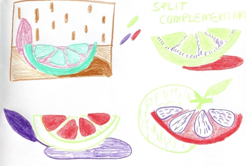
10. Split Complementary Colors: Split complimentary. I admit if you are
new to the color ABC, this name might
seem intimidating, but it's actually quite simple. You choose a main color, and then you look for
the two neighbors of its opposite or
complimentary color. Let's have an example. If your main color is violet, the complimentary
color is yellow. The split complimentary
colors are the two that are
directly next to it. So yellow, orange
and yellow, green. These three make up a split complimentary
color combination, and let's pick them and see how they look
next to each other. Actually, quite pretty. I will draw with those, but let me show you
a second example. If yellow is your base color, then you look for
the color that are next to the complimentary
color violet, red violet and blue violet. Let's assume you choose
Turquise as your base color. Then the opposite is vermilion, and the adjacent colors are
orange and primary red. That's how easy you pick a complimentary
color combination. You task now is to first
pick a base color. Now determine the
exact opposite, the complimentary color and take the colors that are right and left of the complimentary
color from the color wheel. Bravo. Now you have three colors that make up a split
complimentary color combination. Have you found yours? Then let's get started with
our last coloring exercise.
11. Draw With Split Complementary Colors: Welcome to the last
color adventure. Let's start with a
little color history of our split complimentary
color scheme. My main or base color is purple, and the two split
complimentary colors are yellow green and yellow orange. Your color combination
may be different, but ensure that you distinguish between your base color as the dominant color and the split complimentary
colors as secondary colors. To simplify our final exercise, we will use our all
time favorite sketch. The half orange. As this
is my hero element, I will draw it in my base color. All right. That's good. Once again, the orange is
divided into segments. Like this, and I use a slightly thicker line
to make them stand out. Cool. In the next step, one of the two split
complimentary colors, yellow green will
represent the shadow. You can see here that I'm now adding accents with
the yellow orange. Wow. This is actually a cool
combination. Look at that. In our second example, you will see that
the orange peel is designed in the two split
complimentary colors. First, the yellow green, and it gets a slightly
thicker outline. Followed by the
yellow orange tone, which appears a bit
thinner as an accent. I draw the segments
of the orange in a very saturated version
of our main color violet. As I said, it's not
about beauty here. We just want to see
how we can make these colors stance
together. Yeah, like this. And one more and we're ready. Super. Let's start our final piece, and I can't imagine a creative juice class without
my orange doodle emojis. What you're looking at is the heat with the leave of
our little Emoji doodle. You may recognize it from our mini creative classes
doodling with intention or some of the
creative juice lessons where we created Emoji Doodles. If not, join us there for more creative prompts to get
your creativity flowing. All right, now, a
nice set of teeth, a nose and two eyes, and my little friend is ready. The outline here is
drawn in my base color. Next, I use my
secondary colors yellow green and yellow orange
as accents or fils. I've used various shades of yellow green to make the
picture a bit more interesting. And although I aim to stay as unrealistic as possible
in my color choices, I've realized that a bit
of orange is unavoidable. Okay, great. Our little
moge is complete. What a funny friend
to finish with. Congratulations. We mastered our last
color combination, the split complimentary colors. Now it's time to review all the color adventures we've accomplished and
submit our project. It will be easy. So see you there. C.
12. Wrap up & Submit Your Project: Congratulations. You've mastered all
four color adventures. I'm confident that you are
a confident color friend by now because here is
what you learned in class. You got a basic understanding
of the color wheel, including the primary colors, secondary, and all
six tertiary colors. In our second step, we explored all four
fundamental color schemes. Analogous, monochrome, triadic
and split complimentary. In your resources PDF, you will find one more
color combination, and I can't wait to see
what you created with this. Don't forget to share with us at least one of your
sketches you did in class. Upload it here in the project
section on Skill Share, and let us know what color
combination you used. If you enjoyed this prompt
of the creative Jes, I would be Uber happy
to receive your review, and it's really easy to do here. I hope to see you at one of my other classes I teach
here on Skill Share. Get ready because more
creative prompts are coming. Don't forget to follow, so you don't miss any of them. Thank you so much for
joining me today. I can't wait to
see you again for the next creative
choose time. Choose.
 Ulrike Text&Tulip, Digital Art in Procreate