Transcripts
1. Intro: If your typical workflow and resolve is applying
a lot tweaking and not really knowing
where to go from there, then you definitely
want to learn what the curves and Da
Vinci Resolve do. This is a really powerful tool that can take your footage
from this to this. It's a tool that
admittedly looks very complicated,
very intimidating, but after this class, you'll know what the curves do, how to use them,
and how to really elevate your footage
to the next level. I'm Fred Trevino and
I've been a colorist for over 10 years for Primax
studio in New York, I've created over 50
feature-length films and I've worked with
companies like HBO, Gucci product just
to name a few. My goal is to give you
the confidence to start using the curves
on every project. In this class, we're going
to cover the custom curves, the hue versus hue, hue versus saturation,
and a lot more. If you're ready to become
a better colorist, let's get started.
2. Custom Curves: In this lesson we are going to cover the Custom Curves
here at the bottom. The Custom Curves basically
let you control the shadows, midtones, and
highlights of a clip. Let's jump right in here. The first thing you
want to do is make sure that Custom is selected. Then it's always easiest
to expand so you can have more control and then just position this
somewhere where you can see the entire shot. For those of you who
may not know how to read the different curves, basically the way
they are laid out is on the left side,
there are shadows. The right side over
here represents the highlights and
in the middle, of course, are all
of the midtones. What's extra helpful is that they show you
the scope here, which shows you the distribution
of the entire image. What you can see here is
over here on this side, this area here represents
the highlights of the shot, this over here represents the shadows of the shot and
you can see the distribution of pixels and then right here is the middle or the midtones and you can see that most
of the information is here, which is the case
for most shots. For example to show you
that a little bit better, if I were to click by looking
at this image, obviously, the shadows are this area here, the highlights are probably
the tree trunk here, and then the midtones are probably this backward and wall, or maybe right here. If I were just to click
here, for example, you can see that it
makes this little dot here which represents
the highlights. If I were to click, say on the shadows, it's showing you where those
shadows are on the chart. If I were to go to the midtones, you can see that
it's showing you here on the chart as well. That's just to show
you to illustrate how the image is spread across
the different curves here. I'm going to reset this here. Let's just say you want to
now jump in and adjust this. What I typically do with curves is shadows are normally
a good place to start. You don't necessarily have
to click on the image, a lot of times just
by looking at it, you can see where everything is. Again, shadows,
midtones, highlights. I'm just going to click right around here
because I can see that this concentration of
pixels or the shadow. I'll just click here and then for the midtones,
I'll click here. I normally make a few
initial selection. So what I'm going to do is just drop down the shadows a touch, and I'm just going to drop
them down a little bit. You can see if I
really do an extreme, you can see what part of
the image it's adjusting. I'm going to take this
and just drop it down a touch and the shadows
are already pretty good. I'm just illustrating. I'm also looking at
the scopes here. If you're not familiar
with reading the scopes, you can check out my
other class where I do have a lesson
on reading scopes. But generally speaking,
down here are the shadows. This area here are the midtones, and this area here
are the highlights. For example you can
see that there's this really dark area here and you can see that shows on
the waveform scopes here. Zero is true black. You can see it's already
a pretty black black. The fact that it's touching, if this were for
example like that, it would tell you that's
not a true black. It's a little bit
washed out for example and that's something
that you want to look for when you're
reading the scopes. Whether these touch the bottom, I'm going to undo
so we can go back. Whether this touches
the absolute bottom is a complete creative choice. Don't think that every image has to be touching that line. If you want rich blacks, you can have it
touching that line. But if not, more washed
out and milky or shadows, It's all a creative choice. By no means think
that this has to have your shadows touching here and your midtones have to be
at a perfect place here, and your highlights
have to be at a perfect place way up here. This is just a
general guideline. Let's get back to where we were. Again, I was just adjusting the shadows and
I'm just going to create a little look
and then the midtones. I just want it to look
very dark and moody. I would probably bring those
down to a place that I like. These are the highlights. I'm going to click on the highlights and you can
drag this up and down. I'm just going to really raise these highlights a
little bit like that. That's pretty much how
these curves work. You can see it also made
a very gentle S curve, which you might have
heard talk about. Let me accentuate that
a little bit more. I'm going to drop the shadows. You can see it looks like an S, which a lot of people talk
about if you want to have a cinematic or very
boosted contrast, a lot of times, the first
things you want to do is create a soft S shape to your curves. If I turn this off, this is where we started and
that's where we are now. It was by a simple curves, adjustments of the shadows,
midtones and highlights. Now I want to show you
another very nice tool that you can use to have a little bit more control
and if we click up here and then go to
Editable Splines. What that does is create these
little handles here which just let you finetune
certain areas. If I wanted to, for example, just drop that
down a little bit, I could grab this handle. If I want to grab these
upper areas of the midtones, I could maybe tweak that here or flatten it out if
I wanted it a little bit. That's just a way to really customize a
look a little bit. Give you a little bit more
control with these right here. Again, before, after
and fullscreen. This is where we
were and now after. The last thing I'll show you on the Custom Curves
is this area here, high soft and low soft. For this shot here, let me actually really go this, I'm going to really
crush the shadows. I'm going to make a custom
look and in this case, actually, I want
to turn these off. I don't need that. I'm really crushing the shadows on purpose. You can see how it
looks. I'm going to hit option S to
add another node. What the low shadows do, you have low and low
shadows, is these rays, the blacks or dark
shadows in an image, and also applies a soft
curve to them automatically, which is another
characteristic of film and a cinematic look is
video tends to have very harsh shadows
and highlights. This is a very gentle way
to raise the shadows. Notice what's happening here. You got to always have your
eyes in two different places. As I raise this, check out what happens
to the scopes first. You see I'm just cutting
that off a little bit. Then reset that. Notice what it
does to the image. I'm going to go up again. That's just a hard cutoff. Before, after, before, after. There we go. If I do low soft,
instead of a cut off, it's just gently bracing
them. The shadows. This is the before, after, before, after and the shadow is just
a little bit more washed out and that's just, again, a stylistic choice. What we've done so far with just this Custom Curves
is we start off here. I'm going to go ahead
and close this. We started off here
and we went here. The first thing we did
was go here and make these shadows midtone
highlight adjustments. Then we brought up
the shadows a little bit to make a stylistic choice. Now for high soft, we're going to go over to this shot because it's easier to see because these
highlights are blown out. Again, if we look at the scopes, you can see that the
sky is super bright and you can also tell by
looking at the scopes that they are clipping at
100 percent way too high. What I'm going to do is go
with high soft and high far. First I'm going to
just drop down. You can see what it's doing. Again, just like low, soft and low, when
you adjust this, if you keep your
eyes on the sky, you can see that
it gets a little darker because it
only brings down the brightest areas
and it cuts it off. Sometimes you can do
a blend of the two. I'm going to just bring it down a little bit
so it's not so bright, and then I'm going to soften it. This is making a
gentle softening of the highlights.
I'm going to do that. Now, if you look at the sky, they were here, and
now they're here. You see they were a
little bit brighter, both visually how they
look and in the scopes. With high and high soft, I made them a little darker. Now here they're not as bright. I'll bring them down even more. I'm really going to soften
these. There we go. Before, after, before,
after, before, after. There we go. Hopefully you
can see what that's doing. That is what the high soft does. It's basically taking the
highest bright highlights and it's giving them a soft luminance adjustments
so that they look good, they look natural and you don't
have to necessarily bring down an entire image when
something is too bright, you can choose just to bring
down just the highlights, which is by the way, probably
what this spike here is. Those are the Custom Curves. Just a quick crash
course in them. In the next lesson, we're going to move on to
the next set of curves, which is the hue vs hue
curve. I'll see you there.
3. Hue vs Hue: Now in this lesson, we're going to spend
a good amount of time on this shot here. Because now we're going to cover the next curve adjustment, which is hue versus hue. What that basically means is, as you might know, Hue is basically a
fancy word for color. Yellow is a hue, red is a hue, green is a hue, blue is a hue. When in the curves, when it reads hue versus hue, it basically means when
anything is this color, if you make an adjustment, you're going to change
it to another color. If we look at the
color wheel down here. This coat, for example, if I click on the code, you can see that it
selected the yellows. If we look at the color wheel, we have yellows and
then in this direction, the closest colors
are reds and oranges. In this direction,
the closest colors are in the green area. If I grab this little
dot here and go up, it changes it a little bit
more towards the orange. If I go down, it changes it a little bit
more towards the greens. That's basically what the hue
versus hue adjustment does. Let me reset that
again and show you. Let's say this was a shot where we wanted to do
something to the greens because I like to show
more real-world examples and not just randomly changing
the colors of everything. I want this green to
look a little different. Also take notice by the way, that just like in
the custom curves, it shows you the distribution
of the image here. What do you think this
big spike is here? It's probably the red hat. But you can see that most
of the data is here. Then we have a few peaks here, which that little peak in
the blues is probably this. Then that peak
here in the red is probably the hat as well, or parts of the hat. You can see the hat is split
up into this bright area, this dark area, or maybe
this little area here. But the point is, it's telling you what part
of the image is where. Again, I clicked
on the green wall, and let's make an adjustment. Maybe I want it to look a
little dustier and rustier. I'll do that. Or I could go the other way if I wanted to look a little bit more green in this
direction, I'll do that. That's basically
the very simple way of showing you what
hue versus hue does. I could also go to let's
see, the hat here. We thought this little
spike here is hat. I can make the hat look a
little bit of this darker red or I can push it up
to look back color. By the way, if you
right-click on these dots, it's how you delete them. I'm just right-clicking
on these here. Other thing you can do is well, I'm going to reset
this completely is that you can just select color. I can say, all the yellows in this
image I want to change. I clicked here and then this is just going straight
down on whatever is yellow. You see I can change the coat. I'm going to reset that. You can also reset here. I'm going to pick yellows again. Or I could do input
hue down here. If I slide this left and right, you can see that it changes what part of the yellow
hue you're changing. Maybe I want to go
this way or that way. That's what that's useful for. Then hue rotation, this is just a more numerical
way to make the adjustments. You see I can go up and down. But most of the time, I'm going to reset
this, most of the time, it's just easier to click on what you want to adjust the coat and it picks that up perfectly. Then I'll make the code a little bit more
in this direction. That's it. Hopefully, that's helpful. This is a short one. All the other lessons
will also be pretty short because they're pretty simple. These different adjustments do one thing and one thing only for the most part whereas the custom curves
did everything, it did a little
bit of everything. In the next lesson, we're going to jump right back
into hue versus saturation, so I'll see you there.
4. Hue vs Saturation: Now in this lesson, we are going to cover
hue versus saturation. As you might have guessed, so hue versus saturation
basically says, anything that's this
hue or this color, I want to increase or
decrease the saturation. If this is a little too saturated for you,
you would click. You can see it made the
little circle down here and I'm going to grab this
and just drag it down. You can see it's
desaturating that, so maybe you want to create a muted look on all
these bright colors, also on the yellow jacket. I grab that and decentered
the yellow jacket. That creates this muted look. What's interesting about that is rather than going down here
to the regular saturation and just cranking that down. A more interesting
way to usually play with adjustments is if
this is too saturated, just grab that one
color and desaturated. If the code is too saturated, just grab that one
color and desaturated. Because that's much more
interesting than saying, Oh, her code is too saturated, let me just turn this down, and then everything
else goes down with it. It's much better to say if
that code is too saturated, I'll just click here and
bring that down like that. If that head is too saturated, I'll click on that and then
bring that down like that, and there we go. That's basically the explanation of hue versus saturation. In the next lesson, we're going to keep
moving on down, and we're going to cover
hue versus luminance, so I'll see you there.
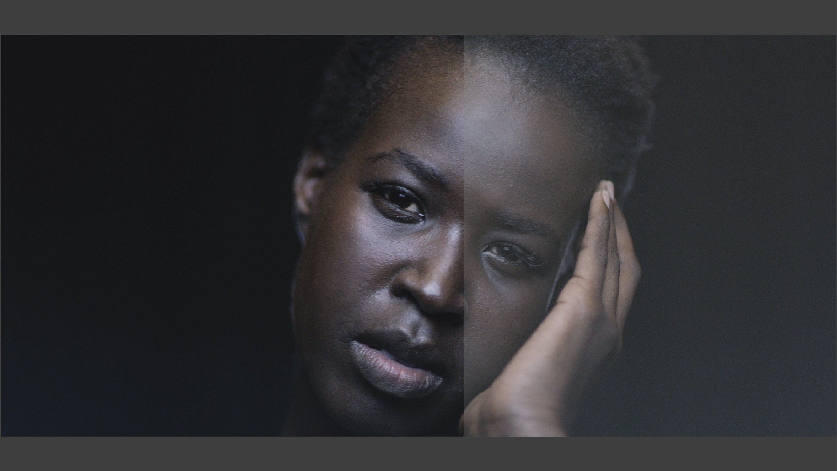
5. Hue vs Luminance: Here we are in hue
versus luminance. We're going to jump
over to this clip here, because what I'm going
to do now is show you, I'm just going to do a
very basic adjustment to this shot, like that. I really barely touched it. I just adjusted the shadows, a touch like this. That's just so you can see what hue versus luminance does. That just basically says, anything that's this
color, say skin tones, I want to adjust the luminance or make it brighter or darker. By clicking on her forehead, which is a little
too bright for me, I want to darken
that a little bit. Here we are, and I'm just going to really x so you can
see what's happening. Anything that's that hue, I can make brighter or darker. I'm just going to take
both of their skin tones and drop it down a little bit. This is where it was originally, believe it or not, and
this is where it is now. Let me just reset this. I'm going to another
note so you can see it, and I'm going to again
click on her forehead, and I'm going to drop
again, color grading. What separates a
lot of the things that professional
colors do from people who don't have as
much experience is very fine tuned adjustments, very specific
focused adjustments versus adjusting
the entire image. Just with that small adjustment, I made their skin tones
look blown out and ghostly, and they look like that. Let me go. They were like this,
blown out skin, blown out highlights, now it looks a
little more natural. If I want to, just for fun, add something else, I could say, okay,
this blue here, I'm going to select that, and the thing to
remember is that hue and luminance are connected. Usually when you adjust
the brightness of a shot, if something is for example, these skin tones that were in the pink or in the
red categories, when you make that less bright, it's going to make
the colors pop out. It's like a different way of
increasing the saturation. For example, I clicked
on her blue shirt here, and then I'm just going
to make that shirt darker and watch what's
going to happen. See, it looks like I'm
increasing the saturation, and if I make it brighter, it's going to start getting
a little washed out. I'm going to make
it much darker. Again, let me just actually, so you can really see it, I'm going to go to a new node, select anything that's
that luminance, and I'm going to darken it. Before, after. You can always do a comment, like if you really want
that shirt to pop, you can do a
combination of this, and then jumping back over here to the hue versus saturation, picking her shirt as well and then increasing
the saturation. See. Learn to use all these in
combination with each other. It's just a combination
of hue versus saturation and then hue versus luminance. We started off here, the microscopic little
basic adjustment. All we did here was a hue versus luminance
of the skin tones, that makes all the difference, and then the blue here. There you go, hue
versus luminance. We're moving through
these quickly, and now next we're
going to move on to luminance versus saturation. I'll see you all there.
6. Luminance vs Saturation: Now we're going to work with luminance versus saturation, and I will tell you this, the next three are probably some they're used
the least amount, but they are great to know because they are
extremely useful. Again, it's similar to one
we've covered in the past, but this is luminance
versus saturation, which basically means,
let's go back to her skin. Anything that's
this bright here, and this is not just going
to cover the skin tone. Anything that Resolve registers at this brightness
level in the forehead, I can increase or
decrease the saturation. I'm going to really
increase it just to show you not this is going
to look that good, but just helps illustrate
what it's doing. What this is used for the most, I'm going to reset that and
let's jump over to this clip. What luminance versus saturation
is used for the most is sometimes you want to only
desaturate the highlights, or maybe the shadows tend to be a little muted or lifeless, and you want to increase the saturation in just
the shadow areas. That's what this is
used for the most. If I click on, say here, anything that's this
brightness level, I want to saturate it. Again, this is a very
subtle adjustment. You can see what
it's doing there. Anything that's level
of adjustment again, in this case is
doing the shadows. I'm just going to do
a small little bump, then someone to go
back to full screen. You can really see it
here in his jacket. Because I'm basically
saying the darker areas of a shot can see it here. In the shadows of
his jacket as well, and some of his hat. Again, like I said, this one isn't used as much. It's really, if you're wanting
to just really make small, tiny fine tuning adjustments. Let's see what happens to we
click on this brighter area. I'm going to increase
the saturation there. Might see it a little
bit more there because it's basically the sky. See if you're wanting to
bring out the sky here. Before, after, before, after, and that's honestly one of the
great things about Resolve. It's got a tool for
every single situation. This is one of those
tools it's getting a surgical razor to make
very fine tune adjustments. A lot of people may not
even notice a difference, but again, what I typically
tell students is what makes a color grade
look really great, it's not the big adjustments, it's when you take a
million tiny adjustments and really shape an image, and that's the
tool that this is. That's the luminance
versus saturation, and then we're
moving along here. Next is saturation
versus saturation.
7. Saturation vs Saturation: Here we are. Saturation versus saturation, almost towards the end. As it sounds, this is a
very desaturated shot. You can see it's very muted. The greens are very muted. The things that are
probably the most vibrant are this hat here. For example in something that says saturated versus saturated. Again, this is another
tool where you're taking something that's a very fine, precise tool and you're
saying you know what everything in this shot is desaturated except for this hat. I want this hat to maybe match the saturation
level of everything else. I'll click here and now
I'm going to make that of that saturation level and am
going to desaturate more. You can see what's happening, go to full screen. The hat is the only thing
that's desaturating. It's anything that's equally
saturated as the hat. For example let's say
on a scale of one, how saturated is this hat? If the answer is a nine, anything that's a saturation
Level 9 will be desaturated. We can see that his coat
is also pretty saturated and you can see we're
now matching the hat and his coat to maybe
the background. Before, after, before, after. Now, this has a much
more muted look to it. Maybe you didn't want the coat and hat to pop out as much. We simply say, okay, anything that's that
saturation level, let's just bring it
up or bring down. This is also pretty
helpful a lot of times if you have things like
neon signs or anything like that's just really
popping off the screen. It's usually something in a red channel or
something like that. This is great to say anything in this shot that's
supersaturated, super neon, let me just click on that one item and
then bring it down. Or if something is in
the opposite direction, something that's maybe very desaturated
level you can say, let's bring anything that's that
desaturated and bring it up. That's a pretty easy one. The next and final will be a
saturation versus luminance.
8. Saturation vs Luminance: Here we are in saturation
versus luminance, and as you might have picked
up hopefully by this point, anything that is a
certain saturation level, we are now going to make
it brighter or darker. This is a pretty saturated
patch of grass here. For this example, I'm
just going to click here, and then what it's going to
do is anything that's of that saturation level
like we did with the hat, anything that's of a
specific saturation, instead of making it more or
less saturated like we did in the last lesson for
saturation versus luminance, we're just going to make
it brighter or darker. Let's take anything
that's not saturated and make it a little darker. Before, after. Before, after. Another short and sweet lesson with saturation
versus luminance. We have one last lesson left, but we've covered so much so far from the custom curves
all the way till now, so I'll see you in
the next lesson.
9. The Project: Okay, so now let's talk
about the project. It's very simple. I included several
shots for you to use. Download those
shots and then feel free to use one or all of them. Use what you've
learned in the class; from the custom curves
all the way through to the Luma versus
Saturation curves, stylize those shots and
make them look good. Then, if you do publish
them to the projects page, definitely show the before
and after of the two. If you choose to
do something like uploading the video to YouTube, then share the link, make sure you keep it
public so I can see it. If you can show the
before and after there, that's always awesome. I love looking at your projects, so I'm definitely
looking forward to it. See you in the next lesson.
10. Final Thoughts: Okay, so that's it. Thank you again for
taking the class. Only thing left to do
now is the projects, so download the footage, use it to curves, and upload
it to the Projects page. Also if you can, it's very helpful when
you leave a review. Let me know what you think, and if you want to check out any other supplementary stuff, check out my YouTube
channel here. I'm always posting new stuff, that goes with my
skill share work, and use the discussions
page below. If you have any questions, I love talking to you guys, I love answering your questions, so definitely take
advantage of that. So thanks again and
I'll see you all later.