Transcripts
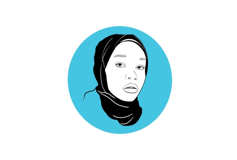
1. Class Intro: [MUSIC] Hi. My name is Thais. If you're looking for one
of a kind gift ideas, you have come to
the right place. I'm a freelance designer
from Rio de Janeiro. I love to create things
and my interests are wide, but my go-to is
digital illustration. In this class, we'll
learn how to create unique and realistic-looking
line drawing portraits to give as gifts using
photos as reference. We'll cover things like finding your best
reference photo, combining a few photos in case not everybody is
looking their best, some tips and basics
of composition, my best secrets and techniques of line drawing portraits, and formatting and saving your work to put in physical
products if you wish. I will be using Adobe
Fresco on my iPad Pro. Go over the basics you
need for this project, but feel free to use any other tools you
prefer, like Procreate. This class is open
to all levels. I'll go over some
basic concepts, but it was designed
for anyone looking to improve the line
quality of their drawing, learning where to simplify
things when using reference photos and making sure your subject looks
good on paper too. I love making gifts for people. I think that you can
get something really unique and a guarantee that
they don't already have it. I chose this project
because I believe that making custom
gifts shouldn't have to break the bank and then making
your time and effort to create something for someone makes it even more
meaningful and special. I'm super excited to have you in my class and I can't wait to see what you come up
with. Let's get started.
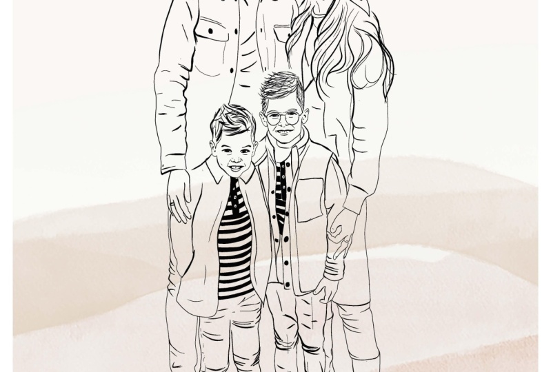
2. Class Project: [MUSIC] For your class project, you'll have a finished illustration ready to be set digitally or placed it in a product as a gift. We will break the project into three easy steps. Step 1, prepare. We'll start by looking at our reference photos and picking the best ones to get accurate details, and even combine any few photos if it's needed. Composition. We'll look through the basics of composition and decide what works best for our project. Step 2, illustrate, we will talk about what to focus on and what to simplify from your reference photo and I'll give you my best advice on drawing good looking portraits. After we have our base drawing ready, we can refine it with our finishing touches. We can add a background if we wish to. Wallah, illustration is done. Step 3, give. With our finished illustration, it's time to share our gift. Here's where we'll format and save it in different sizes depending on how you'd like to get it, whether it's on a card, on a mug or simply digitally. As your finishing step, please make sure to share in the project gallery for feedback and virtual high-five. Also, feel free to post any questions you may have in the discussion section, and I'll be happy to help. I'm also including an overview of each step in the class documents as a quick reference guide. Let's get started. [MUSIC]
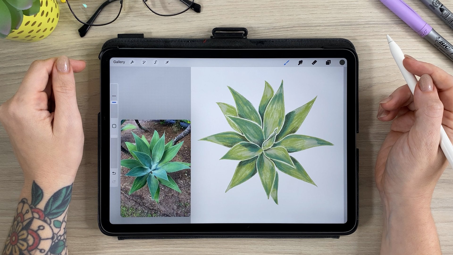
3. Prepare: Reference Photos: [MUSIC] Even though we'll be drawing directly from a photograph, there are some things to keep in mind in choosing this; which photo works the best. The main things I look for are: Good light, good quality and close distance. The darkest the light, the harder it will be to get the details, especially on a person's face. I try to avoid harsh shadows, but sometimes you can make it work. Same with the distance and quality. You'll be zooming in a lot, especially when drawing the face. If it's blurry or super pixelated, you will be able to get all the important details. Closer photos, at least from the waist up. Of course, the more drawing experience you have, the easiest will be to overlook some of these details. But regardless of that, having a good reference photo will make your job so much easier. Note that the person will look completely different depending on the camera angle, lenses and proximity. Yes, that might be where yourself is, sometimes look a bit weird. [MUSIC] Check out this example. In order for the head to be the same size, he had to move further as the focal length increases. [MUSIC] Basically, he started out pretty close with the 20 millimeter and then it up the furthest with a 200. That doesn't mean that you shouldn't draw a portrait from a selfie. That is just something to keep in mind. You can see the nodes specially gets really big, as it's the closest thing from the camera. Other things to keep in mind are, this is a flattering angle. The chin is too high up. It can make the forehead look small and get a weird perspective. Depending on where the person's looking at, it can make them look a little bit cross-eyed, which sometimes you can get away within a photo, but the illustration may look a little bit weird. Going to picture the drawing over the photo you're looking at to get a better idea of where those light will be. Don't worry if you can't picture it right away, but don't give up, it does get easier every time. I also like to get multiple pictures of the same subjects to cross-reference if possible. This way you can see if the details are consistent, or if it's just something that looks like that in one particular factor. If you ever tried to take a group photo, you know how hard it can be to get everyone's attention at the same time. This is especially true if you're trying to take photos with kids or pets, or maybe you just want to add someone that just wasn't there at the time. When combining different factors, which we'll look at someone took that picture at the same time of them altogether. Try to keep a similar angle and a similar distance. Don't forget to [inaudible] by scaling it up or down. Next, we'll go over composition structures. See you soon. [MUSIC]
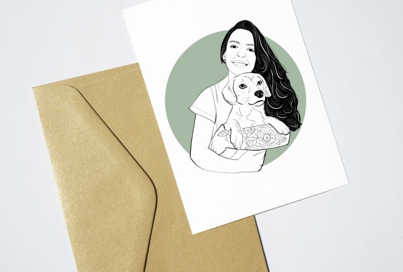
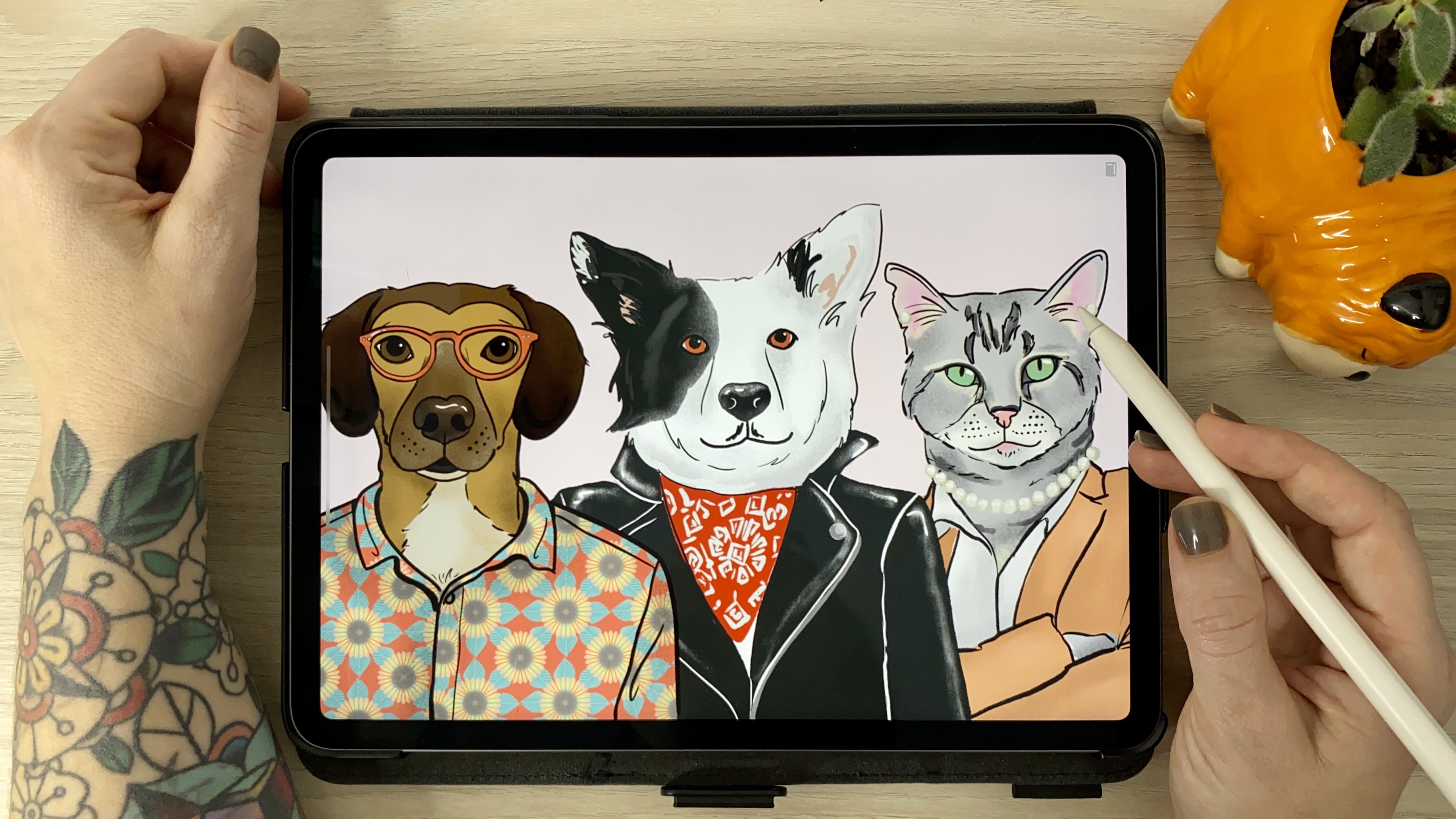
4. Composition: Composition can make your product look really cool or weird. There are many compositional structures, but I'll go over my favorite ones for this tech project. The rule of thirds. This is the most common structure and you've probably seen it before when taking photos. As it's very often used for photography. Basically, it consists of splitting the image, integrate vertically and horizontally. Then placing the subject at the intersection of those lines or along them. Here's an example of the structure. You can notice that the eyes are placed pretty much right on each intersection. O shape and triangle. Pretty self-explanatory. Pretty much you'll organize everything into the shape you choose. I like using this for groups of three, or where there's an obvious size difference, like a portrait of my friend and her cat. They work really well when he can actually fill in the shape of the background, making it look like a frame. Most of the portraits I do are either half body or from the chest up. I love to include the arms, especially when they're bent because I think they finished the bottom part of the image really well, and sometimes even act like a frame too. That means that we're not drawing the whole body and to keep one thing in mind, avoid accidental limb chopping. Basically, you don't want to cut off any fingers, top of the head or body parts unintentionally. You also don't want to cut directly on the joints, like the elbows, the wrists. It looks really weird and uncomfortable. You may wonder, hey Tass, but where do you chop it off? My answer to that is chop mindfully and with intention. Try chopping the line a little bit higher or lower in the joint. I also really like to vary the weight and the length of the lines, and I try not to cut the line straight or on the widest part of the body. Last but not least, sometimes it just completely omit the lines and your brain will step in and fill out those lines for you. You can see here on this portrait, I stopped the light is right below the shoulders and emitted completely the other line of the arms, and the image still works. By the way, you can take these suggestions even beyond illustration and apply them when taking pictures is as well. This is the reference photo that I'm going to use. When I picked it, I try to keep in mind everything that we covered so far. Lighting, quality, proximity, do I to have to combine, what type of composition is it going to be and where do I want to crop it and do I have to combine more than one image? In the end I chose this picture of me and Aggie for a few reasons. [MUSIC] First, I like how we both look in it, which it's the most important thing. I can zoom in and still see the details and I think it's going to make a good composition. I'm planning on doing a greeting card and I want to have a circular shape behind us. [MUSIC] I think my arms are going to go well with it because it has this brown shape over here and I don't have to combine anything. [MUSIC] I'm going to crop it around here, and he's going to be right in the middle of the circle. Coming up, time for step 2. Let's start drawing.1
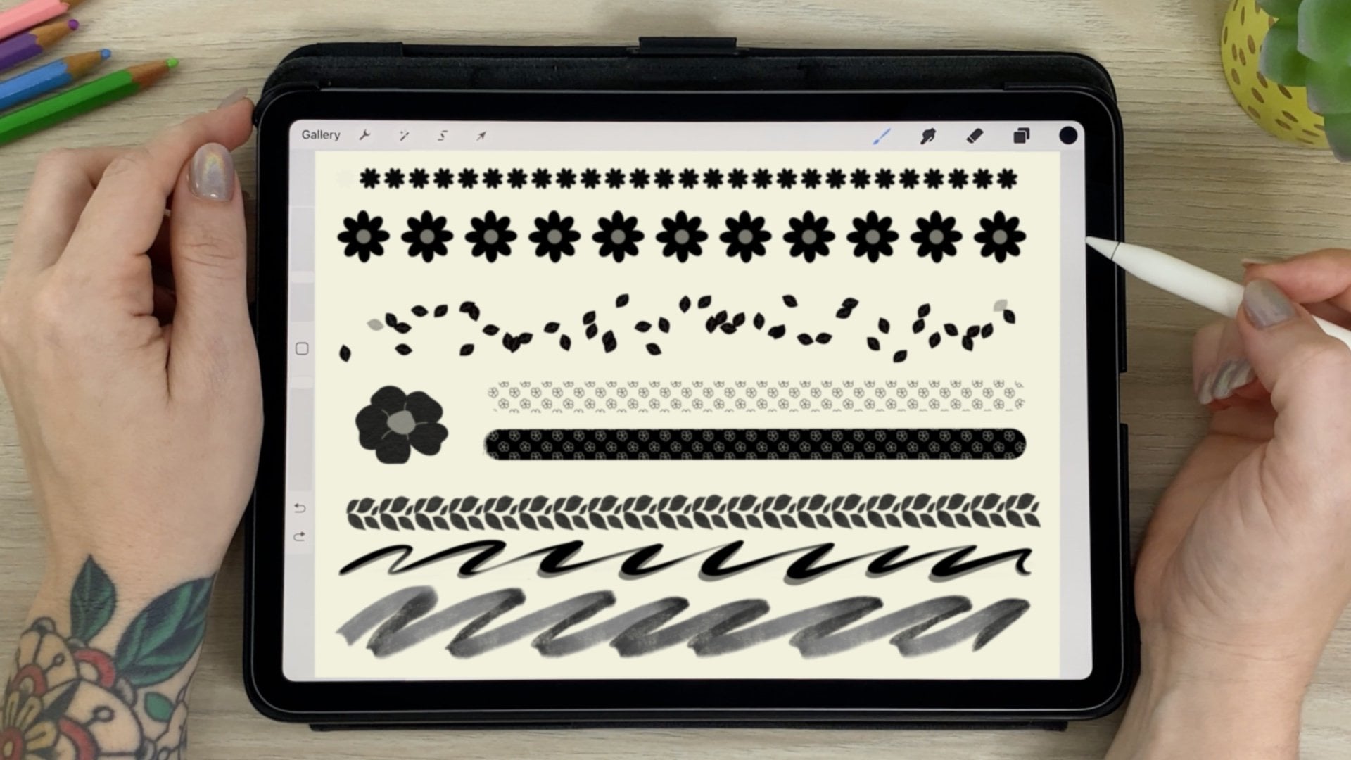
5. Illustrate: We create a new art board by hitting the little plus sign on the bottom left corner. Then we'll go to print on the top menu and select Letter. Let's place our reference image. I will do that by clicking on This Picture button icon on the left side menu. Let's mask this image so it's easier for us to see what we're working with. And you can do that by tapping the Select button on the side and drawing a line around the part that will compose your illustration. Then when it's done, hit Mask on the bottom menu and swipe to the side to hide the rest of the photo that you don't need. If you want to resize it, click on the Transform button on the menu, which will allow you to scale and move your image. Then hit Done on the top right. Now I'm going to lower the opacity of this layer so that it's easier for me to see what I'm drawing over. Click the Opacity button again to hide the top. The top three buttons on the menu are the brushes. The one on top being the pixel brush, the second one, a live brush that simulates watercolor and oil painting although we won't be using those in this project. The third one is where you'll find the vector brushes. We'll only be using the first two, the basic brown, and the taper. By the way, this is the difference between vector brushes and pixel brushes. See what happens when I zoom in? The pixel brush gets pixelated and the vector brushes stay sharp no matter how much we zoom it. That means we can scale it down from very small to the size of a building if we want to. Okay, so moving on, let's create a new layer by clicking on the Square button on the right menu. I like to start by drawing the eyes and using the round brush. [MUSIC] For the eyebrows, I'm going to use the tapered brush. I like to draw the top and the bottom line of the eyebrow lightly with short strokes in the direction of the hair. Then I go back and fill it in, making sure it looks even. Sometimes I do draw the whole shape of the eyebrow and then fill it in flat. But my eyebrows are not as solid as a lot of people's so I prefer to fill it in in this case. [MUSIC]. I like working with multiple layers, so I'm making a new one for filling in the eyes. [MUSIC] Then back to my tapered brush for the eyelashes. I like to go a bit heavier on the top outer part of the lashes rather than just making every single lash and then just a few in the bottom. I think it makes it look cute. Remember we talked earlier about how the camera can make your nose look really big. Well, we can fix this by drawing the line on the inside of the actual photo. This is even more noticeable in selfies, But I still like to draw the nose on the inside of the picture, even in a professional photo. Because if you draw the nose exactly where it is, it's still going to make it look bigger than normal. I also like to slightly exaggerate the angle on the side. At the mouth, I like to make the inside line of the top lip slightly heavier. This was a color illustration. I wouldn't even draw the top line necessarily, just add a darker shade of the bottom lip. But since we're doing a black and white line drawing, in this case, it would not look good with that. Especially when drawing women. I find that when I draw men in this style, I usually do a minute though. For the teeth, you definitely don't want to draw every single tooth. I like to outline here and very lightly draw the gums. [MUSIC]. For the face, I did the same thing I did with the nose and just draw a line a bit inside the lines of the photograph. For the hair, if this was a drawing of somebody with light color hair, or if it wasn't a black and white line drawing, I would start drawing hair string shapes. But since my hair is pretty dark, I'm going to go ahead and outline the whole thing while simplifying the tips of it, and then fill it in black. Don't forget to draw that hair shape in a separate layer so that you can change the opacity when drawing the strands. Then I draw the strands in white, which should also be in a different layer. I like to draw the hair strands with the tapered brush. I won't try every single hair, but only the strands that catch my attention the most. That's why we'll go back to the hair later in the final touches anyway. [MUSIC] Back to the round brush, I'm going to finish drawing the body. Again, drawing slightly inside the reference image.. Now the human part is almost ready. I'll group the layer so I don't get lost, and it's time to get started on [inaudible]. After making a new layer for [inaudible] I'll start by drawing the outline of his nose. Just like I did with my hair, I'll make a new layer, fill in with color, then another one and add the details in white. [MUSIC]. Then I'll draw the eyes followed by the mouth. [MUSIC] This guy has short cue but his ears are quite fuzzy. I can show that alternating some solid longer lines with a few shorter ones in the fuzzier area. The shorter the pet's fur, the more I'll use the solid lines. And the longer the fur, the more I'll use the choppy lines, some of the choppy lines will indicate this note as well as the areas where his coat changes color. [MUSIC] Then I'll group all the layers together and then group all the groups together so that it can move and scale everything as one. [MUSIC]
6. Final Touches: We're almost done with our illustration. It's time to refine it to make it even more interesting. For the finishing touches, I like to do a little housekeeping and make sure I deleted any of the layers I don't need. I have everything in one group. Then inside that group, I have one group for me, one group for Iggy. I still have the reference photo in case I need it again. First, I look around for anything that I missed and I already see two things here. The inside corner of the eye and the top of the ear. I'm going to go ahead and do that. Varying the weight of the line has a lot of of interest to the artwork, it should make your eyes travel around the piece. During the final touches, I look for lines that I can give a heavier end. Usually places where I'd add a shadow like this side of the nose, that corners of the mouth, inside of the ear. Some other spots here and there. [MUSIC] I'm not really loving how the smile lines turned out or this little line on the nose. I'm going to redo these. [MUSIC] I can now go back to varying the lines. [MUSIC] I'd like to go heavy on some spots and then taper it back to the original line. [MUSIC] Now I'm going to go back and fill in the hair, a little bit more to give it more movement. [MUSIC] The last part of the hair is to add some of loose strands here and there to give it even more movement. [MUSIC] Now let's go back to Iggy. Same thing, go to his group, new layer. Let's see what we can make darker. [MUSIC] Now the last touch, is to just add some reflection on the eyes. I made a new layer on top of everything. [MUSIC] I don't really like this reflection on his nose, so I'm going to fix that before we go. [MUSIC] Right now that reflection is done. You can leave it like this if you like, if you want to print it at home, then that's it. But if you want to place it on the product, you want a transparent image. Because otherwise, if you were to print this exact image on a t-shirt right now, you would have white square around it. We can do that by deleting the background layer and making a base for our drawing. What you want to do to make a base is make an outline around the whole image and then fill it. I'm going to add a random color, put it underneath. That's going to make it easier to see what we're drawing. [MUSIC] Check for any openings, and then fill, you can erase the part where you don't have anything if you'd like. I don't want this pink background so I'm going to delete it. Now I'm going to make my circle. [MUSIC] [inaudible] Next let's make it a gift. [MUSIC]
7. Give: Now that our work is done, it's time to share a gift. Let's take a look at some of the options out there. There's print on demand. There are many print-on-demand websites where you can just upload your artwork, and I'll take care of printing and shipping. You can send it directly to the person you want to gift. Which works really well especially when sending the gift to somebody that's far away. They have tons of product options for you to pick. Just keep in mind that they have a turnaround time, which might take a couple of weeks. If you want to place it on a product, red bubble is a good option. In the Help Center, they have the dimensions. Since we don't have a specific product that we're going for here, I would just size to what they recommend and then we can see from there, so this is the size. I can go over here. Size, pixels. Then I can scale my work. It's very important to note here that the only reason I can scale it this much, it's because I'm working with vector lines. The dimensions they're suggesting here, it's so that you can fit even in the largest products like duvet cover or shower curtains. If you're working with pixels, you might want to look for smaller objects so that you don't have to larger like this. Another great option for faraway gifts, or if you don't have the time to wait for the print-on-demand company is sending the digital file. That way the person receiving can print themselves at home. I like to share it in three different formats. PNG, which will give you the transparent background, JPEG which is the most used for social media, and PDF, which will keep the vector lines, so if they want to print a bigger, they can dissociate from the PDF file. If I was sending this to somebody, I would do the three types of files, save it and email it to them. This is also a great option for anyone strapping cash since it's pretty much free. I always like to buy some really nice paper and print it at home. You can just hit "Quick Expert" on the top right and save the photos super and directly from here. I decided to make it a holiday card. On the third button on my side menu, I can find this little square for the Precision menu. Here's where I can turn on the grid and I can size it up and down by dragging my finger on the space box. In this case, I want to go to the maximum size because it's going to be the easiest to see the middle of the page. Then I go to settings and change my canvas from portrait to landscape. The grid shows where the middle of the page is. Now all I have to do is adjust my image and center it on the cover of my card. Don't worry, the grades won't show up in your saved image. Let me know which brand you decided to take. Don't forget to share a mock-up of your product and you decided to do the prints on demand. [MUSIC]
8. Final Thoughts: [MUSIC] Thank you so much for joining me and I hope you enjoy the process. Well, let's do a quick recap of what we went through. On step 1, we covered reference photos and picking a good one with good lighting and good quality and that's close enough to the subject and choosing a flattering angle. Also how the camera changes a person's face, and if possible to get multiple photos to cross-reference. Combining different photos, that you should make it seem as it was taken at the same time using similar angles and don't forget to adjust the size. Composition structures, the rule of thirds, where we split the image in three horizontally and vertically, the O-shape and triangle where we organize the subjects according to the shape. Cropping, don't chop thumbs. Avoid cutting directly at joints, vary the lines weight in length when cropping, and that it's okay to omit lines. On step 2 we covered, illustrating. Difference between a vector and pixel, a quick Adobe Fresco overview, and steps on drawing portraits from photos and refining your work. Then the last part, Step 3, we made it a gift. We covered how to resize our work in different formats to save our illustration as well as gift options. If you take anything from this class, I hope it's how to make up for the camera distortion by drawing inside the lines of the photos and that you don't have to draw every single line. Also that varying the weight line throughout your illustration makes it look a lot more refined. Thank you again for taking this class and I really encourage you to share your project and if you can to follow me here on Skillshare and on Instagram @bythaisq. Let's keep in touch. See you soon. [MUSIC]
 Thais Queiroz, Designer/ Artist/ Curious Creative